Transcripts
1. Introduction: Hi. My name is Elisabeth
and welcome to another artist inspired class as part of my artist
inspired class series. I've been teaching on
Skillshare since 2021, and I've been
teaching in person to a variety of age
students since 2005. I have a long history as a professional educator and
as a professional artist, and I love sharing
my passion for art history digging into the lives and
artistic journeys of artists and how we can use that as influence for our own
artistic practice and weave that with what we most
love about art making to get inspired and push
ourselves in new creative ways. In this class, we look
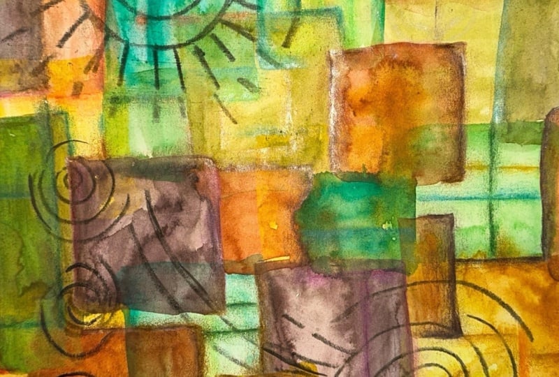
to the artist Paul Klee. He is a really fascinating
artist that was really focused on artistic
growth and development, was really pushing the
limits of art making, and exploring a wide range of ways that he could express
himself creatively. We are specifically
going to focus in on the Image Transfer technique
that Paul Klee created. He would do Image
Transfer using oil paint. This one can get a little
messy, but I promise you, the results are well worth any messiness that might
happen and I will give you a full breakdown of
how to very easily and safely clean up your
oil paint supplies and you only need
one oil paint color. If you don't have
oil paint on hand, you can easily pop out and get a small tube of black oil
paint for this project. And I guarantee you it's a technique that you're not
going to want to stop using, it will be well worth any small investment that you might have
to make for that material. In this class, we're going
to look to the artist Paul Klee and his Image
Transfer technique using oil paint and paper
and a pencil or a skewer. It's a very easy class project as far as the materials
that we need. But the results
are just amazing. Then you can either leave
it as is once you transfer the black image to white
paper or to colored paper. Or you can work
back into that in a variety of medias
such as Watercolor. It works really fantastic
because we have the oil paint, and then we get the oil resist
with the Watercolor media, it just creates really
beautiful pieces, much like the pieces here
that Paul Klee has created. Let's head it over to our
next lesson to learn a little bit more about our
class project. See you there.
2. Class Project: For our class project, we are going to be looking at the Image Transfer technique that was created by
artist Paul Klee. What you do is you have a
sheet of paper and you spread out the oil paint on
one sheet of paper, and then you lay
the painted surface down on top of another
sheet of paper, and then you draw over the back side of
the painted paper and anywhere you press
down is going to transfer the oil paint
to your other paper. If you are interested in adding a wet media to your
transferred image, make sure that you
do the transferring onto Watercolor or
mixed media paper. If you want to stick
to drawing elements, then really, you could use
any paper you wanted to. Even copy paper works fine. Copy paper is absolutely fine for what you spread
the oil paint out on. We could work
relatively small too. This doesn't have to
be a large process. These can be miniature
pieces as you explore this technique and
find your way through it. Then anywhere that
you put any pressure down whatsoever on the back
of that painted surface, it's going to transfer through. You can go beyond the
skewer line drawing to give the really defined lines and you can play with
different textures. Pressing in different patterns, that gives a little bit of
a fuzziness and grayness to the whole background as a whole when that oil paint
surface lands on there. Then you don't even
have to wait for the oil paint to dry on
your transferred image. You can go right from there into painting into it,
drawing into it. But you do want to be a
little bit careful because oil paint is a media
that stays wet. If you are new to
oil, just know that oil paint stays wet and because
it's an oil based media, you can't wash it
off with water. You might want to have
a pair of gloves on hand just to keep
your fingers clean. Don't mind getting art on me. There's a lot of
different ways that you can wash the oil paint off. One way that you can
do it is obviously with mineral spirits
or turpentine, but that can be pretty harsh for both your water
system at your house. It can be harsh on your skin, the chemicals in the atmosphere, the smells, even odorless. One way that I found to clean
up my oil paint safely, and in a very lovely fragrant
way is to use citrusal. Citrusv is a great
safe way and it smells lovely to clean up any oil paint that
you get anywhere. Because we are working
with a messier material, you're going to want
to make sure that you protect your art surface. Putting down some
old newspaper or a large sheet of scrap paper
is a really great idea. Even the old tablecloth or a disposable tablecloth,
that's what I use. When I teach classes in person. I protect the tables
from the art making. Putting down disposable
tablecloths. That's a really great
way to do it too, because then when you're all done printing and
image transferring, you can just easily bundle
that all up and throw it away. I will have a special video
about cleaning up since our art material is a
little more tricky to use, but I am super excited
about this class project. It is a technique that I have
gotten so obsessed with and can't wait to explore further in additional art
making opportunities. Let's head over to
the next lesson to talk a little bit more
specifically about the materials we're
going to want to have on hand for class and the cleanup supplies
you're going to want to have at the ready.
See you there.
3. Materials: For our Paul Klee
inspired art project, we're going to need
some oil paint. You can use any color
that you want to, but black is more in
line with the work that Klee was doing with his Image Transfer
process that he invented. So I'm working with Black
for my class project. So I've got black oil
paint. I've got a brayer. If you don't have a brayer, you could take just
kind of one of a craft brush and just use that to spread
out your oil paint. But the brayer works
really, really great. Then you're going to
want to have whatever kind of paper you
want to work with. If you're going to
be painting back into your image transfers, you're going to want to
work with a Watercolor or a mixed media paper if you're
just going to be testing out this experience
first or if you want to do a couple of
trial runs or you just want to work with it as
far as Image Transfer goes and work back into it
with dry media or not at all. Any drying paper
will work for that. It gets pretty messy
with the oil paint, I like to have some
copy paper on hand, and I put that underneath the Image Transfer
paper just so I've got something that keeps
my work surface clean. So it's a little
easier to kind of go between ying the oil paint and then image transferring
onto your artwork paper. Having a cloth on hand to wipe your fingers off is
a really good idea. Then as far as
scratching the image, you could use a wooden towel. You could use the handle
of a paint brush. Anything that's has a point
to it that you can draw an image onto the
paper to transfer that isn't going to scratch your
paper or rip through it. So you want it to be a little bit kinder surface to work with. When you go to clean up, you're going to need something that's going to be able to clean the oil paint off of your
brayer and then your fingers. You could use paint
thinner for that. You could use mineral spirits. If you don't want to work
with such harsh materials, you could also use citrusalve. That's another more
gentler solution that is great for
cleaning brushes, whether they've got acrylic
paint on them, oil paint. It may take a little bit
more work to get it clean, but the citr salve will
do the job without being as aromatic and
harsh on your skin. And that is all we need for our Paul Klee inspired project. So let's head over to
the next lesson for some tips on cleaning up our
oil paint and materials. See you there.
4. Clean Up: To clean up our oil paint, we are going to be
using citrusal. This is what I recommend. You could also use Mineral
Spirits or serpentine. Minerals and serpentine are
great. They're very quick. They're designed to clean up oil based materials
like oil paint. But I do find that citrusalv is a really nice
natural cleaner. It's also a degreaser, it really helps break down
the oils in the oil paint. This is what I would recommend if you want something
that's a little easier on your skin and smells really nice isn't going
to be as harmful. What I do is I have a scrap
plastic container that I use, and put the citruslv in there, and then I let this soak for a little while and start
to break down the oils. And then I start to
massage out the paint. You could absolutely
do this with plastic gloves on too so that you're not making a bigger mess in the process of
cleaning up your mess. You can also get a lot of the excess paint off
on a scrap paper. That's probably what I
would do first is wipe off any extra oil
paint that you have. And paper bags like this that you might have from the
grocery store are great. Any scrap paper that you have, you just get off as
much of it as you can, and then you can
go ahead and let the brush soak in
the citrus salve. Then after it's soaked
for a while and you start massaging
out the oils, then you can rinse it with water and it should
be good to go. Then you can just
let your brush air dry. The same would
go for your skin. You just put a little
citrus salve on your skin and wash off any oil
paint mess that you have. I hope that helps as far as
tackling a messy medium, but it is well worth it to get our really awesome
Image Transfer results. If you have any
questions about this or anything else about class, don't hesitate to drop a note in the discussion section of our class on
Skillshare and I will reply to you very quickly
and get back to you with some guidance and
information and anything that can help you
with what you're doing. Let's head on over
to our next lesson to learn a little bit more about the art and life of artist Paul Klee. See you there.
5. About Klee: Named. Paul Klee is a Swiss German artist who really had an
interesting art career. He is tied to Vasily Kandinsky. They both worked together at
the Bauhaus, teaching there, as far as his art
were concerned, he was greatly influenced by expressionism, cubism,
and surrealism. We can see a lot of
that playing out in the different imagery and abstractions that
he played with. But ultimately, his main
focus was on color. Really did a deep
dive in color theory. He wrote extensively about
it about the power of it and he really felt that
color represented an optimism. It is interesting that
we are doing a class focused on his more
black and white pieces, which he felt were intentionally a little bit more
grotesque and satirical. He had a very dry humor and
satire is definitely at play. The ones that explore
this Image Transfer technique that we're
going to be using. Like Kandinsky, he was also
very influenced by music. He came from a very
musical family. He was very encouraged
to pursue music, which he did for a long time. He was a very talented
violinist and he was performing in major
groups from a young age, and that was the path
that he was going on. He was also very
talented at drawing. He showed a lot of creative
ability and skill there too. Like Kandinsky, music was a huge influence in Clay's work. Travel was very
important to Cl also. He explored many
different places and when he would go to
a place was the color. If you've traveled
to anywhere that is quite different from
where you normally live, you'll notice the
colors are different. The light changes things. It's just a very
different experience of the world when you're in a new spot and you're really tuned into things
in a very unique way. Paul Klee has some pieces that are very directly
influenced by some of the travels that he
took and the colors impact on him and trying to explore how to
represent an imagery, what he saw in the world around him when he was in these
different locations is very key. When we look at putting color back into our image transfers, that's something that
we can consider too, the power of color, the
feeling behind color, what it communicates,
how it represents, and what colors relate
to the images that we decide to transfer in our
technique with the black oil. So Paul Klee, there's
a lot more to Polkey than what we're
diving into in this class, and I hope that if
you get excited about his work that you decide to
do a little deeper dive too, because he's a very interesting
creative person and has a really wonderful
story to dig into. Over on the Projects and
Resources section of class, I have a Google Slides
presentation that I put together that
gives you an overview of Clee's life from
birth to death and some of the artistic
influences along the way and tons of his artworks
and help you get inside his view of the world and how he represented that in his art. Especially his exploration of tyicalblack line Image
Transfer drawings and the play of color that he explored as he dove deep into the power of color
and color theory and color application
in the visual arts. Now that we know a
little bit more about Paul Klee and we've taken a
look at some of his pieces. Let's dive in to our class project and start playing with Image
Transfer ourselves. I'll see you in the next lesson.
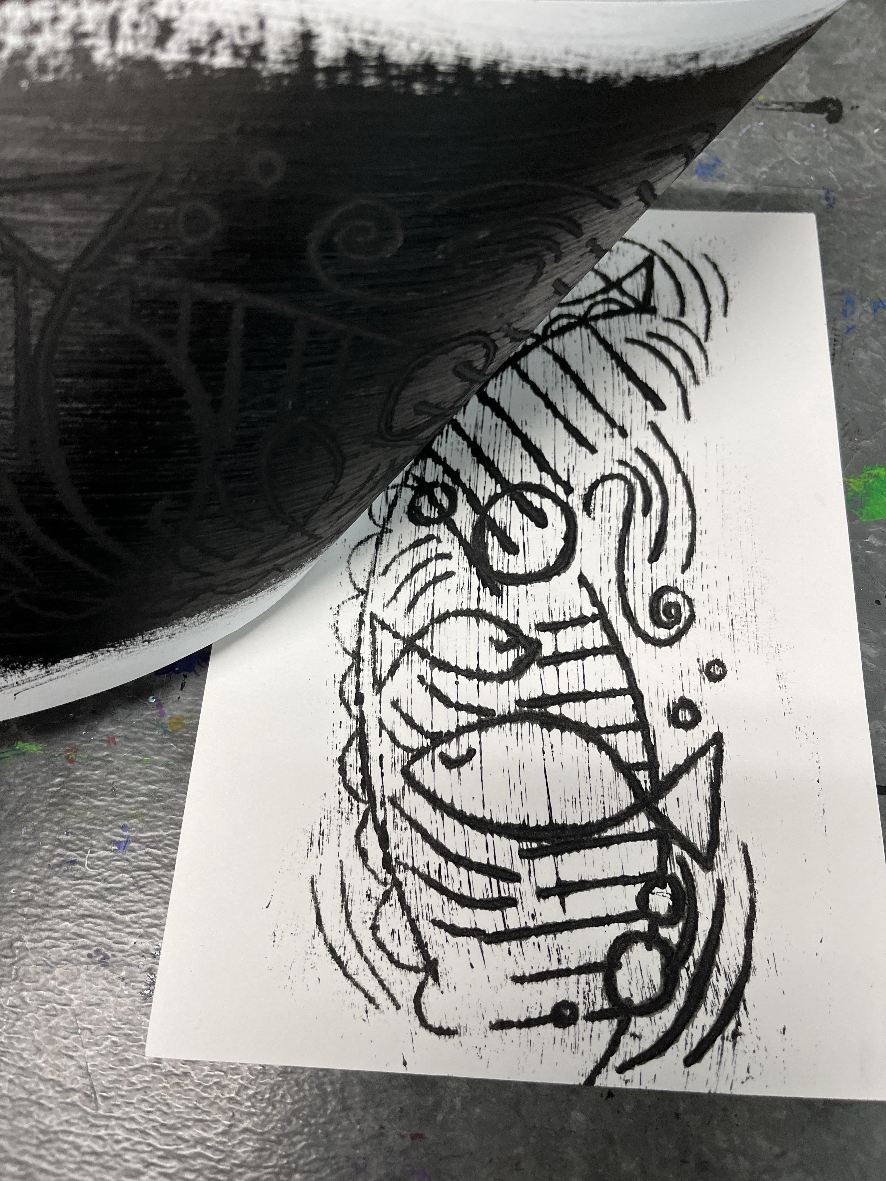
6. Image Transfer: So let's create our
first Image Transfer. I have my black oil paint. For this one, I'm
just going to use an old chip paintbrush. You can also use a brayer.
They both work great for this. I do have my surface
protected by a recycled paper bag
from grocery shopping. I have a skewer, but I can use anything to do my
scribing back in. I've got one paper I'm going
to be applying my oil paint, and then I've got the
scraps of paper that I'm going to be image
transferring on. I'm going to create
just a little bit put a little
bit of paint down. A little bit goes a long way. And then I'm going to pull that down you might need to
add a little bit more. We just want a nice evenish
layer of the oil paint. If you go all the
way to the edges, you're going to have a little
bit messier of a situation, just know that oil paint is messy and it's going to take
a little bit to clean it up, but we've watched
the cleanup video, so we know how to do that. Now I've created an area that is covered in my oil
paint, nice and even. I'm going to take a
piece of my paper, just using mixed media paper
so that I can work back into it with
anything else I want to and I'm setting
that on top of it. Now, holding these two
together just at the edge, I'm just going to start
drawing over my background, drawing over my open space. Anywhere that I push down, it's going to start transferring an image and we can peek at it and see how
it's coming along. You see how it does the lines. Now, because we're
working with oil paint, we can have some fun doing some other kinds of transfer with that using different tools. The more I push down and brayer burnish
more I burnish it, the more paints going
to transfer over so I can play with some
different lights and darks. Pretty this is the basics of it. But the other thing I can do, I can use different resources and different tools to create
different effects too. You see it starts to get it.
I think I need more paint. This is a really good start.
This gives my test run. Now, I can keep reusing this. I'm going to go ahead
and get some more paint, put some more paint down. And the great thing is oil paint stays wet
for a long time. This gives me a lot
of time to work. I don't have to worry about moving too
quickly or too slowly. I can just keep going. I can work back into this one or I can just set it aside
and I can do another one. This one I want to play
with some different kinds of marks on here. I'm actually going
to use the handle of my scissors because
it's got a wider line and do something a little bit more maybe play with the
idea of a landscape. Let's see if I can create
some interesting line there. This paper is pretty thin
for mixed media paper, so I can actually see some of the pressure that
I'm putting through. But then we can
also hold the two together and lift it up to C. I can see areas that didn't
quite transfer as much. Then I can also switch
to different tools. Maybe I want to play a
different line quality. Get some texture in
my mountains, maybe. Maybe I want to put in
some grass down here. You could absolutely
create a drawing on one side of this and then
use that as your guide. This is getting a
little bit muddled, but I think I can keep working it and resolve
some of the strangeness. Ultimately, at this stage,
this is an experiment. I just want to see what I can get the oil paint
to do as far as image transfer and see see what the different
effects are. Okay. Kind of interesting,
a little bit crazy. I think what I want to
do is, let's do that. Let's do a quick sketch. I'm just going to grab a
colored pencil because that's what I've got on hand. And I'm going to do a quick little I like the
idea of a landscape, but maybe we'll do a quick little just kind
of a fun flower. I'll just kind of play with
something kind of fun. So I'm going to take
this paper now, and I'm actually going
to add more oil paint. I really want to get a little bit of the
texture effects that happens. I'm adding more. I'm going to put
this down drawing up and then I'm going
to use, let's see. What else do I
have on hand here? This isn't a guitar pick, but it looks like one. I'm going to use this
piece of plastic. To kind of draw in my leaf. Sorry, my petals,
draw my petals. Then I'm going to switch to the skewer put in the
stem and the petals. And then I'm going to kind
of scratch into that. I'm going to outline and I'm
scratching into the middle. Make it a little
crazy. That's okay. Then I want to add a little
bit of line texture here. So my drawing is giving me a
basic idea to play off of, but I still don't really
know what's happening with the oil paint
underneath. Oh, yeah. Books, great. That'd be a
whole lot of fun to play into. So that is what I'm
going to lead into. I'm going to lean into
more paint on my paper and really make sure that
I've got lots of coverage. You don't necessarily
have to keep going, but I feel like I
did go a little too thin in the beginning. I'm also starting to
get a little messier. I've got some on my thumb, I've got a rag off to the side so I can just wipe off some
of the excess there. Three examples, let's do
let's do another one. This one, I'm just going
to go for it again. This one I think I want to
play with creating a pattern. I'm going to rub it gently I want a little bit
of grayness to transfer. We can peek at what
that's looking like. See it's getting a little bit. It's going to have some of
the scratching that come through from before from
the paint brush marks. I love that. This would be great just to
leave it as it is. But let's keep going. I liked
what happened with this. Let's see. We do a little
bit of vertical lines. But then I want to
have some variety. I'm going to do this. I'm doing a checkerboard type
pattern over it. Then let's peek at what
we have. That's fun. Now, let's see what else
we can do with this. Let's take our skewer and just start adding in
some other design. That's fun. I'm going to
leave that one like that. So you can see how you can
get the basic grayness and it picks up the
texture of the oil paint. You can get the
thicker lines and then the thinner lines depending on what you use to
scratch into it. Remembering that when
we first started with my initial layering of the oil paint onto my transfer
paper, it was very thin. The ghosting that happened
was much lighter. The line that I could create with the skewer
was much lighter. The more oil paint I put on it, the more I had to work with
as far as image transferring. So if you want a
more delicate line, I would lean into less oil paint and if you want
something bolder, like these two, I would lean into more oil paint, and
then you can kind of play. The more you do Image
Transfer of this, the less paint is going to be on there, so I can
kind of keep going. I have a ghost on here. This image is now
scratched into this paint. So what I can do is I can
get another sheet of paper. Oh, actually, let's do this. I can get another
sheet of paper. I can take This is
just, you know, Watercolor scratching into,
you know, scrap demo paper. So I'm going to do
this onto the color. But instead of
scratching into it, I am just going to furnish it. And see if I can get the
scratch texture to transfer. The other thing I could
do is I could get out my roller and I could roll this across here and see if that would help too. So it's pretty light,
but it did pick it up. I picked it up a little bit. I wonder if I go back
and really focus in on the part where
it didn't transfer much if I could get
that to transfer more. So I'm adding more pressure and more time with the
pressure to see. No, I think there's
just less oil paint there. But this is pretty fun. Like I love the idea of this Image Transfer
on the color paper, too. And this was already
Watercolor paper. So that's great. So play around with how much
oil paint you use. Play around with different
tools that you can use to draw over
and kind of press into the backside of the
paper you're transferring it onto and then kind of play
and see what you like. If you want to just
do black and white, you can do the Image Transfer
on any kind of paper. If you want to transfer
onto something else, then obviously you can just do that Image Transfer right onto whatever other paper
you want to that maybe is already treated
with color or image. If you want to
paint back into it, make sure that you
choose a paper that is designed for whatever
media you want to do. The oil paint is going
to stay wet for a while, but if I'm going to
go into Watercolor, which I'll show you
in the next lesson, I can absolutely go
right to that stage. Because we're working
with oil paint, we do want to clean
up this finish this stage of your
class project and then head over to
the next lesson to see how I work back
into these with Watercolor and maybe some
other media, too, we'll see. But Watercolor is
going to be where I'm going to focus this next. And don't forget to review
the cleanup video for some helpful information
about how we need to clean up
this very beautiful, very fun Image
Transfer techniques, very messy art materials. So after I get cleaned up, I will meet you in the
next lesson to Watercolor back into some of these.
See it a little bit.
7. Oil Pastel Alternative: So we're going to follow
the exact same process as I demonstrated
with the oil paint, but now we're going to
do it with oil pastels. So I'm going to take
my black oil pastle and I just have a piece
of drawing paper. You could use any
paper you want, and we're going to
create a nice solid coat of the black oil pastle. Just like with the oil paint, I really want to lean into a nice even coverage
because if I have areas where I'm not filling it in
with the oil pastel, I'm not going to get
as much of a transfer. So the thicker the oil
pastle I put down, the darker my line should be. You can absolutely
experiment and play and try what happens if I do a lighter application
of oil paste? What if I do a heavier one? I know that I really want
some big bold line here. So I really want to
make sure that I am filling in really, really boldly with
my oil pastle. We could also lead into some other colors too and have a lot of fun
playing with this. But for the first
one, let's just do it with black and kind of
get the technique down, modifying the materials
that we're working with. So I have my black. I'm going to lay my mixed media
paper over the top of it. I chose a mixed media paper just like the last one because I just don't know what else
I want to do into this. I'm not quite sure.
Now I'm going to start just kind of
drawing into this. Just like I did the last one. So kind of playing with that, I'm going to do a little test. That is transferring
beautifully. This is a fantastic
option if for whatever reason you don't
want to use oil paint. This is a much easier
one to work with. Chances are you're
more likely to have oil pastels around than you
might be to have oil paint. In all honesty, I
have had oil paint around since I was in
art school and college and I haven't touched it since I was done with
art school except for maybe a little bit
during my teaching of high school years
if I was working on some examples
for my students. That's why I leaned
into it because I really wanted to
start the class being authentic to Paul
Clee's artistic process. But in this day and age, we have more options and we
don't have to rely on that. So this is fantastic. Oil pastel will be a little
chunky sometimes. So that's how I'm picking
up these speckles. But I love that because
it's also kind of leaning into the printmaking process of it because we're
doing monoprints. So there's little nuances that
you get that are just kind of inherent in the
printmaking and kind of, you know, the little
bit of missteps that happen really adds some
nice authenticity to it. I want to play
with a seven more. I want to go I'm
going to lay it down. I want to kind of
try burnishing more. So I'm going to take the handle of my scissors and
I'm going to really, really apply a lot of pressure to see how that
changes it a bit. Versus pushing down
with the Sharpie cap. It gives me some darkness,
so that's great. I feel like I have
to work a little bit harder with the oil
pastel to get the really, really bold dark to
transfer, but that's okay. Anything that makes the
project more accessible to more students, I'm
always all about. This is just such a fun
process to play with. Now, the other thing
I want to do is, I want to take something
that's got a really, really big end to it and kind of get myself some really
intense lines in there. Let's see what happens there.
Transfer is a little bit. Now, could we do
the same thing that I showed you with the oil paint? Could I put down more knowing
that we've taken some off? Can I add more oil
pastel like I did with the oil paint and get
even more to transfer? Now, absolutely, I could keep
going without adding more. But what I want to see is, can I really lean into
getting even more on here? I'm just going to kind of
go for a zig zig pattern. I'm sorry that it's
shaking the table. I'm really pushing hard to get it to kind of pick up the
lines that I'm creating. Now, what I do love is the
nature of the oil pastel, to get the background values
that I have to do by, like, really pushing into it. But I can get that bold line, and it doesn't transfer much
oil pastel to the back. Like, it's not just naturally carrying over the oil pastel. But when I add
pressure to all of it, then that's when I start to
get a little bit of dusting. You have to really work to
get the overall texture, but you can lead into the drawing elements
of this very well. Then because this is still
an oil based medium, it's going to still do
the wax resist that I achieved when I showed you
the watercolor section of the previous lessons. You can do the exact
same next steps and work back into this with watercolor or anything else you want to. I can go back in with
colored pencil and I can play with that and have
that be something fun. I can go in with paint pen. And kind of work with that. I would be more inclined
to use paint pen into an oil pastel
transfer than I would an oil paint transfer
unless I let the oil paint dry a little bit. Just because I don't
want to pick up too much oil paint on the
tip of my paint pens. But because paint pens
are relatively opaque. I I don't work into it too much, they can cover over the line. Or mask it out
pretty pretty fully. I can also go into this
with a brush pen, too. I've got some brush pens. My brush pens are transparent, so I'm going to be able to see my lines through them,
which is really fun. I'm adding a nice layer there, just like the
colored pencil wood. So that's super fun. So if you don't want
to work with oil, paint, or you want to try both and kind
of compare the two. Oil pastels are a
fantastic route to go for your class project. I hope you enjoyed
this bonus lesson. I really appreciate you
checking out the class, and I hope you'll
consider sharing your work over in
the student gallery and definitely let me know in the reviews how
things are going. And if you want to have, like, a nice back and
forth exchange and kind of talk through
your process, pop on over to the
discussion section, and I would love to chat
with you over there.
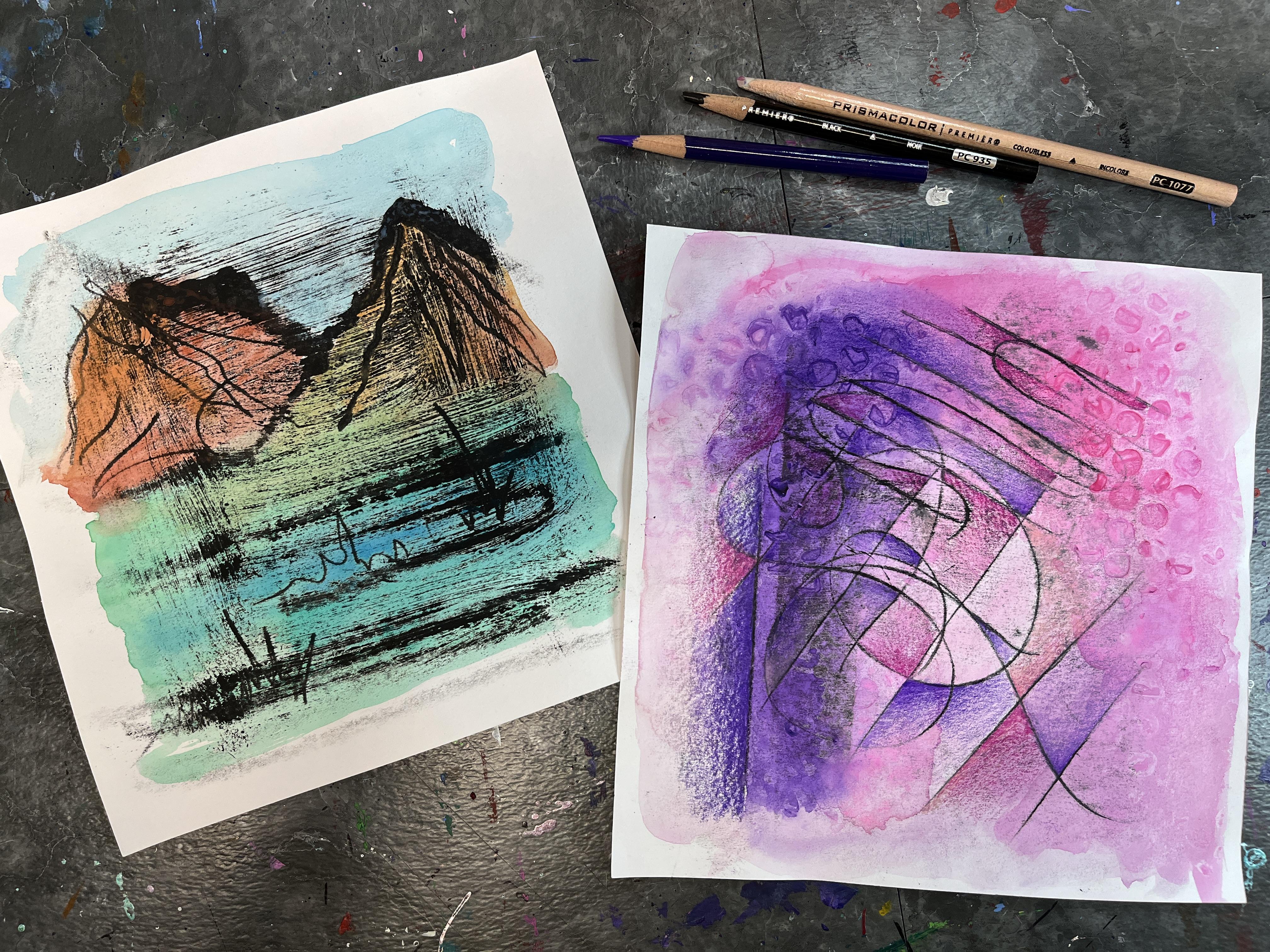
8. Watercolor: So now I'm ready
to watercolor back into my images that
I transferred. Because my oil
paint is still wet, it might get a little bit muy, but that's really in line with Paul Klee work and kind
of what he was doing. I'm going to start
with this one. I go to kind of just drop in some color because oil
paint is an oil paint. It's an oil based paint. It's going to do
the cool oil resist that happens with that, which is really, really fun. Paul Klee wasn't working with incredibly bold color. He was. He was working with
bold pure color, but there was still
kind of that play of transparency to it when he was painting back into
his image transfers. So I'm going to kind of
lean into that also. Because I want to have
the texture show through, but it's going to
anyway, just by the nature of what I'm painting. This part can be as detail oriented or as sped up
as you want it to be, but I just wanted to
drop in some color. Because it's doing
the oil resist, I don't have to be incredibly precious or careful
with where it's going. I just let it do its thing. It's going to create
a natural barrier between different areas,
which is super fun. And I'm just having fun dropping color in kind
of seeing what happens. Now, I could absolutely
let this dry and work back into it some more with
some other different media. I could draw back into it. I could do colored
pencil back into this, but I love that it's just this bold graphic quality of the oil paint and then
the really delicate, transparent aspect
of the watercolor. I think I'm just going to
let that one be that one. This one is just kind of
a more abstract design. I could just kind
of do a cool wash of fun colors over it. Because I have all these fun
colors already mixed up, I'm going to kind of lean
into my palette a bit and use that as my inspiration for
where to take this one. Just kind of going for
colors that bring me joy. So I'm working really, really
loose. Really, really what. Now, I could absolutely do some watercolor
technique over this, some different
texture technique. I could drop in some salt. I could play around with plastic wrap and add some additional
texture. Look at that. Because this was an area
where I really rubbed a lot, there is a ton of
oil paint here. So you're getting a
lot of beating up. And then the area
where it isn't, I'm getting that crisp
watercolor line next to it. And then I'm going to play
with just kind of adding some more water and
letting the paint move. Now, if you had a more controlled image that
you were working with, you could obviously
do, like I said, more controlled Watercolor,
but I just want to have fun with this step of the project and
just see what happens. This one I think I
definitely want to work back into just because I want to. Like, I want to resolve it more. I feel like I have a nice start to what I did with my line work, and then I've got
kind of a nice start to the Watercolor, too. I want to give it a chance
to develop some more. I am realizing that
I think I was wrong about this paper and that this
is actually drawing paper. But that's okay, too. Is
it kind of buckling a lot, but it'll flatten
back out again, and I can always squash it with some books after it's dry. Let's actually play with this. And I'm going to do a little bit of watercolor technique with this because then
that will give me even more to work back
into when this dries, and I circle back
with paint pens or colored pencils or both. So I'm going to go ahead
and lean into bubble wrap. In order to get the
texture to show through, I do want to layer on
a lot more pigment. With these Watercolor
texture techniques, which I have a class about
a couple of classes, I think that incorporate them if you want to get
more into this. I don't necessarily want
it to go everywhere, so I'm okay with the fact
that some of this is dried. But the more pigment I put down, the more texture I'm
going to leave behind. It'll push the pigment,
and then you let it dry and it creates a
really beautiful texture. This bubble wrap has
the bubble side, and then it has
the smoother side. I'm going to just lean
into the bubbles. I'm going to put this
down and just kind of press it in some areas, and then I let it dry. I could pull it off now, and
it'll have a softer texture, but if I let it dry on there, it will create some really
nice crispness where it's pushed and pulled the
pigment around a little bit. The same thing would
work with plastic wrap, too, where you scrnch
it up and put it down, or you put it down, and
then you scrinch it up, and it creates more of
a stained glass effect. So this is going
to create a nice bubble effect on top of it. I'm going to let this dry and then circle back to
this after it's dry to see what other
interesting things I want to do to it as
I push it further. But my goal for you is to at least experiment with the Image Transfer that we
did in the previous lesson. And then if you want to
explore adding color to it, Watercolor is a really
easy, fun way to do that. And you can see, now that
this is starting to dry, there's some really
gorgeous play that happens between even
really bold Watercolor, but the transparency
of that against the opacity of the
black oil paint. I just creates really
fun. It almost feels like it has kind of a similar
feeling to printmaking. And we aren't doing I
mean, Image Transfer is a form of printmaking,
so model printing. So I love that about this. Like the texture that Cl had in these different
pieces that he was creating and the way
that we can kind of play with that and get a similar
effect in our works.
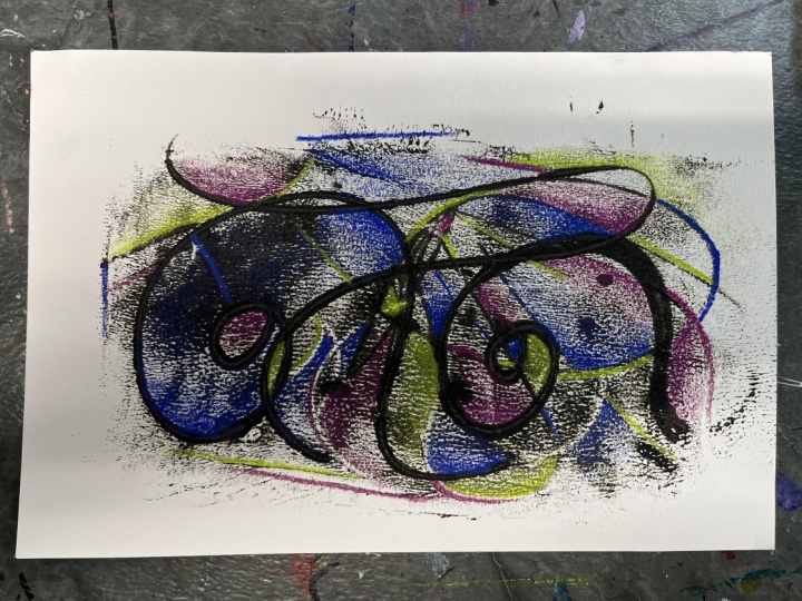
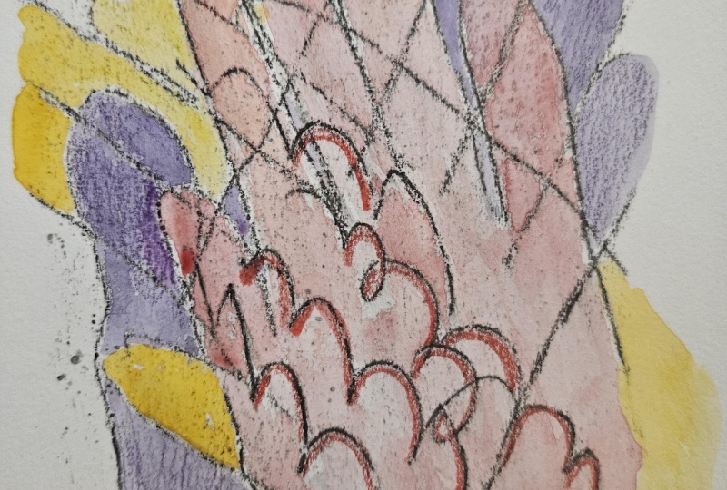
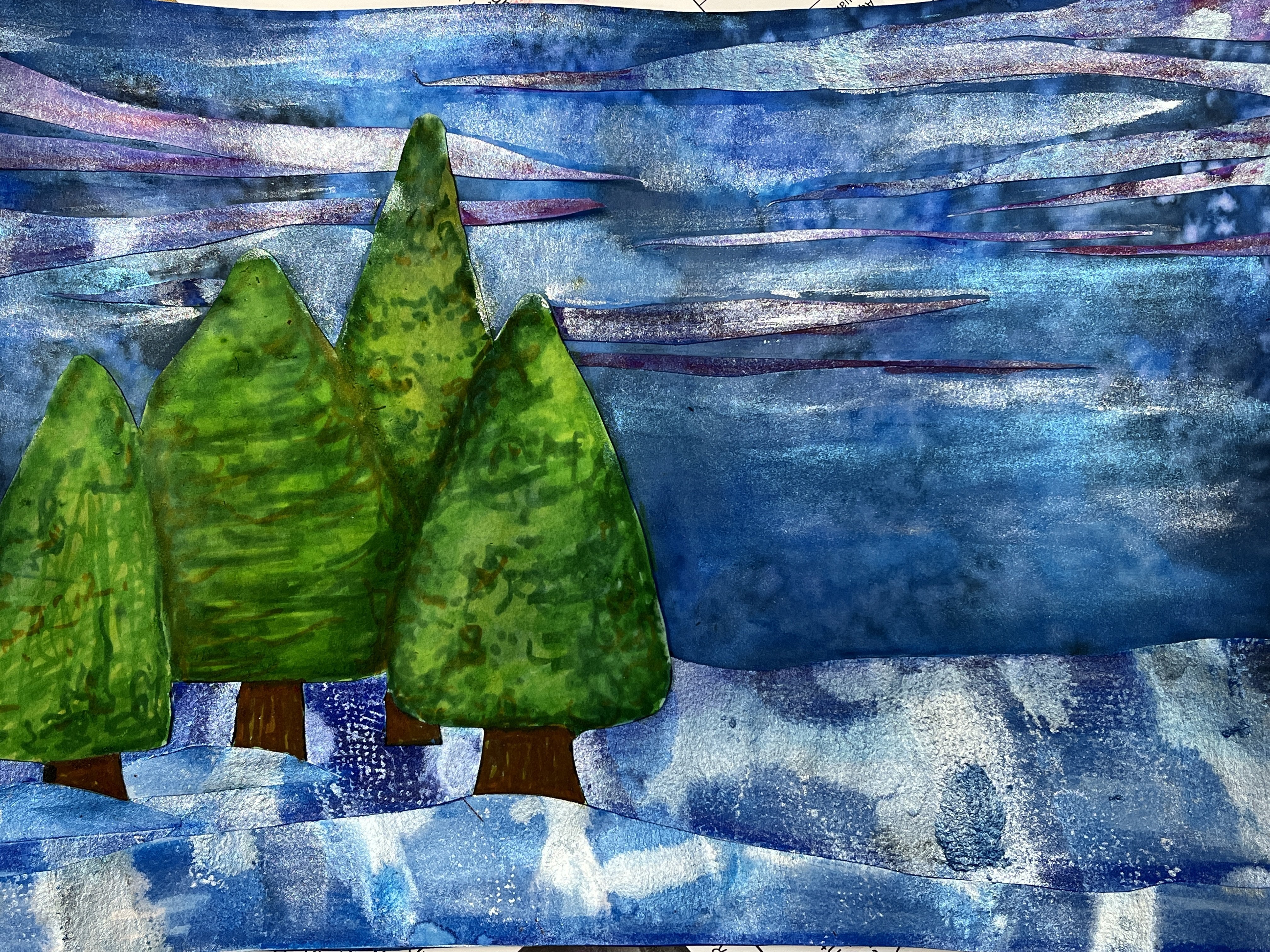
9. Adding Details: So the first step after we have done our
Watercolor techniques, and in this case, I
did the bubble wrap. After it's dry, I can
remove the bubble wrap, and then you can
see that there is some really gorgeous
bubble texture. This, like I said, in
the previous lesson is more prominent if
there's more pigment down. So there's a couple areas
where it's really bold and then areas where the watercolor had already started drying. So there's very little
to no texture there. I love working back into my
pieces with colored pencil. It's a really nice
way to work into a dry artwork to give
bright bold pops of color. So I'm leaning into
the colors that I chose for the
Watercolor application, and then I am using the overlapping lines that I did with the clue Image
Transfer technique that created new shapes
and new spaces and really emphasizing some areas by just doing some
really basic gradients. So a gradient is when you
go from a light value to a dark value or a dark value to a light value and
where it fades out. So I love to really add
these nice pops and rich colors that emphasize a line or a shape or an edge and then
quickly fade them out. So I'm leaning into my
pinks and my purples. I did a little bit
of light pink. Some of them are just a
straight color on there. Other ones, I've layered in a couple of different
colored pencils. I'm not building up a really heavy application
of my colored pencil. I'm letting it be loose. I'm letting all of the beautiful linework
and Watercolor texture in the bubble wrap
bits show through. I'm just adding some extra pops. I really love what this
adds to the piece. I'm just deciding as I go along where I want to
add these pops of color. If I'm in a purple section, where do I want to
add some more pink? If I'm in a pink
section, where do I want to add some more purple? And then where do I want to
intensify those colors too? This is a really, really easy way to work back
into your drawing. If you were new to
Mixed Media or you have a beginning understanding of colored pencil and value. This can be used in a lot of different ways beyond our class. But this I found to be a really fantastic way to
just add a little something more to my Image Transfer
Watercolor piece because it just
wasn't quite there. It needed some more resolution. I'll say with the
other one that I did, I was completely happy
with the Watercolor, and at that stage
it felt done and I was satisfied and
ready to move on. But this one, I am so glad
that I decided to push it further and that I played with a Watercolor
texture technique, and then I also started
drawing back into it. You could use any art materials
that you have on hand. You could add more linework. You could add pattern. You could really kind of
play with oil pastels. Even charcoal or soft
pastel would be great. There's really no limit to what materials you
could play with even ballpoint pen would be really fun to go in to
kind of really push the linework that you did in your Image
Transfer even further. I'm doing this in
an abstract piece, but you could absolutely
color back in and enhance and add flourishes
to a representational, Image Transfer piece
that you created too. I did find that I had this
one little section down there where it got a little
extra textured, something I can't remember now, but something about what I had done to the paper just kind of made it a little more
texture than I want to. Later in the video, I go in
with a clear colored pencil. Prismacolor makes these. I think there's probably
some other brands of colored pencil
that do as well. But it just adds a
layer of clear wax. So the pigment, there's
no pigment you'd normally find in
a colored pencil, you'd have pigment and wax. Or the colored pencil material. A clear colored
pencil is one that is just the wax and
it's designed to blend the colored pencil
more just to add a little bit more waxiness and give it a little bit
more smoothness to it. Here it is here. It's a
really fantastic tool. I didn't do a lot of it, but
this is where you go into the burnishing and you get a little bit more of that waxy, luscious, creamy colored pencil. I just did a little bit of
it to see what would happen, but it was reacting strangely with the residue that was still
there from the oil paint. Then the last thing I wanted to do was I really wanted to add a little bit more value
to my black lines. They're very light. So I decided
to go over some areas of them with a really sharp
black colored pencil and to play with the pressure. So I'm pushing down
very heavily to create some darkness and
then I'm lighting it up as I go along the line. I did this especially where
I had lines intersecting, and it just adds a little
bit more visual interest. I love how this turned out.
I can't wait to see yours. So let's head it over
to the next lesson to wrap up the class.
See you there.
10. Final Thoughts: Thank you so much
for joining me in my Paul Klee inspired class. I had so much fun sharing his Image Transfer
technique with you and exploring the
different ways that we can incorporate that into
our own artist or practice and the variety of ways that we can play with that in
future art making sessions. I hope you enjoyed the class. I would love to see how
your Image Transfer turned out and what other additional things that you might
have done with them. Please pop on over to the projects and resources
section of class to check out the student gallery of what others share and
share your own work there. It's so fun to see that grow. I hope you'll return
back and update us on your continued experiments with Image Transfer inspired by Paul. You've had a chance
to do that, I hope you will also consider
leaving a review, sharing your experience with
a class, what you enjoyed, things that you could like
to see improved or added in, different aha moments
that you had, and maybe how this
influenced you as an artist. It's fantastic for me as a teacher to hear how
students are receiving the class and it's
really exciting for students who might be
considering taking the class. I hope that a whole
lot of folks decide to join us on this artistic
journey because it's a really fun way to explore Image Transfer in a style that I hadn't considered before. I know a lot of different
ways to do Image Transfer. It's always fun to learn
one that we're like, oh, that's really cool. I didn't know you
could do that and I didn't know Paul
Klee invented it. I'd also love to stay connected. Please be sure to give me a follow on Skillshare
to get notified about future classes to
follow me over on Instagram where I share
all things art related, and I have a whole lot of
art awesomes coming up this year that I hope you will come along the journey for. I'd also love to support you in your artistic journey and
give you a follow back. I also have a YouTube
channel where I expand upon some of the things
that I'm doing in class. I share some my own artistic
journeys that go outside of a Skillshare class and
to adventures I go on and I got some really fun
ones coming up this fall. It would be really great
to take you along with me. I hope to see you in
another artist inspired Skillshare class real
soon till next time.
 Elisabeth Wellfare, Artist, Art Educator