Transcripts
1. Introduction: Are you curious
about how to capture the magic of the Northern
Lights in your artwork? Do you enjoy playful
art experiments using a variety of
techniques and materials? Hi, I'm Elizabeth and
welcome to my class, Northern Lights
Mixed Media College. I'm a professionally trained
artist and art educator, as well as a published
author, Illustrator. In 2020, I began teaching
classes on skillshare, sharing my love of
the creative process, artistic practice
and experimentation, and very technique approaches. I have to combine my love of art technique and
art media to create mixed media collages using my watercolor and acrylic
ink texture papers. As a jumping off point in this
class, we'll do just that. We'll explore a few
ways to work with watercolor and acrylic ink
to create texture papers. But if you are curious
to learn more, please be sure to head over to my Skillshare profile page, where you can see
several other classes that explore texture papers, watercolor techniques,
and collaging methods. This class is intended for
creatives of all skill levels. As a fun way to create and use watercolor and acrylic
ink texture papers as collage elements. And then apply various
mixed media techniques to bring the northern lights of our winter nighttime
scene to life. By the end of this,
you will have created some fun texture papers. Learn how to incorporate them
into your collage practice, as well as mixed
media techniques that you can apply to
bring the magic of the Northern lights or any other subject matter you work with in
the future to life. I hope you'll join me as we create our mixed media collages featuring the magic
of winter evenings when the Northern lights
are dancing across the sky.
2. Class Project: Thanks for joining me
for our class project. We will be creating some beautiful watercolor and acrylic ink texture papers using various parts of them to create a nighttime
winter collage. And then we'll go back
in with a variety of mixed media techniques to add an element of wonder
to our winter skies. In the class resource section on the projects and
resources page of class, you'll find a PDF where I
share some line drawings that you can use to
develop your winter scene. You're also welcome to use
your own reference images or sketches to create
your class project when I find the website
Unsplash.com to be a great resource
when I'm looking for reference images beyond the
ones that I create myself. Our class project is going
to have us working with watercolor and acrylic ink to
create our texture papers. We're also going
to need a couple different collage material items to create the collage portion. And then there are some
options you can choose from for the mixed media
technique portion of class. Now let's head over to the
next lesson to talk about what art supplies will be using
in class. See there.
3. Materials: Now, let's talk about
what art supplies you're going to want to have
on hand for this class. Our final artwork will
be around nine by 12 ", but you're welcome to go as
small or large as you like. Since we're collaging, I like to create full sized
texture papers, so I have plenty
of paper to pick from as I create my
collage elements. Let's take a look at what
we're going to be using. You can use watercolor
or mixed media paper. And the size depends on you. Our final project is going
to be about nine by 12 ", or at least that's what
I'm aiming for for mine. But as we work through our different textured
watercolor papers, you could use a different
size if you would like, you could go larger, so you have more textured watercolor paper. On hand or to work with
or you could go smaller. And then we're also going to need a cup of
water because we're going to want to be able to wet our paper and
activate our paints. I love these containers because
they have a lid on them. It was just an old lemonade jar. I also have a spray bottle
on hand so that I can activate my dried
tube water colors. But then I'm also
going to be using water colors straight out of
the tube because I really love the vibrancy that
I get from that without having to work for it
on the dried paint. But if you have
pan water colors, that is also fine as well. But the bulk of our
project is going to be done using acrylic ink. You don't have to
use acrylic ink, but I really love the effects
that it has and the way it plays with the
different textures we're going to be creating. I have some FW
pssent acrylic ink as well as some
liquitex acrylic ink, using various greens and blues
and acre white so that I really get some nice shimmer to my textures and
my final artwork. I also I'm going to
be incorporating some metallic watercolors. I also have some
liquid water color. This is black brand. It is a little gummier. So it doesn't necessarily work the way I want it to with these techniques that we're
going to be playing with, but I do love the boldness
of the color that it brings. I'm going to be using three
different size brushes for my class project. Mostly just two of these three. I like having a small brush and then a super juicy big brush for really getting
some nice bold washes of both water and color. This one is a size 24. It's a little excessive,
but it's great. And then this is just
a 1 " flat brush. I'm finding myself leaning more towards the 1 " flat
brush these days, for doing nice washes of water for wet and
wet application, as well as moving my
color around on the page. And then my size ten brush is
great for going back in for a little bit more
detailed work or a little more intentional
water color application. We're also going to be
using a toothbrush. We're also going to be using
some sponges or cloths to do some pulling of color as well as dabbing of color. I've got
some art sponges. You've use kitchen sponges. I also like to save my extra washi tape
that I use for taping down my papers for especially wet and wet
painting application. Once you budge up the tape and then stamp it
into your color, it creates a really
beautiful texture. We're also going
to be collaging. So we're going to need
a pair of scissors on hand for cutting out
our collage pieces. But then you're also
going to want to have an exact knife as well. Just in case you have
some smaller sections or detailed areas that
you want to cut out. So it's nice to
have the option for both the scissors and
the exacto knife. But if you are going to
be using an exacto knife, you will want to have a scrap of cardboard or a cutting mat to put underneath it to protect your art surface from any cuts. And then to attach
our collage pieces, we're going to want
to make sure that we have some glue on hand. I like using both glues sticks as well as
white liquid glue. I do a lot of bookmaking, so I tend to go for the PVA glue because
I have it on hand. But any liquid white
glue will be great. I do find that this helps my mixed media collage
materials stick a little bit better than the glutic I used the gluestic for one of the projects I made
for this class, and it didn't stick
down as well. So I'm going to lean more
towards the white liquid glue. But to apply the
white liquid glue, we are going to need a
small cup to pour it into, as well as an old
acrylic paint brush. These are great because
the bristles can handle the glue as well as
give us a nice smearing or spreading of the
glue to ensure for full coverage and good
collage adhesion. Then once we've
done our watercolor section and our coaging, we're going to work back into our nighttime scenes with
some mixed media techniques. There is no limit to what you could use for your
mixed media materials, but my go to these
days are brush pens. I like to have my other
fine liners on hand, just to have a variety
of color options. Then another mixed media
material that I often incorporate at the final
stage would be color pencils. Prisma color are my favorite, but any brand is great. It gives you a little bit
more shading control. It adds some nice pops of color. These are all the art supplies that we will need for class. Take some time to gather
up your materials, and I'll meet you
in the next lesson where we'll begin talking about texture techniques using
watercolor and acrylic ink. See you there.
4. Technique Demo Part 1: Welcome back. Before we begin diving into creating
our texture papers, let's take a moment to
learn about and explore the texture options that you
will have to choose from. All right, We have several
different techniques that we are going to be
using in this class. Demonstrate those
for you to practice. I recommend that you start with a sheet roughly nine by 12 ". I'm going to take
down all four sides because the paper is
going to get pretty wet. This helps minimize
the buckling. Different papers will buckle at different rates of wetness. Taping it down is a good idea. Oftentimes I'll do this to a separate masonite sheet or plexiglass board that I have. But I'm just going to
go ahead and tape this right down to my art table. I want to do four variations. So I'm going to go ahead
and loosely divide this in half by taping down the middle vertically
and horizontally. Then I'm going to be using a little bit of my water color. I'm going to go
ahead and wet those. Then I'm also going to be
working with my acrylic inks. I've got a great
big cup of water. I've got my 1 " flat brush. I've also got a
toothbrush on hand, and I've got my number ten Windsor Newton
University series. This is one of my favorite watercolor brushes
to have on hand. And then I've got several
acrylic inks off to the side. In the end, we're
going to want to have decorative papers that
represent a snowy landscape, a night sky, and our trees. I'm not going to worry about the green of the trees
versus the brown. I'm going to let a lot of the mixed media techniques
that happen after the collage step dictate and
bring those colors to life. For our practice techniques, feel free to use any
colors that you want to. In the end, we're
going to do bigger sheets about the size that, that give us a lot of option for the technique on
the texture paper. But these will also be really
great collage pieces or even just a little mini
abstracts for fun that you could cut them down to size and do whatever you want with. The first inigue
we're going to do is going to involve blotting the color up as well as
dabbing the color down. What I want to do is
I'm going to start by wetting half of my rectangle. Because the technique for
dabbing the color down changes depending
whether it's on a wet surface or a dry surface. It also varies a
little bit if it's on a white plain paper or if
it's over a painted paper. I'll show you that
in a little bit. Now, for the dabbing technique, you can use a sponge. This is just an art
sponge that I have. I'm going to go ahead and just rip some pieces off of that, so it's nice and small, but I also want to get some acrylic ink
prepped over here, just make a puddle
in my paint palette. Then I also want to use my brush to kind of get some of these
colors that were dry, puddled out a little bit. Dabbing on the wet paper versus
dabbing on the dry paper. I'm going to make sure that
my wet side is still wet. So we're going to go
ahead, we're going to dab on the dry side first. So I'm going to go ahead
and take my sponge. I'm going to dip it
into the acrylic ink. You'll notice that it creates
some pretty defined marks. Now, when we take it over to the wet side,
they're much softer. They puddle out a bit. It's a gentle
technique over there. I can layer into this as
many times as I want to, pressing as hard, as
soft as I want to. And you can see when
it hits the wet side, it starts to pull out, which is a really
beautiful effect that can be really lovely for your night sky or for
your snow ground. Dabbing into the paint.
We've got dabbing into onto wet paper and then
dabbing onto dry paper. Now you can leave it
as that is or you can go even farther because
the inks are still wet. We can use them like
water colors and we can take a wet brush and
paint back into this. Those darker inks
are very pigmented. They will dominate a little bit. But we can pull some of this
wetness into it and let that be a way to add more value
dimension to our paper. We can also continue
to paint into this, let me grab some of our purple. We can drop that in and even add more value
and shading to this, which is pretty lovely. I'm going to do the same
thing over here now It's wet. It's going to continue pooling, but I still have that softness
of where the color touched down from the dabbing
that we did earlier. Dabbing on wet, dabbing on dry. If we're going to
pull the color off, we need to have a
very juicy area. That's where we're going to
jump over to our next box. This one's going to
be a combination of just wet on wet gorgeousness, as well as dabbing the color. This time I'm going to take
my brush and I'm going to wet the whole
rectangle because I really want that color to move when it hits the surface.
This one's going to get. Pretty juicy because
we want to have some color to pull
off, water color. Pulling off versus acrylic ink pulling off is going to be
a little bit different, but I think you're going
to really love it now. We're going to grab our
lighter plescent blue. Again, any colors are great. I'm just going to start
dropping that in. That in itself is gorgeous. I love when the
color just goes out. The acrylic inks do this
differently than water colors. I recommend you play with both and just see what
happens as you do that. Then each color
for both mediums, each color that you
drop on is going to keep pushing
out the next one. Now let's go in with some of the pearl and that adds a lovely contrast,
We can just drop it down. This is also great for
your sky or your snow, or if you did it in greens, it could be lovely
for your trees. The key is that it's wet. Who? The key is that it's
wet. It's really wet. All right, for fun, let's
pop in some of this purple. And that just keeps
adding more layers to it. Now it's very wet and it's
gorgeous. I love this. But we want to try and play and experiment with
the blotting technique. You can blot with a
terry cloth, a napkin, a Kleenex, a paper
towel, old fabric regs. It doesn't really matter, but when I dab with the acrylic ink, pulls back some of that color and reveals what's underneath. Which then creates a
beautiful contrast between where it's pulling out and the veininess
that happens. And then the softer areas, you can come back over
here, we can pull that out. Now it's a metal defect. We can still add more
to this one too. We can get some of
our ink on our brush. We can go in more controlled
and paint that back in. I personally love it when it splashes and
has a great time. We can also jump back over
here, the blotting technique, and pull up some of those darks to reveal
what's hidden underneath. That gives you a nice balance
between the lighter areas and your darks and can create really beautiful
effects there. You can dab the color
over a painted surface, which would look like this. I had a very softly painted textured paper
that I had done. This was with plastic wrap with liquid water color
with the Blick stuff, so it's a little cloudy. And then I wanted to bring
some more drama to it. I did some dabbing into
it with the greens and the yellows and the dark blues and painted into it
a little bit too. And just really started adding more and more and
more dimension, depth layer contrast,
all those great things. This texture was actually
created using tape. You can dab the tape, then the tape can dab
down onto your surface. That gives you a
whole other look. Because the tape does
not absorb the paint like fabric or cotton
or anything else would it keeps that crispness which leaves some lovely marks. That's something you
might want to consider when you go back in to add texture to your ground or your sky or your
trees especially. You can do some lovely
stuff just with your leftover tape
from your papers. Now let's head over
to our next lesson, or we will continue exploring texture techniques with
splattering. I'll see you there.
5. Technique Demo Part 2: In the second part of our texture technique
demonstration, we are going to be
exploring the effect of splattering with
a watercolor brush as well as a toothbrush. Now we want to do splattering
for our next technique. We're going to start it the same way that we did up
here with our dabbing. We're going to go ahead
and wet half of our paper, and we're going to splatter
on wet and splatter on a paintbrush
versus a toothbrush. We have a little bit of bleeding happening up there.
It doesn't matter. Then we're going to go
ahead and this time we're going to splatter
with a paintbrush. First I'm going to go ahead
and pick up some purple. It's nice and juicy. This can be watercolor
or acrylic ink. Now I, I tap it on my finger and it's going to splatter a little
everywhere, but that's okay. But I've got some
splatters happening on the wet area as well
as the dry area. That's where you can
see the difference. The wet area, it
is just going to bloom out really beautifully. The dry area, it is just going
to stay there as a puddle. Then what you can do is you can keep going
back into this, like I said, with the
water color or the ink. You could use this for florals, you could use this
for ice crystals. The more I go back into it, the more layers of value I get. I can go ahead and keep
dropping in there, and the blues are just going
to get darker, and darker, and darker as I go,
which is beautiful. I can also dab in with my brush and get those to
spread even more if I want to, or just add some
really nice pops. This would be lovely
for an abstract floral. I'm going to go ahead
and wash my brush off, and then I'm going
to go in and you can activate your dots that way or you can splatter
down and they'll just keep rolling dab into them and
activate them that way. I can even grab a different
color dab in with that. And that'll create a whole
other mix of colors as it touches and plays and moves
the paint around the paper, Splattering with a paintbrush to dry this side
off a little bit. Should have dabbed
instead of wiped. That's okay. This side is
going to be splatter again. I'm going to get
some clean water. I'm going to go ahead and
wet half of it again. Now we're going to
do splattering, but we're going to do
it with the toothbrush, which gives a really
cool spray effect. Now, this can get
a little messy. I enjoy getting
messy with my art, but we are working with
acrylic inks here, which are a little more inclined to stain,
especially the metallics. If you don't want to get messy, but you want to use
the toothbrush effect, just put some gloves
on and you'll be fine. I'm going to start
with the water color. I'm going to go ahead
and make a puddle, and then I'm going
to go ahead and scrub my brush around in it. Then I'm going to
take my fingers, and I'm just going
to run it along the bristles and let the
bristles bounce back. And it creates a really
lovely splattering effect. Almost like reminds me of
the mist or offshoot from, and if you spray paint,
that's the word. But when I did it
on the wet section, they go down, but
then they go out. Where here it stays very
controlled and very fine. Just super cool. Just
like the other one, I can layer it up a bunch. Both of the splatter and the splatter spray techniques were great with water color, water acrylic acrylic paint. Now let's try it with some of our ink that's going to
be a little bit bolder, but oh, pretty, I love that. That's just such a
great technique. I'm going to wash
this off and try it with another color on top. Let's just do some of
that yellow again. It is pretty much
green at this point because my tree has
gotten contaminated, but it's a very pretty green. I make my puddle, then I
load up my paint brush, load up my tooth brush, and then I go ahead
and splatter that. Now the other thing I can do
is I could wait for this to dry and then splatter
either technique, Splatter it back in, and
then that would allow it to lay there without
blending as much. But it's really
lovely. This is great for background, you
could do masking. If I wanted to
block off an area, I could create a
mask with something. And then I could go back
in here, we can do, can load, load up
some of the purple. I'll create a masked area. It's only going to go where
it can get to the paper. It's going to get a little
muddled purple in the yellow. But there you can
see it, there's like an edge where this is
preserved from that. When I added splatter to
the back of this one, I created a masking area
with just cardboard. And I covered up the trees and the snow so that I could get the splatter effect in the sky. Then it became a
little harsh and I wanted to bring
back the bands of northern lights that I
need to blue back down. I took a damp paintbrush
and I went in and went over those splatters
and it softened them. I still have the texture there. It just wasn't as extreme as that because it was on a
dry surface at that point. Play around with
these techniques, experiment until you
feel comfortable. Then we're going
to go ahead and do each one in a larger sheet with the intention of using
them for our project. And then we'll move
on to collage. After that, feel free to explore any other watercolor texture
techniques that you like. I love watercolor texture. It's a little bit of an
art obsession for me, and I love having
collage papers on hand. The more I make, the better. Now that we've had an overview
of our texture techniques, let's head over to our next
lesson to begin creating our texture papers for
collaging. See you there.
6. Textured Papers Part 1: Now let's start using the texture techniques
that we learned about in our previous two
videos to create our textured papers for our
winter nighttime collashes. I've got some
liquid water color. I've grabbed the
blue and the green. I've also grabbed a couple of different greens in
my watercolor tubes. I've got emerald
green, Hookers green, dark dian, he cadmium
yellow, and supression blue. But any arrangement of blues
and greens and yellows, or even just greens
will be great. The reason I want to squeeze fresh paint out of
the tube is because I really want the vibrancy
of the fresh color. Because if I were to reactivate
some dried water color, I'd have to work a
little harder to get those vibrant hues that I love in my mixed media collages. I have a cloth on hand for messes and wiping
off my paint brush, as well as getting my tubes of watercolor
paint to open up. All of our techniques
are going to essentially incorporate a wet
on wet approach. Oftentimes I am working
with this really giant one, but I'm going to actually go with my flat, soft
bristle brush. It's nice because it
works really great for getting some water on. It doesn't hold too much water, but it does enough to really get water across the whole
surface of the paper. Then I'm going to go ahead
and activate my water colors. Just start dropping it down. I'm going to keep
this very loose. I'm not going to worry
about what happens here other than getting
some fun textures, because we're going to
be cutting these up to create our
nighttime collages. What actually happens in the
painting process is really just about fun and
play for this class, which happens to be one of
my favorite ways to work. I'm not worrying about
cleaning off my brush too much and I really
want the color. It's okay that it's going on a little goofy and that it's not quite
washing off the brush. All right, now we have a wet
on wet application of color. We can leave it like this or we can take it
a step farther. I'm going to go ahead
and wash my brush off now just for some fun, because the viscosity of
my tube water colors is different than the viscosity of the Blick liquid water color. I'm going to go ahead and pop
a little of that down too, just to give it a
little something else. It's also another green. It's a little gummy
but that is okay. All right. I'm going
to go back into that with some more of
my tube water color. I haven't put any of
that blue down yet, so let's go ahead and
grab some pression blue. We have no idea what part of our paper we're
going to end up using. This should be a
very fun step in the process where you
just get to play. The Prussian blue
is very intense. I want to make sure that
I'm not losing the greens, but I also don't want to lose
the Prussian blue either. I have a lot of color down now. What I want to do is I want to pull back some of that color. I'm going to go ahead and do
that in a variety of ways. I have some cloths that I always use,
they're just terry cloth. These are my clean up
the studio cloths, my water coloring
water coloring cloths. They allow me to save
a little money on kitchen towel because
I can just easily wash these. They come in bulk. I bought these I
think on Amazon. Get a ton of them so that I could have a lot of easy ones. And then I just have a
box in my studio where I throw them when they
get used up and dirty. And I wash them
when I get a bunch. The dabbing sponging
technique for a wet surface, anywhere that I touch down
the absorbent material, it's going to pull the color out and it's going to leave
behind the texture. If you're using kitchen
towel or paper towel, there are different prints
and different patterns and bought like stamped
into those towels. Though it can be a really
fun way to get variety. This has a texture too and it's a little a grid work
knit situation. This is going to pull up
the color a little bit. I still want some
of the boldness. I'm just going to pull it up
in a couple of spots now. I've lightened it,
which is great. I've brought my lights back. But with a smaller brush, I want to go back in and
pull out some more darks. Now, I can use a
smaller brush to also define some
areas a little bit. These two techniques
work great together. The dabbing in of the color
and the pulling up of color. It's really fun to play
with it and gives you so much variation and adds a lovely contrast to
it. I just love it. It's a really easy approach for someone who's
noodle water color. This is a great way to have a low stakes play session and just to
see what might happen. All right, great. Now the fabric, because the pattern on
the towel is so subtle, I have lost some of
the dabbing texture, but I've got the value
contrast which is great. I'm going to go ahead and normally I would wait
for this to dry, but I'm going to keep going. I've got some open space
on the floor where I'm just going to go ahead
and lay my wet pages. As I go, I'm going
to peel up the tape. This isn't too with color because we
dabbed off some of it. We're going to go ahead
and let this dry. We're going to try
another technique with the sponging
and the dabbing. Okay, for this one, we're
going to start with a fairly not so clean page, and we're going to go ahead and dab down onto it from
puddles of color. Got some puddles of
color already on here. I'm going to add some more water to those with my spray bottle. I'm going to keep working
with the Greens because I love having a variety of
options to choose from. I'm going to stick with
my terry cloth towel, so I'm going to go
ahead and soak up that puddle and do a
little bit of stamping. It's it's going to absorb more or less color
depending on what it picks up. That one got a little bit of the color that was there too. This gives me some more subtle, like a really soft
texture, which I love. The more you stamp into it, the more you layer it over, you can let it dry and then
continue stamping back in. I can add some more water, build up those petals. I can use the juicy wet paint
brush to activate it even more if you want writer areas
to your nighttime scene. Doing this on a white paper
is a great way to go. It doesn't look like much now, but you have to use
your imagination and just imagine what
this could turn into. You can leave it
like this or you can start painting back
in between those areas. I'm going to go ahead
and take a smaller brush and go between them
with some color. The areas that have boulder
color are going to shine through because water color
loves to layer dab back in. Now what I can also do is
I can dab on the paper as well and use those spots
to continue texture. This is one that
gets a little more exciting the more
you play with it. You can also dab onto paper
that's already painted. It's not super exciting
now, but it will, we have to remember,
this is going to be a mixed media collage. We're doing the watercolor
part of our media options, we're building up our textures. Then we're going to keep
working back and back and back into these
pages with other media, even more watercolor at times. This one is going to
hang out like this. Actually, let's add some
metallic just for fun. It'll add another
dimension because we're doing a Northern lights picture. We definitely want
to have some shine. If you don't have
metallic watercolors, don't worry about it. But if you wanted an
excuse to get them, this is a great excuse.
This is a great reason. They're really fun. They're even cooler when they're
on darker colors. This isn't going
to be as exciting as it's going to be
in a little bit, especially when I pop the
silvers in to make the snow. The other cool thing about
the metallic watercolors is they're pretty transparent. As you can see, a lot of the marks that I've
made with the terry cloth, sponge, terry cloth are now dry. I can put the metallic over them and the marks stay there, but the metallics add
another dimension to them. There's definitely lots
of awkward stages when you're working in the land
of textured water colors. Some stuff you do it and it's
like, wow, that's amazing. And other stuff, you do
it and you're like, okay. But some of those, it's okay. Papers when you use them in a mixed media collage down the road, they become stunning. There have been papers
where I was like, yeah, I don't know if I'm going to use this and then in the end I did. And I loved how they turned out, so don't discount
a texture paper, you just never know what's
going to happen with it. I've got to work through some of those backward
stages, all right. Grab some more metallics, pop some more of those down. They bleed really nicely, especially with those
really bold colors. Let's head them over to our
next lesson to continue creating our texture
papers. I'll see you there.
7. Textured Papers Part 2: Now we are ready to begin
creating the next set of textured technique papers for our wintertime
nighttime collages. I want to have a
nice snowy ground for my nighttime winter scene. This time I'm going
to use acrylic ink. So I do want to start
with a wet background, so I really want my
inks to play and dance. I like to just start
dropping it down. I don't want to lose my white because we are going for snow, but it is nighttime
in our world. We're going to go ahead and use some of the
metallic brightness. One is galactic blue. That's a little lighter. I love working with acrylic inks. They are so fun and the
colors are just so juicy. You get some really
lovely bleeds that happen when you work
wet on wet with acrylic inks that are a little different than when you work
wet on wet with water color. That's something fun to keep
in mind with a wet brush. I'm going to move some
of this blue out, fill in the paper
a little bit more. Also gives me some of
the subtle variation of value that I want. I get that lightness without having to
maintain too much white. This one, you want to
work a little faster than you might with a wet
on wet water color just because the ink does absorb
into the paper a little differently to bring back some brightness and
add a little shimmer. Because winter
scenes are magical. I'm going to go ahead and drop some of my white
metallic in there. Not metallic, perlescent white. Then I'm going to go in with some really juicy
metallic silver. Just go ahead and drop
some of that down. Now the water color
is going to be more transparent then the ink. It does a nice job of adding a little shimmer to our
less metallic blue areas, but it also pops a little bit of that metallic silver in there that is different than what's
happening with the pearl. This is just a super loose
wet on wet application. But when you use acrylic
inks and they're shiny, you had water color,
it's awesome. This could end up being snow, this could also end up being
the start of our night sky. But now we're going to do
our splatter technique. We're going to lay down
some color and then we'll splatter on top of it. And that'll be really effective. I'm going to go ahead
and get some water down. I'm going to do a
little less water because the wetter it is, the more my splatters
are going to spread and lose some
of their definition. Just a little bit of
water evenly distributed. Then this time, actually let's start with
the lighter color and work our way backwards. We'll just drip, drop it down. We're going to build
this up in layers. A little bit
different application because we have the dropper, we can do a different splatter. Then we talked about in
the splatter lesson. Let's add some water and
let the colors dance. I am going to go back in
with more of that pearl. Actually, before we do that, let's add some water
splatters with the water. It's very subtle the effect
of splattering water onto wet paint and some of the
colors have already dried. The right, the non
metallic blue is very wet. The metallic blue in
some areas is very wet, but some areas it's been sucked right up to the
page, which is interesting. The other factor is going to be the type of paper
that you're using. This is why this
stage is all about experimenting and
seeing what happens. Because you've got
different paints, you've got different inks,
you've got different paper. You're probably in a
different climate. Humidity and temperatures will impact your water
colors and your ink. For your paper and the moisture, it'll all impact all of it. If you don't get
the same results, try to figure out why. Feel free to get in touch
in the discussion section. I would love to chat. Water, color, and ink and paper and anything else you
want to. I love this. I want to take it one tiny
step further and add a little bit more of the
white splatter on top. But I want to make
it more subtle. So I'm going to actually put
some of the white in a cup and I'm going to splatter
it with my toothbrush. I love these little cups. We get these at our
food service store. You can order them online also. They're great. I use them all
the time in the art studio. This is going to
get messy. This is where you might want
to have gloves, but as you can tell, I don't
mind getting hard on me. I tell myself, and I would tell my students when I
teach in person, if you end the day, if you get a little on you, it's
been a good day. Smaller, more
controlled splatters for a more subtle effect. I'm going to do this because it gives a nice little
frosted effect. But anywhere it's super wet, like this giant dark
blue puddle here, it's going to just suck it up. You can take a paintbrush
and you can soak up an overly enthusiastic
puddles that happen. And it's going to
take the paint off the top and leave the
paint that is settled. The heavier color. In this case, I have all these beautiful, lighter blues under there. But you just want to
clean, dry brush, and you can pull back
the layers of the color, which is magical. Super magical. I like to just roll it and to use the paint brush
instead of the cloth because I don't want the
dabbed texture here. I just want the color and
what I've already done. See, I rolled over that area
and there was a light spot. It was still there,
it wasn't gone. Let's try this one. I'm
just going to roll up the color, dry it off. Roll up the color, that one had a dark
spot hiding under it that was already
soaked into the paper. Super cool. This is another
great technique or strategy. Strategy than a technique.
I love this actually. I'm not going to do
anything extra to this. Now I know that I have another beautiful textured
watercolor paper option for snow and or sky. This one, because
the northern lights can be all sorts of colors, you can do anything you
want to for this paper. You could even use some of your other paper and then
layer colors into it. My original Northern
Lights pieces came from some liquid water
color paper that I had done. The Northern Lights strips
that are layered in here, I ended up doing washes
of liquid water color. Now metallic water color, so everything was a
little more unified. But these strips that
I glued down on top of my Night sky originally
came from paper like this. This is liquid water color just and acrylic ink. So
that's what we're going to do. We're going to go ahead and use liquid water color with the acrylic ink and it's
going to be gorgeous. You can do any of
the other techniques that you want to for
your Northern Lights. Probably going to keep it mostly just a wet on wet
plate of color. And I'm going to go
really juicy because I really want those bold colors. Let's start with the purple. Let's start splattering it down. It's not seem like
the right purple. Maybe I did use
liquid water color. I might have used
liquid water color. What I'm going to
do though is I'm going to water it
down a little bit. I'm going to fit it out a bit and I'm going to splash it on. It's still going to be
goopy. That's okay. The reason I'm starting
with purple is because I already know my sky is going
to be predominantly blue. I want to ensure that I have something that's going
to go against that. Then I can still add my blues in and all the other
things that I want. This one's going
to be super juicy. This one I'm not really
going to be able to untape after I
finish this round. I'm going to have to let it dry. All right, let's
go ahead and go in with some of our blue. This one's pretty dark
when you look at it, against the purple,
which is fun, it's a new way to
perceive it. Okay? I'm going to do some of the pearlescent blue that
gives me those gorgeous pops. I don't want to do too
much of this though, because I know that
this is going to be in, at least my snow, if not my sky. Ooh. That just cuts through
that blue so nicely. It's going to bring some
of our brightnesses back, but it's also going to sink through that
liquid water color. But then I can pull it back up. It's crazy with a huge
puddle in the middle. We're going to let
it sit for a minute. There is a way to pull the color back
in the bubble areas. That does not involve creating a texture or losing
what's there. So we're going to take
one of our cloths. I'm not going to touch normally, I was blotting, I would
go down to the paper. But right now I'm just hovering above the surface of the paper. See, pulling the
color towards it. This is another fun technique. We're creating
florals, because look at how beautiful is that, right? Spring classes, are you
getting planned out here? Gorgeous creates a really
nice marbling effect. We've just invented
marbling with water color. It's funny, I've
done this technique, I've done this before to
pull off excess color. But with the acrylic inks, it's it behaves differently. I love this. You may not be
able to cut up this paper. I don't know. It's okay. I'm going to go ahead and dry up some of my puddles.
Going to let this dry. And then we will head on
over to the next lesson to start planning out
our nighttime seeds. Now let our texture
papers dry as we begin sketching and planning out
our nighttime winter seeds. See you in the next lesson.
8. Collage Part 1: Welcome back. Let's begin planning out our
nighttime winter scenes. You can use the provided
resource sketches that I have shared in the projects and resources section of class. Your own reference sketches or reference images or look online for additional
inspiration. All right, now we're
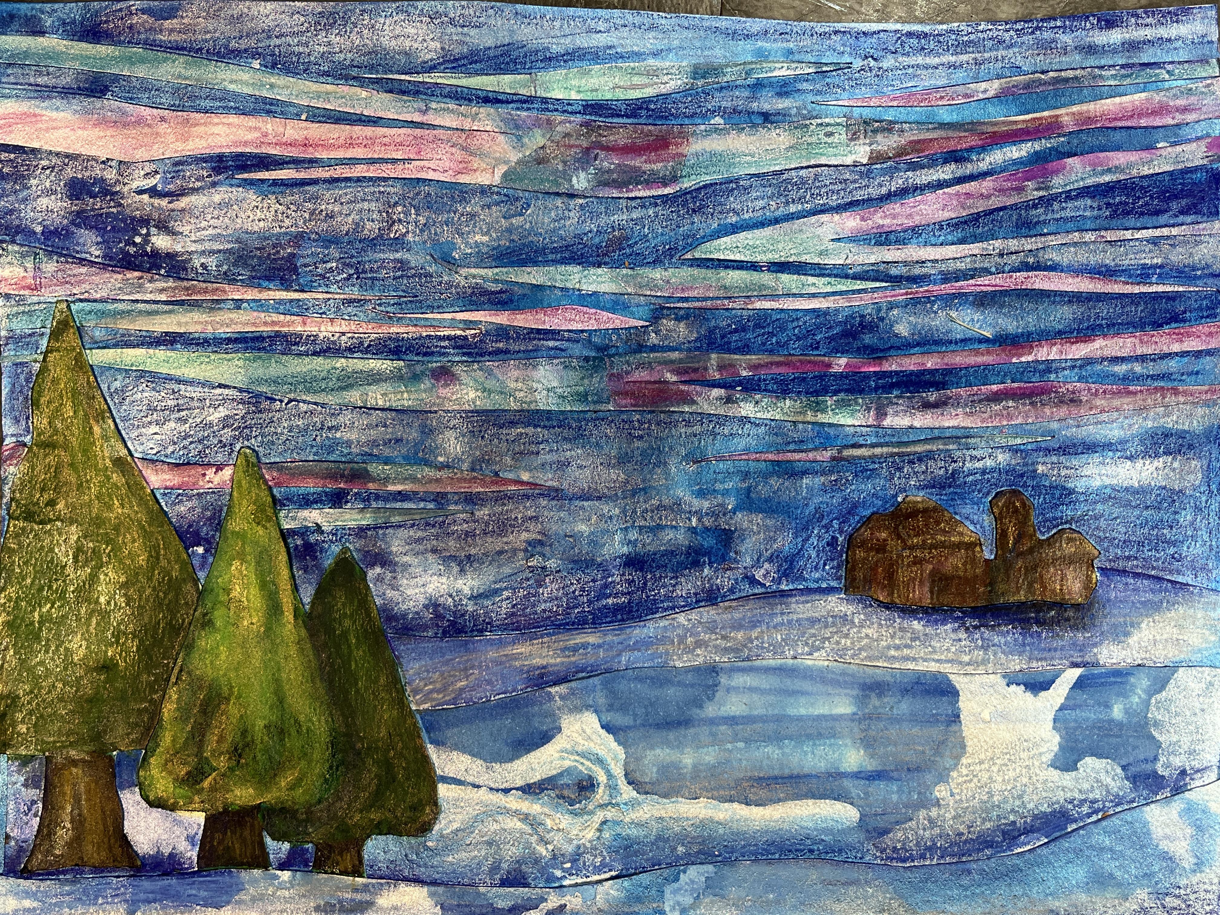
going to start creating our pieces for our nighttime Northern
lights winter scene. The first thing I want to do is I want to choose a background. This, I really love
for Northern Lights is a good starting point. This feels very much, these have a snow vibe. Then I've got lots
of materials that I can use for possible trees. From what I've created, I might need to make one
more texture paper or a sky, or I just need to make a choice. The first step I'm
going to do is I'm going to cut off the border. Because sometimes seeing a piece like this when we're
using it for collage, seeing it without
that border on it, really helps you start to
visualize what it can become. We're going to be
cutting everything up. We don't need that
crispoid edge. I'm going to go ahead
and I'm going to use this for my sky and
this for my ground. But I want this to be darker
because it's nighttime. In my picture, we're seeing the northern
lights. It's nighttime. What I want to do
is I'm going to add a little bit more ink into this and push it a little farther into
the nighttime realm. I'm going to get
my inks back out. You may not have to do this.
You may not want to do this for your piece, but I do. I'm going to go ahead and
wet the paper a little bit. I don't want to lose everything that I did because I do really love this paper, but I do want to have some
more contrast happening. I'm going to go ahead
and just drop some more into this, my dark blue. Then I'm going to move it
around with my big brush. When I move it, it's
going to obscure some areas and it's going
to layer into some areas. It's going to give
me a nice dark sky. I think we'll see anytime that I'm getting
too much in on my paper, on my brush rather, I'm going to go ahead
and wash it off. I'm still getting
the luminescence of the pearl that I put
down underneath it. The texture I did
is still there. I haven't lost it. I'm just heightening a bit. I don't want petals, but I do want the
darkness in some spots. I want it to go even
I'm going to go in with my pearlescent blue and add
some more highlight areas. Not everywhere, some spots. I didn't tape it down so it's going to get a little crazy. I'm doing a horizontal
application of sorts. It has the feeling because
my northern lights are going to go across
that way too. Okay. I want to go all the way to the edges making a bit of
a mess, but that's okay. I might let this dry. Actually, I have some
liquid water color. Yeah, the sky is going to become filled with color anyway. It's completely okay to start doing that
into the start of your sky because it'll create a unifying element when
you layer in the collage, northern light
sections of paper. All right. I'm going to go ahead and set this off to the side to dry. My sky is drying after I've done some additional
modifications to it. So I'm going to
go ahead and grab my Tree Options village. This one I want to have
a little village sitting back aside from the woods. I think this is going
to be the start of my village and then these are going to be
the start of my trees. I'm going to go with this one. If you want to have
more control over what part of your paper
becomes, you know, makes its way into your collage, then go ahead and sketch
it out on the front. But I really don't personally like seeing the pencil lines that
inevitably happen. I like surprise when
it comes to art. So I'm going to go ahead
and flip it over now. This is where you can access the class resources
if you want to. On the projects and
resources page, you will find PDF that I have uploaded that have
different sketches of little village sky lines and tre silhouettes
that you can use. You could incorporate a
fence if you wanted to. You could do
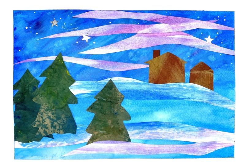
anything you want to for your nighttime scene. The first one I made, I decided
to keep it pretty simple. I'm going to have
the snowy ground, and I have the trees
and I have the sky. Just a very simple, beautiful nighttime
scene featuring some subtlety in
the northern lights and the glistening snow. For this one, I want
to do trees again. I know I want to do
a little village. Maybe I'm going to add a fence, I'm not sure on the back side. With a pencil, I can use my reference images if I want
to or I can freehand it. I know that my sky is a
little smaller than this. Now that I've cut
off the border, I could use that and
sketch out my idea. Maybe there's going to be
a little bit of a fence. It's a tiny fence there. And then maybe a little village
probably can't see this. I'm going to use this
for my village though. I don't really want
to draw on that one. All right, let's draw on
the back of my artwork. I know I'm going to
have some snow on the ground, some layers of snow. I know I'm going to have sky
with the northern lights. I want to do a little rickety
fence coming in here, maybe at an angle going
back, something like that. And then tucked back here, I want to have just a little
village and night time, something the shape of it doesn't matter at this
point. Something like that. Then in the foreground, I like the idea of those trees. Maybe there's a couple
trees really close. The bulk of it's going to
be the sky for this one. Since this is my tree
picture, my tree paper, I'm going to just roughly sketch in some very loose trees. The last one, when I didn't, I did them as one
block of trees. The whole, if you look
at the scrap paper, the trees I did trunks
and I drew them out. And then I added overlapping
tree shapes behind them. And then I cut that out. There's four of them
but you get the idea. I just cut the outermost edge. It was one section of
paper you could do, individual trees, and
then layer them up. But I knew I was working with a little bit thicker
water color paper. I didn't want to go to
stacked with my collage part, I did it as one unit. All of this was one
single sheet of paper. And then I used the brush pens to start a more water color, to start defining the trees
from each other and create the layered stacked behind
for grown background trees. For this one, I've got my rough Scotch which you
can choose to do or not do. Normally I just wing it. But it is nice to plan
it out sometimes, especially if you have
an idea in your mind, you're really keen on
making that happen. I liked the idea of the trees
overlapping having that. Then I use that as
my center point from the point to come down and figure out where the trunk
was going to go for easiness, I'm going to make
the trunk overlap. That way maybe I want to have a couple separate
chunks of trees. Then maybe I'm going to
have another wobbly tree over here. Maybe that's all. I'm going to go
ahead and cut those out and then see how they look on a stand in background. This is where it's fun because
we just start cutting. The texture that you end
up using is a mystery, but it's going to
change so much once you start going in with
your mixed media details. I mean, if you're a little
nervous about this step, just embrace it because you still have complete
control over how it looks in the end, all right? And then I can always
tweak this some more after I get it cut out
and flip it over. I'm going to go ahead
and define this a little bit more there. Okay? I got one tree, let's
cut out another tree. Okay? You could do a whole
forest line if you wanted to. The whole back along
your horizon area, that could be a
whole line of trees. You could add even more trees, like maybe you've got
your collage trees closer to the foreground
or the mid ground. And then maybe in the back
you've got a small line of trees that you draw or paint in separate that isn't
part of the collaging. Let's just use, I'm going to use my snow paper, this
will be my snow. But I'm going to go
ahead and use it to help map out what's
happening with the rest of this See and then you flip them over and
they're so pretty. They're so, so
pretty. All right. So if those are roughly there, then I'm going to go
ahead and use this paper. Now, this I want
to be a village. You can control it a little bit. Like I really love
what's happening down here with these blues
and these golds. So I'm going to
intentionally flip it over and focus on this
corner of the space. You can look at a village
of little village, nighttime syllable
if you want to, where I've provided
some reference drawings that you can incorporate
into your collis. Jamkese cuts a little easier. I'm going to go ahead
and just cut off this rectangle of the paper
and then I'm going to start carefully cutting in these shapes that I've created with my
stand in background. Oh, that's lovely. Not what I thought
I was going for and not the color I
actually want to be. Part of the problem is in my head because we're drawing it on the back side and cutting it out
and then flipping it. We're ending up with
a mirrored version with the trees. I loved it. I was going for the shorter on the left and the taller on
the right because I just, my brain is tired and
I wasn't thinking about the mirror thing
that was happening. But in the end, I love the tall tree on the left and the shorter
tree on the right. But with the village,
I'm not a huge fan, I'm going to do a
little editing here. I'm going to chop off some bits. I'm going to play around
with where things go. I'm going to reattach
some stuff on the other side. This is
what I really liked. I probably should have cut it
more closer to the bottom. I'm going to go
ahead and do some of my cutting on the front side without drawing it
out. There we go. Okay, we have, we have this and then this could maybe be something to
have done in front. It'll look like a village when we actually
get this into it. I think the fronts I'm going
to create without collage, I think I'm just going to
go ahead and draw that in when I get to that point. Or paint it in loosely and then draw on top of it
after it dries. Maybe the village needs
to happen in its own. It's only I'm going
to set these off to the side and save
them. We need our sky. That's what we need,
because then we can figure out our snow, and then that will help
us resolve our trees. Let's continue creating our
nighttime winter collages in our next lesson.
See you there.
9. Collage Part 2: In this lesson, we're going to complete the collage portion of our mixed media winter
nighttime collage artworks. Now that our sky is dry. After going back into it, I have some tree options that I've cut out and
I've got my snow, which I think is going to
work out really great. What I'm going to do is take my scissors and I'm
just going to cut a soft rolling hill thing. Then that's going to be
the start of the bottom. Then I want to play
with some layering. I'm going to go ahead
and turn that over. I'm going to make a small
section that goes in front of that using the rolling hill that I already created
on the one side. I can then use that to create another layer or
this can go behind it, whatever makes the most sense. It's okay if it feels like it's competing at
this point with what's happening in each of those sections of snow.
I'm not sure like that. I'm going to go section
on the other end. Let's see what this looks
like on top of that. That'll be good. Okay, I'm going to go ahead
and glue those down. And then I can keep
building up from here. If you have a little bit
of warping to your paper, you could go ahead and lay this out underneath some books, but I'm going to go ahead
and do that after I'm done collaging on this
section of the piece. For this stage, I'd like
to have some scrap paper so that I can easily paint
on the back of it and not worry about my table getting covered and
other sticky residue. I'm going to start with
this bigger section. I've got my white liquid glue
poured into a little cup. And then this time I grabbed
a size eight acrylic brush. Now you can use your
acrylic brushes. If you don't have
that many brushes, it's fine to use your acrylics. You just want to make
sure that you wash your glue off really well. But it's also nice
to take some of those older brushes and use
those for gluing brushes. Brushing the glue on
ensures that I get a nice even coverage
and should help keep everything in place
since we're going to be putting down a wide variety of sized pieces as we build up our nighttime scene and make sure that I have this going
the way I want it to. I like the splitters
coming through there. That's going to be my sky, then that's going to go down. I'm not going to worry
about attaching it too firmly because I do want to be able to
tuck things behind it. I think I was going to do
this one on the bottom. So I'm going to go up
to my upper piece, put some glue on that. The scrap paper means I also don't have to be
terribly careful with it because the glue is
going to clear in the end. It doesn't matter if my piece ends up sitting
in a bunch of glue. At any point when this one's
going to get tucked behind, I could have put
that one down first, but I wanted to make sure
that I have the bottom flesh. Now I can attach that top
piece and the bottom piece. Now I can go ahead and add
my last layer of snow. You don't have to build
up your snow in layers. I just really like the
effect it gives me. It's a nice starting
point for building up some depth to my land. I like to imagine that the snow, there's drifts of snow
because it's out in the country or out in some
open lands that down. I'm not worrying
about the edges. I'm going to trim those
up when we're all done. All I have three
layers of land and I have my sky to help
this stick better. I can always turn
it over and then furnish on the back side. At any point in time,
you can let this sit and dry before moving on
to the next step. Now I have some trees. This is where I can decide
where these are going to go. They don't have to tuck
in where the snow is. They can be their own. But it's nice when they
tuck in because it gives it a little bit more
realistic look to it. I did want to do that village, but I just don't know if it's going to look
the way I want it to. This is where you can play
around a little bit and decide what elements do you
want to add that looks like a farm off in the
distance, which I like. But if that's going
to be way back there, then I have to rethink my trees. I don't know though.
That's pretty cute. It is nice when things
go off the page. On my other one, I have the
tree going off the page just helps you feel like you're more in the
scene by doing that. But if I'm going to
have that off the page, I don't want the trunk way down in the bottom because that breaks the idea of it
being a realistic depth. I want to have a little
bit of ground there. I do like these. I'm
going to go ahead and glue those ones down. You can have it all figured out before you get to
the gluing stage. But I like to do it in stages as things start to solidify
in my head for a plan. That way I can make
some decisions as I go. Things can inspire other things. If you find your fingers
are getting super gluey, you can always have
an extra cloth on hand that's wet
and a dry one. That way you can wipe
off your gluey fingers and dry them off again so that you're not getting a bunch of glue all
over the place. Now, as we layer
more and more layers of watercolor paper, it's going to get a little thick in some areas and
it's going to need a little extra rubbing to
get everything to adhere. The first one I made, I
did it with glue sticks. In the moment that seemed okay, but as I've worked back into
it needs some touch ups. Let's take our farm from a village to a farm
country winter scene. Now that could sit in the snow, in front of the snow, it's got a little bit
of land to sit on. We have a foreground, We
have a middle ground. We have a background,
we have a sky, we have a question
mark about trees. I'm going to wait on that.
I'm just going to let that settle a bit in my mind. Now, I do want to add
in Northern lights. What I'm going to
do is this is where the really fun part happens to create the Northern
light effect. You can look up some
different references to the Northern Lights, but what I like
to do is just cut some wobbly wonky V's from
the edges of the paper, and I'm just going
to create a pile of them that are going to
give me some options. This one I'm going to be the other way I have
this big strand. But what makes it
look really neat is to cut some little
strands out of it. I'm going for this idea of these color bands
across the sky. And then that gives
you some smaller bands you can work with too, that's going to
look really neat. If anything looks bizarre, can trim it up even more and play with
where they're going to go, hang on your scraps. Because those can
make really beautiful additions that you might want to pop in here and there
as you play with the scale of your
Northern Lights. Now let's start playing with
where they're going to go. I shouldn't have attached
these down as much as I did, because it's really fun and realistic to have
it going behind them. Go and start gluing these
down and see where we end up. This part gets a little messy. If you're using the white glue, that's where the wet
cloth is, great. And it's okay if it's
peeling up a little like I'm intentionally
ripping up that tree. It's nice to have some thickness
and thinness variation if it's feeling a
little too even, you know, trim it up
even more so that your Northern lights have
a randomness to them. And then you can decide at
whatever point you want to stop with building up
your Northern Lights. Need a little
something down there. I'm going to get a
scrap paper and I'm going to put that
over the top of this. And then I'm going to weigh it down with some heavy books. And I'm going to let that dry. And then I'll come back and
see if it needs more in the collage department
or if it's ready to move on to our mixed
media techniques. Now that we've completed the collage portion
of our class, I recommend that you
put a scrap paper over your artwork and a
heavy book or two on top, and let it dry for a
little while just to ensure that all of the
glue is set and that none of your collage pieces
are going to move on you as you begin incorporating
mixed media techniques. This is also very handy
because sometimes wet glue and mixed media techniques
don't like to play that well together
After your glue is set. Heading over to the next lesson where I'll meet you to start exploring our mixed media
techniques. See you there.
10. Mixed Media Techniques Part 1 : Welcome back. I really
love working back into my texture papers to further
enhance those textures, as well as to add more
depth and dimension and detail in this
Flesson we are going to explore adding brush pen and additional water color and even activating our
brush pen with water. So I consider this
to be our what, Mixed media technique lesson. Now that my co lodging is done, I want to start going in with my mixed media
texture techniques. I'm starting out with brush
pen and working back and forth with various
greens and yellows to give some texture
and definition and help define the depth from tree to tree and add a little
bit of roundness as well. I'm jumping around
between different trees, focusing on the foliage
as well as the trunks. And just adding value and color wherever seems to
make the most sense. As each of the trees of change, as we add more and more texture, you can decide how to find.
You want to go with this? I really enjoy playing with a different kind
of mark making to help give some character and some uniqueness to the
different trees as well. And then for color, using the water color
that's already down from my texture paper as a jumping off point to decide where each
tree is going to go. These ones were cut out
from different papers. That tallest tree was from my
more metallic green paper. So I need to work on creating some unity between the
two different types of texture papers that I use while still adding
and maintaining the shimmer that
I really loved in that initial paper that I
used for the tall tree. As I work into this,
I'm pulling colors across the different trees and pulling inspiration
from all of them. And continually working back and forth between them to define them and give them a little
bit more of an illustrative, realistic sort of
quality to them, while still maintaining
the essence of what is mixed media art. Then once I have the trees to a point where I'm
happy with them, I start working into
the snowy landscape. Just starting to define the different layers of snow that I created
with my collaging, using the values that
are already in the snow, water color and
acrylic ink paper to help guide where
I go with this, but then also using my own
understanding of depth and landscape and perspective
to define that. I decided that I want
to put in a little bit of shadow for the farm
in the background. I don't have a moon
in this image, but I do have the
light source of the northern lights up
above the farm behind it. So I'm using that to help
guide where the shadows fall. And because I have a snowbank going in
front of the trees, I don't really need to worry
about any darkness there. But I do add a little bit behind them and around
them to push them back. Then at any point
in time, if you need to do any
trimming on the sides, I hit a couple of sections
where my collage overlapped my background paper or my background paper didn't
quite fit the collage strips. So I did a little bit
there to clean that up, then I start going
back into the sky. The great thing about brush
pens, the ones I use, is you can activate them with water so they work so
well with water color. I'm going in with my brush and using that to
further blend out the brush pen that I
put into the sky and on the snow and just kind of getting that to a state where I'm ready to move
on to the barn. I'm keeping it super rough. I do have some defined
barn esque shapes like silhouettes going on, but I don't really want to get nit picky
about those details. For one, it's very small and it's way in the background
and I just kind of want everything to
have a unity to it. So I'm using the
brush pens to define the barn without getting too specific about
it at this point. And then I really wanted to pop the watercolor colors that were in the Northern light
strips a little boulder. So I'm going into some pinks and some purples and some teal. And just using those colors that are already there
in the acrylic ink as a jumping off point
and then popping them even bolder with my brush pens, you just kind of
keep working it, playing with value,
playing with brightness, until you're happy
with what you've got for this stage of the
mixed media application. So I'm activating what
I've got there first. And then I'm going in with
some of my metallic silver. This is going to pull some of the shimmer that
already exists in the northern collage strips by unifying it with
the background paper. By popping in some silver
bands loosely across the strips as well as
the background paper so that you have this layering
of shimmer happen. And then I needed to have
a little bit more unity between the types of collage
papers I used in my trees, so I decided to pop a little
metallic there as well. Now I'm going to take
a couple minutes and let this stage of my mixed media
collage dry before I continue in the next lesson
with some more dry media. See you soon.
11. Mixed Media Techniques Part 2: Now we're going to
continue working into mixed movie collages
with dry media. You can choose at this
point to work back in with fine liner
metallic markers. Any other markers you wish to use that are a little
more on the dry side, the dry faster as well as colored pencil or any other
media you have on hand. At this stage, I really
enjoy going back in with colored pencil
because it allows me to add even more detail and texture as well as really
beef up those values, help define the space,
especially when I'm working on a landscape or a
still life object. So now I'm going to
work some colored pencil back into my picture. Again, I'm going to
start with my trees and continue to further
push the values and the textures using the colors in the color pencils that mirror the colors that are already
happening in the trees, between the water color and acrylic ink paper and
the metallic watercolor, as well as the brush pen that I put it in the previous video, but now I want to also pop
in some more brightness. Color pencils are
great for this. I can add in some warmth or some coolness as
the picture needs. And my own intuition guides me, this is a really fun stage. I love building up the
values and the richness of a mixed media artwork
by putting in the color pencil is one
of the final touches. This biggest tree
is my trickiest one because it has so
much metallic on it from the original texture paper that there isn't a
lot to go off of. I'm using the other ones as a guide as I keep
going back into it, as I try to create some unity. It is a little odd, well awkward, I should say, to put color pencil over
that metallic just because it's a different surface texture than traditional water color. But it's such a lovely addition to a piece like this that
it's worth, you know, the having to make up the colors more so on
that specific tree. But the darks are
really lovely to go in to create the bark
of the trunks and help have those sit underneath the wideness of
the green foliage above them. And then I went
over to the barn. This is probably
the most fun part for me to work on because
I could really define the edges of the roof top and the different
planes and sides of the barn structures
while still keeping that looseness and generality
that I wanted to have. I really went for it with color. I played with browns
and reds and blues. I think I popped a little tiny bit of black in at the end. But I tend to shy away from adding the black
in for my darks, because in actuality, shadows in the world
don't have black in them. So this is a really
lovely opportunity to really build up a richness with a variety of color and
color value, which is great. And then I spent a decent chunk of time really
popping the shadow underneath it to kind of help it sit on the snowy background. And then because the lights
were so bright in the studio, I found that I had
to keep lifting it up so that I could
assess the color versus the light glare depending
on the room that you're working in and the light
that you have going on and all of the metallic
shine that's happening. Don't be afraid to lift up your artwork and tilt
it so you can really assess color and value as you're defining different
parts of your picture. I went back into the
snow much like I did with a brush pen,
with the color pencils. Just using different
blues to further define the different
layers of collage snow. And to really help push back the furthest section so that I had some really nice depth. But I was very mindful to not go to overboard
because I didn't want to lose that beautiful
silver shimmer and metallic blue that I had achieved with my acrylic inks for those colaash papers. So I did end up
going back in with some metallic silver
colored pencil as well just to kind of help unify the metallics of
the acrylic ink, with the metallics of
the colored pencil. And then it was time to go
into the Northern lights and pop those a little bit more. This just gives me the
colored pencils give me a little bit more control
over the brush pen, then the water color
to really kind of pop a couple extra special
moments into those. So they really have
a lovely rich range of colors to them. And then I continued
to check it and kind of see where it needed, more or less depending
on what was happening. And ultimately, I decided the sky background behind the Northern lights
was much too light. So this was a really
great time to just go for it and really
push those darks. I was very nervous
about this step, but I knew it needed to
happen because I had built up so much wonderful shimmer
in my northern lights. And trying to unify
those two sections that I had lost the depth
at this point. So I went in with some
really dark colored pencil and really just push that
pressure down so I could get a lot of color on the page to pop the northern lights out and to push the
rest of the sky back. Then I went back into
the trees one last time just to really further pop some of that darkness to define each tree
from its neighbor. And it's really easy
to get caught up in the small moments
and forget to take a step back and assess
the whole picture and see what needs a
little bit more or less. Really take some time to check your work and decide
what needs more, what needs more depth or color or whatever as you're
working through this project. And then I had a couple
areas that popped up that I needed to glue back down for
my Northern Light sections. It's been so fun to create a nighttime winter
scene with you. And I especially enjoyed sharing how I work
with texture papers, how I use those papers
to collage and then go back into them with various
mixed media techniques. I hope you had as
much fun as I did. Let's over to the next lesson to wrap up the class.
See you there.
12. Final Thoughts: Thank you so much for taking this class and exploring
textured papers, collage and mixed media
technique with me. I hope you're feeling inspired and that you've added a new approach to
artistic practice. And you're feeling the
magic and wonder that can be the northern lights
during the nighttime winters. I'd love to see northern
light, winter scenes. So please go on over
to the projects and resources area and upload a project to the class
resources section to showcase your work
in the student gallery. This is a wonderful opportunity to see what everyone
has created, The varied approaches
that students take to texture paper, collage, mixed media approaches,
and the imagery that you created for your
unique wintertime scene. It is also a great place to
give feedback and believe, give cheerlead and
encourage everyone. So please not only share your project in the
project section of class, but also check out the projects of others and feel free to leave comments and likes
as we support each other on our creative
artistic journeys. I would greatly appreciate it if you took the time
to leave a review. Student feedback is the best way for me to continue to
grow as a teacher, and I really value what
my students have to say about my classes
as a student. I love leaving a review because it gives me a
chance to share my thoughts about the classes that
I and it gives me a chance to summarize and reflect back on
what I've learned. And share my thoughts about
how I might apply what I've learned into future art making
practices and projects. I hope you'll consider
leaving your review. I love sharing my art
adventures on social media as well as celebrating my
students work on Instagram. If you feel comfortable,
please be sure to include your Instagram
name in your project. Or if you share
your work online, please be sure to tag me
so that I can find it and celebrate it and continue to follow you on your
artistic journey. You can also join me over on Youtube where I post
art process videos, share art techniques
and demonstrations, do sketchbook tours, and
share my art adventures. And if you want to stay up to
date on my latest classes, be sure to click the
Follow button below. That way you'll get
notified every time I post a new discussion
to my followers, update a new class, and share other exciting
skillshare related news. And I'll see you next time.
 Elisabeth Wellfare, Artist, Art Educator