Transcripts
1. Introduction to Fur & Hair Texture : When producing an
animal portrait, trying to create that
realistic look of hair and fur can appear to be
quite a challenge. But there is a great
technique that you can learn, that really does help to create these realistic
looking textures. I'm Jamie and I've been a professional artist
for around 20 years now. I use this technique extensively
in most of my pictures. My work has been exhibited widely as well as
also been published. I now also have a YouTube
channel to showcase my work. What is this technique? Well, it's basically
a system of using various tools to
indent texture into the paper and then
combining this by using various grades of
graphite pencils over the top, to create the different types
of effects that you want. In the class we start by
covering the materials, from pencils to paper, as well as the different
types of tools that can be used to create
the indentations. Also as well, I'll show
you how you can very simply make one
of these as well. This class is aimed at intermediate to advanced
levels of artists, or anybody that's looking to add that extra realistic
element to their work. But if you're a
complete beginner, don't be put off by this, as you might be surprised at what you can actually achieve. If this is something
that appeals to you, then why not sign up and I'll look forward to
seeing you in class.
2. Class Project: [MUSIC] For the class project, you're going to learn how to use the indenting
technique to help to create that really
realistic effect when drawing hair and fur. Now this does take time, practice, and, of course, patience. But it is well worth it
and it does help to add that extra dimension to a
picture that you're working on. You will learn how to make
and use an indenting tool, as well as how much pressure
you actually need to use to indent a texture
into the paper. Then in subsequent lessons, we'll move on to how to use patterns to create
a basic texture, apply pencil for the
most natural look, deal with different lengths, types, and changes in direction, shading and highlighting to
reduce a layered appearance, as well as how to
deal with texture in strong shadow areas to
help to create depth. Each lesson forms part of the class project
and as you progress, you'll gain confidence in the application
of the technique. Now it's up to you how
much of your work that you upload to the
class project section, but it would be really
nice to see how you're progressing
using this technique. Also remember, I'm always
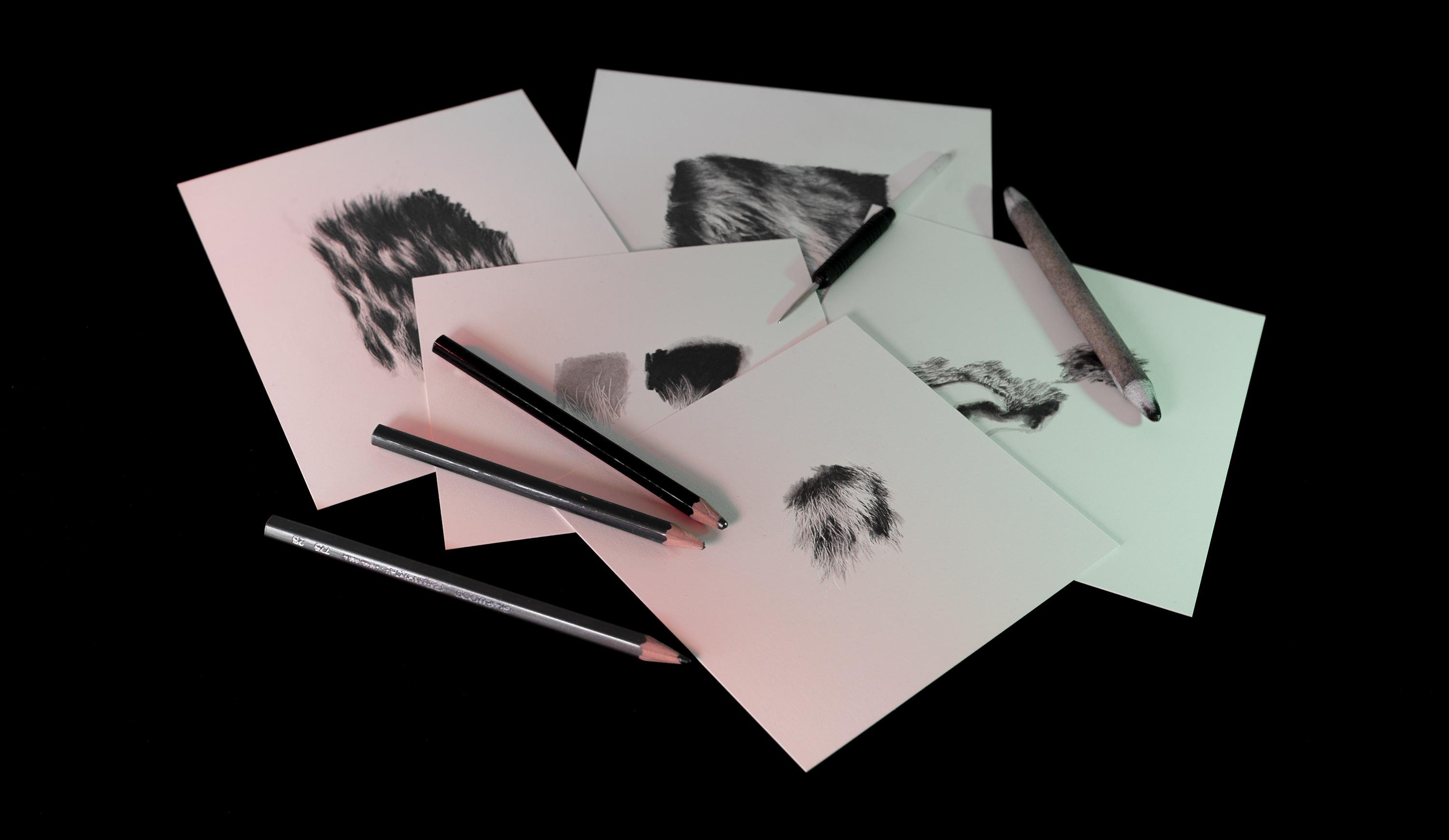
happy to offer any feedback. I have provided a few various different
pieces of reference that show the different types of patterns and textures
that you get. Alternatively though, you could use your own reference
to work from. Next time we're
going to talk about the different types
of materials, as well as the tools that
can be used. [MUSIC]
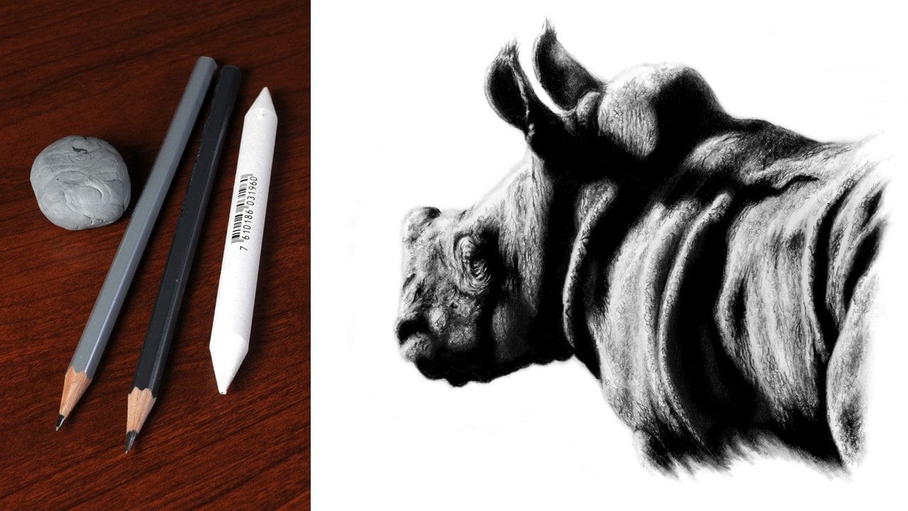
3. Materials : [MUSIC] When talking
about materials, it's important to
use the right ones for the type of work
that you are doing. Particularly with
this technique, we're going to start
with what is the main foundation of a picture, and that is the paper. Now, when it comes to choosing a paper to use with
this technique, you aren't going to want to have something that's
relatively tough. What I would recommend is 100 percent cotton
watercolor paper. It wants to be a
round-about, say, 300 grams, and have a hot
press smooth finish to it. The two papers that I
generally use are St. Cuthberts Saunders Waterford
and Arches Aquarelle. The Arches though is a little
bit tougher, and as such, does take a little
bit more work when it comes to indenting
texture into the surface. You can use a number
of different items as indenting tools with a relatively minor
bit of modification. I'll show you how
you can do this in the first lesson using a
darning needle and a dart. Alternatively, you can purchase indenting or embossing tools. These are relatively
inexpensive to purchase. My own personal choice
though is to make a tool, as I then feel I've got something that exactly
fits my needs. Some pencils can also be
used when it comes to indenting texture,
say, for example, 4-9H, but it is worth
bearing in mind that these will leave a degree
of tonal residue behind. You're also going
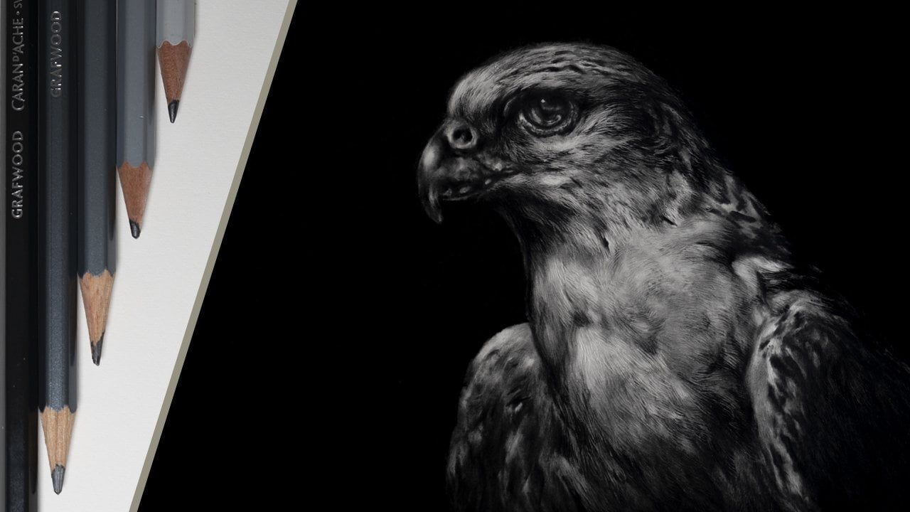
to need a few of the graphite pencils in the B range to
reveal the texture. What I'd recommend
using are a 2B, 4B, and 9B, but if you've got
any grader pencil that's around that area, those would be absolutely fine. We're also going to have to do a little bit of
shading and blending. What I'd recommend
for this is to use a paper blending stump
or alternatively, you could simply use
a Qtip or cotton bud. Now, one thing that
I would say about paper blending stumps is that the ones that seem to work
the best have a soft, velvety feel to them. For erasing and highlighting, I'd recommend using
a kneadable eraser. The two that I generally use are a Caran d'Ache or Factis K20. But you can always use
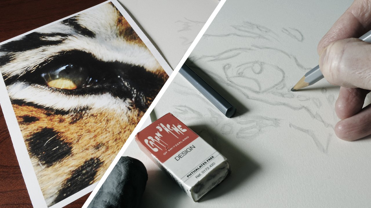
blue or sticky tack, if that's all you've got. Of course, you are going to need some reference to work from. Now, you can work from your own images or I have
supplied a few bits of reference which do show
the different types of patterns and textures
that you can get. That's our material's covered. In the first lesson, I'll just go through how
you can simply make it all to indent texture
into the paper. [MUSIC]
4. Making an Indenting Tool: [MUSIC] These
irregular indenting or embossing tools come
in different sizes, and as you can see they've got this bubble on the end of them. Now, this is there
to prevent them from damaging the
surface of the paper. Personally speaking, I prefer
to make a tool to use for this and that's what I'm going to show you in this lesson. We're just going to use a
couple of different items, but there are many other
things that you could use. With all that said,
let's get started. The first thing that we
need to do is to remove the flight because I don't really think we're going
to be needing that. Now we're just left
with the dart. The only thing is it's
too sharp to start with, so we just need to
reshape the tip. To do this, we just want to use either a small file or
a piece of sandpaper. [NOISE] This is a relatively cheap steel
dart and because of this, I find these are quite
simple to reshape. Now what I want to do is to work around the dart like that. Then this will
basically take off the point and round off the end. It's worth remembering that the rounder that the tip becomes, the thicker the indentation
it will produce. [NOISE] You'll notice that
as I follow the dart, I also regularly rotate it, as this will produce a
much more even result. Now it's a good idea to regularly try the
dart on a piece of scrap paper to make sure that it doesn't
tear the surface. Again, rotate it occasionally. If you do find any harsh areas, just simply refile these. Just repeat this process until the dart is nicely rounded on the end and you don't feel it catching or scratching
the surface. Also as well when using it, don't hold it upright, made sure to use it a
roughly a 45-degree angle as I find this compresses the fibers of the
paper the best. I'll also cover
more about how to use these tools in
the next lesson. [NOISE] For this one,
I'm just going to fit a dining needle into
a clutch pencil. The only problem is, it's
just a bit too loose. What I'm going to do is fit
a bit of sticky tape to it, and that'll solve the problem. [NOISE] I've got my bit of tape and I'm now
just going to attach this to the needle like that. Then all I have to do
is just wrap it around. Now it fits in the
pencil no problem, and it's nice and secure. [NOISE] It's then just
exactly the same process as what was done with the dart, the filing it, and
then occasionally testing it out on a
piece of scrap paper. That's just a
couple of the tools that you could make for this. But there are plenty of
other things out there. The key thing to remember is
that you don't want anything that's too sharp or have
any harsh edges on it. In the next lesson,
we'll start to work on the fundamentals of
indenting. [NOISE] [MUSIC]
5. Using an Indenting Tool: In this lesson, I'm going to cover the fundamental basics of indenting from the angle of the tool that
you're going to use, to the amounts of
pressure that needs to be applied to create
the best effect. It doesn't matter if this
is a tool that you've made or one that's
been purchased. The principle is exactly
the same for all of these. The first place that
we want to start is with the correct
angle to use this. Whatever tool you're using, you want to hold it a roughly a 30 to 45 degree angle to the direction
that you are working. This will compress the
fibers of the paper, and I generally find this
produces the best result. One thing that you want to avoid doing is working too
upright with the tool. Firstly, this can be more
awkward and plus we are particularly fine tools this can tend to tear up the surface. We now come to how
much pressure needs to be applied to create
indentations. Now, one thing I
would say is the near the tip you can
comfortably hold the tool, the more pressure you will
naturally apply through it. The further away you hold it, the less pressure
is applied and the less control you
have over the tool. So you now want
to practice this, simply indent a line and then work over the top of it
with a blunt pencil. The reason for this is because
where the pencil is blunt, it won't go down into the
indentation that's been made. Also as well, you want to use a relatively dark pencil and for example I'm using a 4B for this. If you can't see the
indentation then, simply repeat this and apply
a little bit more pressure. Then what I would suggest
is just playing around with different amounts of pressure to see the result that you can get. You can also see the
results that I've got here from using different
types of tools. The key key to
remember this time, are firstly the angle
of the tool to be used, say 30-45 degrees, as well as the amount of
pressure to be applied. In the next lesson,
we can now start to work on creating
a basic texture.
6. Creating Patterns: [MUSIC] In this lesson, we're
going to learn how to use patterns to create
a basic texture. You will need a piece of paper and I'm going to be working on some Casper Saunders Waterford 300-gram hot press
watercolor paper. You're also going to need
something to work on. I'd recommend using
a drawing board with a relatively firm
surface such as MDF. If the surface is too soft, the indentations will
be less prominent. Let's get started. First, hold the
indenting to all or roughly a 30-45-degree angle and work in that direction applying pressure using
an elongated S shape. Repeat this randomly
overlapping the previous lines. The more you repeat this, the denser the texture and the more tangled
it will appear. If you're struggling to see
the marks that you've made, you can shine a light from
the side and this will cast a shadow down
into the indentations. Something like a small
torch is ideal for this. Next, take a blunt 4B
pencil or a similar grade, and lightly shade over the surface to reveal the
pattern that is being made. It is important that the pencil
is blunt as this prevents any chance of it going down
into the indentations. Remember, at the moment
we're only working on the patterns in the density of the texture that is being made. If you find after shading
that there are lots of gaps, just simply repeat this, overlapping the lines more
creating a denser texture. Repeat this process until you're confident in using
the technique. It may take a little bit
of time to get used to, but it is purely
down to practice. The key points to
remember are to work on a firm surface and to try
to create a dense texture. In the next lesson, we can start working on applying
the pencil in different ways to create a more realistic-looking
effect. [MUSIC]
7. Applying Pencils: Just shading over
a texture doesn't produce a very believable
looking result. In this lesson, we're going
to learn how to apply pencils to create a
more realistic effect. It is important to remember that the application of
the pencil over the texture also contributes to creating depth
and tactile quality. Not just the texture itself. Start by indenting the
texture into the paper. Remember, make sure
the texture is dense with very few gaps. Then using a blank 2B pencil, lightly draw the same
pattern back over the top. They should only be done lightly to reveal a subtle texture. Next, we can apply
more 2B pencil to some areas
creating more depth. The more laser pencil
that are applied, the darker tone will get, and the stronger the
contrast will be. We can take this further by applying darker tones of pencil. For example here I'm using a 4B. Now let's take this
one step further indent the texture
into the paper again. But this time work
back over the top, varying the length
of the pencil stroke from longer to shorter. This will create a
slightly different effect. You can even try just
dabbing the pencil in some areas to see what
effect this will create. I suggest taking the
time to practice this and don't be
afraid to experiment. When trying to
build a darker tone the one thing you want to avoid is pressing the pencil too hard as this can
compress the fibers of the paper, diminishing
the indentations. The best way to build
tone is to either apply more layers or to simply
use a darker pencil. The key points to
remember this time are to avoid your shading over the texture that
has been created, and to use different grades of pencils to create
different depths of tone. In the next lesson, we will
explore different lengths, directions, and types
of hair on fur, and how to create them.
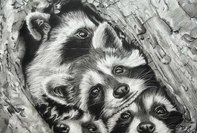
8. Length, Type & Direction: [MUSIC] Now that we got
the hang of indenting, let's dive into the fun part, playing around with
the different lengths and textures that are a veritable playground
for the creative mind. Get ready to dive
into the world of texture and let your
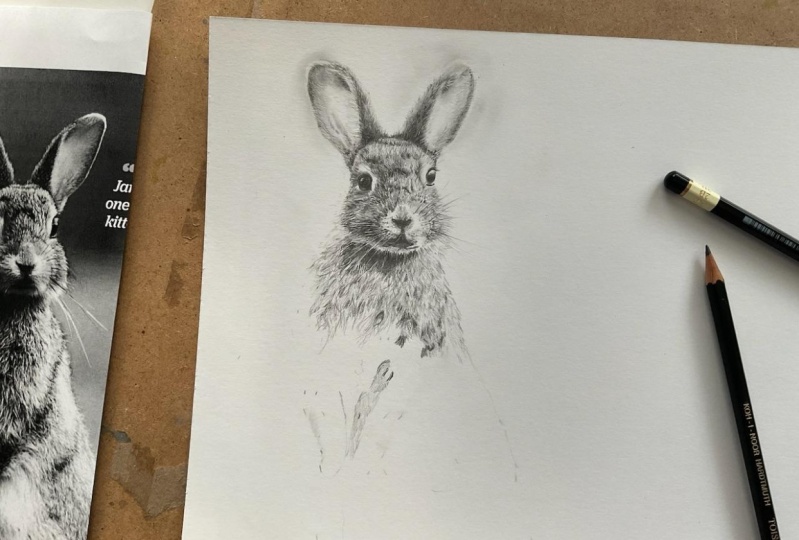
imagination run wild. I would advise using
some reference for this, whether it'd be
what I've supplied or something of your own. But what I would suggest
is starting with a relatively simple texture before moving on to
anything more complex. Take a close look at
your reference and concentrate on identifying
the patterns within it. Keep in mind that hair or fur tend to get finer
towards the tips. Ideally, you want to finish
your strokes at this point. As you can see, when
using a pencil, the pressure naturally lessens towards the end of the stroke, creating a more delicate line. Try this a few times to
see how this effect works. The same principle applies
when using the indenting tool. Again, try this and
just shade over the top and you should see
a tapering of the line. I'm going to be working from
some reference of a gorilla. By studying the reference, so I can see that this has a relatively short and
coarse texture to it. It's a good idea to only work
in small areas at a time, switching between
indenting texture and the application
of the pencil. The reason for this is that
when you cover large areas, it can become difficult to see the indentations
that have been made. Plus, it sporadically removes
pressure from the hand. Trust me, this does build
up over a period of time. It's worth remembering that even with shorter hair and fur, you still need to cross
over the strikes as this will help to give a
slightly tangled appearance. This still applies
when it comes to applying the pencil over
the top of the texture. The fur on a tiger's
nose is short and dense, so this requires a much
shorter straighter stroke, but there still needs to
be a degree of randomness. You can also see I'm being
conscious of the direction of the fur and this will change
as you work over a picture. I find it's a good idea in
areas of direction change to work on different parts of the picture as you can
see I'm doing here. This way as you slowly
work between these areas, a more natural
transition is created. This also avoids creating a
very repetitive appearance. Most animals have a variety of different lengths and
types of hair and fur, which is why it is
crucial to study the reference thoroughly
before starting. The fur of the tiger in
this part is much longer, so it requires a much longer,
more free-flowing stroke. But it is important
that the texture is still dense and tangled. Working with texture
takes time and patience. But with practice, you can
perfect your technique. The key points to
remember this time, have a study of the
reference thoroughly, finish the indentation at the tip and apply
the pencil to match. In the next lesson,
we'll explore how to add shadows and highlights to
really sell the effect. [MUSIC]
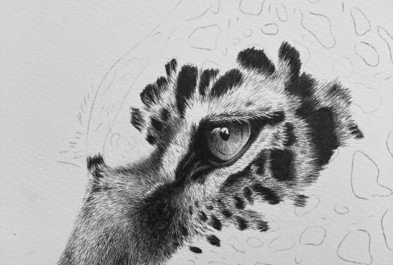
9. Adding Shadows & Highlightss: You should be getting
more confident with using this technique. Now he's telling you
what that final bit of polish that will help to
really sell the effect. To do this, we need to watch
shadows and highlights, which will create a sense
of depth and shape, helping to bring
the effect to life. [NOISE] You're going to want
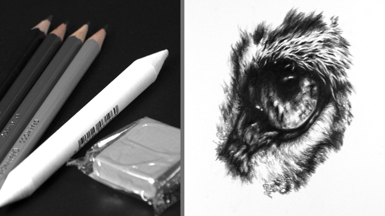
to use three pencils 2, 4, and 9B of similar grades. A blending stump,
kneadable eraser, and of course the
indenting tool. There are also a couple
of extra pencils that we can use to
refine this further. These were in the hard
range being a 9h and 4h. Again, similar grades around these will work just as well. I'm going to start by
working on this part of the gorilla and you can see there are some nice
strong shadows, particularly in the root area. Before doing any indenting, we're going to want to build
a strong debt for tone. The ideal tool to use for
this is the blending stump. But remember, if you
don't have one of these, a Q-tip or cotton bud
will work just as well. Ideally, these don't
want to be clean. They want to have a degree
of graphite within them. But if all you've
got is a clean one, you can always add graphite to it from a piece of scrap paper. The reason for using one of these is that they do
produce a soft edge, helping to create a
smooth transition. Starting the root area and again work in the direction
that the friar takes, as this will produce
the best result. One thing that you don't want
to do is to just shade over the surface as this won't
produce as good an effect. Because these tools are soft, they will easily brushed tone down into the grain
of the paper. Preventing any harsh white
areas will showing through. To strengthen the time further
apply two B pencil again, working from root to tip, and then use the
blender over the top. Repeat this, adding
more layers until you achieved the depth of
the time that you want. We now want to switch
to the four B pencil, but this time we only want
to work in the root area. By working this way, a very smooth transition is produced that will help
to create curvature. With this done, we
are now ready to add our texture because we're
using a metal indenting tall, it will not spread any
other graphite that is already on the paper
as we work over it. However, there are
situations where you might want to manipulate
the graphite, but I'll explain how to
do this a bit later. As the texture is applied, work back over it using
two B and 4B pencils. Again, these can be applied
in layers depending on the level of darkness and
contrast that is required. The root area wants
to be really dark. So just keep applying tone. If you find that the
indentation stand out too much, use the blender to brush
tone back down into them. For the very darkest parts, we can now add 9B pencil as this will just add that
last bit of darkness. Now, this may have
a harsh edge to it. So to blend this out, simply use a 2B or 4B
pencil over the edge. This will create a nice
smooth transition. To add highlights, use
a kneadable eraser by rolling a point on the end of it and likely use
this to brush tone away. Alternatively, you could use either blue tack or sticky tack. For dark shadow areas
are still fine. It's important to have detail, even if it's not going
to be that visible. With a tiger, we
have a mixture of light and dark markings. Again, these are
initially put in using the blending stump with the debt for time
being built up using the 2B and 4B pencils. Texture is again added with these pencils being
used back over the top. You may have quite
a harsh contrast between the light
and dark markings. So they just soften
this you want to use the blending stump
likely over the edge. The 9B pencil can then be applied to the darkest
part of the markings. If the edge needs
to be blended out, I would suggest using
the 2B pencil this time. As I said earlier, the American
indenting tool were to manipulate any of the graphite
that is on the paper. But this is where the
harder-grade pencils come in. Because they were not
only in them but also drag other tones that have
already been applied. These are the only
pencils that are sharp, being used over the edge of the darker markings
to break them up. This creates a much
nicer transition and prevents the markings
from looking stuck on. This is also one of the
only times that I would choose to work against
the direction of the fur. The four H nine H age produce
slightly different effects, with the four H producing a slightly thicker line
compared to the nine. Which one you use
purely depends on the type of effects that
you want to create. To finish this part of the tiger tone can be
added using the pencils, softened and subtle shading
added with the blender, as well as highlighting
using the eraser. This is a very methodical
and time-consuming process, but it really does give a
picture that 3D quality. [MUSIC] The key
points to remember. Use the blender to build
tone in darker areas, add highlights with
a kneadable eraser, and use your harder grades of pencils to manipulate dark time. In the next lesson,
I'll give you some bonus tips for
using this technique, as well as my final
thoughts. [MUSIC]
10. Bonus Tips & Conclusion: [MUSIC] I do have
a few bonus tips when it comes to
using this technique. First of which is if you're creating a picture with
a dark background, the hair or fur on the
edge needs to stand out, so the strands need
to vary in length. Also, some of them will
clump together at the tip, so as you can see here. Then the texture finishing
the stroke at the tip. Build the dark tone using
the blender and 4B pencil, and then finish with 9B making sure that this is quite
close to the texture. Now take a blunt 2B pencil and run this through
the darker tone, working back into the texture as this will spread
the darker tone. You might be wondering why
not just use the 9B pencil. But in my experience, this will produce a rough edge, whereas the 2B will carry the
nine producing a smoother, more delicate looking result. The one downside is
that it does take time, as you occasionally need
to add more 9B to work with as the tone will
only spread so far. If you want a more
subtle background, you can simply use the
2B pencil and blender. But when using the blender, make sure to only use it lightly when working
over the strokes. Otherwise, you may
find that you brushed tone down into the indentations. However, if the hairs
look too harsh, you can use the blender
to brush tone into the tips as this will
create more subtlety. When working with a
white background, just use either the
4H or 9H freehand, as these will
produce much finer, fainter lines, again, depending on the type of effect
that you want to create. The indenting technique is very versatile and it can be used
with other mediums as well, such as color pencil
and watercolor, so don't be afraid
to experiment. The key points to
remember this time. Make sure to vary the
length of your strokes. Clump some of the fur
together at the tips, and don't be afraid
to experiment. Don't forget you can upload your work to the project's gallery at anytime as it'd be
really nice to see. Remember, I'm always happy
to offer any advice. In conclusion, I hope this
class has been enjoyable and helpful in teaching you the
technique of indenting. By practicing the techniques
that you've learned, you should now have
a solid foundation for mastering this skill. Remember, take your time, practice regularly, and don't be afraid of
making mistakes. The thing that you want
to bear in mind is that with enough dedication
and perseverance, you will become proficient in creating realistic
looking hair and fur. Thank you for watching
and I look forward to seeing you in
another class. [MUSIC]
 Jamie Boots, Wildlife Artist, Teacher