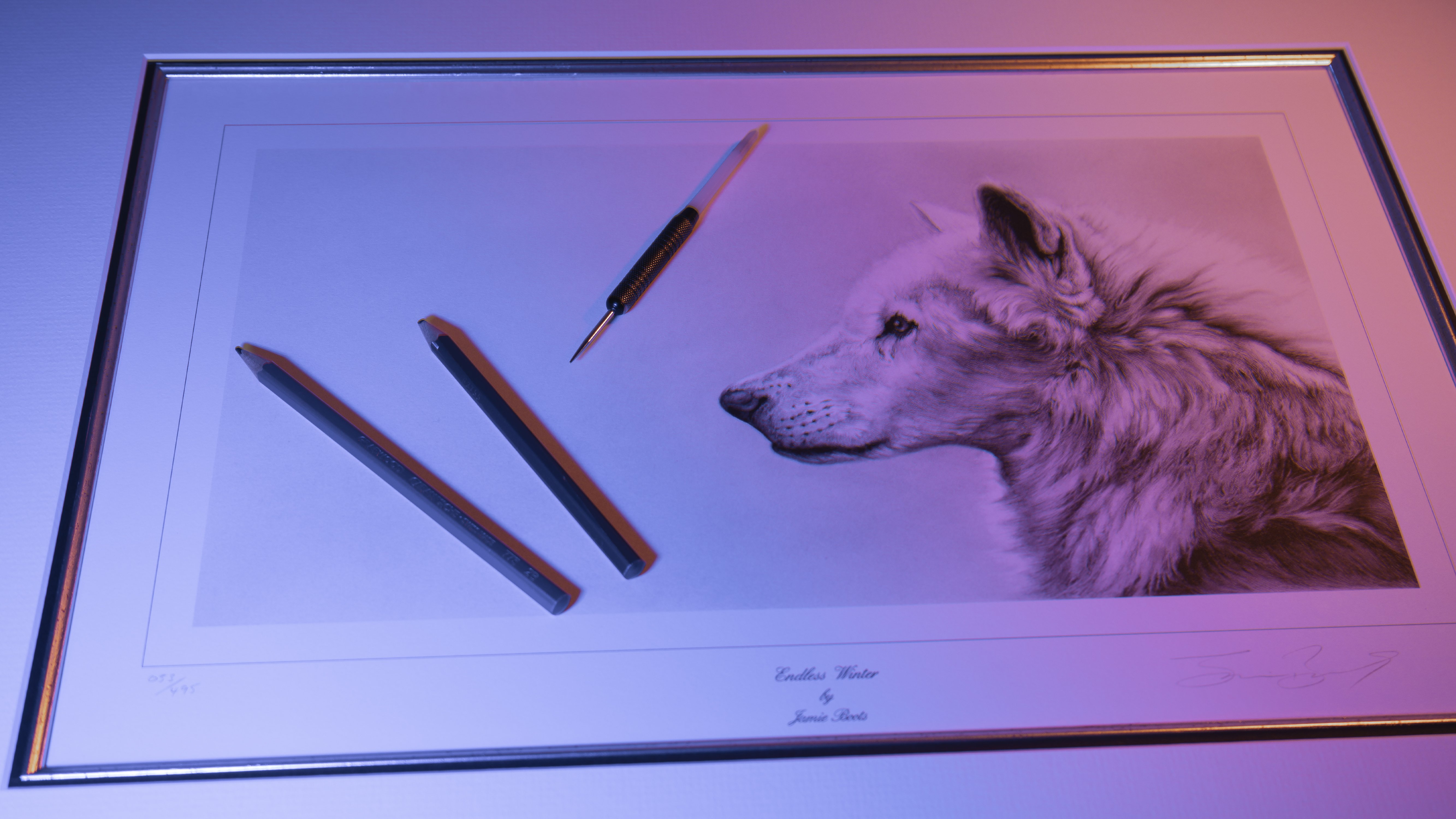
Transcripts
1. Introduction: Highly detailed, realistic
looking pictures can take a considerable
amount of time to create. If you also combine
this with a dark, dramatic background, the results really can be quite striking. I'm Jamie and I've been a professional artist
for around 20 years now. My pictures have been widely exhibited in galleries
and exhibitions, as well as being published. I also use Youtube
to showcase my work. Where do you start when it
comes to creating a picture? Well, that's what we're going
to cover in this class. From what materials to use? Planning and composition, how to create that
dramatic dark background, as well as how to use
the indenting technique, create realistic
looking textures. This is aimed at intermediate
to advanced levels of artists or anybody looking to push themselves further
and learn new techniques. But even if you're a
complete beginner, don't be put off by this. You might be surprised
at what you can learn and what you're
able to achieve. If this is something
that appeals to you, then why not sign up? And I look forward to
seeing you in class.
2. Class Project: For the class project,
you're going to learn the techniques that
are used when it comes to creating
very striking and sometimes emotional
pieces of artwork. Now, because of the
level of detail, this does require a lot
of time and patience. But it's always worth
remembering that it's not a race and it's the end
result that counts. In this class,
you'll first learn how to plan to
compose a picture, before then moving on to
creating a basic sketch. How to apply a dark
background and use shading to give the
main subject shape. We can then tackle some of the more technical
aspects of the picture, such as how to give an eye
that glassy appearance, as well as adding texture
to create the effect of feathers by using the
indenting technique. There are many
different types of textures that we
need to replicate. We will dive into
this in some depth. You'll also see how to blend
subject and background together to create cohesion
within the picture. Each lesson forms part of the class project,
and as you progress, you'll gain confidence
and understanding in the application of the
techniques that are being used. Now, it is totally up to
you how much of your work that you actually upload to
the class project section. But it would be great to be
able to see your progress. Remember, I'm always glad to
offer any help and advice. I have provided a few
various different images of birds of prey that you
can work from, of course. Alternatively, you can always work from your own reference. Next time we'll take a look at the different
materials as well as the various different
tools that we're going to be using
during this class.
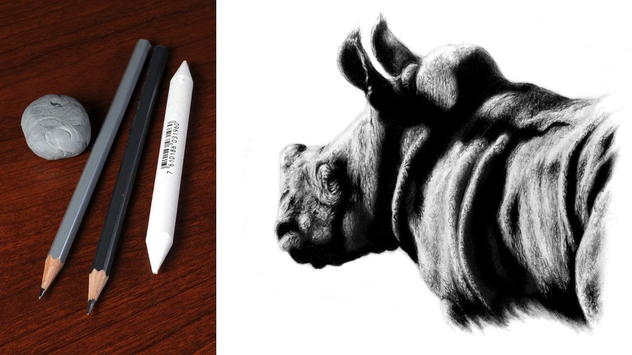
3. Materials: Let's take a look at the materials that
you're going to need. We want to start with the paper. First of all, as this is really the main foundation
of any picture, because we're going to be
using the indenting technique, I'd recommend a paper
that's relatively tough. I suggest using a
watercolor paper that's 100% cotton and this wants to
be around about 300 grams. As I find that
this tends to work the best when using
this technique. This also wants to
be a hot press paper as this will have a
relatively smooth surface. Incidentally, the paper
that I've used for this project isn't Cuthbert
Saunders Waterford. We now come to the pencils that you're
going to need for this. I'm using the card graphod
range of graphite pencils, but whatever you're using
should be absolutely fine in terms of grades
four H, H, 24.9 B. But don't worry if you haven't
got these exact same ones, Any similar grades around
these will work just as well. The four H is the only one of
these which is used sharp. Its main purpose is to indent and manipulate
other darker tones. Another option is
to use something like an F pencil,
as I'm doing here. The H pencil, on the other
hand, is used very blunt. The reason for this is
because we're purely going to use it to lightly
build up our initial sketch. By doing it this way, it won't scratch or damage the
surface of the paper. This makes any alterations or changes relatively
easy to do. Soft pencils won't tend
to hold a point anyway. The 24.9 B are just
used blunt for raising. You're going to want to have
some form of eatable eraser. Now I'm using a car and dash, but a couple of other
good alternatives are A facts K 20 or Favor Castle. Alternatively, you could
just simply use blue tack or sticky tack to blend
in shade tones. I'd recommend using
a blending stump. I find that the best
ones of these have a soft valvety feel to them. But of course, another option is to use a Q tip or cotton bud. If you have got a
new blending stump and you want to add
some graphite to it, you can simply do this by
applying two or four B pencil to a piece of scrap paper and then just work
this into the end. Alternatively, if you've
got some graphite powder, you can just dip it into that. Over time it will become
more saturated graphite. Now you are going to
need some former tool to indent texture
into the paper. I'm just using a
cheap steel dart, and this has had the tip
rounded off with a small file. But there are plenty
of other things that you could use as
an indenting tool. Alternatively, you can buy
indenting or embossing tools, and these are
relatively inexpensive. You're also going to
need some masking tape to mask off the border. For the background, I would recommend using a low
tach decorating one. For this, we now come to
some additional items, but these are not essential. The first of these
is graphite powder. This is used to build a base
tone for the background, but it can also be used to load new blending stumps
with graphite. Also for blending the
background baste, you're going to want to use a makeup sponge or make up pad, but you can use cotton wool, but it does tend to leave
a lot of fibers behind. Lastly, a graphite block, as this is a much
more economical way than just using a pencil to
block in the background. Ideally, this wants to be the same make and tone as the
pencils that you're using. This is why I'm
using a nine B car. But like I said,
alternatively you can just use a pencil when
creating the background. I have supplied a few various
different reference images or alternatively you can use
your own if you'd rather. As for me, I'm
going to be working on this picture of a Gia Falcon, that's our materials covered. In the first lesson, we'll take a look at planning
and composition.
4. Planning & Composition: The most important thing
to do before starting any picture is to plan
it out thoroughly. This involves deciding on the exact composition and size of the piece that
you want to produce. It can be tempting to
rush into a picture, but it's well worth taking
the time to get this right. Once you've chosen the subject and decided on the
reference to be used, you then need to make a decision on the emotion that
you want to convey. This image does have
everything that is needed when it comes to creating
a highly detailed drawing, but it's never going to
have that well factor. If it's done exactly the
same way that it is. By using a bit of imagination, I think we can create
something that's a lot more striking for this
subject and pose. I think a much more
dramatic appearance will suit this
picture much better. To achieve this,
I want to convert the picture to what is
called a low key image. I think you can see this really does make a huge difference. A low key image will
tend to feature a dark background and
utilize strong contrast, prominent highlights and
strengthen shadow areas. Only real limit with this
is your imagination. With the overall look
of the subject decided, it's now time to do a little bit of work on the composition. One of the things that can
be used to help create a composition is what's
called a Rule of Thirds grid. The grid is used to divide the image up into
nine equal parts. But how does this work? Well, the theory
is that by placing key features along these grid
lines or its intersections, you will naturally produce
a pleasing composition. But bear in mind, this should only ever be
used as a guide. For the first version, I want to create a landscape image. The grid is used to position
the subject to the right, also cropping the
top and the bottom, and positioning the eye
along the top line. The first third is used
as negative space. This gives the subject
the sense that it is looking at something
that is out of frame. The grid can also be
used when it comes to creating a more traditional
portrait composition. The grid is again applied with the eye being positioned
along the top line. But with this composition, we take in more of
the body and wing. There is still negative space, but this is weighted more
towards the top of the image. When using a rule
of thirds grid, it's worth remembering
that you're not purely restricted to an exact
height or width. You can literally make this
whatever size you want. If composition is something that you feel you struggle with, then using a system like this is something
that can really help. As you gain confidence
and experience, you'll just learn to
trust your own judgment. With most pictures, it's important to have a
clear point of focus. The lower right hand corner
of the image is a little bit distracting by adding a dark
vignette to this corner. This adds subtlety and also helps to draw more
focus up to the head. This also helps to blend the
subject with the background, preventing it from
looking stuck on. Now, this image has been altered to just show one
of the many looks, as well as a couple of the
different compositions that can be created. As I said earlier,
the only limitation really, is your imagination. The key points to
remember, look, imagine, and don't forget
to plan thoroughly. In the next lesson,
we can take pencil to paper and start to create
our initial sketch.
5. Border & Sketch: Because the picture is going to have a black background to it. The first thing I want to
do is to add a border. You don't have to do this. If you'd rather you
can just feather out the edge and have a more
natural appearance. To create the border, I'm
going to be using a square. This just came from
a local DIY store and was relatively inexpensive, but it is ideal for
doing things like this. The one downside is it's a bit awkward to use on the easel. So I'm just going to take this over to the
table to do this. To create the border, you
want to use two pencils. Now, for the first one, I'd
recommend using a pencil that's quite dark but
also not too soft. For this, I'm going
to use A, two B. We only want to use the tone of this pencil so it doesn't
need to be sharp. If it was, there would be a chance that the
tip could shear off to finish the border and to give a nice,
crisp, clean edge. A hard, sharp pencil like
this four H can be used. Apply a bit of
pressure and run this through the two B that's
already been applied. Because the pencil is sharp, it will indent this creating
a permanent dark line. Of course, don't worry.
If you've not got a large square like
the one I'm using, you can just use a
regular ruler and square. This just takes a little
bit longer when it comes to marking out the border
with the border. Now done, we're all ready
to start our drawing. I'm going to be using a
blunt H pencil to do this. And the reason why I recommend the pencils blunt is because it doesn't damage the
surface of the paper. And any marks that we make are
relatively easy to remove. When doing the initial drawing, there is really one
key thing to remember, that's the keep it as
simple as possible. You don't want to be
fixated on details and just concentrate on the basic shapes and positions of key elements. Don't worry if you're not 100% confident we're doing
the initial drawing. I'm going to show
you a system that you can use to help position the subject as well as gauge proportions you're
going to need to do. This is a piece of scrap paper. The first thing to
do is to position the subject for this image. I'm going to use the beak
as a starting point. The scrap paper is laid across the image and a marked place showing the position
of the border. Another is placed to show
the position of the beak, as this is the widest part of the subject using the
border as a reference, this can then be used
to transfer the mark. The same process
can then be used to mark the position for
the top of the head. Remember, the pencil is blunt and is only used with
a light pressure. These two marks give us the
overall size of the subject. And now we can use the same
system to help to create the rest of the drawing for
a more precise position. Simply measure from both
the side and the bottom. It's a good idea to
erase the marks from the scrap paper after
they've been transferred. Otherwise, they
can get confusing. This is one way of creating
the initial drawing, but it is by no means perfect
with a few marks placed. We can now start to sketch in. If you notice, I'm
only doing this very lightly and holding the pencil
well away from the tip, as this will reduce the amount of pressure that
is put through it. Again, because the
pencil is blunt, it has minimal effect on
the surface of the paper. This may seem strange to
use a pencil this way, but it does make it relatively
easy to make alterations. At this point, the sketch
is only relatively loose. The eye can now be positioned, marking both sides, as well
as the top and the bottom. The eye is a real key feature
with these four marks. It can now loosely be sketched in before being refined later. There is a lot of detail
around this area, but at this point,
the best thing to do is to simply ignore it. Remember, you can use as many or as few marks as you like. This purely depends
on your level of confidence at this point. The picture does look
incredibly basic, but it does provide a good
foundation to work on. Once you've got a
basic sketch in place, you can then start to refine it for relatively minor changes. Or to clean up
around the drawing. I'd recommend using
a needable eraser with a point rolled
on the end of it. This can simply be
used to draw tone back out for more drastic
corrections. Drawing the new lines using
the original drawing as a guide before then removing
it with the eraser. This prevents drawing the lines back where they originally were. Once you're happy with
the initial drawing, you can then start to add a little bit more detail
for more technical areas. I'd advise holding the
pencil nearer the tip, as this will give
you more control. But bear in mind by
using the pencil this way you will naturally put
more pressure through it. This does require
a bit more care to avoid indenting the surface. Even when using a blunt pencil where you hold a pencil
does make a difference, This is something that
you just get used to. It is easy to get carried away
with the initial drawing, but there is a point
where you have to stop. Remember, the most
important thing at this stage is to keep it
as simple as possible. The key points to remember, keep the initial
drawing as simple as possible and use a blunt
pencil lightly to do this. In the next lesson, we
can now start to work on the background as well as
create some of the shading.
6. Background & Shading: When creating a picture with
a dark or black background, I find it's essential to put this in at a very early stage. This can then be
used as a tone or reference as the
picture develops. This basically helps
to visually create the correct balance of tone between subject and background. The first thing I want to do is to mask off the background. To do this, I'm going to use
some low tech masking tape. This is placed along
the lines that were indented in the
previous lesson. It's important this
is a low tact tape and it doesn't want to be
rubbed down to firmly. With that done, we
can now start to apply some tone to
the surrounding area. To do this, I'm going to
dip a makeup sponge into some graphite powder and then remove the excess on a
piece of scrap paper. Alternatively, you
could just use a make up pad or some
cotton wool for this. This can then be applied
to the background, with tone being brushed down
into the grain of the paper. This is a very non aggressive
way to build a base tone. Also, at this point,
you don't want to go right up to the
subject itself. Simply repeat this process until you have a
good depth of tone. With this done, it's now time to get the background
as dark as possible. For me, that means using a nine pencil to protect the
picture as I work over it. I also attach a piece of glassine paper as this will
help to prevent smudging. The pencil is blunt and is applied using a tight,
circular motion. As you can see, this produces
a nice rich dark tone. It's at this point that I
recommend removing the tape. Now. This is purely a
precautionary measure to prevent it from over
adhering to the surface. And when it's needed later, we can always attach some more. Make sure to only leave the
tape on the picture for the minimal amount of time
possible when removing it. Make sure to do this slowly and carefully to continue
blocking in the background. You could simply carry
on using the pencil, but I'm going to
switch to this nine graphite block because I find this is much easier when it comes to covering larger areas. Before starting,
I'm just going to cover the area of the
picture where I'm going to be resting my hand to apply
the tone using the block, I suggest holding it exactly the same way as you
would with a pencil, using the end to apply the tone. This is, again, done in
a tight circular motion. You may have to do
this a couple of times to achieve the
desired level of darkness with the
background established. We're now ready to start
to add some shading to the main subject to give
the pig some shape, we need to add some shading. To do this, I'm going to
use a blending stump. This is a very non
invasive tool to use if there are any alterations or changes that need to be made. These can be done
relatively easily by using a needable
eraser if you need to load more graphite into the blending stump or if
you're using a new one, then you can do
this the same way as we did with the
makeup sponge. Again, remember to remove the
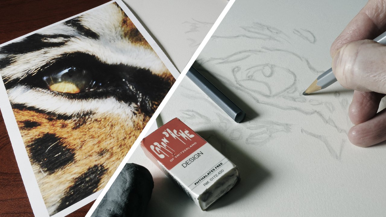
excess on the scrap paper before use before starting. Study your reference
thoroughly and make a decision on where you
want to apply tone. Remember, at this stage, this only wants to
be done very subtly. After all, we're just looking to add some basic shape
to the picture. At this time, you want to make sure to use the blender
lightly in areas of detail. Be careful not to blend out the original drawing as we still need these lines
to remain visible. The blending stump is an
ideal tool to use for this, because it produces a
very soft appearance. It can be easily erased. And also, if you do need
to add more depth of tone, then you can just simply
apply more layers. You can see that
just by doing this, the picture has
started to take on a much more three
dimensional appearance. One thing I would
say is that it is very easy to get carried
away when doing this. Make sure to keep it
to the bare minimum. The key point is to remember, take your time to build the
background tone and only apply the minimal amount of
shading to the main subject. In the next lesson,
we can now start to work on creating a
realistic looking eye.
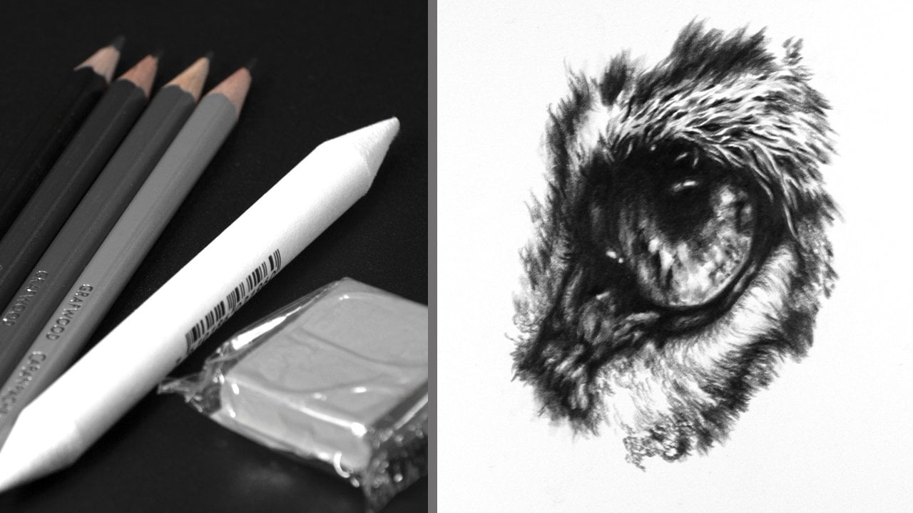
7. Creating A Realistic Looking Eye: Now we've got our
background in and built some shape
into the subject. It's time to start
work on probably what is the most important
part of the picture, and that's the eye, as this is going to be our
key focal element. With that said,
let's get started. The first thing I want to
do is to just establish this lower line that goes
around the eye, just here. To do this, I'm going
to use a two B pencil. I want a fair degree of
control over the pencil. I'm going to be holding it
fairly close to the tip. The pencil is blunt
and this is to create a separation between the eyeball and the surrounding socket. Only the lower part of
the eye is done this way. Where we want a more defined
separation, a tight, circular motion is used to
apply tone to the upper area, as this will eventually
be in strong shadow. Also, now we can start
to build up some of the darker tones
surrounding the eye. Now we have this done,
we can start to build some tone and some shape
into the eye itself. This wants to be done slowly and carefully as it's such an
important part of the picture. The best tool to use for this is going to be
the blending stump. Tone is applied to
the lower part of the pupil as well as the upper part which is going
to be in strong shadow. This provides a foundation to which we can then build
darker tones upon. We're also brushing tone
into the grain of the paper. This is essential
when it comes to creating a glassy appearance. Once you're happy
with the shape, you can then start to apply some pencil to build
the tone further. I'm going to start
by lightly applying a blunt TV pencil
to the surface. And then brush this down into the grain of the paper
with the blending stump. As each layer is applied,
the tone darkens. I would say it's around
about this point that I will suggest switching
to a darker pencil. This may seem strange and
you might think that why not just use the darkest pencil that you've got to start with. But I've found over
the years that this produces the richest darkest
tone that you can achieve. It also has a very
smooth appearance to it. I'm going to be using
a four B pencil, but if you haven't got one, a similar grader pencil
should be absolutely fine. As with the two B, the
pencil is used blunt. And again, you want to
work between pencil and blender to just push the
darkness that bit further. You'll probably find
that you don't need as many layers
this time, though, as you're already starting with a fairly dark tone that's given us our
basic tone and shape. And now for the interesting bit, starting to add the detail, you always want to take
plenty of time when doing this and constantly refer
back to your reference. The first pencil that I
want to use to start to add some detail is going
to be the two B again, I want to hold it quite close to the tip because I
want more control. And also as well, it's still
going to be used blunt. You can see a large areas
being left for the highlights. That's the first part that
we're going to work on. The main highlight
to the upper left is quite small and has a
hard dark edge to it. All I literally have to do with this is to just draw around it. The larger part of the high
light is quite subtle. This just needs some
tone applied to it to add some of
the finer detail. I just want to sharpen
the pencil a bit further. Now, if you are going to
do this with something like a two B pencil,
which is quite soft, I suggest after sharpening it, just use it on a
piece of scrap paper first before going
into the picture. This way if the tip
fractures at all, it's not going to do any
damage also as well. It'll just take a little bit of the harshness off of
it before starting. I want to use this randomly to produce a slightly
crazed appearance, as this will help to create the effect of subtle reflection. This can be enhanced
further by using a needable eraser with a
point rolled on the end of it to very likely brush and tone away to
create more shape. It's always worth
constantly referring back to the reference,
but remember, you can always use a fair
degree of artistic license, particularly in areas like this. Once the pupil is done, it's then time to concentrate on the surrounding lighter
area of the eye. Again, the two B pencil is used very carefully
and lightly to add very fine detail with the erasor being used to lighten and
highlight some areas. Pay close attention to the patterns and
straations that there are within this area and take plenty of time
to recreate them. Also, as the picture develops, you may find it necessary to add more highlighting and
shading depending on the type of look
that you want to achieve with the last
bit of detail added, I just want to add a bit more of a highlight to the
right hand side. Using the two B pencil, I want to add a bit of
shadow below the pupil. Now this will have a slightly
grainy appearance to it, which is what I
want for this area. But if you want
something smoother, then just simply go
back over this with the blending stump by building the picture up in a relatively non
aggressive manner. This makes any minor
alterations relatively simple to do once you're happy with
how the picture is looking. The next thing that we
want to do is to just push those dark tones
that bit further. I'm going to start by first
using the four B pencil. Before then moving
on to the nine. Now, this will only make a very slight
difference because of the depth of tone that's
already been built up. If you find that you end up with a slightly harder
edge to the nine, then you can just simply work over the edge
of this with a two. To blend this out, I think
you can see that the eye has a nice glassy appearance by using a degree of
artistic license, stands out more than
the original image for the core skin
texture below the eye. I'd recommend starting
with a two pencil. Remember, if you need to make
any alterations or changes, this can easily be done
with a needable eraser. To create the look
of this texture, you want to use the
pencil randomly. Using short strokes, what you're looking to achieve is a
slightly crazy looking pattern. This is done in conjunction with the eraser to add highlights. You can see I'm being quite erratic with the
application of the pencil. I think this helps
when trying to create a more realistic
looking effect. Again, this is a lot of work for what is effectively
a very small part of the picture for
very fine detail. A hard sharp pencil can be used. Now I'm using a four H for this. Again, any grade around this
will work just as well. This pencil doesn't
produce a very dark tone, but when it is used
through a tone that's already on the paper, it will drag this, producing
a very fine dark line. Because the pencil
is hard and sharp, it will also indent this into
the surface of the paper. If you need to remove
any excess surface tone, you can just lightly brush
the eraser back over the top. Softer grades of pencil, such as the range, will not hold a point. As opposed to the four H, which will stay sharp
for a long period of time and can be used to
manipulate these darker tones. At this stage, I suggest
leaving the picture overnight. That way you can look at it with a fresh set of
eyes and it's much easier to see any alterations or changes that need to be made. Nine B can now be added to
the area in front of the eye, and then some subtle
highlights can be drawn out using the
needable eraser. By having a fine point
rolled on the end. This becomes a highly
technical tool. The lower edge is a bit smooth, this is just broken
up using the two. Some more highlights are added, then some nine to just add
that last bit of contrast. The highlight in
the lower part of the eye is just made a
little bit more prominent. With the edge being
finished with the two B pencil to give a
slightly coarser texture. Said the I is the
main focal point and such a crucial
part of the picture, it's well worth taking
the time to get it right. The key points to remember, study a reference thoroughly and apply detail slowly
and methodically. In the next lesson, we're
now start to work on the B.
8. Detailed Beak: The pitch is developing nicely. But before we can start
work on the beak itself, we first need to bring
the background up to it, so that's where we're going to start to protect the picture
from getting smudged. I'm just going to
cover it with a piece of glassine paper. This also prevents
any of the oils from my hand from being
transferred to the paper. You want to start by
establishing a darker line for the background around
the outside of the beak. I'd recommend using the two
B pencil likely to do this. All you want to do at
this point is to just create a more defined
line to work up to. Just as with the rest
of the background. We need to build a base tone because we're working
close to the subject. This time we need a
bit more control, which is why the blending
stump is ideal for this. Again, this is used to brush
tone down into the grain of the paper with more layers being applied to
darken this further. Remember, you can always load more graphite into the
blending stump if you need to. Once you have a good base, it's then time to add nine
B pencil to apply this. Use it in a circular
motion and you want to carry this fairly
close to the beak itself, but not right up to it again, if you need to just apply more layers until you achieve
the desired depth of tone. A nine B pencil is
not exactly the most technical of tools
because it's quite soft. It's at this point
that I would recommend switching to something
like a two B pencil, which is that bit harder, but it's still fairly dark. This can be used
over the edge of the nine B and will
carry it up to the beak. Because it's that bit harder, it's a bit more precise and gives a cleaner, sharper edge. It's worth remembering that
you can use harder grades of pencils to manipulate
other tones which have already been applied. Once you have the beak outlined, you're ready to start to add
in some of the shape and tone at a glance. The beak may look quite simple, but if you study the
reference closely, you can see there's actually
quite a lot of detail. I'm going to start
with a two pencil to build some contrast
into the lower area. As usual, make sure to take your time and constantly
refer back to your reference. The patterns in the reference
are really quite nice. But again, this is an
area where you could use a fair degree of
artistic license. It can be difficult to get things to look right
straight away. It's a good idea to not press
two hard with a pencil, as you may need to
make alterations even if they're only
relatively minor. This can easily be
done by just drawing the tone back out with
the eatable eraser. Just as with the eye, this is a very methodical and
time consuming process, but it is well worth taking that time to achieve
the end result. The next part that we want
to turn our attention to is the area to the right of the beak that
incorporates the nostril. We're still not worried too much about detail at this point. We're just simply
adding tone to build stronger shadows and
enhance the basic shape. Again, remember to work between the pencil and erasor to make adjustments with this picture. The nostril is not perfectly
round also as well. There is a ridge
just inside of it. This can be very subtly
highlighted with the erasor. The shadow below the
nostril is strengthened before then moving onto the tip and front
part of the beak. This part is quite
chipped and scratched. I'm using a more erratic and
jagged stroke to do this. Also don't be afraid
in some places to go over the edge of
the beak when doing this. This helps to tie
the picture into the background and prevents the subject from
looking stuck on. When working on a
picture very closely, it's very easy to become
fixated on one spot. I always find it's a good idea to occasionally
just step back from the picture and look at the whole area that
you've been working on. This way, it's much easier to
see if you do need to make any subtle changes
for larger areas. Still apply the pencil lightly using a tight,
circular motion. If you want to darken
the tone further, just simply apply more layers. Again, I'd recommend
using something like a blunt two B
pencil for this. Now because we're using
the pencil lightly, this may produce a slightly
grainy appearance. But this isn't really
a problem as we can always go back in later
and smooth this out. I find when making an
alteration like I'm doing here, it's best to draw the new line in using the
original as a guide. Then when you're happy with it, just simply erase
the original marks. I tend to do this
quite a lot as I work, even though some
of the alterations are really very minimal. But I do feel that
these little things do make a huge difference
to the finish. Look at the overall picture. Once you're happy with
how the beak is looking, you can then start to use
the blending stump to smooth the tone and reduce the appearance of
grain in some areas. You can do this by just brushing the blender lightly
over the surface. You can also dab the
blender as well. This is ideal for
dealing with any of those smaller areas or like these darker ones that
I'm working on at the moment. But this will diminish the
strength of the tone slightly. With the shape now
fully established, we can start to work on
adding more contrast. The four B pencil can be applied to what are going to
be the darkest areas. You shouldn't have to
press too hard with this, as we've already built
up a good depth of tone. This may have a hard edge to it, but remember at this
point we're purely just darkening the tone
to add more contrast. To blend out the
edges of the four, you may think that you need
to use the blending stump, but I actually find
that the two works much better and produces a
smoother transition. But you may find
that this varies from one maker
pencil to the other. You want to continue
this working between the four pencil
and then blending out the edges with the
two B until you achieve the desired shape and strength of
tone that you want. The edges can be softened further by using
the blending stump, and this will also create a
smoother looking appearance. To create subtle highlighting, a point can be rolled on the
end of the needable eraser, and then this can be used
to just brush tone away. It can also be used in some
areas to just press in for a more pinpoint highlight
by using the eraser. This way it becomes a
highly technical tool. Minimal changes can be made working between pencil, blender, and razor before moving on
to the finer detailed work. For this, I'm going to
be using an F pencil, and this time the pencil
wants to be sharp. Again, you can use any similar
graded pencil around this, even up to say, four H, as this will work just as well. This area of the beak is
chipped and scratched. I want to use a crazed pattern
to create this texture, also by working
slightly over the edge this house to connect the
subject with the background, creating a more
realistic appearance. Although harder pencils
aren't particularly dark, they can be used
over darker tones. Then they will pick this
tone up and carry it, producing finer darker detail. Which you just can't achieve by sharpening softer
darker pencils, as they simply
won't hold a point. They can also be used to create a harder edge or
a finer texture, like I'm doing here with
all the detailed work done. The thing that we want
to do now is to just push that contrast
that bit further. To do this, you want to use the nine pencil and apply this
to the very darkest areas. Again, to create a
smoother transition, the edges can just be
blended out using the two B. The beak is another
strong focal element, and this goes a long way to the overall look of
the finished picture. The key points,
remember this time, take time when applying
the background around the beak and don't be afraid to play around
with contrast. In the next lesson, we
can start to work on adding some of the
texture around the face.
9. Creating Texture: We're ready to start to add some of the detail to the face. This is going to
involve indenting texture into the
surface of the paper. I suggest practicing this
on a piece of scrap paper first before actually attempting it on the picture itself. There are a number of different tools you
can use to do this. For example, I'm going
to be using a dart. You want to hold this at
roughly a 30 to 45 degree angle to the paper and then work
in the same direction. The advantage of trying it
on a piece of scrap paper first is to see how much
pressure you need to apply. Indent a few lines into
the paper and then just simply shade over the top
with a blunt two B pencil. And you should see
the marks appear. If you don't, you just need to apply a little bit
more pressure. I'd also suggest working on a firm surface when doing this. The next thing to do is to
study the reference and look for the patterns
that you can see within the
feathers themselves. Then try to replicate this
on the piece of scrap paper, indenting it into the surface. But this time when you work over the top of
the two B pencil, imagine you're drawing
the same pattern over the top and this will create a much more realistic
looking effect. Once you're happy
with this, we're all ready to start to work on the picture itself using
your indenting tool. Start to apply texture
to the surface of the paper for the area
that I'm working on. This requires quite
a short stroke with some crossing over each other to produce
the desired effect. It's a good idea to only
work in small areas at a time as it can be quite difficult to see
what you have done. This also helps to sporadically
remove pressure from the hand for the effect to work. You are effectively putting in every strand as the texture
needs to be quite dense. This is one of the
things that makes this such a time
consuming process. Using a short stroke two
B pencil can then be applied randomly over the
top to reveal the texture. Don't expect to see anything too impressive to start with, as you do need a
larger area done before you can really start
to appreciate the effect. Also, at this point,
the pencil that's been applied is only there
to reveal the texture. This will have to be refined
as the picture develops. By studying the reference, we can see that the length of the strands changes
from shorter to longer. As such, we need to change the length of our
strokes to match. Again, you only want to work
in small areas at a time, constantly switching
between adding texture and applying pencil. It's also worth remembering that this is not the
finished result. This is purely to
allow us to see the underlying texture
that has been created. You can see on the reference
that the direction of the strands changes as we move around the
bottom of the eye. What I suggest is to
work on the area to the right before then filling
in the bid in between. This is a simple way to
get smooth changes of direction and also reduces the chances of making mistakes. By working this way, you can actually see how
much you need to adjust the stroke to smoothly connect the
two areas together. As each bit is added, the texture starts to
stand out more and more, even though we've still only covered a very small
part of the picture. In some areas you can get a dramatic change in
direction to deal with this, simply cross the
strokes over working in various different directions to connect the two parts together. And this will help to create
a seamless transition. Also in the transition area, you're going to want to shorten
the length of the stroke. Also, remember to do the same when applying the pencil
back over the top. You can also use four B
pencil if you want to create a darker depth of tone in these types of
transitional areas. When using the indenting tool, you may have to adjust
your hand position to maintain that 30 to
45 degree angle. Alternatively, if
you're only working on a small picture on
a flat surface, you can just simply turn this
round to make it easier. You can see that as the
amount of texture builds up, it really does become
very effective. It just lacks shape and depth. This is what we can
now start to work on. Just as with the
beacon, the eye, we want to create that three
dimensional appearance. To do this, we're going
to use a few grades of pencils plus the blending
stump and needable eraser. If the indentations
look too harsh, and this can be particularly noticeable in areas
of strong shadow, just simply use
the blending stump to brush tone back
down into them. This will diminish
the strength of the tone that's
already on the paper. You will have to re, establish this using the pencils
back over the top. Tone can also be diminished in other parts by using
the needable eraser. It has to be said that there is a fair degree of
tridonerrohen doing this. When I'm working on a picture, I will constantly go back to areas and make
minor alterations. Remember you can use
the two B pencil to lightly blend out
darker surface tones. Because the pencil is blunt, it won't affect the appearance
of the underlying texture. The same process
can now be used to add shape to the larger
area below the eye. When working over an
indented texture, you want to think of the
paper as having two layers, an upper surface, the
lower indented texture. If you want to apply
tone to both of these, then you want to use a
relatively soft tool like the blending stump. If you only want to apply
tone to the upper layer, then just use a blunt pencil. It's important to only
do this lightly though, as you will compress the fibers
of the paper if you press too hard and diminish the
effect of the texture. But there are times when
you may want to do this. The needable eraser with a
point rod on the end of it can be used to delicately draw tone away from the
surface layer. But if you use it
more vigorously, it can deform down into the indentations and remove tone from the lower
layer as well. I think that you can see that by constantly switching between the different tools
and making what are sometimes very
minor alterations, that the picture slowly
does start to come to life. The front of the neck
is in strong shadow. This is also a part that
we can subtly tie into the background before
any texture is added. This area needs to be darkened
first using 2.4 B pencil. The blender is used to spread the tone as well
as creating shape. We also want to make sure
to remove any appearance of grain before any texture
is added to this part. Again, you want to
apply a layers of tone until you achieve the
desired level of darkness. With this done,
it's time to again study the reference
in this area. The strands on the
left hand side really are quite
coarse and random, but slowly become more uniform
as you move to the right. You can see here I'm using a short stroke and also
varying the direction, but as I work to the right, the stroke becomes longer
and more consistent. This is the same when it
comes to applying the pencil, as it is a combination of the indentation and the way that the pencil is
applied over the top, that makes the effect work. Now I'm starting with a two B, but remember, any similar
grade will work just as well. Then what I'll do
is switch to the four to darken some
parts further. This is a lot of work. Again, I know I've said this before, but you really do have to take the time to get this right. You can see that as
I work to the right, the strands become more uniform and have a noticeable
direction to them, but they're still quite
tangled at this point. We still need to make
sure to cross the strokes over if you want to create a
more subtle looking texture. Then first of all, just
brush a little bit of tone onto the paper with
the blending stump, Add some texture, apply the
pencil back over the top, and then adjust the
look by lightly using the needable eraser texture will constantly vary
over the entire subject. For example, here I'm using a much longer, less
tangled stroke. You might also be wondering, why am I adding textures
to the very darkest parts? Well, the simple answer is
that by adding texture, this prevents them
from looking flat. If you find that the
texture looks too harsh between the darker
and lighter areas, then just use the
blending stump over the edge and this will create a smoother
looking transition. The texture on the top
of the head differs. Again, this is much neater and requires a more curved,
less tangled stroke. When applying texture, you want to be careful
not to work over the original outline because you will end up indenting
this down into the paper. Again, make sure to work
in small areas and apply the two B and four B pencil back over the top using
the same stroke. For this picture,
I want to create a subtle transition between the neck and the
dark background. I'm going to apply a little
bit more four B pencil first before softening
the edge with the blending stump texture can then be added
back over the top, indenting the dark
tone into the paper. Don't be surprised that
as you work on one area, this may affect how the
part next to it looks. You may find yourself
needing to go in and make slight alterations
and adjustments. As you can see, I'm doing here, I find this is particularly noticeable after darker
tones are being applied. At this point, we're
ready to bring the subject and
background together. The first thing
that you want to do is to use the blending stump in a tight, circular motion to brush tone down into
the grain of the paper. Just as we did when
working around the beak. Remember you can always apply more layers if you want to
darken the tone further. Once you're happy with
how this is looking, you can then switch to
using the nine B pencil. Again, you want to use this in a tight circular motion and take this up
close to the neck, leaving a very slight gap
texture can now be added. For this part, I just want to
bring it out very slightly into the background in
the finished picture. These only want to
appear very subtle. The two areas can now be blended together using the two B pencil. What you want to do is to
work across the edge of the background and run
this into the texture. The two B will pick
up the nine and will spread it and will create
a nice smooth transition. I find that this is
much better than just trying to use
the nine on its own. As you do tend to get a much smoother result
for lighter areas. First, remove a small amount of the outline using the eraser. Then apply the texture. Use the blending stump to create a base tone for the background, but this time carry it
slightly over the edge of the texture as this will prevent it from
looking too harsh. Apply nine pencil and then use the two B to carry
this up to the texture. I'm just going to make some
very minor adjustments to the tone with the
needable eraser, then tidy the edge
with the two B pencil. When you get to this point, it's a good idea to
stand back and take a good long look at what
you've done so far. You can then make a
decision if you want to make any alterations or changes. Now for me, I want to add
a little bit more nine. That's what I'm going to do now. By adding this to
the darkest parts, this just helps to give the texture a little
bit more definition. If needed, this can be blended out using the two B pencil. Again, this is incredibly
subtle and it's only something
that you can truly appreciate when you're stood
in front of the picture. That's the key focal area done. It's surprising how many
different variations of texture there
are within this. The key points to remember study the different
patterns that you can see within the
reference practice these on a piece of scrap paper. First, always remember to only work in very
small areas at a time. In the next lesson,
we can now start to concentrate on the
softer looking textures.
10. Variations of Texture & Markings: In this lesson, we want to work on our softer looking textures. But before we can do this, we need to add
some more shading. It's back to the blending stump. As usual, study the reference before applying tone
to the picture. And make sure to do this in
the direction of any texture. You want to avoid just
shading over an area, even when you're going to add
detail back over the top. This creates a more
random looking appearance and gives you a much more realistic looking
base to build on. Continue this as you
work down over the body. Remember, if you want
to darken this further, you can simply
apply more layers. The blending stump I'm using is quite saturated, a graphite. But if you're using a newer one, then you may just need to
add a bit more to this. As we did in the previous lesson with some areas
such as the wing, we're looking to
create a nice depth of tone and remove the
appearance of grain. This way, as the
picture develops, we'll be able to blend this seamlessly into the background. Remember, this is a very
non aggressive tool to use to build up the
shape of a picture. If you do need to make any
alterations or changes, you can simply do this
with the needable eraser. With more shape now established, we can go back to
adding texture. It's a good idea to now work more generally over
the rest of the head. As some of these areas can tend to get a little
bit more repetitive, remember to concentrate on the texture that
you want to create, length direction, as well as if the texture is tangled or
needs to be more uniform. I'm going to start by working on the area surrounding
the top of the eye. Some of this is still
a little bit tangled, but as they work away from this, the stroke will progressively get smoother and more uniform. Two B and four B Pencil
can then be applied as usual if an area
looks too harsh, remember, you can always use
the blending stump to just soften its appearance equally. You can always adjust the tone lightly with a needable eraser. Textures will vary over the entire picture by working in different
areas at a time. Find that this helps
to prevent repetition. With most subjects, you will have markings that
you'll have to put in, for example, on this picture. A lot of these are
around the head, just around this area. To do this, I'm going to use
a piece of scrap paper and a two B pencil to help to
position the markings. I first want to lightly sketch
in a couple of guidelines. The scrap paper can be
lined up on the reference, and then the points that
we want to transfer can be marked also as well. For example, here
I'm using the top of the eye and the top of the
head as reference points. These can then be lined
up on the same place on the drawing and then
the marks transferred. Once a few points have
been transferred, some guidelines can
be lightly sketched in bear in mind that some of these will have
to be removed later. These can also be tidied up, if necessary, by just
using the needable eraser. You don't want to do too
much at a time with this, as it can get quite confusing, just concentrate
on small areas at a time with these guidelines. Now, in some of the individual markings can now be applied. The first one I want to
look at is this one. As you can see, it's in
line with this area here. It's quite a simple
one to start with, Using the line as a guide. I just sketch this in
using the two B pencil. This is the next part to put in. This is at the very
start of the guide line, then this one just here being
roughly towards the back. This again, is quite
a simple way to mark out what is quite
a random pattern. But alternatively, you could
just free hand these in. This is just a way to help gauge the position
of the markings. Remember, this will vary from
one individual to another. Once you're happy with the
positioning of the markings, it's then time to
add some detail. To do this, I'm going
to use a four H pencil, but this time it's sharp. The reason for this
is that I not only want to manipulate the
tone that's been applied, but I also want to indent
this into the surface. For any of the finer
darker markings, just simply use the
four H and draw through the tone that's already been applied to the surface. Because the four H is
a graphite pencil, it will pick the tone
up and carry it, as well as indenting
it into the surface. The needable eraser
can be lightly brushed over the surface to
reveal the finer, darker lines that
have been indented. The simple fact is, soft
pencils won't hold a point. Whereas harder ones will. But because you can manipulate the tone with the
harder pencils, this is a great way to
create finer detail. The data, on the other hand, will slide over graphite. This can be used to
indent texture into areas where you don't want
to manipulate the tone. Then to create a very
subtle texture, you can, again, just lightly brush
the tube over the top. Remember you can
always adjust to the look of this with
the needable eraser. As you work around the head, you can now start to gradually bring the background up to it. This is the same process as we did in the
previous lesson. Remember to only work in
small areas at a time. First, remove a small part of the outline before applying
some texture to the edge. Apply some base tone
with the blending stump. Apply nine pencil and then use the two B to carry
this up to the subject. Then slowly continue this
working round the head. You can also see
that this part of the head starts to subtly
blend with the background. As I've said before,
this helps to tie the subject and
background together. It's then back to
adding texture, making sure to be
conscious of density, length, and direction of
stroke that's required. Now, this does get
very repetitive, it's a good idea to only work on small areas at a time
moving around the picture, and eventually everything
will just connect up. You can also combine this with bringing the background
up to the subject, as well as slowly adding
more of the markings. Also, remember to carry the background into
the subject in some areas as this
helps to create more cohesion between
subject and background. When you get a picture
to this stage, you once again
want to stand back from it and take
a good long look. Making any decision on changes or alterations
that need to be made. Now for me, for this picture, I personally feel that this area here lacks a little
bit of contrast. That's what I'm going to do now. This involves working
over a much larger area, darkening some parts
whilst lightning others. This will make the
picture look more dramatic and you'll
probably find that you have to do this
to other areas as well as the picture develops. Moving down into the body, more shape and tone can be
applied and refined using the blending stump
for darker parts or areas are stronger shadow
2.4 B pencil can be lightly applied to the surface and then blended out to create
a smoother gradient. It doesn't matter
if you're trying to replicate the look of
say, fur or feathers, But as you work over a picture, these textures will tend to vary from one area to the other. This is really apparent
on the picture of the falcon as the texture on the head is
really quite coarse. But as you move down
through the body, this becomes much
smoother and more subtle. There are some quite
dramatic direction changes as the texture appears
to become smoother. Then also the stroke needs to match becoming more uniform. And even you can still have texture and detail
in areas of subtlety. The trick is to
just make it less visible for darker areas. Use the pencils to
apply tone and then use the blending stump to brush
this down into the texture, as well as smoothing
the tone out. You then just have to
repeat this until you achieve the desired level
of darkness and subtlety. Less tone is applied
to lighter areas, with the eraser being used to soften and lighten
the appearance. Now this is a lot of work. I would suggest having
a lot of breaks when doing this to avoid
any complacency. It's also worth remembering that all of this
work goes a long way in helping give the
picture that three D quality that we've
been aiming for. That's a large part
of the picture done. The key points,
remember this time. Use guidelines to help
to position markings. And make sure to
pay close attention to the different
variations of texture. In the next lesson, we can now start to work on the wings, finish off the background, and tie the whole
picture together.
11. Subtlety, Contrast & Finishing Touches: In this lesson, we want to
work on the wings as well as really bring that
background tone into the lower part
of the picture. The first thing that
we need to do to start with is to add in
our darkest tones. We've already applied
some base tone with a blending stump in
a previous lesson. Now we can start to darken this further using the two B pencil. This is again used blunt. I also want to use this to
strengthen the outline around the wing and then use blending stump and nine
pencil for the background. The two pencil can then be used to blend this
into the edge of the wing to prevent the contrast
from looking too harsh. Once you're happy with
how the wing is looking, you can then soften
and smooth out the appearance of the two
B with the blending stump. Remember you don't have to
press hard when doing this. Just lightly brush
it over the surface. And this will not only
smooth out the tone, but also create a slightly
blurry appearance. Areas like this don't want to detract from our
main focal area. This is why it suggests mainly concentrating on adding in
these darker tones first. Now, we will still
need to add texture, but this time it needs
to be incredibly subtle. We'll do that a
little bit later. Four B can be used to
strengthen the tone further. At this point you still
don't really want to worry about adding
too much detail. The blending stump
is used this time to just soften the
edges of the four B, as you don't actually want to diminish the main part
of the tone itself. Once you've got this much done, you can then work between
the 4.2 B pencils, blender and eraser until you achieve the
look that you want. It's also a good idea to
constantly refer back to the reference and make tiny
corrections at a time. At this point, I'd advise
working on the other wing as well before
adding any detail. This is exactly the same process as we did with the other wing. Again, starting with
the two B pencil. Still apply the pencil with
direction and purpose even in very dark areas as this still helps to
create subtle shape. This may seem strange, but little things like
this do make a difference. Use the blender to soften
and smooth the tone. Apply four to darken and then just soften some of
the edges with the blender. Clean up the edge
of the background and then refine the wing with the pencils blender and
eraser with a good base. Now established, we're ready to add some of that
subtle detail. For areas like this,
you want to use a short, smooth, uniform stroke. You also want to use
less pressure so as to create a minimal indentation
into the surface. I suggest trying this on
a piece of scrap paper first before adding
texture to these areas. If you're working on the
same picture that I am, I suggest occasionally looking
at the unprocessed image. The reason for this
is that you can see so much more detail in
the very darkest areas, particularly the direction
that the texture takes. This is very apparent on the right hand side of the falcon, which in this composition
is in very strong shadow. As with the other
side, less pressure is required to create a more
subtle looking texture. Now you may be wondering
why even bother to put texture in the very
darkest areas at all, as it's going to be
very difficult to see. The answer is exactly that
it is difficult to see, but it can still be seen
when somebody is very close to the picture as
we work across the wing. We also want to make the
texture more sporadic, as well as reduce the amount of pressure that we're using. This will help to
create a more smoother, gradual transition
between subject and background to get
the best results. When doing this, I
find it's a good idea to work randomly
over a large area. This creates a
patchy texture which will diminish towards
the edge of the picture, allowing background and subject
to fully merge together. More texture is added to the lower part of the
other wing and this will eventually continue right
up to the border two. B pencil is likely applied to the very lightest
parts of the wings, soften with the blending stump. Then it can be highlighted
with the needable eraser. This will reveal that
very subtle texture. The pitcher is nearly finished. The next thing we
need to do is to bring the picture
up to the border. But before we can do that, we first need to mask it off. Remember to use a low tack
masking tape when doing this. It wants to be attached for the minimal amount
of time possible. Make sure to take time
when lining this up and only press down lightly
along the edge of the border, as this will make it much easier to remove a
little bit later. Use the 2.4 B pencils to
build a depth of tone. Again, this wants to
be done in layers, smoothing each one with
the blending stump. Also, make sure to
be careful when working over the edge of
the tape as you don't want to accidentally lift it
before adding any nine B, this lower area just needs
a little bit more texture. Again, be careful working
up to the edge of the tape. Remember this texture only
wants to be very subtle. Nine can now be applied over the top to just darken
this a little bit further. Remember, if you do
find any harsh edges, you can always use the two B as a blender to just
smooth these out. Once the border is established, you may find that
you want to make some minor tonal adjustments
as I'm doing here. Once that's done, it's
time to remove the tape. Simply fold it over against itself and then
just lightly pull, making sure to do
this very slowly and carefully so as not to
damage the surface. With the tape removed, we've got a nice clean, sharp border. It's now time to deal with
this last area just here. Because this is an
area in strong shadow, we first need to apply
a very dark base tone. This is done using
the blending stump. If you do need to
darken it any further, you can just lightly
apply a layer of two B pencil and then use the blender back over the
top to even out the tone. The markings can be positioned free hand quite easily
or alternatively, you can use a piece
of scrap paper and a two B pencil as we did in a previous lesson 2.4 B pencil can then be used to block in the darker markings, with the blending stop
being used to soften the edges and create a
slightly blurry appearance. Subtle texture added using a light pressure nine B
for the darkest tone. Then again, the edges can be
blended out with the two B. To finish, the overall
look of the area can be adjusted and
refined using the pencils, blender and eraser to achieve
the desired appearance. When you're happy
with the result, the last thing to do
is to sign your work. Stand back and admire it. With all that work done, the picture is now finished. The key points,
remember this time, use subtlety in less
prominent areas so as not to detract from
the main focal area. Still use the pencils with
direction and purpose, even in areas of strong shadow. Of course, the most
important thing is to just simply take your time
when doing any of this. In the next lesson, I'll
give you a couple of bonus tips as well as
my final thoughts.
12. Bonus Tips and Conclusion: I do have a couple
of extra bonus tips when it comes to working
on pictures like these. The first of these
may seem strange, but it's to work from a
colored reference image. The reason for this is because personally
I feel I can see more detail in a color compared to a black
and white image. Also, two colors are very
noticeably different. Yet when converted
to black and white, they can appear to be
very similar in tone. The next is when you
get to the point where you think that the
picture is finished. I then suggest putting it out of sight for
a couple of days, and don't even be
tempted to look at it. You can then look at it with
a completely fresh set of eyes and then make any alterations or
changes that you need to. Generally speaking, these are usually pretty
minimal, if at all. Working on pictures
like this can be a very long methodical process. But if maximum detail
is what you want, then it's well worth it. Don't forget, you
can always upload your work to the projects
gallery at any time, and that would be
really nice to see. Remember, I'm always glad
to offer any advice. In conclusion, I really do hope that you found the class
useful and informative. And I've learned
a lot about what goes into creating a
picture like this. And of course, the
more you practice, the more natural these
techniques will become. Thank you for watching,
and I very much look forward to seeing
you in another class.
 Jamie Boots, Wildlife Artist, Teacher