Transcripts
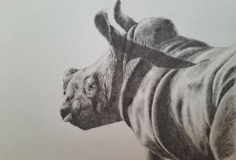
1. Introduction: Hi, I'm Jamie and I've been a professional wildlife artists for around 20 years, with my preferred medium of choice being graphite pencil. My main focus when drawing a picture is to try to capture the animals individual character and personality. I usually work in very fine detail with pictures, sometimes taking months to complete. But for this course, I want to show how you can create a very striking picture of this baby rhino with just a few materials. No matter what level of artist you are. You will learn a system that even as a complete beginner, will allow you to get a highly accurate initial drawing. Now as you gain confidence, you will start to rely on less and less. Eventually just using it to double-check the accuracy of your work. We will then move on to adding contrast and shading, as well as blending times to gray subtle transitions. Now, although this is not a highly detailed picture, you will also learn how by using a couple of patterns and the grain of the paper, you can create the illusion of texture with some finer details then being added to finish. So if you think this is something that you would like to learn, then why not download the reference photograph and get started. I would advise watching each part first before following along. Also remember, you can share your work by uploading it to the project's page where I look forward to seeing it. If you are interested in seeing more of my work, then why not visit my website, www.jamieboots.com.
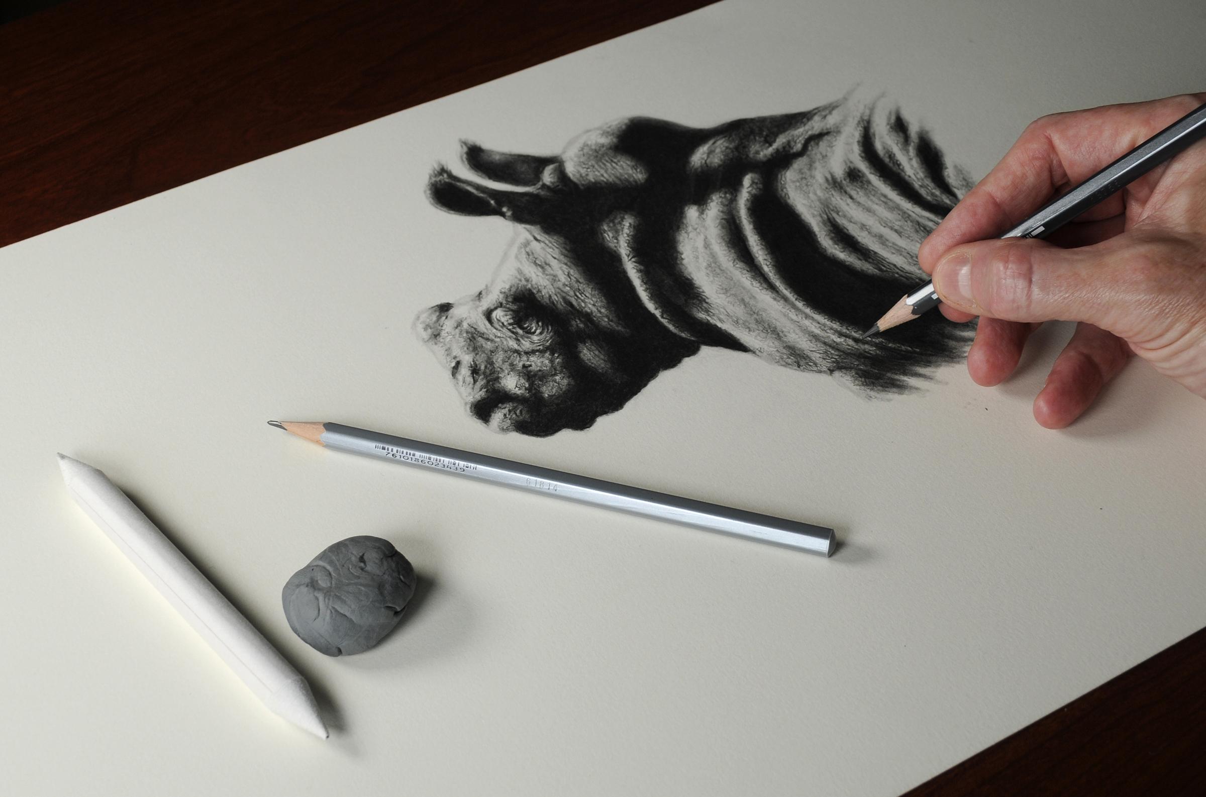
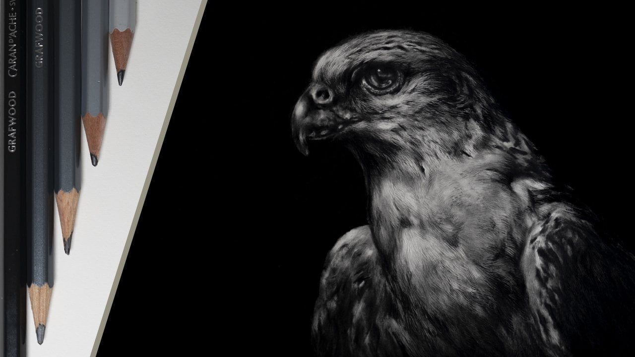
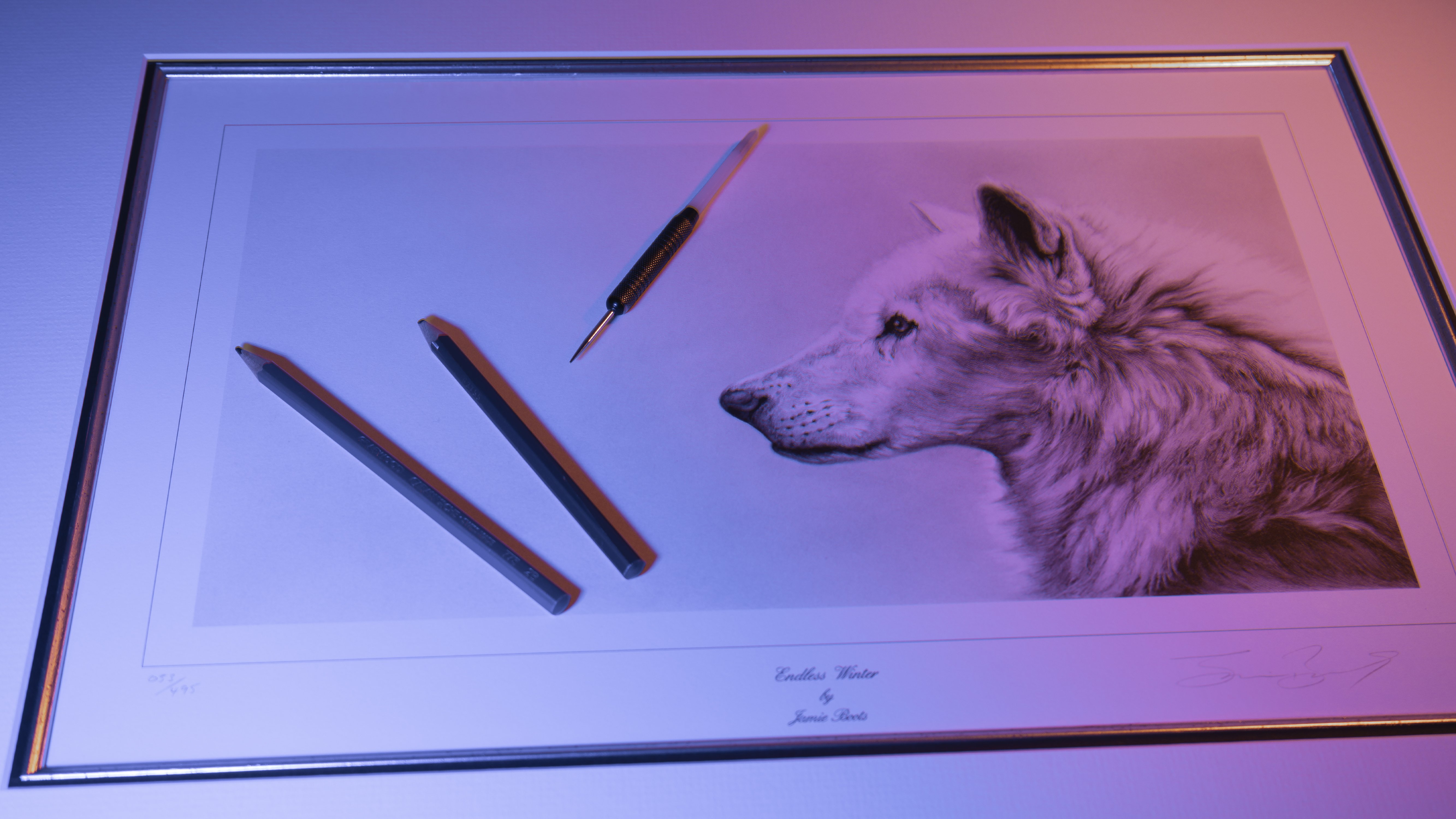
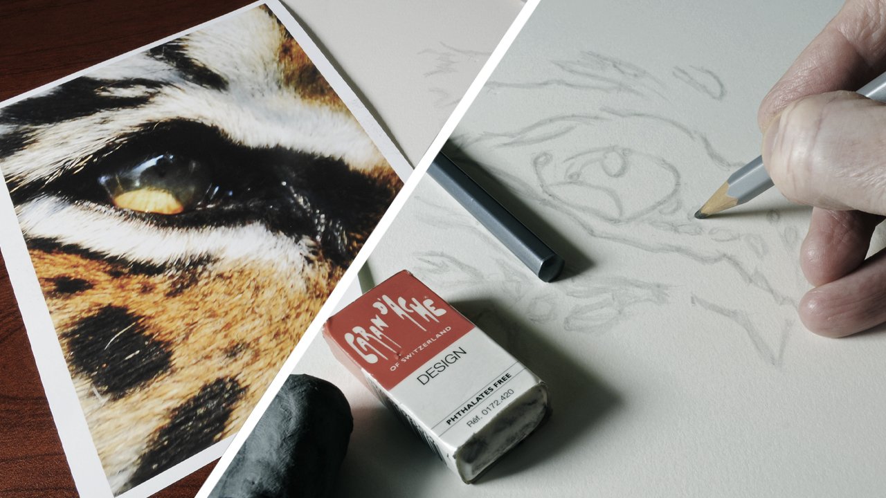
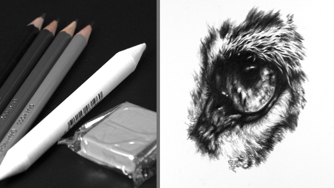
2. Materials: To create this picture of the baby rhino, you're going to need the following materials. Now, I will just quickly go over these first, and then we will go into them in more depth. Firstly, two pencils, H and 4B, a pencil sharpener, a blending stump, a kneadable eraser, a normal eraser, and of course not forgetting the paper that we will be working on. Starting with the pencils, I'm using Karen dash graph woods. But this is not essential. Both the H and 4B will we use relatively blunt for most of the time. At this point, the 4B will only be used to make marks to help with the initial drawing, with the H pencil then being used to sketch in. The reason why the pencils are blunt is so as to not damage the surface of the paper, and this also makes making any alterations relatively easy. If a pencil is sharp, it will make an indentation into the surface that cannot be erased. However, the 4B will be used sharp towards the end when we start to apply the finer details, and your pencil sharpener will do for this, because we do not actually need to go to a pin sharp point. We will also be using a blending stump, and this will be used to apply subtle shading, as well as blending tone. The way to tell a good blender is that it should have a velvet feel at the end. You do not want one that is hard or scratchy. Alternatively, you could use a cotton bud or Q-tip. But personally I think a blending stump produces a better result. We now come to the kneadable eraser, and I would say that these do vary considerably from one make to the other. I would recommend either Caran D'ache or Factis, as both of these work equally as well. They are both quite firm and hold a point, which I find is ideal. However, if you have less dexterity in the hand, another option is the Faber Castell. As this is softer, but bear in mind that it won't hold a point quite so well. Blu Tack or Sticky Tack can also be used for this does have to be changed quite regularly as it gets greasy fairly quickly. You will also need a normal eraser. This is never actually used in the picture, being solely used to remove marks from a piece of scrap paper. The paper that I will be using is St. Cuthberts Saunders Waterford 300 gram hot press. But any hot press watercolor paper should be fine because they usually have a slight grainy texture to them. I would not recommend cartridge or copier paper for this, as they do not give a good result. You will also need to download and print out the reference photograph of the baby rhino. I always print reference photographs on proofing paper, as this is relatively inexpensive compared to general photographic paper, and gives a detailed image to work from. Now, I have supplied two images, one color and the other black and white. Personally, I prefer to work from the color photograph because I feel it gives me more detail. But at the end of the day, this is purely down to personal choice. The only other things that you will need are a couple of rulers and some masking tape to attach them. I would advise a low tack tape for this. For example, I'm using Scotch Delicate, but I have also used Frogtape as well. I would not recommend regular masking tape, as this can adhere quite aggressively to the surface of the paper. The last thing is a piece of scrap paper, and this must be slightly bigger than the reference photograph, as this will be used to help plot the pitch route. In the next part, we will go through the preparation that is required before starting the drawing.
3. Preparation: For this part, we are going to need our sheet of paper to work on. The reference photograph, the rhino, masking tape, and two rulers. The reference photograph is 20 centimeters in height. The first thing you want to do is to take a small piece of the tape and attach it to the 20-centimeter mark on one of the rulers. Then take the second ruler and do the same. The tape will effectively act as a guide. We now want to attach the first ruler to the photograph. To do this, first turn the photograph over and attach two pieces of tape to the back, making sure that they extend out over the edge so that when the photograph is turned back over the correct way, the protruding tape will then be sticky side up. We now want to attach one of the rulers to do this line the ruler up against the edge of the image and then line up the tape that we put on as a guide with the bottom. When you are happy that this is in the correct position, then press the ruler down and this will attach it to the tape. Our ruler is now attached securely in line with the edge of the image and with the piece of tape in line with the bottom. As I said, this will act as a guide. Now take the second ruler and attach it to the piece of paper with two more pieces of tape. Effectively our picture will be drawn to the right-hand side. That's the setup complete and in the next part, we will start to work on the initial sketch.
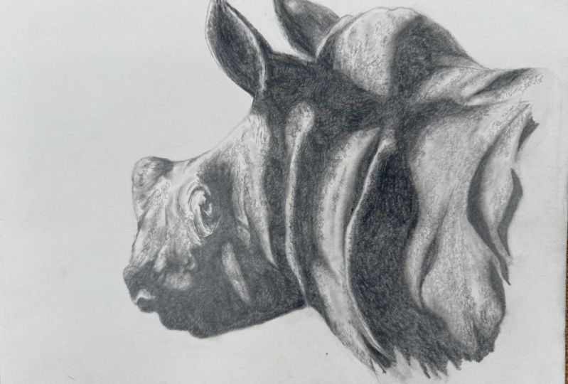
4. Initial Sketch: In the previous part, we attached our rulers to our drawing paper and reference photograph and we are now ready to plot out the picture. For this part you are going to need an H and a 4B pencil, a normal eraser, a kneadable eraser, and a piece of scrap paper that needs to be roughly the same size as the photograph. We will start by plotting out the outline of the head. To do this first take the piece of scrap paper and line it up against the edge of the ruler that is attached to the photograph. Position it in line with the bottom of the rhino's chin and place a mark with the 4B pencil. Using the tape as a guide, you now want to place a second mark. This can be lined up with the tape on the second ruler and then lightly place a mark for the position of the chin. I'm using the 4B pencil to do this. As you can see it is blunt as this is less likely to damage the surface of the paper. Using the normal eraser, now remove the marks from the piece of scrap paper. This is a good position to use for the next point. Again, line up the scrap paper and place a mark. With the second one being placed by the tape on the ruler, and then transfer this across to the picture. Remember to remove the marks from the scrap paper with the eraser. This is important so as to avoid any confusion as the picture builds up. Now repeat the process to place another mark below the lip. We can now join the marks up. To do this you want to use the H pencil. Again you wants it to be blunt. Lightly hold the pencil and sketch in between the marks. Because the pencil is blunt, these lines can quite easily be altered or erased if needed. I now choose three more points to plot. Then using the same processes before, apply these with the 4B pencil. Again likely join them up using the blunt edge. I use four points to mark out the next part. As you can see, I have avoided working around the mouth and horn as these will take more work. I would advise wherein first getting used to this process to do the easier parts first, and then return to the more complex areas later. Also, the lines at this point look quite jagged. But don't worry about this as we will tidy this up when the initial sketch is finished. The next part of the top of the head is shorter but quite curved. Again, use four points to create the marks with the 4B before sketching in with the H. This time using a more curved stroke. The hump is a more progressive curve. For this you want to use more marks. The advantage with this system is that as you get more confident, you can just simply use less marks to build up the picture. This is quite a time consuming way to work. But just take your time and you'll slowly see the picture develop. If you're not sure that you have made a mark in the correct place, you can always double-check it before sketching in. If you do make a mistake, remember it can quite easily be erased with a kneadable eraser. We now come to the ear. The best place to start is at the tip. You can see I just pulled a scrap paper back to double-check it is in the correct position. Again, plot the point on the scrap paper and then transfer the mark to the drawing. You can see I've used a number of marks and this will create a sweeping curve when sketched in. Then repeat this for the other side before moving on to the second ear. As I said previously, it is up to you how many marks you use to build up the shape. Just remember that if you are only using a few marks on a curved area to curve the stroke when sketching in. I'll use a number of marks for the shape of the horn. But if you're feeling confident then just use a couple. The next thing that I draw are in are the areas on the body that will be in shadow. These areas will be filled in later to help give the picture a strong contrast, as well as adding shade. The mouth and nostrils are then added, as well as some more areas of shadow. The eye also has a lot of shadow around it. But this is a very important part of the picture. Make sure to take plenty of time when doing this. I would advise when working around the eye itself, to only do 2-3 marks at a time before sketching in. As in a small area like this, too many marks will just become confusing and it can be quite easy to make mistakes. The shadow line is added around the top. Then I just add a mark for the highlight that is positioned below the eye. A few last details are added to the face to finish. The rulers can now be carefully removed from the drawing and from the reference photograph. The only other thing to do is to lighten any marks that stand out. To do this you want to use a kneadable eraser. If you have a new eraser, it will probably need to be broken in. The best way that I've found to do this is to first fold the eraser in half, then twist it, and then start to fold it, and knead it until it becomes pliable. To remove the marks, make a point by rolling the end of the eraser between your thumb and index finger. Then use this lightly to diminish the marks. You don't have to remove them totally as they will eventually disappear as the picture builds up. Remember, use the pencils lightly in blunt but most importantly take your time. Now, as I said, some of the lines are quite jagged. In the next part we will smooth this out and make any alterations that are needed.
5. Refining Sketch: In the previous part, we worked on the rough sketch of the baby rhino. But this now needs to be refined. Because of how the picture was built up we have have ended up with an accurate but angular drawing. We now need to smooth this out and this will give the picture a bit more shape. The first thing I'm going to do is work along the line that goes between the chin and the neck. You don't need to erase any lines at this time, you just need to work back over them to alter the shape. You can see as I work along doing this, the shape is altered to more accurately represent the photograph. These are only slight alterations to the line, but they do make a difference. I then do the same below the lip. As I mentioned in the previous part, I am using the H pencil lightly and blunt as this will not damage the surface of the paper. Also remember to hold the pencil away from the tip, as this will mean that less pressure is applied. I continue working around the face, making slight alterations. As I work over the drawing, you can see the lines darken. But again, this is not a problem as they will either disappear as the picture is built up, or they can quite simply be erased if necessary. You can see I have the reference photograph close to the area that I'm working on, and I will constantly glance at it before making the alteration. I can also add any extra detail that I think is needed. Now I'm happy with how this part of the picture looks. I can tidy up the lines with the kneadable eraser. Again, a point is rolled on the end of it and then this is used to work around the area that has been done. You can literally use the kneadable eraser to just draw tone back out. The line around the ear is a little bit jagged. I just round this off by working back over it and then curve the stroke outputs towards the tip to add more shape. A line is added around the inside of the ear to create a separation between the highlighted edge and the shadow in the ear itself. The edge is as smoothed out on the second ear and again, I curve the stroke upwards towards the tip. It is surprising how smoothing the lines out and just making very slight alterations with the H pencil and kneadable eraser can make a big difference to how the drawing looks. Just remember to constantly refer back to the reference photograph before making any alterations. I would also say that any areas that are slightly more complicated, like for example, around the eye, it is really where taking that extra bit of time to make sure that it is right. Now, one thing that I would advise when doing any initial drawing is to keep it as simple as possible and only put the minimal amount of information into the drawing that you need. For example, we haven't really put in any of the wrinkles around the eye at this point, as too many lines would just become confusing. That is our initial drawing finished and in the next part we will start to add in the darker shadows.
6. Building Contrast: Now we have the initial drawing done. We want to fill in the areas of dark shadow as this will give the picture a strong contrast. The picture at the moment being aligned it's drawing looks flat, but once we put some of the darker tone in, the picture will gain shape. Using the blunt 4B pencil, work around the areas that are in shadow. Use a very short stroke when doing this and do not press too hard. You may have to work over this a couple of times to build up a nice depth of tone, but it is far better to do this than press too hard as this could emboss a line into the paper, which could end up being quite prominent. This is also the reason for using short strokes to do this. You also may want to practice this on a piece of scrap paper first to see how the pressure that you apply to the pencil affects the tone that it produces. For example, if you press hard, you will get a very dark tone, but you will effectively emboss this into the paper. Whereas if you use less pressure, the tone will be lighter, but by applying another layer over the top, this will darken but will not damage the paper. I avoid working around the eye at this stage because this requires a little bit more care, as it is a much more detailed part of the picture. We can now start to block in the darker tone. Again, use the 4B pencil to do this, and again, it wants to be used blunt. Apply the pencil using a tight circular motion, working back over the area until you achieve the desired tone. It is up to you but you may wish to practice this on a piece of scrap paper first. Now I am using Caran d'Ache graph pencils and I do find that when a pencil is used blunt for a long period of time, it does have the tendency to glaze. This is quite noticeable as the tone that the pencil produces suddenly becomes less dark. Of course, this may vary depending on the make of pencils that you are using. To rectify this, simply place the pencil in a sharpener and give it a twist to remove the gray surface. Remember, you do not want to sharpen the pencil to a point as it still needs to be used blunt at this stage. As more areas are blocked in, the picture really starts to take shape and gains dimension. This is a nice stage of the picture to work on as it builds quite quickly. Rather than just finish on the abrupt line. You can see I've created a broken edge. Randomly working out further in some places, and this will be finished in a later part. The hump has a slightly lighter edge, and again, this will help to add shape. I can then [inaudible] be sketching a line before blocking the darker tone in. Still using the 4B pencil in a tight circular motion, only this time a bit lighter, work down the edge of the hump and repeat this until you get the desired tone. This just wants to be a bit lighter than the part that it is next to. The same applies for the part that I'm working on now. Dark tone can then be applied to the second ear, but make sure to leave a high lighted edge to the left. With the larger parts done, you can now start to concentrate on some of the smaller areas. Again, just look at the reference photograph before applying the pencil. You can see I'm making some slight alterations in some places. But ultimately at the moment, this part of the drawing will still be quite rough. You may want to sharpen the 4B just a little bit for this next part. But because of the softness of the pencil, you do not want to go to a sharp point because this may break off when in use. If you do think that you have too sharper point on the pencil, then just use it on a piece of scrap paper first and this will dull the tip. As I said previously, the area around the eye does require a little more care. I can now draw around the highlight below the eye before blocking in more tone in the eye itself. Now, there are a lot of wrinkles around this area. But for the time being, we will just put in the one that was sketched in during the previous part. Again, this will act purely as a guide at this time. The area behind the eye can then be blocked in and just feather the edge towards the top. I'm now adding the darker bits of detail to the face and then to finish, I just want to apply a little bit of lighter tone to the ear. Hopefully you can see that just by applying darker tone, I'm building a strong contrast into the picture, it dramatically changes its appearance. Remember when building darker tones, it may take a few layers to achieve the desired effect. But as mentioned before, just take your time. In the next part, we will start to add some of the lighter tones.
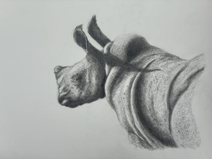
7. Adding Midtones & Blending: Previously we blocked in the darker shadows and in this part we can start to add in some of the lighter tones. Again, this will help to add more shape to the picture. To do this you are going to want to use the blending stump. Now, if you are using a new one, you will need to load some graphite into it. The best way to do this is to take the 4B pencil and apply it to a piece of scrap paper. You only want to apply this lightly, because if you press too hard it will wipe the tone into the paper and this will not transfer as well to the blender. To achieve an even coverage, I rotate the blender occasionally. Now you may need to repeat this until the blender produces the desired tone. Before starting study the reference photograph to familiarize yourself with the position of the lighter shadows. It is also a good idea to choose a less complicated area of the picture to start with. For example, I'm starting down towards the leg and will then work out into the body, leaving the head until last as this is the most complicated part. You want to use a random circular motion to apply the tone as this will create a more realistic pattern and try to avoid your shading. If you are new to using a blender, then practice this on a piece of scrap paper first as they can take a little bit of time to get used to. You can see I'm not holding the blender near the tip because I only need to apply a relatively low pressure. By working randomly this will help to start build a very subtle texture as the grain of the paper will show through helping to create the effect of skin. To create a soft transition between darker shadow areas and lighter ones, just use the blender over the edge of the darker tone and work back into the lighter area. This will blend out the darker harder edge of the shadow, effectively softening the look. This has the effect of creating curvature, and the more this is blended out the more subtle the curve will be. By working over the edge of the darker tone, this will also keep the blender loaded with graphite. But if you do find that the tone it produces starts to get too light, then simply reload it with more 4B and the piece of scrap paper. As a blender gets older, it will naturally become more saturated with graphite, and I find becomes better to use. This folder in the skin is quite prominent. I work over the edge of the darker tone to create the transition. But I'm careful to leave a highlighted edge to the left to exaggerate the fold. The big advantage of using the blender is there is a very non-invasive tool to apply tone to the paper. The difference mistake is made it can be very easily removed with a kneadable eraser. Now I just want to pull a tone down a bit further here to exaggerate the shape. This is a little bit different than what is in the photograph, but I think it works better, and I can now just soften the edge slightly up through here. Moving up to the hump, you want to work a bit more random. Is there a lighter and darker patches within it. But again refer back to the photograph before starting. Also if you need to darken any areas further, you can just simply work back over them as this will apply another layer and darken the tone. When using the reference photograph, remember it is just that reference. Don't be afraid to use a degree of artistic license when working on a picture. For example, on this area here. Again, I want to add a bit more shape. To do this, I just darken a bit further. I also darken the lower parts of the fold. Before moving up, blending out the right-hand edge of the shadow, making sure to leave the left-hand edge highlighted. In the previous part, we lightly apply some 4B to the right hand here. I'm now going to use the blender to smooth this out. Moving on to the left-hand here, I work over the edge of the darker tone, blending it up towards the tip. Before then working down the edge of the right-hand shadow lightly softening it. The rest of the markings are now added to the body. You can see I'm being quite random when doing this as this will build a subtle base texture. The remaining undulations increases are also added as well as softening any edges of shadow that I feel are too harsh. The head is the key focus of the picture and being more detailed requires a bit more care. Now, after using the blender on the body, you should feel more confident in its use. Again, it is a good idea to start with a less complicated parts, such as the horn. First use the blender, softening the edge of the right-hand shadow, and then blend the lower part out towards the left. This will create a very subtle shadow line along the base of the horn. As you can see, this gives the horn a nice curved appearance. A little bit of shadow is then added below. The edges of the shadows to the right of the eye can now be softened, as well as more subtle ones being added. With this picture, the direction of the main source of light is coming from the upper left. As you work down the head, remember the shadows will get stronger towards the right-hand side as well as the bottom. You can see I have just added some time through here, but I want to add a little bit more to the right-hand edge to create more definition. The main wrinkle that we put in in the previous part has a hard edge to it that we now want to soften. This can be done by just lightly working the blenders side-to-side over it. We also want to widen it slightly towards the bottom and again towards the top. You usually find more wrinkles that some bits look wider than others and this is dependent on the depth and how the shadows are cast. Some of the edges are just slightly soften around the eye, as well as creating a bit more shadow below it. I just strengthen this a bit more by pulling some darker tone from the right-hand shadow. A couple more marks are then added to the face. At this point, it is a good idea to look at the reference and add any final bits of tone that need to be applied. I usually find that when doing this, I generally work over a larger area, glancing between the reference and the drawing, and then make any additions or alterations needed. Areas that need to be darkened can simply be worked back over adding another layer. Also remember, you can always load more graphite into the blender from the piece of scrap paper. I find a blender as an invaluable tool. However, there are other things that you can use. Cotton buds or Q-tips as they are otherwise known work well, but are less easy to hold. For much larger pictures, cotton wool can be another option. You can now see the picture is really starting to come to life. In the next part, we will start to add some of the detail to the body.
8. Skin Texture: The picture is progressing nicely, and I can now start to add a bit more detail. To do this, I'm going to use the 4B pencil, and as you can see it is still not particularly sharp. Although, I'm using a 300 gram hot press paper, it's still has a very slight grain to it, and this can be used to our advantage when creating textures such as gin. Now I have slowed the footage down to about half speed to make it easier to see the pattern that I'm using. The pencil is used randomly with a light pressure, creating an uneven appearance. Again, it is a good idea to practice this on a piece of scrap paper first, to see how much pressure you need to apply and the effect it can create. You can see if the pattern is loosened, this slightly different effect is produced. Whether you use the tighter or looser pattern purely depends on the area of the picture that you are working on, so remember to refer to the reference photograph before starting. As you can see, for these areas I'm using the tighter pattern, whereas the area to the left of where I am working now, the looser pattern was used. To lighten or soften the look of any parts, use the kneadable eraser. First, make sure it is nice and appliable by kneading it. This will also clean the eraser by dispersing any graphite that is already on it within the eraser itself. Then roll a point on it between your thumb and index finger, and this can then be used lightly over the surface to draw a tone out. For this part, I'm working over quite a large area using the looser pattern. Where you hold the pencil can also make a difference to the results it produces. For example, if you hold the pencil near the tip, you will naturally apply more pressure and have more control, whereas holding it further away applies less pressure with less control. Because I'm working very loosely over this area and I want more delicate touch, you can see I'm holding the pencil farther up the shaft. For the areas of darker shadow, you want to work over the edge as I am doing here. This will break up the shadow and tie it into the lighter part creating a transition between the two. Again, the kneadable eraser can be used to soften the look or add highlights. This also helps to smooth out the transitions. I continue working over the body, working between the looser and tighter patterns. Remember if you do make any mistakes or an area doesn't look quite right, it can very easily be removed with a kneadable eraser. It is, however, sometimes worth putting the picture to one side for a little while before making any alteration. Then put the reference next to it and view the two together. It may be worth just standing back little bit when doing this. You will then be able to look at the picture with a fresh perspective and make any alterations that are needed. It is not surprising to find that this may have changed from what you initially thought. The part I'm working on now looks a little straight, so I just work over the edge to break it up. The tighter pattern is applied along the right-hand edge of the fault by the neck, before then breaking up the edge of the darker tone on the hump. The tighter pattern is used to round the darker edge, with the loose one then being applied to the lighter areas. You can see in the reference there is a slightly ridged appearance to this part of the hump, which you may also see in other parts of the picture. To achieve this effect, you want to draw a line, but this has to be done in a jagged manner as you can see I am doing here. Before then returning to the looser more random pattern above. You can see the difference is adding a bit of texture makes, and in the next part we will work on the head and also adding some of the finer details.
9. Fine Detail: The last time we added some of the skin texture to the body and now we can start to work on the head. As with the previous part, work over the edge of the darker shadow using the tighter pattern. This will break up the edge and tie it into the lighter area. Also remember, as you work away from the shadow, the pattern will get looser. You can see, I'm holding the pencil quite near the tip as this will naturally apply more pressure and produce a slightly thicker line. If I move my hand further away, less pressure is applied and a fine fainter line is produced. Now, you can use a degree of artistic license when doing this to exaggerate particular parts of the picture. Now, this is quite a repetitive process but you can see it is very effective considering you are just using random patterns on the grain of the paper to create the effective texture. This does however look a little bit harsh. We now just need to soften the look and add in some subtle highlights. To do this, we again use the kneadable eraser. The advantage of this type of eraser is that it can be used to literally brush tone away. I am using it in the same way as I did in the previous palm by first rolling a pointer on the end of it and then using this to draw time back down. With each light pulse of the eraser, it very gently removes the tone. Because the eraser is sticky, graphite will accumulate on the end of it very quickly and it will just stop working. Every now and again, the eraser has to be needed on a new point re-established. I now continue working over the rest of the face. You can see at this point I am avoiding working around the actual eye itself. As we still need to put in some of the fine wrinkles which we will do a bit later. The skin around the base of the horn of the front is much smoother. The blender is used slightly over the top to smooth out the tone. Now we come to the horn and the texture on this is much smoother than the skin that we have been working on. They're awesome dark amounts and I just put these in with the full pencil. The blender is then used lightly by dabbing it over the top. This will just soften the tone and take away any hard edges. The shadow is strengthened at the back of the horn with the blender then being used to blend the tone out towards the left, creating curvature. The back of the horn looks a bit ragged. I just told you this output, the full pay. The texture going along the top of the head is quite subtle. Again, apply the full bit lightly. Hold the pencil away from the tip so as not to apply too much pressure and use the loose upon. Moving on to the ear, the first thing to do is to break up the edge of the shadow. As we've done before when working on an area like this, the pencil is held near the tip and the tighter pattern is used. Now, the back of the ear looks too light. Using the pencil in a tight circular motion, I build up the tone by working back over it until the tone looks about right. Because of how the ear curves out from the shadow, I want a more gradual transition. I make a slight alteration to the shape on the other side and then add a more subtle transition at the back before just highlighting a few areas with a kneadable eraser. This is a good time to stand back and look at the whole picture and make any slight alterations that need to be made working between the pencil, blender, and a razor. Also I can see that I need to build a lot more tone into the shadow at the very back of the left hand here. Then just lighten and highlight some more areas with the eraser. We now need to sharpen the 4B pencil. However, it doesn't need to be pin sharp. With softer pencils like the 4B, a very sharp point can very easily fracture. After sharpening, first try the pencil on a piece of scrap paper. Because the pencil is sharp, you will only need to apply a very small amount of pressure to it to reduce a relatively fine dark line. If too much pressure is applied, the point will just fracture as you can see here. In a previous part we put our main wrinkling around the eye. This will act as a guide when adding in these finer details. Because the pencil has been sharpened, remember to use it lightly so as not to fracture the point. The next wrinkle to be draw in is to the right of the main one. Whenever putting anything like this in, always use other points to gauge distance. For example, the wrinkle I'm drawing in now is between the main one and the eye. This is first lightly sketched in and could easily be erased in the event of a mistake. When I'm happy with the position, I can just make some slight alterations before moving onto the wrinkles below the eye as these again are fairly prominent. You can see only very slowly build these up and again, just work around them applying random texture. The main wrinkle at the top is quite thick. You can see I'm just applying more tone to make a stronger shadow. When you are doing wrinkles, remember they are not uniform. Some bits are thicker than others depending on how the light catches them. The skin does look a little bit smooth so I just lightly apply a loose pattern over some parts. When you've got to this stage, again, take some time to study the reference before then adding in any more tone, patterns while highlighting any of the areas around the eye. The one thing you don't want to do is to end up overworking the picture. Sometimes it is a good idea to leave the picture overnight and then look at it the next day with a fresh perspective. In the next part we will add the final details, re-establish the darker tones that have diminished this way I've worked across the picture as well as cleaning up and adding any finishing touches.
10. Finishing Touches: I've left the picture over night and I am now ready to add in the finishing touches. There are some wrinkles that are more prominent down through here, and they can now be added to the picture, as well as some through here. Moving onto the body, we also have some quite prominent ones through this area, as well as also up through here. As I have been working on the picture, my hand has diminished some of the darker tones. These will need to be re-established. Therefore, I will now work from left to right, preventing me from going back over an area that is now finished. I now have the reference quite close to the picture so that I can glance between the two. You can also see I don't solely work in one place, but we will now tend to work over a much larger area. Some of the finer wrinkles are applied to the face. Now these aren't quite short and random. Again, just taking the more prominent ones from the reference. I might tend to be making slight alterations, but they do make a difference to the overall look. Remember with your picture, these may differ depending on how the picture is built up. With the longer wrinkles, you want to avoid using straight lines. You can see I slowly build the ring column using short, jagged strokes. Again, this may be worth practicing on a piece of scrap paper first. You also may need to re-sharpen the pencil as well. But this purely depends on how much the point has worn down. When doing these longer wrinkles, it is important to look at the reference to see the direction that they take. For example, the ones that I'm working on at the moment run up towards the right. Whereas these run-up towards the left. I now want to give a rough or darker appearance to these lower areas. I just worked back over them using the looser pen, and this again will help to add a bit more shape. Looking at the reference, I can see I need to make a slight alteration. Remember if you need to make any changes, you just simply need to roll a point on the kneadable eraser and just remove it. Because we've slowly built the picture up, the paper is not being overworked so the graphite can quite easily be removed and the correction can be made. Because the head now looks a lot more detailed, the folder skin around the neck looks too soft. Using the looser pattern, more tone is applied to the right-hand side. You will tend to find that as you change one part of the picture, this may have an effect on the appearance of the rest of it. We now need to re-establish our darker tones that are being diminished as we have worked over the picture. Again, to do this, you just need to use a tight circular motion. The pencil ideally wants to be blunt for this. If it looks too sharp, simply where the point down on a piece of scrap paper. Now, as I said previously, as I've been working over the picture, my [inaudible] brushed over the surface and will it diminish the tone slightly. This will also happen to a degree even if you cover the picture over. The tone will still need to be built backup. We now come to the hairs on the tips of the ears, and the thing to remember is that the hairs get finer towards the tip. You start from the ear and workout. The start of the stroke is thicker and darker, and as the pressure comes off towards the end, it gets finer or fainter. Again, it is worth practicing this on a piece of scrap paper first. When drawing the hairs in, you want to curve the stroke slightly, also crossing them over to create a more tangled appearance. You only need to use the pencil lightly, making some strokes longer than others, as this creates a more realistic look. You do not want the hairs to be the same length or too straight as this will lookout natural. Now I have used a bit of artistic license when drawing this, making them a little more tangled as I feel this makes them stand down. The eraser is then used with a point rolled on the end, lightly brushing it back into the tips of the hair. This would just soften the ends because as I said earlier, has got finer and fainter towards the end. I finished the hair by adding a little more texture, and then just tidy up the edge. Using the looser pattern, more texture is applied to the hump. Before then, strengthening the tone and the wrinkles. Again, you may find this differs on your picture depending on how it has developed. The top of the hump is just slightly soften with the blender, and the darker tone around the hump is re-established. You want to continue the same process as you work across the body. Re-establishing the darker tones by blocking him with the tight circular motion. Use the type pattern for texture, and the looser pattern for a more wrinkled crazed appearance, with longer jagged lines being used for the more prominent wrinkles. Because I'm right-handed, I'm working across the page from left to right. But if you are left-handed, you may find that this is easier if you work the other way. Also remember, if an area looks too harsh and you just want to knock it back a little, simply dab the blender over the top. If you need to knock it back further or highlight an area, then the kneadable eraser can be used. The picture is now almost finished and it just needs those last few touches. Any smudges or marks around the picture are cleaned up, as well as the initial outline around the hump and face being lightened before adding in the final highlights. This is only done very subtly, but study your picture first before deciding which areas you want to highlight as this may differ from mine. The next thing to do is to blend out the body, creating a subtle transition into the background. To do this, you want to use the blender over the edge of the body, and blend out the tone into the background. Then with a point rolled on the end of the eraser, lightly work back into the body, and then continue this working along. You may sometimes need to apply a little bit more [inaudible] in some places. This is dependent on the appearance that you want to create. The blender is then used to just soften the tone in some parts. This is only dealing strong shadow areas to create very subtle shape. For example, like you can see I'm doing here in the folds of the skin. There we have it. Our pitch for the baby rhino is now finished. Hopefully you can see that just by using a few materials, you can achieve quite a striking picture. Remember, when you are doing the initial drawing to take your time and don't be afraid to double-check your work. Practice techniques and patterns on scrap paper before applying them to the drawing, and if you do need any help or advice, then please ask. The thing to do now is to watch each part again, working alone and you can always pause or go back. Your pitch, you will develop slightly differently to mine. But if I was to do the picture again, it would also differ. Thank you for watching, and I hope that you enjoy drawing the picture, and are pleased with the result. Remember, this is all purely down to practice so just keep trying.
 Jamie Boots, Wildlife Artist, Teacher