Transcripts
1. Introduction: [MUSIC] Whenever I work
on an animal's portrait, I always feel that the eyes are such a crucial part
of the picture, as you can not only capture the individual's character and personality but also the
mood of the subject as well. Hi. I'm Jamie, and I've been a professional artist
for around 20 years now. My work has been exhibited in
galleries and exhibitions, as well as also being published as limited
edition prints. I also regularly run
classes teaching the techniques that I use
when creating my drawings. This class is aimed
at intermediate to advance levels of artists. But even if you're a
complete beginner, why not give it a try? You never know you might be surprised at what you
can actually achieve. In the class, we'll start
with the initial sketch, and I'll show you a
system that you can use that will help
you to accurately gauge proportions and distances when creating the
initial drawing. Now, this class is a bit of a progression from one
that I've previously done, which purely focused on how to get an accurate initial sketch. If you're less confident with
the drawing side of things, then why not just check
that one out first? I will then show you the
techniques that I use to help give the eye that
glassy realistic appearance. The reason for
taking this class is that if you're interested
in learning new techniques, that will help me to develop more realism within
your drawings, then why not sign up and I'll look forward to
seeing you in class.
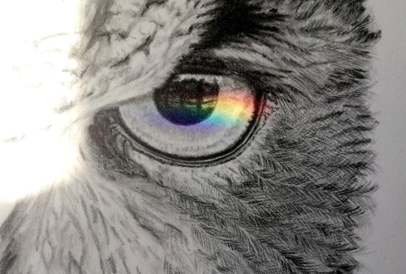
2. Project Introduction: This class is about the
techniques that are involved when going about creating the realistic look
of an animals eye. Now I'm going to be working on a picture of a jaguar's eye, but I have also provided some other reference material that you can use if you wish. Alternatively, if you'd rather, you can work from
your own images. Now you are not
solely restricted to just animals with
this technique, as it does carry over
into many other subjects. We first start with
the very basic sketch. Tone is then lightly
applied to this and this will create
our under drawing. I'll then show you that by
applying the pencils in layers, you can build very
rich dark tones as this helps to create very strong contrast within pictures. We can then move on to what is probably the most
technical part, which is applying the detail. I've chosen this project because it's not only a
great technical exercise, but it also teaches
you the benefits of studying your reference
material thoroughly. Also as well, it'd
be really nice if you were to
upload your work to the projects gallery
as it will be great to see your progress. Next time, what I'll do is
I'll go through the materials that we're going to
use during the class.
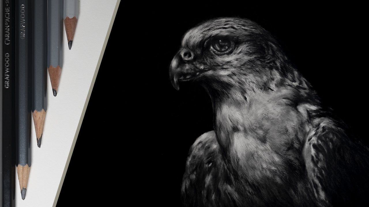
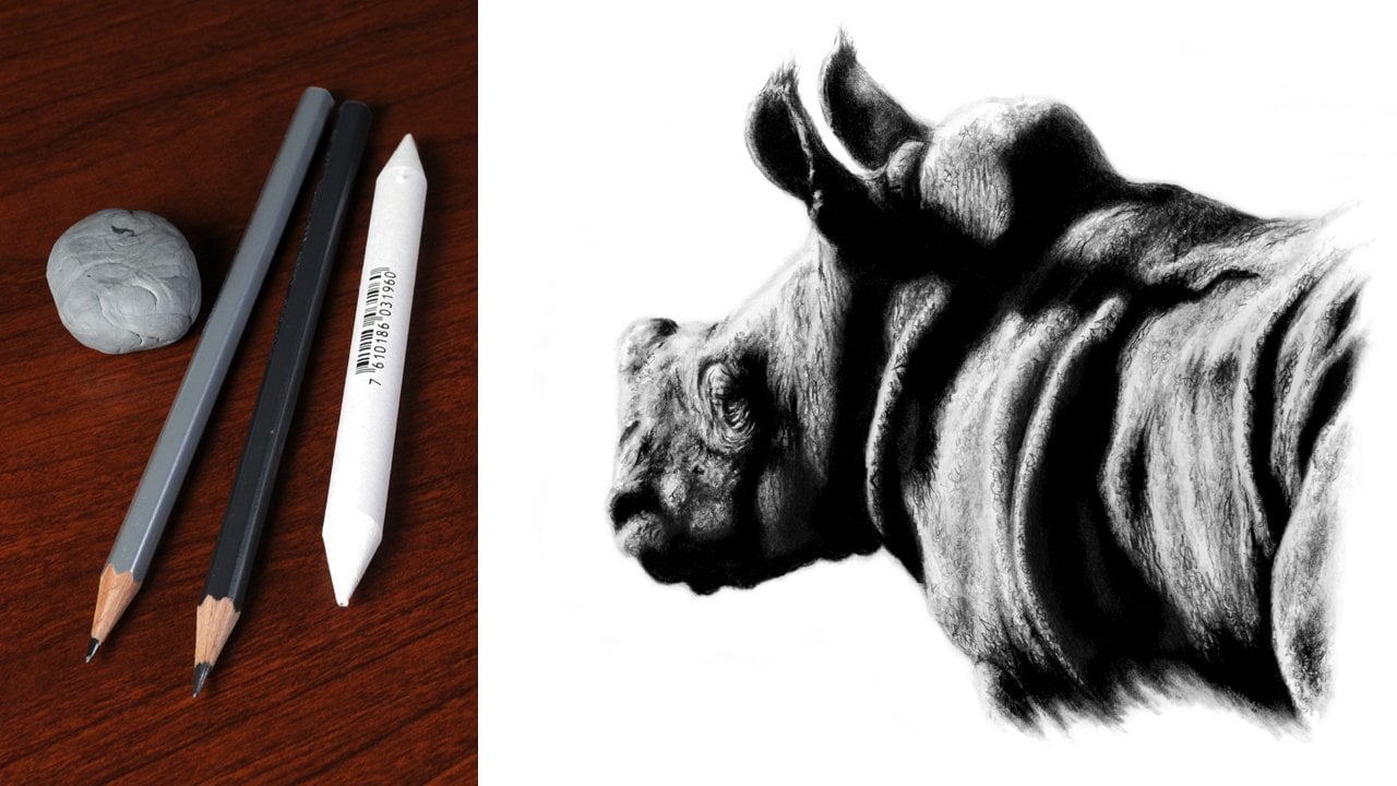
3. Materials: Let's take a moment to talk
about the art materials that we're going to
need for this project and the first place that we
need to start is the paper. When choosing a paper
you want to think of it as your foundation and the picture will
then be built on that. I'll be using some
Casper Saunders Waterford 300 gram hot press, but alternatively you
could use something else. The only thing I
would say is ideally it wants to be 100
percent cotton and have a hot press finish as this has a relatively
smooth surface to it. We next come to the range
of graphite pencils. Manufacturers make a
considerable amount of different grades, but the ones that we're going
to be using for this project or an H, a 2B, a 4B, and a 9B. It doesn't matter
what make you've got. I'm going to be using
the Caran d'Ache range of graphite pencils, but you can use
pretty much anything. Also as well in terms of grades, they don't have to be
the exact same ones as what I'm using as long as they're pretty close
to that grade. The next thing you're going
to need is an eraser, and what I would recommend
is a kneadable one for this. Kneadable eraser is absolutely brilliant for making shapes, for pulling out highlights, and basically just
drawing out tone. The ones that I
would recommend for this are either a Caran d'Ache, a Factis K20, or
a Faber-Castell. Alternatively, if you
haven't got one of those, then you can just use a piece
of Blue tack or sticky tack. For creating, shading
and blending tones you're also going to want
to have a blending stump. These do vary considerably
from one to the other, and the best advice I
can give when choosing one is that it wants to have
a velvety texture to it. I find that these
tend to work the best and blend the tones
the smoothest. The only other things
you're going to need are the reference photograph that you're going
to be working from, a piece of scrap paper, and just a normal regular
pencil sharpener. You don't need anything
too fancy for this. Once you've got your
materials together, in the first lesson we can now start to work on
our initial sketch.
4. Initial Sketch: In this lesson, I
just want to work on the basic outline for the eye. I don't want anything too
complicated at this stage, so the initial sketch is
going to be very loose. To do this, I'm also going to
use a piece of scrap paper and a blunt H pencil. Now the reason why the
pencil is used blunt is to simply reduce
the chance of damaging the surface
of the paper. This makes any alterations or changes relatively simple
to make at this stage. Also as well, it's
a good idea to hold the pencil further
away from the tip, as this produces a
much lighter touch and reduces the
amount of pressure that is naturally applied
through the pencil. The first thing
that I want to do is to create a framework. Then the shape of the eye
can be built up within this. Using the piece of scrap
paper and the H pencil, I place two marks to show
the height for the eyeball. The scrap can then
be used as a guide with the marks then being
transferred to the paper. The same process can then
be used to gauge the width. With just these four marks, we can now create the
shape of the eye. But again to do this, I'm going to need to use
my piece of scrap paper. Using the same points
on the reference that I used to create the marks, I can now lay the
piece of scrap paper between the lowest point
and for this left, and this shows me the curvature
for this part of the eye. The scrap is then placed over the corresponding
marks on the paper. Then working from the
deepest part of the curve, the line is lightly sketched in. Again when doing this, I'm using the pencil blunt, and I'm making sure to use a
minimal amount of pressure. I now repeat this
for the other side. Because the top of the
eyes in strong shadow I use the fur line is
the highest point. Also as the line curves up, it gets more abrupt
towards the top. This is not the actual
top of the eye, but just where the
shadow is cast above it, making it less visible. Again, on this side is the same. The line curves
until it eventually disappears into the
shadow area or above. That's the eye
roughly sketched in. The same method
can now be applied to the surrounding
areas as well. The piece of scrap
paper is basically used as a crude
measuring device. It's worth remembering
that this method is purely to help you
in building up the shape of the
initial drawing. Also with any picture
at this stage, you want to keep it as
simple as possible. You don't want to
add too many details as these can be added later. If too much detail
is added too soon, it will just become confusing. Before starting any picture, it's always worth studying
the reference thoroughly and deciding which
parts of the picture that you want to put in. You can see that it
only the basic amount of information is
added to the drawing because this is all that
is needed at this stage. Once this is complete, it's just a case of
looking at the reference and then deciding if any
alterations need to be made. Now, I am quite happy
with the drawing, but there are a couple
of minor alterations that I need to make. Firstly, I feel
that this part of the eye needs to be
a little rounder. To do this, I can just simply
work back over the line with the pencil creating
more of a curve. The other is to this part where the skin area surrounding
the eye meets the fur. Now the changes
that I have had to make have been relatively minor. But if you do have to do
something more drastic, then I would always
suggest using a kneadable eraser to
clean up afterwards. Some key things to remember. Firstly, study the
reference photograph thoroughly and make
the initial sketch as simple as possible. Also when sketching in
with the blunt H pencil, remember to use this lightly so as not to damage the paper. In the next lesson,
we can now start to work on applying some of
the shading to the picture. As this will really start
to give it some shape.
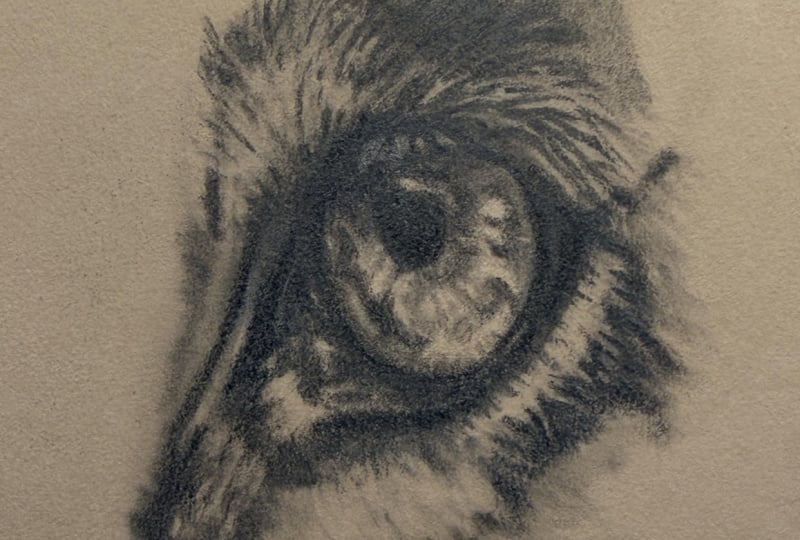
5. Shading The Underdrawing: [MUSIC] In the previous lesson, we worked on the initial sketch. With that now done, we're ready to
start to apply some shading.This will help to give the picture some
shape and form and will produce what is
a basic underdrawing. The ideal tool to do this, is the blending stump.I find the ones that work
the best tend to have a velvety texture to them. Now, when these are new, they do need to have some
graphite added to them. The best way that
I've found to do this is to either very lightly shade a bit of two or 4B pencil on a piece of scrap paper, and then work this into
the end of the blender. Or the other way if you have it, is to simply just dip it
in some graphite powder and then get rid of the excess on a piece of scrap
paper as well. The first thing we want
to add in is the pupil, as this is the main
feature of any eye. Again, study the reference to determine the shape
and position. Because you can see from
the picture that I'm doing, the pupil is not exactly round, and this is also offset
slightly to the left. As the eye has a
glassy appearance, we need to try to maintain that. What I always suggest is when using the blending stump within it is to use it lightly
and in a circular motion. This way the tone will build slowly and then you'll
be able to maintain that glassy appearance.This is
a very non-invasive way to work into the paper as the tone is only
being applied lightly. This again makes
any alterations or corrections relatively
simple to make. Some tone can now be applied to the surrounding areas of skin. One thing I would say though, is just be a little bit
careful so as not to blend out the initial
drawing too much. Also you only want to be really concentrating on the
very darkest areas. Avoid any lighter ones. Also just be a little
bit careful when working around more highlighted
areas like this one. If you're using a new blend, you may find that
occasionally you have to reload it with graphite. But over time as it
becomes more saturated, you have to do this
less and less. Now some areas and pitches
can get quite confusing, so for example like in this picture where the
fur overhangs the eye, the best thing to
do is to stick to the basic outline at this point. For darker markings
like this one, again study the reference before applying any
tone to the paper. What you want to look for is
the direction that the fur takes and then apply the
tone in the same direction. You can see here,
the fur goes in a completely different direction compared to what I was
working on just now. Even with only a basic
amount of tone applied, the picture really does
start to take shape. Once a picture is to this stage, it's then time to
go back in and add a little bit more
detail to the eye. What you want to do is to
look for the key patterns that stand out and then
just lightly put these in. The thing that you have to
be careful of is to not over-complicate this
too much at this time. After all, this is
only the underdrawing. A more detail will
be added later on. That's the under drawing done. The key things to
remember are apply the tone lightly and work
in the darkest areas first, when working on areas
such as the fur, remember to follow the
direction that it takes. In the next lesson,
we can now start to work on building our
tones further. [MUSIC]
6. Building Tone: [MUSIC] In the last lesson we
created our under drawing. Now we're ready to start to add some darker tones to that. To do this, I'm going to be
using a 2B and 4B pencil, as well as the blending stump. We want to build the
tone up in layers. Again, both of these
pencils are used blunt. The first thing I
want to do is to draw a darker line
around the eye. Plus also as well as you can
see from the photograph, the eye is not
perfectly rounded, so now is a good time to make
these minor alterations. To start with, I
use the 2B pencil and draw around the eye. This produces a more
defined line and helps to create more separation
between the two areas. The best way that
I've found to create really dark tones is to
build the tone in layers. For example, here I'm using
the 2B pencil lightly and in a circular motion to very gently apply the tone to
the surface of the paper. This will produce a
grainy appearance. The thing we want
to do next is to use the blending
stump over the top, and this will brush some of the graphite down into
the grain of the paper. There is no set number
of layers to apply, so just keep applying
layers until you've got a relatively dark even tone with no grain showing through. The same process can now
be applied to the pupil. This way of working
does take time, but it does produce
a very nice result. With the amount of
work that's being done with the 2B pencil, you should find that
you've managed to achieve a relatively dark tone. But now to darken this further, we just want to go
back in with our 4B. The 4B pencil is
applied the same way. Now this will only make a
very slight difference, so you'll probably find that you only need to apply one layer. If you find the edge of
the pupil looks too sharp, then you can go back over
it with the blender, blurring out the edge and
creating a smoother transition. The key things to remember, use the pencils lightly and
build the tone in layers. In the next lesson,
we can now start to work on some of the more
minor details. [MUSIC]
7. Adding Minor Detail: Last time, we built
up tone in some of the darker areas
of the picture. In this lesson,
with that now done, we're ready to start to work on some of the more minor details. I start by first
using the 2B pencil. As with the previous lesson, this is again used blunt and in a tight circular motion. By applying the pencil lightly to the
surface of the paper, this allows the grain of
the paper to show through and helps to produce the
effect of skin texture. For any darker areas, just simply add additional
layers of pencil over the top to darken
the tone further. The skin texture
look quite harsh at this point compared
to the photograph. But this is not a
problem as all we need to do is to just go back into the picture with the blending stump
to soften the look. By brushing the blender
over the surface lightly, this reduces the
harshness of the texture and will produce a much
more realistic effect. This gives a good base
that we can now start to build more contrast
and detail on. The 4B pencil can now be used to build more tone into
the darkest areas. Again, the pencil is still
blunt and it does only want to be used lightly
over the surface and again, more layers can be added to
build the darkest tones. The highlights in
front of the eye is just a little bit too large. I just want to work
around the edge of it carefully to make
it a bit smaller. It is always worth
remembering that the photograph is
only reference, and particularly with
things like highlights, don't be afraid to alter
them, change them, or even add extra
ones if you feel that this is going to enhance
the overall look of the finished picture. As this area is developing, I now need to make some more minor subtle adjustments to it. The best tool that
I find to do to this is the kneadable eraser. By taking the eraser and then rolling it between the
thumb and forefinger, this will produce a point. The more you do this, the longer and finer
the point will be. This can then be used
delicately to brush tone away. It will also leave a
soft edge and help to create a very smooth
transition between tones. Now, I just want to make a slight alteration to
this area below the eye. As I feel that by adding a little bit more
of a highlight, it will help to exaggerate
the shape in this area. Whenever you're
working on a picture, don't be afraid to
use a degree of artistic license in some places. You can see that
all I'm literally doing is using the point that I made on the eraser
to draw tone back out. Once you get to this stage, it's a good idea to stand back and have a look at the
picture and the reference and decide if any alterations
that you still need to make. You can then go back
into the picture with the 4B and the eraser and make any subtle changes
that need to be done. Although this is not the
main focus of the picture, it is well worth taking
the time to get it right. The key things to remember, use the grain of the paper to help create the
effect of texture, use the blending stump
to add subtlety, and the kneadable eraser to draw out tone and
add highlights. In the next lesson, we
can now start to work on the main detail in the
actual eye itself.
8. Adding Main Detail: [MUSIC] In the last lesson,
we worked on adding some detail to the skin
area surrounding the eye. This time we're now
ready to start to add the main details to
the actual eye itself. I'm going to grab my 2B pencil
and we can get started. I'm going to start by
adding some tone to these two darkest areas first. The 2B pencil is applied lightly and using
a circular motion. This will prevent damaging
the surface of the paper. I always find that when working in an area such as the eye, it's important to do
this as this will help to maintain that
glassy appearance. The blending stump is used
to smooth out the tone by brushing some of it down
into the grain of the paper. Now, as with previous lessons, you may find that it's
necessary to use a number of layers before you achieve
the desired effect. Remember to constantly refer
back to the reference and pay close attention to the patterns that their
within these areas. For example here, I'm
looking how this pattern comes down and then connects
through to this lower area. Again, I apply some 2B pencil before then just softening
the look with the blender. With each layer that
is applied to the eye, this increases the
level of contrast. As such, this helps to give
the eye more shape and form. I just want to make a slight
alteration to this part. Because of how the
tone has been applied, this is relatively simple
to do with the eraser. The 2B is then used to just
re-establish the darker tone. This part does have
quite a hard edge to it. I'm just going to use
the blending stump in the lower area just to
pull some tone down. This will also help to add more shape and curvature
to this part of the eye. I find it's best to
work over the eye, progressively adding more
detail with each step. Up until now, everything has been done using blunt pencils. The main reason for
this is obviously to avoid damaging the
surface of the paper. But now we're getting to
the point where we need to start to add in some of
those finer details. To do this, I need to
use my 2B pencil still, but now I need to just
sharpen it a little bit. To do this, what I'm going to do is just use a regular pencil sharpener and just put a little bit
more of a point on them. Now, up to this point, we've tended to concentrate on working on the whole
area of the eye. But now we're getting down
to those finer details. I find it personally
it's a good idea to just concentrate and focus on one area at a time
until this is completed. The first place I want to concentrate on is
this part just here. Again, I only want to
use the pencil lightly replicating the patterns that I can see in the
reference photograph. You can also see I'm holding the pencil much nearer the tip as this gives greater control over it when adding
finer details. When working in
these smaller areas, I'm now generally constantly
switching between the sharpened 2B pencil
if I'm adding detail, the blunt 4B pencil if I need to re-establish
any darker tones, the blending stump if I need to soften the look of anything, as well as a knit-able
eraser if I need to draw out any tone or re-establish
any highlighted areas. You might remember earlier
that I mentioned that this part has a slightly
harder edge to it. What I'm going to do now
is go back into it with the sharpened 2B pencil to just make this a little
bit more prominent. With this done, I can then go back to working on
the rest of the eye. Now this is a slow process, but the last thing you
want to do is to rush it. Also remember,
constantly refer back to the reference photograph before taking the pencil to the paper. The next thing to address is the main highlight in the pupil, because I feel the one in
the reference photograph is a little bit small. I've left plenty of
room in the picture, so as I can create
something which I think is going to be
a little bit better. The blender is used
to apply tone to the inside edge of
the highlight with more time being applied
to the left-hand side as I want this to
be a darker area. This will also help to create more curvature to the
actual highlight itself. The 4B pencil is then used carefully to just close the
highlight down a little bit, making it just a
little bit narrower. Soften the edge, and
then just clean out the lightest part of the
highlight with the eraser. I can then just finish
by tidying up around the edge with the
sharp 2B pencil. The key things to
remember this time, add tone to the
darkest areas first. Look for patterns within the eye and only use a sharp pencil
for the finest detail. [MUSIC] In the next lesson, we can now start to add
those finishing touches.
9. Finishing Touches: Last time we worked
on the finer details, but now we have those done. We're already to start to put
in those finishing touches. Now the composition at the moment is a
little bit lacking. What we need to do is to add some of the surrounding
area as this will really make
the eyes stand out. As usual, the first
thing to do is to study the reference
photograph closely. Now, what you're looking for is the different
changes in directions as well as the different
types of fur patterns that they're all
within the picture. I'll then take my 4B pencil and I can then loosely
start to draw this in. When working on an area
of fur, for example, this marking under the eye, first pick a point that
you want to start from. Then, after you sketch a
little bit of the fur in, move on to another area where the fur is in a
different direction. Then it's just a simple case
of filling in the gaps. This way you'll get
a smooth transition between the different
directions that the fur takes. You can also see that
I'm working away from the darkest
parts of the marking, and the reason for
this is because the start of the stroke
is always quite thick, but as you get to the end of it, it becomes finer and fainter as the pressure is
removed from the pencil. This also produces a much
more natural appearance. Another thing to
consider is also the length of fur that
you're trying to replicate. This will vary
considerably throughout the picture between
longer and shorter fur. For example, here I'm
using a fairly long stroke as opposed to this part where I'm using a
much shorter one. This purely depends on the area of the picture
that I'm working on. The effect that I want to create for the surrounding areas of fur is a looser,
less detailed, more sketchy appearance, as I still want
the main focus of the picture to be the
actual eye itself. Now I'm still using my
pencil blunt for this, but there's absolutely no
reason why for an area like this you couldn't use
a sharp one if you wished. The only thing that
I would say though, particularly with softer
grades of pencils, try to avoid going
too sharp with them because the tip of the pencil
could always break off. We now come to this area of fur. Now this is much thicker and has a much coarser
texture to it. Also as well it projects out
over the top of the eye. To really exaggerate this, we want to make sure to have a nice strong contrast and then this will
help to create more depth between
these two areas. The first thing I
want to do is to just draw in this
up a darker edge, just below the overhanging far. This is just loosely sketched
in using the 4B pencil. This can be refined later
as this area develops. It's also worth remembering that when working on a part of
the picture like this, you can use a fair degree
of artistic license. I now want to put in
these random bits of fur. My first sketch
around them before then blocking in the
surrounding dark tone. The blender is then used to
soften the ends of the fur, as this will help to
give it more shape. Now this does tend to soften the surrounding tone as well. This just needs to be
re-established with the 4B pencil. The kneaded eraser is then
used to add highlights, and the sharp 2B pencil
to just tidy up, giving a cleaner, sharper edge. The fur above the eye
can look quite daunting. We're trying to simplify
this as much as possible and only work in
small areas at a time. First, using the
sharp 2B pencil, draw around the
darker shadow areas, and then fill these in
with the blunt 4B as we want in this area to be
quite sharp and detailed. The sharp 2B can also
be used to apply subtle shadows between the
individual strands of fur. Whereas the blender would be just a little bit too
thick to do this. I'm really happy with
how this part of the picture is looking and I can now move on
to the upper area. Again, I draw in
the prominent parts first before applying
my darker tones. Remember if you need
to highlight any areas or just soften the
look to add subtlety, you can just simply do this
with a kneadable eraser. Just a couple more things to do. The first of these, I just want to apply
a bit of 9B pencil to the very darkest
areas of the picture. Now, because of
the depth of tone that we've already
built into this, the difference it makes
is only very minimal, but it does make a
slight difference. The last thing is
to just clean up around the picture
with the eraser. That's it, the picture
is all finished. The key things to
remember when drawing fur are to take account of the
direction, the length, and also the patterns
that there are within it. In conclusion, I
always think that the eyes are the most
important part of any picture, as it's the ideal
place to capture the individual's character
and personality, so it's well worth taking
the time to get them right. I hope you've enjoyed this and obviously learned
from it as well. Please remember to
upload your work to the project's gallery as it
will be really nice to see. Thank you for watching. Hopefully I'll see
you in another class.
 Jamie Boots, Wildlife Artist, Teacher