Transcripts
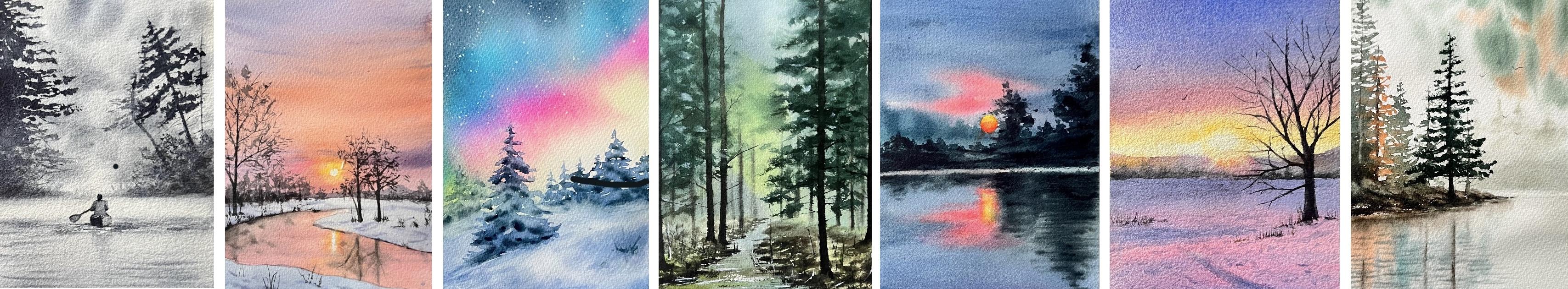
1. Introduction: Hello, I am Zeha as a watercolor
artist and instructor. I had the pleasure of teaching and holding
workshops across different countries
and connecting with citizens both in
person and online. And landscape
painting has always had a special place in
my artistic journey. I refine my own approach through years of
practice, travel, and observation of
nature variations, and landscapes are one of the richest and most expressive
fields in watercolor. It allows artists
to explore light, atmosphere, texture,
and emotion. All within a single scene. And unlike other mediums, watercolor breaths
with the landscape, it is a dance between the
control and spontaneity. And in this class, we will be painting seven beautiful
landscape scenes, each one inspired by nature, different seasons and unique
light and color modes. Think of this class as a
creative watercolor challenge. Every day you watch
one lesson and complete a full painting
from start to finish. We will start with
the materials. And then in our first painting, we will paint a foggy lake
using just one color. You will learn how to create
atmospheric depth and misty effect using
only volume and tone. In our second painting, we will focus on warm gradients
in the sky and mastering right on white technique for reflections and
subtle transition. Next, we will move on
to Northern lights. You will learn how to
gently move pigment on wet paper to create
flowing luminous skies, plus how to paint
snow covered trees. In the fourth painting, we will dive into a cold forest. You will explore
warm and cool tones to create depth and atmosphere. Our fish lessons features
a dramatic night scene. You will experiment with
bold color combinations. The sixth painting,
we will paint a winter landscape in
soft pink and purple. You will learn how to
build gentle gradients, create sunlight, and paint delicate shadows
and tree branches. Finally, in the seventh scene, we will create misty
autumn landscape using simplified shapes, and you will learn how to create atmospheric perspective and
paint pine trees with yeast. You will also learn how to use variet of color palette tests, how to reflect different
seasonal atmosphere, and how to choose
the right techniques to match each scene. Class is perfect if you want to improve your
watercolor skills, build a daily painting habit, or simply enjoy the calm
of painting nature. Whether you are a beginner
or have some experience, you will find this
class in spraying, relaxing and full
of hassle tips. So grab your brushes and let's
start painting together.
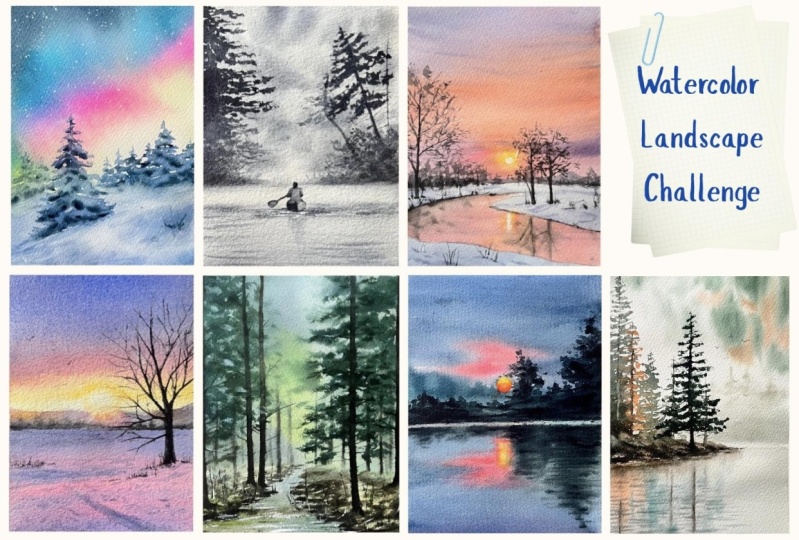
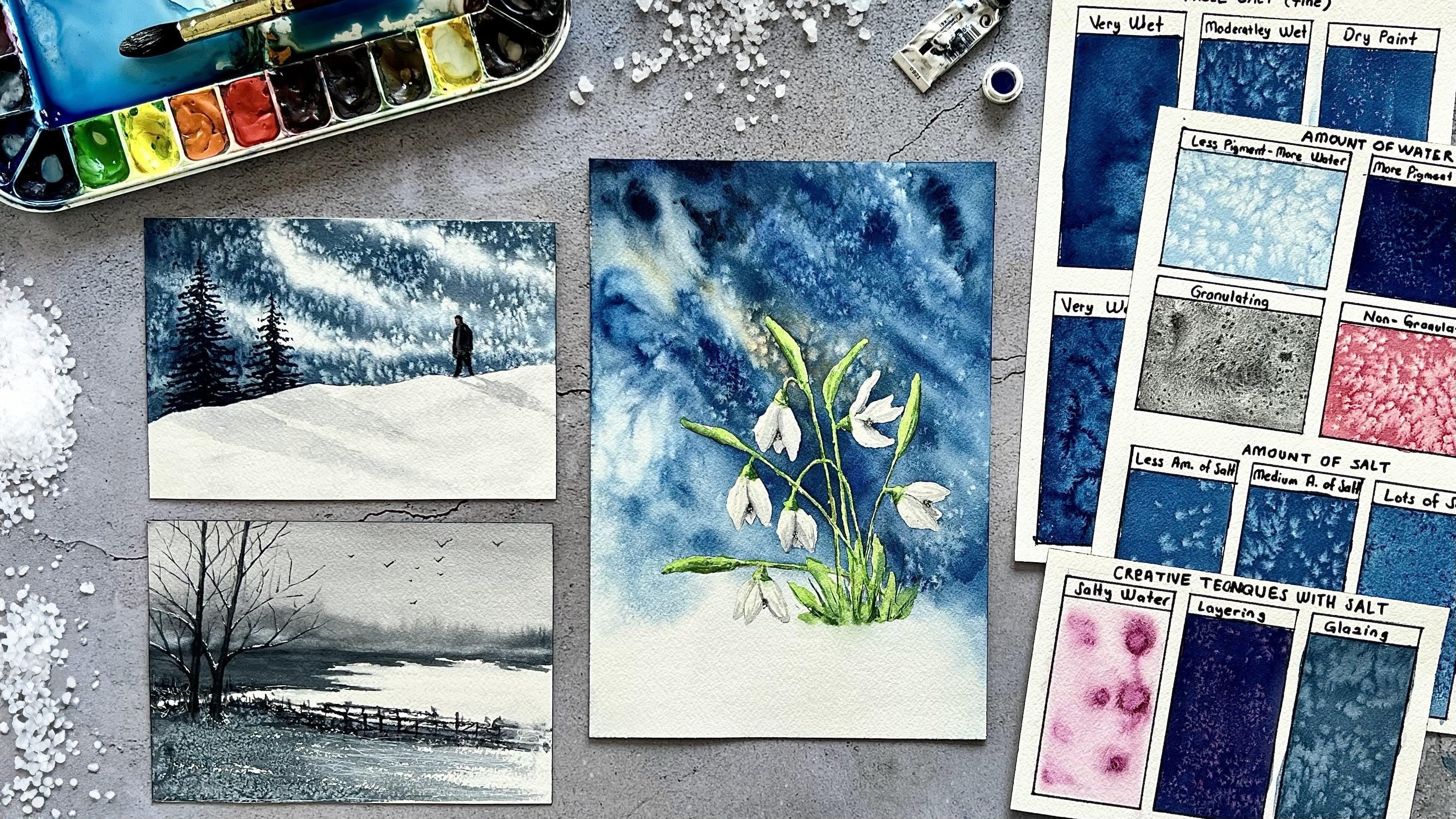
2. Class Orientation: Welcome, and thank you
for joining this class. I am happy to have you here. And in this class, we will be painting seven
different landscapes, each designed to help you
explore new techniques, color combinations, and
seasonal atmospheres. Think of it, this is a
watercolor challenge. Each day you will complete a painting and share
it as a project. And by committing
to paint daily, you will build a steady habit, improve your brush control, understand watercolor
more deeply and feel your confidence
grow with ever painting. In your projects, I will be looking at how
effectively you use watercolor techniques we
learned and how you capture the feeling of the scene through light, color,
and composition. And I will be offering detailed
feedback on each piece you share to help you grow
and refine your skills. I was editing the sects,
reference photos, and color combinations
we will be using to the project
section of the class. So you can refer back
to them anytime. Now, let's talk
about the materials. You will need watercolor
paper, preferably 100% cotton. And these are the
color we will use. Feel free to use similar
colors from your palette. As for brushes, we will
use one big mop brush, one natural bristles
round brush. And one in front brush, you will also need
a cup of water, spray bottle, napkins, a
pencil, and an eraser. By the end of this class, you will have seven
beautiful paintings and a deeper understanding of
watercolor landscapes. And whether you are a beginner
or experienced artist, this challenge will push your creativity and
improve your skills. And I'm so excited
to have you join me. Let's start painting.
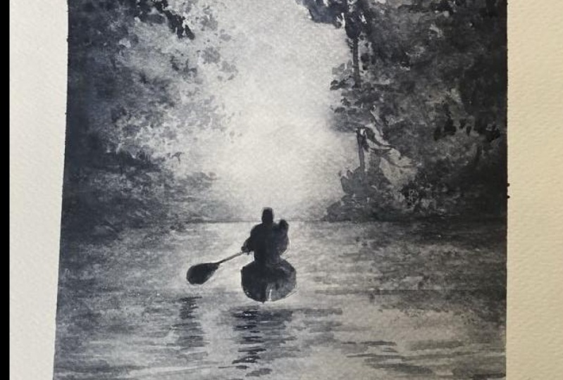
3. Day 1 - Misty Serenity: Hello, on. Today, we will be painting this beautiful
misty landscape. To start, we need to wet
the paper generously. And for that, we will
be using a big brush. And since this is a
soft atmospheric scene, adding plenty of water will help to create
that misty effect. And for this painting, we will be using just one color, and I'm using neutral tint, but you can also use any dark blue or gray
shade that you prefer. Make sure there are no puddles on the surface of the paper. If needed, you can remove
excess water like this. As for color, I am
using neutral tint, which is a bluish gray shade. And if you prefer, you can also use paints gray or indigo. And I will remove any
water one more time. Alright, now I am going
to paint the first layer, the soft glow in the
background, just like this. I want to make it a
little bit darker. And here, I will separate the
pigments like this. Okay. And for this
one, for this part, we are going to use same color, but only up part of the
horizon near the part. And a little bit here. Now, we will create mist effect by lifting the
pigments like this. Moving on the bottom part, we will just add
the color directly. And you can see I'm using
my brush horizontally. Like, I came to this part. And we need to leave this space white because
there's a mist in there, and we will use the whiteness
of the paper for this. For the top part, I am going to add a little bit
more shadow for the clouds. As we paint the lower
part of the painting, the top of the paper has dried slightly, reducing its moisture. This is actually great for us because when adding
shadows to cloths, we don't want them to
separate too much. The shadows should
have soft edge, but also stay in place
where we apply the paint. The paper moisture
level is crucial here. If it's too wet, the paint
will disperse quickly. That is why we need to keep an eye on the paper's dampness when we continue painting.
A little bit here. And here for this part. You can see this part right
and it has a hard edge, and we need to
soften the edge of this part with the
damp and clean brush. To add more depth
to our background, we need to work on
shading a bit more. For this, we will
take some more paint, but as you will notice, we are not using too much water. The paint should have
a creamy consistency, meaning it should be rich in
pigment with minimal water. And we will continue adding darker tones to
the lower parts of the painted arrals and my
paper start to dry slightly. But since I want to work on
the background a little more, I will lightly spray
clean water over it. If your paper has dried as well, you can use a spray bottle
to reintroduce moisture. And we will keep working with the same creamy
paint consistency. To create a misty effect in the background and
enhance the dp, we need to use tunnel
variation effectively. And this is why we are layering darker tones gradually
to build up the effect. And from the bottom part, I wet it again. I will create tiny lines
on the paper like here. And on the part also Tin and long
line on the bottom. I will take more big mans. If you want, you can use
a fine brush on the sp. It will be more easier for you. Now we are moving on
foreground elements, adding details like
bushes and small plants. And at this stage, the paper should
be slightly damp, not too wet, but not
completely dry either. We will be working just
about the horizon line, and we are adding some bushes
on the right side here. As you can see, we are using
a highly pigmented mixture, working with a rich, intense paint consistency, and we are adding
small tiny plants. And on the left side also. And be sure to keep these details above
the horizon line and avoid letting the paint separate downwards onto the lower
part of the paper. Me natural tint. We will work with the darker
tones. Little bit here. And here. The paper is
still wet in this part. You can see the paint
spreads a little bit, and we are separating the bristles of the
brush like that. It will create some
foliage on this side. I think it needs more darker stones and here. Okay. I think for the wet
part, this is enough. I just only want the
smooth this part. And I will use lifting
technique for that part. I just wet my brush and clean I'm taking the excessive paint. I'm just rubbing the paper, removing the
pigments from there. And after every brush it took, you need to clean
your brush and take the excessive water with napkin. Okay. Now, I will let it dry and we will add the
foreground elements later. Now that our paper
is completely dry, we can move on to
foreground elements. We will start with the trees. So let's prepare
and paint mixture. And the consistency should
be similar to milk, not too watery and
not too thick. It should have a
smooth folw texture. We will start on
the left side of the painting and imagining
a tree trunk in this area. However, we won't be painting the trunk itself,
just the leaves. And instead of drawing, we will use our brush
to create the foliage. And at this stage,
a fine tip brush will be more effective. Think of the leaves as the
similar dose of the pine tree, and using just a
tip of the brush, we will create
small scared dots, leaving some gaps in between. And I change my brush, and this one has
softer bristles. It is a wafer brush, and it is better suited for painting three foliage
because it is flexible, bristless create more
natural organic effect. I'm going to a little more
paint while it's stil wet. And for the top part and the middle part
needs to be darker. And when we go to downwards, the color tone will be light. When I come to the here, I'm thinning the eggs, adding small leaves here, and I will leave some white
spaces between wounded part. Now I'm going to add more water. And now the
consistency is like a T. I separate the bristles and here I just change the color tone with the water. Now I just add more
water on the bottom. And I think that's enough. Only just I want to add
branches also here. Now we can move on this part. And on this part, we can
see the three trunks and I will paint them like this. And I will soften the
bottom part like this. And this one also Again, I soften the bottom part. I want to start with
this tree because it is far away from us and we
will use lighter tone on them. I just separate the
bristles and train to create natural organic
looks on the leaves. Now we can move on
the other tree. And for this tree,
we will start by adding small dots on the top, very small and tiny dots. And as we move downwards, the branches and the leaves will become denser and thicker. Atate using a natural
brises brush is important. By slightly separating
the brises, we can create a more
realistic leaf texture. And this tree is near to us. Because of this, the color tone should be darker
compared to other tree. And if you more here, A little bit here. Small dots. And now we will add small branches. Oh. And I want to add one tree
trunk here like this. And small branches on it. I'm using only tip of my brush. We use darker tones for the
upper part of the tree. Now as we move downward, we will gradually
lighten the color. Just like with the
tree on the left, we will work with
lighter gray tones. And to achieve this, we will add a bit more
water to our paint mixture. Once again, we will
create texture by separating the
brites of our brush. A little bit here, small dots. And on the bottom.
And once again, we will soften the bottom
part with the damp brush. I will start with
the bot and now we will paint this part first. And this part needs
to be more lighter. Yeah, I think the tone
difference is good. And now we can move on the man. For his head, I'm going
to use darker tone, same colour, neutral tin. Let me go downwards. I will just move the
big mass downwards. We need to add more
duct tones on the top. And I take the pigments directly
from palette I's thick. And I just add shadow here, and here under the arm and here. Now we will work on dry paper, and we will use dry
brush technique. We will just add a reflection
using the same mixture, but in lighter tones
under the bod, it will create texture
and more depth, and I think we need to add shadow of him in lighter tones, and we need to
soften the edge of that shadow with the damp brush. And I think that's enough. We created beautiful landscape and see you in the next lesson.
4. Day 2 - Golden Dusk: Hello, everyone. Today,
we are going to paint a beautiful winter
sunset with the river. And I put small dots
of mussen fluid here for the sun.
And let's start. First of all, we need to wet the upper part of the horizon
line with the clean water. Do not press too much
on the muskin polute. Mine is already dry. But still, we need
to be careful. We will start painting
around the sun. And for this, we are using Hansow applying it in
a circular motions. And around the masking fluid, we applied Hanseello and now we will add little
bit brilliant orange to the same mixture and continue the painting with
the same circular strokes. Now we will add vermilion, a warm red colour around
a brilliant orange. No way. This part
is already dry. I need to wet it again. Okay. After vermilion, I will add a little
bit permanent rose. Me permanent rose. And at this your paint mixture should be creamy very thick. And you can see I use
directly from the palette and more permanent rose
and little bit cobalt to make the
purple colour. Right. This side also. After that, in this part, I'm going to use
brilliant orange in the spar and more orange here. I mix the colors. In that part, I
will add a little bit permanent rose
and orange together. After that, I will add a little bit cobalt
pu to the mixture here and more cobalt and rose and more cobalt
a little bit more. Two and here this part and I am going to blend
them to each other. Tops. Let's fix this part. Now, while our paper
is settle wet, we will add clots
near to the sun. For the cloths I'll
mix cobalblue with Aizarin I need a bit
lavender too here. In this part, your paper
should be wet enough. If it is dried already, you can dry with the blow dryer and then you can wet with clean water again. After that, you can
make your gloves. You can see this
part is dry and I will soften the
edge now like this. When painting the clots, the paper should
be slightly damp, not too wet and not
completely dry either. And at the same time,
our paint mixture should have a thick
creamy consistency. And if the paint is too watery, it will push away the
first layer of color when applied and creating
unwanted white spots. That is why we are using a more concentrated
mixture for the clots. And here we will use more cobalt blue,
a little bit here. I think that's enough
for the class. Now we can add the small
trees in the background. The lower part of my
paper is completely dry, so I can start
painting right away. And if your paper is still damp, you can use a hair dryer to
speed up the drying process. We will add indigo to
the same paint mixture. And now the paint mixture
should be like tea. It shouldn't be very thick. And I separate the bristles, creating small dots for the
trees on the background. And I think that's enough, and now we can move on to the
bottom part to the river. For the river first,
we need to do that part with the
clean water carefully. We need to stay inside of the pencil skage because the other areas
will be the snow. We don't want to
paint, go there. Now we will actually repeat the same process we
use for the sky. We will start painting from
the sun's reflections. Right where the
sunlight reflects, we are using Hansa yellow again. And if you notice, I left the brightest part
completely white and try to keep that light and gradually add
yellow around it. And I think we need to soften the bottom
part a little bit. And then we will move
on the orange color. Brilliant orange. Like this and like this. After orange, brilliant orange, I will just add opera pink. But if you don't
have opera pink, you can use a rose color too. I'll just mix with
the brilliant orange. Okay. That's it. Now we can move on
to other colors. Orange. And permanent rose. I'll just add and here
permanent rose again. Oh And in this part, I'll mix permanent rolls with indigo more permanent rolls. And in that part,
I'm going to use Brilliant orange
again. Here this part. For the vase, I'll just mix indigo and rough
color here. The part. You can see my brush
is very thin and I'm just adding and the
tone of the color should be very light also in this part also a
little bit more here. We had left a white area
for the sun's reflections, but since we work with
a white technique, the yellow paint spread
into that space. So now we will lift some of the paint to bring
back that brightness. And for this, we are using
a clean and damp brush and gently rubbing over the area will help
the lift paint, and this is called the
lifting technique. And to remove even more pigmt, we can also press a
tissue onto that surface. And now we can move
on to snowy area. And for that, I am
just mixing indigo, a little bit fit Blu we will prepare a
light bluish purple color, and a little bit red. And the paint consistency
should be like T, and we will start
from the right side. You can see I'm working
with very light color, and we will just
cover this part. And I'll take a little
bit purplish color. And here. This is our base color. Now I will mix more
pigmented paint mixture for that alto rose rose color, and ultramarine sorry,
this is pico blue. Rose and ultramarine. And a little bit cobalt. You can see it's the
texture like cream. Now I want to add texture, more ultramarine here and the paper is sitting wet either way near the edge of the river. This part and I am separating
the bristles, I just touch. And this part already, and we need to wet it
again with clean water, and now we can continue to work. Actually, these are
our shadows of snow. We are using the same color. And on the age of the river, we are adding little
bit dark tones, and now I'm using
sepia for that. And, bit here and on this side. I think this part is very thick. We need to soften the
eggs a little bit. Now we can move on
the foreground. We will use the
same color mixture, and now we are creating
a base for the snow. Be careful to eggs on the river, and we will follow
the same steps. After that, we will
add the shadows. Yeah, that's it.
Now we can move on the sun let's remove it. Okay. After removing
the masking food, we need to soften the eggs of the sun a
little bit up too much. With the clean and then
brush. Okay. That's it. Now let's move on the
background trees again. For that, I'll just add
sepia to colored mixture. We previously painted a small
mountain in the background, and now we will add some
trees in front of it. And these trees will still
remain in the background. So we are just creating
the impression of trees rather than painting
them with too much detail. If we add too much detail here, it could create
visual clutter when we paint the foreground
trees later. And as we get closer to the sun, we will make the tree
slightly smaller to maintain the balance and ensure they
don't block the sunlight. And I just add sepia
to the same mixture. I think that's enough
for the background. Now let's move on this big tree. For that, I'll just mix sepia. I'll change my brush because
this has more fine tip. Sepia indigo here or
paint gray you can use. A little bit red. And now we will start
with the tree trunk. First, we draw a thin
line from bottom upward, and then we gradually then
this line to form tree trunk. And as the tree grows taller, the tree trunk should
become thinner. And also the branches
should be very thin. First, we will paint all the branches before
edding the leaves. And now we can move on the leaves to create a
natural leaf texture. We press the bristles
of our brush against the palette to slide
the separate them. And using the same
paint mixture, we tap the brush tip
onto the paper to form the foliage
and don't forget to change the direction of your
brush strokes because this prevents repetitive patterns and helps achieve a
more natural look. Now we can move on the
other trees on the right. Again, we will start
with the tree trunk, and these trees will be
smaller and shorter. And another tree branch here. And for the leaves,
we are separating the bristles in the same way. And please do not cover the sun when you are
placing your leaves. And we are combining these
two tree leaves together. We are just eating the
leaves of other tree. And then we will draw
the tree trunk here. Now we can move on the
foliage on the snow. We are using the same color. We will just create tiny plants, bushes on the snow and the
trees and on this tree, also. And on the edge of the river, a little bit, not too much. And on the background, and on the right
side, small bushes. And the bushes in the foreground
will be more defined, and we are painting thin tall tree branches
emerging from the snow. And these branches
will be placed over the shadowed s we
previously painted. And by making the foreground
bushes more distinct, we will also enhance the sense
of depth in our painting. A little bit here, taller branches on the
river. I think that's it. Now we are moving on to the
final stage of our painting, the reflection of the
trees and bushes. And before we start, we will vet the river with
the clean water. And this is important
because reflections should have soft edges
and smooth transitions. We don't want any hard
lines in the reflections, so we are working on damp paper. And the paint mixtures
should be very thick. Dash with lots of pigments. We are using sepia
and paint gray, same tones on the trees. Since the river has dripples, we add horizontal strokes to suggest the
movement of the water. And we also reflect the foliage
on the water, branches. And leaves and more water small
dots for the leaves. Now we can move on
to tree on the left. I revet that area again. First, we paint
the reflections of the bushes along the river side. And then we add the
trees reflections with thin delicate strokes
for the smaller bushes. Using a concentrated mix, we tap small dots on the rivers surface to suggest
the reflected lay. If your paper is too wet, the paint will
separate too much, so it is best to work
on slightly damp paper. Now I am, again, painting the reflections
on the tree trunk on the right side because the paint separate
a bit on this part. And tree trunk again and the leaves and branches. We finish this beautiful
winter sunset painting and see you in the next lesson.
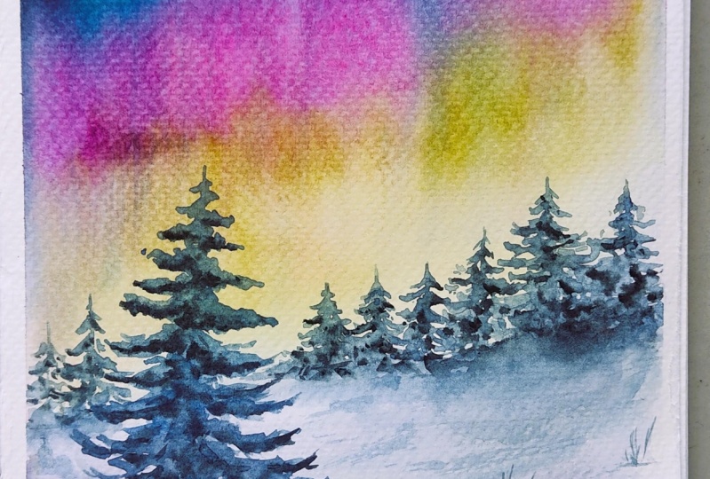
5. Day 3 - Aurora Dreams: Hello, everyone.
In today's lesson, we are going to paint a winter scene with
the Northern lights. You can see I draw
a basic sketch for this horizon line
and three trunks. And first, we need to wet the
paper with the clean water. I think we can this part also because it will be
easier to control the paints. And the paper should
be wet enough. For colors, we will we will start with
indigo or pains gray. I'll choose pains gray I'm
starting from the left part. More colors like this. And then I'm moving
on to cause color. You can see the color
through blue here. In this part, I think it needs more to
cause in this part. Okay. Then quibble I want to add a oper pink. It's a perfect color for
the Northern lights. If you don't have opera pink, a You can use any pink colour, like rose. Okay, now I will let them to move and just
sprint a little bit. And wet on wet technique
is perfect for capturing the fluid movement
of the northern lights. And the key is to work quickly
and avoid overbrushing, allowing the pig mass to flow and create soft
and diffuse edge. And to enhance the bending, we need to gently
tip the board in different directions and letting the colors merge seamsly and
create a natural gradient. And we need to wet
this part again. Now we will add a
greenish color. You can see it is a warm
and light green tone. And if your paper
is start to dry, you can spray a little
bit water, clean water, and we need to take
the excessive pigments and more green on the bottom and more opera I think it needs to be
more dark on the top. And we are taking the
excessive pigments. Again, we are mowing
the pigments. You can see I'm
adding more to cost. And now again and you can see I'm taking
the excessive bigns with the napkin and then moving downwards, here, here, here. Yes. I think that's good. Now we will paint
the bottom part. For the bottom part.
I will just wet. First, like that. After wetting the paper, we are going to mix cobalt blue, cobalt, and rose,
little using crimson, more cobalt here, this
part on this part. These are like shadows
on the snow area. And more in that part, here. I mix copacul with the pens
gray on the bottom and in the spar Now, I will just take excessivens
in the part like that. Finally, I will let
them to move upwards. And this is the final
shape of the Suki. Now we will let this to dry and then we will
paint our trees on it. I just spray a little bit
water here. That's it. My paper is dry completely, and now we can
move on the trees. For the trees, first
of all, let's clean. For the trees, I will use cobalt blue and idle with paints gray. Yeah, that's it. This
is for the tree. Remember we just draw the
tree trunk and now we will paint the leaves
with this paint mixture. I want it idle
with lavender too. If you don't have lavender, it is not mandatory. Ex. I'll change in brush with this. Let's start with this tree. I always start with
the tree trunk. Now, we will just add small and thin
leaves on the top, and they will get bigger and bigger move downwards. You can see my paint
mixture is already watery. I move quickly on the
bottom, like this. Okay. And mark the tree is still wet. I'll take indigo directly
indigo and paint gray. Adding small bots under the tree leaves
here a little bit. The paint mixture thick, it's like cream only
under the leaves. And a little bit more. Now we can move on the
other trees on the back. We will repeat the same steps. I'll take cobalt, go
little bit longer too, and I'll draw the
lines for the trunk. I follow the same steps. And I'm mowing the
other tree immediately. I'm not waiting.
And the other one and small one here. And another big one here. You can see my list getting
bigger and bigger on the bottom and the
small one here. Now, we will add dactns now on the bottom
of some leaves. Only a wet area. If your trees start to dry, you can spray water
a little bit. I'll take more paint gray. And on this tree also. In this way, we created
snowy looks on the trees. That's it and for that, I just take excessive paint
and I will add one more here. And this small one here. Now, I will add pins gray. Also I want to soften
the edge of this part. Just add directly pins gray. And I think we need to
soften this part also. A little bit, not too much. For the softening, I'm
using a wet brush. Near to the right, there's
not too much water on my brush. Okay. And now we can move
on the foreground. I want to add more
texture on the stree. I'll just use the
color on my palette, light cobalt blue, and I will add more paints
gray on the bottom. Here, for the foreground, I'll take the cobalt bolo and
create some snowy texture. We need to follow the shape of the stray and little bit here. A little bit here
under the tree. And I want it a little
bit more foliage. Okay. I think that's
good foreground. Now I want to add a little
bit satire on the sky. And for this, I will use Guach. If you want, you
can use a japan, just paint sky on it. I'll take the Guaj on my hand. After that, I'll take
a little bit water, mixing it, and we
will just splash. Now, a little bit more. And I want to draw some
of them big stars. Small dots. I think
that's enough. Seeing the next lesson.
6. Day 4 - River in the Woodland: Hello, everyone.
In today's lesson, we will paint a forest
landscape filled with the pine trees and a
cold misty atmosphere. And before we begin, we need to wet the entire
paper with clean water, and this is important
because we will using the wet on wet technique for the background and
the sky parts. Now let's start with
the background first. For the background,
we are going to use cool greenish bluish color. For example, for the sky part, I'm going to mix indigo. So paints gray and a little bit two cars and ridian
In this part, more ridian I think we need. A little bit amber, amber. And for here, I'm going
to use this green. I'll just add little
bit protamber. And here, I'll just mix than and bro tamber in this part. I will just add
little bit to cost. And in this part, I'm going to add a little
bit natural tint. Now, we need to
soften the edge of the sky part like that. And I change my brush. This is a small one. Now we are going to add my
paper start to dry here, and I just want to spray a
little bit, not too much. Now, we are going to
add more dark tones. I'll just mix viridian, B tamber, and nitro
tint and pins grey. Ops too much, I think. Here, little bit. Here. Here, I will be background leaves. When painting the
background trees, we need to create a
soft and misty effect. Distance objects don't
appear sharp and their forms fade slightly due
to atmospheric perspective. To achieve this, we are
working on wet paper, allowing the eggs
to blend naturally. And here, and instead of defining individual
leaves and branches, we are only suggesting their presence with
gentle bright to rocks. The colors should be cool and muted to enhance the
sense of distance. And by keeping the background
subtle and diffuse, we are creating
depth in painting, making the foreground elements
tend or more vividly. You can see the
paper start to dry. There is less moist now and you can see mybras strokes
are more visible. You should manage
your wetness level of your paper in this part. This part dried already. I just soften. And for the background
trees tree trunks, I'll took Betamber,
mix it with pin gray, and starting from here, I'm just adding Here, one more. And one more here. This
part dry completely. I just want to soften
the eggs. No way. Okay. And let's check this
part. This part also dry. Okay, let's left
this part to dry first and move on
the river part. For the river, we
will start with the inscriclar here here like that. A little bit green
in some parts. More tamber here. And more green colour
here in this part. But cas color in this part, we need to soften the edge of the river to make it blurry. And we will cover here with the more warmer green
tones first like that. I'll just add a little bit
Huns law to the screen. And now we will add our darker toons sepia here. M sepia here. And on the eighth of river And this part also on the back, I will add a little
bit more paints gray to the sepia color to make the color more in
cool ton, little bit. And more dark tones. We need to take the pigment
directly from the tubes. No water. A little bit here. Now we will left part to dry and now we can
move on this part. For this part, you will
use the same color again here little little bit that warm green from
the warm green. This one Okay. We need to soften the
eggs, again, like that. Okay. And it's time
to add dark colors. I'll talk sepia, and I'll just separate
the restless little bit. Just add texture. And on the edge of river,
you need to darken. Now we can add the
background trees.For that, we need to wet the paper
again with clean water. Your water should be
clean in this part. And here Okay. We bet the paper. Now we need to wait almost ten second for the paper to absorb the
water a little bit. And for the background trees, I'll take sepia and a little bit pins
gray Let's check. And this one the paper
is still too wet, and I think we can start
with the background trees. And when painting
background trees always work on a wet paper. This ensures that the
trees have soft edge and seamless transition to create
natural atmospheric effect. At the same time,
your paint mixture should be thick and creamy, similar to the
consistency of butter. This allows the colour
to separate smoothly while maintaining the depth and richness in the background. The name of this
technique is dry on wet. It means your brush
should be almost dry, almost no water on the pigments, and your paper should be
wet, moist, actually. And another one here. Um, And in this way, we can get soft edge trees, and at the same time, it will not separate
easily on the wet paper. You can see this part is all ready to the right,
not just wet. And for this part
also, one more here. And one more I want to add here. I think that's good for the three trunks
on the background. Now I want a little bit leaves we mix, we need to mix rten
with the bird. Amber. An brown is good for this. Here. You can see the paint
separate immediately. It means we need to prepare more fiigmented
mixture like that. You can see this
part right already, and I'm not going there. I'm just working on wet paper. And here a little bit. Okay. Now, we need to soften this edge with the damp brush. Okay. Now let's move on to the three
trunks on the foreground. For that, I'm mixing sepia
and a little bit pens gray. Here, the first one. They are going to be
very dark in tone. Now, let's move on the spot. Me sepia and paints gray here. We need to prepare
more paint mixture. And the other one is here. Before moving on that, we need to add some branches
on the foreground trees. And when painting three
branches in watercolor, it is important to use fui confident price drugs to create natural organic lines. And we are starting with a fine brush and a highly
pigmented mixture. Your paint should be
slightly thicker than usual to ensure crips defined edge and apply light
pressure at the beginning of each branch and gradually lift your brush to create
the branch effect, making the branches
look more realistic. And for more natural appearance, variate the thickness
of the branches and allow some of
them to overlap. And by layering and adjusting
the color intensity, you can create depth and
dimension in your trees. And I want to paint
this tree also, the street trunk, sepia, and indigo a little bit. And starting from the
bottom towards the up. While we are painting the
branches, paper completely. This is good for us
because this tree is the nearest to us and it
needs to be more visible. I should have heard aids more branches for that one also. Now it's time to paint leaves. I'll take more Vitan
and but umber. I'll separate the sss. Little bit in pink gray here. A And for this tree, you are going to same Tex charge.
7. Day 5 - Blue dusk: Hello, everyone. Today we will painting the reflection
of a crimson sun and nighttime trees on a
deep blue and navy sky mirrored in a lake. I draw the pencil sketch. It's a basic horizon line, and some lines for the trees
and bushes on the back. And we will start
with the background, and then we will move
on the lake part. For the background, first, we will need to
wet the paper with the clean water like this. I'm careful on the age. Okay. Okay. Now we will start with the sky. For the sky, I'll
take Ultramarine like that a little bit indigo and perent rolls. I will just mix them
to each other here. And we need to leave
some space for the pink cloth on
the back like this. And for the bottom part, we will just cover
part like this. Okay. And here also. And for this part,
I'll take vermilion, a warm red color, and then permanent rolls. They need to be clear
permanent rolls and vermilion. If you have, you can add
little bit opera pink to. Here in the part. And here. More opera pink and vermilion. Here. And for this color, I'll take cobalt
Bulo indigo again. And here we just cover
some parts like this. Okay. Now, the
bottom part start to dry and we will add
the background trees. And for that, I will add then green to same color, viridian, and to cos and permanent red Otan It's a bit indigo. And we are starting
from the left part. And since the trees in the
background are very far away, their eggs should
be soft and blued. That is why attate your paper should still be slightly damp. If it is dry, you can lightly mist it with the clean
water using a spray bottle. At the same time, your
paint mixture should be thick because once
you shape the trees, you don't want the paint to separate too much on the paper. A thicker mixture helps to keep the form while still
activating a soft effect. Little bitier Okay. And now we will move on
the leg part for that. First, we need to wet the paper with clean water like this. And on the horizon
line, be careful. Do not wet paint. Like this. Okay. I'll take this here. Okay. Actually, now we
will mirror this sky. And for the bottom part, I'll take cobalt glu and
rose or cobalt and rose and here cobalt indigo on the spart or cobalt for the reflection of sunlight, we will first use slow here and we need to take excessive paint. And now we will use
the same color here. Vermillion and rose here. You can see I'm making horizontal line vermilion again and opera pink here. Okay, like that. And for this part, we will add a per
pink like this. Okay. Now we will
move on the sp. Again, we will just
cover this part with the same color. Like this. And for that part,
under the horizon line, we will use the our pinkish
color here like that. Okay. And here a little bit. Okay. Now we can move on the trees on the
foreground here. My paper is dry already. And for the color, I'll take a pink gray Pins grey, you can use indigo
or you can mix. If you don't have pins gray, you can mix ultramarine and sepia together. And you can get a dark color. Mm. At this stage, we are painting the
trees that appear in front of the distance
bushes and woods. To create depth and
sense of perspective, we are using a darker, more saturated mix of paint, and these trees are
closer to the river, so they should appear more defined than the soft
shades in the background. Yet we are still avoiding
too much detail. In watercolor, it's important to balance suggestion with form, letting contrast and edge
control tell the story. And by using sharper edges
and stronger tones here, we draw the eye forward and build a layered
atmospheric landscape. And we are not going
into too much detail. The goal is to suggest
their presence, not to describe every branch. And because sometimes
in watercolor, less really is more letting the viewers
eyes fill in the rest. And one more tree here. Again, we separate the brists if you use natural Brists brush, you can get more natural
look on the leaves. And on the top of the
tree, more leaves. I'll add more dark tones. Some parts like that. And here, and we need to lift some parts to create light on the ground here. Like that. And here
a little bit more. Okay. Now we can move
on the reflection part. And my papers start to dry and we need to with this part
a little bit, not too much. Okay. I'll just with this part. Now, let's start to paint the reflections of the
trees. We just finished. And since the reflections are naturally softer and
a bit distorted, we are using gentle
brisutrok and working on slightly damp paper to
help the edge stay soft. The shapes are more abstract, almost like a horizontal
smudge in the water, and it is important not
to over define them. Just hinting at the
forms is enough. Reflection should feel like a whisper of the original trees, not a perfect mirror. You can see my paint
mixture is really thick because the paper is wet. And here not too much.
8. Day 6 - Rose Frost: Hello, everyone. Today
we will be painting a beautiful winter
landscape where sunlight filters through the mountains
and falls onto the snow. And this scene will have
a soft color palette, dominated by pink
and purple tones. And before we begin, we
will wet the area above the horizon line with clean water to ensure
smooth colored transitions. And now we need to
change our brush. We are moving on
to smaller brush, and this is a natural
versus brush. We will start with the lemon
yellow for the sunlight. And above the horizon line, we are adding the lemon yellow. This is a cold yellow color, and it is very light in tone. Now we will move on
the warm yellow color, and I am using
handselo for that. And you can see my paint
mixture consistency with the thick because I don't want the pigment
separate easily. And we need to separate
the pigments here. You can see I create a
circle in this part. It is a sum. After the yellow, I'm
going to use war million, a warm red color. I'm mixing it with
the Hans here. And I'm separating the pigments inside of the yellow color. After the vermilion,
we will going to use a pinkish color. My color is permanent rose. You can use similar colors. You can see I'm mixing it
with the orange color. After a permanent rose, we will use purple color. And for that, I'm mixing permanent rose with
the cobalt blue. And now again, I'm just cleaning my brush and blending
them to each other. After that, I will add more more cobalt and our people will be
more bluish in tone. I just want to add a
little bit more purple. Sorry pink hair, pink colour. And now I'm just mix
them to each other. Okay. For the sky
part, that's it. Now, we will let
this part to dry, and then we will add
the mountain area. And for the bottom part, we will paint directly
on a dry paper. I am going to use opera pink and permanent
rose to get there. Look at that color.
It's so beautiful. And in this part, we will change the color tone to
purple again in that part. And more more. We need to add more blue. And I'm just adding a little bit lavender too, and here also, little bit purple here. And now we will let
our paper to dry, and then we will continue
with the mountains. Now my paper is
dried completely, and you can use a blow dryer to dry the paper to
make it quicker. And we will start with the
mountains on the background. And for this, we will use the same colour tone and this mountain is
far away from us, and it should be light in tone. And near to the sun, we will use warm colors. I'm just mixing
permantros and vermilion. And we need to follow the circular
movements around the sun. And we also lift
the paint a little bit to soften the edge of
the mountain that area. And I'm softening again with
the clean and damp brush. And for the right side, we will use a little
bit darker tones, and I'm just mixing indigo
with the permanros. We get a dark purple tones here. A little bit here. And again, we need to soften. And for the bottom part, we need to darken the tones. And for this, we will use
paints gray with the sepia. We will make a
bullish brown tone, and we are just adding the
under the montone area. They will look like small
buhons on the background. And now we need to
soften the edge of the mountain Rs that
are closer to the sun. And this is because the
parts illuminated by sunlight appear softer
and lighter to the eye. And to achieve this effect, we will use the
lifting technique, and we are using synthetic brush for this
because it is easier. It has harder brises
a little bit here. And now we will add small bushes again because a paper
dry little bit, and I want to make it
a little bit visible. A little bit here, small dots. And here, that's it. For the for grant, first, we need to draw our tree, and then we will paint
the shadows on the snow. For the tree, I need sepia paints gray and rose and a little bit more
paints gray and loss. Okay. You can see the consistence of the paint mixture like milk, and we are starting from the
bottom, bottom of the tree. And now I'm using
natural versus rush. And it is really easier to
paint trees because the versus very soft then easily. At this stage,
actually, you are free. You can paint wherever you want. You can place your branches
wherever you want. After painting the tree trunk, we need just to paint
the three branches. They should be thin
and in broken lines. And in winter landscapes, trees without leaves adapt
and character to the scene. And these tree standing
strong against the cold and wind showing how nature
adapts to the seasons. H. And when painting the trees, it is important to keep the
branches looking natural. They should start tick near to the trunk and become thinner
as they extend outward. And no branch in nature
is perfectly symmetrical. Some reach upwards while
others band or twist. And by varying the direction, we can create a more
organic and realistic look. And instead of
making hush lines, I
9. Day 7 - Whisper of Autumn: Hello, Evan. In this lesson, we are going to
paint Autumk with the orange trees and
mist on the background. And let's start with
the background first. For this, we need
to wet the paper, only the upper part
of the horizon line. We write the paper. And now
we will create Mr. Effect. For that, I will start with the visible trees
on the back here. I'll take RdianGreen
and Burk umber. It's a brown color, dark brown. While my paper is wet, I will just wet one more time before starting here. In this part, I will just add only lines and here, I will just spray water. And I want to add Bosina for the autumn
trees on the background. Bocena here a little bit. Here. I'll just mix with
orange orange colors. Okay. Now we will
create mist effect. And for that for that, I'll just clean
my brush and take excessive water like this upper I need to be softened
on the eggs. And this one also we. Here I'm using a moist brush for this dumped he Mm I want more dark colors. I mixing indigo and
I will just add a little bit inside of
the green area here. It's part also maybe a little bit here. Okay. And her. And now you can see we
create miss texture here. Now I will wet this
part one more time. Only the clean area white part. And here we will
paint pine trees. But we will soften the edges of the tree like in the
mist, more timber. Yeah Let's check.
Starting from here. You can see my paper
is moist, not too wet. And mist in watercolor
is all about subtle transitions
and delicate layers. And to achieve this effect, we need to keep our
paint mixture very diluted and work on damp paper. This allows the colors
to blend smoothly, creating the illusion of mist. We need to avoid from hard eggs and let the shapes
sold into the background. When we move here, I'll just add more
cobalt in this part. Okay. And now you will
just soften the eggs. And one more fish. We finished the background, and now we can move on the
leg part, the water part. For this, again, we
need the first wet the paper on the bottom
part on this part. And for this part, we will just choose the same
color on our palette here. Now we use the same color here and a little bit
greenish color here. We are just mirroring
these trees. And in this part, we will use orange and green on the trees. And I think we need just use Brcina little bit orange. I use Berlim orange
in the spark here. Okay. I think for
George, that's enough. Now we can move on the
green color again. Gridian Viridian and paints gray. I think, yeah, that's nice here. More paint gray and
little bit amber here. These are the reflections
of the trees on the water and they need to
be in a soft edge. And you can see I am
painting in vertical lines. Now I will add Berg Amber
directly under this area. A little sepia too. Now, I take excessive
water from my brush and I just separating the
pigment downwards because these are reflections. Like this. Now we will let this part dry and we
can move on the trees. For the trees, I will start
with the tree trunk first. I'll took sepia and
little bit pine gray. I'll start with the
background tree here. I'll just draw the
tree trunk first. And for the leaves, I'll just mix ridden
and bur tamber, a little bit paint gray
and more bor tamber. And here, starting from here. I think this is too thick. I add more water and
starting from the top. I'm just making zig zag moves. Oops. I'll take more pigments
on the bottom. Now I will add the
orange color tree. Now let's first paint
the tree trunk here. For the three leaves,
I will add orange and Barcena Anita bit starting from here. Here it will wards You can see I mix in
the sp to each other. No, I want to add other trees. M and when painting pine trees in watercolor, it is important to vary
your bright strokes. You should use the tip of your brush to create
light airy branches at the top and press a little more as you move downwards
for denser foliage. And you should let the
some colors be lend naturally on the paper to
create a more organic look. And since these trees
are in the foreground, their edge should be sharper and more defined compared to
the misty background. And this contrast
between the surf and sharp edge enhance the depth and atmosphere of the painting. Dian, again, dian, pins gray and tuber tamber. Okay. Now, let's
start with this. I'm just separating my
bristles like that. A more texture here. And one more small try
we will add later. And for the bottom,
we will just soften the eggs with the nap
with the moist brush, and soften the eggs, and it will be te also. And we will add
Batumber on the bottom. And then we will add rosena And we will add sepia
directly, creating texture. And I'm mixing the
sepia with this colour, the orange color, and we will use it on the bottom
part of the ground. And we are needing more texture. Okay. And I'll just add
more colors here. And I want to add, we'll let this dry. And I want to add small dots here. Like that. Okay. One more tree on the back. Small details of it. Now, let's move on this part. First, I will just spray
water here, and after that, I will just wet the
bottom part like this. And we will reflect the
trees and the leaves. For the trees, we will
sepia tree trunk, for the tree trunk,
and a little bit deco. And here, more Tums and here and one more here, more thinner. And for this one also, and the other one here, you can see, it's my paper
is little wet, not too much. And this separate a lot and I
just want it one more time. Okay. Now let's create the reflection. I just add the indigo
to my paint picture. Now we just need to create
some waste on the river. And more here. I'll take the excessive paint and
moving the right side. And now we just add
this party dry. We just add this just rye
brush. I'll take sepia. You can see it's very
pigmented, cream texture here. A little bit paints gray too. Here. This part. And we are adding
final touches on the ground part with the
dry brush technique, and our paint mixture at
dictate should be very thick and in dark tone also to
enhance the foreground. And here. I think we finish this and see
you in the next painting.
10. Conclusion: Congratulations.
You have made it to the end of this watercolor
landscape challenge, and I couldn't be
more proud of you. Throughout this class, we explored seven different scenes, each with its own unique mood, season and color harmony. We painted Mr. Lake, snowy sunset, cold forest, rose frost, glowing
Northern lights, sun at dusk and
warm autumn wheels. And with each project, you practice different
watercolor techniques like wet on wet lifting. Dry on moist, creating soft age, reflections and dry brush. More than just learning
the techniques, you have built a hat of
painting consistently, and that is such a
powerful step for you. Daily practice, even
in small doses, help your creativity grow and your skills
develop naturally. Thank you so much for joining
me in this challenge. I hope it has inspired
you to keep painting, keep exploring and most importantly, enjoying
the process. And if you have any question
or need clarification, feel free to post them
on the discussion page. I'm more than happy to help. And if you enjoy this class, I would love to hear your
feedback in a review. Your feedback is essential for me to improve my future classes. If you haven't already, don't forget to upload your projects in the project
section of the class. I truly love seeing
what you have created, and I will be leaving
feedback there. See you in the next class and until an keep creating with joy.
 Züleyha Aydoğdu, Artist, Instructor