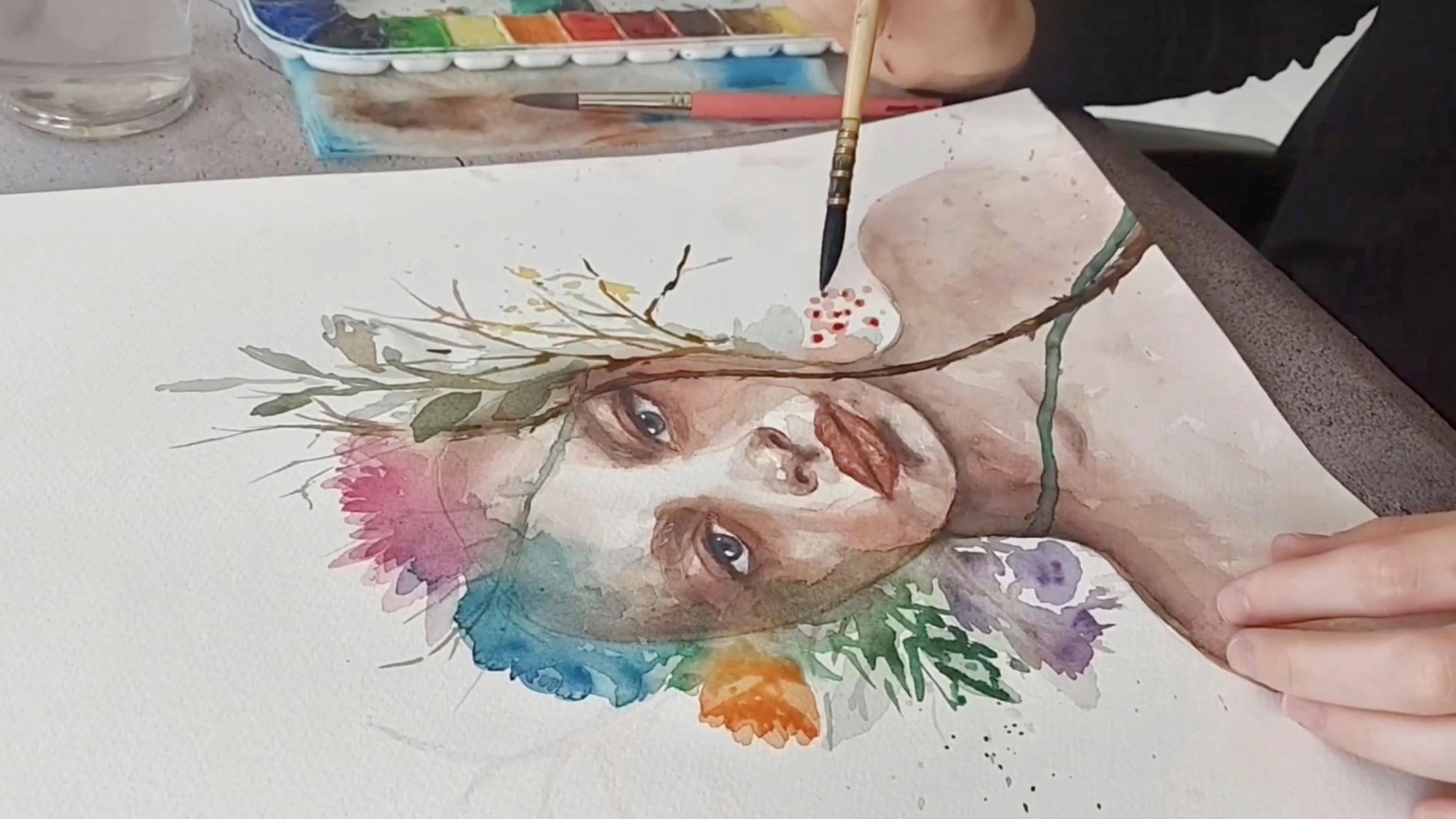
Transcripts
1. Welcome to My Class!: Painting watercolor
landscape is like a dance between the
artist and nature. With each stroke and color, bringing the landscape to live in a way that is
uniquely. It's on. Hello, this is lay her, I'm a watercolor
artist and instructor. As a professional artist, I paint landscapes
and portraits, and I'm a member of
international watercolor society or the years I have had workshop
in different countries. And I learn and teach watercolor
in person and online. In today's class, you
will learn how to observe your surroundings and how to turn it into landscape
painting by integrating the current season using
your own reference photo. Either Kara, the art materials, how to mix color
palette this for each season in the
context of color theory. And how to simplify
the reference photo by deriving a basic
parts of sketch. The first section of the class
is Mr. autumn landscape. You will learn to
use the right colors to create a foggy atmosphere. I will teach you to paint organic subjects like
trees, leaves, and reverse. For other intersection
of the class, I will paint a winter landscape. You will learn how
to paint snow, creating a snowball effect, and how to paint
different types of three. For the third section
of the class, I will paint a
supreme plastic case that is full of vibrant
colors and texture. You will learn to beat a
colorful variegated sky, create, lose white flowers, and paint reflection on water. Lastly, the fourth
section of the class is summer landscapes that
celebrates, right? Shoes on which colors you will learn to take
a closest chi, create realistic tree leaves. And I will teach you to use different modern techniques for painting grass and
how to achieve that. I'm brightness run
painting everywhere. This class is for those
who want to improve themselves in watercolor
landscape painting. And I will teach you found
the mountains of each season. At the end of this class, you will be able to pay any landscapes you
want in any season. I'm so excited because
we will embark on a journey through a
dictionary and a vacant, our inner creativity. Let's get started.
2. Class Overview & Art Materials: I'm glad to see you
join the class. Your project for this glove is a paint watercolor
landscapes. Your choice, using the
knowledge you have learned, you can take your picture
of your current view and interpret the current
season if you wish. You can also use the
reference photo of the class. You can also share your
exercise per season, such as 3s four summers, or variegated skies
for separate season. The philosophy
behind watercolor is rooted in deep appreciation for the natural world is the
technique is used to capture the beryllium and
the fragility of the light, shadow and colors
found in landscapes. I think this makes watercolor perfect medium to
paint landscapes. To paint the four
seasons landscapes. First, we need watercolor paper, preferably the 100% cotton. For the painting. I chose cobalt blue, gray, alizarin crimson,
and Prussian blue, salvia versed in subgrade Hansa, yellow, orange, region
law under colors. If you have similar colors, they will work to as the garage. I will lose one natural
basis, round brush. Once synthetic round brush and one flat brush and
one large brush. We also need a cup of food, water, napkins,
pencils, and erasers. And I will also upload the reference photo
underpasses case of landscapes to the
resources section of the class to make
it easier for you. And I will also upload the
color palette of atheism. In this way, you can
check each color mixes I use to embark on an
exciting journey of discovery and
learning that will challenge your mind and
unleash your full potential
3. Pencil Sketch: In this lesson, you will
learn how to simplify the reference photo and draw
a basic passes the case. As you can see,
there are a lot of trees and plants in
the reference photo. And you will see many details in the reference photo
you have chosen. However, we will not draw
every detail in the photo. You should concentrate
on big picture, which is the essence
of the skin. First, I will draw a straight line through
the center of the paper. This will be the horizontal
line of the painting. Ryan Garcia kitchen. Consider the overall composition of the reference photo and think about how you want to
translate it into a sketch. These includes the placement of the horizontal line and the arrangement of
the foreground, middle ground
background elements and the overall
balance of the image. The foreground office
again is the array of a that appears nearest to you. In this reference photo, the foreground is the
widening of the river and the grass and trees which
are the nearest to us. And the middle ground is
the part of this again, which hits between the
foreground and background. And the background
is the part of the skin for this
from the weaver. In this reference photo, the background is the sky and
the trees at the very back. Now I am driving the trees. I will just draw the basic lines for the
trunks and branches. To simplify a reference
photo for your painting, you can follow these steps. The first one is analyzing
the composition. You should identifying
the big main elements in the reference photo, such as skies, mountains,
trees, or reverse. And you should determine
the focal point or array of interests that you want to
emphasize on your painting. The second one is eliminating
the unnecessary elements. You should remove or simplify any distracting or less important elements
from the composition. This could include
bullying small trees or bushes or any other elements that might clutter the painting. And the top one is focusing
on the main elements. You should emphasize
the main elements in your painting by giving them
more detail on attention. You can simplify this
smaller elements and reduce the level of details as you
move towards the background. And the fourth one is the
reducing the color palette that you can limit the number of colors you will
use in your painting. You can choose a
limited palette that complements the utmost
far you want to convey. This will help create a more harmonious,
unsimplified book. And remember, simplification
is a subjective process. You can adapt these
steps based on your personal artistic style,
preferences, experiment, practice, and trust your
artistic intent and sinks to create a simplified and visually pleasing
classic cave paintings. While driving in New
should leave your hand free and will not
hold the pen tightly. You should don't
draw straight lines. That I should be broken lines and multiple lines
in the sketch parts. I just draw the
horizontal lines, reverse. Trees and branches. We will do everything as the watercolor and prepare your sketch before you
start to painting. In the next lesson, we will start to paint
autumn landscapes
4. Autumn: Color Palette: It is easy to recognize
the colors of autumn, shades of yellow, orange, red, brown, green,
and blue bluish gray. Sky. I will use bindings
gray in light tones. I will dilute the
finest Gray more. I'm adding lots of water. I will use this color on
the background and river. And for the dark shades, I will do just fine
this gray again. But at this time there will
be more pigment in my brush. I will use this color on the background and the
reflections on the river. And again for the dark Chase, I will use plaintiffs gray, but at this time I
will add little bit sepia to my paint mixture. In this way, I will
get a grayish color. For the trees. I will use different
shades of brown and the first one is burnt umber, and the second shade is sepia. I will use this color
on the dark areas. And then their color
is raw sienna. I will use this
color on the ground and on the background. Background trees. And other color is a hunt, say a law, a warm yellow. I will use this
color on the ground and on the background, trees. On the phone layer. Another color is
transparent, orange. Again, I will use this
on the background race, or their color is bursting. I'll use this color
on the trees, on the background trees. And for the following nice, I want to mix an
unsaturated tone to you on the green parts. For this, I am using yellow, green, and I'm adding
a little bit sepia. I will use these colors on the ground and on the
background trees. The colors of autumn
landscapes will be these colors and
they are shades. Let's start to learn more
about autumn lasts the caves. In the next lesson.
5. Autumn: Atmosphere & Sky: In the ultimate CISM, the words takes on a
unique atmosphere. And in this lesson, we will use different
watercolor techniques to paint a cool, foggy
autumn landscape. I'm bringing that out must
refer to our painting. Firstly, I wet my paper using clean water and a large brush. After the paper
absorb some water, I will wet it again because
I will use the wet-on-wet technique to paint the
sky and trees behind. Let's attack from the sky. For this guy, I will use
the pioneers gray color. When I imagined an
autumn landscape and the weather is always
Misty and slightly cool. This grayish, cool, bluish color will
give us that feeling. I want my color to be more
intense at the aids to face. As it gets to closer
to the middle. It's the same time because I
want a lighter color, right? The sky meets the river. I paint from top to bottom. You can also create
a fog effect by removing the paint on the bottom with a
clean, damp brush. Now let's start painting
the background. Why the paper is certain
that I am using now, wet on wet technique. And one will locate
the foci, landscape. We see trees in the
distance with a pale color. I'm loathed. Because of tastes. I won't use the
colors too bright as a tourist in backgrounds
are also covered in. For now, I'm using a
warm yellow color. It is hansa yellow. It is very important that our paper is still
damp at this stage. If our paper has started to dry, we can not get soft. And below the image. If your paper has
started to dry, you can completely
dry your paper with the help of a blow dryer
and then wet it again. We take clean water and
proceeded this stage. The second color for the background is
transparent orange. Because since the orange and blue are
complimentary colors, they will create a
good color match. No, I just want a
little bit person to the background and just try
to create some three inmates. And as you can see, my paper is too dry. I am trying the balloon to buy anyway, this tree will be
white and I need to clean the blue paint
on it with a clean brush. If you, if you want, you can use a napkin to
remove the pigments. The first layer
is completely dry and now I will paint
the second layer. First of all, I wet the top of my paper with a clean water. I want to make this guy
a little bit darker because it will create
an atmospheric effect. I paint the H using
natural tint. It is a little bit darker
from the ***** gray. I will add the little
green, cool green. And one way to get there. And I want to add sepia. Also Painting in watercolor is all about creating a sense
of atmosphere and mood. It will look like folk is
coming through the trees. And I will add that to the fog. By making is more darker. The colors I will
add to the bottom of background will form
my background trees. So I want to create an
image of autumn trees. Because of that, I will use burnt sienna and
orange together. Just try to create 3 min. Now, I will use this gray to
make the sky more darker. My brush groves. It's coming from up to
down slowly and smoothly. I will also be some screen
for more nature lobe. And I want to add
more brushes and the backgrounds looks tool yellow and I want to add green. I will mix my green
white person. This green is very
saturated color and I want to mix
this with the person. In this way it will
be unsaturated. More natural. My paper is starting to dry. I will not paint
this part anymore. My paper is still wet and I want to clean the white three. We took the name brush. And I want to create white trees on the background
using clean brush. And I will remove
the peak months. After every rational strokes, I will clean my brush. We tend to have kickin. My paper is completely dry. Now. I will wet my paper with a clean water and we will
pay background trees. I want to add some
small green trains to the background. Green colors. I will use reaching
green and gray. And a little bit first. For the background trees, I will use minus gray
and green mixture. And the background trees
should be softer aids. But at the same time, the pain shouldn't
separate too much on the paper for this unit to
pay attention to two things. First, all we need to wait for paper or to absorb the
work toward a ladle. It should be damped. Not too much, right? If we start painting
trees directly, the paint will spread
uncontrollably on the paper. Secondly, where
really the water and loss of pigment in
our brush campaign, both soft and visible
background trace. Now I will use my rigger brush and do not forget to change the color tone you
will use on the trees. I will also paint some
trees in blue tones, some pains in brown tones. As I get to the middle part, I increase the water on my brush so that the color
should be more lighter. I think this is enough. And we calculated
the background. In the next lesson, we'll paint where you are
6. Autumn: River: In this lesson, I will
paint a CTL and calm river. First of all, I wet the
bottom of the paper. We take clean water. Please make sure that the
water does not get to the top. I want to paint the ray. We're a very light
shade of gray. To get this color,
I will use pioneers caret with loss of water. And I will add a little
bit of alizarin, crimson. Red. Here is the tip for you. If you want to get
cool gray color, you can easily mix
with Alizarin crimson, cobalt blue, and a little
bit of births and or CPR. Let's do the reflections. So why the river Park is
still done for reflections, Ivo mix sepia and punish gray to get a brown
niche, cool tone. I'm careful not to
paint this part as it will be a reflection
of our white tree. You should take lots of
paint to your brush. That should be less water. I will use a flat
brush for reflections. But you can also
use a round brush if you don't have
any flood brush. For the reflections first, I paint the edge of the river and run the paint
down with my brush. Now, I will derive
my paper completely. None of you will make
the second layer. Let's continue making
the second player for during infections on river. Now, I wet the paper
with clean water. I will use some gray and I will add in
a little bit person. In the same way. First, I will paint the edge
of the river with my paint. And then I will
paint the banks of the river vertical, downwards. It is important
that the length of the reflections differ
from each other. For a realistic image. On the right side, I will paint some horizontal brush strokes If your papers started to dry, you can wet it again with the clean water or
you can spray putting Walter hubs and you can work more on
your reflections. Since we are looking at the
river from the right side. On the right size should be shorter compared
to the left side. Now, I will use lifting
technique on the reflections. First, I clean my
brush completely and I will screw up the
paint vertically to create some blighted RAS on the reflections are
very thin lines. We finished the river. In this lesson, you'll
learn how to paint a calm river and how to paint
reflection on the river
7. Autumn: Trees & Natural Textures: In this lesson, we will learn
how to paint ground trees, and especially how to paint
a tree trunk and branches. Let's start making the
ground part first. Now, I'm going to wet the
ground with clean water. Be careful of the river, do not let the
river underground. I will use different colors. First, I will use Hansel yellow. You can use any warm
yellow you have. And now I will make cirrhosis
and now with the yellow and will not paint all the
parts, leave some whitespace. Now, I will add
some little bursts. And now for the green tones, I will make my cobalt window
and Hansa yellow little bit. And I will add a
little bit green, little bit burnt sienna. Why my paper is still damp. I will supply clean water
on the park. I painted. In this way, we will get them more natural
and textured ground. Now it is time to dry our paper, and then we will make
the second layer. Oh, paper is completely dry. Now, I will use dry
on wet technique. In this way, we will create
texture on the ground. First, I will use green
and mixing it with Burson. Now, you look at the view. Leaves and stones in
distance appear smaller, ambulatory and ramping
landscape ground. Try to paint distance grant with less detail so you can create, adapt in the ground. Now, I will use burnt sienna and mixing
it with wholesale low. And I will create some
really nice texture. Since the part closer
to us is more inclined. I also make my brush
strokes incline. As you can see, I paint the foreground more
textured and darker. And my brush strokes
is always incline. On the backside of the ground, I paint a horizontal brush the
trunks and lighter colors. In this phase, we will
create that in our painting. You can use these techniques in any landscapes to create
depth in your painting. Now let's learn how to paint
a tree trunk and branches To paint a tree trunk of V3, neat and imaginary light source. I imagined the light
hitting from the left side. And the light facing side of the trunk should be
lighter in tone. Here this part. Now I will paint the tree trunk in
lighter brownish color. I use sepia and
nursing for this. You can use cool and a warm
brown tones to get there. Now I add some verse in. And now I should be a loss
of water in your brush. It shouldn't be a dry quickly. Now, I will use sepia and paint the edge of the trunk
on the right side. Because if there are, these are shut-out
RAR and the paper is still wet and pigments will separate inside
of the trunk. Now I'm adding more
sepia to the right side. And I want to make some
thin lines on the trunk. It creates the
texture of the trunk. Forward your
branches, I will use fine tip brush because it
should be thinner on the aids. And your hands move
freely on the paper. Will not tighten. Brush too much, leave your hand free and be
careful not to paint it. Flood. Do you have some moon
with two branches? Branches should be look
like like flat line. It should look
like broken lines. As you can see, there
are different size and and their connection to the tree trunk should
be more smooth, smooth, lighter and lighter. So you can get natural
tree branches. Now let's paint the
trees in the landscape. I will start with the
brown trace first. I use sepia and burnt sienna. I will follow the same
steps in this dream. First, I will paint
the first layer. This is my base color. I'm using well soft
water on the first day or the right side of the three should be darker as the light comes
from the middle. For this, I lift the
paint on the left edge of the tree a little
bit, a clean brush. Just start grabbing it pain
and try it there two more. Enlightened the debt. It's time to add branches. I will use CPFR guess. I add little bit pioneers gray to make it
more cooler color This theory is
more far away from us and it should be
more lighter in tone. I will use more
water, less beef man. Now, I'm adding the
darker tones on the shaded RIR using sepia. Only the right edge of the tree. And now I'm separating the pigment inside of
the tree a little bit. You also have to
white which traits? If you are, which trees
are not white enough? You can use white watercolor
or acrylic or Japan. Now I am using a job. Palm Beach trees have role fine lines and dark spots. To create this texture, I will use sepia and
dry on dry technique. I will make some teen
horizontal lines on the tree trunk and dark spots. I think the texture is enough and I want
to make branches. Now. I will use a sepia and bit
punish gray for branches. And I'm using my rigger brush. It has a fine tip, but it's asserting that
goes for branches. And I want to add a little bit too white
color two branches because they are
little bit wider. And it should be, it should be white in there. And I will, I am using my
white gel pen for this. Now, it is time to
paint this tree. It should be brown and I
forgot to paint it before. I will use lighter
brown color first. Finish the trees. In this lesson, you
learned how to create that in ground using different
techniques and texture. Moreover, I'll show you
how to paint autumn trees and the tips you will need to
pay natural tree branches. In the next lesson, you will learn about the foliage and how to paint fallen leaves
8. Autumn: Foliage: In this lesson, you
will learn how to paint fallen leaves and
natural texture. Let's start with default
one leaves. First. I will use autumn colors like
yellows, browns, orange. Now, I'm using can't say a low. I add lots of water
to my mixture. You will need to
cover the sky part. For this technique, I will
tap the brush to my finger. I supplied lots of dots of different sizes,
small and vague. And I want to change their shape to give them a slightly
more leafy look. Running using this technique, you should always start with
the lighter tones first. As you know, I
started with yellow. Now I will add a little
bit birth center. If you tap your brush
to your finger, you will get more
bigger size dots. But in the back side, I want to create
more small dots. And for this, I will splashed
the bristles of the brush. And as you can see, this will create more
smaller size leaves texture. I just want to add more
lethal looks my brush. Now let's apply these
techniques to our painting. I will use synthetic brushes
for splashing because it's just more harder compared
to natural brushes. It is easier to
splash with this. Now, I want to use brush channel and I will
follow the same steps. The size of the dots should
be smaller on the behind. We can use splashing technique, inner reminder for you. The leaves will get smaller as they move away from
ours as the NO. So I cleaned some of them with napkins or we can
use a clean brush. Now, I will paint some tiny
branches on the ground. Mostly I will paint
them near two trees. For this, I'm using sepia
and Elizabeth person. These branches should look like where the team and broken lines. These teen suicide to tranche, the visual exploration
of the painting. I also want to add
tiny branches and grass to the bank
software over this, I will use reaching green by
nice gray and green color On the background,
girls should be more smaller compared to foreground. I will add little dots. In there. I think Elton paintings
capture the essence of this beautiful season with warm colors and lush landscape. Painting with these
colors brings a sense of peace, uncertainty, reminding us to slow down and appreciate the simple
pleasures of life. Now, I will paint the
shadow of this tree. First I read there with clean
water and I will use sepia. I will just draw the
shape of the tree. I think the shadow of this study should be more whiter and I will paint with
Japan and some RAS. Now I'm going to paint
some leaves on the river. Now, I'm going to complete
the painting by adding a few, ultimately is
floating in the air, which are indispensable for
the ultimate landscapes. Now I will add some
brown lists using bursty and now under
Eva and on the air. Now I will use my gel
pen again to create some highlights
inside of the grass, inside of the branches. The painting is
almost completed. In this lesson, you have
learned how to paint follow leaves, natural texture. You can apply the techniques
you have learned to any less escapes you want and make your own
art and painting
9. Winter: Color Palette: The utmost far off I've
interned landscape can be IC or warm, depending on the chosen palette. And I will use warm and
cool colors together to get a glowing effect. For the sky. I will use cobalt blue
and lots of water. I will use this color
also in the river. For the dark shades, I will use finance gray. I will use this color
in the reflections on the water and on the background. In the river, I will use
different shades of blue. The first one is Prussian blue. For the green tones, I will mix reaching green. And I'm adding a little
bit burnt umber. In this way, I will get
unsaturated green tones. In the background part. There will be purple shades. And for this, I will
use cobalt blue first. Then I will add little
bit of alizarin crimson. For the tree trunks
and branches. I will use burnt sienna. Again. I will use sepia for the dark shades
on the tree trunks. For snow. I will use purple
shades of gray shades. First, I'm mixing cobalt
blue with Alizarin crimson. I'm adding a little
bit burnt umber. I will use these
colors on small part. And I'm adding a
little bit cobalt blue in the same mixture. I will use this color
on small parts. These are the colors
of winter landscapes. In the next lesson, we will start to learn more
about to enter landscapes
10. Winter: Atmosphere & Sky: The veto of winter
landscape painting slice in the depiction of quiet and sudden and nature of
the winter season. And we will capture this
utmost far with this painting. Let's learn about the skies. To paint a flat
wash for the sky, we can use two techniques. The first technique
is wet on dry. The paper should be dry, and we will paint
directly on a paper. I will use cobalt
blue for the sky. And the important part is that you should tilt your paper. I'm painting. The water comes down
and in this way, there will be no brush
strokes on the paper. And I will paint horizontally. As you can see, there's no brush
strokes on the paper. It looks perfect. And the Peking Man separates
a purely on the paper. No less dry. The another technique
for this guy. The second technique is
the wet on wet brush. I will wash my paper
with a clean water. It is easier. Compare it to
wet-on-dry technique. You have more control
on your drugs. I will paint horizontally. If the wash seems on EVM, you can incline the paper in
whatever direction is needed to separate the peak month
around more uniformly. You can use this technique
for any re-interview. Let's start to paint the winter ElastiCache and apply these techniques
to our last decade. For the sky, I want
to use cobalt blue. I want the lighter
tones for disguise. But be careful about that. One. The paper dry, it will look more lighter in tone and you shoot
around your color. According to this inventor, nature's comes down and
falling sono of the landscape. I want to create
this utmost her by painting a large soft Bulara
trees in the background. First color is P9 is gray. But the important part is
that your paper should be wet enough to paint
background, trace. The pigments will separate on the paper and it will
create soft edge trees. I want the hair Prussian
blue little bit. And I want to add
burnt sienna to create contrast
between the colors. Now I'm playing
with the pigments because I want them
look like trees. I want the Adhere little
bit purplish color. I will use more warm
tones in the middle, and I want to add little
orange, transparent orange. The closer I get to the right. The greener stories real way. I'm mixed region green,
sepia and Elizabeth. Cobalt, Purdue. I'm going to use
slightly darker tones on the ACE and lower parts. And we must be quick at
this stage because I want to finish the background
before the paper dries. If you need more time, you can spray water on your
paper when it's still wet. I don't want any paint on
my grant because it's snow and I will remove the
pigments using clean napkins. My paper is still wet. I want to add more darker tones. On the lower part. Run, my paper is still
wet. I want the paint. Tree trunks. I will use different
color tones, finest Gray and purplish color. I'm painting straight lines. I wanted to create a highlight on the background and I'm using my clean wet brush for this. We've finished the
background in this lesson, you'll learn how
to create software is still utmost far for winter landscapes in the Lexis and we will paint River Park
11. Winter: River: In this lesson, you'll
learn how to paint three, where and how to create
deafness in the river. Let's start to paint. Now I will wet my river with clean water and be careful
do not wet the ground part. I paint the power to write the reverse sitars
with burnt sienna. I use pushing. For the bottom part. I will add a little bit
firsthand to the ads. In winter, there is a
sharp contrast between the snow accumulated on the
river banks and the water. Reading all this contrast, we must pay the banks of the
river in very dark tones. I am using this gray
for the dark tones, and I will paint the
age of three over. Now, I will use a flat brush to distribute the pigments
inside of the Wind River. Now I want the ads, deafness inside of the river, and I am using Prussian
blue for this. I use my brush
strokes horizontally. Now. I'm using more pioneers gray to create contrast on the river. And why painting? I take care not to lose the light in the
middle of the river. For this, you can
make the length of the reflections a
little bit short. Now, I will derive the paper. After drying, we will
paint the second layer. The river part is
completely dry. And now I write the river with clean water to make
more reflections. And now I will add more punish gray to the edge of the river. During the winter season, water is everywhere
in moieties forms. The ground is covered with snow, which is essentially
frozen water. And as the sun rises
and warms the Earth and miss the effect is create a
rising of water in the air. And the wind which picks
up the loose snow, also blows, it fights the weight in the form most clusters. These unique characteristics
make watercolor and ideal medium to capture the essence of this
beautiful season. Now I will use a clean brush and I want to soften the
ace of the reflections. Now, I will use
clean flood brush to create some
highlights on the river. We finished the river part. In this lesson, you have
learned how to paint a shiny engraver that contrast
with the snowy ground. And in the next lesson, you will learn about
the big trees. And we will paint
the territory's
12. Winter: Trees & Natural Textures: I love to paint trees, but painting, which
is a pleasure for me. And I painted fishery
in autumn landscape. But now I want to show
it in more detail. Let's start. For
the first layer. I will mix a ***** gray
with the raw sienna. And there are lots of
water in my brush. You should use lots of water in the first layer
because we will add another color and I want the separase paint
on the first layer. Why did the paper is still damp? I will paint the outline
so with a thin brush, I use sepia for this sedate. You have to be careful not
to paint the entire edge. The paper is to tell them, I want to create some
texture on the trunk. I values at pioneers
gray with dyslexia. And I will paint some
thoughts on the truck. No, I will take Scipio and
there's no water on my brush. Thick paint. And I want to create some
dots and lines on the drug. In this way, the paint will not separate easily
on the wet layer. Now, I will paint
branches for this. I will mix CPR with the gray and I will get
coolish, dark brown color. Your branches should
look like natural. And for this, it should
be in broken lines, not as straight lines. You can use a fine
tip brush for this. Before start to your painting, you can make some exercise. How to paint branches. With practice, your branches
will look more natural. Your hand muscles
will get used to it, and you will use the
brush more freely. We've finished the
obituaries and let's apply these
techniques to our painting. Let's start the pain stories. I want to make. My bush tree is more whiter and i values Jack pen for this. I will not paint the entire RAM. I will just paint them
on some pigments. Now, I will wet the tree
with the clean water. Now, I will paint some
old laws on the trunk. For this, I will use verstehen and the
sepia to get there. I will soften the edge of
the Payne's little bit. Clean brush. Now, I will paint the
branches for this. I will use my garage. You can use any fine tape
around bright brushes I will miss Scipio
width minus gray. The branches should loop
like in a broken lines, not as straight lines. It should be thinner. Now, I will paint
these branches with a white gel pen because it is a little bit thicker branch. We completed this birch tree. Now we campaign
another beach today. I will follow the same
steps in this tree. Now we can paint
the other theories. At this stage, I will use
the wet on dry technique. I will not make
dark first layer. I am using verstehen now
for the first layer. And our loss of
water on my brush. Now, I will paint the right side of the tree in darker tones. I have repeatedly the water
and lots of paint on my brush because I don't want
pain separate easily. I will paint history
in lighter tones and cool tones because it is
further away from us. I will lose sepia and paint
this grade to get there. I am using lots of water and I will not add
too much texture on it. Now let's paint the
three closest to us. For this, I will use the same mixture by
nice gray and sepia, and I'm using lots of water. Now, I will paint the right side of the
tree in darker tones. I am using setback for this. I think capturing the essence of this winter landscape
on paper records, not just technical skill, but also a deep appreciation
for the B2 of the nature. When I start to
paint landscapes, I don't just want
to paint the skin. I want to feel it to painting. Famous painter Paul Cezanne says that painting from nature
is not coping the object. It is realizing what sensations. It's just like that for me too. While mixing the color, I will use trying to control the water and deciding
on the rise strokes. I leave landscape, I
look at and scholar my own emotions and direct
the painting by myself. We finished the branches, and I think it will
be nice to paint a few branches among the
snow and under the trees. Now, I want to add warm tones. I will use burnt
sienna for this. The contrast between
the white snow and dark branches creates a reasonable harmony that is
both calming and peaceful. And each branch we paint
is unique and displays a delicate balance between this tranche and
fragility often nature. We finished histories. In the next lesson, you will learn how to paint snow
13. Winter: Foliage & Snow: In this lesson, you
will learn how to paint snow and create a snowy effect. And we will apply these
techniques to our landscape. How do you create
the illusion of snow in more
transparent watercolor? We talked white color. It is all about
lights and shadows. The light source shutdown on
the snowy ground from here. I prepared a quick driving
and throw a shadow area. The white of the paper will
be the lightest value, and I paint the lightest part. The first layer, I
will use binary Gray. And I will add a
little bit snappier. And isn't crimson. I will get a light gray. I'm painting the shadow. Ras know, I will paint here the
second shadowed area. I want to add a little bit
more gray to my paint mixture. I'm using lots of water
and less pigment. Now I'm painting the
term shudder aria, meet the same paint mixture. For the second layer,
I'm ending it. Is it Prussian blue and
crimson to same paint mixture. You should paint the second
layer of shading in it though small because it
will be a darker color. Now I will paint this
part the same mixture. Know, I'm painting
the integer REL. I imagined this node
lies on the ground. And I will paint the bottom
part with disappear. I will smooth the edge of
the sepia with clean water. I imagined this node
is near to a river. Now, I will paint a river
using find this gray. Now, I will paint a
background to emphasize the snow I will
use by this gray. And I will add a little
bit rich in green. And CPR little bit. For the background. I'm
painting the aids off the snow. Generally. For the
sheets off the snow, I use white and gray tones. For blue tones, I use
Prussian blue and gray. To create violet shades. I use edges and creams. And for gray tones,
I mixed Spanish, great sepia and
allergies and creams. Generally, I use these colors. Why you look at the
winter landscape, you should observe the
light and shade it. Arielle do really well because
it's the shadows that give the appearance of
three-dimensional small on the white
sheet of paper. My paper is completely dry. Now, I want to show you how
to create snobby effect. For this, I will
use white gouache. I took the paint on my hand
and I dilute it with water. Now I will splash I'm using a synthetic brush
for this because it has a hard bristles and it is easy to splash with
it. That's it. Repaint, snowpack and
smells in the air. Let's apply these techniques
to our landscape. Now we can start making
the shadows on SNL. I will take some punish gray. And I will add in
Ralph's the end now. And a little bit
Alizarin crimson. To get M bullish, grayish color. I will paint the
bottoms of the 3s. I am shading in a curved way because the ground is inclined. And now I will smooth the
ace of the shaded area. When you paint is no, you should always plan while you want to keep the
white of the paper. For brightest followers. I know snow. Snow is a tough subject for watercolor painting
because it is white. However, after deciding
a shadow areas, you will only have to pay. Those are out in cold
blue and violet tones. Now, I will paint
the second layer. And I'm painting
the bottom parts of the shaded areas and do not forget the smooth,
a softer veins. Neo to riverbanks. Be sure to add more shadows. Aria, bottom of two signals. Now we come to the
most enjoyable part. I take white gouache
paint on my hand and I will dilute it with water. If you want. You can
also use acrylic paint. I take the paint on my brush and I splashed it fit my finger. And be careful not
to supply too much. Because if it is less, of course we can add later. Now, I will use paint
directly from the tube. And I want to add
some snow under the trees and on the branches. We finished your
winter landscape. In this video, you'll
learn how to paint snow and how to
create snow effect. Don't forget to share
your artworks and snow exoticized in the
project section of the class. See you in the next lesson.
14. Spring: Color Palette: As an artist, mixing
watercolor palette, there is a crucial
step in creating a painting and supreme palette that is full of vibrant colors. For this guy, I want to paint
a colorful variegated sky. First, I will use cobalt
blue for the sky part. Then I will paint a yellow
shade using raw sienna. I'm adding a little bit
transparent orange there ofs. And again, I am eating
little bit rose madder. To do same mixture. I will use roads
Mender directly. And these are the colors
of spring-mass gapes. In the background part, I will use purple shades. For this. I am mixing eyes and crimson on cobalt blue. In the background. I will use pioneers gray
and reaching green. This is my green shades
for the background. For the green parts, I will use a yellow-green, such as trees ground like that. And I am adding burnt umber to get unsaturated green color. For the trees, I will use different shades of brown tones. First, one is burnt sienna, and then I will add
sepia to my palette. And final color is lavender. I will use this color
on the white flowers. These are the colors
of supreme palette. And let's start to learn how
to paint supreme landscapes
15. Spring: Atmosphere & Sky: So bring is a seasonal
free naval war. Nature's come back to, to live with blooming flowers, lush green trees, and
lots of vibrant colors. And I'm sure we will feel
the freshness and warm off the supreme season while painting this separate
class, the capes. And now let's learn about the health pain to
irrigate this guy. First, I will wet my
paper with clean water. If you paint a big surveys, you can wait a little bit. After reading your paper
to absorb some water. And you can read it again
with a clean water. In this way, you will have
more time than painting. Your, your paper will
not be dry quickly. We can mix as many colors as
we want with this technique. First, I will use cobalt blue to create a gradual change from one color to another. You can take the bar. Now, I will use yellow
for the second color. I will take the Board little bit to mix the pigments
to each other. Now, I will add little
orange to my yellow. I paint horizontally, and I add more orange on the button. And add a little bit
pink rose mother. Now I add more red color, girl's mother on the button. And now I will hit the bar. And Mansfield makes Asia,
they're beautifully. We created a variegated sky
and the pigments mixed each other beautifully and there are no greens between
the blue and yellow. And the less, apply these techniques to
our spring nasty cake. For painting skies. First of all, I will let
every part of the paper. I'm starting to paint
the sky from elbow. And I'm using cobalt
blue for the top. And this guy will turn
pink as you go down. I will add the
little girl's mother and mix it with orange color. While the paper is still wet, less paint the trees
in the background. For this, I will use
this gray green. I want to get a
dark green color. And I will use wireless
tones between them. I'm mixed green
with burnt sienna. Warm green tone. I will paint the
light green as I get closer to the middle part. And I will use the
cool tones. Again. I want to add more
wildlife tones, and I will mix cobalt blue
with arrows on my dirt. Now, I will use a
flood brush because I want to create a highlight
on the background. My brush is wet
and I will lift it pains to create tree trunk. The company to the background. In this lesson, you'll learn how to create variegated skies and how to create colorful,
make wrong choices. In the next lesson, we will aim to river
16. Spring: River: In this class, you'll
learn how to paint colorful reverse and how
to make reflections on it. Let's start to paint River. The first color is cobalt blue. I will start to paint the
bottom part of the river. Know why I'm adding a little
bit of Prussian blue. I wanted to keep
Santa ready Light. And I'm a dean. Why net colors? I missed roles Med
there with cobalt blue. Now I will use directly rows
mother for pink colors. I want to make smooth transition towards the end of the river. Now, I will add a
little bit orange. At the end of the river. I'm using raw sienna. Why the river is done? I will paint shade on the
river using different colors. There's Ivo views, coupons, you. My brush strokes
are horizontally. Now I am painting purple shades. In siblings. The sun shining upon the water creates a tongue
spectrum of colors. In the same way. I want them to
reflect the colors of the sky to the river. Now, I want to add little dark green on the 8th of the river. For this, I will use jingle in its delivery city than because of this edge
will be some motor. No, I will derive the
paper and after dry, I will make the reflections. The paper is completely dry. Now, I will let the word
again with the clean water. I will paint the edge
of the river again. I use green sepia together. Now, I will use
lifting technique with my flat brush to create
highlights on the reflections. We've finished part.
In this lesson, you have learned how to
paint variegated color fill and how to create that by
using price drops effectively. In the next lesson, you will learn how to
pay for new age and natural texture for
Sprint landscapes
17. Spring: Foliage: In this lesson, you will
learn how to paint foliage and natural texture
for spring landscapes. And let's start with
the white flowers. One painting, a floral
ground for Supreme skin. The thing to consider
is to work closely. Instead of trying to paint every single detail
of the flowers, you should only try
to imitate them. So the white flowers in your painting will
look more connected. I just want to paint a quick
guide for my painting. The first layer I will
use wet on wet technique. The paper should be wet. Now, I will add a
little dark green. For this. I added a little bit pioneers
gray to paint mixture. Now, I will add the
colors of lovers. The first color is pain. Stage. The colors will
blend to each other. Now, I will add little yellow. At this stage, the humidity of the paper is very important. If your paper is too moist, the peak man's with separate
easily on the paper and you will not be able
to get F lower image. If your paper is too dry, you will get a
sharp edge flowers. Now, I'm painting a little dark green
background for the landscape. Now, I'm covering
the sky part with a napkin to creating
white flowers. Now I will supply
some things on paper. The flowers on the backside
should be smaller. For this, I am using
splashing techniques. Now. I will add lavender colors. Now, I will paint
little dots for white flowers using pink color. Now I want to paint flow rho brand chance
using a fine tip brush. For this, I'm mixing
green with dystopia. No, I want to add a little
texture to the ground. I'm using light green tones or this one painting as supreme classic keeps the
flowers on the backside. Sure, it's smaller and software. However, the floors on
the foreground should be more vigor and they
should have hired eight. More visible. You can add more details to the flowers on
the foreground. As you can see, I
am painting loosely I will not draw the
exact flow rho branches. I just paint some
green RAS between the flowers to create
loose flower effect. Now, you have learned how to paint white flowers on ground. And let's apply these techniques
to our spring landscape. I am starting to paint
using light green. And now I'm using wet on wet technique and I
just add a little bit. I make horizontal brush
strokes on the back. The barrage to trough should be inclined as you get closer
to the front sparked. Now I'm starting to paint white flowers on the background. Why Florida should be
more lighter in tone? And now my paper is still wet. I want to add more texture. The first layer is finished and the paper is completely dry. And now let's make the grass and white flowers on the ground. I'll use the same paint
mixture, green and sepia. And I'm using the tip of the brush starting
from the bottom. Imitating the grass texture techniques is called dry brush technique. Is no water on my
brush, just pigments. And now I will use
flushing technique. If you want, you can
cover the sky part. Now, it's time to
paint Florida has bean small dots for the flowers
with the tip of my brush. Now I am using pink color When I paint white
floras, of course, I think of the colors he used in the paintings
are always my inspiration. He's white flowers
depict nature in its purest and most vivid form. And I'm trying to bring the colors of his white
flowers to this painting. Now let's paint the girls
on the banks of the river. Ious reach in green and mercy and I want to get cold,
dark green color. And I am starting off 30
over the bottom part. We have Initiative lovers. And in this lesson you have learned how to mix B24 Boudin, who's painting white
flowers and grasses. It goes in different
watercolor techniques. In the next lesson, we will complete the
suffering landscape
18. Spring: Trees & Natural Textures: This is dark to pin and
learn more about the trees. I may Scipio with
Bush seeing now. And I will start
from three trunk. First layer if your brush
should have lots of water. Now, I am starting to painting from the right
edge of the tree. And then I will separate the pigments inside
of the trunk. I'm using sepia. Freud. Left side of the trunk
should be lighter in color because of the
position of the sun. No, I want to make small touch with sip yet to create
a texture on the trunk. Now let's paint this tree. I will repeat this same
stays on this tray. Now let's paint this tree. I will paint this tree in a light color because it's
just far away from us. And the trees on the
background should have lighter color and less detail. In this way, you can create that in your
landscape paintings. And light and shadow play an essential role
in giving form. And I mentioned to
the tree trunk, you should observe
how lights fall on the trunk and create softer transition between
the darker shadow or else and lighter
highlight areas. Now it's time to add branches. And you are free to add
branches wherever you want. And be careful not to add too many branches to
three is in the bag. Because when we paint leaves
on the trees in front, the branches in the back, a pair of too much. And do not forget
to add details to your branches to make
them more realistic. You can paint some logs, bombs, and texture in the bark. For DC can use a fine brush or called the dry
brush with the pain. I remember when I was a kid
going out to the garden in the spring afternoons and trying to draw the beat full
trace that surrounded me I still have that
sketchbook even today. When I look at the drivings, I'm made of those
to bring trace. I am thrust project the back
to that time and place. Feeling the same
sense of wonder and joy that I did as a child. On the painting, the
leaves of the trees. I will use green and a
little bit rough seeing now. And I want to use a soft brush. At this stage. I separated the
bristles of the brush. And I want the right pray, tiny leaves effects
meet my brush strokes. The first layer should be
very light green tone. I'm just tapping my brush
near to tip off the branches. Now I am using a clean brush and I'm chewing the blue
between the leaves. This technique will create
a soft edge leaves group. I want to add some leaves there. And now I want to add dark
green tones for shadow. Mix, cobalt, green
and raw sienna. As you know,
different trees have different leaf texture and capturing this texture can add that and realism
to your painting. Moreover, while
you are painting, think about where
the light is coming from and how it
affects the leaves. And shadows can add dimension and interest
to your painting. And do not forget to pay attention to the space
between the leaves, which can help
define the shapes of the tree and make it
look more natural. Now, I'm painting tiny
branches between the leaves. Now, I will use a different
technique for this term. I will use water and we'll add some
water on the branches. I just want to show possibilities for
painting to release. And now I'm adding green
paint inside of the water. This technique is
called wet on wet. The pigments will
separate inside of the water and create
soft texture. Now it is time to add branches. There are some gaps left
between the leaves. I will add branches there. I want to add more trees to background because
it looks empty. For this, I will wet the paper first with
the clean water. I'm mixing Scipio
with cobalt blue And getting cool tone. Now it's time to
paint this pink tray. I will use rosemary
there for this. You can use any pink
color you have. I will not add too many
layers to this tree. I will only use the
tip of my brush and paint tiny leaves only
on the ends of branches. And the first layer should
be very light color. And now I will blow the
leaves using cooling water. In some parts, they
will get a soft edge. Now, I'm adding the dark
colors in my brush. There are more pigments. I want to add more leaves. And the techniques I use a skull layering because the underlying paint
is completely dry. Now I will paint this tree. And this tree should be lighter because it's
just far away from us. For this, I will
produce the aids. I'm using prelim motor. You should add more leaves. The tree on the left. I'm using natural brush for this and run my
mixing my paints. I am trying to separate races. We finished our
supreme painting. In this lesson, you have learned different watercolor techniques
for painting tree trunks, branches, and three leaves. Let's move on to
the summer season.
19. Summer: Color Palette: In our summer color palette, that data will be reached
and bright colors. And for this guy, I will use Prussian blue. If you don't have Prussian blue, you can use ultramarine
bureau will do. Second color is Pinterest gray. I will use this on
background on, on the river. For the green shades. I will use yellow, green, and I'm adding a little bit of sepia to get an
unsaturated green tone. And for the cool and
dark green shades, I will use this gray and I think little
bit rich in green. For the n under green shades, I'm mixing region green. And I'm adding a
little bit snappier and a tree trunks branches. I will use different shades of brown and the first
one is bursting, and another one is sepia. I will use this color
on the dark areas. On the river part, I will use cobalt blue. And for the ground parts, I will use yellow, green. And I'm adding gets a
bit person not to eat. These are the colors of summer and let's start to
learn how to paint. Some are landscapes
20. Summer: Atmosphere & Sky: Summary is that column
was off brightest and the word is rich in
color and texture. And in this lesson, you will learn how to paint a colored sky and a
vibrant atmosphere. Let's get started. There are two different
techniques to paint the blue sky. The first technique is
leaving white space. First, I wet the paper. I will use cobalt
blue for the sky. And be careful to leave large
whitespace is in the sky. These would be our clouds. On the button bars
clause will be smaller. Because of the perception. You can use a clean
brush to give the clause shape you want. I'm just removing the some
pigments from the paper. And in this way I'm creating
soft ace on the clouds. Now, I will paint the shaded
parts for the gloves. For this, I am mixing
cobalt blue ideas and creams then and sepia
to get a gray color. I'm painting the bottom parts of the clouds because these
are two shaded RAS. The second technique is to
use a napkin or a damp cloth. I also wet the paper with
the clean water completely. I will paint the entire red area with a cobalt blue Hearst. This technique is called
wet on wet technique. I use lots of pigment
on the paper. Then I crumbled the napkin
and I will try to lift the paint with the napkin to give to give it a cloud shape. I'm using the front
part of the napkin. The gloss on the bottom
should be smaller. Now, I will paint
the shaded areas. I'm using cobalt blue
and is in sepia again. Now this part is dried and the shaded area will
be heartache aids. I'm using a wet brush to soften the edge
of the shaded RIS. Let's try these techniques
on the summer landscape. First of all, I will
what every part of the paper I will use
Prussian blue for the sky. But first, I want to write again because I want to extend the
drying time of the paper. To create a perfect gloss, we need to add a
little shade to them. I will paint the
light gray shadow on the inside of the class. Now, I'm using a
resisting cream, some cobalt blue,
and ended the sepia. Now I will paint the trees in the background while
my paper is still wet. I am using different
shades of green. And now I want to add little bit burnt sienna
inside of the tree. And I want make these trees too tall because I want
the sky to be visible. Now, I want to add darker trees. I'm using reaching green and
said before this is a bit by this gray color should
be in cool green tones. The paper is not
to get too much. These trees will
be more visible. I will be softer than the ace of the paints with a clean brush. Now I will add
little purple color. Not a river. I think that's enough. The background is
completely done. In this lesson, you have
learned how to paint clouds, sky, and reprint background
for summers, landscapes. In the next lesson, we will paint the river part
21. Summer: River: In this lesson, you
will learn how to paint at boride three
where and how to make reflexes on them
and less wet the paper. First, I will lose cobalt blue on the bottom
part of the river. And I will add
little bit pushing you towards the
end of the river. I decrease the color intensity because this will create
that in the painting. In the summer, it crystal-clear water flows through
the lush green along the river bank and the sunlight shimmer on
the reverse our phase. And to create such an effect, I paint horizontal shapes on the river with the
turquoise color. The colors on the bottom of the river should
be more intense. Now I want to add more shades. I'm using a ***** gray. These shades will create
the app in the river and will not lost their lighted RAS in the
middle of the river. Please be careful, though not
all are painting their AR. Now I want to add more
pigments to riverbanks. I'm using the same mixture. At this stage. The river parts
should be still wet. Now I'm going to use
a clean flood brush and I will lift the paint
to create light. Ira else. I'm doing it horizontally. I usually clean your
brush frequently. We finished the first layer. Now I will derive the paper. The first layer is
completely dry. Now I can do the
reflections on the river. For this, I need the
river path again. Towards your reflections. I will use Prussian blue, little bit cobalt blue. And neither bit raw
sienna, blindness gray. I want to get a dark green tone. Now I will paint the
shadow of this tree. For this, I am using
verstehen now. And I want the smooth aids. The riverbanks should
be more darker. And I will add more Payne's. There. My paper is starting to dry. The reflections will
be more visible. I think it's enough. We completed the River Park. In the next lesson, you
will learn about the trees
22. Summer: Trees & Natural Textures: Welcome back. In this lesson, I will teach you
how to paint trees. The artists should focus on
the general forms and colors of the three rather than
its specific details. And here is an example. Image on the left shows the tree with all its detail
leaves visible. While the image on the
right represents how an artist's mind should
simplify the trees features, basic shapes of color and value. In order to paint it, you should always start
with a light green tone. I'm mixing green
with a raw sienna. In this way, I will
get warm green color. First of all, I will paint the whole RL of the leafs part. This is my base color. And I am adding little
leaves of the tree. Now, I will add the cool grill. Tom, I'm mixing cobalt blue
with green region green. Little bit worse, and I will paint the
under the leaves group. This is wet on wet technique and it will create smooth aids. You should pay attention
to the direction the light is coming from. And they're important thing
is that you should paint the lighter and warm
stones on sight of the trees that are
closest to the light source. Now, I will add
more darker tones. I'm using rich in green. Needle be Ralston. Now, I will add these colors to under the
leaves group shaded RAS. And my paper is still wet. And please be careful
do not over painted. With a medium like watercolor. It is important not to
overthink the subject. Details should be
allowed to manifest themselves by working layers of applications of contrasting values and
color temperatures. Am adding more darker
tones under the tree. Because these areas
are in the shade. Now, I will add warmer dark colors to
the top of the three. My paper is dry already. And this will create
leaves texture. You should use cool green
tones on the shaded RAS. And you should use warm green
tones on the lighted RAS. In this way, you can get
realistic tree image. Color temperature
is very important. I'm painting small dots on the three using different
green tones, warm and cool tones together. These techniques is
called layering. And because my paper is derived
to get cool green tone, I'm mixing Prussian blue
with the lemon yellow. In this way, you
can get cool tones using cool yellows
and cool videos And to get warm green tones, I am mixing Naples
yellow and cobalt polio. You can use any warm,
yellow and warm. What do you have? Now? I will paint the tree
trunk and I will use the same principle
in the trunk. First, I'm using burnt sienna. This is my base color. I'm using lots of water in it. Now. I will add a dark brown tone using sepia and Lady
the ***** gray. I'm painting the right
side of the tree because this is the shaded area. Now, I will add a little
texture and branches on a tree. You can use your finest brush. At this stage, you should
use tip of the brush. The branches between
the leaves group on the lightest parts. You can use these principles. I'm painting all types of trees. You should be careful
about the color, temperature and light
and shut off RAS. And the three is finished. Now, I'm starting
to paint trees by using these principles
on summer landscape. I'm using burnt sienna
for the tree trunks. Little bit cobalt blue. This is my base color, which should be lots of
water in your brush. Now I will paint this tree. The trees in the bag should
be lighter in color. Because of this, there are
lots of water in my brush. This tree is on the backside and it's to have more cooler tones. I will follow the same
steps on the other trees. Now, I will paint the branches. The branches, I will use a warm and cold brown
tones together. On the right side of the trees. The branches should be
more cooler in tone. I will not add too many branches Because later I
will paint, please. Your branches shouldn't
look like a straight line. They should look
like a broken line. And it should be getting thinner on the top
of the branches. And I think the medium
of watercolor is perfect for painting
organic subjects. And the trees are simply made of organic shapes of
color and value. We should stay away
from analyzing the details of the object
too much water coloring. Instead, we should let the
details emerge naturally by applying layers of contrasting values and
color temperatures. In this way, you can get
them more realistic image. Now, I'm wetting the
paper with clean water. Before I start painting delays. I will not paint the
first layer really dark because I will
add dark leaves later. I'm mixing rich in green with sepia and burnt
sienna and yellow. I'm getting warm. Green tone. The paper is wet and I'm just tapping my brush on the paper. Now, I will painting
this tree in more lighter tones and warm tones because this is
the nearest tree to us. To create a three for mutual, keep the light in your painting. This can be achieved
by adding lighter, warmer shades to the parts of the trees that are facing towards the
source of the light. And in order to
create a contrast, we need to add colder
and deeper colors in the areas where the shadows
are cast on the trees. And now I am painting
a shaded RAS, which are cool green
tones to create contrast. Now I'm painting trees
from a reference. It is better to concentrate
on general shapes of colors and values that
make up the tree. Instead of getting overwhelmed, trying to capture every
detail of the three. Rather than focusing
on individual lives, it is more effective to approach trees as a set of largest forms. And this is because
when observing 3s, we tend to perceive them as a
larger masses of shapes and form rather than a
collection of tiny details. We finished the race. In this lesson, you have
learned how to achieve the ideal tree forms and how
to paint the tree leaves. See you in the next lesson.
23. Summer: Foliage: In this lesson, you
will learn how to paint natural foliage and texture for summer landscapes such as
ground, grass and plants. Let's start learn
more about grass. There are different techniques
for painting grass. The first technique is salt. Days I'm mixing a *****
gray and gray and yellow. Paper is dry. I will paint the middle Arielle. You will need different
tones of green. Now, I will add salt
on the wet paint. After this, I will leave the
paint to dry a little bit. I want to add more salt. After the paper dry, we will see the effect. The second technique is lifting. I'm mix cobalt blue and green. I'm using synthetic
brush for this and I'm using the
tip of the brush. Now, the paint is still wet. I will try to lift the
paint using a flat brush. My brush is clean
and little bit wet. Scrubbing the paper
and lifted paint. After every brush strokes, I'm cleaning the
brush within napkin. In this way you
can add highlights and emphasize the
shape builder Graz. This technique
creates a sense of depth and form
written the fields. The third technique
is scratching. First, I will paint grass
shapes on the paper. I am using lots of water on my brush and loss of pigments. I'm adding darker
tones, the grass, great, varying shapes
and size of garage. You can use a card
or just your nails. I'm just scratching
the paper in this way, I am creating highlights
on the grass. Another technique
is using dry brush. I'm using flat brush for this. I am separating
bristles of the brush. I'm starting to bottom
two are still off. My brush is very dry. It there's almost
no water on it. It will create a heart aids. And other technique is using a round brush with
dry technique. I am using only the
tip of the brush. And starting from
bottom to wash them up. Again, I will separate the
bristles of the brush. Then their technique
is combining the dry on wet and wet on
wet techniques. First, I'm using the wet on dry My paper is dry and
my brush is wet. It's like a grant. Now, I will add small
paints on the wet areas. I'm just tapping my brush. I'm not paying think
the whole RAR. And I'm using the different
tones of the green. In this technique,
you can create small girls on the ground. Let's apply these techniques
to our landscape painting. Now, I will paint the first
layer off the ground. First, I need to wet the area. I will paint only
the ground parked. I am using green for
the first layer. And nature, I will
use different color and this color available
land each other. You show to use lightest
tone for the first layer. In the first layer we only
use wet on wet technique. Your paper should be wet. So we can paint the first layer. The colors will blend softly
and there are no heart aids. Is you paying, paying
attention the way the paint flows and
blend on the paper. However, sometimes we may encounter an unexpected results. Watercolor is a medium that
has a mind of its own soul, let it do its thing and embrace the happy
accidents that occur. Now, I will use the flushing
technique for this. I need to cover the arias. I don't want to pain. Why is my paper is still wet? I want to add more brown
tones to the ground. For this, I'm using
bursting now. We completed the first layer. Now I will let it dry. Paper is completely dry. Now I will paint the ground. I will use a dry technique on the background
and foreground. I'm using a light green. And this is dry brush technique. The age will be visible.
On the background. You should make thin lines
and horizontal lines. I will paint more darker
tones in the foreground. And the girls, I want
them to be visible. My brush strokes are blind I'm painting the darker
tones near the river banks. Now let's start
to paint grass on the landscape and
learn more about it. I'm mixing gray to dark green. And the pain should be
t and less Voltaire. I'm using a fine tip brush and different shades of green line. You are painting a grass. It is very important
that all rights to drugs are made from road to top. Painting. The graphs can be
difficult for beginners. It will look boring. Run each your brush
strokes is the same size, the same color, and the same
distance from each other. And at the same time, grass that looks too perfect can distract your attention from
the focus of the painting. So what we can do
to prevent this, you can use the grass painting techniques
you have learned in different areas in
your landscape paintings. Now I will use
splashing technique. Again. I will cover the
background and Rava part. In this time, we will use these techniques on a dry paper. Now, it is time to edge lovers in dots with
a white pencil. I'm using a white gel
pen for this and you can use white gouache or white
watercolor with your brush. I had that a lot of fun working with vibrant and bright colors. I hope it brings you joy. In this lesson, you have
learned different techniques for painting grass and
nature of texture. And I can't wait to
see your paintings.
24. Conclusion: Congratulations on
completing the class. You should be proud of your art folks and your
hard work you put in. Your efforts have
paid off and now you have gained a valuable
knowledge and skills. In this class, you have learned the fundamentals of
watercolor landscapes. You have gained an understanding of mixing the color palette, the off season, and capturing its utmost fire with different watercolor
techniques and tips. You have the ability
to paint foggy, gradient, bright,
and close the skies. And organic subjects
such as trees, reverse grass, flowers,
leaves, and snow. With the knowledge and skills you have gained in this class, I'm sure that you've compete
in landscapes you want. If you have any questions, please don't hesitate to ask them on the discussion
page of the class. I would appreciate it. If you leave a review. I would like to know what
they think about the class. Finally, be sure to
share your paintings or exercise of each seasons
in the project gallery. I will look at each painting you share and leave a
detailed comments. And if you liked this class, if the whole law with
them by my name, I can't wait to
see what you have
 Züleyha Aydoğdu, Artist, Instructor