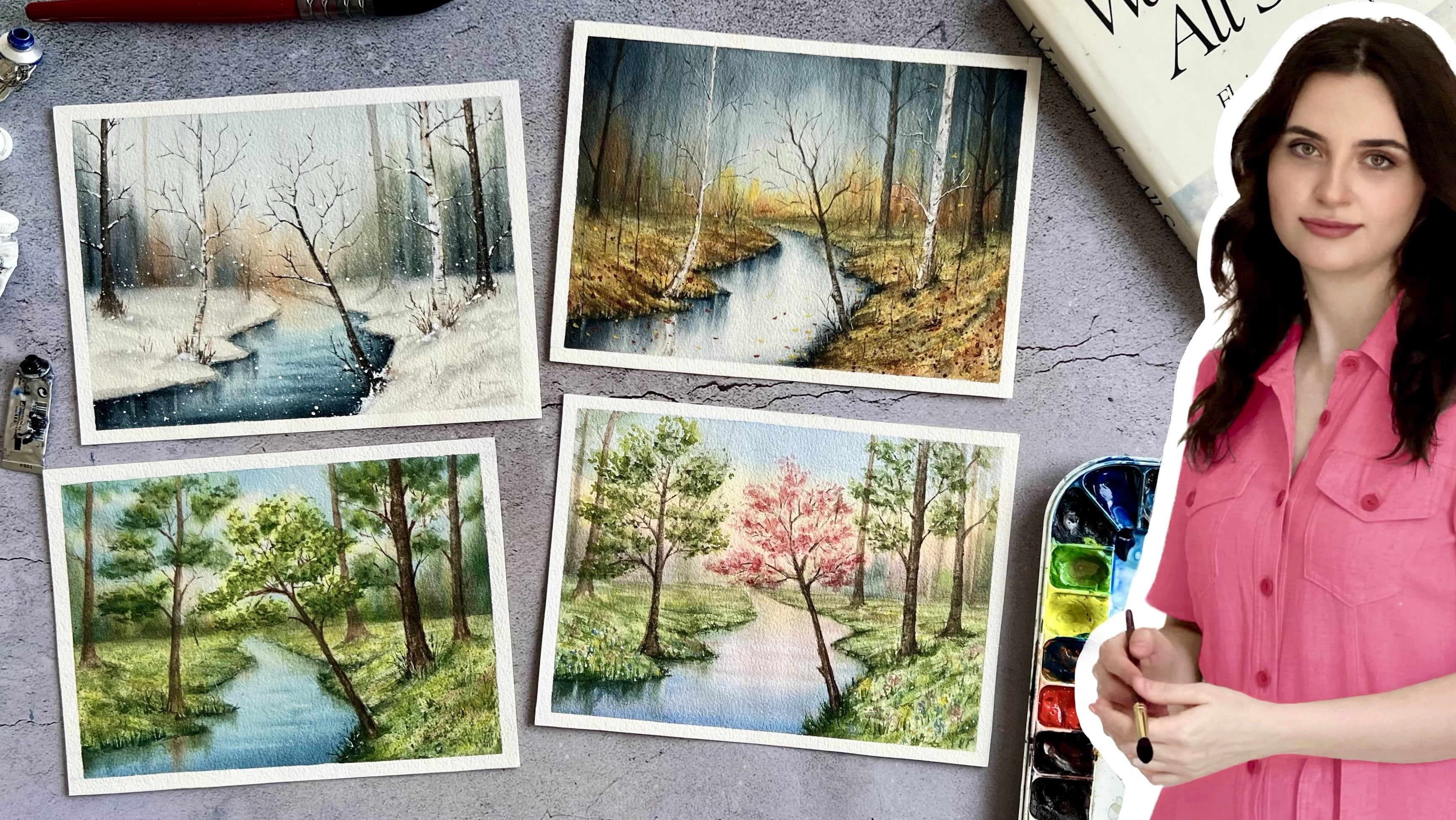
Transcripts
1. Welcome to My Class!: Do you want to
create snow texture in a quick and easy way? Hello, this is Leha. I'm a watercolor
artist and instructor. Over the years I have
held workshops in different countries and I teach watercolor in person and online. I've been painting landscape for the last five
years with a focus on how the different seasons affect the atmosphere
and mood of a painting. And I always try to
capture the impression of each season with my brush
out of all seasons. Winter has a special place in my heart because water
takes many different forms. It snows, freezes,
accumulates, and melts. It is like a fun puzzle. Figuring out the best way to create of each state of water. Salt is my favorite
way to create this texture for
winter landscapes. Unlike other techniques,
salt creates a starbuts effect that closely
resemble the form of snow. It is a practical way
to cover large areas because creating this effect is so quick and easy with salt. In this class, you
will learn how to use salt as a magical tool to create stunning texture and effects in your
watercolor art ads. We will start with the basics. You will learn about different
types of salt, the behind, how it interacts
with watercolors, and how to control and manipulate
the texture it creates. Then we will uncover the
secrets of how water ratio, types of pigments and salt
ratio change the effect. Then you will learn
creative techniques such as the solving, layering, and glazing that you can use to make your artwork
through the standout. After gaining a
solid understanding of the basics of salt, we will apply our knowledge through three exciting studies. In the first exercise, we will discover how to
create a good composition of a snow sky using the salt
technique and negative space. Moving on to the exercise, we will create a frosty
foliage effect by playing with the different
amounts of salt for texture. Finally, we will bring it all together in our
snow draw painting, applying to all creative
techniques we have learned. The salt techniques is a
great starting point for beginners who want to create texture and effects
with watercolor. It is an incredible way to add character and uniqueness to
watercolor paintings for experienced artists prepared
to be inspired with this funk and let your creativity flow.
Let's get started.
2. Class Orientation: Welcome to the class. I am happy to have you here. I think salt is a
magical tool to create stunning texture and effects
in your watercolor artwork. And it is a great
starting point for those who want to push the
possibilities of watercolor. Your project for this
class is to create a winter landscape using
the salt creatively. And I highly recommend you to paint and share the
exercise of snow, frosty foliage and
snow drop paintings we will paint in the class. In this way you can reinforce what you have learned
in your projects. I will be looking for how you use salt, enhance
your composition, experiment with different
maintenance level, and incorporate creative
salt techniques. I'm excited to see what
you come up with and I will provide detailed feedback
on each project you share. I will also add the sects of the painting we will
paint in the class, and images of the
salt experiment to the project
section of the class. You can always look
back for reference. Now let's top the materials. We first need watercolor
papers, preferably 100% cotton. For the paintings, I
choose cobalt blue, Persian blue, pins gray, Alison, crimson, sepia, Vercena, Sans love orange
and region colors. If you have similar colors,
they will work too. As a brush, I will use one
natural bresess Rom brush, one Santi Rom brush, one rigger brush,
and one large brush. We also need a cup of water,
some napkins masking, fold pencil razor and salt, salt prepared to be
inspired by the salt. And let's get started.
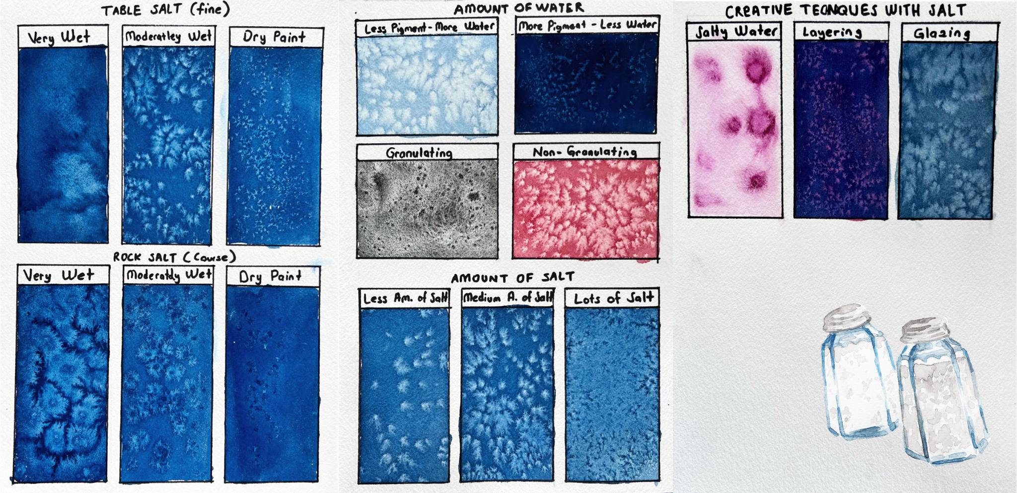
3. Different Salt Types & Textures: Welcome to the class Using salt in Watercolor is a
smasinating technique that can add texture and visually test your artworks less type. To learn how to use salt, to see how salt interacts
with watercolor, we will use two
different types of salt. The first one is table salt, which has fine grain, and the second one
will be rock salt, which has coarser grain. They will both create different
effects with watercolor. Actually, you can use any
kind of salt with watercolor. There is no correct type. However, different types of salt will give you different
effects for different reasons. The grain size and the salt type are the
two main variables. Understanding the
rest removes the Mr. of potables on
your paper. And Y. As I said before, there is no wrong or right salt to use when expressing texture
in your watercolor. The preference is entirely
up to your personal tile. Have fun experimenting
with different salt types available to you in order
to see the effects of salt. Divided my paper into six
different comparments. In the first one, we
will apply the salt on a very wet surface
and see the effects. For the second one, we will apply the salt on
a moderately wet paint. In the third one, we
will apply the salt on almost dry paint
and see the effects. First of all, I
want to talk about very wet ground for this. I wet my brush completely. You need to have plenty
of water in your brush. For the color, I will
use Prussian Blue. But you can use any
colors you want. But of course, the effect will vary depending on
the color you use. We will talk about this later. As you can see on my brush, there is lots of paint
and lots of water. The consistence of your
paint should be like now, we start applying the
paint on a dry paper, painting all over it. Now I want to show you
how shiny the paper is. You can't tell
whether you have used enough paint by brightness
level of the paper. Now the paper is wet. You should sprinkle the
salt on a wet paint. I want a little bit
more there now. We'll leave this part to the dry and move on to
moderate wet part. In this part, we will
apply the salt when our paper is moderately
wet, not too much wet. The consistency of
my paint should be like milk for this
time, not like a tea. Now we will take lots of paint and less water to our brush. Now I will show my paper so that you can understand
the brightness level. As you can see, there's not
too much water on the paper, but we will wait a little
bit to absorb some water. My paper is not too wet or not too dry,
just in the middle. Now it is time to sprinkle
some salt on the paper. Please do not sprinkle too much. Now let's move on the
dry paint surface. In this technique, there will be very little water on my brush. As you can see, the consistency of the paint will be creamy, not like tea or milk. This time. This time, there should be less
water in our brush. Less water, more pigment. Now I will show you
the paper so you can understand the wetness
level of the paint. As you can see, this time our
paint is not very bright. It has started to dry slightly. There is very slight
wetness on it. Now, let's sprinkle
the salt on the paper. Your paper shouldn't
be completely dry, it should be slightly wet. If it is completely dry, you will not get any effects. Now let's move on to rock salt. We will repeat the same
tapes with the rock salt, but since the size and structure of the rock
salt is different, the effect it will give
will also be different. Same as before. We want
a consistency here. Remember to observe your paper. It is time to add rock salt. Now, do not sprinkle too much. Be careful. Now, let it dry
completely and move on. The moderate wetness,
same as before, we want a meat consistency
here and moderately wet paper. The paper is ready and now
you can sprinkle the salt. Now let's move on
to the dry paint. We want a meat consistency here. There should be less
water in your brush. It is time to sprinkle salt. Now, we will leave the paper dry completely After it dries, we will talk about the effects. Now my paper was completely dry. I cleaned the salt on it. You can use a pool
to remove the salt, or you can clean it with a
heart brush by pressing it. Or as an easier method, you can clean the salt by using the back of
the watercolor tube. Let's talk about the effects. Now we use table
salt in this part. First, we bring the table
salt on the very wet ground. Because our paper was very wet, the salt dissolved
in the water easily. Another reason why
it dissolves easily is that table salt
has very fine grains. It dissolved easily
in the water. Since the salt was
dissolved in the water, its effect was very low. Technically, when you
se pringle salt on the surface of a wet
watercolor painting, it will pull in and absorb
the water it touches. It is essentially lifting
the colors as it absorbs it. The effect is that
little star buds are created where color has been lifted from the areas where a
grain of salt rest. At this stage, the
salt couldn't do its job because there
was too much water. In the second part, our
paper was moderately wet. When applying salt to
the wet wash of pigment, timing will determine
the success. There were no puddles
on the paint. Our paper was slightly shiny. The paper had also absorbed
the paint, a little nay. The salt, the salt was able to find the space to
create its own effect. As you can see, an
image like beautiful, tiny star particles was formed. I like to use this
in snow landscapes, it creates beautiful
snow textures. Or you can use the techniques to create magical background
for your paintings. Thirdly, we applied our salt
on the almost dry paint, since there was very
little water on the paper. The effects of salt
was very little. As you can see, star
bots are very small. It may be a little
more difficult to create the effects of
salt with this technique, but you can still use it to create texture in your painting. The area where each technique will be used may be different. Now let's mo, want
the rock salt. As you can see, Babe apply rock salt to
the very wet paper. It didn't dissolve in water. This is because rock salt is coarser grain than table salt. Since the paper was very wet, the effect of the
salt was greater. I love using the rock
salt on flower landscape. It can create loose flower
effect on background. As you can see, when we applied rock salt to
moderately wet paper, its effect was slightly smaller. The texture it creates is
different than the table salt. It is more textured
and flower like. Finally, we applied rock
salt on a very dry pane. As you can see, it
had almost no effect. Another thing I noticed
was that the rock salt stuck on the paper a little bit and created
such dark supports. We didn't see such an effect
with table salt on paint. In this lesson, we have learned how different types of salt changed the effects of the salt. See you in the next lesson.
4. Effects: Water to Pigment Ratio: In this lesson,
we will learn how the amount of water we use will change the texture that salt
will create, So less type. On this side, we will use
less pigmant and more water. In the second, we will use
more Pigmt and less water. The effects of salt will
be different in both. And lets get started. I am using Persian blue as the color you can use
any color you want. At this stage, there should be very little pigment and loss
of water in your brush. As you can see, the color of the paint is very
lighter in tone. The witness of your
paper should be moderate when you
are adding the salt. Now we should paint a little bit for paper to
absorb the paint. It's time to sprinkle salt. Now let's let it dry completely
and move on the next. Here we will use less
water and more pigment. You should take lots of paint to your brush by mixing it
with a little water. As you can see, even though
I use the same color, the color turned out
to be quite dark because there was too much
pigment in the paint mix. After adding salt, we
will let the paper dry completely and
talk about its effect. The paper dry completely, I clean the salt. Salt reacts more to water
than it does to pit. Here we use more water
and less pigmentt. When there is more
water in our paint, the salt can show
its effect better. As you can see, it created
a larger starboardt because it was able to
absorb more water here. Because we use more
pigmentt and less water, the salt couldn't show
its effect sufficiently. As you can see, it created
really small starboard. Since there was not enough
water in our paint, the salt couldn't
show its effect. If you want to get
best effect from salt, you should make sure
there's enough water in your paint and do not
use too much pigment. In this lesson, we learn
how the amount of pigment and water we use change
the effect we get. And in the next lesson, we are going to focus more
on pick means and learn how the types of pick means
we use change the effects. See you in the next lesson.
5. Effects: Pigment Granulation: In this lesson, we
will examine how the properties of the pigments change the effects of the salt. First, we will use
a granulating paint and then we will use a
non granulating paint. What is granulation? The granulation is an interesting characteristic
of watercolor, which causes the paint
layer to look textured. This texture
appearance is caused by pick maan
particles clustering together rather
than staying evilly dispersed within the layer
of poter color paint. It is often used by artists
to add artistic effects. As a granulating color, I will use Lunar Blake
from Daniel Sit. Granulating colors
did not produce an obvious tar board effect because it is already
heavily textured. Some paints are
naturally textured. When you want to use a salt
effect in these paints, they cannot create
a new texture. The tans level of
your paper should be moderate and now
it's time for salt. Here, I will use rose metal
as non granulating paint. I didn't use Persian blue. I wanted it to be
a different color. Actually, granulating
paints are few. Most paints do not granulate. You can take the
website of the brand of paint you use to find out. Do not forget to
observe your paper. The Wetnus level should be moderate and it is
time to force salt. The paper dried completely
and I cleaned the salt of it. Technically, it is
possible to create texture with salt
using any pigment. But the result will be more clear with non
granulating pigment. As you can see here, salt had no effect on
granulating paint. It just left dark
supports on the paper. This is because the paint
is already texture. On the other hand, the
salt was able to show its normal effect on the
non granulating pigment. It created a starboard effect
by removing the paint. In this son, we have
learned how the structure of the pigments will change
the effects of salt. In the next lesson, we will learn how the amount of salt we used will change the salt
effects see in the next lesson.
6. Effects: Amount of Salt: In this lesson, we will
examine how the amount of salt you use change
the effects you will get. Firstly, we will
use less amount of salt and secondly we
will use medium amount. And lastly, we will use of salt. I use Persian blue as paint. The consistence of your
paint should be milky and the wetness level of your
paper should be moderate. The paper is J D. Now
you can add the salt. Very little amount of salt. You can see the amount
of salt I used. Now move on to the second part and let's paint it
in the same way. After waiting a little bit. Now it's time to
sprinkle the salt. For this time, we should use moderate amount of
salt. Not too much. Not too less. Lastly, I will repeat the same
painting process here. For this time, we will use lost salt and sprinkle
it everywhere. Now, I let the paper dry completely and we will
talk about the effects. After it derives the
paper derived completely, I cleaned the salt of it. Firstly, I want to examine the part where we use less salt. As you can see, since
you use less salt, the salts were able
to find space for themselves and
absorb more paint. I think it has a calmer,
more peaceful appearance. For example, you can use it in the background of a
flower landscape. It may look like flower
petals flying in the air. Secondly, we will use
medium amount of soles. And when we look at here, the salt levels are
low in some places, it happens too much
in some places. The soles that are close to each other actually created
a cluster together. As you can see, when they
are closer together, they create a greater whiteness. If you do not want
such an appearance, you can be a little careful
when suprinling the salt. Thirdly, we use too
much salt here. Since we use too much salt, the salt absorbed the
paint almost completely. We can barely see the
blue paint underneath it, left a white appearance
on the paper. You can also use this
for foliage if you want. For example, I use
the techniques on the foliage part
of this painting. In this way, I created texture
around for this landscape. In this lesson, we
solve how the amount of salt we use
changed the effects. Now it is time to learn creative techniques
by using salt. Seeing the next lesson.
7. Techniques: Dissolving, Layering & Glazing: In this system, we
will learn how to create different
techniques using salt. The first technique
is dissolving. For this technique, you
should add some salt to the water and
dissolve it in water. The salt was completely
dissolved in the water. Now you water to your brush and wet your paper
with this water completely. Now I will take
paint on my brush. You can use any
color you want at. I chose a pinkish color. The important part is
that in your brush, that should be less
water and more pigment. Since the paper is still wet, you don't need to take lots
of water to your brush. I just paint onto the paper
with the tip of the brush. The feature of this
technique is that the pigments react
differently in salty water. Unlike what we apply
to normal water, the pigments are dispersed into more particles
in the water. Now I will drop salty water. The circle paint, you
can see the effects. It is incredible. It creates a
wonderful texture by allowing the paint to
separate into particles. It's like a flower. You can take excessive
water with your brush. It is time to add
more salt water now. We will let it dry. After it dries completely, we can see the effects better. Let's move on the second
technique, which is layering. In this technique, we will learn how to paint
colorful star burst. We should take lots of water
and pigment to our brush. For the first layer,
I choose pink color. You can use any color. This is our underlying
layer. This is wet. On dry technique, paint the first layer completely
and let it dry. The paper is dry completely. Now we can paint
the second layer. What you need to pay attention
to one painting is that you do not press your brush
too hard on the paint. Otherwise you can
activate the first layer. You should paint
with slow movements. As a color, I choose
portion ballo, you can use any color you want. The wetness level of the
paper should be moderate, not too much wet, or
not too much dry. Now it is time to add salt. The paper should be still wet when you
are adding your salt. The paper was completely dry and I cleaned
the salt of it. As you can see, we got pink starboard effect when the salt absorbed the
ballo paint on the top, the pink layer
underneath was revealed. I really like this technique. You can use it to paint
colorful flowers. Use your creativity. I think this technique can be used in many
different places, But there's something you
should pay attention to. We use pink color
in the first layer, then I use Prussian
blue color on it. In this way, I get
dark purple color. You should take
this into account before starting your painting. Let's move on. The
third technique, which is glazing, we are
starting with the first layer. You should take
lots of water and pigment and paint
the first layer. The witness level of your
paper should be moderate when adding salt to
dry, not too wet. The salt amount
should be like that. Now, let it dry completely. The first layer is completely
dry and I clean the salt. Now I will show you how you can change the color of
the salt effect. Sometimes this whiteness
may appear very light depending on the
location in the painting. There may be a shadow
on the white areas and sometimes you want
to make it darker. You can use glazing
technique for this. Now we are painting the second
layer with the same color. As you can see, the tone has changed and
become more darker. You can also use
different colors, so you can completely change the ambience
of your painting. Now the white areas become so no matter how dark color
you when you spin the salt, the color of the
paper will appear. If you want a painting, you can change the color of the whites using this technique. In this lesson, we
have learned how to create different
techniques using salt. And now let's put what we learned into practice
in the next lesson.
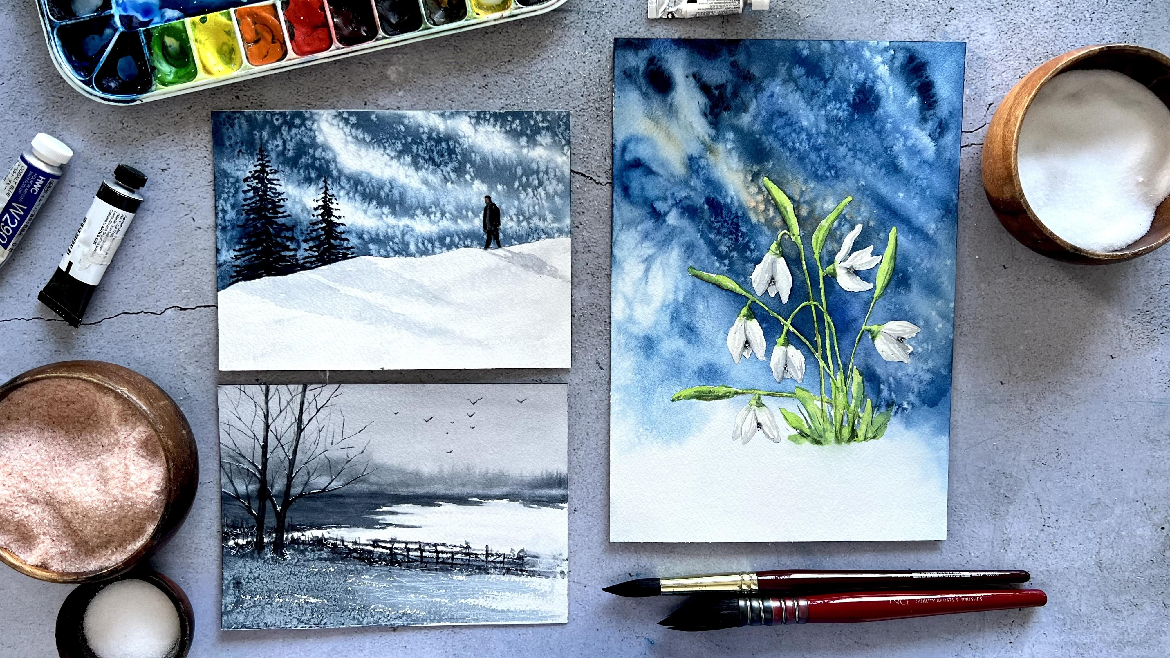
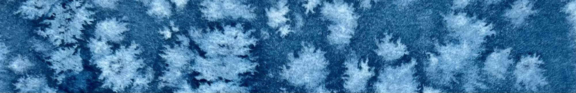
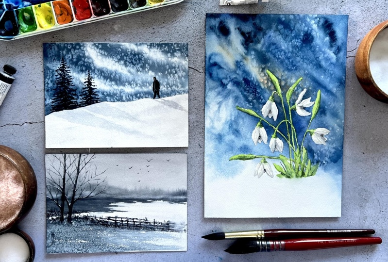
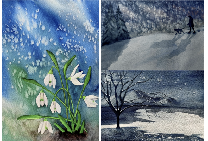
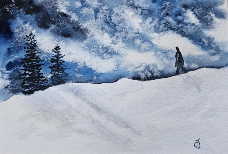
8. Composition Practice: Snowy Sky with Salt: In this system, we will
learn the principles of creating a good composition
using negative space. By applying these
principles in our painting, we will learn to paint a snow winter landscape
with the slow techniques. Let's get started.
Negative space is the area surrounding the main subject in a painting which is
left unoccupied. Simply, it is the space
around the object itself that helps to find the positive space
which is main focus. For example, in this picture, negative sipace is the sky and the snowy area
on the ground. The trees in the middle are the main object of the picture. In this way, trees
are emphasized in the picture using
negative space. Negative Sipase plays
a crucial role in defining the overall balance and visual impact of a painting. Here are some tips for utilizing negative Sipase effectively
in our composition. The first one is
balance and harmony. Pay attention to
the balance between the positive and negative space. Aim for harmonious distribution that enhance the overall visual. Consider the weight
of objects and their placement within
the negative space to create a sense of harmony. For example, in the
painting on the left, the positive space
is not balanced. As you can see, there is a
very large negative space on the left side of the
painting to balance the. I added a similar size story, the painting on the right. The second one is
simplifying the composition. Use negative space to simplify your composition by eliminating
unnecessary details. This can help draw attention to the main subject or focal
paint of your painting. For example, here you can see the bad and good examples together in the
painting on the right, I increase the negative
space by eliminating the unnecessary details
and emphasize the bird, which is the focal
point of the painting. The third one is creating
depth and atmosphere. Negative space can contribute to illusion of depth
in our painting. We can use it to suggest distance and atmospheric
perspective. For example, in this painting, the ski and the snow way area
are the negative sepace. But I created distance in the ski by using
different layers. The last one is thinking
about the color. Negative space doesn't
have to be avoid. It can be an opportunity to
explore color relationships, experiment with different
color choices for negative space to enhance the overall mode
of your painting. Now let's start the paint Now. We will start our painting by
deriving our horizon line. We start driving from the
middle part of the paper, I'm driving a curved
horizon line. You can also draw a
straight line if you wish, but in this way you can
trangent decomposition. As you can see in our
example painting, I left white areas
in the sky part. In this way, with
these white areas, we can get the image
of heavy snowfall. If we had just sprinkle
salt on a plain paint, we wouldn't have
been able to create the same effect as in color. I will use Parisian
blue and pines gray. You can darken it by mixing
any blue color you want. With pines gray, you
should just make sure that the paint you use are
not granulating paints. We are adding lots of water
to our paint mixture. The consistency of the paint
mixture should be milky. Let's wet the sky
part with water. Before we start painting, let's start painting from
upper left corner of paper. You should control your brush. This time I want to add a
little bit more pines gray. It should be more darker. Since we use Tomate
technique here, the area we painted will expand
in a little in the water. Let's be careful to paint in narrow lines because the paint
will expand after a while. This is how we can
preserve white areas. We must completely
paint the area where the ski approached
the horizon line. We can create contrasts
between the snow area and ski. You can see the wetons
level of the paper. Now it is time to springle
the salt without waiting. Firstly, we should start spring the salt around
the white areas. We can get more intense
effect in those parts. After we have spring
salt on the white areas, let's spring the salt
on the entire sky. I hold my hand a little higher so the salt
separates more evenly. Now I will share a tip
with you so that you will understand how to
direct the effects of salt. Immediately after
spring with the salt, I leave my paper down. Thus, the effects of salt as dry will be directed downwards. In this way, we can create the appearance of falling snow. You can place an object under your paper to keep it inclined. You can make like this
for up to one minutes. Then you can lay
your paper flat. The paper dry completely
and I cleaned the salt. As you can see, the salt around the white area slope downwards, creating the appearance
of falling snow. On the other hand, where
we use more pigment, the salt left black dots. Actually, I love the effect, and now we can start to
paint details and shadows.
9. Snowy Sky with Salt: Details & Shadows: I will paint two pine trees. The first tree will be here on the left side
of the painting, and the second tree
will be close to it. You can add more
trees if you wish, or you can also paint a
small house or fences. They will all be beautiful and fit the atmosphere
of the painting. I would like to add
a person walking in the snow to enrich the
sea of the painting. First we will start
with his head. I draw a small circle and the height of the man will
be seven circle long, draft seven lines equal the
length of the first circle. The man walks to the left side and slightly leaning forward. This is why we draw the
back part a little wider. After the fourth line, we will drove the legs. Now let's first add pines gray to our existing
paint mixture for trees. It needs to be dark
color because we will create contrasts between
the sky and the tree. I also add some natural tint. You can also use a blue
color close to the black. As a brush, I use
a rigger brush. The upper part of this brush is thick and the tip
is really thin. We can also use a
fine tip brush. First we will draw three
trunk of the tree. Now we draw a tree trunk starting from the
top and downwards. Let's make sure it is thin. The branches of the tree should be short and thin at the top. As you move downwards, the branches will become
wider and thicker. We must not forget to
leave space between the branches and the consistency
of our paint is milky. In this way, we can
control the paint easily. We will completely
paint the part where our tree meets
the snow we ground. I don't want any paste
left in that part, so we will emphasize
the contrast. Now let's start painting our
man walking in the snow. First we will start
with his head. I will use red occur
color for his head. You can also use, or you can use orange by mixing
it with a little blue. We painted his head completely. Now I'm going to put his
hand in a small out. Let's paint his hair. Using the paint
we use for trees, we make his hair
very thin on the top of his head and paint it a little thicker on the
right side of his head because it can be
seen from the side. We will use the same
color for his jacket. I leave a slight opening at
the front of the jacket. This place will
look like there is a sitter inside the jacket, and we will paint it
in a lighter color. Let's move on to the legs. Since our figure is in motion, we will paint his legs
in a walking position. Yes, we finished painting
the trees and our figure. Now we will paint
shadows on the snow. Before we start
painting the shadows, we need to pour out our water and fill
it with clean water. For the shadows, I
will use Cobot Blue. First, I'm going to add a
little bit crimson to it. It needs to be a
very light color. I will add a little bit sepia. We will add plant of water. As you can see, we get
a mixture that is very light in color and has
very little pigment in it. Now, we will paint by leaving
space on the snowy ground. Let's be careful not
to paint too much. Now we clean our
brush completely and soften the ads of the
shadows with clean water. I also want to create some
texture on scene ground. For this, we will springle salt while our paper still wet. The texture of the salt
will be very unclear, the paper dry completely. Now we move on to painting the shadows of our
trees and the figure. For these shadows, I want to
use the same paint mixture. If you wish, you can
test how dark your paint is on a piece of paper
before you start painting. I think this tone is very
nice. We can use it. The direction of the shadows will be from the
left to the right, because I want it to be
in harmony with the sky. We can trangent the composition. We start painting from
the tree on the left. We start from the bottom of the tree and paint
towards the right. First, it will be white and our shadow
netrows towards the end. In this way, we create
a triangle form. Let's soften the ends of the
shadows with clean water, because shadows have softer aids as they move away
from the object. Let's move on to the
shadow of the man. We will start with his leg. First two line, The shadow of the man should be parallel to other shadows. Now we are going to the head. We finished the painting. In this, we have learned
how to create a painting with a strong composition,
negative space. And how to use the salt
technique in a small landscape. In the next son, we will
learn how to create texture on the ground using
salt see in the next son.
10. Texture Practice: Foliage with Frost: In this, we will learn how to create texture on the
ground using salt. We will paint an icy
winter landscacape by creating a florocy
appearance with salt. Tho let's get started. Let's start the dredge
of the Landscaape. We start by driving the horizon line and draw a citrate line from the
middle of the paper. Now draw a mountain
above the horizon line. I try not to press
the pencil too hard so that it won't be
visible after painting. Now we can move on the
drive in the lake, we will draw a lake
with indentations. Now we will draw 23 trunks on the left side
of the painting. We will not drove the
branches in the sec part. Now we can start painting
from the scare part. We will use wet on dry
technique in the sky. We will not wet the
paper before I. Natural tint as color. You can use pines
gray if you wish. We should use a
horizontal brysotroke on the sky part because we don't want to see
brysotrokes after it dries. We paint up to the horizon line. We need to soften the lower part of the sky with a clean brush. Now let's move on to
the mountain part. We should, while our
paper is siluet, mixing the pins gray
with natural tint, The density of our paint
should be milky so that it will not separate
easily on the underlying layer. We will use darker color. At the bottom of the mountain, we almost completed
the background. All that remained was to paint the ground
behind the trees. I will use the same
color mixture there too. We need to pay attention to
the lines we draw for lake. While painting, these will be like small bushes on
the edge of the lake. Now let's move on to
painting the ground. In the front part, we are going to use a little more pines
gray in this part. Now we start painting
from the left side. On the right side, we will use dry brush technique for this. There shouldn't be too
much paint on our brush. We paint from left
to the right with a single brush stroke without dipping our
brush into paint. Again, we can make
texture brush strokes. In this way, we can leave small white areas
on the ground part. Let's add more pain
to the left side. To make it a little bit darker, it is time to add the salt
we will use loss of salt. In this part, we learned that the amount of salt we use will change the
effect we will get. Now we will create
a frosty texture on the ground by
using loss of salt. Let's leave this place
to dry completely. The ground part on
the background look unsaturated and while
the salty part dries, we will paint the second
layer using pines gray. Now we need to soften the ads of the ground part with
a clean water brush. I often clean my
brush with a napkin. Because our brush
shouldn't be too wet. The paper is completely dry
and I have cleaned the salt. As you can see,
tiny white suppose created a ic and
frosty appearance. Now we can start
painting our three. First, we will
paint the trunk of the tree using the
same paint mixture. We will make the edges of the
tree a little bit darker. For this, I took pines gray
to my brush and I'm painting the edges of the three before we start
painting the branches. We drove down with a pencil, we only drove the big branches. And then we will paint the small branches directly with a paint for the branches, we will use the same
paint, paint mixture. At this stage, it is important
to use a fine brush. Now I am using a rigger brush. We need to paint the
areas where the branches connect to the tree trunk of
the tree a little darker. Now we can move on
to second three. We finished the series, now we can start to
painting the fences. At this stage, I will use
expressive brsotroks. Fences do not need
to be proportional, they can be curved,
or different plans. We will try to quickly create the impression of a
fence with our brush. Now we will paint small
bushes around the tree. These will be like
small grasses. Now let's paint some
flying birds to enhance the atmosphere
and fill the sky a bit. Now we will give the effect
of accumulated snow on the fences and the
trees using a el Pan. You can also use white
gouache if you wish. Now we will paint secretches on the right side of the ground. In this way, we will increase
the effect of icy image. We finished the painting. In this lesson, we
have learned how to create texture using salt. In the next lesson, we
will begin our snow draw painting using the create salt techniques
we have learned. See you in the next lesson.
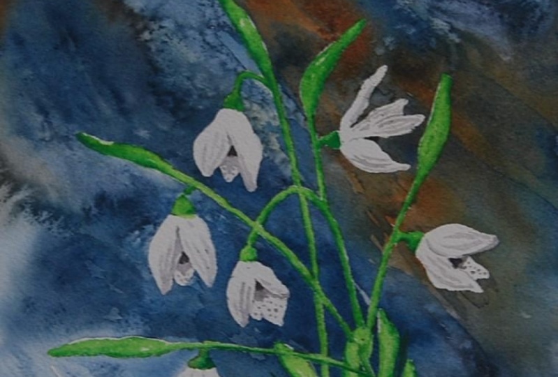
11. Snow Drops: Painting the Background with Salt: Let's start to driving the
seckage of snow drop flowers. I app secage the project
section of the gloss. If you want you can
do land it from there and you can trace
it over the paper. Let's start with the
stems of the flowers. The snow has three main parts, The bell shaped blossom, the stem, and the leaves. We will always start
with the stem, then we will draw
bell shaped blossoms. Basically, it has three petals. And now we taken
the stem a little, and now we are driving the leaves extending
from the stem. The suckage part is finished. And now we need to use
musking flute on the snow drops to prevent the paint
from getting on them. The masking flit has
dried completely. If you start painting
before it dries, the liquid may stick
to your brush. You should make sure
it dries completely. Now let's start painting the background using decorative techniques
we have learned. Firstly, we need to wet our paper with a clean
water completely. As a color, I choose
Persian blue. We start painting from the
right corner of the paper, and the brush strokes
should be diagonal lines. Now I'm making a little
bit ultramarine. Now we will use
layering technique. One of the creative techniques
we learned for this, I mix brsana, little
bit transparent orange. We paint the upper
part of the flowers. This will be our first layer. Later when we paint the
second layer on top, the orange paint underneath
will appear thanks to the salts I want to make the upper left
corner of the paper. We will use Pinys gray for this. We will not paint
this side completely. We will rip the paint with
the tip of our brush. Now we leave our paper
a little to direct the paint and we need to clean the paint from the bottom of flowers
with a clean brush. Now we are adding a
little bit orange here. I think we need to add more
blue paint to the background. Now it is time to add
salt, but not everywhere. A little bit here. A little
bit over the orange. A little bit here. I
think that's enough. Now, we will let to
dry the upper part of the painting and we will
use salty water technique. I added salt inside of the
water and dissolved it. Now we will use this. We take glass of water
to our brush and cover the bottom part of the
paint with the salty water. Now we are going to paint only in drops on
the salty water. Our paint must be, we should take
loss of pigment to our brush and there should
be little water in it. We just the paint with
the tip of the brush. Now after cleaning our brush, we need to take salty water and drop it into the
areas where we painted. You can see the effects. The paint instantly breaks
down into particles in this part. In addition
to the salt and water, I want to sprinkle salt into
create different effect. You can see the amount
of salt I added. Now we can let our
paper dry completely. The paper was completely dry and I cleaned off
the salt on it. As you can see, now
we use our salt in this part when the
paper was normally wet. The effect moderate. In this part, we use salt. Why Our paper was more dry? As you can see, the
effect was very small. In the part where
we use salty water, the salt created a very small
and fine grain texture. It really looked like
crystallized snow texture. I like it very much. Now we move on the
layering technique. In this technique,
we use a color different from our main
color in the first layer. After this layer, the right, we painted our second
layer and sprinkling salt. As we learned, we are creating the colorful
starboard effect. Now we can paint
our second layer. We need to soften the
edges of the layer. With a clean brush, we need to add more pigments and clean the Gs a
little bit here. Now it's time to add salt. We are adding a little on
the area we just painted. Now we move on to our next
technique, which is glazing. We were using this technique to make white areas
a little darker. We will darken the part in the upper right corner
of the painting. I'm using Persian
blue as a color. We should soften the edge of the layer with a clean brush. Now to see the effects, we will let our paper
dry completely. The paper dry completely, and let's see the
effects in here. We use layering technique and we got orange color sitar burst. A second technique,
we use glazing here and we darken the white
colored sitar burst effect. Finally, we use salty water. Here we got ready
textured snow image. In this lesson, we created a composition with the
creative salt techniques. In the next lesson, we
will start to paint snow drops in the next lesson.
12. Snow Drops: Analyzing Lights & Shadows in the Reference: Now let's start by understanding the
subtracture of snow drops. Snow drops basically
consists of three parts, leaves, stems, and flowers. To get a three
dimensional image, we need to pay attention to
the light and shadow areas. To understand the shadow
and highlighted area, we must first look at where
the light source comes from. For example, in this picture, the light hits the
flowers from a ball. Why some of the flower
petals receive light? The other half
remains in the shade. In this case, the
follower petal in the middle part is
mostly in the shade. The parts of the other
two flower petals close to the middle flower petal
remain in the shade. Also the outer facing part of the petals to
receive more lights. When we paint our snow drops, we will paint only the
areas in the shade. We will leave the white of
the paper as the light areas. In this way, we can obtain a three dimensional
realistic snow drops. The same applies to
leaves and stems. Also, as you can see
in this picture, the part of the stems facing
downwards is in the shadow. The part of the leaves facing
inwards are in the shadow. Now that we understand what the light and shadow areas
are like in snow drops, we can start painting.
13. Snow Drops: Leaves & Stems: Now we will start by painting the stem and leaves
of the snow drops. Before we start, remove
the masking fluid, first I'm going to use
an eraser for this. We will remove the masking fluid completely by rubbing
it with an eraser. Now that we have completely
removed the masking fluid, we can start painting
the leaves and branches. We will use a red light green as the base color and we will add little bit sepia to make the color unsaturated. Little bit. Starting
from the leaves, as you can see, I
left some white parts for highlight and I am
moving towards the stem. Now we're painting the connection
parts with the blossom. Now we are cleaning
our brush and soften the ads of this part. And now our paint is site. We will paint the shadow area. For this, I am using rich and
green and little bit sepia, a dark green color. We are painting
the bottom part of the leaves and sitting
little bit, not too much. Now we are moving on the
third snow drop again, we will paint the
first base color. If you want, you can
change the color tone. You can add a little bit pi
to make a different tone. Now we will add
the shadowed area. But this time the shadow will be the left
side of the leaves. I am mixing region and sepia
to get a dark green color. Now we are going to
pain the on the snow, we will use the same base color. But our brush strokes
should be broken bit. You should leave white
areas for high lights. Now we will paint
the second layer to make the leaves and
stems more realistic. We will use dry brush
techniques here. For this technique, there should be very little
water in our brush. In this way, we are going
to create some texture on the leaves a little bit here. Here on the leaves. Now let's use this technique on the leaves near to the snow. We will add dark shadows on
the edges of the leaves. We finish this part, and in the next lesson, we will learn how to paint
snow drops, blossoms. See you in the next lesson.
14. Snow Drops: Painting the Blossoms with Light & Shadow: Before starting the painting, we will draw the eight
of the, each petals. Let's start the
paint blossom part. For this, we will
use a gray color. We'll mix cobalt pudo. It is in crimson and
little bit sepia. I think it needs more blue. Now, we will just
paint the shadows. Since the flower petal in
the middle is in the shadow, we will paint the entire
upper part of it. As we move on to
the second petal, we reduce the density
of the paint mixture. We paint in lines. I'm painting in lines to create negative space for the
bots of the flower. We will add small dots
inside of the middle petal. I will use natural
tint for this. It should be very thick paint. Now we are moving on
the second blast them, I added little bit
pines create to paint mixture to make it little
bit different tones. On the left petal, we painted in lines near
to the middle part, Sam, on the right side, we
will paint in lines, and now we will paint small
dots inside of the blossom. The third blossom has a slightly different
rotation of petals. So we will paint
this differently. The petals here are
it, further apart. We will use negative sepa at
the bottom of the petals. We will cover the bottom part
of the petals completely. We will paint shadows in thin lines on the
inside of the petals. Now we paint black dolls in the sipes between
the flower petals. Now we are moving on
the laser blossom. Here we will paint
on the bottom part. And this part we will
paint the connection, only the bottom part. For the third one, we will paint lines inside of the petal. We will cover the bottom part. Now we will add small dots. We finished, the paint blossoms. Now it's time for final details. I think we need to add more darker shadows to
the leaves and stems. For the I miss chingen
little bit sepia. We will start with the
leaves on the snow. We are painting from
bottom to wash to P and we are using
dry brush technique. Here. For the highlights, I
will use white gel pen. I am adding small dots inside of the blossoms
on the dark area. We finish the painting
In this system, we have learned the
subtracture of snow drops, how the light and shadow
areas are formed, and how we can get a realistic snow drops by
painting only the shadow area.
15. Conclusion: Hey everyone. A huge concorace
on completing the class. I hope this class has not only boosted your watercolor skills, but also sparked a new avenues of creative expression for you. In this class, we discuss the use of different
types of salt in watercolor and factors that
change the effect of salt, such as ratio type
and salt ratio. Moreover, we learned creative
techniques that we can use in our artworks by pushing
the limits of salt. Later we put what we learn into practice in the three
different studies. Composition, practice, texture,
practice, and snow drops. Your commitment to learning different artistic techniques
is admirable and I am confident that the
knowledge with this class will continue to
enrich your artistic journey. If you have any questions, please don't hesitate, ask them on the discussion
page of the class. I will be happy to answer, and I would appreciate it
if you leave a review. I would like to know what
you think about the glass. Finally, be sure to share your
paintings in the project. I will look at each painting you share and your feedbacks. If you like this glass, hit the follow
button by my name, and I'm super excited to see the incredible
things you have created.
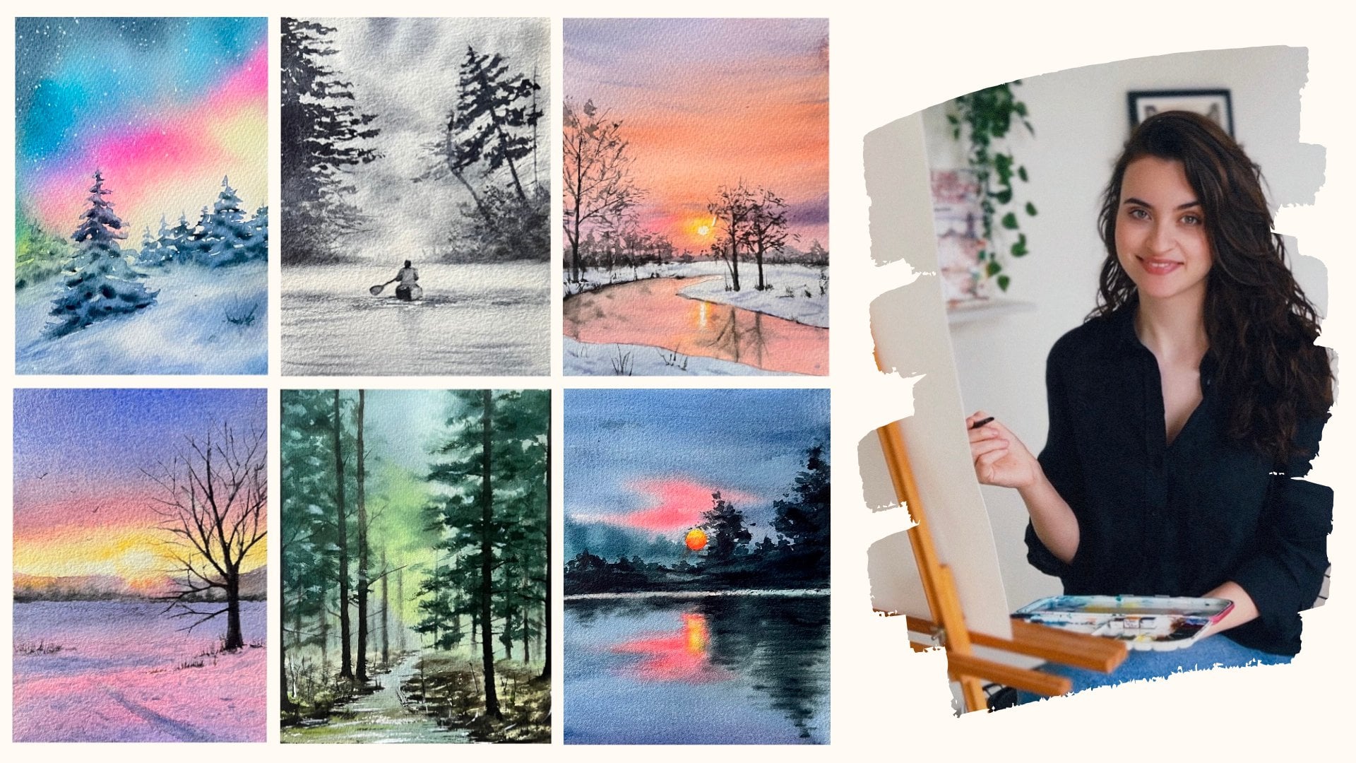
 Züleyha Aydoğdu, Artist, Instructor