Transcripts
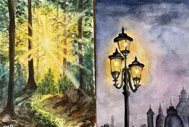
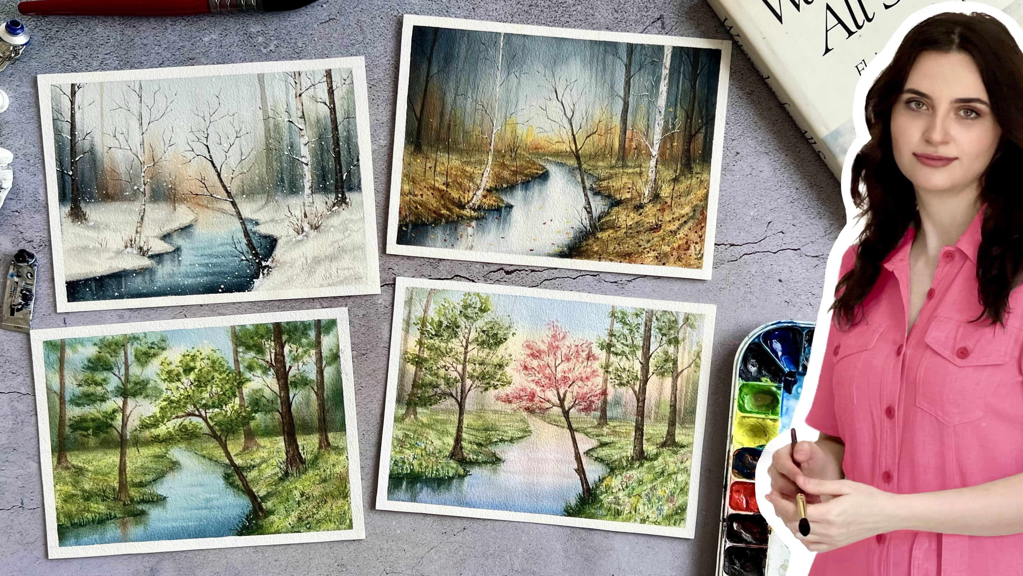
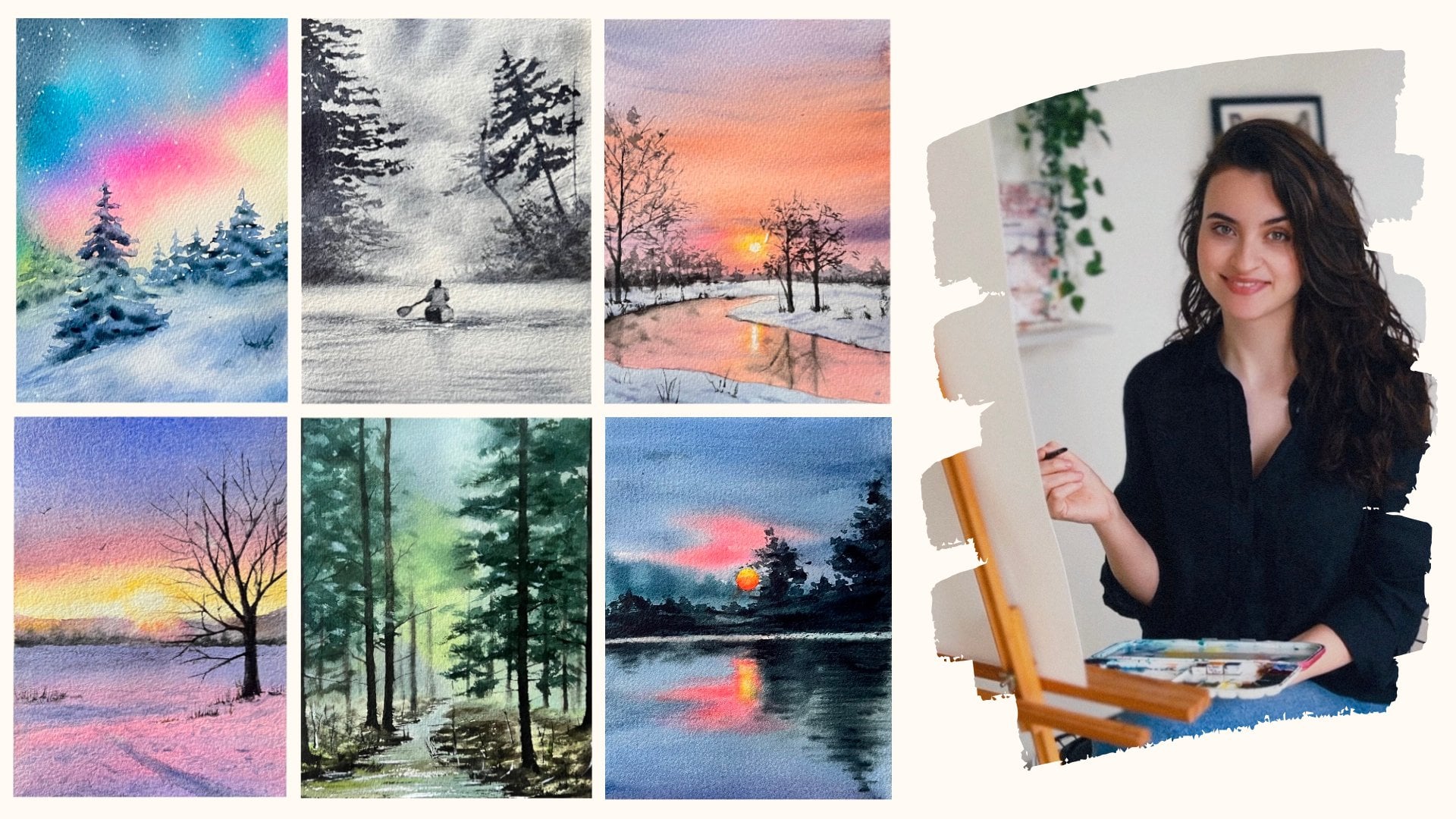
1. Welcome to the Class!: Hello, I am Zleha as a watercolor
artist and instructor. I had pleasure of teaching
and having workshops around different countries
and connecting with Steden both in
person and online. For me, light is the key bringing a watercolor
painting to life, and it is the element
that defines shapes, atmosphere, and emotion
in my artworks. And light can transform an ordinary scene into
something extraordinary, and mastering this skill will adapt and dimension
to your artworks. Over the years, I've been using watercolor to explore
the interaction of light and scene and natural
transparency of this medium offers incredible
opportunities to capture subtle effects of light. Through countless experiments, I developed the techniques that allow me to make light a powerful presence
in every artwork, and these techniques will be your key to eliminate
your artworks, too. We will start with the materials needed to paint the light, and then we will examine the nature of sunlight
and artificial light, tons and intensity of color, and dificien of light and how it affects
surrounding objects. Will explore three essential
techniques for capturing the diffusion of light and achieving smooth
colored transitions. These are flat wash, wet
on wet and dry on wet, and these techniques will
empower us to effortlessly depict light as suppress from the source and
illuminate the scene. Next, we will master
three techniques to reflect the change in
light around objects. Will understand how to use water and a damp
brush to achieve soft edge and how to create sunrise using the
lifting technique. And we will learn water
dripping, paint splittering, and salt techniques to
create rich texture for greenery in our sun filled
landscape paintings. After gaining a
solid understanding of the techniques
and nature of light, we will apply our knowledge through two wonderful paintings. We will understand how
to reflect sunlight, learn how to build perspective by creating tonal differences, and create that by emphasizing the contrast between
the light and shadow. Moreover, we will examine the differences between the
natural and artificial light and the effect of
artificial light on the man made things such as buildings,
lamps, and streets. By the end of this class, you will be able to skillfully depict both natural
and artificial light, transforming ordinary
scenes into vibrant, light filled compositions
that showcase the magic of watercolor.
Let's get started.
2. Class Orientation: Welcome, and thank you
for joining this class. I am heavy heavy here. Today we are diving into one of the most fascinating aspects of watercolor painting the
Art of capturing light. Light can transform an ordinary skin into
something extraordinary, and mastering this skill will adapt and dimension
to your works. And your project for
this class is to create a painting
that captures light, whether is sunlight
streaming through the trees, the glow of a candle or slights. I encourage you to practice and share your exercise
of color transition, softening edge and
textures for greenery. This will help reinforce what you have
learned and give you more confidence in capturing
light effectively. In your projects, and I
will be looking at how effectively you
capture light source and its effects
on your subjects. As well as how you use the techniques to
depict highlights, sun rays, and reflections
based on the light source. I can wait to see how you bring light into your paintings, and I will be offering detailed
feedback on each piece you share to help you grow
and refine your skills. I will also adding the
ices, reference photos, example of the
techniques we will be using to the project
section of the class, so you can refer back
to them anytime. Now, let's talk materials. You will need watercolor
paper, preferably 100% cotton. As colors we will
use lemon yellow, hands low, orange, cobalt, blue, pins gray, viridian, sepia, sub green, Rosenabr
Sienna, and Asen crimson. Feel free to use similar
colors from your palette. As for brushes, we will be
using one big mop brush, one natural breezes round brush, one scenting round
brush, one flat brush, and you will also
need a cup of water, napkins, spray bottle,
a pencil and eraser. I am confident that by
the end of this class, you will have a deeper
understanding of how to harness the power of
light in watercolor. So gather your materials, open your mind to
the possibilities, and let's get started on
this luminous journey.
3. Understanding the Light: We need to good light in order
to create a good painting, and good lighting isn't just about the intensity
of the lighting, but about its direction and effect on the
elements of the artworks. A good composition depends on
how the light enhance each of these elements and how that affects the way
we perceive them. The illusion of light in art can be created many
different ways. For instance, in watercolor, the illusion of light isn't created by the
addition of pigment, but by the blankness
of the paper. When we examine the sun and
the lights emitted from it, we see that the colors
change gradually. In the brightest
part of the sun, none of the tunnel volues should contrast too
much with each other. The brightest part of
the sun is its center. This part should be as
light color as possible. We can use the white
of the paper for this. The yellow color closer to
the center of the sun should be a brighter and more
natural shade of yellow. As you move away from the sun, the tone of yellow should be warmer and the
color more intense. So how does the sun affect
the objects around it? Sunlight change the color and
appearance of the objects. First, let's talk
about the color. For example, in our
first painting, where sunlight filter
through the trees, the trees closer to the sun will be warmer and
lighter in color. Trees away from the sun have
darker and color tones, so we can capture atmospheric
depth in our painting. Secondly, sunlight change
the appearance of objects. Trees closer to the sun appear bollar and have softer edge. There are some special
watercolor techniques to create these effects, and we will learn this in
the following lessons.
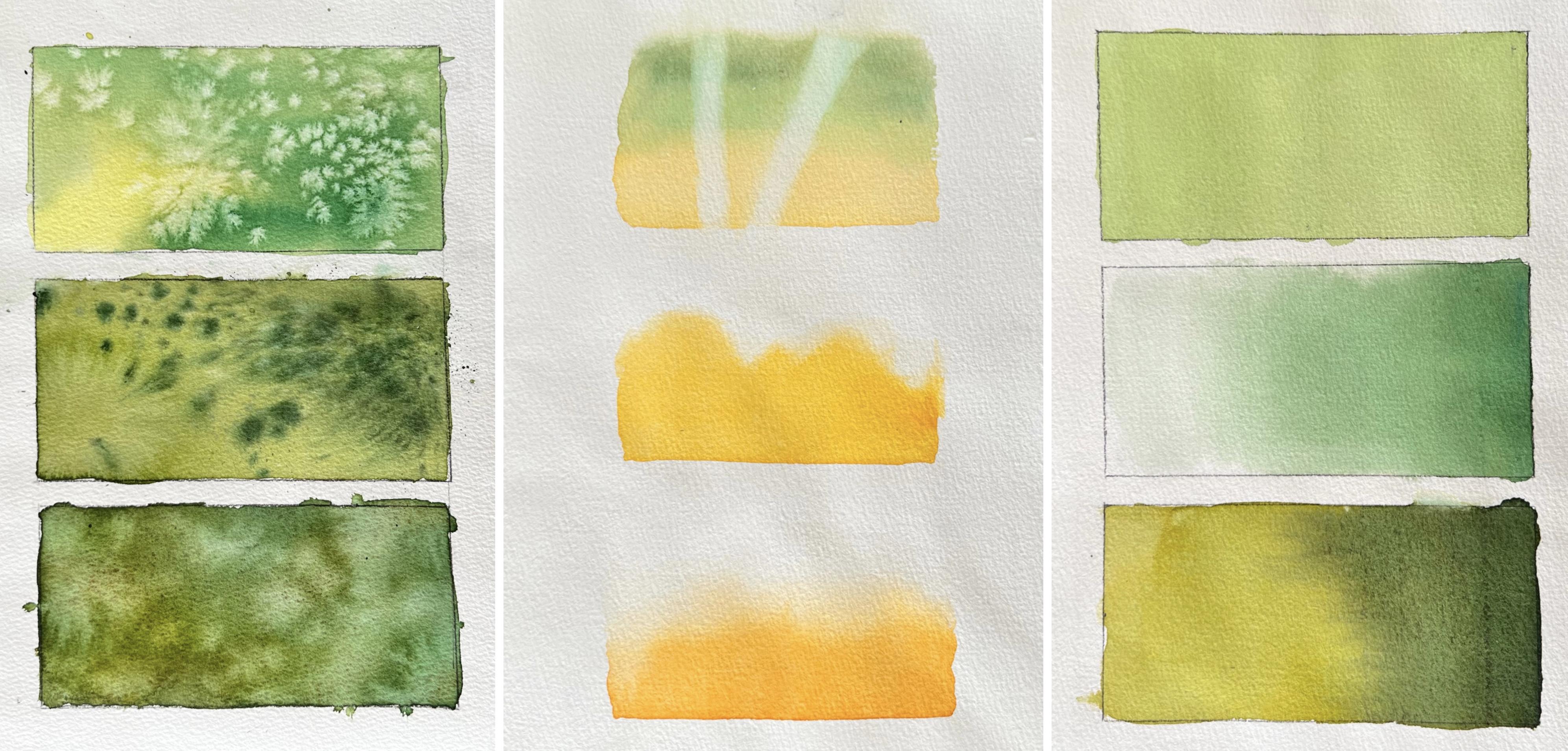
4. Color Transıtıon for Light: This lesson, we will learn
how to paint without brush marks and how to make
smooth colored transitions. I will show you three
different techniques and these techniques
are very important to us because we can use these techniques
when painting the sky, trees, light or ground. Now let's move on to techniques. And the first technique
is wet on dry. For this, the paper
should be completely dry, and we will take lots of
water to our palette. As a color, I choose light
green, but it doesn't matter. You can use any color. We start painting from
the top of the paper, and we take plenty of water
and paint on our brush. When we use this technique, we must keep our board inclined. We need to lift it slightly, and when we lift our board,
water comes downwards, and this is called beat, when we are using
this technique, we need to keep this bead
alive and not allow it to dry. In this way, we can get a smooth wash. Now we are
repeating the same steps. You can see I'm using my brush horizontally and the
bead comes downwards. It is important to take
lots of water at this step. Now, we finished our painting and water comes at the bottom. And if we tilt our board back, the water will flow back up
and create a watercolor boom. To prevent this, I am using a damp brush and taking
excessive water. As you can see, we get a smooth wash and there's
no brush marks on it. Now we move on to our
second technique, which is wet on wet. Here, we will learn how
to make a gradient wash, and we will start from dark
and move towards the light. For this, our water
container must be clean, and now I will fill
it with clean water. I change my water tank, and now we will wet the paper with clean
water completely. Now, you can see how
wet the paper is, and that should not be
puddle on the paper. As a color, I choose red
green, a dark green, and I'm starting to
paint top of the paper, and water comes downwards. At this stage, we need
to control the paint. If there's too much paint, you can take the excessive
paint with your brush, and you can use napkin. And the bottom of the
paper should be lighter. And here, I'm using more
water, less pigment. And I want to add more pigment
to the top of the paper. It is very useful technique
also to paint the sky. I think it needs more paint, and we will use
this technique to demonstrate the
spread of the light. The areas closer to the light
source will be lighter, and the areas further away from the light will be darker tones. And if your paper is sittil wet, you can make changes. You can add more
paint or you can take excessive paint
with your damp brush. Now we can move on
our third technique which is dry on wet. And in this technique, we will learn how to use two
different colors together. As a color, I added a little bit brown to the paint mixture. And it doesn't matter
how you use your brush. And the important part is that the first layer
should be wet enough. You can use lots of water and pigment in this first layer. And the top part is started to dry and I'm adding
more paint there. Now, as a second color, I choose rig and green, and I'm adding little
bi sepia, too. We are starting to paint
from the top of the paper. And the important part is that the paint mixture
should be thicker, there should be more
pigment and less water. Is density should be like milk. And as you can see,
paints come downwards, and we continue
to keep our board inclined so that the
paint comes down more. And then we bend it
to the right side. On the left side, in this way, we can get a smooth transition
between two colors, and I'm adding a
little bit more paint to make it dark the
upside of the paper. And I think that's it. We achieve beautiful,
smooth color transition between two colors and see you in the next lesson.
5. Softening Edges & Lifting Color: Sunrise or the As affected by the sunrise appear
soft and blue. And in this lesson, we will learn how we can soften the hard edge in watercolor
to create this effect. And I will show you three
techniques for this, and let's start
with the first one. When we use watercolor
on dry paper, we always get hard eggs. But there are ways to soften the hard edge without using
the wet on wet technique. And the first one is the water. Now I prepare a
yellow pink mixture I'm starting to
paint the left side, and the paper is completely
dry, by the way. Now you can see it's settle wet. It's not dry. And I
took a wet brush. The brush must be completely
clean and wet enough. We apply water with the tip of our brush to the edge
we want to soften. And in this the paint will come towards the
water a little bit, but we never touch our
brush to the painted area. And now I change my brush
with another clean brush. The brush is still wet and do not touch to
the painted area. And the paint will come a
little towards the water. But since we are wet
large area with water, this will not be a problem. After paper rice, we
will see the soft edge, and the only thing we need
to pay attention to is that there is no paint on the edge
where we use clean water. And the second technique
is the damp brush. We have more control
in this technique, and now I'm painting a large area and using
the same color again. And I don't want to paint a strate edge because I want to show how we have more
control with this technique. And now I clean my brush and remove excessive
water with a napkin, and we need to soften only the eggs with
the tip of our brush. And it is very important that we clean our brush frequently. And the wetness level of the
brush is very important. At this stage, you need to take excessive water
with your napkin. And unlike the first technique, here we can easily soften
smaller or difficult areas. And as you can see, in the first technique,
we softened gradually. I mean, we soften a large area. But with this technique, we soften only the
edge of the paints. Now let's move on our third
technique which is lifting. First, in order to
try this technique, we will prepare a base by combining the two colors we learned in our
previous lesson, and we will use yellow in one part and the green
in the right side. I choose yellow and
green because I want it to look like a little
view from a forest. We can think of it as if
there's the sun on the left, and sun rays illuminate the
area where the trees are. Now I will change my brush
and get a synthetic brush. Since synthetic
bristles are harder, they are more useful
in this technique, and I take a napkin
in my other hand. I clean the brush and take excessive water
with the napkin. And now we will lift the underlying paint by rubbing the damp brush in
a straight line, and we need to clean our brush after every time we
remove the paint. If we don't clean the brush, the paint will transfer
back to the paper again. On the other hand, since
natural brushes are soft and they have difficulty
removing the paint, and also they remove the paint over a large area we
cannot control easily. And some paints are
more difficult to lift. It leaves more
trace behind them. And this is institution related to staining
level of the paint. If you check, there
is information on the paint tubes about
how permanent it is. Therefore, you should pay attention to the
permanence level of the yellow color you use
wine painting the light. And additionally, when using
the lifting technique, the moisture level
of the paper also important when trying
to lift the paint. If the paint we are trying
to remove is really dry, it will be more
difficult to remove it. But if the paper
is slightly damp, we can remove the paper easily. You will understand this better while we painting our picture. We are almost done
with the lifting, and I think we made a really beautiful
reflection of sunlight. See you in the next lesson.
6. Creating Textures for Greneery: In this lesson,
we will learn how to create texture for greenery. The picture we will
paint is a forest view, and sunlight is separating through the trees
into the forest, and there are a lot
of green areas. And if you do not create
texture in these green areas, we cannot bring life
lengths to our painting. And now we will learn three
techniques to create texture, and the first one
is water supply. And now I am preparing a
paint mixture for the base. I'm mixing written
green with the yellow and adding
little bit sepia. You can add rsenna. You can see I added
a lot of water, and the consistency
of paint mixture like tea now we are
painting the base. We are using the same color, but I want to add
different colors also, a little bit yellow
and a little bit sepia here and do not forget to
mix them to each other. And as you can see, our
paper is very wet now. If we try our technique now, we won't get any results. We need to remove excess
water with a brush, and we need to wet the paper to absorb some of the
paint a little bit. It should be slightly moist. It's too wet right now. And if you try our technique after our paper is
completely dry, we will not get any
result this time also. We must be very careful about the moisture level of the paper. I think the paper
is almost ready. Now we will splash water, and I'm taking water
to my fingers. And now I'm splashing and I will let the paper dry and after we will
see the results. Now the paper is completely dry, and we can see the effect
created by the water. It creates such a texture,
light green spaces. In this way, we will
be able to capture that in the green
areas in our painting. Now we can move on to
our second technique, which is paint splash. In this technique, we will create colorful textured areas. First, we need to
wet the paper with clean water and be sure to
wet every part of the paper. And we are preparing color
mixture for the base. I'm mixing reaching green
with the yellow, Hans yellow, and I am adding little bit sepia to to make the
color unsaturated. It should be light green, and I think that's good. Now we are preparing the
paint we will suplsh. And what is important here is the water ratio in the
paint we will supplh. And the consistency of the
paint should be like milk. If our paint mixture
is too watery, it will immediately
disperse on the base. You can see it is too thick. I will add a little bit more
sepia and now we will take lots of paint to
our brush and we will supplh the paint by
tapping it with our finger. I also suplsh it with
the tip of my finger. As you can see, we
get different results with these two different
splashing techniques. When I hit the brush on
my finger and splash it, larger drops fall on the paper. And also, when we splash it
with the tip of our finger, smaller drops we will get. I ended little mid
sepia to paint mixture and splashing here more. And now we will
let it dry and we will see the effects
clearly later. And now the paper
dry completely, and we created such a natural and realistic
foliage texture. And I think this technique
is really useful. For example, we can use
other colors and create a soil texture or
a stone texture. Now we can move on to our
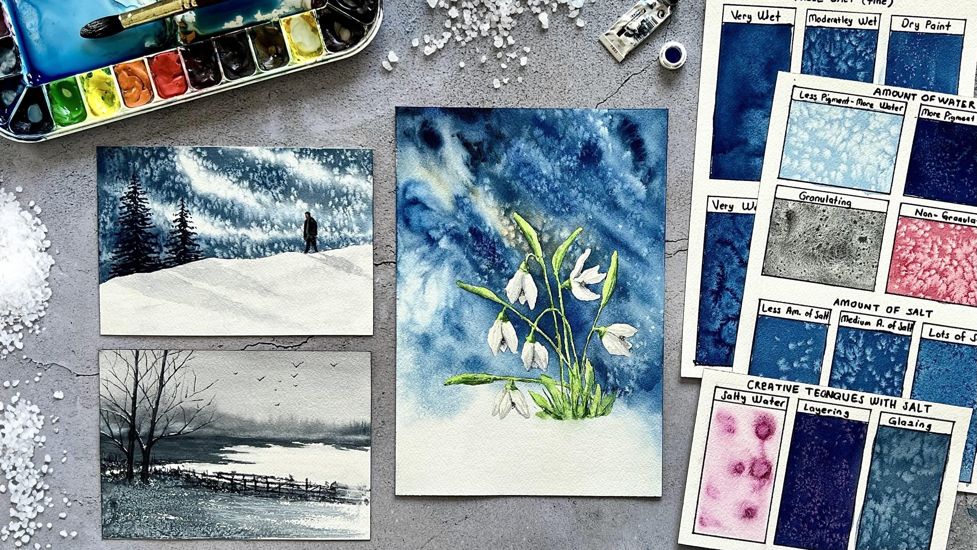
next technique which is salt. And to try this
technique, first, we need to wet our paper
with clean water completely. Later, we will create a green
base for the technique, and I will use the
same colors again, and I just want to add
a little bit yellow. And we will use table salt here, a regular salt, and I'm just going to show you only
one technique with salt. But watercolor salt technique is a really complex subject. The result we obtain
will vary depending on the type of the salt we use
and the size of the salt, the type of the paint or the
moisture level of the paper. I have another very
detailed class about this, and you can get more
detailed information about salt by watching
that class in my profile. And I am taking the excessive
paint from the paper, and now I think the
paper is deady. We can sprinkle the salt. Not too much, a little bit. And now we will let the
paper dry completely. The paper dry completely, and I clean off the salt. As you can see, the salts
create a tiny starboard effect. We will use this technique to create foliage in green areas. And what we need to pay
attention to here is the moisture level of the paper when we
sprinkle the salt. If your paper is too wet, the salts will melt immediately and will not
create such an effect. Our paper should
be slightly damp. I think SOT is truly magical tool when
painting watercolors, and the effects you can
achieve are limitless. You can also watch
that glass and apply what we learn
in this project. See you in the next lesson. Mm.
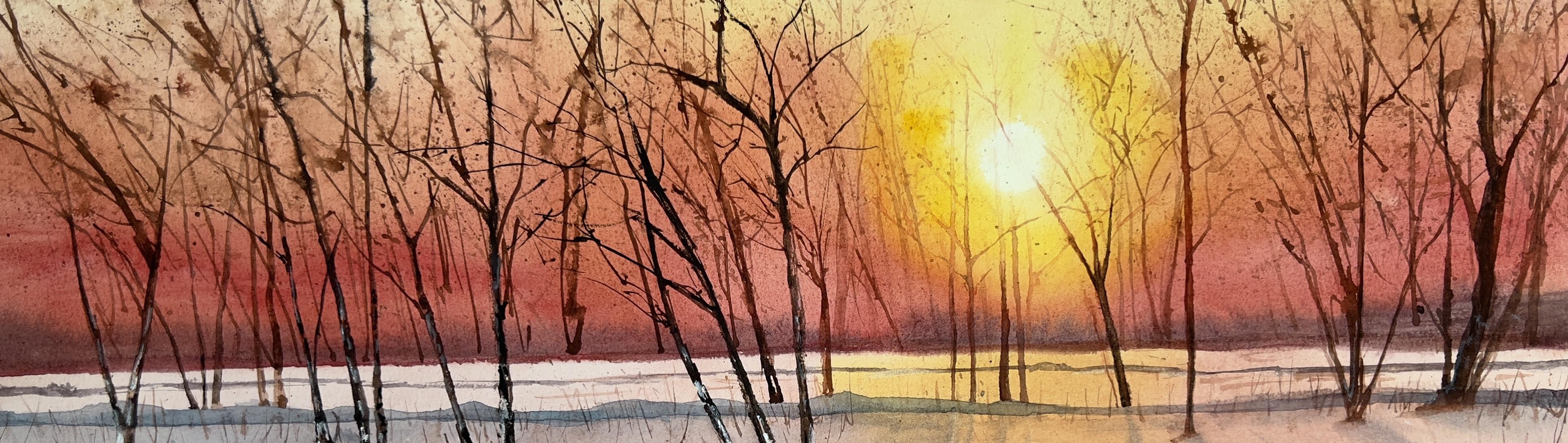
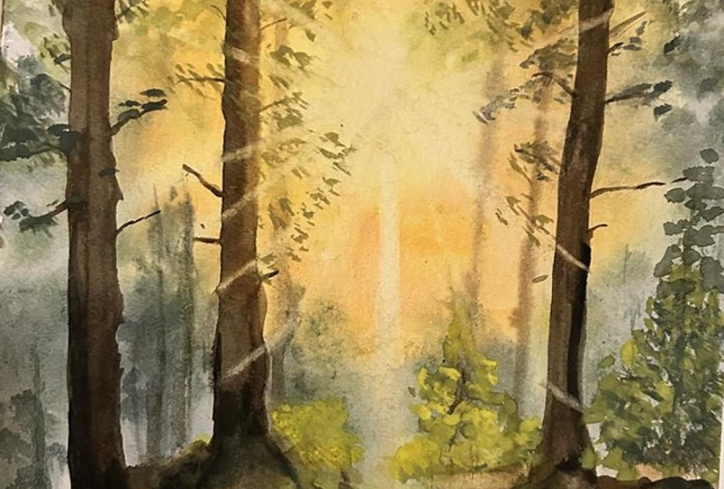
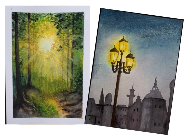
7. Landscape: Sunlıght: In this lesson, we
will start to put the techniques and information we have learned into practice. First, we will paint our first layer for
the sun and sun rays. Now we need to determine
the location of our sun. The sun is here
between two trees, and starting from that part, we will paint the sun
rays in a circle. Before we start to painting, the lines of these trees in the background look
very distinct. We need to fade
them out a little. And for this, I use this
soft eraser to remove the excess pencil marks by gently pressing
on those trees. And I think the
other trees can stay because we will paint them
in a dark brown anyway. The lines will not be visible, and I need to draw
this tree again. And we will use the wet
on wet technique in the first layer because we
will need to get soft ads. And for this, we need to
wet our paper very well. Here are the self additive as of the watercolor
paper I use. And if you are using a
single piece of paper, you should tape your
paper tightly to a board because we will
use a lot of water. And when we use so much water, the paper start to swell and it becomes
difficult to paint. And you can solve this
problem by tapping intensely. And after the paper
is completely wet, we will wait for a while and
the paper absorbs the water. After the paper
absorbs the water, we will wet it again. So the paper will be
sufficiently wet. And in this way, we
will be able to work on our paper for a long
time before it dries. Now we are starting to
paint our first layer, and we will use lemon
yellow for this, which is called yellow. I am adding a little bit
handselot starting from here. Here is the center of our sun. And after cleaning the brush, we need to soften the
middle part of the sun. And now we will use hands
low, only hands low, which is warm yellow, and we need to paint with
a circular movements. And I'm using odolin yellow
now, which is warmer. And if you don't
have this color, you can add little bit
orange to your yellow color. And the color
should be warmer as we move away from the
center of the sun and keep the brush movement circular and it
didn't built here. At the same time, the tone of the yellow color should become lighter as we move away
from the center of the sun. And now the center
of the sun has become really yellow,
and I don't like this. So we need to remove the paint
there with a clean brush and napkin with a
circular movement. And I want to add a
little bit more here. It looks lighter to me. Again, with a circular moments. I add a little bit orange too
while we continue painting, and we should also check the
wetness level of the paper. If our paper is too dry
and hard edge appear, you can spray a clean water on the paper with
a spray bottle. And since our paper was wet, the paints went towards the
center of the sun again. And now we will use
another technique to remove the paint from
the center of the sun. We will use a clean
napkin and pierce it towards the center and
left the paint there. Every time I press the napkin, I use the clean part of
the napkin, by the way. As you can see, after removing
the paint with a napkin, there are heartag in the center, and to fix this, we will
use a clean damp brush. And now we can start to
creating the sun rays. And for this, we will
use a clean damp brush. Starting from the center, we remove the paint in a
single and straight line. We shouldn't forget to
clean our brush and remove excess water after
each brush of drugs. And here we need to clean this
paint with a clean brush, and we will encounter this situton after
every brush moment. So do not forget to clean those paints before
the paper dries. And here, here new one. And as I said before, some paints left more easily, and some of them stain
very much to the paper, and it is really
difficult to remove them. And if you have problem
lifting the paint, you can check the sustaining
level of your paint, and at the same time, paper also plays a big role
in the lifting technique. If you use 100 person
cotton and coiled paper, you will lift the paint
much more easily. And now I want to
change the brush with a flat brush because
some sun rays need to be thinner and a flat brush will be
more useful in this tab. And after wetting my brush and dampening it with a napkin, I flattened the ends with my finger to make
thinner sunrise. Now I want to make a correction. Here, the sunlight was too thick and I lift the
paint too much, I think. Now I take a little
bit yellow paint to my brush and paint a thin line. In this way, we will get
two thinner sun rays. I think this might sight is enough and see you
in the next lesson.
8. Landscape: Sky & Atmosphere: In this season, we will paint the greenery in the background, and my paper is completely dry. I dry it with the blow dryer, and now we will wet it
again with the clean water. However, while
wetting the paper, I do not press my
brush too much on the part where we
painted the first layer. If we press too hard, we can activate the
underlying paint, and we don't want this,
so we wet it slightly. Now, we will paint
the sky part first. And for this, we will
use cobalt blue. It will be very light colored. Only the top of the paper. Now in this lower part, we will use cold colours to
add more depth to the back. And one of these
color is piness gray. I want to add some sucuas too. As you can see, it is a really nice cold tone a
little bit to this side. Not too much. And now I want to use a little bit
more to cos here. It is a really nice cool color, and now I want to
change my brush, and this is a synthetic brush. We are mixing pines gray
with a red and green. We will make a cold green tone and adding little dis sepia. More pines gray. That's nice. Now, we want to create a soft background using
the tot technique, and we will change the
color tones to create tree leaves or bushes
with the soft ads. Because of that, try to create different movements
with your brush, try to change color tone. And now we are moving
the middle part. I am starting to paint upper
part of the horizon line. In this part, we will use more cold colors like pins gray, or you can mix Pines gray
a little bit sepia because this part is more far away from us and little bit
light green here, and we will need to smooth
the bottom part of the paint. And more colder tones here. And you should use
your brush freely. Do not try to make straight
lines or shape of the leaves. We are just imitating the real
tied leaves or the washes. And after painting the second
or third layer on this, this part will remain very blurry and will not
be very noticeable. And now we will increase the amount of pigment
in our paint mixture. I added a little bit
more pines gray, and the consistence of the
paint mixture should be like buttery texture
because the foliage in the first layer
was more bleary. Now we will make greenery with the soft edge but more visible. And in this way,
the paint will not disperse immediately
in the layer. And now we need to lift
the green paint on the sun rays and we will use the same technique
again, which is lifting. We lift the paint using
a damp and thin brush. And after every brushes throws, I am cleaning the
brush with the napkin, and we must pay attention to the angle of sun rays
by removing the paint. It should be in the
same direction. And now we will paint some greenery at the
top of the paper, and the paper is a little dry. I want to spray
some clean water, only the upper
part of the paper. Oh and now we will use one
more green tones here. I mixing green green with
the yellow and little bit Brgena and consists of
paint mixture like milk. We will create a leaf image by separating the bristle
of the brush a little bit, and our paper is still moist, and the leaves here
will have soft eggs. And since the leaves
remain in the background, we need to get a Bleui image. A little bit here. At this part, we will
use more green paint. And now we will change
the color tone. We will use color green
tones as we move away from the sun and I added little bit pinss gray to
the paint mixture. And there's another
thing we need to pay attention when
painting the leaves. Be careful to leave
space between them. If you make them too
close to each other, the sky in the first layer
will not be visible. And now I'll take anselo and little bit fatillablu because the closer we get to the sun, the warmer color tone should be. I'll take lots of
hansa low any b can work little bit Brsena
and let's see the colors. I think that's nice. It is light and warm
near to yellow green. And I try not to paint
over the sun rays. And you can see we are painting the leaves on the parts
between the sun rays. Little bit here, in this part. I think in that part,
the paper start to dry. You can see the hard eggs. In this part, I will use only Hans low to reflect
the sunlight more. I want it to be more visible, and I will soften the eggs here. I'm using a damp
and clean brush. A little bit more here. While we are painting
these leaves, our paper got a
little drier and now I'll take a cool green tone
and paint more leaves. And since our paper is
a little less moist, the leaves at this stage
will be more noticeable. You can see the leaves
preserve their shapes. They are not separating easily, and they are more visible, a little bit here
towards the sunrise. And here. And it little bit here. But this part is dry already. I want to spray
clean water here. And now we will paint a pine tree on the left
side near to the ground. And for this, we got a
cool green colour mix, and I'm separating the
bristles to create pine texture a little bit here. And these are it leaves a little bit more to upper part and
a little bit this part. And here. And this part
is dry a little bit here. I want to spray. And now we
will prepare a paint mixture, and there will be lots
of pigment in it. I mix rich and green
meat with the sepia. The consisting of the
paint mixture like butter. It's creamy texture. We first started painting our leaves with
the lightest tone, and our paper was very wet. And as our paper slowly dried, we both darkened the green tone and use a more pigmented
paint mixture. In fact, this is how we
created dep in our landscape. And this part upper
part is very dry. I correct it with the damp
brush a little bit here. I take the excessive water. I think that's it and see
you in the next lesson.
9. Landscape: Background Trees: Hello again. In this lesson, we will paint the trees in the background and
the ground blow. And now we will use the wet
on wet technique again, so our paper needs to
be completely dry. I write the paper
with a blow dryer. And if your paper is damp, you can write quickly with the blow dryer
before starting. And we wet it again
with clean water. And the reason I want
it to dry completely is that if the paper is
even slightly damp, the paint underneath will reactivate when we wet it again. But if the paper is completely
dry and we wet it again, it is more difficult for the paint underneath
to activate. We do not press our brush
too hard on the paper, and we distribute the water
with the light brush moments. Now, first, we will
paint the ground. And as you can see,
there are places where the light hits the ground
more intensely here. And this part needs to be
darker because of the trees. And we will start with
the light tones first. And to create sunny atmosphere, I use hansa yellow in this part and little
bit Buffy Tanium. If you don't have wafytanum,
it's not necessary. You can use only yellow
warm yellow colors in the middle part and little
bit here under the trees. Now I'm going to add a little bit rosier
now to the mixture, and I will add this
paint the eighth of the area where we are painting a little
bit, not too much. It's going to create a warm
earthy look like this. And now in these areas, we are going to use a light and warm green tone and mixing light green
with the hansa yellow. And now, since we are using
the tome technique here, our paper and brush are wet, and so the paints will mix each other a little
bit on the paper. And I want to use
dark brown here, this part, and under
the tree here. A little bit Barcena and here. And they are mixing
to each other. Me Barcena I want to add here. And this is our first layer. It will be light and blurri and a little bit
yellow on this part. And now since these areas
get a lot of sunlight, we are going to add more
light greens and yellow here. I mix yellow green with the
lemo yellow and a little bit Hanse yellow and
more yellow here. This area seems empty to me, and I want to add green here. And now while our
paper is stil wet, we are going to use the
water splush technique to create some texture. I splash only the bottom part. Now we can move
on the upper part of our paper to create
the background trees. Now our paper is stil wet. When we lift the paper, you can see the sture content. Our paper is shining,
and that's good. Now I want to paint
more leaves on the top, and for this, we need to
prepare a dark paint. I mix den green
with the pins gray. At this stage, we
don't want the leaves we are going to paint
to separate too much. They should be more visible, and this is why the humidity of the paper is very
important at this stage. If your paper is too damp, you should wait a bit. When you put the paint with
your brush to the paper, you will observe
how much the paint spreads and you can
decide accordingly. Now I want to use warm
green tones here. For this, I'm mixing sepia
with the green little bit. Now we are preparing the paint mixture we will use for the trees
in the background, but it will be like this. We will use colder and darker brown tones
in the place far from the sun and warmer tones as we get
closer to the sun, our color will become more
orange near to the sun. Now I will try the paint. I think it's
separating too much. The paper is still
wet but too much. Because of that, I want to
wait a little bit more. While waiting, I want to
spread a little bit water to the ground and
here a little bit. I think paper needs to
be absorbed more water. Because of that, I will
wait a little bit longer. Let's try again. Yes,
I think that's good. It's not separating. And here, at this stage, I'm using sepia and
versin together. And the tone is light. I want to add a little bit
more sepia on the upper part. And we are using only
the tip of our brush, and the paint mixture
should be really thick. On the pigments,
not too much water. If you use more pigment
and less water, it is easier to control
the brush trucks. Mm Now we have painted our first tree
and at this stage, we will use lifting technique. To show the sun rays
falling on our tree, we follow the sun rays and lift the parts on the tree with
the tip of our brush. And after every brush strokes, we need to clean the brush with the clean water and
napkin and eggs also. I want to add a little
bit brown paint here. Now, let's move on
to the second tree. This tree should be cooler toned because it
is further back. And so we will use a little bit blue in the paint mixture. I am adding a little bit pines
gray and little bit sepia. It is very cool tone and
starting from here, going up. And now the moisture level
of the paper is much better. You can say it's not separading
it is easier to control, a little bit more
Brsena on the bottom. And I think it's enough. Now we will use lifting technique again
with the clean brush. I follow the sun rays direction and do not forget
the clean brown paint. And now let's move on
to the third tree. It is very light in tone because it is
farther away from us. I'm using very light brown tone. And the bottom part should
be a little bit more darker. In this part, we
are using sepia. And this tree looks
really light to me, and I want to add more brown. Especially on the
bottom in this park. And I think that's enough. I just want to blue
the bottom part. And now we will use the
lifting technique again. We have finished the trees, and now let's paint some more leaves while
our paper is still damp. I already had green
paint on my palette. I just add ultramarine
blue and Hans low. And now I am using natural
bristles brush and separating it bristless
because in this way, we can create more texture,
not natural leaves. A little bit here. And you can see the moisture
level of paper is great now. The leaves has soft ggs, but at the same time,
they are visible. And more here, I'm using
only tip of our brush. And now we are adding
more hand sale load because we are getting
closer to the sun. It needs to be more warm colors. Again, using only tip of our brush, creating
leaves texture. As we move away from the sun, we need to use cold
and dark green tones. But as we move
closer to the sun, we need to use warm
and light green tones, and that's the secret of this. Now I want to use more warm colors, more
yellowish colors. I'm mixing Mersen
with Hansa low. We will use this paint
in the middle part. Now, as you can
see, in this part, our leaves have heartaches because of the
paper is very dry. So we need to spray
a little bit water. And I give direction to
the water a little bit. And now I want to
add more coltons on the right side because
it looks empty to me. And they need to have soft eggs. And now we have finished
painting our background leaves, and we will finally use the
lifting technique again. And I'm following the
sun rays direction. And please do not forget
after every brush to drugs, we need to clean our
brush with the napkin, and I think that's enough and see you in the next lesson. Oh
10. Landscape: Foreground Trees: In this ston we will paint
the trees in the foreground, and these trees will be
much darker in color, and we will reflect the sun
rays back into these trees. We will start with
the tree in the left, and this tree is the
farthest from the sun, so it will be a very dark brown because only the back
of the tree gets sunlight. And now let's prepare
the paint mixture. I'm using Pines gray and sepia, and you can see the
paint is very thick, and we will start from here. And now we are using
wet on dry technique. I have lots of
paint on my brush, and now I want to
change the brush. Now I'm using a
natural versus brush. It holds more paint, and it is easier to
paint with this. And now I'm painting the tree, we need to pay attention
to making it look natural. And for this, first of all, I change my brush, and while synthetic brushes
create straight eggs, natural brushes are soft
and create rough eggs. And secondly, we do not paint the edge in
a straight line. We paint them in a
slightly uneven manner, and thus we get a more
natural tree trunk. We finished the tree, and now we need to soften
the bottom part of it. And for this, I'm using
a clean damp brush, softening only the eggs. Now we will paint small
branches on our tree in here, very small and thin. It will be. I was using a synthetic brush, but this brush was a bit thick. So I want to use a rigor brush. It is it has very thin
and long bristles. For the paint, I'm using
sepia and little bit ersena. It is a very dark brown, and you can see it is very
thick paint, by the way. These branches will
not be very long, but you can add them
wherever you want, but we should be careful not to make them too
close to each other. Now we are moving
onto the second tree. We are going to use a dark
brown tone on this tree again. But in this middle section, when we are getting
closer to the sun, we are going to change
the color tone. We are going to
use a warmer tone. I start from the bottom part. Going up carefully, and I
add a little bit water. And in this way, it will
be more lighter ton. And now we leave the middle part and move
on to the top part. We paint the top part using
the same paint mixture. And when we reach
the middle part, we do not take any more
paint to our brush. We are using only a
clean and damp brush, and we are softening
the edge of the paint. In this way, we can
reflect the softening of the ds of the tree due to
the reflection of sunlight. And now the middle
part is moist here, we will use Brzen as a
slightly warmer tone. And the left side of the tree should be a little bit darker. I'm adding a little
bit sepia too, and do not forget to separate the pigments
inside of the tree. And in the right side, we will use orange color. I mix orange thehans yellow. Mixing it with the
sepia a little bit. Now it looks too light. We need to add a little bit
more sepia on the left side. We finished the tree, and now we will use the lifting technique
to reflect the sunrise. And I use a flat brush for this. And we need to clean
the excessive paint on the paper with the napkin here. If it is difficult for you to
remove the excessive paint, you can wet it again
with clean water, and after that, you can
press the napkin on them. I'm rubbing a little bit here. And here, and the napkin
should be clean and dry. If the napkin is wet, it will lift the
paint underneath. And if the napkin is dry, it will only lift the paint where we use the
lifting technique. Now, we will paint the
branches for this tree. I'm mixing sepia with Persia, and I am using a rigor brush for this and taking
excessive paint. And starting from
here, very thin line. And it shouldn't be strate. It should be in a broken
line, thin and broken. And when we get closer to the middle part near to the sun, we will change the color tone. We are going to use
more warmer tones like arsena like orange. B, We finished the branches, and now we will soften the bottom part of the
tree with the damp brush. Now, it will be a little bit difficult because
it's dry already. And now we are mowing
our turk tree. I mix sepia and little
bit natural tin to make the color more darker and
starting from the upper part. Painting, but this tree will
be a little bit thinner. And again, we will
left the middle part, and then we will move
on to the bottom. And after that, we are connected these two
parts to each other. And the middle part should be a little bit lighter,
not too much. And for the bottom part, I want to use little bit piness gray because it needs to be more cooler ton because it
stays under the shadow, and we are softening Now we will use the lifting
technique on this tree, but this tree is a little further from the sun
than the other one. And this is why not all the
sun rays fall on this tree. We will use the lifting technique
only for a few of them. And I will fix little bit there We finished the sun raise, and now we can move
on the branches. I changed my brush. Now our music rigor and
starting from the top, they should be thinner
and in a broken lines. After painting a tree branch, if it look too dark to you, you can remove the excess by pressing lightly
with a tissue, and sometimes I even smooth
it out with my hand finger, and it creates a more
natural look in this way. A little bit here.
And in the center, they should be lighter. One more here. I
am darkening it. And thin tip for the branch. And I'm darkening this one also. In this lesson, we've painted the foreground trees and branches and see you
in the next lesson.
11. Landscape: Painting the Leaves: In this season, we will paint the leaves and bushions
in the foreground. And right now my paper
is completely dry and I want to spray water
before we start, but we are not
wetting completely, only just spray a little bit. And now let's prepare the
paint for the leaves. I'm using the same
color on my palette. I'm just adding cobalt
boil and more cobalt Blu. You can use ultramarine
to and little bit fetloblu a little bit more. And now I will add Rosiena it will make cool
and dark green tone. And now we are separating
the bristless. It's the natural bristles brush. Creating leaves texture. By the way, we are using a
wet ton dry technique here, and you can see that
on our paint mixture, there are lots of water. The consistency is like a
t and And in this part, we are using more
yellowish green tone, more warmer tones. And I think it needs
a little bit water and a little bit here. We are moving the
bottom part now, and you can see I'm only
using the tip of the brush. I'm just touching the
paper. Little bit here. O and here. When trying to
create a leaf image, I move my brush horizontally. We touch and lift the
tip of the brush, and we do not press too hard. And since it's a natural brushes it creates a texture
and natural image. And now near to the sun, we will use yellowish color. Now I'm using hands low
and a little bit Persian. Again, separating
the breathless and here we are following the same moments,
horizontal movements. A little bit here, not too much. I think it needs a
little bit water. The reason we separy
water because I want some eggs of
the leaves to be hard and some to be soft
and a little bit more Near to the center, I don't want to make
too much leaves. I want the sun visible. And we remove the excess paint by pressing lightly
with a tissue. Now we are using the
lifting technique again, and we will remove the
yellow leaves that are on the sun rays with a thin
and synthetic brush. I'm just scrubbing the
paper in a thin line. And after that, I press the napkin to take
the excessive paint. I changed the brush. I use flat brush now because I want to create more thin lines. The brush needs to
be a little damp, and we need to push the
brush a little bit more. We started painting our leaves with the light green and yellow. And the first layer is dry now, we will move on to second layer, and we will use dc tons. I'm mixing thin green
and a little bit rosy and a little bit more and war. It's a dark and cool green tone. And this is our second layer. Again, we are separating
the bristles of the brush and creating
the leaf image. And here on the left part, on the top, we are
making big leaves. Now we can start
painting the bushes or small trees at the
bottom of the trees. And these trees should
be lighter and have warm tones because the
sun rays shine on them. We are mixing Hansow and green colour and
separating the breasts again. And now we are trying to
create a pine tree image, and I think it needs
to be more yellowish, and I want to add a little
bit more hansa yellow. And again, separating the Bests there are fever leaves in the upper parts of
the pine trees, and these leaves
expand downwards. So we will actually create a triangle shape with
the leaves we painted. It will be bigger on the bottom. And remember, we are using
on the tip of our brush. I am very gently painting a little more
yellow and yellow. And we are moving to the center. On this part, we will paint a small pine tree
here, small bushes. And now we are using more lemon yellow on
the paint mixture, little bit tons love on the top. And you can see I'm using
lots of paint and water and splashing a little bit here to get more natural
foliage texture. And now we are moving
to dark tones, and we are adding the dark
tones under the light tones. We are not covering
the light tones. We are just adding actually
shadows to the leaves. Now, we will paint the
third layer for the least, and we are moving on
the darker colors. And now I'm mixing Berciana
with the withing green. I prepared a lot of paint
mixture. We need a lot. In fact, by doing this, we are creating dab
in our painting by painting layer by layer. First, we started with the light colors
and then mid tones, and now we are using dark tones. And in this way, we will
create dap painting and a three dimensional image for the trees and the leaves. And a little bit on
the left part here. I don't want to pay
too much leaves in this part because it is
very near to the sun and I don't want to cover
the sunrise with the leaves a little bit here. And I'm taking excessive
paint with the napkin. And here under the
sun rays, little bit. A little bit here. You can see I'm careful
not to paint on a sunray. I'm trying to paint
between the sun rays. A little bit here. I'm
taking excessive paint. We finished painting the leave, but the three branches
seem a little to me, and I think we need to paint
some more three branches. I already have brown paint on my palette, so
I will use that. And if you don't have it, you can mix sepia and Berciena to get a
tone close to this. And again, the branches
will be thin in a horizontal direction
a little bit. Here, one more. I'm taking sepia to make it more darker. And here, one more on the top. I think that's enough
for the branches, but this tree on the right
looks a little flat. And so I need to paint some dark tones on
the right side of the territoran and
here little bit, and I think that's enough, seeing the next lesson.
12. Landscape: Foliage: In this son, we will
paint the ground part, and we will paint
small grassy areas, rocky and soil parts. And first, we will start
with the light tones. There were sepia and
Berson on my palette, and I just add water on them. You can see how
light the color is, and we are just painting the ge of the yellow
part in a zigzag shape. And here I will add a little bit more
horizontal and thin lines. Now we are going to paint
over this green color here. And there was a green
paint on my palette. I will just add little bit
rosin and lots of water. You can see the
consistence like a tea, and do not forget to
separate the breasts. We are just imitating
the grass look, and we need to be careful. We shouldn't cover whole area. We need to leave some space
between the brush strokes. We should see the first layer. It will give a light
effect to the painting. I'll bet too. It will be big brass
strokes in there. I want to splash some paint
and on the right side, we will use the same color
only the bottom part. Now we will prepare
a dark brown paint. Now I'm using sepia and adding
little bit pines gray too. While the paint still wet, we will add little bit
under the green areas. It will be lend each other in
the painted area and little bit spray too because in
this part we have soft eggs. And we will splash little
bit brown paint too. And if the paint
supplies on the top, don't forget to wipe it
off with the tissue. And here, in the same way, we will add dark colors
under the green paint. They are the shadows
of the green part. Now, this part of
the paper is wet, we wet it with spray, and we are going
to use dark tones here because the sun light
doesn't get much here. Also, since this
part is in shadow, things in this area
should have soft edge, and this is why I use
tom technique here. And here I will add dark tones because that area
is also under the shadow. And now I will add
a little bit Brs to and we will soften the edge
of the paint with the damp and clean brush
a little bit here, too. And now we will move on the green parts on
the background. And in this way, we create the contrast between the
foreground and background. Now we will move on the
warm tones for the brown. We are using Persena
on the right. They look like there's
a soil in there, but at the same time, we need to show
the lighted area, the first layer, do not
cover the whole area. I need bit here in a thin lines here and more horizontal
lines in this part. And now we will add the dc tons. This area also is
under the shadow, and we will use
dark sepia color. A little bit d. They will mix each other,
Berciana and sepia. But again, we need to be
careful when we add the paint. And more dark tones in here. And it will create some texture. The paper is moist
at this stage, not too wet, not too
dry, a little bit more. Now while the paper
is sitting wet, I want to display some water to create texture on the ground. You can see it started to bloom, and I'm using my finger
to create texture too. And now on the horizon
line on the background, we will use dark colors because that area is under the shadow, and I mix sepia with the Brsena you can see I hold my brush horizontally
in that part. A little bit here.
And now we need to soften the g and do not forget some space here, too. And we will add more duck
tones while the paper is wet, small dots, thin
lines under the tree. Now we are going to add some more greenery
to this background, and this will be about
the horizon line. And they will be in color tones. And now in this part, we are going to use a
lot of yellow colour because that's the part of the painting that gets
the most sunlight. We are directly using Huns and that part
is a little bit wet. And this will look like little
sunny bushes over there. And now we need to left
the paint over the bushes. Again, now we are
using a flat brush. After every brush drops, we need to clean the brush. Now, I want to add a
little bit more paint to the right side of the paper
while it's still wet. If you notice we practice
a lot of techniques here. We also change the
moisture level of the paper and the paint
content of the brush. For example, it had been a while since we wet
this part of the paper. So our paper is not very
wet, it's slightly damp. And when we paint on them, the paint doesn't
smudge right away. And I think the ground
part is really good for practicing this because you don't have to imitate
my Bisutroxs. You can create a
texture yourself. And you can also practice
the techniques and the moisture level of the paper and the pigment
level of the brush also. And little dots here. And now we will create a then branches above
the ground part. On the right side,
they will be longer, like tree trunk,
but it's written And now I want to
add some highlights on the bushes background. And we are using a
yellow color for this. Normally, I am using white japan or white
gouache for the highlights. But it's really sunny landscape. I want to use directly Hansow. And there is less
water on my brush, pigments, directly pigments and let's brush a little
bit more here. And now we will paint some
branches on the left side. Again, it will be thin and
long. It's like a tread. Now we will create texture
on the ground for this, we will use dry
on dry technique. You can see I take excessive
paint from my brush. It means the paper should be dry and brush also should be dry. For this, I'm using a natural rests almost there's no water on
my brush, pigment. And for the color, I'm using sepia and we will splash a little bit sepia
color on the ground. Now it's time to paint
shadow for these trees. And for the shadow, I am mixing a sin crimson
little bit cobalt blue here. It's a dark brown color, but at the same time,
there's blue on it. And we need to follow the
direction of sun rays. And now for this, not too much, a little bit. And one more for this tree. You can see there's lots of
water on the paint mixture. It's very light color and
taking excessive paint. Now we are going to add a
little bit more dark brown to these two trees on the left
because they look flat to me, and I want to give them a
little bit more dimension. A little bit on the left side, not too much, only edge. And for this tree, also, only the left side,
we are painting. And the painting is almost done. We are just doing
the final touches. And now we are painting small dots and tiny
branches on the ground. And for this, now I am using
sepia and here a little bit. And I think we finished
this beautiful landscape. See you in the next lesson.
13. Cityscape: Sky & Artificial Light: In our previous project, we learn how to
paint natural light. And now in this lesson, we will learn how to paint artificial light and how it
affects the things around it. And before we start
to painting, first, we need to wet paper with
clean water completely. You can see I'm
using lots of water, and we need to make sure that we wet every part of the paper very well because we need
time vamp painting, and the paper shouldn't
dry immediately. The paper is very wet right now, so we will paint the
lights a little bit later. But we can start with
this sky because the wetness level of the paper
is very suitable for that. We mix finest gray
with cobalt blue. And in this way, we will get dark midnight blue
color like this. Now we are using wet
on wet technique, and we should keep our
brush always horizontally. A little bit more.
The upper part should be more darker in tone. And this part is okay. Now we will use
cobalt blue directly. And starting from this part, we will move gradually
towards downwards, and we shouldn't get
too close to the lamp while painting and
a little bit here, we will be lent to
color each other. And you can see we left this part white because we
will add another color here. Now I am adding a little
bit is and creams to the paint mixture
because we want to get a purple that's
close to the blue color, and we will mix it
with the cobalt pllu. We are blending to each other. And as we get down, we need to increase
the amount of pink in the paint mixture because I want the sky look like
it just darkened. And we are painting the bottom part with the
paint on the palette. We are using very light
colour, lots of water. And on this part, we will use lemon yellow for the lights, little bit sylow too. And we start painting right
from the center of the lamp. And while we are
painting the sky, the paper start to dry a little bit and the
humidity decrease. And in this way, it reached the exact
humidity that we wanted. It's slightly damp now. We can control the paint easily, and at the same time, we
will get the soft gs. And now we will add a little
bit orange to the palette, and we will mix it
with the yellow color. And now we are painting around the yellow area with
the circular movements. And for this one also, I want to add I want
to add more color. It looks very pale to me, a little bit more
orange and yellow. And for this one, also, now we will use lifting technique in
the center of the lamp. And for this, I
cleaned the brush completely and remove
the excess moisture. The brush should be almost dry. And now we also need to belnd this yellow light
with the purple color we use in the sky. But I see that my paper is
a little bit dry right now, and I have difficulty
when mixing the colors. And I think we need to spray
little bit clean water, and we can um moisten the
paper again in this way. And my spraying water
on the paper again. The colors will
lighten a little bit. So we need to add a
little bit more paint, a little bit for the lamps, a little bit hansa in a
circular moments again. And here, And also, the sky also looks
really fate to me. I want to add more pins gray. Actually, we are using
the same color again, Pine gray for the top and for the middle cobalt blue here in this part a little
bit lesion crimson. And we are mixing it with the pins gray and
cobalt blue here. And in this part on the bottom, we will use more
reddish purple here. And on the bottom. Now, in order for
the yellow colours and the sky to blend naturally, we lift our paper while
it is still very wet and the pigments come downwards and on the left side little bit. And by turning it in different directions and
waiting for a while, we allow the pigments to move on the paper and mix
with each other. It is really difficult
to do this with a brush, and we can achieve a softer transition by giving
direction in this way. And now we will use the
lifting technique again. And the center of the
artificial light is always very bright and close
to the white, actually. And this is why we want to use a tissue to
lift the paint. And the tissue is
different from the brush. It creates a hard edge like
this now. You can see that. To get rid of the hard edge, we will soften those edge with a clean and damp brush here. And I think we need
to add a little bit more orange
around the center. And one more here, a little bit not too much. It looks too yellow to me. And again, we will use the damp brush because you can see it creates
a hard dish again. I want to soften that and
this one and this one. And little bit here,
too, and here. And we finish the
first layer for the lamps and for
the sky part also. See you in the next lesson.
14. Cityscape: Painting the Street Lamp: In this lesson, we will paint the metal parts of
the sutured lamp. And we will start from
the top part of the lamp, and there was already gray
color in the palette. I'm adding a little
bit sepia to it. We will get a dark
brownish color that's close to the black. And starting from
here, at this stage, we need to be a
little bit careful because we are painting
a very small area, and we are using on the
tip of our brush now. And I'm continuing
with the same brush. But if you want, you can use a thin bristles
brush while painting the small aras and carefully
moving the left part. And again, I'm using the same color in
this part on the top. And of course, you won't use the same color through the lamp. And now the areas that
closer to the light will be warmer and lighter tone because they reflected light. Now I am softening the edge
near to the light source, and I'm adding a
little bit more paint this part on the right. A little bit here. And now I want to add a little
bit mercena on the bottom because it needs
to be a warmer color here. And again, we need
to soften the eggs. And we are relending two
colors to each other. And now we are only using
the Mercana on the spot. Also, our colors should be in a light tone because these parts are very close
to the light source. So they should look both
very warm and light. We don't see the parts on
the right and left complete, we only see them from the side, and so we painted
them in a thin line. But we see the middle part
clearly from the front, so it should be a little bit
thicker compared to them. At the same time,
since the middle part of this line is
closer to the light, we are painting that part a little thinner and
in a lighter tone. And now I want to soften the edge of the middle
part a little bit. Now we are moving on
to the bottom part. In this part, we will
paint a small circle. And on the side, we will use a dark color. And on the back, we will use birch Sienna because
this side is facing the light and
here a little bit more. And we will continue to paint this line a little bit
darker, it needs to be. And on the here, I will use Bersana
directly on a line tone, but we will continue with
the dark tone on the bottom. And here we will use lighter tone where we
approach the light source. So this means we use a little
bit more water on the part, same color, but lighter tone. And we are painting downwards using the
same colour mixture. A little bit carefully inspired. And now on the bottom, I will use more pigment
sepia with the natural tint. You can see how I'm
using the brush boldly. And the bottom part doesn't
look symmetric to me. I need to fix this
little bit here. And parts also looks very light. I want to add more Bersna to reflect the warmness
of the light source. Here And in this part, I am really careful because the shape is really
difficult to paint. We finished this part, and now we will soften the
eggs of the bottom part. And when we get to
the middle part, the top and the
bottom of this line will be dark again, like this. And in the middle part, we will use a very light colour. Now, in this part first, we use Bercia as base tone. And then we paint the edge with the dark brown color. And here. And we make sure that the light color
underneath is visible. And under this
more darker tones. In this part, the metal piece is closer to the light source, and this is why we use
slightly lighter tone here. And the left side of
this metal receives more light while the
right side remains dark, and that is why we add little more dark tones on
the right side on the eggs. We almost finished the lamp. I just want to leave some
parts to add highlights to the lamp and the brush is clean, and I just lift
the upper part of the lamp here a little bit in
a thin line, not too much. And in this lesson, we learn how artificial lights
affect the objects around them and we practice it and see
in the next lesson.
15. Cityscape: Buildings in the Background: In this system, we will paint the city view behind the lamps. And since we are
using tow technique, I will spray clean water. And if you want, you can use your brush with a clean water. I prefer the spray bottle
because it's easier to splash water and because we are
painting a small area. Now I will gently separate
the water with the brush. And I'm careful. I do not touch the
body of the lamp too much because I don't want to activate the
paint underneath. And now we will get a dark
purple color for the city. For this, I will use
a synthetic brush, and I am getting pins gray, lots of pines gray, little bit resin crimson. And the paint mixture should be should have
a milky consistency. It should be thick. There should be lots of pigments because when
we paint the city, our paint will have the soft g and will not
separate easily on the paper. A little bit more piness gray. I think the consistency
is good. Let's check. You can see it's not separating
easily on the water. Starting from the left, I'm following the lines, the sketch part, and I'm
using the same color. A little bit more
on the bottom part. And again, I'm careful. I'm not touching the
body part of the lamp. And you can see we
have subtle soft ads, but it's not separating easily. It keeps its shape. It's very important. And on the bottom part, I add little bit bat blue also. And if you want in
the small area, you can switch in a thin brush. I'm using the same brush
because it has a very thin tip. Now I want to add a little bit more cobalt pollute to actually left side
here on the part. A little bit lavender color. More lavender here. But as you can see, a watercolor bloom has formed, and but we can fix this. I will just spray water. This kind of mistakes is
very common in watercolor. And the reason is that I added more watery paint
mixture than the first layer. I didn't pay attention the
water ratio of the paint. And now here, the
paper start to dry and this part will
be more visible. And you can see I am using
more dark color on the top, and do not forget to
leave some white spaces. And here a thin line. And on here, we are
using dark color, again, on the top of this house. Ten line again. And on the edge, little bit contrast and separate the pigment
inside of that. And moving on the
third building, we will use a little
bit more lighter color because this building
is far away from us. It's on the
background, actually. And we are leaving psy paces again and thin strate
line on the top. And connected to the building. And on the right, it should be more darker on the right side. And some lines for
some structures. And again, we are
creating some buildings. We are just indicating them. Mm. I am thinking if I should add some
small lights to this city part like
yellow light like this, but I didn't like it. So instead, let's remove
this yellow paint and create a smoke texture. I lift the paint
with the napkin, and I'm using clean brush right now to create the smoke texture. I'm just lifting the
paint a little bit here, and I think that's enough. See you in the next lesson.
16. Cityscape: Final Details: We are almost done
with the painting, and now we will make
the final touch. I want to add a little bit
highlight to the city. And for this, we are using a
clean damp and a flat brush. And these will look like
the lights of the city or the windows of the
buildings on the background. And actually, our aim here is to give the city
a little breath. And after every brush strokes, I take a little bit napkin and push it to the paper to
take the excessive paint. And now when I look
at this escape, it looks very flat
and monotone to me. So I think we should add a few more buildings
onto the foreground. And here is the first one. And I'm using a darker tone, same color, but darker tone, but it needs to be
a little bit soft. For this, I spray a little bit. And separating to
the right and left. And on the left, I want
it to look more softer. And on the right, more
buildings if you line. And we actually using the vertical and horizontal
brass rocks to make buildings in the background
to create such a cityscape. And I take excessive paint around the buildings
with the napkin. And more color here
and little bit here. It should be symmetrical and for the top five lines and
a straight long line. Now, we are going to add a few birds to the sky
to create a balanced, and they're going to
be very, very tiny. We are going to paint
three or five birds with the tip of our brush. And like we are making
a lowercase letter ui and one more here. And one more for
the bottom part, a small one here. And I think that's enough. We finish the painting
and congratulations.
17. Conclusion: Hey, everyone, a huge congrats
on completing the class. I hope this journey has not only enhanced your
watercolor skills, but also opened up a new ways to explore light
in your artworks. In this class, we
master how to make smooth colored transitions
using dry on wet, wet on wet and moist
on wet techniques. Then we learn different
techniques to soften the edge to create soft diffuse light and to lift the paint
to reflect sunrise. We also cover different texture
techniques for greenery. Finally, we put what we learned into practice into two
different projects. In the first project,
we learn how to create realistic sunlight effects with the right use of
shadow highlights and subtle transitions. In the second project, we focus on the
dramatic effects of harsh artificial lighting
to build depth and glow, ensuring that it captures
the atmosphere intended. Your dedication to
understanding how to capture light in your
painting is truly inspiring, and I am confident the
techniques you mastered will continue to elevate your
artistic expression. And if you have any question
or need clarification, feel free to post them
on the discussion page. I'm more than happy to have. And if you enjoy this class, I would love to hear your
thoughts in a review. Your feedback is
essential for me to improve my feature
classes and make sure to share your paintings
in the project galleries so I can celebrate your
progress and give feedbacks. And if you like to stay
update on upcoming classes, be sure to hit the follow
button on my name. I can wait to see how you bring
light into your artworks.
 Züleyha Aydoğdu, Artist, Instructor