Transcripts
1. Welcome! Let's Paint with More Confidence: If you've ever finished a watercolor painting and felt like something
just wasn't working, you're definitely not alone. Maybe your painting feels
a little stiff or a little muddy or more detailed
than you had hoped. Or maybe you've looked at the watercolor
painting and wondered, how do artists make them
look so effortless? The good news is that those feelings are
incredibly common, especially when you're
just getting started. Most beginners run into
the same challenges and they're definitely much easier to overcome than
you might think. In today's class,
I'm going to be sharing five simple
ideas that can help you paint with more
confidence and create a fresher, looser
watercolor painting. These are not strict rules, and they certainly
aren't meant to make you feel like you've been
doing something wrong. Think of them as gentle shifts
in the way you approach watercolor that can make a surprising big
difference in the results. We'll talk about using
water to your advantage, choosing a brush that helps
you create expressive marks, simplifying instead of
painting every detail and preserving the beautiful
white pieces of your paper, perhaps the hardest lesson of all knowing when it's time
to stop along the way, we'll do some quick practice studies together so that you can immediately try some of these ideas in a relaxed,
no pressure way. Then we'll finish
up the class by painting a beautiful
loose floral arrangement where you'll bring
all five concepts together into one
finished piece. This class is designed
for beginners, but even if you've been
painting for a while and you feel like your work has become a little tight or overworked, I think you'll find
these reminders helpful. Remember that watercolor isn't about controlling
every brushstrokes. Some of the most
beautiful effects happen when we
learn to work with the paint instead of trying to control every little
thing that it does. So gather your supplies, take a deep breath,
and let's get started. I can't wait to paint with you.
2. Mistake #1: Knowing When to Stop: Today's first tip
is learning when to stop or let's not
overwork our paintings. This is something that a lot of artists and it does
not matter if you are a beginner artist or
an artist who's been working for years and years
and years on their artwork. Knowing when to stop, having the confidence to
say it's the right way, don't touch it is
so challenging. Probably out of all of
my little tips today, I'm going to be starting
out with the one that is the most
challenging to learn. It's not that you
can't learn this, it's that it has to take it takes a lot of
practice and a lot of confidence and a lot
of self assurance that what you've done is good enough and you
need to let it go. So what often happens is you're going to be in
the middle of painting. You're going to find one
little bloom that you say, I think that could be darker. I think that should be maybe a slightly different
color or I needed to have added more contrast with that bloom or that petal
and you're going to want to dive back into the
paint and paint on top of it. Whether that paint
is already dry, slightly wet or very
wet, it doesn't matter. If you are trying to fix it, you are probably
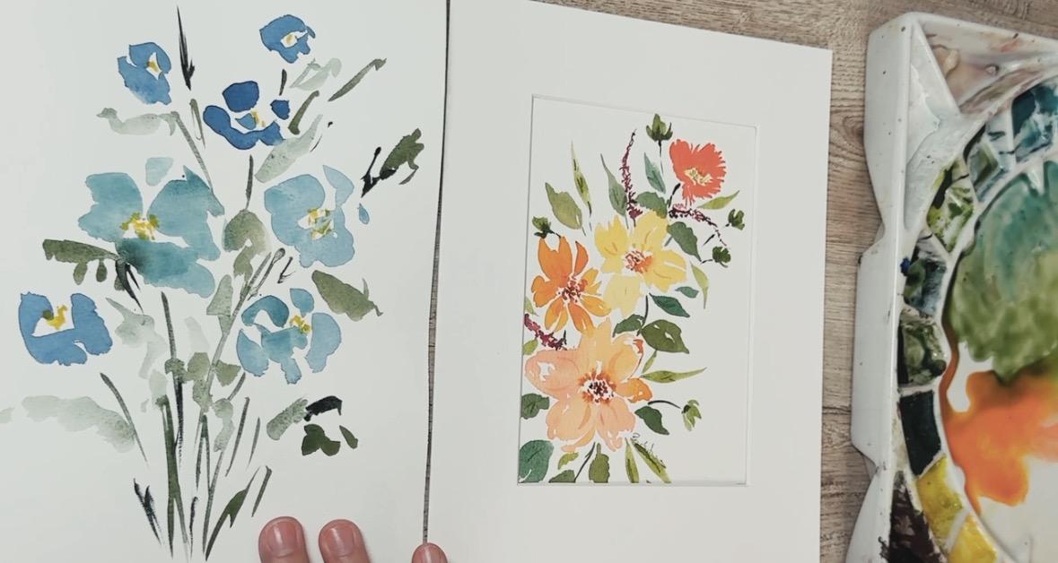
going to overwork it. Here I have a perfect example. This comes from
one of the classes that I just recently uploaded where I overworked my
painting. Right here. Let's take a really
good close up of this. I'm going to actually zoom
in so that you can see that. So let's just take
a look at this for a minute and take a
look at this painting. Right here, this
particular bloom. You can see that not only is it darker where I have added, like, almost a darker color, but it also got muddy because it touched into
some of the black that was already there and brought
it up into the petals, and it made it a
completely different depth from all the
other blooms around it. This wasn't a intentional layer. I could have and
should have just added in little extra spots like this or a spot like this where it just adds
just a little touch of something to create a
little variation in the depth. I didn't do any of those. I tried to fix it. And when I tried to fix it, I actually messed up
this whole bloom. So now this entire
painting feels overworked. So we're going to
intentionally look at. I'm going to show you how
to overwork your project, how to not stop in time. Even though I showed
you this example here, I want to show you in real life what that would look like. Let's say we're using a
size ight paintbrush. I have my water on here. I'm going to use some
of my teal paint, and we're just going to make
a cute little flower here, just a little simple flower
with some little buds. Okay, and we're going
to go like that. Or maybe we're going to add
in another one over here. So we're going to put in another
couple petals over here. So something just very, very simple as to what you
may be painting at your home. And you can feel free
to paint right along with me or just watch
whatever you want to do. So we're just going
to be painting some of our little buds here, just making a little grouping similar to the yellow one
that we just looked at. And then now that I got these little four or
five different buds going on here and I'm
getting these things going. I'm starting to look at it,
and I'm starting to go, Oh, this one is so much darker
than all the other ones. I don't really know, I started my paintbrush was full
of paint from my pan, and that made this
really, really full. So I should probably and really, really but I really
like these lighter, more transparent ones where they have more water
and less paint. I really should fix that one and maybe I should
fix this one too. So we go and we rinse
off our paintbrush and we dry it off
on our rag here. And then we come in
here and we start to manipulate it and we
start to lift it up, and we drop it off. Oh, oops. And then that made it
into a bigger leaf, so we should probably fix that. So we're just going to make that petal bigger. That's fine. We're just going to, you know, rinse off our paint
brush and come back in here and lift because I've
heard that we can lift paint, so that's good, right? We should lift
that up. And maybe this one's too dark, too, so we're just going to
we're just going to change that one completely and
just change that around. And, Okay, well, I don't
want to overwork it. So I'm going to call that done. Oh, but now this
one's too light, so I should probably add some more paint back
into it because, you know, that's you can
always add more paint back in. Do you see what I just did?
I completely overworked this because I let
my anxiety over my painting not being
perfect control my paint brush instead of just allowing the paint
to do what paint does, accepting what was
happening on my paper, leaning into it and
saying, That's okay. This painting this particular
bud is going to be darker, and these other
ones are lighter. So if I want to balance it, maybe I could have just
put some darker buds over here to balance the whole
thing and make these heavier. And then I would have
had nice contrast because I would have
had lighter buds, a darker bud, a little flower
here and a darker one here. And then I could have put maybe some little tiny
ones that hadn't completely bloomed.
Out to the side. And we could have
done something like this and made it really interesting and then
added in a green, like a stem and had it
coming over like this. And wouldn't that
have been cute? But instead, now I have overworked buds that
are going to dry crazy, and we're not going to enjoy
this painting anymore. So when we are painting, when something happens
that isn't expected, we have to remember that this is watercolor and watercolor
is not perfect. That is not the
medium of watercolor. There are some areas where
you can paint perfectly, but watercolor just kind
of goes with the flow, and we need to just allow
ourselves that freedom and that grace to allow our paintings to become what they're
going to become. So if you have realized that you're not sure if
you like something, you need to really think about if fixing it is
the right solution, or is there a better solution? Should we be adding just
a contrast out here and adding something that makes the balance happen better? Or maybe we just lean
into it and we say, Oh, let's just create a great big flower over here instead. Wasn't our original
plan, but that's okay. Let's not overwork
our paintings. Now the next thing that
happens with overworking, and we're just going to
keep using the same one is if somebody comes in and they're taking
a look at this, they're painting, and
they go, Oh, gosh, this painting, let's say this particular bud because we haven't messed
with this one yet. This bud is too soft. I think it needs to
have been darker. And so I come in with my paint brush and I try
to paint on top of it. And I try to very carefully
get my thick paint, and I try to paint on top
of it and coat it and overwork it this way by adding some dark thick paint
up on top of it. Now that is also going to be
overworking your painting. When that dries, that's going to look really crazy
and unfortunate. Where a simple solution instead of going
right on top of it, and this is a painting, this particular bud and that
one we haven't touched yet. I'm going to come in here
with the same paint, and I'm just going to add
maybe a little bit of center to it and
maybe on this one, add a little outline or a little line in there just
creates a second layer. And then all we can
do is just have these little tiny lines that creates a look of
depth and dimension. And that is really all
we need it to have done instead of painting
over the whole thing. So when we are
overworking our painting, sometimes it happens when it is completely wet like
we just did here. Sometimes it happens after
it's dry and we add in too much of the good
thing right here, like we just did
here, or sometimes it happens when it is
still just damp. So this one is still damp. And if I come in
here and I go, Oh, let's add in a little bit more we're just going to
stay with that same color. I go and I put some more in. I really want to get
it to look darker. We can add more color
right there like that. Now, that may or
may not work okay. It might be fine, but we have to be really
careful when we are adding layers that you are at the right, the
amount of water. And that only comes
from practice. So, the more you practice with
your water and your paint, the better that you
were going to become with knowing when to
add that second layer, when to add that second color, so let's just move on and I'll show you an
example of what I mean. So if I'm making a bud, get my paint brush full. If I'm making a bud
and I go like this, and I'm going to make
this little flour, I'm just going to make it
a little four petal flour, and I come over here and
there's my four petal flour. Gonna rinse off my paint brush. Right now, it is very wet. And if I went to try to
put another color in here, it's going to bleed out crazy, and that's going to be too much. So we have to wait for
that to dry a little bit. In the meantime, I
could be thinking, now what color should
I add in here? I think a really pretty blue or yellow would
be really pretty. I'm just going to wait and I'm going to watch this
and you can see how shiny it is you can start to
learn that when it's shiny, too shiny or the
paint is rolling, then it has too much
paint in there. So when that becomes just the
perfect amount of dampness, then I will add my yellow
in and let that bleed out. In the meantime, maybe we'll
just paint another one. We'll just paint
another little petal, just a sweet little
four petal flower. If you are learning
petals right now, a four petal is something
that's really fun to paint because you can just squeeze those petals in
however you want to. They don't have to
be the exact shape that you can make them whatever shape you
want to make them. So we're just going
to make a couple. I do like to vary my
shapes of my petals, it causes them to have
some dimension and some direction so they look like they're
facing different ways. So I've got a couple of
different petals here, and they're going to be
drying at different steps, because I have different
amounts of water. So this one is still very, very wet, but this one
is almost perfect. Actually, the last
one that I painted is almost a perfect, dryness. So I'm going to get my yellow. I'm going to add my
yellow to my paintbrush, and then I'm just
going to come in here and touch into the middle. And as I go and touch into
the middle, I can go, Oh, maybe that's a little
too much on my paintbrush, Brush it off, and then I
can just carefully touch into the petals so that
you can watch them bloom. It's just slowly spread out. So instead of overworking this, I'm just going to
allow it to happen, and I'm just going
to allow them to flow the way they want to flow without overworking my petals over here like I did at
the beginning to show you. So as with watercolor
and as with most things in life,
there's always exceptions. So I'm going to show you
an exception right now. I have cleaned my paintbrush. I have it fairly dried off. I just using this rag
and just dabbing it off. And now I'm going
to come in here. I'm going to say,
if I don't want it to I don't want this yellow
coming all the way out, I can kind of stop it by
lifting up some of it. I'm just very intentionally and carefully lifting up
some of the paint. I'm not moving it around,
not manipulating it. Lifting some of it up, and that's going to
keep it contained. So go ahead and practice this when you get to the
class project at the end, if you are doing something
and you realize that you are just about ready
to overwork something, just slow down, consider it, think, is it really
necessary to fix it? Or if I fix it, am I going to be creating something
that looks like this that is overworked and is going
to ruin the entire piece. Be careful with that.
Come on back to the next lesson and we're
going to talk about having too small of a paintbrush or too large of a paintbrush and deciding which paintbrush is the job right tool for the job.
3. Mistake #2: Choosing the Right Brush: So many paint brushes. This is only a little small selection of
my paint brushes, but I wanted to talk about
the right tool for the job. Oh, my goodness. As you become more and more
accustomed to painting, you are going to realize that collecting paint brushes
becomes kind of a hobby. I don't know what it is, but every artist that
I talk to talks about how they have collected so many paint
brushes over the years. So I just gathered up a few just to show you what
I'm talking about. We have flat paint brushes
that are really good for adding a lot of
water across a page, and you can get
them in any size. This is a 1 ". This
is a half inch. There's different brands,
there's different qualities. Paint brushes that are flat
like this are really nice. I definitely recommend that
you have one of these. A 1 " is fantastic. Sometimes you can get them in a whole set and a whole kit. So that would be one thing
that you might want to find. They're also fun
for painting with, but I'm not going to be us
them on a regular basis. That's not the paintbrush
that I tend to go to. But I have seen
watercolor artists who love their square brushes. It creates a lot of really beautiful angles when
you're painting. So I can see why
somebody might like the really flat brushes. Then there are mop brushes, and mop brushes can come
in all different sizes. You can get a kit like this
that has a whole bunch of sizes from something that's really big to something
that's much, much smaller. You can always get a
set of mop brushes, and they're really awesome, especially when you're
trying to just paint really loose and organically and let the paint brush flow and let a lot of water and a lot of paint hit your paper all at one time and just see what
happens as you're painting. So you will often see me
painting with a mop style brush, mainly because it's just fun. So I definitely will
use mop size brushes. Then we will have the dagger, and the dagger brush is absolutely one of my favorites
to paint brush with. I don't usually do very
many lessons using the dagger paint brush
just because it's a pretty tricky
paint brush to learn and I know that most of my students are on
the beginner side. So one of the this one
is a Princeton Neptune, and this is the three eighth, and this one is a quarter inch. You can also get them from this transonset and this is
a set that I really enjoy, especially for beginners because it has all the different shapes. So it has a point. You can see how it
comes and it's almost carved like a knife down to a point and then flat
down at this end. But the other thing
about a dagger is how floppy they are. So they're just
really, really floppy, floppy brushes, and this is
without it even being wet. Once you wet a paint
brush like this, they just get really, really fun and floppy. And just to give
you an example of what a dagger paint
brush can do, as you are painting along with a dagger, a little
too much there, you can drag a really thin
line and then you can lay a paintbrush down and you can create some really
unusual shaped leaves. Just a fun fun fun fun
paintbrush to use. You can also use it to create some really nice looking petals and flowers and you
can get really, really organic with it. A great paintbrush, something that you would
have to learn how to use. Then after the dagger. So then we have
the filber brush, and I got this set and it has a whole bunch of
different sizes in them, and a filber paint
brush is going to have the traditional
it's going to be flat, similar to our big
flat paint brush. But as you can see, it
is rounded at the top. So instead of being squared
off like a flat paint brush, it has a round tip to it, which is really fun to use. I have not been successful
with the filber. These I find to be a
little challenging, but I'm sure it's because I haven't practiced
very much with it. Some people love to make
flowers with a filbert brush. So you could give those a try. Then I have this little guy, which is one of my favorites, and I should actually
show you this one. This is a mop brush,
and you can see, it's just a little tiny has a
little tiny tip at the end, and it's small and it's round, but it's almost like a cut off. It's almost as if they've taken a round brush and just cut off the tip so it doesn't
get pointy at the end. But what's really
awesome with it is that you can just dab it
into a little bit of paint, and then you can make these
little tiny um, dots. So if you wanted to
add little berries, these could be
little tiny berries, or if you wanted to add something to the
center of a flower, you could add this into
the center of a flower. So really a fun little it's
almost like a stamp where you can use it to stamp down
and make a little design. This is actually one
of my favorites. I use it quite a bit when
I am painting on my own. Then I have a detail brush. So this one is just the
tiniest little thing, and you can use this to
create little tiny details. If you wanted to add in little tiny dots into the
center of your flowers, you could use
something like this. So I like my little
detail brush. I can use it for all
different kinds of things. And then I have this one, which is a liner brush, and a liner brush or it's also could be
called a rigger brush. So if you're looking for
this out in the market, you can look for a
liner or a rigger, and they're long and floppy. So just these long, long floppy brushes
that are really skinny and they can come
in all different lengths. Sometimes this line can be really long, sometimes
it's shorter. Then how that one works is you fill your paint
brush up with it, and then you can create some really interesting little lines. You can create all
kinds of swirls, you can even lay
it down and create lines like that
to create a leaf. Really a fun brush. This is probably one
of my favorites as well when I am off
painting by myself, because it's just such
a fun paint brush to experiment with. That's my liner or
my rigor brush. And then you're going to
have your standard brushes, which are your round brushes. Now, this is what I will paint with 90% of the time
when I'm making classes for you guys because round brushes are on
the standard side. This is what you would
typically have in your home, and I want to make sure that watercolor is accessible
to everybody. So I stay in the round brushes. Round brushes, when
you are looking for a really good round brush, I want you to look for
something that is, um has a nice handle, but not too long. Sometimes the handles can
be really, really long, something like this
or even longer, and those can be sometimes a
little challenging to use. I like to have my paintbrush
about that length. And then I like the fact
that these are springy. So as I use them, they spring right back. Uh, and I love the fact
that they come to a point, and you can see how nice of a point they are now
they're not all wet, let's just get them all wet. You can see that. But all of these have a really
nice point at the ends. So I really enjoy a round brush. So now let's talk about sizes
of these round brushes. If you were going to be
only buying four brushes, and you're like, I
don't need all those. I know they're available,
but I don't need all that. I just need my top four brushes. These are the four that I
would recommend that you get. Now, whether it's this
brand or not, I don't care. This is the Princeton
Heritage collection, but that doesn't matter. You can use a school
supply paint brush, as far as I'm concerned. The paintbrush
itself, the quality is nice as you are growing and learning to get better
quality paint brushes eventually is nice. That is not going to be
your most important supply. So use whatever you have, whatever you have available or easily accessible or
something that's affordable. So the four sizes that I would
recommend is a size three, a size six, a size eight, and a size 12. If you can't find a size eight, then a size ten is also fine. The reason I'm suggesting
those four sizes is because it gives you enough variation between the four
different sizes. So that you can do almost every painting with
one of these four brushes. You can get a lot of paint. If you needed to fill this entire section
up with white with water and you don't
have a nice flat brush, you can use a size 12 to quickly fill this whole page with water instead of
using a flat brush. If you just want to paint
your traditional flowers, a size eight is a great
almost always go to size. A size six is great for
adding some smaller details, and then a size three, you can use this instead
of using your very, very tiny little micro detailer. You can also use a size
three to create all of these lines that
I showed you from the rigor brush or
the liner brush. You can create all kinds of lines using this
very small brush. So those would be my four
that I would recommend. We have our brush
lesson out of the way. I do want to show you some of the classic mistakes or ways that you can make sure that you're choosing
the right tool. And that is by one
of the biggest, probably the most
obvious mistake that I see is using too small of a paint brush
when you are painting. So if we are going
to be painting, I'm just going to set this one here so
that you can see it. If you're going to be painting
this painting right here, I was going to be choosing a
paint brush and I could only choose one paint brush to
paint this whole piece. The one I would select
is a size eight. I would not choose the size six and I would
not choose a size three. Now you're going to say, but I thought you just said
that you could use the size six and three to
create all these small details, and you absolutely can. You can use these to create these little
tiny small details, but you would not want
to use a size six or a size three to create
these flowers here. These are too small to
create these flowers. You could use the size 12 to
create this entire painting, but you would not want to
choose a smaller paint brush. Then you're going to
say, but this one has all these little
tiny details. How on Earth would I paint all those little tiny details with a size eight paintbrush? Well, because we talked
about the fact that this paint brush has a tip on the end and this little tiny tip is the same size as
this little tiny tip. All we have to do is when we
are going to be painting, those little dots is just add little tiny
dots to the top. So we just added paint to
the tip of this paint brush, and then I can create
all those little dots. Then you might say,
but how do you create these little
tiny flowers, these little pink flowers
if you're going to be using a great big
size eight paintbrush. I'm going to tell
you, because all you have to do is just use this part of the paintbrush from about a third of the way or a quarter
of the way to the end, and then you can just create little tiny flowers
just like that. Same flowers a
little tiny flowers by just using the tip
of that paint brush. So using a size
eight is going to always be my recommendation if you don't have
these other ones. If you do have a
size three or a size six and you want to switch between brushes to make
different flowers, that's fine. You can do that. But you don't have to have these smaller brushes in
order to be able to do this. And then you might
ask, well, how do you use a size eight when you're making a flower, like a leaf. So we're going to just fill
this up with my green. And because it has that tip, I can make a fairly
small thin line. And then I can lay this down and create my leaves
using the size eight. I did not need to make this
with a smaller paintbrush. So now I'm going to
show you the contrast as if you were going
to be creating these flowers with a size six or a smaller paint
brush like a size three. So we're going to choose a
nice orange here, orangey red, and I'm going to put this around so I put
my hand in the paint, and I'm just going to be
creating a flower like that. So if I paint here. Now, one brush did not create an entire size
of brush that petal. It's petal here compared
to this petal here. So now I have to add
another one here. And then I'm going
to create one here, and I have to keep
brushing out to create that same petal. Oh, I'm going to create
another one here, and then I'm going to
create another one here. And you start to
see all the lines that are inside of here, where you are creating
and you're having to push that paint brush
around and you have to work so hard to add
and to make that pedal. And then it got too big, it's so difficult because
I'm using too small of a paintbrush versus if I switch over and I
use my size eight, and I go to make the same
petal, the same flour. I can create one, maybe even just add a
second thing here. Just like that, I can have my flour without all
this overworking. Do you see all the
overworking inside of here? That's because I used a smaller paintbrush versus
a larger paint brush. Would be even worse if
I went and tried to use the size three
paintbrush to make that I have to lay my
paintbrush completely down, and I'm almost having
to scribble to generate that same shape petal. And I do not recommend too
small of a paintbrush, go with a larger paintbrush. You could even do the same
thing with a size 12. Here I'm going to grab my paint. I'm just going to create
a size 12 flower. You can see how size 12 creates almost the whole
petal in one go. The larger the paintbrush, the easier you will
actually paint. When I suggest to you to use one of your
larger paint brushes, this is what I'm referring to. I could even paint a leaf using this size
12, this great big one. Let's go ahead and
paint this same thing. But with a size 12,
this great big one, I can just make a nice tiny line because it has that nice tip. And then I can create
a leaf and a leaf. See how even though it's
a great big paintbrush, you can still paint the exact same flower leaf
setup or flowers. But you also have the freedom to paint something that's large. When you only have one
paintbrush in your hand, you can really move around
and you can be like, I'm making this grouping and I'm going to be making
this whole painting, but I really want to be able
to put a great big leaf in here because you have this great big paint
brush in your hand, you can move from painting
something like that and adding a great big leaf to adding something with
just a little details. You could add
little tiny details without having to
switch paint brushes. So I highly recommend that
you use a size eight, ten or 12 for 90%
of your painting, and this will get you the success that
you're looking for. Stay away from the
smaller paint brushes or reserve them once your painting has
dried and you want to add a layer or you want
to add some details. Use these smaller
paint brushes for that and the larger
paint brushes for your main works of art. Come on back to the
next lesson and we are going to be talking
about water control.
4. Mistake #3: Learning to Read the Water: In today's first lesson, I talked about one of the most classic or most scene concerns, which is overworking
your painting. Although that is
very, very common for what you see in a
finished piece of work, one of the largest challenge that I would think that
people have is water control. When you are
painting with water, water is one of
the key elements. It's probably the most
important element that we work with knowing
how much water, adding too much water or not
enough water is really going to be one of the
largest challenges that you need to learn as a
beginner, watercolor artist. When I work with water, I have two, sometimes
three containers of water. I just usually use my
little mason jars. I have one that is mostly clear. I start with all
three being clear, but very quickly
they become dirty. So my clear one,
I'm going to use, if I want to make sure
that my paintbrush is 100% clean and that there
is no pigment left, no paint left in my
paintbrush at all. So that one kind of stays on the furthest away
from my right hand. I am right handed, so that one goes on
the left hand side. Then I'm going to have a
mostly clean jar of water, which is where I might just if I just had a little
bit of paint in my paint brush and I just want to quick rinse it off,
I might use this one. And then I might
have a third one, and you can see this,
this one's dirty. This is where I'm like, Oh, my paintbrush is full of water. I've got to get the
bulk of it off in here. This is almost like
my quick rinse, then my start of my wash,
and then I have my third, which is for if I'm really, really being careful and making sure that I don't
have any paint. I'm going to use
this one the least. So these two being forward here, when you use your paint
brush and your water, I like to spray down my paints. I want to make sure
that all my paints are 100% wet and activated. Then you're going to
have different levels of how much paint and
water go together. And when I mix mine, I like to have little
puddles so that I can see how much paint
and water I have here. The different amount of water
in your paint is going to make your paint on your
paper darker or lighter. Right here, you can see
that this is very liquidt. Look at how I think you can
see that in the camera. Yeah, you can see that this
is very, very liquidy, and there's lots
and lots of water here and just a little
tiny amount of paint. When I come over
here to paint that, you're going to see that
it is very, very clear. It's almost transparent because there's so much water that
it becomes very transparent. This is a great background. It's a great way to show layers. It's a great way to
introduce a petal or a flower that you then later want to add in
another color too. So if I have it like that, but then I decide that I want
to add in just a little bit of this lavender color, I could add in just a
touch of lavender to it. To add another layer of color. This one we're going to call just your transparent,
the most watery. Some people call
it tea strength. If you think of iced
tea or hot tea, this is tea strength where it's just water with a
touch of color to it. Then we can go to more of a
coffee strength where we add a little bit more color to
it where it's still thick. But you see how when you push
your paint brush across it, it does leave a
little white line, so it's a little bit thicker. If I'm just using this teal color now
and I add this to it, you can see that I
am getting just a little thicker in my paint. That will be really
great if I want to be able to add in
another color on top, using that same teal, but just
a darker less water to it. You can see how that's just
going to now flow across. Then if you want to
make it even thicker, I would call this
milk consistency where you're coming in and
it's pretty darn thick. It's a lot of paint and
just a little bit of water. Now this is going to be a
more milky consistency. So you can see how much
darker that is in here. Compared to these others. But you will also
notice that when I go to add in another color and let's just choose this blue. If I go to add in this color, it will blend continue
to blend and bleed out. It's just going to
have less contrast because here we were really, really light, and I
added in a color. And here we were medium, and I added in a color. So you're just going to
be getting less contrast. So you don't have
that light background with a little darker on top. You're going to be seeing this. And when this starts to dry,
you'll see what I mean, where there's less
contrast between the background and that little addition
that you added in. Then what I'm going to use next is what I would call cream. That's pretty much
when you go right into the wet paint itself, and there's very
little water on it. I'm not going down in here into where the
water is liquid. I'm just going into
where the paint is itself and it's really thick. Let me just use this
little palette. This is just a dry
palette just to show you this is
how creamy it is. So almost like cream that you would put on your face,
very, very creamy. And when I put that on here, look at how creamy
that paint is. But it also makes
it so that it's almost not transparent at all. And if I go and try
to add in that blue, that dark blue again, it's barely going to move
because it is so dry already. That cream is so dry
that that's not going to blend because it's
almost too dry of a paint. When cream is really
great is when you are adding it to something
that is already wet. I'm going to try that again and I'm just going to
show you what I mean. I'm going to take some of
this more coffee texture where it's still transparent, but maybe not as
transparent as this tea. So back to coffee. Then if I wanted to
add in this cream, go back to this
cream and dipping right into the paint itself. Same color. I'm just going
to do the same color. Because this is creamy
and this is coffee, it creates just this
beautiful flow. Look at that. It's
coffee and cream. Cream that you put
in your coffee, it as a perfect combination. You will be able to create really nice combinations
of color if your original if your
original painting was made with a coffee
strength of water and paint, and then you add in a cream
strength of a second color. We're going to watch
how that flows. See how you can
watch that and you can see it's just flowing
out and growing across. Coffee on the
bottom, cream added. So there's a perfect
example of all of that. So now I'm going to
just show you what happens if we paint with cream. Let's just say I'm not
going to I just have this creamy see
that creamy texture where it's just paint with a little bit of
water added to it. I'm like, Well, that's wet.
That's water painting. That's watercolor there, right? That's creamy. So now
I go to make my flour. And just look at
how difficult that is for me to paint and
look how jagged that is. It's not flowing. It's not
filling in with the paper. It's just it's too dry. It's too hard to paint
with watercolor. And if you are getting
this kind of a result, you're probably painting with
cream and not enough water. If I just take a little bit
of water and I add it to it and I make it more
of a coffee strength, watch how much easier it is
for me to paint that flour. But then if I want to add that dark color back
into the center, I can come back
over and dip in and get that creamy part and I can add it right here into
the center because I'm adding cream to my coffee. And just look how beautiful
that is. That is so pretty. Because it's the
right combination of how much water to paint and using it in
the right application. I can even because I have
cream here on my brush, I can add in some little
dots into the center here to finish off
those little flowers. Same with if I was going
to be painting a leaf. If I used this creamy paint, creamy paint to paint a
leaf, spin it around. I try to make a line, and I make this leaf, I make another leaf.
Now, that worked. But it's thick and
it's dry and I can't make the leaf as
nicely as I can, if it is more of a coffee strength where I can
create this beautiful flow. So use coffee or tea strength when you are
painting the first layer. Add cream when you're adding
in some of the details. Now, you might say, but
then when on Earth do I use the tea strength?
Let's talk about that. You would use the tea
strength when you are adding in a
background or when you want to add
additional leaves and petals that are a lighter
consistency, lighter quality. Here we have coffee flowers. And if I wanted to add in, here you can see all
the way out here, this is my tea strength, blue. So I'm just going
to pick up some of my teeth strength
because it's so liquidy. I can create these
little tiny tea Flowers, Tea strength flowers.
Put one there. Put another one,
tiny one over here. We're gonna let those dry. Those there. I'm gonna let
those start to dry to show you what tea strength
flowers look like. Compared to these flowers. But again, I'm gonna
wait. I'm going to add in some cream to my tea. I'll dip back into my
creamy paint over here. And you can see that I can add a touch of that creamy
paint into my flowers. Because the cream
that I'm adding is cream strength and
not too watery, it's just going to naturally
blend out so beautifully. But you can also see the
color difference between these tea strength flowers and these coffee
strength flowers. You can also use strength
paint as your background. Here I'm using this teal color, strength, and I'm
just going to add in some background and around. You can see how you can add in this lighter
color because it's tea strength in and around your flowers and that'll create a really
beautiful background. So, coffee, milk, cream.
Hope that helped. I think the only
thing that left that I really wanted to
show you is what happens if you try
to use your coffee or tea strength on a coffee
or tea strength flour. So let's just quick
do that one as one last thing just to make
sure you fully understand. So here I have this
is a coffee strength. I'm just going to make a
quick little flour here. Again, just a little a little quick flour,
four petal flour. Then let's say you want to come. You want to come in with
a coffee strength blue, and you want to add
that to the center instead of adding in cream, let's just watch to
see what happens. It's always fun to
do experiments, so you should be experimenting
with this at home. So this is not a problem. You can do this. There's
nothing wrong with doing this in your paintings. If you use a coffee strength and a coffee strength or a tea
strength and a tea strength, but what you're going to get is a much more subtle combination instead of a much more dynamic, dramatic contrast like this. This remember, this was
the exact same color. I use the same blue
for my coffee, and I use the same blue
for my cream and look at how drastic of a
change in colors. This is a tea strength blue
with the exact same blue, same paint, but in cream. Tea with cream and
coffee with cream. But here I use two different
colors and you can see how that second color almost took over
the first color. Instead of leaving a really
nice dramatic change. So we'll just do it
one more time for fun. If I added running out of a
little bit of paint here, if I added in, this is just gonna make a three petal because that's
what I have room for. A T strength or this
is coffee. Sorry. Coffee strength petals. And then doing it again
in the same color, it doesn't make sense
because it's going to just be more of the same. You see how it
doesn't do anything, which is why I had to
choose a different color. We're here adding in the same color just made
this beautiful contrast. Here, when I added in
a complimentary color, it just blended almost
out to the tips. I would have to come back in with more cream
strength on my brush. Here, I can do this
because this is still wet. And add cream to my coffee. I want you to play
around with this. This would be so good for
you as beginner artists to play like I just did
follow along, do this. You can rewind this
video and do this again. Get out This is just a
scrap piece of paper. This is just a painting I
had done for another class. I just use the backside of it. That's what I've been
doing all along. It's all these little ones. I just use the
backside of something else that I've already
done that I'm not going to be framing and I use the backside of the
paper for scrap. And I play and I practice, I see if I can
create tea strength, coffee strength, milk
strength, and cream. Once I have made those four, I start to play around with them and I create little
combinations. So we're going to be using
this in our final lesson, so make sure you have practiced this so that you have
an opportunity to use this skill in our
final class because I cannot wait to see what you have learned and what you
have put to practice. Come on back for our fourth
class, our fourth lesson, which is going to be not
painting in every single detail. Or another way of saying that is creating beauty without details. So let's come on back
to the next lesson, and we're going to be
discussing creating paintings without feeling like we have to get into the nitty
gritty detail.
5. Mistake #4: Staying Loose Without Every Detail: If you followed my
account for a while, you have probably
noticed that I like to paint in a loose
watercolor style. Sometimes I call it atmospheric, sometimes I call it loose. Sometimes it's even abstract. The reason that I prefer that and maybe it's
the same reason you prefer it is that I am
not detail oriented. I personally don't love all the little
details that go into a painting when
paintings get really, really refined and
absolutely beautiful. There is I'm not disrespecting
a detailed painting. Those are beyond beautiful, but that is not my style. What I think is
really important is that you discover your style. Try a whole bunch of different styles of
watercolor paintings. Try painting sceneries and trees and landscapes and
houses and buildings, try painting flowers
that look realistic. Try painting leaves that have a realistic take a
real leaf and lay it out and paint it so
that you get it to be as close to
realistic as possible. Then also try loose, organic, flowing atmospheric painting and discover what brings
you the most joy. Some people look at my
watercolors and see how loose and atmospheric and almost abstract
that they are. And they go, No,
that's not for me. I like it when I can look
at it and I can identify that that is a blue cornflower, or that is a pink rose, whereas they might look at
my roses and say, well, are they roses or are they
peonies, am I looking at it? What is it that I'm looking at? It looks like it's
blurry almost. To me and my style, this is what brings me joy. This painting like this
brings relaxation. Where there are
so many things in my life that the details
are so important. I I don't get all
my details done right in other areas of my life, then I cause problems, either problems for myself or for my work or for my family. You have to be detail
oriented in so many places in your life that when I come and sit down at
my watercolor table, the last thing I want is to feel like I have to be detail
oriented here too. So for me, painting in a style that allows your
brain to just relax, let the paint flow, see what happens,
discover a new technique, create something unexpected, add color combinations that you had no idea if they were going
to work or not work. Play and have fun. So when I paint in this style, I personally get
relaxation and joy. Not everybody does. Some people like control. They like to have the understanding that
when they are finished, it's going to actually
look like a rose. They look at this and they say, but what flower is it? And their minds need
details, definition. And specifics. And that is great. You can go and paint that way, and your work is
going to be stunning. And I am so proud of you for knowing who you are and
what makes you relax. I find relaxation in this style. What makes you happy? Have you tried all
the different styles? Have you looked into all the different
kinds of paintings? I encourage you to go and
try different styles. Find loose like
some of my classes, find some more detailed, try landscape, try buildings, see what's going to
be making you happy. We're going to be painting something similar to this today, just as an example of what I'm talking about
where we do not need to have the answers,
all the details. We just have
something that shows shape and form without
needing all the details. Now, this particular one is
one of my other classes. I'm not going to repaint
this one because you can take this one from
another class of mine. But what we are going to
be doing is using this as the foundation for what I'm referring to when I talk about just letting
the paint brush do its thing and painting loose and not worrying
about the details. So I'm adding this lesson
in here in this class for my tips and tricks or
mistakes that people make. I want to be careful
because it's not a mistake to be
detail oriented. That's not what I'm
trying to explain here. What I'm trying to explain is if you are working
in a loose way, if you are working in
an atmospheric style, if what your goal is more abstract or more loose
or more atmospheric, and then you go and try
to add your details in, that's when the
mistakes are happening. So choose your style
and then decide to stay there instead of going and then adding in the
details on top. That's where the
mistake is coming from. So for example, on here, if I had gone and all of a sudden decided
that I needed to draw real petals and show you exactly where
every single petal was and draw out maybe outline the leaves and put in
all the different vines, I mean, the veins in the leaves, that's where the
mistake would have been coming from by adding in too many details on top
of a very loose painting. So let's paint something really loose and get into it
and see what happens. So when I am painting loose, I definitely like to choose one of my
larger paint brushes. Today, I'm going to
be using my size 12. And in today's lesson, what we're going to do is just use some paint and we're going
to put it down on paper. I'm not going to be painting
anything in particular. I'm not looking to paint
a specific rose or a specific daisy or tulip
or anything like that. I'm just going to, I
put a little dot there, so that's obviously where
my paint is going to go. I'm just going to add some little bits of
paint around here. Maybe this is my first flower. I'm just going to add
something like that. Then maybe I want to
pick up some blue. I'm going to get my
coffee strength, and I'm just going to
add in some blue here. I want you to see
that I'm holding my paint brush up near the end. I'm at least a third
of the way up, and I'm just holding
onto it like that. And I'm just dabbing it. Dab dab dab, dab
some more over here, switch it up, come
back over to my teal. I didn't wash off my
paintbrush completely, so now it's kind
of a combination. Do you see how I'm
I'm not making it particular or detailed. I don't even have
real petals here. I'm just putting in some
little blobs in a circle. Now I'm going to rinse
off my paint brush. I'm going to use
the same size 12, this great big
giant paint brush, and I'm going to grab some green and I'm going to
add in some little lines. Do you see how they're
not all connecting? Some of them come
all the way down, some of them don't of them
touch to the flowers, some of them don't
I'm going to add in some little leaves
using the same size 12, again, holding it
on the top quarter, top third, I'm just going to
add in some little leaves. Because we're not going to
be making details here. We're just going to be adding in some pretty little leaves. I'm going to mix it
up and I'm going to come in and get a
different color green and just see if I can add in some extra
little bits here and there. Adding different colors of greens really adds
to your painting. I'm going to rinse that off. I'm going to just
stay with this size 12 because I want to make
a point here that you can use your size 12 for everything if that is the
way you'd like to go. I'm going to stay
with those colors. We're going to add
in one other green, but I want this green to
be more of a yellow green. I'm just going to grab some
of this orangey color. I'm going to pick up
some of my green. I'm going to mix them
together here on my palette. Pick that up. Again, this is a milky
strength right now. I could add a little
bit more water to make it coffee strength. Dip it off, and then
I'm going to just add a little bit more of
the third color. I'm looking very carefully
for where a little bit extra of leaves
would be beneficial. Okay. That's it. That's all I'm going
to do for my greens. Now I feel like my centers need something for
my little flowers, using the same great
big paint brush because I am going to
stay with my size 12. I'm just going to come
in and grab some yellow, and I'm going to use that
in my cream strength. So I want it to be nice
and creamy, creamy yellow. Cream strength. If
you skipped over the last lesson where
we talked about water, you might want to
go back and review that where we were talking
about how much water to use. I'm going to use
my cream strength. I'm going to come
in and look for the petals flowers that can handle some yellow added to it. Just going to add in
some yellow here or there as if they are the
centers of these flowers. There we go. Now, I did all of this whole
painting with a size 12, and you can see this
great big paintbrush, there is no way
that I could add in details by using a great
big size 12 paintbrush. But I've painted something
that's really pretty, very organic, very fun
and extremely relaxing. So go ahead and paint
something similar to this. Use the largest paint
brush that you have. Don't add in the details. Don't go back in
and add in layers. Just let it be the
way it's going to be. Let them blend the paints. So here you can see
that my green leaf is blending in with
my teal petal, and that's great. I love that. Maybe there'd be more for you. Maybe yours blended
in even more, and that would be wonderful. So go ahead and paint something like this without
adding in the details. Just drop the paint
brush and let the paint brush do its thing
and see what you discover. See what you create
just by letting the paintbrush and the paint
play around on the paper. I think you're going to be
surprised once you are all finished and it is dry and
you step away from it, I bet you're surprised at how beautiful it actually
is and how much fun you had without thinking
about adding details or making sure each
flower looked perfect. I want to see this
painting in the gallery. So when you have
finished it and stride, grab a screenshot of it and upload it to the
gallery because it's really good to see
what everybody is going to be making when they
make something like this. Come back to the next lesson, which is going to
be our last one, which is regarding white space on your painting
and allowing for that white space and allowing for the painting
to breathe and for your eyes to wander with
intentional white space. Come on back to the next lesson.
6. Mistake #5: Letting White Space Do the Work: So we've gone over so many
different things so far. We've talked about not
overworking our paintings. We also talked about
using too small of a paintbrush and
how that can affect our paintings and
that actually using a larger paintbrush
is going to be helping us be more successful. Then we talked about
water control. And if you missed this lesson, please go back and watch this
lesson about water control. It's so important. It's probably the
most important lesson in this whole class. And then in the last lesson, we talked about not painting
every single detail. If you are painting in a loose atmospheric style,
the way that I teach, painting the details
is where sometimes we get hung up and that a lot of looseness and this flow
comes when you are not intentionally creating a specific flower
or specific shape. Just like when we painted
these little flowers, I was not trying to create a shape or having it face
a certain direction. I wasn't doing anything
intentional at all. But even so because we
just allowed the paint to work and the paint brush
to flow across our page, we're able to create
something that's really fun. But something that I want to
bring into the attention for this next class is
controlling the white space. In watercolor, white
space is so important. We don't typically have
white on our palette. Now, here you do see
some white right here. This is actually guash. I don't think, as far
as my understanding is, is that watercolor does
not actually have a white. If you want white, you have to buy guash Guash is just more opaque watercolor. You still use water with this, but it creates a thicker,
more opaque paint. If you are going to be adding
this, let's see if I have. If I was going to be
adding this squash, I can be adding some
guash paint and white and you can add it
on top, just like that. Which is fine, and I
100% agree with that, there's nothing wrong with
using white to guash. But when you're painting
with watercolor, I want you to learn
how to not have to need to use the
guash and to rather intentionally leave
white space around things so that your white space is naturally coming
from your paper. So let's take a look at
a couple other examples. These are some of
the other pieces that I have painted
for my classes, so we'll just use
these as an example. Here, when I was painting
these little flowers, maybe it doesn't matter what
kind of flower they are, you can see that I added
white space around there. I was not making my petals so solid that we don't have
white spaces around. So with this one,
you can see how I incorporated the white spaces
right into the flowers. Instead of making it solid, I allowed for white spaces in
between each of the petals. Even up in here, where
these would have been solid petals if you were
seeing them out in the wild. But I left little white dots around just to create that
little contrast and to add a little bit of white and
highlights to my flowers. Even here, you can see that this petals aren't
usually shaped like that. But it adds so much interest to allow for that white space. Then even over here, if you want to see in
some of my leaves, I intentionally left
some white spaces for adding interest
into my leaves. Then down at the base, where I was painting
and I added in this really soft
background for a table, I intentionally used
a dry paint brush with just a little
bit of paint on it, and I brushed it
across and allowed white spaces to be formed all the way
across my paper here. And all those little white
spots gives it texture. It gives it highlight,
gives it interest. If you look inside of my vase, you can see where I just
added little bits of color, different blues,
different greens, but I didn't fill
it in edge to edge. I left white spaces. I even left white spaces around the outside edge where
I was painting in my backgrounds and in the centers here where I wanted to allow for
some light to be. So when you look at my
painting from a distance, you look at it and you don't necessarily see white spaces, but your eye naturally
allows you to enjoy those white spaces and
almost rest in those areas. Maybe your eye
immediately goes to the yellow because
that's the contrast, that's the bright one, that's
the one that's different. Maybe your eye goes there, but then as your eye floats across, maybe it comes down
this direction and it's getting some breath in
here with the white space. This one being the lightest
is almost a white space all of its own and it feels
very relaxed and enjoyable. Then you see all this down
and here and your eye goes across because you see that
texture and that lightness. So it's really
important that we add in and allow for
those white spaces, just like on this one that we just did from the last lesson, where I intentionally
left white spaces. I didn't fill everything
full with leaves. I didn't make sure that every
single flower had a stem. I didn't make sure
that there was three leaves on every stem. I'm just adding in the stems and the leaves where needed
and where appropriate. Where it adds to my painting because there's no obligation
when you are painting. There's no obligation
to make it perfect. There's no obligation
to make sure that every flower is facing the
right exact direction. You are the artist and you are allowed to make this however
you want to make it. But leaving in that white
space certainly allows for your eyes to
wander and to rest in different areas and to
explore the painting with a fresh new look
because your eye is not being bogged
down by darkness. So here's another example
where I added white. I allowed the white to come
in between these petals. When you look at a real
rose or a real peony, you do not see white spaces. There is no white in here. But if I hadn't added this
white in between here, you wouldn't understand
the definition between the different
peony petals. Here we have these little
white parts to show and indicate where the
different petals are. Even on a darker painting, I have intentionally
left white spaces. I left a couple of white
spaces in these little roses. Then I also made sure
that when I was painting my background that I left some areas that were
going to be lighter. Now, they're not
completely white. As you can see, this is painted. This is Okay. As you can see up close, this is white with a little
tiny bit of paint on it. That paint is very, very light. It's that T strength that we were talking about
earlier in the other class. This is that T strength. You look at the entire
painting as a whole. This allows for a white space
for your eyes to rest in, and this allows for some white space for
your eyes to rest in. Even though technically that is painted with T strength paint, and this is as well, it is so much lighter than the
rest of the painting. That this is your area for rest. I hope that that makes sense for you and that you
can intentionally, whether you're painting
a darker painting that you allow for
some white spaces, even if it's just
a few little spots in amongst your rose petals, or if you're painting
a much lighter, looser style like this where you have lots
of white spaces. But looking at the white spaces in between my petals and in the center of my flowers
really adds a lot to this. Come on back to the
very next class lesson where we are going to
actually build on all five of these tips and tricks and concerns or issues or whatever
we want to call them. I don't like to make them called mistakes because in watercolor, I don't think there is mistakes. I think it's just a
learning process. Come on back to the next
class where we're going to work on our next
project and we are going to create a really
fun painting where we incorporate not
overworking our painting or knowing when to stop. Using the right size paintbrush, which will probably mean
a larger paintbrush, maybe even larger than
what you're used to. Using the right
quantity of water, not too much, not too little, the right amount
for the right job. Foregoing those details. Let the rest of your
life have details. In today's painting,
let's skip those details. Then also making sure that
we allow for space for our eyes to rest and leaving
in some white spaces. I can't wait to see
what you've painted. You're going to
be able to choose whatever it is that you
would like to paint, but come on back and I will
be painting a painting with you where we incorporate
those five lessons. See you in the next class.
7. Class Project: Bringing It All Together: So for our last class, what we're going to
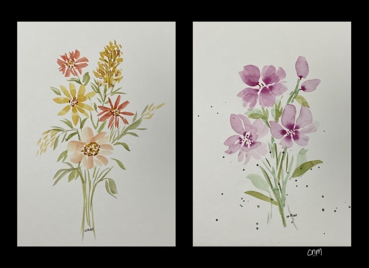
do is just paint a simple three flower bouquet. You can make whatever
you want to. If you want to make roses,
go ahead and make roses. If you want to make tulips, go ahead and make tulips. It doesn't matter to me what
shape you make your flowers, what style or color, or even the composition. What I'm looking for from
this particular class, from the upload that
you're going to be giving of your final
class project, is that you have
listened to the class, that you have taken
from that class the five different things that we have gone
over in this lesson. That you are not
overworking your painting, that you're learning and
figuring out when to stop before you go
and overwork it, know when to stop and be
done with your painting, that you are using the
right size paintbrush, which probably means you need
to go larger than smaller. Most likely you are using
too small of a paint brush, and you should try
the next size larger. The third thing was
that you are using the appropriate amount
of water for the task. Go back and watch that lesson, learn your water control, learn how to use water
to your advantage. Fourth, that you are not worrying about every
single detail. Today we're painting in a loose style and you
can be painting in a way that the flower
does not actually have to be recognizable as
a specific flower. You do not need to add in every single vein that
is inside of a leaf. Today in this lesson, we are just going to paint
loose and without detail. It doesn't mean you
can't add layers. You're very welcome to add
different layers of painting. But we're going to be
trying to just skip all the extra details that might be seen
inside of painting. And lastly, we're going to make sure that we preserve
our white space, the white space
around the painting and within the painting,
within each flower. Doesn't mean that
every single leaf must have a white
center or white stripe. I've seen that as well, where every single leaf gets that little extra
detail of white. Let me see if I can find that to show you what
I'm referring to. So in this one, we talked about how I left some white
spaces in my leaves, like a little spot there
and a little spot here. Now, if I had done these little white spots
in every single leaf, it may have become a
little bit too expected, a little too standard. So I was very selective
in not making every single leaf had that little white center or
a little white highlight. Just add the highlights
in some of your leaves. It will just add so
much to your painting. So I will paint if you
would like to follow my painting and do the exact
same thing, that is fine. You go right ahead and
follow along with what I'm doing and make it
however you would like to. If it looks similar to
mine, that's great. If you want to go
completely off kilter and do something completely
different, that's also fine. I'm just asking that you follow the lessons that were in
today's class and that you practice your best to show
that you have learned those five challenges that new watercolor artists
have experienced and that you are trying to overcome
some of those challenges. When you are talking to me about your challenges and the things that you still are
struggling with, I would love for you
to tell me about that. Create a little discussion in our class here today
so that we can discuss the issues that you're having because maybe then I can make an entire class just around the things that
you are experiencing. So I would love
to hear from you. So in today's class, I have this great big piece
of watercolor paper, but I have a piece of tape that comes down here. It's
not even centered. I'm just going to be painting
on this quadrant over here. This whole other side is going to be reserved
for something else. So I'm going to paint with a little flower up
here at the top. This is going to be my
very, very top flower. And I'm painting with a
size eight paint brush. And I'm going to just kind
of make this little jagged, see how I'm making it
really jag it at the top. I'm going to leave a
little open space. I'm gonna create a
little base to it, and I'm gonna put a
center in here with some little yellow
semens coming out of it. I'm just going to create
some little lines, some little white lines that
come out that direction. Y'all need a little bit
more this direction down, coming down, adding in just a little bit of white
space here and there. Yeah, that worked. Just to add a little bit
more over this side. That's going to be my
center of my flour. I'll be adding in some little
details, not main details, some light details
like the center of a flower in here once it dries. Now I'm going to move
on. I'm going to create a little orange flower. I was going again, I'm going to be using my I already had some water
sprayed on this palette, which is why I was able
to create this puddle of this almost milky texture somewhere between
milk and coffee, and I'm going to be creating
my base flower over here. And this one, I'm
going to create kind of a multiple little leaves around the center. But I'm going to leave in
some white spaces as I paint. I left those little white
spots all the way around, and I left a white center. Now I will probably
come back in with another color in a
minute to add into that, but I need to wait
for that paint to dry just a little bit because we're
working on water control. I'm going to add a
little bit of yellow. I'm gonna just create
another flower here. This one is going to be kind
of a little combination. I want my water to be looser, so I'm making this
more on the coffee or tea side so that I have it's gonna be a
fairly nice size flour. Something like that, leaving
some white spaces in around and possibly maybe I'll
add one more down in here. I wasn't going to, but
I kind of feel like I want another flower down here. I add in some of my pinks. Kind of like a combination of all the different colors
that are going on in here. Just add a little bit of
everything. A little bit bigger. Petals. I'm not going to overwork it. Didn't love that
one, but it's okay. I'm not going to overwork it. I'm going to leave
it the way it is, and we can always add some
extra details to it later. I'm just going to
extend this a little bit by adding some
white spaces to it. Now that this is
starting to dry, I'm gonna come back
in with this kind of red and add just a little bit
of that other color to it, just to allow it
to blend together. I'll put some over
in this one, too. But now I'm going to go and find some creamier paint
and use that cream. Thicker paint, less water
and add that in here. So if it does blend, it's going to blend
really thick. So I add some of those old dots. Maybe add a couple
more up in here. Blend that in together. Okay. Now, my first one looks
like that's almost dry. So I'm going to reuse my I'm just I've been rinsing
off in this one, and then I have this clean one because I want to
go into my yellow. So I'm going to
use my clean water to make sure that
my paintbrush is completely clean before I come over into my yellow because
yellows are so careful, so easy to get messed
up with other colors. So I like to make
sure my paintbrush is fairly clean before
I come in here. Now I'm going to be using
that cream texture. So it's nice and thick
on my paintbrush. I'm going to be adding
in some little lines, some little stamens here. Just little lines
and little dots. I even come in here and add some more, but
that's still wet. I have to be careful.
We're gonna let that dry. Okay. I rinse it off
in my rinse bucket. Rinse it off in my
white my clean bucket, so I rinse it off
in my other one, and then I rinse it
off in my clean so that I'm completely
dry and clean. Now I'm going to come over
and grab some greens. I'm just gonna mix it in with
some of that yellow just because I like that
earthier color. Again, this is kind of
in that milky texture. I'm gonna create a little base. And how that flower
stem is coming down. Oh, I want to have this one. It's going to kind of
come this direction. This one's going
to come that way. This one's going
to come this way. And I'm gonna be adding off
some little extra flowers, some extra buds, and
maybe some little leaves. So I might want to
add in a leaf here, and then I'm going to add some
white space to that leaf. I'm going to add
another leaf over here. Another white space, and I'll add a leaf
up this direction. See how I added
the little white? It wasn't identical
in all of them. They're just similar. Then I can come and grab
a different color green. I can add another thing,
another leaf here. It's just a slightly
different leaf. Slightly different leaf color. If I want to, I can even add
some teal to this green. Make it more of a blue green. You can come off in different directions.
You have a bigger one. Another big leaf down here. Put one here in the center. I feel like I need something
there in the middle. Yours is going to look
very different from mine. You're going to have decided to put flowers in different
locations, and that's fine. There's no right or wrong. I think before I get too
carried away with leaves, I'm going to add in
another kind of flower. I'm going to choose to use one of my smaller paint brushes. This time, I'm going
to use my size three, and I'm going to grab some
a little bit of pink. Again, in my coffee strength, and I'm just going to add in maybe just a little
wispness here. I've done this little
flower before for you, where it's just
these little dots and they just kind of come off in kind of a line with
a little arch to them. Wider at the base,
skinnier at the top. Yeah. Another one
comes off of and here. Maybe what I do is I imagine it. I go, should it come here?
Should it come down? Should it be
something coming out? Where does it come
from? Where Where does this next one come out of? I've imagined it and I decided that it should
come up this way. I make the map and
then I can make it wider as it comes
up out of that. Maybe there's another
one over here. Little dots, wider at the base. Well, you can come back
in with another color. I'm gonna come in with a creamy, more of a purple color. I'm just going to add
that because it's cream, it's going to be
thicker and it'll help blend and create a second color. Something like that. Then I think maybe I want to add some
go back to my paintbrush. My size eight. And I'm going
to add a little yellow to my green and add some longer I have some coming down. I like to group them sometimes. It feels like
that's getting dry, so I'm gonna dip back in and get my paintbrush nice
and full and wet. This kind of creates this
pretty little escape here. Lots of white space,
not overworking it. Even though this one I want
to come back in and overwork. I want to show you
this. Let's take a minute and look
at this together. I'm going to bring it up close. Now I brought it up close, you can see how this one my
paint brush got a little dry. And so it left some little white spots
of my paper showing. Now, the temptation is
to come back over here with a fresh paint brush and
paint right on top of that. But what will happen is this
will then look overworked. And it is best if I leave
this exactly the way it is. And then when it is 100% dry, if I still feel like
it needs something, I can then come in and add
a second layer of, like, just in some of the area, add a little touch of
another color on top. But adding more paint
right to this is going to add a problem that will
make it look overworked. So I'm going to leave it
exactly the way it is, even though it bothers me. So now I have my
four little flowers, but I feel like I
need a little bud. So sometimes I like
to have, like, the small little buds
coming off of it. So I think I'm going to add little a little green
bud right here, kind of like a just kind of like an unformed
flower, you know, just like a little
small thing there, and maybe it gets
another one up here, kind of like a little ball. Um, and then maybe let's see. Maybe I'll put one more over here kind of coming
off this direction, leaving some little
white spaces. And I'll do three. I think maybe I'll add something here,
a little round one. And come back in for more paint 'cause my paintbrush
is feeling a little dry. I think that maybe it needs something up in
this area just to fully make my balance. Okay. So before those dry too much, I am going to come back
in with a second color. I'm going to come back in with a darker color in a
creamier texture. My paint is going to be creamy. I'm just going to add to
the base before it dries. A darker, creamier green so that they can blend up into it and create that
two tone effect. And then I'm going to use
that same green and create a little stem like that. And now I'm going to get
that two tone effect because I added
cream to my coffee. So this is almost dry. Of course, the things that
I just added are not dry, but I do want to add
in some little green to these pink flowers. I'm just going to come back
in with a little tiny. This is my size
three paint brush. I'm just going to add
in little tiny bits of green and a little
stem in between the white spots. Okay. Now I think I want to
add in little tiny bits of detail into the centers. I had put in the centers
to let them bleed, but now I just want to add
in just a little tiny bit of detail with
some darker brown. See how I'm not worrying
about making sure that every single piece
of detail gets added in. I'm being very selective
in my details. That's what I'm referring
to about staying loose and not feeling like you have to get into
all the details. I'm not sitting here saying, Oh, these leaves, they all need
to have a center stem, so I have to add in
a vein into every single one of these and with all the little veins
coming off of them. That's what we're
trying to avoid doing. It's fine if you want to
add them into some but try not to be too
detailed when you're working in a loose style. So I'm going to
come back up here to this one that I didn't like, and I'm going to just grab some little bit darker than the
shade that it was painted in. And I'm just going to add
a small a small smidgen of detail just so that it kind of
camouflages the fact that that leaf didn't have enough paint on
it when it was done. And then I'm just
going to add in just a little bit down in here just so that it feels balanced so that some of
the other ones have that. Like I said, it's not when
I say avoid the details, I'm not saying don't
put a second layer. I'm saying just be very limiting in how much
detail you add. Using my smaller
paintbrush of size three, I am going to come in
here and just add in just a little bit of a second layer to
some of these petals. I'm just using the paint
that's on my palette. That was very, very loose, very light lines. Okay. I think that's good
enough. I'm going to stop while I'm ahead, stop before I've overworked it, stop before I added
in too many details. I have left my white spaces. I have white spaces
in my centers. I have white spaces
in my leaves. I have white spaces
in my petals, and I am leaving white spaces all the way around
my whole painting. I hope you had fun
painting with me today. Come back to the next lesson, and we're going to be
putting this all together, reviewing the different
lessons that we learned, looking for the challenges, and discussing which one is the one that might
be hardest for you. I'd really like
to hear from you. I'm also going to take this out of this board and show it to you in a mat because I think when you are
finished with your painting, should always mat it, at least if you don't
have a frame for it, at least put a mat
around it so that you can see it and don't
forget to sign your work. This is your beautiful work, and if you don't hang
it up in your house, maybe someday
somebody else will, or maybe somebody close
to you will be able to look at this and find
it in a drawer and say, Oh, remember back then
when she used to paint? Isn't that so beautiful? So make sure you get your
name printed onto this. I sometimes use just a pencil. I just have a
mechanical pencil here, and I'll just sign my name
a piece with a pencil. Sometimes I even go and I
get my little gel pens out, and I sign it in a
complimentary color. So you sign it, however, you feel comfortable. A pen works also. So whatever works for you. So come on back to
the next lesson where we wrap everything up.
8. Final Thoughts and Next Steps: Congratulations on
finishing the class and hopefully you painted
your floral arrangement. I hope as you were painting, you found yourself thinking a little bit differently
about the process. Maybe you pause before
adding that other brushstroke and maybe you let the water create some of
the softness for you, or perhaps you noticed yourself leaving a little bit
more white space or simplifying a few of your leaves instead of
painting all the details. Those small decisions may not seem like much,
but over time, they can completely change the way that your
watercolor painting looks and just as important how they feel and how it makes you feel. I also hope that you
remember that these aren't rules that you have to perfectly follow every time you paint. They're simply ideas
to keep in mind as you continue growing on
your watercolor journey. Some paintings may
need more layers, while others are at their best with just a few
confident brushstrokes. The more you practice, the more you'll develop a feel
for those decisions. And that confidence
comes with experience. Would love for you to upload your finished project
into the project gallery. It doesn't have to
look like mine. In fact, I hope it doesn't you've chosen different colors, changed the
composition, or added your own creative touches,
that's wonderful. Those personal choices are all about developing your
own artistic style. If you have questions or
would like to have feedback, please leave them in
the discussion section. I check in regularly, and I truly enjoy seeing your progress
and cheering you on. And if you enjoyed this class and would like to
continue practicing, I have many more
watercolor classes to explore with
different flowers, techniques and ways to build confidence with a loose,
relaxed painting style. Each class is designed to help you grow one step at a time, and I'd love to paint
with you again. I hope you picked
up some tips today, possibly a few new things that you hadn't
practiced before, and maybe you've
discovered something that you will take
into your future and enjoy painting well into the time that we have
finished painting together. Thank you so much for
spending your time with me today and I hope that this
class encouraged you to relax, enjoy the process, and
trust yourself a little bit more every time you
pick up your brush. Happy painting, and I'll
see you in the next class.
 Brenda Jones, Watercolor Artist & Teacher