Transcripts
1. Introduction: In this short module, we will start to
look at typography for UI design for our project. This week we will be describing and talking about a
couple of typefaces. To do this, we'll need to
know the anatomy of typeface. So we'll talk about all
the bits of typefaces and how to talk about
them, what to call them. Then we'll also look
at the history of typefaces and how different typefaces
have been classified. Finally, we'll start to
touch on why you might choose one typeface
rather than another. Typefaces make up almost
your entire design when you're creating
a UI design. So it's really important you
know how to work with them. And before you can start
working with them, you need to understand
what they are. You need to be able to
talk about them with your client and you need to
know what you're looking at. So let's get started with
this vital foundation.
2. Importance of Typography: You are of course, already taking an online
course in web typography. I'm not going to
lecture you too hard about how very important
this topic is. You already know,
that's why you're here. Many years ago, Oliver, right? Einstein made the
very valid point that the Internet is 95% typography. So therefore, we really, really need to make sure
we're getting that right. In the years since then, the Internet is still very
much filled with typography, and most of it is pretty bad. Good typography has
some effects on the efficiency and effectiveness
of our reading online, but it also affects
us emotionally. Now if we want to be good,
well-rounded designers, and we want to create
designs that have character that are unique, that convey the brand message. But also we want to create a
website which has minimal. Then we want to try and convey all that other stuff in the topography
because technically, we could make a website
with just type on it, provided we can use typography well enough to convey
that branding message, to have character, to be
unique and still be readable. Then maybe that's all we need. We don't need to overdo it
with other bits of the design. I find it endlessly fascinating about how
people will try and guess what it is
about Steve Jobs that made him create such
successful software. People will say, well, Apple make products that
are just easier to use. Something that I personally
see no evidence in. People say, well, Apple products feel familiar and
comfortable to us. They speak to us in a way we understand why that may be true. We then have to guess again, we need to guess, or
how did Apple do that? How did Steve Jobs do that? And maybe it was
the type choices or the colors or something to do with the layouts of the pages. Then we have to guess again, what skills did Steve Jobs develop to be so
good at doing that? Well, if we wanted to emulate
the success of Steve Jobs, rather than taking three guesses in a row to decide what
skills we should learn. We could just look at
his CV or his resume. And we would learn
that he studied calligraphy, he
studied typefaces. That was the skill he
developed to be so good. Maybe studying topography
makes us better at seeing the important details
that other people miss. Maybe it gives us more of an understanding of how to
layout designs as a whole. Maybe it gives us some
technical insights. It's all speculation really. If we wanted to try and emulate the founder of the most successful tech
company of our time. We might want to at least
learn a bit about typography. It can sometimes feel like a
tiny insignificant detail, whether one typeface
works with another, or whether that's the
exact correct size. But these tiny details add up. And typography is most of what we're looking
at on a website or a web application, those
little insignificant, annoying details add up and make us feel uncomfortable
and they make us not like using it and make the product feel like hard work. Typography is the
bricks and mortar the most basic building
block of a website. And it makes up something like 95% of all websites
and applications. If you are unsure of the importance of
studying topography, maybe it's worth reminding
yourself that the CEO of the most successful
tech company of our time studied typography.
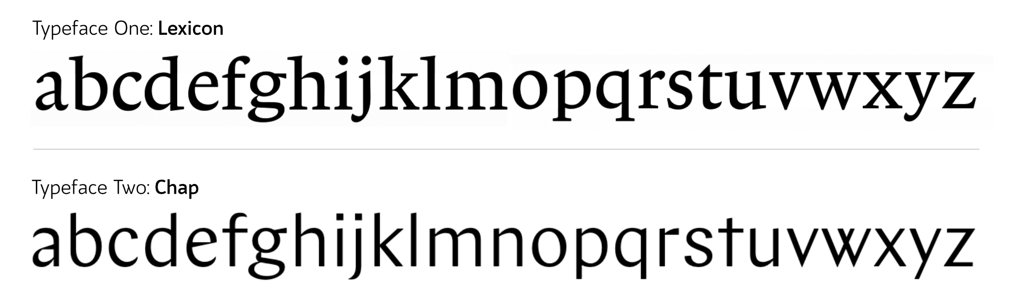
3. Typeface or Fonts: At a few stages
throughout this course, I will be giving you some
terminology, some new words. A glossary if you like. This is one of those videos. We're going to define
what a typeface is, what topography is,
what a font is, and what a glyph is. Now a typeface is
the overall artwork. If you talk about
aerial Verdana, Times New Roman, you're
talking about a typeface. A font, on the other hand, is a piece of software that you install on your
computer so that you can use the typeface if you
wanted to, for example, use a typeface in some design
software on your computer, you would go to a website that sells the typeface and you would buy various font files
from Matt websites. These font files would
include a bold version of a typeface and italic
version of the typeface. And each will be available in
a file format like a dot T, T F or a dot ETF, or a dot w OFF. This file is called a font. Remembering the
difference between these two terms isn't too important because even if
you work in a design studio, you'll often call
the typeface of font and maybe use both of these
words interchangeably. But for the rest of this course, I'll be referring to the
typeface using the correct term. The typeface is the artwork, the font is the file. Similar to how a
song is a piece of music and an MP3 is a file. Somebody might listen to
a piece of music and say, I really like this MP3 not
being completely inaccurate, but there's probably a better
way of expressing that. You would say, I
really like this song. Topography is
possibly two things. It's selecting the typeface. And it's also how we
use the typeface, the various sizes, line heights, line lengths, but
also how and when we use the bold version
of the typeface, typography is the
decisions that we make when we using the typeface in the
not-too-distant future, you're going to be working
out a typographic system. This is topography. You're going to be selecting
which typeface you use, but you're also gonna
be making decisions about how it will be used. Whilst you are making
those decisions. You are a type or graphy
designer or a typographer. And the final new piece of vocab I want to give
you is the word glyph. A glyph is the individual
symbol in a font file. You might want to refer
to this as a letter, but that's not entirely
accurate because some of them are numbers and some of them
are grammar points, and some of them are
neither of those things. Glyph is a term we use
to explain all of them. A glyph is the individual symbol in the typeface
in the font file. Whether it is a
letter, a number, a grammar symbol,
or anything else. A typeface is the artwork. Verdana is a typeface. Font is the file
that you install on your computer or your website so that you can
access that typeface. Typography is the art of choosing a typeface and
choosing how it is used. And a glyph is the individual
symbol in a font file.
4. Web Typography: Until quite recently,
web typography and printed topography have been
treated exactly the same. There's been one set of books, one set of tutorials. Everyone has learned
one type of typography, but web typography is significantly different
to print it type. There are some restrictions
to web typography. Specifically, every
single font you use is going to slow down
the loading of your webpage. You are restricted to only using fonts which you have
web licenses for, which can be more expensive. There are some things
which are just different with web typography, we need to think
about the browsers render engine and
how it's gonna look on the screen rather
than thinking about the printer or the
ink we're using. And there are some
things which are just better with typography
on the web, people have an option of what kind of screen they're
going to read it on. They can actually control
the size of the type. Sometimes there are some rules
that are just different. For example, oversize texts like you might see on a magazine
double-page spread. It's not going to work on
a mobile phone screen. The rules for how that
worker quite different when the text is rendered on
the user's computer, we don't know if something's
going to go wrong. So we need to program
in fall backs and think about what happens when
a file doesn't load. For example, one user could have an incredibly fast
internet connection. I'm going to have
an incredibly slow Internet connection
in the print world. This would be like
them printing it on completely different
qualities of paper. And of course, there
is the issue that each user can potentially be
using a different browser. This is a big problem for
typography because the browsers that although they
update quite regularly and they keep up to date
with lots of the roles. Sometimes with something
like topography that can often forget things
and leave them behind. And sometimes
browsers can be very, very slow to adapt
new conventions. Or browser does
not always render our type nicely or how
the rules tell it, it should render them. We can't trust a
computer the same way we can trust our
printers on our paper. And probably the biggest, the most substantial
difference between printed topography
and web typography is when somebody is doing the typographic decisions
for a piece of print design, they're often given
the exact text and then it's up to them to style it and
figure out how it fits on the page online. This isn't possible. Newspapers might print
multiple articles a day. Normally the designer,
the typographer, works out the system before
the article is written. As a typographer. For web typography,
it's your job to create a typographic system rather than to take existing
content and lay it out, you need to create a
system that applies to slightly different scenarios to make sure the text
always looks good. Does it look good
when the headline is ten words long and when it's
one word long, for example. Although the absolute basics
for what makes topography readable and what makes it look good are the same across
print and the web. There are many, many things
that are quite different. We want to learn web typography as a completely
separate discipline. One of the main differences is that topography for the web is normally designed
before we have the content rather than after.
5. Non Verbal Communication: If you have ever attended sales training or public
speaking training of any kind, you've probably
heard the comment. 93% of communication
is nonverbal, whilst that's not exactly wrong, it is an oversimplification. It's based on a series of
experiments run by a guy called Albert Mehrabian
at UCLA in 1972. Mehrabian categorized
worst based on how negative or
positive they sounded. For example, the word pleasure is probably quite
a positive word, whereas the word tragedy
is quite a negative word. Mehrabian then combine
the words with positive or negative
facial expressions to see how people felt. If they, for example, I heard the word tragedy, but when someone had quite a
positive facial expression, Mehrabian also tried this by varying the tone of the voice. For example, someone might say quite a positive
word like pleasure, but in a negative tone of voice. Afterwards, Mehrabian looked at the data and concluded that 55% of our communication is
based on visual information, 38% on the tone of the voice and 7% on the actual
word displayed. The reason that comment, 93% of communication is nonverbal is perhaps
an oversimplification, is because he was only testing how much emotion was communicated and not
really information at all. He was also testing in
something that's not really a real world scenario. And of course, a single
word taken out of context generally doesn't
have a great deal of meaning on its own. If we completely trust
Mehrabian experiments, we might conclude that when
saying one single word, the way you say it might be more important than the word you say. But if you were to
say a whole sentence, or indeed a whole
paragraph is probably more important what
words you choose. Now if we come back to
looking at our websites, it's probably quite
unfair to say our typographic choices are more important than the words chosen. But although that comment, 93% of communication is nonverbal is a massive,
massive oversimplification. It's important for
us to remember that a large amounts
of communication, at least is nonverbal, and a large amount of that nonverbal
communication is emotional. The way people feel about the company and the
application that they are using is largely
communicated through the typographic choices
rather than the words used. If we want a reader to trust our company and to feel
an emotional connection, it is vital that we make
good typographic choices. Further research
found similar results when looking at memory. Essentially people
remember the visuals better than they remember
the actual words. If we want people to
remember what we've written, again, the type of graph that choices are going to
be really important. Some artists, particularly abstract artists
like Jackson Pollock, for example, believe
that words are an ineffective
representation of fault. That they are a weak form of communication
because you have to rely on the meaning of a
finite amount of symbols, words, abstract art
as an attempt to communicate more authentically
on a deeper level. Because as soon as we use words, they're misinterpreted and
they're misrepresented. And we therefore
trust them slightly less with something
like topography with tapping into
the power of that unconscious or subconscious
communication. There's something incredibly
bold and confident about a brand who chooses topography
with a lot of character. Because however hard they try, they are subconsciously
putting parts of their personality
into that decision. And that little part of their personality
cannot be a lie. Whereas the words they
choose to write with it can quite easily be ally. For this reason, I'm a firm
believer in the theory that there is more truth in fiction than there
is in nonfiction. If somebody writes an
autobiography then naturally in some way trying to persuade you of something in their lives. But when someone writes fiction, they inadvertently pour their real personality
into the book. I think we can learn far more
about the human race from reading fiction than from
reading books on anthropology. Likewise, I think you can learn
just as much from a brand by their typographic choices than the words they
choose to write in it. It would be absurd
of us to suggest that 93% of communication is nonverbal or even to suggest the topography is
more important than the words chosen unless
we have an application with just one single
word on the application. However, the non-verbal
communication, things like topography or communicating on a
very different level. They're communicating
on an emotional level. And that's very important
to our application. If for no other reason, because we trust messages communicated on an
emotional level.
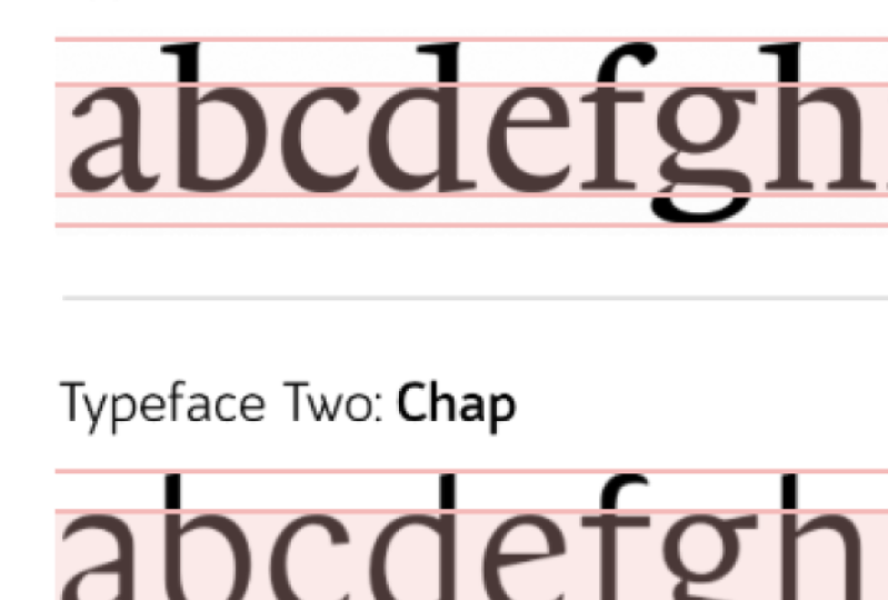
6. Anatomy of Type: Improving our vocabulary
about typefaces. Not only is gonna make us better at working with the typeface, it's also going to make us
better at communicating with our team or communicating
with our clients. For that reason, it's
important we take some time to learn all the names of the
anatomy of typography. The first thing to talk about
is how we define height. There's the overall heights of the glyphs in the typeface, but there's also the cap height, and that is how high the
capital letters are. Then we have the x-height. This is the height of
a lowercase letter. Not necessarily the exact
height of a lowercase x, because sometimes
different stylized x's might not be exactly the
same as the x-height. We're better off thinking of the x-height is the height
of the lowercase letters. And when we talk about the height of the
lowercase letters, this is not including the
ascenders and descenders. These are the bits you
can think of as going below or above the line. A lowercase H, for example, has an ascender that sticks up above the x-height of
the lowercase letter. And a lowercase g
has a descender that comes down below
the lowercase letter. We refer to the line that makes up the letter has
been the stroke. So we might talk about
the stroke width, talking about how
wide the line is. The main vertical line like on an uppercase T is
called the stem. Any horizontal lines like
the one in the middle of an uppercase a is
called the crossbar. Any letters were the
main stroke is curved, is sometimes referred
to as a spine, like for example,
uppercase S has a spine. The rounded areas like on an O or an a are
called the bowl. The enclosed area inside the
bowl is called a counter. And if this area is
open like an E or a C, we call it an open counter. Sometimes I typeface
has these little feet, these hats, we call them serifs. And if it does not have a serif, we refer to the ending of
the letter as a terminal. Whenever the serifs sticks out slightly increasing the
width of the letter, we would call this an overshoot. And any diagonal lines, if we have a diagonal line that sticks up from the letter, we call it an arm, and one that sticks
down from a letter, we call it a lag. Lets us like an M and N or an H, have what we call a shoulder, a rounded upper right
portion of the letter. And a letter like a queue
has a tail that sticks out. Sometimes, typeface might add some little decorative
lines that aren't necessary to
identify the letter. We might call this a swash. Having these new terms and our vocabulary to talk
about our typefaces. It's gonna make it much
more easier for us to make decisions and have
conversations. For example, we could
say that Helvetica, having a big x-height might make it readable
at a small size. But this reduces the heights of the ascender on a lowercase h. So the lowercase h and lowercase n look
much more similar. We could say that
although Futura uses very simple geometric shapes
that could make an O, an E, a, C, and an a to similar. It's also worth noting that the SEA has a very
large counter, making it look distinctively different to those
other letters. A sans serif font has no serifs and therefore
has no overshoots. We can have a more
condensed version, which will make it
much more appropriate inside buttons or in menus. There's three examples of
conversations you can now have, whether in your own head with your clients or
with your teammates about typefaces that you probably could have
had five minutes ago. Take a look at a few
typefaces around you and identify the different anatomy in each letter in the typeface. And see what the advantages and disadvantages of
having those features for each typeface are. Learning to communicate
about the anatomy of typefaces is gonna make it much easier for you to
make decisions, especially with a team. Spend some time familiarizing
yourself with these words. Every tiny detail of a letter has some kind of unique name. Often people who designed typefaces use these
names quite a lot. As a typographer
or a web designer, you probably didn't have
to use them too much, but it's worth
spending a little bit of time learning these. Actually, overall, we're
probably more interested in the qualities of the
typeface, the overall shape, how wide they are, how thick the stroke is, what the contrast and
thickness of the stroke is, whether it has serifs or not. But at some point you're going
to use all of these words. So make sure you know them.
7. Printing Press: In the 15th century, a German man named
Johannes Gutenberg created movable type or
the printing press or so European history
goes at least. The printing press was of course invented much earlier in China. The problem in China
is they're just far too many characters
for it to be useful. Making it expensive to
create a printing press, but also making it quite time-consuming to
arrange all the letters. And more importantly,
it makes it much harder to reduce the
size of the letters. In Europe around
Gutenberg's time, most books looked like this, a style of text we call
black letter today. And you would very,
very rarely see anybody use this anymore, apart from Nazi Germany, who used it as a kind of
rejection of anything new or modern because they were
against globalized ideas. And sometimes tattoo studios. Possibly because black letter
looks quite decorative or you've got an
entire back and you just want to put
six letters on it. But when you're trying to
print a whole page of a book, it's actually not a
particularly useful type. It's a little too decorative
to make two small, but also it has these very
thick harsh black lines that mean as you make them smaller and cram more
letters together, you create a very dense
area of contrast on the page which is
not inviting to a reader or easy to read. The printing press probably
wouldn't have been much use if it wasn't
for Nicholas Jensen. And Nicholas Jensen wouldn't
have been much use if it wasn't for the humanist
miniscule calligraphy style from Verona in the 15th century in Renaissance Italy
they referred to black letter is
latter-day Moderna. My Latin is not perfect, but this means modern letters. And they're referred to
what the Romans used to use as latter-day and TK. The Romans just had
the uppercase letters. So they did a lot
of experimenting to decide what lowercase
letters look like, and as a result, created
something that looked far more modern
than black letter. Jensen spend some
time observing and experimenting with these new
renaissance letters and some of the decisions that
he made right back then in the 15th century
of stock right through to today about how we decide how an end
looks or a D looks. Jensen created a typeface
that can be cut much, much smaller than
black letter type, and therefore much
more economical to fit much more letters on a page and therefore
more information. It can be spread across Europe much more cheaply
and efficiently. You can still use a form of
Jensen's typeface today. You could, for example, by Adobe Jensen, this
typeface here. If you did, you
might be wondering why am I paying for something that's around 500 years
old and outs of copyright? Well, actually the effort
Adobe have gone to to re-create this typeface is much more than
you would think. You see if you take an old printed book
written in Jensen, actually every E isn't the same. There's tiny discrepancies in the different cuts
of the letter. For Adobe to create
a single letter, they need to scan in hundreds of Jensen 0s and then work out
roughly what the average is. There are several reasons why
every E on the page wasn't identical while they weren't necessarily all cuts
exactly the same. And one of those reasons is
actually that people were so used to reading
handwritten pages that the share monotony
of seeing a page of uniform identical symbols would send people's brains to sleep. They couldn't engage or
interact with that material. The less novel the imprint
of each word on the page, the less novel the
imprint and our brains, the less likely we
are to remember it and engage with the material. It also lets us have
different sizes were caught slightly
differently because if the way that perception works, we don't see a big E and a small e of the same
typeface has been identical. They actually appear slightly differently when
they're smaller. Something we call
optical waiting. Realistically, if you wanted to re-create a typeface
like Jensen today, you would have to recreate
multiple font files, one for texts that
is 16 pixels high, and then an entirely
separate font file for texts that is
20 pixels high. For example, with a
slightly different cut, a slightly different
optical weight. Because a typeface showing at 20 pixels does not look like a slightly bigger version of a typeface shown at 16 pixels. That's not how perception works. We'll talk about
this more later, but this is the typeface Jensen, and this is what we now
call an old-style serif. You probably wouldn't
really use Jensen because it has too many
implications of the time, unless you wanted
to create a design that appear to have a
15th century fail to it. You'd probably choose something
more like Garamond if you wanted a old-style
serif typeface. The invention of
the printing press brought a whole new challenge. How can we reduce the size of the letters
and still make them readable and still make it comfortable and
enjoyable to read. Luckily, this was
already solved by calligraphers in Italy
around the same time. And so typefaces like Jensen
or Garamond were created, which are very comfortable
and easy to read. Even a smallest 16
pixels high on our page, the printing press board. Other challenges including
how monotonous it looked to see a page of
identical symbols on it, and also how the
optical waiting is different for larger
and smaller characters. These are problems
that we did solve at the time and we've
since forgotten about. In fact, many people say
that typographers or the last 200 years
of kind of got lazy.
8. Serif Typeface: We can categorize serif
typefaces into a few categories. First of all, we have
for old-style serif like Jensen or Garamond,
we just spoke about. Following on from that we have transitional serifs
like Baskerville that we'll talk about shortly. And then we have modern serifs
like Bodoni and Diderot. The more modern the typeface, the more contrast
between the line widths, the more old style or
traditional, the more humanistic, the more the linewidth
seem to blend into each other as if drawn
by hand with a pen. Let's first of all look at
these transitional typefaces like Baskerville. Now John Baskerville lived
in Birmingham, England, and towards the end of his life, he decided to invest
all of his money in trying to improve
printing processes. So he tried to
improve the ink and the paper to try and get a
consistent look on the page. And actually, as he improved the printing paper and ink
as almost like a showcase, he created this
typeface, Baskerville, that could have
very thin lines and quite thick lines on the same
paper and look pretty good. It may not have been possible to print with Baskerville until the quality of the ink and
paper had improved enough that this would look crisp
and clean on the page, people hated basketballs
typeface at the time, people said it was
quite difficult to see those very thin lines. They said it hurt
their eyes even. Probably a lot of printing presses were
probably kind of jealous. And let's face it,
his books just cost more because they
were printed with higher-quality ink and paper. Basketball is metal typeface
symptom mostly disappear, but it emerged
back in France not long before the French
Revolution when it was used for the material for some revolutionary
ideas being printed, the fact that it
looked different, fresh and modern
made it perfect for expressing these
revolutionary ideas. And not long afterwards another French
designer creates it, did it this typeface which
is almost synonymous with the French Revolution and with
much more modernist ideas, very similar to an Italian
typeface called Bodoni. Did a Bodoni are both
equally as popular. When we think about
modern serif typefaces, if we put the three
next to each other, we can see how the three
stages of serif typefaces get progressively less
humanistic and higher contrast as people get used to looking at
things that aren't written by hand and get used to identifying the
different contrasts when looking at small
type on a page, I recently heard someone
refer to the difference in style has been like the difference in style
of the Renaissance, the rock and the
enlightenment errors. There is one final stage
of serif typography, that is the Egyptian serif, sometimes called the slab serif, like Rockwell for example. This became popular at sometime
around the Victorian era when we wanted our
posters to have nice big punchy headings. And it looked very bold and confident at the
top of our poster. In the 21st century, new typefaces very rarely fit comfortably into
one categorization. For example, the typeface I used for headings
throughout this course, on a couple of other
courses is this one which is a wedge serif. It doesn't fit into any of those other categories that has these big triangular serifs, which I think makes
it look ultra modern. Traditionally, we fit serif
fonts into three categories, old style, transitional
and modern. You can think of
these as being like Garamond, Baskerville,
and Bodoni, with each generation becoming slightly less
humanistic and having a slightly thicker
contrast using Serifs from one of these
three periods in history. It gives it a distinct
character from that era. Today, there's all
kinds of new types of serifs like Slab Serif
and wedge serif, but don't fit to comfortably into any one of
those categories.
9. Sans Serif Typeface: At the beginning of
the 20th century, avant-garde artists
wanted to reject everything that had come
before and create new, simpler designs for everything. Purists didn't want anything
on a letter form that distracted from the most
basic pure symbol underneath. Naturally, designers started
to remove the serifs. Now we know that
these little serifs probably help us recognize
one letter from another. But they also overall
makeup page looks slightly messier,
slightly more complex. And in 1927, Paul
Renner created Futura. This typeface made up
entirely of geometric shapes, made it incredibly fast
for us to perceive, to get it into our brain. And if nothing
else, it perfectly fit the style of the time. If it wasn't for the
fact he lived in Germany shortly after in 1927, the Nazis took
control of Germany. And as we spoke about earlier, they loved black letter,
they loved old-fashioned. They didn't want anything
new or modern looking. Futura actually became popular or around the rest
of the world and became an international typeface after the Second World War, Helvetica was created
in Switzerland, and this is now
the most popular, most used typeface in the world. It looks great, as
big as you like, and it can be read quite small. It's very minimalist, but it still has a little
bit of character. And character was exactly what motivated eric Gill
to create Gill Sans. Now this has all the advantages
of a sans serif font, but it has a slight
Humanistic feel to it. These sans serif fonts were all a massive hits in the world that emerged after
the Second World War. A world that was hungry
for change and wanted to accept the globalization
of the world. And then we invented computers, computers with very
low resolution for a pixelated screens. And so naturally, sans
serifs became even more popular because
they were easy to render on these poor
quality monitors. Typefaces like Vedanta were created to be a kind
of Helvetica for the computer where every
pixel was considered to make sure it looked good when rendered on a pixelated
computer screen. Later, arial was also
created for the same reason, after decades of staring
at screens with text all written in Verdana and now
kind of looks quite dated. If you saw a website today and all the texts was
written in Verdana, you might think you are just
time traveled back 30 years, the days of considering
a typeface to be more modern just because it's
sans serif are long gone. In fact, they might
look kind of dated because anything rendered
on a screen and san-serif, it looks like what you were
looking at in the 1990's. Just like how
various serif fonts remind us of periods in history. Most sans serif fonts
also reminded us of what is now really
a historic period. And of course, new
classifications and new typefaces are
created all the time. The typeface Gotham was created in around the
year 2 thousand and the USA was made popular because of Obama's political campaign. Using a brand new
cutting edge typeface is making just as much of a political statement
as using an old one. Nazi Germany using
old-fashioned black letter was making a political
statement about traditional values and what they believed to be important just as much as the French Revolution using Baskerville
and then deduct, we're making a statement about
how forward thinking they were and how they wanted
to be part of a new world. Gotham fit Barack Obama's
political campaign perfectly. Barack Obama was
trying to be seen as something new and different. He did not appear to be a new choice because
he used a san-serif. He appeared to be a new choice
because he used Gotham. His posters wouldn't have
had that kind of impacts if they were written in
Helvetica or Gill Sans. The relevance of
typeface classifications is much less important
with new typefaces. In fact, typography
designers often split across different
classifications or create new ones. There is no classification
that fits our modern times. Just as fashion in other
industries has sped up incredibly so has
fashion in typefaces. Designers started creating
sans serif typefaces at the start of
the 20th century. And they really became popular after the
Second World War when people were looking forward
to a new international, globalized world,
san-serif fonts didn't necessarily become more popular because they were
easier to read. We could probably say, it's easier to perceive them, to assimilate them
into our brains, but probably a bit hard to differentiate between them
or recognize the letters. But they also became more
popular because they were easier to render on
low-quality computer monitors. Today, this probably makes
some san-serif fonts look just as dated as
Garamond Vedanta too, is now a piece of history as new typefaces are
designed and created, they often transcend
genres or classifications.
10. Summary: Typography is the voice of our brand application
or a service. Some voices are more clear, but the clearest voice
might not be the most engaging or
the most memorable. Do you need a voice
with more character? And if so, what character? Every typeface, like every
voice has a personality. Whatever typeface we choose, it will express
something we need to make sure it expresses
the correct thing. A typeface speaks from
a time and a place. We need to pick the correct one. And as we move more towards a complete typographic system, we may need to use
multiple typefaces and they need to work well and
compliment each other.
 Rob Sutcliffe, UI Designer / Developer