Transcripts
1. Intro: In this video, in
this short course, we will be building a
typographic system. We will first talk about
and learn about why the most important part of our design grid is
the vertical grid, especially with
responsive design. And therefore our topography is going to dictate everything. We will use this
knowledge to build a typographic scale where we just concerned with the size of the different
headings and the spaces, the paddings and margins around those various
headings and paragraphs. We will look at some of the
other things that build visual hierarchy in a
typographic system. And we'll look at some of
the advanced features we can use to make our typographic system a bit more interesting. Then finally, we
will put all this together with our project
this week to create a simple typographic system like the one you can currently
see on the screen. Your typographic system is your first building block to building a complete
design system. Let's get this sorted.
2. Vertical Grid: There are many
different reasons why the absolute first
thing we're going to do when designing an application is choose the body topography. The choice of typeface
for the body texts is going to influence the
line-height for the body text. And the line-height for
the body text is going to influence the vertical
rhythm for the entire page, the entire design of the
whole site or application. If we look at a couple of lines of body text on
my Facebook page, we can see the exact same
baseline grid is used elsewhere for UI elements or all kinds of different parts
of the design of this page, including icons, bottoms, but also different sizes
of typography. Now this gives us a
more unified look, which is of course
good for design, having a nice uniformed
baseline grid down the page. But it is also going to
help with readability. As a user reads different areas of text
of different sizes. When they make those
saccadic eye movements back, they have a understanding subconsciously of where
the baseline grid is. It's for these reasons
that I personally believe that the
absolute first thing you need to do when designing an application is to
choose the body typeface. The trace of typeface will dictate the size of
the body typeface. The size of the body typeface will dictate the line length. And all of those things combined will dictate
the line height, which dictates the
vertical rhythm for the entire design of the page. If Facebook suddenly decided to re-brand and used Garamond, they would have to redesign everything on the
page, every margin, every piece of padding, because the line height would need to change for the text. The term baseline grid can
be a little misleading. We should probably really
call it a vertical grid. I've just taken
this button pretty similar to the one we
just saw on Facebook. And I just showed
you it with a line that comes right on the see more in the grid right under the bottom
of the letters. Realistically the grid on
Facebook and I don't know, I've not worked on Facebook. Probably looks something
similar to this. We're actually see
more doesn't quite sit on the baseline grid. And if I split that
into smaller chunks, this is a four pixel grid. This is a 16 pixel grid. I think it probably looks
slightly more like this. The text sits in
the middle of this. Essentially the line heights
of Seymour is 16 pixels, rather than it's sitting with the letters resting on
the bottom of the grid. Now the several reasons why we actually user grid
similar to this. And the first one
is as soon as you translate this to Japanese, it's not going to sit on the
bottom of the grid anymore. And of course we
would change the size slightly for Japanese anyway, but it will not sit on
that baseline comfortably. It's going to sit in the middle. The line height is
based on the grid, not the baseline of the text. An incredibly common mistake that I have seen designers with a print background who
have started doing web design do is to tell us
what this margin is. The margin from the baseline of one text to the top of the
heading of the next text. Now as we know, that's not
how we measure text height, but when we come to write CSS, that's absolutely impossible to implement what our
developers need. Or if we are
front-end developers, what we need is to
know this margin. This is the margin from the
bottom of the boundary box. If I select this heading text, you can see the boundary box. And if I double-click in
here and select the text, you can see where
the line-height ends to the top of this text. And if I click in here
and select some text, you can see where the
line height of this is. Now in CSS, we can implement this if we know this size here, we can implement it. This, we cannot because
as this text changes, as these margins change, as our vertical grid changes
and as this tax changes, this space is also
going to change. So a very common problem in new designers or designers who have had a print background, is to think that the space from the baseline grid is
of any use to us. What we're always
interested in is the actual space of
the boundary box, and therefore we're more
interested in the line height. I've brought back
our two favorites, Garamond and Verdana. And as I've talked
about previously, I'm using these two
as examples because they are such wildly
different typefaces, they have very
different x heights. Now we already know that to
make EB Garamond readable, we ideally want it
at a type size of 17.5 reference pixels high. And because of that, I've
made the line-height about 1.25 times the typeface, partially because this is quite a long line
length. It says 75. Character per line, line length. And as you can see right now, 75 characters per line
isn't really that long. Now what we have with this
24 pixel line height, we've got a nice
convenient line-height to make a vertical grid. I've just created
a full pixel grid. And we can see that all
the line heights nicely fit into that because they
are all line heights of 24. I've created a heading
that fits into that too. And a button with a padding and margins and stuff that all
fit comfortably into that. In fact, if I overlay
this space between them, we can see that the gaps
between each block of text also fits quite nicely
into that four pixel grid. So that's all well and
good for Garamond. What about for DAWNA? Now we know verdana
has a larger x-height, so we can make the
typeface a little smaller, but ideally want a slightly
higher line-height. Let's look at how Vedanta looks. I think it's looking
quite nice here. You'll know from the previous
videos that for Donna, we ideally want a 12.5
reference pixel texts heights. And if we put that
right to the max, right to 150 per
cent line height, that gives us 18.5
reference pixels. Now we can't defy
that into a nice, comfortable vertical
grid so easily. I've divided it into a
three-point seven vertical grid. And please don't forget that you can have a fraction
of a reference pixel. Some developers, designers,
and even software won't let you use fractions
of a reference pixel. Fractions of a reference
pixel have been completely acceptable since the very
first version of CSS. And there's no
practical reason that it would be a problem
when you take into consideration that a
reference pixel is very rarely divisible by the
real pixels on the screen. Anyway. Instead, I've given for
Donna a baseline grid of 3.7 reference pixels
rather than four. And that's how I've chosen the line height of
the heading text, which is 48.1 reference pixels, line-height and the
button and the spacing. Now of course,
that's all well and good in a perfect world, but you're very rarely
working in a perfect world. You normally have
to get your designs out quite quickly and you need to translate them into other languages quite quickly. What a lot of designers will do, and what you will
probably end up doing. And what I'm mostly going to do for the
rest of this course. Let's just round the
numbers up a little bit. For example, we know
that the perfect heights for our Vedanta text
is 12.5 pixels. But maybe we just
round that up to 13 and we just made
the line-height a tiny bit bigger so that
it's fits more nicely into a full reference
pixel grid. And that's going to make it
much easier for us to use design software
to communicate to other designers and
communicates what developers. And we're gonna get our
designs out quicker, not going to make
better designs. But in the real-world, you normally have to make
the slight compromises. And likewise, a
lot of designers, when they translate it into
Japanese, for example, they'll ignore the fact
that you want to make it about 110% to 115% text size, because they're going
to need to then alter that baseline
grid quite a lot, which is potentially
punishing the Japanese users. But if we took this for
Donna, for example, we're actually not making it harder for our Japanese
readers to use. We're making it harder for
our English readers to use because we're rounding up the
size of the text already. But it's not just translations
we need to worry about. It's also responsiveness. Now if I look at this
nice handy Garamond page, I have with a four
pixel vertical grid. As soon as I turn
this into mobile, we're going to reduce
the line-height because the line
length isn't as long. And then that's
going to completely change my vertical grid. Figma doesn't even let me have a fraction in the size
of my vertical grid. I've had to create my
own grids with boxes. And you can see here that the textile still
quite nicely fits into my own custom-made
grid drawn with boxes. And all of the margins also
fit nicely into that grid. But as we saw,
subtly changed from the desktop view into
the mobile view, we're gonna need to change
these margins a tiny bit. Change this button a
tiny bit to make sure we don't lose the vertical
rhythm going down the page. Because of that, we
can never really rely on our vertical
grid been a nice, comfortable round number
like four pixels. Again, in this situation, you'll realistically
probably going to take a small sacrifice for
your mobile users or maybe optimized for
mobile and take a small sacrifice to
your desktop users. Normally in the interests
of something as important as actually
meeting the deadline. In web design, the idea of a
baseline grid is impossible. We have a vertical grid. The text-based line
never sets on the grid. That would be impossible
to write the CSS for and work out
the translations. The ideal baseline grid for a web application is the
line-height of the body texts. Now the line-height
of the body texts can actually change. For example, when we look
at the application on their mobile phone or if
we change the text to Japanese were possible we want some CSS rules in place
that can update this. We'll look at this much more in the implementation
stage for now though. Once we know our typeface
and we know the line length, and we know the line height. Now we have a good idea what our baseline grid
is going to be. We can start working
out a type scale and eventually work out
the entire design for our application. Off of that line height.
3. Visual Hierarchy: Of course, when we're working
out our typographic system, we want to build a visual
hierarchy into that. We know visual
hierarchy is vitally important because the user needs to know what
to read first, what to read second,
and what to read. Third, we know the
content on the website. They don't yet. It's up to us to tell them the importance of each
piece of typography. Now, everybody knows
the old rule that more important text is bigger and less important
text is smaller. But there are multiple
other things we can do to create a visual hierarchy
in our typographic system. I've got this website here
up, think global health.org. I've actually never seen
this website before, but I'm going to
use this to spot some examples of visual
hierarchy in the topography. The first thing is that the
big heading texts at the top, it is big, but it's not actually that much bigger
than the body texts. There's a is quite a jump up, but it's not that much bigger. It is boulder. But more importantly,
it's centrally justified. It's the only thing. This and the menu below is the only thing that's
centrally justified. Everything else is left aligned, all the other texts
instantly it pops out. It looks like it's more
important because it's in the center of the page and of course at the top of the page. And I kind of wonder
if we made this text even less bold are a
little bit smaller, but it's still look
quite important. Now, another thing that
gives something a lot of visual hierarchy is having a
lot of whitespace around it. Often we don't necessarily
need to make the text bigger, we just need to make the
space it occupies larger. This think global
health box at the top, it's got quite a large
margin around it. And if you include the
lockup with the menu, it's significant percentage of the page is taken up
by this heading text. Without Think Global
Health been that much bigger than one size
doesn't fit all clearly has a lot more
importance because of the amount of whitespace
that exists around it. Now I notice that every
news story on this page has a little overlying poverty, governance, this kind of thing to say what
category it's in. And this had pops
out a certain way because it's in all caps and
it's in a different color. So there's two other things there which help
give it hierarchy, that help differentiate it and say that it's
something different. The only things on the
page in this orange color, which is obviously one of the
branding highlight colors, is the sign-up button and
these category buttons. Now another thing
they've used to identify hierarchy
is the typeface. When we get to the headings
for individual articles, they are in this serif typeface, whereas the main
headings all seemed to be in this sans serif typeface. We can instantly spot that
these mean different things. As I scroll down the page, you'll see that there
are dividers with a top border written
in a bold text. These obviously divide the page up and are a different
level of heading. This divider is also, in a way a typographic
visual hierarchy mechanism. And if I scroll down
a little further, you'll see that there
is supporting texts from time-to-time
written in italics, which again tells us it means something different to the
other text on the page. It's a different level
in the hierarchy. It's clearly some Meta tags or some description of what
this series is about. Now a couple of
other things which they haven't used on this site, Although I think they have used most visual hierarchy
techniques I can think of with typography is having a background color, although I know is
here where it says subscribe to and use lesser
and quite big writing. Like obviously you
want us to see that this has a black background
with white text. So instantly stands out and looks quite different to
the other text on the page. We could of course have
a colored block behind some texts or something
like that to create a, to create visual hierarchy without coloring
the text itself, but by giving it a background, generally speaking, texts
with a higher contrast between the background and the foreground color are
considered more important. And I couldn't help but
notice that this color of the text here is a slightly lighter gray
than the headings. And actually right
at the very top, Think global health
appears to be a slightly darker black when
these subheadings as well. Lastly, another visual
hierarchy tool is tracking. Actually this orange
texts which says poverty. The category headings
appear to have a certain amount of space
around the letters, of course, because they're
written in all caps, so they've increased
the tracking. But increasingly letter
spacing or tracking can again make a block of text appear more important up the
visual hierarchy. We just looked at this think global health website
because it had a lot of examples of visual
hierarchy in the typography. Generally speaking,
news websites do because they have a
lot of text on them. But some of the techniques
we might want to think about our color,
background, color, spacing, or tracking
the margins, the amount of whitespace
around the text. Using all caps,
the justification, we could indent the
text slightly using italics or small caps or
different text styles. We could have a
texture over the text if it was a heading
texts specifically. See if there's anything
else I haven't thought of that you can think of literally
the skies, the limits, but these are the ones which we mostly seemed to use in
typographic systems.
4. Type Scale: Once we have all the
dimensions for our body text, we can figure out the size for the heading texts and
the caption texts, etc. By coming up with a type scale, we want the heading, one, heading texts, what
was be the same size. You want all our captions
towards be the same size. But we also want them
to feel like they're part of the same composition, if you will, as the body text, we want them to
fit into a scale. Now sometimes people
might actually use one of the musical scales
because we know that these naturally
feel right to us. I tend to use the golden ratio
or the Fibonacci sequence mainly because I use that
ratio elsewhere in my design. And possibly it
gives some kind of uniform field to everything using the same ratio
for the type scale. I'm not 100% sure. I've set my body text height to be 16 reference pixels high. And you can see that it's then decided that if you're using the major thirds scale and your body text is 16
reference pixels, then you're heading
texts should be 48.83. Reference pixels. As reference pixels are not the exact same thing as pixels. You can have a point or
a fraction of a pixel. So it's perfectly okay for you to use
something like that. And these numbers are going
to be slightly different. You are going to have
to use your eye a bit and see how it works
with other parts of your design and fits onto your vertical rhythm
of your design, all that kind of stuff. But I think this is a
really nice starting place to find what could potentially be
quite a good heading size for this body text. Now as I just said, I tend
to use the golden ratio. And the other advantage of
that is that this calculator, G R T calculator.com, I find to be a little
bit nicer anyway. Now I've put in EB Garamond, which is a Google Fonts, a free version of Garamond
available on Google Fonts. And we can see that actually
the aspect ratio of EB Garamond is a tiny bit
bigger than of Garamond. Google's version has a
slightly higher x-height than the normal standard
Garamond typeface. And if I divide seven reference
pixels by nought, 0.4, Seven reference pixels been
roughly nine arc minutes. I'm going to get 17.517.5 is quite a good
font size to make Garamond, to make it most readable
for most people, I've set the content width to 700 reference pixels for now. And you can actually see
if you look down here, the scale, it's suggested
the golden ratio scale. It has actually round it up
my 17.5 reference pixels. It doesn't like fractions
of a pixel on this app, but you can see that it has
given me the font sizes for the different heights
as well as the line height. Now if I change the
content width here, you can see that it
actually updates the line height as we
spoke about earlier. If we have longer texts, we do want a slightly
higher line-height as well. What I like about this calculator is
actually if I come down, I can see some examples of all the different text
sizes and how our list might look and all this
kind of stuff using this typeface with
this type scale. If I switch this over to Verdana because we've talked about
for Dinah a little already. Now we know that for
Diana actually can be quite a bit smaller
than Garamond. I'm going to set this to 12.5, which is the best reading
height for Verdana according to our
earlier calculations. And you'll see that actually
the line-height it's given, it is a little bit larger and it actually gives it a slightly
larger line-height, even if we make it
the same size as Garamond because it's
calculated that it does have a slightly
higher x-height and so needs a bit
more space around it. This calculator might be a
good place to come and get some basic numbers
before we start trying to figure
out our type scale. We never want to just
take these numbers and stick them into our design
and hope it looks good. We are going to
have to tweak them slightly because this
is all based pretty much on some basic numbers
around these typefaces. We can see a lot more
with our eyes than these calculators can ever
see with that numbers. We just want to take
these numbers out there and possibly use
them as a starting point before we fine tune how these type scales are
going to actually look. Once we know what our
body typeface is, we can use this so we know
what size our body text is, and then we know what line-height our body
texts is going to have. And we can use that to
identify two things. What's the baseline
grid we're going to use for the entire application. And what's the type scale? How big are our headings and
subheadings going to be?
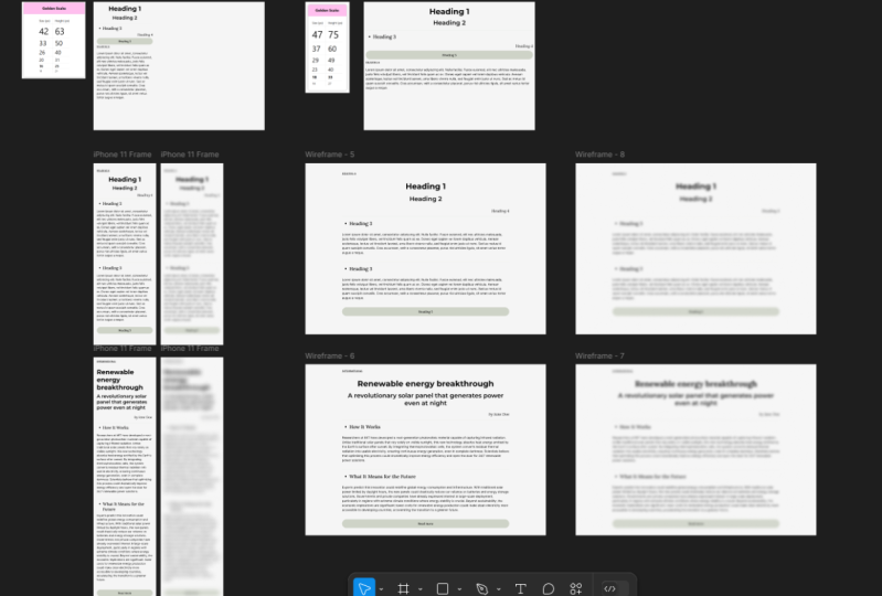
5. Create Type Scale: In the last video, we learned how to use an online type scale
calculator to get some basic heights
for our headings from one to six and
our paragraph text, and also get an idea about
the initial line height. Now, what I've done here
on my screen at the moment is I've put some
text into Figma. And if you use a different
design software, that's absolutely fine. I'm just gonna demonstrates in Figma because that's what I use. And I have six
pieces of texts for different heading sizes and
one for the paragraph size. Now, I've done two
things to each of these. Once I've decided the text size, I've also decided a line height. You can see if I zoom in, I've got a four pixel
vertical grid on. You can see that the
line-height fits perfectly into that four pixel grid because I've got a
line height of 64. But I've also gone and
hidden a gray box, which is what would
be the margin. Now if you're not familiar
with the CSS box model, you would have your
line-height and your padding, etc, inside the box, that would be inside this area, then you would have some
margins outside of the box. Now I'm not gonna
get too much into the details of what the CSS
box model is all about. But all you need to
know right now is that this gray area is the additional space that we're going to add around the heading. And that needs to
also be in red. So the height of the whole area for the
heading tags is a 132, which is also fits in quite nicely into our four pixel grid. Now, what I've done
is I've gone in hidden NAT box so you
can't actually see it. But you can see
that each heading has no space between them. And that is because for
each of the headings, I've added these margin boxes so we can see how they
would fit together. That is because for
each of these headings, I've added this gray
margin box and hidden it. We can easily line them up and see how they would fit
together with their margins. Now, what I've done
is I've gone and done that for all six of
these heading elements. And once for the paragraph, the paragraph, as you can see, it has just a four pixel margin at the top and the bottom. Maybe that's okay. Maybe it isn't. We're going to find out now. And now I've created these
as Figma components, but if you're using
different designs software, feel free to do it
however you like. What I can now do is I've
got an example page and I'm going to drag my
heading component out, fit that into my grids, then drag a paragraph
out and make it line up so we can see that
they touch each other. If I zoom out, I should
be able to start getting an idea of do those look okay, if I have a number one heading and then some paragraph texts, is that looking all right? Now what I want to
do on this page is make sure I've tried out all the combinations so that we see what
they look like now, rather than try and create our entire application and then realize something doesn't work. Maybe I have a heading
to heading three. What about when I have heading three followed by heading for? Now, I'm already starting
to think that maybe the space at the top
of the heading three, the margin isn't quite
high enough and the margin at the bottom is perhaps
a little bit too small. So what I can do is
I can come back over here and in my component, I can move the margin. And then it's going
to update on all of these and I can
reset out my page. Now I think there's
probably still needs a little bit tweaking, but once I've got it
looking reasonably good, I want to try this out with some better texts than
just heading one, heading two, at the earliest
possible opportunity when we're creating
a design system or a typography scale, we want to be
putting real content in there because we want
to see how it looks with actual content that might actually fit into
the design. Heading. One is a very short heading. We probably never
going to have that. Now I'm just going
to pop on over to the BBC News website
and grab some text. So now I've got a new bit
of text in heading one, and we can actually get
a much better idea of how the line-height is
working because it's going over onto a second
line and we can see how the margin
around it working. Now ideally we
want to update our heading two and our heading
three texts as well. So we can start to
see how this looks with real text in it. Now straight away, I'm gonna say maybe this heading one is a tiny bit too far away
from this text down here. So maybe we reduce the
margin between the heading one and the paragraph
texts by four pixels. And at some point
we're going to maybe want to say, well,
you know what, there isn't really enough
definition between. The heading three and
heading for text. I think I need to make the
heading three texts a tiny bit bigger or the heading
full-text a tiny bit smaller. Well, we can just do that
in our component and see how it looks throughout
our sample page. And it doesn't matter
if it doesn't fit into that type scale
calculator we originally started off with because our eye is much more important
than the maths if it looks good on the page
and we can easily see the visual hierarchy and the difference
between the headings. That's what's important. So we use that scale from the last video
as a starting point, but we're gonna tweak it
now and find something that works better for us
and for this typeface. When you're doing this exercise, when you're doing this
with your type scale, one very important thing
to always remember is that there's four pixel grid
that I've created. And you might choose
a six pixel grid or you might choose
a 3.5 pixel grid. I'm using four pixels or
I'm using a full number of pixels because it is quicker
to set the grid up on Figma, I'm going to use A6 reference
pixel vertical grid. And remember if at any
point it looks better if something is not
fitting into that grid, then don't fit it in the grid. We using the vertical grid as a guideline is to
help it look nicer without too much effort as
soon as we think it looks better to ignore the
grid or break the grid, then we should absolutely do
that when I'm fine tuning. If I decide that this
heading three should have three pixel margin at the top rather than
a full pixel margin, then that's absolutely
what we should do. The vertical grid, the vertical rhythm of the page is
all there to aid us. It's not there to completely
dictates how we work. So take one of the typefaces
you're working with and open up whatever
design software you use. Start off with one of those
Type Scale calculators. If you find it a
useful starting points and create your heading
texts from one to six and your paragraph texts
as an invisible box around it which will
be used as a margin, and then try them in
different orders. How does it look if you
have a heading three with a heading for under it and then
five paragraphs of text. How is it going to look? Does it look too condensed? Does it look too spread out? Is it obvious that the
heading relates to the text below it
are not above it. Possibly something that this
heading three is failing at right now and it possibly needs a slightly larger
margin at the top. And then one technique that is often used by type
designers is to squint your eyes slightly or
save it and put it into Photoshop or something
so you can use a blur. Now when we put the
blur on the body texts, we wanted to have a nice
consistent light gray color so it doesn't look
too heavy to us. But another good point is
to help our hierarchy. We ideally want the
density or the darkness of the main heading to look bunch more dark than the
paragraph text. If you squint your eyes, do you get a slightly
different consistency for the heading text and the paragraph texts
that should at least tell you there's
enough differentiation. Remember, people aren't focusing on the whole page at a time. They're only focusing where the absolute dead center of their eye is looking
at that time, it's called the fovea. Everything else on the page
appears blurred to them and they need to be able
to identify where the headings are straight away. If the page is blurry or they're different consistencies in the gray for the different headings. I want you to go
ahead and choose a random typeface
or one you've been working with and try and just create this very
simple type scale. Put some real text
in there and try out as many layouts as you can with the heading
to heading three, heading four altogether to
make sure it looks good. Now, before you start creating the rest of
your type system, your design system, and then
designing the application.
6. Create Type Scale 2: In the last couple of videos, we created a typographic scale, which we can start to use for our type system and
our design system. So far, we've established visual hierarchy just
using the font size. Now on the screen here, I've gone and done
the same exercise. I've created headings one to
six and some paragraph tags. I've tried to create a visual hierarchy where I don't change the
type size, tall. I've made the paragraph
texts kind of large because I know I'm
using it throughout. So it's 18 reference
pixels high. But I've made the
type size four, all of the texts 18
reference pixels. And I've tried to create
a visual hierarchy. Just some ideas of
other things we can do to create some kind of visual
hierarchy with our texts. The first one of probably
the most important is how big that margin is around
the text are heading one, it doesn't necessarily
need to be much bigger, but if it has a big
space around it, it instantly looks
more important and it fits in higher up
in our hierarchy, often in a type scale, in a type system, heading six won't even be
bigger than the paragraph text. There's plenty of type
systems we're heading six is actually smaller
than the paragraph text, but maybe it's in
bold are in all caps, or has something about it
that makes it stand out. Sometimes that could just be that it has more
space around it. Now, I think this heading six
still looks like a heading. A few other things to consider. Heading one here I've got a
**** of a lot of tracking. There's a lot of spacing
between the letters. Whereas by the time I
come down to heading six, I'm actually squashing
lettuce quite close together. There's obviously color in
the first two headings and then some other visual indicator
in the next two headings and the final headings I've got italicized just to
give them something that draws attention to them and makes them look slightly
more like a heading. I've used the whites a little. This one's very
heavy at the top, and by the time we
get to the bottom, it's quite a thin text. We could potentially indent one. This could be indented slightly or even indented negatively. So it goes into the margin and that's going
to instantly make it stand out and make it
obvious fates more important. And actually simply
it not fitting on the grid whether that's
vertical or horizontal, is going to give it importance. So it's possible that we could create a visual hierarchy for some texts simply by having it not work on that vertical
grid we've created. Now, I want you to have
a go with this as well. See if you can find
two different ways to identify headings to
what I have tried, you'll never going to
do this in real life. This is purely for practice, but let's see if we can
create a visual hierarchy, a type scale without
touching the font size. And then just like
in the last video, I'm going to create
a new desktop view. I'm gonna see how
these elements look if I put them one on
top of the other, how does it look
if I have heading one and then paragraph text? How does it look if
I have heading two, followed by heading three, followed by more paragraph text. Now I haven't
actually tried that. All right now, but I can
straight away see that this is far too
squashed up in here. I'd want to add a
little margin at the top of that heading
two, for example. And possibly that this red line going the whole way across might be a bit too much
of a divider to have in the middle
of an article. Similar to in the last video. At some point we're
going to want to edit this text to be something
slightly more realistic. Just see if you can
create a type scale, a visual hierarchy that
looks good and works, but without having to touch the text size because there's so many other things
that we can do. I'm not sure if I fully
achieved it here just yet, but have a play around with it. It's not going to look great and it's not gonna be perfect. But it's a really nice exercise to get your brain to think about other things than
text size before we move on and create an
actual type system.
7. Design System: One huge difference between
printed topography and web typography is often
with a magazine or a book. The type will be written first. The typesetter will receive
all the articles and all the texts ready to
create a typographic system. Whereas often with a web
application or a website, the articles and the content
will come much later. When we're dealing
with web typography, we need a much more solid
system of how the captions, how the quotes, how all
of these things look, because we don't know what
the content is going to be. We don't know if the
newspaper is someday is going to have a really
long heading and other days have a
very short one. We need a series
of rules because as the designer or even
the front-end developer, we will not be available when
every article is published. Working out a solid
typographic system is a very important part
of our design system. And I'm gonna start
with a little bit of inspiration again, if you come to design
systems repo.com, you actually see links to hundreds and hundreds of
different designs systems. Bye, sometimes quite
large companies, Uber, IBM is right here. Lots of Audi, lots of big
companies are publishing their design guidelines that design systems so
everybody can see them. And we can look at
some of these for some inspiration for creating
our own design system. And a big part of that is
I've typographic system. I'm gonna look at one right
now because it's one of the, probably one of the
most famous ones. It's Google, google's material
design, design system. And I'm just looking at the
typography section right now. Now the top thing they
have is the type scale. We've talked about this a little bit already and we're going to fine tune it in this section. You'll see that they
have a scale of all the headings and all the body text
and the bottom text, and how all of those
are going to look. We actually have a
handy little table here showing that there are
two kinds of body text. This is a button. The button is in all caps. And it tells us not only
what typeface to use, where, whether it's
light, regular or medium. It tells us the size
and reference pixels, whether the button or the
overlying are in all caps. And actually tells us the
lesser spacing as well because this headings
quite large, so we're going to want to
tighten it up a little bit. Whereas this button text, although buttons, we do
have limited real estate, it is in all caps. The letter spacing or the tracking has been
increased a little there. We can have a look at this, give us an idea of how
Google are using that. A couple of interesting things to take note of is first of all, although this chart has got
reference pixels in it, they do suggest using RAM
units more on that later. But if we come down a little, they have some stuff about
how to apply the type scale. This is rules that
are written into the design system so that
when people are using it, they can see Exactly some
ideas of how to use it. Now one thing that I do think
is quite interesting with Google's material
design is when they substitute the heading typeface. You may have noticed
that they used Roboto for headings
and body text. But they suggest
when substituting the heading typeface to actually use the exact same requirements, the exact same type size. And I would assume
the same tracking, line-height and everything else. So despite the fact that in
this design they have a very, very heavy weighted typeface. And this one, they have this for a light scripting with
a very high x-height. They're suggesting using
the exact same type size that you would use with Roboto. Now however, if I scroll
down a little further, it suggests that for
things like the subtitles, it's giving a little
warning saying, you don't want to use a to express a typeface
for the subtitles. They do. Try and restrict the rules
when you get down to the body and the
smaller title text. But overall, this is
a very good place to come and get some
inspiration for how a type system is going to look now over the next
couple of videos, certainly by the end
of this section, we're going to have a very
solid type system for our own applications
that we are working on. One way that web typography
massively differs from printed topography is
often with web typography, we need to work out
the type system long before a lot of the
content is ever written. A web type system needs to have a lot more rules to it before we complete
our own type systems, it's worth going and taking a little bit of inspiration by having a look at how
Google's type system works, or Uber or any other
quite large company that you believe has
a very good design.
8. Figma: In this video and in
the next two videos, I'm going to show you
how to use some of the advanced open type features for different
pieces of software. This video, I'm going
to talk about Figma. If you don't use Figma, then skip to the one
on either Adobe XD or Sketch to see how to enable those features on
those applications. Now in Figma, I've written this one line of texts
that says Figma, and it's written in Roboto. Roboto has some open type
features we can switch on. If I click these
three dots down here. Actually, Figma is
absolutely the easiest to work with this stuff because when I click these three dots, it comes up with this
really long menu with all the stuff that is
available for this typeface. We've just, for a quick example, I can switch on ligatures. And what that's gonna
do if you look at the F and the I of Figma, is going to just connect
those up quite nicely there. So although we are using
quite a standard typeface, Roboto, quite a
commonly used typeface. We can switch this feat shot on and it's gonna give it a
little bit more character, which is quite nice for us. And then there's another
one called rare ligatures. Will take a look at why to
switch to these on later and all the features that are available for
different typefaces. But just so you know,
if you're a Figma user, this is how you access the open type features
of a typeface. If any of the features
are grayed out like the ones shown at
the very bottom of the screen right now. That means that the
specific typeface, the specific text that
is currently selected, does not have an option for
that open type feature. Now if you don't know
what open type means, don't worry, we're
gonna be talking about it throughout
this section.
9. Sketch: Now if you are a sketch user, at some point we're going to
want to switch on the open type features for
some texts in sketch. I've just written sketch 50 to here because that is the
version of sketch I'm using. I haven't paid for
sketch for a while. So you may see things a little differently if you have
a new version of sketch, I've written this text
in Playfair display. Now if I select this, I can come up to
View Show fonts. And it's gonna show me
all the different fonts have available to me right now. And if I click the
cog at the very top and select typography. These are all the
open type features available for Playfair
display right now. If I just move this over here, now if I just select this text, maybe I want to change
these numbers to lowercase texts
because it's inline. Also lowercase text is actually
called old style figures. We'll talk about
this more later. But if I select that,
you'll see that it turns these numbers into lowercase. Now if you see different
typography features here to the ones
I've currently got. That's probably because you've selected a different typeface. If I, for example,
select Roboto instead, and you'll see that I have
different options available. Now if you don't
understand that what old-style numbers are
just yet, that's fine. We're gonna have a
video on that shortly. But now you know
how to access all of the open type
features in Sketch. So it's simply view, show fonts and then
click the cog at the top here and
click Topography. And that's going to
bring this window up.
10. Other Software: I've spent some time trying to figure out how to
switch on open type features in Adobe XD
or in InVision Studio. And in all honesty, if you do want to do this, you may need to
write some code that can get incredibly complicated. My personal opinion is that
if you aren't currently using Sketch or Figma
for doing UI designs, now might be a good time to
just learn how to use Figma. Because to be perfectly honest, adobe XD and InVision
Studio have never really fully actualize their dream of being a fully
sketch competitor. And I think their
lack of support for open type features
is just one of many reasons why these
software perhaps can't be used for
UI design just yet. Of course, this might
not be possible depending on where you work, but even if you are forced to use one of these
pieces of software for work, maybe learn a little
bit about Figma or if you choose to
sketch just so you can have a play around
with the open type features that we're gonna talk about throughout
this module.
11. Styling: For the rest of this section, we are going to have some
quick fire videos about how to add style and visual
interest to help your visual hierarchy to
convert your typographic scale into a full type system ready to be used in an application
or a website. In this first video, I want to talk about
what we commonly refer to as type style, which is bold and italic. There's a couple of
real quick rules I want to set out
on one of those is if you have a really heavy
weighted heading texts, you don't want to make it bold. If I change the
heading to Montserrat, Montserrat has a
extra bold black even they call it Black option. Now making your
number one heading this thick is pretty intense. It's demanding a little
bit too much attention. And to be honest, this typeface, Montserrat doesn't have
the kind of detail to work at that scale
and that waiting, it doesn't scale up
to that size well, but it's also incredibly
dense and incredibly punchy. One thing you could do if you
had to do this is you could actually lower the
color ever so slightly. If I make this a slightly
lighter black, realistically, it's going to look
about the same color as the rest of the text
because it's so much denser, it's going to look
blacker anyway. Sometimes if people have way
too dense area of texts, they might reduce that color a little bit to help counter it. But really you shouldn't
be doing this. Of course, we could have our main heading to be
in a black Montserrat, but just not so big as we introduce new styles to help us with our
visual hierarchy, we don't have to rely on
size so much anymore. For similar reasons,
if I got this heading six or even some of
my smaller text. And I made this
monstera as well. And I'm choosing
Montserrat because I know it has plenty of whites. If I made Montserrat
extra light, it's just not going to
work on this heading six, depending on how good
quality someone's monitors, they might not even be
able to properly see that. It might not render
correctly on the screen. The lines are far too thin. We of course, when
we making sure we're not putting our
biggest heading and the boldest texts
and our smallest heading in the lightest text, it's not going to work. You should be aware
whilst you're still at the design stage there, if you have a typeface
that does not have a bold font file or does not
have an italic font file. Some browsers will
correct for that for you. It won't tell you that you don't have an italic font file. It will actually
slant the letters, italics are not slanted
versions of the same letters. They are an entirely
new Original Cliff to have the styling
of an italic. It's not just
slanting the letter, but the browser will do that for you in some horrible feature
that some browsers have, where they will just
slant the text for you. And occasionally some browsers
have even been known to Bolden the text for
you without actually having the bold
typeface available. We want to be careful if we have quite a heavy weights of text at quite a large size that we
don't also make it quite bold, it's going to be a bit too much. And likewise, if we have
quite a small text, we don't want to
make it too thin. If we ever do make some texts a bit too
dense on the page, we can adjust the darkness or lightness of the color
ever so slightly. And it will almost be on
noticeable by our users because the denser text is
going to appear darker anyway. So we're just
correcting for that. And if we are using italic text or a specific weighting
of bold text, we want to make sure we have the correct font
file because it can sometimes go unnoticed if the browser corrects for
the fact that we don't.
12. Ligatures: Let's take a look at some of
those features that we just saw how to enable in
Figma and in sketch. I'm going to select
this Type II heading. I've changed it to fairer sands. I'm using fear a sense for
the reason that there are plenty of alternatives to
the type styles in here. If I just write FF, FF II even you'll see how the F kinda clashes into
the dots of the eye. Now, you may potentially
want to style this so that that f does not crash
into the dot of the I. Or you may want it
to appear like that. That's where ligatures
come in handy. I've just selected FI and
in the type Details panel, I'm going to switch
on ligatures. And you'll see that the I and F Now combine into
a single letter. And actually this typeface
has something called rare ligatures as well, where if I want the FF to
all combined together, I can switch that on as well. And that's now joined up into a single glyph of
three characters. Now this is worth
looking at a little bit when you're selecting
your typeface. Because sometimes these
subtle changes can actually make one typeface
look quite different. And then it gives you some potentially more
interesting options. You may want the
ligatures just to appear for parts of the texts
but not another. Or you may not want
to use them at all, but it's worth taking a look. Now, Farah sounds actually
has quite a few other things. For example, the, these interesting symbols here which can be switched on and off. I honestly don't know
what these so forth. Or maybe for example, I need to use the shorthand
for number as no. If I switch this on, I can write N O dot and
it's going to automatically convert that into
this symbol here. If we were creating
an application or a website which has a lot
of maths stuff going on than we probably want to
take notes that there are certain mathematical
symbols that some fonts are going to allow
us to switch on or off. We also have a stylistic
variations in here as well, wherever very traditional
a shape here. But if we like, we
can make this a simpler a like this
similar with the G. You can see how there are slight modification
is you can make to a typeface to
create more interest, to potentially create
some variation. But certainly this,
some of these are gonna be math symbols which you might actually need for the application
you are creating. Now if you're using some
software and you're using a typeface
and you're pretty sure it should have
these options, but you aren't seeing them. It's worth noting
that it is dependent on the kind of font
file you have. And we'll talk about a bit more in the implementation stage. But these are
sometimes referred to as open type features. The open type file type
allows you to have these, as does the W OFF file type. If you are using an
older style font file, you might not necessarily have the ligatures available
for that typeface. And of course that
means we want to make sure we're loading the correct font file on
our websites as well. That is ligatures and stylistic alternatives
wherever typeface you're dealing with y-naught, see if there are some additional glyphs for combining some of the letters or alternatives for some of
the letters that might work better with the designs that
you're going to be creating. Provided we are using an open type font and OTF file or a web open
font format file and a W0 OFF, we have access to the
open type features like ligatures and
stylistic alternatives. It's worth us taking a look at what is available in
there because some of these are going to help our typeface convey the
message we want to convey. And sometimes there are gonna
be some kinds of symbols that we actually need
to use for our text.
13. Small Caps: Sometimes you see this in written books and sometimes
you might see on websites, but starting a paragraph
or a section of text with a couple of words of small caps can help
lead us in and a half, a little bit of visual interest
at the start of the text. So I'm actually going to
change this typeface. It's currently in later, and I'm gonna change it
to allegory or that is because you'll notice that the typeface is now
completely changed. And I'm going to just select
the first three words. And this is going to again, remember this will work
differently in sketch, but I'm going to
click down here. And I'm going to come
along here and there is a style here for small caps. Now what we have is we have
this funky little bit where the paragraph starts with
three words in small caps. Now there's multiple reasons
why we might choose to have small camps at the start or in the middle
even of a sentence, or possibly for our headings. Now if we ever wanted to use two typefaces in the
same paragraph and have the other typeface
of small caps inline with the lowercase letters
of this other typeface. We are going to want
to try and line up the small caps
with the x-height. Actually looks like we're
pretty close here already. We may want to increase a small amount of tracking to help differentiate
between these elements. I'm just going to put
two spaces in for now. Just to ensure that we're
separating them out slightly. We could use small caps for one of the headings
or something, but it's more commonly used as a little start to a
paragraph of text. We could potentially use
a different typeface for the small caps if the one we are using
doesn't have small caps, for example, when we
do we want to line the x-height with the
top of the small caps. And because these are caps, we may want to increase the
tracking ever so slightly and possibly have a
bit more space at the end of the section
of small caps.
14. Letter Spacing: Let's us spacing, character
spacing and tracking are three different names for essentially the
exact same thing. Which is if you check this, the amount of space between
each individual letter. If I have a big heading
at the top of the page, this is perhaps the most commonly used reason
for tracking. If I have an oversized heading, a quite a large heading, I'm going to reduce the
tracking slightly below 0. So I'm going to take some of the excess space out
between the letters. The several reasons you might do this on an oversized heading. One is that it's
just bigger so there is more space available
to squish it up. Of course, you've probably got a limited amount of space on your screen,
specifically on mobile. So there may be several
reasons you need to reduce it. So the whole screen isn't
taken up by a heading. But also most other websites are removing some tracking from
the big oversized headings. So it might look a little
weird now when people see big headings which do
not have reduced tracking. Generally speaking,
for our main heading, we're going to reduce
the tracking slightly. And then for two and
heading three potentially, you're going to
take a little bit less tracking out each time. The further you come down, the more space you're going to have between those letters. Now if at any point you
have a heading that is in all caps or even quite bold, quite heavyweight it, then it's going to start looking
a bit bunched up too much. So you're going to
want additional tracking around those letters. Again, we can do
this by blurring the page or squinting
our eyes and seeing if it has a reasonably
consistent gray color over it. We don't want any large, dense blocks of dark color. And so tracking can help us
make sure we remove those. When it comes to UI, text buttons and menus
and stuff like that, there is probably a
reason to sometimes expand the tracking and
sometimes reduce it. You may have gone for all
caps on your UI text. It could potentially be quite small or quite lives depending
on what you've gone for. If it's quite small
and it's all caps, you're going to need to
space them out a little. You do want your UI
elements to stand out and be easy to identify. But on the flip side of that
may be for those reasons, you've made the text a
little larger like I have. Maybe you make it all caps
and then you only gonna be able to fit so many
menu items on the screen. So you might want to
reduce the tracking and squash those UI
elements together a little. So tracking is a really nice way of reducing density around the page and also
reducing the amount of space some less dense bits
of texts can take up, but it could also be used
for the visual hierarchy. For example, I've got
my overlying text here, which may be as a different
color above some texts. We'll look at some of
the other options later. But maybe I want this text to stand out and look
quite different. So maybe I'll just put in a kind of ridiculous
amount of tracking. And it's going to create a more visual
hierarchy because it instantly looks quite different
to the other elements. As well as needing
tracking to control the density on the page
and our use of space. It can also help us establish a more interesting
visual hierarchy. We can use letter spacing,
character spacing, or tracking whatever
you want to call it to increase or reduce the density of different blocks of text. But we can also use it
to help us establish our visual hierarchy and create texts elements with a bit
more visual interest.
15. Kerning: We just looked at
letter spacing or tracking how much space there
is between each letter. But kerning is what
the difference is between the space
of certain letters. For example, we don't
want this I and this d to be too close because
they're quite big letters, but something like
this e and this a can get slightly closer
because they have this rounded edge and there's
less of the density of the character at the edge of
the glyph for those reasons, when we're figuring out
how much space there is between each letter. We're not concerned with this. We're not concerned
with the gap. We're concerned with the area. We're concerned with this. Let me just make the text white
so you can see it easier. Do these two yellow areas have roughly the
same surface area? The shape on the left
looks a little bit bigger, but that's probably
more because I drew straight lines on the
edge of the E and the a. We can see the spaces
between these letters. The area between them
is roughly the same. Well, if you are lucky
enough to be working with a typeface with some
open font features. We can come back into here and we can switch
on kerning pairs. It's actually already
switched on for this. But if I turn it off, you can see that
actually that adds even more space between
that H and E. Certain letters are quite difficult
for the software or the browser to identify how
big that space should be. What happens is when people
are creating the typeface, when they're creating
the font files, they add in a kerning table so that they can identify what the gaps should be between specific problem letters
when they go together. When you think about
all the combinations of all the different letters and checking that they look good. It might help you
understand why typefaces take literally years to create. It also possibly helps you understand some of the
differences between the really expensive ones and the ones that people
give away for free. Problems between a
capital letter and a lowercase letter
are always an issue. And so the font file has some kerning data in there to tell us that this E should be closer than this h.
Now your software or your browser sometimes tries to figure this out itself. It does some special
calculations to figure out how it should
occur in the letters, which ones should be
closer and farther apart? Actually, the software I'm using full video editing
right now does that. So if you look at the title
screens for these lectures, you might notice some obscure
kerning occasionally. A lot of software doesn't consider this to
be too important, and a lot of browsers
still don't either. And yet, it is actually pretty important when you
think about how much of your website is taxed and how you need it to be
comfortably space, to be easy to read, comfortable to read and not
look weird for your users. Kerning is an incredibly
important part of web design, and yet you can't
really do it properly. Most browsers aren't going
to correct for this, and most of the typefaces aren't going to do too much either. But it is getting better. And we'll look at this when
we look at implementation. But there are some
JavaScript libraries that we can use which will actually do a bit
of optical kerning for us and figure some
of those numbers out. If we have a typeface which doesn't have a good
kerning table. This one, I'm using a free
Google font called Laura. I would say looks pretty good. And you're going to need
to train your eye on this. Again, I've actually found a really cool game
called type method, where you have to try and
Kern the letters yourself, so it gives you the
letters on the screen. I have to try and figure out if the space between each of
these letters is equal, not from the point to the point, but the actual area
in-between them. So I think there's V needs to
be a little closer to this. When you're happy with
it, you hit compare. And you'll see that I actually
did really, really badly. I've been a web designer
for most of my career. And kerning is something
which hasn't really been possible on websites
still quite recently. I've never been good at kerning. But follow what I say, not what I do and
compare and try it out because this is something
which is now possible. Certain typefaces do now have these kerning tables in
the open type features. There are some JavaScript
features to help us realistically when
we're thinking about this in our designs. All we need to be aware
of is that there's massive limitations with the
typefaces and the browsers. And we want to make
sure that we're just minimally some of the kerning
issues that we might see. Kerning is the space
between specific letters. So we adjust for letters which appear
closer because they're denser in weight or they have straight lines right
next to each other. A good quality
typeface will have a kerning table built into it to adjust for some of
the problem letters. As long as we have an OTF
or a W OFF font file, we can switch on
those kerning pairs. If not, we may want to train
our eyes slightly to spot kerning problems more
because we can now use JavaScript to fix some
kerning problems.
16. Paragraph Alignment: We've mocked up a small
area of our text here using our current design
system right here, I've mocked up a
small section of what our texts would look like with two headings and
some paragraphs. One thing with the paragraphs
online that generally kept quite short compared
two paragraphs in a book, people have a lot less patients once they get to their computer. Brains have adapted since
we started using computers. And if we see two
bigger block of text that's too daunting, we get scared and
we stop reading it. We generally keep our
paragraphs quite short, but also with print text, you normally have
a little indent at the start of
paragraph like this. There's a little indicator that the paragraph starts there. You never really
see this online. That's not how we do it. What we tend to do
is put a bit of space around the paragraphs. We've already done
that with our margin, but it's worth noting
that this is more to do with how we read online. Generally, a
paragraph of text on a web application or
a website is written in such a way that it
could be read out of context because people
generally skim down, maybe find a heading which sounds Rafael like
what they wanted to rereading about and
occasionally skip a paragraph. The paragraphs are
normally written to be slightly more self-contained
than they would in a book. They're less likely to follow on from what was written before, are more likely to be a self-contained block
of text in themselves. If you were to write
some text and you wanted it to be read in a
similar style to a book, it might be quite a useful
visual indicator to half that indents rather than the margins between
the paragraphs. Another thing you very
rarely see online is texts that is justified the
hallway from left to right, you always have this
rag on the far right. There are some CSS rules to make the texts stretch all
the way across and just increase the
spacing so that all the texts lines will
end in the same space. Unfortunately, these
CSS rules aren't supported by hardly
any browsers. And I'm not really sure
why you would do it. Anyway. It creates a horrible rivers of space in the middle
of your paragraphs. It kind of looks ugly and it doesn't really have too
great an advantage. Another thing you
would generally never see in print is having an orphaned word at
the bottom like this, we would normally
push a few words down intentionally to
create a nicer rag on the right-hand side here. And to make sure we have at least two or three
words on the new line. Again, these things aren't necessarily that
possible online, so we normally just accept
that we have to deal with it. There are again, some
JavaScript libraries out there, or we could write some
JavaScript to take care of the orphan words
and account for them. But it's a pretty bad
trade-off when it's slowing down your
site or what sort of stuff you have to decide how important that even is to you. Something you would
very rarely see someone do is centrally align or centrally justify
the texts like this. For a couple of
lines, this is okay, but remember how your eye
needs to learn how to jump back to the start
of the next line. And when that starts
has moved around, it gets more difficult for larger blocks of
texts would normally only centrally justify text if it's a very short
piece of text. One reason that you may
essentially justify text from time to time is it
looks more authoritative. It's reminiscent of old-style
flyers and other pieces of graphics which have
centrally aligned text would normally something
quite authoritative. We looked at a news
website earlier and it had a centrally aligned
logo in the middle. It makes the newspaper appear a little bit more authoritative. For our paragraph texts, we're almost never going
to centrally justify it. When we are laying out
paragraphs of texts, we want to be aware
that people don't read online the same as
they read in a book. So we don't have the same rules. We add margins between
paragraphs and we don't indent because they don't follow
on as much from each other. If we are trying to
make a statement and encourage people to
read in a linear way. We may want to be more
influenced by print design. We mostly don't worry
about things like orphaned words at the
end of a paragraph or things like the rag on
the right-hand side of a paragraph is far too hard for us to put rules into our system to make sure
that those don't happen. And we only centrally justify a piece of text if
it's very short, I quotes or possibly
the main heading, it can look a little
bit more authoritative, look more important when we do. And it certainly
makes it stand out.
17. Numbers and Data: A really important point when selecting a typeface
and when selecting the styles and how
they use through our typographic system
is numbers and data. Because there's all kinds
of different things to consider with our
numbers and our data. We've already talked
quite a bit about how actually with your typeface, you want to make
sure that you have access to all the mathematical
symbols you like. Some typefaces have glyphs
for fractions or for certain mathematical
symbols that possibly other ones don't. You don't need to struggle
or find substitutes. You need to find a
typeface that has all the glyphs that you need. Now one thing I touched
on earlier as well is that if I put some numbers
in the middle of this text, these are uppercase numbers. These probably look
okay in the heading, even though it's a
lowercase heading, but in the middle of a paragraph
that's kind of strange having these big chunky numbers, it's quite distracting even, and it just looks a bit weird. What we want to do here
is for our paragraphs, we want to turn on what is sometimes called
old-style numbers, but you can think of
as lowercase numbers. You can think of uppercase
as been lining numbers. If I switch this, you can
now see that the numbers in the middle of this paragraph
on our lowercase numbers, they now sit comfortably
on that baseline. They have to send us just the same as some of the
lowercase letters do. Of course, if you're
dealing with Chinese, Japanese, Korean, where there is no concept of lowercase numbers. That's not something you're
going to need to worry about. Then there comes the question of when the data is in a table. Now this is something we
haven't looked at a tool yet, but of course, sometimes
your data is in a table. Now the most common rule that you've probably
already heard is that although you left align
all the texts columns, you should write a line. The number columns. You would normally have
something like this. And part of the reason
is it's slightly easier to see what is right
of that decimal point. This top number I've given here, 1.27 is slightly
easier to compare that with the number below when the decimal points
are all aligned. But as these numbers get
bigger and you can already see some sort of differences by having a one here
rather than a 0, these dots are going
to miss a line. Ideally, what you would
want is to be able to align the typeface to
the decimal point rather than left or right. Well, that would
be pretty tough, but we do have a system
to get around this. And it's similar to those
monospaced typeface is, we talked about monospaced
typeface is slightly earlier. This is when every character is the same width with numbers, we normally don't use
the word monospace, we normally use the word tabula. But if I select all of these, there is another option to have a monospace or Tabula numbers that are also
uppercase and lining. If I click that, now, however many numbers I get to the left here and whatever
those numbers are, those decimal points
are all going to align actually with
this typeface later, it doesn't appear to make
too big a difference. On that note. I would just point out that later actually has some pretty nice
options for the numbers and does work quite
well in a table. So this is a really nice
typeface to use for table data. So really there are three things to think about with
numbers and data. And the first one is to make
sure the typeface you're using has all the mathematical
symbols you might need. If you're gonna be using
a lot of fractions, make sure that the typeface
has glyphs for fractions. Next, if you know you're
gonna be using numbers a lot in the middle of paragraphs. Make sure there's an option for lowercase or old-style numbers. And if you are going to be using a lot of
numbers in tables, make sure there is a monospace
version of the numbers, also sometimes called a tabular
version of the numbers.
18. Typographic Systems: This stage, we have
absolutely loads of information about how to
make a good decision, choosing one typeface
over another for our brand and for the project that we're
creating with that brand, we've learned
absolutely loads about getting the sizes and
the line lengths, etc, correct for
good readability. Then we've looked
at how to look at the various different
heading sizes and creates a good visual hierarchy using other techniques
other than just size, the best way for
us to bring all of these skills together
is to create a typographic design
system that we would use throughout an
application when we create it. Now, I've gone ahead and created three of these as an example, and I'm going to talk
you through them. Now. In all three of these examples, I have taken a Wikipedia page
not completely at random. I wanted to get a few
quite different ones, but almost completely at random. And I've tried laying out using my new typographic system. We might not actually be in
a position where we have a layout for the page or we know exactly what the content is. But when we start trying
to create our system, we want to think about
the possibilities and we want to be using
real-world content. We don't want to use
placeholder text. It's going to look different
and we're not going to fully understand how the
finished thing will work. Of course, as we actually
start creating an application, as we start designing all various different
pages and elements, we're going to
realize there were different typographic
styles that we need to change slightly. But as long as we have
our design system, we have a single source of truth that we can share
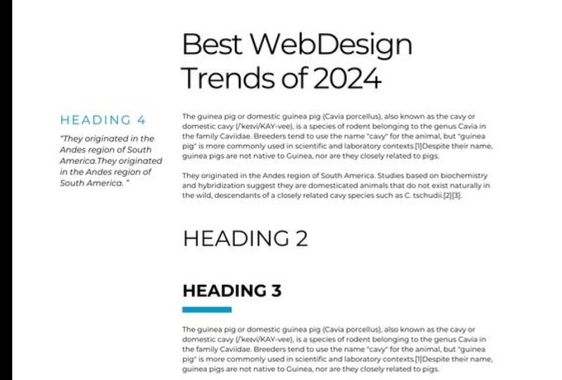
with all our authors, developers, and other designers. The first example is I've taken this one about
childbearing a yacht, and I've chosen, you
may have noticed, I've also made some initial
decisions about colors and things which aren't necessarily what we're talking
about in this course, but it's worth throwing it in whilst you try and create
this design system because it gives you a much
better idea about sizes and typeface choices. If we look back at the system, you'll see I haven't
stopped with the name heading
one to heading six. I have gone ahead and given them names depending
on how they would actually be used instead
throughout the application. And we haven't got
a super big display heading on hair that might appear on the homepage
or something because it's just not used in the page. I then went on to create
for this type system. If I did have some
display heading, this is the style
I've gone with, with the ligatures
and everything. But I've not used
it in the design, so I've just taken it out of the typographic system
because if it's not used, I don't want it in the system. Everything we have on this
block on the left has all the correct sizes
with the line heights, the line lengths, and
the margins around them. How I think they're going
to work well on a page. And then I've gone ahead
and created a page. In reality, you're
going to create several different
ones and see how it might work in different parts of your application or website to ensure that my
typographic system is something I'm happy with now because it is quite
a sort of exotic, traditional kind of thing,
chartering a yacht. It's got very, very upper-class traditional
kind of feel to it. I've gone for a Baskerville
style typeface, which as we know, is
a traditional serif. And I think it fits quite
well with how I believe the branding would be four
page about chartering a yacht. If we look at my second example, I've gone for Blockchain. I've taken the Wikipedia
page for blockchain and I've gone for
something that looks a little bit more
technical hair, of course, slightly more
technical looking colors. This typeface here
is Mary Weather, and it has a slightly
more modern Serif. Some interesting contrast in the topography and some
quite interesting shapes without being really
out there and bizarre. It looks very modern, without being too stylistic. It looks very modern. And I think for some sort
of cutting edge technology, this is a particularly
good choice. And you can see I've
added a few layers in my typographic
hierarchy that I've then yet again just try
to laying out on a page, my initial page and seeing how well the line height
looks going down. It's possibly got a bit
more of an official look, the sort of thing that a journal might look because
it's probably quite informative and
talking about cutting edge technology and
possibly trying to convince people about some new
scientific evidence about how good blockchain
is or something like that. So I've laid it out a little
bit more like a journal, but with a few things
that make it a bit different to show that it is a sort of cutting
edge technology. And then finally I've gone for something with a
bit of data on it. I've gone for this page
about GDP from Wikipedia. And for this, I centrally aligned to the headings,
as I said before, this always gives things
more of a kind of authoritative feel when we're talking about
something like data than perhaps centrally
aligned text is a good idea. The headings and body
text is all in Roboto. Now roboto is a really
good choice for this style of page list of all, because it has all the numbers styling that
we need to make sure it's properly aligned so we can read our
numbers correctly. But one reason I think
Roboto is really good for this style
of page is that this is a page that's gonna
be read by people who are analysts and they like
non nonsense styles. Without really admitting
that deep down, they are just as influenced by visual styling
as everyone else. I think Roboto has a kind of no nonsense kind of
aesthetic to it, whilst still being
quite friendly, has got quite nice
rounded edges and things. And so I believe
I would describe this typefaces haven't quite
a welcoming personality, but it's subtle enough that
data analysts and people who don't believe that there are emotions or
that it affects them. Other people who
perhaps are going to let that small
bit of style slide. It is of course quite
ironic to suggest that some people would be
completely logical minded. Just believe that they want to read an article just
to get the data when you're talking about something like comparing GDP figures
across countries, which is almost completely
illogical because the way we measure GDP is ludicrous now. But some people just like to see numbers and have unlimited
faith in numbers. And it's my understanding
that those kind of people are going to want this much more simpler
no-nonsense typeface because roboto does have quite a well spaced characters with good x-height and large
counters like for example, in the OS and stuff, I've
managed to make it a little bit smaller while still
being quite readable. If we just come over to
the side here you can see the typographic
system on its own. Now, when you're using, I'm using Figma hair, as I've said before, I'm
using Figma and when you're viewing them on the page, you want to remember that to set the view to a 100% when you're deciding if you think
it's a good size and readable right now on my screen. And it could be
different to do with the size of your screen and how the video dimensions
are different. But right now on my screen, I'm looking at this at a 100%. So this is the exact
size it would look on the screen if we created this
design exactly the same. But that's going to change a
little bit when you want to create your responsive
typographic system. So just for this system, I've created the mobile version. This is a mobile page of the exact same page of
created the mobile version. And this is the mobile system. This is all the margins
and type sizes for mobile. Now one thing you'll notice
is if you are looking, if your dimensions are
anything like my screen, this is looking way
too small to read. But that is of course, because you don't hold your mobile phone that
far away from your face. When we are using design
software and we want to really make sure we hand over our designs to our
developers or share them with the rest of our
team in the sizes that actually going to
be on the screen and the actual physical dimensions. So this is how we would want to create our type system
and our designs. But when we viewing it
on our desktop display, if we're sat on a laptop
or a desktop computer, we want to make sure
when we look at the mobile version that
we're zooming that enter 200 per cent to make up for
the fact that the screen is so much further from our face than we would normally
hold our mobile phone. Now, as I said, I'm
using Figma and it's worth noting if
you're also using Figma, that there is a mobile
app called Figma mirror, where once you log
in, whichever, whichever artboard
you've selected on the desktop app will be
mirrored on your mobile phone. You can quite comfortably
look at your phone and see exactly how that design is going to look
on a mobile phone, which is a far better
way of assessing if we think the type sizes are good and then just zooming into 200%. I have seen other
designers before do things like simply make
the art board for the mobile view
twice the size on their desktop so that
they are viewing everything twice the size to get an idea of how it's going
to look in comparison. I think we always want
to be dealing with the actual physical size
that everything's gonna be when we're dealing with the design files
so that it's less confusing when we share it
with the rest of our team. Just a couple of pointers
there that when you are checking the mobile view, you're playing with
your type sizes. Don't forget to either zoom in or just view the
design straight on a phone because it's
not going to look the same as it looks
on a desktop view. The big challenge,
this is the big main, big design challenge
is I want you to create a design system. Now using the application
you're gonna be creating, whether it's a web
app or whether it's a blog or a magazine. And think about all the stuff we've already learned about
choosing the typeface. We already had a go at that. Getting the correct type sizes, line heights, and all of those things to do
with readability. And now start thinking about
the visual hierarchy and all the things that we can tweak to get a nice
visual hierarchy. Whether it's color,
whether it's small caps, whether it's using
multiple typefaces, creating larger margins around things to decide what creates a nice visual hierarchy
whilst working with the content you've got and
the branding that you've got. Again, the more times you complete this
challenge, the better. So why not do what
I've done and just get a Wikipedia page and see if
fallback Wikipedia page, you can find typefaces that you feel communicate
the same message. Find out how to make those typefaces are
good readable size, and then create a
visual hierarchy for just that Wikipedia page. The more times you do this, the better you're going to get at creating typographic systems.
19. Summary: Styling and formatting our
text has various advantages. We can use ligatures,
for example, to create unique combinations in our texts that give
it more personality. But we could also use something like lowercase numbers inside a paragraph and fixed width
numbers inside a table, where it's going to
be much more useful. If we choose a free typeface, we may not always
have these options. That can be a deciding
factor when we're choosing the best
typeface for our project. We can use more obvious
styles like color and bold text to help create a visual hierarchy
throughout our design, we want our users to instantly identify where
they're supposed to look first and have very few items fighting for
our attention at any time. We could start this by creating a typographic scale using
the Fibonacci sequence or a musical scale if we
like to ensure that we have consistent ratios
throughout our design, depending on the nature of the application
we're designing, we may want the type size to increase less dramatically
for the larger text. So it isn't so big. We don't necessarily need a
billboard across every page, but we always need to make the final decisions about
sizing without eyes. There are different
optical weightings and different colors that can make the sizing feel
slightly different. We need to train our eye. Anything we can use to
differentiate a heading, color position,
background-color border color, margins can all be
used to convert the simple type scale in Sway sophisticated
typographic system. Once we have VAT, we are ready to finally
write some code.
 Rob Sutcliffe, UI Designer / Developer