Transcripts
1. Intro: In week four of the
UI design bootcamp, we will be looking
at readability. We will first have to understand the various stages of
how somebody reads. We'll look at some of the myths about
readability on websites. For example, the myth that sans serif typefaces are easier to read than serif typefaces.
So they aren't. Of course, the myth
that we should have our body typeface
always at 16 pixels. Different typefaces
are different sizes at 16 pixels and different devices or different distances
from our face. We will instead learn a only slightly more
difficult formula to make sure our typefaces are
a good size to read. And we'll make sure those sizes adjust well for
different devices. We will learn about an optical illusion that makes it a bit
trickier than you'd think to pair a heading
typeface with a body typeface. And finally, we'll
look at how to choose the line length and
the line height once you know the size
of your typeface. Then by the end of
this short course, you will know how to choose
the font size, line length, and line-height for
any typeface to make it optimal for
readability on the web.
2. How We Read: Before we can talk
about readability, we need to look at how
people actually read. It seems like quite
an obvious thing. But even if you look
at a web application, there are two different kinds of reading that are going on. One is when you're trying
to find something. So your navigation
and your buttons and that sort of thing
where you know what you're looking for
and you're using the text to help you
identify the thing. And the other is when
you're trying to extract information
from something, maybe you're looking at
a data visualization or you are reading an
article or a comment that somebody has written when you don't know what's in it yet and you're trying to extract and understand the
information in it. Those are two very
different kinds of reading to help us
understand the difference, I'm going to borrow a
definition from Toni Basil. You may have heard of
Tony Belsen because here's a speed reading champion. He is an expert on how we learn, and he's the guy who
invented mindmaps. Tony boson says there are
seven stages to reading. The first one is recognition. This is identifying the E on the page as the one which
is in your brain somewhere. Most of this work has done
before you start reading, when you learn what each
of the letters mean, the next stage is assimilation. This is the physical part. This is when the light bounces
off the screen and into your eye and then is
transported up to your brain. The third stage
is comprehension. This is where we actually
understand what the words say. All the words on the
page combined have some kind of meaning and understanding what
that meaning is. The next stage is knowledge. This is where we apply it to the other things we've
previously learned. Maybe we form some kind of
opinion about what we've read. We might reject it or we might integrate it into
our other ideas. The first three stages are
all learned at school. But unless you attended
college or university, you probably didn't really
learn the knowledge stage. You didn't really learn to rewrite it in your
own words or have an opinion about the
thing that you're reading until you
got to university. So this is a more advanced
stage in reading. If we think back to our web application when
we have labels for pages, navigation and buttons, we don't have to worry
about this stage. People already knew what
they were looking for. We just need to worry about
those first couple of stages. But for all the other parts of our application where we're giving someone information and we need them to take them away, engage with the information, and use it in some way. Those will apply to
all seven stages. The fifth stage of
reading is retention. This is actually been able to
store it away somewhere in our brain to bring it back later when we actually need it, then we have recall, which is when we bring
that information back out of storage
when we need it. And Tony buttons, final stage, stage seven is communication. Being able to use that
information we've stored and recalled and explain
it to somebody else. I think it's worth us being
aware of and thinking about these seven stages when we're
making typographic choices. But I'm not going to go into
them for too much detail, certainly not right now. However, if you are making a
decision like what to use as the body text in a large
block of typography. We just looked at the
very first two things on here, recognition
and assimilation. We might say, You know what? Helvetica is a really,
really nice body. Follow it because it's very, very quick for us to perceive. It's very fast and
efficient for assimilation. It uses simple geometric shapes. It's perceptually
less effort for us to assimilate the letters. When we looked at the
anatomy of typography, we mentioned how the ascender on a Helvetica H is not
particularly high, making it almost
identical to the n. This gives us recognition
problems instantly. Likewise, if you look at a, C has a very small opening and the exact same geometric
shape as an O or an E. And of course
the uppercase and the lowercase l are pretty
much the exact same shape. Even if we just consider these first two stages when making a typographic decision, we can see how they
might actually massively contradict each other. Helvetica is a great
choice for assimilation, but a terrible choice
for recognition. And because of the overuse of the Helvetica
typeface is probably particularly bad for
memory and engagement, meaning most of the stages
between comprehension and communication are gonna be negatively affected by
choosing this typeface. Now it may seem like an
unnecessary detail to look at the definition of
every single letter and criticize or praise
the recognition and assimilation factor for those
tiny, tiny little details. But as an adult, when you read, you almost never look at every
single individual letter. And if you read fast enough, you'll rarely even looking
at a single word at a time. This means over time, we're learning to read
an entire word because of the overall
shape of that word. It might not even
be the one which are I is currently focused on. It may be two or even
three words away from it. If we read particularly quickly, meaning it is not even in
focus when we read it. Identifying the
difference between a Helvetica o and a Helvetica or C or E when it is not in
the center of our focus, leads to potential
misreading and therefore will negatively affect
the following six stages. The tiniest detail in a typeface that
affects recognition, assimilation,
engagement in memory, or any of these details, becomes massively important
when people are reading a large body of
text because they will go through it at
an incredible pace. And the smallest
detail can affect them emotionally or affect
their understanding. Now if your first language
was Japanese or Chinese, or somehow Mahan or
Egyptian hieroglyphics, then you will be used to reading an entire word as
a single symbol. You were already
reading quite fast. But we should also be aware that the perceptual
effort required to assimilate a Chinese
or Japanese character is much more difficult. And the importance of recognition because if
the similarities between characters makes it even more important that we consider these factors with
these alphabets. According to Tony boson, there are seven
stages to reading. When we take all of these
factors into consideration, there is no way we
can possibly say there is one typeface
we should choose. That's gonna be the best
one in all scenarios. And even if there was, we are currently just
talking about reading. We're not even talking about all the other parts of visual communication
we just discussed. We're not talking about
motivating people to read. We are literally talking
about how well they read. All of these factors
make a term like readability almost
impossible to define. But we're going to
come up with some form of definition in the next video. Just be aware that it's
not a rule set in stone.
3. Readability: If we wanted to measure
how readable or the readability of a block
of text on a website. There are multiple, multiple things that we
would want to consider. The way that people gauge
readability is as wild and varied as the way that
they measure usability itself. There are multiple
techniques where people count the
number of adverbs. They look at how complex
the sentence structure is, how many syllables per
words that are in the text. Lots of stuff that we
won't look at throughout this course because they've
not related to typography. But if you go to a website
like readable.com, you can put in a paragraph
of text and have it rated on that kind of stuff. There's lots of
ways of measuring the speed of perception and how accurately perceived
typefaces are. There's lots of things to
do with how easy it is to differentiate between
letters in the typeface. And everything I just
mentioned is just to do with the first few stages of reading, not to do with how easy it
is to remember or recall, or how much it engages
you and makes you think and form your own
opinions about the content. As web typographers, it's
better for us to think about the variables that we
have available to us rather than all the ways we can write readability as a whole. Now once we've chosen a typeface and we're gonna
be doing that largely based on how well the character of the
typeface fits the brand. There are three variables
that we can control. We can control the text size, the line-height, and
the line length. You may have from time-to-time, heard some rules of thumb
about these three variables, specifically with text size. For example, you might
have heard people say text needs to be at
least 16 pixels high. Unfortunately, that
is a rule of thumb. And as typographic designers, it's not really much use to us. 16 pixels high for one
typeface isn't the same as 16 pixels high for another
typeface, for various reasons. The 16 pixels is referring
to the surrounding box and different letters and
different typefaces fill these boxes in
multiple different ways. They might go right
to the edges. They have absolutely
no guarantee that that's going to happen. They might be quite
small inside that box. And even then there's
various attributes like the x-height and
the optical weight. Stuff that we'll talk about in some videos very soon
that are actually going to affect how big it appears on the page. Even then. That's before we even talk
about responsive design. We actually hold
different screens at different distances
from our face. So our phone, when we look
at the screen on our phone, we hold it much
closer than when we look at a website on
a monitor screen. There's no way of
been exactly sure how far the user is holding
their phone from their face. But generally speaking, a
type size of 16 pixels on a phone screen is
not the same as a type size of 16
pixels on a monitor. The other two variables, line heights on line length, are gonna be in some
way affected by the choice of topography
and then the font size. So it's impossible
for us to work these things out until
we have that font size. In fact, for any of these
variables, the text size, line-height, and line length changing one is going
to affect all three. If you look at the design of an existing website and you say, You know what, we
need to make the text bigger on this website. That's gonna change
absolutely everything. When we think about
readability as typographers, we're thinking about
the text size, the line-height, and
the line length. And we're thinking about
all these three things working well what together? For the rest of this course, I will refer to readability as how well these three
things work together. Being well aware that there are multiple other things that go into whether or not
the text is readable, especially that we might
even consider how well we remember and recall
the information as part of readability.
4. Aspect Ratio: In the last video, I said the overall heights
of the typeface is not too important to us when we're thinking
about readability. And just to prove that point, I want to show you some
texts written in Verdana and then texture in the exact
same size, but in Garamond. Now a big difference
between Madonna and Garamond is
Madonna has a very, very high x-height, and
Garamond has a very, very small x-height over all. If you take any
typeface and you divide the overall height of the
letters by the x-height, you get the aspect ratio. The x-height is normally around half the height of
the overall character. You're normally looking at
something around nought 0.5 as the aspect ratio. But it could be anything from nought 0.4 up to nought 0.6. Garamond has an aspect
ratio as small as 0.38. The x-height of Garamond is very small compared to
the overall size. Remember the size is the
size of the surrounding box. So even the capital letters might not fit perfectly
inside that box. For Donna has an aspect
ratio of nought, 0.58. The x-height is quite large inside the overall
height of the letter. There are various calculators
available online to find out the aspect
ratio of your typefaces. I quite like this one on this page which I
will share with you. And I like it because I
can put in the name of any font family and a
half on my computer so I can calculate all kinds of wacky and wonderful font
files I happen to have. Now if we were, for example, using Verdana and
Garamond together, or if we were using one as a
fallback font for the other, then we would want them to look roughly the same size and have a similar rhythm
going down the page. Something we will talk
about a little later. If we, for example, take 16 pixels, we say we have some Vedanta
that's 16 pixels high. We can times that 16 by nought, 0.58, and this gives
us a number like 9.28. This is the x-height of the Verdana that
is 16 pixels high. Now if we divide that by 0.38, which is the aspect
ratio of Garamond, we get the number
twenty four forty two. Twenty four point forty two is a pretty good size
to make Garamond, if we wanted to look
roughly the same size as 16 pixel for Donna. Now as you'll see that I'm
quite look the same size. And part of the reason
is because I've chosen two typefaces as the exact
opposite end of the spectrum, and they don't even look
similar in any way. The Garamond is pretty big
compared to the Vedanta. But there's also a
few other things. Garamond is quite
an open typeface, has got big open
balls and apertures, has got quite heavy
weighted lines and quite some
variety in there too. There's various aspects of this typeface that
are a bit harder to quantify for those reasons
in instances like this, I might trust my eye a little
bit more than the maths. Maybe I'd reduce the size of fat Garamond a tiny little bit. Now for now we just need to do all of that stuff I
just said manually. But at some point in the
not-too-distant future, there is a CSS rule
that does it for us. Font size adjust. Now if I had some Garamond and I gave it a value of font
size adjusts nought, 0.58 naught point
five-eighths being the aspect ratio of Verdana, then give it a font
size of 16 pixels, and it would automatically
make it 23.2 pixels high. For me, essentially,
our browser will just do that little equation
we just did for us. The first thing we have control over when we're thinking about how redouble our textures
is the font size, but the font sizes, It's not
really an interest to us. The x-height or the aspect ratio of the font is what's
interesting to us. We can find out the
fonts aspect ratio using a aspect ratio
calculator online. And then we can make any
adjustments to typefaces we use together so that
they have the same x-height rather than
the same height. However, we do always want to be making sure we use our eyes, we trust our eyes and
we train our IE's. Because if you had something
like Garamond and Verdana, there's such drastically
different sizes that when you try and
make them uniform, they're going to always
look a little bit off. Realistically, this is just one of the many
things you should consider when you find typefaces
that work well together.
5. Viewing Distance: In the last video, we
were talking about how to set your pixels high for a typeface based on its x
heights or its aspect ratio. Of course, we don't want to be measuring things in pixels, not anymore because all of our displays now work
based on reference pixels. A reference pixel is
only the same size as a pixel if you're
using a desktop monitor, and it is a 96 DPI monitor, the resolution of
the screen affects how many pixels a
reference pixel is, but so does how far the devices held from the user's face. Unfortunately, different devices and different displays can show reference pixels to the correct size with
varying results. So it is worth understanding
how they work. We'll talk more about
how to reference the sizes of our texts later. But before that, I want
to touch on a point about design that I love saying, which is that designers shouldn't care about
the real world. We should care about people's perception of the real world. The amount of pixels
on the screen isn't. What's important is the
amount of pixels in your eye. I like to refer to these
as perceptual pixels, but astronomy and navigation
already had a term for it, which is arc minutes
of minutes of arc. An arc minutes is
basically the number of degrees that the earth
turns in one minute, which is almost exactly
160th of a degree. So why am I talking to you about this term that astronomers
and navigators use? Well, the reason astronomers
talk about arc minutes is because let's talking
about what we can perceive from the earth. One arc minute is pretty much one of our perceptual pixels. It's how much we can actually
make out with our eye. If you imagine your head
right now as the Earth, you imagine the 360 degree
vision that you have. If you turn your head around
and you look up and down. If you take any one degree
movement up and down, and only one degree
movement left and right. And you divide both
of those by 60. You've just basically
created the pixel grid. That is what you
actually can see. If something is less
than half the size of an arc minute,
we can't see it. And the reason we measure in degrees or arc
minutes is because the distance from our AI makes a big difference in how
well we can see it. So let's say that we were
measuring something in pixels and it was on a
display, on a monitor. Monitors are typically
60 centimeters from the user's face. So 16 pixels high on that
monitor would be 24 arcminutes. I'll give you the
calculations for that later. Now if we showed the
same 16 pixel text on a mobile phone screen, which we typically hold around 30 centimeters
from our face. That would be closer
to 48 arcminutes. And on an iPad, 45 centimeters from
our face would be looking at 36 arc minutes. So this diagram shows
the difference in text size if each of
these devices was showing actual pixels
and they all have the same resolution
display realistically, because you hold your
phone closer to your face, it normally has a
higher resolution. In fact, Apple gave the iPhone a 300 dots per inch or pixels
per inch Retina display, precisely because you hold it 30 centimeters from your face. And that means that one pixel is almost exactly
one arc minute, making it the highest
possible perceived quality for a mobile
phone screen. As another side note, you may have noticed
this funny symbol after the numbers in red. This slightly slanted thing that looks like a
single quote mark. This is not a single
quote mark it as a prime symbol is used for
two things in typography. It's used to say a
certain number of feet, and it's used to say a certain
number of arc minutes. You can also abbreviate
this by writing 48 AM, 48 amen or 48 arc men. All of these are
acceptable standards. Yes, that was a very
complicated way of saying things that are
further away look smaller. But that was, so I
could introduce you to one of these handy calculators. You put in your
viewing distance, which is typically going
to be 30 centimeters, 45 centimeters, or 60
centimeters for a phone, iPad, or TV screen, you may want to calculate
slightly differently for a watch screen or if you're even dealing with TV
interfaces or movies, then in the perceived size, you can say 20 or
22 arc minutes. 28 to 22 arc minutes is agreed upon to be quite comfortable
size for reading, but I will give you some better calculations
for that much later. And it will tell you
the physical size that the texts
would need to be on something at that
distance if you want to view It's at that
many arc minutes. One thing you'll
notice about any of these calculators is
the output is not in pixels and that's
because pixels on not a defined physical size. It depends on the display. Or it's time we came back
to reference pixels. If I look at the
perceived size up here, you'll notice that
one of the options is reference pixels up here. You'll also notice that it is unfortunately nothing
translatable from an arc minutes. The agreed upon size
of a reference pixel unfortunately has nothing
to do with our perception. It's based upon a display
of 96 pixels per inch, which we're looking at
from 60 centimeters away, purely because that is the
standardized size of a pixel. Back in the early
days of the Internet, a reference pixel is equal
to 1.2789 arc minutes. So it's slightly larger than a perceptual pixel
or what we can see. And it is also equal to about naught point
naught 213 degrees. It would be really handy for designers who care
about perception if they just made a reference pixel the same size as an arc minutes. But we're not going
to talk about reference pixels
too much anyway, we'll touch on it's slightly in the implementation module, but we're not going to
talk about them too much. And that's because
there not too much use, because different
devices haven't really adopted them perfectly. A big role of design and front-end development is
never trust a computer. You have to understand what
it's doing behind the scenes because a lot of them are
going to do it wrong. If we combine everything we
know about arcminutes and everything we know about Aspect Ratio or
x-height of our text, we should be able
to come up with some pretty good calculations for our typography. We look at one more thing. If we take a look at this
article in the Journal of vision from some
experiments that were done into reading efficiency, reading speed, we can get a pretty good calculation for how big our texts should be. If we want people to
read efficiently, we would be really punishing
our readers if we made it as small as we possibly
could for it to be legible, we want it to be comfortable and easy for them to read quickly. The ideal x-height for
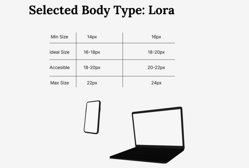
reading efficiency on your site is nine arc minutes for the size of the x-height. This is actually based on
the research finding that the perfect size is
six arc minutes. But we're going to bump
it up a little bit. So let's make sure we're
catering for all eyesight's. Actually, if you are making
an application where the users are perhaps
a bit older or perhaps have a hard
of seeing problem. You may want to push
this all the way up to 12 arc minutes. But generally the
recommended size is nine arc minutes
for the x-height. Now if for the sake of example, we bring Vedanta and
the Garamond back. We can simply times nine by the aspect ratio of
these two typefaces. And that would make Garamond
24 arcminutes and total, whereas Madonna is only
16 arc minutes in total. Or to put this right back into a measurement that
everybody can understand. We can look at reference pixels. Garamond would be 18.8
reference pixels, while for Donna would be
12.5 reference pixels. This would make Garamond
2.4 millimeters on a mobile and 4.2
millimeters on a desktop. And it would make for
Donna 1.4 millimeters on a mobile and 2.8
millimeters on a desktop. We can see that the recommended
size is quite different. Actually, neither of
them are even that close to 16 reference pixels. Now whether we like it or not, we are still going to need reference pixels
from time to time. So how did I calculate
that last number? We know one reference pixel
equals 1.2789 arc minutes. So if you divide nine by 1.2789, you get something around seven. So we could say that
seven pixels divided by the aspect ratio gives you the ideal reference pixel
height for the typeface. As designers, we are
far more concerned with the pixels that people see than the ones that
are on the screen. So we don't measure
the heights of text using the pixels
on the screen. We do it using arcminutes, which is 160th of a degree of the few weeks and see all around us when we
move our head around. The ideal size for text
for people to read quickly and efficiently is
between 612 arcminutes. We ideally aim for nine right in the middle so that we're
catering for all people. If you have any information
that proves that most of your users have
particularly good eyesight or particularly bad eyesight. You might want to
move this slightly more to one of the two extremes. Otherwise, we're generally
going to aim for an x-height of nine arc minutes. Hi, there is no way the device we're looking at
knows how far away our faces. Although people have tried to develop little bits of
technology that will do that. So we have to deal
with the units of measurement that CSS gives us. We'll look at those
a little later. All we need to worry about
for now is that there is no minimum size
for typography. It's dependent upon
the device and how far away people generally hold
that device from their face. And that we can use an arc
minute size calculator so we can get a uniform
size between mobile, tablet and desktop and
possibly TV and watches. Should we wanted to.
6. Large Text: We now know that the
optimal size for our texts, for the average person
to read it quickly and efficiently is that the x-height should be nine arc minutes. Hi, but what about all the
rest of the text on the page? What about the headings
or the text on buttons? All of these things need
to stand out a little bit because button text
or other UI elements are things that we're going to scan for rather than be actively reading and headings need to grab our attention
and jurors in. Well, readability
isn't our concern with these other bits of text or button has two
words on it may be the heading has most
five or six words. We're not worrying if it's efficient for somebody
to read those with UI elements were
worried if it's easy to spot out of the
corner of our eye and with headings were worried
if it has impact and it sets the tone of the message
of the rest of the text. Essentially, we can make all
these things a little bit bigger than what is comfortable for large
areas of reading, because that solves
other purposes. However, there are some
other things to take into consideration that are
not about readability, but fit in quite nicely with what we were
just talking about. One thing you may have noticed about all these
different devices. Your watch, your mobile
phone, your iPad, your monitor, your television, is how big they are. The further away they are from your face, The
bigger they are. And I don't just mean how
physically big they are. I mean, they take up more arcminutes if
they're farther away. If you're currently sitting in a comfortable 60 centimeters
from your monitor right now and you hold your
mobile phone up or comfortable 30 centimeters
from your face, you'll notice you can
still see your monitor, your mobile phone covers maybe
a quarter of the screen. If you have a massive phone for most of our
assets, even less. So we could say we have
a lot more arc minutes available on a desktop screen than we do on a mobile screen. Again, probably
slightly obvious, but you might want to ask
why we generally don't like having big things
really close to our faces. Ideally, we don't want big obstructive headlines
shoved in our face either. If you look at a billboard, the big text is massive and the small
text is pretty small. The ratio between the
heading texts and the body text on a
billboard is massive. Of course, a billboard has quite a different purpose
to a mobile phone. But you'll notice
that the smaller the device and the closer you
hold it to your face, also, the smaller the headings. If we have a big bit of banner text across
the homepage of a website or a heading on the
top of a web application. The number of arc
minutes is going to reduce on devices we hold
closer to our faces. We simply have less arc minutes
available on the screen. And we also don't like having big things too
close to our face. One other thing to take note
of with big typography, you may have noticed some
monitors these days, some real swanky TVs
and monitors been curved and wonder what
is the point in those? Well, here's an
interesting point for you. If your eyes are
currently positioned right in the middle
of your screen, you've got more arc minutes
in the middle of your screen, then you have in the top left of your screen, for example. Because the top left
of your screen is ever so slightly further
away than the middle. And because of that,
everything appears to bulge outwards
ever so slightly. There's a kind of
lens distortion. When the Parthenon was
built in ancient Greece, they built it so none of
the walls are straight. There are no straight
lines on the Parthenon. Everything about the Parthenon corrects ever so slightly
for this kind of lens distortion that our eyes have when the first
typefaces were cuts, when the actual physical metal
pieces of type were cut, the larger letters were caught with a different
optical weight to the smaller letters
to correct for this kind of lens distortion
that we have in our eye. I mentioned this earlier. If you look at a typeface
from before the 20th century, when the process of cutting the type was a little
bit more manual, the type cutter would give a smaller optical size or optical waiting to
the larger letters. You would have to be a
very keen and typography purest to want to do something
similar to this today, but this is just about possible. Now with variable typefaces, there are multiple reasons
when we're working out our typographic
system that we're not going to make
the typeface for the headings the same
typeface as the body. But one of them really
should be that they don't actually appear
the same anyway. There are a handful
of typeface families available where the
type designer has made a slight variation for
the heading and for the body text so that you can use them at different sizes. This is a really nice option if you want to use
the same typeface for the heading texts
and the body text without looking slightly
weird and distorted to us. We will be talking about
these a little bit later on. For heading text or UI text. We don't need to worry too much about how easy it is
to read because it's normally not too many words
as long as it's above that readability size we talked
about in the last video. We didn't want to be
aware though that different screens have
different amounts of arc minutes generally, the closer we hold them to our face, the
smaller the screen. And therefore, we should
make these larger bits of typography a
little smaller in comparison because it's
not as essential for them to jump out
at us when we're holding it closer to our face. And we don't have as
much screen real estate. And as a super, super advanced
topography lesson, I talked a little about
how the optic sizing is going to appear
larger and larger text because of the fact that something that is
more arcminutes big has a slight bit
of lens distortion. If we wanted to use the same typeface for the
headings and the body, we can choose a font family that has a specific heading font, which is actually going to have a slightly lower optic sizing. And much later on we'll get onto the really exciting
topic of variable fonts, which could allow us to control this optic sizing on a
much more granular level.
7. Line Length: We now have a pretty good
calculation for working out the ideal font size for
large bodies of text. The next measurement I
want to look at that helps with readability is
the line length. We measure the line length
in characters per line. But as how many characters, including the spaces
appear on each line, you've probably
heard some rule at some point that says
there should be 50 to 70 characters per line
for the ideal line length. I say something like 50
to 70 characters per line because every single
rule I've ever heard like this has
slightly different numbers. They're all actually based
on some research from way back in 1971 that said the ideal character
length is between 5075 characters per line. And so ideally you
want to aim at about 60 characters per line. And this is one of those rules why you can't just learn about typography if you're dealing with web typography
specifically, because they weren't testing
with web typography in 1971. And when people
did finally start testing in 98 and then
in the early 2000s, they found the optimal line
length for typography on a digital display was
95 characters per line. That is 95 characters
per line is the optimal length
for reading speed and efficiency if you're reading off a computer screen now
before you rush off and go and change every digital
design you've ever done to make the texts being 95
characters per line. There's a few other things that I believe we should consider. Firstly, we are still just
talking about readability. Readability been a kind
of usability and there is a different thing
designers think about a lot user experience. When people see a block of
text on a computer screen, they feel like they're going
to read faster and more efficiently with a
shorter line length than 95 characters per line. And they feel like they're
making more progress. It feels like they're reading
faster even if they're not. Maybe it's because
of the feeling of progress we get when
we reach the end of the line and our eyes dart back to the start
of the next line. Or maybe it's that
satisfying feeling when we get to scroll our
mouse button down, knowing that we've
completed reading a whole screen for whatever
the reasons we should be aware that 95 characters
per line might be the accepted best line length for readability on
a computer screen, but it doesn't mean it's the
best for users experience. We also want to be aware
of that characters per line is potentially
quite ambiguous. When we were looking at
the size of our text, we will look at an
arc minutes and we were looking at
the aspect ratio. There are some
typefaces that are much thinner than
other typefaces. We have big wide letters and tiny thin letters depending
on which typeface we choose. And it's possible
that we read faster on a longer line length
on a computer screen, because of the
computer screen is typically 60 centimeters
from our eye, whereas printed material
like a newspaper, magazine, or a book are typically about 45 centimeters
from our eye. This is, of course,
all speculation. My point is none of the research
we currently have about line length is accurate enough for us to use as a solid rule. I believe this is one of the
few instances where you can ignore science a little bit and ignore user
experience a little bit, and look at what most
people are doing on their websites to see what
our users are most used to. And that is back to
square one between 4575 characters per line. If you are, however, ever dealing with Chinese, Japanese, and Korean typefaces, you want to aim for
somewhere around 15 to 30 characters per line for something about iPad
book distance from your face or all the way up
to 40 on a computer screen. I would recommend pushing to the higher end of
these numbers though, because more and more websites are making longer line lends, possibly based on the science or possibly for other reasons. So overtime people are
becoming more used to reading longer line lengths
on Mac computer screens. And it is going to make
reading faster and more efficient for your
users if that is your goal. For those reasons, I would
recommend trying to aim for about 75 characters per line
went on a computer screen. And now we can probably
speculate that 60 characters per line is
pretty good for an iPad, because we know that that
was the optimal length for printed material and that's roughly the same place that
we would hold an iPad. And then we want to
reduce it slightly more when we move on
to a mobile display, possibly somewhere in the region of 50 characters per line. And just again, be
aware that this is not an exact science I've told you the experiments
is based on, but also be aware that
when other people try and tell you
the correct amount of characters per line, they are also not basing that
on an exact science either. What would be
absolutely brilliant as if we could vary the line a little bit based on how wide the characters in
the typeface are. And luckily with CSS, we can sort of do this because we can control
the width using an EM units rather than saying how many characters
per line, for example. And we'll be looking
at this a little bit more later when we implement the sort of stuff we're talking about right now. We measure line length
with characters per line, and that's all the special
characters, all the spaces, every single character
there is in the line. Original research found that 50 to 75 characters per line is the best for reading
speed and efficiency. But this was based on print. When looking at a
computer screen, it turns out the optimal
characters per line is 95. However, people feel they're making more progress
with shorter lines. And therefore a
shorter line may be a better user experience even if it is worse for readability. And it is widely believed, but not yet proven
that we would want less characters per
line as we move the device closer to our face to try and match
this up with what our users are currently used to from using other websites. I would personally recommend
going for something like 75 characters per
line on a desktop, 60 characters per line on an iPad and then 50
on a mobile device. But you are going to want
to adjust this up or down slightly depending
on whether you would rather your user had a better experience or you
want them to read faster.
8. Line Height: We have something that
looks kind of like an exact equation for
working out the font size. We may want to play
with it a little. When we look at it, we
have something that's kind of an equation for working
out the line length, but largely based on what most other people are doing rather than what's
best for the reader. And then when we look
at the line height, it's gonna be almost entirely by I and by trusting
our own judgment, we are getting slowly less
scientific as we work through each of these sections
when we write our CSS. And therefore in web development we refer to this
as line heights. But generally designers
or anyone who's dealing with typography
refers to this as leading. And that's because he would
put small thin pieces of lead in-between the lines of the
old style metal typefaces. To understand the issues around
line heights or reading, we need to understand what it is that makes it
more efficient for people to read a longer line of texts on a computer monitor. Our eyes don't actually stop on every single letter
and they probably don't even stop on
every single word, depending on how fast you read. We make these saccadic
eye movements where our eyes jump from
one spot to the next, which finds scan possibly
three or four words at a time before
making another jump. I mentioned this earlier. This is why with
something like Futura, you can't have an
OH and an a that look too similar
because they probably aren't in the very
center of your field of vision and possibly
a little blurry. Now to make our saccadic
eye movement to the next optimal
place for us to pick up the optimal number
of words that we can. It's actually kind of tricky. We have to know from
the line heights, the line length, and
the font size exactly. Whereas the optimal place
for us to jump on I2 next, this saccadic eye movement
is going to be much easier if we're making a small jump along
a straight line, then if we're making a big jump, an angle back to the
start of the next line. Even the most
proficient reader is going to over jump
from time to time, especially if they're
dealing with a line-height, font size, or line length that they're not
particularly used to. Having a longer line length and therefore less
lines means that more of your saccadic
eye movements are along a standard flat line, but adds the line
length increases. We're going to be tilting
our head from left to right, all straining our
eyes from left to right to pick up all the words. Which is why I suggested in the last video
that we might read longer line lengths on a
desktop display than in a book, for example, purely because if the type size is
relatively similar, the line length is less
arc minutes on a monitor. When it comes to line heights, we really want to
be looking at what most other websites are doing. And most websites say that
your line-height should be around 130 to 150 per
cent of the text height. For example, if you decided 140% is the best line heights and your text height
was 20 arc minutes. Hi, you would be aiming for a line height of 28 arcminutes. What are the factors that
would tell us to make a 150 per cent line heights
compared to 130% line height. Well, the first thing is if your line length is
relatively long, you want an extra
bit of line height. It means when you make that saccadic eye movement back to the start
of the next line, the angles not quite so tight. It's also adding a little
bit more breathing room, a bit more whitespace around
what would otherwise be quite a dense dark
block of text. Now we'll look at
this more later, but a common technique
is to look at a page of text and squint
your eyes ever so slightly, or add a blur
filter to the page. Ideally, we want
the page to then have quite a consistent kind of gray color rather
than big black, dark, thick, dense areas. As we look at a block of text, most of the text is not in the center of our
field of vision, therefore, is looking blurry. We want that text
to look pleasant to our user and also not
look daunting and scary. So for this reason, if we
chose a typeface like Vedanta, which has a really
high x-height. It therefore by definition, has quite small ascenders
and descenders. Therefore, we want a
bit more line-height for these typefaces
with a large x-height. Because the closer they
get to each other, the denser we're making the color on the
page and the more daunting we're making
the whole thing looking for are user. If we have a larger
aspect ratio, a larger x-height to height
ratio of the typeface. We also want to increase that
line-height a little bit. So finally, the one thing
that's gonna make us change the line height is purely
based on us looking at it. We need to start trusting our own perception at
some point and seeing how dense and daunting
that looks on the page. Generally speaking,
if you're in doubt about two possible line
heights for a block of text, probably go for the bigger one. You're not really worrying
about real estate when you're dealing with
digital web applications. And if it works better, feel free to push it
above a 150 per cent. I've seen plenty of
very good websites push all the miced up to
200% line-height. You never want to
stick to rigidly to any of these rules
or any other rules. If it works well, then it works well
what you should do it depending on how experienced are
user is at reading, they're going to make saccadic
eye movements or jumps of different sizes along the line up to a certain line length. These jumps are easier and more accurate than jumping
back to the next line. If the line length is
a relatively long, we'd be making the
saccadic eye movement to the next line, a much tighter angle. So we want to increase the line height as we
increase the line length. A common technique
we'll look at later to assess our text blocks
is to blur the screen. The block of text should have a relatively consistent color, but should also not be too
dark at any 0.1 rule to reduce the density of
this color if you're dealing with a typeface
with a large x-height, also added more line-height. A typeface with a large x-height naturally has more of the
bulk of the typeface. Closer to the next line, we just add an extra bit of
breathing room in there. We're actually going to base the line-height
rule a lot more on our own perception
and our own eyes were aiming for somewhere around
a hundred and thirty, one hundred and fifty per
cent of the text height. And we're doing that
mainly because that's what most other
websites are doing. There are plenty of websites
that push beyond this, a 150 per cent up to a 170, or sometimes even
slightly further. So feel free to push beyond this upper limit if it works
well on your application.
9. Localization: Throughout this section
on readability, I have been talking
exclusively about Latin typography or Latin text. And what I mean by that is the alphabet you're currently
seeing on the screen. You may, from time
to time hear it referred to as Roman alphabet. I'm avoiding that
because the word Roman already means some
stuff in typography. Now a couple of quick things
about our Latin alphabet. It's kind of a strange one. A single glyph. Remember, a glyph is
one of the shapes, one of the symbols
in the alphabet could be a phonetic sound. So for example, how
the H makes a sound, it could be combined with
different glyphs like the th of the two create a one phonetic
sound for multiple glyphs. When we put a space in, this means one word has ended
and the next has begun. But we also have compound
words like we are. We could say where and sometimes we might put a apostrophe or a hyphen to say
that the words being compounded and
sometimes we don't, a glyph could be an entire
word like for example, I. And in many ways the Latin
alphabet is quite weird, and probably the
English language is the most weird of them all. But just so we understand
a few of the rules, first of all, it always
goes from left to right. It never goes from
top to bottom. It never goes from
right to left. And we start the next line. If we look at this
sentence here, how will the coronavirus
virus pandemic change? Ramadan for Muslims, Latin
text generally always breaks on a space unless there's a particularly
long word where we, it might put a hyphenation n, where you have a little
hyphen at the end of one line to tell you that the word has broken
across the line. Now these rules can change quite a lot for
different languages. In fact, even just that
hyphenation rule I mentioned, some languages might have the hyphen at the start
of the next line. And some languages might
have a hyphenation at the end of one line and
the start of the next. Now when we created our brief, I said it's important to know what languages you
are creating for, but also if you are having a conversation with your
client about languages, there's quite a few things you want to talk to
them about because some languages rules are
less strict than others. Through the rest of this video, I'm gonna give you some
quick fire things to look for when you are dealing
with different languages, it would be impossible
for me to even know, let alone explain to you every single rule with
every single alphabet. That's probably as
many alphabets in the world as there are
videos in this whole course. Now an obvious one you
might have to deal with. You may have noticed I've
set my browser to Arabic. The tabs are in the top rights. All of the buttons and everything are the
opposite way round. And if I look at the
Al-Jazeera websites in Arabic, you can see that all the
texts that goes right to left as a designer
and definitely as a developer it's worth
also notes are saying that generally everything
changes from right to left. So the search icon, which would normally be in the top right is now
in the top left, we would generally just change a value and the top
of the HTML to say that it is right-to-left
text so that we can easily create all
the styles for it. We'll talk about that more in
the implementation section. But it's worth being
aware if you're a designer that sometimes
you may need to create the Arabic
designs separate to the rest of the designs
for other languages. Because buttons, etc., are
going to move from left to right over to right-to-left often or certainly the
majority places I've worked. It's normally not the case that a designer would create
separate designs for Arabic. We would simply develop everything to switch
over to the other side. But it really all depends on the client you're working with. Generally speaking,
Arabic text appears roughly the same
size as Latin texts. So unless there is good reason, you can normally keep the same text sizes
and line heights, but it could depend
quite greatly on what typeface you are using
for the Arabic texts. One final thing to
be aware of with Arabic is because you're
going from right to left. If you should quote
something in the middle of some Arabic texts in a different language that
goes from left to right. That text will still read
left to right or vice versa. If you quote some Arabic in the middle of a
different language text, that text will still
go right to the left. This is okay. It can be quite a difficult
thing to deal with. But one thing to
watch out for is if it breaks across a line, you could end up having a line break in a
different direction. If we ever have a quotes
in an alphabet that goes in a different direction in the middle of some texts. We ideally want to wrap
it in some sort of span to stop it having a
line break MIT quote. Japanese text is possibly
the one language, the one alphabet where you may want to increase the
size a little bit. Sometimes people will
bump up the text size by about 15% purely because they've translated
it to Japanese. And that's because there are
many characters that are incredibly complicated
with Chinese, there is a simplified
version of the alphabet. Sometimes with
Japanese, there are certain letters or certain
glyphs which you cannot avoid. So often people might
bump up the size. Another thing with
Japanese is that there are not necessarily spaces. I'm on the BBC website right now and sometimes
there are spaces, but exactly when and where these appear can be slightly debated. It is entirely
acceptable to write Japanese with no spaces at all. And this little punctuation
mark of the circle is occasionally used to mark the end of a sentence a
bit like a full stop. Now something we will
again talk about later is hanging punctuation. If this little circle
symbol was ever to appear, why at the end of
the line over here, it would not break
onto a new line. It would hang off the
margin as in it would appear in the white
area to the right, you often see people
hanging punctuation when they write a
quote in Latin texts, because the quotation mark will normally appear at the
start of the line. And therefore the
quotation mark hangs over the margin onto the
left-hand side. So it will appear to push
out into the margin. While we have that same
rule with Japanese, this little circle here, there's full stop
or hang out into the margin if it appears
at the end of a line, there is a CSS rule for line breaking called line
break, line hyphen break. If we set this to strict, it will stop parts of Japanese syllables
breaking across the line. Sometimes a Japanese symbol can just be part of a syllable. Very much like how
a single glyph in English makes a single
phonetic sound, but just part of a syllable. We can use this CSS rule, line break strict to stop a part of a syllable breaking
over to the next line. Or if we would like it to be completely justified
with no spaces, we can write line break loose, and that will allow it to
break over to the next slide. There are certain rules in the unique code that you
set your page to be. Normally at the
top of your page, you would have something like
the Unicode equals UTF-8. Although there are
slightly different to unique codes like ascii, these codes will set
certain rules for which glyphs can break onto a new
line and which ones cannot. These are updated quite often, so I'm not going to go
into any details here, but from time to time, you may need to check
what the unicode rules are for what can and cannot
break in different languages. In Southeast Asian
languages like for example, tie the spaces do not appear
between specific words, but actually appear at
the end of a phrase. The website knows how
and where to break onto a new line because UTF-8 now has rules in there
about where you can and cannot break onto
the next line in Thai. But some Southeast Asian
languages still do not have roles in UTF-8, Unicode. And some websites still have a weird little symbol where you used to be
able to add a space between words without it
physically appearing on the website to help inform the browser where it
could line break. For example, perhaps
somewhere around here is the end of one word and the beginning of the next. People use to insert
a symbol which had no visible spacing but acted
like a space on the website. Now those used to be very
problematic because you could add those spaces are not easily be able to
see they were there. But you could also add multiple in one place without
realizing it. For most Southeast
Asian languages, this is no longer a problem. But if you are dealing with
a lessor, use language, there is a possibility
that it might still use these
invisible spaces. Lastly, I just wanted to say a couple of things about Korean. Now at Korean again, does have some slightly
different rules about whether you can break mid word, each symbol and
Korean is a syllable. Multiple syllables can, of
course make a one word. Can you break mid word? It's another thing
you're going to want to ask your client or your boss. The interesting
thing with Korean is each symbol is a
single syllable, but each syllable is made
up of phonetic sounds. Korean is actually a
phonetically perfect alphabet. This first syllable
on the first line, for example, says NAM. And this L shape is always an sound and then
it's always an a sound, and the square is
always a sound. Each of the phonetic
symbols is called a GMO and the alphabet
is called Hangeul. Now, the typeface could be
saved in two different ways. Some typefaces save every individual piece
of the syllable, every GMO as a
separate glyph and some typefaces save the
entire syllable as a glyph. The second option is much
more preferable these days, but there is a
possibility you're dealing with the first one. This could be important when you end up having to work
with a career and typeface at some point
that there are technically two different ways of
saving the glyphs. That is all I really
wanted to say at this point about
localization. There is a million other
things I could say. This was a quick fire video with multiple different things to
do with different alphabets. I hope it was helpful.
10. Summary: There are multiple
stages to reading, right from identifying
the shapes on the page to combining it with
things we've previously learned, forming an opinion. And then lakes are recalling that information
and that opinion. As designers and developers, we can't overemphasize
the very first stage, simply making the shapes
easy to identify. I've mostly focused
on this as well. But please don't forget that someone
acquiring information quickly can be pointless if they didn't form an
opinion and remember it. Right now, I hope that you form your own opinions about
anything I have to say. Once we've chosen a
typeface, the variables, we can control the size, the line length, and
the line height. We can use research to
better work all these out. But the final
adjustments will always come from your
expert trained eye. The more you practice, the better you'll get. Sometimes we might
understand our users enough to stray away from
the researcher little. If our application
is for older people, we might want to make that
font size a little bit larger. If we're working with academics, we can make the line
length a little bit longer because this allows
them to read quick. Well, as these variables
mentioned earlier, line length, line
heights, and font size, we can also control the style, making it bold or italic and coloring the typeface,
for example. Typically, we use these
attributes to help us create a better visual
hierarchy on our page and to add some more style
and character to our design.
 Rob Sutcliffe, UI Designer / Developer