Transcripts
1. Introduction: This week we are
going to be selecting typefaces for a UI design. We're going to start
by talking about what makes a good typography
combination. What makes a good body
text and what makes a good display text and
have to pair them together. And then the project you
will work on this week will be to choose an artist
that you enjoy. Think about what characteristics
that artist has, and then find a display
and body texts which matches the art style as well as pairs well
with each other. Typography makes up
almost everything we see on the Internet
and the skills we learned this week will help us choose the best typefaces
for our UI designs. Let's get started.
2. Inspiration: Now, before we can go and
start selecting any typefaces, we need to fill our
brain with inspiration. We need to look at designs from all different industries and get a sense of what's out there. What different
typefaces make us feel. Really, we should
spend quite a lot of time and probably
quite regularly Looking at other design work and contemplating what
it communicates, what it says to us and
how we feel about it. It also gives us ideas about
how we can use the typeface. As Pablo Picasso famously said, good artists copy,
great artists steal. Now we don't
necessarily want to be directly stealing people's work, but we do want to
be getting inspired by good things we've seen out there in
the design industry. Now I always advocate looking
at avert kinds of design, not web design, not app design, but looking at design as a whole so that we have a
much broader range of inspiration and possibly
create something a bit more unique or knew that other designers in
the industry aren't. We could come to a site
like design inspiration. There's obviously plenty of
design inspiration websites, but we could come to
design inspiration and search for typography. And we're gonna see quite a
lot of handwritten lettering, if I'm honest or pretty funky little illustrations
using letters. But all of these letters are
going to give us a feeling. They're gonna give
us a sense that they belong to something. This letter here or this number. It looks very regal, it looks really important. It looks valuable. And it looks slightly delicate. And I think it's because of
the huge amount of contrasts between the big thick areas
and the very thin lines. And possibly because there's only a few slightly
straight areas to it, it looks and if we
were looking for something that communicated
those characteristics, maybe we were working for quite a high-value
brand or jewelry brand, for example, then
we can look for a typeface that has
those characteristics, but is much more
simple and clearer and easier to read when we
come to choose a typeface. Now you might say, well, that's all well and good. I'm making an app for a bank. So why would I want anything with those kinds
of characteristics? Well, actually, I,
bank has still going to have lots of very
specific characteristics. And I've chosen these letters here from a football
match by the looks of it. It looks very secure, very safe, very trusting, and would definitely work on
a banking website. And then my question
is, why is that? Is it because it's
very thick letters or is it because the letters
don't have any contrast? Is it to do with the
tracking those quite a bit of space between each letter. Is it even to do
with the alignment, how this is centered, and the text is all
centrally aligned. There's lots of typographic
decisions that have gone into this very simple poster
that make it half flat, trustworthy kind of feeling that would work for a
banking application. Let's try and think
about what those are now so that when we come
to choose our typefaces, we've got some ideas of
what we're looking for. Now, I could still use
design inspiration and next, and just search for
web typography. So I get things that
are a little bit more specific and
you'll start seeing some ideas of actual web
applications start popping up. But maybe at this point
we want to switch over to a different inspiration
gallery like this one, fonts in use because as
we get more specific, we're going to be questioning
what are these fonts? Can I access them? One thing that's really
nice with fonts and uses, we see lots of
different designs, but we also find out which actual typefaces
they are using. So similarly to how we've
just been trying to get inspiration from
different mediums. We could look here and
unless we see lots of album covers and posters
and all sorts of stuff. Or maybe at this point
we want to start filtering based on things
which are quite similar to us. We could look at websites, maybe we could
look at packaging. I mean, maybe there's some interesting inspiration
we can get from packaging. As we searched through here, we can pick up what
the typefaces. And sometimes that
typeface might not be available to us
for various reasons, but knowing what
it is is going to help us find something similar. A couple of other useful
inspiration galleries, we've got type wolf. Now this is again got
some really nice designs, but it also tells you
what the typefaces are. So that's absolutely
brilliant and these are a bit more simpler and clearer and a bit more
similar to what you're actually going to be
using on your website. So very good for some
later stage inspiration. What's quite nice with
the type wolf website is like they were
actually write a lot of posts as well if you want to really nerd out on typography, this is another
good place to come. And lastly, I want to
show you type exploration where these little mockups of what it could look
like on our website. Interactive UI elements
in headings and links. So you can see exactly
what it's going to look like if it was in
a web application. So this is much more useful
after you've completed your inspiration
and you're actually going to choose typefaces, especially because again,
it is using Google Fonts. So if you are on a budget, these most of the things
they've mocked up here, our typefaces that
are free to use. Now similar to this
inspiration gallery, there's one here
called Font pair, where you can literally
just find Google fonts that pair well together so
you can filter it by. I want a san serif heading
with a Serif body text. And it's going to give you all the different
Google fonts which can pair quite nicely together. And you can just
look down and see which one has this
sort of feeling that you wanted to
have as a very quick, easy way of choosing, but also so you can be inspired by and see how
these look together. Lastly, I just
wanted to show you this Chrome plugin
called type sample, which if you install into
Chrome is gonna help you identify what type has been
used in different websites. If you're not too tech savvy, that can be quite useful. There's also a website
called what the font, where you can upload
images and it will tell you what typefaces it thinks
you are using in them. Just one takeaway from
this video really, which is make sure
you are filling your brain with
great inspiration. As you look through these
inspiration galleries, try and have a think about what each typeface and
the way it's used is actually communicating
to you how it makes you feel and what the message
is that the typeface has.
3. Define The Brand: Before any kind of
visual design project, you're going to work with your client to establish
what the brand means, what it stands for, what it should communicate. Different design agencies use very different techniques are
ways of talking about this. You may have come across
market researchers before that as crazy
questions like, what kind of car does
your brand drive? They're trying to create a shared understanding of what the brand's personality is. Probably the most commonly
used technique is to try and create five adjectives
that explain the brand. As this course isn't
about branding per se. Let's use this technique. If you're working with
a team or a client, you can put a few hours
aside and try this. Simply get together and brainstorm all the
adjectives that you feel, communicate the brand,
and collect them all up on a whiteboard or
on a big piece of paper. Then have a discussion
about which words kind of mean
the same thing. Cross some out, decide which one of those words is
the better one. Then from the words you
have remaining between, you have a discussion
to decide which of the five adjectives that are unique and best describe the
personality of the brand. Once you have this sets
of five adjectives, switch summarize
what the brand is. It helps with design
critiques later on. It stops us having
a conversation of if we like the aesthetic, and instead we have a
conversation about if the aesthetic style communicates
the brand's personality. When your team get back together
to look at the designs, you can remind them of the five adjectives that summarize the brand's
personality and say, does this color palette,
this typography, all this composition
communicate the personality. And no one needs to say
if they like it or not. Getting a team of
designers and the client to like a design is impossible. Getting a team of
designers and the client to agree that a
design communicates a brand personality
is a bit more useful and possibly a
bit more realistic. You may from time to time see people create design briefs with sliding scales
between youthful and experienced, strong
and delicate. If you would like suggestions to work through the
exercises in this course for every module where we do have some
practical activities. Then I will create five branding adjectives
that you can use. I'll create different ones for each section so that
you get a go at creating quite different styles for each of these modules. Your exercise for this video is to get together
with your clients, your design team
or both of those, and identify five adjectives
that summarize your brand. Alternatively, if you're
working on your own, you could just come up with five adjectives that you
think sound kind of cool. Or I'll attach five to the
resources of this video. And as you choose your typefaces throughout
the rest of this module, try and keep these five
adjectives in mind. Just do the typefaces
you're choosing help communicate these
branding adjectives. The purpose of this video
is to ensure, you know, to only ever work on
aesthetic design work when you know what the brand
is trying to communicate. If you haven't established what the brand's personality
as you can't possibly choose a typeface that
communicates that or do any of the other kind
of design activities. If you're working on
a real-world project, sit down with your clients, otherwise choose another
designer or you could possibly do this on your own just for practice
the first time. And between you brainstorm and work out what your
branding adjectives are. Five adjectives that communicate what your brand personality is. Most of you on working
with a real brand yet. So just to get some practice in, maybe choose an
existing brand or an existing website that
you work with occasionally. And think of what
the five adjectives that describe its personality.
4. Font Shops: Obviously, at some
point you're going to need to find some fonts. Of course, finding
some typefaces to use. You've got your inspiration. You know what the
requirements are, where are you going
to look for them? And a lot of the time it is
going to be Google Fonts. That's because they're free, they're easy to implement, and there's lots of potentially
quite good fonts in here. First of all, let's
just take a quick look at Google Fonts. We can search if we
know the name of it or we can type some
text here if we want it to say some
different texts here in the little
example bits and all, we can filter it by categories. Now these categories aren't
gonna be slightly different to different
categories you've come across on different sites. They all categorize them
slightly differently, but we know what a serif is. We know what a sans serif is. It's whether it has the
little feet are not. Display just means a typeface that's specifically
designed for headings. Handwriting means does it have a humanistic handwritten
kind of feel to it? And monospace, of course, means that the widths of every character or the same
normally used for coding. Now one thing we haven't
talked about too much is if you were to select a different language
like let's say for example, we selected Japanese. Japanese tends to have
its own classifications, but Google Fonts, It's
just going to classify those the same straightaway. If you are looking for a
Japanese typeface, for example, it's gonna be kind
of a bit harder to find one that fits your
exact requirements on Google fonts because they
aren't classifying them in a way that people might expect Japanese typefaces
to be classified. But we can also see that there's basically eight to choose from. So you've got to just choose
the one that you want. Now one thing that's particularly
nice about Google fonts as well is we can select
some of the font properties. So for example, maybe we want it to be
quite narrow because we're mostly designing
dashboards for a very heavy UI website, which perhaps doesn't
have a lot of blog posts and stuff where focusing purely
on what's kind of fit well in menus and buttons. We're going to want it to
be quite a narrow typeface so we can just filter on that straight hair
and that's going to reduce the number of
available options. Ideally, a big thing
about choosing a typeface is just ruling out all
the ones that don't fit. And then you're gonna have a
handful left to choose from. Lastly, one quite nice feature
that Google Fonts has, which is quite a new feature. We're gonna talk more about
variable fonts later. But if I click
this checkbox here show only variable fonts. There are currently
34 variable fonts on Google and there
is one variable. I will show you
with Roboto slab. If you look here,
there are if you were importing this and
we'll talk much more about this in the
implementation stage. But if you were importing this, you might be tempted to import these nine
different font files, so you have all the
different weights. Well actually you could just
import this one font file. And it has 900
different weights, which you can control with a
variable in your CSS later. This is particularly
nice for getting the exact correct whites, especially when we're dealing
with responsive design, where there could be multiple different sizes
for the typeface. We're going to want
there to be multiple different weights as well. And we can now control that on a much more granular level, increasingly more
with web typography, we're gonna be looking
for variable fonts. And like we just saw,
Google Fonts itself already has 34 variable fonts. Different variable fonts have other variables
other than whites. But Google Fonts currently just have these with
the white variables. So that's really nice. Now the next location to
mention is purely for people who have an Adobe
Creative Cloud account. Because if you have
Adobe Creative Cloud, you would be crazy to
go anywhere other than fonts.adobe.com to try
and find your typefaces. First of all, and that
is because Adobe have a really impressive collection which are available to
Creative Cloud users. But you do want a question
if the person who is publishing the website also has a license to use the
typeface as well. What I mean by that
is if you are doing client work and you personally have the
Creative Cloud account, do they need a different
license for them to use the same typeface on
the client's website. Now, with Adobe fonts, you're already going to
notice straight away that the classifications
are greater here. In fact, handwriting
and script is separated into two
different classifications. We've got black letter
we talked about earlier, who'd be quite strange to
use that on a website, but maybe you will. And Slab Serif. So already we've
got a richer choice of classification
is to choose from. And we can select
these properties not quite on a sliding
scale like on Google, but we could choose one that's
kind of more narrow or, or heavier weighted, or even select one with quite a
high or low x-height. And we already know that could potentially be quite useful. Now again, another thing
that's really nice with Adobe Fonts is if I was to select Japanese and they have singled Japanese
out here a little bit. You'll notice the classifications
does actually change. If you are dealing with
Japanese typefaces, it may be easier to
find one that fits your exact classification
on Adobe Fonts. But again, it's worth
noting that there are only seven Japanese typefaces. So how useful it
is to be able to, to filter on the different
classifications. I'm not too sure. Adobe Fonts is absolutely
amazing if you have Adobe Creative
Cloud license. Now the next couple
I'm just going to show you quickly our font shop.com and lie no type. And these are websites which collects fonts from all
different type foundries. And they position
them on their website so you can easily search through a large number of purchasable fonts bought
from different designers. Flew out this course, I am using branding with type for the typefaces
are used there. Relatively affordable and
I quite like their style. You do want to be careful
when you are buying ones from individual designers that you understand what
the licensing is. So for example, if I look at branding with types licensing, we can see that actually there's an entirely separate different
license that we need to use it on mobile apps to if we are using it on a website. So we need to be aware of where we can use it on
the license that we have because it can be very easy to get the
licensing wrong. I'm just going to
quickly show you a couple of slightly
more pricier ones. This is play type. The actually offer a commission based type design where
you can go to them with your requirements
and they will actually create the typeface for you if you're working on a project with a
very big budget, this is Hoefler and Co, and they have some really
nice typefaces on here. One thing you'll notice
is it looks like really good value
because it says ninety-nine dollars
for the typeface. But actually, if you do
want to use it on the web, which of course you
do than the license. And it's gonna go up
quite a lot based on how many impressions
that are on the website and
how long you have it live for all
that sort of stuff. So don't be too fooled by what looks like quite a
low price of first, this is an interesting
project I came across recently
called prototype, where you can kind of
designing your own typeface. You can choose the
serif heights, and it's probably working with
variable fonts somehow you can choose the width of
the Serif and contrast. And there's all kinds of
different sliding scales where you can
control exactly how the typeface looks and possibly design your own with
some minimal effort. In this video, I'm mostly talked to you about
where are you going to find your
typefaces, your font files? And realistically, if you
have an Adobe account, you want to get straight
over to Adobe fonts right now and be using that
to find your fonts. Otherwise, depending
on your budget, we are mostly going to
be in Google fonts. So if you have a bit
of extra spare cash, you might want to start
looking at some of those sites where you can
buy a typeface specifically. Otherwise, I'm going to spend
the rest of this course using Google Fonts
purely because I believe that's where
about 90% of you are going to be spending
about 90% of your time.
5. Body Text: If 95% of our application
is topography, then maybe something like 85
to 90% is body topography. The body text, the text in
the paragraphs in blog posts, the texts in descriptions
around infographics, areas of text explaining how
you use the application. All of that body style text is the majority of any website. Therefore, most typographers or most designers choose the
body topography first. I'm gonna suggest that now and I'm going to suggest
it again later, but for very different reasons. Now a few things to think of when choosing your
body topography. We don't want to pick
something too crazy. For example, we're
not going to choose our handwritten
typeface to make up the body topography of
our web application. It could be in huge long
paragraphs of text, the terms and conditions. Maybe we want it to be
individual and unique. We wanted to communicate who the brand is and the
brand's personality. But we wanted to do it
in the most minimal, subtlest way it possibly can. We're going to learn
later on when we look into readability
that we want our body typeface
to ideally have a slightly above
average x-height. Meaning if we look
at Roboto here, it does have a reasonably
large x-height and a very nice size. We look at the size of
the lowercase letters. They're pretty large compared
to the overall size. So that's really good for
reading a small size. But we also don't want
too much contrast. Something like Baskerville is probably not ideal
for body texts, especially if it was a bit small because there's
quite a lot of contrast between some of the
thin and thicker strokes. Here we have Playfair
display and it's got a very thin lines
on this side of the a and a very thick line
on that side of the a. If this was too much smaller, it's going to start
causing us some problems to differentiate things and to make sure we can
see it properly. Now, Playfair
display, we're gonna talk about display in a bit in its very name is
suggesting we use it as heading texts and
not as body texts. But one thing to
watch out for is something with too
much contrast. Here we have PT serif and
this has got some contrast, but much less than
display sands. We could probably get away with using this as a body texts. We may want to make
it a little bit larger than our average
body topography. Now the next thing to think
about is we're going to want several times to use different weights of bolded
text and possibly italic text to draw attention to things depending on the purpose
of our body texts. But certainly if
we were going to use quite a lot of
texts on our website, we're going to want
multiple styles where we have font properties. We can actually say
that we are looking for it to have more
than a certain amount of styles to make sure that we're only seeing
ones where we're going to have italicized
and bolded options as well. Now we have our specifications
from our brief. If we start ruling out all
the typefaces we can't use, we're only going to be left
with so many to choose from. If we were, for example, choosing a typeface for a bank and some of
our branding keywords said things like safe and
secure and trustworthy. We're probably going to avoid
something like Poppins, which has very
interesting unique shapes around the G here, or railway, which has this quite extravagant
crossover with the WWE. And we're gonna choose
something which looks a bit more reliable than creative rowboats WHO might actually be quite a
good choice for a bank. But if we still want it to
have some kind of personality, maybe not, maybe Morley would be a more
interesting option. Regardless of what our
brand and keywords are, we don't want the
body typeface to have too much personality. By the time the reader
gets to the body texts, they've already decided they're interested in
reading the article. They already decided that they are going to use
the application. We've already communicated
the personality of the brand and what
we're all about. Now we want to
make it as easy as possible for them to read. I set myself the
brief of finding one for a self safe, secure bank. It's only going to
have Sans Serif. We don't want the
splay texts in there. And we've instantly
narrowed this down to 139. Maybe I want it to be
kind of narrow because I'm going to use it for
my UI elements as well. And then I'm left
with Sarah burn. So simply by just setting myself specific rules based
on my design brief, I've straightaway found a
typeface that is perfect. Now I want you to take the
brief that you've created, whether you created it
yourself or your work, the client, to create it. I want you to spend some time again looking at the
inspiration galleries. But now you've got an idea of what it is
you're looking for. So it's going to force your eyes to see things that you weren't looking at before. Then I want you to come over to Google Fonts or if you
have an Adobe account, feel free to use Adobe
Typekit and try and narrow it down and find a typeface which doesn't
have too much contrast. It doesn't have too
much personality, but has the personality
you're looking for subtly in there that you feel is going to work well
for your project.
6. Single Typefaces: Before we start to talk about
matching typefaces to use multiple typefaces in
our designs and how to find these typefaces
that work well together. It's worth taking
a minute to think, can I get away
with one typeface? It's entirely possible to create a really nice design
with a lot of character using a
single typeface. It can look really good, it can look minimalistic, and it is going to be quicker and easier for you to create. Possibly the main
disadvantage with using a single typeface is
that the headings, the display type can really
help communicate character, brand, personality, and
can really draw people in. But it also helps create
that visual hierarchy by making a really
clear distinction between headings and body text. And as we talked about before, because of the way that we get a sort of visual distortion, the text isn't going to look
like the same typeface, a big size as it will
at a small size, it might look a little
bit like a mistake. There are actually
some solutions if you weren't going to choose a single typeface and use it for everything
throughout your site. There are certain typefaces on the screen right
now we have slab. And you may have noticed
there's two versions, one called slab 013 pixels and one called slab 027 pixels, which tell you the
exact sizes that they are designed to these
typefaces to be used for. We can see that the one to be
used larger is a little bit narrower because if you
have long headings, it's gonna take up quite a
lot of your screen space. And they've probably adjusted the visual waiting slightly
for the two different sizes. Now when you look around, there are multiple typefaces where a separate font or a
separate typeface has been created for display
the body texts and sometimes even a separate
typeface for caption text. I'm just going to
show you another one. This one's called DM serif
text and DM Serif Display. Now this is an actual
peculiar one I think, because dM Serif Display
is obviously been designed with a bit more
contrast in the letters, so you can use it
much bigger size, but dm serif text
probably isn't going to work particularly good if
it was around 14 pixels, maybe 16, possibly even 18. Ideally, this would be
a separate text for subheadings two main headings. In fact, even when
I click on this in Google fonts and I look
for the pairings it recommends it's almost
consistently suggesting using DM serif text as
actually the heading typeface until I get right to the bottom
where it's saying I could maybe use Playfair display
and DM serif text. I don't even think that's a particularly good combination that we'll talk about later. But just to be clear,
there are plenty of possibilities where
a typeface has been designed with
a separate font for the display text
and for the body text. If you are interested in
using a single typeface, that's one quite elegant option. Another thing to
look out for us, if you are using to
use a single font, make sure it has a lot
of different weighting. Make sure it has italic options. Possibly small
camps like could be used for subheadings
or captions. But make sure it has a
lot of variation to it. Because when you come to build out your whole design system, you're going to need all
those extra bits and pieces. We'll look at that more
in the styling section. But just be aware right now
that if you're going to use a single typeface
for everything, you're going to want it to
have a lot more options. Okay, Now next
we're gonna look at pairing with our display text.
7. Display Text: Before we find a typeface
to pair with our body text, to find a nice heading texts to match with that body tags, we need to understand the
purpose of heading topography. We sometimes refer to
this as display text. When we are dealing
with the body texts, we are much more concerned with the technicalities about
how you can read it, the readability you'll read
in large areas at a time. We are going to look at
readability very soon. But the heading texts serves
a very different purpose. It needs to draw people in. It needs to make them
want to read it, even if it's something
which someone needs to read for work
or for another reason, they still have to want to
read it to make sure that they fully engage with the text
and get the most out of it. The heading texts sets the tone. It tells us if we're talking in a playful tone or a
very serious tone, it tells us who the person is that we're having
a conversation with. What's the personality that
speaking to us right now. On top of that, it creates a certain amount of
visual interest. If our typography, if our
typeface communicates enough emotion and communicates
the crack demotion, we might not need to
even use a picture or other graphical elements to
set the tone for the page, we can actually creates a much more
minimalistic design if we're better at selecting
a good display typeface. Because the more of the brand's personality that's communicated through
the typeface, that less we need to rely on illustrations,
images, or textures. When we talked about how some
communication is nonverbal, this is the place where
you can put most of your nonverbal communication in the display text where it's not going to interfere
with readability. And it's going to set the
tone right from the start. Now the flip side
of all of this, if we don't put any
thoughts into our display, typography might be something
like you would see with Bootstrap before you've done
any editing to the code, we have a very bland, dull personality
list heading here. And it creates no
engagement, no interest. And it already gets your brain assuming that
this is gonna be a dull, uninteresting, and
quite frankly, unimportant piece of text. And it arguably looks
like a mistake. It's like when you find a
very simple icon designed to be only 20 pixels high and
you blow it up to be huge. It looks wrong
because it doesn't have enough detail
to be that large. The topography and
the heading here is clearly a body topography. It doesn't have
enough detail and interest to be blown
up to this size. It looks like a mistake. In fact, I actually
edited the CSS slightly to create this quite ugly
heading for this website, it's impossible for us to
ignore all the advantages in choosing an effective
display text for our headings. Because if we don't
inadvertently have all the negative effects of the heading which is
on screen right now. The purpose of the display
text is much more about branding and setting the tone than it is about readability. This is the place
where we can really communicate below
that conscious level. And it acts as sort
of imagery really it draws people in and it
makes them want to read, even if somebody has to
read the text on the page, they need to want
to read it first to make sure they
fully engage with it. And their brain is
interested in the material, whether we're creating
a newspaper, a blog, all the dashboard
for a banking app, that heading display
text needs to make people interested as well as
communicate the personality.
8. Meta Information: We're going to talk about
pairing two typefaces. But of course, there's plenty
of situations where you might choose more
than two typefaces. A common one is for meta-information for
captions, for example, if you were dealing with a very content heavy
web application or web sites like
potentially a news website. I've got the guardian on
the screen right now, then you will naturally need a much more sophisticated
visual hierarchy. There are many more
different types and meanings for the
text on the screen. And therefore, it's much
harder work for us to differentiate between
things like the date or the caption for
a picture which aren't actually important
to that many readers, 99% of the people who read this article don't need to
read the caption on the photo. Don't really need to know
what time it was posted, and we don't want
to interfere with those ninety-nine
percent of the readers. We also want to make it visually obvious that the caption
is something else, that the date is something else. We may choose a
different typeface to help make that
differentiation. But also because we know very few people
need to read that, we can actually make it slightly smaller than what is
uncomfortable reading size, we can make it
uncomfortable to read. The Guardian have
made the caption on this image much smaller
than the body typeface. They've made it a
sans serif typeface, and they've also made it
a lighter color so it has less contrast
with the background, as well as adding a symbol or a little visual
indicator that it's a caption and the
shape of a triangle. It looks a bit like an arrow
pointing up at the image. All of these things
combined make it really clear to us
that this is not important and it's not part of the article and we can
just skip over it. On the very rare occasion that
somebody needs to know who the photographer was or the exact time the article
was published. And they happen to have
quite bad eyesight. They can ask someone for help. They could use a screen
reader, they could zoom in. We don't need to
worry too much about the readability in these
incredibly rare edge cases. Because if we do, it's going to damage the readability for the ninety-nine percent who are just here to try and
read the article. If we are in a
situation where we have a content heavy application
we're designing and we decide we need a new typeface
for the buyer lines, the dates, the captions, or any other Meta information. The most important thing is if we make it incredibly small, can we still read it? And other than that
single points, the other rules we're about
to talk about to do with pairing your body typeface
with your heading typeface. All of those still
apply when you're designing on a third typeface
for your Meta information. If we are working on a very content heavy
website like for example, a news website or an application with a dashboard with lots
of data visualizations on. Then the need for a
third typeface increases as the complexity of the
typographic system increases. If we are choosing
a third typeface for our meta-information, our captions are our
dates for an example, then the most important thing is if we make it really small, is it still readable? And other than that,
all of the rules about pairing topography still apply and we'll look at those next.
9. Font Pairing: In this video, we're
going to talk about how to pair typefaces. 99% of the time when we're designing an application
or a website, we're going to choose
more than one typeface. We're going to have one for the headings and one
for the body texts, and potentially a third typeface for things
like captions. Now we have some set rules. There are some rules to help us decide if one typeface
works well with another. Unfortunately, there are
far too many variables for those rules to
be relied upon. You're always gonna have to
learn to train your eyes. But once you have
trained your eyes to pair typefaces that
work well together, you can make an entire career just out of that if you want, being able to pair typefaces
in effective combinations, but also unique combinations is a really vital cornerstone
to your designs. Now, let's assume I've chosen EB Garamond to be
my body typeface. And I've chosen this partially
because we're going to be using Garamond a lot
in the next section. But first of all, a few things we know about this typeface. So we know it's a
traditional serif typeface. We know it's an
absolute classic. It's one of the earliest
other than perhaps Jensen, which is still in use today. But Jensen has some
characteristics that draw it back
a bit too much. Whereas Garamond can still look like a modern-day typeface. And for these reasons,
a lot of lawyers and attorneys and accountants
like using Garamond. It makes things look quite
official and classic. I was working with a
lawyer recently and every Word document I sent him, he changed the
typeface, the Garamond. If we assume for a
second that I have a brief to create an application for lawyers or someone else with a very professional
legal type background, then Garamond might be quite a good choice
for the body texts. Or if I'm designing
a application with a slightly crazy
outlier typeface, I might use Garamond just for the Terms and
Conditions page, for example, where I want things to look a
bit more official. So how could we then pair
this with a heading? Well, we can look at some of those inspiration galleries we talked about like type Wolf. And another place to
look obviously is at the bottom of the
Google fonts page. It's going to suggest
some things which are quite commonly paired with it. Now, I just suggested
that my brief is to make an application or a website for lawyers or other
similar professionals. So something like lobster is
definitely not gonna work. We could cross that
out straightaway. Similarly, a typeface like play, which is called play, I assume because it has reminiscence of old-style
computer games. In fact, it looks almost
monospace is perhaps drawing to a very
specific genre. And therefore we can also sort
of ignore lots leaving us. And obviously we're left with hundreds of other
heading typefaces, but leaving us with three possibilities that
Google says are quite common, which is Roboto,
Montserrat, and Oswald. Now roboto is
incredibly overused. Some app designers
will just use Roboto. So without even
thinking about it, they'll just stick
Roboto on everything. I'm always reluctant
to use something like this because the
possibility of our user being asleep whilst
using our application is incredibly high with
something like Roboto. Now I don't actually feel
like Montserrat is that good appearing the
something to do with especially using
Montserrat Regular, maybe if I made it
medium or bold, but something to do it having a very kind of narrow strokes, which makes it I feel
clash a little with Garamond and we'll talk about this a little bit more later. But I'm quite drawn to the idea of using
Oswald with Garamond. And one huge advantage
straightaway is this is very impactful heading. You're drawn to it so quickly, it's so large and
dense and it grabs your attention almost like
one of those slab serifs. But without having connotations of Victorian England posters. I feel like there's a
really nice level of contrast between
these two typefaces. I'm going to take
these out into Figma now, Oswald and Garamond. And I'm going to explain
a few of the reasons why these typefaces
work together. Here we have Oswald and
Garamond as a block of text how they may potentially appear on a website
or web application. And you can see they look
pretty nice together. I think one thing
I think is really useful about Oswald
as a heading texts on a side note is because it stands out so much
and has such impact, you can make it a little
bit smaller as a heading. And therefore, we're already perhaps looks a bit
more professional for our lawyers website or web application that we
are potentially making. Now when we are
pairing typefaces, what we don't want is typefaces that are too similar,
they are going to clash. It's going to look
like a mistake. And we're gonna talk
about this more later. But you have an
optical distortion when you make a typeface bigger. And that could potentially
make it look like a different typeface and like
it's clashing with itself. So even if we're just using the exact same typeface
for the headings, it might look a little
bit like it clashes. We want it to look
obviously different. We want it to look like
an intentional decision. And that's going to help us with our visual hierarchy as well. It's going to make it more distinguishable that
it's a heading. So we never want to
have a heading that looks too similar
to the body text. Now, as far as we
can see right now, these look quite
drastically different. I'm in garments quite wide, is quite open space and
Oswald's very condensed. In fact, this would be
quite good for UI elements. There is a Oswald's
condensed version as well, but they do actually
have a few similarities. We don't want them to look
complete opposites either. If they look like
complete opposites, they look like two things from different worlds which
we've shoved together. They need some similarities. We want equal measures
of personality. If our display text, if I heading texts has
far too much personality, we want quite a conservative
body text and vice versa. Now let's look at a few
of the things they have similar them because they look
quite different right now. One thing we always, always, always want them to have at least relatively similar between the display text and the
body text is the x height. So here I have a capital
L and a couple of capital x in both
Oswald and in Garamond. And we can see that Oswald has a slightly higher
x-height than garment, but it's not drastically higher. It's about 57% of the heights in Oswald and it's
about 50% in EB Garamond. It's a bit smaller
in normal Garamond, there is a bit of space here, but they are relatively similar. That's really
important and we're going to talk about
that more later. But we always want
our display texts and our body texts to have
a similar x-height. We never want one with
a really high x-height and one with a
really low x-height. Now the next thing I
want to look at is if you look at this
E from both of them, you can see how the
weighting is quite similar. There isn't a huge
amount of contrast in a traditional serif
like Garamond. When you look at
the small crossbar of the E and then the
side of the E. You can see that the contrast
in waiting is about the same as the contrast them waiting that Oswald has. They're similar in that respect. If we were to choose a
typeface like modern serif, then it's going to
look quite drastically different to something
like Oswald. And we're going to
want to try and find other ways to make it similar. Perhaps we could find a heading text with
a similar width. The contrast in stroke is pretty similar between
these two typefaces. And then finally
the actual shape. The Garamond obviously has
much larger apertures. We can see how it's much
wider and this space in the E is much larger
and Garamond to Oswald. But the actual overall shape
of the letters, for example, the a is the traditional
a shape in both of them. And I've looked
through the typeface. Most of the lattice do
have similar shapes. And I mentioned that
because if I switched this Oswald a over two, perhaps a Futura a or something, you'll see that it has a
completely different shape. And even if this related
and all the other ways, then it's going to create
contrast with that. There are similarities between these typefaces that make
them look like they belong together whilst having
enough contrast to create a visual interest. Of course, combining a serif with a sans serif
is always going to instantly creates that tension that contrasts between the two. But we could also do plenty of things to do with the
shaping of the latter, the contrast of the stroke, how humanistic it looks. Sometimes something like
Futura looks geometric, whereas some Garamond does almost look slightly
handwritten. It has a flowing stroke to it. We might call that
humanistic and we'd call future rational. And when we're choosing
typefaces that go well together, we want some contrast
and some similarities. It's about balancing
those two things. But the one thing we
don't want to compromise on the x heights. It always has to have a
relatively similar x-height. That is a font pairing
with Oswald and Garamond. Go and see if you can find
a display texts that meets your brief and also matches
your body text quite well. Remember you want it to have
a significant amount of contrast but still look
like it belongs together. The Ideally there should
be some similarities and some contrast.
10. Font Pairing Practice: Before we start practicing
our type pairing, I wanted to show you
this really cool game I've found It's called
type connection. And type connection is jokingly describing itself as a
typographic dating game. To train you up to
help pair typefaces. It's gonna give us five
here to start with. And I'm choosing Garamond because we've already
looked at Garamond. And then it's giving us sort of full rules here
about how we might choose a good partner for Garamond is suggesting we could either rely on the family, in which case select a another typeface
from the same family, another traditional
serif typeface. Or to seek something
that looks quite similar or look at something with
quite stark contrast, or to find something with some kind of
historic connection. Now let's say I wanted to find something which
looked quite similar. I'm going to click here and
it gives me three options. And one of them is the correct combination
according to this website. And two of them are Dodds, which are not going to look good with Garamond
straight away. We know that this is
a modern serif here, this Pm, and I don't
have to pronounce that. So I would say this is
probably not the crack dancer. And this one looks
quite transitional, but also very strong
slab serifs here. And if I look down at
the script description, it says it has a tall x-height, sort of leaves me
with this one option, which is that maybe this typeface is the
best match for Garamond. And what's really cool
here is I can see some of the features about
how the crossbar looks. It says it's got a small counter SCOTUS flagged head serif. And if I switch on over to the other typeface
exists also has a wedge-shaped head serif
and a small counter. So it's got lots
of similarities. And the thing we
were looking for was a similar typeface, let's say. And it says, Well done, I've found a typeface that
works well together. Come and have a play
with this game because sometimes it's going
to tell you you're wrong and it's going
to explain why. And you can see
some of the details about the typeface and
it's really going to help you with some of
those anatomy words we already talked about
and stuff like that. This can be quite a fun game to spend ten minutes playing. Now, I also really
quickly just want to remind you of a
couple of sites we looked at earlier when we talked about inspiration type wolf, where it's just going
to show you typefaces, combinations and font
pair where it's showing you combinations of
just Google Fonts. Now if you've already
chosen your body typeface, it could be kind of
handy just to see what these websites are
recommending pairs well, with that typeface already. And then from the
options that power well, you can see one that
fits your brief. Now could be quite a
good time to revisit your inspiration
after you've already chosen a body typeface. Next, I have a challenge for you that I would
like you to repeat ideally as many times as possible we learn
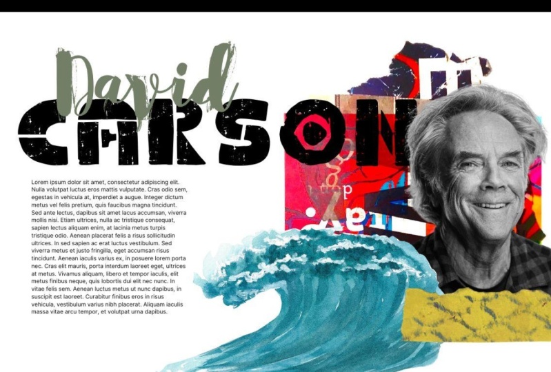
by doing after all, I want you to take
a famous designer or artist or musician
or anybody really, and try and creates
a very simple mockup for how a page about
them might look. We want it to have a different display texts to body texts, and then possibly layer
out with a picture. Really, really simple. Before we create an entire
typographic system, we want to have had some
kind of playing around with it to see how it might
look and work on a page. I really quickly just did this three times for Dieter Rams, Jackson *******,
and Frank Gehry, where I chose to
typefaces for each. And then I lay
them out on a page so I can see how they look. Now, Dieter Rams for those
of you who don't know, he was a very famous designer
who worked at Braun. And I've chosen two typefaces, hair, Ubuntu and cabin. And I've chosen
these because they are very minimalistic and very modern looking or modern in terms of Dieter Rams as time. But they both have a very
subtle playfulness to them. When we look at
the two Rams work, we see he uses a
very, very subtle, very simple use of color and pattern to make them
a little bit playful and have certain characters. And I think this open two texts, the B is absolutely
perfect the way it has this little curve up
and curve down just over the baseline and
over the top line. And it makes it
bulge out and look sort of similar to how I see Dieter Rams is worth looking. I found what I think is a pretty reasonable
pairing between the two. And again, if I zoom
into the body text, you can see that it has a
certain level of contrast, but again, certain level
of similarities as well. Again, has a small
amount of playfulness. One thing I think
is particularly nice is that Dieter Rams says, new company is it.So
and it actually has the glyph with
the O and E together, which is absolutely
vital if I was going to make a page writing
about Dieter Rams. And so having chosen this famous designer and then
chosen these two typefaces, and later out on a page, I can see this really communicating the
exact message I want. It's more of a feeling
than anything. But both these typefaces
work together. They're very modernist, but
they have the same sort of playfulness that I feel Dieter Rams would
have with his work. The second one I chose
was Jackson *******, which I thought would
have a very different. Approach to it. He did a lot of stuff with
splashing paint on canvas. And when I zoom in
the heading text is cuando and the
body text is Judson. And when I zoom in, the heading text almost looks like splattered
paint on the page. We can see it's quite playful. However, PII doesn't
quite join up. It looks quite humanistic. Some of the shapes, the way that the
narrower part of the E is at a slight angle. It looks like it
was hand painted. There's a certain
movement in the serifs of the top of the W and the H. I almost can envisage this being drawn by someone dripping
paint down, tap perhaps. But at the very
least it has that expressionists feel to it. And then similarly the body text has a similar feel I think, but it's a lot more subtle. It doesn't draw anything
away from the readability. If y was creating a page
about Jackson *******, I think these texts, It's
absolutely fantastic. We can see that the shape
of the T is very similar, but this one is much
cleaner and easier to read. A small size. Of course, I've gone for
Serifs with Jackson *******. I wanted as much extravagance
and detail as possible. And when I lay out on a
page next to this picture, I couldn't say that i'm I'm pretty happy with this choice. I feel like this does communicate a similar
sort of message. Then finally, I created a
really quick simple page for Frank Gehry and I've put one of his architectural
buildings on here. He's an architect similar to Dieter Rams is very modernist. I've gone for sans serifs, but he has a different
style of playfulness. It's postmodern, it's
nonsensical playfulness. The typefaces I've
chosen here are six caps and Joseph in sands. And you can see that
the sixth caps want the lowercase letters
are actually small caps, which is kind of wacky and it doesn't really
make any sense. It's purely there
just to be different, which I think is how Frank Gehry would quite like
it, to be honest. At first look Joseph and
sounds maybe it doesn't look like it has that
wacky postmodernists edge, but I'm going to zoom in
and you can see this E, it's cut off a really
strange angle. It's rotated. This Z or Z. If you're in the USA, it has a weird lip where it just flicks up at the end there and
the W crosses over. Particularly strange. But overall it still
has a modernist look. It just has these really
wacky little twists here and there that just
save Frank Gehry to me. So my challenge for you, and really I think you
should do this just as many times as you have time
to do is pick an artist, pick a designer, pick a
musician if you like, and try and find a body tax and a display text that
work well together. But you feel communicate
the same message as the artist that gives you
the same kind of feeling. If you can't think of
anybody or you would like an extra bit of challenge. What I think could be
really fun would be to use a website like a
wiki roulette.co. I've just come to
Wiki roulette and it's randomly give
me the name of a Ukrainian politician who's also a builder and electrician. And I think it could
be fun to just take a random Wikipedia page and see how you
would redesign it. What typefaces would you choose if it was for just
this one page? You might get lucky and
get a person like hair, but sometimes you get a
theory or a place and see if you can get
some idea about what emotions are invoked
from Marketplace or that theory or whatever
is on that Wikipedia page. And see if you can then create a really simple
composition like this from that random
Wikipedia page could be the next level
of this challenge. I really want you to
go away and do this, and I want you to go away and
do it at least three times. Because the more
times you do it, the more you'll get an idea of what personality and what feelings typefaces
have, and of course, how well they pair with other brands or other ideas you're trying to
create designs for.
11. Summary: We need two things
before we can start to select a typeface,
we need inspiration. We need loads of inspiration. Where are these
typefaces commonly used? What options of typefaces are out there and how are they used? Then we need to ensure we know
our requirements upfront. Requirements can
change as we get ideas and if we're working with
a client or stakeholder, requirements might change too. So we need to
ensure it's defined before we start to shop around. As we shop, there are free
typefaces and paid ones. Paid ones will be more unique, but also might have better alignment and more
glyphs available to us. Free ones are either built by hobbyists who have built
their bare minimum. All they might be made by Google or Microsoft too often copy popular typefaces
and so may give something less
distinguishable characters. For most projects. However, something
like Google fonts will be your go-to shop, or maybe Adobe fonts if you have a Creative Cloud account
or if your client does, professional
typefaces can be very expensive and it's very
important you ensure you have the correct license for our display text
and our headings. We want something unique that
expresses the character of the application and gives it
a rare and valuable feel. We need any font combination
to contrast with each other, as well as compliment each
other in equal parts. As we select our body text, one of the most
important attributes is how easy it is for
our user to read.
 Rob Sutcliffe, UI Designer / Developer