Describing Lexicon and Chap Typefaces
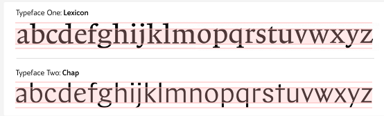
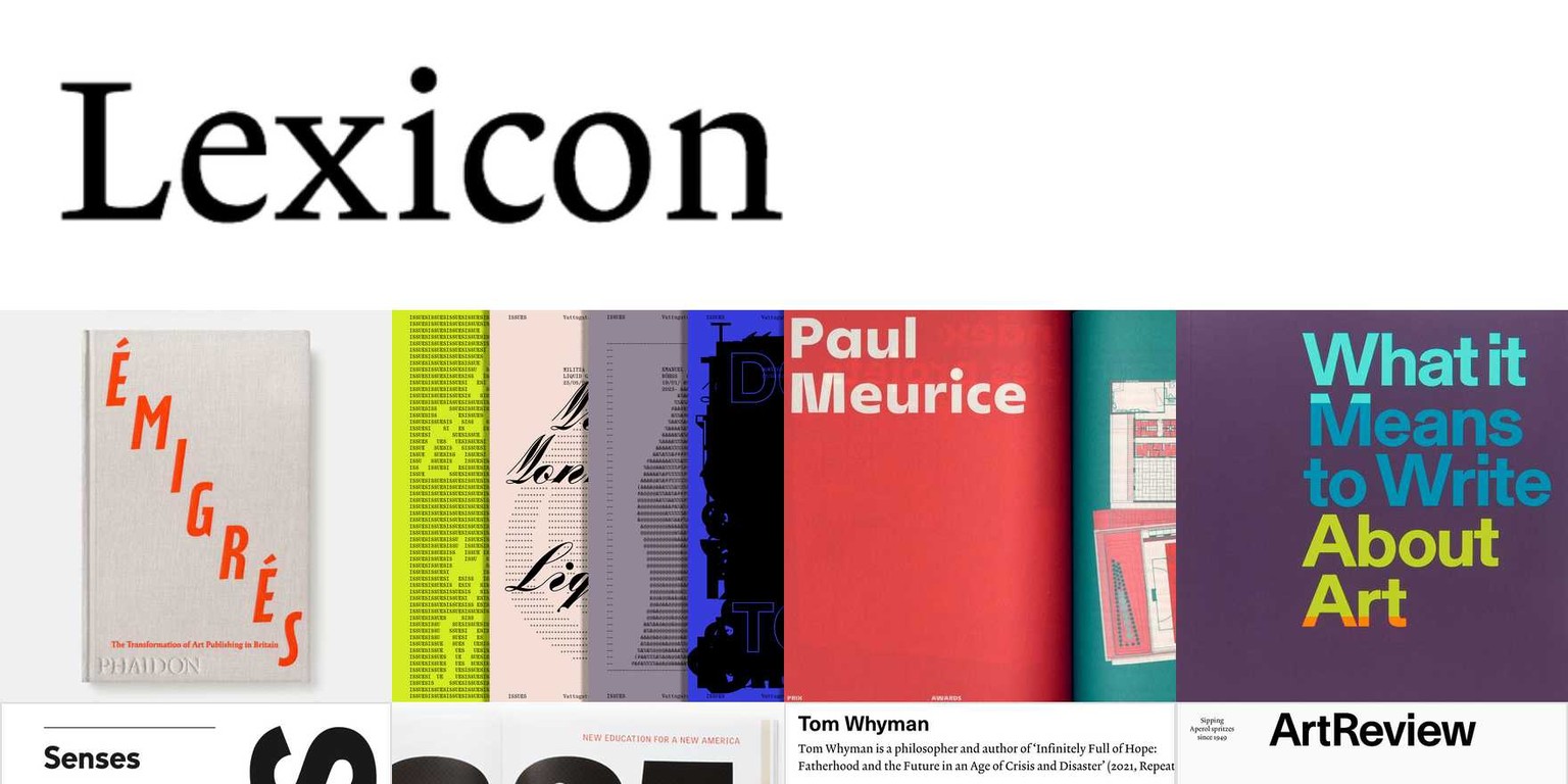
Lexicon Typeface
Lexicon is a Serif typeface created by Dutch Designer Brand the Does.
We can guess it’s a serif typeface because it has decorative endings on the ascenders and descenders.
It looks like a humanistic typeface because the stroke is consistent, whereas in transitionals and modern typefaces, there is a great stroke contrast. We can observe this on the bowl of ’a’ or arm of ’y’, resembling the consistent stroke from hand-made fonts.
Lexicon was specially designed for small sizes, and its practical use was for a dictionary. We know this because the x-height is very big. The descenders and ascenders are short, so the type size is small.
It also has a big open counter and eye, letter 'c' and 'e'.
Its advantages include its high legibility because of its big x-height. Disadvantages include the difficulty of recognising letters like ‘t’ due to its small serif.
This font could have been used for print for small sizes, such as dictionaries or Bibles.
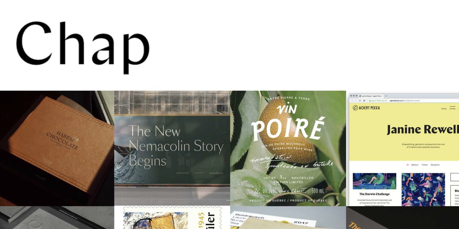
Chap Typeface
Chap is a sans-serif typeface. The Finnish Culture Institute in New York created it.
It does not have serifs on its ascenders or descenders. However, it is an unusual sans serif, having modulations on the stroke, taking inspiration from the serif typefaces. We can observe unusual stroke contrast in gliphs like ‘a’ in its bowl or ‘e’, on the cross bar.
The x-height is big, and the typeface height is big, so it can be read at a small size. However, this twist of the stroke might make the typeface hard to read. It also has interesting ears in the glyphs ‘r’ or ‘g’. It also has a tail for the ‘j’. We notice subtle modulation on the 'm' and ‘n’ shoulder.
Advantages include its high legibility in small-size points, thanks to its large x-height. Disadvantages include being hard to print, needing high-quality paper because of its high modulation on specific glyphs, or making it hard to recognise certain glyphs on a small scale.
This font could have been used for headlines, digital use, or logotypes.