Transcripts
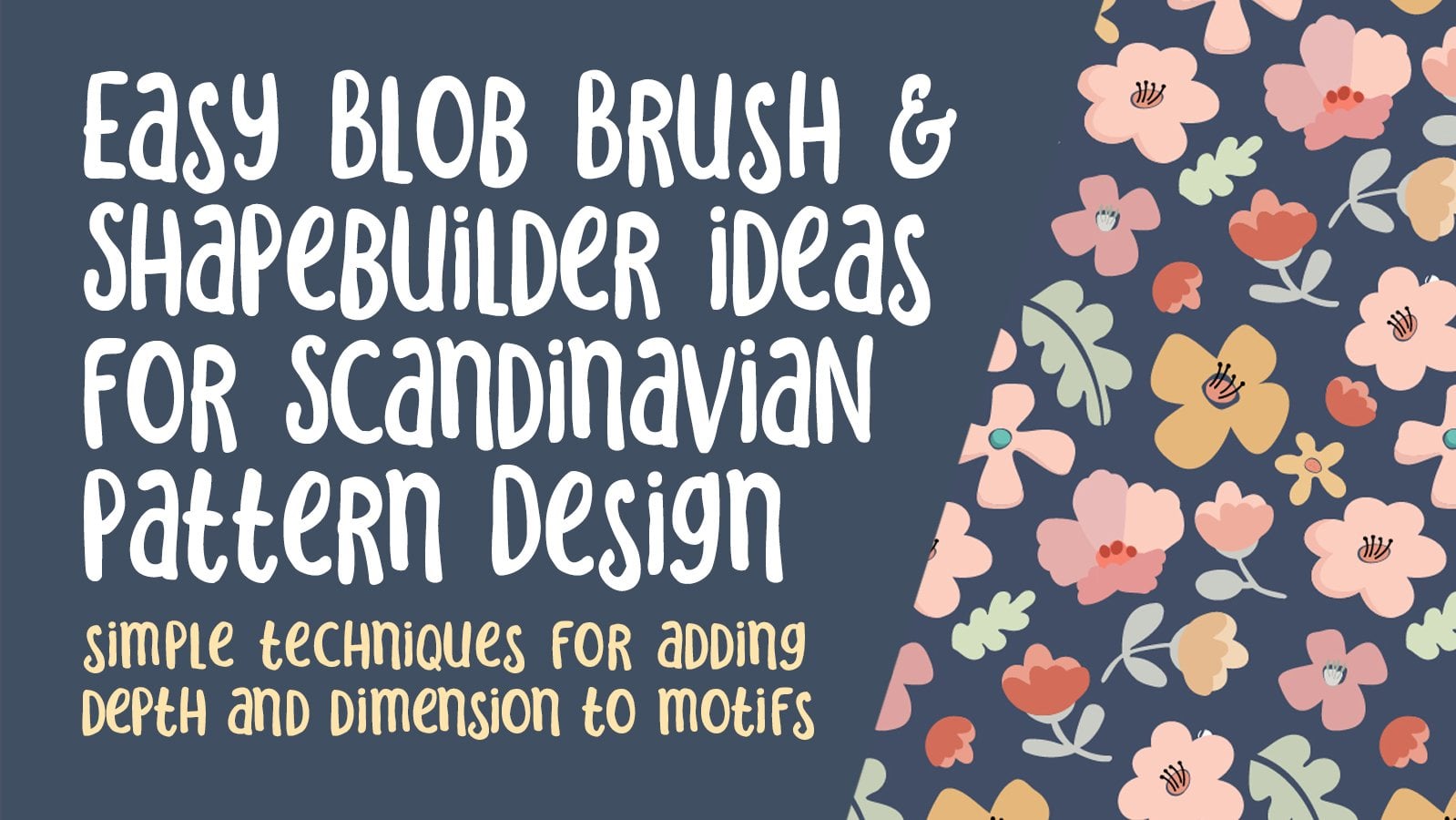
1. Introduction Easy Negative Space Blob Brush Motifs: Hey there, welcome. My name is still Earth mass grin and I'm coming to you from sunny, Manitoba, Canada. So in today's class, I'm bringing you another use of the blob brush tool. I know you're probably thinking what brush again. But this time we're gonna do something completely different. What I wanna do this time is playing with the negative space within the motifs. So we're not going to be doing a lot of layering like we have in some of the other classes. In this case, we're just going to be taking stuff away. So we're going to accomplish this using mainly the Eraser tool. But I'm gonna show you a bunch of techniques including the Pathfinder pellet and functions like crop, trim and divide. And like I said, what we'll be doing is taking parts away from the initial motifs that we draw. Ultimately, we're trying to produce about a dozen different motifs and we're gonna use those to arrange a really lovely pattern. Once we've got a nice layout for our pattern, we're gonna play with some colors. And in the end what we'll do is put those on a couple of mock-ups just to see how it all turned out. Remember that if you have any trouble with the speed, you can adjust that in your browser. Down in that corner. You can also make adjustments on the audio on your phone if necessary. I'll do my best not to talk too fast, but I definitely get excited sometimes and just go for it. I'm sorry. I'm also doing my best to get this recorded before my house is again full of people and pets. Are you ready to get started? All right, let's get to it.
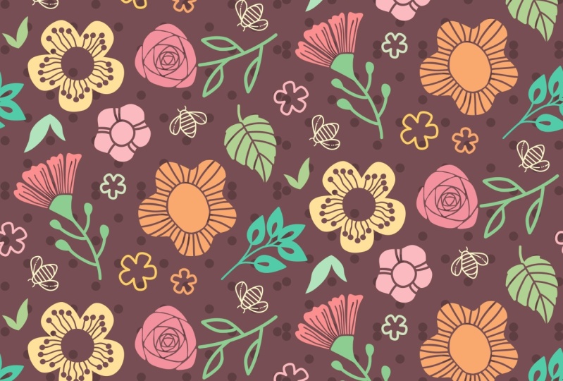
2. Overview and Inspiration: Hi guys, welcome to lesson one. So here in less than one, I'm going to show you some examples of pieces that I drew from for inspiration. Let's take a look at some of my Pinterest boards. We're gonna start off here in my surface pattern designed main board. And within that bored, I've got subcategories. The two that I want to really show you are the paint detailed patterns and the bold leaves and flowers. So when the ball leaves and flowers board, you can see a lot of uses of this negative space that I'm talking about. For example, this one here, the fruits. You can see that all these lines have actually been subtracted out of the shapes. And that's kinda what I'm trying to accomplish here. Really. What's this was pointed out to you? You really start to see it. Let's take a closer look at this one here. So for example, within this leaf here, you can see details have been just created by removing some of the original motif. Let's take a close-up look at this example here. Imagine just drawing the circles solid and then using your eraser tool to erase those lines to make the detail. The same thing could apply to these block flowers here. Just imagine having that as a solid block shape and then using the eraser to eliminate some of the black and create the detail in white. And that of course, is going to show through whatever your background color is just like it is here. So this port is a really good source of inspiration for that. There are a lot of really simple, simple ideas here. Even these leaves here, with the veins erased out. Are these flowers here? Murray maker, Oh, one of my favorites with the centers erased. And then another little detail added in the middle. So let's also take a look at my paint detailed patterns because that's another really good source of ideas. So in this case, a lot of the detail is painted on, but you can get the idea for some of the things that you might want to erase out with. So here's a good example. See the very solid shapes with little bits of detail, which could be erased out and then show through to the background. Same with this one. I see a lot of erasing here, which then shows through two to the background color. And even something like this is really fun and a really good source of ideas for you. This board has lots and lots of examples. A lot of these are layered, but I really want you to think about how you could use negative space within the motifs rather than layering with different colors. Not that, that isn't a valid way to do it. And we'll maybe do a couple of examples of that later on in the class. But I really want you to focus on some of these that look like areas have been erased out of the actual motif. I just love looking at these patterns. There's a lot here by Helen dyadic. She would definitely be an inspiration for this kind of work. I think I've got enough in my head to get started. So these are the initial motifs that I have drawn. And I'm gonna walk you through the creation of these one by one. They all basically used the same technique where we draw a sheep using the blog brush and then go in and erase or eliminate little sections using the eraser tool. You can definitely see some of the influences of the patterns that I looked at. To access the blob brush, the shortcut is shifted B, and you'll also want to know shift E, which the shortest way to access the Eraser tool, we'll be using the shape builder at 1 and the shortcut for that one is Shift M. So that's also good to know. And as we go through the class, if there's anything else, I will definitely point them out to you. I also add keyboard shortcuts for useful processes. One of the first things I want to point out is the simplify command, and that can be found under the object menu to path and then simplify path. And you can see here that I've got a shortcut minus command period. You've probably seen me use that many times in my classes. The other one is the remove anchor point shortcut that I've got here, which is command comma. If you don't have those in right now, you can definitely go into the menus every time. But I would strongly suggest that you go in and you add some of those key shortcuts. Another thing to note is that there are some controls for the blob brush itself. Now you can see here that I'm drawing this extremely roughly. And once I'm done drawing magically, you'll see the lines really smooth out. Now that's controlled here using the fidelity scale, writing the blog brush options, which I accessed by double-clicking on the brush itself. Now, if you want real accuracy, it's going to show every little thing that you draw. You'll get a lot more detail. But smoothing helps you to three really smooth shapes, which is really what I'm looking for at this point. So you take my time here and draw one a little bit slower. And again, you can see it's pretty rough, but it's going to work. Now, one of the things that you'll notice about the blob brush. Once you take a look at it really closely, it's not brushstrokes anymore. So what it has done is actually created layered sheeps. Now if I was to do a brush, I'll just grab a really simple brush here and draw a line. You can see that when I select it, it is still just a brush line. It is not a sheep. I would have to go to expand appearance. But I like to save myself at step by just using the blob brush. And then what I can do here is eliminate that insight shape. If that's what's at basically need is just kind of a silhouette. So the next thing I do is my shortcut for simplify, which is Command period. And here, let me just pull us to the side. You can see that it has already removed some of the extra anchor points, so it's gone from 22 points to 13 points. And I think that's really decent, has simplified My sheep. If I wanted to do any additional kind of corrections to it, I could hit S on my keyboard, which will give you my smooth tool. And that will allow me to just kind of drag over the areas that I want to improve on and simplify them further, or at least smooth them out. So you'll have to do a little bit of experimenting. Everybody has a different result when they use that brush. Initially. It just takes a little bit of practice. Now for this next part, what I wanna do is actually cut out that section in the middle. So in this case, what I'm gonna do is grab my eraser tool and a shortcut for that is shift E. So shift B for the blob brush, shift E for the eraser tool. I could go and erase that inside bit, but I might as well just select it and eliminate it. And Well, that looks bad. So let's go in and do some minor fixes here. So you can do things like the smooth to again, or you can go in and do some additional erasing. And you can see that when you do the erasing, it basically just enlarges the shape or takes more away. Now I'm going to smooth out, went out by simplifying. That's already taken it down from 42 to 21 points. And I've basically got the same idea as what you see here in my example. With any adjustments that you want at this point, It's pretty easy to go in and adjust individual points or users smooth tool here, something's a smooth tool just won't do so those you have to go in and adjust individually. Now the next thing I want to do is use my blob brush again, so shifts to B and I'm just going to draw this rough little shape on the inside. You can see that if you even drop a little section of it there, as long as you continue painting over that area, you will be adding to what you've drawn and then just simply delete the inside part. Now I'm gonna show you different blob brush settings as we work our way through the class. For now, I'm just going to draw these little circles. And I've just suggested to a smaller brush size here so that I can make them look a little bit more organic. When you're enlarge at this point, you could do any sort of touch up that you want, but you really don't need to sweat the details. We've got a lot of motifs going on here. And honestly, it's pretty forgiving in the end when you actually compose your whole complete tile. So in the next lesson, what we're going to do is one of these other motifs to give you some other ideas. So I'll see you there.
3. Basic Shapes with the Blob Brush: Hi guys, welcome to lesson two. So if you've taken some of my blob brush classes before, that'll be kind of a review for you. But I want to just kind of go through all the basic settings and ways to control the brush. Alright, so for this one, we're going to be using the eraser tool a little bit more. We're going to start with that basic outside shape as we did before. So shift BY, enlarge your tip. And let's get rid of that inside bits. Aes for smoothing will smooth that out a little bit. And now let's switch to the Eraser tool. So in this case I want the research to be a little bit smaller. Now I don't have to have the sheep actually selected. You can see here that if I erase, it will erase even on a sheep that's not selected. And let's start by just drawing that central section in there. And I'm going to leave this piece in the middle this time. Let's smooth out this path. So I will select that path S. Got that smoothed out. We could select all of it right now and just simplify. So you don't need to open this panel every time I open it to show you that we have reduced from 36 to 19 points. And now we will continue with theories are tools. So I'm just going to draw from this point on and towards the outside. Now you can see my scale of my lines is quite a lot larger here. I like doing a variety like that so that sorry, dogs scratch break. I like doing a variety like this. Sorry, I just have to take a break there and make sure that's one of the three cats that are my roommates right now, has not opened the front door. We've realized that he can open the front door and then all the animals make a break for it. And two of the cats are supposed to be host cats. I don't know how good my chances would be at actually capturing all four because I've seen my daughter and her husband go out to catch one animal and it sometimes takes time. So I want to make sure that front door was locked. As I was saying, I like doing different scales of lines here because I may reduce some of these in size. And at the end, I'll show and explain to you that what I need is for these lines to remain consistent in my pattern. So if I reduce this down and it had the same line thickness, it wouldn't look right. So I do some flowers that may possibly be smaller. I actually do them with the thicker lines so they'll reduce down better. So you have a 100 different ways that you could do this right now I'm just starting by putting in a couple of tight lines in this area which I would believe or imagined as being dips in the flour. And then I'm spreading out other filler lines on each petal just a little bit more so that it looks like these closer lines would dip in a little bit. And these would be the part of the petal that stays a little bit more in the foreground. Like I said, create a variety. You'll be thankful that you did when you're actually putting your pattern together. So that could be one of my flowers. The other thing you would consider or could consider doing would be to take and duplicate that back. Actually, let's take the whole thing so that you've got the base to work with. You could consider doing smaller lines. Whoops, I guess any of the research shift E, even a little bit smaller. So if this was going to be used at the size, this dog was a rescue dog and he gets real separation anxiety when his parents leaves. So my daughter and her husband have gone off to work in the sun is at daycare. I thought perfect. This'll be a good recording day, but I didn't take into account the fact that his dog would be crying. Now he was rescued and he was basically a feral dog living on his own. He lived with another family, foster family for awhile before my daughter adopted him. And he is very, very clingy, cutest dog ever love him to death? An absolute doll. And I've only got maybe a couple more weeks living here with my daughter. My house is supposed to be delivered within this next week or so. So at that point, I'll have my own place. Will be a lot easier to carve out time to do my actual work. I have thoroughly enjoyed it. It's been just a treasure. Having the time with my grandson here, all of us living under one roof. And I'm constantly reminded that my life is full of blessings and it's not like we're going to be moving far. We're going to be living literally across the street here. Shift B, we'll do another version here real quick. This one I think, oops, shift E, sorry. This one, I think I'm going to put just a real minimum of lines, but I'm going to make them bigger. And this might be a good one to use in very small sizes. I just love seeing how this eraser tool chunks out those pieces. That's quite fascinating. Hey, so I've drawn three of this version. I kind of imagined this one is a petunia, but that grouping is done. So I will meet you in the next lesson. We're gonna take a look at one of the other ones, and I'll see you there.
4. Carving Out Negative Space: Hi guys, welcome to lesson three. So unless the three here, I'm gonna take you through the use of the Eraser tool to carve out some of those intersections. Let's get started. All right, which one should we do next? So thinking, I'm going to show you how to do this quick Rose pattern shift B for your blog brush. And what I want you to imagine is that you're drawing triangles. Now I'm going to start my drawing of my triangle, not in a corner, but probably midway here on this side. And it's going to be a super rounded triangles. So word aiming for that triangular shape. And I like to start in the middle because it's hard to get that perfect connection if I started here, it's a little bit harder to just make sure that you get right into that section without doing some kind of bump like that. So I usually just start here and make it very rounded. Okay? Next, what you're gonna do is repeat the drawing of triangles, but you're going to bisect the triangle itself. Let me just actually make one that's really triangular so you can really see what I'm doing here. So I'm gonna make one that's more of a full triangle. So take note of where I start my next triangle. So what I'm going to be doing is starting halfway in the middle of the first, the first triangle, like the side of one of these triangles. So what I'll be doing is going into the middle of one of these sides. So let's see here, here, and here is where I'm going to aim for this other triangle. So let's just do that. And again, I'm trying to make it fairly rounded. I'm kind of exaggerating the shape of the triangle more so that you can see it. But I will be doing a couple of them and I'll show you a little bit more of a rounded one after. But again, I'm going into the middle, middle, middle. And I just keep repeating that until I really can't draw anything more at all. So then when I would do is select this block and eliminate it. You'll see that when I eliminate, what happens is that the block leaves, but all of this white stays black. So I'm gonna hit delete. And now you can see that. So of course I did it with really thick lines and this one wouldn't be one that I'd probably you can keep or use, but it's one of you to get the practice for it. So I'm going to now reduce the size of my brush or just draw it a little bit bigger. So now you're going to get to the point where you're able to draw these triangles a little bit faster. And you'll also round them out a little bit more. And you'll see that that makes it look more like the rows that you're trying to achieve. Okay? Don't sweat the details too much if you end up making a mistake like that, we'll fix that in a second. That arose generally has pre-typed petals as it gets into the insight area. So you can see that I am kind of tightening up my spacing as I'm going. Again, let's eliminate that black. And now you can see that that's a little bit more on the roles. So of course, a very stylized as you can see. But that's going to work for my pattern. So now in a case like this where I've got a bunch of little mistakes, there are a number of different tools to help us fix those best for smooth tool, I'm not sure you'll get that great big jog over there. No, it won't. So then you start employing different methods. So q on your keyboard gives you your last few Tool. You can last you a section, and this is where the shortcut F4 remove points is great. So that was command comma. We will take a few less. And so that would work here to command and comma. And probably here. Remember that even if you're on the last few Tool, you can switch to your direct select really easily with a on your keyboard. And in some cases, like case like this, you might just want to use that little widget to straighten out or round, I should say, some spots. So use your judgment and make some decisions about that. I didn't simplify, so let's select it and command periods simplify 115 to 56 points. So that also helps to smooth it out. And I think that one would be perfectly usable. So we've drawn how many different motifs now? Quite a few here that we have to choose from when we're going to be doing our pattern. Let's do this one next is really, this is just another version of this one here. So you've got your little kinda star-shaped background. Now I've been doing these with five petals. You can do them with as many petals as you want. So let's try one that's a little bit busier. I even don't mind that little bit there. I mean, you could leave it, you can take it out. It's all up to you as Q a little bit. And then let's just use the simplify it to smooth it a little bit more. So 2414. And then again here is where you grab your eraser tool shift E, make your brush a wee bit smaller. Well, it's me got centre. Now this is another one where you could make a lot of different flowers by just changing the size of this middle bit. So if we went really big on one of these, IT definitely looks different than this one here. Again, select if you want to smooth it out, then users smooth Tool Company used my eraser tool to draw these little stamens. And I generally draw from the outside in, and in this case I'm making them shorter just to have kind of a different looking motif. So that's how that one looks. And then let's go a little bit bigger with a brush. And we can just simply add a dot to the end of all of these. If, if you're going for, you know, just to have a bit of variety. And I think here I would also draw the center bit just to make it different. Again, select, simplify, and I've reduced it down to 2, so from ten points to two points. So really just these 21 on each side that control this shape. Now this one is still a corner point. I can use this to create a smooth point. And I'm going to shut off my smart guides just to make it easier for selecting and no snapping. You can make any adjustments you want here. Let's select this and simplify it as well. So that kicks it from an original of 150 one down to 81 points. Okay, so I will meet you in the next lesson where we're going to do those last couple of motifs and maybe some leaves. So I will see you there.
5. Pathfinder Crop and Trim: Hi guys, welcome to lesson four. So there are numerous ways of accomplishing the goal of creating negative space within our motifs. This time I'm going to show you some of the Pathfinder functions that I use. Let's get started. And I think with this one I'm still going to add a point here and make another slight adjustments. Okay, so what have we got left here? Let's work with this one here, because I want to show you a couple of things with the Pathfinder pellet in this case, let's just first of all draw the two components here. So I'm still going to use my blob brush. So Ship B and we're going to draw, actually relative is draw sort of a rounded cylinder. I'm going to delete that incites bit here, then use my eraser tool. So shift E And we're going to draw this what would be an opening kind of on a pod? So this would be the opening at the top here and this is going to be the sides of it. You just trying to him. No, I can see that my blood sugar is getting a little bit low because I'm getting a little bit shaky here, but I can, I can make this work, which is going to elongate that a little bit and slightly rotate it. And I actually am going to put that aside for a second. Anyways. Let me just simplify this shape. Because what I wanted to do is use this shape here to do some tricks with bowl-shaped builder and Pathfinder. Okay, so let's just say we had a different brush or we didn't want to use the blob brush for whatever reason. Now, the way I've caught my blob brush setup right now, if I did use it, it's just going to add onto the shape. So if you look in outline mode, you can see that that's added on. So what I wanna do is double-click on the brush tool and I'm going to say merge only with selection. That means that if this is not selected, oops, so de-selected Command Shift a if you ever want to de-select. Or of course you know that you could just click somewhere else on your page. And I want to be drawing these lines here. And you'll see now that when we go into preview mode, that it isn't just adding on ok. So what it's doing is giving me the shapes in front, instead of actually merging them with that original shape. So it's hard to see here because I've got black on black. I want to do now is show you two different ways that we can, maybe even three different ways that we can cut off all of this extra stuff that we have here. My personal favorite is shaped builder, especially when I'm just doing simple motifs like this, shift and wiki V-shaped builder. And you can see here that as I drag over, you get that little bit of grid work there. And you can tell which one you're actually affecting. If you were to hold down your Option key, you could drag and simply delete what you didn't want. So I think for me that's what I would consider the fastest way, I guess. But there are other ways. So let me show you those. Let's just select them all. Grabbed him and bring them over here. And let's try working with the pathfinder so you can experiment. And it's probably a great idea to do this. Now if we were to hit divide here, it would do the exact same thing as the shape builder did where it separates, so that now these pieces are no longer all connected. So you could go through and eliminates, gets like that. You could select them all and use the crop. And that's not going to give you the results that you would like there. Let's try trim. And I think that's done the same thing. If you rigid grab your last CSU CU on your keyboard and then just select, you could get rid of all of this extra jobs. And this is what you used to have to do before shaped builder existed. This was the way you would do it. You would use your Pathfinder. I remember before shape builder doing this specific thing. And I'm gonna put it all back together again. And this time what I'm gonna do is I'm going to copy that shape. We know right now that it's in back. If we were to look in the Layers palette, let's just select all and cut it and put it on its own layer. So that I can show you. You can see that that shape is in the back. So we could duplicate that shape. We can just select it individually, copy it, and paste it in front, which would be Command Shift v if pastes it in place, but it's in front of all of these. Now we can select all of these. You can select them individually like that. You could, this is easier. Just command. When you've got the one selected here and hold down your command and shift and you can select all of the ones above here. Now you can see that this is in front. If we were to go to pathfinder and hit crop, you can see that that crops off those extra bits. So there's that method. You would still have to go in and individually select these and delete them. And that isn't exactly what I wanted. What I want to do is actually, let's just hide this backbone here. And we're going to move this to people low. And let's see what happens if we do minus brunch. And see that does the same thing where eliminates those extra bits. So if we were to look in the preview mode, you can see that that is all nice and clean. And then the cool thing about it is if you've got this alternate here, alternate layer, this you could eventually color in a different color. So let's just select it and we'll just go, just grab another color here quick. And you can see that you could do a two tone kind of a flower than just drag your center bit down here and you've got another motif. Now the one I did originally hand quite thin lines, so this would be one that I would use it full size and this could be one that I could use at half size is could be a pod that is in addition to this one or on another branch, just an alternate. Hey, let's take a little break here and I will meet you in the next lesson.
6. Additional Motif Tricks: Hi guys, welcome to lesson five. So unless than five here we're just going to continue creating our motifs so that we have a good collection for our final arrangement. Let's get started. So I've just got a couple of motifs left here. This one that's actually kind of a fun one to do. So let me show you how I did this. Now just imagine drawing little hearts. So I'm going to draw a very elongated heart there. Your loop down. Draw another one. That's the basic idea behind the shape. Now, in this case, I accidentally overlapped here. That's something I can show you how to fix real easily. And let's just finish this shape here now, you can see that remember that we had changed the settings on our brush. I went back and changed it. But setting we had was merged only with selection. And so in that case I had to habit selected in order to add onto it. I generally have that off so that I am adding to whatever I have going on. It's up to you which way you want to do it. At first, I used to leave it like this so that I always had to select it in order to add to it. And now I've just found that it's easier to do it the other way. So it's, it's really up to you. Then what we're gonna do is eliminate this inside bit. Simple, Back to my preview mode. And you can see here that this is connected. I mean, that's not a bad thing. You can keep it that way. Maybe in this case I will just to have an alternate to this one here. So at this point we want to subtract from the shape to put these vain kinda lines in there. So I'm going to shift to my eraser, shift, ie. Let's go a little bit smaller, and let's aim for three on each of these. So I'm doing 12. So I'm gonna go a little bit longer with the middle one, rounded out a little bit. And we're not paying too much attention to what's down here because we're going to be eliminating that. So you can just kinda pull down the company helps a little bit smaller, actually. One of the things you find that when the tool is easy to use, you don't mind so much when you have to erase part of it and try it again. If it had been a complex kind of a thing, you wouldn't be wanting to do all of this sort of practice and redoing of stuff. I think that looks pretty decent. And then what I wanna do is get rid of this whole bottom part. I used to do elaborate Pen tool kind of work with the pathfinder, where I would grab my pen tool and draw a path and then use that path, select everything, go into Pathfinder, divide, take all of that stuff on the bottom. Qs and my keyboard. I mean, it's not like this isn't fast. You can do it this way if you so choose, but I just kinda late the intuitive nearness of the Eraser tool. So this doesn't even have to be selected shift ie. Let's just take off this bottom bit. Work your way up to the spot. If you're just, you know, a little bit unsure, you can use your eraser to get rid of all this or you can just simply select it. But that would be the method I would use to draw this kind of a flower. I don't love the way that particular vein kind of worked here. So here I would get my brush again, shift B and possibly just take it right out like this. I probably have to go in and do some cleanup in there. And then shipped IE. And then again, you know, check out all of your interior shapes here and just make sure that they're all okay. So I would probably grab S on my keyboard to do that straight, not one out. I don't know if I can use I'll have to use my last Sue here to take out some of these extra points and then select the entire shape. Make sure you have the whole shape is selected before you do your simplify. If I had just this, let say just this section here selected. When I go to do my simplify, I'm only simplifying that one little sections, so definitely select your whole motif command period. And again, I'm going to show you we went from a 125 to 58 points. You may be wondering why I do that all the time. I know I mentioned this in a lot of my classes, but when you are doing pattern design and you get some of these really complex motifs, you can really start to bog down the processing. And so it's nice to just have as few points as possible when you're working with pattern design. I mean, don't compromise your patterns, but just make sure that you have simplified them as much as you can. Definitely go in and make little adjustments like what I'm doing here, just to sort of make the motif as nice as you want it to be. And then you can add your little cup-shaped underneath. Again, that's something I would do with my blob brush. And this is one thing I want to point out to you. Now. I could, let's just move that up here. I could kind of run my blob brush this way so that I get that feeling that it's connecting or that it's getting that outside line, the angle of that outside line. But you can see that it's really the inside here. That's going to be what lines up to the petals. So I would, in this case choose to eliminate the outside shape and have this inside shape B, what I end up using here, alternately, you could just go for it and draw, get rid of this insight bit. And then use your eraser to make sure that your lines are beautifully aligned. And this is kind of maybe a good way because you can also carbon into more of the shape that you want. And I think I'm going to leave this one a little bit longer than this one. Simplify. And in this case right here, it's kind of a corner points. So I can do shift c to get this tool the most beautiful. This one's called convert an anchor point to all. This is called the anchor point tool, and that allows you to change it. So I'll show you what it was before. It was a corner point. And what I want is a handle on this site as well. So shift C gives me that other handle on the other side of it. So I've got a nice smooth line in here. Still not love in that this particular line here is so close and make some slight adjustments. And I've got another little motif I can use here. So I think in the next lesson we're pretty much ready to start composing our pattern. We're going to talk about the leaves in that next lesson. And we're just going to fiddle around with some arranging of our motifs in that lesson. So I will see you there.
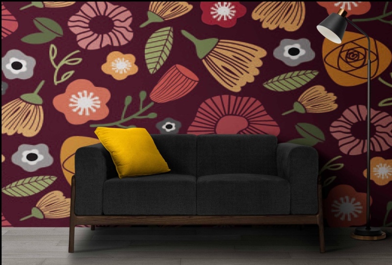
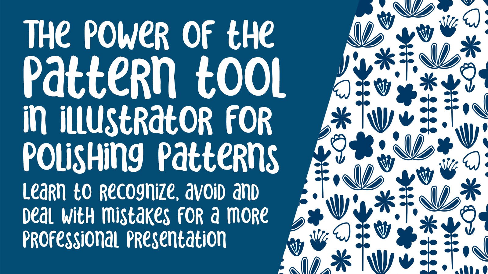
7. Starting the Pattern: Hi guys, welcome to lesson six, surfaces, the really fun part. We're gonna start arranging our motifs. Let's get started. Alright, so we've got a bunch of motifs here. We're ready to maybe start roughing out a pattern. I've not shown you how to do the leaf that I think you get the idea of how that would be done pretty easy. And yeah, so we've got all these guys that we can start. Positioning was off that Pathfinder palette. And I've got a ten by ten sort of basic shape here that we're going to use. And I'm just gonna start dragging my motifs over here and roughly positioning them. So when I do select my motif, I'm going to take the time to group it. So actually let's just go through and quickly do them all. This is much easier to work with if they're grouped. So when you select them, there's no way that you're gonna leave anything behind. So I'm just drag selecting over them and hitting command G just to make sure that what's happening there, that one's connected to something else because I copied it over and it was already grouped from something over here. So I'm going to cut it first, then I'm going to paste it. Ok, so let's get rid of that guy. And he's no individual all the way through. Now these two maybe grouped together. So what I'll do is I'll select that and cut it, and then I'll paste it and group, which I could have done paste in place. I did paste in place. Command shift v would have pasted it right back into position and group it. And then we'll do that one as well. Okay, so we've got each of these guys, make sure this one's done. We've gotten them all individual and we can start easily grabbing them. You can see here that now I won't be, mustn't miss fat guy when I was enemies now they're all individually groups, so it's easy to grab them. So I missed the center and a couple of those, my goodness. This time I'm holding down my Option key as I'm dragging over just to be sure that they're all selected. And yes, robots working. Ok, so let's start with just kinda making one big anchor flour. I'm going to add a stem to this one. I'm going to be doing kind of a toss pattern. I still want to leave a bit of a gap between the flour and the stem just to have it in keeping with the overall design. And let's just talk about these leaves stems here, honestly drawn with the shift B, blob brush trick. And I draw the main stem line. And when I go to draw the leaf, the should just connect soloists. That yes, it does. So when I drag this way and come back, I don't go all the way back down. That's just the style I've chosen, but you can do them whichever which way that you like. If you want to just do a big leaf, you can do that. For this design I've chosen to do this, just went up a bit. And a lot of times you just really have to do one or two leafy branches only and you'll have enough for your entire design. And one of the ways to just make your leaf look a little bit different or your brash look a little bit different on some of them, is to eliminate those little center bits. So you could have a completely different looking. Leaf here for one of the other flowers. So this one, I probably equal over smaller. And let's just drag over one of these. Now, if you have the direct select tool, this is what's going to happen when you select. So you want to be on your Move Tool, which is v on your keyboard. And I like kinda doing a couple of the bigger sort of anchor flowers first. So I've kind of got a base to work with. It's roughly kind of a triangle of those big motifs. And then we'll start filling in with some of the smaller ones. And then remember that the ones that are like this, There's another one that green myths are today. Remember the ones with the thicker lines here are the ones that you're gonna wanna make smaller. Ultimately, what you want is that all of these interior lines here are roughly the same. So we can see already that this one would have to go at least that small for those lines to be about the same as these. And this rose would have to be smaller. Use your arrow keys of humor one and move just a little bit at a time. And I think this one's going to have to be our biggest one because it's got pretty thin lines there. You can rotate them if you feel like you want them slightly different. And then let's just start dragging over some of our other ones here to fill in this. And I think a mythical pit smaller. Now this one, I'd love to have it curve the other way. So what I'm gonna do is just grab that middle handle so that I could flip it. It's a little bit more of a reflection of that particular shape there. And in a way, I think I want this one a little bit more rounded. So let me just put the original back here. So in auction dragging a should have done that in the first place. And what I wanna do here is just use the puppet work that's, this looks like a thumbtack over here and let the mesh appear. It's a little bit bigger. I just want to round this out a little bit more. So I'm going to put an additional tag in here. And then I'm gonna pull these to put one in here just to allow me to give a bit of a sweep. Each of these can be moved individually and you can also grab these and twist, use them for twisting. So that's kind of a neat trick when you're trying to get some movement in one of your motifs, sometimes you end up having to make some adjustments on the inside, but this one doesn't look too bad. So I'm thinking maybe we'll tuck that in here. Now this is quite similar to this one here. So I'm going to make an adjustment here where I select this inside bit here and just make it bigger so that having the whole flower smaller works. Now I can hear my processor really kicking on here. So that means that I'm really pushing my computer to its processing limits. So that's one of the key reasons why I keep my motifs so simple. Now I'm going to save and print a time-lapse as I position a bunch more of these, I'll stop and explain anything that's important as we go along. Great. Now in a case like this, I'm trying to retrofit this to the stamp that I have. It's pretty easy to draw a quick PS down, but I just want to show you this. I'm now going to grab these two. I'm going to use Pathfinder to join them. And then just, you know, take a good look here and make sure that there's nothing that needs adjusting. Eliminated a couple of points there with the pen tool minus key setting. So if you want to get rid of a point minus on your keyboard, will allow you to do that. By the same token, floss on your keyboard will have you easily add a point. So let's hit plus at a point here. I'm going to use that to make an adjustment here, know this point. You can see that those handles are not necessary here. Like in this case, I wanted to straighten this out. And you can see that right now this handle and this handle are kind of stuck together. So in order to move them individually, I'm holding down my option key and the Nike and grab that little handle to reposition it that I can fix up this bottom bit. Now the other thing I could have done was to just use my eraser and so shift E. And if I was to erase across the bottom there, I would get a flat line as well. So just a couple of ways that you can straight network change the way a line is. Extra points here. So minus on my keyboard can just allow me to quickly get rid of those extra points. I don't usually sweat that tiny little bit of detail because it really isn't going to affect my overall look of my pattern. But now I've got this one on establishes kinda cute. A lot of times at this point, I will do a quick test of my positioning and I'll do that with my pattern tool, pattern maker. So select the entire shape. I've got a shortcut which is command apostrophe. You can go under Object two, pattern and make as well. Sama shortcut there, hit OK. And what we've got here is a grid pattern. I want brick by column, so half dropped repeat. And I know my repeat is ten inches by ten inches, and that gives me just the first really rough look at my pattern. So here I would also hive mind or Command Shift H. And now I'm just kind of getting an idea of how the overall look is. And I can tell for one thing what I wanna do is get rid of this really visible line with these particular motifs. Possibly the same thing here about these all kind of lined up. So I'm going to be going in there and making some of those kinds of adjustments. Switches hit escape. You can see that it has added the swatch here. And in this top row you can see all the testing I did for the original swatch, which is what we're going to actually switch to for the next lesson. Because I can explain to you some of these steps that I take and show you the progression as I worked a bunch of different tests of the pattern that I ended up with. So I'll see you in the next lesson where we're gonna do that. But don't worry, by the end, I'll actually finish this one as well and it'll be one of my coordinates. But I'll meet you next lesson where I'll explain all the moves I made in creating that other pattern. All right, I'll see you there.
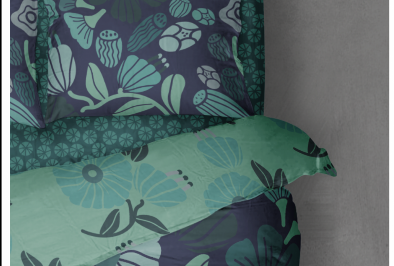
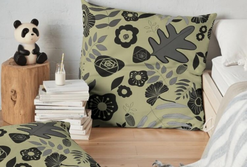
8. Perfecting the Pattern: Hey guys, welcome back. So in this lesson, what we're doing is perfecting our layout. And believe me, it's a process. At the end. We're also going to take a look at that recolored tool. Let's get started. Okay, so let's draw a rectangle and fill it with that pattern that we have just used as a, as our first test, I'm going to use my command options shifty shortcut for transform each. I'm going to transform just the pattern. And I'm going to reduce that by, let's say, make a boat two-thirds scale on the pattern so that you can see that problem that I was talking about with the line as I go through and correct it a little bit. So the problem is this is already kind of in a half drop formation so that when we created the pattern repeat, it's already at that half drop, which then makes it into a really prominent lines. So to fix that, I'm going to move this one up and I'm going to rotate this one so you can do your rotate just like this with your at the corner of the transform. Or you can do are on your keyboard, which allows you to pin in a different spot, let's say right here and swing out from that spot. So that's what I'm gonna do for this for now. So now there are a little bit more across from each other, which means that when they're in a half drop formation, it should solve that other issue. Now that's given us this issue. So I'm going to actually group these two. They're currently not grouped because they were two separate pieces, remember? And now I can move that down a little bit. And you can see when you move one thing, it usually means you have to adjust a bunch of other things as well. I'm going to actually group these two as well. Let's just lengthen this stem a bit. Pwm, a keyboard allows me to pull that out a little bit. I'm going to use my eraser That's on my keyboard for my smooth tool. Let's smooth that out nicely. And then let's group these to make sure that they're grouped anyways. So now that flower will move with its stem. If you want to just select part of it. Ben option, click on it with your direct selected, you'll get just that part of it. So, you know, I would go through and do a lot of testing. Now, let's just double-check and testis little bit here. So we didn't do very many changes, but we can still see if that one change helped and it did help. Now, we've created another little problem here, and those were things that I would go and address. So I'd escape out of here, change this to the new swatch and then go through and make additional changes. Now, I have gone through this whole process off camera and done my pattern repeat over here and perfected my Leo and gone through and done all the colorization. I've done my own take on the colors of the year for this one. And here that these are my final test swatches. So I'm going to draw some rectangles up here and show you the process as I went through it. And you'll see basically the same thing happening where I had just kind of my initial pattern. So this was just really loosely positioning a few of the starting elements than I added a couple more elements. I've reduced the scale here so you could see really exactly what I was showing you in the other example there as I worked through just getting the positioning of items right, adding additional brushes. And let me just scale that and back a bit here so you can see, so more elements added and some of that extra space, rearranging the elements to avoid striping and so on, and just progressing one step at a time until I got something that I really liked. So the cool thing is now that I've started that other one, I can basically to coordinate that will work with this one out of that other set. So it was really kind of good exercise for me to do, to do that and show it to you. Now, this ended up being my final colored swatch. And really you don't see the magic of the lines and stuff in here until you add that, you know, background in there. And I had created my color swatches based on this color theme that I had on Pinterest in my color palettes to love Board. And I added some additional colors in here. I kinda wanted to add a little bit about kind of a navy grey in there. So really what I found is as soon as I started adding a darker color in there, all of these negative space lines here started to really make sense. So what I did is I copied that rectangle, pasted it in back, right in place, man, be I'll show you that there's two. Now that one in behind, I'm going to color with this darker Navy color. And that's truly where you see the value of having done those little negative space lines in there. So then the color of the background is what ends up showing through these lines here. And do a little bit of experimenting. Try a couple of the different colors that you've got in your color group or make some more. I really liked this darker gray blue in here. And then another thing that I did just to make it even more interesting is I added an additional layer in between here. So copy, actually copy this one, copy and this one I'm gonna paste in front. So command shift the, so I've got a new rectangle here, nu square. So what I wanna do is show you how to make the polka dot that you would put in here. So very, very simple. Showing you this another couple of my classes. If you've been in them, little circle, fill it with whatever colour you'd like towards your powdered options. My shortcut is command apostrophe and Melaka, brick by role for a polka dot will make that spacing quite spread out. Use your up and down arrows to adjust that spacing when I escape out of here, you'll see it as my new pattern here. And let's fill it with that polka dot. You see it there now that one's in front, so I'm just going to send it behind the orderly here and select all of my squares and realign them. Now that scale of that pulpit out looks a bit big to me. So what I would do is select it and. My transform each to reduce that down, maybe 50%. And let's get all of these aligned. So that makes a really cute pattern. I'm thinking that I might actually change that polka dot because it is the same color as this. Great here. So let's double-click on it. You can do all the same editing here as you could anywhere else, where in the pattern options right now, select your circle and just make it lighter. And we're going to double-click on this axis. I'm going to make it darker and hits you now that the, there is a bit of a contrast, it's a little bit different than that one. I think we can even go darker. I don't want it to be exactly the same as the background, but yeah, I like that better. And that's something you can really experiment with because you could also continue to adjust the scale. That's again at another 50%. And we've created a really adorable floral pattern with negative space details. Now one of the things I'm noticing here is this flower here with the white center. That would be something that might go in and change. I'm not gonna do that now, but just to give you the idea. And then of course, you know, think about now experimenting with your recolor tool. I'm an saves. We're gonna go and let's go into my color themes here and grab a new color scheme. I've saved these a bunch of new ones for 2021 that I am having fun working with. You've seen me use and a couple of other classes. Once you've got them up here on the screen, you can click the ellipses here and add two swatches. So let's add that one and this one, what I wanna do is have a set that has about the same amount of colors in it as this previous one. So let's, let's drag this into here. And maybe this one and this one. So now I've got a set with the same amount of colors approximately. So we're going to duplicate this. I'm going to actually just option command shift drag. Let's go into the recolor tool, ready to go into these advanced options. I'm just gonna move this over first, and let's just click on this color Group. And my looks terrible. However, we can muck around with this. And yeah, I'm not loving enough. You've got too much contrasts, so let's eliminate this. The selectors eliminate out1. And perhaps at this one here, sometimes what I do is I actually literally lined them up value iss here to get a better idea of whether or not it's going to work. And I'm gonna do two here because we're gonna do this one. We're going to recolor with this new group. And it's got potential. Someone's kinda queued actually. You can individually go in and change the colors. I mean, I don't want to have a whole class or a whole lesson here on the recolor artwork tool, because this lesson is getting more than long enough, but you get the idea and you can, like I said, individually go in and change any of these that you don't like. For example, if I didn't like this one here, which is the one that I think that bothering me the most. I would double-click on it and change it. I think I wanted to be a little bit pinker. No, maybe not that pink. You know, something like that. Let's go a little bit of a contrast to the original. So I mean, you can take some of my other classes where we do a little bit more work with the recolor tool. I just want to just quickly show you how that could lock. Or of course, we can always grab the palate that we originally had and just experiment with it as well. Can just different combinations. And you can decide whether or not you want to have the color actually being changed here by clicking on this little arrow, which controls whether that color is going to be changed at all. So what I've done is I've locked in that Navy background. Now. It wouldn't be changed, it would stay the same. We'd have to kinda do that again, I think. But so we're going to recolor tool. Advanced options will go to this. Let's lock in these two, so the background stays the same. And now when we move, when we mess around with these background colors are remaining the same, but we're just trying different. That last year actually, it was kinda good. I shouldn't be doing this so fast mission be talking while I'm doing it. But you can see that you can arrive at some pretty neat looks this way as well. So it would take a little bit of experimenting for you with recolor tool to arrive at some really nice palettes that you might like to this one here. So recolor, try this one. But I'm going to lock that background. Then let's just try experimenting with just the foreground items being changed into these colors. And this one's a cute one. Now, remember that you should stop if you like one. Don't keep going because you can't get back to this spot if you choose to ongoing, to continue, but well, let's just do that and let's just save that one. So we've got that one, we've got this one. Those are two really cute color waves for this floral. And I'm going to take some time off camera to finish developing that other pattern. And then in the next lesson, what we'll do take all of our different patterns that we've got with some mock ups. So you can just kinda see what the ultimate goal is for your patterns. So I'll see you in the next lesson.
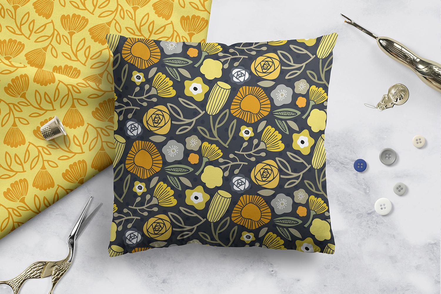
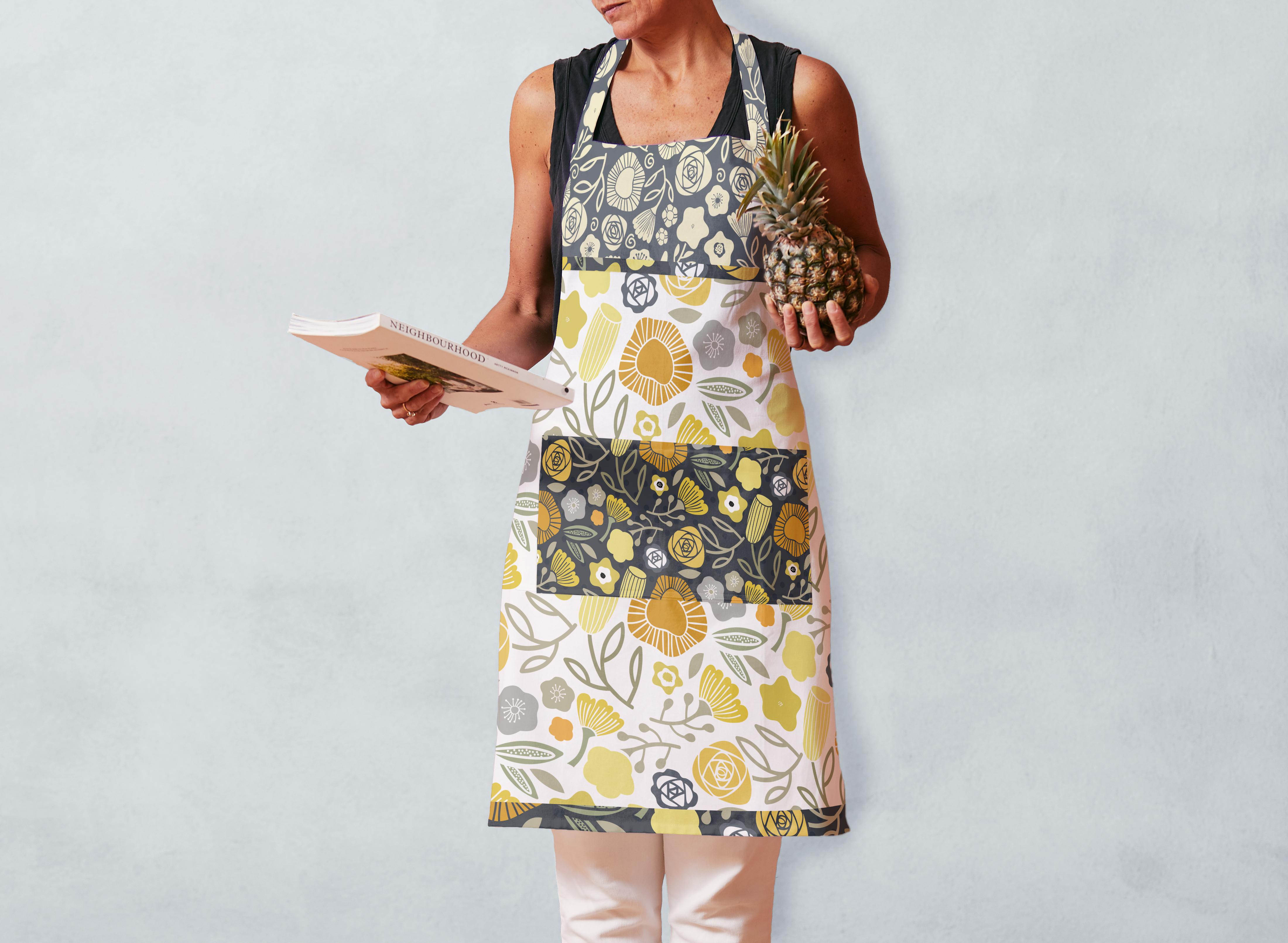
9. Mockups and Finalizing: Hi guys, welcome to lesson eight. So I've got a couple of mock-ups that I finished up here. We're gonna take a look at those and I'm just gonna kinda walk you through the process really quickly. Let's get started. Hey guys, welcome back. So here we have all of the quick patterns that I created so that I would have something to use for my mockups. I've done a few corrections, as you can see there without one flower. I think this one here that had the white and I've taken that out, I've just done some real quick coordinates and this probably would never be a finished collection by any means, but I'm ready to now export these to be used as assets for making my final mock-ups. So what I did is I grabbed all of these and I duplicated them over here on this side. So I've got all, all the ones I need. I've already, already exported this one here, but I'm going to export these. And even if their overlap like this, it's possible to export them. This would actually make a really cute scrapbook paper collection looking at it like this. But like I said, if these are individually groups, so the background, if there's a background color, is grouped with the final pattern, I could actually take that one step further and align them and distribute them so that they're even not that that makes any difference at all. And you could even select this bottom, make sure that all of those points are lined up at almost half the graphic there that I could use to make the collection. Anyways, I diverge. So I took all of these and I drag them into my asset export panel. And you can see here that they have come in separately, which is exactly what I want. So the background color is grouped with whatever pattern I thought with it here, you can actually name them. You can double click in here and name them. I've just left these names as is just to expedite things. And then I'm over in Photoshop here. I've got my mockup that I'm using. So over here, I've taken that layer, whichever has a Smart Object double-clicked on it. And in that smart objects, I could copy and paste and put in my separate patterns. So when I opened up my assets, they were as is nice and big, no lines. So it's just a simple copy and paste. And this one my favorite mock-up because there's a pockets that's supposed to be on here and it isn't. So that's just, I think a mistake with the mock-up that's missing. And I usually just end up on this PSB file. I've got the, I could actually make this into a Smart Object myself, but I just don't want to spend the time doing it right at this exact moment because I want to show you finishing my process here. So I'm going to just grab a little rectangle here and copy it. Go back to the PSB file and paste. I'm going to resize that real quick to become my pockets from just roughly positioning. I've used this a couple times. So what I do is I position and paste again. I could have taken one of the alternate patterns. I put these two together, so I merge these two. And then I use my magic wand and I just do the selection from that original pocket area. So I just go to this layer here. Now in hit Delete Shan and everything is now position where it needs to be. Make sure you save. And when you go back to your document, it updates with the pocket imposition. So like I said, not my favorite mock-up, but you get the idea. I'll show you another one, so we'll open up. Another mockup will have a huge file up mockups because I used them so much. And we're going to go into fabric factory. Or let's even try this one here. Pretty cute. Materially opened the PSD file, not the JPEG. Now if you didn't want to go through the process of buying mock-ups for all of the different Shannon collections or patterns that you create. There are definitely lots of free resources as well. I've bought a lot of these from Creative Market, but there's a few that I've bought elsewhere or have downloaded as free templates are free mockups. Find the layer that you want to change. Double-click on that smart objects. And OK, double-click on Smart Object, then paste whichever pattern you want in there. So lets just grab this one, select all copy, paste, resize bats to whatever you think we're going to be adequate. Once you save it, it's going to update your ESD file. And definitely some of these mockups take longer than others to update. This one might be a really high resolution one. Go back to the PSD and now you can see that your fabric is in position there. I kind of like this one because it does give that fabric. We've makes it look really realistic. And let's go to the other. There's the pillow PSB file. I have already piece at this into it. We'll hit Save, wait for it to update. And yeah, so we've got another really cute example of the use of our patterns. So I guess in the wrap up there, I'll show you a couple of the other ones that I did. So I will see you there.
10. Outro and Wrap Ups: You guys, he made it to the end. Yay. I'm always so pleased to see the students who have taken my course. And I really love seeing your work. So if you come back to this and post at some point, I wouldn't be really pleased if you ever have any questions. Make sure you post them into discussion section. If I answer your question, it probably helps other students who have the same question. I'd also like to invite you at this time to visit my new and improved website. I've been doing a lot of work on it. I've been collaborating with someone else and I think it's pretty much ready for everyone to see. Definitely check out my artist resources page. I've got some brief guest for you there and I really plan to continually update the resources, their resources for artists, stuff that you can use in your everyday work. If you haven't hit the Follow button, make sure that you do. That way. You'll hear about my classes as I post them, and you'll get all my email updates as well. And if you are on my website, definitely join my mailing list there as well. Now I showed you my Pinterest site there, which is full of all kinds of resources and references for you. I have two sites. One is Dolores art colorist aspirin, and the other one is called teacher Delors gas grant. Tons of artists resources. Definitely check it out. If you're curious about my work, check out my store is I've got one on Southall, that's probably the biggest wine. I've got one on red bubble here in Canada at art of where. And definitely check out my other classes. I'd love to see you there. Alright. Gets a spy for now. See you next time.
 Delores Naskrent, Creative Explorer