Transcripts
1. Introduction and Overview: Hi there and welcome. My name is Dolores now Scranton. I'm coming to you from sunny, Manitoba, Canada. So this class is for you. If you're looking for a little bit of adventure, it could be for a surface powder designer or could be for a graphic designer. The techniques I teach you today can be used for both. The adventure that I'm talking about is introducing some really striking, bold kind of Mariko style artwork in a very layered way. We're gonna be using some striking color schemes. And we're going to be experimenting a lot with hue and saturation and balance to try to create some real depth in our pattern. I'm really hoping that you'll join me today if you've been in my classes before. Thanks so much and welcome back. If you're a new, make sure you hit that follow button. That way you'll get all the information about my cost is psi release them. Like I said, we're into a little bit of an adventure today. I hope you're ready person layers. Let's get started.
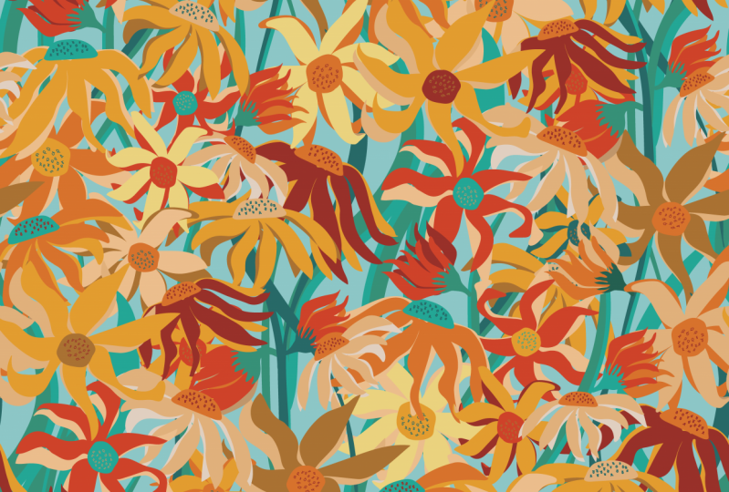
2. Overview, Inspiration and Outcomes: Hey guys, I'm so glad you committed. So in this first lesson here, I want to just give you an overview of the Merrimack WHO style. And I'm going to show you a ton of examples. What it started out this class by showing you my inspiration for this type of floral. Mari MCO is a famous designing label and it has been around for many, many years in my surface pattern design board on Pinterest, I have this surface pattern design, bold leaves and flowers board here. I've seen a lot of Mary Makkot sort of styled floral. This, this. If you work your way down, you'll probably see lots of them here in my board. And what I really like about these particular types of floral. And I know we've talked about this in a couple of other classes, but what I like about them is their bold simplicity. I'd been working on these kinda plurals and you've got a couple of classes with me, and I've kind of started to look at them a little bit more critically. So what I've found with really looking at examples like this and said it made me really think critically what the kind of work that I wanted to produce. I really like that simple aesthetic of the Merrimack hostile. And I really like these layered, really bold patterns and colors. So I'm kind of going to marry the two together and come up with some kind of a really cool pattern. And I hope that you'll enjoy the whole process with me. Like I said, we're going to be using some kind of unconventional techniques. But everything is really simple. And I'm sure that even if you're a beginner, you're going to be able to grasp all of the concepts. Let's get started.
3. Initial Brush Work: Hi guys, welcome to lesson to you. If you've been in a few of my other classes, this lesson probably be kind of a review for you. We're gonna be going through the use of the brushes and shape builder tool to create our initial motifs, are gonna create some flowers and some leaves. Let's get started. Okay, so here I am an illustrator. I just open a document doesn't really matter too much about your size at the moment, but my art board was ten by ten, and I've just started randomly drawing a few, kind of practicing and drawing some blob brush flowers. So these are all solid shapes. And I'm going to show you how to create those. And we're going to draw a variety of, we're gonna do some leaves, we're gonna do some flowers. I've got a bit of a template here that I've been using to draw something like this. And I just want to explain that to you real quick. So in one of my other classes, I showed you how to draw leaves like this really quickly with the blob brush, the four main shortcuts that you're going to need and want to remember for this class are shift B for the blob brush, Shift M for the shape builder tool. Shift E for the Eraser tool asks for the smooth tool. And I'd recommend that you add shortcuts for simplify and for remove anchor points. If not, you're going to be going up into this menu all the time and going to path here, simplify and remove anchor points. They're just two quick ones that if you add, you'll be forever grateful that you did. Ok. And two, you add shortcuts if you haven't got them, is very easy. You go under edit the keyboard shortcuts. And I would go to the actual menu, which is the object menu. And it kinda go down to path here, and you'll see the two that I've added here. So for simplify command period and for remove anchor points, command comma. And if there's any other ones that I think of, I will definitely add them and explain it to you as we go along. Alright, so we can get rid of all of this chunk here, and let's get into the actual drawing. Now in the other class that I had, we were creating leaves for high-demand Wal-Mart. And I explained it to you like this. We use the blog brush. So let me just move a little bit out of the way here. The blob precious, great, because you can enlarge or reduce it just using your bracket key doesn't really matter how big you draw it. Because really all we're going to be doing is keeping the central part of the leaf there. So let me go back to a black brush here, and I will explain to you these settings here. So on the blob brush, if you double-click on it here in the Tools Panel, you'll get this dialogue box and you can set how accurately you want to have the blob brush draw for you, or how much you want it to smooth. I'm gonna land about here. And you'll see that when I draw, there's a little bit of correction going on, but I can still be fairly accurate when I draw. And what I want is to keep the inside part of the leaf. Now you can see right here the reason why I would want to have the shortcut for simplifying, you can see how many points are, are there? And if I hit my shortcut command period, this little dialog comes up, it does an immediate correction. If I want to go in and simplify or adjust these anymore, I can go right in and you can see my original has sixty-six point. Now I'm down to 15 points. You can play with these sliders and see if I go all the way down to the bottom you into the very minimum, I get down to 12 points and the leaf shape has not really changed all that much. Really accurate, really simplified. You can land somewhere in the middle here and hit OK. So depending on the type of leaf sheep that you're trying to achieve, you could either choose to take out the middle or to take out the outside. I'm going to take out the outside. I did last time. I'm going to simplify and I'm gonna keep drawing. Now if I went to a much smaller brush size, I might even choose to keep the outside sheet, select and hit delete. I think I would still do the simplify. Make sure you've got the whole shape is selected. I did not there and you can see that I've reduced from 2412 points, so that's really good. Now, I did notice that there was a little bit of a problem right here. If I select it, you can see here. So this is where I would switch to my smooth tool S on my keyboard and just kinda drag a line over that spot and it'll smooth it out. So we could go through and draw a whole bunch of leaves and then also a whole bunch of flowers. In the next lesson, I'm going to show you how I drew these different ones here. And we'll talk about starting to put together everything that we need in order to fill out that pattern or H. And by the way, does not necessarily have to be a pattern. If you go back to Ophelia pangs print shop here, you see that these are actually paintings. These are not patterned designs at this point. And I know one of these, this one here I think you can see is a painting. I am just using this as inspiration for pattern design, but you can definitely use it just for creating illustrations or one-off artworks. Alright, so let's meet event next lesson and we're going to talk about the flowers.
4. Quick Motif Prep Work for Layering: Hi guys, welcome to lesson three. So in less than three here we're going to do a little bit more preparation for setting up our layering in the next lesson. Let's get started. Now if you look at the inspiration, again, you'll see that there are lots of different styles of flowers here. I'm going to stick with some really basic flowers and shapes. And I'm trying to keep them a little bit abstract. So this is probably the most realistic 1.5 here. Shift B gives me my blog brash, enlarge a little bit and I'll show you the reason for having drawn his particular guideline. What I did is I just drew two concentric circles. Doesn't matter if they have a fill, hold down your command, option and shift, you can do two of them. So that's the second one I just drag selected and you can see it there. Enlarge that one. You know, for some reason my bounding boxes hidden command shift B shows my bounding box, enlarge it. I'm not being super accurate because I'm going to use these to align them. Let's put these over here. You could be drawing these without a fill if it's easier for you, you've got the two circles, select them both and with or without a fill these command F5, and you've now got guidelines. So these are just lines that will not print. Now shift B gives me back my brush. I'm gonna draw one that's quite different. But basically, the guideline here helps me to align the little inside dips here on the flowers. And then this is just a way to keep the outside even. I'm gonna make my indifferent than this one just so I have an alternate. But you can see that I can be drawn quite roughly, shaky hand or not. I'm actually going to switch to avoid a medium fidelity their friend to get some really chunky shapes. So that works out quite well. And the guideline is helped me to keep it a little bit more smooth. So command period, really quick to simplify down to 12 points. And I've got another flower here. Now one of the things that I like about some of these designs here are the double layering of some of the motifs like you see in this one here. So I want to draw more than one that looked like this. So I'm going to actually move that back into position here and copy it. But I'm going to change this one to a guide piece, that one that I copied. And then I'm going to kind of use that as a guide to draw a second layer. So I'm not trying to get a completely perfectly lined up. I'm kinda going a little bit off in spots as you can see here. And again, I can choose the inside and also simplify. And I've got the layer that can go over or behind this one. So just to help me start visualizing all this, I'm going to go into one of the color palettes that I've imported here. These are themes that I created using the Adobe color themes here. Sometimes it takes a second to just come up on the screen, but this is one of the ways that I create colors or color schemes. And you can see a couple of them here that I've had in the past. I've got a whole board here, color ideas for 2021, and I talked about that and several of my other classes. So I I won't spend too much time on at the moment. We may go back to make some other themes as color is going to be a really big part of the way I worked my design. But for now, let's just color these up in a way that allows me to try some of this layering. See that's the kind of thing that I'm thinking about. So that we get start getting that sort of a look. So let's draw a few more of these flowers. So this one here was, you can tell, see how many petals way help. 1-2-3, 4-5-6. And I want to show you kind of a quick way that could also work for you if you don't want to use the blob brush and that's to use a hexagon and draw it. Now this is Scott, six sides. And we can go under effect to distort and transform into poker and blow tonight you see I have a shortcut hearings. I use it quite often is command shift two. So let's just use that shortcut, pucker and bloke. And you can see that if I make some adjustments here, I can get a six petaled flower. Somebody say, okay here. Now some of these guys might be getting confusing, so I'm just going to shut them off. And command semicolon is what turns the guys off temporarily. You can see here that the shape is not expanded yet. So I'm gonna go under object to expand appearance. Now it is a shape. The way I would accomplish with this particular look would be to add points. So you can add a point by using your pen tool ad, which was the plus key, adding a point in the middle here that's at the company data points on either side as well. So I'm not being very accurate. I'm not trying to make them all the same. And then this point in the middle here, it's currently a smooth point. So you can see it's got handles on both sides. What I wanna do is convert these into a corner point. So you can either use this shortcut up here or you shift C on your keyboard and you get this tool which is the same, and you can just click right on the point and it converts it. So it's not smooth point anymore. It will be a corner point. And that's going to be what helps us to create something similar to what we see here. This one's gonna be little bit different than that. We're going to make some adjustments later on to smooth it out. To make it look more like this, we can see how that's another very quick and easy way to create a flower. So in order to continue this or have this sort of smoothness down in here, you can see that if you just kinda mouthfuls, handles a little bit, you'll get the widget and that which helps you to make a smooth point in there. So at first, these are a little bit too tight together, so you have to move them apart just a little bit. And then you can get that widget to make a quick adjustment. So we've got something a little bit different than the original over here that I showed you. But with some adjustments, you can definitely change and simply move points individually and open up those curves a little bit. Again, I would select it, Go to simplify and even use my simplify to change and kind of make my shape a little bit more abstract and naive. Now if you've got to this point and you thought she's, I really like these three, but I don't love these three so much. You could use your loss you again. So Q and your keyboard select and delete parts that you don't like. And I'm going to copy this by using the rotate tool. So I'm on the Rotate tool. Click in the middle here to essentially put it in a thumbtack. And as I start rotating, I'm going to hold down my command and Option key, and that will give me a duplicate. Let's just look at it in outline mode to see what we can get rid of. And I think we could delete this. Actually, this could be rotated just a bit more and relocated am a keyboard and I can eliminate points that I didn't want. At a point if you need to, to have your path land where you need it to, or what you can do is overlap them like I'm doing here. Show it with its fill and use shift to give you the shape builder tool. Just drag over to get all of those parts connected. So I'm gonna do a little bit more adjusting of this one off camera and then we'll come back and I'm going to show you some of the layering techniques that we're going to use to start our pattern. Alright, I'll see you in the next lesson.
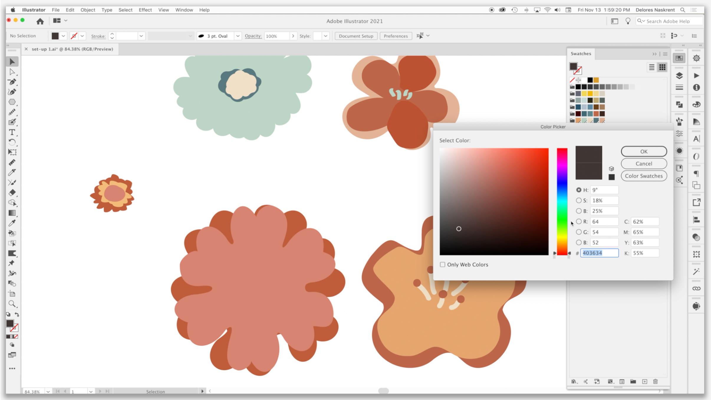
5. Motif Color and Layered Construction: Hi guys, welcome to lesson four. So in this lesson here we're going to really work on that, larry. So the first thing I think we need to do is to create color schemes or a color theme that we can use for doing this. It'll really help us to layer if we have some color here. And I think we're going to also just grab a screenshot of our reference so we can use it here. We're not going to be copying these artists, but we're definitely gonna draw some inspiration from their work. Let's get started. Here's a bit of the layering that I started doing. And it was a lot easier for me to do this with a color scheme in mind. And I want to show you quickly before we do any more of this layering, how I sometimes go about getting my color schemes. So here are a few that have already added. I showed you that Adobe themes and that was in my libraries. So I have the color themes here, and I've saved a few into my library, but I want to show you online how to do that, especially if you don't have Adobe Illustrator, you might just want to download those themes. So let's go into that color dot adobe.com website and check it out. So you don't necessarily have to connect illustrator for this. If you're using a different software, you're going to be able to download these themes. You don't need to just integrate them into Illustrator. So the one that I find I use most often is I extract a theme. So I go up here to this corner and click on this extract theme, and then I select a file from my computer. Now, I've saved these color schemes and I'm going to open them up individually and will check them out. So just like that, instantly, I have created, or I should say it, the software has created for me this color scheme that was just so easy. So you could save it to Adobe Illustrator and you are going to David into your color themes or color ideas to integrate into illustrator. You can do it. Here is the I've logged on here as myself and soul. This library is interconnected web, my Creative Cloud subscription, so I can save it. You can see down here it tells me that I have successfully saved it. And then I can move on to another one. Now if you wanted to download this, there is a way to do that and I'll show you that in a minute. First of all, I want to go through and extract the theme from another image. I go over here into the upper right hand corner, replace image, and I'm going to grab another one here. Again, a theme has been added. I'm going to save it to my color ideas. And you can see how quickly I could go through all of these and save them. And this last one I think is probably the one I'm going to work with today. So I've saved this into my color ideas. And now when I flip over into Illustrator here and go back to my color ideas, you'll see that my new themes have been added here. So if I wanted to add a grouping, like, let's say this one, I could add it to the color swatches by just control clicking on them. Let's do that for all of these new ones. I think I've got those other ones. And now you see when I switch back into my swatches, I've got all of them here. Now amongst the things you can do here are going in and changing these to be global colors. You can go ahead and do that with all of your themes. That way you can make adjustments later on that I will explain as we get to them. Number thing that I thought might be helpful here would be for us to grab a screenshot of these as reference. So I've done that and I have here open in preview. I'm going to select all and copy even to illustrate it here and paste and move that off to the side a little bit here. You never really want to copy exactly what another artist is doing, but you can definitely be inspired by other work. And whether you're doing it directly like this or your mind has just saved all of this stuff in its memory banks. We're all always influenced by other artists and art that we see. So there's nothing wrong in taking a look at this to get some ideas. And one of the things I was doing here was drawing some of these little centers for the flowers, shift B for the law brush. And I've actually set up a different law brush here. I'm using a calligraphic brush. You can use calligraphic brushes for blob brushes. And I have made some changes here in the wave pressure will affect what I'm drawing. So I'll show you how that works. You can see that if I press harder or softer, I get quite a variation in the way of my line looks. And sometimes that's just fine for, just for the sake of experimenting, I guess you'd say, I'm going to make a couple of just little blobby shapes that I could layer and use for some of these centers. In this case, I would get rid of that. Just haven't decided which color scheme I'm going to use yet, right? It's probably going to be this bottom one. So I'm gonna kinda start shifting into those colors for my motifs that I'm gonna layer, I'm using the bracket key and command and shift to change the order one above the other. Currently I've got everything on one layer. If you were to look in the Layers palette, often as I get working on these designs, I will separate a complete flower group and put it on its own layer. I'm going to group this one and I'll probably go through and group other ones as I see fit. And let's just start switching over some of my other motifs to this color scheme. Or I could introduce more colors here easily. Double-click here, change the color, and then drag it into my swatch group and you get rid of them. And so I usually go through and do this for just some variation in my shades intense. I'm gonna change this to be a little bit more of a Navy, right, Patti, and I'm going to get rid of this one and then I will make a later version of it as well. So this may or may not end up being my final pellet who'd always kinda like that Healon there too. So I may just drag that in. I'm going to take a few minutes here to get my motifs organized and I'll come back to you in the next lesson, ready to start laying out my design. I'll see you there.
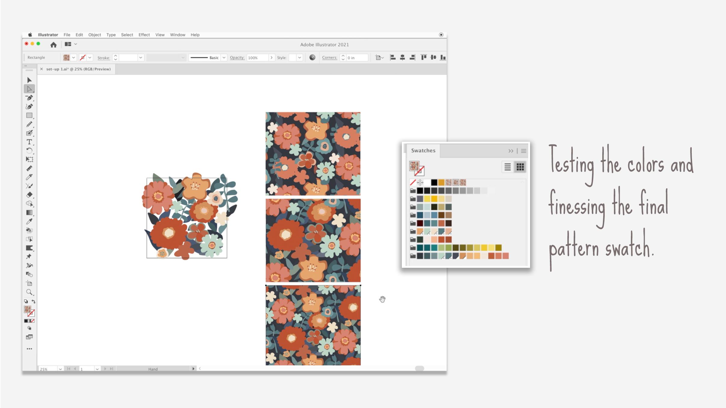
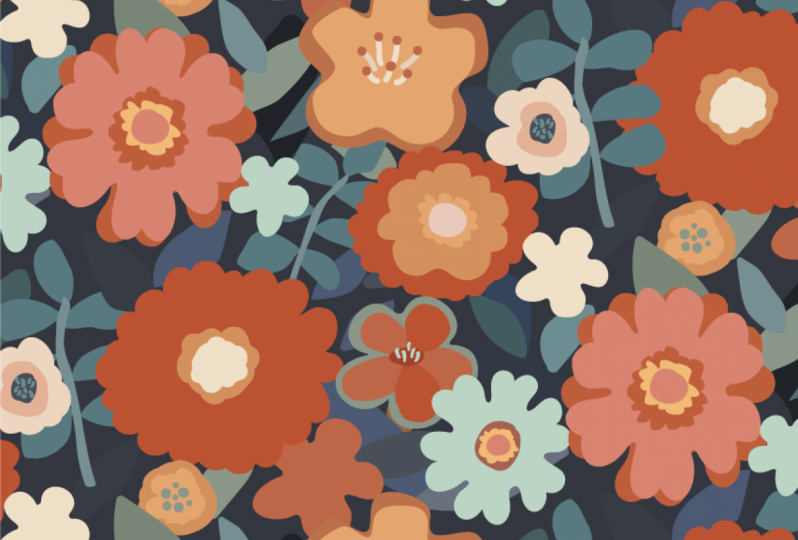
6. Composition and Layout of the Artwork: Hi guys. Welcome less than five. So I'd say we're really at the point now where we're laying out our swatch. And I think we may have to draw a couple of more motifs to fill in this space and to give us a little bit more variety. So in this lesson we'll be doing a little bit of this and a little bit of that. Alright, let's get started. Okay, so I've got a good number of motifs here, ready to go. A couple of them I've just made as variance of a particular flower. Like for example, I separated this one and made just a single layer flower with a different kind of a center. I've got an extra center here just in case I made this kind of goofy flower here and I made a couple of stems with leaves on them. And of course I've got a good variety of leaves here that I can use in the background. And so I'm ready to actually start composing my file. Show my art board here. I'm going to move that ran out of the way and bring this up closer. And it looks like a maybe wanting to reduce that a little bit in size. I've also gone through and grouped my flower. So you can see here that if I select them with selection tool, the entire grouping for flower is very easy to move or adjust in any way. So if you take a look at my layers palette now, actually let me get into isolation here you can see a bunch of single flowers in groups, which is gonna make it a lot faster and easier for me to do my construction. So there's two different ways you could go about doing this. I think it's really a matter of preference. I have tried both ways. And for me, my preference is to roughly place the foreground items and then go in and add background items afterwards. So generally what I do is I grab a flower, drag it into position. At first, I'm not really thinking too much about the conversation. I'm just kind of roughly positioning them where I think they might work. If necessary, I go and make some changes to the color is just to start having me looking at balance to a certain extent. Now I'm pretty sure I'm going to be doing a half drop repeat. And so when I'm composing this, I'm thinking about positioning of especially repeating items so that they aren't going to be hitting each other or creating too much of a striping. This one for sure. I know it's something that I would put in the background. So I'm using right now just might command shift and bracket key. I'm going to have to do some work on the layers to get that all working. I'm thinking with this flower, I'm going to bring it back into the orange, orange he family because I am considering doing all of my background elements in these darker colors so that I can get that foreground, middle ground and background sort of depth happening. So I'm gonna do a little bit of work here at propagated time-lapse it as I position a bunch of the leaves in the background. So one of the things that I could do here is to select all of this and cut it, go into my layers palette, make a new layer. And you see right away that that's above the leaves. And then I can just paste in place, which is Command Shift v. So they're all back in position here, but the leaves are all in behind. So that makes it easier for me to grab these items and put them in behind. So I'm going to do that in a timelapse and I'll stop and explain anything that's significant as I go along. Sometimes it's nice to go into isolation mode like this so that you can really take a look at how these background items are working by themselves. And remember that you can manned option and drag to make do Pickett's then just escape out of that layer when you want to do some more of the fine tuning, pretty take a few minutes off camera because I think I want to maybe add another motif or two to fill out my design. And I'm going to come back to you with something a little bit closer to a finished layout so that we don't spend too much time on camera as I'm doing this, I can then explain the results and talk to you about how I use my judgment to perfect a pattern or a layout. Maybe what I'll do is I'll take a duplicate of this and work with it. So I'll keep that one as is and then I'll make my changes over here that I can let you know or compare notes with this original. Once I come back, it'll just take me a few minutes here. Alright, so here are the adjustments that I've made. And a lot of it has to do with just mainly resizing and slightly moving around the icons with the main motifs and also changing a few of the colors. So you can see this flower here is now a lot darker. This one's a bit darker. I've added this one in here, which I just drew really quick, using this basic background or using this flower as the base. And I just used my blob brush. So basically if you had your blob brush selected here and you had this set add, merge only with selection than whatever the selected object is. You can start drawing and it's going to make sure we got the right color here. And you see, you can just add to that very, very easily. So that's why it's so quick to do it that way. So I just made of those kind of changes, some minor changes on the adjustment of my leaves in the background. And now I'm going to do a couple of tests. Before I did this one. What I did is I selected at all, use my shortcut for adding a pattern. And I did experiment with that brick by column. So half draw. I know my pattern is ten by ten or the my original art board. I'm going to actually hide that or at board temporarily. But you can see that in essence it works. You can decide on how you want it overlapping and just having that one look at this really helped me to make some adjustments on this new layout. One of the things I've done is I've gone through on most of the leaves and use that little widget to round out the corners or the points. I just felt that that was a little bit more in keeping with my overall design. And you can also see that I've added a couple of extra colors. So this one here, I should probably dragged down in here somewhere here because I'm getting closer to what I would consider my final palette. Now looking at some of these leaves, you know, you can see that you could simplify them. I mean, that's something you can go ahead and do before you make your pattern. So I'm basically just selecting the shapes. Looks like most of them I've got done, but every once in a while I forget. So my shortcut, One of the things I want to round it a little bit more, and I wanted to just experiment now with a background color. So remember our inspiration here. And the one that I really liked or wanting to work towards was somewhat like this. You can see I've even fashioned mind little leafy branches a little bit after this sort of a look. And I liked this really dark background, then these sort of intermediate colors would be considered a middle ground, and then these lighter objects become the foreground. So I'm kind of working towards that idea. But I also really liked in this sort of look that really extensive layering in the background and the action that's going on in comparison to this one. So I've really kinda married those two and then took the insides of these flowers, kind of inspiration for the middle of my own flowers kinda took a little bit about that look on one of them. And so you can see how inspiration can play into your design. Now, you would never look at this and say, oh, that's copied, that's definitely a copy of this one or this one. I've drawn all of the motifs myself. I've colorized it completely differently and inspired by these artists here. So thank you so much Ophelia lives Mariko, I have been influenced by and inspired by all of you, and this is what I've ended up with. So I think at this point, I can actually get rid of that. Then I'm going to actually get that little guy out of the way there. And so I've come to the point where I think this is going to be pretty close to my final, so I'm gonna get rid of this one as well as my report hiding there it is. So let's just move this onto the art board. Not that, that's a 100% necessary, but if I ever wanted to export the art board separately, sometimes this ends up being a full collection. So I end up with a bunch of different art boards. You've probably seen that in my other classes. My pen InDesign workflow class has a document that you can actually download to use for just that purpose. So now I'm going to start doing a little bit of the testing, and I'm thinking that this lesson has gone on long enough. So my next lesson will be all about testing this pattern and choosing a background. Alright, I'll see you there.
7. Conclusion and Wrap Up with Advice: Hey guys, welcome to the wrap-up. I'm so glad you made it to the end. It's always so rewarding for me to see that you've completed some of the projects and that you get involved in the discussions here, this is a great place for sharing and I'd love to see you pose some of your work here. And I'm happy to promote your work as well. With your permission, I'll share anything that you post here. Make sure that you sign up for my mailing list on my website as well. That way you can really keep up with what I'm doing in my life and read my blog posts from pasts are really helping to develop that site as a real resource for artists. Also make sure you check out my two Pinterest sites. I've got that Dolores art Dolores now sprint site that we were looking at. And another one called teacher Dolores mask wrecked. On those sites. I share a lot of artists resources for your use. If you're curious about the kind of work I do, I've got a couple of stores. The biggest one is adds acyl.com. But I also sell on many other websites. So just search out my name and you'll see a lot of the work that I've been producing over the years. I really love looking at other artist's work and I do the same thing, so don't feel bad. I love seeing the progression that artists make in their professional lives. All the changes that can take place, especially if you're an artist trying to make a living with your art. You really never know where you're going to end up with this kind of a career. Please make sure that you hit that follow button. Joined me in some of my other classes. I'd love to see you there. Bye for now.
 Delores Naskrent, Creative Explorer