Transcripts
1. Intro to Layered Brushes and Motifs for Pattern making in Illustrator: Hi there and welcome. My name is Dolores nascar and I'm coming to you from sunny, Manitoba, Canada. It's a little chilly today actually. I'm not sure if you're checking in for the weather reports is going to be a little bit at crackling in the background on my audio. And that's because I've got a warm fire going in the background. Today I'm bringing you class fat will help you as you are working your way through to total illustrator proficiency. I'm going to be helping you to produce a really cool layered motifs. And we're going to use God in creating a pattern. We're gonna do some great work with brushes. We're going to use things like the blob brush. We're gonna talk about color on the brushes and layering your motifs to make them really, really interesting. Like I said, I'm really hoping that as you work your way through my continuum here, of course is you will have total illustrator proficiency when you're done. We're gonna do a little bit of work with effects. And I'm going to show you how to do things in multiple ways. I'm gonna keep this intro short and sweet. They are ready to get started. All right, Amit, you in less than one.
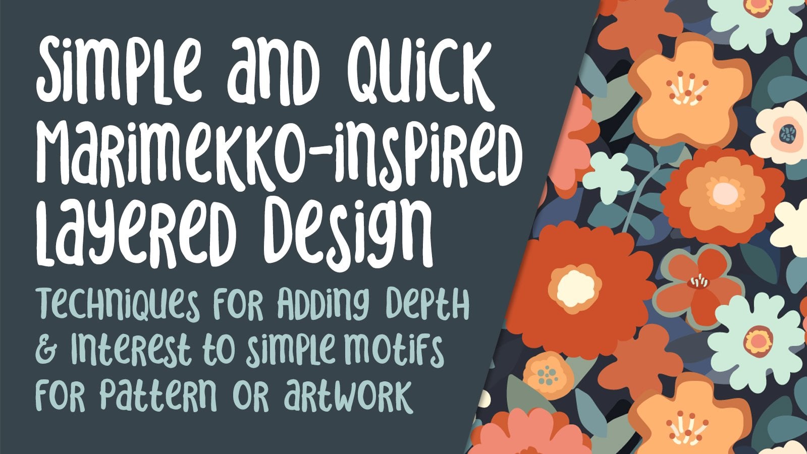
2. Inspiration, Examples and Overview: Hi guys, welcome to lesson one. So less than one here is all about inspiration. I'm so glad you committed. Let's take a look at some examples and then we'll get started. I wanted to give you just a basic overview of what I have been working on. And these are the patterns that I have created in this really layered style. I am experimenting with this technique. It's not something that I have done on a regular basis. And I've been wanting to do this ever since. I worked on layered brushes in one of my other classes set you may or may not have been in. So I have a bunch of brushes here that I borrowed from the other class. Will, some of them were layered, some of them were not layered. And we're gonna do a little bit more of that kind of exploration of rush making from those brushes will then create patterns. I've kind of done a couple of them here. Some of them use layered brushes, some of them don't. And yeah, I am basically trying to experiment with some of these styles that and I've seen all over. So I've created a board on my Pinterest site, dollar art, Dolores now script. And on that site I've got a ton of examples. So you could take just one of these and use it to inspired with the brush making itself. So something like this one you can see uses a lot of thinner brushes, is layered over and giving detailed to pedals for example, some of these are actual little shapes. You can see. For example, the Fox here covered with little flowers. Doc. Once you start doing research on this, you are going to find two or three names that come up very often. So these are artists that you could check out. One of them is Helen garlic, of course, the fantastic and talented Helen darted. Her studio was called orangey lucky, and she's got a blog, so let's just hop on over there. She's also Canadian. She's got a studio in Montreal, Canada. And look at this just amazing, incredible work. I just love this so whimsical and so playful. And I love her combination of colors, a love that she's got these really quirky birds, definitely flowers from another planet. It's great to gather inspiration in this way is make sure that you never actually copy another artist's work. Grab some ideas, figure out how they're doing, whatever it is they're doing, but keep your work completely original. There are many artists who have started to incorporate a sort of style into their work. You could find plenty to be inspired by. Back to my work here. Definitely. I'm no Helen dyadic. But what I'm trying to do is develop a style of my own that has a lot of the leering and a lot of the whimsical kind of flowers in it. So in this class we're going to focus on the actual techniques to create those layered brushes. Throughout, I will be showing you reference that I've used. And from there we will develop our patterns. Alright. Ok, let's meet in the next lesson where we're going to get to work. There.
3. Gradient and Varied Brushes: Hi guys, welcome to lesson two. So unless until here we're gonna take a look at a variety of different types of pressure. We're going to add a lot of detail and I'm even going to show you how you could use a gradient in the background of your brushes. We're also going to work with clipping mask. Let's get started. So there are likely hundreds of different ways to add texture to a pattern. I am going to show you few of the ones I've experimented with. And who knows? Maybe we'll figure something out along the way. We may or may not use all of our experiments who know hosts, all about the process as keep reminding yourself that if you were in my pattern design workflow class, you probably recognize this basic layout document that I use. I actually had attached this document as a download for you. If you wanted to go back and check it out, I use it to put together all of my collections. I've got it kind of worked out so that I've got art boards. I've got a spot to put my collection. These are the different patterns that I worked out as I go along. This is the construction of the patterns right on the art boards. And then this would be a finished pattern which I would have here in my swatches palette. I usually start by figuring out some sort of a color scheme that I want. And I decided on these colors. Some of them I had as I started and then some of them I added as I went along. But there's more than enough colors here to work with. Who knows, we may even add more later on, we'll see, but those colors that I have, there were ones that I use to create these two patterns that I have so far. I've still got quite a few to go. I would like to have probably a dozen in this collection when I'm done. So what we're gonna do is go through and talk about some of the different methods that I used for constructing these layered motifs and brushes. If you're hearing a little bit of noise in the background here, I gotta tell you it's a chilly day here and I've got a fire going. So just imagine you'll hear some snapping every once in a while and it's also terribly windy. So I've got big branch that is scraping on the roof. Hey, Google, what's the forecast for today in Brandon? Today, it'll be Cloudy with a forecasted high of 12 and a low of lime. It's currently 11 degrees and mostly cloudy. But anyhow, let's get back to work here. So I've got just a few examples of different techniques that I've kind of used here. I want to kind of explain those because they are really easy ones. In this particular instance, what I did was add the stroked path. So this half that you see here is stroke. You can see here in a slightly darker color. And what I've done is I've dashed the line. So this is a very quick technique for adding these kinda Adi, textures to your motif. So this motif will become a brush. So I've done an 11-point line, slightly darker in color and I've dashed the line. So you can experiment with this are some pretty cool things you can do. I've got it dash right now at 3, you could change this to four if you wanted the circle to be a little bit rounder and could change the thickness, you could change the gap size. Let's do 33. What I often do is copy that and then just do with haste. And you can just hit the tab key to move to the next or every second spot here for inserting your sizes experiment, definitely because everything here will give you a different effect. I'm going to undo that. You can also experiment with using square ends or projected ends. I am going to undo that as well. And of course, there are options that you could put in here, none of which I am interested in. So that was one of the ways. In fact, that's how I did this one here, and I selected it after I had created it. First of all, I changed the color to create this one here. And once I had it complete, selected the entire thing when to object and expand, expanding both the fill and the stroke. And you can see now that these are all shapes. Never think I want to show real quick is that you could put a gradient in the background here. So if we double-click on our gradients, let's grab that color and put it in here. Let's make sure we're not on the stroke. I'm gonna go into my swatches palette here and specifying none. The gradient will be in the background of the flower, and that also could be made into a brush once it is expanded. So let's select it and we're going to expand again because this time we want to create the expansion for the gradient. This is again something you might have to experiment with. I'm gonna say, okay, here have expanded. And now I can go ahead and try dragging that into the brushes panel to create a brush. We're going to create an art brush. I'm gonna hit OK. And I can't use that. So what we're gonna do instead is a couple of steps here. I'm going to copy this and we're gonna paste it in front. And we're going to take the Fill out of that completely. That is going to be our clipping mask that we're going to use after we expand our gradient. So just to make this a little bit easier, I'm going to make a new layer. I'm gonna cut them when actually, and I'm going to paste it right there, paste in place. So now we've got that on a separately or completely. It'll be a little bit easier to work with. We can see the different components here. What I'm gonna do is Ungroup this so that you can see that I've got the 21 with a gradient and one without, so this one without, this going to be, our clipping mask comes going to label it as such. Right now, this one, we're going to expand the appearance on. From my experience. You need a good amount of stats, but you definitely don't need the 255. So I'm going to do, let's just try 55 first and see how it looks. And really that's not bad. I think that especially if you are using this sparingly and use it fairly small, you will not have a problem with that gradient looking really stepped like this. It also depends what you're reading the collection for. If it's for fabric, believe me, fabric is very forgiving and this would work just fine. And I just want to angle this one here. Okay, so now what we're gonna do is expand appearance on this. And remember we've got this one here. I'm gonna put my smart guides on so that I can line it up. I'm gonna make a clipping mask and you see that that shape is on the top of my stack here. So I'll have to do is select everything in the later, go to this flyout menu and make clipping mask. Now that that's done, I can go to divide and you can see that there is nothing beyond the edges. The other thing I often do here is I use my simplify and just check it out and see if there's going to be any advantage to reducing the amount of points. Let's just check this out. Originally has 627 points, now it's got 470. Let's see if we can make this even less. No, I don't like what it's doing back here. So I'm going to stick setting. And now we can make this into a brush. Now I can see that this has turned to kinda out white. I'm gonna use that color as a guy's going to added here to my swatches, double-click on it here. I was gonna make it later, but I think I'm just going to grab it and get into this. So the tip here is not a different color or do you think you think it should be a bit lighter? I think I'm going to leave it. Okay, so now we've got a gradient brush that we can add as well to our brushes. Let's just drag that in there. We're going to be making it into an art brush. I'm going to say OK here, and let's just try that one out. So that might be something interesting that we could use later. Okay, so let's move onto another method. So in this method here, I created a brush using a calligraphy brush to add the detail to it. So let me break that down for you. I'm going to eliminate everything except for the large basic shape there. So the thing with calligraphy brushes that I like is that you can change the shape of the God or the stamp that you're using or that you're painting with. So this one had a really specific look. I want to use the calligraphy brush and be able to paint a line that is thick and thin. So I've selected a lighter color here. I'm going to have no fill on it. And the stroke is this lighter color. So you can see here I'm just giving one quick PS down to produce the dot. I'm taking my time with this part because I want it to be pretty well spaced, quite even. And I'm also trying to prevent straight lines from happening in here as much as possible anyways, now whenever you see the tip of the brush showing like this, it means that you can use the right or left bracket keys to make your brush size smaller or bigger. But it doesn't work with the brushes that you've created. But it does work on these calligraphy brushes. So I'll show you what would happen if we just go and drag this into the brushes palette? You can see my motif with all of the little details comes in just fine. So I'm gonna say okay here, and let's try painting with it. Oops, maybe a good idea to choose it then rates. So you can see that works, just dandy. And you can see that when I curve my brush or my stroke, that the dots will follow. Now you see here, if I hold a long stroke, that it does change the size of the dots within that motif or thickness is still pretty useful, so I'm going to keep it. So I've got a few other ideas. I'm going to show you some of those in the next lesson. Alright, I'll see you there.
4. Brushes with Lines and Silhouettes: Hi guys, welcome to lesson three. So unless than three here I want to show you some brushes that I've made with lines and plants, silhouettes. And you're gonna see me make a couple of mistakes and correct them so that you can learn a little bit from that. We're going to use the blob brush for some construction. And we're also going to use the Pathfinder palette. Let's get started. So in this lesson, what I want to show you is the use of straight lines like this pattern uses. And like this pattern uses. I want to also explain the clipping mouse again and how you can use them to help you create paint strokes that look like this. Alright, so let's start with a basic leaf shape. This is the type of brush we're going to create first, I'll show you here in the brushes panel. And I'm going to show you how to do that one. It's one that's fairly quick actually to produce, Start with an ellipse. So L on your keyboard would give you an ellipse. Let's make this one black, no stroke, and pull it to the approximate size that you think you're going to need. And then shifts C on your keyboard will give you the same as this here, which is the convert selected anchor points to corner. So shift c gives you that on both the top and the bottom, and you've got your basic leaf shape. Now one of the brushes that I have in my brushes panel is just a very plain kind of a basically made the same way. Actually it's sine of a long tapered lines or papers at both ends. And I just want to show you here in the brush settings. I've got it set to tense, which means that we could tint it to whatever we want. I want this to be white, and actually it doesn't matter because of the next step we're gonna do, but let's just do it as whites. So you kinda get the idea that you could brushing your brush line, I'm gonna go a tiny bit smaller here, so 0.75. So I'm just pulling pretty quickly from top to bottom here. A little bit thicker than the original. That's OK. Really, I'm gonna do it 2.5, but it won't matter that it's slightly different. Images give us kind of a leaf with a different kind of a look to it. So I am going to select both of these lines and move them over, just attach. And then o on my keyboard gives me my Reflect tool. I'm going to reflect basically right here in the middle for my lines are completely selected. Now you can see the anchor points is solid there on the keyboard option click, I want them on that side, so that's perfect. I'm going to say copy, and that gives me the four. Now what I would do is just grab the tops of all of those. You can see they're all selected. And I would make sure that the line-up and the same and the bottom. And it's actually not a bad idea to have them overlapping a little bit beyond the end. So I'm just going to pull those. I could have done that at the beginning. A. Well and I think I'm going to bring that out just to touch and I've got everything I need to do the next step. So now what I wanna do is go into the Pathfinder palette. I'm going to be doing some tricks with that. Before I do, I have to change the brush strokes to be actual shapes. In order to do that, I go to expand appearance and you can see now they are shapes, OK, so they're no longer brushstrokes. Now, what I wanna do is actually cut these. Out of this leaf, I want to make sure that I have a copy of that leaf shape that I can colorize leaders. So let's actually select all of this and cut. I'm going to make a new layer. It's no longer on the brushes layer. I can put it back there after, but I like having it on its own layer because then when I open it up, I can see all the parts to this brush. If I left it on the brushes layer, there's a gajillion things on there, so I don't want to deal with, and this is the fastest way to do it. And what I wanna do is duplicate that. You could also just copy that shape and paste it in bad, I'm just trying to show you every possible option for doing a particular SCAP. You'll figure out which one is the best and fastest for you. So here you can choose duplicate path from the flyout menu. Or I could have dragged it onto here to make a duplicate. And now let's just lock that. So we'll select everything that we have here. And we're going to go into the Pathfinder pallor and we're going to try minus front. That's high this one. So we can be sure of what we're seeing here. I'm going to try minus front, and that is exactly what I wanted it to do. So these are all separate now, okay, now these I could color, so I'm going to select each of these and let's color them. I've got a couple of peach colored ones already. Peachy pink. So this one I think I'm couldn't do in a green. And then let's go in the Layers palette again, let's show an unlock, this one. Now we can select it by just targeting it here. And I want to fill it with the same green, but then I'm going to lighten it. So I've double-clicked on it and now I can lighten it and that gives me a really neat leaf. So I could, you know, at this point duplicate it and make a couple of other variance. So let's say this one. I actually want to do it lighter with a darker than which always easier to just go and grab it here, target, and we'll do that one darker. So now we've got two great leaves that we can use. And It's just the simple, just drag them into the brushes, Pallet art brush where not your changes at this moment, we can do the same thing here, drag this one in. You could also just have it selected and click here to make a new brush basically gets you to the same spot. I just find it faster to just drag in and hit OK. So we've got now a bunch of different leaves and the neat thing leaves her petals. The neat thing about them is that they all look a little bit different. And that's going to be fun when we are actually imposing our pattern at the end. So I'm going to actually up these two out of this layer, go into my Russia's layer again and paste in place by doing command shift, the atom's going to group those so that they're kind of on their own, right? So now it's time to try another one. So for our next brush, we're gonna do something like this where we've got kinda maybe for any kind of plant like in lay over top of a leaf. So I've got this one started here, and I'm using the blob brush to do this was to access the blob brush is shifted B on your keyboard and you'll see what the blob brush that. This is one that can be adjusted using the left or right bracket and go a little bit smaller. And the cool thing about the blob brush is that I used it to create these. These different and I want to call them leaves, but these little pods, I guess you'd say it's like a succulent. I drew them with the blob brush, so it created actual shapes. They are brushes that needs to be expanded. I've got the one side drawing and I think I'm going to duplicate this, so I'm drag selecting over it. So I was holding the option key to do that. And I'm going to use the Reflect tool, which is oh, on your keyboard. And I'm gonna go approximately in the middle here and option click. And what that'll do is reflect it based on where I dropped that pins are dropped, that pin here, I could have been a little bit further over. We can make adjustments, but I've got that reflecting vertically. I'm going to hit copy so that I've got kind of both sides of my little fern. I'm going to move that a little bit closer. And then I'm going to use the blob brush to draw a stem. The cool thing about it is it's going to tie into whatever I draw. So it will unite or adds onto any of the shapes that are being dragged over. You could access blob brush options by double-clicking on the brush. So the settings I have are these. You can have it just merged with the selection. If that's something that you're doing, maybe a different purpose than what we're doing right now. And here of course you can make adjustments just like any other brush tool. I'm going to leave it as a straight circle. Click OK here. Even if it's de-selected, it's still going to connect. So I'm just gonna pull is CLIA straight line down the middle street, ish. And then I'm going to use the brush to make all of my connections. And you can see here that it's uniting them beautifully. So my little pods are uniting with the stem that I've drawn. And that's exactly what I'm looking for. I'm gonna move this window over just a little bit. I didn't like those last two, so I'm doing them again. And I'm gonna move this over just a touch. One of the things I could do at this point to actually make this side look maybe a little bit less identical to the other side would be to select the whole column. I guess you'd say I'm going to use a simplified command to just make a couple of changes here. So this is going to just make them a tiny bit different in shape than the other side. And at the same time I'm reducing from 37 points to 26 points. Also, I'm going to just maybe just grab besides on a couple of these and alter them just ever so slightly. I do want it to look like a hand-drawn piece. I'm actually going to also grab this side of my stem and just adjusted slightly to make it look a little bit less perfect. Okay, so here we go. Whoops. I don't know why it defaults back to that other one all the time. Hey, so I've got that drawn. I can go in and make adjustments, of course. Now here in a case like this, I would probably choose the Eraser tool, which is shift E. And it's again one of those brushes that you can adjust with your brackets and you can use it to take chunks out of your painted or expanded shapes. So this would work equally as well on this shape, for example. The other thing I can do is just use my minus c0 and subtract point if it's easier, we're all about the easy right now. And I see here for some reason I've got a ton of points. So I am going to select with my last foo and then hit my remove anchor points shortcut, which is for me command comma. That's one that I actually do use quite frequently. So it was definitely wording in a shortcut for it know, it could definitely sweat the details and take a lot longer to work on this. But I just basically wanted to show you how to construct the brush and I can definitely do that with it looking like this. So now I can superimpose onto this leaf or I could draw another leaf. Let's just do a quick test here because I want to show you something. I'm going to adjusted a little bit. So I'm going to add a point here, a few points there, and I'm going to make a little bit of an adjustment here. We want to pull it in tight to the plant. I'll probably make an adjustment to the stem here, but I want to point out something here. I'm going to drag a ruler guide over. And you can see here that this point and this point don't line up. We're going to do a quick task. I'm going to show you what happens if you don't lie in those two on why it's important that you do. So canadian there will make an art brush. We're going to move this up so that we can just draw with the brush. I just want to show you that the brush will follow what we did over here. And the problem with that is that if you're ever trying to line things up, it's really hard to stop right where you want it to. So let's pull a ruler guide here as we can see, let me get rid of this one and watch what happens. So I'm pulling it over here and I'm trying to line up to that guide and it just doesn't do it. So that's why it's important for you to get those lining up before you actually make it into a brush. So I select the top and a bottom, and I use the align tools to align them. Test this out by doing something lay maybe drawing it with the rectangle or the ellipse and making sure that you pull, I'm going to start it from the middle here that make sure you hold down your Option key while you're pulling your ellipse. And you'll see that when you stop, the center of it is right there where you need it to be. Let's send this to the back and let's actually just use this as our leaf. So like I said, panicky brushes is kind of a process and I could have done this right from the start, but it just goes to show you how sometimes you're making all these decisions on the fly. I want it to be quite a long, kind of oblong shape. I'm not going to touch these two points and I'm going to try to do a distance on both sides of the line equidistant. So I'm also going to align this to my ruler guide. Actually, I think I'm just going to eliminate them. And so for the time being, I'm just going to lock that command to and I'm going to use my last Sue and that selects everything within the lawsuit area. Again, my shortcut or remove anchor points. If you don't have a shortcut yet, you go to path and then remove angle as you can see here, my shortcut man comma, but it's one that you may consider. I would definitely consider putting in their via Were you the more you start doing things like this, more some of those shortcuts really make sense and right now those two are selected, which is perfect because I want to drag them down. I'm not gonna put them right over the edge, but pretty close to the edge. Now the other thing I can do here is now select everything. Oh yeah, that's right. I don't have that unlocked yet, so objects unlock all. Now I can select the two and it automatically goes to align to selection and center them so they were so close, wouldn't even see it. Hide my guides temporarily. I'm still gonna make a couple of adjustments here and then just pull these in. You can use your keyboard increments to make sure that you do an evenly. So we could go 12345678910 that I'm going to select these as well in a monopole OZ and a little bit from me, I could do a lot of adjustments to this, but I just wanted to show you how a brush like this is made and this is adequate for my purposes. Let's get rid of this one here. So I'm going to select it, hit the trash can at the bottom, and then we will drag that one in our brush, okay, and leave all these settings for now. And I'm going to test that out. So b, and you know, I don't think it's a brush and I would use a lot, but it's definitely something that could be used. This is going to be a giant brush. So one of the things I could definitely do is change the size of it already double-click on at school both 50 and networks, just dandy. So that gives us the similar look to brush kinda reminds me of this orange one here at the bottom. And now that you know, the concepts, you know, you could easily do this. I bet she had this one here was created separately because you see it used a lot in this design. You could definitely create a bunch of these for fun. I liked this orange and beige one, but I also like this one here, this leaf one, about something I might consider doing at some point. Okay, so that shows you a few of the other brushes that I had in mind. So let's go into the next lesson where we're going to do something a little bit more like this. So a split leaf.
5. Two Colored Leaves and Hue Shift: Hi guys, welcome to lesson four. This has kind of a short less than, I just want to show you how to make these split leaves. And we're going to use something called hue shifts when we're making the brush. Alright, let's get started. So this last leaf is actually probably one of the easiest ones. And I'm going to show you how to do this one really quickly. Make sure you check out my Pinterest boards. My entire interests site is full of all kinds of artists resources. And if you go to my surface pattern design board, you'll see that I've got a bunch of separate boards. And the board that I'm mainly working on right now are taking inspiration from is this paint detailed patterns. So make sure you check that out. And I just saved that one to this bold leaves Category eight. So let's go into Illustrator, where I'm going to show you how to produce that real quick housekeeping here. I'm going to move these over here. And let's see. I'm going to show you how I actually draw a lot of them. So you can see from scratch how I would go about doing this. And on your keyboard will give you your pencil tool, draw your leaf. Any which way you like, make changes to it in any way that you feel comfortable. I'm going to make sure that this is let's fill it first to make it easier for you to see. But I'm going to make sure that this top and bottom are centered. And the quickest way that I know how you'll probably have your own favorite way, but I like drawing at really quick rectangle. Command five on my keyboard changes that into guides. I believe that was a built in shortcuts. Guides, yet make guides command F5. So I think that was a default Illustrator one, if not, definitely put that in. So you can see here that I've got a nice little centerpoint to work with. And I can bring a ruler guide to that center point that shows me where I need this point to line out M, this point. The rest of it doesn't matter. So much. Like as far as the shape goes, I would definitely pull each side roughly to the outside of that rectangle. Once you're done with your guides, you can hide them, which is command semicolon for me. Or you could actually go into here and clear all your guides. I've got that leap ready to go. And in order to divide it in half, it's pretty simple again. And on my keyboard and I can pull align if i want it perfectly centered on the tips. I line those up and then, and I select them both, go into pathfinder and simply divide. So you see that in your preview mode, you can tell that it is in two parts. And then what I do is just go in and change the color on one side of it. In the example that we looked at, we saw a whole bunch of different ones. What I'm gonna do is show you how you can make this into a brush and then use one of the other functions that you see in the art brush category here where we can change it and I'll show you how in a second. Okay, so I've selected hue shifts. I can use the eyedropper to click on the color that I want changed. When I click OK, I'm gonna make a brush stroke. You can see that it's picking up whatever color I have here as my stroke color. So in that case I had two colors that were really related. I'm gonna do this again, and I'm going to change this completely to a completely different color k. So let's try green and blue. I'm just going to actually be saturate bow a little bit because we're getting kind of a stroll being with those two together. I'm going to do this one again. So I'm selecting the whole thing by dragging over it and holding down my shift and Option key back to the brushes palette. Let's drag that in their art brush again. And this time the key color is agreed because I just had it set at key color and I had that side selected. We can actually keep the color to be this blue on this one. So you can see as I hit it with the eyedropper, it changes here. I'm going to say OK, let's draw stroke without, and let's change it to a completely different color. You have to make sure it's a stroke here. And you see here what happens is that, that side changes. Okay? So that would be a way to affect your brush and get that similar effects that we saw here. Get rid of those two and I'll show you here real quick. I've HQ dark brown color. We'll do this 1 first so you can see what happens and then this one. All right, so that's just another kind of quick option available to you. So we've got quite a few brushes here. I want to start showing you a little bit more about pattern design. I want to show you the use of the brushes to create some of the motifs. I can explain the ones that I've got here. I'll do that as well as start making some new motifs, and we'll do that in the next lesson. Alright, so I will meet you there.
6. Using Brushes and Layering for Building Motifs: Hi guys, welcome to lesson five. So now that we've got such a great selection of brushes, we're going to start working on the motifs. Okay? I'm going to show you how I created a couple of motifs and I'm gonna give you advice along the way. Let's get started with this pattern here. I actually intended to have a light blue background on, so I'm going to copy it, copying the square, and I am going to paste it in back, which is Command B. Or you can look up hearing, you'd see it paste in Back command beat that I'm going to fill with a light blue color that gives you a better idea of what my intention was for this pattern. And then it kinda makes sense. Those blue textural kinda spots I have in the background and highlights a couple of the mistakes that I'm going to fix. For example, right here, I've got two motifs accidentally. Some of these appear to have moved off of their moorings. I'm going to go back and fix that. But I'm going to show you a couple of the sort of completed motifs and break down how I did the construction of them. So let's first take a look at those two mistakes. So this can kinda blow your mind when you look at it in outline view, you can see all of the brushstrokes that I've got in here. So that's pretty crazy. What I like to do. I don't always do it. I'm not necessarily always disciplined enough to do it. I like actually grouping my flowers. So for example, if I wanted to select a particular flower, I could go and selected by. So if you're on the Move tool, which is v on your keyboard, you can see how it's grouped here and that I would always do as a group, or I would completely cut it on that layer, make a new layer, and paste in place. So that is on its own layer and is easy to move around and separate in that way. Okay, that's just one of those little tips. Maybe that's the one that we can take a look at first. So why don't we take it over here. I know that that's the one that's on my clipboard because I just did that copy and paste. So let's take a look at it over here, will break down what brushstrokes I used and how I constructed it. So a particular brush here is the same as I used in the background here. So let's take a look at that brush here in the palette. So that's this brush. If I had it stroked with black, you can see it a lot better. So let me just actually drag the stroke here and let you take a look at it. You can see that that's kinda of an imperfect edge brush. So I've got it in such a way that it looks fairly natural. It's got a couple of defects in here. Let's actually drag that brush out of the brushes palette and take a look at its construction. If you look at it in Preview mode here you can see it's made up of three layers. So we've got the white, which gives that kind of Release around the edges, we've got this solid area which will become the color of the brush. And then this which is that highlight that we have running through the middle. The one thing I realized when I pulled this brush stroke, you can see here that wasn't exactly centers. Oh, I'm going to do that trick again with the rectangle. So I'm pulling a quick rectangle here. Command five turns it into a guy. And I can see that little dot here in the middle, which is where I want to pull my ruler guide. Now that tells me that this point is off actually would be both of them. And I can just drag that so that its central. I'm going to adjust this await release with a little bit more even I'm going to turn off those smart guides now command you and I'm gauging the location by using that kind of rectangle guide here. Alright, so let's just say I'm happy with that now. I'm just going to rotate that just a touch right now. I'm happy then I can drag this back into my brushes. And again, art brush set at tents. I'm gonna hit OK here. And let's drag that backup to this section here. I'm going to delete this one because we know that that one was a little bit off on had better not abused it? Yes. Do not delete the original or you're going to be doing a lot of changes on your artwork. So any who that's exactly what I did, is then go through and just draw a bunch with that brush. Let's just select these topmost ones and change it for the new version of that brush. You didn't see a lot of change there, but oh, my new version, I accidentally pulled in there without the white release. But you know what, I'm going to keep that because that actually looks OK two, so that gives me two versions of paintbrush. Now these were really simple brushes. You see it here, let me pull it out so you can see it basically kind of a paddle shaped nice stamen, make some slight adjustments here. I don't know why I am adjusting this one because that's not even the one in my pattern. This particular pedal was this kind of a paddle shape. And you can see that I just basically went through and layered. And the way I did it was to draw this yellow petal first, and then I drew behind to draw these other ones. So if you want to draw behind, you know that you can switch here, who you can see here, draw, normal draw behind drawing side. So when I was doing that particular function, I would use the draw behind and then turn it back to draw normal. I remember having trouble not knowing that this was something you did with shift D. And there's another shortcut that something, something d may be duplicate Command B. I had accidentally done shifted D And then I couldn't figure out what the heck was going on, why it was drawing in behind. So once I figured it out, I really started to use that function. So that's basically the long and short of it for that particular motif, I've got a whole bunch of other ones that were built basically in the same way. Like if you take a look at any of these here, can see that they were drawing with layers upon layers upon layers. And you see that once I switched to my move tool, which is B on my keyboard, I was able to click on it. And select the entire motif. So that's also very handy if you ever want to duplicate it, because then you can what are your layers here? You see that motif here, and you can take it and drag it and make a duplicate just by dragging onto the Create New Layer icon. I'm going to get rid of it, but that's exactly what I did when I created those duplicates of it. So I think there was two that were similar. Maybe it was just those two. Nope, there's three of them. This one over here too. So the only other thing I've got here is these little motifs and a double there that was drawn with this little sort of square ended brush. So let me pull that one out so you can see it. So again, I could have started with a rectangle. I'm not really sure. Let's just experiment with a rectangle here, drag those corners and then select and pull those in a little closer. Probably these two as well. And then I think probably just a slight adjustment nicely. I have no handle for this area here, so I could either add a point here. So the plus on your keyboard, and if you want to have handles on it, you just pull. So it was straight. If I was to use this convert selected anchor points tool, see I can just pull access it this way. I access it with shifts c, but I could also do that with this point here. So I don't know exactly how I did this particular one, but that's the basic idea. So I could drag this whole thing into my brushes palette. And if I was to draw and colorize it, I've got another version of something really similar to this one here. So these are the back. We're just again drawn with that sort of really basic shape here. The same shape that I used for I think these, Yep. And so really, I had actually composed and created these motifs with very few brushes. I'm going to fix that up a little bit. And I think what I'll do now is let me just move these two out of the way because I don't really need to keep those salts as delete them. And then I'll remake my pattern swatch. What I plan to do in the next lesson is to create another pattern where we use some of those really cool specialty brushes that we developed. So I'm selecting everything in this art board. I'm holding down shift and Option key just to make sure I grab everything. Shortcut for my Create pattern, which is command apostrophe. I can hide the art board, my mini here as well to take a look at it. And you can always increase the amount of pattern repeats to just get a really good idea, a good sense of how your positioning as for everything, you can see that that's been added here. I'll escape out of here, and then we'll go to my pattern here, select it, and let's fill it with our new swatch. I'm going to copy and pasting back and then fill that new rectangle. And you can see that that has adjusted this particular icon here. And I made some corrections to, it looks like I did okay, locating that duplicate that I had here. So we're done for this lesson and I will meet you in the next one where we're going to do some more experimentation with our new Russia's. I'll see you there.
7. Brush Flexibility Pointers to Ease Motif Creation: Hi guys, welcome to lesson six. So in less than six here I'm going to give you some more ideas on building motifs. We're gonna use the appearance panel to do some stuff. And I think that you'll learn a lot about Brush flexibility. Let's get started. What I've done here is a lot of experimentation with the brushes that we created. I've also created a bunch of additional brushes off camera just to speed up the process. So I haven't used a couple of them, like the radiant brush I did not use yet. I don't know if I will use in this particular pattern, but I've used the layered brush that we did with this silhouette. And I've created a couple more to compliment that. I have done some experimenting with these striped or striated brushes. I don't even know what to call them. And then I created a couple more of these with dots. So I will break down anything that I do and how I use these brushes. I have done AP test of the patterns. So that's what you see here. I pretty much like it. I mean, there's a few things I want to change. I'm not loving this particular motif here, so I'm probably going to make changes to that one. And I've done a couple of things like layered this background with a polka dots. So I want to show you how to do all of these things, will try to do most of these in this lesson. If it doesn't take too long, let's hope we can cover at all. First of all, you can pretty much due to how I needed these particular silhouettes. Let's see if I could pick up anything that you wouldn't already know. I think I created them in the exact way that I did before. I duplicated, in this case, an ellipse that was pointed at both ends. I showed you how to do that and I use the log brush to create a stem than I made sure that each of them was separated. All the sections are separated. So here it is with the brushes and before it's been separated out from the background. And then here it is, with it being subtracted out of the background. I did that for a couple of reasons. And one of the things that I've found was working really well was to have just a plain background like this for the branch. And that way I was able to predict different color in the back behind the actual leafy scam here. And that's pretty much what I did with these other two. I've also, you can see here that in my brushes, I've got the block brushes that can be colored so that I had a little bit more flexibility when I was doing the colorizing. So there are colored Persians, oops. So that's the colored version and then the version that can be colored to whatever I choose in my stroke color. Ok, so that gave me a little bit more flexibility. These, you can see we're done just with the brush stamps, just like we did the first one. Once I had all of the little thoughts drawn on the leaf, I created the brush and that's what you see here in my brushes pallet. You'll see that I created several different colors. So in a case like this, having also a Block one would make perfect sense. So I would duplicate the brush here, fill it with lock, change the dots to white. So I'm drag selecting over all of it and then just do selecting the back part. Can those with white? I'm going to fix that one. Couple here that are, you know, if you can see here, but that there are two points. So I would just delete so that their singular drag the whole thing into the brushes palette here aren't brush, okay, and in this case I would set the colorization to tense, then move it up here. So what's with all the other ones? So that's one that I could draw in whatever color I've used here in my swatches palette day. So that gives me a lot more flexibility. Now, I wanted to show you that background. Here, you will see three different layers. So I've got the topmost layer, which is my pattern. And then I've got these two for the background. So this was just straight out coloured with one of my swatches here. Then what I did is a circle l for ellipse on your keyboard, just draw a circle, the color that you want. Let's make an alternate polka dots so that I can use it at some point for some other pattern, drag that dot into your swatches. I've shown you this in a couple of other classes. If you've been with me, double-click on it here, that will open up the pattern options than you and decide what type of pattern repeat you want, and use your arrow keys to space them out the way you want. Okay? Well, it's pretty simple. If you wanted to see it fill the whole screen, you can switch the number of copies here. Now you can kind of get the idea of the effect and what your spacing looks like. And so if I wanted to use that one now, I would simply choose the here and the Swatches palette. I'm going to leave it to what it was and select all of these and align them again. This is just our tests Swatch Here. We will have a swatch that we end up with once we finalized everything. But for now I liked my test to be like right here, right beside what I'm working on. So let's do a little bit of work on this one here. It's just not my favorite and I don't feel like it really works in this particular pattern in its current configuration. So I'm going to start by making some changes to these paddles here. I think I'm going to actually eliminate those. And eliminate these. I'm going to line out that pedal a little bit better to the center and maybe make it a little tiny bit wider or 1.4. So I've got it completely selected here. I'm gonna use my Rotate tool. So I'm going to option click right here and I'm going to do 30 degree copy of it. Now you can see here how far the movement when I hit my preview and I'm going to hit Copy. And since that was the last one on my duplication, I can just do Command D and duplicated all around and could actually undo this and do it again. This is an alternate method for duplicating. This one uses the appearance panels, so I've got it selected and I've clicked on the appearance panel to add an effect, which is a transform effects. We can ignore everything here except for this one here. And this is a nice way because illustrator does the calculating for you. I didn't like the eight petals, so I'm gonna do six and I'm gonna make sure that it is duplicating from the bottom from that location. Here I can put the number of copies and hit OK. And instantly I've got six petals there. So that is a little bit more, I think what I had in mind and undo it and we're going to click on my transformation. So this is why it's kind of nice to do it with the Transform effect in the appearance panel. Because if I change my mind here, let's say I want seven that can just change this setting and all of the calculating is done for me. So I, I think I like that the best. It it just feels more natural to me. More of a natural look. Definitely keep that in mind. That way you don't have to flip to a calculator or try to do it in your head. So if you've got a weird number, like an odd number, I used here, the seven, it figures out how many degrees and it's just done instantly. So I'm gonna click OK here. I'm going to adjust this little guy back here, actually become good and just delete that one. And we're going to put the S1, this flower on its only or so. I'm going to show you here in the Layers palette. And you can see that the entire group, this group here makes up that flower that includes the central part that I did. Going to select the whole thing. I'm going to cut it but make a new layer so I could do it right above this artwork layer. And I'm going to paste place, which is Command Shift P. One of the things I'm thinking of doing here is to change the thickness of the lines that I'm using here to detail this brush. Let's go back to my brushes here. These are the three that I currently have in my brushes palette. And this is a good reason to keep these setups is because then if you need to make a change to the brush, it's pretty simple. So what I've done is I've thinned out that line a little bit. I'm going to drag this New Brush silhouette into the Russia's palette. Let's just move that one back up to her. The other ones are. So now I've got three colored versions and then this one that I can color. So let's go back to where I've been working here. That's one of the nice things about the navigator is getting around your document quickly. So let's select that brushstroke and try it with this fill. I do think I like that better. And I also wanted to talk to you a little bit about these little center bits that I've done for the flowers. Let's try making one real quick. What I find is the fastest way is to use the hex tool as long as you are still putting pressure on your mouse or your stylist, you can increase or decrease the amount of sides with your up and down arrows. So depending on how many sides you want on your flower or whatever it is you're making. This is great. And then I use my Pepper and bloat up, got a shortcut for that. You can find that under your filters if you're looking for it. I just put that shortcut in because I do use it quite a bit. Peppercorn bloat is a good one for making kind of like a little flower shape. So I'm going to fill that deepest rural cough and fill it with my darker color. Let's use the Ellipse tool will fill this one with something a little bit lighter, align them to each other beautifully and you can go in and use other filters to add some interests rough and might be one that works really depends on what kind of a look you're going for. With such a tiny original, You have to keep the size and the details pretty small. Sure, I want out. Again, you can use the pucker and bloke. That would be another method to add a little bit of interests to CMS, gonna steal these dots from this one, bring them over to here, resize them and bring them to the front. Okay, so let's figure out what's happening here, where they are. So that's my two back silhouettes. And down here is where that duplicate went to. Let's bring that up here and I'm going to bring it back up to size so that spacing is decent. And then I'm going to use my transform each so that I can transform the size of these using the settings here instead. Okay, so now I'm going to group this one, just going to copy it and paste it. And of course, a piece where center point of the screen wise move this one into position. And I'm going to change the color. Who I think I like that better overall. I feel like this is a good time to test it again. So let's grab the whole thing. My shortcut command, apostrophe, half drop, ten by ten, escape out of here. My swatch has been added in. Let's switch that out or the new pattern. Now, one of the things that you can do even after the swatches made, is you can change the overlap down here and we'll do that in whatever way you need to have it. Correct. And it actually looks pretty good. So as you can see with my swatches up here, there's been a lot of iterations of this design. Now, keep an eye on that flower there. And you can see a lot of the adjustments that I've made throughout. And this was our final swatch that we just did. So I do know that there would be a little bit more that I would do on this. I may even end up completely getting rid of that one who knows? I think I've showed you enough of this process and I think I will end this lesson. What we'll do in the next lesson is take a look at some other ideas for coordinates, some quick ideas so that we can get through and create a few coordinates super-quick. Alright, so I'll see you in the next lesson.
8. Quick Coordinate Ideas to Fill Out the Collection: Hi guys, welcome to lesson seven. Less than seven here I want to show you some really quick ideas for coordinates. I'm sure that if you've taken all of my other courses, you've taken some of my quick coordinate courses. Bide here are a bunch more that you can add to your repertoire. That's gets started. Yeah, so we've done a ton of work. I've got a couple of Greek patterns that I think I can use. I'm going to make some alterations I'm sure before I finalize my entire collection, but I thought that we could spend this last lesson just talking about coordinates. So what I've done is I've taken the time here on my separate art boards to just quickly start some patterns. And these are coordinates that I could use with this collection. I've tried to do a bunch of different things to show you how quick it can be if you've got some brushes and some motifs that you can use. If you've been in my other pattern design courses where I'm working on collections, you'll have learned a lot of different techniques already. There are a few here that I just want to kind of review. These are things they may not have done with you before. So here's one that basically just used all the leaves that I had a range kind of in a toss pattern, I guess you'd call it. I've used a lot of different colors. I've tried to position them all just kind of haphazardly. Let's take a look at what that one will look like alpha pattern. If we do the usual command apostrophe, you can see the whole pattern. Let's hide the art boards temporarily. And you can see that that one works fine as a grid. You know, you can make adjustments here, like you always do with your arrow tools using the tab to go back and forth between your settings here, I would try something like this as a grid and a half drop and a BRC repeat just to see what is the most pleasing and adult mind that half drop. I would probably make some adjustments here, but overall, the positioning is pretty good. Tighten that up a little bit. And of course you don't have to do half drop experiment with different drops here to see what works best with your arrangement at the company and actually go back to the grid pattern for this one, escape out of here. And let's go into my collection area here. I'm going to make a rectangle. Remember, I think I've set this up or ten by ten, and we'll fill it with that latest pattern. But I like to do here two is play around with the scale. So here we would not transform objects, we would transform the pattern and that scale feels pretty good. Try a little bit smaller. And yeah, that works like nicely to copy and paste in back if you want to attempt a different Fill color just for testing purposes, something like looks pretty nice. I think that would be a good compliment. You've been a darker color like that looks great. So that was my first coordinate idea with the leaves. And this one is the second one I was experimenting way. I first test of this one. That's how it looked. So this would be a really easy one to change and do a bunch of stuff to what I wanted to do was repeat a duplicate of it down here to have this connecting. So that means stem would connect. I reposition the flower as you can see. So I'm going to just make a duplicate of it here to help me figure out what I'm doing for the pattern, but my smart guides on to help me with positioning, you could see the measurements there are consistent. You use the smart guides. I'm going to extend this one down on drag selecting over the both of them and extending it all the way down. And then what I wanna do is have this curve appear the same on both sides. I think the fastest way would be to actually copy these points here that I've selected, copy and paste. So what I'm getting is the stem here, whatever we want to call it, I'm going to rotate it, option click and just do it. 180 had no film would probably be easier for you to see or maybe I'll flip into interview mode. So I'm going to drag that into position. Basically, I just want these Selena up the stem part. I've got the box or the shape around it. Not a 100% perfectly drawn because I want a little bit of casualness to it. Now I've got what I need here. I can eliminate this, eliminate this. I'm left with what I need here. I could probably just join these two sole command J will join them and I can use Pathfinder to make that into one solid piece. There's probably a 100 different ways you could do this. I'm just showing you the way that aim to mind the quickest. So something that I figure I could do very quickly, I just use the first thing that came to my mind. That's when I got. So now what I would do is just select this and apostrophe gives me my pattern options here. I'm going to do it as a half draw and I'll use my adjustments here to get it into position. So you can see I would have to make an adjustment here and I think I would make it actually very tight. Let's look at that nine by nine, and I think that would make it pretty fun little repeat pattern. So let's get out of here. I think the easiest way to deal with the fact that this was not meeting up would be to select everything on this side by drag selecting over it and just using this to line it up so those will be perfectly aligned. The next time I go to do this, I want to try this with a completely different flower here. Delete that. Let's go back into the brushes. Maybe something like this, because it's a brush. Of course, I can color it using any of these other swatches, little bit wider and I'm going to elongate it. And once you have this kind of an idea clear in your head, this is something you can use with all kinds of different sheeps. Remember to use these to help you position it. And that's a pretty interesting design. I think that this is a real sort of mid-century modern kind of a feel to it. And that would make a great coordinate patterns. So i'm going to escape out of here, go into my pattern area, but a grab and start dragging and then hold down my command option and shift keys less just this foreground with our new pattern. Oops, not stroke but the fill. And that doesn't work at all with that background color. So let's change that. And that makes an awesome coordinate. I really like this one. That's definitely something that I can see using in my final collection here at school is to show you, you could play all day when it comes to pattern design. So let's try my other real quick coordinate ideas. Mean at some point I'm just going to have to stop because, you know me, I've got lots of ideas. I'll show you real quick how all of these lucked. I'll just duplicate the box here and show you a few of the other ones that I experimented with. Well, those are just These simple, simple, simple motifs. Now this one was that gradient that we did. I'll show you the settings I used for that. So what you can do when you've got your pattern means it's hearing your swatches, you can double-click on it. And basically what I took, it's just that single flower. So I just grabbed that flower command. Apostrophe gives me my headed options. They come up here and I can make adjustments. So again, this is something fun to play with, even that could be a nice coordinate to follow your collection. So let's just try that one. And you can see as you look at all of the patterns that we've got, how well these are working together. So I just wanted to quickly show you this one so that you get an idea of the concept of using transparent. So I've got the four circles kind of overlapping each other. If you take a look here in the transparency pallet, you'll see that I've got them all at different percentages, you know, approximately 50 or 60%. And the neat thing about that is when you do make that into a pattern, that transparency does translate into the powder. Oh, let's do quick adjustment here. And you can see that that could work quite well to make coordinate patterns as well. I just wanted to show you that real quick while we move on to the next one, these are kind of just different takes on the same idea, builds the pattern by layering. I've layered just a square with a leaf physically just brushed in all of these little motifs on top of either a square or a circle, than what you can do is just select grouping. And in here, play around with your spacing and pattern type. Now my keyboard increments is too much and electronic 0.05. command k takes you into your preferences. You can make the adjustment in there, and then that's how much your arrows will jump. And of course, you can still type in a measurement if necessary. So that makes a pretty quick little pattern. Now if you don't like the fact that's too obvious to repeat that just with the three icons there and motifs, then go back in and do a second set. If you're doing a BRC repeat, then of course you'd want to move that accordingly. And then you could go in and change. Now this is where I would have loved to have had a black one that I could color Anyway, I want somebody to pull that out, change this to black filled with white, rectangle out of their duty that, and drag that back in here, aren't brush, okay, polarization by tenths. And then I can change that icon or that motif based on whatever I've got as my stroke color is what the leaf will be colored as. So it looks a little bit different. I've got the same blue. So I would probably change that background, VB and alternate color like this. And that's a quick way to have made some changes to it. Change that square in the background. You could also just take something like this and rotate it so that it's at a different angle. That one, I will also change, but instead of a blue stroke or maybe try one of the Browns. So betai, which use all of those to make my next pattern and make my adjustments. And I've got another alternate pattern that I can use, k. So you can see our set of coordinates is quickly growing. I would cut that and probably put it over here with my brushes. Actually, let's make sure we're on the brushes layer. Looks like I was like keeping them because look how many times I've gone back to them and meat alternate. So let's make a pattern just with these. Maybe this one will keep as a grid. And then we'll make one that's a little bit different though in this bat first set, we did with the leaves. Everything was leaves. Now in this one we've got three different motifs. We could even go and do six different motifs. And then you'd have to play around with things like, okay, do I keep everything monochromatic, all one color or do I do alternates like this? Do I keep them all facing the same way? Do I make some of them with additional stems or paddles. And I'm doing this super-quick. So don't judge me. Of course I would take more time or will take more time at the end when I'm finalizing to really perfect what I'm doing here. One of the things that's so beautiful about pattern design is that something that looks just so the SEC, once it's repeated, can look so amazing. And we haven't even begun to experiment with the colour, the recolor tool or anything like that. Let's just give out when a quick try. There you go. Another quick pattern. I'm going to take a bit of time off camera to arrange my collection here and maybe make up a couple of other quick little patterns. I'll come back to you at the end with a bunch of stuff that we can work with and use for things like mockups. Alright, I'll see you in the next lesson.
9. Outro and Wrap Up: Hi guys. So you've got another course under your belt. It's not amazing. You're doing so much to learn illustrator and I'm really impressed. Thank so much for having hit the Follow button and for getting involved in the discussions. I love to hear what you have to say. Remember that I've got those Pinterest sites that I was talking about. The one is diverse art dealers, Nas current, and the other one is teacher dealers now script. And I've got several stores in which I sell my products. You can see a lot of the designs that I do as commercial work. And of course you can search me out on the internet and find some of the work I'm doing for art licensing. Also, I've got my website back up and running, so check it out. The Loris art dot ca or shop dot Dolores Hart dot ca. I love seeing you guys drop in for a visit. Remember if you haven't hit that follow button, do that now. Then you'll get all the information about my courses as they are released. A really good follow-up course for this one is shaped builder course that I'm doing it, I think it'll be another one that will really help you in doing some of the work that you need for pattern design. And really all the skills are transferable to almost any sorted illustrator project that you do. Completing all my courses will give you an excellent skill set. I just want you to know that when I taught this as a four-year program in trade school, students came out with a certificate and many of them went on to be employed really gainfully. It makes me really proud to see the work that my students do. Please share. I'd love to see your work here, get involved in the discussions. And yet just contact me and join my mailing list. You can do that on my website and you'll read my blog posts and see all kinds of other stuff that's going on. Thanks so much for being here. Bye for now.
 Delores Naskrent, Creative Explorer