Transcripts
1. Power of the Pattern Tool for Polishing Patterns: Hi, guys. My name is Dolores NASCAR, and I'm an artist and educator coming to you from Sunny Manitoba, Canada. Thank you for your interest in my class. The power of the pattern tool for polishing your patterns. That's a tongue twister if I ever heard one. For those of you who have been around as long as I have, you probably remember the introduction of the pattern tool that was sometime around 2011 or 2012. And, well, what a breakthrough. Prior to that, all of your pattern repeats had to be done manually. I have been using for many years the power of the transformation tool to create the repeats that I want to help me visualize. The way the whole pattern works, went it is repeating. If you've taken my other two classes in this Siri's, you will have actually experimented with the transformation tool. Well, guess what? The transformation tool does exactly what the pattern maker tool does, and the pattern maker tool does it completely automatically. So we're definitely going to be using it to do most of our alterations and corrections. So I'm gonna be helping you to learn how to critique your patterns once they are complete. And we're gonna be looking for specific things, like lack of balance, dealing with banding and dealing with lines both horizontal and diagonally. I'm gonna be giving you pointers about symmetry and disproportionate balance and a whole lot of other things as we go through and correct my patterns that we did in the full collection in my last class. This is a good class for you. If you have been following my other classes and you've been doing pattern designed for a while, I would kind of consider these intermediate skills definitely not for a beginner. And it's best if you already have some patterns that you want to critique and make some corrections on. Are you ready to get started? All right, let's move into lesson one.
2. Tips for Critique of Your Pattern Collection: it's welcome to lesson one. So in this class we're just going to do a little bit of a critique on my own work, and I'm gonna show you what kind of things to look for. So if you've been following my Siri's, this is the third class in which I have been featuring this pattern set. And it was based on this original pattern that I designed in the first class. I wanted to create kind of a full cart pattern based on Ah, look that I had seen on Pinterest that I really like. So in that first class, we worked a little bit on creating these motifs and on initially laying out this first pattern. Repeat, I was able to then use all those icons to help me fill out and designed this entire election. I've got it here. And you saw that if you were in my last class. And I think at that point I had just this first rule here up to here up to number four and then these here. But I didn't have these at the end. You can see these air repeats here. I haven't done any more than east, but I wanted to create a class where we take a look at some of the pitfalls and things to avoid when designing patterns. And really, it was this class here as I was putting it together and this collection that made me think , Oh, yeah, that's something I really haven't covered. But already I had those two classes, so I didn't want to add it to those. And I thought I would dio third class here. That takes a really good look at the repeating pattern and the pitfalls to avoid. So amongst the things that were going to be taking a look at me, not remember all of them at this precise moment. But I'm gonna point out a few. This one is a really good example here of something that's wrong. And that's this really obvious banding that is going on smaller. You look at the pattern, the more obvious it becomes. So there's that problem that I want Teoh address in this pattern. Here, you can see some really obvious areas that need to be dealt with that show a really unbalanced area of negative space. So there's that. I think we touched on this a little bit in one of the other classes, but we're going to really fix it up, and then this one here as well, where it's not quite as obvious, I think, in the dark color on a white background. But definitely once you reverse it out, and how the white motifs and icons on the dark background you can very obviously see abandoned that's going on and creating this kind of diagonal stripe. So then this particular pattern here, the main problem I see here is inthe E. Even though I did a 20 inch repeat, which did help in a lot of ways, I'm still seeing way too much of this vertical line going on. And so we're gonna talk a lot about symmetry and balancing the negative space when we're looking at a pattern like this again, that one's not is obvious when you have it dark on a light background that it certainly is obvious when you have it light on a dark background. Those air amongst the things that we will address if I think of anything else, is we're going along. We'll definitely talk about it throughout this class. I'm also going to be talking to you about different types of repeat the striping theme crossing the multi directional prints and anything else I can think of that I have missed in the other two classes that I have in this series. So hopefully, in the course of these three classes, I cover pretty much everything. There is about pattern design, all of the theory, all of the technical aspects of pattern design and what you want to avoid when you are filling out a whole collection really flush out a design. And Teoh really take a look to repeat in kind of a live way. So we've done that with transformations. I think we've done that. I've done that with you in probably two or three classes. One of the reasons I do it that way is because over the years of teaching, I found that if I introduce students directly Teoh pattern design tool, which was an early innovation, I believe Pattern Tool actually came out in 2012 in illustrator CS six. I believe I could be wrong. What I found was that students just could not wrap their heads around what was actually happening with the pattern design tool. So I went back to working with transformations, and I had students for four year continuum. And so what I would do is I would start in much the same way as I have with you, where I have introduced pattern repeats using the transformation tool. And then, once students were comfortable with the whole idea and could understand what was happening with the transformations, then I would show them the pattern design Jewell. I found that students at that point could really grasp what was happening with the pattern design tool and didn't get all confused. It just made more sense for me to teach it kind of broken down in a step by step way for students who were in the upper levels. I then really focused on the pattern design tool, a pattern maker tool in illustrator, to help them really work out there repeats and to really a deep dive into the different types of repeats like drop repeats, brick repeats and so on. You could really just see when a student had an ah ha moment. So that's how I'm approaching it with you as well. So my first step with you is to we're gonna take individual patterns, watches, and we're gonna break down what's working, what's not working and how the pattern maker tool can help us with our quest to really improve our patterns. Step one, let's just select everything on this page. I want to take my swatches, which are here, into a new document. Fastest way is to just paste. We're gonna use this new document to help us to really analyze each of the different patterns and make the corrections. I'll choose. A pattern will work on that. And that's how we're gonna proceed through this course. All right. All right. I'll see you in the next lesson where we're gonna get to work on that.
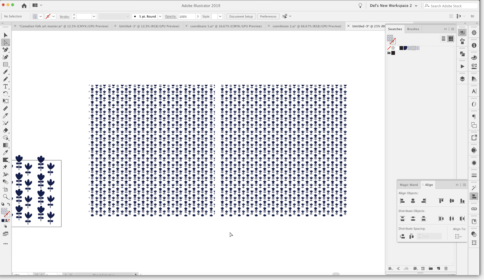
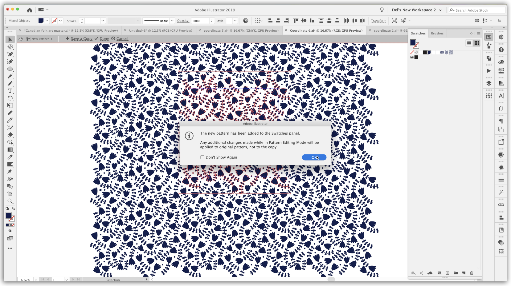
3. Using the Pattern Tool for Adjustments: I think I was walking to lessen too. So this is a lesson where I'm gonna show you how to use the pattern tool for editing your patterns. Let's get to it. First pattern that have decided to take a look at with you. Is this one here? Basically, it's the same as this one right here. It's just a reversed out version of it, but I think it's a little bit easier to tell with the white on the dark background what the problems are here. So let's copy this and copy this. So I'm gonna go make sure that I have absolutely everything selected here. So I've drag selected over all of it, holding down my command option and shift key. And we're gonna add this to the selection by dragging demand option shift dragging over yet as well. So when do copy going to set up a new document? I'm gonna set these out on 30 by 20 inch documents paste. And we've got the two parts that we need for our testing. Arrange both of those on the art board. Not that it really matters, but just makes me feel better. Okay, So taking a look at this, it's pretty obvious to see what the problems are sometimes hard to really see what Or if there are problems with a pattern. And the two tests that I used to determine whether there is an issue, our first of all, the focus test, where I just simply unfocused my eyes or squint them and take a look. And as soon as I do that, I can see the obvious banding both horizontally and vertically, and the other one is to change the scale. So basically, that's what I've done here. I've got the scale here, on the left and in this sample square. What I've got is the reduced scale version. The scale hadn't been reduced. What I would do is go to transform each which is found here, towards the bottom of this man. You and I have a short cut for this, because is just something I use absolutely so much that I can't imagine not having a shortcut for it. So for that I've got command option ship D. If you wanted Teoh, add or change your keyboard shortcuts. I've covered that in the other two classes, but basically could go into the keyboard shortcuts. You're going to go to menu commands and transform its found under object. The duplicate or the transform again was command D. So that's why I chose command option ship. You don't remember if this replaced another shortcut or not, it might have replaced something that wasn't useful to me. But that's one that I find really easy to remember. And I like I said, I use it all the time, so I would strongly recommend that you set that one up because you're gonna be using it a lot as you go through your whole collection. So just for the heck of it, let's use that command auction ship D, and we'll even reduce the scale further. So I'm going down by another 50%. So you can see here the banding even more prominently. So I actually used this as one of my strategies for checking for this kind of a problem. I always reduce the scale by 50 or 25% just to double check on that sort of thing. So, yes, it's obvious we have a problem. So the next step for us to do is to do the editing on that. I'm gonna actually move this one. It's only or did just a command X and I moved into a layer two. And I'm gonna do command shift, be that pace sitting to that layer. I'm just gonna hide it temporarily and were gonna go back and work on layer one. So what I want to do is illustrate for you by showing you again the transformation that we did on this without using the pattern tool in our last class. What we did there is we used a template tentage bread. Repeat. Because I know that this one is in a great format. Since I opened this, I'll show you how I can figure out real quick. What the repeat is my grid. Repeat template already had this this one in it. Ironically, obviously, this is the last one I was working on. The way I know. If it's a grid repeat, you go back to your main collection or wherever you've got all your swatches. If you double click on the icon of your swatch, you will see that all of theseventies for the pattern come up. So I knew that was a 10 by 10. The one that we're working on right now is the reversed version of that particular pattern . So I've got the template here, and that's because I was probably working on this one last. So if we were to look at the actual template was, Well, let's just select. You can see here that this is where the art glorious. I'll show my heart board and you can see that when I select all none of this on the outside is being selected. That's because it's their kind of like Phantom. Lee is just a transformation that if you were look at the layers, just target the layer for a second here, looking up the appearance panel and you'll see that those were just transformations on that original layers. And this is cool to know. It's because this is exactly what the Hatter maker tool does for us. It does this all automatically used to be super confusing for my students when they first started Teoh work with it, so I went back to teaching at the at the time was the regular way of doing it. That was without the pattern maker tool. So let's say in 2011 if you were trying to do this sort of thing in illustrator, you would have been using just transformation effects to create this creditable and live had and repeat. Essentially, that's what we're going to be doing with Theatre maker Tool. Okay, so let's just pretend that I've got nothing in here right now. I want to make sure that this layer still has the transformation in it. So what I'm gonna do is I'm just gonna hide this and let's bring in this copy instead. So I'm gonna select all copy. We're still in this document. I'm going to now paste it, and you can see that now it has jumped in there and become are transformed chatter. So this is exactly what the pattern maker would do. Just so you know, now I can see that there are two things going on here. I've got this little white line here. Sure enough, if I look here, I've got a white stroke on that bounding box, that rectangle. So I'm gonna go down to this rectangle down here and select it on the layers palette, selecting and take that off. And the other thing I'm going to do is I'm going to center that Let's get it close to center here, the whole pattern. And I want you to see that I'm going to just select the rectangle and I'm going to center it. So if we weren't working in the reverse, we were working in the blue on white. That rectangle would actually not be in this. You can see here that using this to try to figure out our pattern issues is exactly what he had a maker tool would do for us if we used it for editing. You can see that it repeats all the way around. So what we're gonna do instead of working with this one here, we're gonna work with this one here. This was what I made my original tile. When I'm going to copy it, we're gonna go back to that document, and we're gonna paste it here. So here, we're gonna work on getting our icons repeating in the way that we like, go back to this. What I want is the swatch. So I'm going Teoh going to copy this whole square face it in here and now it will be one of the swatches. I'm actually gonna select all of the unused swatches here and just get rid of them. So we're down to just having the usual swatches here. All we really need is thievy dark blue that we've been using for this pattern. And the patterns watch itself. The original patterns watch. So again, do that test, you know, on focus your eyes reduced down the scale, Do whatever you have to to visualize the problems that we're having with this particular pattern. I'm just gonna My art boards again were cut for that is command shift e. And what I want to do is actually bring the scale of this up to this side simply So that was about 2.5 times the size. So I'm doing my command option ship the shortcut for transform each and that's 250%. And it definitely looks close to that. So I'm gonna say OK here, actually can get rid of this one here at the moment. Since we're not going to be using the actual transform to do our editing cause we're going Teoh be using the pattern maker tool. So we've got this watch. So in here, you can see this watch has been adage we're gonna double click on that swatch. And what that will do is open up automaker tool for us. So that's the one method of getting into edit your pattern. This is assuming that you have already made this watch in one of the upcoming lessons. I'm gonna show you how to do all this before making this watch. But at this point, we've already got this watch. So we're going to just edit it by doing what I just did, which is double clicking on this watch itself. My personal, like working at about, I don't know, 20 to 25% and that you could see down here. Let's actually change it, Teoh. 25%. I find that you have a 25%. I can focus my eyes and really see the problems that I'm having with my pattern. You can see, of course, the pattern with the banding When you do that, Another method that I used Teoh double check. Something like this is I will duplicate the actual rectangle or square that holds the pattern she lets used transform each again. This time we're gonna transform the object and in large enough so it feels your screen right now, As you can focus your eyes. You can definitely see your problem here. But what I like to do sometimes is to take a screenshot. So I do commission for a get my cross hairs and I can have a preview of it. And believe it or not, I also often print off these screenshots so that I have a copy of it sitting right beside me as I'm working. Teoh Rex some of these issues. So those are three strategies that I've already revealed. One of them being in focusing your eyes, the 2nd 1 being reducing the scale of the pattern and then the 3rd 1 doing a screenshot and printing that screenshot so that you've got something actually physical sitting right beside you that you could take a look at. I have also at times pasted in a copy of it to refer to write on my screen here and illustrator. But if you do that in the pattern design tools is what happens unless you take it way off to the side. But if it's helpful for you, definitely, you know, have it there. So when you're in preview, you just do select all copy. And then you Payson. And like I said, you got to pull that off way out of your transformation zone. But sometimes that's really helpful to have it there. So let's reduce it down so that we can really see what's happening that will help us here. I think my main problem when I'm looking at this is this little area right here, that being just way to open this one, being too tight with this one and then these being in a straight rule. So I think all of those things contributes to it. Having that obvious square around the Hatton tile, everything you may prefer is to have your tile hidden. So in your pattern settings here. So I've got pattern options right here. You may want Teoh hide the tile edge, and that can be done here. The only problem with that is that sometimes you go and you're trying to grab stuff that isn't in the actual tile. You can either high the tile edge or the other thing you could dio is dim the view of the copies in the transformation that's happening around here. So I think that's what I prefer to dio I keep it fairly dark 70 to 80% because that way I can still unfocused and see what's wrong with the pattern. But know which ones are the ones that I can edit. Move. So let's just start moving some of these guys around and see what we can do to fix the pattern. So we're trying Teoh, get rid of that straight across kind of a look. I'm going to actually show my tile for a second. If you ever make the wrong move or change something on here and it's not what you want, remember, you could still use undo and all other illustrator functions while you're in here like you can copy, paste, do all that kind of stuff that you normally do. So I'm thinking what I want to do is to actually look at these edges first. So what I'm gonna do is try to toss these edges around a little bit so that I am dealing with that straight line sort of a look around the edges before I do too much else. You know that whatever you've got touching a line at the top is going to be repeated on the bottom and the sides. If you were using manual methods here, you would grab whatever's on this side and move it 10 inches over if you have a 10 by 10 square, which is what I have, whatever the distances from left to right, you would be moving that straight across if it's a great repeat. So what I'm doing now is just fiddling around with the edges here if you sure that I don't have anything in straight lines. So there's variety, and then what I'm gonna do is go through and work my way around on those interior locations and try to resolve the problems of the white space being unbalanced. I'm gonna time lapse issue can watch as I do it that keep in mind what I'm doing overall and visually refer back to this. If you need to ask, I'm working my way through so you'll notice. At times I am actually altering the size of the icons. It's totally up to you how you want Teoh deal with this issue that you're facing. The other thing I'm checking carefully for is things like this where I've got the two that are close to each other Actually, all three of these are aligned to carefully. One of them has to change in order to make that straight line less obvious. The other strategy I use that times is Teoh actually, flip a couple of the icons to these icons I've got are facing the exact same way. So I'm going to flip a couple of them here just to help to randomize the look of the pattern so you can either right click, go to transform and reflect. Decide which way you want to reflect it. And of course you can preview it. That's one way to do it. The other way to do it would be to simply let me just check which one I wanted to would be to just grab the handle on the one side and pull it over until you've got it where you want it. So remember that also, at any point you can escape out of this and do another test. Get rid of this screenshot because we're gonna have a new Swatch. Don't create a swatch. Let's fill it with our pattern. And now we've got another sample to go by a little bit more perfected, and let's just decide on what some of the issues are now for. The main thing I can see is this little area right here. Let's just reduce the scale. Let's go. 50% transform patterns, okay. And I could see that I've really helped to get rid of the striping when I am focused. My eyes, I still see a little bit kind of happening in here now it's like a zigzag, but it's still kind of a striping. So I would address that, and I would also address this little squishy part here. So I'm gonna do that with the time lapse. And let's check pattern again at the end of the lesson. Remember to access your swatch by double clicking here this open south you had earned editing tool, and in here we can deal with the problems that we had. So I think that was this corner here, and that's where I'm going to start. - All right, Celeste, you a test of this last iteration of my pattern This going here and yes, this blast watch. And I'm much happier with this than what I had originally. Sure, this little things that we could still tweak, but I think we can move on from this particular had to repeat this grid. Repeat that we have had a chance to alter. We're gonna take a look at a couple of other problems that we can avoid and ways to fix him if we've got them. So I'll see you in the next lesson.
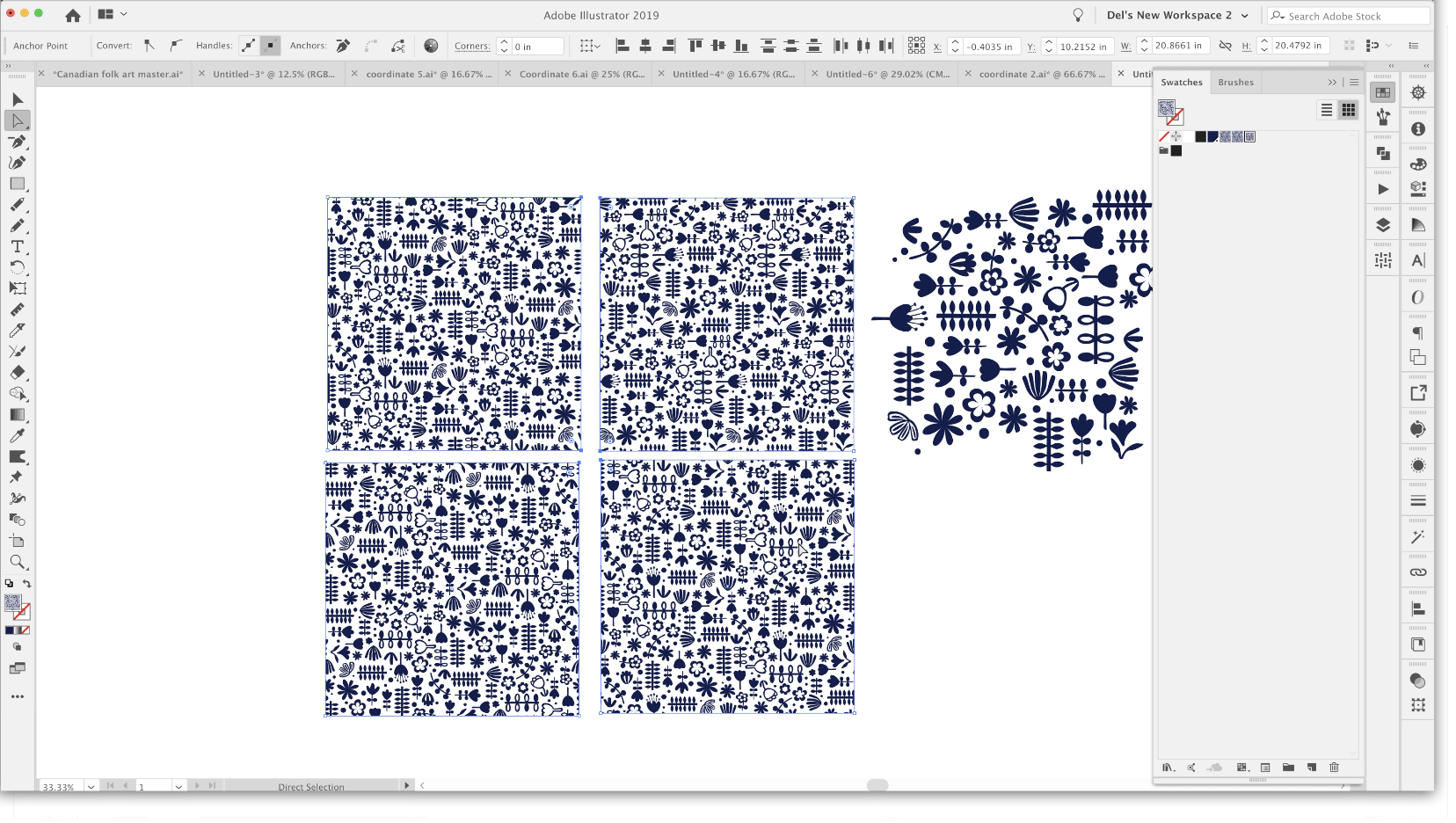
4. Balancing and Fixing Common Problems: Hi, guys. Welcome to less and three in this class. I'm gonna talk about balancing and fixing common problems. Let's get started. It's the last thing is just a little bit of housekeeping here. Not to mention in the last lesson I'm going, Teoh, actually, copy this asset with the pattern image because that's the fastest way for me to go back to my master. And if I paste it in here, it's added to my swatches panel. This is pattern number three. You can see on the art boards over here. That's the method I use for naming. So I'm gonna go in here. I'm going to go into my swatches, show them in this way in list form. I'm going to change the name of this one to co ordinate three, move it up on the list, and I'm going to fill this so that I know I've got the correct pattern in there. A last thing I'm gonna do is get rid of all of this stuff over here, dragged my ordinate three out. So I have the full swatch and take that and put it into position over here on the art board . The corresponding art board. Of course, I still have to go in. And Duthie Reversal. So the inverted version of that file. So what I would do is go back to my pattern that I've been working on it. No, that's watch. For the time being, actually, let's go into this watch itself. We're going to double click on it, select all. And here I'm going to. Instead of having it filled with a blue, I'm gonna fill it with white. And I'm gonna copy that and go back to this mountain later. This one here position that there and I will also escape out of here. Make a square or a rectangle whatever with the pattern in it which we know is this one's white. I'm gonna coffee this side nature to de select it. Really coordinate for rename this to coordinate for new version that this one up here or we replace I want to actually take a full copy of this one here. This is the one we had before this. Now that's what we had before. That's the unrevised version. And now let's fill it with the new version. I mean instantly you can see the improvement, but side by side comparison here. I mean, I could still see one or two little adjustments I would make, but overall, I think this one will definitely pass this one Absolutely not way too much in the way of errors on here. But that just shows you my whole process with something like that. So that was a grid repeat. And now we're gonna take a look at one of the other repeats. Maybe 1/2 drop, and we'll discuss a few of the things that I do to correct errors. I should have saved the whole process of fixing this main jewel hero pattern. I did that felt recording. That was after the first class before the second class. But we can definitely take a look at some of these that are somewhat revised but still need work. So I think maybe this one will be the one will work on next. What I'm gonna do is copy this over onto another document. There is absolutely no rule that says you can't work within this document. When you are making your alterations or corrections is your actual swatch. I can just double click here, and I would be back into my swatch and I could definitely work here. But I have found in the past that I have run into a little bit of trouble sometimes just with having way too much going on in one document. I prefer to go into a new document, and this is where we'll figure out whether it was 20 by 20 or 10 by 10. Think my original was 10 by 10. So let's just give that a shot. Perfect. And there is my full pattern. Repeat. So going back here, take a look at maybe copy this and we're going to take that into that new document just so that I have the actual watch. I can actually now delete it. I'll show you why. Because it is now here as a swatch and get rid of all these unused swatches. So we're left with just what I am working with, which is this particular swatch and the color that I needed? These air now considered just individual motifs. They aren't part of this watch. But I wanted to bring this in so that I could do the scaling, which would help us to visualize some of the issues that I leave I am having here. Okay, so let's take a good look at this. Now, what, in your opinion, is the first thing that you see? Let's say, just unfocused your eyes. I could tell you immediately that this bird and this flower are just not working for me. It just feels like this little area here. Let's say these items here just create too much of a dark spot. I just don't like that. So we're gonna make some adjustments there. One else do I see here helping people? What do you think? I'm thinking right here. This area off white space around. These is just also not working. There's just kind of a general imbalance that I am not liking. So we're gonna make some alterations there, and let's again do that, right? Any swatch and right in the pattern maker Tool 10 by 10. My pattern repeat. And it was 1/2 drop, as I recall. Easy to tell. Yes, that works. So now we are right here in the pattern editing mode, so we might as well just get to work, some selecting all. And I could move this into right position. Let's just get it close. actually, let's just ignore the art board. So I'm doing command shift H getting rid of the art. Bored? Who cares? I don't need to be aligned to it. And so we're good right now for what we need to do. You know what would have been smart would have been to have done that screenshot trick. So let's go back and do that. We know that this watch has been added. That's what happens as soon as you enter into pattern editing mode and less enlarged this a little bit and take screenshot. We can just copy. We don't have to open it in preview. By the way, you can just once you have it here, just copy. We're going to go back into pattern editing, So we're gonna go to our swat. You see that with see it? Just as I said, double click on it and let's go down far enough that we can paste are screenshot and move it out of the image area s So what I want to focus on is this right here? I really need Teoh make some changes with this flower, think or maybe this one and make it all work So I like that when you look at the other end over here, like this little flower, which is this one over here that seems to be working balance. Why? I think one of the ways that we can make this one work is Teoh hollowed out like this one over here. So let's give that a shot first. So what I want to do is create a compound path there. I want to have a knitter shape here, and I can see that I can actually steal this one here, and I'm just going to select it and then option drag it over to this one, and I can just adulterate and see if this is going to be adequate. So let's zoom out a little bit so that you can get a feeling for how this is working to solve our problems. So let's keep it that old squinty eyes trick and see if that works. And you know what? I think that actually does kind of work there. So maybe for a minute I'm gonna leave that there, that I'm gonna start working on these other icons here. So these three, I think I need to do some work to probably time lapse that just to make it a little bit less tedious for you and you may see me stealing little bits from other spots here. I could go back to my main document as well, and I could burrow those icons over here might be one or two. Maybe I'll just grab a couple too. Take while I'm in here. So I'm copying those. Go back to my pattern here. Let's just paste those way over here. A swell where they go somehow I didn't get the whole thing, so I'm, uh Well, let's forget it for now about this one here just in case I need and let's get to it. You're gonna see me Time lapses. If there's anything really significant that I want to share a pause and explain things fully, I should point out here that I'm in the pattern editor Steel and I can access everything that is outside of the editor. For example, Right now I need Teoh make this into a camp own path, and I can access the layers palette without a problem. So this is the group within. Here is the group that is currently a camp own path I'm trying to deal with. I'm trying to add these three items, so I'm going to just select just these. I'm gonna de select everywhere else and select thes three and drag them down to this location and number two. Select that pieces. Well, but all of these parts selected, and I'm gonna go to object, compound path and make. So now I've created the camp own path that I wanted for here. If you want further explanation of a camp own path, I did cover that in the last course. And basically what it does is it changes layered objects like yes into open shapes, just like a doughnut with a hole in. The reason that's important is if you plan to actually do any layering with backgrounds. You would need this to show through tooth background borrowing elements from that other flower with pretty fast week to go. In my opinion, do you notice there if I accidentally my move tool selected, It selects everything in the pattern. If I want to select just an individual element, I have to use my option key with my directs electoral. So a on your keyboard gives you direct, select and then use your auction key to select the entire item. But I want to do here is reflect. So I'm going to go to transform and reflect. Another quick way would be to do the transform each command. If you've got that as one of your keyboard shortcuts, I would keep this at 100. And I am just transforming this object here, and I wanted to be a copy. So there you go. Whichever way you consider the fastest, we all have our little quirky methods. And what might be fast for one person might not necessarily be fast for the next person. So you've got to pick what works for you. I'm just thinking something here. You feel like maybe this needs to be flipped as well. Kind of feeling that that might be part of the problem here. Is that this in this? This and this kind of make too much of a square, I'm sure Maybe I will try just repeating this flower first. I'm going to delete this one. Let me just work on this one for a sec. Going Teoh option shift in drag over all of these parts here to make sure I've got everything selected. Let's just group that while we're at it and I'm gonna copy, copy and paste that one and rotate it. And I'm just gonna take a quick look at this and see that makes me feel a little better about the whole thing. Another keyboard shortcut that I love and used frequently. Sides. Thank you for last two. Here is the remove anchor points, which is something you confined here under object. You pass and remove anchor points. And as you can see, I've got a shortcut for that command options shipped, period. I use that a lot. So what I've done here is I have quickly changed this flower, so it's a little bit different from this one. Instead of having four sets of double leaves, it's got three. And you know, I like that. I think this is a little bit better. Something makes me feel more satisfied now. Lost the little things in life, right? So obviously, now I need to work on all this. So if see me, go back a couple times to my original document to borrow motifs, and that's one of the great things about having all those available is for this part of the process where you could be spending way too much time and not really focusing on what you're supposed to be focusing on, which is fixing things. So I think a lot of times for me, it's really helpful to have those extra little things. And, you know, I'm looking at my original here with that really obvious striping that's going across, and I think I'm ready to test and will probably move on from this pattern in a second. So I'm gonna get rid of all this junk over here one last time, focusing of the eyes, one of things I might to this guy here with this little bitch. I was thinking of possibly moving or changing this one here, but I think I'm gonna leave it for now. Thing that was somewhat bothering me is, Well, let me just try it. So the thing that was somewhat bothering me about it is the fact that this big flower, its little flower here, are moving in the same direction. I'm gonna just make sure you got everything selected and that it's group. That's one thing that can be difficult when you're working at such a zoomed out position is that it's sometimes hard to select things and that group from now I'm gonna do my transform each and let's just try this and I don't Do you think, Does it bother you more than it was heading in the same direction? Is this one or that this one now is too much like this? Let's maybe do this instead and change the angle that could work. So that's one of things that's really nice about being in the transform. Each dialog box here is that you can do some of this kind of stuff. Batch helps you make alterations that could be done all at the same time. I kind of like that. I'm gonna move. That went up just a little bit. And me do these, you know, helped. I made a copy of it. I can get out of this, and now I want to do a side by side comparison. This is the original, and this is the new version. So if you want, focus your eyes here, I think that we have been successful in resolving some of the issues that we had over here . I think I could still do a little bit of work in this area here. These flowers. I'm seeing too many things of the same size. But overall, I much prefer what we've got going on some slight adjustments. I'll do those off camera and we'll come back in the next lesson and I'll show you the final revised coordinate to pattern. All right, I'll see you the next lesson.
5. Toss Pattern Pitfalls to Avoid: Hi, guys. Welcome to lessen for in this lesson, we're going to be working on a toss pattern and I'm gonna show you the kind of things to look for and how to fix the problems. Let's get started. This was the very last one that I did. And the next one that I have chosen to work on, that I felt like I needed a ordinate that had a little bit more structure and some of these other ones I have. But I didn't want it to be just a straight stripe, like a couple of the ones I've got here. So I came up with this combination here, and we're going to do a check of it. This is a toss pattern. So it is supposed to work in all directions. So we're going Teoh, check that out. First thing I want to do is take a look at it at 50% size, and then what I think we should do here is make some copies and check each of the directions. So I'm going, Teoh, use the transform each again, and I'm going to keep the scale at 100. But we're going Teoh, rotate by 90 degrees and I'm gonna make a copy. So we're gonna move that one out of the way and do the same thing that went out of the way and the same thing again and move that from on top of that one. So we've got each of the directions here, and I mean, it's almost impossible to meet. You really have to look close, right to see that these happy and turned at a 90 degree angle. And that's because I've kept a lot of the icons in here at 90 degree angles to each other. So on first glance, it's not too bad. But when you really check it out, there are a couple things that kind of aren't working for me here. So to be truly able to work in any direction, we really need to do a little bit of work on. Let's say some of these thes four here, for example, are all facing the same direction. I would rather have some of them changing a little bit here. Uh, I've got If I am focused, my eyes a little bit of an issue with this area here because of the negative space, possibly this area, so there's a little bit of work to be done in those now. I'm not gonna go through and explained every little step to you because I think that just by observing will learn a lot more. So I'm going to time lapse this and I'll come back at the end and will do just in comparison to see how this all work out. All right, so double click on my swatch, I mean pattern editing mode, and away I go. So before I go into pattern editing mode, I am going to take a screenshot of one of these. It doesn't have to be all of them by any means. I think I'm going to screen shot this one because I think that one shows me more on what it is I want to correct. So again, I can just open up my screen shot here coffee. I'm going to get rid of that. Go to my swatch DoubleClick. I mean pattern tempting mode. I'll paste. Move that off to the side so it's out of our transformation area, and I'll get to work just to point out here. I want to rotate this a little bit more Jozy last retool to just select those points and I can use the rotate tool Now, that way I can independently move just a few of the points here. I'm gonna hollow up this flower. So it is a camp own path. And what I've done is assigned no ill to which I've got a stroke. That's four points. I think I need to be Oh, probably at least six points. And I want to make sure that I align it toothy outside just because in the flower doesn't get all distorted. You can also make changes here on your caps or your corners. I think I'm good with it. The way it ISS and I'm gonna expand, I'm going to just make some slight adjustments to it, so it doesn't look quite so symmetrical. So I'm just kind of pulling individual points, changing things here and there. So I'm going to also expand the appearance because right now it is still a stroke pound and expanding appearance will allow me to adjustments on that outside stroke as well. Aren't that outside now? It's a shape, not a stroke anymore, and a really fast way to do that is to just simplify it. So originally had 21 points. Even if I put this at the maximum, I reduce it down to 11 points, which makes that a lot easier to edit. Number one and number two is it makes it look a little bit more hand drawn, like my other elements. That was kind of look, I was going for a little but of adjustment needed here and there. But keep that as a corner point. You could individually move besides by holding down your option key, and that kind of makes a nice, sharp angle there. That's for me. This one will also change slightly. And like I said, I want to keep those a little bit hand drawn looking. I don't want them to be perfectly symmetrical. I like that better. Definitely. Let's work on its position now. My option dragging over it. If you ever want Teoh, move your items around without having all the handles on them. Remember that you can do command H, which hides the edges, and then you can make your adjustments. Just remember, you've done that because it's pretty easy to forget and then be trying to select something and just be like, Oh my God, What's happening against selected eating? So I always try. Teoh said it right back immediately so that I don't forget getting pretty close to being done. What? I wanted to get done here. So I'm going to just make a few last minute changes and then I'm going to show you a comparison of or different positions with this tile rotating it 90 degrees each time we'll meet you back here in a sec. - Okay , So I think I've got what I would consider a finished pile. So I'm going to save a copy of that. I'm going to name this one. Your pattern three escape out of here and then about thes squares here for comparing. I'm going to select them all along with that third version and just take a really good look at it again. And I'm actually pretty happy with that. I feel like I've addressed most of the problems that I felt were there in the first place. I've got these all in different directions, and I think that they're reading nicely as being a multi directional toss pattern. So one thing I forgot, Teoh, I don't think I mentioned even at the beginning of this particular lesson was that this was a viral patter and that the offset was half brick and that the size was 10 by 10. So I just thought I'd mention that and the course at this point I'd go through the steps of copying this over to my master document and saving the pattern out there, which I actually just did when we were off camera. And so this is the pattern 14. So I just want to make sure that you saw I had done this. I think this one is now considered done in my books. So I will meet you in the next lesson where we're going to work on another problem. I will see you there.
6. Removing Pesky Diagonal Banding: Hi, guys. Welcome Lesson five in less than five here, we're gonna deal with diagonal banding. Let's get started. So this is the next one we're gonna be working on. Coordinate. Six. Now, this one king at it close up is actually quite pleasing. I feel like I've got most of the negative space balanced, but I know from experience that looking at it at this size cannot always show all of the problems. So I've got pattern placed into this larger square here so that you can see issues that I'm facing. So take a look here at the small one. No, not that obvious. Big one. Yes, Super obvious. So we've got this terrible banding that's happening, This diagonal banding. We've got negative space issues in here, in here. And then this huge thinking here it in a home. That's not so. We're gonna do a little bit of work to address that Now, I've already done the repair that I wanted to do in that spot. So here's a look at it. So I've got that big heaping area filled here, and now what I need to do is just deal with this diagonal banding Now one of the issues that you face when you're working on a white pattern. Is that when you actually get into thievy nitty gritty of it? Take a look here. We've actually got two layers going on, so I've got thieves. Just take a look at one of these groups. The one that I'm looking at right now. Is this smaller one here? So I'm just gonna hide those two, Actually, let's look on a bigger one with the white pattern. The problem I'm facing is that when I go into the editor, this is what I'm going to be looking at. So the way that I deal with this is that I'm gonna actually get rid of these two. We're gonna go back to our pattern tile, and believe it or not, these are the pattern tiles here. I'm going. Teoh, drag that pattern tile out. Doesn't matter. Really. Five position on the art board is matter of fact. I'm just gonna hide the art board. But you could see here that it's white, white on white, so that's not gonna work. Dress. So let's go back, Teoh. This I'm gonna select everything. And the problem is, if I feel this right now with a color. Let's just go back, Teoh, filling it with the indigo or navy color that I've got. This happens because I do have that background square, so I'm going to actually go into my layers right now. This is the problem square here for now, we don't need it. I'm just going to get rid of it. And we're left with the pattern that we want Teoh work on. So this I'm gonna actually make a new pattern out of it. So I'm gonna make my 20 by 20 half drop, and we can get to work on trying to fix the problem. So it's very easy to see when we zoom out a little bit that the problem is right down here this entire row. So you're looking at the main image area, the tile that we're gonna be working on. You could see the actual band going across here. There's a couple of reasons why I've done the 20 by 20. And one of the things is I want to really be able to hide the edges of the tile and I feel like with a lot more motifs to work with here I'm going to have a lot more freedom. Teoh, make that really seamless. And I know it seems like a lot more work at this point because you're having to move a lot more motifs. You will end up with a much more pleasing pattern in the long run. So I'm going to just start making some changes so that you could observe as I get rid of this banding line that I have going on here. All right, here I go. If ever you have something like this where you want to make some adjustments on one, but the other one is certainly interfering. I'm trying to select with my last year just temporarily locket command to locks it. And then you can select what you need to select without any interference. And I'm going to use my remove anchor points shortcut, which is command option shift, period. Another one that I would strongly recommend that you all I feel like I've already really made a lot of progress here. I'm combining two of my leafy branches to make one nice, long one. I'm just going to select them both, use Pathfinder to unite them, and then I'll just take a really good look at it. Make sure that there's no goofiness happening here. I'm just going to use my last you tool to select extra points and my command auction shift period to eliminate anything extra. If you were in my last class, you probably saw me doing this, but I'm going to show you this again. I'm making this smaller, and I'm going to use my work tool to help me reshape this particular flower. No, I don't think I'm gonna use that. That is an option. But that's not gonna work for me this time. I think someone I'm gonna use is my puppet work tool. So it has made a mesh over the entire lower that I want to make adjustments to actually going under for a second. Go back to the main size that I had because that was a good balance size. And now I am going to make some adjustments, so I'm pitting it in various spots. Teoh, hold it steady and then using the tax to move it around a bit. Have used this in several of my other classes. So you may have already seen me work with this, but I know that I haven't used it at all in this particular Siri's. So probably as good a time as any. So I'm happy with that and I'm going Teoh, expand it, just to be sure. And at this point I can go in and make any other sort of adjustments that I want to make. I can use the widgets, or it can use the invert selected anchor point too old if need be. I could go in and eliminate points, but I am being much figure than I need to be because overall what I wanted to accomplish, I accomplished. So it's getting good here. You'll see a little bit abandoned going on along this strip here, so I just got a little bit more work to do here. I think two of the things they're contributing to this still looking like it's banding across here are the white space or negative space that I have going on in this area, and then the positioning off this and this flower. So those are the two things I'm gonna look at right now. Thank goodness for these dots. They are definitely a saving grace here. I'm really getting to the point where I think I just have a little bit more to go. I think this is the spot where I can use that work. Just adjust the arc of this one a little bit. Remember that after you've made the work, you still have these handles that you can play around with the lock This going these anchor points and handles really come in handy when you are trying to work on the shape of something without having to move individual points. What do you think? Pretty much there, I'd say. So I'm going to expand this one. I'm gonna go to envelope, distort here and expand. So it's a different expand than the one you see up here for the warps. You have to go here and know that I've expanded. I can work on those leaves a little bit. Okay, so I think I'm pretty happy with this now. Probably a little bit more could be done. I'm sure I will notice more things here and there. But overall pretty happy that I've gotten rid of the really obvious banding that was happening. And I really like this s curve kind of thing that's going on with the pattern. I'm gonna select all and copy. I'm actually going. Teoh, save a copy of this pattern. This will be the fourth the okay and escape. And let's just do a test, Swatch and yeah, I'm happy with that. So we've resolved another problem. Thanks for your patience and watching all that. By the way, it really is a process. Okay, so let's wrap this lesson up and I'll meet you in the next lesson. See there.
7. Symmetry and Vertical Lines: Hi, guys. Welcome to Lessen Six. And this class, we're gonna deal with vertical lines, balance and symmetry. Let's get started. This would be a perfect pattern where I could illustrate the symmetrical and vertical line issues. Okay, at first glance, this looks pretty balanced. You would think, Yeah, that's good. Definitely passes, but let's make a pattern out of it. Now. I'm going to do this as a grid repeat 10 by 10. And I could see already one of the issues is this left side not matching up with this right side. But let's follow through. So I've got the pattern added to my swatches. Let's create square and fill it. And you know, you can see the issues here, though obviously that left and right side are not a line. So let me just get rid of that completely. Let's try it again. Not bad looking pretty symmetrical. Let's change the scale of this. Now, though, I am going to go down to a 40%. Not the object, but the pattern. No angle and let's hit. Okay, So what do you think? I've reduced the scale now, and if you unfocused your eyes, you can definitely see a line running across here and it almost looks like there's something. There's something in here and I can't tell what. But there's one of these looks like this one here second down in the third role is not aligned, so that kind of throws that off a little bit. I'm not sure how, but you can really see it when you unfocused your eyes. So I'm going to get rid of this pattern Swatch, and we're gonna do some more with this pattern to make it perfect. So you can't really rely on your eyes to do something like this At this point, you would swear it was perfectly symmetrical, but it obviously was not. And there was something about the distribution of the rose that was throwing it off and creating that sort of, ah line that you see across If you look real close like here's who were them aren't space very well. This one thes three should be perfectly symmetrical, and they aren't. So we're gonna do a little bit of work to straighten out this pattern. What I will dio probably the fastest is to start from scratch. So I'm going to get rid of all of this extra stuff here, and we're gonna have just these two rows that we're going to deal with. I know that I definitely need them to be aligned vertically. So I'm going to select the mall and go to my allying tools, and we're gonna be using these quite a lot. So let's just swing that out. I'm going to make sure that they're perfectly center to each other. That well, seem to be OK, unless you're that role. Now, that role seem to be all right too. So it was in the additional roles. Let's go back, actually, and let's check all of these. So let's go for alignment of all of these, that one was okay over alignment of all of these, those were okay. Those were OK. Those were okay. So it wasn't in the alignment that the problem existed. So what could it be? The only thing I can think of is that the distribution of the elements within the space was not a symmetrical as I had hoped. So in order to resolve that problem, I'm going to use the align and I'm gonna use this distribute spacing to fix things up So the first step is Teoh duplicate on each the fifth item, which will be exactly 10 inches down on this side. I'm going to use the move command as long as I'm on the move tool or the selection tool here. If I press return on my keyboard, I get the move tool, and I'm going to move that down by 10 inches. I need to have a copy. So now I've got the five items and I need to make sure that what's within, like all of the I have to make sure that they're distributed evenly. I'm selecting them all, and I'm going to align to selection. And I'm gonna hit this vertical distribute space and that will make sure that they're perfectly distributed. So that one was correct. This one we're gonna use. I'm only selecting the one I'm gonna use the move to again. We know the settings were correct. And now we've got the 10 into. Repeat. So again, I'm gonna select everything here. I'm going again. Hit the distribute vertical space button. And now those air perfectly distributed. So that's great. Now all we need to do is duplicate these cross. We need to make sure that this particular role is exactly on the 10 inch line here. So let's select the whole line and we're going to get the move to again. And this time we're going to go 10 inches horizontal zero vertical, and we're gonna make sure it's a copy. We've got the original. We've got the duplicate. And what do you think? Let's just eyeball this guy. You know, he has to be around here somewhere, You know that These two have to be over here. One more. Roll these and looks absolutely perfect, right? Well, it is not. I can guarantee you that it is not. What we're gonna do is continue to make use of that distributes spacing. And this time, we're gonna do it by distributing each of these vertical rows perfectly within the space that we have there. So in order to do that, we need to group each of the rose. So I'm grouping this one electing this grouping. I'm holding my commanded option with the direct select tool that makes sure that I select everything within their within the group. Still, everything is selected. That's group. Everything is selected that's grouped and hear everything is selected and grouped. So now the next step is to select all of these. And the reason we group them is because we want illustrated to recognize these as singular items. If you were to look in the layers palette, you would see each of these is identified as a group gay. But now we want to select all of the group's. I'm just gonna select by targeting all of them here. So I know I've got them all selected, and here we're going to distribute the horizontal space and you're going to see at least slight movement here. We know we're perfectly aligned. If we had left it, I want to do a little test year. If we had left it, let's just make this into Let's watch. So if we had left it, that would be our swatch. Now I'm going to select them all and properly space some horizontally, and then let's make that into a Swatch. Actually, before I do that, I'm going to actually get rid of this extra role here and this extra role here. That's all we need for our had and repeat anyways, so I'm gonna do the noose watch make sure that we've got it. You can buy Tan it escape. I'm gonna do a comparisons. Watch here for both of to compare both of them. So I've got to watch is drawn. I'm gonna put the good one in there for the bad one in there. And let's just to do the reduction. So now, when you take a look at the two and this is reduced by 40% in scale, you can definitely see this vertical distribution problem that we're having. This one is much more balanced. And although you do see a little bit of a horizontal line here definitely improved it from this one. So that's what I was wanted to show you. And I want you to just know that that's a good way to make your patterns more symmetrical and more balanced using this distribute spacing feature. So I'm gonna get rid of these two tests watches, and I'm going to focus on this one here. So what I'm gonna do is, rather than work with this and this, unless I can leave because we can use it later to test again gonna put that on its own layer. I'm gonna get rid of all of this because what I want to do now is use the pattern maker tool to dio further adjustments. So I'm going to double click on that pattern. And in here I can still Duthie distributing or anything else I've been doing to fix the errors. So I'm gonna check that again as faras the grouping. This is grouped. This is grouped. Another way to tell would be to still look at the layers palette. All of my groups are here intact, and I'm going to select all of them right here within the pattern maker tool and distribute the spacing. Now, one of the other things I noticed was some kind of a problem here where if it's an optical illusion or what? But doesn't this space look a little bit bigger to you in this space? So I'm gonna take a couple minutes to figure that problem out. So what I've done is I have duplicated the icon here and now I'm going to select all of these and I'm going Teoh, distribute them again vertically. I guess it was an optical illusion because it is fine. Get rid of that. And I'm thinking that one of the things that would improve my pattern here would be to these are not 100% symmetrical themselves. The flowers. You see that? That this if you look along this tile edge that this has a bit of an angle to it as they move their way down on the line and also the right side and the left side are not the same . So what I'm gonna do is go into my layers pallor and gonna hide thes rules so that alternate role is here. So I've got all of these selected here. I'm sure they're completely selected by doing an option shift drag over them and we're going to use the align tool to align them horizontally. And then I'm going Teoh flip this role vertically. So I'm going to use command auction ship D to go to my That's for each. I want the scale to remain 100%. I want to transform the objects and what I want to do is reflect them on the X axis. So now what I've got is a mirror image happening in the alternate role. Then we're gonna do is go in and hide these three and show these again. I want to make sure that they're perfectly aligned horizontally. So I'm gonna line them up along the tops and I want to show all of my rose just to see how I like the drop happening here. In this case, this is a perfect example of one where I do want the diagonal to be lined up. I want perfect symmetry here, so I'm just gonna slide those down a little bit. So we've got these lining up at a good angle diagonally face have done a few other little alterations here. Also do the flip on the X axis. I'm going to select those three groups again and make sure that they're distributed evenly , horizontally, and let's escape out of here and do a test on that pattern. So I like that feels a little bit more balanced to me. That's reduced the scale on the pattern, not the object. And I am happier with that. Tried here with the even more reduced scale, and I really feel like that helped with the balance. So instead of being, you know, just two rows together that make a pattern, it's before because you've bought those alternate flipping motifs, and overall that gives a much more pleasing all. This is gonna be a bit of a time lapse here, showing the addition of a dot to help with what I consider a little bit of a problem with the white space. One other thing I wanted to point out to you is that when you are looking at my patterns here and you see banding of any kind, I may not be seeing that on my screen. It could be just the resolution of the monitors that affects it. So make sure that when you think you are done, you're at your final final stage. Print off your patterns with the largest paper you possibly can, or print it off in tiles so you can put them up on the wall and take a good look at them from a distance. I find that that's a really good last check to make sure that you don't have any of the banding or striping happening diagonal bounding any of those kind of things. The resolution of your printer will be a lot higher than what you're seeing on your monitor , and that is just a good way to make sure you have resolved all of the issues. I really quite like it now with the DOT added. So I'm gonna definitely take this and put it back into my master document. And we're gonna take a look at one more pattern in this lesson, symmetry and vertical lines, and I'm gonna pull it up on the screen and let's get started right away. So this is the other product I wanted to take a look at with you. I find it quite nicely balanced. Vertical lines are looking OK. White space, I think, is adequately balanced. I'm not noticing any super dark spot. Super light spots. I really like how this has worked out. So the only thing that bothers me about this one is the Let's just reduce the scale here and I'll tell you a little bit more. So the only thing that I found that really seemed to bother me when I took a look at it was the, um, I don't know if it's not really easy to explain, but what I'm feeling is like everything is leaning a little bit, so I find that the angle of the motifs is too balanced and I think what needs to happen here is that alternate rows of the dominant maybe this dominant role that you see causing a little tiny bit abandon on this. I think if I was to flip alternate rows, it would make a difference, and I might change one of thes multi peddled. Don't you know what to call them? Um, this one right here. Let's let's say it's, Ah, succulent, that one. I think there's just too many recurrences of the use of that I like in a pattern, but I know that it's causing a little bit of banding, so we're gonna make changes to at least some of them. So let's pull out or that's actually double click on the patterns watch so we can take a look at the whole thing here. I'm going to hide my art board, and I'm gonna hide my heil edge. So what I'm thinking is this role here with this dark five petaled flower? 1234 ou five pedal power, I think, but alternate rows here need to be flipped. I mean, that's gonna help a lot. So I'm just going to select that. So basically, it's this So this one, I think if I was to flip it so I'm going to use transform each and I'm going Teoh, transform the pattern. Okay, I want to make sure that this is completely grouped before I start so that it's easier to select from selecting this whole role. Including that one Don't want this guy. So this row is selected. So what I'm gonna do is the transforms each transform object Onley reflect on X and preview . And I think that's gonna help quite a bit. And then I think what we need to do is change one of these three here. What I'm thinking is, I'm going Teoh possibly eliminate the inside of this one. And then let's take a look at that overall, what do you think doesn't help? I think I'm okay that I think maybe we need to thicken up the lines here a little bit. But other than that, I think this may have done the trick. So let's just first of all, I'm going to select that float side shape and simplifying so we can go to It was originally 47 points, so keep an eye on this section here. I am simplifying it. But I can still go to the maximum here, and I've reduced like a lot. Looks like almost 1/3. That's gonna just make it easier for me to make the alterations that I want. So I am selecting whichever way is easiest. Remember, your shortcuts plead to add a point just the plus sign. And I think this is pretty much going to give me what I want. So I'm going to save a copy of this and say, OK, the noose watch has been added. I'm gonna escape on here. And let's change to that second swatch here, and I think that's helped for me. What about you guys? I think that is satisfying me at least enough right now that I can end this uber long lesson and we can move on Teoh our next lesson. So one more pattern pretty much ready. So that makes about 55 or six that we've done. And you've now been a part of the entire process. In the next lesson, what we're gonna do is just wrap things up and talk about moving forward with your pattern design and doing successful critiques on your own work. I will see you there
8. Outro and Wrap Up: Hi, guys. I'm so glad you made it through the entire class. I really hope that this has helped you to figure out what to do when critiquing your own patterns. I'm also hoping that this has helped you to figure out how to deal with those problems. Now you know how to perfect that whole collection. Please take the time to do the project and share what you have learned. I'd love to see some of your patterns. Maybe the before and after That would be awesome. I know for myself that looking at this kind of thing really helps me with my pattern design . So I'm really hoping that you and other students share here so that we could all learn from each other. If you have a time check, help my to Pinterest sites. One is Delores Art. The Lord's Nah sprint. And the other one is Teacher. The Lord's NASCAR it on there. I've got ah whole lot of reference and resource is for you for both pattern design and any other sort of art that you dio If you happen to share on social media, please tag me. The Lord's nascar aunt slash skill share I'd love to see what you've done and do check help my instagram site as well as my Facebook site. Also, if you want to take a look at some of my work, check me out on my different stores. I've got a store on Zazzle. I've got one on art of wear here in Canada and, of course, red Bubble and society six. I'm represented by out of the blue licensing so you could check out their site as well. Thanks so much for hanging in there. And make sure you hit. Follow if you want to receive information about my classes as I published them. And yeah, thanks for having joined me in this class. I love to see your work and I love to see returning students take here by Fidel.
 Delores Naskrent, Creative Explorer