Transcripts
1. Intro: Hi guys, my name is Dolores aspirin. I'm a graphic designer, illustrator and surface pattern designer living in sunny Manitoba, Canada. So I wanted to create a pattern and a class based on sea life. And the reason why is that, it's just so inspirational. I'm going to show you a few little video clips of my last trip to Florida. And that was earlier here in 2019 and we're about to head back there. You'll see why I am so inspired by it and planning on going back to the aquarium and walking the beaches. But I decided I would do at least one pattern before I go. We were fortunate enough to get to visit both coasts. We were kind of in the middle of Florida. So we spent some time on the Gulf coast and we spend some time on the Atlantic. I was lucky enough to pick shells, see manatees, see dolphins. I saw tons of jellyfish washed up on the beach, as well as seeing them in the Florida aquarium at Tampa. Talk about a feast for the eyes. Any artists would be just like mind-blowing, going to visit there. Here's a couple of the shells they picked up. Of course, the kids and grandkids help themselves to the big ones. I actually hit a couple in my traveling home so that nobody can get their hands on them. Anyhow, it was a fantastic trip and I'm just so excited about going back there. So I wanted to take that enthusiasm and make it into a class. So the first thing I did was imagine what kind of brushes would work best to really illustrate shells and coral and that sort of thing. So the first part of this course will definitely be based on making some new Illustrator brushes. It's completely different than anything we've done in my other courses. So if you've done the other courses, perfect, you've got a great basis. And now we're gonna go in and do something completely different. We're going to use brushes to make more brushes. Once we have our brushes all squared away, then I'm going to show you a method to put together the pattern tile that's probably a little bit different than what you've seen before. We're gonna do this crazy sort of a half drop scatter pattern that's super fitted. Okay, so we're gonna do some manipulating once we get all those brushes and shapes drawn. I'm really excited to get started. So let's get to that first lesson. Alright, I'll see you there.
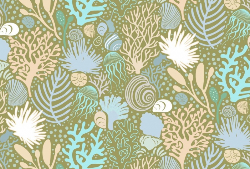
2. Complex Brushmaking with Brushes: Hi guys, welcome to lesson one. So in this lesson we're going to do some kind of complex brush making with brushes to create new rushes. Crazy. I know. Let's get started. So I wasn't sure that I was going to be actually producing another class before leaving on our trip down cells, I really wanted to spend this last couple weeks really packing properly, but of course I couldn't help myself. And here I am with another course prepared. The project I was thinking would be really fun for you guys to do is to produce a pattern like this. Overall, it's really not that difficult to do. What I'm thinking is I'm going to give you this brush set and so that you can create this artwork. And we're going to kind of do it in a step-by-step way and we're going to add a few extra brushes here. So how does that sound? Does that sound like fun? I figured it would be something I could record really easily in quickly. So first things first, let's talk about creating some of these initial brushes. I'm gonna take a look at these seashell brushes here, and that's what I'm going to create. So I made this document here that has a bunch of the shells that I'm thinking of using. What I'm gonna do is show you quickly what each of these brushes looks like when I paint with it, must be waiting on, oops, sorry, black stroke. And these are just a bunch of the basic brushes that are used to create some initial IRB works. I'm going to select the unused brushes here now and delete them. So in the case of some of these, I actually trace them. I did a little ink drawing and then I Auto traced and came up with these shapes. Since we've done a couple of things like that in previous classes, I won't do the auto trace with you. I'll just talk about what we're gonna do now with these to create the brushes, I'm going to actually show you this brush here because it's this one here are similar that I used to create these shapes here. And you can see this other little shell over here, and it's a few here that you will recognize from my other document. And I just want to show you how easy it is to create the brush. So let's take this one for example. I've already simplified the shape. I'll just a quick refresher. These are all quite simplified as it is. Will it be checked for one that might not be simplified yet because one does not look simplified. So what I would do my shortcut for simplification, which is command forward slash. If you don't have that sets, I would suggest that you do site yourself a shortcut bus here. So I set mine to be command forward slash. You can set it to be whatever you want. I uses so much, so that's one of the ones that I have automatically and persistent on all my documents. And other one I use a lot is the command period for remove anchor points. I know I'm the one who put that in, so that's something you could also add. So let's go into that simplified dialog box. Before we do, I'm just gonna take a look down here and just noticed, or I know what I did. I drew a line to get consistent smooth edge and I just haven't gotten rid of these extra bits. Okay, let's do that first. That went off completely. And when I got here, sometimes you'll take it up real close and check these things to make sure you haven't got any extra things that you don't want. And I can see here I also want to bring these to appoint. So command y brings you into this wireframe mode, and it's a nice way to double-check your files. Okay, and I got some funky going on here. This is obviously supposed to join with that here would be a good time to use this cool Join tool. Okay, a couple of Very minor little repairs error from here to here to join, I'm gonna use command J and I'm going to change that curve a little bit because a smooth point selected and move it a little bit closer in. And then just correct that. Idealistic a look at that and get rid of this point K, I have corrected that whole shape adequately. I'm ready to do my simplification, so I'm going to use the manpower slash and it has reduced it to 81 points. But I want to take a look at the whole panel. So click on those three ellipses that you see there when it comes up and it opens up this panel. If you have Preview on, you can toggle back and forth and see how much of an improvement it gives, how you've reduced the amount of points. To me, it looks like I've probably done simplification once already because it's probably the minimum amount of points or close to it. Play around with the settings here and see how your preview looks. This is the before and after. So it has changed it from hat on here, lower I go course less true to my original shape it is, but it has reduced the amount of points. So in this case, I'm really not gonna make any changes. I think that's adequate for the brush. So I don't know if it's any one of these here, like maybe this one where I could do that simplification and it's changed. It's considerably here from 319 points to 75 points. The reason you do that is to have your brush a lot more efficient, especially if you're repeating it a lot on an artwork. So it's always good to simplify as much as possible. Remember to toggle to see if it looks okay. And so in this case I would say okay, and I see here that I want to get rid of this extra little bit here. And I'm going to use Pathfinder two minus the front. So that's subtracted out of that shape. The other lines are still there. They're just in behind me, are still there. And now look at how many points are, are here. Let's just simplify this shape. So it's simplified it considerably. These need to be moved. And so that nicely simplified, lots of points removed. And now let's make some of the brushes. So what I would do is select the brush, show my rulers command R, bring out a guide and rotate this so that I would be drawing from top to bottom. Okay, now I would pull that into my precious palette or brush, okay? And I'm going to draw it from top to bottom, from the flared part of the shell to the pointed part of the shell. At this moment, I'm going to leave it fixed. I could change it to pressure because I use a stylus. But I find in most cases with this kind of an art brush that having a pixel size is better for what I do. And I think I'll produce it in size and always change it to chance so that the brush can be coloured. Okay, let's give it a test run. Brush beat on my keyboard. And there I can see that I can draw quite nicely without little shape. Now what I also do, as I say, if these out as scatter brushes, I'm going to drag it into here. I'm going to, happens is a scatter brush. And I'm gonna say, okay, brings me into a similar dialog box, fixed size. I'm going to leave it on fixed, but I'm going to reduce it down to about 30%, again pins. And the reason I want that rush as a scatter brushes, wow, is that I can then use this almost like a rubber stamp. So I select the brush before brush, click once, and just like a rubber stamp of created duplicates. So both processes are very useful to me. Hearing just, just used my Pathfinder to even out that edge by putting a pen line in first and then just using the divide function to get a nice clean edge up here at the top. It's double-checking some of these and getting rid of some of the extra points manually just so I can reshape it. I don't want anything overlapping for touching. Like you can see here, this almost touching. So this is one that I would move over a little bit. You can see that I've got some snapping on here. So I'm going to turn all this off. And I'm going to turn off my smart guides as well command you would turn off the smart guides. Ems can eliminate that one. Kinda don't mind the irregularity on this side. You could put in a ton of effort on these and have them all absolutely perfect. I am going to give you this brush set to fool around with, and I'll give you this document as well so that you can make some of the brushes that I didn't make, at least the line art is here. And just know that what you'll have to do is go in and probably do some of this fixed up before you make the actual brush. And just make sure that you do the scatter brushes. Well, you won't regret it. Something that can be very useful when you're trying to fill in your patterns. Note that I remember too. I don't remember if I did tints on this one. So I want to be able to colorize them in the next lessons. So I'm going to always make sure that I do that. So you know what to do. If you wanted to draw a show like this with a little wavy edge. I know that the wavy edge brush is already here and this one here. If you were to change it to white for the stroke, you would be able to go in here and add that little wavy line and wherever you see fit. And you could use it and this one as well. So just wanted you to know that that brushes there and available. Alright, so in the next lesson, we'll do some of this composition. I'm going to show you how to use some of these other brushes to create this sort of a coral and these different types here based on the brushes that are in the set. So we'll take a look at those brushes and how to use them. And then we'll start working on the composition together. So I'll see you there.
3. Creating the Tree Coral: Hey guys, welcome to lesson two. So this is the first lesson where we're going to do some drawing and we're gonna create this coral trees. If I wanted to let you know how to use this particular kind of brush set. These are the brushes that I've included for you for free. So you can take those out and give them a try. And what you're gonna wanna do is go to your brushes and the brushes File menu, and then go to user-defined and locate wherever you downloaded that brush set. I'm going to save this so you know exactly what I would have done and what you can do after you have your brush stat complete. So you go to see your brush library. I'm gonna see if it Here in the folder that I'm creating for you, for assets, and I'm going to call it roll and see life pressures. So these brushes, it'll be named this exact way when you go to upload them, I'm going to save them right now. And then I'm going to show you how you can access them Asal now, I was going to be loading that if I was you, This is what I would do. I'd go to user-defined and then I would go to other library wherever you happen to have downloaded those brushes, that's where you need to look. So I'm gonna go to that folder that I created. I'm going to hit open and then you'll see that all the brushes are there. Now, what I would do if I were you, is to then just select all of the brushes and hit this. It says Add two brushes and they would show up here if you wanted them to be available forever and ever every time you open up Illustrator and on persistent, I only just open up the ones that I am going to be currently using for a particular project that I don't have a huge library here, but just the relevant ones. So that's what you would do. I will have added more to this set by the time you get it and download it. Obviously, the ones that I've created in this document, I will do the same thing to save them, save rush libraries, this is where it would do it by default on my system. But I'm going to save them where I find them to upload for you. So I'm gonna put it in that same folder and I'm going to leave this one as shells. And so then if I was back in this document and I now wanted to load them, I would go to open brush library and find that set and ready to go to other library for the first time that I'm opening it and I'm gonna go to the folder where I know I've saved him and go into shells and click Open. And then those brushes I created with you earlier are here and I can add them. So I could choose to just select those that I know are new and then hit add your brushes. And now this set has those brushes. When I'm completely done, I could choose to then output this as one big sat instead of having two separate sets. But we'll talk about that in one of the upcoming lessons. Okay, so I wanted to show you how to use these brushes. So when I was creating that, say this one here, I believe I use this brush here. Actually, let's start with just a basic kind of a trunk. Your streets rush. So I've got that one at a fixed size. So those are two distance same brush, they look identical except to different sizes. But I'm also going to change this one to be controlled by pressure so that it'll range from 60% to a 100 and let's say 200% Esau on how hard I press OK and I want to be able to pull it in that direction from Purdue. I left school from school from thin to thick. So I want to go from the thin edge down to the thick edge and for some reason didn't have it on tints. This one's not either no, that one's rate. Okay. So this one wasn't but it is now. And then I'm just going to show you if I have to change to have bought and you'll notice that I've got animals open here that I'm going to use a lot during this particular project. And you know that you can do that. I say I was going to use this as my layers palette. If I wanted to, I could add it to this column is have to wait tc that Lou line and it'll add to it. I know for sure that at some point I will be needing that and I won't want it open over top of these, so I'm putting it here so that I'd be able to access that panel without covering these after a while, you just get to know the way you like your panels to be kind of organized in ways, the brush drawing. So I've got this main one which I'm going to try as a trunk. So you can see that if I press really softly, align is thin and if I press hard line is thicker and might even go thicker. Let's go up to 300 on that for hit preview. And then I make the changes. You'll see them happening here in real time. So I'm gonna go really thick. O so is one thick brush. So if I don't press too hard duty that I could get better control over the thickness of a line. That would be for doing something like this part here, this part. So I want you to imagine this kind of like the iconic tree that you learn to draw when you're a child. And that's to make a trunk and then an offshoot of a bunch of branches. And think I'm going to draw in that direction for the branches. Let's just start with something like that. But kinda simple for the first one. Now you can go in and make adjustments because this is still very editable, still just points. It's almost like a pen line. You can go in and adjust hotline in any way that you'd like. If you want the trunk to be pretty straight at the bottom, straighten it up, i adjusting that last curve. In my case, with this project that we're doing, we actually end up really shaping all of the branches to kinda fit an interlock with other shapes, sort of like a puzzle. And you can see here on this one, I've done a lot of different branches, but something that you can decide to do after the fact. So now I'm going to switch to funny sort of paddle shaped branch. You just double-check on my color here. I want this to be a 100% blocks, so I've double-clicked on it and just drag this down to the corner and say, okay, back to my brushes. Maybe I'll make a couple of branches. Case want to also point out here that you can control the thickness of a line also with the strokes palate k. So I'm going to use that to draw a few little branches just to give it a little bit of variety. And any of the brushes for any of the lines that you have already drawn. You can still even go in, select them and use this to make them a little bit thinner if you'd like it been any measurement. And now lets out a few little kind of know what they would call the, wanna see branches or leaves, but there It's coral. So who knows? Let's try that one and see. Okay, so this one, and you looking at it here, that it's not dragging in the direction that I want. Okay, so you can see that when I draw, it goes from thin to thick. And you see that on this side, on the left side, that's where your orientation is. You could decide what works best for you. You could switch it easily here and then you'd be drawing from thick to thin. So it's up to you. I like drawing from thick to thin because then I can kind of place the and where I want it on the branch. And I can tell from looking at this that I want this quite a bit smaller. No.
4. Finessing the Tree Coral: Hi guys, welcome to lesson three. So in this lesson we're gonna just kinda finesse this tree that we've drawn. Okay, let's get started. Okay, so you saw me go through that whole process of drawing this little pearl tree looking coral. And I want to show you what I would do to finish this up. You saw as I reduce some of them in size using the stroke palette, which is why I keep that open. And then you saw me do a little bit of kind of fitting, making sure that everything was positioned the way that I want. I think that I've done most of what I can write now with the brushes. But what I wanna do now is take this and make a couple of changes to it. I'm going to expand it. But before I do, I wanted to show you how I could go about changing some of these issues are being created with the same brush. And I don't want it to be really obvious, especially in a case like these two. They look like they were created with the same brush up are the ones that have a little bit of a curve on the look a little bit different. That's okay. I want to show you how to take and make accustomed brush based on this one. But quite different or slightly different. I would take that brush and drag it back out. And once I've got it dragged out here, you can see the original line art that I created. And what I'm gonna do is just go in and make a few changes to this. And I didn't realize for some reason I had a stroke on that I would take the stroke off. Generally, I don't have the stroke on it unless it's a weight stroke that I intend to show you a little bit more about that later, but to go right now and just do some changes here so that there's a bit of an alternate version of this. And I still don't know what to call it, this little branch. I'm skewing it. I'm straightening up some of the points. Actually me, what I'll do is I'll add another bit of a computer. So I'm going to shift c, which gives me the complete anchor point. And what I wanna do is just click in there. It makes it into a street corner there, but at a point in the middle. And then you could see I grabbed the Move tool here. I could have done that by hitting A0 my keyboard. And then I'm going to just use this Horner widget to give it a curve here. We know that this is a corner point. And now we've created very, very similar to the other brush except that it has three little box at the end instead. When I went to smooth it out as well. So I can either use the widget here, which is probably the fastest, or I could go here and convert the selected anchor points to a smooth point, whatever you prefer. Also, no matter what tool I'm on over here, let's say I was on the pencil tool or nave tool. If I was to hold down my command key, I can access the direct selection tool, this tool, okay? Okay, now that I've got that drawn, I go through and make the brush in exactly the same way by dragging it into the brushes palette. I'm going to put a here with this close to his other paddle looking brush, kit art brush. I'm going to make this one pressure controlled. Point, not too much of a range for now gets hit. Okay? Brush tool on my keyboard by hitting the geeky. And now you can see that makes quite a different loci brush. So I'm just going to take and select a couple of these such as where were those two that were together? These two looks a lot alike, so I'm going to wish that out. No, I guess it did add it to the bottom. I'm going to move it out like keeping brushes that are kinda the same together. So let's select that one. And what, I'm going to go back to fixed size. You can see that I'm watching it on the screen here so that I can see this brush in relation to the other brushes. You could do this any which way you like. When I'm first setting up our set, if I'm not actually using it at the time, I often do that pressure controlled. But in a case like this, I want it to be relatively size like the other ones. Hit OK and I just strokes and let's just get rid of these. You can see that that one looks quite different. So you could go ahead and do that on two or three of the branches. And you can see that keeping it the same relative size was a good idea. Because now when I'm making these changes, I don't also have to alter the weight of the line. So I am going to tell myself that I'm satisfied with this one currently, and I'm going to select the whole thing. And that is what ever that depending on how comfortable you are, you could just expand the appearance as is. What I often do though is I duplicate it so I copy it and paste it, or drag the whole thing using my option and shift keys so that I keep my original with all the brushstrokes intact. And then I can go and Expand Appearance. And I'm now changing it so that the actual brushstrokes are not editable anymore, okay, they are sheeps now. So if you take a look at that tree in outline mode, that looks pretty scary, wouldn't want to be using this or trying to move it or make it into a brush or anything, not the way it is right now, what I would do is select it all. I would go under Pathfinder here to unite, to make them into one shape. Actually, let's do just a little experiment first, let's go to the simplified command and look at how many points is 2433 points at the moment, okay, I'm going to cancel here and we're gonna combine, so unite the shapes. And let's take a look at that simplify again. And that's taken about 500 points off down to 1811 points now or now that we're in the simplify, we can do our simplification and we can take this maximum here. Let's preview it, what it was like before. And then with the simplification, we also keep go pretty darn sharp here and still be true to that original shape. And yet we've gone from 1800 points down to 321. So that's important if you are going to be using the shape a lot in your art, wanna keep those points down. It's even more important if you're actually going to be using it to make a brush. So I'm gonna click OK on that. Let's take a final look at it before we do make it into a brush. There are things like this that you could smooth out. I usually out my lasso tool command queue on the keyboard, select a bunch of the points that I would want removed and you have to be pretty selective, but it's just. There, that's one of the spots I didn't like and I think I'd want to take out one of these points. I'm holding down the Shift key so I can go around in these multiple selections. And then I've got a shortcut man period for removing points. Otherwise you can coherent to path for move anchor points and it'll remove all those that you selected. Okay? I'm gonna do my shortcut. I've now taken out those points, switch to my selection tool and Boyd and make changes. Now, did you notice that that when I went to move this one, they moved together. If ever you have that problem, hold down your Option key and you can move independently. Now the other thing is you can also hide all of those anchor points and things while you're working on it. If you wanted to. So command H would hide them. They're still selected. So then you can still go and make changes on the points. Like in that case, I want to make it smooth. I can do that. And I don't have to have all of the anchor points and things showing. That's also completely up to you. Sometimes if you want to in a smooth point there as well, what you can do is shift C on your keyboard and you can just get access to that anchor point tool. And what that allows you to do is then mole to make your app can handle that was missing. And if you wanted to make that smooth, you can either use the widget or you could use the invert selected anchor points tool here on the control bar. And sometimes I switch back and forth. And just to have a look at the outline version of encoding, wanting this one a little bit thinner in here. And this is where the Lasso Tool access to by the QP is handy because you can go in and say select a whole grouping like this and move them all at once. In this case, I'm using the widget. So I just want to take that little point off of there. This is where I would use shifts C and get my handles and just smooth out that line a little bit. I would round this out a little bit. This is just one of those things that it's completely up to you what you wanna do, or you want to change that. You can still add or subtract other parts to it. So let's pretend we wanted to add another little brash. And here at the bottom, let's add one down here. And what I would have to do here is go to object, expand appearance. So Command backslash Once you have the path there or I would simplify it and then I would select both of these shapes and unite them. So I've added another little branch down there. Tick got off. So I'm going to back up a little bit because this is basically ready now to make into a brush. I know rate, doesn't it seem like this would be impossible to have as a brush, but let's do it's dragging it in, making it into an art brush. Drawing from top to bottom would be my preference. That's one definitely keeping it in a fixed size, a little bit smaller. And they say, okay, grabbed my brush tool, be on my keyboard and let's just draw one. Well, you've now created a brush that you could have shaped in any way that you want. Isn't that cool? Like does not look like something that's being affected by waves or has grown kind of weirdly. And the other cool thing about it a week, did we do it? This on? The other cool thing about it is that now I can go into the swatches and I can pick any color here to recolor it. I know, aren't you just thinking right now, this is gonna be a blast. So in the next lesson, we'll do more with some of these other brushes that I haven't explained yet. So I'll see you there.
5. Make a Jellyfish with Blend Tool: Hey guys, welcome to lesson four. So in this lesson I'm going to show you a cool technique with the blending tool to create this jellyfish. Let's get started. In this lesson, I wanted to show you how to go about drawing this kind of sea creatures whose jellyfish and another one of my favorites. I saw many on my last trip when I went to the aquarium in Tampa, Florida has a couple of quick shots of jellyfish that I saw there. So I wanted to figure out a way to draw these a little bit more quickly than hand drawing each of these different, I don't know what to even call them separations. On the top part of the jellyfish, There's a little bit of investigating and I figured out that I could use the planned tool to create that kind of effect. So they want to do is basically draw a line on one side and draw it on the other side and then use a blend tool to draw all of the lines in between. Let's give that a shot. I think this one might work well, I'm going to actually change it slightly. So because I may have used it somewhere else in my artwork, I'm just going to duplicate it by dragging it onto this duplication icon. So here it is at the bottom, that's my new one. I'm going to make it a little bit smaller. And then I'm going to draw my line. Let's make that a little bit darker so you'll be able to see it more easily and make it couple of adjustments here. Basically, what I'm drawing is from here, center to the outside edge. So I want a good amount of a curve. That's probably going to work just fine. So I've got my line here and I'm going to just reflect it. So I'm going to use a keyboard shortcut on my keyboard here. And I'm going to option click right here in the very center at the top and previewing it, as long as I hit Copy, then I'll have the two sides. Ok, so in order to use the blend tool, you select both of the sides and you go object and make my keyboard shortcut for that is Shift Command B. But what I wanna do first is set the options for the blending. And here I'm going to be able to specify how many steps I want in-between. I want to specify the amount of steps and I think I'm gonna try one with about eight. This one's going to be a smaller one then here, soon as I hit OK on this, and then can I hit Command Option B? And you can see that it has drawn all of the lines in between. For now. I'm going to just leave it at that as what we're gonna do is some other alterations to it to finish it off. A problem with the blend is that you really can't actually access and click on any of these in-between to make any changes. And I think, and I'm gonna do is I'm going to actually grab those two endpoints and I'm gonna make this longer. That will give me a little bit more flexibility as to the shape that I am going to give it at the bottom. Like I said, we can't actually at this point Select and work on any of these. So what I need to do is go to objects and Expand Appearance. And you can see now that it has actually expanded. And then you go to object again and expand. And this way it'll expand both the object and the fill. You can see now that it's expanded everything there. And looking at this in retrospect, I would do a thinner line. This still shows you exactly how it works. And now you can see that I've got all of these overlapping shapes here. You know, my next move, I, Cohen and I unite the shape. And then of course, always end by going in and simplifying. So that's a very quick way to make a blend. And in this case, this was more like the legs. To me it looked doesn't really look like this at all. But if I had started with a thinner line, that would work. Now it's completely editable. You know, you can move any of this stuff around. And if I was to take and select, let's say all these bottom points, I could now extend this as long as I wanted to. Okay, so the next thing I would do is to actually go back and try that again with a different kind of a brush. Let's try it with this one. Still too big. So this is another little tool that I don't think I've really talked about it any of my other classes. It's the width tool and width. The width. You can grab any part of the line. You can see how I get that little kind of point that moves along the line. Wherever I stop and pull will expand the thickness of the line. So that's another thing that you can do to alter the look of your line. Remember also that you can go in here and you can change the thickness by just typing in another measurement. So let's try this one and see how this one works out. So we're going to select the whole thing all on the keyboard gives us the Reflect tool option. Click at the end of a line, make sure that you hit Copy Here, we're on vertical, so it's gonna do the flip side, and we've got the two sides. Now what we're gonna do is select both of those lines, object land, and the Blend options. Let's change that to 12. And we're gonna try this orientation this time to, so you could see because now what we have to do is go to make the blend and the blend is drawn out for us. It was kinda cool too. And again, we would select and Expand Appearance and then expand both the object and the fill of quiet are repeated lines that unites. I think what I would do is use that again and draw my little wavy line at the bottom. See what we can do about getting rid of everything that's over here. So let's select everything here, will hit Divide and our Pathfinder palette. Now did that. Yes, I think you did. So now if I just select the bottom, you can see it's going to cut it off right here. It glee a couple times and you've caught that wavy shaped. I think what I would do is I would copy that line again, do the fide, relive all of these at the bottom. And then I'm gonna paste that line and I'm gonna use paste in front Madoff, and it'll piece it exactly where I wanted it to be pasted. Now this line, I think I might do a little bit thicker. I'm going to use it to actually draw an outside. And what we wanna do is expand these lines. I make sure that this is closed here. So I'm going to just tray that over, select them both and use Pathfinder tonight them. Sometimes you get extra points that you can just get rid of in this case. And I used my minus 6y with my pen tool. But you can also use the Massu tool if you wanted to sort of combined that. I want to make sure these are combined. And now I've got pretty similar sort of creature drawn here. And I'm looking at this again. I think we can still go in. Looks like we need to expand appearance or unify this much through that's all united, okay? Sometimes we needed to your Expand Appearance. You might get unexpected results like this where you've got something extra going on here. I don't know if it was from the expanded parents or perhaps from one of the Pathfinder settings here, maybe divide. I don't know. That's one thing good about wireframe is that you can go back and you can see those things and make any adjustments necessary. And now you could draw these little tentacles. This one might work and want one that's kinda pointed out, that's the one they could go through and add your little tentacles. I'm going to mess around a little bit with the shape here and we'll just see if this is something that could be doable with the puppet work tool. This thing that looks like a thumbtack Here is a Puppet Warp tool. If you click on it, then you can use it to reshape. I'm just going to make some slight adjustments here. So if you've never used this before, these little task can be moved to reshape and add or subtract tax. Here, for example, I can add this and I can use it to reshape the outside. And I've seen these up-close and personal and one of the beaches we were on in Florida, which of these had washed up? They really are kind of had sheep's when you see them up close, it was really weird, not share what had happened. That they were all washed up on shore and birds were eating their holes, which was so weird once you're happy with the shade has hit another tool and your changes are applied. And I'm gonna go back and do my tentacles. You can see that when I'm drawing this line that I'm drawing it quite detailed, but it's really smoothing it out so that something that you can set by double-clicking on the tool. Right now it's a little bit smoother than I'd like. So I'm going to bring it down a little bit and check that modality. Yeah, I like that better because then it's responding more to what I'm doing with my stylus. So if you're happy with what you've drawn, they could up-close and getting adjustments necessary. And again, you would expand appearance on this and unite it. So we're gonna do that. Drag select over them all spanned appearance. You can see why have a shortcut for rate and backslash. Then select this block shape and we're going to unite. It. Didn't have that one. That one when I was expanding, it will prevent shift and then you can go in and make any adjustments. Again. For example, something like this. I'd probably just get rid of this point. Slit. It blends in a bit more, gives that kind of a rounded look here. And maybe this one, I'm going to simplify this outside shape a little bit more and the computer make it smooth. This is something, it's a lot of experimenting before you get to what you yourself want, whatever your preferences. Sometimes smooth works better for certain Lux. And again, you could do that mad H, which hides all of the anchor points and stuff before you do your smooth. Sometimes it just makes it easier to see what you're doing. You can see that that's really yucky. And what I want is I'm going to go to the maximum with the curve. You can see here the two, what the difference is. This rounds it out. This makes it really Angular. So experiment with that and remember that you can have Preview on, so you can see what's happening with your lines as you're doing it. So the middle distorts at too much. In my opinion, sharp isn't too bad and smooth isn't too bad. So just like I said, experiment until you're happy and keep an eye on these numbers here. So even if I were to put it at the maximum smoothness and maximum simplification, I've reduced it down from 4904286 points. When I click OK on that. That will now allow me to just kind of thicken up this outside a little bit. Now in a case like this, at a point if you needed one in the middle. And you can see how easily I could make adjustments here if there's not enough points. Remember, you can always add by adding the plus key that can also help you to finance the shape to what you really want. I'm just going to move these down, use Q, so I can multi-select, and I'm doing this so that I can make the bottom line of the body so a little bit thicker. So you can see that the bottom line and the outlines are a little bit thicker. And then just go down and take a look at some of these you might wanna smooth nice out, but now you've got another sea creature to add to your composition. Ok, so we're getting a pretty healthy amount of icons and motifs that we can use in our composition. And so many draw this lesson to a close. And in the next lesson, we're gonna talk a little bit about brushes with a white outline. I'll show you that in the next lesson. So I'll see you there.
6. White Edged Brush Strokes: Hey guys, welcome to lesson five. So in this lesson, we're going to make some white edge brush strokes. And you'll see why that's important and useful when you're creating a pattern like this. Or I've moved my little jellyfish up here to want to let you know why I do this, like why I'm keeping some of the artwork versions here. The reason I do that, first of all, in this case with the kind of tree looking correlated it so that I would still have editable lines. And in this case with the jellyfish, I just want to keep it so that when I create the package with this brush sets for Creative Market, for example, that I am also going to include in that set actual individual artworks for people who possibly aren't using Illustrator and just need some good vector art. I kinda keep these. You can even take them and put them in a completely separate document, label each of them separately at this point that something else comfortably after the fact, after this class is over, I'll prepare this epic package that I will list on Creative Market. For now. I wanted explained in this lesson how I can make something like this with white edges. There's a couple of different reasons why you'd want to make a brush that has a white edge, something like this. I would probably do it because I would want to have a colored background and it would show up on the colored background. So let me just fill that and you'll see what I mean. You can see that this white outline brush shows up really nicely. This is actually perfect timing because I really did want to make changes to this coral that I had created over here. So I'm gonna quickly time lapses and explain what I'm doing to draw the teardrop shape or start with a circle, I'll make it black so you can see it a little bit better than what I do is I a stroke on there. I'm going to put a thicker stroke on so you can see it a little bit better than I grab that bottom point and turn it into a corner point. You could do it this control in the control bar or you can hit shift C to access the anchor point of versions. You'll now, you can leave it blunt. I personally like it when it has a rounded, can want to make sure that the stroke is aligned on the outside. Because this is what I'm after for the look on that particular petal. This is what I'm trying to create, is this that I already have created but better. So you know that you can get this corner widget if you wanted to, you and you could adjust that curve. I can come actually going to leave it fairly pointed. I want it to be better than what I have here, which is really blunt square points, but I don't want to make it overly rounded to make some adjustments here, what I'm gonna do is add a couple of points with my plus 6y is I'm on the Pen tool, then just use the direct select to make some adjustments. So you'll see me adjusting the top and the bottom, which just gives the bottom part of the pedal. I'm just going to start calling it a pedal. I don't know what else to call it. I'm gonna make that bottom part of the pedal a little bit more of a concave shape. And then just a few little tweaks here and there to change the overall feel of it. And then really, when you have completed this, you basically go through the same steps as you normally would. You can expand appearance and drag it into the panel. I found that this works just fine without expanding appearance, I'm going to go and create an art brush. Say ok, I am going to change it to pressure controlled. Give it a bit of a variance here. Now 20 or 30% should work. I wanted to draw it downwards like it's showing here. And of course I'm gonna change it to tense. Now you can see that when I draw with it, it's very true to the original shape. But as you can see, depending on how you curve it, you can really effect the way it looks. So I think that can be very useful. And I do want to also test the colorization here. Let's get rid of that one. Oops, I better lock that and pick one of the things I want to do is align those endpoints. So I've locked everything else in the background, and I can select those 3 and then just use Command Shift J to align it. Alright. I tried to change color here, obviously hadn't hit tints when I thought I did. And now you can see that with ten supplied, it's applying the color that I had chosen for the stroke in my color swatches, unless you supply that to my original configuration over here. And I like that. I think that looks pretty cool. Remember you can still affect the stroke size by using the strokes palate through a few little adjustments here. I know it would take a little bit of manipulation to get it to work like the original shapes. So I would do all of that, adjusting that thickness seems to be pretty decent. I might have gone back and change the thickness of that line, but I know that you get the idea. I'm also going to use q and select all those endpoints and align them again using Command Shift J. And now we've got another lovely aligned, weird little coral plant. So we've completed that. And our next thing we're going to work on variegated branch that we will do in the next lesson. So I will meet you there and I get started on that.
7. Variegated Branches: Hi guys, welcome to lesson six. So in this lesson, I'm going to show you how I created a variegated brushstroke. Alright, but in this lesson I want to talk to you about this funny little coral that I created here. I created it with the brushes much the same way as I did that tree coral. And then I expanded the brushes. And I wanted to talk to you about these light colored areas that I've put on here. So in general, you can do this by adding another brush stroke over top of the original. You can see that I've colored that stroke and that's possible because I did tense when I was creating the brush in the first place. So here's an example of me just adding a little bit of detail over top of that background color. I used a variety of strokes to create a little tree, take shape in the first place. Remember that when it's a stroke, you can affect it in any way that you normally would on a stroke with the pen tool or with the direct select two or with the stroke widths. And just remember, it's really important to have the colorization set to tense when you have created the brush. It didn't do that here. So that's me going back and fixing that up. Then once you've made your stroke, you expand appearance. And I'm going to add some highlights with this stroke color. Because when I'm thinking of doing, is actually making this into a brush with it already having these lighter areas on it. I'm going to position these, make some alterations and try to perfect it as much as possible before making it into a brush. I think if I move this over a little bit, I should be able to actually put 51 in here. So I'm just going to rearrange these a little bit. And here at the bottom, and I show you up close, what I wanna do is line up all the tips of those brushstroke. So just like we did in the last unit, I will average them out on both axes and that will put them right on top of each other. And then I can click okay, and it's done. I'll do a little bit of adjusting here, should be a little bit better, less of a hook at the bottom. Perfect, that's exactly what I want and I'm gonna just move this one over a little bit more to reshape it slightly out a point onto on the Pen tool. Just have to use the plus key to add points. And let me just do a little bit of straightening up here. I can add this fifth one in. Experiment a little bit with thickness. This one I think I could just move over slightly. And now of course I have to expand appearance on all of it. I want to unite that shapes so it's all one and that reduces the amount of points is received by just a tiny bit over here. I think I might go through a little bit of a simplification here. That's a little bit too much. Remember to toggle back and forth between preview on and off to see what the adjustment looks like. And here you can see I've gone from 86 original points to 21. So even if I haven't really Hi, I'm still down to only 25 points, which seems pretty good to me. And I'm going to drag it into my brush pallet. Create art fresh, Of course. Okay, and I'm gonna change this to tense just so you can see what would happen if I do B progressional my keyboard. I'm doing it on a duplicate just so that I can keep the original as is. Let's just give that one a little bit of a test run. So now you can see that when I brushed with that, I'm getting the actual color that I have chosen in my swatches palette is pallet. So whatever color I choose here is the color that it will paint because I've got it on tense C. So if I change that to none, it goes back to normal. And I just want to show you all the different settings here and all the things that I can do. I'll do it on that duplicate. So let's try it tints and shades, just for the fun of it. I'll try a couple of different colors here so you can see. So that could be quite interesting and useful. So I want to show you that that's one of the possibilities of things that you can do here with the polarization options. Remember that it's the stroke that you have to change up here in the colors palette. I want to show you also what would happen if I change this to a huge shift. And let's see what happens here. Remember to change the actual swatch. And you can see that if I change this color, I'm completely changing the color of my brushstroke. So that's something for you just to keep in the back of your mind. It's another possibility and another thing that you can do with your strokes and your brushes to create some diversity in your design will kinda like that purple. So again, I encourage you to practice and experiment, and I'll see you in the next lesson.
8. Arranging the Tile: Hey guys, welcome to less than seven. In this lesson we're gonna talk about the arrangement on our pattern tile. I'll give you some tips and tricks. So let's get to it already. So we've got that little irrigated brushed w1. And in this lesson I'm going to show you a couple of other things that I wouldn't be doing that I did on my original pattern. And one of them is to take this particular coral and create a brush with it. So that's exactly what I did. I took the Coral Sea it up here, I think. Yeah. And I dragged it into the brushes panel, made this brush and this one I've actually put as pressure controlled brush just to experiment with that a bit worse, I've also added tints for colorization. And let's go down and take a look and see how that brush turned out. So what I like about having the pressure control on it is that I could somewhat shape it. So you'll find that when you're trying to put the pattern tiled together, sometimes it's cool to have a little bit of control over that so that you can do some of this tight fitting that I've done with my different parts. That's of course personal preference. So if you don't like that, you can definitely go back and make it into a fixed brush and depression or whether you press hard on your stylist or not, it's always going to draw in a fixed way. Didn't do adjustments on the brush, just like you would any other brush line or pen line. But I also wanted to show you the scatter brush. We haven't done that yet. I'll hop up here to the scatter brushes. Let's just pick one of these and stamp. I can get solid, just single shell. I'll get rid of those. And then what I'm gonna do is a brush line. So we'll do you have a long stroke here, so you've got two or three, but you can see on the line now I'm going to go into the Brush itself. So double-clicking on the brushes me, the scatter brush controls. Keep an eye on the line here in the background and what happens in effect, size, spacing, scatter and rotation. And right now everything is being set relative to the page, but I like setting it relative to the path. You can see right away that that makes a big difference here and makes it look a little bit more roundup. I think I've been actually set that one on random spacing. I kinda like to experiment with that at the end. And we'll see link with this random sizing. I'm going to just give a little bit of a range. So we get some small, kind of medium sized ones in large One More than that you see on the line. Once we adjust the spacing, or the more you'll be able to see that random sizing. See I'm decreasing the spacing in between where you can see a lot more along the path. And that is also something that can be controlled randomly. And you can set our size range here. This can be controlled by pressure as well, but I think in this case I'm just going to leave it on random. I'm just kinda give you an example anyhow. So the scatter is something that affects how far off the line is going to be right now you can see that the point is centrally located on all of the shells. And what happens when you adjust this is that center point is moved up and down on your shell fund. That doesn't take much to scatter it. So I'm leaving that really minimal product 6% here, the rotation, again, same idea. A range. And you can see that relative to the path, they're kinda changing indirection and they're not so uniform. So this is one of those things that it does take a lot of experimentation. You kind of get the feel for it and leave me every different artwork has its different kind of needs. I'm going to go back to just single stamping a few of these. You can see that work that I did here on the right, that I did position a lot of these just singles and went ahead off-camera and developed to all of the rest of the brushes here. You can see I've got this now as a full set. I will be giving you some of these to play with, but I plan to solve this full set on Creative Market. So I took some time last night and did a bunch of work on them. Now that I've got the full set here, what I would want to do is export them. So I go to the flyout menu on the side here, save the brush library. That's my default location. And I am going to save a copy there to save a copy in this skill share assets folder. Here's my fate of market folder, coral brush set, make a new folder called brushes. And there I'm going to save the full set. And usually when I'm selling it, I add my name to it so it can be identified. Right. So I'm gonna get out of this document and go back to my other document. Now, what I'll do is go to this fly out menu, open the brush library that I just created and select all of the brushes that I want to transfer. So that would be from here down. And of course all the scatter crushes takes 90. You see my full set is here, and I can go ahead and use some of these in my new composition. Not sure if I'll end up completing this one to show you, but this gives you an idea of what I did. So in a case like this one here or be rotated it Expand Appearance first are on my keyboard, gives me my rotation tool than do the rotation. And you can see, you know, it just takes a little bit of arranging and moving around. So are do a little bit of rotating, so on and so forth. So I go through and do that with all my little assets. So the happier on the page, knotting is pretty easy when I want a show, I just use my breast tool B on the keyboard. If I use the scatter brushes, I can just drop it in like a rubber stamp spanned appearance. My shortcut for that is command shift and an ACA slash and then of course rotating and fitting. Whichever way I would like, I would go through and do all that. And I just want to show you this one here. This is basically a duplicate of this tree here. What I did there is I did the Carl, the tree expanded appearance on it and I change the fill, do know feel at the moment. And then I'm going to do green strokes and you can see it down here, my strokes palate, CY, I've got this open because it's something that I would be using a lot during this particular projects. And I can use the weight control here to change to whatever thickness I want. I would have this stroke on the outside of the lines. So that's why I would set this here and there's no corners here, so I wouldn't really worry too much about this setting. But if you like it rounded, definitely you want to the rounded corner here. You can see that that gives me also another completely different look that I can work with. This particular brush here, what I did was I used. One of the really plain brushes, I might have done it with this one, increase the thickness and just basically draw a bunch of overlapping branches a lot thicker than I did, but that gives you the idea and then expand the appearance. Use Pathfinder to create outlines teams your fill and your stroke if you want. Let's have white fill on that. And this is my stroke. Again, I wanted on the outside and have created just an, another options. Okay? Now, another little thing that you can experiment with when you're trying to fit something. So let's say I was trying to fit that in. Let's say we're trying to actually fit this guy in. Parents on that, bring him in here, maybe rotate them a bit and it's pretty good. Fitting somewhat. Will rotate this one a little bit. Are so we've got it quite nice as far as the fitting, fairly tight in here, but let's say we just want to make some minor adjustments to it. We could use the Puppet Warp. You'll get a second for the mesh to load up. And remember that you can add tax to either hold something in place or to move it. So in this case, let's say I want to actually fit this in a little ways in here. And I want to pull this one, it'll always in here, possibly re-size it here, move this up a little bit and, and just click on any other tool and that will set particular reshaping. So that's a way to just kind of add to the way on tours together. Think I've showed you most of the pressures except for maybe this one here, this set. So in this case, and that was one that I did leave towards the end because I thought it's still in its sort of separate petal or separate branch form. So it would be easy for me to create shapes that fit within or around other things so that brush B on your keyboard and you can just draw an in this case, I believe I had it set to no, I didn't have a separate pressure. No. So I can select both of them met fixed. But you can see that that one might be a good one for when you're trying to fit into these oddly shaped areas. You can put a stamp of some sort in their trunk. Remember that you can change the thickness here. Go back to this one, the select first, and I'm going to go a lot smaller here. I forgot that I've got this right now on a three-point stroke. So that's why it was so big. So go back to its normal setting and I'm maybe a little bit bigger. 1.5 maybe do that brushstroke and then add the stem after this, or at least move it in, tight-knit out. And of course, I would then expand appearance, which you're going to change this one to be the non spiked version. That was a brush I had actually from a succulent set that I did think possibly in one of my other classes are also I did as a pattern, surface pattern designed for a client. So once I was done all of these, I would select the whole thing, Expand Appearance, and unite. Now in this case, you see what's happened. It has switched to whatever I had as my fill colour here. So I would definitely go here and switch these to be sent to the back. You can see that my whites are still there. If I go into wireframe mode, let's look in the layers to see what's happening and why I'm gonna do is I'm going to select this entire mixture of God, everything. We're going to cut it from there. I'm gonna make a new layer and I'm gonna paste command absolute cause writing to the same position. And now that's completely separate. And you can see here that this grouping is above the two groupings that are the thoughts. So I just have to move it down. And you can see now it's an behind. And what I would definitely do is go in and simplify this shape. This is one of those that you can really changed and it's still going to look really defense. So in comparison, PUC macho difference between 22 points and a 155 points known either can I? So I am just going to say OK here. And I've got another one created. I can go in and straight now any of the things that I don't like, I think I noticed that I this little branch seemed a little bit thin compared to the others. That's how I would go about treating this pattern tile or patterns swatch. Okay. So then once I had a pretty darn good fill up my tile area, I knew it was time to at least do one test to see how it works. So in the next lesson, that's what I'm gonna do, is a couple of tests and we'll do those together so you can see exactly how I go about doing that. Alright. I'll see there.
9. Testing the Tile: While you guys, you made it through and I hope you've got a really lovely coral pattern or sea life pattern that you can work with. So off camera, I did a little test here and I wanted to show you some of the things that I discovered. This area here is just awful. So you can see that there's a bunch of overlap, way too many icons in that area. There's a bit of a problem right here where I've got some overlap. Taken a quick look around. You can see here that I've got quite a bit of empty space. So quite a few things to deal with here. But overall, you just kinda squint your eyes. It's actually not bad. For some things I would change, you know, looking at it. And if I would have this one this dark and this one as well, because to me it makes this upper area here a little bit too dark, maybe too obvious of a pattern. But one of the things I really like is testing it like this so that I can have something solid to look at when I am going in and making adjustments. So low times what I will do is I will hide the art board and then I'm gonna do a quick screen capture. I use Command Shift four and I get this little cross hair I can select. And I make sure that I catch the complete repeat so that I've got everything that's happening that's bad in my viewfinder. So you can see here I've gone from the kind of Ferroni thing and I've captured it in all four corners, pretty much found out to be perfect. And here the little camera shutter telling me that I've created the screenshot, I see it here. And if I click on it and click on the Share button, I can go to preview. It'll open up and I do select all and copy and go into my document here and paste it right here. And I've got it as a guide. You can resize it or do whatever. I'm gonna get it in nice and close. As I'm working over here, I can see what kind of things I need to change. Now, I have gone through and made the adjustments necessary and along this so command to a locket. And you'll see that in this empty space that I had between the variegated and that darker tree added this shell here. So this has now been added. I've moved around some of these blue bubbles, which I'm still gonna tell you how to do that in a second. Just hang on. And then I have made adjustments with these dark shells to make sure that they aren't overlapping with his tree. I think I shortened I don't know what to even call these. I should find out what these are called so that I'm not just calling the random things, but this little bush, I have shorten some of the branches of it so that it'll fit nicely around that shell. Down here, you see above the snail, I have made changes so that the tree will work. I'm gonna do another quick tasks so we can see how this looks. I'm going to just go into my layers here and a new layer actually can throw that screenshot that I can temporarily hide it. And I am going to select everything here. Holy moly aid. Look at all those points. So you see why as I was going through and doing a lot of these brushes with that, I was trying to simplify as much as possible so that there wouldn't be too many points. So I think really when you look at it like this, you can see why I would do that because they just become soul full of anchor points that it can really make illustrator sluggish even if you have a fast machine. So I am going to get my shortcut for pattern-making. Have set up manned apostrophe as my keyboard shortcuts. If you don't have a shortcut, of course you'd wonder object, pattern and make. And you can see here my little shortcuts tells me that a new pattern has been added to a swatches panel. You can see that up here. Okay. What I had done was a half drop, repeat, I'm gonna say okay here and then I'm going to go to Brick by column half drop is correct. And by ten I believe was my setting. Let's just check that out. Yeah, ten by ten. And you can see that some by problems were dealt with, but some of them were not. I did fairly well and some of them to reposition them or to correct. And I can see here that I'm not quite there yet with my jellyfish and this shell here, I guess I just completely forgot that one. Had a little bit of a brain fart. So again, I'm going to do that. Hide art boards. I should remember that shortcut Command, Shift H, And I'm going to do another screenshot to use as a reference. I'm going to, again try to capture the whole repeat. She going to toss these patterns here out of my swatches palette. That's another way to ensure that my document doesn't run too slow. I let that screenshot close before I grabbed it. I know that all I have to do is place. So this is another option for getting that screenshot. And I know my screenshots are saved on my desktop. And I can place it in from the Lockett's OK, man T2 locks it. So this is what we have to deal with. So this shell here has to rotate a little bit. It's not that one is this one. This one here has to rotate. And I think I'm going to do it in a little bit tighter. Just use my arrow keys to move it won't sort other ones. Rate this guy. So that is this shell here. So this shell is, looks like really needs to go completely. So I'm going to take that out. And then down here, this branch here on this particular coral needs to move in. So I'm going to shorten this one, a couple of ways to shorten it. I'm going to use C or my keyboard which cuts it. Get rid of that end bit and then just use my direct select to just move without a little bit. So you can see I've also not expanded a lot of these. Definitely before I would do my final pattern, I would expand absolutely everything and go in and fix little things like, you know, I don't like the way this is actually fitting here. I would put more of a curve on here so that it blends a little bit better. This little bump, things like that I would get rid of. That's what I call a finessing page. And I don't usually do that until I know that I've got all of these other problems worked out. Some of the positive things that I can see that I like are some of the fitting like this one here. It looks really good over here. I've got some problems with a few of these dots times it's hard to tell which dot it is because this is against this branch here. And so it's probably one of these dots down here. I'm going to show you a way to check that this shell here I hadn't even noticed before, but this one is a problem. So that is this one over here. It needs to be shortened a fair bit and maybe move did a little bit more tightly here. I think I'm going to make them smaller, or actually this went over Touch. So when I am using my direct select tool, if I hold down the option key, I can select all the parts are holding Shift and option to select everything. And then I'm still on that same tool. If I hold down my command key, I get the transform handles. Ok, so it helps quite a lot, speeds it up a little bit in another quick lobe here, k. So a couple things that I'm going to change would be nice to actually have on my screen where the repeat actually is happening. Sometimes when I do where I'm having some problems with this, I want to know where exactly will be located on this side, I would grab that guy. I can tell you real quick. It's been a move ten inches over and five inches down. So I'm still on my direct select tool. I can hit the return key that gives me the move dialog box. I can go minus ten because I'm moving to the left for my horizontal and five for my vertical because I'm moving five inches down. What's gonna bring it down or to the side here? I'm going to do it as a copy, but I'm going to hit preview just to see quickly. I'm going to hit copy so that the original stays over here. I can leave it like this. I can lock it and then unlock it later. Sometimes what I do is I just make it into a guide. Command five makes it into a guide. And now I can see the problems that are happening here, okay? For me, that's another method to do a really quick check when I want to make sure that things are going to line up. And I can do that really quickly. I just it takes me a lot longer when I'm explaining it to you, but overall, I can do this kinda thing so quickly are usually it's just hit one button and I've got it moved exactly to where I wanted. It was that I wanted to get rid of this one. And I think I'm going to just kinda changed that branch over here. So that's this one here. And I want to change it so that it's a little bit more angled. So by the same token, I can do the same thing with this shell here, select the whole thing, it move. And in this case, I'm gonna move it ten inches over, so it's over to the right. Is Positive ten and vertical. I want to move it up so it's minus five and I'm gonna do copy. So that's a duplicate man five to make it into guys. So I can see it's going to have to go. This would have to go. And now I can reshape this slightly. Ever want to move a bunch at the same time, like I told you this already, but using q on your keyboard, you can select a bunch of the points. So I'm going to select all of these at the top here, and I'm just going to move it down a bit so that I can equalize the space here and here. So I think I'll move this one. Non-profit alike that fit. There's something here. And I think over here we could add a few. What do you think? Let me see. If I see over here on my screenshot, you can see I've got this space. So I am going to add a few more dots in here. So on this side here, kinda glad I got that guide in there so I can see. And I promised you I'd show you how to do those dots so easy. They are rounded brush. I've got the stroke set to that color, get beyond my keyboard, press once and I've got a dot. Now, I'm gonna make that bigger. I using the right bracket, smaller left bracket. And just take a quick look throughout. So this is just representing bubbles, I guess you'd say. But one of the things I also wasn't sure about with this spot here, see how that one branch is broken and it goes around that. I think I would rather have these ends straight. So I'm going to expand appearance on these two and then take the stroke, offer them that's not necessary. And then I'm going to bring back, make a guide out of this one as well. So in this case, I just need to move straight down ten inches, horizontal, 0 vertical, ten, positive tan, copy and command five to make it into guide. So now I can see these little ends that I want to change. There's probably a 100 different ways I could show you. I'm gonna do way where I am just adding points. And just like that, I've got that straightened out. Now what I would do is make it so the branches don't come in and taper like that. O again, that would be something I'd probably use my lasso tool to get a bunch of those points out. Command period is my shortcut. V on the keyboard gives me my direct select tool gowns and crack that one off and that one I think, and probably that one and I can just adjust these, this one should be with point minus will give you this pen tool subtraction and you can just track any anchor points you don't want on there. The financing stage, this would be something I would expand this entire thing, join it together, and do some adjustments on the lines when hearing the good could shortened a little bit. So probably off-camera. What I'll do is I will go through and completely finish and repair all this. But what I want to do right now is another quick test. Now, all of my guides either have to lock them or get rid of them. I'm just going to lock them for now. That would be interview guide was the perfect. So they won't be selected when I do this, if they weren't locked. When I do this selection and try to do a test, that would tell me that it can't do that because I've got these guides that the guys can't be included. So now I can go through and say, okay here, let's go into her and change to how dropped repeats and by tan. And so a couple of little things see here here. And like I said, I'll do all this off camera. I'll try to perfect it. I may make changes here. I think I would want this White's release here to be a little bit thicker. Change those branches a little bit. And I still haven't changed the color of one of these trees here. So I'm going to figure out what I'm gonna do there. Otherwise, I liked the balance. I like color scheme overall. And so in the next lesson, we'll just talk a little bit about absolutely finalizing and getting this ready for professional use. So I'll see you in that next lesson. Ib soft coffee hop a little break and I will. And I think that'll be pretty much our last lesson. See you there.
10. Finessing and Finalizing: Hey guys, welcome back. I've gone through and made a bunch of the changes that we talked about. I've redone this coral here. Remember there was that one there. What I've done here is just made the outline a little bit chunkier so it matches a mother white in these other shells and creatures. Done a lot in the way of changing my colors. Remember that this coral here was very dark. I've lightened that. I've lightened a couple of these bigger or darker shells. Remember this one was just as dark before. So I've lighten that one. I've done a quick tests. And I just noticed that this area here you can see over here by this giant snail that was an area that was bothering me. So I thought I would just do this very last thing on camera U to C. So one of the things that I can see that I could do here is to eliminate a couple of these bubbles, maybe even this one, and move, move the shell up. So if I move it here, you can see that it would be kind of in this area here. And I'm also going to eat this little corner of this coral and simplify it a bit and just have it work cupped so it'll fit around the shape of that shell that's been moved in a little bit tighter. Okay. You can see that I'm kind of working on both sides of my pattern to make it work. Okay? Now, I'm also thinking that when you look at that area, this particular shell here, it's a lot going on otherwise. And I think what I'd like to do is color this shell to be that same, lighter, reddish color. Actually, maybe I'll go light blue color. No. Back to my original light green. Or anything else here that you can see. I've adjusted that area, meet a couple of changes on that particular jellyfish. Fixed that area around that little branch there. Thinking I might change these B, this lighter peachy color. I'm ready to do another test. So I'm going to get rid of this here and I'm going to get this point clear. All the guides need those anymore. Select our pattern, shortcut command, apostrophe. Correct settings in here. You still need to make a little bit of an adjustment on that shell. Just a little bit smaller, I think would work. And I see one more bubble that's on top of my jellyfish. Otherwise, taken a quick look at this. It looks pretty darn good, so i'm going to escape. I'll take all of those out and then a little bit smaller again on this. So quick to test the pattern this way. I remember back in the day where all of this was done with moves and calculations manually. And now we're able to do it so easily just with this pattern maker in Illustrator. So I also have just noticed here near my arrogated that this gray are all comes over top. So I'm going to definitely change that. And I'm gonna try actually rotating this shell here completely. So I'm gonna get out of this here. I'll just use my C. He cut it in close. Get rid of pyruvate. What maybe maybe it was fine but we had the two of them go in there. I had this one. There's well, before I do any rotating on that, I'm going to check it again because that big one up that was over here was probably overlapping. This one's my mistake. For this Again, that's actually better over here. So if I added a little bit of bubbles around there, we could probably make that work and maybe even elongate it a little bit. So escape out of here. And to make it easier on myself, I'm going to duplicate all of these that are affected and move him down into this area as a guide, hit Return minus ten. And demand five will make it into a guide. That might make it just a little bit easier for me to do this and we'll try that rotation first to see how that might work. Maybe felt was put in this way bigger and, you know, I could move this one a little bit as well. That might work. A couple of bubbles using my bracket key to make smaller ones where I need it. This little cross hairs that you see here is probably one of these already, so we'll put one there. We're going to clear the guides again, and this should be our last test. And there we go. So I'll tell you the things I like better about it. I like that there isn't too much dark dark, teal color. I like that. Fitting is a lot more accurate alike. This paralytic created here with the white outlined brush like that a lot better. This little arrangement of shells is better. This is something that I could continue to work on and I might actually high, I would go in and definitely expand all my shapes and combine them all to reduce the amount of points. But overall, I'm very happy with how this pattern is turned out in this class. So I just had to take one last shot at this before. And in this class, I just wanted to show you some of the things that I did real quick. One of the things was to go in on this tree here. I selected it and I use the smooth tool, hid my selection. So the whole tree is selected. I hit Command age to hide my selection. And then I took this smooth tool, fix out some of the sort of unsmooth area so that I saw and I remembered that I have not demonstrated this, so I wanted to give you a quick demo of that. And notice that there's something in here. I'll hop to change as soon as I am done with this smooth tool, you can see that you could go through with that smooth tool and very easily just straight note any of these little things you don't like. So as long as the path is selected, smooth Tool is here in the tools with the path Eraser tool. So I'm going to show my direct select here, the select and get my drugs lack to just take a good look at what's here. Okay, so just a little bit of extra junk. And I'm going to just use that corner widget to round that out. So that's one thing that I did and I'll point out a couple of other little things here. I have changed the shell configuration here. I've changed it a couple times off camera. This is what my last configuration wise and I think the problem and what I don't like about it is there's too many small shells that are laid in color over here. So you can see I've changed it over here. Alright, so completely taken out that particular grave shell at was in this spot. I have fitted a new conch shell here and I've made my new pattern swatch off camera. So I'm just going to select it here, but keep an eye on those shells here. And I think I like that better. So this is what my file swatch looks like at the end of my class. Thanks for indulging me a moment while I did that. I could easily go in now and make it a completely different pattern using these that we set up in our original experimentation. And I think that's the fun part of having the brushes is that you can go back now and use these brushes again and again to create more Hero patterns, maybe a couple of coordinates. That's something that I would do to flesh out my whole collection, may be in one of the upcoming classes, but I do will do a little bit of work with trying to come up with some Navy patterns. Maybe for this one or one of my other sets of brushes that I already have. Because I think that would be a really fun experience. I think for now, we're actually done. Meet me in the next lesson where we'll think about what we can do moving forward. I'll see you there.
11. Outro: Well guys, you made it to the end is not awesome. I hope you have a beautiful coral or sea life pattern that you can share here, upload anything that was interesting to you as you went through these lessons. Examples are a wonderful way for us to share what we have done. If you have a minute right now, would you mind posting a couple of comments or review, thumbs up, anything? I'd really appreciate it. If you happen to share on social media, Please hashtag me, Dolores Nas grunt slash skill share. If you know anyone else who might be interested in my courses, could you please pass on my info? I'd really appreciate it and follow. I will follow you back. I love seeing what everyone's created here. Also take a look at my other sites. You can follow me on Instagram or Facebook at Dolores art Canada. And if you can check out my store at shop dot dollar art dot ca. Thanks so much for hanging in there until the end of the class. See you next time. Bye for now.
 Delores Naskrent, Creative Explorer