Transcripts
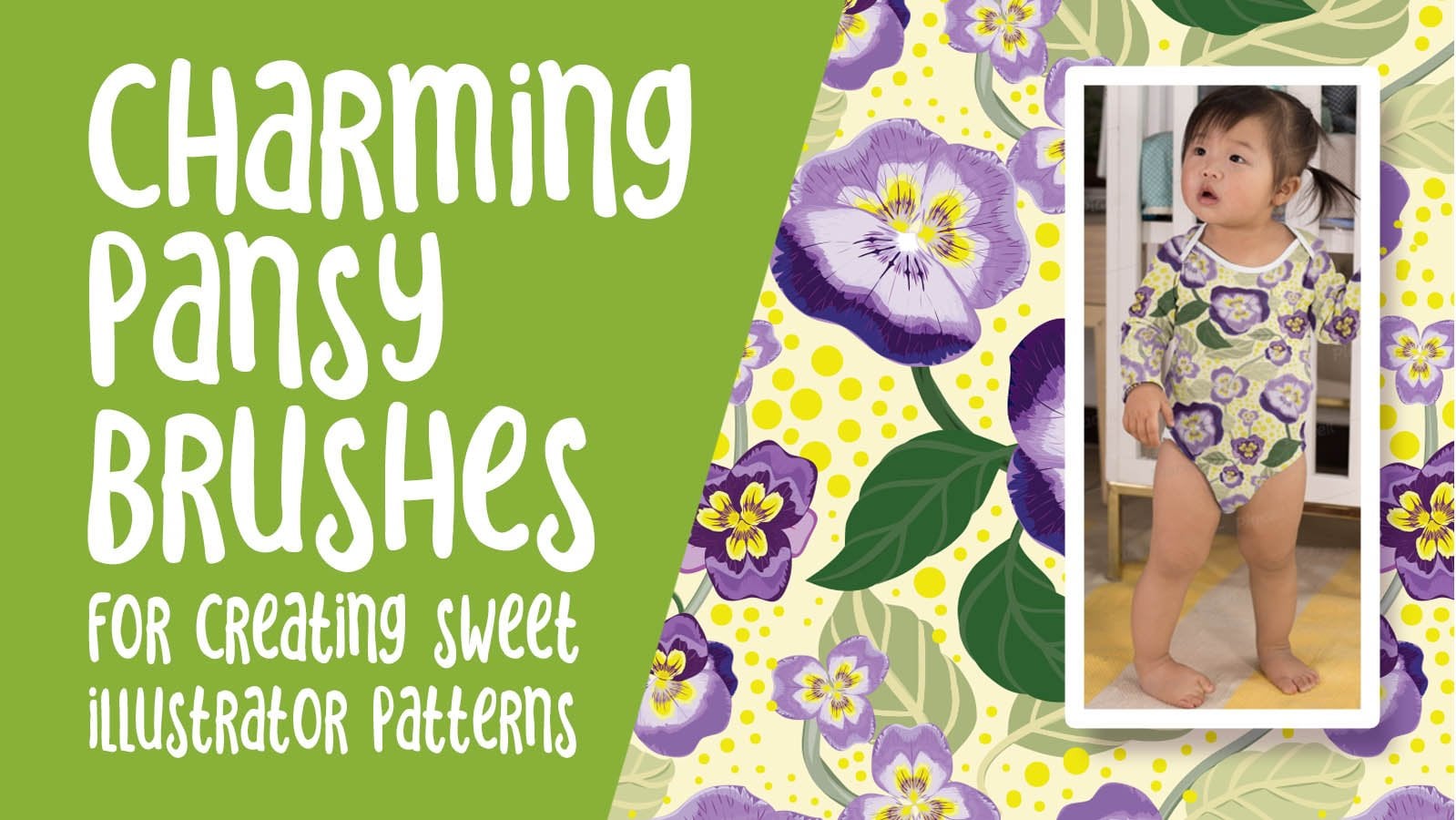
1. Intro Easy Blob Brush and Shapebuilder for Scandinavian Design Techniques for Adding Depth and Inter: Hi guys. My name is dollar nascar and I'm coming to you from sunny, Manitoba, Canada. So there's been something that I've been wanting to explore for some time now. And that's the naive Scandinavian style. I wanted to do a pattern collection with really simple motifs. And I thought this would be a great way to tie in the use of the shape builder tool and the blob brush. So this class today is going to feature those two tools. We're also going to be doing some experiments with the Pathfinder pellet and the Eraser tool. We're going to create a full collection. And you know me, those coordinates are going to be easy. I started by first creating a toss pattern to use as my hero pattern. I've got two that I've kind of developed throughout. So you're gonna see me go through all the pieces, were going to be doing some neat things like adding a release around the motifs so that I could work on a dark background. Yes, there's gonna be lots that will Explorer. I think that this course is one that could be done by a beginner. These are tools that are very, very basic and the exploration of pattern design and creating the pattern tiles is actually fairly easy. If you have a similar software program to Adobe Illustrator, you should be okay. It has the same features. What's really important is for you to pick up all of the concepts that I'm teaching here and to apply them to your day-to-day pattern design. If you don't do pattern design, there are a lot of really good techniques here that can be applied to almost any sort of illustration project. Are you ready to get started? All right, let's do this.
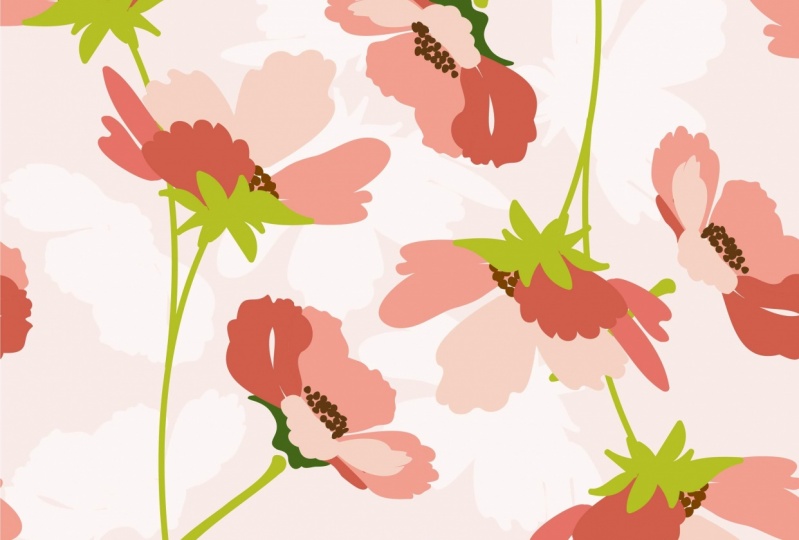
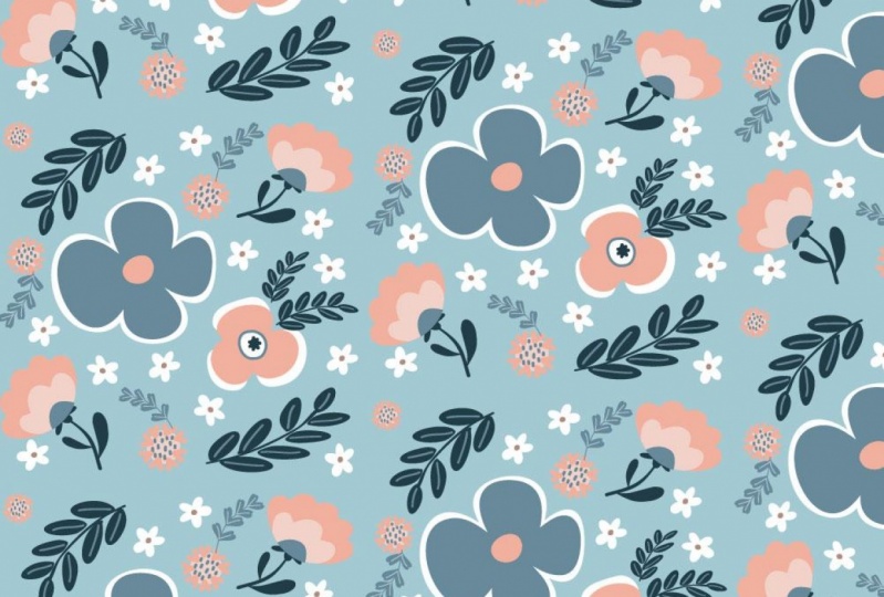
2. Overview, Inspiration and Examples: Hi guys, welcome to lesson one. So in Lesson one here, we're going to just take a look at a lot of examples. And we're going to explore some different possibilities for what our pattern design could look like. You're ready to be inspired. Alright, let's get started. Before we get started, I thought it would be great for us to just take a look at some of the types of patterns that fall into this category of Scandinavian. I'm looking for a particular look, and I've got this board here on Pinterest call fold leaves and flowers in it. You'll see a bunch of the types of flowers that I am trying to emulate. I guess you'd say, of course I don't encourage any sort of copying, but you can definitely look at stuff like this to get inspired for the type of work that we're going to be doing. This one here would be a pretty good example of the kind of layering that I am wanting to do with you. We're going to be doing some really, really basic shapes. We're using the blob brush. So of course, it's going to be kind of interesting how, how we go about doing this. There are some really great examples and some artists that once you start looking at this, where you will see over and over again, this is another really good example of the kind of work that I want to do with you. Pippa Shock is a fabulous artist. I don't know really anything about her, but I can tell you this is a kind of work that really appeals to me. I think my obsession with this kind of art started in the 19 seventies. Believe it or not, I worked in a wallpaper store and we used to get fabrics and while papers by Mariko. So there were so many amazing patterns. And this is of course Scandinavian and this is the kind of work that I've always loved. It's just so fun and bold. I just really like the way it comes together in patterns. It's just something that has really always been a dream of mine is to produce fabrics and patterns like this. So I've been investigating it more. And so recently I started experimenting with it. I started using the blog brush. And, and this is an example of the pattern that we're going to be working on today. You can see here that I've got a lot of layered motifs. I've got really bold, chunky shapes. I've used a technique to add shadow. And we'll do a lot of just overlapping shapes and cut-out shapes will also be doing this kind of a thing where we completely remove a section that would show through the background-color. I'll show you this with a background that I put it on to give you an idea of what we are going to be working on. Now, a lot of the Scandinavian stuff that you see is really bold and the colors are bright. I've kinda picked a more subdued palette because I think that is on trend right now. So that's what I'm working towards. But we're gonna experiment and we're also going to use the recolor tool to just check out different ways that we can use our color. So if you're looking for inspiration at all before you start this project, definitely hop on over to my Pinterest site and check out this category says one that we did use in a recent class. You may recognize it, although it was called bold leaves at the time, I didn't have it called bold leaves and flowers. So I've added a lot of flowers as I was kind of mentally preparing myself for this new project that I'm working on. The other thing that we're going to be doing in this class is using Photoshop just as a really basic way to bring in a sketch that we can use when we're drawing our motifs. You can see that my drawings here are really rough, kind of embarrassing. Actually. This is really all you need and I will show you both drawing without a template and drawing with a template to just give you an idea of the value of the template. By the way, you can use whatever program you're comfortable with. You could use procreate to do you're sketching. You could even sketch on paper and then take a photo and import it into Illustrator. So the great thing about Photoshop and Illustrator, they worked together. I'm going to actually plot these so that they are altogether. So Command E merged everything onto the one layer. I'm going to select all and copy. And then we'll go into Illustrator. I've got a layer here called templates. I'm gonna peace. So very, very simple. Paste it into position. And I happen now available for my US. I happened on separate layer here so that I can hide it when I don't need it anymore. And we're going to work on a second pattern to go with this first pattern. So it's going to be, I'm not sure which one is going to actually end up being my hero pattern as I'm kind of just in the experimentation stage right now. But we're going to make use of that template to draw some more of my motifs. I'm going to show you both ways. I'm going to show you drawing the motifs with and without just so that you get an idea. And we'll be using the shape builder tool, which is this one over here. And we're going to be using the blog brush. The heck is that one? I don't even know where these tools normally are because I use the shortcuts all the time. There it is, under the paintbrush tool, shift B. So the shape builder with Shift M, shift B. And we're going to be also using the eraser tool, which is shift E. So remember those three shift, shift B, Shift M. We're gonna be using those a lot in this class. Alright, so I think we're ready to just move on into the next lesson where we're going to start talking about how to use the blob brush to create some of the motifs. Alright, I'll see you then.
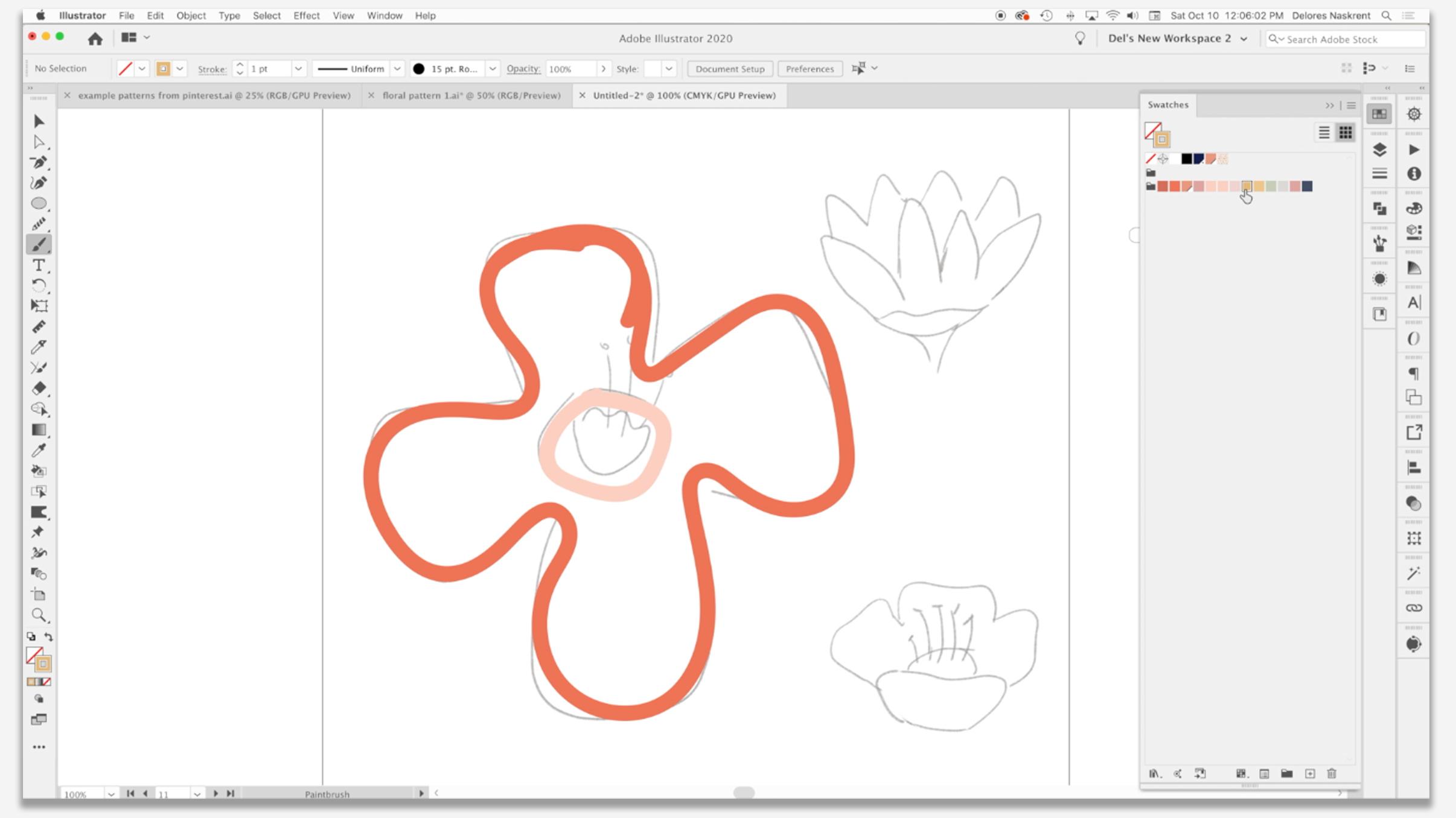
3. Getting Started with The Blob Brush: Hi guys, welcome to lesson two. So in less than two here we're gonna take a really good look at that blob brush. I'm going to give us some ins and outs about using ads. And I'm sure that we can figure out some really great little motifs that we can create. Let's get started. In this lesson, I want to really focus on the blob brush itself. So remember shift B is the keyboard shortcut to access it. And it's one of those brushes that you can see here by the brush tip. If it ever looks like this, it's different than an art brush. See how an art brush has that little star kind of thing beside it. When you use the Bob brush, you get this little icon. What this means is that it's a brush that can be enlarged or reduced using your bracket keys. So I'm using my right bracket here and you can see that my brush is enlarging. That doesn't mean that with the blob brush, you're stuck with this brush tip shape. You can actually go in and pick any of these other brushes. And you can see here like you get a sort of a calligraphic kind of a stroke or you can get just die regular stroke. And remember that the big, big difference here is that these, once they're drawn, our full shapes k. So you can see that there, if I select them, be on my keyboard, gave me my direct select. And you can see here that there are actual filled shapes. So that's another big difference. If you use just a regular brushy on your keyboard and you draw that line remains a path or a stroke. It is not an expanded shapes. So if you wanted to expand it, you you definitely could hear under Expand Appearance that extra step involved, get rid of those two guys. And I'm going to switch to first of all, my basic round brush. So and I'm going to shut my smart guides off command you because I don't really need them at the moment. So I want to start with probably this one. I think it's the easiest one here. And I want to show you really how quick it is to draw with the blob brush. At the moment, I don't have a color selected. I can definitely go in there and select one if I want to. I can go nice and big. And I'm going to show you how quickly I can create a filled shape now, do you see that as I'm drawing, I'm a little bit shaky. And you see that when you look at the line here, it looks quite shaky. I let go. It is really smoothed out now that is controlled here with the fidelity settings on the brush. So I double-clicked on the brush, saw brush, and it opened up this palette. And you can see that I've got a variety of different options here. I've got it set to not the fullest smoothness, but definitely not the most accurate. If I was down here at accurate than it would show every little shake that I make. You see that. So what I want is to have it smoothing out for me, but not necessarily super smooth if that makes sense. These two settings here we'll discuss as we go along at the moment, I'm going to click on merge only with selection, and I'll show you why. So if I were to stop down here and I wanted to keep going and it'll lock that. You can see here that there's still two separate thrush strokes. Okay. If I wanted them to merge, I would have had to have selected this shape to continue drawing and have it connects. And I've kinda hard to see the anchor points on this flare kinda match the color that I am drawing with. So I think I'm gonna do something to help myself out. I think I'm going to actually make a new layer here for our flower, let's call it flower one. For lack of anything more appropriate. I wanted to make a new layer because the color of the brush I was using, you can see the anchor points really well. So I think this one will have a better contrast. I'm going to just quickly go through and all my outline here. And you can see that even though this is really rough when I let go, it smooths out considerably. So that's a really nice feature of having this on smooth. I'm going to actually redo it with a little bit less smoothness so that you can see the difference. You'll see that it won't correct quite as much as it did the first time, but it still has drawn it adequately for my purposes. I also have changed this to keep selected. And the reason for that is that when I'm at this point with my drawing, I sometimes use the blob brush for corrections like this, so I'm smoothing out that line a little bit. Now, one of the cool things about this is also that I can eliminate that hole inside shape to have the solid orange for my flower. But that's gonna kinda block my view of this inside part. So now I'm going to draw it PINKO, use an intermediate color here. Now a cool thing about this being in shapes instead of brushstrokes are paths. I can use my direct select tool, which is a on my keyboard, select those inside sheeps on each of these and eliminate them. So now I've got some really nice, quite luscious and very bold looking flowers and shapes. I'm going to actually select all of the at this point and use my simplify which has command period on my keyboard. That looks like maybe it's a little bit too simplified. You can see here that it's changed it from 63 points, 27 points. And I think that's still pretty true to my shape here. And I'm gonna say, okay, I've got my first motif. I can go through and make little corrections if i feel it's necessary. And these are all still shapes that I can definitely alter as you can see, or even add strokes to. So for example, if I wanted this to be stroked with white, I would just go to my strokes palate here, set my stroke and increase the size of it. So here I would, as I'm working on it, hide the edges. So command H.pylori hides the edges. If you saw me hit Command Shift H here, that was hiding my art board. I just wanted to see how that line thickness was and it looks good to me. Just remember that once you have hit that command H, you're handles will not show when you're trying to select and it feels a bit weird. So I always try to remember to switch it back so that the handles will be there when I need them. So we've drawn our first quick shape here, and I want to show you some really cool shaped builder kind of tricks. So I'm thinking here that what I want to do is add a bit of a shadow around the edges of my flower. So I'm going to grab my lot brush again. I'm going to grab that slightly darker orange, the darker one. And I'm going to just draw where I think I want the shadow to be. So you can see I've left some gaps here. Those are areas where I don't want the shadow. There'll be a shadow running along here. If you were to see it in Preview mode, you can see that there are going to be some shadow areas in here that I'll have. And this is where fun with the sheet builder tool starts to happen. I'm going to select both of these and you can see that as I drag over them with my shape builder tool, that certain areas are being highlighted. So these little bits that I have on the edge here are what I want to keep, what I want to get rid of all of this extra stuff that's on the outside. Now you see my tool currently has a plus sign on it. If I hit the Option key, becomes a minus, and I simply click on that and it's gone. Fettah. Isn't that just the most amazing thing? When I discovered this, I was just flabbergasted. So the neat thing about it is that now is that now these match up perfectly. I didn't have to do any sort of adjusting. And it has added a great little detail to my motif. So I think that's good for this lesson. In the next lesson, we're going to start working on these other two moles. Alright? I was there.
4. Shapebuilder and Transparency Use in Motif Making: Hi guys. Welcome to lesson three. So in lesson three here we're gonna take a really good look at the sheet builder tool. We're going to figure out how to use it for combining shapes and for extracting shapes. Let's get started. So think I'm gonna do this one here next. And I want to do the back section darker than the front section. So I'm going to pick this sort of grayish red and I'm going to just use my, because I should put that on the stroke. I'm going to use the blob brush, but I'm not going to pay too much attention to this area down here. I'm just going to go for it and you'll see that I'm just kinda drawing my petals here. And having this as a guide is really helpful. Having just, I know just as you're doing it, you don't want to be having to think about it too much. I did a lot of these other ones just freehand. But I do kinda like the idea of having this guide to use when I'm doing especially multiple layers. So I'm thinking I might use that a little bit more often. So I'm gonna use my direct select again a on my keyboard, couple of hits on my delete key, and I've gotten rid of the inside part. I think this one needs a little bit of adjusting. So as you see there, I just move the anchor points. But the other thing I could do is use the eraser tool. Eraser tool. That was the other shortcut I was telling you about shift. Shift or the Eraser tool will do is it will eliminate within a shape. So it doesn't, you can see what it does is it actually cuts whatever shape it is interacting with. So in a case like that, that might be just what you need for making some adjustments. I can shift back to the blob brush. I'm going to add or correct these points a little bit, but I'm gonna see if another brush might work better for me. So I'm going to try a calligraphy brush here and see if that might work better. So I'm selecting and then I'm just going to go in and it just kind of feels like I can get a better point on my petals are a little bit more accurate of a, of a drawing there. So this is something that you will need to experiment with on your own to figure out. Now in a case like that, I had a corner point shift to my direct select by hitting a on my keyboard and just using the widget to make the adjustment. You see here that I've got a lot of extra points that I probably don't need. So I'm going to use simplify to try to get rid of some of those. So it went from 48 points to 14 points, which is just fine. And I think here the fastest way it would be just to hit that convert selected anchor point to smooth tool when you are learning and as you go through your training, you're going to figure out the ways that are fastest for you. Sometimes it's faster to hit this. If you're gonna do a lot of them you can do is shift c, and that also works. So you can just decide as you go along, what you think is your best bet. So this is one where I could just hit this. Now it's smooth, make my little adjustments. And also here, you're deciding whether or not moving the anchor points is faster or going back to the brush and rushing in a little bit more. Now, I want to draw that foreground, and at the moment I can't really see it. So what I would do here is I would go to my transparency palette, reduce the transparency of that to 40 or 50%. And then I can see my foreground. I can go back afterwards and change the transparency here. I see that this is. Off, so I have made some little adjustments, nothing major. Now switching back and forth here, if you press X on your keyboard and you can really quickly between these two. Now for this foreground, I'm going to use this pink color shift B gives me my brush again. And I'm gonna try using this calligraphy kinda brush this time. So it was great for that last petal, not as good for this side. So maybe I'll switch. Now you notice that as soon as I let go, it switched from L to the stroke because as soon as I stopped drawing, it became a shape, right? Okay, so a couple of quick adjustments here. Shift E and I can erase and then direct select tool AMA Board and I can eliminate. Now this, I can go back and change to its full, full strength. Here, I would probably use my smooth tool to fix up, so let's grab that. So S or your keyboard is your smooth tool. I'm going to select the whole path s, And I'm going to use it to just take out some of those little notches. So rather than using your direct select, let me just enlarge here so you can see what's happening, rather than using your direct selected eliminated points are moving points. I find that that smooth tool often works now in this case, it doesn't seem to be working, so I'm going to hit Q on my keyboard, elect those points, and then just remove the anchor points. I've got a short cut for remove anchor points. If you do not, it is here under object and path. So remove anchor points is one that I use a lot as well as simplify. So I've got those two shortcuts in there for that. And I could do that here as well, could select that and eliminate it. Otherwise, I think this has turned out pretty good. So I could now go and draw this one in. I could reduce the transparency of this temporarily so that I could see a little bit better. Just pull that down a little bit. Here again, I might get rid of some of these extra anchor points so that I could make this adjustment with 1. And, and now I'll just draw our PTEN this with the blob brush. So I'm just going to give you a little bit of a comparison. So before I learned about the blob brush, I would use the pen tool. So let's just grab the pen tool and draw this shape option click when you want to change direction. And you can see that when I hit that last point, you see how this turns into a circle. That means I'm closing my shape option. Click in there just to make sure it's a corner point. So that didn't take too long. But when you're first learning that pen tool can be very frustrating. I find that the blob brush is just a lot more intuitive and was a lot easier to teach students how to use. That's the one way to do it. And now let's try it with the blob brush. I'm going to switch to this color here. No fill just for stroke. I'm going to use this profile of brush, this little calligraphy brush again. I feel like that took a lot less time to draw then using the pen tool. And if I want sharp points here, 50, and I can just taper that and a little bit. So I'm liking that. I think that's faster. It just seems more like your artistry is more natural when you're using the brush. That's just my opinion. Make a couple of little adjustments there. Let's bring this back up to full opacity. And we've got another little icon or motif drawn here. So you notice that I use the word icon and motif kind of interchangeably in Canada here, believe it or not, icon is usually what we call this. So that's why I just kinda have that as a habit. So forgive me if I sometimes the icon instead of motif anyways, that's enough for this lesson. In the next lesson, we're going to draw the other little flower and then we're going to maybe start doing some quick tests on our pattern. All right, I'll see you there.
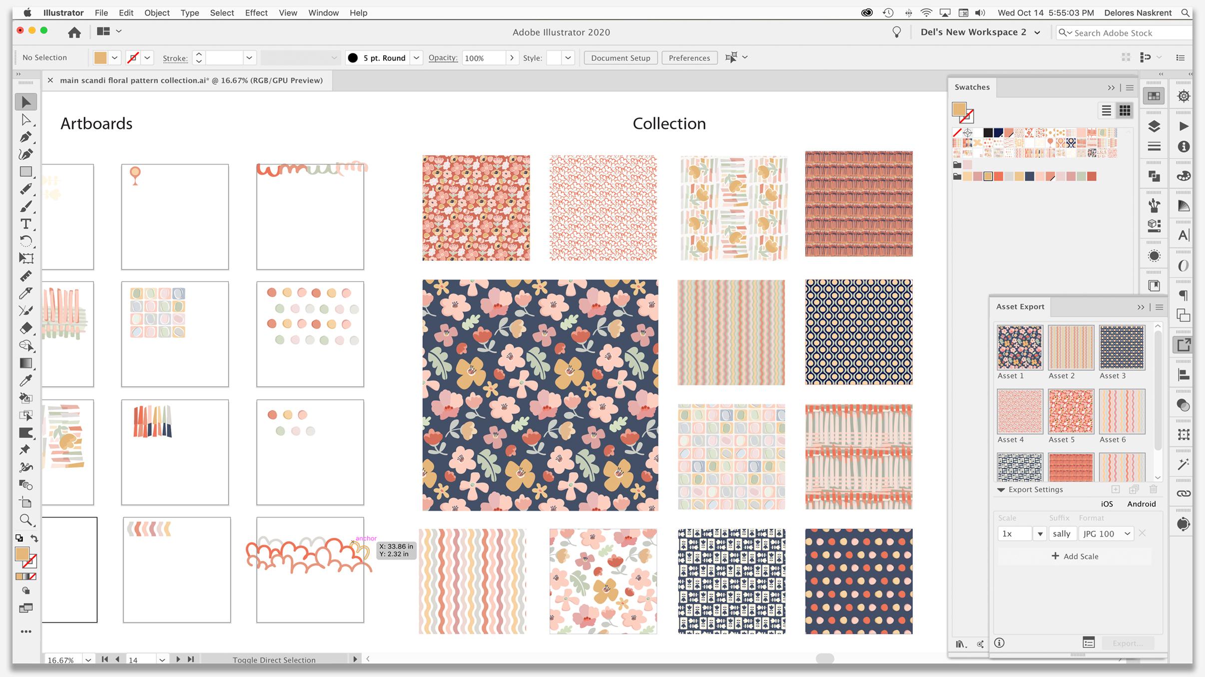
5. Combining Shapes and Subtracting with Shapebuilder: Hi guys, welcome to lesson four. So it looks like our pattern is coming together. In this lesson, we're going to do a lot more work in really developing our motifs. Alright, so we're going to start this flower here. And I've decided that what I wanted to do is more of a gold colored flour on this one. So I'm going to start with what I think will be my darkest area, which will be this area in here. Now, sometimes it's hard to resist the urge to just color this all in by hand, honestly, but I know that I can just grab my direct selects a on my keyboard and hit delete a couple times and it's gone. Now, I'm going to reduce that transparency again, just like we did in the last one. And I think this time I'm going to draw these little stamens before I do anything else. So shift be, accompany US Navy as my color. I want these nice and bold, going to select all of these. And I'm going to show you also what to do if they aren't selected and they don't actually hook on. So this would be where you would use the sheep builder tool. Remember that shortcut is shift em. And you can see here that I can just drag over the areas that I want to connect. So here I'm just basically drawing a line. So as long as you've got selected in the first place, you can use that shape builder tool to easily connect, right? So we've got those two parts drawn already. And let's see what are we going to do four color on this front part. So remember this is, transparency is a little bit change here. I'm going to probably use this for this front pedal. I'm definitely going to be making some changes with the colors once I get it back to full transparency and the like, how I can just use the same brush, correct? I don't have to do any intermediate steps like expanding appearance, eon my keyboard option click or just click on that, hit Delete once or twice, and you're golden K. So I'm not sure about this. I'm going to actually bring these both up to full opacity. And yep, I actually kind of works. I think. Let me be Layton this one just a little bit. And so what do you think for that middle part? I'm thinking maybe just white. Let's give that a shot, shift B. And let's use a sheet builder to eliminate what we don't need on that white shape. Now, there will be a problem here. If I try to use the shape builder Shift M and option clicking here to delete because you see what happens. It actually completely cuts out that area. So we have to do things a little bit differently here. Rather than trying to eliminate that shape, I am just going to use ship builder to combine these two. And see what that has done is separated the two parts. So that's kinda great function that I use quite often with shape builder. Now here I can see that what I need to do is move these stamens over the, whatever this part is called. I'm going to select all this, actually, cut it and I'm gonna go in here, make a new layer and pasting place. The reason I did that is because then I can look at my sheets here without them being all mixed up with the shapes. And I could tell that this was it because you can see nothing on that layer. All we need to do now is drag it down and have it below the stamens. So in retrospect, I think I would do this a little bit differently. It would make a lot more sense if I was to have drawn this central bit in first, I could built up in layers and then did all my sheet builder kinda stuff. I sort of thought about, sorry about that, that we we could have avoided dealing with all those transparencies so well, you live and learn. At least now we've got three really quick little flowers that we can maybe start experimenting with a little bit to see if we can make this into a really nice pattern. I think I'm going to change this. I'm going to just slightly change that color, but I want it more in keeping with that particular color scheme. And I think maybe right now I will a bit of a stem before I go too much further. So I'm going to use that green. Here's one instance where I did use that to fill in and we're just going to U-shaped builder again. Eliminate that point, I think. And I'm going to use Sheet builder. I'm going to select these two associate Builder knows that these are the two that I'm trying to work with. Shipped EM gives me shape builder itself. And I'm going to just drag over those two, combine the shapes. So we've got three little flowers here. I know we don't have nearly enough to make the pattern. I'm going to hide my templates here and I just wanna do a little bit of a test. So I'm just selecting these items. I'm going to go into my pattern options. So I hit my shortcut which is command apostrophe. And let's take a look at this for some reason. I don't know if this happens to YouTube, but even viewing it once or twice like this gives me a better idea of what I might want to do with the patterns I'm thinking I want to reduce the size of this major flower here. I think what might be good is curbing Matt stem or adding a little bit more to it. And I think we can use this one in more than one spot and perhaps changed the coloration on it. I'm also going to take a look at some of my motifs from the other pattern and see if there's something that I might want to borrow out of this set to add to this. In this one would be a good candidate here. So I'm going to copy it and he's to here. I'm going to actually grab all of this stuff, make a new layer. Actually, maybe we will just use this layer. I think this was the one that I had just made. I'm going to call it pattern too. You can see that lower down, I had Pattern one. Show my art boards and paste and move this onto this art board. And now we've got these guys all separate. So I'm going to eliminate that large flower layer since we're not using it anymore. I'm going to start doing some of this adjustment. I'm gonna do some of it as a timelapse for you so that I can speed it up a little bit. I will stop and mentioned anything that I think is worth mentioning right now to make this one just a little bit different than it is on the other pattern. I'm going to make a couple of quick adjustments. In this case, I'm just going to use my direct select, so AI on my keyboard and I'm just making some adjustments on these curves here. When you've got two handles that are stuck together like this, you know, as I was trying to move the handle and they were both moving at the same time. There is you hold down your Option key and then you can individually select them and move them. So that looks different than it does on the other pattern. Then we're going to copy and paste or start dragging and then hold down your commanded Option key and you'll be making a duplicate. And this one I think I'm going to rotate. Now. I don't know if you noticed, but I had grabbed a couple of brushes from another BRAF set I have. So in a case like this, I'm going to use one of these brushes to create some leaves. That'll be the quickest. And I'm going to actually change out to tense, Increase the size, and use it to address a couple of leaves on this plant. Here, you can see here that those are brushstrokes as opposed to the sheep. The Stam is o, I'm going to do Expand Appearance than now, allows me to unify them so I can just use my shape builder again, Shift M and drag to select or to combine the shapes. Oh, let's see what's happening here, right across this way. There we go. And I'm going to use Command period to simplify. And I lost the color there. So I'm going to just put that in again. So that made that just a little bit more interesting. I'm going to move that up a little bit more into the corner here because I know I'm going to fill up this whole pattern tile at the moment, so I'm going to check it at this size. Get a better feel for what? It's looking light. And I think I did that. I wrote in 1900, you got half droplet work actually quite nicely and hide the art board. And you can see what's happening here. We're starting to fill out our pattern a little bit. And that's just giving me some more ideas about what I want to add and subtract from this. So I'm gonna time-lapse it again as I go through and make some changes here. Since I just did a little test here, I might as well have it here as a guys, so I'm going to make a copy of it. I used to transform each to reduce the scale of the pattern itself. And now I can use this as a guide. Aren't born again. And I think what I need is something that can balance or contrast that a little bit, just a different type of flower, a little bit bigger. So I think I'm going to grab this one here and start dragging and then hold down my option and shifts so that I have a duplicate of it. So the other thing I'm thinking is that I want to change the colors on this one a little bit. It's just a little bit too bright now for my color palette that I've chosen. So I'm going to switch to this color. And I'm gonna do a little bit more work off camera to fill out this pattern. And I will meet you in the next lesson. See you there.
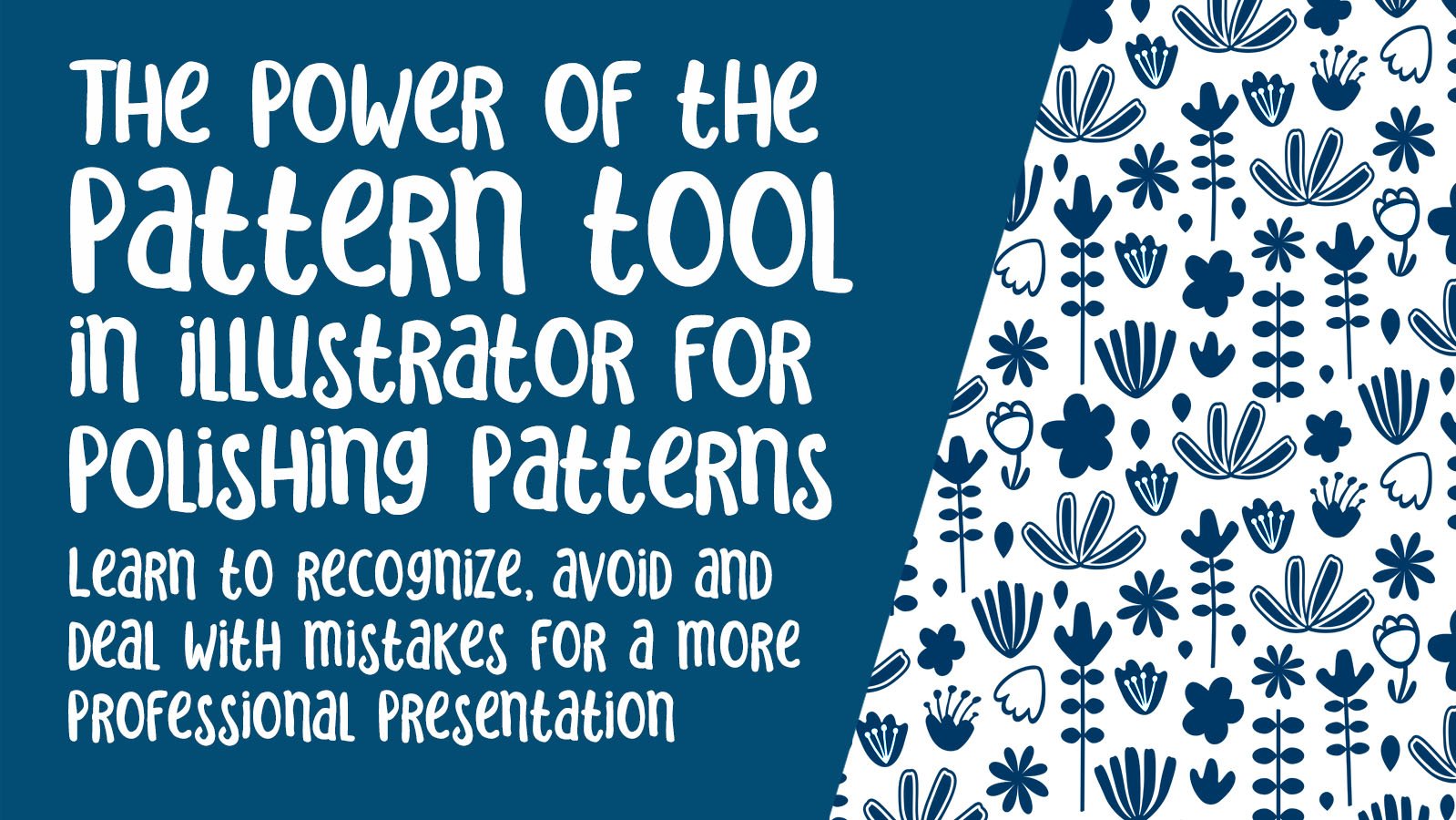
6. Additional Motif Building Techniques: Hi guys, welcome to lesson five. So we're still exploring the creation of motifs. We're going to create a few more in this lesson. Let's get to it. So I've got to leave here. I'm going to add a little bit of detail and I'm gonna make a couple of more motifs while I'm at it, I'm actually gonna show you a couple of more things you can do with the shape builder tool. So this leaf I drew with the blob brush and I'm going to just do a quick stem going through it. Now in this case, when I wanted to do is actually take that section out. I'll select both of these first shift builder, and I can now hold down the option key to get rid of that. So now I've got just a clear section in there that's going to show through the background. I think I'm going to show my art board here and grab this motif and move it down here somewhere, movies to up. So I'm drag selecting and I'm holding my Option key at the same time to be sure that I've selected everything. And I'm just going to move that up just a little bit. I also wanted to draw kind of a dandelion silhouette, so I'll do that here. I am going to pick a new color to put the dots on the top. I'm just making my brush a little bit bigger and I'm gonna kind of as a stamp. So before we go any further, let's just do another quick tasks so we can have one here to refer to as we draw additional motifs. So Missy, I think this time I'll try my role. Move it over by half a brick. And that shows us right here that we do have some problems. So it's perfect that we did a test. I'm going to draw another rectangle and fill it with our latest iteration of the design Command Option Shift D as my shortcut to get into my transform. Do it at about 55% and you can see lakes, lots to change here. Okay, so let's get started. We'll do this real quick and bring that over here because it's conflicting without flower. So Beth position it in this way. This one conflicts with this one here a little bit, so we're going to move it and this one up, maybe 20 bit more and maybe I'll just make it a little bit smaller as well. I'd like to use this leaf elsewhere actually as well. So maybe we can put it in beside here, which should be beside this flower. So I'm going to flip it, rotate it, and make it a little bit smaller. So you can see that some of these curves are going to probably make some nice lines in our pattern. Grab that and move it over. And let's try this again. I do a lot of testing. Not all pattern designers necessarily do this when you're first learning though, it's probably a really good way to kind of get a handle on how you really need to work with this pattern designed to make your pattern flow hide your art boards with Command Shift H, and I think we're getting closer. So let's get out of this and apply that new swatch. And now we can see some of the other adjustments that we could make a can move these up so that we don't have as much of a conflict here. I'd like this to maybe flow into this line a little bit better. I don't know. I may change that by just for a second. I'm going to try that now if you've been in any of my other classes, I do have a class called The Power of the pattern tool for polishing your patterns. Talk about an alliteration. In that class. We do a lot of the work on a pattern, right, in the pattern options. So that's another way that you could go. This is the way I'm gonna do it for this particular class. And we're gonna do another test in a second. But I just see here that I've somehow missed moving those at some point or move the whole flower without that being part of it. I'm going to group those together while I've got them selected. And I'm going to actually rotate tool, an option shifts clicking on those to select them in their entirety. I'm going to do here is group this entire flower, so that doesn't happen again or H. So North thinking this leaf maybe seemed a bit small. I'm going to enlarge it just a bit while I've got that selected, I'll group it and I'm gonna grab my Rotate tool. And I'm going to click right here to kind of put a tack in there and then I can rotate from that point. So let's run that quick test again. And you could do, like I said, all of your adjusting in here. All of your regular tools work in here. And with a pattern like this, it might not even be a bad idea to try that. Just remember that that will create a completely different swatch so it doesn't affect what's on your art board. And sometimes what I do is I duplicate my art board and try that. But I think that's an extra step right now that we can just avoid. I think I'm going to stick to the method I'm using right now, at least until I have a little bit more of this done. So we've got a new swatch to put in here. I think at this point, I can get rid of all those. We're getting there. We're getting to the point where we have something that looks like a pattern. I'm not lumping this dandy lion, honestly. I think it kinda looks like Poseidon spork or so. Doesn't really look like a dandelion To me. I think I'm going to eliminate it. And maybe it here. Put a little flower that looks somewhat like this. They'll again, I'm going to just quickly draw a similar flower. Now I use my the leaf brush to make those. Because it's a brush, you would think that I would not be able to use my sheet builder. What we can do with the sheeple or tool is also use it for trimming, which is really interesting. So let's just select these three and I'll show you here. So Shift M to get my shape builder tool. And you can see here, let me just enlarge it to be sure that you get a full view of that. If I hold down the option key, you can see that it's going to cut that section. You see it turned red. So I'm going to do that there. And there is, oops, I missed. And you can see that that has trimmed it back really nicely. So we can do the same thing with these. We can use it for either trimming or combining. And in this case I'm going to use it first for combining. So I'm just going to see I can drag over these two areas to combine them into one. And actually I'm going to grab that little guy up at the same time. Let me fill that back with that darker color. I am going to just use my minus c0 to take those two points away and adjust this way with my direct select. So a on my keyboard, even my direct select. So what will happen as you become more and more efficient in using all of these shortcuts and tools is that you'll make these decisions on the fly. So how I decide what tool to grab or what shortcut to use is usually just instinct. And I just decide right at that moment whether or not one way is faster than the other and I just go for it. You learn that kind of thing just by tons and tons of repetition through with a gajillion times. And you'll see there you saw me use my converge anchor point tool, shifts si is the shortcut. And then I can pull to make sure that there is a handle on both sides. So now I'm going to select both of these and I'm going to use Shift M. And in this case, and I want to combine these so you can see that here I had that color selected, so that's why it failed with that particular color. Now a on my keyboard gives me my x select. And you can see here that we've got everything trimmed up really nicely. The only thing here is that this bit of the brush stroke overlaps. You can see my color is a little bit different here too. So I think what I'm gonna do is just grab those two and expand appearance. Now I have a shortcut for expand appearance as well. So Expand Appearance and then I can simplify. And now we can select all of this shift M for cheap builder, and now it's all combined. So we've got another little motif there, slight adjustments here. Now, what I'd like to do is have this side, kind of even with this side. And another way that I can work with the shape builder is to do something like this where they overlap and you shift them and then just drag over all of it and get rid of that little piece that was giving me grief. A on my keyboard gives me my direct select. And again, I'm going to take away a couple of these points here because I can make a much smoother curve with less anchor points there. Okay, so we've got another little motif. And that's why I really loved the Scandinavian style. It so sweet how simple the motifs are and how really forgiving the drawing part of it is. It's really amazing what you can do and how quick you can do it with some of these great Illustrator tools like sheep builder and the blob brush. Another quick tests, and we'll end this lesson. And I'm gonna do a little bit of work off camera. I'm gonna deal with this empty space here, and I'll come back to you with a somewhat more finished a pattern. I think I'm going to add just one single motif in here. And I want to do some work with adding some detail in between to make it look a little bit more textural. And some of these spots, that'll be kind of an experiment. We'll see what happens. So I will.
7. Adding a White Release and Background: Hi guys, welcome to lesson six. So unless S6 here we're going to be exploring adding the white release around our motifs. We're gonna do that with a couple of different methods. Let's get started. At the beginning here I'm just gonna do a quick test of adding some texture into the background. I think a minute ride just adding some little leaf shapes here. Bear with me while I do that, I'm gonna do them in one of the lighter colors. I'm gonna time-lapse this and then we'll just check it out and see how it looks. Right? So let's do a test of this. And who's the pattern options? I'm not really like you mess. I don't know for some reason it's not the feeling that I was looking for. So I think I'm going to look back at some of that reference and see if there's anything, any ideas I can draw from that. Let's go into Pinterest here for a sec and take a look at what we can find. When you go back to my bowl leaves category here and see, maybe all I need to do is put it on a background and a No, I'm not thinking of this one as a hero pattern. I'm thinking more of a coordinate and look how this looks with a white release. So I'm thinking maybe I will, Yeah, maybe I'll take a look at doing that with my pattern and see if I can improve its appearance. Kay, so there's a couple of different ways I could do this. I was thinking of doing it with my blob brush, but I think that would be really time-consuming. So I'm gonna use my strokes. So to make it easier to create a single image here, I'm going to copy all of this and make a new layer pasted in, paste in place or Command Shift v. We'll paste it right on top. Don't need all the individuals sort of inside shapes here. So I could go through what the shape builder tool to buying those shapes. But that might be pretty time-consuming, as you can see here, it's pretty easy to miss some of these little pieces. So I think in this case, this is one case where using the Pathfinder will work better. So I just hit unite and that has done it almost instantly. Now at the moment, it's filled with this light color. I am going to be replacing that with white. What I'm actually gonna do is set that to a white stroke here. Experiment with different thicknesses. What sometimes happens with a fixed stroke is that you get these little kind of protruding points that can be controlled using this mitre limit here. So just set that to a low number. So that's one method for doing this. And I'm gonna show you another one that I like as well. The difference with it, you'll see is that it ends up being a shape. Again, not just a stroke that has to be expanded. So just removed that stroke from the last step. And now let's do the offset path. And here I'm going to set it at, I don't know, maybe 0.1. So I think that amount is good. I'm going to have finder to just unite these hearts on some of these. And the nice thing about the offset path is that these are now independent shapes, so the outsides are separate from the insides. If you were in my course on the enhanced line art, I used this technique to ask him interests to align art fluoride, it works really great. It's really fun to be able to move that outline and offset a little bit to give the effect of, let's say a woodcut or the lineup block print. Now the only thing that I'm wondering about is how to add that kind of naive or natural kind of irregular white release. The outline is not super consistent, so the white release looks like it's handgun. So I have to figure out a way to achieve that. Let me do that. I'll be back in a sec and I'll tell you exactly what I did. So I'm thinking that the easiest way, I have actually tried a couple different things. And I'm thinking, I'm going to try to see using the Ruffin effect. Now before I do that, I'm going to simplify it a little bit. So I've taken it from 430 to 238 points. And now the Ruffin effect, you'll find here in the Effects menu under distort and transform does under pucker and blow here and a wow, yeah, that's not going to work. And know from experience that especially when working with pretty small motifs here, you have to keep this percentage or this number here really low. I set them both at really small numbers and I want kind of a smooth finish. So I'm going to hit this radio button for smooth and not corner. So that's with having simplified the path I'm going to undo and go back to before it was simplified, selected again. We'll try that effect when there are more anchor points. So you can see what that looks like. Not much of a difference. I kinda like how that's giving that kind of rough and are inconsistent luck that's enlarge fat and take a good look. I'm gonna zoom in. No, that's not going to work. It looks like simplifying is going to be important here. So simplified again to a 138 points. And then we'll try that effect. Set very low, 1% and smooth. And it's nice because it has kind of changed. You can see that there are some thinner and thicker areas. I like that this offset is as thick as it is because if this is going to be scaled down at all, we need a nice thick release here, and I'm pretty sure now that I am going to be using this a coordinate. So probably we'll have a smaller scale than what I have on my hero pattern. Now at this point, what I need to do is expand this appearance and I like that, that's a little bit less consistent looking. Now of course, I could go in and make changes, you know, move a few points here in there just to make it even a little bit less consistent than it is here. Maybe I'll do that off camera and come back to you with my finished adjusted white release. Alright. Hey, so I've got a bit of experimenting here and my experiments have taught me a really cool way to do this. So I've got the Puppet Warp tool. And it's working just great for making my borders a little bit less consistent. Would have thought that you'd be going out of your way to try to make something less perfect. So one of the cool things I discovered here was that if you're on the Puppet Warp tool and you click to another shape, your settings, your mesh is applied exactly as it was on the last one. You don't have to go over a pre-selected again, it stays selected. So that's kinda neat that help speed up the process a little bit. So I'm just dropping ends or using the pins that are there to drop in a new pin, you just click. If you wanted to get rid of upm, you just select it and hit delete. To select the next shape. I hold down my command key, which gives me my direct select. And when I let go, the previously used mash is their souls were the same points I have selected on that one. They reappear on this one. And I can go through and just make a couple of quick changes to make it look less consistent. Literally, one-click and you're back into your puppet work to make changes. And like I said, you can add or subtract points so foes points don't work for you. Just click to add another one. And I knew there must be an easier way if I had used my direct select or my pen tool to actually make changes like taking away points are moving them. It would have taken me forever. So tapped down your command, grab the other shape and just move around these points until you have what you want. It's really so easy. And you can see that that's doing a great job of making my white release a little bit more interesting. If you ever see that little circle around the pen, you can use that to slightly rotate something nearby wasn't talking so much, I would be probably even going faster than this. So I like that there's a lot of things I could adjust to make it look more polished. But in a way, what we're doing here is trying to make it look less polished, if that makes sense. So i'm going to escape out of here. And then I want to actually run another test of my pattern. I'm going to delete that for now. Let's grab this. I'm gonna do is safe because I could hear my processor has kicked in and let's try that out. So that's worked. Great. I love it. I can see some adjustments I might make to my color and so on. But I like that a lot better than having added those little leaves in the background. And that's really just the way this process works. Sometimes it just trial and error and literally experimenting until you get what you're looking for. I have done a ton of this kind of drawing in my sketchbooks, fully painted half, got a huge collection of paint markers that I use. I've added this white release manually with a white marker a million times, but I can tell you this is a lot faster. So I think now we can move on from this pattern. I might make some changes off camera. I want to do a little bit of work with making some coordinates. So that's probably a good time to end this lesson. Hopefully in that lesson two, we can work on some other home Wordnet ideas. Alright, I will see you there.
8. Quick Coordinate Ideas and Varied Experimentation: So of course his class would not be complete without us creating a bunch of coordinates. I've got some really quick ideas for you. Let's get started. So I've got a whole bunch of ideas for coordinates or blender prints. I'm going to show you just real quickly. Oh, my tests went. These are just some quick ones that I have put together to show you. Initially, we're going to go through each of these and add a couple of other ones that are kinda variations on some of the motifs that we have here. So you'll see quite a few different ideas here. What's important is for you to embrace the concepts, I guess you'd say. So you can use these ideas absolutely. At, maybe tried to think of different ways to accomplish the same goals. It's basically what I do when I go through and I look at coordinates here to get ideas, I would never flat out copy someone else's work, but you can certainly grab inspiration from all of these. This is one of the ones that I was inspired by. You'll see something similar to this. So we're going to explore a similar kind of a look as well as this one here. You're gonna see that mine are very different. We're going to make them so that they're different. And we'll go through a few different ideas. I invite you to, of course, check out this board. And one of the great things I find about looking for ideas on Pinterest is that when you find one that you're kind of interested in and you say, go take a closer look at it. You'll also get an additional bunch of ideas presented to you. So this is a great way for you to really explore the whole idea of coordinates. Alright, let's get started. My first one here was that one that you saw that was kind of just hand drawn. I used the blob brush to do this, so I just simply drew and went in different colors. Now this one, in my opinion is a little bit too close to the sample, so I'm going to make some changes to it in a case like this. And I'm just going to manually select and rotate these. I've got my smart guides on as you can see, these are helped, that's helping me somewhat lined it up. And what else can I do to make this a little bit different? Let's just give this a shot. I'm going to select it all command apostrophe for my shortcut and experiment with the overlap here. I think I'm good with that. And let's make some adjustments and spacing, even just spacing is a way to adjust or make something look a little bit different. Of course, you can mess around with your different types of repeats. Escape. Let's go and check that out. It's going to replace this one with that new swatch. So it's not super fancy, but it's an idea. You could do a lot of different things to this to make it more interesting, I'll leave that up to you. Let's move on to the next one here. So I thought it would be a good idea to actually use the shape builder to help us out with doing some of this. So you can see here that this is a brushstroke on top of a solid shape. What I'd like to do is actually have the shape only and have this. Showing through account pound path like a doughnut hole, right? So I'm going to use the shape builder to do this. Shift to m gives me the sheet builder tool. And you can see here that I'm getting no differentiation between the shape and the brush. I'm gonna hold down my Option key. Let's see if we can just subtract and know what we can't do that. So what we need to do here is expand appearance so that brush now becomes a shade on. You can go to the Pathfinder and you could make it into account pound path. You can also do this with your sheet builder tool. So Shift M, hold down your Option key. The cursor returns to a minus and you can just subtract shape out of there. And now we've got exactly what I was talking about and I can now select this. I wouldn't have thought of this at all. But I mean, even that is not the worst pattern of the world. And let's just space at o and little bit, I'm using my arrow keys to space it out. Tab will move me into the different settings here, and that makes a perfectly acceptable coordinate pattern. Again, I encourage you to play with these settings. Take a look at what that looks like with your main patterns. Escape out of here and go back to our main pattern, fill it with this, and you've got another quick coordinate. Now for something like this, you can also copy the square, paste in back and then experiment with filling that with a color. And that could be a really great coordinate, doing it that way. Now if you didn't want it to be one directional, you could definitely go in and copy that. I'm actually gonna just Option Shift Command and slide it over. So I get a duplicate and then rotate that a 180 degree and go through the process. I'm going to make this a super light yellow and go through the same steps. Remember, you can always go in and change these manually if you don't want to use the up and down arrows. Let's try that one in here. We're going to do copy paste in front and fill it with our newest pattern. So that works great. Now it is multi-directional that can be easily explored further and different motifs could be put in here. It could easily be Foursquare's, two of them going in the opposite direction. Your imagination is your guide here. Now the next one I wanted to do with you is one that I think is perfect for this class because we can use the ship builder tool to do what I have in mind. So you can see here that I've got three circles and a rectangle. I've arranged them to be touching. When you have your smart guides on command, you, you can see that when you move these around, you can easily see where the center is. Now what I'm interested in is this shape in here. I want to make a pattern, maybe just imagine it like a golf ball on a t. So what I want is this that's in here. Now with the Pathfinder tool, what I would have to do is divide and then take all these extra shapes away. And I'm gonna show you something really neat with the shape builder. So Shift M gets me the shape builder. And you can see here that what's happening is the shape builder is actually recognizing each of these different shapes. You see that? So even though this is a rectangle, this is a circle. Wherever they overlap, is also recognized as a shape. What I wanna do is grab this whole middle section. I want to get rid of these two. So I'm going to just drag over these and you can see the red outline there shows what's going to be joined. So now that is one solid piece. And then here what I wanna do is get rid of these two on both sides. So you can see how the shape builder is actually much faster to work with. Now we can just repeat this as a pattern, so I can go into my pattern options here. My shortcut is command apostrophe, move these until I have a good overlap happening. But this isn't exactly what I had in mind. So let's go back here and I'll show you what I'm thinking. What I want is to actually put a circle in here. Now, I've got the smart guides on still helped me centre it. I'm going to color that with an alternate color and that's what I'm thinking for the pattern. Make a half drop. So I want to tuck this in real tight and I want these to overlap. So, you know, it's really tempting is to use a side arrow as you want to move something sideways. No, you don't do that. So you can see here that this is jumping too much for what I need. So I'm going to hit Command K. I'm gonna change this increment here, 20010001. Now that's a little bit more of what I wanted one. So that's what I had in mind. So let's take a look at that with more repeats here. I have it at five-by-five, but I'm gonna change this to a nine by nine. And I really like that. I think that's a super cute pattern. Let's take a look at how that works with our hero print. So you can see here I'm using my navigator to move around on my documented. Let's put that one up here, mobile and that one looks great. Let's check it out and see how it looks. I think that could work really nicely together. And of course you can copy that square or that rectangle pasting back and fill it with any of your other colors. Now one of the things that I like doing to sometimes is to just copy the entire sample and go into transform each and change the scale. Let's try this one at a 150. You can see here that this pattern can easily be scaled differently horizontally and vertically. And then what I do is go into the recolor and even just try randomly changing the color. So it's going to take the colors that we had and just show them in a different order. When you find something that you like, make sure you stop and save. Cuz you can't go back. Unfortunately, I wish this would go back. Everything you can do is change completely by clicking on your color group. Then you can definitely go through and randomly change it again until you find something suitable. You can definitely go in also and change your color by double-clicking, even that could work. So there's lots of different ways that you can work with the recolor tool. This class is not about that, so I'm not going to spend a ton of time on it. But you can see how fun this could be to work with is going to keep going and so tempting to play with this, isn't it? Funny how different it looks, just with a change of scale and change of colors, make you imagine a quilt using both of those. That would be awesome. Let's just go with that one and then make sure hit my okay, and not much council K. So there's another couple of quick ideas. Alright, next, so this one here was just simply using the blob tool and doing two layers. Now one of the things you could do here too, is you could definitely air meant with the positioning. This one was inspired by, by this one on my coordinates born on Pinterest. And you can see that some of them, in some cases, they've moved the color off, overlapped at differently. You could definitely play around with this and come up with very different iterations of the design just by moving items around, changing the colors. I think what's neat about doing this too, is that you can rework your patterns for use with other collections once you've got kind of the basic idea set up with something like this, looks very different when it's done in pastel colors, depending on how many lines you put here could make a big difference to the appearance of it. So I'm just Option Shift and dragging that line, putting it in different positions, you can change the color of it, selected all and apostrophe ticket in and take a look at it, space it out more. That could give you kind of add checkered effect. You could bring it in really tight experiment with your overlaps to see what you find the most appealing. If I wanted these lines to actually join up, I would make those kind of changes in my artwork before making it into a swatch, you can easily use aligned tools or whatever's necessary to get the lions to join out perfectly the how different that looks from this original here. So let's copy it, paste in back hill with another color. Let's try this one here will go really late. And then again, that's somebody who go into the recolor tool and just make random changes to come up with a completely different style or Look, I actually quite like this lighter version. And I think that makes a completely different look to this one here. That just goes to show you how many different looks you can get just by changing color or are just slightly changing the order of the elements or the scale. I think I would have to work on this a lot more to resolve some of the issues that I see here, like the overlapping, but it's the concept that I wanted you to take a look at. So the next two, I basically started like this just with little rectangles. You could definitely just grab these and make a pattern out of them. Let's just quickly check what that would look like. That would be a perfectly usable pattern right there. You could also do what I did, which was to move and change a lot of the corners. So I'm just basically grabbing a corner, pulling it, going through and doing that on a lot of the edges. Check that one out. So that gives you a whole new look. Remember that you could also alternate the type of repeats late you're doing to get a completely different look out of it. And remember that every time you do this, a swatches added here for you. We could escape out of here and then we could use this one much as I did here where I overlapped. So I grabbed the whole sat auctions shift and dragged it and then went in and also change these up. Now, I just went into physically change all those different things. You could also rotate it. So grab the whole thing, rotate it, move it. You could actually do a change right here for whether you want it to be like a BRC. Repeat, you could physically do it yourself at this point and then go in and use the pattern options to make changes. You could also change up some of the colors or even go in and change the transparency on all of these. So we could go 50% transparency, have it overlap a little bit here, and that gives you a really great effect. Let's check what that looks like. Ooh, that was kinda nice. Hate it because it's just a grid. Repeat what happens if we do it? Prick buyer role. The negative space here creates something completely different. So that's really neat. You could take and use these in conjunction with one of your other motifs. That's just grab this one here because it's the closest grocery. Put that onto my kinda be a neat thing. So that looks super good, especially without white release. So let's check out what that would look like. That could be a really neat pattern. And I think what I would do is grab this, repeated myself here, then rotate this motif. I know, I know I should have had it grouped, change it, then repeat that and look how great that looks too. Just so fun. My gosh, I could go all day. You know, I could couple more ideas to show. You will go over there and put them into our layout in a second, but I want to show you a couple of other ones. So this one here was super easy. Again, it was basically a started out with a square around it out and kind of randomized it to make it look just a little bit irregular. So a little bit more naive looking. Now that you can repeat, that's the one that you saw that I already had, but you could also take it and do the same idea where you maybe jog it over a little bit. Let's actually rotate this one as well, change the transparency, and maybe even change some of these colors a bit, just to give a little bit of an alternate. Now I could spend a lot more time on these as I'm working on them, but I'm just trying to get you a bunch of ideas for we end this class. So just showing you some examples here and how quick and easy it can really be. As my intent, of course, you could go and do a million different things to these. I just wanted you to get the basic idea. So by role, by column, the best one was buyer role, because then you get a bit of randomness in here. So that's kind of a neat idea. There's a quick one, 4i. If you wanted to have a less obvious repeats, then make the repeat yourself and change a bunch of the colors in here before you do your pattern options. That's another quick idea for you. Now. This is just a different take on the polka dots. With the poker dot, you could added two rows to slip. I can randomize the colors a little bit. I would do something a little brick by brick by role, I think because and you can move this around if you don't like the fact that you can see all these orange ones, let's say repeating so close to each other than go back to your original, Do the duplication yourself, and then go in and change some of these colors out for something else until you get a repeat that you like. Now there was one last one that I want to show you that I'm not keep the setup for it. I guess I didn't K So this one show my art boards again. This one would also start with a bunch of little rectangles. Actually, I'm gonna repeat that same one. Turn off my smart guides for a second could make that a little bit longer. I'm going to repeat it here. So Command D will repeat what I've just done. I'm going to change the colors on these alternately. For this one, I want to use one of the filters. So we're gonna go up here to distort and transform. And I'm going to try the zigzag. So this is really cool. I've done a couple of different iterations of this in the past. Ignore the top and the bottom because we're gonna fix that up. But you can see here that you could get a beautiful kind of a zigzag stripe pattern happening. What I did with mine as I went smooth and I reduced the size of zigzag a little bit. Not that much. Land about their russet. Ok, and what I'm gonna do is expand appearance on this. And then I'm going to use a rectangle. So M on the keyboard gives me my rectangle. I'm going to drag that. So I have the same on top and the bottom, oops, Option Shift and drag. I really actually need just this little strip in here. So I'm gonna go back and what I'm gonna do is enlarge this. If it's hard to visualize this, what I would do is enlarge it so you can see that central point right there. And you could drag a ruler guide. So commander for the rulers, drag a guide right down to that dot there showing your guides. I'm just going to make sure that that's right on my guide. If you want to be really accurate, enlarge it. I've got this now at 2500%, so you can't get much more accurate than that will go right to that dot. I'm going to drag this, my smart guys back on, drag the top part, just need this one side. And you see the smart guides will make it snap rate to that guide. Now when I select all, let's go back into preview mode and I get my shape builder Shift M Option key, and you can zip that off as easy as that later. I think I've done something wrong here and I needed was actually right here at this spot. So I will just quickly grab a ruler guide, put it in their Shift M option drag, and that's all gone. So I got what I need here to make my stripe hide those guides, select all command apostrophe, and there's my lovely refract kind of a stripe. So that's kinda fun. Escape out of here. That's another quick one that you can do. I think we've got plenty here now to get to work. Incidentally, this one here was also created using the zigzag. So just give me a completely different look. I just wanted to show you a strange sort of a Rick rack pattern. Now, I think I've got way too many stripes. So I probably, if I was presenting this, would definitely end up choosing one or the stripes only. But I wanted to just show you how quick and easy it is. Again, that's something you could copy this whole rectangle. You sit in back, experiment with different background colors, and that also gives it a completely new look. This is that original one that I showed you with the rectangles. And what I did here is I layered on top of each other and I could select these now and try the recolor tool to come up with some new ideas for how that would look kinda like that kind of a basket weave. You know, it's just an idea. I'm trying to give you as many as I can so you can make some decisions about what you wanna do. And so that's a ton of different ideas for you off-camera. I'm gonna do a couple of mockups. We'll check this all out. I could probably switch this out for any number of the other patterns that I had on as tests, I'll see what I come up with for a whole collection. And then we'll definitely be able to do some experimenting with the mockups I'm going to sign off for now and I'll see you in the wrap-up.
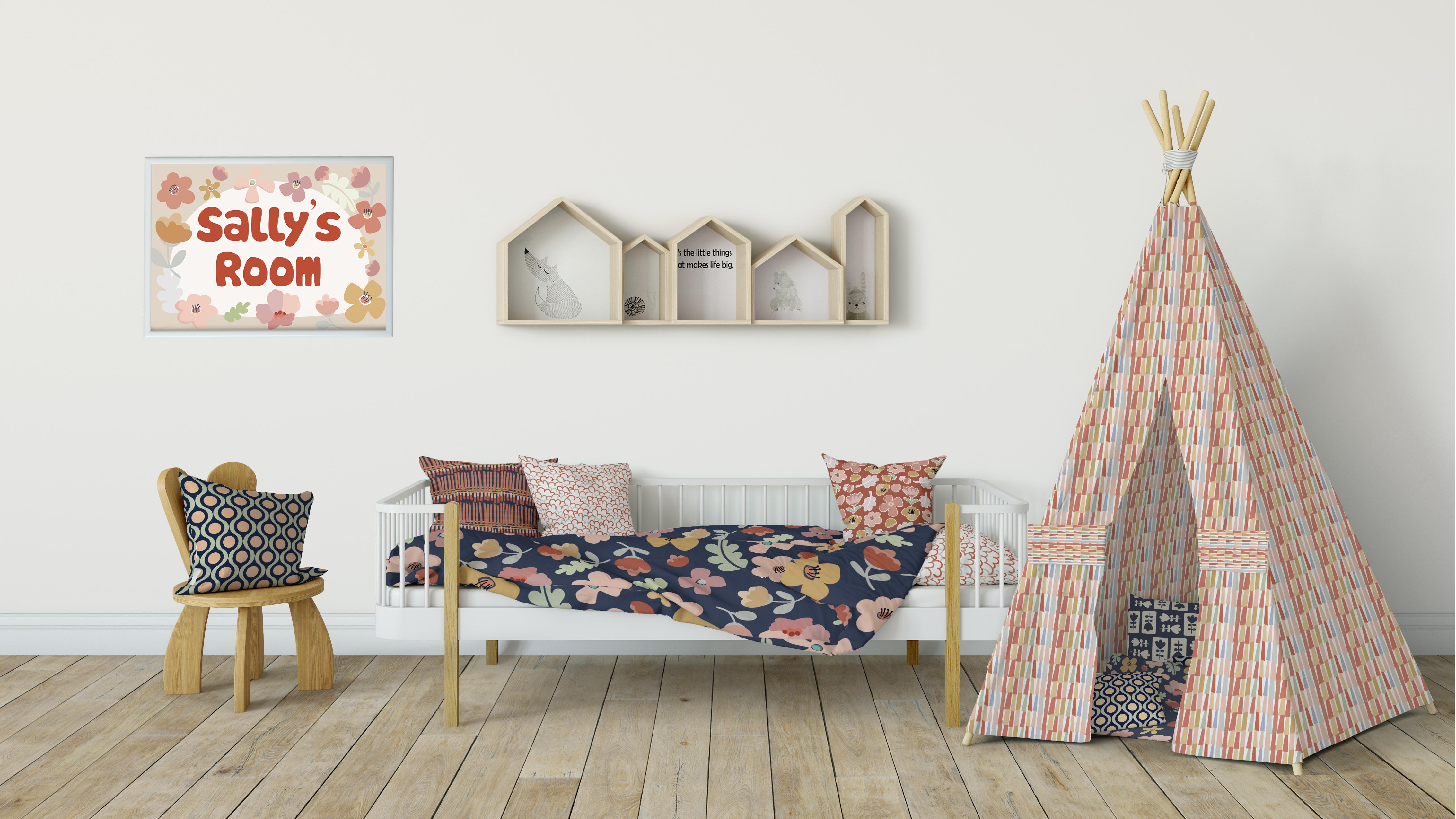
9. Outro: Well guys, Looks like we made it. We now have a complete coordinate set and I've given it a try here on a BB onesy hand. I think that looks super cute and blanket and also in a kid's room. And I really liked that. I had so many different patterns available in my collection to apply to all of these pillows and things. So these were just quick little mockups I wanted to share with you. I'm sure I do a lot more work on this collection before I consider it done, but this just goes to show you what can be accomplished pretty easily, especially when using the blob brush and the shape builder tool. This has been a great process for learning a couple of new tools more thoroughly than I've ever learned. I've used them in the past, but not to this extent. So we've done this together and I really appreciate it. I thank you so much for having attended my class. This is always so fun when I have people to do it with. If you haven't done it before, make sure you hit that follow button. I love seeing you here, learning new things. Make sure you visit my Pinterest sites. The two are Dolores art dealers Nas cringe and teacher Dolores Nas grant. Of course, on there. I share all of my resources. I don't think I could live without them. There are just so valuable when you're doing exploration and learning. I've got tons of artists resources on there. Make sure you check it out. Also, I have my website back up and running. So if you go and visit me there, you can add your name to my mailing lists and you'll see my blog posts and anything new that comes out. Please make sure you check out my other classes. If you do all of my classes, you will eventually learn everything there is to know at least everything that I know. And if I don't know something, I'm happy to check it out for you. And maybe I could even create a class. I never know what I'm gonna do next. It'll be a surprise for all of us. It's all part of the kinda stuff that you need to know if you're into illustration or pattern design, there's always something new that can be learned. Also, if you're interested, check out my stories. I've got one adds acyl.com, that's probably the biggest one. I've got a society six-sided and a red bubble site, as well as an art of where site here in Canada. Thanks so much for being here with me today. Bye for now.
 Delores Naskrent, Creative Explorer