Transcripts
1. Intro: Hello there. My name is Dolores NASCAR and I'm a graphic designer surface pattern designer, illustrator and former teacher living in sunny Manitoba, Canada. Today I'm here to share with you a class have created in which you're gonna work with illustrator and create brushes to produce a beautiful pansy flower. The first thing we'll do is we're going to create a really nice pedal from that pedal. You're gonna create alternate pedals. Then you're going to use these alternate pedals to help create flowers. Those flowers were going to use in a gorgeous repeating pattern. All of this will be done. An illustrator. This class is great for you. Whether you're just getting started or whether you're into doing this on a day to day basis and just want another perspective, we could always use another perspective. My main objective is to show you a bunch of illustrator hidden techniques and tools that are somewhat hidden at times or have purposes that you've never experimented with. So are you ready to get into it? All right, I'll meet you in less than one in this lesson.
2. Lesson 1 Gathering Reference and Creating Swatches: Hey there. Welcome to lesson one. I'm so glad you committed in this first lesson. What we're gonna do is we're gonna set up our workspace, and I'm gonna show you how to gather and important some references that we're going to use for our drawing, and then we'll probably create some swatches towards the end. Okay, we're ready to get started with our pansy illustration. And I just wanted to let you know how I went about getting all of this reference here together. Whenever I'm about to start some sort of an illustration project, I like Teoh quite a bit of time to gather some good reference and create Guess what you'd call a mood board. My first off, of course, is the Internet and a like Dan pansy and viola flowers to try to get some images that I could use. Now, fancies and Viola's are very related to the same family, and they're known by all kinds of different names like Johnny Jump up and violence. And I wanted to get some just really basic, beautiful photograph you refer to as I was doing my drawing and the things that I always do when I am searching for a good photograph for reference is I go under tools here and I go to size large. That way I get really high resolution pictures to use his reference, and this is one of the ones that I chose. So I clicked on it here. And when it came up into my image viewing area, I decided I wanted really to just center in on these four flowers here. So rather than take this whole large photo in, I opted to make a screenshot. And I did that. I using the keyboard shortcut man shift for so command ship for gives you this little crosshairs and you can see it there. I can select the area that you would like to cry, and it is saved as a screenshot on your desktop or wherever it is you've specified for your screenshots to go. I have mine go to my desktop so they're easy to get rid of. After that, I went back into illustrator and there I just used the place command and went to my desktop , popped up into and list here. I hit lace and I was able to position that where I wanted it so I've gotta here and it's all ready to go. And that was the one thing that I did. That was the first thing that I did. The next thing that I did is I created a Grady inch that I was going to use to create my swatches. So if you create brushes and if you've done a few, you know this radiance cannot be made into brushes. Therefore, you have to kind of fake your way into getting that greedy int. And I wanted to at least have this kind of range of tints of my agreeable color. So I created ingredient. And I did that by normal method. I hated a rectangle, and I filled it with my Grady inch. And if you double click on your radiant tool, you get this window. Whatever color you want in here, you could just double click on it. You can choose from your swatches. I'm going to use this one, I think, is my darkest in this case, If you've used radiance before, you know how to work them. Basically, you can slide the different sliders around. You can add other colors if you wanted to buy just clicking below I don't need that. I just want on the dark purple to basically light as possible Purple and I clicked. Okay, Now I want to sample the color here. You know that for sampling colors, especially in an image of any kind, you just grab that eyedropper tool, you can click anywhere in the image and your swatch will come up here, which you could then dragged into your other group that you've created always create a new color group. So I clicked on this soldier at the bottom rate. A new color group called it pansy colors, and I was able to then dragged my colors my swatch colors into that group. I'm gonna show you how to do it because you can't actually example colors from this Grady int. As you can see here when I click on that, it just samples the entire Grady in. So in order to be able to sample from dark to light, what I did was go under object to Rast. Arise, Kate. That's how I got that Grady int color Swatch here is click OK, When you get to this point, defaults are perfectly fine is ingredient. When you look at it, but it is not defined by the Grady int tool in Illustrator. So now you can grab, I drop her and you can sample any part of this. Now look at my swatches as I'm doing this and you can see as I'm moving my way across the swatch, I'm getting different degrees or different tints of that color. It was kind of neat. I find that's a very fast way for me to do. It seems long when I'm explaining it, but this takes me less than a minute to do and sample my colors and create my color group. Have a color there that I like. I grab it and drag it down into my color group. I can create a pretty quick radiant here. Now. One of the other things that I do is a double click on them, and I make sure that they're all defined is global. You see, when I defined it as global Little Triangle appears in the corner, that could be very important for you in the long run. If you plan to do some different color ways using the re color tool here in Illustrator Okay, if they're defined as global. You would be able to change them wherever you have them in the document. Leave me. That is super important if you have hundreds of flowers or items that you want to re color Okay, so I've defined all of these as global when I don't need, so I'm going to delete it. Me? I'm gonna actually re color this one a little bit to re color. That's watch. I find it easier to just double click on this. Watch up here in the pallor, and then you can side around in this box to make your changes. So after, I'm just gonna eliminate that one temporarily. Because I have what I like as a good greedy here. And I'm going to rename this color group handsy color Group one. Now, there are a lot of other different settings that you can change here. I'm not gonna explain these all right now, because it's not part of the scope of this course. So I've got a great color group there for my first pansy, and I'm ready to get started with the drawings. What we'll do in the next lesson, I will see you there.
3. Lesson 2 Drawing First Petals: Hey, guys, welcome to lessen, too. In this lesson, what I want to do is focus on the actual drawing of the initial pedals. All right, let's get started. You guys welcome back. So in less than two here, we're going to focus on the drawing of our pedals. We're gonna get rid of these two because we don't need them anymore. And to get back Teoh viewing my whole art board, I'm gonna get command. One can also use command and the minus key to move out a little bit. And I'm holding down my space bar to get the hand tool to move my document around you. Everything I want to do is just get rid of my art board temporarily. I don't need to be looking at that constantly to do that under view. Teoh. Hi. Dart boards of shortcut for that is command shift in each. So my art board is hit. And so when I wanted to do for the first flower is loosely trace one of the flowers that I have here. So I used the pencil tool and I enlarged really big on the one flower. So I'm holding down my command key and my space bar to get the magnifying glass, and that allows me to zoom in right on that flower that I wanted to zoom in on. Okay, it's a lot easier than going command minus and command, plus, you know, 30 times to get to where you want and moving it around with your space bar. I just find that the man space bar and selection method gets me to where I want to go a lot faster. So I decided to use my pencil tool for this. You can use whatever your favorite drawing tool IUs. For this, I decided to use my pencil tool so N on your keyboard will give you your pencil tool. And if you double click on the tool itself, you will get the fidelity settings. I practiced a little bit. Normally, I haven't said probably about here, and it helps to smooth out my lines as I'm drawing them and like that, because even if you're shaky, your lines will come out really smooth. But in this case, I found that it was a little bit too smooth, so I moved it down closer to the accurate end of the Fidelity scale. what this is. Keep selected so that I can make changes on the fly. And I will show you that in a minute. You can actually also specify whether you want the past to close automatically. If you don't have this selected, you can just hold your option key at the end. It'll close your path. But I figure I'll do this. It will be a lot faster than I clicked. Okay? And then I went ahead and started tracing pretty loosely. My petal shape close to the end. Here I'm within the 15 pixels and you can see I get a little circle by my pan tool. That tells me that I'm closing the path just let go and my path has been drawn. It's fairly accurate. So as it selected there, if I want to smooth it out, Okay, I just went ahead and I traced all my different pedals. That's what I have here again. I'll switch Teoh. Why your frame are outlined. What would So you can see that he's shortcut for that is command. Why? Hey, I will actually cull arises right now so that I don't have to keep flipping into outline mode. But you can see the pedals are right. Now it's just one color. No tents, no shades. And what I'm gonna do is work on one of the pedals and show you how we can get this sort of ingredient happening between the white, the medium purple, darker purples and than some of the veins here. In the next lesson, I'll show you two or three techniques to do that really quickly and easily remember that our end goal is to have no Grady INTs so that we can actually use Thies to create brushstrokes for future drawings of our flower. So I will see you in the next lesson where we'll work on that.
4. Lesson 3 Dividing the Petal: Hey, guys, welcome to Lesson three. This lesson will focus on taking the pedal and dividing it up. And we're gonna do a bunch of different things with tools that you may never have experimented with before, Like the eraser tool. The joint tool, which is really new and will probably work with, reflect on a whole bunch of other techniques that you've used before. But maybe in a different way. What we're gonna do is a little bit of work on this drawn pedal, and one of the first things I would do is to simplify it. So in order to simplify once the path selected, you go under object to pass a simplifying. Now I have a keyboard shortcut. Command forward slash So that's what I would use. It's currently showing me my last settings, which would have been pretty simplified. I'm not sure that that's exactly what I want. So in this case, I would click on these three dots, bring me into the full dialogue box, and here I could mess around with the settings. It shows an original of 13 points once it simplifies down to eight points based on these settings, and this is something that you can play with until you're happy with the way it looks here . You can always toggle leave you on and off to see if it is accurate enough for you, and you can see that it reduces the amount of points now appear to. What I had originally at the end of the last lessons is probably 1/3 of the amount of points here, so that's good. Just remember, when you're using these to make brushes, it really adds up. If you've got, let's say, several pedals or several flowers and you want to keep your illustrator document running really efficiently, so you want to keep that amount of points as low as possible while still retaining. Of course, your integrity of your sketch here. When I hit OK, and there are a couple things that I would do, I would straighten up this. I don't really like this point here. I think what's really bothering me about it? It's just that it's not matched on this side, because if you look at the drawing, there's definitely a bit of a point over here. I think what I would do is smooth out this quaint and then I think what I'm gonna do is actually reflect this one on this side. So I'm gonna get rid of this one completely. And then I'm going to straight note a couple of these. Now you can see that this is not actually a smooth point. So I could hit this convert, selected anchor points to smooth in the control bar, or I can hit shift, See, which gives me the convert anchor point to Ally could use that and just click. If I wanted this smooth, for example, I would just click on that I want, but I could do it that way. Maybe this one will do this way. And you see, as I'm dragging, I get that handles on. I can control the curve in that way. So I think maybe this might work here. Now, I've made sure that I've turned off everything to do with snapping. If ever you get your points actually snapping from one spot to another, you can turn it all off here seeing this little control panel for Excell snapping options. I always keep these off when I'm doing some intricate drawing like this. So what I want to do now is reflect this the reflect UAL YSL on your keyboard and see here that I selected that tool and when I will do is just option Click here right where the flip is gonna occur and got it already set to vertical. That must have been my last selection that I did with this tool. And I've got preview checked off, so it's showing me a preview. So that's before and after, and I definitely want to make sure I hit copy. And now I've got a perfect replica off the pedal on this side. Okay? That may not be what you want, but if you do want that now you know how to do it. So then these were still separate shapes. What I want to do is join them. So I'm going, Teoh, enlarge a little bit here. I'm going to drag select over the end points here. Under you command option J average the axes of both of those points. And then I'm going to command Jay to join them to do the same thing at the bottom. Here, man. Option J and then Command J. Now I've got a solid pedal. Everything is joined out Okay, So the next thing I want to show you is how to do a quick, darker area at the bottom here. One of the fast ways to do that is again to use my pencil tool, which is an on my keyboard, and just quickly draw. And I could continue all the way across here if I wanted to, but I'm going to use the reflect tool again. So I'm going to stop right there. I'm gonna grab that. So be on your keyboard would grab your move tool or your select tool. You can bring that over. Just put it up here for a second, because I see something that I want to fix. So I'm gonna switch to wire frame, bow or outline, which is command. Why? And you can see here that I've got a little bit of a notch at the end, so I'm gonna hit am a keyboard and delete that and select my whole path. So selected here old will get me the reflect tool option. Click right here. I want it to reflect on it. Copy. And then let's just join those two again. So, Amanda, Auction J Command J and I've now created basically the contour off that darker area that I want. So right now I know that the fastest way for me to get that matching these outlines here perfectly is to actually use a duplicate of this shape. For that they can share this line. Okay, So again, with this electoral, so v on your keyboard selector line and bring it down into position ultimately, where you want it to be placed and then click on the shape that you originally drew for the pedal, hoppy it and then use command off to paste it in front. So if you're not sure, see, if you pull it over, you can see that there was the original shape and then the one that I drew, if you're not sure of what layer that is, open up your layers palette and you can see here that I've got two copies of that shuttle. Okay, this is the lower ones. If I was to click here about the lower one and if I was to click here, I've got the upper one. So I know that the upper one is selected and I'm going to select a line as well. So I'm shift clicking on the line that both of these were selected. And then I'm gonna go into my Pathfinder pal and I'm gonna hit divide, and it has now created See this when I select on this, this selects the entire shape. But if I switch to my direct select tool a my keyboard, you can see that when I hook on the path here that only the bottom half is selected. So that means I've successfully divided my whole petal shape. I'm actually going to get rid of that, which is the duplicate of the top, which I don't need a duplicate of the fallen members. Right now, it's still the same color. But if I was to click on it and go to my swatches and fill it with one of my darker colors , you can see that I have now created this darker area that I was looking for. All right, so that's one of the ways that you can do that. And I'm gonna show you a couple of other ways in the next lesson that used the eraser tool to achieve the same results. So I will see you there
5. Lesson 4 Eraser and Knife Tool Methods: Hey, guys, welcome to lessen. For so in this lesson, I want to show you how to use the eraser tool to do kind of the same thing as we did in the last lesson. So in order to make it easier for you to see, I am going to take a copy of the shape from just drag, selecting it to put it above so you can see what I'm doing. Only what I would do is copy and paste in front and then just work on it. But that might be a little bit difficult for you to do what I'm doing. So I've got it separate here, and what I'm gonna do is grab my eraser tool shortcut for that one is shift E and with the eraser tool, you can enlarge or reduce it using the bracket keys. Okay, I've talked about this to a well before in other classes, but just a little reminder for you. So if this shape is selected, that is the only one that will be affected by the eraser tool. If I had nothing selected, I will de select this one. If I had nothing selected and I grab the eraser tool I could erase across multiple items which I don't want to do. I'm going to select that shape and then I'm going to use the eraser tool on this one. So what I'm trying to achieve with this next shape is kind of a transition where the dark purple and the light purple meat So it's kind of a transition between the light and the dark. So I'm gonna create that by erasing most of this bottom part out. So I'm gonna make my eraser barely large to start out with on. I'm just gonna go kind of a long and created in that way. It's with the large eraser, and then I'm going to reduce the size of it, and I'm gonna go in and make this a little bit more jagged E so that it kind of has a natural feel to it. You take a look over here, you can see that it ebbs and flows with the shape of the pell. If I don't like it or if I want to simplify it, I could just go in any race even a little bit more. So I've created an area that will overlap right on the edge of the other dark purple and give us that little transitional area if you're left with little shapes like this around a lei agency resource as well. So I could even erase more here. Kind of like it, though it's not too bad. So create a few kind of points, and it's pretty much created what I was looking for. So now I can take a bag that shack into position here. Now, if I had my smart guides on the case where I want them back on again, it's going to allow me to drag. And it'll kind of issue itself also automatically at the end. So obviously it's not perfect, but you're that over. So obviously at is still the same color, so that's not gonna work for us. What we want is this kind of a transition. We want to be kind of in between color, and I want to achieve that, using the blending modes. So the bloody mode that I think is gonna work for that is overly. I like the way it kind of bland's with the shapes and the colors below it. Okay, so I'm going to adjust the opacity here, and this is something that is really something you need to take some time and experiment with. One of the ways I would suggest is what I would have my students do is draw square duplicated by shift dragging and then manned D will do became or of the shapes above each other. So if you look at it in outline view, you can see that there's a bunch of overlapping shapes there. Then what I would do is take each of these squares and apply a different blending mold. Do it not gonna move this transparency up here. Be part of my tools that are a lot easier to access right now. I don't need this pattern tools. I'm gonna move it down. And same with the stroke. I always like to do this. Arrange my tools and panels in such a way that I can grab them really easily if I'm using them over and over again. The bottom here, let's do hard light. This one soft light do anything so but I'll do the next one overlay about the second goal here. Really, a soft light looks about the same. Let's try overly. I would have my students create a chart and label at my high school student status. Let's try color dodge. Try, lighten and again, changing the capacity will make a difference as well. So I would have to go through and create a chart that's actually had them really thinking about what each of the different on the Mod's could do. So that's something you could try after you're done the course or you can pause right now and do It's up to you. I think I will work in that slightly. And now well, we're on the next kind of a blend that I want to do. So again, we work with that same original be settled that I had, and this time I will copy in Pace and put it in front. So, man C man F and I've copied a duplicate going to outline mode so you can see that that is exact duplicate placed exactly on top of the previous one. So for this one, I'm going to use the knife tool instead. What the shortcut is for that one. It has no shortcut, and this works very much in the same way. So I'm going to show you how to work with that one. It's important thing to remember is that you have to go over hast the outside lines that you're cutting into. Okay, if I was to just do it in the middle here creates the path. But it has not separated up in the bottom. Let's say so. I'm going under that. And what I want to do is create this little area kind of around the edges here, right? So I'm kind of following along on tour of this one and the edge Contour self for way up here and I dissected the paths, and now I can kind of move along and draw along the edges. The way I watch so you can see I have cut through is what I wanted. I'm going to use the direct select so a on your keyboard using direct select and you can see that I've created a new shape that follows along the edges really nicely. So let's feel like the different colors so that you can see it unless Checco bitch of the blending modes is gonna work best for that. The body, your transparency pallet over here. And you could try overly again That's not quite what I want. Kind of Don't mind that, actually, and I'm gonna change the color. No, I'm not gonna use hardly. I'm going to use overlay and I'll be a little bit of experimenting with that. It works well with that darkest color. And again, you can see have created area here along the edges. So we're really starting to see a blend happening here. Think I'm gonna go and change that to multiply and then is the capacity to get it to the saturation point that I watch. Now, when it comes to the color itself, remember that you can either double click on this watch or double click on this watch. And if you double click on the one at the bottom here can use the C. M Y case liners to change the color. I don't want to change it for this whole Swatch here. You know this. Grab one of these over here, double click on it, and I'm gonna just mess around with this a little bit. Let's see if I can preview this same time. They needed to be a little bit more purple, e at their legal. So it's taking the pinky nous out of it. Click. OK, and that's getting closer to what I'm looking at over here. You could go on and on with this and keep working on it until you get a real good Grady int from light to dark. So I drew this crazy shape with my pencil tool. I'm actually gonna use Pathfinder to divide is part of the pedal. With what? I just drew no slight on books both selected. I'm gonna go to divide. Then I'm going to get rid of all of this extra stuff here. So, off camera, I think I'm gonna do a little bit of tidying up of my layers palette here and then in the next lesson, what we'll do is some of the detail ing and perhaps some of the brushwork, so I will see you there.
6. Lesson 5 Custom Brush Construction Methods: Hey, guys, welcome to less than five. So in this lesson, you'll see that I've tidied up my layers palette, and then we're gonna use some custom brushes to add details. All right. Okay. So I put the reference in a separate file, and I did just a little bit of work on my colorizing here. Now I have those little handed, darker areas around the side. Now, at any point, I could be changing my colors, but I think I'm gonna just stick with this for now. And just remember that I'm gonna have a bunch of different flowers. So colorization is something that can change Iran and create the alternate flowers. All right, but I thought the first thing I would do in this lesson was to talk a little bit about brushes and demonstrate taking of a brush. Earlier on when we were tracing, I traced this funny little jagged e section Here was part of the tracing that I did. I think of this kind of immune for this area here, but, you know, it could be any of these little jagged lines. We're gonna use that to create our first brush. What? To make a brush that I can color to any of the colors in my swatches palette. So it needs to be a brush that I can apply colorization options to. The best way to do that is to create a brush that's block. That's what I did a little experiment off camera and I created that brush. I'm gonna walk you through creating that brush. And so that was that little section that I had traced. And one of the most important things about a brush is to draw it perfectly particular. So you wanna have it either straight up or down or straight sideways, always at a 90 degree angle. So I'm going to line that one up to this guide that I just created, and I think in large so that you can see what I'm doing more easily. When I trace this shape, I traced it to pretty much the exact size. I'm gonna need it on there, and I like that for my brushes rather than creating them really large or really small. This will make sense to me when I'm in my brush and changing some of the options on it. And I'll point that out when I get to it, I'm going to make sure that this is centered along this line. So I am a keyboard to grab my direct select tool. And then I can line up right to the center for both the upper and the lower points for this product time when having the snap two guides would have been an advantage. But rather than do that, I'm gonna leave it off just for now because we're gonna be working really small. I don't want any snapping. So then I can move any of these points and I could make any adjustments that I want along the way. So I'm doing that right now. Have you ever get this where the two handles are locked together? If you ever want to separate them, your auction key and you'll be able to ground move each of these handles independently. Now that they're disconnected, I can easily do it. I want to line these two up to each other, so I'm going to use a line tools for that. I think I kind of want them to be approximately the same distance apart from the center, so I'm really getting the left side in the right side and much the same. I could probably just draw one side and do our little trick there reflecting. But don't take the time to do that. This is gonna be more than adequate. Okay, here's another example of where the two handles were stuck together so I can use my option key. And now they're dependent and I can move from the way I want them. But that's close enough. I don't need to have it. Absolutely. Exactly the same on both sides. This is gonna work for my example. Now I want to be able to re color this brush using my different swatches. So what I'm gonna do is I'm going to fill this one with blast looks. Just do that over here with this watches and then to create the art brush. If you've taken my other classes, you know, we've gone through this a 1,000,000 times, select your entire shape, drag it over into the brushes palette. You'll be given this dialog box. Choose Arte brush, OK? And then this is where I was talking about the settings that we could adjust so I don't want it to be a fixed size. I wanted Teoh react to my pressure pressure. I put on my stylist and I watch it Teoh Range maybe 30% in size. Hey, I'll demonstrate that when the brush is complete Now the other thing is here I want to set the colorization too tense because I want to be able to tench this color what I want. Hang on a sec. Looks like you almost have to A must absolutely made a duplicate there. OK, try that again. Arte Brush. OK, I sure possibly 30% difference since okay and my brush has been created. The other thing. I didn't point out with this direction for drawing the line a light, keeping my direction, my arrow there pointing downs I like Drawing in that way is the natural way that I would draw in Illustrator Council that undue because it applied the brush stroke to that. And let's just just be on the keyboard to get the brush tool and let's give it a test run. That's perfect. And you see, if I press really softly, I could make your fairly thin line. If I press really hard, I could make a thicker or heavyset looking line so Let's get rid of all of these and take a look at our pedal. And I think I'm going to just try a few lines in a deeper purple. So I'm going to close that. Still got that brush selected? Yes, I do. And if I choose a deep purple color when I draw my lines, make sure that you're set on the actual stroke when you're polarizing it. Russia's are still strokes, so when you cull, arise them. They're not using the fill your using stroke right there, that one, this one. It can just select and change. Then I can go through, and I kids draw lines the way that I want them. So I'm showing you a bunch of different techniques that you're gonna go ahead and apply. And meantime, I'm going to do a bunch of work with brushes and get you on the right track to having all of the different tools that you need order to accomplish your goal. So next one I think we're going to do is a brush that is just quite simple, very straight, jagged line in the middle, and I'll do that by creating an ellipsis again. I'm creating it approximately the size that I think I would need it. No stroke ill with block. And this one I wanna have pointed ends to it Or if you see the ends to this right now, they're very rounded set of handles for the smooth point. I want just a corner point there so you can click here to convert it to a corner or, if you prefer in your keyboard, use the shortcut shift, see? And then you can click for one little thing that you're doing. This is probably adequate to slip up here. But if you do the whole bunch of points and you're switching back and forth between your move, tool, your election tool or any of the other tools on your keyboard, then sometimes it's just us fast DFC and how I've got a contour created. And now I can take and drag that into my brushes palette. Arte brush. OK, crusher 30% if these options don't come up for you, If they're great out, it probably has something to do with your tablets. So we're not showing up. That's something that you'll need to check on. I would go to the Adobe website and get advice on what? To dio. I don't think you can use pressure if you don't have a stylus and tablet. Yeah, they're gonna change this to tense. Okay? And I've created another brush. OK, so that's one of the ways that you can have a brush that was from thin, too, that you try the same thing. I press softly. It's a certain size. If I press harder, I could even change. I think I'm gonna go in and I've been and make this a lot more of a range really softly, really hard. Like a difference. Okay, Now, the other type of brush that can work for this is well is a calligraphy brush. So if you were to grab one of these leg a few brushes, you can create your own new one, but actually go into this one. I've been double click on it, and I'm going Teoh on the settings here. So what? Calligraphy brush by nature has already ability. Teoh go from thin to thick just by the amount of pressure that you put on there. Just designed that way. These are the kind of brushes that you would use for lettering and they could be very useful. When you're doing some kind of a project like this where you retire, lines that are in and Dick I'm gonna go in and I'm gonna alter this five point oval. Actually, I think I burn gone in and done a little bit of that already, cause I've got this already 11 point and you can see here that I've got three different profiles. And the reason for that is that I've got this size, said it pressure and you could also change things like the angle. Basically, I'm just gonna leave it normal. Zero probably is perfect. The roundness. I think I'm also going to take that off and leave it at fixed so that roundness will not change. What's important to me is the pressure and what kind of a variation it gives me. So you can see here that on this 11 point lines giving me 10 points of variation, which means it will go down to one point and up to 22 points, probably something like that. So I might change us to be just a little bit less terribly. Don't need it to be that big of a brush Let's try seven with a seven point variation, and you can see how the brushwood change. Here you do six so that you can see that there's a little dot right there. Okay, it's hard to see on your screen right now. That means that could do it a line that thin. And as I apply pressure, I can get it thicker. Hey, let's give that one a try so you can see that that could be very useful for me in what I'm doing right now. So what I usually go through and do is two or three and have different settings for each of these. So as I'm working on my artwork, I've got a variety of Russia's toe work on course. You could make these brushes at any time. I'm just making a few now for an example, so you could see how to do that here in new changes to pressure again, it's gonna be a really small brush variation of three. Just know that you can also control it, using your bracket keys, you so I could make it smaller and larger, and I'm just using my left and right brackets. I wanted to really teeny tiny brush and went to the smallest. I could do it. Just use my bracket keys. I didn't have to go in here to change it. Let's go back to that one. Just wanted demonstrating that one works with color. If you want to go back and forth between your stroke and your fill, you can just press X on your keyboard so you don't have to actually go way over here to the tool panel or up here. Even you can just press sex on your keyboard. Your hand should probably be sitting pretty much there anyways. If you're always poised on your demand option shift on the left side of your keyboard so I could pick a color. I just did it wrong. I could pick a stroke color. That stroke color would then be the color that my brush paints, right? So there's two different types of brushes that are gonna be very useful for us in completing our final pedals. One other little quick technique I forgot to explain to you about a joining of two shapes quickly went in and drew this yellow area. So I did. The one side traced it and then I made a duplicate by reflecting one side to the other. And of course, now I need to join these two areas. So there's this Ah, little new tool that I had never really used before. And it's the joint tool. It's kind of cool, cause what you could do is if you've got to open, that's or something you want to connect like this, you don't even have to select it. But you can just drag over it with this tool and it will connect it. Just thought I'd quickly show you that. So I am going to end this lesson so that it's not too long. In the next lesson, I'm gonna show you how to use the brushes to kind of create that Grady, in effect, that I was talking about
7. Lesson 6 Working on Petal Color Areas: Hey, guys, welcome to less than six. So in this lesson, I'm gonna show you how to crop that reference photo that we've been using. And then we're also gonna use things like the layers palette and transparency and a bunch of other things that you're gonna see along the way. I created the yellow parts of the pedal here the same way as I did all these other ones. I made the sort of main first shape. And then I used the eraser tool to decode all this central part of the duplicate that I had pasted in front. But I would have this light area blend more into this light purple area. I think I still want one more step here. I want to show you a slightly different way off creating an offset area. So a slightly larger area I go under, object to path and go to offset path. And here you can set the amount that you wanted to offset. I'm just going to give you a preview here and you can see that it's going Teoh, enlarge the area that I've chosen. I don't want it to be quite that much. I'm gonna maybe trying to millimeters. And that's kind of what I want. Just a little outside area that's going Teoh and or have a little bit actually think you're gonna go smaller? Notice how I'm just double clicking on the preview or two clicks on the preview. Teoh set whatever my measurement is and show it on the screen here. So I kind of like that little bit of an offset there and change the miter limit. And what the miter limit does is if he's come to too much of a point for you, you can reduce that. The default seems pretty good for me, so I'm gonna click. Oh, now I've got this alternates shape here. Actually, this one. But I can also re color, and I think I'm gonna try that in the purple. I'm going to probably I'm gonna try this in the purples lately. Lighter. There we go. Lighter purple, and then I'm going to erase this inner area that I don't want so shifty gets me the eraser hopes. Let me select that first, and I could just stop at any point and select that little area rather than going through with the eraser tool. You see how this is a neat way to actually give yourself extra or add on to any shape that you want. See, I'm slowly building light to dark kind of greedy INTs happening here. Remember, these are all still super edit Herbal. If you wanted to, you could go in and make any changes or fix anything that you don't like. Like, right here. I have this little thing happening. I actually think for this one here, I want Teoh make it a little bit less insistently spaced around the edge here. I want add to it. So I'm gonna use my blob brush shift. Be getting that shortcut. Shift began I could, and larger reduced with my bracket keys. And I'm just going Teoh, change the contour of that little bit lead to far. They're shifty, my eraser. And grab that and clean it up into that. Over here is Well, whole point of what I'm trying to do here is to go from the darks to the lights and create that Grady into effect without actually use ingredients. I just love being able to use this blob tool and this eraser tool I can remember by way, way back in the history of Illustrator. I've been using it since 1988. Yes, believe it or not, 1988 and every one of these new, innovative tools that they would add, I would be just so happy and excited because there'd be some way to do a particular task that I was doing or easily and believe me at the beginning, it was basically just the pen tool you really didn't have much else to choose from. This would have been painstaking work back in the day. So when I see that there innovating still, after 30 years, I can't help but be impressed by adobes. Conscientious approach. Teoh making the artist's life easier off camera gonna continue or maybe all time lapse it. And you just keep an eye on what I'm doing here. If there is anything interesting that comes up, I will stop and explain. - I think this is the flower that I'm mainly using for reference. I want them to be close together, and this is kind of not close enough for me and not enlarged enough. So what I'm gonna do is I'm gonna crop this so that get this one flower be as close as possible, but my reference there locked the moment. I'm unlocking them here in the layers palette. Going to take this one here. Copy it. Sit in front. You can see I've got the duplicate, and then I'm gonna crop that one. So a crop it I just right click on it. I select crop image here. A co created that. And then you can just crop wherever you'd like. I'm gonna crop this one in real close. So I've got this moving a lot closer. Little work out better for me. So now when I enlarged, I'm using commands Fees bar again. I can just select really close to those two. Shut down. These I don't need. It's like that Brush Contemporary collapse. That panel a little housekeeping that my brush tool. Make sure I'm still selected on that brush. Yes, I am. And of course, I can choose whatever color I want. I don't want any Phil. I'm going. Teoh, start with a medium toned purple here in that one there. Sure that that's on the stroke. And then I can start drawing my lines in. You can notice that I am able to apply pressure friendly, get different thicknesses. I'm just simply moving, pulling downwards with rest you'll and getting from shapes of lines. Spending on how I control my stylists were getting closer and closer to this look, which is fantastic, Exactly what I wanted. You might want to have a ton of detail. It's completely up to you. You could have it quite stylized. You could have it kind of in between where you've got enough detail that it's recognizable as a pansy. Not too much. It's completely up to you. So I am going Teoh mess around with this from this pedal until I'm satisfy and I will probably just time lapse it for you so you can watch as this develops. Remember that If you wanted to have all of these points line up here, you can drag select over them and use the average. I'm going to lock these two command to toe lock thm I want a little bit closer now I can drag select over all of these. Second thes were locked block selection. Yes, command to those air locked. They will not be affected and I select over those you see, That's the only thing that selected their command Auction J. Of course, you could use those align tools, but I think this is faster, puts them together, and then you can pull them whichever way you want. And you're pulling the massive group. Pull them up to here from a murder. Any time you can change the color of your brush just by clicking on another horse watch before you continue. Now, this is a perfect example of when I would make another brush because I think I want TEM much thinner lines down here. So I'm going to duplicate the brush drag over new brush icon and you'll create duplicate, duplicate. You can then go in and meet whatever changes you want. So I'm gonna make that one actually fixed with and I'm going Teoh about 50%. Let me just test it, uh, go even smaller. I see I've been affecting of that original brush soul. Undo that last two and this is the one that I want to change. Changes back to pressure, says the one I want to change. And this is probably a good time to name my brushes. I could seem this one larger dinner, whatever. I'm gonna call this one largest because chances are I'm going. Teoh make changes. We'll call this one medium. And then that way, if I make even a smaller one and have that name and you see when you hover over them, you get the name of the brush. Let's call this one, then you want to call that one. Let's call that one speed. Even though it's not really a speed, you need to call it something. Okay, so that's how you could go about adding all of the vein. Work in the pedal will continue brushwork and the next lesson, So I will see you there.
8. Lesson 7 Optional Brush Technique for Blending: Hey, guys, welcome to lessen Seven. So this lesson will show you something a little bit different with brushes in creating possibly something we can use as a blending area from one color to another. You'll see what I mean. Let's get started. So before we continue with all of this vein work, I think we're gonna take a little bit of time to enhance the way our large color areas land , have another technique to share that will help us blend. These area didn't undo all of these brush strokes. And I'm going to use a brush, probably in about this color here to help blend this in. So this is an optional way to do it. Depends on how much really want to go into detail with the radiance. So I'm going to choose this color. I believe this is it. Here. She want to locate this layer here. That's this one here. I'm going to make sure that this one is here below. I know that I want Teoh were above this layer with those brushes. Let me try my first brush here, and you can see that thickness is actually gonna work pretty good because I'm gonna go around and add the brushwork like this. It's still creating separate layers. Here's the paths are not a part of that shape yet, but they will be eventually. So just bear with me and you can watch as I go through. I can kind of tell at this point that my documents illustrator itself the memory it started to be taxed. And I can tell because if I go too fast, it can't keep up with me like that, You see? And also I could hear the fan kind of kicking into overdrive. Processing I know is getting slow. The one of the reasons for that is because we're adding so many points so much more to the actual basis of this just so much information within the documents that it is making my document and my program run really slept going to do something here to help alleviate that problem. So I'm gonna select all I'm only on this layer and you can see how many points are there and especially probably because I did that offset Pammy. This this is ridiculously crazy here. So I'm going to elect it'll. I notice I can do select all and I am Onley selecting what's on this layer at the moment. Locked all that the other layers. So I'm going to go under object to expand appearance. It's going to change my brush strokes to be actual shapes. Can you see that this is the first step towards simplifying. What I'm gonna do now is go to Pathfinder and watch this as I find the shapes. A lot of these inside points here from those past are gonna disappear because they're gonna become one solid shoot. This is one solid shape. Now, I've already reduced a ton of the points that are there, and I'm gonna go to simplify again, meets command or re flash. I've got it on preview here so that I can watch what's happening. And there were 455 points. Wow, that is a lot of points. I can actually bring this close to the maximum, and I'm still going to be way improving amount. Ah, once that there are, And by improving, I mean reducing. So that's fantastic. That's exactly what I want to do because he here that there's gonna be some stuff here. I can get rid of all you see race for tool. For that, I'm gonna click OK to this. And after I do a bunch of strokes on this side, I'll probably go ahead and do that is what you see. Just even this brush or even this ah offset path that I had done. All of the points have gone like this. Just the main points that I need. You see race, ritual, shift, eat and also erase some of this stuff in here. So I can't do that off to use. Applaud. Brush. Actually, so it's the opposite. Trying using shift B shift B will help add. So that's something to learn also about the difference between the blob brush in the race for tool. They're really related, in my opinion, but do different things. So in this big, solid shape area here, I can't use the erase because of the way I want my layers to be building up. So the opposite of the erase in my case would be the blob brush tool, which in when I did the same thing. It got rid of all those extra points. One of the things that just need to practice and you'll figure it out. OK, so back to my brush, My regular brush bill should be selected on the same, but actually switch this because it's switched me out. And I think it was his color was that? And I'm gonna go through and continue my brushwork. I find a lot harder to know to this side because my natural polls for my hand, is it easy to do this and to make the strokes come out straight this way? I'm kind of working the opposite. I don't like that. It's just a lot harder for me. So I'm going to actually at this point, just get rid of this side. I'm kind of going right up to the center point here. Gonna get rid of this side. I'm going. Teoh, use the reflect tool now, which is on the keyboard, and I'm gonna option click right here where I want the flip to occur. It copy. And then I've got this side and all I need to do is join these two. I can just use my joint tool drag over it. So now the perfect replica of what I had on this side and I didn't have to draw in that awkward way with my hand. Just not doing it the way I want. Think somebody be using that joint to a quite a lot. So I want to make a short cut for it. And I'm gonna show you quick how to edit shortcuts. It just doesn't have a shortcut. As you can see, when I click on it, there's nothing that comes out that shows me that there's a shortcut I'm gonna go to edit and go to keyboard shortcuts. And it is one of the tools that I want to edit. So these tools are the ones that are on the tool are over here. So if I scroll down confined it there, it iss no shortcut on the hard part is gonna be trying to figure out what short cut I haven't used yet because I do assign a lot of shortcuts when try command option ship J. But it tells me that I can't tool shortcuts can't have either commander option as modifiers . In this case, I'm gonna say OK, and I've got the tilt key. Teoh make joins using this joint tool. All right, so I'm gonna continue on. I'm probably time lapses, but I'm gonna do a little bit more off this kind of work with brushes to create what appears to be more of a blend between levels here of color. So I may be making new layers and maybe making use watches. Let's keep an eye on what's going on over here, and something really critical comes up. I'll stop and explain it, Uriel. Okay, I'm going to unlock everything temporarily and could have been work on this color. So I'm going to find that one right here, create a new layer. Is that rating here? Right above the path. I can see the swatch I'm using here. So it's the 3rd 1 is my brush tool X to switch X switches me back. Is that one there? So can you see what's happening here? Like if you squint, your eyes were getting especially. You see, between these sellers here, it's becoming less and less of a hard line in between and looking more like a greedy, a smaller with my brush. So I'm not overlapping those some of this could be done with the law brush. I've just found that this is the fastest way for me, actually, years what I've created all these little brush strokes here. I'm going, Teoh, Select them all on my block. All of these other things. With this money you select, all of those brushes are elected, and I'm going to object. Expand appearance into unite them with Pathfinder just to simplify that a little bit. So in this case, I don't need to join it up. Too many Shand. Now that I've bind it, I'm going to try just flipping it over and see if I can use it over here on this side. Well, on my keyboard gives me my reflect tool. I'm still gonna option click here in the middle and hit Copy. And now I've got it over on this side. So you can see from the shape that I had drawn here on this side that it doesn't quite blend it like it did on this. I'll I'm going to make a few little adjustments here to pull this one over, get rid of a couple points and then just brush in some of the areas. If I'd like. I actually don't mind some of these little or es that are still showing through on both sides. I think that just helps make it look even more natural. Right? So I'm going Teoh im lapsed this and do the next two layers of color here. And when I'm done, you'll see that it is a lot more of a radiant happening. So we're getting there. Hey, take a look at this. You can really see if you can focus your eyes just kind of ah softer blend towards our goal here of creating ingredient. I just want to show you another method for creating a jagged effect on the outside of the shape. Not sure if I'll use it, but I am going to demonstrate it. She go under effects to distort and transform. You can go to this rough in command here, make sure that the entire path is selected and then I go under, distort and transform rough in that preview. Obviously that is not what I watch so I can go through and adjust here. And the main problem I would find with this is just not being able to control the direction If it's really contrast ing, This is such a dark purple against this couple here. So it's super obvious. I think this would work Well, if the transition between the colors wasn't so severe, that's another way that we could go on. Let's look okay here and then maybe just mess around a little bit with the blending modes. Now you can see here that the path is still there. I could still go in and edit this undo or whatever in order to make changes to it. Like the blending mode thing I was just talking about. It would probably have to expand appearance. And then that actually just applies at effect, that I had chosen. Actually, you know what? It's kind of growing on me. I don't mind this too much, actually. Let's should have, uh, making some adjustments on our transparency. My help? Actually, not that bad. Take a look at what this other shape is that can't remember anymore. Oh, yeah. Okay. There's that one. So we could do a couple of different things here so that this line does not actually show because of the transparency that we've adjusted here, we could cut out that section in the back so that this just butts up to the next color. So I'm gonna select both of these right now before I do that, I'm going to just make a little bit of an adjustment on the sin behind to make sure that it is overlapping. Don't want to get a whole bunch of weird little shapes that I have to deal with. So I'm going in nice and large here. I get a few adjustments. I don't have any of these Weird little overlap is happening. I want them to overlap completely so that when I do the trimming that the trim is really clean. It's pretty good all the way along here, mainly the ends that are a problem. It's going to use the minus two or minus key with my pan tool. Get rid of some of these extras Smoothies, radium at a point in the middle here and shifts. He gives me the controls that I can give this a bit of a curve on a line that quite well okay, so what? I want to be left West is as though this as a cookie cutter has cut out of this shape here . Okay, so I'll select them both. I'm gonna hit hit trim. And what this trip will do is eliminate all of this overlapping that's going on in here, and it's going to give us just solid shapes in our different color areas. That will also just really simplify our document. I don't want to do that till the end, though, because I want this to be still very edit herbal. So just keep that in mind that we will do a couple more steps at the end that will simplify this and make it viable as a rash.
9. Lesson 8 Details, Details, Details: Hey, guys, welcome to lessen Eight. In this lesson, we're gonna focus on doing a bunch of the small detail time, lots it. As I work on putting the veins back in that I took out. Remember to use your shortcut command shift. Jay, if you want to line up two points afrisam right on top of each other and then you can move them over together, just gonna go through and do a little bit of that kind of clean up right now. And then I'm going to reflect that brought on this side. Go to the other side as well. If you are having trouble, you want to select something. And there's a tight area like this where your drag selecting. If you're selecting something you don't want shift click on something that you want a de select were another way to do it is Q on your keyboard gives you your last You and you can easily just last you. The two points that you want Command shift J average approach and then directs Electoral A on your keyboard. You can It's what you don't really easily you can see now I've kind of lined things up No, I want a group. Anything that is this brush this colored stroke gonna go under, select and go under Same stroke color selects everything that is that color. I am going to band appearance notice here that my shortcut is command backslash. Now, if you're confused as to why I keep expanding appearance is because it has to be expanded order for me to create the brush later. Remember that I'm doing that to also help me simplify and get rid of points. So I'm going to do man backslash and then I need a wonder Simplify reduced it from 116 to 45 points. I'm gonna leave it at that. I'm also gonna use Pathfinder and combine wherever I can go through and do that. You'll see me doing it for each of the different colors. And now I want to do is take all of this detail I've done on this side and flip it over to this size. Oh, I think I've got everything else locked, including this central point here. I will expand appearance on everything is to be sure. And then old gives me my reflect Tual option. Click somewhere here in the center. I can see that it's going to give me the duplicate of my reflect over on this side hoppy and I've got all the details on my pedal. Unfocused your eyes a little bit or squint and you can see that it actually, when you're squinting your eyes this looks very much like this list. In my opinion, I think I want to maybe pull these shapes of front so that we could see that shape. We're bulges out in the middle, humming forward man shift in my right bracket key to bring it forward. In this case, there must be a conflict with the year that it's on. Let's take a look here and at first case. So this is it here, so I can just take and physically dragged this one up. See, that's for enough. Yeah, start off So you can see how valuable use of your layer pallet is when you're doing this kind of work. We didn't make any changes that you see at this time for the purposes of my demonstration. This will be more than adequate now. I could spend hours more making it look even more like this. And I always have to keep in mind that this is stylization with stylization. You're simplifying. Just keep that in mind, so don't go too crazy. And remember, try to balance the amount of time you spend and whether or not it's worth it. Something like this I enjoy doing. And I consider it an investment because I think I'm going to use the brush is more than once definitely gonna use it for several pedals. You know, for me, it makes sense to spend that amount of time. So in order to keep it kind of edit herbal so that I can use it for other pedals and change it off a little bit, I'm definitely gonna keep a copy of this when I'm not going to do anything to completely finish that pedal at the moment, would rather duplicate it and then use the duplicate to make my brush. So I'm gonna keep this one as is. I'm going to select all I'm just dragging over all of it. Actually, I think I've got some of it locked me. Go back here and unlock some of this other stuff here. This is all part of the pedal. Get rid of that guy that I had. And so all of this represents the entire pedal unlocked. Okay, So that so I'm going to copy it. I'm going. Teoh, keep that layer intact. I'm gonna make a new layer. And then when I paste, this one, which is my duplicate, is pasted on its own layer. So going to lock this later on? But a name it original, unedited, So that there's no danger of me doing something to this one here. So I guess my yellows words unlocked. Let me go back. Going here. Where are those? Little yellow is hiding. That's weird because they were unlocked. Let's try that again. Go into my group. Okay. Locked within the group, you weren't being selected. Copy going to this layer and paste. And I've got that pedal and it's ready for its next step, which is to simplify it and make the brush. Oh, that's what I'll do in the next lesson. I'll see you there
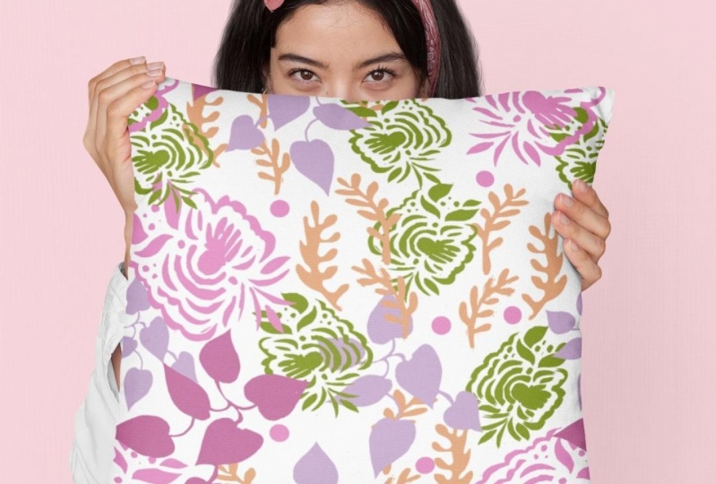
10. Lesson 9 Getting to the Pattern Repeat: Hey, guys, welcome to lessen nine. So here's the moment we've been waiting for. We're gonna finally create our brush. So with this graphic that we have, all the outlines have been created. So we're ready to actually make the brush get open up my brushes panel here so you can see what I'm doing in a moment. All we have in here are those custom brushes that we created. Help us complete these details or this graphic here. I'm going to drag into the panel. You can see that I've selected the entire pedal and I'm gonna drag it in here to create the art brush. Definitely. I could have clicked on the bottom of this panel on Just hit this little page icon here, which indicates a new brush. And this would have got me to this exact same spot. Art brushes what we're creating, I'm gonna click, OK? And I am going to make sure that I changed us to pressure and that will allow me to have a bit of control just in the way. I guess on my stylist. When I'm drawing the pedal, I'm gonna do about a 30% differential between lightweight and heavyweight and leave these settings, as is I personally like drawing my petals or leaves or anything like that going downwards when I am on my art bored. I'm going to use this arrow that faces down, and I'm not going to change anything to do with colorization because for now, what this all colored and it'll be adequate for what we need. I'm gonna hit okay here, and you can see that the brush has been added to my tool panel. So let's give this a test run. I'm gonna presby on my keyboard. That gives me my brush, and I am going to just pull straight down. And as you can see, I've created a pedal just by doing the breaststroke. So, as you can see, when I draw the brushstroke follows, the center line indicated inthe e brushes control panel, so you'll have to experiment a little bit to see what kind of different strokes you can create, how far you'd have to pull, how hard you'd have to press and the different kind of pedals that you can create that you can always double click on the brush and make adjustments here. If you wanted it to be fixed so that pressure doesn't apply at all. And just go in there and change it. You can have it apply to the strokes you've already created, or you could leave the strokes as is. I'm gonna just leave the first stroke. I don't know. I'm gonna try it again. And longer it pull the line, the bigger the pedal will be again with the fixed size. What I could go in and do is make this a lot smaller. And sometimes what I do is I create an actual duplicate of this brush by dragging it onto that little page. Iconic bottom. And then the duplicate. I set to a smaller size so that I got one for big pedals and one for small petals. It's all up to you. And of course, what we would do is create alternate pedals here based on this artwork. So I've gone ahead and done that on another document. I'm gonna take you in there, and I'm gonna show you exactly what I did. So here are numerous additional pedals that I create. And believe it or not, they're all based on that original pedal that we did so when you have your pedal artwork. Let's go back to that pedal there. And remember this one here where we've created all the outline. I just copied it and then went to my alternate pedals, documents and pasted can but on a differently. Or here, if I wanted to. You can see all the different ones that I have, so I might actually create a new layer. I've got a blank layer there and I can actually cut it from this layer. Go into the new layer and paste. You'll see that the anchor points come out in a different color here, showing me that I'm on a new layer. Okay? And what I did when I was creating these other pedals, I just enlarged really close to the artwork. And I made my modification so you could do all kinds of different things. You can change Shea off parts of it. You can simplified parts, So if I was to simplify number, my shortcuts, I could go in, and that would just smooth it out. I could remove parts in this case. Maybe let's remove this whole section here, and I could go in and change the colors. Let's go back into my swatches here, and I could make it a lighter color. Maybe make this one slightly different on some of them. What I did is I removed a lot of the actual veins that I drew. I wasn't sure at the end whether it really loved the vein work, so I did take it off on some of them. Now I could work on just this pedal and to ensure that I'm doing that, take a look at my layers palette here and lock all of the other layers, Then use my selection. Let's say I want to get rid of everything in this darker color. Go under select to same feel color. It's gonna select everything in that color. I could either change the color or delete it completely. Maybe do the same thing with this one. Now you can see here in this case that it's selecting all of these other items as well. You can use Q and your option key to subtract from the selection so that those would not change. You could hit the leads, they said. You could do endless things to make this one be different from other ones. Don't forget your minus key for eliminating points If you wanted to, you could win and affect the transparency. Use different blending modes. Whatever you think you want to do to make a pedal, be completely different. And that's another way of really changing the way something looks. This is just to go in and simplify it or rough in it, or apply some sort of some other sort of filter to it. So let's say this was one of the pedals that I've created as alternate, and I would just go through the same steps selected all drag it into the brushes panel. Arte Brush say OK, change my drawing direction to what my preferences decide on how I want thescore ailing to work and whether or not I want pressure or anything else to affect the way I draw my brush . It okay at brushes. Now in my brushes palette, give it a test. I'll use the B. I'm a keyboard to grab the brush tool. Select that brush and I'm just going to You likely draw some restaurants here so you can see that very easy to create the alternate pedals once you've got one created on the other thing you can do to affect the sizes of your brushes, remember, is that you go into your stroke panel here and you can use the stroke panel to make your pedals bigger or smaller. Actually, what it's doing is widening the stroke. So that's something to keep in mind as well when you're drawing. Once I had all of these pedals, I was ready to start drawing my flowers and I'll show you on my other documents, that kind of flowers that I went ahead and created. So you can see here. I'm using a whole bunch of different pedals here. Handle because I copied and pasted this flower from my other documents. You can see that this is my full brush palette here. And when I paste it over into this document only the brushes that I had used him up in my brushes panel. I just want to show you just a few of the techniques that I used in creating this grouping . No, this one could easily be used as a placement print. You can use this for so many different things and cheating a pattern is really just one of them. So when you have your idols all settled and you wanted to start drawing. Actually, let's go back to this one where I've got all of my brushes and let's just do a little bit of experimenting with the drawing. I'm going to zoom in a little bit. I'm gonna enlarge to about 66 Which is fine gives me kind of better scale for drawing. And you can see I can just pull, create the little flowers and then go in with a different pedal and create something completely different in this case is almost like a viola viola. You know how you pronounce that? Get these growing wild in my yard. Actually, remember that you can combine pedals so you could do something like of these in the foreground, and then you could draw pedals in the background. Right now I'm drawing in front. But if I go over here into my tools, I can change the drawing mode. So over here you can see the shortcut for what this will do is help me raw in behind. So when I'm over here, I don't generally go over to the tool panels. You actually select that? I just do shifty and then I can draw behind. You can see here. I'm just adding to that flower very easily. And I'm drawing in behind. I'm not drawing on top, so that's kind of cool. And one of my previous classes, the extraordinary brushes loss I created these leave and I created these stems. These were just a bunch of additional things that I had in that document. Remember that you can import those brushes from a different rush, sat and then you've got those to play with this. Well, these brushes were pretty nice, cause they're really kind of universal leaves that I can use over and over again. So I really like doing that. And that's why I don't mind spending time producing brushes because you can use them again . And that's a really late thing to have. Is Arsenal brushes that you can you remember again, I can go into the strokes palette tenacious, appear smaller. I can create stems and you'll see in my finished pattern that one of things I did was I made sure that I drag some really nice long stands behind the flowers. You give it unit of this particular stamp here, and if you notice that. But this one draws in green and this one's a little bit thicker. Also draws in that green. Nothing has been altered in the brush for change in the colorization. But this one here, I did alter that I put Pinson shades and now I know that when I draw this stem, it will be affected by whatever color I house and at the time in my swatches palette. If I choose that color and my son will be drawn in that that's kind of an interesting thing to keep in mind. And I covered this more in that other class, the class with the extraordinary pedals, and see a little bit better there if I enlarge it. So another thing to keep in mind. Okay, Another thing to check on and to experiment with you in the end. This is kind of the grouping and it didn't want to take the time on camera to show you all of this. It's suffice it to say it was like to produce this, and it is still very easy for me to alter it so great, because you have so much flexibility at this point when you're doing your pattern design. You have to stop and do all of this. Drawing pedals are already there. You just have to arrange them the way you want them. So I went ahead and did that. Got the positions exactly the way I like them. I added some of this see tail in the background so that I just created using my basic round brush. Those little dots are very hazy and quick to draw. Pick the color you want to work with, and then just drop in whatever color you want. Remember that you can still control the size of the brush using stroke size. Or you can use your left bracket to make it smaller right bracket to make it bigger. Okay, I experimented with different combinations, changing the flowers just by quickly changing the pedals. I changed the color of those dots by selecting. I'm gonna lock this one first. Hang on. So this one's locked. It won't be part of what I'm doing next. I want to change all of this yellow, all of these dots in the background. So I select one. Then I go under a select same stroke color. So that's where you're gonna find using that select and select saying option to be a real time saver. And then I can quickly change that to be another color. Make sure you're on the stroke over here and then just click on your other color on me. Nothing I would have chosen. But just to show it to you on screen, you can see how easy that would be. That's how I ended up doing this light purple over here. So then I took and used that to create my pattern. This ends up being the final pattern that I've created out of it. OK? And I'm gonna show you that in the next lesson I'll see you there.
11. Lesson 10 The Pattern, Colorization and Mockups: Hey, guys, welcome to lessen 10. Hey, we've made it to the end. I'm always so excited when we get to this part when I could actually see what all my efforts have allowed me to achieve. So I'm gonna create my pattern. And I think I'm gonna use this yellow one as the basis for this next experiment. This one's locked. Anyhow, I'm going to go into the layers palette. You see here that it's locked, I'm gonna create a new layer, and I'm going to select this whole grouping of flowers. I could see which ones they are easily here because they are the ones that are locked. See that all the way down. So I'm selecting, dragging on Teoh this layer, lock it and hide it completely. We probably won't use that again because I'm going to concentrate on this one here, but you can see that this has all of the yellow dots. It's like a huge amount of work. There wasn't too bad. And now I'm going to select this entire motif that I've created, and I have done some experimenting on the side, so don't think that I can actually just this quickly figure out all of my settings on my pattern. I'm not that good. Believe me, I did a bunch of experimenting and I knew that I wanted to create a creepy So you'll see that. It tells me that a new swatch has been added to my Anil over here. You can see it right here. Really small. I'm gonna say OK, cause then that is me access to the panel here I can put in my settings. So I did a brick by roll. Don't see that That kind of is slow. In my opinion, you can see when I'm I'm doing this, that there is, ah, lag here. And that's just telling me that I have a ba jillion points in here. So I'm so glad that as we went along, I did do whatever I could to simplify my Vettel's. And that's another reason why I brought it onto its own separate document. And it only has the brushes in it that are currently being used have done all these things to help illustrator so that it doesn't have to work quite as hard. And even then, it's a little bit Laghi when I'm actually starting to do this kind of work. I end up figuring out that I wanted a 3/4. You'll see it'll alternate them recorders of the way across of the previous role. And I know that my file size is nine inch by nine inch. That's what I created. It took me a bit of time to do, but it's not within the scope of this particular course for me to go through this step by step with you. I just wanted to show you the end results. So once I hit return for this site setting, you can see that I've done all of the appropriate kind of calculating to have my repeat work properly. I know you sharp eyed illustrators out there have noticed already that this you see it there. This stem is overlapping incorrectly. So remember that that's something that you can set here right in this Anil. You see all the different overlap controls that you have here and sure you experiment with those because that's what's gonna have to do things like talking and things behind that you don't want to have overlap and what Not Like I said, I did this work off camera just so that I could do this very quickly with you so we could cover a lot more. And you could see that that's worked out just great. The pattern repeat is really nice. We've got a nice flow happening. Withy stems in the background is balance between the darker colors and the lighter colors. It would be fun to really play with this pattern now and use my brushes to create even a bigger pattern. So the repeat isn't quite so obvious, but I really like this. And the first thing I thought of when I looked at this was that this remind me a lot of, like hanker chiller bandanna fabric, you know, So you'll see at the end, I'm gonna throw this onto a nice and Danna walk up. Anyways, this is what I did. I was happy with this, So I applied the change by hitting return, and I left my pattern Repeat here and you could do that up here, where you see new pattern upper left hand corner. Your swatch has been added. All of settings here have been apply. And you can either click over here exit pattern editing mode or I just using escape on my keyboard so you can see here that that's been added. You've got it on your panel. You can see my other tests, watches that I created previous to this You've taken any of my other classes. You know that what I do when I'm working on a pattern repeat is I often do screenshots to help me figure out exactly what I want to do. I'm gonna open a few of those real quick to just show you the progression that I went through when I was actually working out everything to do with my pattern. I do screenshots and I do those by doing command shift for and I get the little crosshairs and then I can select the area that I want. And what I did was these three different screenshots, as I progressed through when I was working on my pattern, what I would have done is to that screen shot and then used the place command and bring whatever screenshot that waas. So this was my first iteration of the pattern that would have been my second. And then that would have been my final. So I'm gonna bring these three onto the document pull and create them to whatever size you want. I just want to show you that's the 1st 1 That's the 2nd 1 and that's the 3rd 1 Let's make this the same size, Yes, So you can kind of see the progression that I took here. I had no fillers in there at all or just a few. It was like I had the initial idea, but I hadn't actually flushed it out yet. And then this is a little bit more of a test with more of the shots actually drawn in and a test to see where I was missing them, where I needed to actually fill in. And then this would have been pretty close to the final one, where I've got also that fleshed out. You can see why Screenshots are very helpful for this. Sometimes I even actually print the moat. Now you can see that Basically, this was the final pattern that I arrived at. So I'll just get rid of those now and then. I wanted to, of course, do a test to see how my color hell, it would work with a background color. If you could see here, I've actually got the pattern on its own. So what I did is I hit em on my keyboard and I drew myself out a square. I feel that square with my pattern that last watch There it's Make sure I'm on Phil X on my keyboard will bring the fill the foreground. See, I fill it with that pattern that I copied that square and I pasted in behind. So if you take a look up here, you can see that command B is to pay sitting back. So that's what I'm gonna do you command be. It's a Senate, absolutely in exactly the same position. So it's not gonna look like there's anything there now. I can change to fill off that to whatever color I want. So you could experiment. Of course, that's exactly what I went around and did and established that that light color like yellow , with one of the colors that I wanted to just take a look at, and I also experimented with a light blue, and that looks really nice to I think that is one of those that could work for a bandanna. You know, just have fun with it at this point that's the whole point is for experimentation. And to check out what kind of things work for your design, remember that you can also go in and play with the re color tool. It's not really in a scope of my course today to go through the whole re color tool, but I'll just show you something real quick and you'll see how quickly and easily you could change things if you wanted to. I would select here of the edit, and you can use these little handles to move your color along to a different location. Let's say I wanted to switch everything to be quite a bit more pink. I could just drag these over and you'll see that the changes are occurring here in my artwork in real time. Like I said, I'm not gonna cover this in great detail today. I just want you to know that this is another thing that's available to you. I'm gonna cover re color tool in some upcoming lessons. Let's say we wanted to change and get a lot more of the yellow out of the document and have it just a lot of green. Instead, you could see that the changes are happening right here on my screen, right here in my artwork. Let me try one of these. That's a little bit more obvious to you. This is another one of those things you could just play with. All day long we change some of these greens. That's probably the most obvious one To show you is changing the background, which is this giant circle here. What it would look like on pink be later. Maybe super deep, More purple E So you could see how much fun that would be to play with. The last thing I want to show you is experimenting with this on, um, aka and one of the fastest ways you can do it is with this website here called Place it. You can experiment. You can search. This is the one that I decided. I wanted to try my image out on here. By the way, you can just purchase at one time use of the market where you can actually get a subscription, and I think it's pretty unlimited for the amount that you can actually use. I like the idea of paying just 7 95 for that one time use. So I'm gonna upload image. And what I did is I saved out This color scheme has a J peg with 20 by 20. Document an illustrator. It give me 7000 by 7000 pixel image as a J paid on screen. It does all of this. You can enlarge it, scale it to whatever you think is gonna work for your particular design crop does. It's thing in the background and then you see the adorable print. So I'm super pleased with this one. So remember I had that other idea to to try it on a bandanna. So this is the image that I think I want to use. I think this one's a very engaging image. I'm gonna import another version of my pattern that I actually played with a little bit in Photoshopped, using color ways to re color, to work a little bit better with this image. Same thing here. It can crop, do whatever I want. There's my image applied to a bandana. That's kind of fun to you. Like I said, this is the time to experiment and play. I really hope you can share some of these with me and show other students exactly what you have done. If you wanted to go ahead and purchase that you would hit, download, and you're given a couple of different ways to purchase. I think I'm done with my demonstrating here. And I really hope that you have fun with all this and share here, please post anything that you've created. And if you put it on social media, please do hash Tag me at the Lloris nascar and slash skill share. I'd love to see what you create, and I'm sure other students here would love to see it to the very last thing I want to show you, though, is also going into a site like society six. How easy it is for you to take a look at what your products might look like. Especially when you're just testing. You have no idea whether or not you want to actually proceed with the pattern. I've done this numerous times. Create a draft post. So I add an art post. I upload my artwork and you do need to have a really good resolution. Find the artwork that you've created for that purpose. Sure, if this one will be big enough. Give it a try. You have to own all the rights to the image, which, of course, you do. If you're the one who created it, sure, you click on that or you won't be able to go to the next out. Then, of course, you're going to go through and name it. Follow through with all of these. If you're just testing Honestly, you don't have to put all of this stuff in. But something like a nice return. Pretty pansy pattern. Especially if you're just gonna have it as a draft just for you to see what it looks like on these different products. Then it pops up with all of these mock ups. So which is kind of fun? It's not gonna show all of my mockups here because I didn't upload high enough resolution. If you wanted to see that, you would definitely have to go back and uploads something off of higher quality. All of this credenza you can upload individual artwork specifically for that one actual product. Here. I've got one that I created that is a high resolution, and it's a very large file. Your different sites will tell you what their requirements are this one I created. At 28 by 20 it's almost almost 30 inches in pixels. That's about 7000. Chicks will square again. Save it out as a gay pig or whatever that site requires is my finish pattern as a J pig. Remember, I'm just on the credenza here. It's safe and then scribble back down. But look, it has applied automatically to a bunch of different products. You make great getting to. I love that it's betting. Prefer this light blue background, though. What do you think down? I love their back back here. Phil, Fanny, any pack. It's kind of cool to you just to show you how easy it is for you to just kind of test your pattern and see how it looks after. Sometimes what I do is I will just take a little screenshot of that so command shift for for your screenshots, select the image area that you want and you see it has created a little screenshot that I can use may be uploaded to instagram or use it as part of this video. Actually do that Fanny back to, and it just is really fun to see it in these alternate colors. Definitely. Do have fun with it. Make sure you share and you have a minute right now. It really appreciate it. If you would leave your comments and to let me know if you liked the course, give me a thumbs up or a review that would be super awesome. And please do check out all of my other courses. I think I've got 15 or 16 courses up now. A lot of them relate to pattern design, but there's a lot of other stuff there as well, so make sure you check it out. Thanks so much. See you next time.
 Delores Naskrent, Creative Explorer