Transcripts
1. Intro Jap: Japanese woodblock
prints inspired me to carry this snow scapes, and I am happy to share with you how to paint the
white of the snow. My utilizing negative
painting and strong contrasting colors and knit trick on how to cover a large area even
with a small brush. How to maximize a
limited palette. We will also have lots of
opportunities to practice controlling brush pressure
and painting thin lines. And we'll have
fine finishing off the paintings with the
splattering technique. Hi, I'm Bianca, loose Gerais
a lot their colors from the Philippines with 40 years of daily painting experience, who also loves to teach. In this class, we will paint three Japanese Inspired
winter scenes, starting from the easiest line down to the most,
the failed one. These landscapes are inspired by Japanese woodblock prints, create them by Hiroshima
and a key away artist and is
considered the last great master of that tradition. You can do all three
paintings in one sitting or in bold
yourself with the story behind each snow escape
as you work on it and come back sometime later
to complete the project. Watercolor beginners,
hobbyists, and enthusiasts are encouraged
to give this a try. And even those who have adequate experience are
welcome to join the fine. You'll find a scanned
copy of mice catch and the finished artworks in the projects and resources tab. So feel free to download them. As your reference. Once you've completed
this class, you can now paint others no
escape series by applying the techniques that
will be discussed and practiced
throughout the class. Prepare your
watercolor materials, including paper, brushes, paint, pen and eraser, masking day, water jar
and be wary towel. And let's get started.
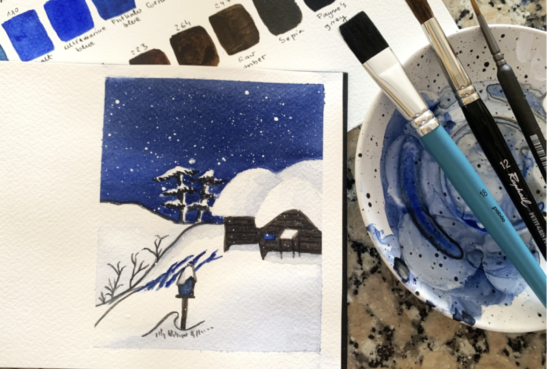
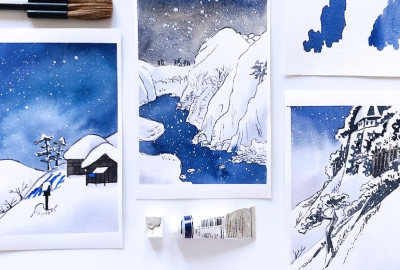
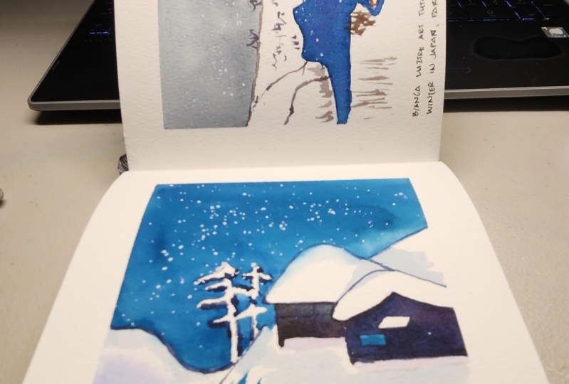
2. Project 1 Seki: Let's kick off this class with our first project showing
the village of psyche. The original woodblock print shows the village and
it's easy shrine, which lies submerged
in snow chimps. The spatial depth
is suggested by using a delicate blue shading. I will only be in the right
side of this reference photo, painting the people and the tare gate and include
on the two trees. So in my version that people
have already left E6 shrine. Here's my sketch of the
scene and you'll find a copy of this in the
projects and resources tab. Feel free to download and
use it as your reference. For this painting. I will use a mixture of royal blue and carboxyl
violet for the sky, and a watered down version
of it for the soft shadows. Ultramarine blue for the window, the hard shadows and the lamb. Burnt umber. And ultramarine blue for
the house and outlines. The white of the paper. For the snowy chlorides and
white paint for falling snow. I'll start with the shadows. I want a soft transition
for these Bart's. So I will wet this
area first with clean water and draw
my shadow color, which is blue, violet. And let us spread on its own and work on the other part. Shot. But I'm being careful so that the shadow color will not read
the edge of the wet area. These is to prevent hard edges. If you've noticed,
I also avoided wetting this area where
the snow heel and the sky meet so that I can work on the background without waiting for the soft shadows to dry. Now here comes the fine
but challenging parts. We will negatively themed around the houses, trees, and heal. To prepare this area for
the background color. I will use a watered
down version of the background color to
show you how I do it. But usually I just fainted. Clean water and tilt
might be bird to see if I have covered
the whole area. Quick tip. If you find negative painting challenging
and the one to avoid it, especially with organic
shapes like these trees. You can try and paint
the whole background. Wait for it to dry. Then use white paint,
watercolor or gouache, whichever you may prefer to paint the trees offered
the battleground. Here's a quick demo. These trees there I were
negatively big bed. Now let's try painting another one using
pure white pigment. Over the dark background. You will see the difference
between the two, and I'll leave it
to you to decide which technique you will use. As you work on these
complicated shapes. Depending also on the weather and the humidity of your room. Some parts may have
started to dry already and go ahead and
we read those areas. So you see me doing here. And then we can finally
draw our background color. If you'll also notice, I am using a smaller
brush for a large area. But it didn't give
me a hard time since I am doing this and we've
the wet on wet technique. Just make sure that when you
drop the background color, there is less water in the mixture as the
paper is already wet. If you load your brush with your background color
that is very watery, then you might end up
with a pale background. And with a very wet paper. We want our background to be dark and strong for this
node to be noticeable. Once you're satisfied with this, we can now move on
to the hard shadows. As long as the lower
part is already dried. This same color,
ultramarine blue, is what values for
the base color. Often the lamp and the
window of the house. These are just
random shadow shapes that follow the
slope of the hill. No need to overthink this bar
and I know you can do it. And remember, you don't
necessarily need to produce a replica of an image
that inspired you to paint. So if in case you're watching this class
and painting along and suddenly realized
that your painting is different from mine. Don't feel blue,
own European thing. It's your very shot,
your interpretation. So be the first line
to appreciate it. To finish this off, we will be adding our darkest dark using our neutral mixture, ultramarine blue and burnt umber to define the house
and some twigs, defining the lamb
falling in shadow. And the overall outline. I'm using a round brush
for infrastructures. So I find that easier
to use comparing to a mob round our flat brush. I am being careful in this part, but not so much that I
am pressuring myself in painting perfect shapes are getting it right the first time. Honestly. I hate fainting structures like these houses and the lamp, but they can avoid
them forever, can i? So you might have
observed that compared to organic shapes like the
trees and the twigs, I am painting a bit
slower this time, carefully filling in mice
catch and dark colors. And I hope you do the same, enjoying the process
and not getting so stressed and bending
the perfect shapes. I've heard Guide to AI
add shadows on the roof. So I'm doing that now. This should be the most
fulfilling barred for me. Adding details and finishing
touch for a debate thing. It completes the story and gives that feeling
of satisfaction. As a new art Doric
comes to life. So really immerse yourself in the process and see
where Lindsay you. If you wanted to change a
few things here and there, feel free to do so. This is your
fainting, so own it. Let's splatter some white
paint for in the snow. Quick tip and splattering. He again tap beer brush against another brush or lightly
tap it with your finger. I recommend using a smaller
brush, rinse blathering, and not a big thirsty brush like a mop brush up these for
art breaks this size. Convenient doing this
until you're satisfied. Just make sure that your
gadgets or away from your painting area
when doing this part. Or you'll get a snowy
screen to and to be safe. We can also cover
your table with all newspaper or scrap
paper for ISI cleaning. Flattering can be addictive that you might not notice if
you're doing it too much. Talking from experience. Finally, for the
outline and using light pressure on my brush
to achieve thin lines. Based on my teaching experience, thin lines are really
challenging for those who are just starting
with library colors. If you want to skip
this bar, no pressure, or if you prefer
using a gel pen or a marker instead the four
brush for the outlines. Please do so. It might seem easy for me, but that's just because this is my second time being
thing the same piece. So it's a lot easier
this time round. If it's your first. Don't be too hard on yourself aiming for a very
thick art work. But the approach of this
with a growth mindset. If in case you made the mistake, ask yourself, what did
I learn from this? What should I do next time? What do I need to improve on? Instead of blaming
it on your hands, on your materials
and your skills, or even on yourself is all
part of the learning process. And if there's one
thing that I hope you do during this
paint along class. That is for you to
enjoy painting. Okay, Here's our first project. How do you feel about
their own very shine? In the next video, we'll work on our
second beam thing. Put a little bit more details. We'll use the same techniques
like negative paintings, splattering, wet unless,
and painting thin lines. To further practice
these techniques. Cf.
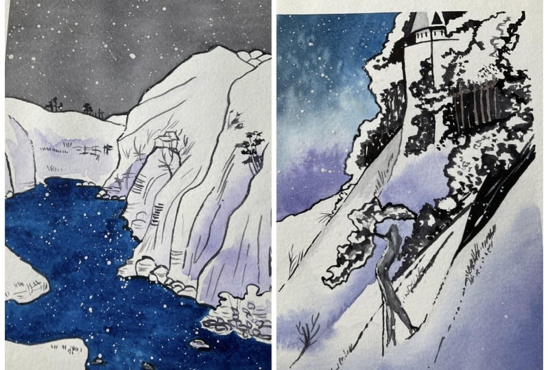
3. Project 2 Kiso: The next project is based
on the woodblock print entitled mountain and the
river on the key cell. This no scape is actually
divided in three and was created shortly before
he wrote, she gets death. The artist, it birthdates deep seriousness
and great serenity. I will only be focusing
on the left side of the woodblock print and use
that as my reference photo. Also skipping bean thing, this mountain at
the background to give more space for the sky. Here's my simplified sketch
for our disciplinary. I will add the
details neither as I paint the colors to be
used on this project, our ultramarine blue and
burnt umber for this guy. Or you can some Situ
black if you want to. The same color goes for the
outline and the details. Card, Brazil violet and
royal blue for the river. A watered down version
of that for the shadows. The white of the paper
for this snowy mountains. And the white paint for snow. We approach will
be pretty much the same as the first project, except that there will
be more details and we will cover it zoo large
areas with a single color, the sky and the river. Let's start by
coloring in the sky. Once again. I will wet this area with water and drop my
new chiral mixture. Ultramarine blue and burnt
umber must have been my favorite combination when
it comes to mixing graze. The upper bar, it
should be darker. So I'm tilting my
VBR this way and letting most of the pigment
settle at that area. We can do the same
with the river, like the paper first with water, then Java doc collars. But if you're confident
that you can cover this area by directly
painting on it, then do so. Just make sure that you
have already prepared your mixture before the wing
it I will directly faint. My river while waiting
for a disguised to dry. The key here is not
to get too conscious. And negative painting, especially the area
where the rocks are. As long as it looks
like a river. Even though the shapes are
not perfect, that will do. If you make a mistake,
just let it go. I'm also leaving shapes for a small rocks here and there to add interest to our painting. After completing this, we can work on our soft
and hard shadows. Quick tip in covering
larger areas like this, I make sure to
load my brush with more paint and water than usual. It might bowl somewhere, but that's what they want. Also, make sure that
your pigment is ready before I
covering large areas. What you see here, I'm
also working fast. And since I'm using
the same color, no need to rinse the
brush repeatedly. Next, I will recreate
the same shape. Load my brush with
less paint and water. You should see the difference
when starts to dry. Of course, the size of
the brush also matters. If your brain being on the large shape with
the same color, make sure you use a big brush. In this quick demo. I'm painting a small one, so I don't need to switch
to a bigger brush. You should see the
difference already. The one at the bottom has a more even color compared
to the line at the top. If you feel that you
can't work on the river as fast as you see
me during the demo. You can do wet on wet. The same approach that
we did for the sky. Also. I didn't mention earlier, and at most dirty river
and the shadows use car, Brazil, violet and
royal blue mixture. But I added more and blue for the river and more
violet for the shadows. You may change the
proportion as you see fit. That's continue. The river is still wet, but I can work on
my shadows now. I'll start with the soft ones.
4. Project 3 Kameyama: Last and most exciting project. This painting is based
on the woodblock print, clearing, whether after snow, I call me on my station. The original print
shows a diamond or a feudal lord
procession moving on a clear afternoon after a heavy snowfall up
this deep timeline, mountain Snow did
call me on my castle. You can see the hats off the beach ball peeking
through the foliage. An element of surprise
used by the artist. And the picture is
also cropped in an oblique way where the top part of the castle
has been caught off. This is my version, which only shows the
upper right part. Here's my sketch, which can be found in the projects
and resources tab. The most complicated one so far. But I believe he can do it. For this artwork. I'll use ultramarine blue for the thought
part of this guy. Burnt umber with a bit of
ultramarine blue for defense. An equal mixture of those two colors for the
outlines and darkest bar, it's our blue violet mixture for the shadows and the
bottom gradient in the sky. The white of the
paper for it is snow and white paint for
defaulting ones. Let's start with the sky. If needed, you can
rotate the beeper, foreign ACB or
angle to work with. This barred surrounding
the bushes and trees is a little more
complicated shape, but it gives opportunity to practice our negative
painting further. I will wet the sky shape with clean water first and
then dropped car, Brazil violet and royal blue are blue violet
mixture at the bottom. Rinse my brush, loaded with ultramarine blue to
bake the thought Bart. And then lightly makes the
area where the two colors meet using only the tip of my
brush to create a gradient. Or if your paper is wet enough. We can also try tilting it instead and let the colors
bleed with each other. I've learned a simple
composition principle where you can place your horizon either above or below the center
of your bean thing. For the horizon
is where the land or sea and the sky meet. The same goes for the
two previous paintings. If I wanted to show
more of the sky, then I'll move the horizon lower than descender
off my Bieber. But if I want to
do the opposite, then the horizon
should lie above the center of the painting area. On to the soft shadows. I'll wet this large area on the lower right with clean water and drop
colors at the bottom. To give it variation, I'll make some my
car puzzled violet and ultramarine blue. We want the bug and Bari
to be slightly darker. So I'll drop my
ultramarine there. I really love with
unwed technique. It's so helpful in creating
misty effects in landscapes. Delicate flowers,
soft backgrounds, and smooth transition
of callers and value. I hate it The first because
I cannot get the right. But the key really
lies on the paper. And good water color. Bieber, which is almost always a 100th
person caught done. Bieber produces an
excellent wet on wet bloke. On your paintings. I will also give this little
behind the tree some shadow colors and work around
this challenging shapes. Since there are lots of organic shapes in
this composition, built worrying, making mistakes. It won't be that
obvious compared to making a portrait of
a person or effect. So take your time
and the GI painting. Next, let's define the castle, their roof, and the windows, and where it stands. As usual, I will use my
favorite neutral mix of ultramarine blue and burnt
umber for these parts, this mixture has less water to make it stronger and darker. Dark for a strong contrast. And for this node
can be very visible, which is actually the
white of the paper. This part is a bit tricky. But with patients, you'll
surely be able to do this. Since I am right-handed. All work from left to right, top to bottom so as not to disturb the areas
that need drying. The foliage that
surrounds the castle are mostly done through that
technique called scumbling. You will see me repeatedly
dabbing my brush to create the shape using
only the tip of it. And doing this, make
sure that your brush is loaded with enough paint
to do it continuously. Scumbling is really useful in adding details and
texture on the painting. And I personally
find it relaxing. Well, as long as you're not in a hurry to finish an artwork, if you start getting confused, please remember to refer back to the finished artwork also found in the projects
and resources tab. As your guide and
painting this shapes. I am now working around
the rock shapes. Negative painting again. It can be done thing a first. If you look at the
whole thing, thing. But if you focus on working
on it section by section one, at the time, he'll be
surprised when you finish. So don't give up and
continue working on this project with
a growth mindset. Next, we can work on the fence. I mixed a bit ultramarine
blue with my burnt umber. Since burnt umber straight from the tube is still saturated to my liking and painted
defense directly. Now I'm adding more ultramarine blue back
to minute chiral mixture to continue working on the foliage surrounding
the castle and defense. That, to continue dabbing
and scrambling to her aid, pad CI shapes that
make up the foliage. Mind you though, just
like during this can be very a day thing
that you might not notice if you've been
scumbling too much. So why isn't a while? Stop. Observe your painting
if it needs more of those shapes or it's
better do it alone. Remember to leave
some white spaces to make the foliage
shape more interesting. I'll move down
Lorentz and continue adding details using
the same color. I am also starting domain this Snopes visible
by being thin, hard shapes along them. With the same color. I will paint the leaves
and the trunk of the tree. Switching from scumbling
to direct painting, as I see fit, adding splotches of grasses. And to make the
smoke more visible. I'm not just painting them
with vertical strokes. Or a day will look like
they're floating in the air. I am connecting my
grasses when the Snopes and varying their
direction for complexity. Some are being done in groups, some are painted individually. Our brains will automatically
complete the picture event. If we can only see small
suggestions like lease. So don't stress too much in
painting the foliage and the grasses and the bushes
exactly as you see it. Now back to very keen
around the fence. Make sure that it has
already lead dry first. Before adding more
foliage at the right side and some shadows
surrounding the fence. Use the same blue
violet mixture to add a bit of a shadow on
the castle and around it. And we're ready
for the last step. Finally, let's work on the
outlines, our final details. When I also beginner
ident avoiding paintings with so many details because I don't know
how to do them. And I am pressure
and if I can create a credible replica of
the reference or not. But it doesn't have to be
that we're not machines. So we have the free will to use the reference image
to our liking. And we don't need to make an
exact copy of what we see. Instead, treat painting as
a tool in expressing how you feel about something and giving others
a glimpse of that. What do you think about that thought? Great day? When working with thin lines, you can either use a big
brush with a nice point like this so that you won't have the loaded with paint
every now and then. Or you can use a
smaller brush with, you will need to reload
it every so often. However, if using a
brush is stressful, our pressure see
you at the moment. Then makes your media and goal
for append a regular pen, a marker or a gel pen, and draw those names. You can also try working
with brush pens. They have a beautiful tip like this and perfect for details. Even for calligraphy. I forgot to remove
the water inside. That's why the lines
I'm producing are slightly paler than
the first lines. Either way, whatever
is comfortable with, you go with it. Come back with more details. He can stop now if
you're satisfied, are continue adding
just a little bit more. If you're enjoying the
process just like I am. And finally, snow splatter for the reference
shows a clear afternoon. But I'm liking how it looks with the additional
snowflakes and how cold it feels when I'm
looking at this painting. So a little more
snow and we're done with you believe it
finished all projects with the same thing using a limited palette and
water color techniques. Here are very Shaun
of the clearing, whether after snow, coming out my station for ideas
on what you could do. A next and a quick recap. I'll see you in the next video.
5. Outro Temp: Hey, we've finished,
how do you fail? And by completing one or all
of our painting projects, which one's your favorite? Since we've practiced allied of wet on wet technique,
negative fainting. And they are recommending
splattering. Using the white of the paper for dismissal and strong
contrasting colors to make it the fear. You can now go ahead and create
another when their escape on your own and apply what
you've learned in this class. I do hope that the quick
tips also gave you new ideas to help you with
your painting process. And with that, I'm really
excited to see your artwork, so please go ahead and share them through the projects and resources tab and to further
improve my future classes. I appreciate your
class review too. I hope to see you on my
other classes and together, let's make this world
a little bit more colorful with our creations. Happy painting. Hi.
 Bianca Luztre, Watercolor, Productivity, Color Mixing