Transcripts
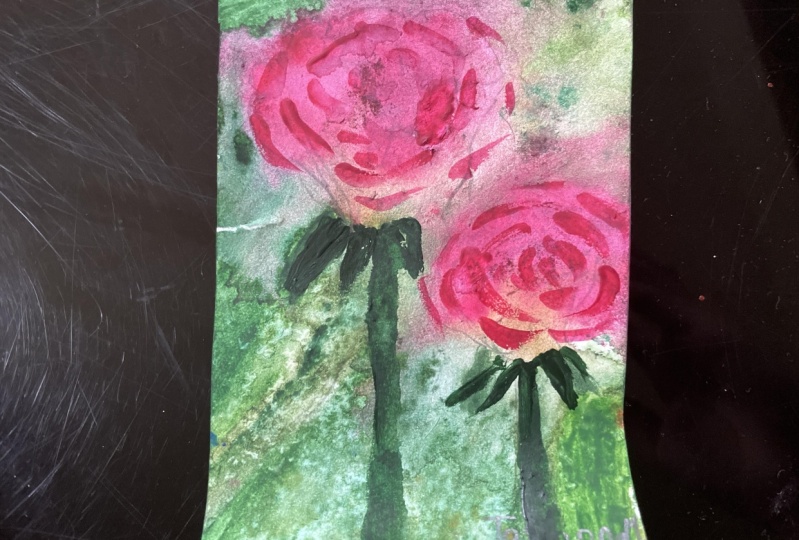
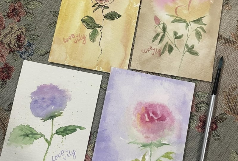
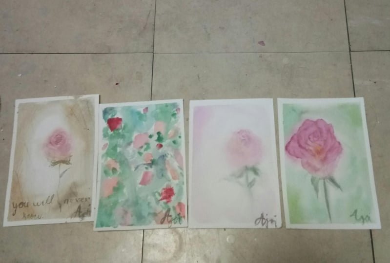
1. Introduction: Instead of struggling to find your own style, why not focus first on learning and trying out different techniques. That made me think. When I was a beginner, I was focused on finding, developing, or even discovering my personal style. One that would speak for me, that would represent me. But then someone advised me to focus on learning first, try out different styles and eventually you will find your own. Hi, I'm Bianca, the face behind BianxArts, an aspiring watercolor artist from the Philippines. This Skillshare class is not a how-to-paint a rose course, but with every exercise and class project, I'm happy to share with you how I approach each painting. We'll paint a rose using doodles, loose strokes, in a careful and detailed manner, semi abstract and vintage colors. You may paint one that you find the most interesting or paint all and see which one struck you the most. In my whole watercolor journey, I have tried all of these techniques. And I come back to them from time to time, depending on my mood. We'll talk about ink and wash, adjusting your reference for a semi abstract painting. Wet on wet and wet on damp. Coming up with your own color combinations and creating textures. I will also provide you my scanned sketch that you may print out if you need to. And hopefully by the end of this class, but I'm not promising, you'll find a style that suites you the best. So let's grab our materials and start painting.
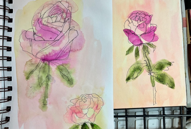
2. Preparing for Ink and Wash: The first style is ink and wash. You will need a regular gel pen or a sign pen for this one. Now observe the reference photo and with a single continuous line, draw a rose. You could practice this as much as you need to. And our goal here is for us to learn to commit and be confident with our lines. We're using a gel pen and drawing directly on the paper with no way to erase our lines. It doesn't need to be perfect or smooth either. You can see me here stopping from time to time, but not lifting my pen. Once confident, let's jump to the next video and try the first style.
3. Painting in Ink and Wash Style: For the background of this first painting, I want it to be light, since I am using a gel pen with black ink. I will make my pink and yellow with white to achieve a pastel palette, and I will do the same with my green later. Remember that this is your painting and I want you to own it and choose your own colors. But it's important to note the color of the ink that you will use. If it this dark, then go for a light background and vice versa. Imagine how unique this would be if I used a white ink against a dark background. I'll spontaneously do my background. Leave this to dry and make sure that it is completely dry. And when ready, I will draw my rose in a single continuous line. Just like how we practiced. I used to do this style when I was a beginner and I kept coming back to it when I don't know what or how to paint a certain subject. This is relaxing for me and I hope you find it therapeutic too. It is a balance between easy and challenging. Easy in a way that you don't need to worry about your background. But challenging when drawing with ink and committing to your lines. Again, as I draw, I am imagining how a rose looks like. If we need to. You can also refer back to the reference photo as often as you need. But drawing from memory makes it easier and removes the distraction of too much detail. Growing with a plant lover mom, I have seen so many roses in my life that I can imagine how it looks. It's also a relaxing way to draw and paint something that you are already familiar with. If asked to draw a bear from memory and with a continuous line, then I might need some practice. Not only have I not seen a bear in real life, but I have never painted one before. That's the reason why I chose rose as our subject for this class as well. Hoping that everyone of us has already seen one in a photo or even in real life. If needed, you can also add more strokes of colors for the rose and the leaves, and even retouch the ink drawing. You may wish to add details such as the veins and thorns as you see fit. No need to do it in a single line. Since we already did that for the base drawing. And here is our first rose in ink and wash style. In the next video, we will prepare for our vintage style rose.
4. Preparing for Vintage Style: The next project that we will work on is painting a rose in vintage colors and colors matter when you want to achieve a vintage feel. It has muted tones and if you go ahead and look for vintage flower postcards online, you'll notice the color choices. I'm demonstrating how I would do the leaves later with two strokes. And to get a muted or a desaturated leaf color, I will mix my green with my pink, the same pink that I will use on my flower later. This combination works so well because this color's lie opposite in the color wheel. The traditional pair would be red and green. But since pink as close to red, it's a good complement to green. Complimentary colors never fail for the refresh your eye. Every time you look at them. I'm using hookers green and quinacridone rose, but you don't need these exact colors to paint your own version. For the background, I love using yellow ochre and burnt umber. I will even tone down my burnt umber by mixing any blue to it. Burnt umber being close to orange is a complement of blue. That's why they work so well. And to create textures and trying mimicking an aged paper, I will use the other side of my Chinese brush and scratch paper. You can also use old credit cards for these technique. Sometimes I also use raw umber and sepia for my vintage backgrounds.
5. Painting with Vintage Colors: Vintage style, one of my go-to styles with my florals. I will start by preparing the colors of my background. Yellow ochre, burnt umber, and a mixture of burnt umber and ultramarine blue for a toned down version. If you don't have yellow ochre and a bright yellow, instead, try and add red and a bit of blue and see how that goes. And if burnt umber is not present on your palette, try mixing red, yellow, and blue, and you should produce a brown. Then I will wet my paper with clean water using a bigger brush. It's always easier to use a wider brush when wetting the background. Now, in painting my background, I will not touch the area where I will place my flower with these colors. Instead, I will load my brush with Quinacridone Rose as my pink and lay down that base color where the rose will be. Knowing that watercolor dries lighter, I will load my brush and add another layer of those background colors. To add texture, I'm switching to my smaller brush loaded with burnt umber and splatter here and there. And just like what we practiced earlier, I will use the other side of the brush and scratch the paper. These two techniques when combined, should produce an age paper look once it dries, as I've mentioned in my intro, this is not a how to paint a rose course. But I'm happy to share with you how I approach this painting. Looking at the reference photo, I am directly painting the overall shape of the flower. And I'm not worrying about the details at this stage. As I reach the bottom of the rose, I will load my brush with yellow ochre and complete the shape. By doing this, I am creating a harmonious palette by using the same background color on the foreground object. I will retouch and correct the shape as I see fit without struggling too much to make a perfect replica of the reference photo. Next, I will focus on the highlights. Rinse my brush, tap it, dry on a tissue or a rag, and lift some of those colors. I will do this repeatedly if needed. Since I'm lifting while the paper is wet, those pigments are still spreading on the paper. Personally, I have to practice this technique a few more times before getting the hang of it. So if you are not perfecting this technique, don't worry. Treat this painting as your practice piece and focus on learning instead of perfecting the painting. Then I'll grab a smaller brush loaded with pink and brown mixture and add petals. That Brown is my burnt umber, which I also used in the background. To keep the harmonious effect of the color choices. I'm looking at my reference photo from time to time to check where the dark lines are. These lines will separate the petals from each other. Again, there's no need to replicate the reference photo 100%. As long as it's looking like a flower, then That should be more than enough. Next, let's work on the stem and leaves. Did you see what I did there? I mixed my green with my remaining yellow ochre on my palette. And by now you should have an idea why I did that, right. Instead of painting my stem in slow manner, I am using quick, short strokes by engaging my whole wrist and moving it quickly. If you're not confident with quick strokes, maybe you can grab an extra sheet of paper first and practice. From my own experience, I was able to paint a more stable line with quick strokes than with a slow one. This also introduces movement on the painting. It looks fresh and shows that the strokes were with confidence. Also, the reference photo is cut and the leaves are not shown. But we have the artistic license to add that and paint what we want. I'll introduce small and big leaves pointing in different directions. To make this painting look interesting. I fell in love with this style when I first tried it with orchids as my entry for a local exhibit. And ever since, I have tried it with roses and even with the full floral arrangement. Sometimes I also pair it with some written text. And yeah, I need to work on my calligraphy. By combining this style with a carefully chosen color palette and a bit of calligraphy. It does look like a vintage postcard, does it? I'm so fond of this style because it seems like it carries precious memories with it. Some untold stories even. And that's what I love with painting florals. They never die. I'll continue adding leaves here and there. As I see fit. At this stage, they look pale. But we can just add another layer later. And the same thing that they did with the flower. I'm also lifting up some of those pigment on my leaves. To introduce the highlights. I'll also go and add more blue on my green for a more interesting color combination. For added drama. Let's have two rose buds. Here. I'm using the same colors but making the top part darker. These added buds gives us a feeling of a complete painting. The full bloom rose being our main actor and the buds as the supporting actors. For added interest, I will have those rose buds face different directions as well. Though this may seem like a straightforward painting. There are certain composition principles applied here. A rose bud was added at the left side. And I will balance that by adding one on the right side. Not in a strict manner. For I have placed the right rose bud higher than the other one. Also. Did you notice that my rose is off-center? The empty space at the lower left gives us time to rest our eye before looking back at the right side, which is heavy with details. And speaking of details, the petals don't have too much details on them. So let's paint the veins of the leaves. Not all, just some. Using the same color, Quinacridone rose, Let's darken the center of the rose. It's darker because of the contact shadow the petals are making since they are clumped together at the center. And to finish this painting off, let's add darker tones on the leaves as well. And this is our vintage style rose painting. How are you doing so far? In the next video, Let's loosen up with a semi abstract painting style.
6. Preparing for Semi-abstract Style: For disomy abstract painting style, I'll just play with my flat brush. I love using flat brush when painting semiabstract, it's an inch wide, big enough for me not to worry about the details and also good to cover a wide background. I will apply different pressures and dab and drag it down on my paper in different angles to see what kind of strokes I can make from it. Since it is a semi abstract, there's no need for our rose to look like a flower. But yes, we'll still be looking at our reference photo. I will use colors instead to suggest that I'm painting a rose. But no need to be too stiff and worried about the details and the shape. I'll use only one brush for this painting. And have fun doing it.
7. Painting a Semi-abstract Rose: The way that I approach this semi abstract style is little bit different. I printed the reference photo, cut it into smaller pieces. And I will rearrange it in a way where I can no longer see it as a rose. I will distribute the color pink as I see fit. And if you wanted to follow the same procedure, I encourage you to come up with your own composition. Have fun cutting and rearranging your rose. And our painting does not need to look like a flower either, but we will focus on colors instead. So feel free to choose one color for your flower and one for the leaves. Let me start with a pastel color. I mix quinacridone rose, and white for my rose colors, where I can see the rose from my cut reference. I'll kind of do the same thing on my painting, but no need to worry about the shapes being perfect. From time to time, I'll shift my colors to pure quin rose and a bit of light red or burnt sienna. If you have that color. Once done with my pinks and oranges, I will switch to green. Here I'm using viridian hue plus white. And later I'll incorporate blue and violet as well. I won't worry that I'm touching the still wet pink paint on my paper or that I'm leaving some white of my paper. Really. There's no need for this to be perfect. But if there's one thing to keep in mind, that is to keep the four corners of our painting different from each other. Take notice of how I do that. I added a hint of violet on my upper right to make it different from the lower right, which is greener. And since my upper left has a pink on it, I'll add blue on my lower left. But not to a point that it's due obvious. Just a hint of other colors would do. Or other patterns or maybe shapes. Just make those four corners different from each other so it won't look too uniform or do stiff. Play with your brush. And let's see where it brings you. If you'll think in shapes, we have two big ones already, the background and the pink ones for the rose. To balance this, we'll need smaller shapes. And it just happens that leaves would be a good addition to this painting. I'm using the side of my brush to do this. Since I have a bigger brush for small details, it removes the stress of focusing too much on perfecting the shape. As long as I'm able to paint a smaller shape than those of the pink ones, then I'm satisfied. No need for it to look like leaves either, since I'm using a leaf color already. And that color is viridian hue plus yellow. And by using the same color that they use on the background, what do we have? Harmony? Since we have thick lines, I'll also use the tip of my brush to paint thin lines. Specifically, I added horizontal lines on the flowers since we already have vertical lines for the leaves. If you'll notice, there's a reason why I paint what I paint, big and small shapes, complementary colors, thick and thin lines, light and dark colors and so on. Yes, if this is a semi abstract painting, but it won't hurt to introduce balancing elements as well. And here is our semi abstract painting. It's nowhere near a rose but what's undeniable is I had fun. And I hope you will too.
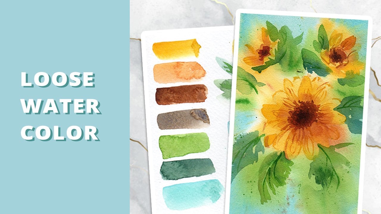
8. Preparing for Loose Painting Style: The next style that we'll explore is the loose painting style. This style gives a fresh and dynamic look to our painting. This also requires the least amount of painting time, excluding the drying time, but the most amount of confidence. If needed, you may also prepare by doing what I'm doing here. I'm exploring what this brush can make with quick strokes, varied angles, and different pressures applied to it. When I use my smaller brush later. We'll do the same. And you'll see the dry brush technique in action. Since a smaller brush is loaded with less water and pigment, it's easier to do a dry brush with it. I will use painterly strokes like this to paint the base and the details of my flower. See you in the next video, and let's start painting loosely.
9. Painting in Loose Watercolor Style: Now it's time for some fun painting. I will use a spray bottle later for added drama on my painting. If you don't have this, you can use a brush to soften the edges of your flower petals instead. This will be quick, but don't worry. You can play this over and over again until you're satisfied. When I first saw someone doing a demo of a loose painting, I was surprised. It happened way too fast that I wasn't able to grasp what magic the teacher was doing. But luckily, since this is a recorded video, we can review it over and over again. So worry not if you find this too fast and no, I am not doing any magic here. It's a result of constant practice and learning. Okay, I'm using quick strokes to build up the overall shape of the flower. And I loaded my brush with other warm colors using my spray bottle, I will soften the edges of the petals and let them blend in the background. This technique too, requires a bit of getting used to. When it first tried this, it spread all over the place, including my classmates' watercolor paper. Oops, you could say I learned the hard way. While the flower is still wet. I also lifted up some of the pigment for my highlights. And for the leaves. I will use different shades of green. Hookers green, green mixed with yellow, and green mixed with pink. I'll use a smaller brush and do the dry brush technique that I've mentioned earlier. The brush is almost dry with little pigment and the paper is dry too. That's how I do it. Notice how I pressed my brush on the paper than lifted it up quickly? That's how I paint loose leaves. And when I mean, this style requires confidence. I'm speaking from experience. It took me quite some time to get confident in painting leaves in a few strokes. While the flower is still wet, I'll drop darker colors on it. Make sure that there's less water and more pigment. To achieve this. I won't even wait for the flower or leaves to dry, but spontaneously color in my background. And I might even leave some white of the paper and splatter for additional texture. This painting style is also useful when you're painting outside or painting a subject from life. Imagine how relaxing that would be to sit in the garden and be able to paint a flower in front of you on the go. Wouldn't that be a beautiful experience? This might also be the best painting style when you are doing plein air. Or painting while traveling. As challenging and intimidating as this may look. Please go ahead and give this a try, and another try, and one more? Until you build muscle memory and confidence in painting loosely. I let the first layer dry and for additional volume, I'll add shadows. Looking at my reference photo to help me decide where to paint those shadows. I'm just repeating that kind of strokes I did earlier to keep it fresh and loose. If needed. I will also soften some of the edges and try to mimic the soft shadows on our flower. Don't forget in the shadows for your leaves and stem, I'll use the same green color that I mixed earlier. I rarely use black for my shadows. And since watercolor is transparent, adding another layer of the same color can make it darker. And guess what, we're almost done. See how quick this one took. And only two layers at the most. But again, if you're trying loose style for the first time, go easy on yourself. Okay? Treat this as practice piece and not an exhibit, not even a commissioned nor a masterpiece. Go have fun and let me know how you feel about this technique. In the next video, Let's get a bit serious and prepare for the semi realistic rose.
10. Preparing for Semi-Realistic Style: For the semi realistic approach, we need to practice two techniques. Wet on wet and wet on damp. Wet on wet technique requires both paper and brush to be wet. Brush is loaded with paint and water. Observe how shiny my paper is when doing wet on wet. When I dropped my colors, the paint spreads on the paper. But for the wet on damp, make sure that the paper is not too shiny or not too wet. And the brush should have more pigment than water. You will know that you have timed it correctly if the paint is not spreading far. Like what do you can see here. So with wet on wet, the paint spreads farther. But with wet on damp, we have more control. These two will be used as our main techniques for the semi realistic painting.
11. Painting in Semi Realistic Style: I have uploaded a scanned copy of my sketch on the projects and resources tab. You may download it and print it directly on your watercolor paper. If you just want to focus on painting and mastering the wet on wet and wet on damp techniques. And want to skip drawing. But all good if you want to draw it on your own as well. Our painting will heavily depend on the drawing. So please make sure to get the proportions right. Doesn't mean that you need an exact copy of the rose though, but make sure that it looks like a flower. So the way that I'll approach this painting is to build it up with each layer. I will start with the background colors for my first layer. Wet the paper with clean water, not soaking wet, just wet enough for the pigments to blend smoothly. And I'll drop my warm colors first on the rose and surround it with different shades of green. The first layer should blend smoothly with the wet on wet technique. Since the pigment travels faster when the paper is wet, it helps if you avoid dropping your green mixtures near the flower. One thing to consider with this technique is that paper matters. I am using 100% cotton paper by Meeden it's called Baohong watercolor paper. And I have tried it for over a year now. So I am well acquainted with how this one performs. But if you are using wood pulp, cellulose, or other student grade watercolor papers, it might be a bit different from what you'll see on my painting. But no worries if you don't have 100% cotton paper. Just observe how quickly your paper dries and make the most out of it. My paper is still wet and that means I can still add darker colors if I want to. Like what I'm doing here. The check if your paper is still good for wet on wet or wet and damp. Tilt it and check if it still shines due to the wetness. If not, I suggest that you leave it to dry completely, wet it again with clean water, and add another layer. I am using the same color. Quinacridone rose for the darker parts of my flower. And this time, I am closely observing the reference photo. Since I am aiming for a semi realistic look, my paper starting to dry, but not completely. And it's the perfect time to use the wet on damp technique. I showed you my palette to remind that there should be more pigment than water loaded in the brush when using this technique. If you are not confident with wet on damp, then try painting directly and softening the edges instead. I will continue doing this until I'm satisfied with how the petals look. Our goal in this stage is to separate the petals by painting the shadows or the darker areas in the flower. I'm also using an angled brush here. But you can use a flat or round brush if you don't have this type of brush, this style must have been the most challenging for it requires you to know your materials well. From the paper. to the brush, to the paint. It took me quite some time to estimate how wet the paper is, especially when I shifted from cellulose and wood pulp to a 100% cotton paper. To achieve a vibrant and somewhat fresh color palette. You need to know your colors as well. I've been using quinacridone rose for my florals and testing out different color combinations for my green mixtures. That's why I know which color to pick when I started the painting. This brush might be different from the other brushes that you saw me using. But before even getting comfortable with this one, I've practiced using it for at least two weeks. I treat it as a date or getting to know stage every time a purchase or have my hands on a new art material, whether it be paper, paint, brush, or even a medium, I require myself to get to know them for at least two weeks. This way, I will gain experience and confidence in using them for my actual paintings. Another unsolicited advice from me, but I hope you find that useful. We're on our last stage of this painting. If you'll notice, I approached the semi realistic style this way. I laid down the colors for my background and base colors of the flowers and leaves, added the darkest colors while the paper is still damp. And this time I left that layer to dry. And I will work on my mid-tones using a light brown to achieve the orangey look and add a softer shadow on the petals. From time to time, I am softening those edges with the same brush. I hope you are following along or if you're just watching, hoping that you pick up a technique or a concept that you can apply on your own paintings. Personally, the loose painting style is my pick. But I'm curious to know which one excites you the most or the one that you find the most difficult. Or which style do you think would be a personal favorite? Or maybe a combination of two? Either ways. I encourage you to share your version of any or all of these paintings. And I will leave a feedback, as soon as, I am free to do so. With each painting. I want you to own it - use your own color palette, paint for yourself and not for others. And paint with a goal of learning in mind. So here is our final class project, a semi realistic rose. I'll see you in the next video for final words.
12. Final Words: I hope you enjoy this Skillshare class as much as I enjoyed making this for you. And I'm so excited to see your own version of any or all of these paintings. Please upload your paintings in the Projects and Resources tab. And I would love to leave a feedback. You may also leave me a review so that I could improve my classes better. I have published other Skill\share classes before this one, so feel free to check them out. I hope you enjoyed painting with different techniques and hopefully, as time passes by, you will discover your own style. Stay in love with painting. Bye.
 Bianca Luztre, Watercolor, Productivity, Color Mixing