Transcripts
1. Welcome to This Class: Let's create these beautiful, high contrast floral
paintings using wet on wet watercolor technique layered with white, opaque gouache. Hi, I'm Bianca Luztre, an aspiring watercolor artist
from Batangas Philippines. I just love handmade cards. Nothing motivates me more than seeing the joy
and gratitude that a simple hand painted gesture
can bring to someone's day. And I'm so excited to share
that passion with you. In this class, we'll discuss how to blend watercolor
background smoothly. Add organic texture, which composition looks
good and which doesn't, how to use gouache and its opaque nature to
cover up the background, and how to simplify complicated shapes
into a few strokes. We'll be painting these
four postcards together, and I encourage you to paint one or try your
hand at all four. My goal is for you to walk
away from this class with the confidence to apply these techniques to your
own reference photos, allowing you to create your original watercolor
and gauche artwork. To inspire you to work
on your class projects, here are some of my students output during my in
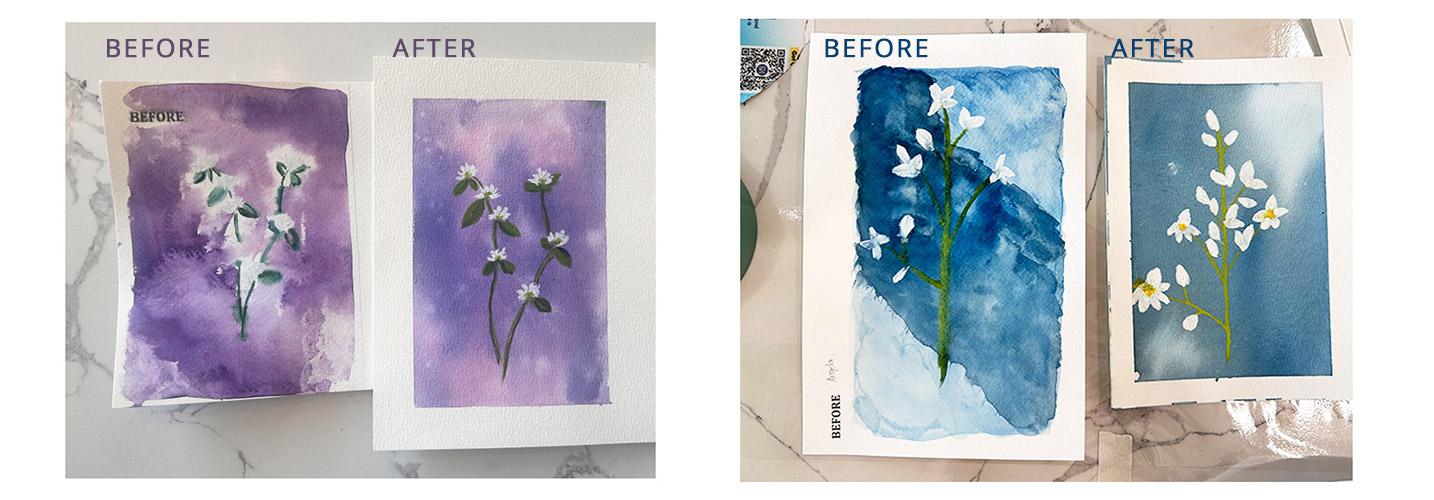
person workshop, before the drills
in the workshop and after the workshop versions. Whether you're a total beginner or just looking for a relaxing, low pressure creative escape, I hope you'll enjoy this class as much as I enjoyed
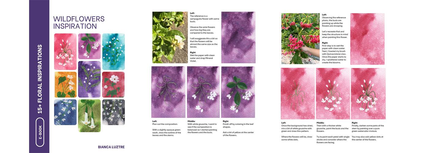
creating it. In fact, I have prepared
an eBook containing over 15 floral
inspirations with step by step instructions that you can take away after you
finish this class. Find out how to get your
copy in the next video.
2. What We'll Do in This Class: Our goal for this
class is to create these mini postcard
sized flower paintings. You can share one painting
as your class project or take the most out of this
class and paint them all. To get started, I recommend that you download
the class guide first, where the list of
materials, colors used, drills to help you
practice your brushstroke, additional projects
you can work on, reference photos and scan
paintings are found. After that, let's
prepare our materials. For our project, you'll
need a watercolor paper. I always recommend using a
100% cotton watercolor paper. The tape is optional if you
want clean, crisp borders. You may also use a postcard
size watercolor paper or just cut it in any
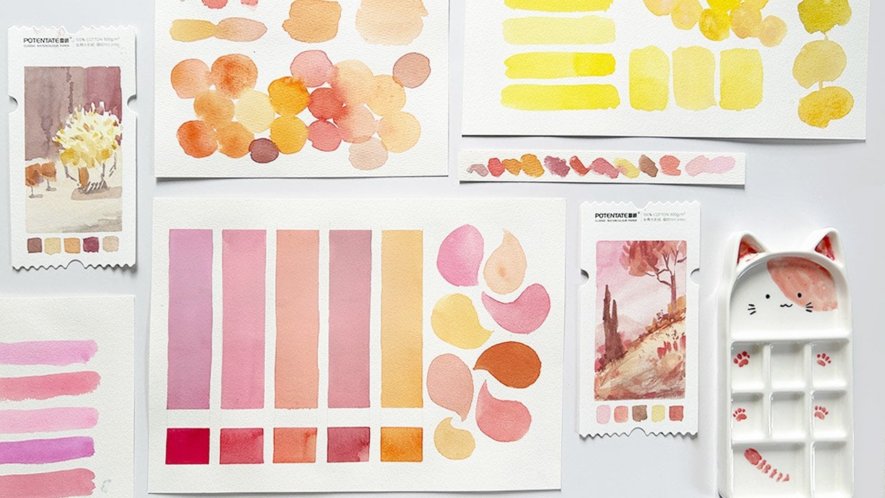
size that you prefer. Some dark watercolor
pigments will do any color that you like. Personally, I have
here paints gray, royal blue, opera pink,
and hookers green. I would suggest that
you fill your pans with freshly squeezed paint
for easier coverage. Then you'll need white gouache. This is a cheap gouache
and combining it with watercolor is a good
introduction to this medium. Let me show you why gouache and not white watercolor
paint is recommended. Gouache is known for its
opaque characteristic. You can layer a light color
over a dark background. But look at this mini test
where watercolor was used. I wasn't able to cover the
black paper completely. What you have to
remember, though, is getting the
right consistency. If you add too much
water and less paint, then it won't be visible. If you add too much
paint and less water, then it will be hard
to control the shape. But if you achieve just
the right consistency, then it would glide smoothly while covering
the layer underneath. Going back, when
using white gouache, a freshly squeezed batch is more user friendly
than dried up paint. For the brushes,
you'll only need a flat brush and a small round
brush, and that's enough. The brand doesn't really matter as long as you know what
your materials can do. I also have here a mini water
container for clean water, which would come in handy when doing the wet on wet
technique later. Of course, a water jar we will rinse or
brush, and we're all set. Oh, and if you come to love this style and want
to paint even more, I have prepared an
eBook containing 15 inspiration where I'll share how I did this postcards step by step to
grab a free copy, simply upload a project, or an honest class review
after finishing this class. Then shoot me an email with the subject Wildflowers EBook. I'm so excited to be
painting with you, so let's jump in
to the next video.
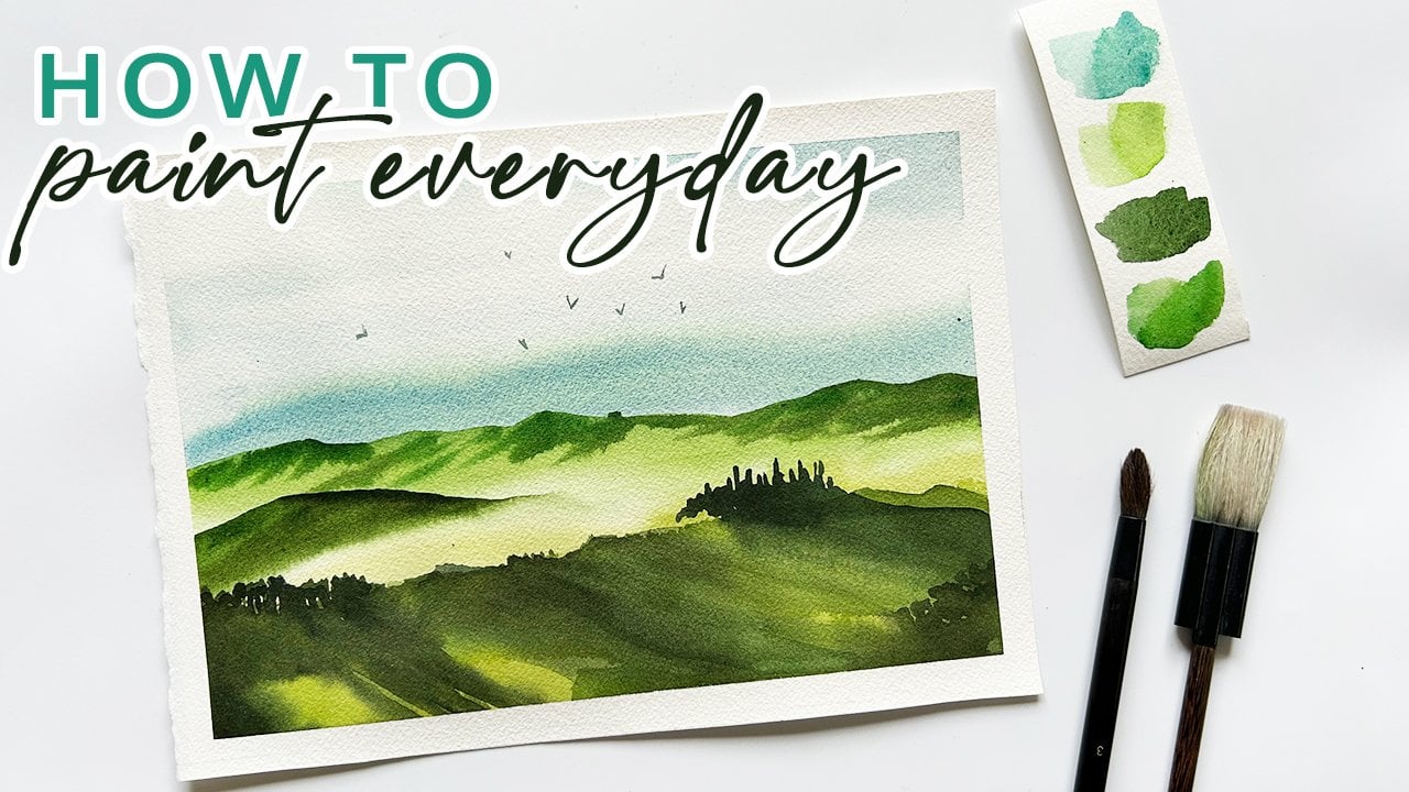
3. Smooth Backgrounds: There are mainly two steps in painting these
lovely postcards. Step one is letting go. Let the pigments blend with each other while doing
the background. And step two is taking control with practiced
brush strokes, paint the stems,
leaves and petals. I have prepared
an exercise sheet in the class guide to help
you practice your strokes. This is what helped my in person workshop students improve
their confidence and skills. So I hope you'll
find it helpful too. Okay, once your materials
are ready, let's begin. Prepare the paper by wetting
it with clean water. In my samples, I did not cover the whole area
with plain paint. So for variety, we can cover the center part and intentionally
leave some areas white. You may also mix another
pigment directly on paper. Like what you can see here, I used Panes gray first and then blended it
with opera pink. If this is your first time
seeing this technique, I have a separate class
that you may want to explore where I discuss different ways to
blend watercolors. Okay, going back, I will
let this dry for a bit and splatter water once the shine on the paper starts
to disappear. Preparing the second
paper with clean water again and then loading my
brush with royal blue. This is such a vibrant blue. Rinse your brush and
cover the white areas with barrowed pigment that's
already on the paper. Now, let's check this one. It is less shiny and it's the perfect time
to splatter water. You can either use a
spray bottle and get this lovely effect or simply use your finger or brush to add
texture using this technique. For the third one, the process will be pretty much the same, but I will be using a
granulating pigment. This is Shu Bill
blue by Holbein. Of course, you don't have to
get the same pigment, okay? Other more accessible colors like ultramarine, cobalt blue, and serlem blue are using
granulating pigments, and you may want to try those. What I'll do differently
here is grab a stiff brush like this
one for acrylic painting, which is dry and then use it to blend the still wet pigments. If you don't have
this, a hake brush could also do the same
trick or any dry brush. For the fourth artwork, I will be starting with Hookers
green as the base layer, which I find too
bright to my liking, so I will load my brush
with pains gray and add another layer while
the paper is still wet. Remember, we will be
painting white flowers, so the darker the background is, the more the flowers
will pop out. Okay, time to test our patients. Let's leave this to
dry completely. H
4. Floral Composition: Now let's remove the tape and
reveal the crisp borders. Aren't they lovely
a tip for you. I find that masking tapes
and 100% cotton papers are, most of the time, compatible. I've got no problems at all when I'm peeling off the tape. But if you're using
a paper made from different materials like
wood pulp or cellulose, then I would recommend
a painter's tape. It's less sticky.
To prove my point, here's a regular
sketchbook which I use for my small
watercolor studies. I used this painter's
tape, and look at this. I was still able to achieve
Chris borders without accidentally
destroying the paper when peeling off the tape. Going back, I know you're
excited to paint, but first, let's observe the postcards
I did as study pieces. This one has maximized the
space, so it looks good. Another one which has
good composition too. But this one has a
lot of wasted space. I wasn't able to
use the left side, so the composition
doesn't look so good. Same goes for this, a
lot of unused space. This one is okay,
as well as this. While this one is
sort of balanced, since it has light
coming from the top, so it's kind of in between. So as you let the
background dry, take some time to make a
mock up of the flowers. First, to make sure that
the composition is okay. What really helped
me is actually going outside and observing
these wild flowers. Take note of how big the flowers are
compared to the leaves. What's the overall structure? Are the petals
close to the stem? Are they clumping together
or far from each other? You don't need to go overboard when planning out the
composition, okay? Use your instinct. By nature, we humans can recognize
a good composition. So I'll see you in the next video and let's
paint the flowers.
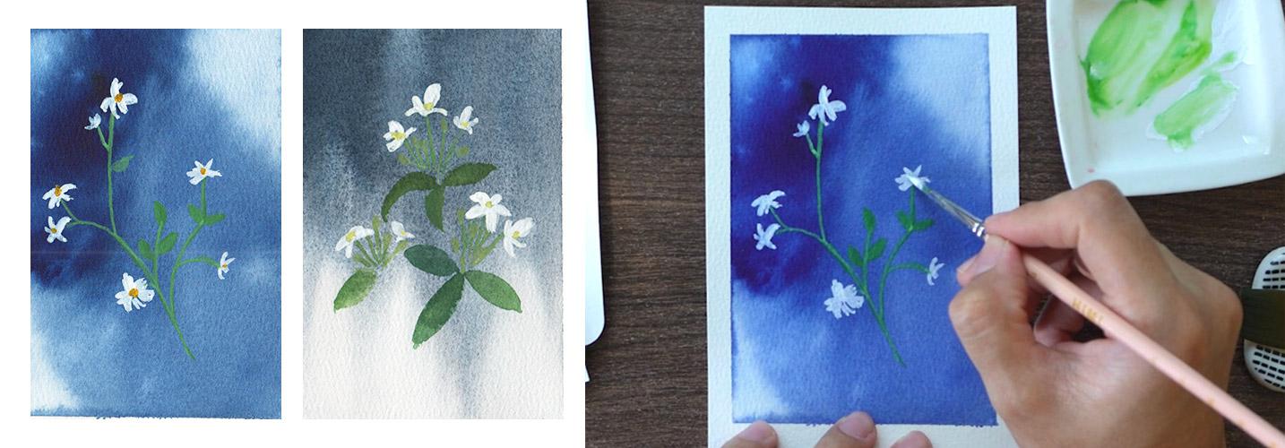
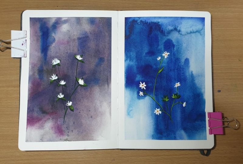
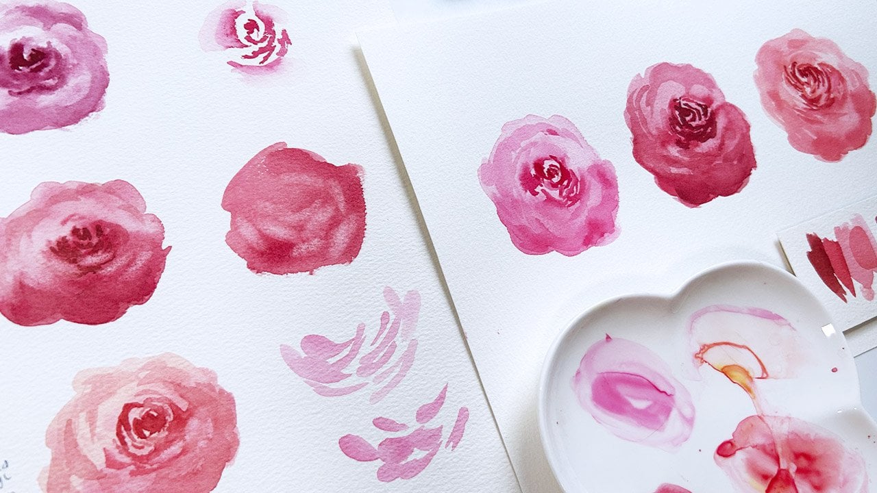
5. Wildflowers 1: Backgrounds dry, time
to paint the flowers. I decided to add yellow to my palette to achieve
various shades of green. Let's start with the stem first. This will help us plan out where the flowers
and leaves would be. Watercolor is transparent. So if we add a somewhat dark
color on a dark background, it won't be too visible. And that's what we
want for this step. Then let's start plotting
where the leaves are. I've painted the wildflowers
multiple times now, so I have a general idea on
what composition looks okay. As mentioned earlier, observing flowers in real life
also helped me a lot. So I really encourage
you to give it a try. If you did what I recommended
with the exercise sheet, then you should find it easier. Add a bit of water on your white gouache and plot
where the flowers would go. I am recreating this wildflower and notice that they are
facing different angles. Paint the dainty petals
with one or two strokes. If it feels hard to
control the brush, then give it a rinse. You might be using a paint
with thick consistency, making it hard to paint
these tiny petals. Continue retouching and adding more details as you see fit. Like in this case, the upper
part feels a bit empty. So I will add another stem
and extend this to the right. Then add a flour. This way, the painting won't feel like it's leaning
heavily to the left. Retouch with thicker
gauche paint to make the petals whiter
and more opaque. Then we can now
mix our green with a bit of white
gouache and retouch some leaves and
parts of the stem to make them more visible
on our dark background. Adding a bit of yellow
for some warmth, and we're done with
the first postcard.
6. Wildflowers 2: For the second postcard, the darkest part and
intentionally is over here. Let's make sure that there are
some flowers in this area. With a transparent
green mixture, green plus water, design the stems and make sure that
it is somewhat balanced. It is not visible for
now, but that's okay. It is intentional.
For the leaves, I added a bit of white as
I started painting them. Now, the flowers.
These wildflowers have expressive petals and quite
playful and I like it. Some are facing us, the top, left or right. They're also quite
far from the stem. Add more white to the
green mixture and retouch the stems and
leaves as needed. You may also do the same with the petals using thicker
gouache paint now. Before you do this, make sure that the first
layer has dried, okay? And then use yellow
for the center of the flowers to
balance the colors. And we can wrap this up.
7. Wildflowers 3: Moving on to the third postcard, we will now paint bigger flowers compared to the
first two artworks. And since the
background is green, I will add more
yellow to my green just so I can see where
I am drawing the stems. The leaves are triangle shaped. This is actually
an oxalis plant, and it comes in many forms, and I love their dainty flowers. Here, I'm using transparent
watercolor mixture first to plan out
the composition, and once satisfied, we can
now use white gouache. For the first flower, the three petals are pointing up while the two petals
are sort of facing us, so it takes this shape. The second one has
more upright petals and has a narrower
overall shape. Retouch the petals if needed and make sure that
there is less water in the mixture for them to successfully cover up
the background color. The third flower has a
standard five petal look. Add white to the
yellow green mixture and retouch the stems as needed. Just some parts of it, okay? Add some buds to complement the flowers and fill in the
leaves with the same color. This one has less flowers, but since they are bigger, we are able to maximize
the space that we have. Retouch if this
happens to you too. My flowers are not
really covering up the background color
as I wanted them to. More final details, and
we can wrap this up.
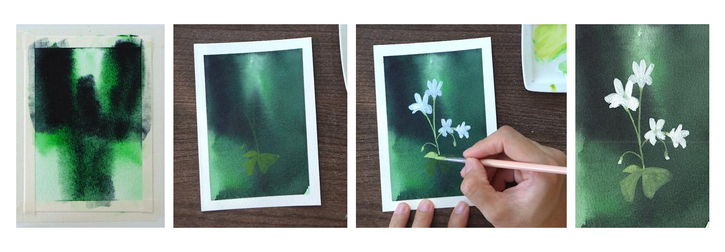
8. Wildflowers 4: Last postcard, and this has
a different background. To compensate for this layout, we will paint the
flowers at the top, since the white flowers
won't be visible if we painted them where the
light background is. As always, start by painting
the stems and leaves. This time, we can go darker with the leaves since the background
on this part is lighter. Make the upper leaves visible
by mixing in white quash. Give your brush a good rinse, and then we can start
adding flowers. I'm not sure what
flower this is, but they have
playful shapes too. Paint them with varying
angles and sizes to make this painting look
a bit more complicated. Looking at this, it seems like
the left side feels empty. So if this happens to you too, feel free to add more
flowers as needed, but don't overdo it, okay? Now, go ahead and mix
white gauche with a stem color and
retouch some parts. Load your brush with thicker and more
concentrated gouache paint to make the petals
pop out even more. And now we have our
fourth artwork.
9. What to Paint Next: Great job in
completing this class. Which flower is
your favorite and which one did you find
the most challenging? We learned about wet on wet technique to achieve
a smooth background. Then we use gouache over watercolor since
it's more opaque, and I showed you what
good composition looks like and what doesn't. The first part is
about letting go and letting the pigments
blend with each other, while the second part is
all about taking control. So now the question is, what do we paint next? When I first created
and gave away this style of postcard to
my family and friends, I receive a heartfelt thanks. Who wouldn't love
a handmade card? So if you feel the same way and want to
paint more of these, I have a wildflowers
eBook for you, where I'll share step by step instructions on
how to paint them. This eBook contains over
15 floral inspirations and colors that you
can try on your own. If you want to grab a free copy, all you have to do is
upload a class project. You can share with
us one or all of the postcards or even come up
with your own composition. Then leave an honest
class review for others to decide whether this
class is for them or not. Finally, send me an email with the subject
wildflowers eBook, and then I'll respond
with the PDF. I'm looking forward to
seeing what you create from this class and hoping to meet
you in my other classes. And together, let's make
this world a little bit more colorful with our artwork. Oh
10. Bonus: Drills: Let me show you how
to do the drills. You won't need cotton
paper for this exercise. What I have here is
actually scratch paper. For the paint, a
student grade would do any color that you like. You can even use pigments
that you don't use regularly. Now, let's discuss brushes. I will be showing
you how to paint the different shapes
using these brushes, a big flat brush, a smaller flat, an oval brush, a Chinese calligraphy brush, a round tip brush, and a small synthetic
flat brush. Starting off with the stems. Obviously, you would want to
choose a round tip brush, since we will be
painting smaller shapes. Loading my brush with
enough paint and oops. That's okay. Ease it with a rag or paper
towel and continue. What you need to remember
is the thickness of the lines will depend on the pressure you
apply on the brush. A hard press would
render a thick stroke. But if you use your
pinky finger to support your hand to apply the lightest
pressure that you can, then you'll be able to
paint thinner lines. Practice as much as you need. This is one of the challenging
tasks for beginners, but with enough drills,
you can do this too. Switching to a Chinese brush. This would be more
challenging to use, but if you manage to
apply light pressure, you will still be able
to paint narrow stems. Now, what about a flat brush? Hold it upright
and use the tip of the brush and slowly
glide downwards. Or you can also use the
corner tip like this. Play around with your
brushes and get to know them what they can
do and cannot do. If you want a medium sized leaf, try using a bigger
round tip brush and see what you can achieve
with a single stroke. Or try going from hard
pressure to light pressure, hard to light, starting from top to bottom and
close off the shape. Obviously, if you switch
to a smaller brush, you'll also get smaller marks. Repeating the same
strokes from top to bottom and applying
hard to light pressure. Repeat this drill as
much as you need. Is it possible with
a flat brush though? Use the corner tape of
the brush and you will still somewhat
create leaf shapes? It will look different, but it's not impossible. You may also need to
retouch the shape if it seems a bit messy like
what I'm doing here. Now, what if we reverse the
pressure that we apply, going from light
to hard pressure? The shape will
also be different. This time, we use the tip
of the brush and then press harder and
engage the whole belly of the brush to
finish off the shape. Still different, but they
look like leaves, right? And that's what's important
during these drills. For the petals, personally, I think using an oval
brush is the easiest way, but your experience
might be different. With two strokes, it's
easy to create petals with rounded edges or
apply hard pressure and then slowly lift up the brush to create
the same shape. Okay, you don't need to purchase
the brushes that I use. That is the purpose
of these drills, getting to know our materials. With enough practice,
you can also replicate these shapes
using a calligraphy brush. If I were to paint a
five petal flower, I can do it like this. Always going back to the center until I
completed the shape. If I switch to a smaller
brush, of course, the approach is the same, but the output would
be slightly different, and that's totally fine. Now with a flat brush again, it would be more challenging,
but still possible. This bigger flat brush is what I usually use for backgrounds. But if you apply
just enough pressure and use the corner tip, it's still possible
to paint flowers. Have fun during these exercises
and experiment a lot. For the buds, all you
have to do is use the tip and paint
smaller dots like this. Use two strokes or
start from the bottom going up and then down again
to close off the shape. Repeat as many times as needed. What about a big flat brush? Use the corner tip and try to achieve this shape
in a single stroke. If you have a
bigger round brush, apply as light pressure as you can and paint the shape
with a single stroke. For an oval brush, do not press too hard, and you will also
render this shape. A thinner version, though. See, it's all about getting to know your materials,
being patient, and I'm sure you'll be able to paint these shapes
after a few practice. Again, to give you a boost in
motivation and inspiration, here are some of my students before and after the
workshop output. Looking forward,
see your project.
 Bianca Luztre, Watercolor, Productivity, Color Mixing