Transcripts
1. Welcome to this Class: Love watching sunsets. They're a great reminder that you've made it
through another day. But more often than not, I keep thinking to myself, how in the world am I
going to paint that? So I started studying how to
paint skies and soft clouds, how to blend your
background smoothly, and figure out which colors to use to portray a
particular scene, which led to this cloud diary consisting of multiple
mini sky studies. Hi and welcome to
this challenge class. I'm Bianca Lustre, an aspiring watercolor artist
from Betangas Philippines. In this lesson, we'll paint
different sunset scenes using a limited palette and review
watercolor techniques to achieve the
lute that we want. This class is perfect
for you if you have enough watercolor
experience that you know fundamental techniques
like wet on wet, lifting and glazing,
or if you just want to paint vibrant and atmospheric
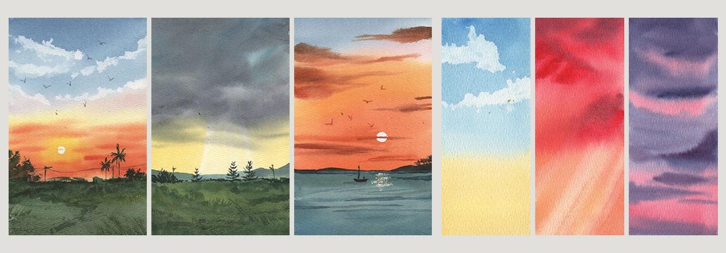
sunset scenes like these. As mentioned, we will be limiting our colors
to five pigments. If you love that challenge, I have other classes
where you'll get lots of opportunities to practice
your mixing skills. Or check out these classes where we will paint
skies and clouds. To help build up
your confidence, we will start with
warm up exercises and mini studies before
doing a bigger painting. Once you finish this class, you'll have a deeper
understanding what makes a
harmonious painting, how to paint soft and
effortless clouds and blend your
background smoothly, which you can then apply to your future landscape projects. Stick with me till the
end of this challenge, and you'll receive a free
copy of my Cloud diary ebook. Find out how to get
yours in the next video.
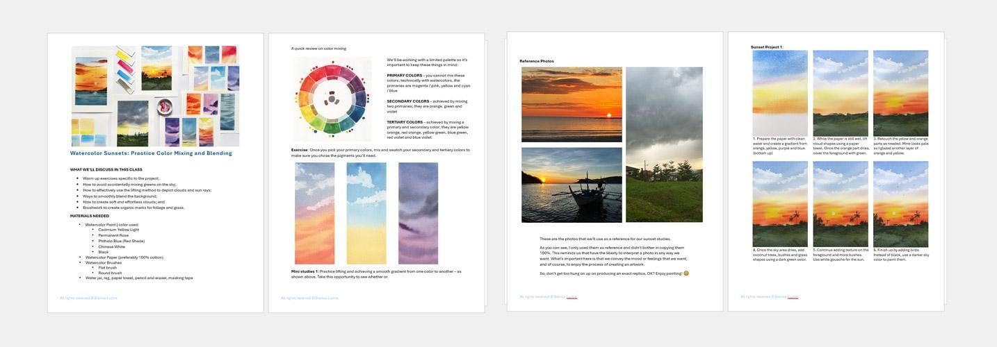
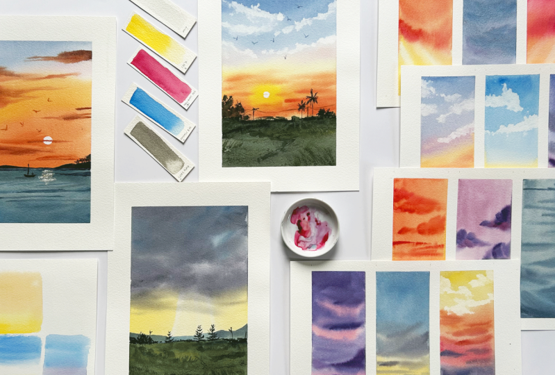
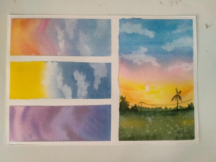
2. Class Project / A Gift for You: Our goal for this class is to
create these mini studies, which will help us prepare for the bigger projects,
these sunset scenes. Welcome to this seven day
watercolor challenge class. Where we'll focus on painting
smoothly blended skies with fluffy clouds using
a limited palette of five pigments only. Days one and two,
blending colors smoothly will be our focus. For day three and four, lifting paint will
be emphasized. For days five and six, we'll practice wet on wet, and on day seven, we'll play with other colors and test different compositions. That means our color mixing
skill will be put to test. So if you need a refresher on how to
choose your primary colors, how to mix secondary
and tertiary ones or create muted tones, you can watch my 30 day
Watercolor challenge and check out Day
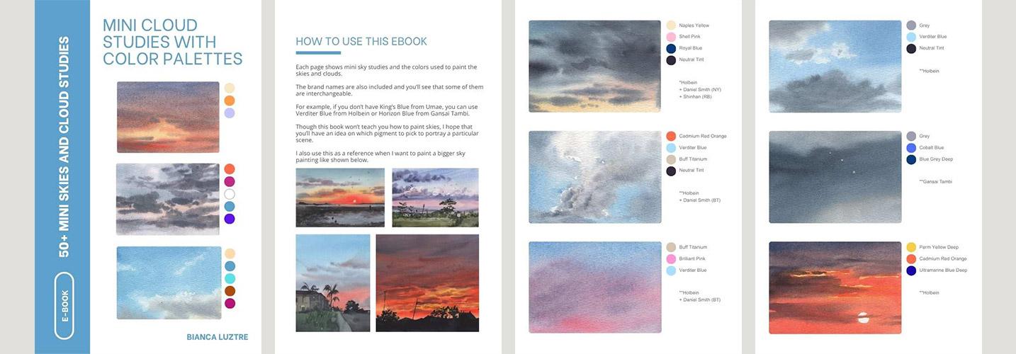
seven, eight, and ten. Link into discussion stab. I did mention that you can get a free copy of my Cloud Ebook containing over 50
mini sky studies with the colors I used. And you can grab
yours by sharing your class project and leaving
an honest class review. And then shoot me an email
with the subject Cloud EBOok. Well, not only for the freebies, but I highly encourage
you to work on the warm up exercises and do the class project to complete
the learning process. In fact, I recently joined an online floral workshop,
and look at this, you'll see the improvement
I made just by following the teacher's
suggestions and feedback, which I wouldn't be
able to get if I did not work on the project
in the first place. This shows that
watching and actually practicing what you just learned are two
different things. So I look forward to what
you'll create in this class. Download the class guide, which contains the materials and pigment list, reference photos, mini studies, and the bigger projects
in different stages, and let's get started
in the next video.
3. D1: Mini Studies 1: We'll be painting this sunset
tomorrow, but before that, we need to warm up and practice the watercolor techniques
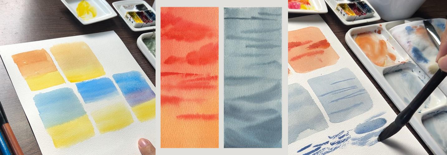
we'll be using to give us confidence and help us ease into the bigger project. First, we'll need to practice blending two colors smoothly. For demonstration purposes,
I will show you what not to do first and what I
recommend you practice doing. Timing is important here. For example, we want to achieve a gradient from
orange to yellow, and we started by
painting yellow, the lighter color of the
two directly on the paper, and then we rinse our brush
and prepare orange next. It's all good when
we do it fast. But when we take too much
time to mix our colors so that the yellow paint
has already started to dry, then this is what will happen. The orange pigment will
disturb the yellow color, so it's not that smooth enough, like how skies
usually look like. In worst cases,
you can even have a cauliflower or the
blooming effect. But let's say we prepared
our colors in advance this time and then instead of
directly painting on the paper, we will wet it first with clean water and then cover
it with the two colors. Let's see how it will look like. Same as the first example, let's start with yellow
and then immediately add orange from the top and let
the two pigments met halfway. We also don't need to rinse or brush since orange
contains yellow as well. Can you see the difference here between the
blending of the two? The second one is
obviously paler because we pre wet the paper with
water, but no worries. We can always add
another layer of the same color if this happens, but we'll have to wait for
it to dry first, okay? Another thing that we have to practice is working
with gradients, including yellow and blue. Let's prepare these
two colors first. If you want, you
can have a really bright yellow or
try a pastel one by adding white and a
really bright blue or tone it down by
adding a bit of pink. Now let's wet the paper again with clean water since we've learned that it helps us
achieve a smoother blending, and then let's start
with the yellow. Paint the bottom half
with this color, switch to blue, and then let's let them
blend with each other. But if we do this, chances are we will accidentally mix green
in between them. Could either be yellow green or blue green or just
neutral green. Since blue plus
yellow makes green, something that we'd like to avoid in our sunset paintings. Now, how do we prevent
this from happening? We have two options. First is leaving a space between the two pigments
so that they won't touch with each other and then blend together
to create green. To do this, cover almost half of the wet area with blue and then rinse and
load it with yellow, but intentionally
leave a white gap between the two colors. You can use a damp brush to soften the feathery
edges of the two colors, but be careful not to mix them. The other option is to add a light purple in
between the two colors. Now, why will this work? Since purple has
both blue and pink, even if it mixes with yellow, it won't produce green
because in this case, all of the primary
colors are present. Thus, it will most likely
produce a neutral color. To do this, let's wet the
paper once again with water, paint the bottom
half with yellow, and then the upper
half with blue. But instead of
leaving a white gap, mix pink with blue
to create purple. You can even make this lighter, but for you to better see this, I'm making a really
noticeable purple. This way, there's no
white space between, but we can also
avoid accidentally mixing green by
introducing purple. Next, we'll also practice lifting cloud shapes
using a paper towel. This has been one of my go to techniques when I want to
paint effortless white clouds. Let's start by painting a blue rectangle first and
then grab a tissue paper. Again, for
demonstration purposes, let me show you what to avoid. If you don't apply
enough pressure and just slightly dab the paper
towel on the wet area, the cloud shapes won't
be that evident. Yes, they will be wispy, but the pigments will slowly go back to those white shapes, making our clouds
almost unnoticeable. But if you do the opposite
and apply too much pressure, then you will get these
big fluffy clouds, which could be good, but it depends on the type of cloud that we're
trying to portray. On the other hand, if you
just apply enough pressure, not too light, not too hard, we can achieve wispy
clouds like this, and this is the
type of cloud that we'll need for our
first bigger project. You will also need to crumple your paper towel into a smaller and manageable
size to achieve this. Now just lay it flat on your wet surface or you lift up too much paint
than intended, okay? Right. Now it's time to
practice our color mixing and warm up with these techniques by creating our mini studies. First thing, let's
prepare the paper with clean water and mix
the colors that we'll need. Yes, you'll observe here that I didn't prepare
my mixtures beforehand, but that's because I wet the paper enough to
give me time to mix. But if you find it that you're starting to panic and
mixing your colors, then better switch the process. Prepare your pigments first, then wet the paper,
and then paint. Okay, let's mix yellow with a bit of pink to
achieve yellow orange. Cover about half of this rectangle with that
color and then make purple. That's just blue plus pink and let it blend
with the yellow. We can add more blue to our mixture and then
cover the whole area. Next, let's add more pink to the mixture and make
the bottom part darker. We can also add some
fluffy orange clouds by painting abstract shapes. This way, we are forcing the viewer to
look at the center. We're creating a frame. Pretty straightforward, right? Then grab a paper towel, crumple it, and
lift up some paint. This practice will
give you an idea how much pressure you needed to create cloud
shapes like this. For the next mini study, we'll use yellow and blue. But this time with only water or blank paper
in between the two colors. Prepare the paper with
clean water again. Make sure to remove
those extra droplets. Paint the bottom thirds
with yellow pigment, and then use blue and cover
more than half of the shape. Intentionally leave a gap
between the two colors. Since we're working
on wet paper, you have to keep in mind that the pigments might spread
farther than intended. Then grab a clean brush, blend the colors, and then wipe off the excess pigment
on the paper towel. Can you see this? On
our first mini studies, the cloud shapes are gone. It means I did not
press hard enough, so let's retouch those shapes by lifting it again with
the same technique. And do the same on
the second study, lift up some cloud shapes
with enough pressure. This looks really easy because I've been doing
it multiple times, as I've shown you before when I was working
on my cloud diary. For the third piece, let's play around with colors. Say, a purple sunset. It's a good warm up
for our first project. Let's start with purple and cover two thirds of the shape, rinse our Brush and
loaded with pink. We can make the upper
part darker too. Then, for additional challenge, let's practice wet on wet. Load your brush with thicker
purple mixture and use single strokes to paint
abstract cloud shapes. This would really
test your confidence in letting go and letting the pigments blend
with each other. So let's keep practicing
and playing around with our colors using
these mini studies. Don't pressure
yourself too much. These are just studies. For the clowns at the top, we can add a bit of yellow just a bit to our purple
to make it darker. And here's our first
set of mini studies. Hopefully, this
helped prepare you for our first bigger
sunset project. Sea.
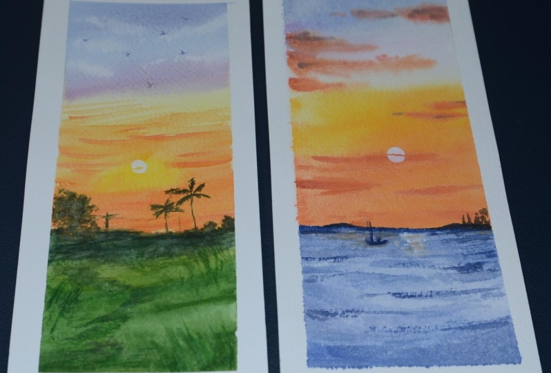
4. D2: Sunset Painting 1: For our first bigger project, we'll work on this scene. This may look complicated,
but don't worry. We'll discuss how to
work on it step by step. Let's get started by drawing
the horizon over here. We're showing more of the sky, so we're allocating
more space to it. It also doesn't need
to be straight, okay? This horizon line will
be covered later. Then with a big brush, wet the background
area with clean water. Make sure it's evenly wet and not too dry nor dripping wet. Now, we'll mix our colors while the paper is
absorbing the water. I always start with the
lightest color first so it doesn't get dirtied
by the other pigment. Prepare a pure yellow mixture
with this consistency. And then on another well, mix pink and yellow
for a bright orange. We'll also need blue, but straight from the tube, this is too bright, so we can add a bit of
pink to tone it down. You may test your
colors on scrap paper, but from what you can
see on my palette, these are the colors
that you'll need. As always, let's
start coloring in the background with the
lightest color. Yellow. Draw an abstract
shape in the middle by dragging your brush
from left to right, and then load your
brush with orange without necessarily rinsing it since orange has yellow in it, too, and cover the bottom
part of the background. Now time for the blue. Start from the top this
time and make sure to leave a black space
between the blue and yellow because you know what
will happen, right? Green. Then add more pink to
your blue mixture that's already on the palette to
make a light purple tone. Use this to cover and blend that white space between
the two pigments. While this is wet, let's grab a paper towel and use that
to lift cloud shapes. If you did the mini
studies yesterday, you should find this technique
quite familiar right now. If needed, you can repeatedly dab and lift pigment
from the paper, but make sure to rotate the paper towel and
use the cleaner side. Okay? As demonstrated earlier,
you will need to apply enough pressure
to lift up the paint. Not too hard or you'll lift
up more paint than intended. Okay, I think this is enough
for our white clouds. For the foreground, we can mix blue with yellow
to achieve green. Again, this is too bright, so let's add its
complimentary color which is pink to tone it down or
create a more muted shade. Adjust as you see fit or until you achieve
the tone that you want. Then test it on a small area. Once satisfied with the mixture, cover the ground
area bit by bit. Or you can continue
adding blue for a blue green shade or yellow
for a yellow green shade. From time to time,
let us adjust and add yellow or black to make this huge color block
more interesting. Avoid using one
shade of green only. As we reach the top
where the horizon is, let's add more black
to the mixture and paint those distant bushes. But make sure to check if
the orange background has dried before painting in
those dark bushes, okay? I mentioned earlier
that we won't need a perfectly
straight horizon line, since we'll be
covering this with absurk shapes that depict
bushes in the middle ground. Add more black to
the green mixture and use that same color
to create texture by dry brushing or applying
a light pressure on your brush and dragging
it lightly on the paper. Of course, if you're using a hot pressed watercolor paper, it might be more challenging
to achieve this texture. Instead of dry brushing, you can use the
scumbling technique. Once the background and
foreground areas are covered, let's leave this to dry. Right, this has
dried completely, and we can see that
the area where the sun is supposed to be looks
really pale. It's okay. Let's add another layer of
yellow and orange wash. Since we worked on the
foreground earlier, my yellow paint here
has become dirty. So if this happens to you
to be careful not to pick up the dirty paint to
avoid muddy skies. Wet the area once
again with water, apply light pressure so as not to disturb the
layers beneath. You can also see here
that even though I'm only covering a
small part of the sky, I am wetting farther
than intended in case the pigments will spread
farther than expected. Then let's drop our colors. Concentrate the yellow paint
where the sun will be. Then prepare a thicker
orange mixture and surround the yellow
part with that color. Now, it's looking more
vibrant, isn't it? Make sure though to
do this lightly. And if in case this feathering of the pigments
is bothering you, you can pick up a
goats hair brush like this and soften it. If you don't have this brush, any clean wet brush
can also do the trick. Now time for some texture
on the foreground. I am pushing my brush on the palette and forcing it
to open up its bristle. So by doing this, we
can paint grass blades nearest to us and add
texture on the farther ones. A hint of grass
shape will give us a textured background and will complement the
softly blended sky. But don't overdo this, as fun as it looks, we can easily overdo it. Also, our brain will
automatically complete the scene. We see a group of gra shapes, and we can assume that the rest of this area is also
covered with grass. Drag the brush on its side, and you'll then achieve
a dry brush effect for an effortless texture. Leave this to dry and then prepare your white
watercolor paint. I'm using guh, by the way, for the next step. With a smaller brush and more
black on our green mixture, let's paint coconut
trees or palm trees. I'd like to start with some guidelines as straight
line for the trunk and a star like shape like this as my guide for the leaves, and then I'll add more details. We're only focusing on
painting their silhouettes, so enjoy this part. And do it slowly if needed. It would also help if you've
seen a coconut tree in life. That way, you'll have an idea
of its overall structure. But I want you to
own this painting. So if a coconut tree
does not interest you, then be free to
replace this with another type of tree and focus on painting
its silhouette only. Add more trees, but this time, vary the height for
visual interest. You can also do the
same on the other side. Use the side of the brush and apply light pressure
for some bushes. Abstract shapes will do. Again, this is just an
impression of the bushes, and we're only working
on their silhouettes, so no need to be too careful and think of painting each leaf. Then add some lampposts for a nice balance of nature
and man made structures. Now it's time for the
white gh to paint the sun. Let's use it over the
yellow part of the sky. I'm using the paint
directly from the tube, so it's more
concentrated and opaque. If you don't have
gouache, don't worry, can just use any white watercolor
pigment that you have. A few more touches and
we're almost done. Don't forget the birds. I find it that when I add a living thing on my
landscape painting, it just gets livelier.
Don't you think? Just like the trees
vary the angle of the birds and how their wings fold and spread to make
it look more complicated. And for an atmospheric effect, if you decide to
paint the bird on the blue part of the
sky, use darker blue. Or if it's located on
the light purple part, use a darker purple or
blue purple and so on. Then let's add some abstract, darker shapes on the foreground to break up this big shape, and we can call it a day. You're doing great. How do you feel about your
painting so far? Did the mini studies
earlier help? Hope you're having fun with
your first bigger project. See you tomorrow for another
set of mini sunset studies. H
5. D3: Mini Studies 2: We'll be doing this
unusual sunset scene next where the dominant
colors are yellow and gray. And to prepare for this, we have to practice lifting paint to
portray the sun rays. I will be using these brushes, one for painting and
the other for lifting. Let's mix pastel yellow. Just add a bit of white to
your yellow, and that's it. One option to paint rays is to combine the wet on wet
and lifting techniques. Prepare the background area with clean water first,
drop the colors, and then press the brush
hard on the paper, then wipe off the excess
pigment on the paper towel. As this dries, the pigments will try to
spread on the white area, so we will need to
keep an eye on it and repeatedly lift the
paint as needed. Another option is using the
negative painting technique. Paint the sky while leaving
the ray shapes white and then soften the edges using
another clean damp brush. But I'm not used
to this approach, so you won't see me using this option in our
mini studies later. There's also a high chance
that the paint will dry before we could
even soften the edges. So it's up to you which option you'd like to
practice later, okay? Another warm up exercise I suggest you do is
painting the silhouette of this African Tisa tree
or the Madagascar almond. It has a sort of inverted
pine tree shape. Its branches are
pointing upwards and there are spaces
in between them. Using the same dark green color we used with the tiza trees, grab a smaller brush and
with light pressure, paint abstract shapes to depict bushes in the middle
ground or background. One last thing, we'll also
have to practice mixing gray. If you watched my
color wheels class, a quick review in color mixing, you'll know that mixing all primaries will give
us a neutral color. Say we have this yellow. If we mix in pink, we'll achieve orange, right. Then add blue, and all of the
primary colors are there. You'll get this
neutral color brown. But if you add more blue, then you will get a blue
biased neutral color. Mix in a bit of pink. So this time we'll have more pink and
blue in the mixture, and you'll get this
neutral purple color. You can see here that I
keep on adjusting my color, and it looks really
easy and fast as I do it because I've been studying color mixing
for a long time. So if you're taking more time in mixing your grays,
that's totally fine. You can even mix white to make a creamy version
of that gray. Now let's get some action and get started with
our mini studies. The mini studies
for today would be more challenging,
but you can do this. We'll use the lifting
method to depict sun rays. Have your paper towel
ready for this technique. Wet the paper evenly
with clean water, load your brush with yellow
to paint half of the shape, and then fill the rest of
the background with orange. Et's say that the
sun is over here. So obviously, the rays
will go this way. With a clean brush, lift up some paint. Apply enough pressure until we see the white of the paper. Let's keep an eye on
this and repeatedly lift the pigment as
the paper is drying. This is looking pale right now, but we'll need it
to dry completely first before adding
another layer. Next up, we'll
practice mixing gray. Mix all our primary
colors, pink, yellow, and blue, and add a bit of
white for a pastel color. For the first layer, it's a purplish gray. That's okay. Just
make sure not to mix muddy grays that
looks brown, okay? Wet the paper with clean water and cover the whole
area with this color. Now that this first study
is starting to dry, we can see that the pigments are once again covering the rays. So with a damp brush, not soaking wet, lift the paint. Make it a habit to check that your brush is not
wetter than the paper, or it will cause cauliflower
or blooms effect. Next, let's add more blue to our pastel gray mixture
and paint rainy clouds. Vary the color from time to
time for visual interest. We can even go darker by
adding black to the mixture and paint these clouds but go lighter with
the pressure, okay? As long as the
paper is still wet, we can add more layers to it. This time, let's add
white for a lighter gray. Remember, the goal here is practice mixing
grays, not browns. It's okay if it isn't a
perfect neutral gray. As long as it's leaning towards blue or purple,
that's totally fine. With a clean damp brush, we can also lift some
paint for lighter clouds. But I think this is still
pale for a rainy scene. So I'll add darker colors
by adding more black. Again, I'm only able to do this because my
paper is still wet. If the paper is half wet, then we have to wait for it to completely dry before
glazing another layer. On the third study, we'll practice lifting again, but let's use different colors. This time, wet half of the paper only and cover that
area with orange, yellow and pink mixed together. We can also vary
that color by adding more pink as we go
up or vice versa. Rinse the brush and lift up some paint to depict the rays. Let's try the opposite
direction this time. Press hard enough
to lift the paint. Wipe off the excess paint
on your paper towel and do it repeatedly and
patiently as needed. Be careful not to touch or go over the second
mini study, okay? Orange is more
vibrant than yellow, so I had to go over this more than I did on the first study. For the next step, we'll
need this to completely dry. So while waiting, let's
retouch the first study. Prepare this area again with clean water and cover
half with orange. Make the upper part darker
for visual interest and vary the mixture by
adding more pink on some parts or more
yellow on the other. Then retouch and glaze over the yellow parts while
avoiding the rays. This time, it's negative
painting plus wet on wet. What a challenge. Again, these are just studies, so no need to get too serious. Have fun while practicing the watercolor techniques we'll need for the bigger projects. For the third study, let's leave this to dry
before adding another layer. Okay, my paper has dried now. Wet the whole area again
with clean water and retouch the orange parts while
avoiding the ray shapes. For this to work, the
paper shouldn't be soaking wet and your brush should have
more paint and less water. Or else the paint will just spread farther and you
cannot control the shapes. For the top part, let's make
it a pastel pink color. Just add white to your pink and add a bit of yellow if
you find that too dull. Cover the white space
with this color and for the next step, please
observe carefully. I am directly dabbing
my brush on my full pan of paint and using that
to paint darker clouds. This way, we get a
thicker mixture. This works perfectly well
for these fluffy clouds. It is also important to
take note that I did not rinse my brush in
between because if I did, I will only load it
with more water. I'm smiling to myself and
loving this guy's studies. I hope the same goes for you. See you tomorrow for our
next bigger project.
6. D4: Sunset Painting 2: For today's project, let's work on this yellow
and gray sunset. Some rain clouds are
covering the sun as it is setting and casting
this lovely rays. As always, let's start by
drawing the horizon and giving more space to the sky by drawing
it below the center. Then proceed by wetting the
paper with clean water. Only the bottom half of the sky area this time or the middle part
of the whole paper. Mix a pastel yellow by combining yellow with a bit of
white pigment and make sure you have
another clean brush ready to lift up some
pigments for the rays. Cover almost half of the background with
that pastel yellow, and then let's grab that clean
brush and a paper towel. With enough pressure, lift some paint by pressing your brush going
from top to bottom. Then white it off with
a paper towel or rack. We might need to keep doing this more than two
to three times. Since the paper is
still wet, naturally, the pastel yellow pigments will go back to that white area. So we have to keep
an eye on this. And when we're lifting
up some paint, it's okay if some of the yellow pigments goes to the foreground area because the foreground area is darker, so that's totally fine. Now, while this is drying, let's mix blue with our
pastel yellow and keep adjusting until we achieve a darker and muted green shade. One common mistake that I always do when I was painting
sunsets before is using really bright
yellow greens for the foreground or grassy
area as if it was summer. I forget to consider that the grassy area
or the foreground area should be receiving less light since the sun is
already setting. So let's avoid that mistake by mixing a darker and muted green. Once we achieve this color, carefully paint the foreground
with various green shades. Let us keep in mind that
the sky area is still wet. So this is actually a challenge
to ourselves that we must leave a thin gap between the green foreground and
the yellow background. Or else the green pigment
will spread upwards the sky. For a variation, add
black and change the green mixture so it
doesn't look too flat. Spread the darker green mixture on the other parts of
the foreground and add some grassy texture or shape by using the
tip of the brush. This foreground area
is a large shape, so we have to vary
what's inside or it will be too monotonous
and thus boring. Additional abstract
shapes will help in increasing the visual
interest of this part. Next, while the yellow
sky is still drying, let's take this time
to mix our grays. As demonstrated in
the previous videos, getting the right shade of
gray can be challenging. But fine. We wouldn't want
a brownish, muddy gray. What we're trying to achieve
here is a cool gray, which could lean towards
either purple or blue. Next, since it's hot and sunny, the time I recorded
this tutorial, the yellow part has
already started to dry. But if it isn't the
case on your end, please wait for it to dry
before doing the next step. Patience is a must. We the remaining
blank background area and up to half of
the yellow sky. And then we can start painting it with various shades of gray. As you can see, I am varying
the shade ever so often. I started with a pale, pastel purple and
then added more blue. Remember that you
can only work on this while the
paper is still wet. If the paper is
half dry, half wet, then you'll have to stop, let it dry completely. And then just like what we did with the first bigger project, you can rewet the area with clean water and proceed by
adding more layers of gray. We can paint abstract
shapes to mimic the clouds while
still glancing over our reference photo from
time to time to help us make decisions on where to
place those dark parts. Like here. Like here, the gray pigment spreads
farther than intended, so I'm lifting up some paint
using a clean wet brush. And of course, my favorite brush and blending can also help. I really love this cheap
brandless calligraphy brush. My paper is still wet at
this point, and I think, and I think we can add darker paint to depict
some rain clouds. But take note that as I add more layers on
this still wet paper, I'm also making my
strokes lighter, and I'm careful not to lift
up the layers underneath. Now we can leave the sky alone and work on a
distant mountain. Using the same gray mixture
that we already have on our palette that we used
for the dark clouds, just add more blue and
paint a mountain shape. Remember, we only wet half
of the yellow sky earlier. This gives us an
opportunity to work on this dry part by
painting a mountain. Now, for an atmospheric effect, we can also make the top of the mountain darker by painting it with a thicker
and darker pigment. We can also leave
the middle part light since the sun rays
are hitting that place. But for the right
and left sides, we can darken both. Now we'll need a smaller brush, and we'll use the
same technique we used earlier to paint grasses. You also have to consider
that this brush I'm using is not that precious, so I can sort of abuse this
brush and really press it against my palette to
open up the bristles more. You can use a fan
brush if you have one. I don't have one, so I keep
on doing this technique. We won't have to cover the
whole area with grass shape. Once again, our brains will perceive that this
part is grassy if we say some grassy texture or some blades that
we painted earlier. Now we don't have any other
dry areas we can work on, so let's leave this to dry completely and add
some final touch. With darker green, let's paint African D Lisi trees or what others refer to as the
Madagascar almond. The structure of
this tree is like an inverted pine tree with its branches pointing
towards the sky. I love the shape of this tree and even love the variegated
version the more. Like what we did with the coconut trees in
the other project, let us vary the height to
create vitual interest. If you want, you can
even replace this with evergreen trees or any
tree to your liking. Take your time in adding
details and enjoy the process. Next, add black to
the mixture and paint some abstract shapes for the distant
bushes and trees. These tiny details will complement the large
sky area that we have. Some more dry and brushing, and this is done. How do you feel about this
second bigger project so far? Have you achieved
to depict the rays, or did you manage to paint the shade of the
gray that you want? Either the case, I'd love to see what you produced
in this class. So don't forget to share
your projects, okay? I'll see you tomorrow for
another set of mini studies. Oh
7. D5: Mini Studies 3: Now it's time to warm up for
our last bigger project, which is a beach sunset. We already learned how to
achieve a smooth transition from one color to another in
the previous demonstrations. Now let's focus on how to
paint these fluffy clouds. The same technique will be used both for the clouds
and the waves. Start with mixing yellow and
pink for a vibrant orange. For demonstration purposes, I'll show you what
to avoid first. Begin by painting an
orange background. This is still wet. If you want to
paint darker clouds but use the same watery
consistency of paint, only darker in shade, what will happen is the cloud
shape won't be sustained. The pigments will just spread out since the paper is so wet. So, what do we do? Let's paint another
orange background. But this time, I'll use a separate palette with an
almost dry yellow pigment. You don't necessarily
need to copy me, okay? This is where we'll mix a thicker consistency
of orange color. Unlike the first one, there's less water here and the mixture is not that runny. It should have this
consistency for it to work. What I'm doing is
I'm directly loading my brush with paint without
rinsing it in between. Now, if we use this
paint consistency, the cloud shapes won't spread too far compared
to the first one. We can also make the
clouds go darker by adding just a
tiny bit of blue. Again, just a tiny bit, or this will turn into a
brown if we add too much. Comparing the two, the clouds are clearer
on the second one. The same goes for the waves. Let's use this leftover mixture, a muted blue green for the
background, and again, for demonstration purposes, I'll drop waves using a
watery consistency, but has a darker blue shade. To achieve this color, just mix blue with a
bit of pink and yellow. For the first demonstration, I'll paint the background first, adjust the color by
making it darker and immediately paint the waves
using a watery consistency. For the second one, which
is what we want to achieve, let's paint the background
with our sea color. Let the paper absorb
the water for a while, and then makes a darker
and thicker blue color. Make sure that
there's less water. This is blue plus black
and a bit of pink. Now, if you use that
to depict waves, the thicker paint
won't spread too far, creating soft but still
distinguishable shapes. For the glare or reflection
of the sunlight on the sea, you can also practice
the dry brush technique. I find that using
a smaller brush and just dragging it lightly on the paper surface will effortlessly create
this broken effect. But if you use a bigger
brush like a mop brush, the shape will be
bigger and chances are it's loaded with
more paint and water, so it's trickier to achieve
the desired effect. Finally, I suggest
you practice moving not only your wrist
when painting a huge shape like the C shape, but engaging your
whole arm to move the brush so you won't
need to cut off the shape. It also allows us to
practice our brush control. Okay, enough of the demo
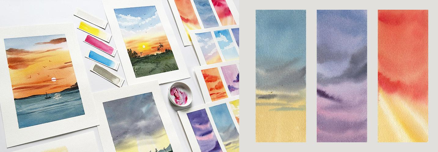
and let's dive into action. Time for our mini studies
again, which, in fact, can be turned into
bookmarks later. You call. On the first one, we'll
practice the clouds. On the third shape,
we'll practice the sea, and on the middle one,
let's play with our colors. As always, prepare the area we'll be painting
with clean water. Then while the paper is
absorbing the water, let's mix yellow orange. Paint half of the shape with
that color and then add more pink to the mixture and fill
in the rest of the shape. So vibrant, isn't it? For the next step,
grab your paper towel. Dry off the belly of the
brush to remove excess water and then mix a thicker
and darker version of the first color, making sure that there's more pigment than
water this time. With fewer strokes as possible, paint abstract shaped clouds. For the thicker
and bigger clouds, use more pressure
so that more part of the brush is in
contact with the paper. On the other hand, for
the thinner clouds, use only the tip of the
brush and then let go. I really mint. Let go and let the paints blend with each other to
achieve this fluffy look. It's so easy to get excited
and overwork this cloud, so practice letting
go early on. Okay. Now for the C, mix a dark blue green color. As long as your color
isn't too vibrant and it leans towards blue green,
that's good enough. Don't forget to prepare the
paper with clean water. Cover two thirds of the
shape with blue green, as we reach the bottom part, let's make it darker by
adding blue and black. We'll do the same technique
as we did with the clouds. Let the paper towel absorb
the excess water from your brush and then mix a
thicker and darker blue green. Combine it with a bit of
orange to tone it down. Now we'll reverse the shapes. The waves should be
larger when it's near us and thinner
when it's farther. So for the big waves
at the bottom, use the side of the brush, and then for the smaller
waves at the top, use the tip of the brush. Once again, let go and don't
fiddle with this too much. Now, time to play with our
colors for our last study. I'd like a purple
sky once again, a color closer to wine, meaning there's more pink
than blue in our mixture. Don't forget to prepare the
paper with clean water. Let's cover two thirds
of the shape with that color and then mix pink and white for
the bottom part. Next step, you know it. Let the paper towel absorb the excess water
from the belly of the brush and then makes a thicker and darker purple color. But instead of using
single stroke for clouds, let's try to give them their
distinct fluffy shape. As we move to the top, we'll make the clouds
smaller to depict distance. I'm also making the bottom part more pinkish and the top part darker to show that
the bottom part of the clouds are receiving
more light from the sun. Oh, I love these colors. And I hope these mini
studies help you prepare for our third
bigger project. Sea.
8. D6: Sunset Painting 3: Right. Let's work on a sunset
scene by the beach. This time, we'll need
a straight horizon. So let's use a masking tape to make sure it's
really straight. Let's prepare our colors. Orange first. Combine
yellow and pink. Make sure that you're grabbing the clean yellow from your pan, or you'll get a muddy
orange mixture, okay? For the upper part of the sky, we'll also need a tone
down version of blue. So let's mix white, blue, and a bit of pink. Once the colors are prepared, let's wet the paper
evenly with clean water. Not dripping wet
just enough so that the pigments will blend
smoothly. You know the drill. Load your brush with
orange and cover half or more than
half of the sky area. As we move upwards, we can also mix in
yellow for variation. By doing this, we're
also preventing a big shape like this area
from looking too flat. If you'll really observe
the sky or a sunset, you'll see variations
of a color, not just one shade of orange or one shade
of yellow, right? Then mix a bit of pink to our blue puddle here and
let's use that to paint in between the yellow orange and tone down blue
color just to make sure that we're not
accidentally mixing greens for this sunset painting. Next, let's load the brush with thicker paint and mix
this dark orange. That's yellow, pink, and
a teeny tiny bit of blue. You have to be extra careful
when you're using blues like Prussian blue or halo blue because they
are really strong, powerful, and staining blue. So just a teeny, tiny bit of blue will do. As practiced, we'll paint
these clouds and let them blend with the background
for its fluffy look. Again, we have to make sure that this mixture is thicker
than the background. More paint, less water. Aim to paint abstract shapes, not too perfect
cloud shapes, okay? And don't scrub your
paper too much. We might accidentally lift
the first layer here. This project will
really teach us to let go and let watercolors
do its magic. A flat brush also helps
in painting thin shapes, or if we want wider
cloud shapes like this, we can push harder
or change the angle, how we're holding the brush. As we reach the
top of the paper, the clouds are
getting less light, so it makes sense if they are darker and darker orange
means there's more blue, but not too much, okay? Now for the lower
part or for the sea, we can just mix the cloud colors that we already have
on our palette. Basically, we're making the
sea darker than the sky. It will help make our
painting look more credible. And if you think about it, the only light source
here is the sun, which is already setting, so it won't make
sense if we paint the sea with a
bright blue color. Just like how we did
the foreground in our second project
or bigger project, instead of using
vivid summer greens, we used muted and dark greens. Once our colors are ready, let's remove the
masking tape carefully. Since the sky is still wet and we'll paint some mountains
on the middle ground, we can still continue
painting by leaving a tiny space between
the sky and the sea. Remember what we
practiced earlier, move your whole arm to paint
continuously and steadily, and then fill in the
rest of the shape. But as we reach the bottom, let's add more blue and
black to make it darker. Like what we did with
the mini studies, the waves near us
should be bigger and the farther ones should
be thinner or smaller. Try to achieve these shapes in one or two strokes
and then let go. That's the purpose of
doing the mini studies. They help you warm up and
practice your brush stroke. Okay, now let's leave this
to dry and then continue. For the next step, let's grab
our white gouache again, our white watercolor paint, whichever is available to you, and then switch to
a smaller brush and use the paint directly
from the tube. Paint a broken circle
to depict the sun. We can design it in a way that some clouds are
covering the sun. I'm also using my paper
towel as an eraser here in case I make
some mistakes. Oh, and did you see that? The sun suddenly
shines so bright. It seems like it's approving
my painting of a sunset. I find it really fun when these things happen
during recording. Okay, how does this look? Now, let's mix white with our orange puddle that's
already on the palette. And since this paint is thicker, we can easily achieve
dry brush marks or dry brushing to paint some glare or reflection of the
sunlight on the sea. Not too much, just enough
to create that effect. And we should only paint
the parts near the sun, and we have to make sure
that it aligns with the sun, not to the left or not to
the right of the sun, okay? Or it will look a bit weird. Next, let's add black to our blue mixture and paint
some distant mountains. I hope by this time
you're appreciating how harmonious our paintings look when we use a limited palette. Paint the mountains wet on dry and be careful to retain
that straight line. Well, not too straight. Some imperfections are
totally acceptable, okay? I also dragged my
clean brush underneath the mountain shape to soften that edge because I
painted outside the lines, but that's totally fine. We can also retouch
the waves and define them more if we need to, like what I'm doing here,
and use the same sea color. One to two strokes will do. I think this part
here is too big, the shape is too big, so I'm painting an
abstract shape here that looks like an island
at the right side. Once this is done, it's
time to paint a boat. A silhouette will do. So don't stress too much
over the shapes, okay. I'm carefully doing it to
get the shapes correct, but I'm also not spending
too much time here as well. Some organic shapes will help balance the
smooth background. So let's paint distant
trees and use the tip of the brush and scumble
abstract shapes for the foliage,
and that will do. Of course, the birds. In painting the birds, I love to use the same color
of the sky, only darker. So if we are adding a bird on
the orange part of the sky, let's use a darker orange. And if it's on the blue
part, use a darker blue. We don't necessarily need to use black or it will
stand out too much. Here's our third bigger project. How do you feel about it? I'll see you tomorrow for our
last set of mini studies.
9. D7: Mini Studies 4: Time for our last
set of mini studies. This time, we'll try different color combinations
and compositions. You'll also see variations
of this on my Cloud diary, which you should
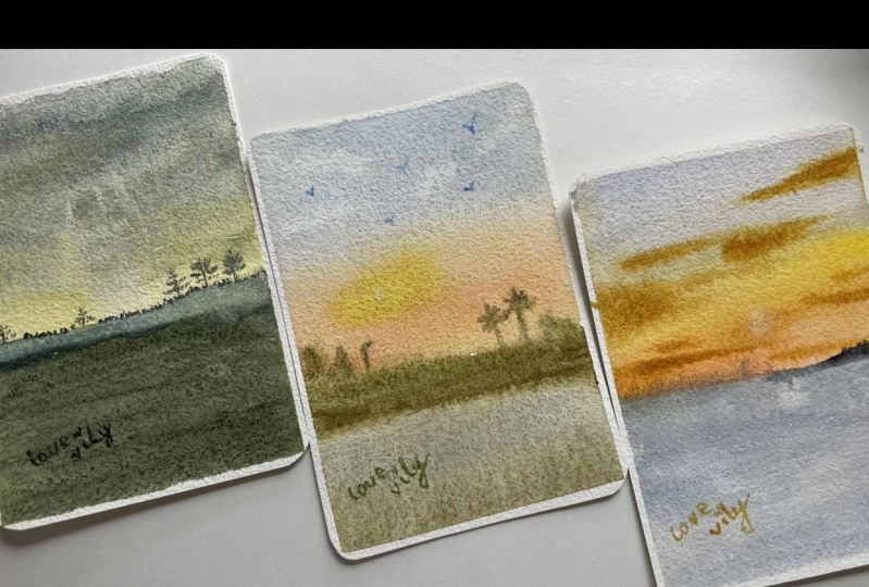
get a copy if you upload a project and leave
an honest class review. Okay, wet that first rectangle and prepare
a pastel pink color. That's pink plus white. But if you find this a bit dull, just add a bit of yellow
to add some vibrancy. Then paint these shapes as
you see on your screen. We're covering the bottom
third with this color, but we'll also spread
it on other parts. And then let's mix
dark blue, purple. More blue than pink
on the mixture. Using this color, let's
fill in the blanks. This is once again negative
painting plus wet on wet. Do not blend too much, or the blue will try to
cover the pink shapes, okay? And then let's grab
our paper towel, let it absorb the excess water by tapping the
belly of the brush, and then mix a thicker
and darker blue purple. Now, paint abstract
cloud shapes. Make the upper parts of those
pink clouds darker, too. The less brush
stroke, the better. We will have to let go
and let them be and let the colors blend with each
other on the still wet paper. For the second one, prepare a pastel yellow,
yellow plus white. And if you want, you can
also add a tiny bit of pink. Prepare the paper once again by wetting it
with clean water, and then paint almost half of that shape with
pastel yellow. Next, let's mix gray. You should know how
to do this, right? A combination of the
three primaries. Let's use that and paint the
middle part of the paper, blend it with yellow, and
then mix a pastel blue color. Fill in the gaps with this color and even paint in
between the gray shape, but not over the yellow
part, to avoid greens. Next, remove excess
water again from the brush and mix a muted
grayish purple color. Mix a bit of yellow to
that purple tone it down, and then use that to paint
azure clouds that go over the yellow part of the sky and retouch some parts of the gray. And once again, it's time
to let go and let this dry. For the last one, let's make a reverse sunset
where the yellow is at the top and then it becomes darker as we move
towards the bottom part. This time, we'll create
a gradient from yellow to orange to pink
to a purplish gray. With each step,
we're going darker, so there's really no need to
rinse or brush in between. That also makes our
process faster, which prevents the
paper from drying before we're able to
drop in our colors. We have to be fast enough, okay? And that's the purpose of the mini studies and
demonstrations earlier to build our confidence and be familiar with the process and the techniques
that we'll be using. So good job if you did all of the mini studies and the
practices I suggested earlier. Once the background is covered, make a thicker purplish gray and paint single stroke clouds. But as we reach the top, we have to match
the colors also. Instead of gray clouds, let's mix darker orange to add some more clouds
at the upper part. Retouch the bottom part if yours is also
looking pale like this, And finally, lift up some cloud shapes
using our paper towel. And as always, don't dwell on
these studies for too long. These are supposedly
quick and meni studies to practice different
watercolor techniques useful in painting skies. And here, ladies and gentlemen, is our last set of Mini studies. Before we go, let's
find out what to do from here to continue
improving our skills. I'll see you in the next video.
10. Claim Your Gift: Wow, great job for sticking
to the end of this class. Now it's time to complete
the learning process by sharing your project
and receiving feedback. Watching and actually doing the exercises and projects
are two different things. So I will be looking forward to what you created in this class. We made mini studies,
tested our colors, and reviewed essential
watercolor techniques to create dramatic sunsets. And then we learned that it's
better to let go and let the pigments blend
with each other to achieve soft
and fluffy clouds. To further improve
your mixing skills, check out these classes
where you'll have lots of opportunities to
get to know your pigments. Or this ones where we'll be
painting skies and sunsets. Now it's my turn to learn from you through a class review. What do you think of this class? Which part do you like the most and what do you
think can be improved? This way, we can help other students decide if this
class is for them or not. Oh, and don't forget to get your free copy of my
Cloud diary eBook. I'll see in my other
classes, and together, let's make this world
a little bit more colorful with our artwork.
 Bianca Luztre, Watercolor, Productivity, Color Mixing