Painting Lifelike Watercolor Roses: Easy Techniques to Add Volume
 Bianca Luztre, Watercolor, Productivity, Color Mixing
Watch this class and thousands more
Watch this class and thousands more
Lessons in This Class
-
-
1.
What You'll Learn
1:00
-
2.
A Gift for You
0:50
-
3.
Establishing the Form
1:52
-
4.
Abstract Shadow Shapes
2:30
-
5.
Lift, Darken, Glaze
4:14
-
6.
Claim Your Gift
0:42
-
7.
Bonus: Editing the Reference Photo
2:13
-
-
- --
- Beginner level
- Intermediate level
- Advanced level
- All levels
Community Generated
The level is determined by a majority opinion of students who have reviewed this class. The teacher's recommendation is shown until at least 5 student responses are collected.
247
Students
15
Projects
About This Class
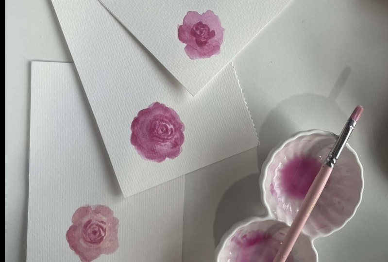
Learn how to add volume to your loose watercolor roses with these simple techniques.
If you’ve been wanting to level up your loose watercolor roses by adding volume to them, then you’ve found the right class.
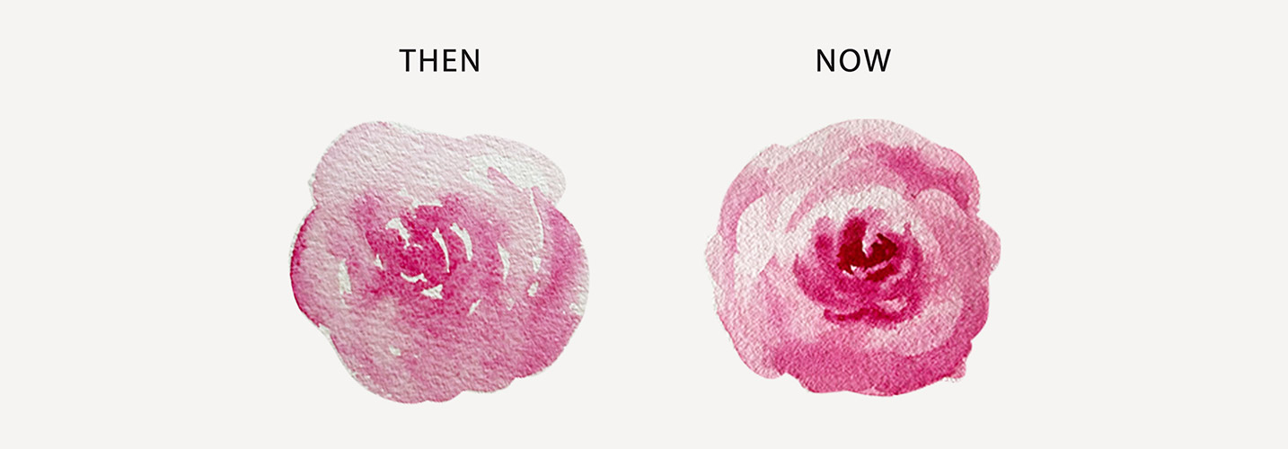
I am fond of painting roses loosely but my old works look too flat. Until I found a way to make them look 3D without sacrificing its looseness and going to the path of realism.
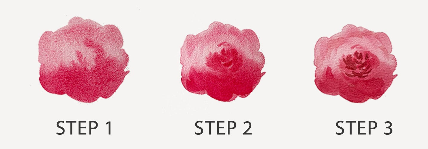
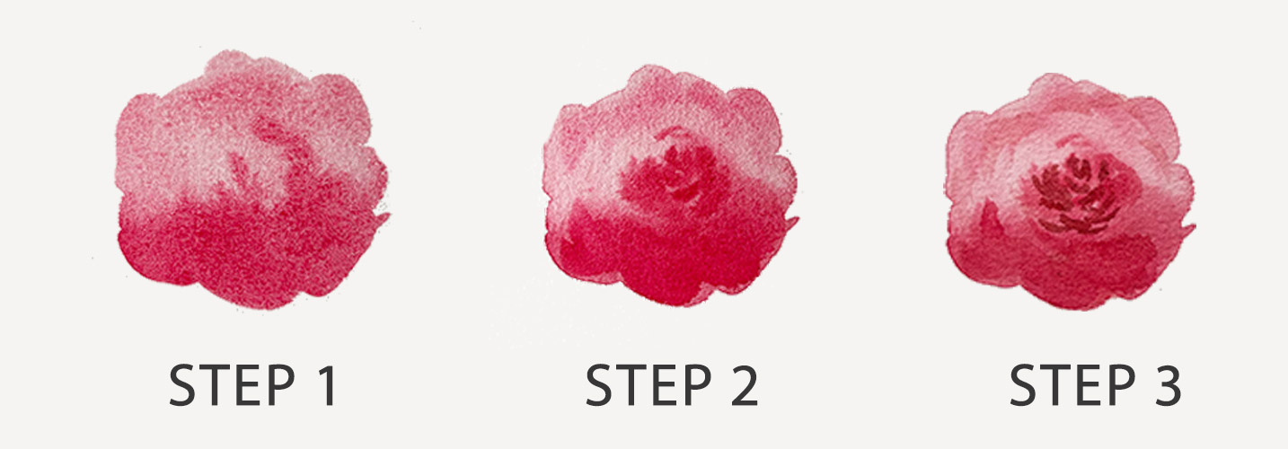
And that's what Ill share in this class. Due to the complexity of this flower, they can be a little bit intimidating to paint but i'll break down the process in three simple steps.
- Observing the general form;
- Placing the shadows correctly;
- Adding highlighted parts and details.
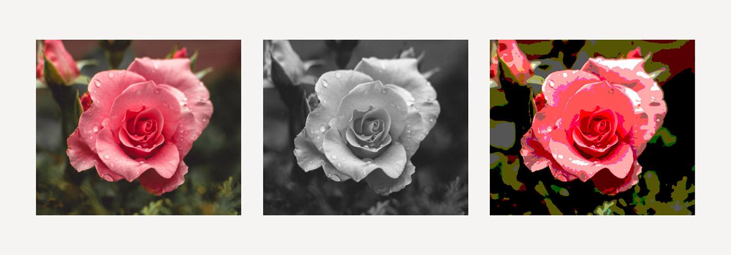
As a bonus, I will also share how I edited my reference photos to make them easier to use.
What will we do in this class?
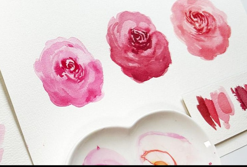
We will paint roses loosely but add volume to them by learning how to place shadows properly.
Don't worry, I will also share with you how you can easily see these abstract shadows shapes without squinting too hard.
We will use the following watercolor techniques to achieve our goal:
- Using different paint consistencies;
- Connecting colors to define the form;
- Wet on dry for the details and abstract shadow parts;
- Glazing or layering for more complexity; and
- Lifting dried paint for the highlighted parts.
Who is this class for?
To all watercolor lovers who want to paint loose roses by adding volume, you're welcome to join this class.
If you're trying out to try watercolors for the first time, then this could also serve as a good starting point.
We won't do any sketching here so prior drawing experience is not needed,
However, a bit of experience in painting with a brush is recommended.
What do we need to get started?
Please prepare the following for this class:
- Watercolor paper: preferably 100% cotton
- Watercolor brush: flat or oval brush, round brush and/or angled brush
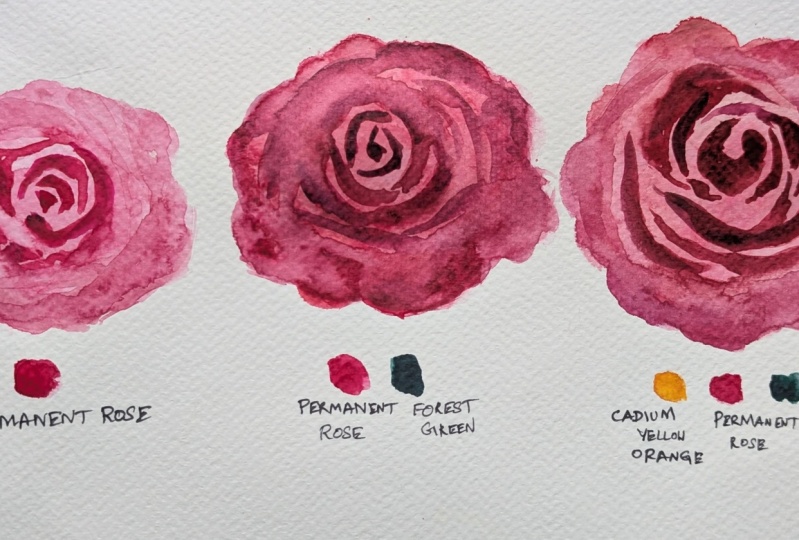
- Watercolor paint: your favorite color for roses (Permanent Rose, Quinacridone Red, Quinacridone Magenta)
- Water jar, rag and/or paper towel
- Download the Class Guide for the reference photo and the edited versions for reference
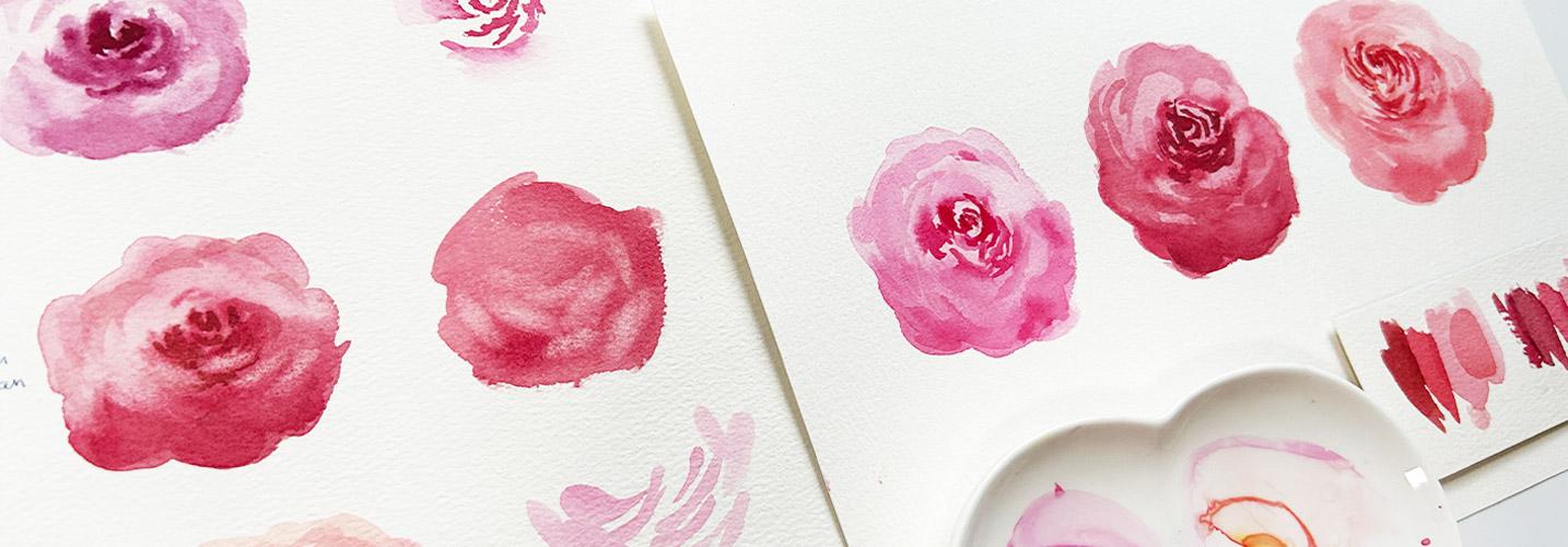
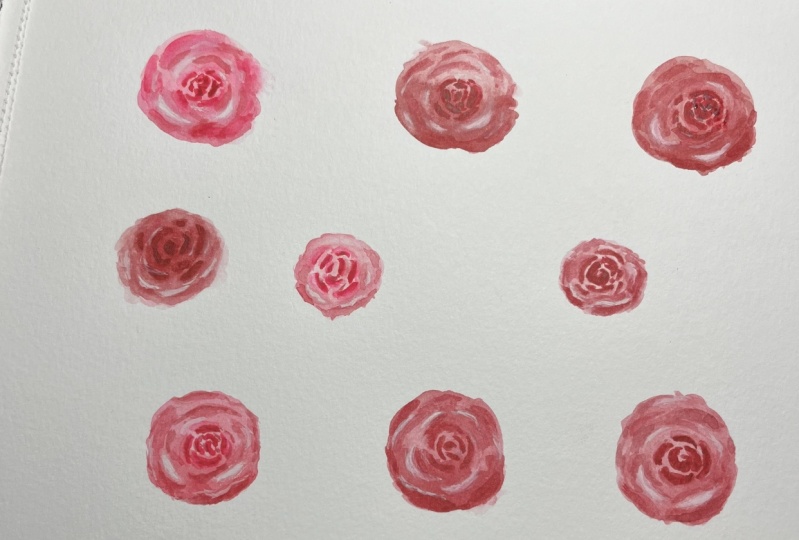
Hope you enjoy this sweet but fun class and won't get disheartened if you didn't get it the first time you try it. Here are my earlier attempts and you could really see that it took me some time before I got the result I wanted.
Music by Purple Planet.com
Meet Your Teacher

Hello, I'm Bianca Luztre, an aspiring watercolorist from the Philippines.
I've been painting with watercolors since 2018 and I made it a habit to practice painting every single day (even for just a few minutes).
I'm still a learner but I love painting so I'm happy to share everything I've learned from books, tutorials, workshops, classes, observation and experience.
I look forward to painting with you!
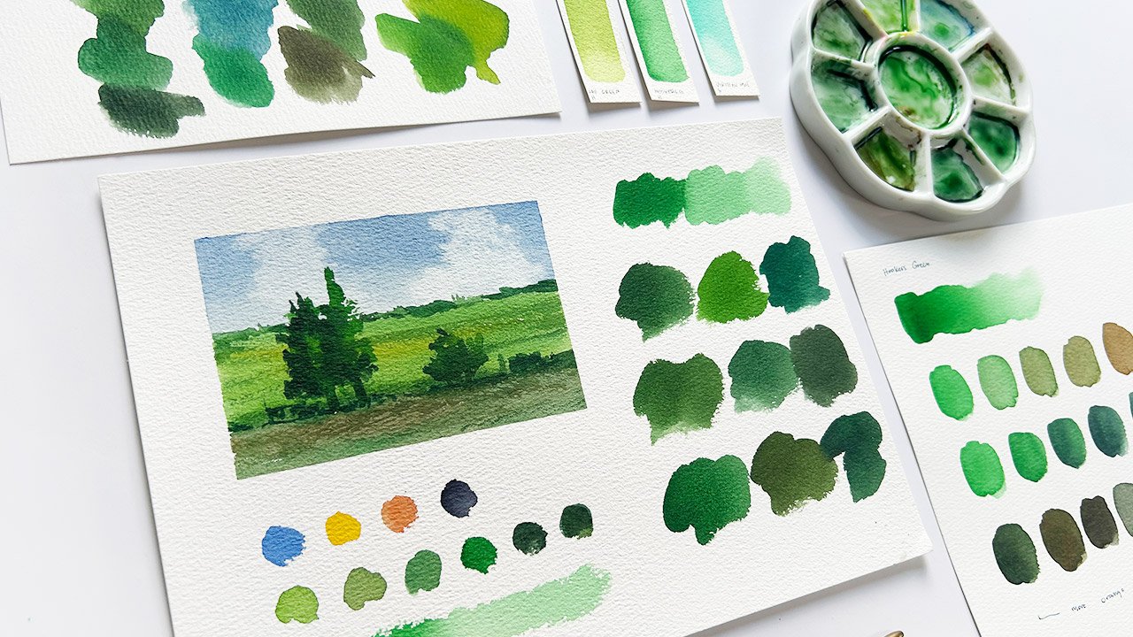
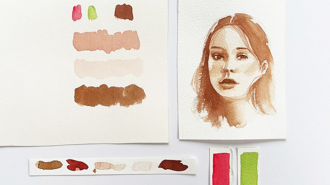
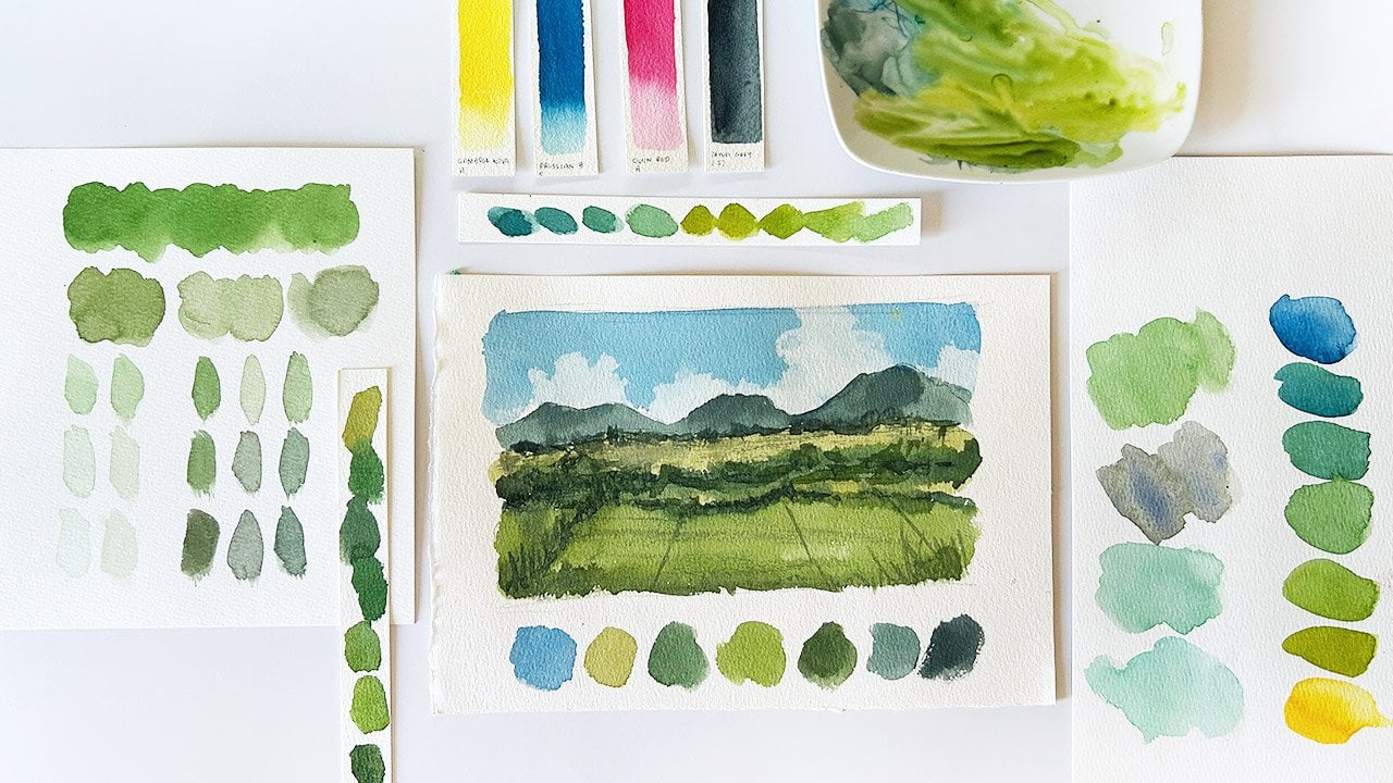
Here are some of my recent paintings. As you can see, I am fond of painting flowers in a loose style. This is the style that I want to develop but I also love painting landscapes and still life (as you see in the classes I offer).
Hands-on Class Project
Lets paint loose watercolor roses with volume by:
- Establishing the form in the first layer;
- Painting the abstract shadows shapes on the second layer; and
- Lifting some areas for the highlights.
To even simplify the process, I recommend using 1-2 colors only.
Don't forget to download the Class Guide for the edited reference photos so you can easily see the abstract shadow shapes.
Then upload a photo of your painting to the Projects Gallery and receive a gift from me.
Class Ratings
Why Join Skillshare?
Take award-winning Skillshare Original Classes
Each class has short lessons, hands-on projects
Your membership supports Skillshare teachers
Learn From Anywhere
Take classes on the go with the Skillshare app. Stream or download to watch on the plane, the subway, or wherever you learn best.