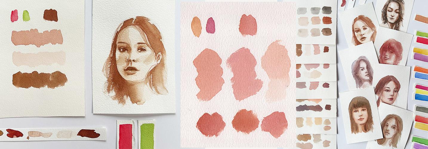
Transcripts
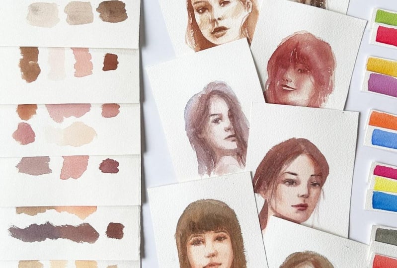
1. Welcome to this Challenge Class: Ever stare at your palette convinced that perfect
skin tones don't exist and lose
portrait paintings. Forget about them, right? I used to think that, too. But here's the secret. Mastering color mixing and understanding the shadow
shapes of the face, is it just possible? It's incredibly fun. Hi, I'm Bianca Lustre, and my current obsession is color mixing and working
with a limited palette. Join me in this two and
one challenge class. Each day features a different
color combination using just two to four pigments to mix a wide range
of skin tones. Then we'll put these
colors to test by painting these loose watercolor portraits
while experimenting with different approaches like
starting from dark or midtones. This class is designed to help you learn to mix
any shade that you need and create
harmonious paintings that reflect your unique style. These portrait studies
will also help you gain confidence in capturing life and emotion with
every brush stroke. Whether you're a complete
beginner or a seasoned artist, I invite you to join in the fun. I know that portrait painting
can be intimidating, but I have prepared
different tools to make each step of the process a
little bit easier for you. Stick with me
throughout the class, and your dedication
will be rewarded with a free copy of my
exclusive skin tone eBook. Packed with over 100
color combinations, including the filled mixtures. That could be your
ultimate guide in mastering skin tones. Find out how to receive your
gift in the next video. We
2. Class Project / Gift for You: Our goal for this class is
to mix skin tones using seven different color
schemes and to reinforce what we learned by painting these loose
watercolor portraits. Depending on your
watercolor experience, you can solely focus on
the color mixing part or go a little extra and
complete the portrait studies. As mentioned earlier,
I have prepared a gift for those who will successfully
complete this challenge. An eBook containing over
100 combinations that you can use as your
guide in picking out pigments to mix skin tones. I've spent so much time
experimenting that I've also discovered which colors
don't work well together. How do you grab your copy? Follow these three simple steps. Complete the class and
upload your project, leave an honest class review, and shoot me an email. I'm so excited to do this challenge with
you and I'm looking forward to the different combinations that
you'll come up with. Let's prepare our sketches, our pigments, download
the class guide, and I'll see you
in the next video.
3. Prepare for the Challenge: This is quite an exciting class, but there are some things that we'll need to prepare to help us finish this class successfully
from day one to seven. First, materials and pigments. Apart from our usual
watercolor materials, including paper, brushes, paint, pencil and eraser, I have provided a list of pigments
I used in the class guide. So please download that
if you haven't already. During the color mixing demos, I will also share alternative
colors that we can use in case you don't have
the specific pigment on hand. Don't let this limit you. I encourage you to explore and experiment with what's
already available to you. I have also prepared legends that will flash
on the upper left of the screen to
show you the ratio of the mixture
currently demonstrated. Number two, sketch. Here's a quick demo on
how I did the sketches. First, I measure the
height and the width of the reference photo by using my pencil and
mark them on my paper. Most of the time, I use the hairline and chin
as the main landmarks. Then I draw a line at
the center of the face followed by guidelines
to mark where the eyebrows and the eyes are. I then draw some lines
for the nose and lips. Next, I estimate how
wide the nose and eyes are and do the
same for the eyebrows. All that's left are using these guides to draw the
features of the face. Now, since our main goal is learning the various
color combinations that we can use in mixing skin tones and testing them by painting
loose watercolor portraits, you can prepare your sketches
in any way you like. You can use a transfer paper
and trace the reference, a light box or a
well lit window. I wouldn't worry too much which approach you'll use
since we're here to learn not to do a commissioned
portrait project, okay? Next to help you see the
shapes that we are painting, I have also edited
the reference photos and will flash on
the screen what I'm currently working on so you can see my
decision process. These are free stock photos, but I do not have the
rights to distribute them. Instead, I included the
links in the class guide. Lastly, our mindset. Perhaps the most important thing to prepare is our mindset. We're here to learn not to create perfect
looking portraits. Though, that's a bonus
if we'll achieve that. As I've done with my
in person workshops, let us have a mantra all
throughout the challenge class. This is just practice. This is just a piece of paper. And if it will help, you can even use a scrap paper, one that's already been used. Have you ever wondered
when using a scrap paper, our artwork looks better than
that of a serious painting. That's because we're relieved of the tension to
make it perfect. So breathe in, breathe out, and let the challenge begin.
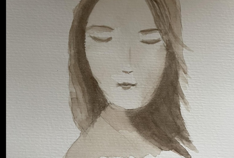
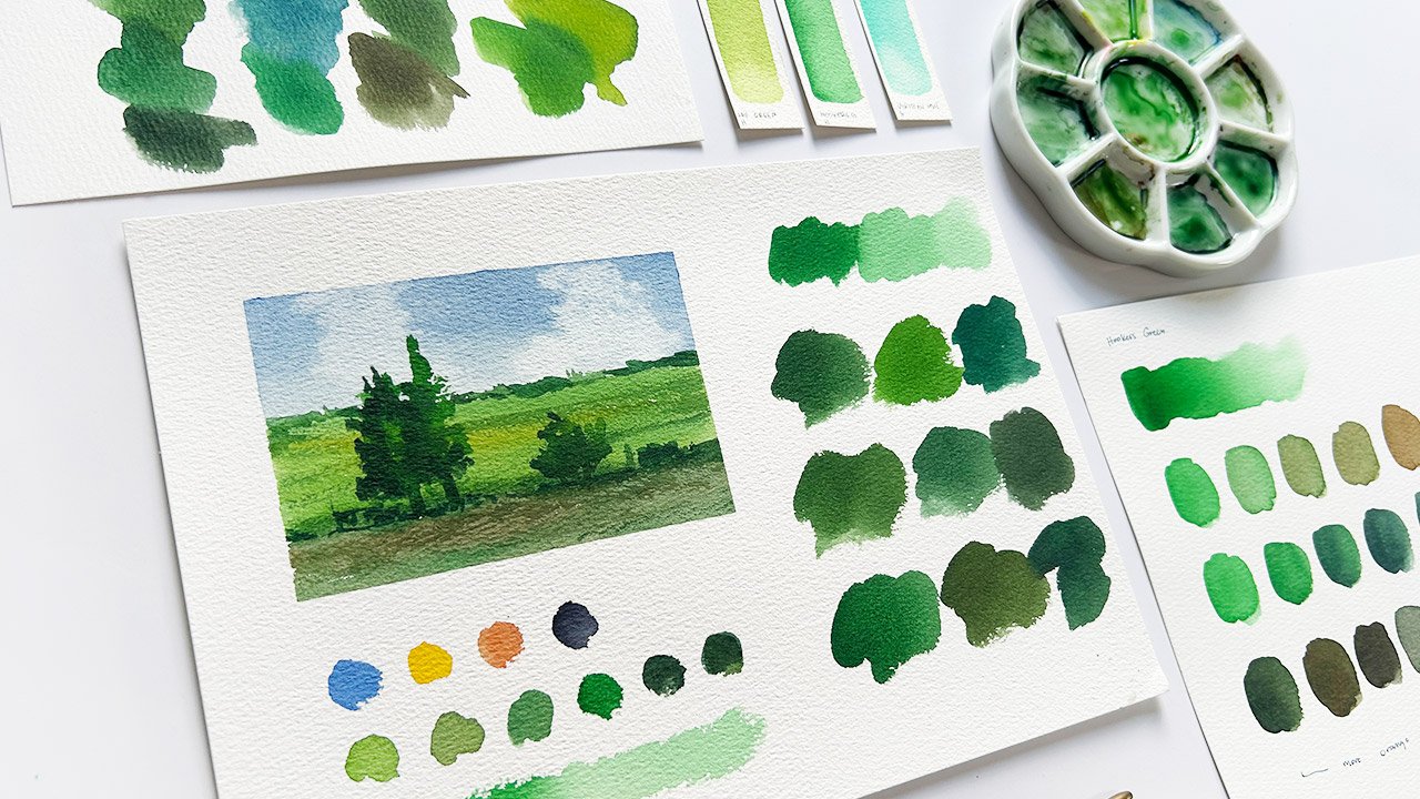
4. Day 1: Monochromatic: The first colors that
we'll play with are a combination of
black and brown. Specifically, I am using
ivory black and burnt sienna. We'll be working with a
monochromatic color scheme, which is technically based
on a single color or hue. Then we'll mix light and
dark versions of that hue. For our first exercise, we're using brown
as the base color. Let's start swatching our brown and aim for this consistency. Here's how burn Sienna, mixed with water, looks like. Now, as we go downwards, let's add more water
and we'll have a lighter version of
the first swatch. We can strictly use a single pigment for our
monochromatic portrait. But if it's not dark enough, then we can mix black. Like what we're doing here. This bird Sienna looks
like burnt burn. That is the magic
of color mixing. It is still considered
monochromatic, even if we're technically using two pigments
because we're using brown as the base color and only mixing black
to make it even darker. With other mediums
like oil and acrylic, you will need white to make
the base color lighter, but with watercolors,
water is enough. Now let's go even darker by mixing in
more black than brown. This color is perfect for the darkest shadows and the
finer details on the face. Add more water as
we move downwards, and our first
swatch is complete. As I mentioned earlier, here are sample
swatches for light red, burnt umber and Sepia that we can use as
alternative colors. Which one do you like best and which one will
you give a go? In the next video, let's
put this color scheme to test by painting a
simple portrait. Sea
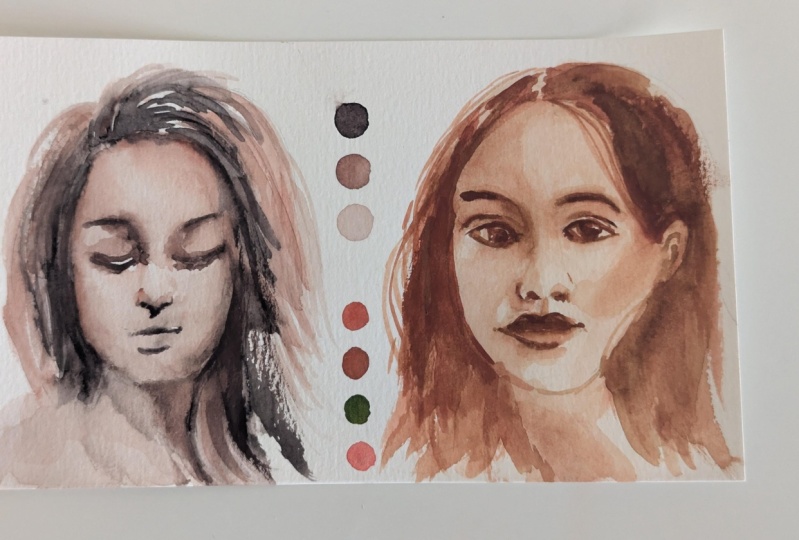
5. Day 1: Portrait: Traditionally, with watercolors, we go from light to dark. But for our first
portrait exercise, let's reverse the process and paint the shadow
shapes first. Let's mix a dark
brown with a bit of black and focus on the
abstract shadow shapes here. Let's use this edited
reference photo to guide us in our
decision making process. It will look weird and flat
at first, but trust me, if your work looks like
a human face with eyes, nose, and lips,
that's already a win. Let's start with a shadow under the nose on the upper lip, below the lower
lip and the eyes. The dark part of the
eyes are actually connected to the eyebrow
and that's totally fine. If it looks too weird, then we can soften
some parts for variety and do the same
on the right side. Now, add some shadows that
will help frame the face, and this includes
the dark parts on the side plane of the
face and the neck. We can see that as we paint these areas and as we
use this approach, the features are already popping out even at the early stages. Once we're done
with those shaves, we can move on to the next one. Another way to frame the face, well, this depends on the model, but there is still some
contact shadow happening, no matter what the
model's hair is, is painting the hair dark. Mixing a bit more
black with our brown and let's loosely
paint the hair shape. Following the general
direction of the strands. We have to remember that
we are doing this loosely, but we're not in a hurry. Let us observe the
reference photo and leave some white areas
where the highlights are. If you're watching this
demo video thinking, how does she make it
look so easy when I can even draw this
shadow shape properly? That's totally fine.
I was like that before and what I always
tell my students is, if we're painting a
portrait and it looks like a human's face and not a
cheeseburger or a cinnamon roll, then you should be proud. You are still learning, but look what you've
achieved so far. Pat yourself on the back
and remember our motto. This is just practice. Okay, going back, we can now fill in the rest of
the hair shape with the lighter brown
mixture we prepared earlier that we used for
the features on the face. Once this is done, let us leave this to dry. Right. Now that the
shadow shapes are done, let us work on the mid tones. We should not forget to erase those extra lines as we
won't need them anymore. With a more diluted
mix of brown, leave the highlights
of the face, which are located on the
forehead, the left cheek, the nose, and cover the whole
face area with this color. It's just practically
brown with lots of water. Once done, we'll blend in those highlight shapes
by softening the edges, but be careful not to overdo
it or we'll end up with a flat wash. Let us retouch some shadow shapes, and we're ready for
the final details. This actually looks de, but a few details
won't hurt, right? With a mixture leaning
towards black, let's make the darkest areas even more visible
with a final touch. Painting over another
layer on the eyelashes, the eyebrows, the hair
surrounding the face, upper lip, and the nose. We can also go back to our
midtone value mixture, which is mostly brown
and define the eyelid, the shape of the nose, the lower lip, and the contact shadow cast it
by the hair on her face. Right. As we near the end
of this exercise, I want you to stand up, look at your painting from
afar and ask this question. Does this, in the very
least look like human face? If yes, great job. If not yet, then consider this a part of
your learning process. Share your project so I can give you a feedback on what you did well or what can be improved and move on to the
next exercise. See you tomorrow.
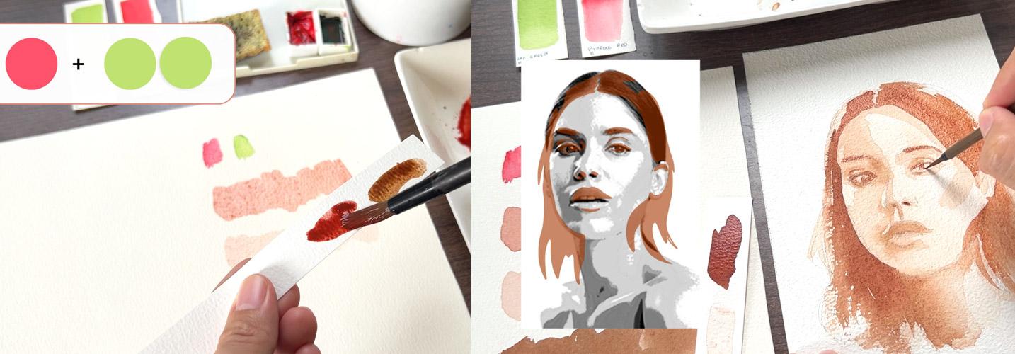
6. Day 2: Complementary 1: The next color combination we'll work with is what's called complimentary colors
or simply colors that are opposite each
other in the color wheel. For this demo, I will use
sap green and pyrole red. Of course, you're free to use whatever colors
are available to you and be surprised with the
discoveries that you'll make. Let's start with a mixture
that has a little bit more red than green and
swatch it on our paper. This looks workable, even lovelier than our burnt sienna
swatch, don't you think? Then add more water and
paint another swatch. This lighter shade is perfect for the first
layers of a painting. Lastly, try to achieve a color that is darker
than the first two, and we'll do that by
adding more green. But be careful not to
make it too green, or the skin tone will
look a little bit weird. If needed, we will
adjust this mixture over and over again to achieve
the shade that we want. Don't worry. Over time, you'll gain mastery on the proportion of the
pigments with practice. Four alternative colors, we have here cadmium red
and viridian hue, scarlet lake and
permanent green, and permanent rose
plus olive green. So far, the rose and
olive combination is the closest to our sap
green and pyalRdswatch. Okay, time to use these
colors in an actual portrait, so I'll see you in
the next video.
7. Day 2: Portrait: Great to see you here again. It's time to put our red and green combination to the test. If we worked from dark to light in our first
portrait exercise, this time, we'll start
with the midtones. Using an equal amount of red and green and observing
the shadow shapes, let's paint them as we see them. You will also notice here that I changed the hair a bit as I find the original reference photos somewhat lacking in
visual interest. This is a good reminder that reference photos should be
used merely as an inspiration. As artists, whatever
the level is, beginner, intermediate or
advanced, we have the artistic license to interpret a subject
as we see fit. I once heard someone saying that creative people allow others to see through their thoughts and feelings with the
artwork that they share. Okay, enough of that. Once again, let us be careful not to paint
over the highlights. An oval brush is what I usually use to paint
during this stage, because it is easy to cut edges, but I am using a rounded one to show you that with
enough experience, your control over your
tools will improve. Now that we're done with this huge connected
mid tone shape, we can switch to a smaller brush and mix a slightly thicker
paint consistency, meaning there's less water
here and let us paint the darker mid tones wet on wet. If this is your first
time doing wet on wet, you might find this challenging, but I encourage you
to take this as an opportunity to learn
and use a new technique. Looking at the reference photo here and the highlighted parts, let's paint the darker areas which can be found
around the eye. The nose, the upper lip and same thing done
to the other eye, and finally, her neck. We're using a smaller
brush for this technique, so we will have more control on how much the
pigment will spread. And since this paint is thicker, it shouldn't spread
out too much. Now, let's lift this to dry
and work on the next shapes. Adding more water to our previous mixture
and make sure there's more water and
it looks really light, we can now cover the whole face. But remember to do this lightly
and don't scrub too much, so we won't disturb the
first layer of dried paint. We will need to practice
our patients once again and leave this to dry before
working on the darker areas. Right, it's time to mix the darkest tone that
we can achieve from this combination and use that to make the features of the
face really pop out. Starting with the
hair. Let us paint the shapes beside the
face really dark. But for the rest
of the hair shape, we can just rinse our
brush and go over the other edge of
the hair shape and soften and let them blend
with the former layers. Leave a tiny gap to
suggest the division of the hair and do the same
thing on the right side. Let us follow the general
direction of the hair, meaning we're
painting from top to bottom or vice versa
to show its form. But if you prefer your strokes
going from left to right, then no problem at all. Once done with the hair, let us work on the features of the face, including
the eyebrows, the eyes, the nose, upper lip, below the lower lip, and switch to a smaller
brush if needed. We can also go over
them again and again as we see fit and
add the final details, including some loose hair
to finish this off later. It's just the same
color over and over again, red and green. And for some parts, you can add more green to
make this even darker. Before learning to
mix my own colors, I wouldn't have imagined that this combination could
yield a skin color. Red and green. Yes, that's perfect when you use it to
paint strawberries, but faces. Mm. That's interesting. And so I tried different combinations of red
and green and even laugh to myself when I went full on studying color mixing
and filling in sketchbooks after sketchbooks of color swatches that
I've experimented with. So Color mixing is a skill
I once hated and avoided, but now it's more
interesting and fun and I hope that
you feel it too. Personally, I think
this combination looks livelier than the
first exercise that we did. But what do you think? What specific red and green
pigments did you use? Let us share our experiences in the discussion
stab and I'll see you tomorrow for another pair
of complimentary colors. H
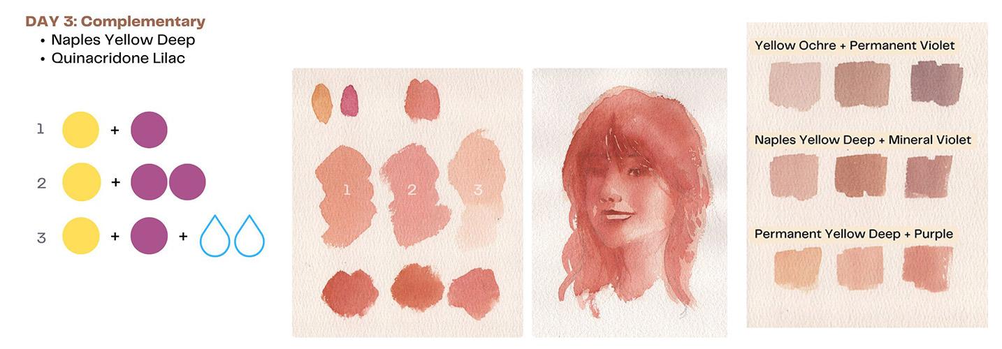
8. Day 3: Complementary 2: Day three, and we'll
work with another set of complimentary colors
yellow and violet. I will use naples yellow deep, along with quinacerdon lilac. Let us start with an equal
mix of yellow and purple. Swatch to see if this
shade suits our taste. Since I have tried
different combinations of these two pigments, so far, quinacidon lilac works with most of the
yellow pigments I have. Try to add more violet, but be careful not to mix too much or it will look too pink. For the third swatch,
add more water. Now, let us try to add more paint and get an equal
mix of yellow and purple. Then add more yellow. It slightly changed the
tone a bit and lastly, add more purple to the mixture. Okay. That's a lovely variation. Here's our yellow
and violet swatch. Now, let's take a look at the other pigments that we can substitute with these colors. We have here yellow ochre
and permanent violet, naples deep and mineral violet and permanent yellow deep
plus purple bisacoakoi. Personally, I think the
last bear is the closest to the naples yellow deep and
quinacidon lilac mixture. Right. Let's use these colors on our third portrait
painting. See you there.
9. Day 3: Portrait: Oh, yellow and violet. They can work for skin tones, but it's a bit
challenging to use. Though, it's a fine
experiment. So let us begin. We've tried working from dark to light and mid to
dark and darker. This time, let us
start by covering the whole area with
the lightest mixture of yellow and violet, meaning there's lots of
water and then observe the shadow shapes and paint
them with a darker tone. I hope this edited version of the reference photo
with an overlay of the shadow shapes will help you see what we're painting
better, let me know. We will be using a damp on wet technique
for this to work, meaning that the pigment
that we're loading on our brush should
have less water, not wet but damp. It's perfect with
portits as the edges of the shadow should blend smoothly
for it to look credible. Once we're done with
these shadow shapes, we'll need to lift this to dry before working
on the details. Time to define the features of the face, including the eyes, nose, and lips with a darker mixture of
yellow and violet. Maybe more violet
for this to work. For this specific
color combination, this is the darkest
that we can go. So let's make use
of it and paint the shapes loosely
but not carelessly. I once thought that loose paintings are done in a rush, but through experience, I now know that it's just
a matter of deciding which features to focus on and which ones are the
least important. For example, you'll
notice that we're not really putting too
much thought on her teeth. It's one of those features
that if you get them wrong, it will really look
funny and odd. Even if she's smiling and it
looks intimidating to paint, we have decided to leave
the teeth and have her smile by just
defining the lips. Let us continue with her
hair and as always leave some white areas to
suggest highlights or parts where the
light hits the hair. Then connect the shadows on the left side of the
face to the hair shape. Now that we've added those
darker parts on her face, the original shadow
shapes look lighter, so we'll need to touch them up and define them even further. Those shadows on her eyes, nose, it might be confusing going from light to dark to
midtones to dark again, but we'll always need to make decisions whether or not
an adjustment is needed. Because watercolors dry lighter. If in case you
experience this in your future projects,
it's totally fine. In time, we'll have
enough knowledge acquired from countless
hours of practice and even failure to
lessen the number of layers that we'll need
to paint a portrait. Of all the portrait exercises I demonstrated in this class, this is the only one
where I needed to do a retake because the first
one looks a bit odd. To pink. That's because
quinacidone Lilac uses the same pigment
as quinacidone red from Holbein and
Daniel Smith, PV 19. And that's why it works so
well with most yellows, because literally, it's just red plus yellow or
pink plus yellow. But still, with enough
experience and experiment, you can use mineral violet or permanent violet and still
achieve a skin tone color. Quinacidon lilac
just happens to be my top pick amongst the purples. Now, some final touch
and we're done. Let us once again redefine
the left side of her face, the eyes, nose, and
we can call it a day. I'm curious as to what pigments you picked for this exercise, so please share them in the discussion stab if
you haven't already. And then tomorrow, we'll work on our last pair of
complimentary colors. Sea.
10. Day 4: Complementary 3: Time for our last pair of complimentary colors,
orange and blue. This, by far is one of the
most challenging colors to work with compared to the
previous exercises that we had. But that's a personal opinion. Let me know what you think
in the discussion stab. I'll be using cobalt blue and red orange for the first
part of this exercise. Let's begin with a mixture
where there's more blue than orange to
achieve a dark brown. Mm. It doesn't really
look like a dark brown, but let's try and
make this work. Now to lighten it up, add more orange to the mixture, hoping that this would
make it look better. But still, it looks too orange. At this point, I felt
like it's time to switch and take out my cadmium red orange
and give this a try. Let's get an equal mixture of cobalt blue and
cadmium red orange to test out the new combination. What do you think? I feel that this will
be more manageable. Now, let's add more blue to the mixture for a
darker version. Yes, that's perfect for shadows. I think this pair would work
better than the first one. Here's our orange
and blue swatch. Looking at the other
colors we try, we have cadmium red orange, plus Manganese
blue, burnt sienna, plus royal blue, and autumn orange, plus
ultramarine blue. What do you think? The three
alternative pairs actually feel more workable than the first two swatches
made with red orange. For next portrait painting, let's use the cadmium red
orange and cobalt blue pear. See in the next video.
11. Day 4: Portrait: I find that starting
with midtones is easier. So let's try that again. With a light mixture of orange and blue,
meaning more water, let us observe these
shapes and paint the whole face and hair shapes while leaving out the highlighted
areas on the forehead. Cheek and nose. Then let's try
something different. With a tone down version
of blue, meaning blue, which is a tiny bit of orange, paint the hair farthest
from the face. This creates a huge contrast and makes it visually
more appealing. Then with a clean damp brush, lightly scrub over
the highlighted areas to achieve smoother blending. This looks weird right now, but we'll see how this portrait will improve with
the next steps. Leave this to r, and let's define the features of the face. Switching to a smaller brush would be a good call right now. Let us observe
these shadow shapes shown here and paint
as we see them. We are now using an equal
mixture of orange and blue. Let's use this to
paint the darker area starting with the shadows on the right side of the face or technically the one
to our right and move on to the upper lip and the shadow below
the lower lip. Then let's paint the eyebrow to our left and the
shadow surrounding the eyes followed by the darker parts on the side
of the face and the neck. We'll also cover
the ear entirely as the hair is casting
a shadow on that part. The side of the nose
needs defining too. If it goes darker than intended, lift up a bit of pigment
and we're good to go. Among the three major pairs
of complimentary colors, I should say that this is also challenging like the
yellow and violet pair. Too much blue would
make it dull, but too much orange
will look odd. So if you're having
a hard time, too, that's good because
you went out of your comfort zone and learned
something new. Keep going. Okay, it's time to
leave this to dry once again and further define
the features of the face. Let's make a slightly thicker
and darker combination of orange and blue and use that to define the darker
parts of the face, including the eyes, the
nostril, the upper lip, the shadow below the lower lip, switch to a bigger brush and use that to paint the hair
framing the face. As always, we're only
using dark colors on the hair shape that
is close to her face, and for the rest of the hair, just blend them
out with a clean, dump brush, borrowing
the pigments that are already on the paper. Now, take a look at this. Once we painted the hair, the shadows on her
face appeared lighter. We can retouch those
areas once again, but remember to brush
them slightly so we won't accidentally pick up the
already dried first layer. Now, all that's left are
final details to define the darkest parts of the
face, including the pupils, eyebrows, nostril, upper lip, and some loose
trends of the hair, which will make this
look more complicated. How do you feel about
this project so far? Did you notice that
there are some parts of the phase where we
always paint shadows? Are you getting familiar
with color mixing too? Let me know your experience
in the discussion stab. I'll see you tomorrow
and let's up our game by working with three
colors. See ya.
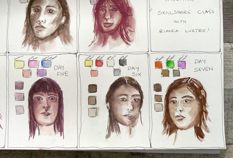
12. Day 5: Primary Colors: Right. It's time to
use three colors. Here we have areolintho
blue, and quinacradone red. Alternatively, just
use any yellow, blue and pink or red
pigments available to you. Let's start with a light
mixture of pink and yellow. That's a lively skin tone color. Then add a bit of blue
to darken the mixture. That tiny drop made a
huge difference, right? Next, let's add more paint and do the same as the
first two swatches. By doing this, we have
a more vibrant mixture. For the bottom swatch, add a bit of blue once again. We added more blue
than intended. So we'll need to mix in
red and yellow again. That's a lovely brown color. Lastly, let's try to
mix an equal amount of the three pigments to achieve an even darker
skin tone color. Then add even more blue
pigment for the last swatch. A tip for you. Be careful
when working with pigments like palo blue because they are very strong
and overpowering. A drop of this pigment and
your whole mixture changes. If you get a greenish mixture, then add more red. If you get a violet color, then add more yellow, just like how
complimentary colors work. Good job. Here's our
primary color swatch. Let's take a look at the
alternative pigments. We have here scarlet
lake plus yellow ochre, plus manganese
blue, cadmium red, plus permanent yellow
deep, plus royal blue, and permanent rose plus naples yellow deep, plus ultramarine. They don't look too different from each other,
don't you think? As long as you know how
to mix your colors, you can definitely make the alternative
pigments work too. Now, time to apply this on a simple portrait
painting. See you.
13. Day 5: Portrait: You're still here,
yeah. Great job. Okay, we've tried
so many ways on how to start a loose
portrait painting. For our fifth project, we'll try to hit two
birds with 1 stone, working on the light
and dark midtones during the first layer. To do that, let us mix a light skin color with
red or pink and yellow, and then observe these shapes. Instead of leaving out
the highlighted shapes, we will be avoiding the
darker mid tone shapes shown here and paint the rest of the face with a lighter
skin tone mixture. Once done with this, we
need to immediately mix a darker brown by adding a
bit of blue. Just a bit. It might take some time
for you to figure out how much pressure
you need to put on your brush to pick
up a bit of pigment, but you'll surely get there. Be patient, okay? Then, while the first
layer is still wet, connect it with a darker color for them to blend smoothly. Did you notice the
extra challenge there? We need to mix the
second color fast enough before the
first layer dries. Great job if you
give this a try. Now that we're adding
the dark mid tones, the check bone really pops out. Let's add the contact
shadow with the hair, emphasize the eye, nose, and upper lip, and paint
the shadows on her neck. Let's keep making
adjustments as we see fit, but remember not to overdo this. Once the first layer
has completely dried, it's time to mix a darker brown. Try to achieve an
equal mixture of red, yellow, and blue and
achieve this color. This is what we'll use as
the base color of the hair. As we start to paint the
hair as a single shape, the face slowly pops out. With almost the
same color that is now focus on these
shapes and paint them, starting with the upper lip and the bottom of the lower lip. Then we'll need to
spread that color a bit so it won't
look out of place. To do that, just
rinse your brush and borrow the pigment
already on the paper. We can also add a bit
more blue to make this mixture darker and
start working on the eyes, specifically the pupil,
the eyelid, the eyebrows. And don't worry about making
them too dark at this stage. Just lay the base color and we can always darken them later. And then move on to
some shadow shapes on her ear and extend
that to her neck. We can also use this shade to
make the chick bone pop out even more and add shadows
surrounding the eyes. But instead of leaving them B, we will soften some of the
edges by cleaning our brush and tapping out excess water
on a paper towel or rag. We will use the same technique on the shadowed
part of her face, the right side, or technically
on our right side. Leave an inverted triangle
shape on her right cheek and that will make the
shadows look credible. With the same eye color, start defining the other
features of the face, such as the eyebrows, the eyes, the shadows
surrounding the nose, the upper lip, and the
bottom of the lower lip. More blue on our mixture
is required now, and we are just adding
the final details. Look at the reference photo. Observe where the
darkest parts are. We'll finish this off by painting some loose
hair here and there to add character and make this visually interesting. If you're wondering how I was able to improve
my portraits, then one thing I would
strongly recommend is joining challenges where you will be forced to sketch
simple portraits daily or every other day, whatever your schedule permits. The key here is to do it repeatedly that you
start to see patterns, especially on facial
shadows and you build confidence to conquer the fear in sketching or
painting portraits. Great job. Here's our fifth loose
portrait painting. Tomorrow, we'll make it more fun by working with four colors.
14. Day 6: Apelles Palette: These colors are inspired by the ApalaPalte or you might have heard of the Zorn palette, which is inspired
by the former one. If you have red, yellow, white and black, use them. Specifically, I have
here yellow ochre, cadmium red, Chinese
white, and ivory black. The closest I can get from
the original apes palette. Our swatches here would be simpler than
the previous ones. For our first worn, just
mix yellow and red. Depending on the
pigments you are using, vary the ratio and try
to achieve a skin tone. For the second worn, add white instead of water to
produce a lighter tone. It looks like a
pastel color close to John brilliant if you've
already used that pigment. Lastly, mix red and yellow again and add black
for the darker tone. This is perfect for shadows. Here's our Palace swatch.
Lovely, isn't it? Since you know, I
love color mixing, here are the other
pigments we can try. Permanent rose,
plus yellow ochre, plus ivory black, cadmium red, naples yellow deep,
and ivory black, scarlet lake and permanent
yellow deep, plus ivory black. I don't know with you, but
they all look the same to me, given that we use
different shades of red, permanent rose is pinkish. Cadmium red is a true red while scarlet lake
is a warm red. The same goes for yellow, but this only proves how fun and interesting color mixing can be and flexible, too. Right. So artists might
discourage you from using white and black with watercolors
for various reasons, but for the joy of color mixing, let's try this
combination and apply it on a simple portrait
in the next video. But
15. Day 6: Portrait: Can you believe it? It's our sixth portrait
project already. Let's start by mixing a pastel skin tone
color with a red, yellow, and white combination. And then prepare
a darker version of that by omitting white. This time, we will try
something different. We will paint over
the highlighted areas instead of leaving them out. Now observe the reference photo, specifically the lightest parts. Where they are, paint them with their pastel
skin tone color. It appears unnatural right now, but let us chose the process. With a darker and
bolder skin tone color, combination of just
red and yellow, let's fill up her
face with this color. Remember to use the reference
photo if it gets confusing, where the lights and
darks should be. Time to add black
to the mixture. This instantly changes our
color to a darker tone. With this mixture, fill
in the hair shape. But as we reach the upper
right side of the hair, let's add even more
black for variety. It will help make it less
monotonous or boring. The next step might not
be applicable to you, but what I'm doing here is just carefully lifting up excess
water from the face so it won't produce
unnecessary blooms or what they call the
cauliflower effect. You can skip this step if
your paper is not too watery. Okay. This part
might be tricky for beginners because we're using the damp damp
technique once again. Let us switch to
a smaller brush, so we'll only be able to pick
up less paint than water. And then with a darker
red and yellow mixture, touch up these parts
where darker shadows are, including the ones
surrounding her eyes, the side of the nose. The upper lip below
the lower lip, the side of the face and once it's time to color
in the neck and the hair, add black to the mixture. Let's leave this a dry and we're ready for
the final details. We will finish this
painting off by defining the darkest parts
of her face with a red, yellow, and black combination,
including the eyes, the nostrils, upper lip, below the lower lip and frame her face using the dark
areas of her hair. I mentioned yesterday that joining challenges help
me improve my portrait. But if they are not your thing, then try studying the skull, draw it from different angles, label some parts,
and even paint it. By doing so, you will have a broad idea where the
features of the face are, the proportions,
and the alignments that would be vital
in drawing portraits. I hope that tip helps. Here's our sixth
portrait painting. The colors are bolder
than the previous ones. I'll see you tomorrow
for our last day.
16. Day 7: Secondary Colors: If you've joined either
my skin tone recipes or 30 day color mixing class, you already have an idea
of what's coming next. Yes, instead of the
traditional primary red, yellow, and blue for skin tones, we will use secondary colors. Specifically, we have
here cadmium red, orange, hookers
green and purple. Let's start with an
equal mix of the three, and this is what we get. Looks workable, right? For the second swatch,
add more green. It will get darker
and this would be perfect for the
details and shadows. Now, let's add more orange, and this is how it looks. I think this would suit
well for the midtones. And lastly, add more purple. This one's ideal for blush and lips in case you
want this color. Here's our secondary
color swatch. Looks dull compared
to the previous ones, but this could also work. Of course, it
wouldn't be complete without the alternative
colors, here they are. Cadium red orange,
permanent violet, and permanent green,
autumn orange, mineral violet, and olive green, Burnsiena, purple,
and viridian hue. Each has its own beauty. Do you agree? Which colors will you be playing with later? Let's put this combination
to test in the next video.
17. Day 7: Portrait: Day seven our last day. I'm so thrilled to finish this
challenge class with you. Let's go back to
our first approach where we will paint the darkest
parts of the face first, meaning dark to light
to mean to dark again. This is an equal mixture of
the three colors and we'll paint the eyebrows,
eyelids, pupils, the nostrils, upper lip below the lower lip and cover a small area of the hair
shape to frame the face. So next, prepare a puddle of brown
with more orange pigment, so it looks like this. And then observe
the shadow shapes. Let us paint these darker areas. Once done, add more water to the same mixture and
use that to cover the whole face and
the rest of the hair while blending in
the darker mid tones that we painted earlier. Oh we will need to
work fast enough so that the dark tones
will not dry before we could even blend in the
lighter skin tone color. That's another challenge. Oops, I have accidentally
blended this too much, so the left side of her face became
lighter than intended. If this happens to you too, we can mix the same color again and retouch that
side of the face. Adjust the shadow
shapes as we see fit, and we can leave this to
dry for the next step. All that's left here is
mixing a darker brown with more paint and less water and following these
shadow shapes. Don't worry about those hands. Like what we did with
our third portrait where we avoided
painting her teeth, we are omitting some parts of the reference photo
that might hold us back in painting this portrait because they are
too complicated. In this case, the hands. As I'm editing this demo video, I can see that the shape of her face is far from
the reference photo, but I'm glad that I
did not stop painting. I wanted to show
you that even if this artwork doesn't look
exactly like the model, but when we view it without
the reference photo, it still looks like a
person, right, right? I want to emphasize that learning portrait
painting is like that. We will go through different
stages of learning, and this time,
specifically this class, our focus is mixing skin tones and painting
shadow shapes and applying those colors to paint
loose portrait paintings. Again, loose portrait paintings, not realistic portraits, okay? So once again, if your painting
has distinguishable eyes, nose, and lips,
that's already a win. So don't be too harsh, okay? Here's our final portrait
painting for this class. I'll see you in the next video for a quick summary and what to do from here to continue
learning portrait painting.
18. Before You Go: Goodness, that was amazing. Good job on completing
this challenge. How do you feel about
your project so far? Which part do you
like the most and which part do you find
extra challenging? If there's one thing that I want you to take away
from this class, that is, color mixing is a skill that can
be learned by anyone. Yes, it might take some time, but it is definitely
possible to master it. Just like what we
did with this class, starting with monochromatic
color scheme where we use one base pigment and
then moving on to three major pairs of complimentary colors
such as red and green, yellow and violet,
and orange and blue, adding more challenge by
using three pigments, featuring our primary colors, using an ancient palette inspired by the
artist Appellees, and of course, switching our primaries with
our secondary colors. I want you to experiment, have fun, and make new
and exciting discoveries. Use the colors that you love, dig out those pigments
that you regretted buying, or even work with alternative colors that
I suggested earlier, and then apply them on your
own portrait projects. I'm looking forward to what you've come up with
with this class, so don't forget to upload them
in the project's gallery. I'll leave some comments and feedback to complete
the learning process. Please do leave a class review. It's my turn to learn from you. See on my other
classes and together, let's make this world
a little bit more colorful with our artwork.
 Bianca Luztre, Watercolor, Productivity, Color Mixing