Watercolor Greens: Mastering Premixed Greens for Vibrant Landscape Paintings | Bianca Luztre Art | Skillshare

Playback Speed


1.0x


  • 0.5x
  • 0.75x
  • 1x (Normal)
  • 1.25x
  • 1.5x
  • 1.75x
  • 2x

Watercolor Greens: Mastering Premixed Greens for Vibrant Landscape Paintings

teacher avatar Bianca Luztre Art, Watercolor, Productivity, Color Mixing

Watch this class and thousands more

Get unlimited access to every class
Taught by industry leaders & working professionals
Topics include illustration, design, photography, and more

Watch this class and thousands more

Get unlimited access to every class
Taught by industry leaders & working professionals
Topics include illustration, design, photography, and more

Lessons in This Class

    • 1.

      What Colors to Mix

      0:59

    • 2.

      Mixing with Primaries

      2:54

    • 3.

      Mixing with Secondaries

      2:43

    • 4.

      Mixing with Dark Neutrals

      1:32

    • 5.

      Mini Landscape Study

      5:24

    • 6.

      What To Do From Here

      0:59

  • --
  • Beginner level
  • Intermediate level
  • Advanced level
  • All levels

Community Generated

The level is determined by a majority opinion of students who have reviewed this class. The teacher's recommendation is shown until at least 5 student responses are collected.

16

Students

2

Projects

About This Class

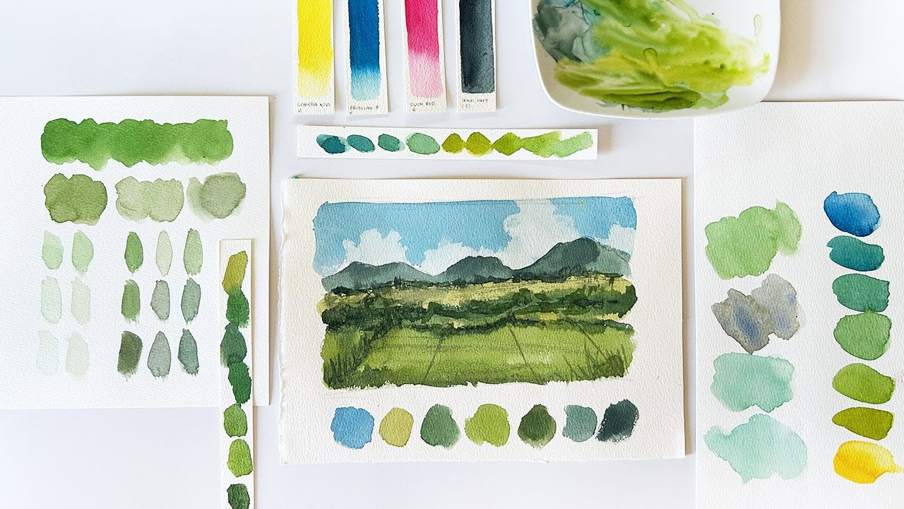
Let’s mix different shades of greens using a premixed or convenient pigment like Hooker’s Green, Sap Green, Permanent Green, etc.

We'll mix it with these groups to achieve various shades such as yellow greens, blue greens, muted greens, dark greens , etc.

  • Primary colors - red, yellow and blue or magenta yellow and cyan
  • Secondary colors - orange and purple to desaturate or darken the base color
  • Neutral colors - to tone down or create darker greens

What will we do in this class?

In another short class, we learned how to mix various shades of green using primary colors and black.

This time, let’s use convenient or premixed green pigments and combine them with with other pigments and learn that:

  1. You don't need to buy new paint tubes if you need a new shade of green;
  2. You can adjust a convenient green mix and produce shades you'll need for your watercolor projects;
  3. Checking the color wheel is a great place to start to know which colors to mix and why; and
  4. Color mixing can be fun as long as you know the basic principles of color theory.

Who is this class for?

This is a short and sweet class open to all students from different levels. 

  • Beginner students would benefit from being exposed to the art of color mixing early on their art journey.
  • Intermediate students will have opportunities to play with pigments and with this specific combination for their watercolor landscapes.
  • Advanced students will find this as a useful way to quickly review color mixing theories and immediately apply them on future art projects.

Everyone who completes this class, shares their project and review can claim their FREE copy of my latest eBook where I adjusted premixed green pigments by combining it with other colors. 


What do we need to get started?

Before you start watching the lessons, I suggest you do the following:

  1. Download the Class Guide which contains alternative pigments you can use, color mixing ratio, mini landscape studies, reference photos and a little homework.
  2. Watercolor brush and paper. Preferably a small flat brush to create organic shapes for the different landscape elements and 100% cotton watercolor paper.
  3. Watercolor paints - premixed green, primary, secondary and neutral colors. 
  4. Your passion to learn and growth mindset to embrace the new discoveries and failed experiments as part of the learning experience.

Music: Purple Planet Music

Meet Your Teacher

Teacher Profile Image

Bianca Luztre Art

Watercolor, Productivity, Color Mixing

Teacher

Hello, I'm Bianca Luztre, an aspiring watercolorist from the Philippines.

I've been painting with watercolors since 2018 and I made it a habit to practice painting every single day (even for just a few minutes).

I'm still a learner but I love painting so I'm happy to share everything I've learned from books, tutorials, workshops, classes, observation and experience.

I look forward to painting with you!

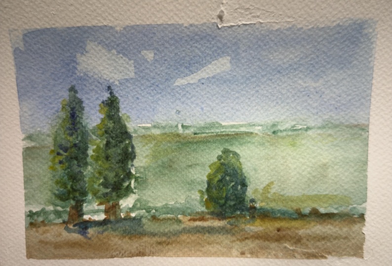
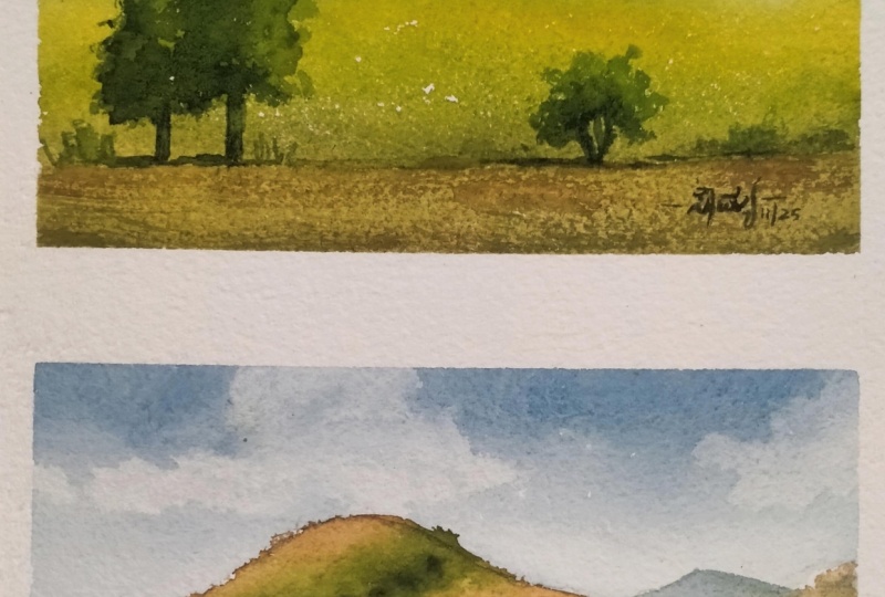
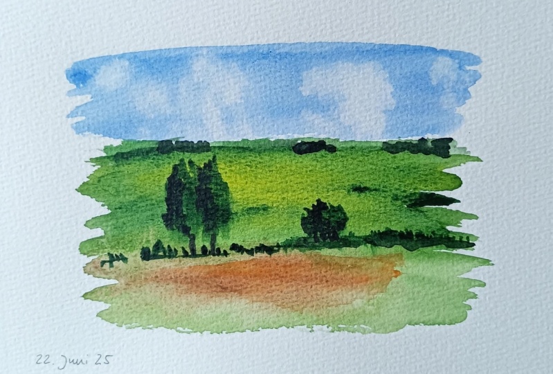
Here are some of my recent paintings. As you can see, I am fond of painting flowers in a loose style. This is the style that I want to develop but I also love painting landscapes and still life (as you see in the classes I offer).


See full profile

Level: All Levels

Class Ratings

Expectations Met?
    Exceeded!
  • 0%
  • Yes
  • 0%
  • Somewhat
  • 0%
  • Not really
  • 0%

Why Join Skillshare?

Take award-winning Skillshare Original Classes

Each class has short lessons, hands-on projects

Your membership supports Skillshare teachers

Learn From Anywhere

Take classes on the go with the Skillshare app. Stream or download to watch on the plane, the subway, or wherever you learn best.

Transcripts

1. What Colors to Mix: Let's say you want to paint this photo and you have this green that is almost close to the shade that you need. How do you know which color to mix with it, to get a yellow green, muted shade, a dark green, and other shades? That's what we'll focus on in this class. Using a green as our base color, let's mix different shades by combining it with other pigments. Once we're done with lots of swatches and reviewing basic color theories, we'll then paint a mini landscape study to apply what we learned. Also, to help you pick your colors, I made this convenient greens ebook, where I mix different greens with other pigments to achieve different shades. And I'm giving away free copies to anyone who completes this class, uploads the project, and leaves an honest review. Just shoot me an email once you're done, and I'll reply as soon as I can. Okay, now download the class guide, and let's get started on the next video. 2. Mixing with Primaries: For a general idea on what colors to mix, the first place that you'll need to go to is the color wheel. Let's talk about primary colors first, red, yellow, and blue, which are placed equidistant to each other. We've talked about this in another short class, but let's do a quick review. Green sits across red. Technically, they're called complimentary colors. When you combine the two equally, you'll get a neutral color. But when you add just a tiny bit of red to your red and mixed green, you'll get a tone down shade of green. These are Hookers Green and scarlet lake. Now, green is a secondary color produced by mixing yellow and blue, so it sits at the middle of our two primaries. Looking at the color wheel, this means that if you want a yellow green, which is a tertiary color, then make the primary color closest to it, which is yellow. This is cadmium yellow light. But remember that the result will vary depending on the ratio of your pigments. Say you added more yellow, then that will lighten up the mixture. And if you add more green, it will darken the shade. Same thing with red. Add more red and you'll get a more neutral muted green. Next, if you want to mix blue green, mix the primary color closest to it, which is blue. Specifically, this is ultramarine blue. Vary the ratio and you'll yield a different shade. It doesn't matter which primary colors you pick. Here's Hooker's green mixed with other red, pink and magenta pigments. Not much difference, right? And here's how it looks when mixed with other yellow and blue pigments. The yellow green versions are very distinct from each other, but the blue greens are quite close. To see it better, here are mini studies I did using different sets of primary colors plus Hookers green. And in case you don't have this specific pigment, here are other greens mixed with same colors scarlet lake, cabby yellow light, and ultramarine blue. A quick recap for yellow green, add yellow, blue green, add blue, for mutant green, add red. But what do you do if you don't have red, yellow or blue? Let's find out in the next video. 3. Mixing with Secondaries: When the primaries are absent, then try mixing green with the other secondary colors, orange and violet. We've learned earlier that red and green makes a muted green, so as long as there's more green in the mixture. But if you don't have red, you can also try orange. Since orange is red and yellow combined, this means adding this to green should tone down the base color. This is cadmium red, orange mixed with Hooker's green. But based on the ratio, if you mix too much orange, you'll get a brownish shade. Now, this is Hooker's green mixed with other orange pigments. And since brown is also grouped with oranges, that is also a good substitute pigment. And here are other greens mixed with the same cadmium red, orange pigment. Now what about violet? Mixing green and violet gives us a darker shade. I'm using permanent violet here, which is close to blue violet. Violet is another secondary color which can be used to adjust the shade of green. Again, depending on the ratio of green and violet mixed, the shade changes. If you've joined any of my skin tone mixing classes, you would have stumbled upon this combination, too. This recipe works both for skin tone and grin shades. Now here's Hooker's green mixed with other violet pigments and other greens mixed with the same permanent violet. Now, if you mix the three secondary colors, you'll get a darker green close to a neutral color. And depending on how much paint you add, you can go even darker. That means these three colors plus blue for the sky can be used to render a full landscape scene. Here are mini studies I did where I used different sets of green, orange, and violet. Which one is your favorite? A quick recap. Adding orange to green tones it down or desaturates it while mixing violet with green gives us a darker shade. Now, what if you want to mix a green that is even darker than this? Let's find out in the next video. 4. Mixing with Dark Neutrals: Since adding water to the base color lightens the shade when we're working with watercolors to darken it, we will use dark neutral pigments. Let's start with black. This time, I'm using lamp black instead of ivory black. There's more green in my mixture. But if you add more black, of course, you'll deepen and darken the color even more. Next, burnt umber. It is still brown but darker, so you'll get a darker, muted green shade. Add more brown and it's closer to a neutral mixture. And lastly, neutral tint, which has a shade of purple. I love this pigment and I use it when I don't have pains gray on hand. Mixing with Guntrl tint produces this dark, cool green. Now here's Hooker's green mixed with other neutral colors. And here are other greens mixed with the three neutral colors we used, lamp black, burnt umber, and neutral tint. A quick recap. For a neutral, dark green, add black. For a muted dark green, add brown. And for a cool dark green, add a cool neutral. See you in the next video, and let's apply what we learn by creating this mini landscape study. 5. Mini Landscape Study: I for our project, let's do a mini study of this scenery. I took this photo when passing by the Expressway or motorway near our place. You can choose which colors to mix with your green or use the same colors I picked. Hooker's green for the base color, ultramarine blue for the sky, and for adjusting the different shades, cadmim yellow light, cadmim red orange and neutral tint. Again, depending on your pigments, the results may vary, and that's totally fine. Let's start with a sky. This is pure ultramarine, the only part where we won't use green. As we go downwards, add more water. Then grab a paper towel, crumple it, and press it down on the paper to create effortless clouds. A fun technique for skies. Then let's mix yellow green. This is cadmium yellow light, plus Hookers green. There's more yellow in my mixture. Fill in some areas with that color and cover the rest of the middle part with just green pigment. This is to avoid making our paintings look flat. Using various shades of the same color adds complexity to it. Let these two colors blend on the paper. Next, we'll need a darker shade. Let's add permanent violet to Hooker's green and draw these abstract shapes on the foreground. And to complete the first layer, we'll need brown to cover the ground area. Let's mix cadmium red orange and hookers green. An equal amount of each pigment will give us this brown color. Fill in the blank area with this color and let it blend with a dark green shade. Now, since the sky area has dried already, we need to fill in the gap on the horizon with a darker green. This time, it's neutral tint with hookers green. Draw distant trees in the background, living space for the trees on the foreground that we'll paint later. Use the same color to reinforce the dark greens, separating the foreground and the middle ground. Now leave this to dry and we'll add the other landscape elements. Next, let's add trees of varying heights. Draw their trunk as a guide where they will be painted. Let's prepare different shades of green for this. I mixed a bit of yellow with green for the base color, but we have to make sure that it's darker and thicker than the first layer. Paint the two trees side by side. I'm also painting them very loosely by changing how I hold my brush. Focus on the silhouette shape of the foliage and never mind the individual leaves, okay? For the shadowed part, make neutral tint and drop those colors at the left side while the paint is still wet. Use the same color for the cast shadow on the ground. We're assuming that the light is coming from the right, so the shadows should be consistently at the left side. Now mix green and orange and try to achieve a color darker than the foreground, meaning there's more paint than water, and then use this color to add texture on the foreground with dry brush technique. Moving on to the other tree, let's use the same colors we used earlier, yellow green for the base and dark green for the shadows. This time, I am scumbling and using only the tip of my brush to create those abstract and organic marks. Neutron tint and hookers green again for the shadowed area on the left side of the tree. And then connect it to the ground by painting the trunk and adding more shadows. Finally, let's retouch the distant trees and make sure there's no white of the paper left untouched. Add some texture on the field by dragging your dry brush across with a very light pressure. And here's our project. See you in the next video for a quick summary and what you need to do from here. 6. What To Do From Here: That was fun. We were able to expand our palette by mixing our convenient green with other colors. We started with primaries, adding yellow for yellow green, blue for blue green and red for muted or toned down green. Then moved on to secondaries, added orange for a miuted green and violet for a dark green shade. And finally, dark neutral pigments, which can give you various shades of your ready mixed greens. And then we applied what we learned with a mini landscape study. To further practice what you learned in this class, I encourage you to paint this scenery on your own. It has almost the same colors as our project. And don't forget to share your project, and I'll leave a feedback to complete the learning process. And while you're here, write an honest class review, too. Then claim your e book to guide you in choosing and mixing your greens. See you in my other classes, and together, let's make this world a little bit more colorful with our artwork.