Transcripts
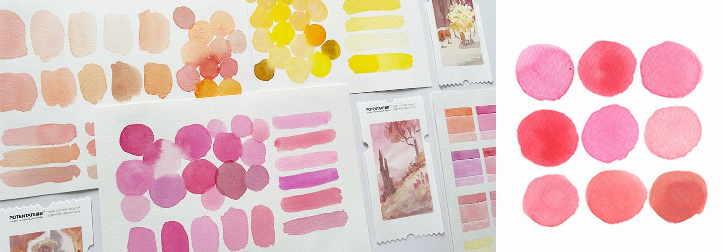
1. Welcome to this Class: Do you love pastel colors? Well, what if I tell you that you can mix your
own pastel shades, so you wouldn't need
to buy new pigments. That's exactly what
we'll do in this class. Since you supported my
previous color mixing classes, I will launch a series of
pastel mixing tutorials, starting with the warm colors, including our reds or
pinks, oranges and yellows. We'll start off with
the basic formula of mixing these creamy shades. Test out different pigments, create the muted versions, adjust dull pastel shades, share alternative color recipes, and even recreate ready
mixed pastels like these. Then we'll apply what we
learned and recolor some of Sargent's paintings and create these mini composition studies. You can either focus
on color mixing and just create
lots of swatches or go extra and work on the simple or complicated
versions of our studies. No matter what your
skill level is, you're welcome to
join in the fun. To reward your effort in sticking with me
throughout the class, I prepared a gift for you. So grab your materials, download the class guide, and find out how to claim your
gift in the next video. Uh
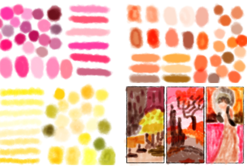
2. A Gift for You: Our goal for this
class is to mix pastel colors and do
lots of swatches, featuring various creamy red, orange and yellow shades. You have different options
for your class project. You can take a photo
of your swatches, as scanned copy would also do. Be creative and use
different shapes. For example, these birds, do simple version of our composition studies or go extra and work on
the complicated ones. Or you may also share a photo of everything
you did in this class. Don't worry. Your efforts
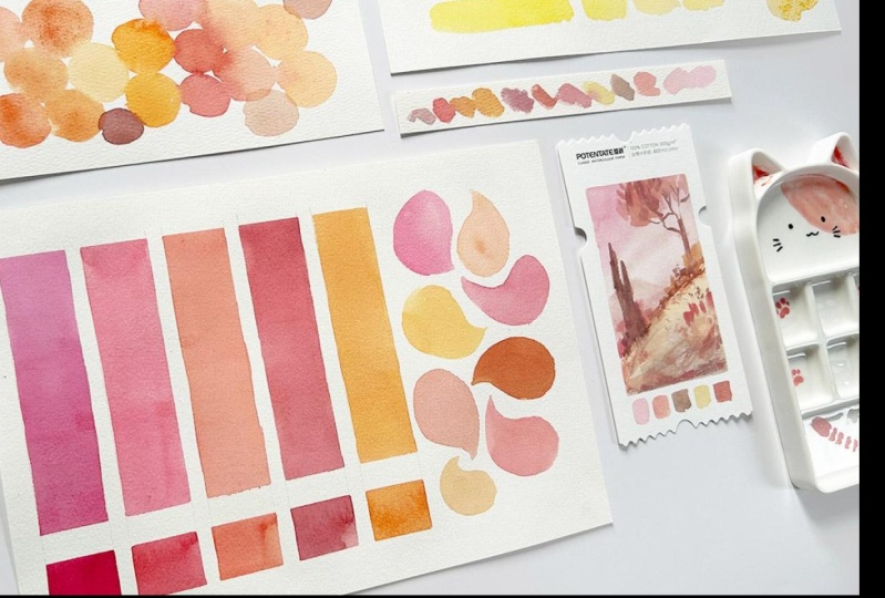
will be rewarded. I prepared an eBook containing over 50 swatches of
beautiful pastel colors. You can claim yours
once you finish this class, upload a project, share your thoughts through
an honest class review, and shoot me an email so I
can send it back to you. Does this get you excited? Great. Let's prepare our
materials in the next video.
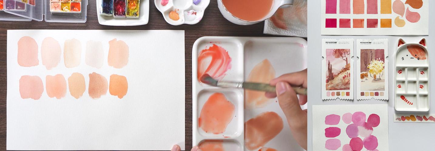
3. Please Prepare These: Okay. I'm so excited to share with you my
discoveries for this class, but let us prepare
our materials first. You'll need some
watercolor paper. For most of the demos, I will be using this Bao Hu
100% cotton watercolor paper, but you can also use
student grade papers like this month Mart pad. Watercolor paints. Pastel
colors are optional, but you'll need
primary colors and white watercolor
paints or gouache. I have here quinacridone red, cadmium yellow light,
and palo blue. I have two types of whites Chinese white and
titanium white. I also squeezed in white gouache in here
as an alternative. And in case you don't have pastel colors,
that's totally fine. I just want to show you
substitute pigments and use them in comparing
our own shades later. It doesn't matter
which brushes you use, just grab whichever is
comfortable enough for mixing and something that
you're already familiar with. These brushes have been with me since 2018, and they still work. And, of course, a palette
to mix in your colors, a water jar, and some
rag or paper towel to rinse off your brushes. Additionally, Algra
flat brushes later for our simple composition
studies and this pretty ticket shaped watercolor paper
from pot and date. But any paper will do. Actually, this are scrap
papers. It doesn't matter. We're here to learn and
not to make a masterpiece. So once you have your
materials ready, I'll see you in the next
video and let's get started.
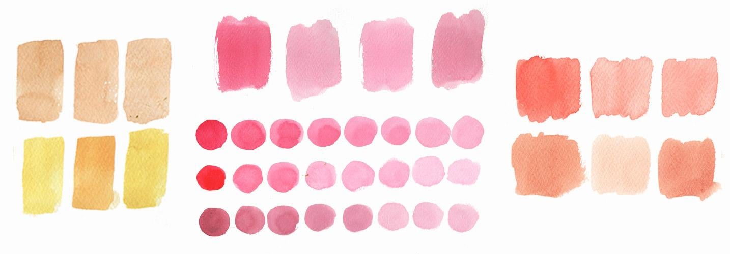
4. Pastel Pinks / Reds: Let's get started with a neutral mix of
quinacridone bread, meaning there's
just enough water and paint to get
this consistency. Then add more water
to the mixture. Immediately, you'll
get a pastel version already by maximizing the
transparency of water colors. But there are times
when this doesn't work, since it's too transparent. In that case, you can mix
your colors with any white. Let's say Chinese white. As soon as we mix it with
our quinacridone red, it becomes opaque and turns
into this lovely pastel pink. See the difference
between the one mixed with water and the
one mixed with white. Next up, we have
here titanium white. This pan is a bit dirty,
but it's all good. You can clean up yours if
in case it bothers you. It looks a bit duller than the one mixed
with Chinese white. But let's use this again later. Now, what if you don't
have these white pigments? But you have a pastel color
from the same family instead. For example, we have here
rose cocktail from ome. Let's use this to transform our quinacrodone red
into a pastel tone. Of course, the ratio of the pigments will play
an important part here. Alternatively, you can also use white gauche to turn your
color into a pastel one. It's also a good
introduction to this medium. Here we have different versions of our pastel queen
red mixed with butter, Chinese white, titanium white, pastel pink, and the
one mixed with quash. Go ahead and grab any pink
or red from your palette. Just to show you
some more example, here's magenta, Pyl red, cadmium red, and upper pink in their pastel versions
using Chinese white, titanium white, rose
cocktail, and guash.
5. Pigment Ratio: Another thing that we have
to consider is the amount of white or pastel pigment that we mix with the original
or base color. For example, this is the
mixture we used for this watch. But what will happen if
we add more pink or red? Obviously, it will turn darker and lean towards
the base color. Now, when we add more
white, it becomes lighter. And as you add more
white pigment, it will also become more opaque, creamier, and naturally lighter. The three here use
the same pigments, quinacridone red with white. But by varying the ratio of each pigment will achieve
different shades. I've tried it on other two
colors which are crimson and maroon by Gansai tambi you can see that as we add more white, the shade changes pretty obvious that they're
from the same family. Go ahead and try it, create some swatches,
adjust the ratio, and see how it goes. But
6. Pink Variations: Next, let me show you that if you use
a different pigment, then obviously, you'll have a different resulting mixture. I have here a Paul
Rubin's simpler kit, which features various pigments
from the same red family, but some of them are close
to red to pink or magenta. Let's give them a try
and see what kind of pastel colors they'll make
if we mix them with white, pastel colors or even guash. I'll prepare these
colors right here. We have rose red, crimson red, peach light, magenta, Chinese
red, madder red, and then let's mix
itch with white quash. Feel free to use Chinese
white or titanium white, or even a ready mixed pastel
color from the same family. This is Rose red's
pastel version. Followed by crimson red. They're different, right?
Next is ***** light, which looks like opera rose. Then magenta in its
pastel version. Followed by Chinese red, which is close to a
true red, my opinion. Then we have madder red, which is a cool red. Which one do you like the most? Let's take a closer look. And here I even added some
pigments like scarlet, cadmium red, and maroon. And as you can see, they all have this pastel
and creamy look. But depending on the
pigment you're using, you'll have a different result. I'm looking forward to see
which colors you'll work with. So don't forget to
upload a photo of your swatch in the
project's gallery.
7. Dull Pastel Pinks: Earlier, we mixed a dull
version of our pink. Now, let me share
with you how I adjust a mixture in case it
gets too dull like this, either from the pigments used or adding too much white on it. To also give justice
the titanium white, I cleaned my pan a bit. Sorry about that.
Now it's cleaner. Let's add some on
our palette and mix it with a bit of
quinacridone red. It still looks a bit dull. You can either add more of the pink pigment and achieve
a vibrant pastel like this. But what if you needed
a lighter pastel? When you add more white, it gets duller and less saturated. What we can do is add a bit
of yellow to the mixture. Now, it becomes a little
bit more vibrant, right? But be careful if you
add too much yellow, then it will start turning
into a pastel orange. Practice adding a bit of
yellow to achieve this shade. Color is a personal preference, so keep adjusting until you achieve the
shade that you love. Here's our swatch, an equal
mixture of pink and white, more pink, more white, a tiny bit of yellow, and more yellow to the mixture. Here, I also experimented with rose red with a bit of yellow, and then a bit of orange. And another one is Chinese red with a bit of yellow
and a bit of orange. Give it a try and let's see
what you experimented with.
8. Muted Pinks: We've already covered the basics of creating a pastel shade. But let's say you're
into muted colors. How do we achieve that? And we're filling this pink. Let's use whatever's
left on our palette now, to get a muted version
of our pastel color, one Shure way is mixing it with a tiny bit of its
complimentary color. If you took any of my
color mixing class, you should already have
an idea about this. Complimentary
colors sit opposite each other in the color wheel. For pink, which is
also grouped with red, its complimentary
color is green. Using our limited palette, let's mix yellow and blue to get green and slowly add
it to the pink puddle. Did you see that?
Did you see how the shade instantly turned
into a muted pastel? Let's try it on our paper. This is so lovely. I am a fan of muted pastels. Now, what if we mix our pink
with a pastel green instead? This is celadon bi ume. Let's see how it goes. Okay. Obviously, this is too much, and you'll know it
if the color starts to turn into a neutral
color instead. Let's add back pink
to the mixture, and here we have another
shade of a muted pink. Of course, you can also use convenient green mixture
like these watches. We have quinacridone red here, mixed with Hooker's green, permanent green, viridian,
olive and celadon. Which one do you like best? And what colors will you
be experimenting with?
9. Same Family: Right. I love how our swatch
is looking right now. What about you?
Another experiment I'd encourage you to do is mixing pigments from the same family. Say you have these two
very different pinks, which have already been mixed with white from
the earlier exercises. Try and combine the two, and you'll get yet another
version of a pastel pink. What about this two?
Looking good, right? My goodness, this is
such a wonderful color. It's a lighted
version of this one. Try exploring the
different colors that you got and experiment creating
their pastel versions. Now, what if we mixed
everything in here? Since they're from
the same family, we won't be too scared of
mixing muddy or dirty pastels. Here I have another
swatch where I mixed quinacerdon red with
other reds and pinks. Here I added maroon, vermilion, mater red, scarlet, magenta, cadmium red, and Chinese red. What colors will you
be playing with?
10. Student Grade: I did mention earlier that using a student grade paper is good enough in testing
your swatches. I have a month mart
watercolor pad here. For the earlier exercises, I've been using a
100% cotton paper. Let's see if the
color becomes dull if you use a more
affordable paper. Use whatever is left on your
palette, doesn't matter. Let's refill since
we've used up most of the pigment and swatch. The color still
looks okay to me. What do you think? The reason I'm showing this to you
is because I have friends who thought that they
should always use 100% cotton paper when
studying watercolors. But there are certain exercises where student grade
papers come in handy. Don't get too pressured and be limited by the materials
available to you, okay? There are instances, of course, that a cotton paper
is the best choice, but for our fun
little experiments, student grade papers would do. Of course, it's a
different story if you use a paper not intended
for watercolor, like a copy paper or Oslo paper.
11. Pastel Oranges: Moving on to oranges. Of course, you can always use ready mixed oranges
like red orange, autumn orange, brown, burnt
sienna, and light red. Yes, browns belong to oranges, too, and I'll show you later. Or you might want
to mix your own by combining red or
pink with yellow. Here's my Paul Ruben sampler
pack for yellow pigments. Let's start with our
original colors here. Mix yellow and pink
to produce orange. Again, depending on the
amount of each pigment, the shade will vary. If you want a yellow orange, then add more yellow. For a red orange, then add more red or pink. And for a neutral orange, try and get an equal mixture. Mix more water, swatch, and you'll get this
version of light orange. For comparison, let's try red
orange and add more water, and this is how it looks. Next is brown by Sakurakoi. Browns also belong to
the orange family. If you look closely in this artist color
wheel by Bruce McEvoy, you'll see that they're
grouped together. Next is burnt sienna
mixed with water. And lastly, light red. See, they're close
to each other. Experiment further by mixing the other alternative pigments
to produce pastel colors. This is pink and yellow
mixed with Chinese white, then red orange
mixed with guash. For the next one, mix
brown with titanium white, then burn sienna with
white quash again. Lastly, light red
with John brilliant. Another good alternative
is beige like natural beige and rose
beige from Gansai tambi. So what do we have here, a nice range of
skin tone colors. Orange is a part pink
and a part yellow. That means this pastel
pink should also be a good alternative in
mixing pastel oranges. Let's give it a try. I'll refill my original
orange mixture, yellow plus pink, and then add rose cocktail, this pastel pink. It's a bit different,
but it can also work. Add more yellow for a different version and try adding more pink
for another shade. Experiment by adding more of that ready mixed pastel pink. This means we can
alternately use pastel yellow or pastel pink to make the mixture
lighter and creamier. I also tried other pigments
from the orange family. We have here vermilion
hue with its neutral, plus water, plus titanium white, plus John Brilliant, and
plus Rose cocktail versions. Then we have transparent
Pyle orange, autumn orange and
Van **** brown. What pigments are
you working with? Let me know in the
discussion stab or share a photo of your swatch
in the project's gallery.
12. Orange Variations: We've tried convenient
orange pigments earlier. Now it's time to test different yellow and red
or pink combinations to create our own oranges. Whatever pigments are
available to you, please just make use of them and have fun mixing and
matching colors. For me, the colors
available are lemon yellow, permanent yellow, Indian
yellow, and yellow sienna. For reds or pinks, I got peach light, magenta, vermilion hue, which is
already an orange by itself, but let's just use
it and then scarlet. Now, mix them together,
adjust as needed. This is our first combination
and then convert that into a pastel color by mixing any white or
pastel that you need. This is a shade where
Chinese white was added. Let's move on to the second set, permanent yellow plus magenta, a different kind
of orange, right. Adjust and add some pigments
for different variations. Now, l mix in titanium
white this time, and we'll keep adding to achieve various shades of
this pastel orange. Next pair is Indian
red and vermilion. Mix together, and you'll
get this bright orange. See? It's so fun
experimenting with them. I'm now using whitewash to
produce a pastel orange. This shows that you shouldn't feel constrained
just because you're not getting the exact 100%
shade that I'm showing you. Explore, discover and learn. Our last pair is
sienna and scarlet. I'm adding more sienna since this one's really transparent. And here goes another
shade of orange. For its pastel version, I'm adding John Brilliant first. And for comparison, let's try the pink pastel or
rose cocktail pigment. Adjust the mixture as
needed and swatch. Aren't they beautiful? I've also experimented with
different combinations. Here we have naples
yellow deep and carmine. And then we have Hansa
yellow and opera pink, a bit lighter than
the first one. Then we have bordeaux
plus quinacridone gold. Then we have cadmium red
and cadmium yellow light. This is a bit close
to skin tones. What do you think? What
colors did you use?
13. Muted Orange: Of course, let's not forget
how to mix muted oranges. It's complimentary
color is blue. So let's introduce
that to the mixture. Let's touch up this beautiful
mixtures that we already have from the last
exercise and add blue. This is palo blue. Use a bit and create
a muted version. Alternatively, we can
use a pastel blue. This is King's blue, close to verdial blue. And you'll see that
it immediately changes the saturation
of this orange. Not too much, though, or it will turn into
a neutral color. More often than not, brown. But that works well if you're looking for
a skin tone shade. You can also pick
other blues like turquoise blue or a
dark blue like indigo. Then it would obviously
turn into a darker one. What about a granulating
blue like ultramarine? Yes, it works fine, too. Explore your colors. Ask what will happen
if I mix this too. Will it be pretty or not? If it is, then good. If not, then we definitely
learn something new. Oh, and what about a sea
blue or a marine blue? This really tones
down this mixture. I also experimented with
other blue mixtures. We have Autumn orange, cadmium orange, and light red mixed with John Brilliant
for comparison. For the second row, I mixed in a bit of royal blue, and you can see how most of them turned
into a brownish color. For the third row, I tried compost blue, which is a bit lighter
than the previous one. And lastly, cerulean blue. I love how bits
of cerulean blue, because this one is granulating is showing through the mixture. What about you? What colors
will you be playing with?
14. Pastel Yellows: Now it's time for
yellow pastels, the last color group
for this class. I'll breeze through
this first part of the demo since you already know the basic recipe of creating pastel
versions of our colors. I am cleaning up my yellow a
bit to avoid muddy mixtures, and you might want to do the same if yours is
looking like mine. This is cadmium
yellow light again. One of my go tos in painting landscapes,
portraits, and florals. I've prepared five puddles
of my yellow here. The first one is a neutral mix, half and half paint and water. Or as long as you have this
consistency, that would do. Add more water for a
transparent pastel version. Next, let's add Chinese white, which makes this more opaque. And then followed
by titanium white, which I personally think is even more opaque
than the previous one. Mix in guash for the next
watch so far so good. And finally, try out
ready mixed pastel colors like Bige or John Brilliant and play around with the colors. I'm going first with
John Brilliant. Mix and swatch. I also have natural Bige
by CuritakeGansi Tambi. Let's give this a try. Followed by a version mixed with Rose Bage by Gansai Tambi again. Not much of a difference, right? And then I have here bright
yellow red by Paul Rubens, but I think it's just the
same with John Brilliant. And lastly, bright yellow
from the same sampler pack. It's closer to yellow
compared with the other one. I'm sure you have a yellow
pigment in your basic set, so go ahead and play with them. Here are other yellows
I converted into their pastel versions by adding white pigments, beige and quash. We have yellow ochre. We have nickel Azuyellow and
quinacredone gold.
15. Yellow Variations: Looking at our swatch, I like the ones mixed
with beige the most, so let's test out other yellows in the sampler pack
to see how they look. We have permanent lemon yellow, permanent yellow light,
permanent yellow deep. Indian yellow and yellow sienna. Some of these colors might
also look like yours, but only with a different name. I'll go ahead and swatch
the original color. This is permanent lemon, followed by their pastel version by mixing the different
beige pigments here. Adjust as needed by adding
more beige or more yellow. Let's do the same with
the next pigment, permanent yellow light, base color first,
the pastel version, and then adjust to
see other variations. Permanent yellow deep next, a deep color, indeed. Convert that into a
pastel color and swatch. Next, we have Indian yellow. Add Bige, keep adjusting and
produce different shades. This is so relaxing. I hope the same is true for you. Lastly, yellow sienna. This is a transparent yellow and is easily overpowered by Bige. So keep adjusting
as you see fit. Go ahead and swatch
your yellows, but here are other
pigments I tried with Chinese white for
their pastel version. Gambogova, lemon yellow,
naples yellow deep, hansa yellow light,
quinacerdone gold, Nickel Azo yellow, permanent yellow deep,
and yellow ochre. What colors are
you going to try?
16. Muted Yellow: Now it's time to
mix muted yellows. Checking our color wheel here, its complementary
colors is purple. We have here our base color
cadmium yellow light. Let's try mixing it with
periwinkle, a pastel purple. Add a bit of that and swatch. Remember not to mix in too much or you'll get this
dirty yellow color. Refilling the puddle
I got here and adding Chinese white
back to the mixture. Now, what we have here
is mineral violet. Mix in a bit of that color
and try it out on paper. I also have here
carbazle violet, which is a staining one. So make sure to use a tiny bit if you also
have this pigment. I'm also curious to see the muted version of this
permanent yellow deep, so I'll refill my puddle here and mix it
with white quash. Let's try combining
periwinkle with it first. See, this is a tone down version compared to this
watch we did earlier. It's so easy to
get yellows dirty, so be careful in picking
up your pigments. Permanent yellow
deep pastel again, now mixed with mineral violet. In case you don't
have these purples, of course, you can mix your
own using a limited palette. Pink plus blue,
plus pastel yellow. This is a very muted
yellow that we got here. To make a lighter
and cleaner version, we can add back yellow
to the mixture. This might look dirty compared to the other
swatches we did earlier, but these colors can also be useful when painting shadows. Here are other
yellows mixed with their complementary colors
such as ultramarine violet, dioxas and purple
and periwinkle, and you can see the difference between the one where
we just used white. We have titanium yellow, yellow ochre, and
queen nacerdoneG. Just grab any
yellows and violets from your palate and experiment.
17. Recreating Pastels: Now that we're done with
our pastel red or pink, orange and yellow,
let's now discuss how we can recreate
a pastel color. For example, we have
John Brilliant here, and we're curious whether
or not we can recreate this color by using the pigments
already available to us. For comparison, here's a
swatch of John Brilliant. We did our warm pastels earlier, but there's no color
close to this one, so where do we even begin? First up, do a
quick research for the pigments used
in John Brilliant. Here we can see that
it's composed of PO 20, PW six, and PY 37. But what do these codes mean? If it's your first time
encountering them, it's okay. I'm just giking out
with my colors. We can also check
the pigment name that each code represents. In this case, PO 20
is cadmium orange, PW six is titanium white, and PY 37 is cadmium yellow middle or D.
I don't have cadmium orange, but I have cadmium red orange. I have titanium white, and I have cadmium yellow light, not deep or middle. Let's see if by using
these pigments, we can still mimic how
John Brilliant looks. Mix and experiment,
adjust if needed, and ask yourself,
will this work? It's a bit close, isn't it? But what if you don't
have these colors? Let's go back to our
limited palette, quinacidone red,
cadmium yellow light, sal blue, and our
white pigments. In case you don't have
cadmium orange, well, we know that orange
is pink plus yellow. So let's do that. And instead of titanium light, let's use whitewash instead. Let's mix and find out. Will this work as
an alternative? It's a yes for me.
It's pretty close. Adjust as needed, add more pink or more
white, and then swatch. This only shows how powerful
color mixing could be. You don't really
have to purchase a new pigment each time
you need a new color, but what you have to do is sharpen your color mixing skill, which is what we're
doing right now. Add more white and see if we can get closer to John Brilliant. Okay, enough for this color. Now let's move on to shell pink. This one is by Shinhan. Let's do a quick research, and the recipe for
shell pink is PO 73, PyroleOnge and PW
six, titanium white. I don't have Pyle orange. So what if we just use
our limited palette here? And instead of titanium, what if we use Chinese white? Add a bit of quinacridone red. This is pretty far
from shell pink. But if you did all of
the exercises earlier, you should already have
an idea what to mix here to get it closer
to shell pink. Yes, you got it. A tiny bit of yellow. Let's watch and see. Hmm. It's a bit closer to
this color, right? I think it could work. Okay,
let's try another recipe. Rose red plus titanium white, and a bit of yellow.
Mix and see. Isn't it so fun to
play with colors? Don't get discouraged, though, if you can mix your intended
color in your first try. I've been playing
around and studying color mixing for
over a year now, so I already have
an idea how much of each pigment is needed to
get the shade that I want. Plus, I did some studies
before filming this class, so just keep going. Let's try recreating
a different pigment. This is natural Bige
by Gansai Tambi. The recipe for this one is PW six titanium white and
TY 42 yellow iron oxide. Let's do a quick research for alternative pigments
for yellow iron oxide, and the AI here
suggests yellow ochre. More often than
not, yellow ochre is included in basic
watercolor sets. I have here my
dirty yellow ochre. Let's recreate that
color by mixing in titanium white
plus yellow ochre. First try Me looks a bit dull. Let's adjust and add
more yellow ochre. And I think this
could work. But what if you don't have yellow ochre? Let's go back to
our limited palette and use cadmium yellow light. It's too vibrant, so I'll add a tiny bit of pink and white. It could work, but
let's see what will happen if we
add a bit of blue. Adjust as needed. As you can see, I added
more blue than intended. What do you think?
Will this work? What about Rose beige
by Gansai Tambi? I think we already accidentally
mix this we over here. Where we added more quinacredone
red to the mixture. Finally, rose cocktail. Let's see if we can
recreate this color. Unfortunately, I cannot find online information
for the recipe of this particular pigment, so let's just use
whatever we have. Let's try Chinese white with
a bit of quinacredone red. Obviously, it's too far
from rose cocktail, so let's add a bit of yellow. What do you think? Will this serve as an alternative
to rose cocktail, adjust as needed, and keep
experimenting and swatching. You'll be amazed what you'll
learn with these exercises. I also tried other combinations
for John Brilliant. We have magenta
and hansa yellow, magenta, and yellow ochre, transparent Pyl orange, plus squash and permanent
yellow deep plus crimson. And I think the last two are the closest to
John Brilliant. For Rose cocktail, I also tried magenta and
permanent yellow deep, Opera and Cadm yellow light, Crimson Lake and yellow ochre, and then Quinacridone
Bread and John Brilliant. All of these are mixed
with white gouache, and I think the closest
is the last two. What about you? What
colors did you experiment with and what pastel
versions are you recreating?
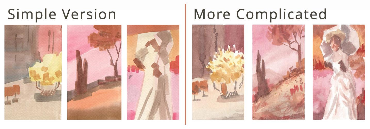
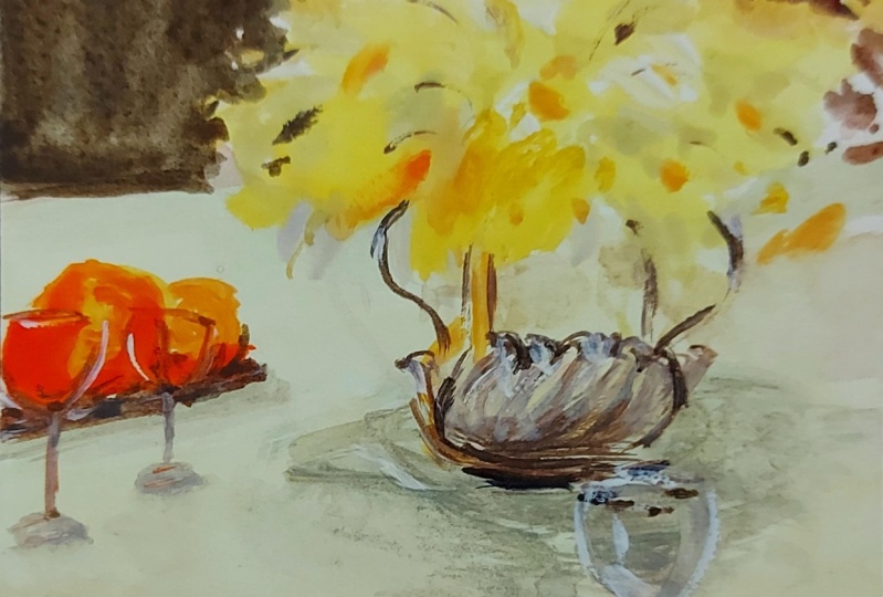
18. Pastel Project 1 : Let's apply what we
learned by doing this mini composition studies. But if you want, you can also paint simple birds like these and use the colors that appeal to you or open up
the class guide, and there you'll find
a simpler version of these abstracted paintings. We will be using John Singer Sargent's
artwork as reference. This is the paper that
I mentioned earlier. I lease them for the projects because I find them so cute. It's a ticket shaped
watercolor paper by potentate. But go ahead and grab whichever material is
available to you, okay? I'll also use flat brushes
now to avoid being too focused on the tiny details that we can see on
the reference photo. Right, for the first study, let's use Sargent's still life with daffodils as a reference. We will focus on the
big shapes and recolor this painting using
the pastel variations we tried and mixed earlier. Our goal here is to test out the colors and grade
something that feels more like a
finished project rather than just swatches. But it's all good if
you only want to do the swatches and
focus on studying, mixing your colors, okay? Let's start with
the pastel yellow for the base of the flowers. Then mix in a bit of pink for a flesh color for the table. As we reach the bottom, add blue to desaturate
that pastel brown, and this will make our study
look more complicated. Mix in a pastel orange and apply where the shadows
of the flowers are. Again, focus on the
abstract shapes. If you squint your eyes, it will blur out, and the dark shapes will
really pop out. Next, makes a darker brown. We need to use contrasting colors for the
shapes to pop out. So it also means
that we're not only mixing and using pastel
colors all the time, okay? For variation, add more pink to that dark brown and negatively
paint around the flowers. Don't get to work up
with the flowers shape. Now hold the flat
brush upright and use the tip to draw some
lines in the background. Mix orange, pink plus yellow, and then paint these
two shapes here, which are I think
they're wine glasses, but don't worry too
much about the details. Just paint the big
shapes that you see. Now on to the shadows. Let's use brown again and let us define the vase that
holds the daffodils. Focus where the shadows are. Adjust the colors to achieve
different shades as needed. Then copy the reflection and use the same orange that
we use on the glasses. Now, let's add more yellow
and with single stroke. Let's try to define some petals. A suggestion would do. No need for it to be
too realistic, okay? We're now going back and adding more shadows that we
see on the table. I hope by this time you would appreciate that by using
a limited palette, the decision process is so
much easier as we don't need to decide which color to pick because we are limited
to a few colors only. It's looking good now. Some final touch,
and we're done. How did your project go? Did you choose the simple or the more complicated version, whichever you pick, let us see it and
share it with others. So go ahead and upload it
in the project's gallery.
19. Pastel Project 2: For the second project, I'll keep using Guache to make the pastel
versions of my colors. Now we're looking at
Sargent's landscape study at San Vigilo Lake of Garda. You will see that I changed
the placement of some of the elements to match the portrait orientation
of the paper. But feel free to copy
the painting as is. Again, here's a simpler
version of the study. Go ahead and check the
class guide for reference. Let's start with the pastel
pink as a background. Cover half of the
background area, add more pink to the mixture
and fill in the gaps. Next, I'm covering
the ground area with the orange that's already on my palette from our
previous project. But as we reach the bottom, let's use the brownish color
to complete the foreground. Then mix a muted pink and use it to depict a distant mountain
in the background. It's not really too
obvious, but this would do. For the foreground texture, let's use orange
and pink and drag the brush across the paper
lightly for added complexity. Start with orange and then
switch to pink later. I am deliberately painting
abstract shapes here, but I'm also being mindful
where to place them, and I'm missing the
reference photo to do that. Next, I want to
recreate this color. So I'll mix my three
primary colors and add this tree in
the middle ground. This has a very simple shape, so just use the
side of the brush, drag it downwards,
and you have a tree. It doesn't have to be
straight, too, okay? I love how this looks. The composition is
almost the same. But by using pastel colors
and re coloring this study, it makes it extra whimsical. Add some bushes and shadows
in the middle ground. And now we can work on
the foliage using orange. You can also change how you hold the brush to make
random organic marks. Just keep in mind the overall
shape of the foliage. Then use the brown color
again to paint the trunk. I'm now applying light pressure on my brush and working
with the textures. Add more shadows, look at the reference photo to help
you decide, and we're done. How do you feel about this one? Are you into landscape, or did you like the Still
Life exercise more?
20. Pastel Project 3: Our last reference,
morning walk by Sargent again is a little bit more complicated than
the previous ones, since it includes a figure now, but I highly
encourage you to take this challenge and focus on
the color mixing part, okay? You can also opt for a
simpler abstracted version. Prepare by sketching
the big shapes and dividing the painting area. There's no need for this to
be an exact replica, okay? These lines will only help us decide where the
colors end or meet, but nothing more than that. We're not even
painting the face, so you can relax. Let's start with a
dark pink background. And as we move upwards, add more white the mixture to
make this soft transition. Use a big flat brush and don't bother too much
about the details. Let's do the same
on the other side. Now we can see some reflections
of the clouds here, so we can use white gouache
and paint those shapes. Next, load your brush with pure pink and paint
some reflections. Max in yellow to your pink for a vibrant orange and
color in these shapes. Again, do the same
on the other side. And just like what
we did with pink, we will add more yellow and
create this transition. Now, as we reach the top, let's add back more pink
and fill in the gaps. This way, it's not
a big flat shape, and we get to practice
more of our color mixing by varying the shades that
we use on the background. Now, let's use whatever's on our palette and
complete this shape. Moving on to the figure, let's start with a pastel, orange color, something
close to flesh. Squint your eyes for you to
see the shadows on the dress. And then if needed, we can also switch to a smaller brush and paint
the shapes that we see. For the face, just
use this orange, add more water if needed. And for the gloves, we'll have to add
blue to the mixture and make it into a
dark, neutral color. Just a suggestion of
the hand will do. I also use the side of the brush and angle it a bit to
draw the small shape. We can paint in the hair
using the same colour. Now grab a lighter orange for the hair ornament and add blue again to the orange mixture for the color of the cast
shadow in her umbrella. Next, use the same
pastel skin tone color for some parts of the umbrella and then define the shadows on her dress by adding another layer
of that brownish color. So what we're doing here
is really testing out our color mixing skills by shifting from one
color to another. Next, let's refill the orange. Use the brush to paint suggestions of grasses
in the background. Now it's time for some
texture in the background. Play with whatever colors
are on your palette, hold and drag your brush
in different angles, and fill in the background
with abstract shapes. Use the reference photo
to help you decide which places need additional
texture or depth. Like this bottom part
where I made it a bit darker by using a
pinkish brown mixture. You can also define
some features of the face by just
focusing on the shadows, but you're very free to
skip this step, okay? Final touches, and we're done. Here's our three mini studies. Which one's your favorite? They look so cute and fancy
when re colored with pastel. And these projects also gave us so many opportunities to
practice our mixing skills. Before you go, I'll see
you in the next video, and I'll share some tips on
what you can do from here.
21. Before You Go: Great job in
completing this class. Did you find your
favorite shade? Let's do a quick review. We learned that by mixing any white pigment or even
its pastel equivalent, you'll have your
basic creamy shade. And then we can adjust the
ratio or make it less duller, or even create its
muted version. I also share with you
alternative colors that you can play with so you wouldn't feel
pressured to produce the exact shades that I mixed. To apply what we learned, we also worked on these
mini composition studies. You are free to
choose whether to share with us the
simple version, the more complicated version, or just a photo of the
swatches that you did. Don't forget to share your project in the
project's gallery, and let's appreciate what
our fellow students created. Do that and leave an
honest class review and then shoot me an email to claim your free copy
of my Pastels eBook. Now that you know the basics
of mixing pastel shades, go ahead and try out other pigments and do lots
and lots of swatches. I have other color
mixing classes, and I hope to see you there. And together, let's
make this world a little bit more colorful
with our artwork.
 Bianca Luztre, Watercolor, Productivity, Color Mixing