Transcripts
1. Introduction: Winter magic isn't just
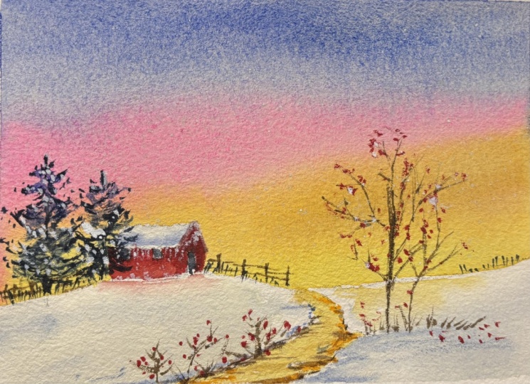
about cold whites. It's about the moment frost meets the fire of a setting sun. I'm going to show you
how to paint a landscape that doesn't just sit on the
paper but actually glows. We're moving beyond
flat colors to create a whimsical storybook atmosphere that feels both cozy
and professional. Hi, everyone. I'm Nashta,
a watercolor artist, and currently a brand
ambassador for art philosophy. And you can find me on social media as
Bombay Painting Club. I'm super thrilled
to welcome you to Whimsical Winter glow as
we begin 2026 together. The art of this class is
mastering the right gradient. I'll show you my secret
sauce, the pink buffer. This is the technical bridge that allows us to
transition from a golden horizon into a deep atmospheric blue
without creating mud. This class is for artists
from beginners to experienced painters
to enjoy your success, the class is broken down into
easy step by step lessons, guiding you through every brush stroke with confidence
and intention. By the end, you'll
have a masterpiece that radiates warmth. Prep your palette, and let's
start mastering the glow. Let's meet in the next
section. See you there.
2. The Glow Toolkit: The Glow tool kit.
Hello, and welcome. Before we start
mastering the glow, we need to talk about
our foundation. For this painting, I highly
recommend using 100% cotton, cold press watercolor paper, at least 300 GSM in weight. Okay. So I already
have my papers cut. Ashes, I usually get the rolls, so I just cut them
into smaller size. So we're going with
the landscape mode. So the size that we'll
be using today is around 19 centimeters
by 11 centimeters. You can have a look at
this bigger paper as well. So we'll be using a lot of
water for a wet on wet sky. So you can use any brand, but 300 GSM, 100% cotton
paper is a must, okay? I'll quickly take you through the brands of the colors
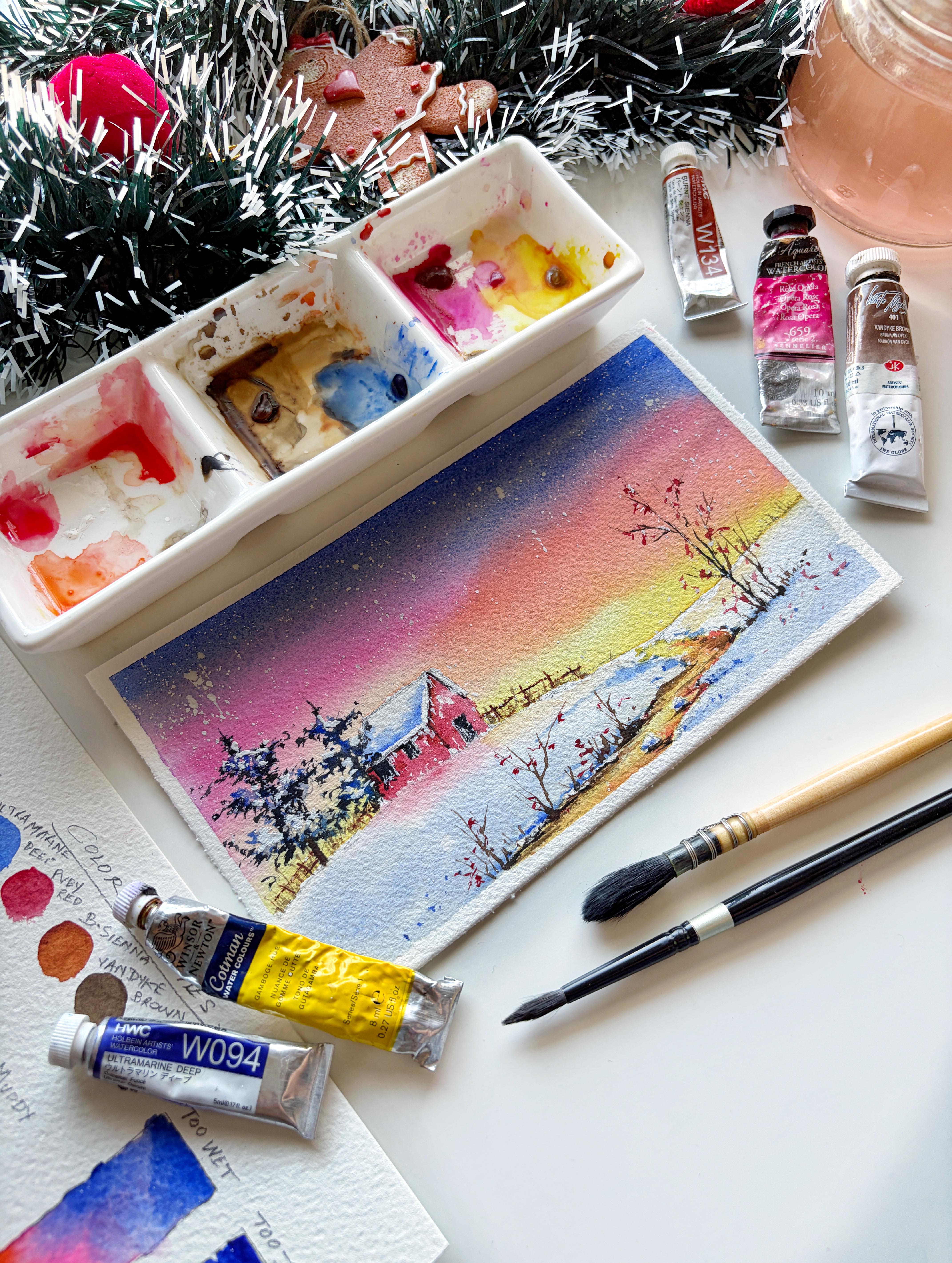
that I'm using today. These are from Holbein, okay? I have pink from SNllier, gamboge yellow from
Windsor and Newton. This is from the Cotman Series. Vandyck Brown from
white Knights. I have a detailed lesson on the color palette
in the next section, so I will take you
through the colors there. Okay? Now, you don't need a massive collection of
brushes for this project. In fact, I'm just using
these three brushes. This one I have is from Fumi. It's a needlepoint brush. You can use any liner
brush or a rig or brush, a mop brush from Brusto which holds a lot of water. This
is for the background. And lastly, my silver brush, black velvet size six. You can use any round
brush that you have. Apart from that, you
need two jars of water, one for rinsing dirty paint, and one for clean water
to wet your paper. You'll also need
a mixing palette, a spray bottle to keep your paints moist
from time to time. Next is the masking tape. I use a standard artist tape
to secure my paper to a bod, okay, a pencil, a
kneadable eraser. Just in case if you want
to lighten your sketch. Okay. And you'll also need a board where you can
tape down your paper. I'm using an acrylic board here. Okay? Yeah, let me just
get that quickly here. I have not removed the
sheet on the acrylic board, so that's why it's brown. Have a stack of paper towels nearby to control the
moisture in your brush. Also, you're going to use
the small clip to place this under the board to have
the painting at an angle. For my practice sessions, I'm keeping a spare sheet
of watercolor paper. This is from Bros throw
300 GSM, 100% cotton. Okay, so I just need
a sheet of AFO size, which I will cut this into two. Okay, where we'll practice
the color palette and some warm ups before we dive
into our final painting. Once your station is set up, join me in the next
lesson where we'll start our warm up and work on the color palette and find that perfect sweet spot
for our watercolor glow. See you there. Bye bye.
3. Color Palette & The Gradient Strip: Hello, and welcome
back. Before we dive into our final landscape, we need to set up
our color palette. On my desk, you can see
a clean jar of water. The colors are here,
and my palette on which I've already removed the colors that we
will discuss in a bit. But most importantly,
our color swat sheet, which we are going
to work on together. So grab a spare sheet of watercolor paper, and
let's get started. Quickly going to
spray some water onto my palette and on the pans
to reactivate the paint. Okay. So they're nice and moist. This also helps in
releasing more pigment, which gives us more
vibrancy in our painting. So always spray your paints a couple of minutes before
you start painting. For a vibrant sunset, I've chosen a warm spectrum. So the very first
color that we will swatch is gamboge yellow. This is from the Cotman
series from Windsor Newton. This is my go to color
for every sunset. It's super bright,
and I love the flow of this pigment. Okay? Now, the next color I'm using
from the pan is orange. This is from white
Knights. Okay? If you've been following
me on Instagram, you will know that vibrant
watercolors are my thing. So these colors are part
of my everyday palette, and I somehow make use of them. Um, okay, so that being said, the next color, we're going
to swatch is Opera rose. This is from Senier. This is a beautiful pink. Alternatives for this color, I would suggest permanent rose, quinacridone magenta,
bright opera pink. Any bright pink that you
have on your palette works. The pink and the orange will
add that electric glow. Next, you add that deep upper atmosphere
to our paintings, we're going to use
ultramarine deep. But you can go with
any of the blues that you have on your palette. Just has to be a darker blue. Next, we will swatch
out ruby red. We are going to use this
color for the cabin. Okay. And for the
winter berries, and you can use any
red that you have. Okay. I'm gonna wash the brush, and the next color that I
will load is Burnsiana. This is from Holbein. Okay. Next, I'm going to
swatch out Van **** brown. This is from white Knights. Okay? The browns are essential to add
depth in the stream, for the bear tree, for
the fences, et cetera. Okay. Lastly, lastly, I'm going to swatch black
from White Knights. Okay. With this, we've swatched
out all the colors that you will need to complete
this project. Okay. Let me just quickly write
down the name of the colors. Okay? Gamboge yellow,
orange, aparaose, ultramarine deep, ruby red, Burn Sienna, Vandyk
Brown, and black, okay? Now let's move on to the
gradient sky exercise. The secret to a sunset
is a transition. If you mix yellow
and blue directly, you'll get green, which usually isn't
what we want in a sky. In this gradient exercise, we're going to paint from
light to dark. Okay. So we start with the yellow and transition through the orange and the pink. Okay, so I'm going
to take orange. And Okay, next, I'm
going to add the pink. And only then we
introduce the blue. When you mix blue and pink, you also get a beautiful violet. So this creates a
natural buffer zone. The best and easy
way to explain this is we want the colors in the gradient to shake
hands with each other and not move into
each other's house. Okay? Now, before we dive into
a final cabin scene, we are going to practice the most technical part of the painting, the
sunset gradient. Now I understand
wet on wet painting can feel a bit like
a race against time, and blank page anxiety is real. That's why we're using
these small test strips. Our goal here is to master
the level of water, finding that perfect balance where the paper isn't a puddle, but isn't drying out either. Now, I'm applying water
to both the strips. The first one is
with a lot of water. You can see that there's
water at the bottom, as well, and there's movement. And on the second strip, I've applied a light
wash of water. And I'm going to let
it sit for a while. Meanwhile, we'll work
on the first trip. Okay, I'm going to drop in the first color that
is Gambogiello. You can see how the colors explode and without you
having any control. Okay. And finally, we'll
add in the blue. When you want a controlled sky, it is very important to have the right amount
of water on your paper. That is where the last
strip comes into picture. That is the sweet spot. When there's too much water
and not enough pigment, this results in very
dull colors, okay? And as it is, watercolor dries 30% lighter than
it looks when wet. So keep this in mind. In the second strip, you can see there is absolutely
no movement in colors. If the paper looks mat or dull, it's already too dry. The paint won't travel and
you'll get hard lines. Okay, you'll not
get a smooth blend between the two colors. I'm just going to
add a little more pink and bring that up a bit. Okay. And finally, we're going to add the
blue from the top. Here also, you can see that
the colors don't move, and this creates a harsh line between the blue and the pink. Okay. With this, we are done with the two practice strips, too wet and too dry. Okay? In watercolors, note that starting from your
lightest colors is often the safest and the most effective way to
keep your painting vibrant. This prevents the dark
pigments from accidentally traveling into the areas that should be
bright and glowing. Okay, now moving on
to the last strip. Okay, now I'm applying a
clean wash of water. Okay. And you can see that I'm
applying an even coat or water. There are no pools of water formed on any of the
edges or the corners. Okay, one way to check
this is from an angle, your pep should have
that satin sheen. If you see puddles, just dab
them away with a dry brush. Okay, so we're starting at the bottom with a Cambogyellow, using light horizontal strokes. Okay, I'm going to
lay down this color. This is the heart of our sunset. We want to maintain the
brightness of the color, okay? Now wash the brush and
dabbing that excess water. And I'm just going to smoothen that out
before I add an orange. Now I'm adding orange
from the right side, and I'll work towards
the left, okay? Okay? Again, note that I am
dabbing that excess water. I don't want too much of water. Okay. And now I'm adding the
pink from the right side. Okay? This is the
most important step. We're placing this pink between warm orange and cool blues. It acts as a bridge so we don't accidentally create any
muddy gray tones in our sky. Okay? Okay. Finally, we will load our brush with that
rich ultramarine blue, start at the very top and bring
it down to meet the pink. See how they create a beautiful, soft violet where they touch. By starting with the light
and moving to the dark, we have protected that bright
yellow glow at the bottom. While the papers still wet, go ahead and add
in more pigments wherever you feel that the
colors are very light. So I'm just going to quickly
add some opera rose. Okay. Applying this
from left to right. Okay, got to go over the colors that we have already placed. Okay, a nice bright orange. Okay. And finally, I will add the yellow to smoothen this out. Okay, so you have a nice
smooth gradient in the sky, and there is a warm up. Don't worry if your first strip didn't come out perfectly. That's exactly why we do this. If your paper dry too fast, try using more water next time. If it's too messy,
try using less. Once you've found your
rhythm on these test strips, you'll feel so much
more confident when we move to the final piece. Okay? Now, if you see that we have added the
pink as a buffer zone. So if you mix blue
and orange, okay, you get a muddy tone
in between, okay? And this is what we did not
want to have in our sky. Now I'm going to show
you why we've used pink between blue and orange. Okay? So here I've added blue. And on the other side, I will add the orange. Okay? Now I'm going to add the color pink as a buffer
between blue and orange. See that the blue
and the pink me to create a gorgeous soft violet. Okay. And the
orange and the pink totally melt into each
other, I would say. Okay, so this is how
we have achieved a beautiful gradient sky without our colors
getting muddy. Okay. Yeah. This creates muddy. And this is what
we want to achieve a beautiful, bright
gradient sky. Okay. Now that we
have a perfect sky, let's create the perfect
plateau, as well. So I'm going to be using gouache for this this wins
from Windsor Newton. For this guy, I'm using a good thick consistency of the paint because we want
dark and defined marks. So gently tap your
finger onto your brush, or you can use the back
of any other brush and gently tap the brush
to get more defined spots. In such an easy way, we have
added beautiful snow to sky. Now that we have our
beautiful color swatches and the perfect gradient
for our sunset, let's move on to
the next lesson. I'll see you there. Bye bye.
4. Warm Up & Practice: Welcome to the most important
part of our journey. We're going to
spend some time on this practice sheet before we dive into our final masterpiece. Think of this as a
building a blueprint. We want to train our hands
and eyes to recognize shapes and values so that when we move
to the final piece, we can paint with
confidence and flow. We'll be covering
everything from snowy pines to the perspective
of our cabin roof. Okay, let's start with the
background snowy pine trees. Okay. First, we'll just map out the tree and understand
the structure, draw a vertical line and add in alternate
horizontal strokes. Okay? This is how your
structure should be. So let's draw another line, and now let's add the pines. Just let your hand
loose and create these clusters of needles. The secret to a realistic tree isn't painting every needle. It's about the value. So we are using three values of
ultramarine blue here. Okay. Let me just show you how I'm making these
shapes one more time. Okay? Just like these, like some curves and
some irregular shapes. Always remember your horizontal guidelines that taper toward the top will create that classic triangle
shape for your pine trees. Each is irregular,
so don't worry about making the branches
perfectly symmetrical. These lines will only act as a safety net once we start
working with the paint. Okay? Just quickly going to spray some water on my paints. Okay, we'll be working
with three tonal values. Okay, starting with
the light tone first. This is a very watery
ultramarine. Okay? That's way too watery. Let me just dab out some
of that excess paint. Okay, you can see this
is a very light value. Using your pencil
lines as a guide, tab in the general shape of the branches and make sure to leave plenty
of white space. The white paper is a
first layer of snow. Okay. Let me show you
your as well. Okay? See, I'm not
painting everything. I'm leaving a lot of
gaps also in between. And I'm just following
the pencil sketch. Okay? So the first
layer is done. Now we'll start
with the mid tone. Okay. Now, while that's still damp, add more concentrated blue to the underside of those
branch clusters. See how this instantly
gives the tree volume. Again, leaving some
space in between because we want all
the values to be seen, the white paper, the lightest
value, the mid value. Okay. And I think now I'm going to change the
brush for the darkest value. Go to take my needle
point brush from Fumi gives a nice thin strokes. Okay? So I'm adding
a little bit of black to that ultramarine blue. You can also use indigo or
Pains gray as well. Okay? This is our third deepest value. Okay, you can see gives
nice fine strokes. Okay, this is going to be
your darkest mix right at the center near the trunk to
suggest the densest shadows. Now, as you go down, you can show some fine needle point pines
coming out of the tree. Again, I'm not covering all the part just
at certain places. Okay. Once you're done
painting the basic structure, you can now add in some more
atmosphere to the tree. Okay, we add in some
dots around the tree. Okay. Wanna extend
this one a bit. Okay. Now for the trunk, I'm going to use some
burn sienna first. Okay? And after this, I'm going to add some
Van **** brown with that blue mix and just
paint it on the left side, making your bottom of the
trunk a little more thicker. Okay. Let me show you the mid tones on the
individual branch here. Okay? Just dropping in the mid tone at certain places and finally
adding the darker tone. Okay. In the final painting, we also add white quash to show snow falling
on these branches. But for now, focus
on these shadows, keep it loose and let
the paint do the work. Okay, now let's move on
to the next element. We'll practice the bare
tree and the twigs. Okay, so take in a mix of burn
Sienna and Vandyke brown. Okay. And I'm starting
from the top it's because I want to get the
length of my tree first. Okay? And then I'm going
to add the branches. Just some wiggly vertical lines. Watch my hand movement
and see how I stop continuously and not paint
one straight vertical line. The stop and go movement will create that natural
bark like texture. Okay? And towards the bottom, you can add a little
bit of black. Okay, going to show some twigs here, very
loosely painting. Just practice these strokes
with your thinnest brush. Any detailed fine rigor
brush should work. Okay. And just with clean water, I'm just going to blend this so that it looks
a little grounded. Okay? And finally, adding
some black at the bottom. Okay, so this is
it. Easy to follow. The two colors we used
here is Bern sienna, Van Dak brown, and a
little bit of black. With this, we're done with
the second element, as well. Next, let's practice
our snowy stones. Even though these will be
tiny in our final scene, they add a huge
amount of realism. So first, we will draw
an irregular bean shape. Okay. And just with clean water, I'm just going to
wet these stones, and using the
lightest value again, I'm just going to drop
this color and let it naturally blend with water. This is the shadow side of the snow sitting on
top of the rock. Just with a damp brush, I'm just going to
smoothen this bit. Okay. And adding a little more darker
value towards the edges. Okay. Okay. Finally, underneath the stone, we're going to show
some deep shadows with Van **** brown. Okay. Okay. We don't need much details as they
are very small. Okay, so this is
it for the stones. Now let's look at
the stream texture. Okay, now, once you have
the stream painted, we're going to add in these
details with burn sienna. We're going to practice
flicking, taking your brush, and with a quick
horizontal motion, create thin broken
lines in the water. Okay. Continue doing the same on
the other side as well. Okay, these flicks will
represent ripples. Now, we add in a darker
value with van **** brown. Okay, in a similar way, adding these flicks
on the edges. Always keep in mind
that ripples near the horizon should be
tiny and close together. And as we move toward
the foreground, they can be slightly larger. Okay, so the two colors
we've used here are Bern sienna and Van **** Brown. Finally, let's talk geometry. The most common mistake in landscape painting
is a squashed house. So let's focus on a roof line. Okay? So when drawing a roof, the sidelines should be
perpendicular to the slope. If they lean too far in or out, the house will look as
if it's collapsing. Okay? Practice drawing these simple a frame shapes for the house. Now, to show the weight
of the snow on the roof, we add a specific
shadow line here. Okay? Gonna show, like, a thick snow is
covering over the roof. First we'll wet this
area with clean water. Oops, I still have some
pigment of that burnt sienna. Uh let me just clean
this off quickly. Okay, now with ultramarine blue, I'm just going to drop this color on the bottom
and on the sides. S I have not painted
the second line here. Okay, now with a damp brush, I will just spread this off. Okay, we're just painting
the shadows here. Okay. Now, once the
first layer is done, we'll drop in a darker
pigment here on the edges. Okay. And some on
the side as well. Then again with a damp brush, I'm going to spread this off. With this, you have
done the hard work. You now have the muscle
memory for the trees, the textures for the water, and the perspective
for the cave in. Keep this practice sheet next to you as we move into
the final painting. This will be your cheat
sheet for success. So take a deep breath and
grab a fresh jar of water, and let's start
the main project. I'll see you there. Bye bye.
5. Taping The Paper: Hey, on. Welcome
to this section. Before we start painting, let's quickly tap
down the paper. This step is just as important
as the painting itself. Here I'm using a masking tape, and I'm going to cut the masking tape just as
long enough as the paper. Okay. Make sure to run
your finger once you've applied the masking tape. If you ever had your paper warp or ill while
using heavy washes, you know how frustrating
that can be. So basically, taping prevents buckling and gives you those
crisp professional borders. The board that I'm using
here is an acrylic board. You can use anything
that you have. Any sturdy board works. And I'm going to
apply the last trip, and then we're good to go. Okay? And with this, we're done
taping down the paper. I'll see you in the
next section. Bye bye.
6. Draw The Sketch: Hey, we won. Welcome
to this section. Now that our paper is secure, it's time to map out our scene. We want to keep our sketch
very light so the pencil marks don't show through our bright
sunset colors later on. Let's place our focal
point first, the cabin. So draw a simple rectangle
with a triangular roof, keeping it small as
we want plenty of space for that glowing sky
and the tall pine trees. Okay. Going to extend
this a little bit here. Okay. A very simple
sketch for the cabin. Next, we will draw a soft, slightly curved horizon line about a third of the
way up the paper. The slopy lines represent
the snowy hills. Okay? So moving
away from the cab, we are going to sketch
in a winding stream, draw two irregular lines that flow down towards
the bottom right. Okay? And somewhat here. Just a bit off the river
towards the right. I'm going to just draw a tree. Okay. Finally going back to the cabin and
adding the details, the doors and the windows. And very loosely,
I'm going to draw these two tall, snowy trees. These are just placeholders. For now, we lay the
details with our brushes. If any of your lines
look too dark, take a needed eraser and
gently dab onto the paper. You just want a ghost
image to guide your paint, keeping the final look soft. And with this, our
composition is set. The cabin is tucked in,
the rivers flowing, and we are ready for those
first vibrant washes of color. So get your paints ready, and I'll see you in
the next section. Bye bye.
7. Paint The Luminous Sky: Welcome. And now that
we are ready to paint, I want to show you
a simple trick that will change how
you handle washes. I've just placed a small
clip under my board. This creates a 15 to
20 degree incline. Why do we do this?
Gravity in watercolors, gravity is your best friend. It helps the pigment flow downward, preventing
those choppy, uneven tight marks that happen when the paint dries
too fast in one spot. Okay, so let's start by
pre wetting the paper. I'm using the mop brush. Go all the way to the
edges of your tape. You want the paper to look
like it has a satin sheen, like a fresh coat
of wax on a car. If you see puddles,
your brush is too wet. If the paper looks
dull in spots, it's already thirsty
for more water. So take your time here and carefully
paint around the house. We don't want any
seepage of water onto the roof as the roof
will be covered with snow. Okay? Let me quickly lift the board and
show you that this is an even wash of water, okay? Now, let's load our brush with
the bright gamboge yellow. We are going to
work light to dark. So drop the yellow right along the horizon line about here
in the center of the stream. Okay, and carefully painting on the other side of
the cabin, as well. If the color feels too faint, don't be afraid to add a bit more pigment
while it's still wet. This is the wet on
wet magic at work. Next, without washing my brush, I'm just going to dab that excess paint
onto the paper towel. And I'm just going
over the paint, just the edges so that I get
a nice soft yellow there. Next, we move into our orange, sweep it just above the yellow
in the sky from the right. As the orange meets
the wet yellow, they'll naturally bloom
into one another. Okay. Same thing
on the other side, going to continue
painting from the left. Now I'll wash the brush
and take the next color. That is Opera rose. And this time, I'm going to
work from right to left. Okay? We can see that
it blends easily. This is the heart of our sunset. By keeping the
board at an angle, the rose will gently
fall into the orange. If you see the pin
moving too fast, just lower the angle of
your board slightly. Finally, we bring in
the ultramarine blue. This is a heavier pigment, so it provides a
beautiful contrast. Apply it to the very
top of the sky. Now note that
ultramarine and orange are complimentary colors as they sit opposite
on the color wheel. When they're mixed together, they create a muddy
gray or neutral tones. So here, basically pink is acting as a buffer
between the two. Just going to darken this bit, you can see that this is turning
into a beautiful purple. The pigment in ultramarine PB 29 is known for being
a granulating pigment. So you can see a
beautiful texture Okay, I'm just going to darken
this bit on the right, adding some orange, as watercolor always
dries 30% lighter. So while the paper is still wet, you can go and add
in more pigments to make your colors look more
vibrant once they dry. I'm going to darken the top
of the sky with blue. Okay? And there is our first wash. It looks vibrant and
messy right now, but trust the process. As this dries, the colors will soften and settle into
the paper fibers. Let this dry completely. I mean, 100% dry before we
move on to the next lesson. I'll see you there. Bye bye.
8. The Little Red Cabin: Welcome back. So the sky on the right is still
wet, as you can see, but the area around the
cabin is absolutely dry, so we will start
painting the roof. Now just above that roof line, I am making a line, a horizontal line, and one going upwards to make an invertedL. Now I'm just going
to wet that area. Note that I've
left a little gap. I've painted just
above the roof line, and I'm going to take in some more color and
darken that area. I've washed the brush,
and with a clean brush, I'm just going to
spread this color. We're doing this to show some depth and
shadow on the snow. Okay. So that's it. For the roof, now we will move ahead and paint the
walls of the cabin. So I'm taking my ruby ren. This is a nice bright red. Okay? So I'm working with
a very thick consistency. If it's too watery,
the cabin will look transparent and weak. Okay? You can use a
small detailed brush to paint the front and
the side of the cabin. Take your time and carefully
paint around the windows. Okay. We're done with one side. Now on the other side, I'm just going to apply a
lighter color first. I do this sometimes to
just map out that area, and then I will go
and dock in that bit. Note that I'm leaving some
white space in between. This is to show some variation. So you can see that
the side is a little lighter as compared
to the front. Just going back and
defining those edges. Okay. I'm going to wash the brush and load my brush with
some burnt sienna. Okay? And just under the roof, I'm going to darken this part
just to show some shadow. Okay. Same thing
on the other side. Okay. Now, I'm loading my
brush with blue, and I'm going to take a
little bit of black. Okay? Not taking black directly. This is almost very
close to pains gray, so you can use Panes gray
as well for your windows. Okay, so I'm just going to
block that entire chunk. Okay. And go to paint
the door, as well. Okay. Now, one more time, just going under the roof. Okay. And I'm just going to make
this line more prominent. Look at that transformation. That one little red shape has instantly given
our landscape a story. So this is it. And in the next lesson, we will add the trees and the twigs to finish the
frame around our cozy home. So I'll see you there. Bye bye.
9. Snowy Background Trees: Welcome to this lesson, and we'll move forward
with painting the trees. Okay, so I'm going to take the lightest value of
my ultramarine blue, and I'm basically
just going to map out this entire tree that
we have drawn, okay? Just the way that I've shown
you in the practice session. Alternate strokes to
balance the tree. Okay? This one on the right, and then we'll move on the left, and one on the bottom right. And we'll continue to do the same on the second
tree, as well. Okay. A little bitier and some
more around the cabin. Okay. I'm going to go back in with
the darker value of blue. And at the edges, and in certain places, I'm going to place this color. Okay? We want all the
tones to be seen. Okay. Same thing
on the other tree. Okay. And finally, we're going to mix blue and black to get
the darkest tone, and we'll start from the top. Okay? Just need some
more water here. Um Okay. I'm just going to take
some more colour and adjust the consistency
of the paint. Okay. And if you can see that
only towards the edge, I'm applying this color. Okay. Just making
these random strokes and some tiny dots. We're basically
making the clusters of needle like leaves
on the pine trees. Keep the moment of your wrist a bit free so that
your hand moves quickly. Okay. Very randomly, I'm adding some dots around
the trees, okay? Gives a beautiful
atmospheric effect around the trees, okay? We're going to
show some branches overlapping the house, okay? Making this portion more darker. And with a mix of
brown and black, I'm going to make the
trunk of the tree. Okay, small tiny trunks. Okay. Now I'm going
to use some brown, and we're going to paint the
delicate background twigs. Okay. This brush has a
beautiful, thin needle point. You can use a line of brush or any detailed brush that you have to get these fine strokes. Okay. And with this, we're done painting
the winter flora of the background
trees and the twigs, and I'll see you in
the next section.
10. Golden Stream & Snowy Hills: Hello and welcome
to this lesson. Let's paint the golden stream. We'll mirror the sky colors to create a glow on the ground. Okay, so I'm going to take some yellow using wet
on dry technique. I'm just going to apply this color here in between the stream line
that we have drawn. Okay, carefully getting
the edges, right. This water acts like a mirror, so we are going to use
the exact same colors we used in our sky that is
close to the horizon line. Okay, so the closest
is yellow and orange. Okay, so I've not painted
those snowy rocks. We'll add in the details
of the rocks later. Okay? Now I'm taking some orange and just supplying this
color on the edges. Okay, only in certain areas. Now I'll wash the brush. And with a damp brush, I'm just going to
spread this color. Okay. So we are showing a nice reflection
of the sky on this stream. If you notice that
this stream is very narrow and flat
near the horizon, but as it comes towards
the bottom of the page, it gets slightly wider. This is a great perspective tip that I wanted to share
with you all and works well if you have a
path in your painting or a stream like this river, anything that you
want to show that there is a moment, okay? So this is the perspective
that you need to keep in mind. Okay, next, we're
going to go ahead and paint the snowy hills. Okay, so I'm just going
to wet this area, change my brush to a mop brush as we're covering a larger area. Okay? So first, we're going to show some reflection of
the cave in on the snow, Okay, with a very diluted red. In watercolors, we
don't paint snow. We paint the shadows
that define it. So the white of your paper
is your brightest light, and our goal is to protect
a lot of that white to keep the scene
feeling cold and fresh. Okay? Just going to spit that off. Okay. And towards the center
of the horizon line, I've taken some very light
yellow. Okay, same thing. I'm going to do on
the other side, just taking a bit of yellow. It's a very light
value of yellow. Next, I'm going to
start working with ultramarine from
the bottom left. Okay. I've taken
my silver brush, black velvet size six. Okay. And just creating
these random strokes. And as I reach
towards the center, I'm just going to
smoothen this out. Okay. Same thing
on the right side. Here we have a tree that
is going to come up, so that's why this area is
going to be more darker. Okay. Now we will define the hills, taking a more concentrated
color of ultramarine blue. And I'm leaving a tiny
bit of white space between the colorful stream
and the blue shadows. Okay? This will give
a nice frosty effect. At the water edge. Okay? So I'm going to
extend onto my hills, creating these soft lines. This gives a foreground
three D volume without needing
much paint at all. Okay. I'm going to
add one more here. Same thing on the
other side as well. Make sure your blue
shadows are pale. If they are too dark, the painting will feel heavy
instead of light and airy. We now have a warm
reflective water and a cool shadowed hills. So take a break, let this dry, and I'll see you in the
next lesson. Bye bye.
11. Foreground Winter Flora: We are one step closer to finishing this beautiful
winter landscape. Hello, and welcome. In this lesson, we will add in further details to the stream and paint the bear
tree on the right. Okay, so I've just got some
Vandyk brown onto my palette. So first, I'm using burn sienna, which is a lighter brown. Okay. Now, with the
tip of your brush, just paint these
thin jagged lines along the edges of
the snow, okay? This creates the undercut look where the snow meets the water. Okay, same thing
on the other side. And then we're going to make these long and short
horizontal lines to add in the ripples
in the water. Okay? So now our
lighter color is done, we're going to do
the same thing, and we're going to add
in the darker brown. Okay. And then create the ripples. Make sure both your
values are seen the light value of the brown and the darker
value of the brown as well. So this shows depth
in the stream. Okay. And that's it. We are done with the stream. Now we will move on to the bear tree and add
in the winter berries. Okay, with a mix of
both the browns. Now, we will put
in the main trunk, starting from the sky and working our way
towards the ground. This will help you decide how tall you want
your tree to look. And once we have the main trunk, we can add in the
other branches easily. The branches here aren't perfectly straight,
as you can see. They have slightly
kings and bends, giving them a natural
weathered look. Also natural look
comes from varieties. Branches should not consistently emerge from the same point
on either side of the trunk. So vary the width, the length and the
angle of the branches. Okay? You can see some
are short, some are tall. Okay. And make sure that they taper as they extend
outwards from the trunk. Okay? The same applies for
these smaller branches. Okay. You can
change the pressure of the brush to get a nice, thin and thick stroke. Okay. Adding in the grass around
the tree makes your tree look more grounded rather than floating
somewhere on the snow. Okay, so we're going to do the same thing on the
other side from the edge, we're going to have
these small grass and some branches coming out. Okay? Just randomly
making these. And we can add some
more here as well. Going to do in this pit, and spread it off, okay? Next, we load the
brush with ruby red, a nice thick consistency
of this paint. Okay? And I'm randomly
making these small dots. The small dots here represent the lingering winter
berries, okay? This is an touch
of nice warm red, which ties back
to our red cabin. So this balances the
entire composition. Adding the berries here on
the other side as well. Okay, make these in cluster of two to three to balance them out rather than just
one dot here and there. Okay. So now we are all set
with the winterberries. Now we will add in some fences on either
side of the cabin. Okay, making these
horizontal lines. Around four of them. And now, just adding these vertical lines to add
in the board of the fence. Okay. Going to darken this bit. Just making them a bit more taller so that they
look more prominent. H Okay. And the same thing
on the other side. Okay. I'm just going to
extend this bit here. I think I'm going to go back to the stream and add a
little bit of black. Okay, just to give
some more depth. Adding a darker value here. Okay? Under these rocks as well to show
some shadow. Okay. Lastly, we will paint the rocks. So with clean water, I'm just going to wet this
area of the rocks, okay? And then just drop in
some ultramarine blue. And with a damp brush, I'm just going to
spread that off to get a nice smooth shadow
on the snow rocks. Okay? And finally, with the same color that
is ultramarine blue. I'm making these small
dots here and there. Okay? And some here under the winter berries
to show some shadow. Okay. And with this, we're done. Moving on to our final
stage. I'll see you there.
12. The Magic Touch: Let's add the final magic touch. For this, we need
an opaque white. Regular watercolor white is
usually too transparent, so I recommend white gouache
or bleed proof white. Here, I'm using the gouache
from Winsor and Newton. You can use any
brand that you have. Okay? So you want the consistency
to be like heavy cream, thick enough to sit on top of the dark blue
without disappearing. Okay, so just randomly
placing this on the tray. Okay? Creating some fine dots and just some blobs of
paint here and there. At certain spots, you can thicken the layer. Of the quash. We'll do the same thing on
the other tree as well. Just at certain places. We don't want to cover
the entire tree. From here, we'll move
on to the house. We're going to show
that the icicles forming from the roof, making these vertical
lines connecting the roof. Then I'm just adding
these highlights on the windows and the door. Okay. And we'll highlight
the foreground tree as well. Just under the winter
berries and the branches. Okay. That's it. Now, let's add some
movement to the air. Take a second brush. A bigger brush or a pencil
and gently tap your paint loaded brush against
it over the sky area. Okay, so you've seen
these fine dots. You can use your finger as well. Okay, to get some bigger dots. W to take some more paint. And I've got some bigger
ones on the paper. Okay. Go Splato everywhere.
And with this, we're done adding
the final highlights and white gouache
snow splatters. So that's what I call
the magic touch. I'll see you in the
next lesson. Bye bye.
13. Master Reveal & Conclusion: We have reached the
most rewarding moment of the entire process.
The tape reveal. This is where all the
hard work pays off, and we see that
beautiful glow of a vibrant winter sky framed by those crisp,
clean white edges. When peeling your tape, always pull away from the
painting at a 45 degree angle. This prevents the tape from accidentally tearing
the top layer of your watercolor paper. Okay? You can already see
that contrast, that sharp, white border instantly
makes the sunset look more vibrant and the
shadows look more deeper. Now that the tape is off, take pride and don't forget
to sign your paintings. Okay? Step back and look
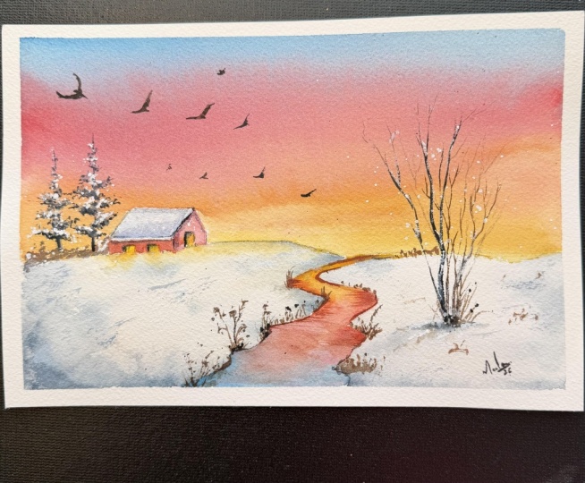
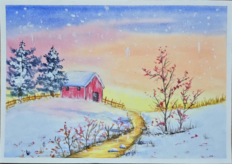
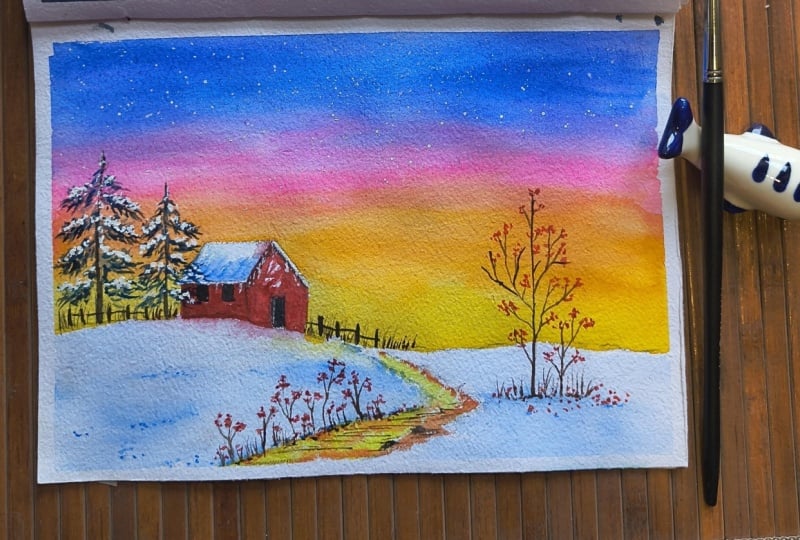
at your work and just see that beautiful light gradient and the golden stream that
pulls us back into the scene. Thank you so much for
joining me in this class. We've covered everything from finding the moisture
sweet spot in Na sky to painting a glowing
stream and a cozy red cabin. My biggest piece
of advice is this, don't be afraid to experiment. Watercolor is a dance
between you and water. Sometimes the water leads
and sometimes you do. Every mistake is
just a new texture in your winter landscape. I would be so honored to see your version
of this painting. Please take a photo of
your finish piece and even your warm up
strips and upload them to the project
gallery below. I check the gallery regularly
and love giving feedback. If you enjoy this class, please leave a review. It helps other students
find their way to a cozy little art
corner until next time, keep painting and keep glowing.
 Nishita Kashyap, Artist, Art Educator