Transcripts
1. Introduction: Imagine completing a
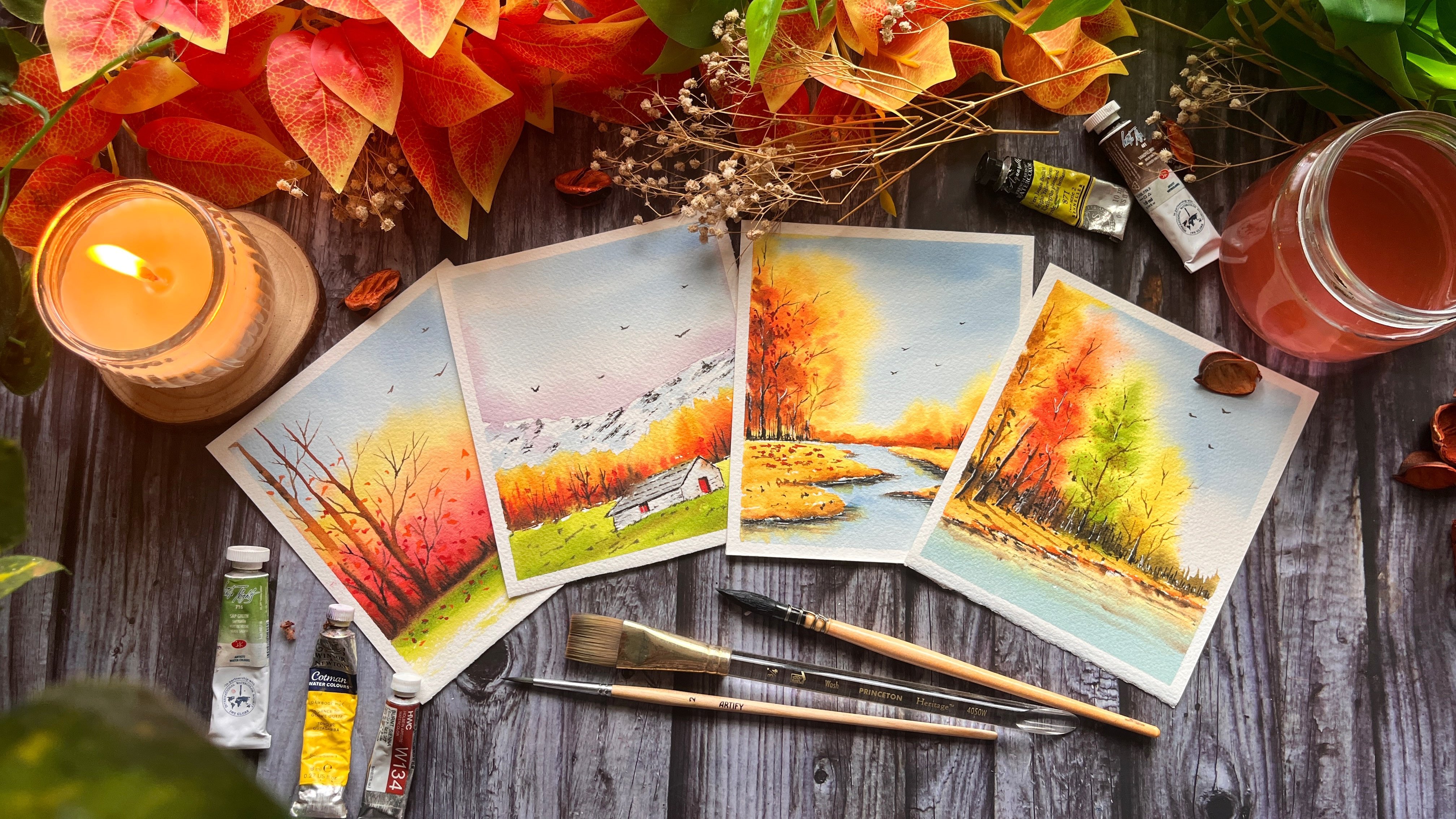
cohesive collection of six atmospheric landscapes, each capturing a different mode of nature in just six days. Hi, everyone. I'm Nishita, a watercolor artist and educator known on social media
as Bombaypaintingclub. Welcome to my six day
watercolor journey on aesthetic landscapes. In this class, we
are just practicing. We're building a
cohesive collection of six atmospheric scenes. To make this journey
easy and sustainable, I'll be uploading one new
lesson every single day. This way, there is no pressure to finish everything at once. Just 20 minutes
of daily practice to build your creative habit. I've structured this class to be a technical roadmap before we dive into our
daily landscapes. We'll start by going over the essential materials
I use in my studio. Then we'll move on to a dedicated master class
on watercolor washes. We will also spend
some time on swatching our color palette before we head on to our six day
watercolor journey. Let me take you
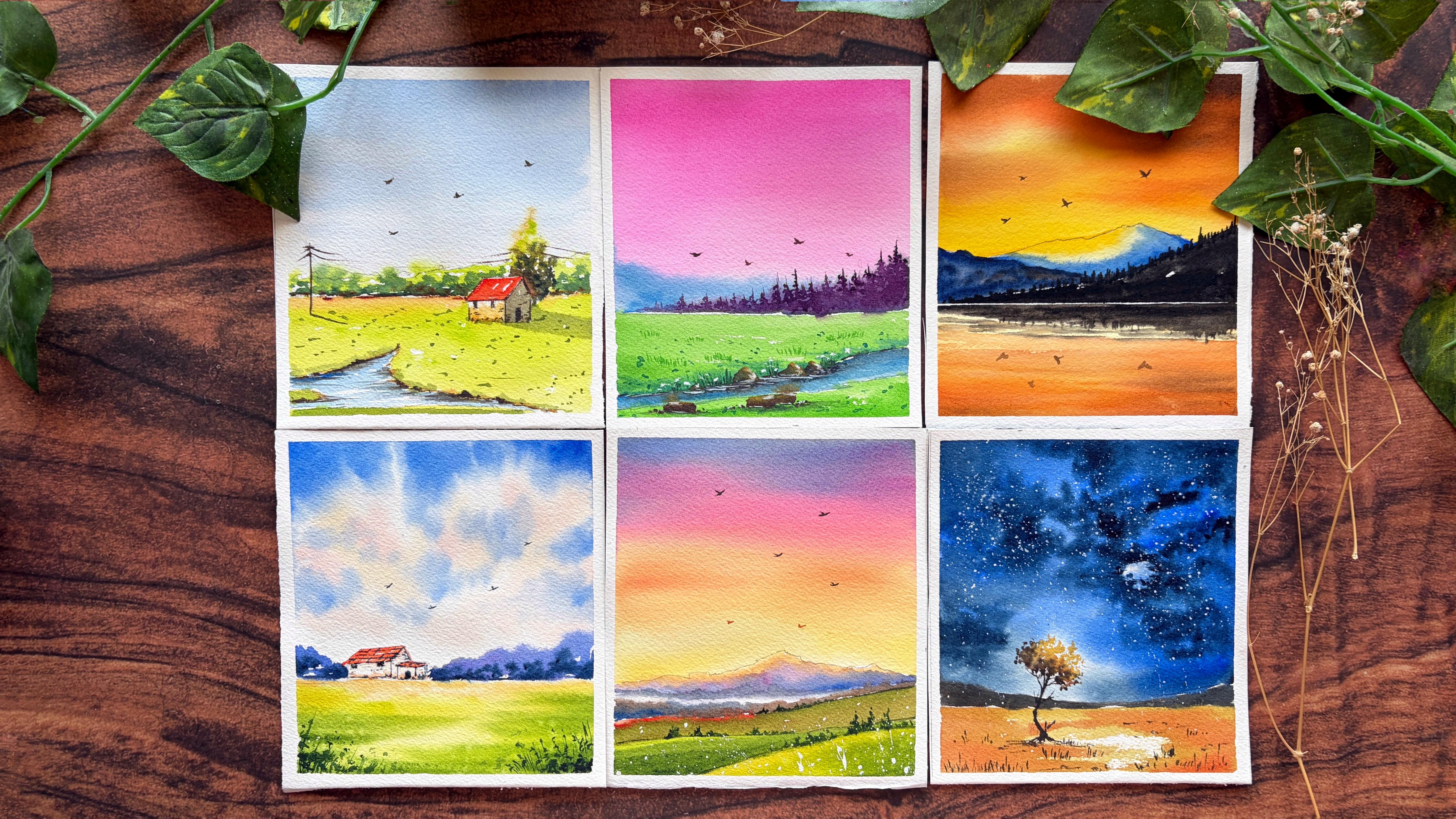
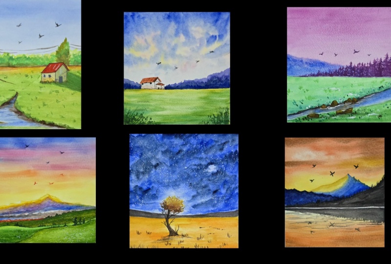
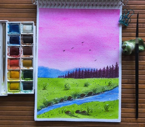
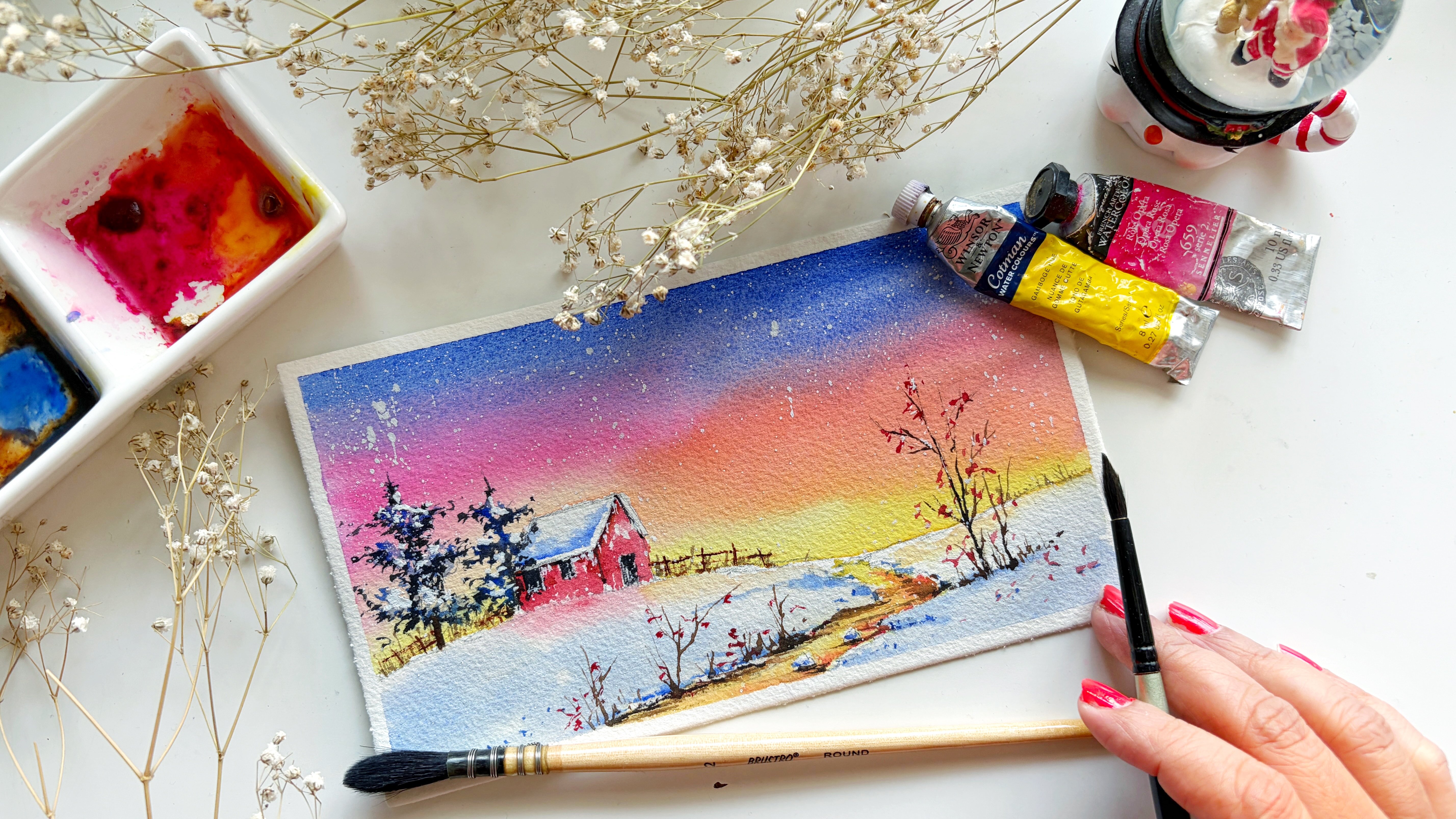
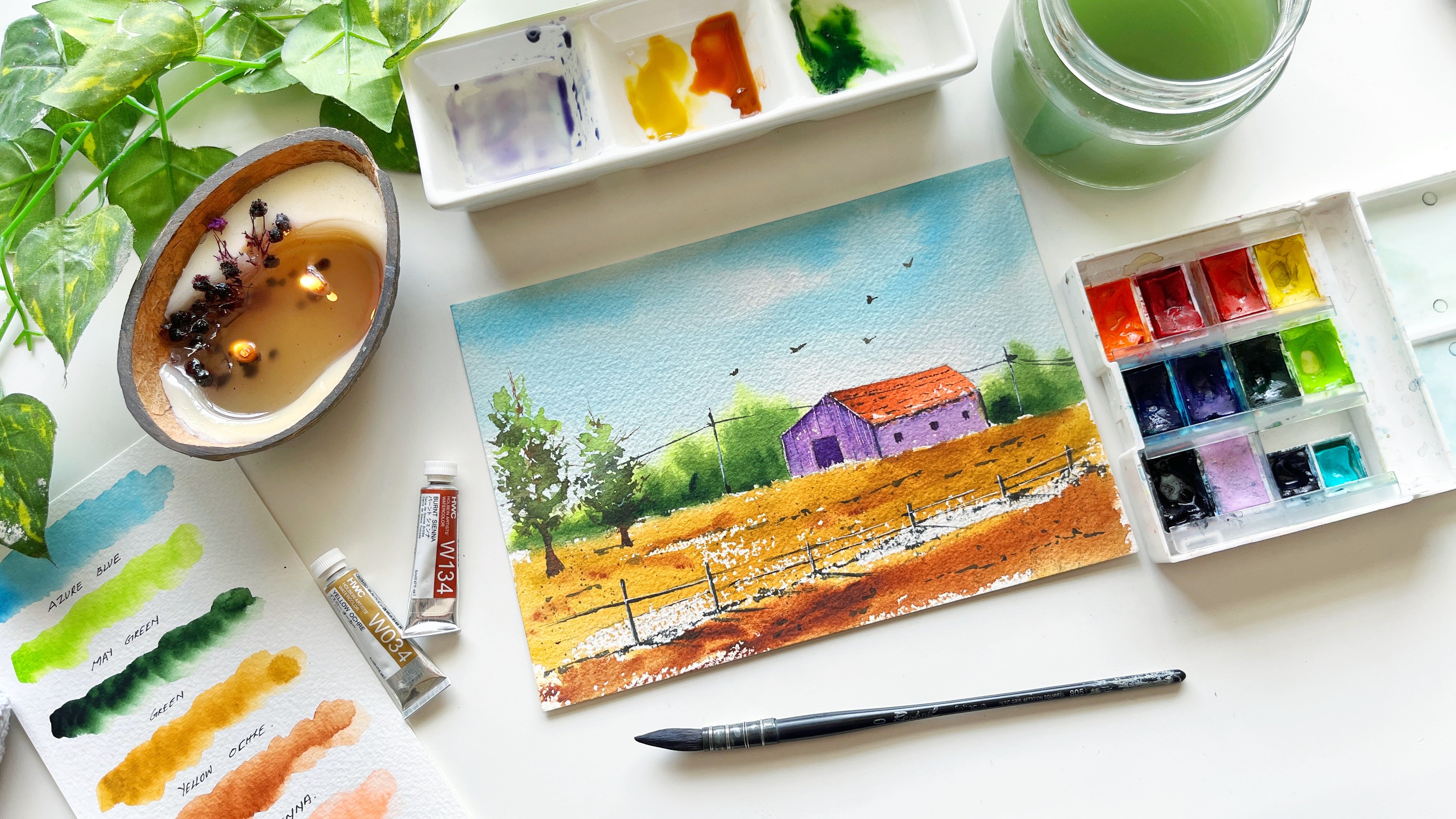
through day one to day six. Cottage In The Meadow. Pink twilight by the stream, golden Peak reflection, Cloudy Valley farmhouse,
hazy highland ridges. And lastly, the lone
tree under the stars. The series is designed to be easy to follow and
highly structured. However, if you're an
absolute beginner, I'd suggest taking my easy watercolor landscapes
for beginners class. You're on Skillshare. It's a wonderful warm up for
what we're about to create. By the end of these six days, you won't just have a grid
of six beautiful landscapes. You'll have the
muscle memory and the artistic toolkit to continue your watercolor
journey on your own. So if you're ready to master
the art of light, haze, and atmosphere, let's
start painting, and I'll see you in
the class. Bye bye.
2. Materials & Paper Prep: Before we start, let's
go over the tools that will make our six
day journey a success. So for this class,
I'm using a 300 GSM, 100% cotton, cold press
paper from Ash's. The size of the paper is
around five by 5.5 ". It's almost in a square format. Feel free to use any
brand watercolor paper. Just make sure that it is
300 GSM and 100% cotton, as it can hold multiple layers and heavy wet on wet
washes without wopping. Now for the color palette, I've curated a selection of professional grade pigments from some of my favorite brands, including Holbein, Sinea,
white knights, et cetera. Don't worry. We have a dedicated color palette lesson
where we'll swatch and explore these colors in detail before we begin
our first painting. In terms of brushes, you'll see me using a flat brush for the background and the sky. This is from Princeton Heritage in size three fourth inch. Next, I have a mop brush
from Brusto in size two. This holds a lot of water, so it helps in
covering larger areas. Next, a round brush. This is
from silver brush Limited, black velvet series in size six. You will also need a
small detail brush for intricate elements like tiny
pines and rocky textures, and this one is from Fumi and the other one is a Chinese
calligraphy brush. Now let's have a look
at the other materials. You will also need two
jars of clean water, one for rinsing your brush, and one for keeping your
mixtures pure and vibrant. You will also need
a masking tape to tape down your paper. A paper towel, a small clip or any tiny object to place
it under the board. Angling the board allows
the water to flow downward, and it brings the
pigments along with it, which creates smooth
background washes without overworking the paper. Next, here, I have a
mechanical pencil. You can use any pencil that
you have a needable eraser. Okay, and a mixing
palette to mix your paints and a spray bottle just to keep your paints
moist at all times. Now that we have covered
all the materials, let's prep our paper. In this section,
I'll demonstrate the taping process for
our first painting. Once you see how it's done, I recommend having
your paper measured and taped ready before
each day's lesson. Okay? So with my masking tape, I'm just eyeballing the borders and applying it on
one of the sides. Okay, return the board and
repeating the process. Whenever you're applying
the masking tape, make sure to run your
fingers a couple of times. Okay? Make sure that
your paper is flat. I've torn the board
again and working on the other side,
stretch your tape. And apply it on the border. Keep checking for
some air pockets that are usually formed. So run your fingers a couple of times, especially the corners. Okay. And we have
our paper ready. I'll see you in the next lesson. Bye bye.
3. Essential Watercolor Washes: Welcome, my dear friends. Before we dive into
our daily landscapes, let's practice some essential
watercolor techniques. These aren't just
for this class. They are fundamental skills
that will help you complete these six scenes and support you throughout your entire
watercolor journey. So let's start with a flat wash with wet on dry technique. This is one of the most
common watercolor technique which is used to
create a smooth, even solid layer of color. So I'm taking a flat brush and applying a generous amount
of ultramarine blue, creating a bead at the bottom
of each horizontal stroke. Keep pulling the
pigment as you move down until the bottom with
the same horizontal stroke. Okay, to create a seamless, consistent color without
streaks or patchiness. Okay. And for the next one, we are going to do
a flat wash again. But here we are going to wet our paper before we start
applying the paint. I have a little bit of pigment left on this
brush, that's okay. We're going to use
the same color. Okay? And I'm going to apply
same ultramarine blue. But I'm leaving some white
space in between just to show some clouds in the sky and this gives
a beautiful effect. With a wet background, you can see how instantly
we've got a super soft sky. So I absolutely love working
with this technique. Now, moving on to
the next technique, we are looking at graduated
wash or a graded wash. Okay? So starting the same way, going to wet the background. And this time, I'm going to load my brush with Vandyke brown. So graded wash typically
progresses from dark to light. So starting from the top, making it more
concentrated at the top. And as you move down, without washing my brush
or loading my brush, I'm just going to
smoothen this out. Okay? And as you move down with the same
horizontal strokes, you can see that the pigment
appears to get lighter. Okay. And if you feel that you need to make the top more darker, you can do so while
the paper is wet. Okay? So here, we've got
a beautiful graded wash. Now the next wash is called
the variegated wash. This is similar
to a graded wash, but involves
transitioning between two or more different colors rather than just
one color to white. Okay? So in a similar way, I'm going to wet the
background, okay? And first, I'm going to load my brush with
the lighter color. So here we will try to
practice the sunset that we're going to be painting
in one of the landscapes. So applying some Indian yellow. Okay, starting from the
bottom of the paper. Okay. And halfway
through the paper, I'm going to add
in a lighter value of vermilion hue or orange, if you want to use that. Okay? And applying a darker value
right on the top. Okay? You can see that
this itself gives a beautiful blend between
yellow and the orange. I'm going to add
another color right on the top with burnt sienna. And finally, I will add some
streaks of van **** brown. Just trying to show some
dark clouds in the sky. Okay. We'll add in more streaks and more depth to our sky
in our final painting, but this is just to
give you an idea on how to paint two or three
colors together. Now moving on to the fifth one, we're going to practice
one of the skies that we'll be
painting on day four. Okay, so this is, again, wet on wet technique, but we're going to
paint this with negative space and some
lifting if required. Okay. After wetting your background, you're going to drop
in a lighter value of Indian yellow
at certain places. Okay. And then I'm
going to drop in some vermilion yu again, a very light value. Dabbing my brush on
the paper, okay? I'm just painting randomly around the yellow
that I've painted. And next we will drop in
ultramarine blue right on the top with a more
concentrated value. Okay. And as I move down, I'm going to paint
a lighter value and smaller clouds going to
make this more dark. You see the bottom of
the sky is super light. I can just go in and drop in some more clouds here and there. Okay, with a clean brush, I'm just going to
smoothen this out. Okay. And next, I'm
going to wash the brush and just going to dab all the excess water
on my piper towel, and I'm going to
lift certain parts of the cloud to make
it look more softer. I'm going to add a more
concentrated color right on the top. Okay? So this is the way we're going
to be working on day four. Now let's practice
the sky for day six, and I'm vetting this
entire section. Okay? So we have practiced these day four and
day six in particular because they are
quite different from the other skies that we're going to be painting
in our landscapes. So I just wanted to
give you a hands on practice before we dive
into our final projects. So I've just applied
ultramarine blue, leaving some white space. Okay, so that's where
the moon will come, and basically, we'll
be painting around it. At the bottom, it's more lighter because we're going
to show a tree there. Next, I'm applying indigo. So we want these
treaks to be seen. So that's why I call it a free play because you can
dab as much as you want, create different variations
of blue from light to dark. And with my paper towel, I'm just going to lift off
the center of the moon, and then I'm going to
just going to give it a nice shape around the moon. Okay? And we go to show some clouds going over
the moon as well. Okay? So I think you
have a basic idea of how we'll be
painting this project. See how instantly this
creates that moody, swirly texture of a
midnight sky where the light and dark pigments blend organically
to create depth. In the final painting,
we will finish off the sky by
adding some stars. Okay. And once this is dried, you can peel off the tape. Now, you have a visual guide for every mood we
are going to paint. In the next lesson,
we will curate a beautiful color palette for the projects that we would be painting in the
next six days. See you there. Bye bye.
4. Color Swatches: Now let's talk
about the heart of our paintings, the
color palette. For the six day series, I've curated a selection of professional grade pigments
from brands like Sinea, the swans from Holbein. We'll also be using white
knights watercolors and lastly, watercolors from art philosophy. Now, you can use
any brand that you have as long as you are very close to the
colors that we are using. So let's watch out all
the colors one by one. The first color that I'll be
swatching is Indian yellow. This color is super rich, it's so vibrant, as
well as transparent. It's more like golden
orange yellow. So in case you do not
have Indian yellow, you can use gamboge yellow
or cadmium yellow deep. The next one I'm going
to use is yellow ochre. This is easily available
in all the palettes, so should not be a problem. Next, we have vermilin hue. This is a bright orange red
color that can be created by mixing either cadmium
red and cadmium yellow. The next on our
palette is Opera rose. This is a beautiful,
florescent, vibrant pink. If you do not have this color, you can use quinacrodon magenta or any bright pink that
you have in your palette. Next, we will swatch
out mineral violet. This is from Holbein. You can also mix this color
by combining ultramarine blue with either opera rose
or quinacrodon magenta. My most favorite and used color is bright yellow
green from Sinea. If you do not have this color, you can get this color by
combining a cool yellow, like a lemon yellow with a very small amount
of bright blue, like tailor blue or
a turquoise blue. This one is permanent
green light. This is from Holbein. This color is known for
being a warm, bright green, and it is very similar to a saturated, permanent
green light. So you can use permanent green from different brands
such as Daniel Smith, Winsor Newton,
Schmik, et cetera. Now, next on our
palette is a sap green. This is easily available
in most of the palettes. In case you do not
have this color, you can use hookers green or any dark green that you
have on your palette. Next, we will swatch
out burn Sienna. This is a beautiful,
vibrant color from Holbein. And then we need a
darker mix of brown, I'm using an dike brown. You can also use burnt umber. In case you do not
have a darker brown, you can add a little
bit of indigo to burn sienna to get the
darker shade of brown. Next, I'm going to
swatch out indigo. This one's from art philosophy, and you will need this
color for the starry night. Let's watch the next color
that is ultramarine deep. This is from Holbein. It is an highly pigmented, warm, violet to blue. And it is known for
being more granulating. In case you do not
have this color, you can use a
French ultramarine, or a cobalbluejep,
or a royal blue. Lastly, we have ivory black, which I use sparingly for
those final high contra silvetes the swat sheet will be uploaded in the project
resources for your reference. We'll also be using white quash. This one is from
Windsor Newton for highlights and to make the
stars for the last project. And now that we have met our colors and seen how
they behave on the paper, we have everything we need to bring our landscapes to life. Keep this sheet nearby as we move through the next six days. It'll be a helpful
reminder of the glow and depth we are aiming
for in each scene. A palette is ready,
a paper is pred, and our techniques
are practiced. Meet me in the next lesson
where we'll begin day one of our series with a very first project,
Cottage In The Meadow. See you in the next
lesson. Bye bye.
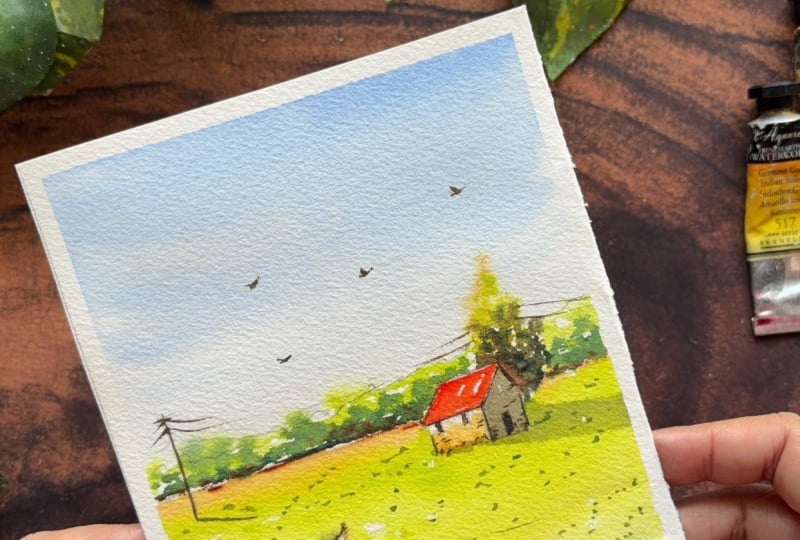
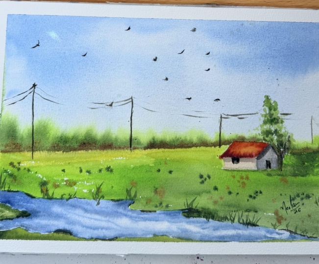
5. DAY 1.1 Cottage In The Meadow: Welcome to day one.
We're starting our journey with a
fresh daylight scene. This space is all about
building a foundation in watercolor and understanding
how to layer simple shapes. Now, after taping
down your paper, let's begin with
a simple sketch. We're keeping the
sketch minimal. Place your horizon line just
below the halfway mark. Now, let's place our focal
point, the farmhouse. We're going to tuck it on
the right side of the paper. So let's first add
the triangular roof. To make it look
three dimensional, draw a very short side wall. Okay, so this is a very
small tiny cottage. So keep the size in mind
while drawing this. Not that I'm placing the roof partially above
the horizon line. By keeping the house small, we make the landscape
feel vast and wide. Next behind the house, we will add in a simple elongated
sketch of a tree, okay? And just above the horizon
line behind the tree as well, we're going to show some distant
trees in the background. Now, let's add the stream. I should start wider at the
bottom, left corner, okay? So I'm just making a curvsh line from somewhere off center of the paper and an irregular line going all the way to the right. Okay. And finally, we will connect these lines to
the edge of the paper. Okay? Now that we have a good balance in
our composition with the cottage being on the right and the stream
being on the left. And if you notice there's
nothing in the center, and that's how you
should always compose your paintings by not having your main focal
point right in the center. Now, for a touch of story, let's add a single utility
pole on the far left. Draw one vertical line, slightly tilted and
a tiny crossbar. Now that we are
done with a sketch, let's start by
wetting the paper. Okay, so just giving
a good wash of water. We will wet the paper until
this line of the trees. Okay? Now, I'm taking some
ultramarine blue, and I'm just going to take a
lighter value of this color. And starting from the top
with a horizontal stroke, you will pull the color down. And as you get closer
to the horizon, we're going to let
the blue fade out. Okay? Just dabbing
multiple times just remove the excess
pigment from the brush. So you can see a
very light value towards the bottom of the sky. Next we will work on
the background trees. So I'm taking the lighter
green. That is May green. Okay. And I'm just going
to paint the edges first, and slowly, I will
block this entire area. It's okay if it
bleeds a little bit, into the sky. Okay. I'm leaving a tiny bit of
white spaces in between. Okay, same thing on the
other side as well. Okay, so I've directly applied the paint without
wetting that area. And now with a darker green, we will go in and drop this color at certain
places and let it bleed with the lighter green. Okay. Keep in mind that we want
both the greens to be seen. The light, as well as the dark. This instantly creates
depth in your paintings. In such a simple way, we have created the
background trees as well. Okay. Now moving on
to the next step. Going to quickly change the
brush to a round brush. I'm going to add some burnt
Siena right at the bottom. Okay. Just adding some
early tones here. Okay, right at the bottom, and at certain places, it will overlap
the darker green. Next, we will paint the
tree behind the house. I've taken a lighter
value of Indian yellow. Okay? So just at the top, I'm placing this color. To this, I'm adding the
lighter green, the may green. Okay. And finally, we will add the darker green mixed with
a little bit of brown. Adding brown to your green
just makes the green more subtle than
having a bright green. And now we will use
the darker green to show the darkest value and
to give the tree some depth. Once you're done with the tree, we will move on to the
roof of the house. So I've taken some vermilion, and I'm just going to directly apply this
color onto the roof. Okay, leaving some
white space in between. Carefully painting the edges, showing the edge of the roof
on the other side as well. Next with a clean damp brush, I'm going to wet the
area of the wall. And I'm taking some
Indian yellow and applying it to the front
side of the house. Whereas on the other side, we will add a little bit
of blue and a bit of brown going to show that there is a shadow
on the side of the wall. That's why it's darker as
compared to the front side. So basically, this contrast
tells us that the sun is hitting the front and
leaving the side in shadow. Now, this instantly makes our house look like
a three D object, but we're going to go in
and add in a darker value of Indian yellow after applying the color at the
bottom with a damp brush, I'm just going to spread that
all the way till the roof. We'll add in the details
once the cottage is dried. Now that we have our
background ready, in the next section,
we will work on the foreground and the other details to
finish the painting. See you there. Bye bye.
6. DAY 1.2 Cottage In The Meadow: Hello and welcome to part two of painting
Cottage In The Meadow. Let's move forward
with the foreground. So let's start with
the green meadow. So for the greenery, we want a fresh spring green. So I'm adding a bit of Indian yellow right at the
top near the horizon line. And then we will add in
this bright may green. And we'll carefully
paint this around the house and also blend
it with the Indian yellow. I think going to take
some more colour and just going to paint
this entire block. Note that I've left some tiny
white spaces in between. And I'm going to paint this
smaller little green field that can be seen at the
bottom of the page as well. Next with burn Sienna, I'm dropping in
this color right at the edge of the
green fields, okay? Just to show some depth. Okay. Next, without
washing my brush, I'm loading the brush
with the darker green. Okay. I'm going to take some may green and mix it
with this brown, the lighter green and
the darker green. So here we are trying to
show that the shadow of the house is falling
on the meadow, okay? It's very light
value of this color. And I'm going to
apply the same color here on the edges
of the green field. Okay. And at the bottom, as well. I'm just going to
make this part a little bit darker
with the green. Now let's move to
our winding stream. The biggest mistake
people make with water is painting it
a solid dark blue. In reality, water
is like a mirror. So since our sky is very light, bright blue, our water
should be even lighter. So I'm taking a very diluted mix of that ultramarine blue, mostly water and just
a hint of pigment and painting it along the S
curve that we sketched. Okay? As I pull the
brush down the stream, I'm not filling
it in completely. I'm leaving that white
space in between, okay? These are highlights
the spots where the sun is basically hitting the ripples of the
water perfectly. Now with the same
mix of green brown. Okay, I'm going to apply
this color on the edges, making some thin
horizontal dashes near the edges of the
stream banks. Okay? This mimics the slight shadows where the grass meets the water. If your paint is still damp, this will softly blur and
create a natural liquid look. So don't overdetail it. Let the simplicity of the white paper do the
heavy lifting for you. Now with the same mix, I'm just going to add
in some bigger dots to show there are rocks on
the banks of the stream. Okay. Next, I'm going to take
some ultramarine blue. Wow, I think this is too dark. Let me just I'm going to tone it down
by taking some brown. Okay. This is still dark. I just diluted it with water. I got a very lighter value
of gray by mixing some blue, some green and a
little bit of brown. Okay. So I'm just going to
apply some of this color, making some tiny streaks in water to show some movement
and depth in the stream. Okay. Okay. With this, we are done adding the
details to the stream. Next, moving on, we will add in the details
to the farmhouse. So I'm making a thin line under the roof just to
show some shadow, and we're going to
add in the doors and the windows with the same color. I have not changed my brush in case you want to move
to a smaller brush. Please feel free to do so. Okay, same thing on the
other side of the roof. Okay. Okay. And we're going to add a tiny line on the
edge of the wall. Next, I will change the
brush to a thinner brush, and I'm going to take
the same darker mix. You can also use black for this, and I'm going to
make a straight line to show the utility pole. Okay? And a small crossbar. Now we're going to
add in the wires. Okay. So we're just going to show the wires connected
from the pole. Okay. So you see that I'm not
painting the whole thing. One small line on the
side, and we're done. Okay? Now we're going to
show the shadow of the pole. So we're going to take a
mix of brown and blue. And this shadow is parallel to the shadow of the
cottage that we painted. Okay. Just go to make
this more darker. Okay. Okay, so almost
coming to an end, taking a mix of green and
brown, a darker green. Okay, mixing it with
a lighter green. Now I'm going to
add some tiny dots on the green meadow
to show some grass. Okay, roughly doing this. Some scattered dots
here and there. Without washing my brush, I've loaded the brush
with burnt tumber. Okay, I'm going to
make some tiny birds. Again, just in the
shape of one short line and one longer line, okay. And I'm going to add
some tiny dots here, some dots and lines on
the walls of the house. Okay? Just go to
show some details. With this, we have finished
with our first piece. This was all about clean
washes and simple composition. Now, for the most rewarding
part, the tape peel, pull it away slowly at a 45 degree angle and look
at that crisp border. You have officially
completed Day one, set this aside to dry, and I'll see you
tomorrow for day two, where we'll play with
some vibrant pinks. I hope you've enjoyed
painting along with me. See you tomorrow in day two. H
7. DAY 2.1 Pink Twilight By The Stream: Welcome to Day two. Now that you've mastered the
basic daylight scene, we're going to step it up. As we proceed through each
day of this challenge, we'll be adding more elements, playing with bolder colors, and exploring more
complex lighting. Today we are shifting from
the bright blue of Day one to a vibrant atmospheric
pink golden hour sky. A sketch today is
similar to Day one, but with a more
detail to handle. So place your horizon lines
slightly lower this time, about the bottom
third of the page. Now, above the horizon line, we will draw these
jagged dense tree line. And finally, we will
add the stream, which gets narrower
towards the left side and broader as we move to
the right side of the page. Okay? So just these
two diagonal lines, and we are done with the sketch. Now, my paper is
already taped down, so I'm going to wet the
sky with a flat brush. Okay? With just clean water, we want a nice, punchy, vibrant sky, so I will be using
opera rose from scenario. We will wet the sky
until the horizon line. Just an even coat of water. If there are any pool
of water on the edges, just simply tap your brush onto the paper towel and run your brush a couple of
times on that area. Okay, now we will load
the brush with the pink, and I will drop the pigment at the top and sweep it across. Notice how the water helps
the color stay even. If you see tight marks
or lines forming, quickly sweep your brush across again while it's still
wet to level it out. Okay? Now, as you move
towards the horizon, let the pink get
slightly lighter. So what we're trying
to achieve here is a beautiful radiant effect. Okay? Okay, I'm going to drop in some more
pigment at the top as watercolor dries 30%
lighter than what you see. So I'm just going
to darken the top, but this flatwh is a great
test of your water control. The goal is to achieve a
perfectly soft velvet like sky. Okay. So I'm happy with the sky, so I'm going to stop right here. Next, I will change the
brush to a round brush. Okay? And I'm loading the
brush with ultramarine blue, and I'm going to drop this color while the
paper is still wet. These are the distant
mountains in the background. Now if you had too much water, this would have spread even more and gone all the
way to your pinks. So having that perfect water
control is very important. Okay, now I'm just dropping in the darker pigment
right at the bottom, giving it some depth. Next, I'm using
violet from Holbein, and dropping it on
the right side, and slightly overlapping
the mountains, okay? We're just giving the
base of pine trees here. The brush movement here is off tall and short lines to
show the pine trees here, we'll add in the details once the sky has
completely dried. Now, as the background dries, we will move on to the
foreground and paint the meadow. I'm using permanent
green from Holbein. And with horizontal strokes, we will fill the field. Just blocking this
entire area and going all the way until
the streamline and just a passing thought
that I would like to share that pink and green are essentially across from each other on
the color wheel, making them complimentary
style tones. So this naturally contrast is what makes the landscape
feel so vibrant and alive that the warmth of
the sky actually makes the cool greens of the field
appear deeper and richer. Now loading my brush
with ultramarine blue, and I'm going to apply this
color right on the edges, and try to blend it with the
green a little bit, okay? So since the green is still wet, this is giving us a very
nice soft look on the field. Next, I'm adding a darker
value of ultramarine blue. Okay, and just going to drop
in this color on the edges. Now we will move
on to the stream, and I'm painting this with a lighter value of
ultramarine blue. Okay. Now, with
just a damp brush, I'm just going to
smoothen this out. I don't want a very dark stream. And only on the edges, I'm going to drop in the darker value of
ultramarine blue, just to show some shadow on
the banks of the stream. Going to make this a little more darker with some van **** brown. Okay, next, I'm going
to clean the brush, and with a very damp brush, I'm just going to smoothen
this entire area. Okay. And with this, we are done
painting the stream as well. Okay. Next, we will again
take some permanent green, and we'll paint the field on the other side of the stream. Okay. Sticking some more
concentrated value of this color and just painting this towards
the bottom of the paper. In the next section, we
will add in the pines and the other details
to finish the painting. See you in the next lesson.
8. DAY 2.2 Pink Twilight By The Stream: Welcome back, my friends. And now that our sky area
is dried completely, we will start working
on the pine trees. Okay? So I'm going to take a very concentrated
color of the violet. Okay? You can change your brush to a liner brush
or any thin brush. I'm using the
Chinese brush here. And using the very
tip of your brush, stipple the tops of the trees to create those
pointed pine shapes. Make the pine smaller as you
work towards the left side. And once you have the top ready, you can go in and just create these very
loose strokes of the pines. Okay? These are very dark at
the bottom, so don't worry. They're just going to
appear as a silhouette. Okay? So you don't
need to define them. Okay? If you feel
that you need to define the top of the
pines a little more, you can go in and do that now. Okay, now moving on further, and we will continue to create these spines until the violet
that we have painted, okay? Okay. So first,
I'm just creating these tops and alternate
strokes on either side, slightly varying the heights
of the peaks to create a more natural organic
flow that leads the eye into the heart
of the landscape. So if you see that
only the top area is more detailed and the rest blends in with the
violet at the back, and this creates a
beautiful silhouette against the bright pink sky. And with this, we have completed adding the silvet
of the pine trees as well. Towards the end, I'm just
making these vertical strokes. I'm just going to darken
this portion a little bit more and just going to
extend the peak a bit. Okay. I think I need to
just stop right here. And here we have a beautiful silhouette
of the pine trees. Now let's focus on those small rocks tucked
along the stream bank. So I'm loading my brush
with Vandyke brown. When painting these, avoid
making them perfect circles. Okay, so they are just
irregular blob like shades. You can think of them as flattened ovals with
slightly jagged edges. So I'm adding these rocks in different shape and in sizes. Now, while the
brown is still wet, we will take some
yellow ochre and just apply it right on
the top of the rock. Now, since the brown is wet, the yellow ochre and the
brown will blend naturally. And this creates a beautiful
highlight on the rock. Now to make these rocks
look like they're sitting in the grass rather
than floating on top of it, we need a contact shadow. So I've taken a mix
of violet and blue. With horizontal
strokes, we're going to create shadows
beneath the rock on the stream to make it
look more grounded. Now I'm going to take
some ultramarine blue, and we will apply another
layer of this color. And this will also blend in
with the shadow of the rocks. You can see that adding
another layer of the blue makes the stream
looks more vibrant. Now, we will continue to add more rocks on the
other side as well. Okay. So with the same process, you're just making different
shapes of the rocks. Okay? I think I'm just
adding one more year. And now we will drop in the
yellow ocher. That's it. I'm going to make the bottom
of the rocks more darker, so I've taken a mix of
brown and violet and just going to drop this colour on the bottom of the rocks. Okay. And now I'm going
to add these tiny, small little rocks
around the big ones. Okay. And that's it. Next, we will add in the grass. I'm taking a more
concentrated color of the permanent green and making
these vertical strokes. Okay? Just small tiny
lines to show some grass. And on the bottom of this, I am just going to darken this with a mix of blue
and green. Okay. And going to make one
year on the edges. In between the rocks. I'm just going to darken
this with some violet. You can also use or darker green by mixing blue and green. Then I'm adding these small
dots in the stream to show there are tiny rocks
around the bigger rocks. Okay? Just small
dots here and there. Now, without washing my brush, I'm going to take
some violet and green and apply this color
right at the bottom. Okay? Making these horizontal
strokes under the rocks. Okay. And then I'm going
to wash the brush, and with a damp brush, I'm just going to blend this to show some shadow
falling on the meadow. Now, we will add the
highlights with white quash. This is from Windsor Newton. Okay, go to remove
some on my palette. Using the same brush, you can use any thin
brush that you have. Okay. And I'm going to apply this on the
bottom of the rocks first. Okay. Just horizontal strokes, adding it on the rocks as
well on the side of the rock. Okay? Same thing on the
other rocks as well. Just a bit here and
there, don't overdo this. Okay? Finishing off
the highlights with a more concentrated
gouache and just making these small dots on each of the rocks for a more
prominent highlight. Just to add more
texture to the fuse, I'm making these tiny dots. Okay, very randomly,
I'm adding these. Okay, now without
washing my brush, I'm loading the brush with burn sienna and a mix of green. And we will add in the birds. Okay. Maybe one here at the bottom. I'm just going to darken the
highlights with whitewash. Okay. Next, we add in tiny dots to show some flowers
on the edges. And with this, we're
done with Day two. You can already see how
adding a few extra elements like the rocks and the
textured tree line has transformed the painting. Now, let's peel the tape. Don't you think those
clean edges against the vibrant pink looks
absolutely stunning? I hope you've enjoyed
painting along with me, and I'll see you
tomorrow for Day three, where we move in to
a fiery org sunset. Until then, take care
and see you tomorrow.
9. DAY 3.1 Golden Peak Reflections: Welcome back to day three. Today, we are tackling the
Golden Peak Reflection. Before we even pick up
a pencil to sketch, we're going to use
a simple trick to keep our horizon line
perfectly sharp. I'm applying a thin strip of masking tape exactly where
the mountain needs the water. This allows us to paint
and blend our sky with total freedom without worrying about the paint bleeding
into our reflection area. Once the tape is down, we'll lightly sketch the
silvet of our glowing peak. Let's map out our
mountain range, okay, starting from the right side and moving across to the left, we'll draw this jagged line. And the next one is
from left to right. This one is a little smaller as this will
be in the background, and we're going to
show one more here. Going upward and connecting to the first mountain
on the right. Note that this peak sits
slightly off center to the right to create a more balanced
aesthetic composition. And that's all with the sketch. I'm starting by pre wetting the sky area with clean water, stopping right at the edge
of a mountain silhouette. We want a soft even
sheen, no puddles. Okay. This wet on wet base
is what allows our colors to dance and blend without
those harsh califler edges. So make sure that you have
an even layer of water. One way to check is
by lifting your board and to see that there
are no puddles form, especially on the edges. Okay. Just run your
brush a couple of times and remove
the excess water. With our paper prepped, we're starting right
above the mountain peaks with a vibrant wash
of Indian yellow. So just on the edges, I'm applying this color
with the tip of my brush. And I'm sweeping this
across the horizon. We let it stay bright
and clean for now. When you apply more of
this color and take it a little more up. And then starting from
the top of the sky, I'm dropping in a warm orange. This is vermilion hue
and pulling the pigment down to meet and blend
seamlessly with the yellow. If your colors are light, you can go in and add
in another layer of the pigment before we add
in more drama to the sky. Okay see how with a very
soft hand I'm blending this we're aiming for a smooth, sun drenched gradient that feels like the
height of a sunset. Now without washing the brush, I'll take some Vandyk
brown and mix it with the yellow to give us a
lighter shade of the brown. Okay. And then we
will go in and add in the darker value
of Vandyk brown, starting from right to left. And then we will go
from left to right. Can you see that I'm not
sweeping across the paper? It's just a few strokes on
either side of the paper. Now, finally, to make
this blend even smoother, we're going to take some Indian
yellow and just apply it on the edges wherever you feel that you need to
blend a particular area. You can see how instantly
we created some deep, moody shadows in
the clouds just by adding a few strategic
strokes of Vandyk brown. And with this, we've got
a beautiful sunset glow. Now let's move on
to the mountains. So we're going to show
the reflection on the mountains with
Indian yellow. I'm just going to make this
lighter and we'll apply this color only on the
top of the peak here. And with clean water, I'm going to smoothen the edges. And then we will apply some ultramarine blue starting from the bottom of the peak. Going all the way to the
edge of this mountain. The contrast between
the warm Indian yellow and the cool ultramarine blue is what will give a mountain the three
d sun drenched look. Now I'm going to wash my brush, and with a clean damp brush, I'm going to just blend
this area with the yellow. Keep washing your brush to
get a nice smooth blend. Next I'm taking a darker
value of ultramarine blue, and I'll apply this at the
bottom of the mountain. I'll paint all the
way till the end. Next, I'm going to wash my brush and with a clean damp brush, I'm just going to blend the
two with the reflection. I'm repeating the process until
I'm happy with the blend. Going to go over
the yellow and then blend the two colors. Here we can see different
values of the blue. It's a beautiful way to
show depth in your subject. Next I'm going to mix ultramarine blue
with Vandyke brown, and we will paint
this entire mountain. Okay. I'm just going to
paint this entire block. I like the bluish black look. I think it's very
close to when they go. Okay, and Okay, so we're done painting the
second mountain, as well. Now we will paint the
third one with black. Just going to cover this
entire mountain with a thick consistency
of ivory black. This one is from the
brand art philosophy. Once we have finished
painting the mountain, we're going to make these
small horizontal strokes as we want to show some distant
trees on the mountains. Okay? So just some
short and tall lines. Using the tip of my brush
to create these lines, you can also switch to a smaller brush in case you're comfortable
with that. Okay? So with this, we have created a beautiful silvett of the
trees on the mountain. Now, before we peel the tape, we are going to wait
for the paint to dry. We'll shift our focus to the foreground in
the next lesson. See you there. Bye bye.
10. DAY 3.2 Golden Peak Reflection: Hello, and welcome. Now that
our background is dried, let's peel off the tape. Look at this perfect, sharp horizon where the golden
peak meets its reflection. Now we build our
water in layers. Okay? So I'm taking
my flat brush again. I'm going to remove some
more of Indian yellow. And now I'm not going
to wet the paper. We're going to work with wet on dry technique for the water. Okay, so it's going to be darker at the bottom
of the paper. And as we reach the horizon, we're going to
lighten the yellow. We want the transparency
of the paper to be seen. Next, I'm loading my
brush with vermilion hue. And with a very light hand, I'm applying this color on
either sides of the paper. Now, we add in the
reflection of the mountains. I've loaded my brush with
ivory black and keeping your brush on the
flatter side, Okay, Leaving some gap between
the horizon line and the reflection to
take some more paint. Okay. And here we go. Okay, now we're just
going to darken this. And as you move further, we're going to create streaks to show
ripples in the water. Just making these
small horizontal lines with the edge of my brush. Next, I'll wash my brush, go to dab it on the
paper towel and load it with burn sienna and
a mix of vermilion hue. And I'm going to add some more streaks here at
the bottom of the paper. Okay. Don't worry. It's not going to
look like this. And after this, we're
going to wash the brush, and with a clean damp brush, we're just going to
blend the streaks, okay? I'm going to take it
all the way to the top. Next, I'm going
to take some more vermilion hue, and again, going to go back in and add in more streaks
of this color. Taking some mix of vandyk brown, mixing it with
vermilon u and adding some darker streaks and
blending it as I go. Okay, you can see the
beautiful streaks in water. Now I'm changing my brush
and taking the round brush, and we're going to show in a similar way the
reflection of the trees. So again, making these
small horizontal lines. You basically replicate what
you have done on the top. Okay, I'm just going
to talk in this bit. Okay, we're almost there. And finally, we will add the
birds with Van **** brown. One small stroke
and a longer one. Okay. And there's some
white gaps here, so I'm just filling that in. We're going to show the
reflection of the birds as well. So either you can turn
your paper upside down or you can just
mirror the birds. It does not have to
be exactly the same, but somewhat to
just give an idea that there's a reflection
of the birds in the water. And here we go
with the last one. Peeling back the tape is
always my favorite part. It reveals those sharp edges and makes the golden reflection
truly glow, doesn't it? By layering our tones
from light to dark, we have created a depth that now feels perfectly
framed and finished. Once the tape is gone, you can see how the multiple tones of gold and shadow come together to create a
real sense of movement. And with this, our day
three project is complete. You now have three beautiful
pieces in your collection. I can't wait to see your golden reflections
in the gallery. I'll see you tomorrow
for day four. Bye bye.
11. DAY 4.1 Cloudy Valley Farmhouse: Welcome today for today we are heading to the Cloudy
Valley farmhouse. This piece is all about
what we don't paint. We're going to use the white
of the paper to create those soft heavy clouds you see hanging over a quiet valley. Let's start by drawing
a simple sketch. So we'll first place the horizon line about
a third of the way up. Okay. And we'll add in a
simple rectangular farmhouse. Okay? This is
slightly off center. No Okay. All the sketches will be
uploaded in the project section. Just making the
windows and we'll make some faint lines just to give an idea of
the distant trees. Okay? Okay. And before starting, I'll place a small
clip under the board. Okay. And now let's wet the
sky area with clean water. Okay. Just be careful
around the house, okay? Just work very slowly. Okay. A nice even wash of water. If there are any pools
of water on the corners, just run your brush
a couple of times. Okay, and even that out. Okay? You can see here it's a nice even wash of water, okay? You see that is a good
amount of water there. And then you just run your brush a couple
of times and it will just give you a nice sheen, and that is what we
want to achieve here. Okay, so while the papers wet, I'm going to quickly change
the brush to a mop brush, and I'm going to load
some Indian yellow, a very light value
of this color. And just going to
apply this color very randomly at certain
places, okay? Next, I load the brush with a very light value
of opera rose. Okay? And again, very randomly painting this on the paper. Okay? There's no plan as such. I've placed both these
colors very randomly, okay? Go to show some
here at the bottom. Okay. And finally,
we'll load the brush with the blue. Okay? Jus taking a good amount of
that paint on the brush, and we'll start applying
this color from the top. Carefully painting
on the top and not going to apply it on the other
areas of yellow and pink. Okay. And you can see, I'm leaving some white
space in between. Okay? So wherever there's a
white space, a little bit, you can go in and fill
that space with blue. As we move toward the horizon, let the blue fade in
to a very light value. Just adding some smaller
clouds in between. Okay. Now, would I take a darker value and just go above these clouds on the top. Okay, so that's about
it with the clouds. And without washing my brush, I'm going to load the
brush with the same blue, and I'm going to add
a little bit of opera rose to this to
make a nice violet. Okay? And I'm going to paint these distant mountains
with this color. Can see, it's not very pinkish. I just love this color. Same thing on the other side. H Okay, blocking
this entire area. Left some white
space in between. Okay. Okay. And once we
are done with this, I'm going to take a
darker value of the blue. This is just blue, I'm just going to drop this
color right at the bottom. Okay, showing some
different values for the mountains and maybe some
bushes around the mountains. Okay? And that's
about it with this. Now I'll wash the brush. Now that our
background is ready, in the next section, we will
proceed with the foreground. See you all in the next section.
12. DAY 4.2 Cloudy Valley Farmhouse: Welcome to part of painting
Cloudy Valley Farm house. Let's proceed with
the green fields. I'm going to take my flat brush. And just going to wet
this entire area, okay? We'll be working on
the foreground now. We'll work on the farmhouse once the area around it
dries completely. So meanwhile, we'll
work on the foreground, changing the brush
to a round brush. Okay. Just taking a
bit of Indian yellow, and I'm going to apply it
right at the top. Okay? Leaving some white
space in between. And now I'm going to
load the brush with a bright yellow green. While the paper's still wet, I'm just going to apply this color all the
way till the end. I'm just going to take
a bit more and using a more concentrated green and
applying it at the bottom. Okay, now I'm going
to take the darker green and just going to add the streaks from right to left and
then left to right, making sure that the lighter
green is being seen, okay? Next, we're going to cover the top area with a
paper towel, okay? And we're going to create some splatters with
just clean water. Okay? So just load your
brush with some water and gently tap it on the area that you want
to show splatters. This creates a beautiful
blooming effect. And adds a lovely
texture to the fields. Now, while this area dries, we will work on the farmhouse. So I'm taking some vermilion. Okay? And I'm going to
just apply it on the roof. Okay, a nice light
value of this color. Okay, I'm just going to block this entire area of the roof. Okay. And you're on
the side as well. Okay. And now I'm going to add the darker value and just
applying it on the edges. Okay, I'm just covered it completely leaving some
white space in between, on the other side of
the roof as well, just making one
simple straight line. For the walls, I'm just going to first apply a clean
wash of water. Okay? Going to leave this as white, but I'm just going to give a
lighter tint of this color. Just going to quickly remove some burnt sienna on my palette. Okay, just a tiny bit
is all what we need. And loading the brush
with burn sienna, and I will apply it at the
bottom of the farmhouse. What we're trying to show you is the stains of the red
soil on the walls, okay? And just with a damp brush, I'm just going to spread this
off and lighten this up. Once we're done with
this, we will take a darker value of the
blue instead of black. Okay? And we'll add in the
windows and the door. And finally, we will add in the details to the
edges of the roof. Okay? So just for
the same color, I'll make a line here
and maybe here as well. I think I'll just change my
brush and use a finer brush. This is the needlepoint
brush from Fumi. You can use any
line of brush that you have carefully going through the edges of the roof
and the walls and making these each
wall more prominent. Okay. And we'll add in these lines on the roof
just to show some tiles. Horizontal and some
vertical lines. Okay? And finally, we will
add some details at the bottom of the
farmhouse, okay? And just randomly adding some
dots and some tiny lines. Okay. I think we are good
to go with the farmhouse. Once we have finished
with the farmhouse, we will add in the last
bit to our painting, and I've taken
some darker green, and I'm just going to
make these fine lines, okay, just to show some grass. And over these fine lines, making these tiny dots
show some leaves. Okay. Make the bottom of
the grass more darker. And we are going to
do the same thing on the other side as well. Okay, you can see
that the cross on either side are facing
towards each other. That means they are inwards
and little bit curvish. Okay, and just adding some
dots on the field as well. And with this, we're done
with the foreground, as well. And let's finish the
painting by adding some tiny birds and using a
darker value of the blue. A simple way of painting birds is painting in the shape of V, but one with a smaller line
and one with a longer line. With this, we are done
painting the birds as well, and just go to darken the bottom part of the
grass with the same color. And now for the most
satisfying part, as we pull the tape away, remember to peel at an angle to keep your
paper from tearing. Look at how that white border makes a bright summer sky pop. By mastering this balance of negative space and
soft blending, you have captured the essence of a bright, airy afternoon. Keep practicing those
white space clouds. And with this, we've
come to an end, and I'm super excited to see
you tomorrow at day five. I hope you've enjoyed
painting along with me. See you all in the
next one. Bye bye.
13. Day 5.1 Hazy Highland Ridges: Hi, everyone, and welcome back. Today, for day five, we are painting these atmospheric
Hazy Highland Ridges. Before we dive into our
light to dark washes, we're going to start with
a very minimal sketch. The goal here isn't
to draw every detail, but to map out the staggered
layers of our ridges. The simple skeleton will
be a guide for where our tones should shift
from light to dark, okay? I'm using a very
light touch with my pencil almost barely
touching the paper. Sketching your ridges,
try to vary the heights. Don't make them
perfectly symmetrical. From here, we will add in
three distinct layers for the fields and a lower
line for the midground, and one right at the bottom. This sketch will be uploaded
in the resources section. In case if your
lines feel too down, just take a needed
eraser and gently dab away the excess graphite. Now that our light
sketch is ready, we are going to pre web the
sky area with clean water, using the Princeton three
fourth inch flat brush to ensure an even glistening
sheen on the paper. We want it damp, not soaking, so our colors can
flow naturally. Notice how I leave plenty
of space for the sky. That open space is what
creates the hazy atmosphere. Just going to run by
brush a couple of times to get an even
layer of water. Next, starting at the sky, I'm dropping in a luminous,
transparent Indian yellow. As you can see, it's
a very light value. There's painting
along those ridges. Now, while this is still wet, I'm gently introducing a
touch of vermilion hue. Again, a way light value. Watch how they blend
on the paper to create that soft glowing warmth
of highland rice. Okay? As you go up, you can darken your colors. Now, before we even
think about adding blue, we're going to transition
into a soft pink. So I'm loading my
brush with opera rose. If you have taken my
whimsical winter glow glass, you'll remember why
this step is so vital. Pink acts as a buffer zone here. By placing it between
the yellow and the blue, we ensure the colors
stay vibrant and clean. Without this pink bridge, the yellow and blue would
mix to create a muddy green, which is exactly what we want
to avoid in our hazy sky. Okay. And finally, we'll drop our ultramarine blue into
the very top of the sky. As it touches a pink, it creates a beautiful, soft violet transition
rather than a green one. And this is how we achieve that professional multitonal sky that feels airy and light. If you feel that
your sky is light, this is the time that
you work on adding more pigments only if you feel that your
paper is still wet, you can go in and add
in another layer. Okay, now moving on. I'm going to change the brush, and we will start working
on the distant pale ridges. We'll start with the
lightest, most diluted wash. So first, I'm going to
take Indian yellow, and I'm just going to take
a tiny bit of opera rose, and I'm going to apply this
color right on the top. I'm going to show the
reflection of the sky falling on these mountains. Okay, carefully painting
along the lines. And to this, I'm adding
a tiny bit bit of purple by mixing opera rose
and ultramarine blue. Okay. So I'm just going to apply
this color at the bottom of the yellow we painted a
very light value of purple. Okay. Next, I'm going to
take some ultramarine blue, and I'm going to drop this
color right at the bottom, going all the way till the end. Okay. Just continue to paint. Since the purple is wet, the blue is blending
in well with it. Okay, once we're done
with this layer, I'm going to wash the brush, and with a clean damp brush, I'm just going to
soften the edges. And this is how we
create a soft, hazy, misty effect between
the mountain ridges. I'm going to take
some ultramarine blue and mix it with a bit of burnt sienna and applying this color just above the
line of our foreground. Okay, we're going
to show another small mountain ridge here. Okay. Adding the
blue at the bottom. And I'm going to extend this dropping in some brown. And we're going to take this to the top and overlap the first mountain
that we have painted. Be careful and not lose the hazy effect that
we have created. And just at the bottom, I'm dropping in the same
mix of blue and brown. M. Okay, defining the
first mountain. And I'm washing my brush and
with a clean damp brush. I'm just going to
soften this area. Okay, with this,
we have finished painting the background, the sky, the
mountains, the ridges. We've created the hazy effect. In the next section,
we will work on the foreground.
I'll see you there. Bye bye.
14. DAY 5.2 Hazy Highland Ridges: Welcome to part two of Day five. Now that our background is dry, we're moving one step
closer to the viewer, so we're going to add a bit
more pigment to our brush. So I'm going to
load my brush with burn Sienna and I'm going to drop this color just to in trop it near the
base of the ridges. And I'm going to apply another layer of
vermilinyu on top of this. Sounds strange, but
that tiny bit of warm suggests wild heather
or distant flowers, and it keeps green
from looking flat. Next, I'm loading the
brush with sap green. And I'm going to apply
this color right below the red that
we have painted. And I'm going to take this color to the edge of the paper. Next, I'm taking
some burnt sienna, so I'm going to get
a nice warm green, and we'll paint this just
below the sap green. And you'll see how
we have painted this entire midground field and how it's come
together as one layer. Okay? Next, I'm going
to wash my brush, and I'm going to load the brush
with bright yellow green. And to differentiate between the two layers of
the green fields, we are going to
apply this color. Okay? And to this at the bottom, we will apply sap green. And paint this entire area. Still following our
light to dark rule. Supplying this wash with
horizontal sweeping strokes. And finally, we are
reaching the foreground, the part of the field closest to us and applying a layer
of Indian yellow. And at the bottom, taking
a good consistency of the bright yellow green because we want this area
to be the brightest. For the final touch, I'm taking some sap
green and adding a few deep shadow accents
from right to left. As the layer is damp, the light and the dark
green will blend perfectly. Now, for my favorite part,
adding organic texture. So vile fox Brown field
is still slightly damp, I'm going to flick my brush
to drop tiny droplets of clean water onto the
bottom of the painting. You can see how we have created
these spontaneous blooms. You can also do this by tapping
the handle of your brush. Next, we're going to define our different layers
of the ground. So I'm taking some sap green, and I will apply
this color right at the borders with the
tip of my brush. It is defining the
different layers of the grounds that
we have painted. Next, I'm going to
change the brush and take the Fumi needlepoint brush. You can take any detailing
brush that you have. And we're going to
take a sap green. And on our furthest hazy ridge, we're just tapping the brush to suggest tiny clusters
of distant trees. Okay, now moving to
the middle ridge, I'm adding a bit more
pigment to my saprene. Here the foilage starts
to take more shape. I'm using the tip of my brush to create slightly larger
staggered clusters. Notice how these darker greens immediately make
the red feel like it's stepping forward toward
us away from the haze. And going to add a
small one there. I think I'm going
to add another one here on to the right. Okay. And finally, we will
work on our closes ground. That bright field
we just painted. We're using a more
saturated creamy sap green. Okay, so now these aren't
just dots anymore. They are defined lines and
textures of grass and shrubs. By repeating the same
green across every layer, but changing the
shape and the size. With this, we have created a
perfect sense of continuity. For the final
touch, I'm going to take some guash from
Windsor Newton. And now I'm using
my Chinese brush. Okay. And I'm going to cover the sky and the mountain
ridges with a paper towel. We don't want any splatters to fall on the other
areas of the painting. So I'm taking a bit of thick
consistency of guash, okay? I'm going to bring the
paper towel a bit down. Okay? I think that's about it. And I'm going to gently tap it against my finger to create a fine mist of white droplets
across the bottom field. Notice how these look
like tiny wildflowers, or maybe morning dew
clinging to the grass. These dots and splatters act as a highlight that pulls
everything together. Okay? If you feel like you
want to add in more dots, just make some tiny dots
with the help of your brush. Okay. I think these look like pretty
wildflowers on the grounds. Okay. I'm gonna make tiny bit
on the first layer as well. Okay. To bring life
to our highlands, we are adding a
few distant birds. I'm starting near the
horizon with burn sienna. This warm tone perfectly matches our yellow and vermilion glow. But as we move higher
into the cooler sky, I'm adding a bit of ultramarine
blue to burn sienna. And this simple shift in
color temperature keeps up birds in perfect harmony
with the atmosphere. Okay, so use the white tip of the brush for tiny
irregular V shapes, keep them small to maintain
that massive sense of scale. And with this, our day five masterpiece is now
ready for the tape pie. After every tape peel, these crisp edges
always brings a sense of maybe satisfaction to your
work that you've created. It just instantly
transforms your painting, making a glowing
Highland sunrise and textured feels truly pop. Now with the tape peeled, our day five hazy
highlands are complete. Look at how that light
to dark transition and the pink buffer created such a luminous,
professional bloom. I can't wait to see
your misty landscapes in the project gallery. We'll wrap up the series tomorrow by creating a
beautiful starry night, so get your blues ready, and I'll see you
tomorrow at day six.
15. DAY 6.1 The Lone Tree Under The Stars: Welcome to day six,
our grand finale. Today we are painting this
atmospheric lone tree under a vast starry night sky. This painting is all about deep cosmic blues and a single glowing focal
point in the field. We'll start with a minimal
sketch on *** paper. First, I'm going to draw
a distant mountain Okay. And below that, we will draw
a low, clean horizon line. Keeping the horizon low gives our night sky maximum
room to breathe. Finally, we will sketch a
simple skeleton for our tree. Okay? This is going to be a bit off center and not in
the center of the paper. Just a few light
lines for the trunk and the general
shape of the canopy. And that's about it. We're done with the sketch. Let me quickly place my
clip under the board. Okay. Now, let's go straight
into our deep blues. And with my flat brush, I'm going to pre web the
sky with clean water. Oh, a little oops moment here. A droplet of water just fell from my brush onto the paper. If this happens to you, don't panic quickly, take a clean, dry paper towel and gently blot the spot
while it's still wet. Okay? Now, going
back to the sky, carefully apply water
around the mountains. Okay, going all the
way to the top. Now you know the drill
even wash of water. Okay, so make sure to run
your brush a couple of times, especially on the edges. Okay. Now I'm going
to change the brush. And this time, I'm going
to take the mop brush. And we load the brush
with ultramarine blue. This is a beautiful
bright pigment. I'm starting with
this color right where our moon will sit. So I'm going to paint around it to keep
the center bright, letting the blue radiate
outwards like a soft lunar glow. And as I move toward
the top and the edges, I'm dropping in a heavily
saturated ultramarine blue. We will first lay down this color on the top and paint all the
way until the tree. Okay? Now, as we go down, notice how I've left
plenty of white space, starting from the center of
the paper to the bottom left, and this is where
our tree stands. Now, while the ultramarine blue is still damp around
the moon area, I'm going to create a
soft luminous glow. So I'm taking a clean, crumpled paper towel
and gently lifting the excess blue right from
the center of our moon. By dabbing lightly, we
aren't just removing paint. We are softening the edges so the white of the
paper peeks through. So I believe this lifting
technique is much more natural than
painting a heart circle, as it makes the
moonlight look like it's radiating into
the deep night sky. And now we are
introducing our deepest, most atmospheric color, indigo. I love this stage because
it's what I call free play. We aren't trying
to paint perfect. Structured clouds here. We're just letting
the brush dance across the damp ultramarine sky. I'm switching to a smaller brush and with a clean damp brush, I'm just going to
run my brush on the moon and create that circle and repeat
the process of lifting, again, gently dabbing my
paper towel on that area. Okay? Okay. Now I'm going to paint around the moon
to define its shape. Now we will add more
clouds around it. So I'm just dabbing and
adding loose strokes of concentrated indigo
into the wet paper. See how the pigment naturally
spreads and blooms. I'm going to wash the brush and remove all the excess water. We still have the blue pigment. Okay. And what I'm
doing here is I'm adding soft clouds on the moon. Like the clouds are
overlapping the sky. Now that our moon area is ready, we can go in and add more of indigo around it,
some darker clouds. Now we will add
in more indigo on the left side, the bottom left. And same thing on the right
side near the mountain. I'm going to wash the brush
and with just clean water. I'm just going to
smoothen this area. Okay? So you notice that there is a light value of indigo at
the bottom of the canopy. With ultramarine
blue, I'm just going to darken this area. And going back to indigo, we will add more
clouds on the top. By working with a
very light hand, we are creating those
moody shifting clouds that only a night sky has. So don't overwork it. The magic of watercolor is in the spontaneous shapes that form when you let the
paint move on its own. And we'll go back in and
lift the area of the moon. Okay. And again,
repeating the process. Going to give it some shape. After the lighter tones, we're going to show
the darker ones, a darker cloud going over
the moon and around it. Okay. I'm going to add some
more darker clouds on the top of the paper. Wherever you feel that you
have added enough clouds, you can stop right there. Okay, I think I'm
done with the sky. Now let's move on
to the mountains. Okay, now I'm loading the
brush with ivory black, and I'm going to apply this
color on the mountains. Okay. And going all the way
to the right side. Okay, let me just
take indigo and add some more tiny clouds
overlapping the moon. Now, while our indigo and ultramarine are still
glistening and wet, let's add one more
layer of magic. So I'm taking a brush
with just clean water and lightly splattering it over
the darkest area of the sky, creating a beautiful,
soft blooms and textures. With this, we have
finished painting the background in
the next section. Let's move to the foreground. I'll see you there. Bye bye.
16. DAY 6.2 The Lone Tree Under The Stars: Welcome to this section. Now that our cosmic
sky is settling, let's bring some
warm to the Earth. I'm applying a smooth
luminous layer of yellow ochre across
the entire foreground. Notice how this golden tone immediately complements
our deep blue sky. Now, to keep that lunar
glow we created earlier, I'm making sure the
area directly under our tree stays a bit
more watery and light. So I'm leaving some
white space in between. Towards the bottom, we will add more pigment of yellow ochre. While this section
is still damp, I'm going back in
with burnt sienna. Now, by layering
this over the ochre, we created a rich
early glow that perfectly balances
a deep blue sky. I think this is the
secret to creating a truly grounded and
a rich foreground. And I'm going to wash the brush and we'll keep it aside next. I'm taking the Chinese
calligraphy brush, and it's now time
for our focal point. So using the fine tip of this brush and a
concentrated yellow ocher, let's define our lone tree. We are going to fill
the tree by using a stippling or tapping
motion to build the foilage. Make sure to keep some space
in between the foilage now, once you're halfway through, we're going to take
some burnt sienna. And we're going to go over the yellow ochre
that we have painted. Not all of them,
just at the bottom. We're going to show three
layers of tones from light, mid value to dark. Next, we're adding
the darker value. So I'm adding some andyke
brown at the bottom of the tree and on the sides
to show depth in the tree. Continue to make
these small dot like foilage and from there on, we will add a thin organic
chunk to the tree. Making some small branches
here right on the top. Next, I'm going
to pull the trunk down to the foreground, okay? Make sure that the bottom
of the trunk is a bit thicker and taking out the roots of the
trees on the sides, Maybe I'm going to
show a branch here on the right side and
one at the bottom. If you feel that you need
to add more darker tones, do that right now. Now with the same dark brown, I'm adding quick flicking
strokes to create grass. And try to keep these strokes
sharp and varied in height. I'm just adding them randomly. Take some small ones here. Showing some more scattered
ones on the right side, and some tiny ones
towards the horizon. Okay, we're going to show a
bit of shadow under the tree. By placing these
dark grass blades over warm burnt sienna, we have created an incredible
sense of depth and detail. Tua for Brown. Now that
our sky is completely dry, it's time for my favorite parts, splattering white
quash for the stars. So after loading my
brush with white guash, I'm gently tapping
it over my finger to create a galaxy of
tiny sparkling points. While you're mixing your guash, remember that it should reach a creamy, ink like consistency. If it's too thick,
it won't splatter. And if it's too watery, the stars will fade as they dry. Okay, so I'm concentrating
more platters near the center where we did our free play clouds to
suggest the milky wave. Keep adding more platters until your sky is
completely filled. Okay? I think that's about it. And now for the final
time in this series, the satisfying tape peel for the last time to reveal
the crisp white borders. And as we are peeling the tape, we can see that
the deep moody sky and the lone tree now
sits perfectly framed, capturing that quiet ethrel
magic of a vast night sky. I'm so proud of the atmosphere we have created in this piece. It's the perfect luminous
end to our six day series. I can't wait to see
our own cosmic skies and lone trees glowing
in the project gallery. In the next lesson, we will conclude our watercolor journey. See you there. Bye bye. Oh
17. FINAL REVEAL & CONCLUSION: Looking back at our
six day challenge, we've traveled through
so many different modes from the soft pink buffer in our hazy highland
ridges to the free play and water blooms of our
starry night finale. We've learned to embrace
the Oops moment with a simple paper towel
and explore how the white of our paper can create a lunar glow that brings
a landscape to life. Every layer you've
added has been a step toward mastering these
atmospheric water coalitic needs. Thank you so much for
joining me in this class. It has been an absolute joy to paint alongside you
and see your progress. Please don't forget to
photograph and upload your full six painting collection
to the Project Gallery. I'll be heading in there to see your beautiful work and leave my feedback until
our next class, keep chasing the light
and happy painting.
 Nishita Kashyap, Artist, Art Educator