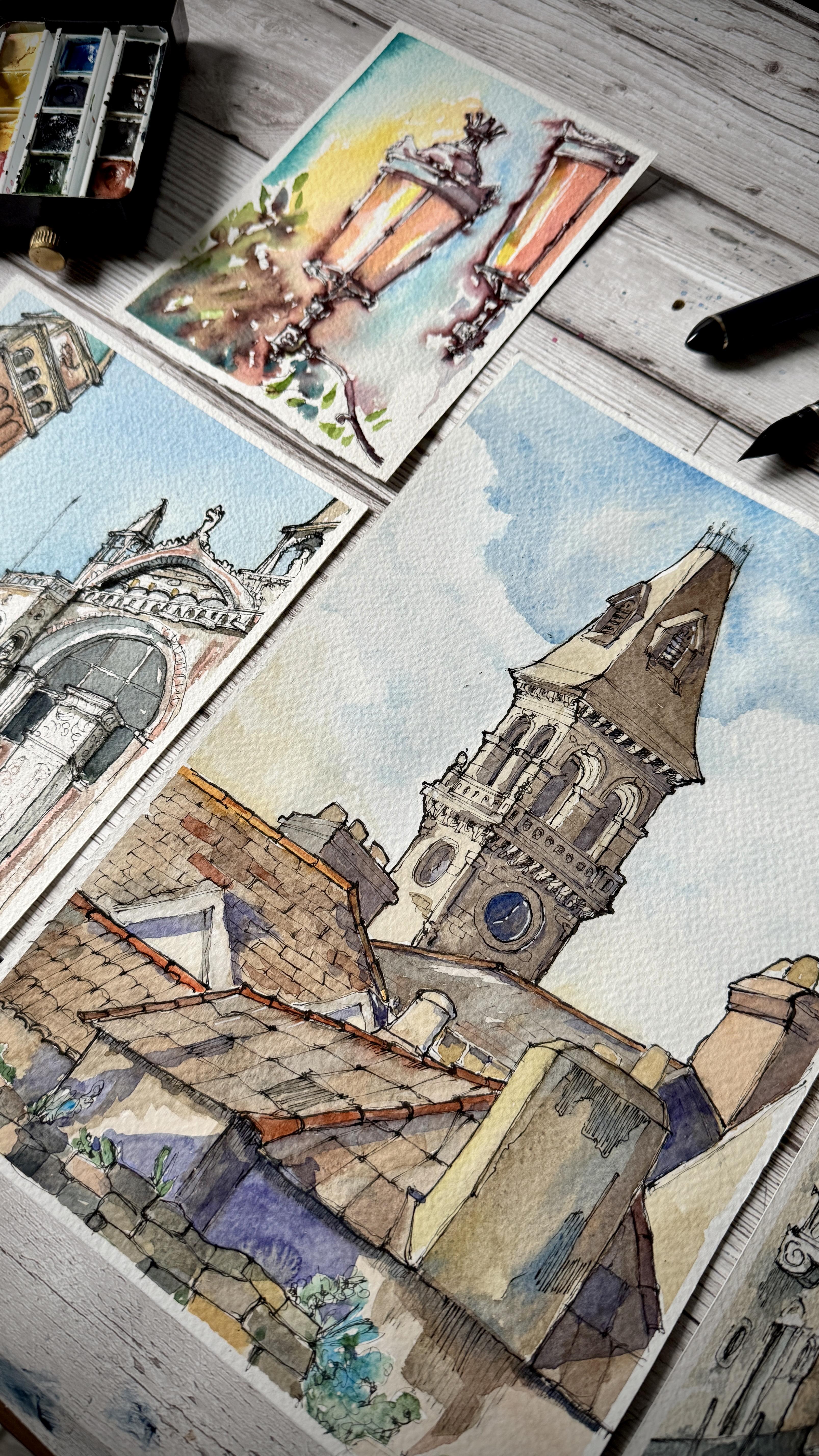
Transcripts
1. Introduction to the class: Hello, and welcome to this
skill share class. I am Sam. I'm an artist and illustrator
coming to you from Ireland. I'm a self taught enthusiast
in watercolor painting, urban sketching,
and oil painting. I specialize in
architectural paintings, landscapes, and portrait. Over this class,
we'll find out how to recreate and paint a
beautiful architecture. We have a look into
the art materials, the supplies that you probably already have in your toolbox. We will look at some
prospective rules, but everything really simple. There's no need of becoming
an architecture to be able to draw and
paint architecture. We will look, of course, at inking and the
watercolor painting. I will recommend you what
shades of color, hues, and tones you will need to recreate a beautiful
architecture around you. As well, some of the painting techniques that I found works for me very well. You will be able to follow along step by step with me while we paint a urban landscape
from the very beginning, from the very sketch, all the way down to inking, coloring and refining
with all the details. By the end of this course, you will be able to go out, take beautiful reference
pictures or paint from nature. You will be able to gather simple rules of
perspective to applies to your everyday urban
sketching and as well some techniques of
watercolor painting. So please join me on this class, and I'm looking forward to seeing your beautiful paintings.
2. Materials: Okay. Okay. Let's talk about the material first. Let's start from
the very beginning. I do like to use
watercolor paper, and I would recommend you to use 100% cotton watercolor paper
of about 300 GSM in weight. You can find this easily in your local art supply shop or in any stationary
shop nowadays. This specific piece
of paper has been cut from a larger
watercolor paper, and it's from the brand canson. I do like to stick my page on a hard surface with
some masking tape, and you can find this easily in your local art supply
shop or hardware store. I'm sure you have this
around the house somewhere. It's very, very handy. Starting from the beginning, we need a pencil. I am using this general
plastic mechanical pencil with a two HB lead. It's very helpful, especially
if you're traveling because it keeps the
point sharp all the time. Of course, a rubber or eraser. We would need a set of
waterproof ink pens. I am using a fude
nib fountain pen, which is this pen
with a bent nib, which allows you to get
a lot of line variation. And I load this pen
with waterproof ink. So whenever we apply watercolor on the
top of the drawing, the water won't
destroy your drawing. And on the same line, I like to use a couple of different waterproof
fine liners. These are very helpful once
again for line variations. I'm using a white gel pen, and this is from sakura, which is probably one of the best white gel
pens that I found. It's very helpful for the
final details overall. In terms of brushes, we don't need to be too precious about our
watercolor brushes. I have here very
inexpensive brushes. They are all round brushes
of different sizes. I would recommend
at least three. I have a mop brush here, which allows for thick line
and a lot of water is perfect for washes and keeping
your color quite flat. Raphael brush number 12, which is a medium size between the thick mop brush and this number two round
brush that I have here. Once again, all we are looking
for is line variation, both on the drawing side and on the watercolor on
the painting side. We need, of course, a
watercolor palette, and as you can see, this
is very well loved. It's a set of watercolor from different brands that I
collected over the years. During this class, I will go through all the colors that I have here and I will be
using for this painting. Don't fear, this is all up
to your own imagination and, of course, the material
that you have at your hand. And lastly, we need
our jug of water. I'm not fussy about having clean water on the
side and dirty water. I think all will add to the
composition of your painting, and it's just a matter
of being playful and learn from your
drawing and your painting.
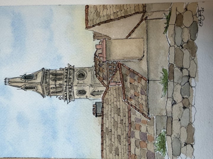
3. Drawing part 1: Has so as you can see, I have taped my
paper on the page. This helps me very
much in keeping the page attached to my surface and not
bubbling up when it's wet. And as well, we'll keep a little bit of a border
around the edges, which is quite nice. So let's start with
our pencil here. And the first thing that
I want to do is just having an idea of
the main shapes. So we do have a tower. Which is more or less in
the center of our painting. Halfway through, we have the
top of the houses starting. And I'm just marking this very, very boldly on the page just for you to get an idea
of where we are at. Down towards the bottom, we have a little rock wall
coming up all the way through. Now, let's decide that we
are focusing on the tower, so the upper part
of the painting. And as you can see, the tower
is divided in three parts. So we have the top
part of the ceiling, a middle part where we have those beautiful window and the bottom part with the clock. The tower is as well divided
in two parts vertically. So we have one quarter, more or less one third of the
page is the one that is in the light coming
from the left and then we have the
two bottom parts. Now it's time to focus a little
bit more on the details. We can start from the top. You see the First of all, the ceiling on the
top is slanted a bit. It's in perspective, of course. I'm not going to teach
any prospective classes because I absolutely
despise perspective. But a good way to
give an idea of the perspective is just
to follow what you see. On the left side, I see
a line that slopes down, and the same happens
on the right side, though the sloping is a bit
less pronounced on that side. Now you can see I went
out from my main shape. This because we have
a bit of a leap on the top of the
beautiful covering, which is going to be
outside of our main shape. Now for clarity, I'm going
to join the lines there. Now, you can see that the
line in the middle that divides the two parts is almost perpendicular
to the horizon. I'm not going to
stress it too much, give it a little bit of angle joining in
towards the bottom. The same way, I'm going to
join in the other piece of our top and same
with the right side. On the very top, we don't really see much, but we do have two
lines that more or less follow the same slant
of the bottom here, full of perspective if you wish. If you prolong this
line over your page, you will find what's called
the disappearing point, which is the point in which all your lines should join in. This line as well from
the top should join in the same disappearing
points and this as well. Let's see how it works. We have our building the
two sides of the building. Let's see our disappearing point is here and the
other one is here. This is two points perspective
and the two points. This first line will follow
the first point over here. This other line
will follow point, the second point over here. Let's say we go up
with our building. This point don't move. So if we want to add a line up here and
maintain perspective, we just need to trace
our line all the way up there and same with this
line all the way down here. So this piece now
is in perspective. If we apply that
to our building, it should result in
something like this. Back to our beautiful
tower bell here. Let's go down towards the
bottom of the tower bell. We do have another leap here. Which always follow the
idea of perspective. So the line will
be thinner towards the disappearing point and
wider towards the center. Now, we do have two arches. I'm keeping in mind these
points here because I want the arches as well
to follow that line. Although I really don't need to be precise in this occasion. We're not building a tower bell, but we are definitely
drawing it. So two arches on one side, and two arches on
the other side, you can see that one is taller than the
other on both sides. Same disappearing
point down here, you see how the line now are sloping in
different direction because I decided to add my disappearing point
on the top here. I would be watching
from up here somewhere. At the off way point
of the arches, we have another
little leap that of course follow us into
the perspective. Now, let's start with the town that I'm more or
less seeing on this painting. Now you can just be
free from every sort of perspective and letting your
imagination just go free. You see, I talk a lot
about perspective, but the main thing is
just to draw what you see on the page and remember
to get those slanting point, disappearing point, both on
the top and on the bottom. So for example, I'm painting I'm drawing
this ceiling here. I know that my perspective
point is up here somewhere. So instead of tracing
my line straight, I might just give
it a little slant to suggest that this line
is into perspective. I'm not going precisely
to draw my line as it was conjuncting into
the disappearing point, but I'm going to
give an idea there.
4. Drawing part 2: So we have our drawing
more or less done. I haven't added
many details yet, but this is the second
part of our class. We need to add details. And to do so, we need just to have a better look at the image. Let's start from the top.
What do we see here? We see a tiny, little bit of a
fence owning thing that I am just going
to suggest in pencil, not being too precise. Down here, then we have
a bit of a window, and I am just penciling it. You see how I slanted this just towards my point of perspective, but not really
being too precise, putting it there to
suggest the perspective. We have another window here. And, same, I'm going to
suggest the perspective by slanting my lines just towards
the disappearing point, a tiny B, not too
much over there. Going down, we have some
other awnings over here where the ceiling is joined to the main body
of the tower bell, and I'm just penciling
them little squiggly line. Going down, we see the
top of the houses. So something that
I do like to play with is all these different
tiles and rooftops. And I like to create tiny
little bitter roof tiles, just using this sort of
scale type of motion. And going down, following
the line of my roof, as you can see, I
trace some lines. This will be my guide
for the roof tiles. And to do the roof tiles, I'm just going to kind of join these lines with a
bit of arch motion. These are big tiles. I could have gone
down very much. Same with the other ones, I can just play around
with the different type of tiles that exist,
especially over here. In Ireland, we have beautiful
slate type of tiles, but as well terra cotta
and other situations. Now that my rooftops
are more or less done, let's concentrate for
a bit on this wall. I do not want to get
the entire wall drawn, especially now at this stage. But I definitely like to give some sort of accent of
a wall being there. And to paint to draw dry walls, I just would recommend you
to just make a couple of squiggly line to
suggest our stones. We don't really need much. Just a couple of squigly line. We have some vegetation
here that I'm just going in and recreate
with more squigly line, suggesting our leaves that
are growing everywhere.
5. Inking: So let's start inking. For the inking, I'm
using this fountain pen. This is a food nib fountain pen which allows you to get
a lot of line variation. Especially allows me to draw wider lines at the very
edge of your painting. I do prefer in my style
to have these bold lines embracing the whole perimeter of the figures
that I'm painting. The first step here will be just go through the perimeter. Once again, we don't need
to be super precise, but a little bit of precision over here
might be required. So now we're done with the
outline of our drawing. The next step will be
inking the details, and I'm using a fine
liner to go in all of this line that require a
little bit of more precision. And at this stage, you really want to
be precise with your lines because it's what then will remain
on your drawing.
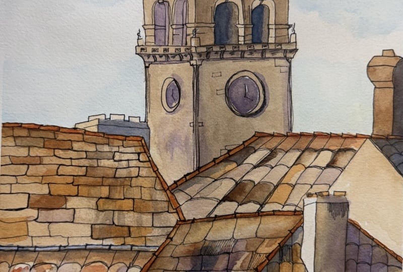
6. Painting the background: Here we go with the
completed work. It's all ink, and it's probably looking a bit different from where we started, but that is exactly
where I wanted to go. Now it's time for us to
start with the watercolor. Now, you can decide to erase your pencil mark
or leave them there. I do very much prefer to leave
all my marks on the page. Let's start with the sky. I always always
start with the sky. I load my brush
with clear water. There's probably some
red in that still left from my previous
painting, but that's fine. I'm just popping some
water on the sky, what is called a wet
on wet technique. Using a fair amount
of cerolem blue, I start from the top and very very slowly bring it
down to the bottom, adding water as I go. Now, I'm not going to add
any paint to my brushes. This is just a clear water. From the top here, I will
just drag down my color. Be mindful of not really
wetting your inside parts, a shade effect type of thing. Still just a clear water. Now I'm deciding to put a
cloud here in the middle. I'm going to leave a
little space between the wet area and the underneath. Loading a tiny bit of my color. Again, I'll start from the
underneath of my cloud and dragging the paint all the way up where I want
to be filled in. Just a tiny amount of paint. We want the vast
majority of the paint to be on the top part of our sky. The sky is darker on the top
and lighter on the bottom. I'm actually going
to wash my brush and now with just the water take up a little bit of this paint down here that I didn't
really want dark. Now, a good technique
that I learned is adding a little bit of yellow ochre
down the bottom of the sky. He's wet. I'm just
dabbing a tiny bit of yellow ochre and allowing it to spread with my wet page. Now I wash my brush
again, clean brush, gently bringing the yellow ochre towards the top of my painting. Now, once again, loading my brush with tiny
bit of cerulean blue. This is still quite
wet as a page and on the very edge of
my cloud on the top, I'm adding some paint on one side and on the
other clean brush, water, dragging up my paint and making that hard
line disappear. Here we go. I think
this looks quite nice. I just don't want hard lines, and I want to remind
ourselves that we have dark on the top and light
in the bottom of the page. With the same mop brush, we're going to start filling
in the buildings down here. As you can see, I'm avoiding touching the tower because
it's wet all around. I just want to work my painting but work it in spots
where I can work on. Yellow ochre and some
transparent amber, you can definitely use
whatever brown color you have, but still give it a bit of yellow ochre to
soften up the edges. My brush is very
wet and I'm going in only where the
roof tiles are. This is just a way to
give myself some surface to paint on later
and add my color.
7. Painting details part 1: Now, while this is
still a little wet, I'm going to use
some neutral tint, or you can use definitely some gray color that you
may have on your palette. Please avoid using black. And just start figuring out
where my first shadows are. Now, the lights come
from the left side. So all the shadows are
projecting on the right side. So I'm just going
to figure out where there are possibilities
for shadows. Don't need to be
super precise here. Just have sort of an idea where you think your
shadows may be going, and that's almost it. While I have this gray color, I'm going to start filling
in some of the rocks. Just put a puddle a real puddle of paint
down on a couple of rocks. This helps making them
to look more natural. Now my tower is almost dry. I go back with my combination of brown and yellow ochre and start filling
in the whole thing. Here we go. Now, let's change color. The towel is wet. Everything else is almost dry. I'm going in with a smaller
brush and I'm picking up some quinacradon gold
and some orange color. If you have on your palette some red and perhaps a warm yellow,
that's completely fine. I'm going to paint
very carefully all the tops of my roofs, all of them, the tiny tops. Don't be afraid if
the color spread, that is a plus that I'm actually looking for in
this case over here. If the color doesn't
spread at all, I'm just cleaning my brush and dragging a bit of water down to touch the orange color and get it to melt away
just a little bit. I'm doing the same
on all of the roofs. I'm adding some purple here just to bring up some of
these roof tiles, just a tiny little bit, one here and one
there without being super precise back
with my orange on the very top part and then down one tile
here, one tile there.
8. Painting details part 2: Good. We have done
our first step. Let's start filling in
some of the details. And to do that, I'm
using my thinner brush. This is the number
two Rafael brush. I am loading my brush
with some burnt umber, which is a very dark brown. You can definitely decide
to use another brown color, adding, of course, some blue. Now I'm going to paint what
is in very dark shade. And leaving out everything else. I'll be quite precise in
this case just because we want the shade to
be quite accurate. I found that this is
what gives the majority of my painting a bit
of natural looking. Now, let's go on with detailing. The paint is completely
dry or almost, and we are still going to
play around with our brands. I got here a darker brown. This is a burnt umber. Once again, I'm
going in and filling all those areas that I think
may be a bit into shadow. As well as blotching some
color here and there to bring a little bit of
life into my painting. I especially want to
bring some depth of tones into these tiles that are absolutely gorgeous,
in my opinion. With the same small brush, now I'm starting to
fill in the plants, and I am using my very
favorite sap green. Sub green is the most amazing
natural looking green that you can imagine. I'm just very randomly filling in all the lines where
my leaves were drawn. Now, definitely don't
need to be precise here. I'm going to add some
ultramarine blue to the sub green and while
it's still wet, I'm just dabbing some color on one or two leaves in order to give some depth to
the leave themselves. Let's focus on the tower. Ultramarine blue, you
can use purple as well. I think this time will go with an ultramarine
blue though. We need to define the
shadows once again. It's all a matter of
defining shadows if you have understood
my painting style. And now we just want the
deepest deep of the shadows. I'm going to have a look at my reference photo and
just follow what are the deepest shadows that I have only those
and nothing else. So ultramarine blue and
my very thin brush, dabbing here and there
where the shadows are. Don't be afraid of the blue. I assure you it will look
amazing when it's dry.
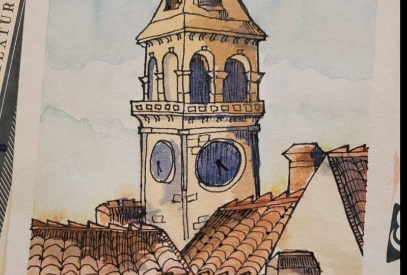
9. Finishing: Here we go with our finish
work in terms of watercolor. Now, it's all a matter
of adding more details. And to do so, I'm
using two pens here. I'm using a fine liner for
the little rock details, bricks and so on and so forth, and then some white gel pen in order to add
additional details in terms of lights and
reflection of the light itself. So let's start analyzing
our drawing and see what we can do in order
to add some of these details. Let's focus on this part here. The fireplace. As you can see, while painting, I left some marks in
terms of darker paints, for example, or different
ton of paints right here. Something that I like to do
is add some etching down towards the marks that I have
left with my watercolor. And these vertical etching
lines will have two functions. One is to add more of
that feeling of shadow, and the other one is to add on the texture of the materials. Now, down here as well, we have this big
splotch of color. Something that I like
to do is to outline it. More or less, and then back
with my etching technique. When I'm saying etching, I'm just saying nice and
squiggly vertical lines. It's just a matter of
analysing your drawing and find the sides in which you want to add this bit of etching. Right here, we do have
another puddle of paint that I will outline and I will add some of my
etching as well. Then you can just experiment, analyze your own drawing
and find this type of situations in which you would like to
add some etching. Sometimes you don't even need to outline your piece like here, for example, on this blob here, I'm just going to add some of my vertical lines following
more or less this shadow, not being really accurate and as well not outlining the area. Something else we
could do to announce our details is refining
a bit the roof tiles. When they connect,
I would just add a tiny bit of ink with my pen, for example, here, they connect. I just add a tiny bit
of Ink here and there. I don't need to be precise. This is a brilliant technique
when it comes to rocks and dry walls in the middle
of rocks of your stones, rather, just add a little
bit of darkness of ink to suggest where the rocks are connecting
one with the other. So let's talk white pen. This is a gel pen. This is meant to add tiny little bit of light
where it's needed. Usually, you can see that
from the reference photo, but if you cannot, of course, you can come up with. And remember that the light come from this side from
the left side. Everything that is
in the light can be accentuated using
the white pen. An example could be this statue. Here, I can just add
just a tiny bit of white in order to get the feature of the statue to
pop up a little bit more. I like to add some light here on this arch just to show that this is
catching all the light. Of course, it's not
there in real life, but I do like to have this
as a narrative for my story. On the top of the roof, just a tiny bit of
light here where it's catching all the
beautiful light, but really not that
much, just a touch. Of course, you can if you want, add some touch of light using your etching technique that
really works very well. My clock because the light come from this side
from the left. We are on the right side where it's showing all the light. I'm just very gently
outlining this clock, not that much, just a touch. I think that is it. You just now need to let this dry completely and if you want, go back in with your ink and
add more and more details. I think if I keep looking
at this painting now, I would keep working
and adding details. This is the part that I
really enjoy very much. So let me know if you
have follow along, please consider to
share your project with me and tag me on Instagram. Of course. You can
find me following the links below or
at Irish Farm Art. I'll see you very soon. Thank you very
much. And bye bye.
 Sam, Watercolor | Oil Paint | Soft Pastels