Transcripts
1. Introduction to the class: Hello, everybody, and
welcome to another of my skill share
classes. I am Sam. I'm an artist and
illustrator coming to you from the heart of Ireland. Today, I would like to
bring you on a journey on how to draw and
paint in watercolor, beautiful, realistic
snowy mountains, exactly like this one that has somehow become
my signature style. Drawing realistic mountains
is very useful if you like to venture outdoors with your watercolors and
your sketchbook. There's nothing as exciting and beautiful than
gorgeous snowy peaks. Capturing the moment is all
what it is about watercolor. And during this class, you will learn how to draw with ink these
beautiful landscapes, how to quickly interpret
shapes, shadows, light reflection, and
the patterns that the snow is creating on
these gorgeous mountains. You will learn to
use watercolor in a very clever way to
blend them and create all those beautiful
moments that are so characteristic of a
wintery landscape. In this course, we'll go through the materials
that you will need, and these are all
simple materials that you probably already
have in your arsenal. We'll discover how to find the perfect reference photo
or the perfect position. We'll discuss drawing
techniques, and finally, the painting stage
with a master class on blending colors to create
beautiful shadows and lights. I would like to take
a moment to thank everybody that joined my
previous watercolor classes. It always means so much when
I receive a nice comment, a feedback or see your work
uploaded in the resources. The end of this
course, I promise you, you will have all
the skills necessary to draw a realistic,
snowy landscape. So without any further ado, let's jump onto the class.
2. 1) Choosing your reference photo: So the first thing that I
want to talk to you about is how to choose the
perfect reference photo, or if you are out and about
and painting plan are, how to choose the
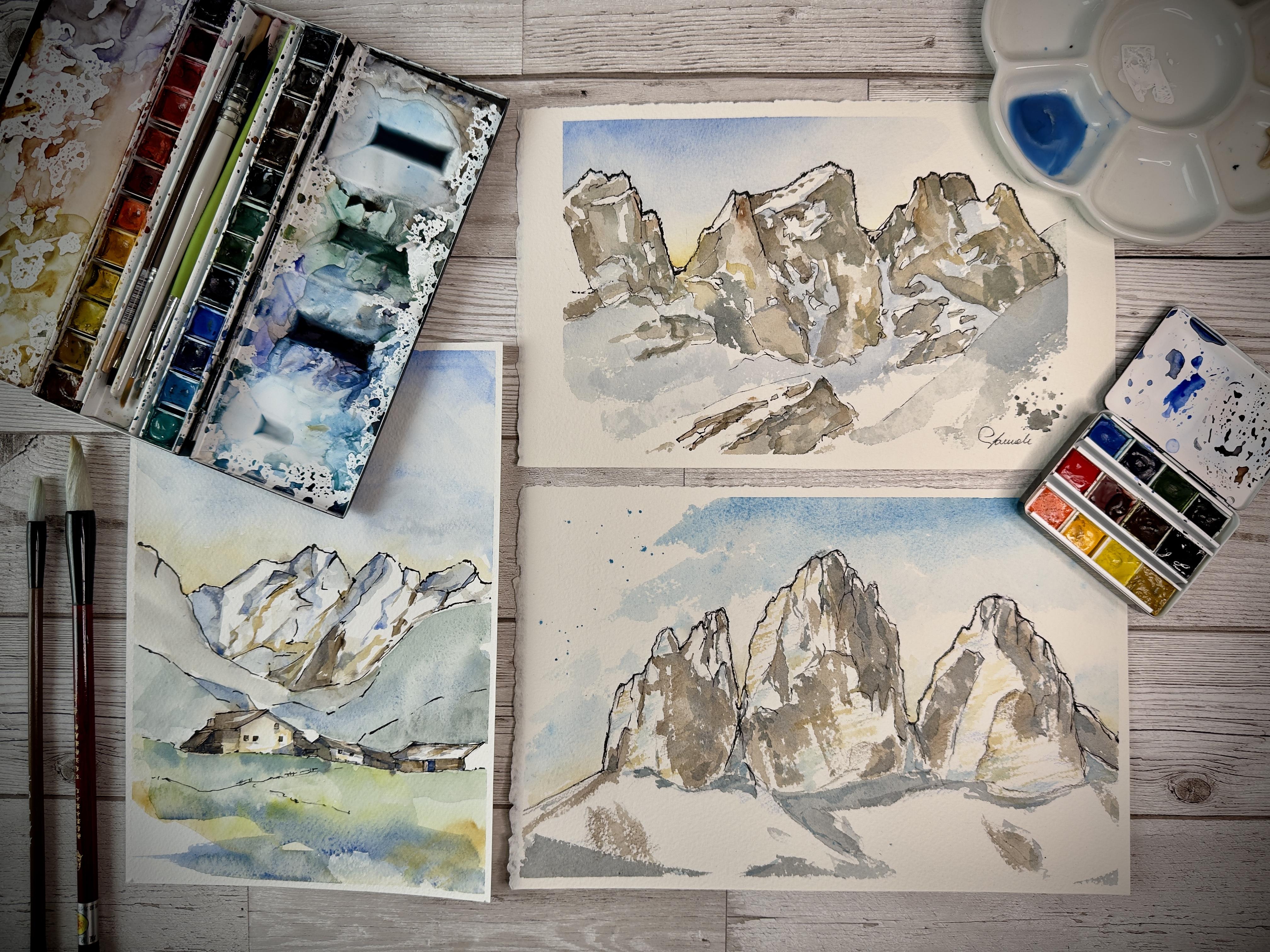
perfect visual position. This is an example of a
painting that I have done, and you will be
able to learn how to make yourself,
to paint yourself. It's a very good example
of how a landscape should look like being a
reference or a real place. We have quite a bit of contrast
between the lights and the shadows and then as well creates a lot of
contrast as you can see. The first thing to learn how to choose on how to choose your
reference photo is actually to take good care of seeing
where the contrasts are and finding a reference that actually have
a bit of contrast. Because the snow is very white. If we don't have
much of a contrast, it's very difficult
to figure out where shadows go and
where the lights go, where the reflections are. You have to notice that this is quite a beginner friendly class. We want to get our life as
easy as possible in this case. From that, you can
actually graduate into more difficult images, more
challenging landscape. Let me show you a
couple of pictures that we may actually
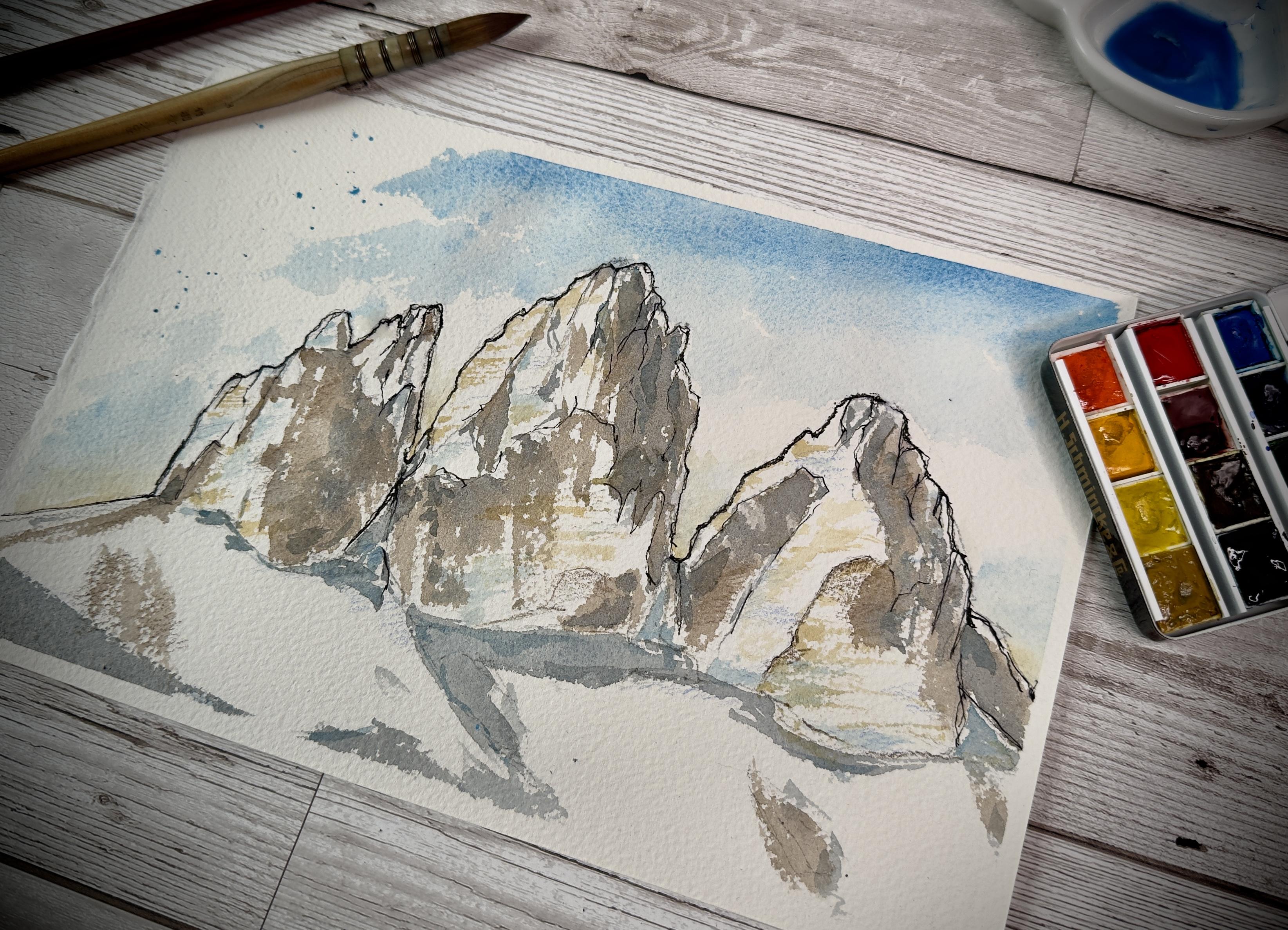
find interesting. This first one is the one that we are going
to paint today. These are the three sisters or the three peaks of lavado
in Northern Italy. As you can see, we have a lot of contrast between
shadows and lights, between the snow and the rocks between where
the sun is shining. This is a very good photo
to help you get starting in understanding how to paint snowy mountain in
a realistic way. Let's have a look at the
second picture here. These are the same mountains, but they are taken in a much lighter light,
much brighter light. We have virtually no shadows. The contour of the mountains, the outer borders are really, really fuzzy and quite difficult to picture
to understand. So this is not in my opinion, a brilliant reference photo for this beginner
friendly class. You may want to get back
to your previous one. If you're out and about, I
know it's quite difficult, but I would recommend to choose a very sunny
and bright day. That as well will help. If it's actually snowing, you may find it much
easier to sit down for a couple of hours to draw and paint when the sun is shining.
3. 2) Materials: Now, the second stage is talking about materials
that we need. The first thing and the most
important is your paper. I'm using here Arches paper, 300 GSM, 100% cotton. I really hope you can see
this from the camera. It's a rough paper, it's a big, big texture. This will help massively
when you're trying to create that natural feeling
of the rock and the snow showing down
or your painting. If you can see from my
previous painting here, where the roughness
of the paper gave us this white spots that
all is natural feeling, and that's exactly what we want. So please go for
your favorite paper. Just be mindful
that if you choose a rougher paper that will help you a lot when it comes
to the painting stage. We need our pencil. This is just a regular
two HB pencil. I warmly recommend you to
go light on your pencil, choose a harder ledge of pencil. We don't want strong
pencil marks. A eraser, then we will
need your array of inks. These are all non water
soluble ink, waterproof inks. I have different pens here. This first one is
a fountain pen. It's a fountain pen nib, very fine that I have loaded
with the atraens ink, which is waterproof
and it doesn't react basically with
your watercolor at the painting stage. I have here another
odd fountain pen. This is a food nib pen. Food is a Japanese
term that means brush. The nib is bent, so it allows you to get lines
variation quite easily. This is absolutely not
necessary for you to have, but it helps a lot when you get to create different lines, different type of textures. Then I have some fine liners, number 01 and 03. I am using as well, two pencils. These are from a fiber
castle the polychroms range. We have here a light
blue and a dark brown. This will be used at the
end of our painting just to get some of the details
highlighted a little bit. Finally, our watercolor palette. We're probably going to use just a couple of water colors. So I will tell you
exactly what you need, and I'm sure you will have
them in your palette, even if you have a very beginner friendly
student grade palette that will be absolutely
enough for you. Lastly, a couple of brushes. I have here a Rafael
number two brush, very thin round brush, and this French quill
brush Number two, these are synthetic
brushes, very inexpensive. I do not absolutely recommend to spend a
fortune on brushes. First of all, because I couldn't afford them myself and second, because I think these
are more versatile. If you're out and
about, you drop one on the ground and
you've lost nothing, just a few Bob's
not worth to spend a huge amount of money on brushes at this stage, at least. So these are the
materials that you have. Please feel free to comment below for a substitution
of the materials. I'll be really happy to
assist you with that.
4. 3) Drawing stage: So before we start drawing, let's set up our paper. I do like to tape my page
with some masking tape, and the surface here is just the back of a
canvas board with the paper covering
the cling film on the top of it is just
basically out of the shop, and having this plastic covering
helps because it allows the moisture of the
watercolor not to draw onto the back of the surface and
to stay on the page, which is very helpful. Okay, your paper is prepared. I'm going to move my painting a little bit so I can put
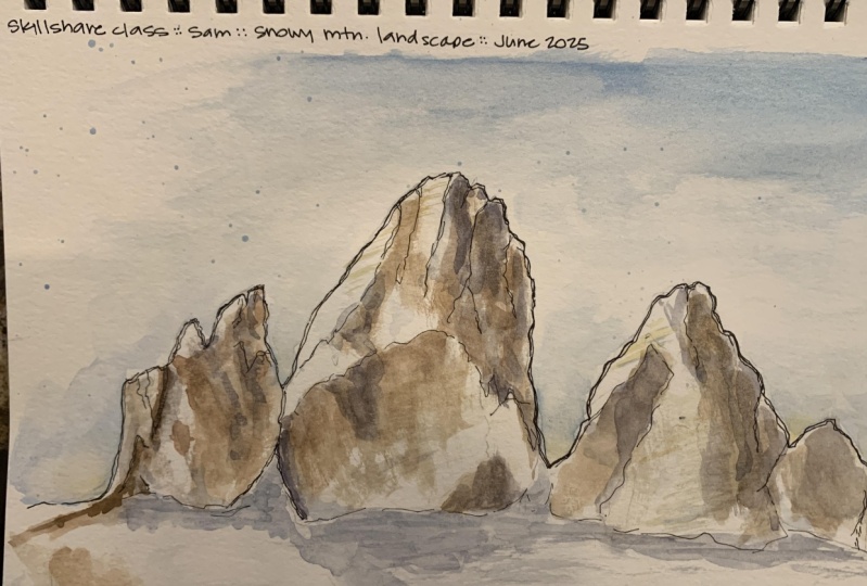
my reference photo there. So let's start with our pencil. What are we looking
for the first thing? Well, of course, the horizon. And as you can see from
the reference photo, the horizon is more
or less down here, which is about three
quarters down the page. I'm marking my
pencil quite dark, but in real life, I would recommend not to because the less
we have a pencil, the less margin that we
will have in watercolor. The next thing to figure out is the shape of your mountains. As you can see here, we
have three big peaks and we want more or less to
center them on our page. I'm going with big bold
lines at this stage, and then we will refine
the shape to give them a more natural
look on a second stage. So I'm going to start
with the center one because this will dictate
everything else that I have. I have a big egg
shape type of thing. On the left side, we have a smaller one, which is more or less a
rectangle type of thing. Then another big egg
shape on the other side. This is our basic shape
of these three peaks. As you notice, I wasn't
really precise at all. I'm just wanting to
block out the space. Now I can start from
my left peak and start giving some more of the actual shapes that
are there in nature. Once again, I'm dividing this tiny shape in
smaller shapes. So from the very,
very left side, we have quite of a square peak that goes
down almost straight. The square peak now has some surface that is
completely in the dark. I'm going to mark that. Be very mindful of marking
your shadows at this stage. We have a picky point. And then up almost
looks like a hand. This goes down almost
straight at a bit of an angle towards this valley here that I'm marking and this
will be full of snow. Now, concentrating on this, you can see that from this
piece of valley in the center, we do have quite a big shadow. I'm marking that as well. Going down up and down
towards the snowy valley. Then on the other side, it goes straight out, back in and down. As you can see, I wasn't
extremely precise over here, but I'm just drawing what I feel like is
there on the page. Then with your
eraser, your rubber, you can lightly erase the marks
that you previously made. We more or less have the
first of our peaks drawn. Let's get on the second one. The second start from this
valley is now Valley, let's call it like that. Goes up a tiny bit. Then we have shadows, which I'm marking up again in a smooth motion
towards the center top. Then we have a teeny tiny
valley on the top of there. I'm calling that
valley because I have no idea how to refer to that. Down, we have another peak down, and then it's almost straight
down towards the base. Let's get inside
how we did before. We have our first big piece of light here that is showing here. I marking that I'm just
marking what I see. Be careful of studying
your reference photo, very much and mark what you see. Here we have a lot
of horizontal lines. And all this part here is
basically in the shadows. But I'm seeing that we
do have a big shape here that is of a
lighter color of rock. I want to get that information
in my drawing as well. Here we go. Third
and final peak. Let's start once again with the outer part goes up
in a ragged motion. Now we have a bit of
a shadowy piece up here and down in another
sort of rugged motion, and this ends up here. Now, second piece,
mark the shadows. I see that there is this big mountain pushing a
shadow on this other one, which has more or
less the shape and then a different color
of stone of rock here. More or less, we're fine. From the top here, we
have another big piece of shadow that goes down here. Let me erase the marks
that I don't need. And let's have a
look to the bottom. Starting from the
left hand side, the horizon goes down and
then up like a U shape, an inverted U shape, and then down as a proper
U shape at this time. Then we have this snowy valley
here that I'm not marking. This goes down this way, a little bit more probably, and then up until this point, this is snow as well. Snow down here,
and then up here, and this is, again, snow. You can see snow is fluffy, so we get all these smooth lines which are very, very nice. Another thing that
I want to mark is the shadows on the snow. And so the light
darker gray part, we have a big piece here, and then the mountain
cast a shed over there, and we have basically nothing
here, just a tiny bit. Down here we do have a patch of darker ground where the
snow has not attached much. So I'm just marking
that quite briefly. Now, with your rubber, you can erase all the
lines that you don't need. A simple as that you
get your drawing done. Keep your pencil as you saw, I don't keep my pencil right to the point
to be super precise, but I keep it almost
at the very edge just to allow me to
be a bit shaky that shakiness really helps
very much to get some natural feeling on your
mountains, on your peaks. We don't have anything that is straight when we
talk about rock. We talk about
natural landscapes. So keep your bans
quite at the end, allow it to be shaking,
and that works. Next step will be inking.
5. 4) Inking stage : So as I mentioned
before, to ink. I'm using a variety of
pens with waterproof ink. It's very important to
have a waterproof ink, not to get the watercolor to smudge everything when
we apply water on it. So the only recommendation that I have is check your
pencil, your pens, your inks and get as much as
you can water resisted ink. So you can use a fine
liner like this. This has a felt tip, or you can use a fountain pen. It's completely up to you. The first thing that I
like to do is to trace the outer edge of my
painting or my drawing. And once again, I am
holding my pen quite at the edge to allow some
wiggly, squiggly lines. Lines to appear on the page. I can change this pen
with a fountain pen. This allows more squiggly line by the nature of the nib itself. So the first stage
is just to trace your borders and be
quite bold there. If you want to apply
my style of painting, be quite bold with your edges. I do enjoy very much
a really bold edge. If you are happy with that, let's get into the nitty
gritty of the situation and mark some of the lines that we have on the inner
side of the mountain. In this case, I
just like to mark a rock rather than snow. Rock meaning all
that you can see, all the crevices
that you can see in the stone of the mountains, in the rock surface
of the mountains, rather than shadows and lights. We have that
information already, so we don't really
need them very much. I want new information
on the page. I want cracks, rocks, and that is basically what
I'm trying to mark here. I'm still following my
reference photo but very, very lightly at this
point because I A, know how the picture look like, and B, I'm just following
a bit of a free motion. And once again, you
can use fountain pen, you can use your fine
liner, play with sizes, play with different
type of nibs that always help a lot to get
more natural feeling. Now, using a different nib, I'm using here a food nib, which is a nib that allows
you to get some bolder lines. You can use a wider fine
liner like 0.3, 0.5, even. I'm just tracing some
of the outer edge. As as I just said,
as you remember, I do enjoy a bolder a
bolder edge to my painting. Be careful not to
smudge your ink because now it's quite wet. So it's very helpful if you use, like, a toilet paper, a piece of toilet paper or a tissue just to
put under your hand and be careful not
to smudge the ink. Here we go with the
final drawing done. The next step will be to paint. I am not going to
erase any more lines. I want all the information to be on the page when I
apply my watercolor.
6. 5) Painting the sky: Alright. Let's start painting. I'm using my watercolor
palette here. Two things I want to remind you. First of all, keep
your palette dirty. And I'm mentioning this over
and over in my classes. Having your palette dirty
helps you for two reasons. First of all, to
remember colors. I have all the blues
here, the green, the browns, the yellows, the red, the purples. I know the shades there are on the palette and what I
want to create afterwards. So I can remember the colors. If you paint a lot. This allows you as well to maintain a sort of
style of painting. Maintain the same
palette of color. It's very important for me to get some sort
of consistency. So keep your watercolor
palette quite dirty. That will help a lot. Then the second thing is water. Many artists use two
vessels of water, one clean, and one dirty. To keep them
completely separate, I prefer very much prefer to get just one pot of water
just to once again, help melting all the
colors together, as well as if you
are out and about, you don't want to carry
a lot of water jugs. You just need the
minimal amount of water, and that was the second thing
I wanted to recommend you. So with our paper, let's just brush away all the dust this is important as well because I've noticed with some cheaper paper, usually with arches is not really the case,
but cheaper paper, you tend to leave finger
marks on the paper and create some oily surface that doesn't allow the paint
to stick very well. So brushing away with a
piece of kitchen paper, toilet paper helps a lot
to remove that as well. So it's very helpful tip that
I didn't know about before. I struggle quite a bit. So let's get our
bigger brush wet. This is a number two
French quill brush. You may use whatever
round brush you have, and that will work
absolutely fine. So first of all, let's
start with the sky. Water, I'm using Ceroleon blue with quite a bit of
water at this stage. The thing that I like to do
is to mark the sky first. So as you notice from
the reference photo, the sky is darker at the top and goes
lighter at the bottom. And we have quite
a big cloud coming up here that I'm
somehow referencing, but I want to ignore as well. So when we have our first line, just put some clean water on
the brush and drag the color down touching quite lightly
the mountains surface. More water, more clean water, dragging more the color down. We want basically to
have a gradient from dark on the top to
light at the bottom. We have this big cloud
coming horizontally. So I'm going to leave a gap
and start again down here. I want to go quite light. Now, with your dry brush
or the toilet tissue, just dab a bit the
edges of the cloud. Not too much, just a tiny
little bit to soften them. More water, more cerolem blue. And I want to emphasize
just a tiny bit, the top part of the sky. This helps a lot the colors to melt together
big brush strokes. Don't be afraid of
what will happen. We have two things
that helps us here. The paper being rough allows
you to get a lovely texture, and then as well, the watercolor itself is really
melting into each other, blending into every stroke. So you don't really get to work too much on the
actual wash of color. Yellow ochre. This is a little
technique that I learned by painting
a lot of mountains. We want yellow ochre
just on the very bottom. Just a tiny touch
and allow it to blend with a tiny bit of
cerulean blue that you had. This not just reminds
us of the sun that is shining underneath
behind the mountains, but as well, give some
sort of natural feeling, I would say, to your painting. And with some clean water, I'm just blending it upwards. Once again, dry brush
or some tissue paper. I'm dabbing a tiny bit. If you want, you can
get some serolem blue on your brush and just splash a bit of color here and there. This is not a must,
but I like to include that in my drawing, as well. So, the sky is done. Let's get started with the
first layer on the mountains.
7. 6) Painting the mountains (first lawyer): Same big brush, water,
and burnt amber. Now, what do we want to do? We want to block out
a bit of the shadows. The paper is still wet, so I'm just mindful not to get into touching the
blue very much. I'm not fussing
letting stuff dry too much because I'm always mindful that if you
are out and about, you're not going to let
your paint dry too much. We don't have much
water on this brush, and we want just
to highlight some of the shadows in our picture. Highlight probably is
not the right word, but you got what I mean. We want to indicate the shadows. And be mindful here. The
sun comes from this area. So all the shadows
are on this part. And this is just
pure burnt amber. You see how already it starts to look like a snowy
mountain peak. Let's get even further. Grey color. I'm using pen gray, but you can use natural
tint or a combination of cerolem blue and your burnt
amber is completely fine. With this, I'm just
going to lightly touch the darkest of the dark where
I previously got my brown. You can see some places in which you have a darker surface, and that is really, really helpful to allow
this gray tone really to highlight that you see how the color spreads quite beautifully when you
touch a wet surface. Once again, only the dark of the darks don't get into anything that you
don't want to get dark at this stage or
at the second stage. This is very, very important. Once again, experiment with
the color a little bit, allow the paint to do its
work and to be the paint to teach you what you
have to do rather than yourself kind of
mastering the paint. You can always, of course, use some of this
tissue paper to get through Mistakes or perhaps areas that you
didn't want to paint and you end up by
mistake painting. It's always really helpful. Yeah. Now that we have
this beautiful gray, I'm going to add some
cerulean to it, just a touch. I want to suggest the
first snow pieces. And as you see, I'm going
with a very light touch and really wet paint just to kind of suggest where
the bigger shadows are. And down here, we have
just a big wave of shadow. That probably is not
important for our painting, but I want to
mention it just now. Eight. This is the
first stage done. Let's allow this to dry just
for a couple of minutes. I don't want it completely dry, just a tiny little bit, not together all the
paints much together. Let's come back with
the second stage.
8. 7) Painting the mountains (second layert): Here we go with the
second stage of painting. We are going to use
the smaller brush, loading it with
some yellow ochre. The thing that I
want to suggest here is the different tone of a rock, and we have a little bit of light as well to
suggest or recommend. And to do so, I'm just
going to drag my brush, touching very
lightly the surface on a diagonal motion
type of thing. So let's try again here. These strokes, these
diagonal strokes helps not just to get some different idea, different texture on the rock, but as well as I
just mentioned to kind suggest the fact that we have some
light shining on them. And then sometimes I
go too bold like here. So we just a clean brush. I'm taking off some of the
paint and I drag it it's very important in this case to have this bond brush as well
to keep it quite dry. We are in furnace painting
a snowy landscape, so we don't want too
much color on the page. Now, you can use your
tissue paper just to dab away a little bit
of color if you think there was too
much color in it. It's a etching technique
than with a paint brush, which I really really find quite helpful when it comes to
painting the landscape. With the same brush, don't
even need to clean it. So serolem blue. I'm doing the same now. Just an idea of a color, dragging my brush in
a diagonal motion. In this case, what
I'm looking for is the snow and the whiter part. I just want to get some of the highlights of the light of the sun to shine
a little bit. And I think cerolem blue, although probably is not
there on the picture, it allows us to have
the idea of it. I think that's pretty much it. I don't want to get too much
into dragging the color. And this is the second stage. Now, let's give it a couple of minutes to the
color to set and get in with the final painting stage and then we'll have another
little step and we're done.
9. 8) Painting the mountains (final stage): So here we go with the
final painting stage. Back on the big brush. I'm loading some of the gray
that we created before using pen gray or burnt amber and ultramarine or burnt
amber or Cerulean. And I'm just focusing
on the bigger shadows. Kind of suggesting
something more. Once again, the
brush is quite dry, so I just want to suggest a little bit more on the
mountains on the shadows. Where really we do have a
focus point, shadowy point. I'm holding my brush at
the very end as well. This allows me as same
as with the pen and pencil to get some
wiggly strokes and that will allow me to be
more natural in the feeling. Focus on the darker part
of the painting now. Especially if you
create your own gray, you can add a little
bit more blue. If you want a cooler tone, you can add a little bit more brown if you want a warmer tone. That is all that it takes to get your painting
a bit more alive. Here we go. The watercolor
stage is finished. Now, pack your painting up if
you're out and about and go home or wait just a few minutes to get the color completely dry. The next stage will be adding
the final little marks to make all the darks and lights to pop out
with our pencils. For this stage, we do need
our painting to be fully dry in order to get the pencil marks actually
to stay on the page. So let's leave it
for a few minutes. Let's get a cup of tea, a cup of coffee, and
come back when it's dry.
10. 9) Final touches: All right, so we are completely dry or
almost completely dry. Two color pencil. We got a burnt umber
and a light blue. I suppose this is cerulean blue. It doesn't really
matter, does it? What we want to do is
to add some marks. We go with the cerulean blue. Cerulean indicates some sort of shadow and some sort
of snowy component. So we will at this stage, focus on the snow. And with some very,
very light marks, I'm just going to reinforce the gray shadow that
we have all over. Here and there, I
don't want too much, and I just want very,
very light marks. This is just a reinforcement. It's completely
optional as well, but it allows us to get a little layer of depth
on your snowy part. Once again, notice how I keep my pencil and notice
how blunt the tip is. This is all part of what I was saying to get more natural
lines as possible, to get more squiggly
as possible. I'm just marking here and
there, keeping a very, very light touch where the blue is and
where my grays are. Just like that
every now and then. When we are happy with that, we can start using
our burnt tumber with the same motion of strokes, we go to reinforce
the rock side. Okay. Just being
super, super light. I think that we are done. So that was the painting done. I really, really hope you
have enjoyed the process. You learned a little bit
these few techniques that I very much tried to teach you somehow and I personally use every day in my paintings
and drawings, endeavors. If you have followed along, now you would have a
beautiful mountain landscape, following my reference
photo that you had found in the files here or
choosing your own. It's perfectly fine. This is actually a technique, a bag of technique that I
want to give you just to go out and about find your favorite landscape and
paint what you really love. If you got your painting done, it would be great if
you could share it in the final results here, that would mean so much, you just will find a link. In your class page to
upload the work and I will be able as well if you so wish
to comment on your piece, give you some ideas of how to improve your
painting skills or how to apply my techniques to your painting and as well a
final comment on the result. Once again, I would
like to thank you so much for
taking this class. It really means a lot to me. You can have a look
at my other videos on my YouTube account
and my Instagram account at Irish Farm
Art All together. That will massively help both myself to get to
know more of these people that creates this
beautiful art community as well yourself to
get a few tricks, tips on how to improve
your painting skills. I also have quite extensive
blog on art supplies reviews, painting techniques on my
website, www.irishfarmart.com. I will see you very soon with another skill
share class. Bye.
 Sam, Watercolor | Oil Paint | Soft Pastels