Transcripts
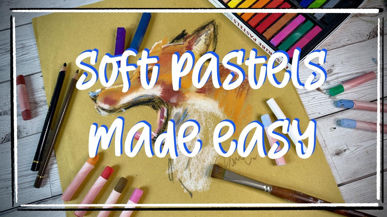
1. Intro to the course: Since I started
using soft pastels, I really fell in love with them. They are a very
versatile medium. They don't require fancy tools. They are quite
inexpensive as well. And in a very short amount of time with very
basic techniques, you can create beautifully
dreamy expressive paintings from portraits to landscapes. Hi, I'm Sam. I'm an artist and illustrator coming to you from
Dublin in Ireland. I have been painting with soft pastels for
quite a while and quickly they became one of
my very favorite mediums. I really love to sit down and create beautiful depth
in my paintings. Over this course,
we will look at the very many different type of pastels that you can
find in the market. We'll go through composition of a pastels and the materials
with which a pastel is made, and I'll help you choose
the best for you. We'll have a look
at the surfaces that you may choose and tools that are very helpful in
drawing with soft pastels. All of that you can
find in your home, you don't really
need fancy tools. Go through the basic techniques on how to use soft pastels, such as blending or create layers of colors and
mixing colors together. Yes, because you can mix
colors with soft pastels. Then finally, I will walk you through creating
your very first project. We will have a reference
photo to follow and we will create together
step by step, a wonderful little portrait. You will be able to apply
the techniques that I will teach you all
over your art journey. You can decide to apply
them to landscapes, for example, or other portrait. So without any further ado, let's get a deeper look
into soft pastels.
2. Lesson 1: Different types of Soft Pastels: So we have many types of
soft pastels in the market, and I kind of put them
together here to show you. We have very soft pastel here. These are quite choky, really, really soft and smooth. If I show you on
a piece of paper, you can probably tell it better. This lay down the color
quite softly and they blend almost to nothing with
just the pass of a finger. They are extraordinarily easy to use and extraordinarily
inexpensive. I got this huge set from a local supermarket
type of thing, so they were quite
discounted, very good price. And after painting with
soft pastel for a long, long time, I still find
this probably the best. And every time they are on sale, I always get them. They are extremely well priced and extremely
high quality. They are not probably
the most pigmented, but for what we want to do, these are more than enough, and I really enjoy
the fact that they are very easy to use and
they are extremely soft. The step up from the soft pastel
supermarket quality are the medium to hard pastels. These are a brand
that I bought in my local art supply shop, and they come into
this square form here. Once again, they are
not expensive at all. And as you can see, they are a little bit harder
than the previous one, and you can get very sharp
and thin lines with these. And when you blend the color, you can still see a bit of a mark of the lines,
the original lines. They are not a bad choice
at all for soft pastels. It's just down to
technique, I would say, deciding which one
to use is just down to how you want your
painting to turn out. In the market, you can
find as well a series of pastels in a pencil form. And these are definitely more expensive and definitely they
are harder to draw with. So as you can see here, I can be very precise
with my lines, but then when I try to blend, there's no much
blending going on. Anyway, these are
very useful to get some details in your paintings and to just touch
up the painting, and I use them quite often. The last piece of
soft pastel type of thing is, choke,
Blackboard choke. The ones that you
probably have used in primary school if you
are of my class, of course. These are extremely useful to get white highlights and marks. As you can see, from
my pastel board, I very seldom use the white
in the soft pastel set just because I think
that the choke has a coverage quality that is much, much higher than any
of the soft pastel. Have now a simple idea
on what the soft pastels are and we'll talk a bit about the composition
of the pastels. Pastels are made out of
two basic materials. We have a pigment and a binder. And this should be the main
component of your pastel. A pigment should look
something like this. It's a powder of
color, of pure color. And depending on
what the color is, the pigment type may change. The binder can be either water, water, and choke or
some types of resin. If you have a higher
quantity of resin, you will end up with a
pastel like this harder to use and less prone to
smudging or blending. If you have less resin and a higher quantity of
either choke or water, you will have a
very soft pastel, which is extremely
easy to blend as well. So which one would I choose? Well, in the end is
really up to what you find in your local art supply
shop or online if you wish. I would tend for the
project that we are making going towards the softest of the pastels
that you can find. This will allow you, A to blend the color a
little bit more use less color and be to be more expressive
with your painting. So you can get those
beautiful dreamy shadows and lights going through
the painting all over. As a general rule, though, with soft pastel, which is quite different from, let's say, watercolor or wash, try to find the cheapest
pastel you can get in your local supermarket like this one or at your local
art supply shop. For the beginning, you
really don't need to spend a lot of money on pastels. In a second moment, when you get into the groove of
painting with pastels, you may decide to invest in
a higher quality pastel set. But for now, just get the cheapest that you can find.
We'll make use of that. Now, you don't really need such a high number of
colors as I have here. It happens that I found these
two sets and once again, they were quite inexpensive. But you really just
need a bunch of color. I would say four to five color. We will see how the blending
techniques work and how you can get all the colors in the world just by getting
a very minimal set. So don't worry about
the number of steels, buy the first set you find. The cheaper you go, the
better and just get painting.
3. Lesson 2: The best surface: So let's now talk
about the materials, the umane and the surface
in the first place. I am very well aware
that for soft pastels, artists would recommend
using some sand paper, which is something like this. You can see how the
paper is quite rough. It's not really sandpaper, the one that you use
to, I don't know, sand wood and stuff like that, but it's a very
rough managed paper. And on this paper, the colors, the pastels really
lay down quite well. It's created for soft
pastels, of course. So you may want to get this try, but I would not recommend
it for the beginning of your work as this may be a bit on the pricey
side as well, can give you some headache when it comes to deal
with the paper itself. You can blend the
colors quite well, but it's probably
a tiny bit more difficult to get a
layering of colors. We will see all these
terminology in detail very soon. What I would recommend
you to go with, it's something like this. This is a piece of straw
paper that is commonly used to dry fry food or as a small
tablecloth in restaurants, for example, it's
very inexpensive. You can get a block of 500 of this little paper for about a couple of euros
or a couple of dollars. It's really effective when
it comes to soft pastels. Alternatively, you can really
use a piece of cardboard. You just want a surface that
has a bit of tooth in it. You don't want to get a fine watercolor paper
or a very shiny surface, hot press surface,
nothing like that. Just go with cardboard, bristol paper, or my favorite
is this straw paper. It's absolutely wonderful and
very inexpensive as well.
4. Lesson 3: Tools: So now we got our pastels, our surface, and of course, you may ask, we need
a blending tool. And the best blending tool
that we have is our finger. I know that pastel painters use fancy smudges and fancy
tools to blend our pastels. I really do not like that. I feel like soft
pastel needs to be a very expressive,
very quick medium. So using your fingers as a blending tool is probably
the best way to go. You can achieve so
many details just by using your fingertips
and changing finger, you have as well, different
sites of blending tools. So we don't really
need anything else. You want to be fancy, get yourself a very hard brush. Perhaps a used brush
would be even better. One of those brushes that you
used with a I don't know, acrylic paint that
I didn't really wash very well or an
oil painting brush. For example, I got
this square brush. Probably I use it with oils. I clean it and it's still
a bit on the rough side. And the other round brush, I think I use glue on this, so it's exactly what you want. I'll show you in a
second what I mean. So let's lay down a
bit of soft pastel. If you use these brushes, you can definitely get a very, very soft blending of the brush. And you create extremely
wonderful pieces of art just by using
very old brushes. Now, in the techniques
part of our lesson, we will see how to use the
brushes and your fingers in the way of layering and
as well on fading colors. But seriously, all the materials you need
are this set of pastels, a couple of pieces of paper, and I recommend using a
rough texture paper as well, I do like a color paper. I feel like white is okay, but if you go with a yellow color paper or
a grayish color paper, this would be even better. The colors would actually
pop up from your pastels. Then if you have them, a couple of very old brushes. This will allow you to get all the techniques in place and achieve everything
that you want. The last piece of equipment
that you may want to get in your arsenal is this
fixative spray. You can definitely use
air spray if you wish. Just be careful that
if you want the color to last in time and to
last in front of a light, for example, the
fixative will allow you to get some light
fastness is called. You get your painting to last and not to get yellow
or muddy in time. But if you're just
catching along, a little bit of air
spray will work. What this fixative does is basically to fix the
color on your paper. It works like a varnish and you can get to
different types. This is a mud finish, so it doesn't really change
the quality of your paint, or you can eventually get
a glossy finish fixative, which will give a little
bit of a sheen on your paint is
definitely up to you. This is quite necessary. We will see on the painting
exercise that you will need to fix your paint at some point in the
middle of the painting, it's very, very useful to have. But once again, if you have some basic air
spray in the house, that will work as
well as this one.
5. Lesson 4: Basic Techniques: So, we've been talking
about basic techniques. What are the basic
techniques of soft pastels? So let's start with
the very first one, which, in my opinion, is actually the one that
you're going to use the most. And we talk about fading. So let's layer down a
big chunk of pastel. By the way, I am deliberately
using this pastel, which are not the
softest in the world, just to show you what I
mean and just to give you a midway benchmark for
your work as well. So with just my finger, I drag the pigment powder that
I just lay down and I work into the pigment with this zig zag motion
with my fingers. You will see how this beautiful effect come
to appear quite quickly. From dark, working with your finger all the way
down in a zigzag mode, you will create this
gradient of color. This is the first technique
that I want to show you. Based on this technique, if you want to add some details with the edge of the pastel, you just go in and
you add details. And they will stay
with you forever. The next piece of technique is, of course, the
blending of color. How does that work
with soft pastels? Well, the same way
that works with any other medium. Let's try. Let's layer down
a bit of color A, let's call it, and
let's choose a color B, this very bright pink. So there are two ways
you can act here. You can blend the color with your fingers
like we just did. Let's try we apply the first
technique and we blend all the way into the pink and
then changing fingers, not as much of the
color from the pink, blending into the blue, and you can see how gorgeous of a purple will
form in the middle. But there's more. You
can definitely go ahead and blend the color
with the pastel themselves. So I lay down a bit of blue, and then I lay down my pink. And when the color
merge together, you will get the
beautiful purple as well. Now, with my finger, I go ahead and work that
purple together. And it's absolutely beautiful. You can decide to add more pink if you want
the purple to go light or add more blue if you want the purple to go
a little bit darker. Now, we saw brushes before. How are we working with brushes? So the first step is
the usual let's lay down a bit of color
with my used brush, I just drag the
powder to my page, and I use the same zigzag
technique to drag the powder. Now, because the
brush has bristles, you can see a little bit
of streakiness going on in the color and the dragging
of the pigment powder. This because the brush works
like a broomstick basically, drags the powder away from the page differently from
my finger technique, which makes the powder
set on the page, this will create a softer
and smoother probably. Effect of gradient. It's literally up to you how you want to use the technique
and now you have it and you will be able to get along with
it quite easily.
6. Lesson 5: Final Project: So here we go now. Let's try and recreate
this painting. I will walk you through every single step
of the painting. You can find the reference photo in the description below. It's attached as a picture file, so feel free to download it
and paint along with me. So what materials do we need? We need our paper, and I'm using for this purpose, the straw paper, which is
absolutely my favorite one. You can find this in
your local grocery shop is generally used
to dry fried food. We will need a set
of soft pastels. I will tell you going
through which color we need, but we just need three
or four colors, no more. I need a piece of white
choke or of course, if you have a white soft
pastel in your set, that is completely fine. We need a pencil, and if you are able to find
any hard pastels your market, that will be a plus, but
that is not necessary. We will see how we can use regular soft pastels out of your set without
any issue at all. So these are the materials
we can get started. So the first thing
that we need to do is actually to get a few shapes in. I like to draw this
with my pencil. Just to get an idea
where we are going. So we have a circle for kind
of the main face of the fox. And we see that the nose starts almost at the very
center of the circle, and we draw that as well. And we see that the point
of the nose starts almost at the same distance between the center of the circle and the
end of the circle. So here, and I
draw that as well. I'm realizing that
you probably can't see anything with a pencil, so I'm going to use a hard
pastel to show it on camera, which is completely fine, but if you have a pencil, this is just the very
beginning of your drawing. Let's get some lines in. I see that the nose goes almost straight and then curves up towards the head of the fox and then down
it's very oblique. And of course, we will have the U shape of the
yawning mouth. We'll see that the
bottom part of the mouth is almost vertical and then up and then we'll have at the very edge of our circle the body
that goes down. Now on the top right corner almost vertical to the
middle of the mouth, we have the ear. And here we go. And of course, our little I, which is just about here. So whenever you draw something, just think about
the bigger picture. Think about the larger
shapes that you can find. As you can see from
the reference picture, I could touch I could detect a circle in
the middle and from there, I got all the other elements. I know it doesn't look like a fox now, but it
will very soon. First thing first, grab your choke or your
white soft pastel. I have a teeny tiny
bit left here. I could probably let it go, but I like to hang on on it. We always need to
start with white, and this because soft pastel, although blends quite well, is not the easiest to blend. So with white, we just want to get the
really white areas. And you can see how
pastels can really benefit from the shape because they draw with
their entire body. So if I want a larger surface, I just lay down my pastels on the back and
I get the larger surface. If I want to go with a detail, I just use the very edge and
I get a beautiful detail. So here we go with
the whiter areas. We have here, then we
have a larger white area down the open mouth and
as well the lower body. Then we have up here, some white and on the top
of the mouth. Here we go. What are we going to do
now is blend everything. So with our fingers, we just much the powder and get it to penetrate the paper. We go with this zig zag backward and forward motion
and blend everything. I do like soft pastel because they allow you to blend
a lot of the color and get really a very how can I say expressionist type
of painting. That is it. Let's go with some darker red or I think this is burnt sienna. Let's see where we can
find darker areas. And we go the mouth has definitely a bit
of dark going on. Here the cheek of the fox
and up towards the eye. Now, instead of putting down all the colors
and then blending, I'm going in and add
and blend as I go. The front of the nose
is definitely darker. Here we go and we track the color down as
better as we feel like. And then the back of the fox
is absolutely in the shade, so let's go in darker. Now, you can use this copper, red, this very
dark burnt sienna, but you can definitely use any dark red or brownish
red you have in your set. I have two different sets here, and I could definitely use this red here is quite similar, actually probably a
little bit better. So it really depends on
what set you do have. Let's go in with
some orange now, which is the main
color of the fox and we'll have a look at the
picture and see where we go. I see that there
is orange up where I put my first layer of
white and don't be afraid to go in with the
white and always lay down a tiny bit of
color and then blend. Also, I like to drag
my lighter color into the darker areas so to create even more depth in the colors. Now, we probably need to start putting into
some darker areas. And at this point,
I like to kind of refine my drawing
a little bit. And I'm using a soft
pastel in a stick form, in a pencil form just because it allows me
to get some more details. But if you have just
a dark soft pastel in a chalk type of situation
that's extremely fine as well. Just be a bit careful
where you're going. This is black, and
I'm going to refine the edge of the mouth
of the fox and as well, give a little
suggestion that there are two pieces showing here. And I'm just suggesting
everything here. I'm not taking care of
the actual shapes at all. I'm just suggesting
bit for the nose, and just a tiny bit for the eye. We go up here and
we have our ears. As you can see, a
very thin suggestion, then you can go in with a
softer pastel and just blend. Everything together
just to get once again a little bit
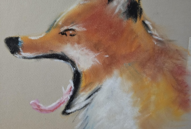
more of these details. Now, we have the tongue
situation sticking out. So what we do here
with our pink, we just go into the mouth and draw a little
tongue that sticks out. We might help ourselves
with some red as well. And of course, with white because we have some
light going on there. Now, with the white, we'll
kind of just touch up the little parts that
are in the lights. And it's just a matter of
looking at the reference photo and understanding where lights are going and where
the shadows are going. That's that's another
suggestion that I have for you, instead of using pure white, just use a light blue to
get some of the shadow. Now that we have our
first step done, is probably a good
time to give it a fix. Once again, this is a fixative. It allows your painting to stick to the paper and not being
reworkable in a second time. So you just take your spray and so very
lightly spray a little bit. You can definitely
use hair spray if you do not have this fixative
in your arsenal. It's not really mandatory, but it's definitely a good help. As you can see, the
color have been darkened a lot by the
fixative as they are wet. This will be just a temporary. As soon as they dry up, everything is going to
come together beautifully. So after about 5 minutes
when everything has been dried completely and we
don't have any powder left, as you can see, I touch my fingers and they
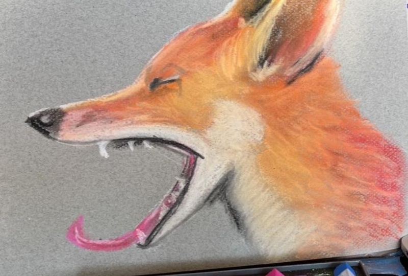
come out quite clean. I'll go in with some
additional details. I'm taking this darker brown
color and I'm just going to highlight some of
the details of the fox. I use the exact same
technique as before. Going in with a bit of color and just blended
straightaway as I go. And you will see that the color won't blend with the colors
that are below it because, of course, they are
fixed to the paper. I just want here to get a bit of the darker areas highlighted as well the lighter
areas to pop, just a tiny bit more. And we'll take some
bright yellow, just to be as a medium between the very
orangy orange that we have on the paper and the very white that we have as well. This will allow us to get a mid tone between
the two colors. I just want to go back to the
lighter areas that we have. You see, I keep repeating
my three or four colors. I really don't use
a big palette. I think there is value in only
having just a few colors. Here we go. I think this looks quite nice. Let's go with the final step, take our white choke and just give a little
bit of a border, but not a continuous
border here and there, just some for highlights. Once again, this is to get us to make everything
flow a little better. A little point tooth down here, another one, and we can
suggest one on the top. Now, if you want, you can
take your brush and very, very gently brush of the lighter parts to kind of blend them together
with everything else. You will see a lot of pigment powder to be
drag out with the brush. You can prevent this by mushing into the
pigment to the paper or by then using your finger to kind of work
it into the paper once again. But that is basically it. If you have followed
along with me, now you will have this
beautiful beautiful fox. It's a very expressionist
as a style, but I think it's
extremely quick. And extremely effective as well. So here we go. Our
painting is done. The last step is just to spray through with your
fixative or your hair spray, and you will have a beautiful
and lasting painting made with very minimal use of expensive tools and difficult techniques and in a very small amount
of times as well. I really hope you
enjoy this class, and if you did, if
you followed along, please submit your project here. I'll be happy to reply
to any questions, any suggestion you
may have or require, and please follow me along. You can find me on Instagram at Irish Farmart or on my website, www.irishfarmart.com, and I will see you next
time. Bye for now.
 Sam, Watercolor | Oil Paint | Soft Pastels