Transcripts
1. Introduction: Hello, and welcome to another skill share
class. I am Sam. I'm an artist and illustrator coming to you from
Dublin in Ireland. And today, we're going
to learn how to paint a beautiful whimsical
watercolor portrait starting from a reference photo. I will teach you what materials we will need for this project, how to choose the
perfect photo reference or modify one with very simple softwares and tools all of us have on
their phones or laptop. We will go through
the drawing stage, and I will give you a couple
of techniques that will make your portrait
absolutely fantastic. We'll go through
the painting stage using watercolor and an array of techniques such as wet on wet wet on dry and the
use of masking fluid. You can find my art all around the Internet looking for
Irish farm art on my website, on Instagram, on
Facebook, and so on. So if you're interested in seeing what my style and work A, please check out my resources. Also, if you have any question, you can pop a comment in the
discussion thread over here, and please remember to follow
me here on skill share. So you will be updated
with any new classes. So without any further
ado, let's get started.
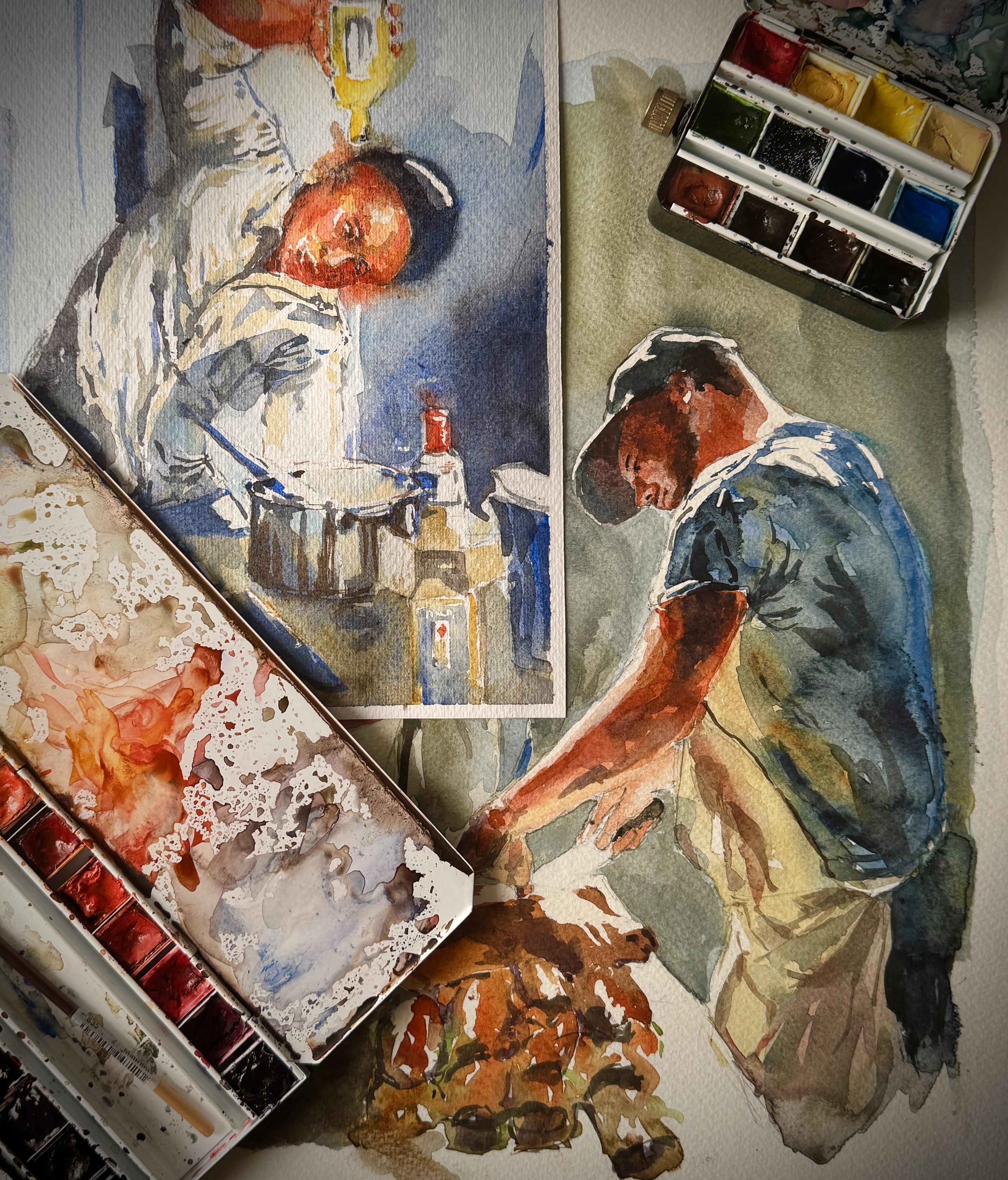
2. 1. Materials: So before we start, let's talk about the materials that we need for this exercise. You will need some
watercolor paper. This is a fabriano rough
watercolor paper, 300 GSM. We need, of course, our pencil. This is just a very inexpensive
big mechanical pencil with HB two leg inside. I do like mechanical pencils because the point
is always sharp, especially if you're
out and about and you don't have a pencil
sharpener with you. This is a great option. We do need a kneading eraser. This is an eraser that you can actually like it
was bread dough, and it's very
helpful for editing your pencil marks
without erasing too much or ruining
the watercolor paper. And this is very well
used by the way. Do need some drawing
gum or masking fluid. Now, you can find different types of masking
fluids in the market. We have this one from campus. It's just a regular
masking fluid, lightly tinted
with blue pigment, as it rise, you can see
where the skin fluid is and you would
need a little rush. To work with this. This is my favorite type
of masking fluid. Basically, the way it goes, you drop a couple of drops of muskin
fluid in a little dish, and with your brush, you just apply your masking
fluid to the paper. The other type of masking
fluid that you can find in the market is this type
from Sneler La quell, which has a little
teeny tiny kib that allows you to apply your masking fluid to the paper without having to use a brush. I find this useful but not
as precise as I would like. We do need, of course, some masking tape to stretch our paper on the surface,
our watercolor palette. And as per usual, in my lessons, I won't tell you what
type of watercolor, what brands to buy. But as we go through every
stage of the drawing, I will describe what tints and what color I'm
using step by step. And what are the substitutions? Because, of course, watercolors are expensive and you don't really want to buy a full set of watercolor
just for one lesson, so you may be able to use what you already have
in your palette. And for this exercise, we do need the usual
suspect to brushes. I have a mop brush
number two and a very tiny Rafael
brush round number two. These are synthetic fibers, and they are quite
inexpensive as well. That is it in terms of material. So let's start with the very
first step of the sketching.
3. 2. Choosing a reference photo: First of all, let's talk about reference photo and how are we choosing a good
reference photos? The first thing to
remember is that we have a lot of tools to find
the reference pictures. I'm very fond of interest
like here on the screen. But as well, you can find
good reference pictures on website like Pixabay or Google Search,
Google image search. But what do we want
for a reference photo? We want a couple of things. First of all, movement. We want our subject
to be interesting, to be doing something,
to be active, and that will create
more interest in your reference photo and
then in your final drawing. It's a bit more challenging, but definitely it's
worth the challenge. The second thing that
we want in a picture, and this is a good example. It's very good lighting. You want to have a very
well defined divide between lights and darks
between tones of paint. This will help massively to get your painting job
easier in a second stage. This picture is
another great example. You can see a lot of dark
and a lot of lights. We want this to pop, very much in your
reference photo. Remember, movement and
as well good contrast. What do we do if we don't have good contrast in our photo? Well, it's very easy. If you have a
computer or a phone, you can just pop into the
photo management app, click on option, and it's just a matter of playing
around with contrast, exposure, lights and shadows. As I'm doing here,
I'm just eraising a bit the exposure
and the shadow. It's a free tool and will get you all what you need to make your reference photo
really pop up and get a clear understanding
of lights and shadows.
4. 3. Drawing: So here we go. For the
sake of this painting, I tape my watercolor paper on. This is a canvas board. Whatever surface you may use, it's fine as far as
it's water resistant. I'm using masking tape. You can find this very easily in your local art supply shop or house Appliance DIY Store
is what decorators use. It's very inexpensive
but very effective. I'm going to move the
picture on the side here so you can get the
photo reference here and work with that. I will be uploading the
photo reference as well in the files down here so you get to work on this
page if you wish. But I warmly recommend you to play around with your
own photo reference. This is a technique
that you can, of course, use with
whatever picture. Let's stop blattering
and start drawing. So I'm using here just a regular two HB lead mechanical pencil. Once again, this is
really up to you. I like this because
it allows me to get a variety of line
variations as well, it's always sharp because it's a mechanical pencil without being super fancy
or super expensive. Let's see what we have in
the reference picture. So we do have the image, which is almost centered, takes the entire page. The first thing
though that I want to look are straight lines. And because we are
creating an environment, we need to look for the
straight lines as well. The first one being the table. Although we don't see
everything of the table, we have a little bit around here of the
edge of the table. So for reference,
we can actually infer the and on the
edge of the table, which is more or less here, I will draw a little bit on the darker side for
the camera to pick up. But you will be really
welcome to stay very light. So this is the
first big line that we want to get
through our painting. What are the other big lines? The body of this chefy guy
is creating a curve that go from the very corner of my drawing all the way up somewhere to the
middle of the drawing. I'm going to trace the
curve there and this will be the topper edge of
the body of the chef. We do have two lines now, two straight lines
that we need to trace. One being the hip
of the subject, which is more or less following the 45 degrees line towards
my edge of the table. Then the shoulder, which
line is following more or less is falling more or less
perpendicular to the table. From the edge of this
line of the hip line, we have the leg slanting
on the other side, and of course, the rest
of the body joining in. Remember when you're
drawing some body moving, remember the hip line
and the shoulder line. They are always straight
and they are flexible, so they move to one
side and the other. To help myself, I do pick, of course, a straight line,
in this case, the table, and then I try to
figure out what are the angles in respect
to the table. So if I join this
will be a 45 degrees, and if I join this will
be almost 90 degrees, a little less probably. We can start filling in the subject with other more
character lines if you wish. I would like to start perhaps
from the arm up here. The arm is made up of sausages. We have one sausage that
follows the shoulder line, which is the upper arm. Another sausage that goes more or less horizontal
with my table. The arm that is down here, I'm going to treaties
as another sausage, although it is halfway mask
or behind a pot of some sort. Back to this arm, we do have a hand, which is of what's the
name of this shape, a diamond shape if you wish. We'll work through
the different shapes and refining those as we go. But for now, I just want to
get the big shapes locked in. Going down, we do have the head, which head is more or less
in the middle of the body. So to draw a head
that makes sense, I always go with a circle and
then down towards the chin, we do have a U shape. Now we have the main
shapes of our body. Let's look at the head first, which is probably
the trickiest part. So the person here is
looking downwards. So I want to trace a line from the very top to the very
bottom of the chin, which will be the
line of the nose, where the middle
of the nose goes, the middle of the
brows and mouth. So the guy is looking down, and my middle line will be right at the three quarter
downwards width of the head. And I can start
tracing the nose. The nose start
more or less here. We have two eyes, one here and one here. I will find the shapes based
on other shapes on the page. Now, we have a
line for the nose, I want to see where the
eyebrows are going. I'm seeing one eyebrow
start a little bit from the upper end
of the nose like here. I'm just tracing that more or less what I'm
seeing on the paper. The other eyebrows, the
one that goes downwards, start attached to the bottom of the upper edge of the nose
and goes down like this. Underneath there we have
two little egg shape for my eye from this, we can just get a little bit
of an idea where the mouth will go and of course, where the chin will go. Get a basic idea of the
head here of the features. Now, let's try and figure
out the upper head. We don't see any year, but we know that the year is
almost at this point here. From that point, we have
this tiny little cap that the chef is wearing
that goes almost across in a curvy line like this and up follows my circle,
my original circle. This will all be black. Now, to give this
person some expression, let's see where the bottom
side of the head goes. My eyebrows is
almost table here. I don't want to touch
this much more, but I'm seeing that
it goes up a bit and outwards to find the line, the edge of the cup. From this point, it goes downwards and then in giving
a little puffy check. To the point where the
mouth is, at that point, we have the chin that
starts and the chin rounds up more rounded
towards the edge of the cup. As you see, I'm keeping referencing to the
edge of one line, the edge of the
other line to get at the end the shapes correctly
or almost correctly. We don't need to be
super precise here. Now, from the edge of the cup, I'm seeing a little bit of
hair coming out and a neck. From this line, we
see the color of the shirt that go all
the way down here, touching almost the right cheek. Now, we can keep
working on this side because we already have this
line settled more or less. We will work on the
color of the shirt. Always keeping the
referencing of other lines that we already have and that we are happy with. The shoulder now,
the shoulder goes in that original straight line of the shoulder and out
towards the arm. Now, the sausage here is
connected to the body with a shoulder seam that
almost is a semicircle, then it goes up towards the elbow in a somehow
straight line. Let's go on the upper side. We have a bit of a muscle here, and then up to meet
the upper side of the shoulder and down to meet the inner
side of the elbow. Now we do have the
opening of the sleeve. The opening of the sleeve starts from the upper arm sausage thing and goes in a shape thing all the way up to meet the
very center of my arm. Then we have a ruffle of fabric over here
that we don't need to take care of right now.
This will come later. Then we have what is the naked
upper arm that once again, is almost a straight line. Same underneath, hand wise. Now, hands are super
difficult to paint to draw. I won't deny them. We have the luck there
we do have a shape here, which is almost
like a rectangle. We have a square bottle with
the neck of the bottle. So we can definitely
work the hand referencing this main
shape of the bottle, which is so much easier. To draw hands always reference. Reference reference,
whatever you have there is whatever you can do
to get it much better. So let's start from
the upper side. We do have the pinky finger. There is here, the pinky finger is
another little sausage. The met the bottom
part of the bottle. We do have two fingers. You only see the upper part because they are
gripping on the bottle. We have actually three fingers. Two small eggs and one
a little bit larger. And downwards, we
do have the thumb, which is gripping on this
side of the bottle here. You see, it's already
more believable as a hand drawing the hand
as we kind of imagine. I'm not 100% happy
with that right now, but it's a beginning. It's a start, so I'm going to leave it there and concentrate
on something else now. Let's go down towards the shirt. The shirt goes down almost straight towards the
ruffling of the heap. And once again down here, we have the shirt opening
which kind of runs in the middle and you can invent completely
here is a squiggly line. So just use your imagination if you don't want to follow
the picture as it is. I like to draw some of the
creases of the shirt now. We'll get back to that later, but it's a good reminder for
us to add as more details, as many details as you
can at this stage, because that is
what you will get then on your final painting. Now, let's start looking
at what's on the table. Part of this painting is not just the portrait of the person, but as well, everything
else that is going on. And we'll get a big bucket that cuts the heap almost here. We don't need to be precise. We do have another pot that
goes more or less here, and the pot has a lovely handle. Right beside the pot, we have a couple of knives
and some chili peppers. Now, you can see I'm not
really following the picture. I just want to get
an idea what's on the page and just get
some of the details. So I go on and
finish my drawing. You will be able to pause this video and keep up with the drawing or if you're
drawing your own picture, please be mindful that we want to get as many
details as we want, especially on the person
that we are painting. Less details on everything else. The two things that
I would like you to concentrate is figuring out from now where the lights are and where the
main shadows are. It will be as simple
as I don't know, drawing a little line to
figure out where the shadow is or a tiny bit of scratch to figure
out where the lights are. And that's basically it
for the first stage.
5. 4. Using masking fluid: So here we go. We have
our first step done. Now, take your knitting eraser and roll it like a sausage. It's all about sausages
today for some reason, and just run it
through your page. This will just take out that
tiny bit of pencil marks. That we don't want there. We lower the tone
of our graphite, just a tiny little bit. Keep rolling until you
can't see big dark marks. When we are happy with
that muskin fluid and a little dish I used this. I used to be a candle holder
or something like that. I'm going to drop a few
drops of muskin fluid. What we want to
do now is to mask out the very lightest of
the lights of everything. If you take your reference
photo, if you have modified, as I showed you before, you will see how
some of the lines, some of the lights are
popping up a little bit more, especially on the face
of the person and as well on the shiny surfaces. That's exactly what I
want to mask out now. Masking fluid is really tricky. So be super careful, especially what brush
you use to apply. This gets everywhere and
destroys your brushes. So just a note there. Let's start from the top. I'm seeing this
ruffle of the shirt being in the whitest
white in the light. I'm just dropping some of my masking fluid
where the light is. I'm starting from the very top, going down to the bottom left to right because I'm right handed. If I was left handed, I would still go up to
down right to left then. The arm has some beautiful light shining on the very upper edge, which I'm going to trace
with mask and fluid, as well as the upper edge of the hand and the upper edge
of my pinky finger here. I'm going to follow this
sort of lightest of the light situation all the way down towards the
end of my painting. Remember, this is just where
the lightest parts are. I don't want anything else, just where the white is. Now we have this
line of oil dripping down on the face and
then into the pot. I want to experiment with
masking fluid and try to get at least a bit of
the line going down. I think we can start
working on the face now. The face is probably
the most difficult part for masking fluid. Let's start from
the top as we said. We have this big white space of the cup where the
light is shining. And I'm going to cover it
completely with masking fluid. Going down on the face itself, we have a tiny little
line just underneath the cap on the top of the brow and on the top of
the bottom one as well. And then on the nose, we have the bulb of the
point of the nose and then going up towards the upper part of the nose, I don't
know how you call it. The top part of the mouth
before the lip start, as well as some
light and the chin. I'm going to add a bit
here on the neck as well, although it's not
really showing much. You can continue working on the masking
fluid, on the shirt, being mindful to
trace everything that's happening in terms of lights and
shadows over there. This is probably one of the
most important pieces of our sketch because
it will allow us to figure out lights and darks shadows and all the goodness that will work through later on.
6. 5. Painting the first layer: Here we go. The muskin
fluid is fully dried. Please let it dry completely. It's quite necessary. Otherwise, it just melts with the water or dilute with water and will
spread everywhere, creating a real mess. You can see that it is dry
because when you touch it is just a little tacky and it
won't attached to your hands. So let's get our
watercolor started. Once again, I'm going to try
to put the reference photo around here so you can have
a reference of the photo. But I will tell you step by step what colors we are using
so you can follow along. So let's get our big brush. A mop brush will
work fantastically and use some cerulean blue. Now, I know cerulean
blue is probably one of the most expensive
blues that you can buy. It's always like a serious one, one of the most expensive. But if we want some
different blues. We may use a very, very light ultramarine blue. That will probably work okay. Yeah. So ultramarine
blue would work nice. But if you have a
cerulean blue or a light blue, that's
completely perfect. What we're going to
do now is to create a big puddle of watercolor. As you can see, I have a lot of water in my watercolor
palette here. And what we are doing is to fill in all the dark part
of the painting. And now I'm just
saying dark part. Everything literally that
is on the darker side, I'm going to keep my
color very, very light. And this will help you
to achieve two things. First, get some
colors on the paper, which is always the first
step and the most difficult. You won't be I don't know, terrified in using
color afterwards. And then second, we'll get you some ideas of where the lights, the dark part go, and so on and so forth. I'm going for now
to skip the person, the shirt and the
flesh of the person. I'm going to come to
that in a second. I just want to get my background colored first, once again, using a ton of water
that will help me to get some clarity
as I go through. Now, I'm already thinking about this steam coming
out of the pot. So with some kitchen towel, I'm just lifting up tiny little bit of
my blue background. Right. So we have the
background kind of painted now. What are the darker parts? Well, we have, first of all, the cup of this person that I'm going just to fill in
because it's very dark. And we can start actually painting some of the
shadows on the shirt. I'm going always with this light blue now
blotching up the shadows, meaning I don't want to
be super precise here, just having an idea of
where the shadows are. Like, for example, you go towards the outer
part of the body, and as well, you will start painting the creases of
the shirt over here. At this stage, we don't need to be super precise with that. Just avoid the flesh for now.
7. 6. Painting lights and shadows: Here we go with the next
part of our painting, we will start painting the flesh by flesh,
meaning the skin. Wherever we see skin,
we'll start painting. So now we want all of this painting of the
surface to be very wet, especially close
to our skin site. So to keep this wet, or we use just some water, some fresh water with
our brush or once again, the little spray bottle, just a bit of spritz. And we are settled. We want the surface to be wet because now we're
going to try and recreate the beautiful
whimsical spreading of color that we're looking for in this kind of style
of portrait painting. I'm using some cadmium red, and I am working with
quite a bit of water. Cadmium red is a very red
red, if you know what I mean, I want it to be as
diluted as we can, because this is just
the first stage of my painting the skin. Let's start with the face. What are we looking for here? We're looking for dark parts. So I know that the
dark parts are towards the bottom
of my painting. So using my tiny brush, I'm just going to paint
the darker areas, and I'm diluting
this color a lot. So keep that in mind. Now, here are the things
that we want to see. This is the magic
that we want to see. We want to see the
color spreading. To the cadmium red, I'm going to add some
yellow cadmium deep. Now, I mentioned I'm going to suggest what type
of paint you can use if you don't have cadmium
red or yellow cadmium deep and so on and so forth. You can definitely use a
warm yellow and a true red. Scarlet red, for example, could work even a
very reddy orange. So you see, I'm keeping
my color quite separate, a tiny bit of yellow, a tiny bit of red, and I'm going to
try to paint just where the darker parts
are in my painting. Leaving almost white,
everything else. And don't be afraid if
this looks very red. This is precisely what we are
looking for at this point. Keep adding and don't be
afraid of the color spreading. Actually, in some point like
this in which I really want my color to spread
with a clean brush, I'm just going to
touch here to add more water so the color will
spread a little bit better. Once again, I'm
playing with my red and my yellow diluting
them as I go. Let's try the same
thing on the hand. Now, clean brush, and let's
add water all around to allow our color to spread as much as we
can because we want to achieve this very technique. Now, red, cadmium red, we start from the darker
parts which are over here. You can see how this spreads. Don't be afraid of doing that. It's gonna work out absolutely
gorgeous at the end.
8. 7. Painting details (Part 1): So here we go for the
surface of the table. I'm still using my two brushes, a mop brush and a thin brush, and we want our surface
to be quite wet. So something that I've done before is getting
my spray bottle and just spraying a
little bit of water. Now, what I like to use is some yellow ochre
with my big brush. And the yellow occur as
this magic thing of turning into beautiful grayish green when it meets the ceroleu blue. I'm starting from this
bucket here and I am just suggesting lights. Whenever the color meet the color that is
below the surface, it will create a gorgeous
green gray tint, which is exactly
what we want here. Let's work down this table and we can safely
adjust the layer. Of yellow hooker. Yellow Ochre really doesn't have many substitutions because A, it's a very cheap color and you can find it
almost every watercolor palette that you can buy or find ready made, if
you know what I mean? So I'm not feeling like to suggest any other color
than this yellow ochre. And yeah, it's a
very nice color. I use this yellow
ochre all the time. So we created a big mess here, but this is precisely
what we want. We want a surface
full of this tone. This will become a
lovely organic tone. Now that I have
the yellow ochre, I'm going to start adding some details on
the shirt as well. Being mindful that
this is very yellow. This will be good to show
a bit of light as well as getting into the
grooves of our shadows. You see here, this part
on the top suggests light while this part of
the top reinforces shadows. I'm going on to add my
yellow ochre here and there to reinforce my shadows
and suggest my lights. To that yellow ochre, you can add some neutral
tint or some gray color or some mix of brown
and ultramarine blue. If you want to have a
darker tone of light. It's probably more than
enough for this stage. While we were doing them, our color on the bottom part have had a chance
to settle a bit. Now I'm going to use some
ultramarine blue and reinforce all those big bold shadows
that I have seen originally. The middle of the bucket on your right hand
side is a big shadow, and I'm going to add that one. As well as going down towards
the bottom of the bucket, we have another big shadow and
I'm going to add that too. This is just pure
ultramarine blue. The knife part of the handle
of the knives are in dark, big shadow, as well
as a suggestion of the knife blade itself. With this blue,
you can as well go down towards the background and start suggesting
shapes for the background. We are not working on the
background itself very much, but we just want to have some suggestion
of what's going on. Everything is going
to be very blurred at the background stage.
9. 8. Painting details (Part 2): So the paint is, I would say, 80% dried, and I want to add some local
colors or are local colors. So we have imaginative colors, colors that we come up with in our imagination can be
this yellow and red here, can be this blue, other colors that
we just want there, but they're not really there. Local colors are colors that
are local to the painting, that are there as
we can see them. I it's important, in my opinion, to add some of these
colors as well as some imaginative color because at the end of the day
we are creating a portrait. So with our small
brush and some gray, this is a neutral tint. You can use whatever
gray you have or again, a combination of
ultramarine blue and a brown burned
amber burnt sienna. I'm just going to add a bit of this gray around here where
the main shadows are. Now, working with
a reference photo is probably a good idea. As I said, it's 90% dry, so we do have a lot of wet patches that
we're going to keep. Now, it's not
important what we are painting as far as we do paint, looking at the
reference photo and having an idea where
we want to go. What am I trying to say
in here is that even if we don't paint precisely
what's on the picture, we do need to have an idea of where the colors
may naturally go, where the shadows
may naturally go without just
inventing stuff that is really not there or
that cannot be there. Because once again, I don't mind if it's not there
in the picture, but I just want that
to be believable. That's what I'm trying
to say. Where the lines are too hard like here, you can definitely soften
them up with some water. Now, I'm adding to this gray, some ultramarine
blue, and I want to soften my shadows just
a tiny little bit. Working with ultramarine
blue definitely helps that. I'm basically retracing some of this gray line with
ultramarine blue. In order to add another
layer of light, we do apply the same idea, the same concept to the
rest of the painting now. I'm going to work on this table. Let me show you
again what I mean. For example, let's
work on the knife. I'm going to add my
gray to the handle of the knife and then
dilute my gray with some yellow ochre
to paint the blades. On the bigger knife,
this is very wet, so we have the chance of
color to spread a bit, very dark on the handle and then adding some yellow
ochre for the blade.
10. 9. Final touches: Now, this painting
is completely dry and it's time to take out
all the masking fluid. I'm using a little
bit of tissue paper. It's a clean tissue paper, and just dabbing
and rotating very, very carefully on my
page, the tissue paper, I will remove all the masking
fluid from the painting. Now we removed all the
muskin fluid thing you may want to try
with a clean finger, just to rub it
across the painting. If you think there's
any skin fluid left, just rub it off quite gently. Right. We don't have any
masking fluid on the page now, so we don't have the safeguard of our white to keep white. What we're going to
do now is to be very, very careful and gentle
on what we're doing. I'm going to use some of my gray mixed with a
little bit of blue and a bit of a brownish
color just to get an idea of darkness,
warm darkness. The wall behind me is white. So we just need to work on
these little shadows that are quite dark that I'm seeing on the background,
just an accent. To bring everything
dropping back a bit more. I'm adding some
more water in order to get the edges more soft. Good. Now we are
going to go back into our main subject and
with the smaller brush, clean and cadmium red, I'm going just to touch
up the very darker parts. I'm going to touch
up the border of the mouth and the face
where it's facing down. Now, the reference photo is very important here
because it will tell me where I get
the dark parts, and so where I can use my red paint now we see there are a lot of
white parts on the face. This is very good
because will allow me to create a different
type of shadow or a different type of tint where these white parts are
layering up my color. So don't be afraid
of covering them. They will become nice
little shadow of pink. I'm going to do the
same on my arm here. You see how covering the white part will give
us two different tones, a darker tone where the original paint
was laid down and the lighter tone
where the white. Once again, I'm adding some
yellow cadmium yellow deep to highlight the the lights. I'm going to leave the
face for a second. I want to concentrate on the headband that is wearing
and it's very very dark. I'm just going to use my gray. In this case, I probably
will avoid touching the white light that we just masked because it's
very white in real life. I'm just going to reduce it a bit and when the paint dries, this will be a
little bit softer. Now, because I don't
like this bubble thing, I'm going with some
ultramarine blue but you wash down, clean brush, and just touch slowly the outside to let the
paint to move a bit more. Now, what else should
we concentrate on? Let's go on with our
bottom part of the shirt, and I'm adding some big shadows just because I'm seeing them. In this case, I'm
not afraid of going over the color that I just
painted because, of course, we add our masking fluid, and that masking fluid
will keep the color a bit lighter as we paint
over the top of it. I am probably going to
use the same brush and still with some of this gray, adding a ton of a warm brown. This is burnt amber. I'm just going to add some
of the details on the pot. And some other suggestion
of shadows on the pot. Now, remember what
we just said when it comes to metal
surfaces, metal gears, vertical shapes are your
friends because they recall a little bit the metal shining. I'm going to give the same
treatment to this big pot here perhaps adding
some more blue. Suggesting the rim and the inside where we have
the big, big shadow there. Now, the chili pepper, I am seeing a bit of
shadows from them as well, and I'm just going
to suggest it. Same goes for the knives. Because I want
definitely this to be all darker with just
some ultramarine blue. When the colors are still wet, I'm going to repaint it all, perhaps as well, a
bit on the top of my chili peppers and on
the top of my knives. Once again, we don't need
to be afraid here of losing our lights because
they all have been masked. I think this looks
so much better now. Small brush, gray. I'm going to add
some more details on this spatula thing here
as well on the bottle. Just some touches.
I don't really need to get all the
information there. Now, I'm seeing that this
bottle is very yellow. I'm going to use
some lemon yellow. And just suggest
the yellow color. I'm going to add some of the
warm yellow cadmium yellow deep because the
hand is behind it. I really want to get the
color sorted as well. Not going to touch the stream of color coming down because I feel like I should remain quite white with
some of my gray. I'm just going to
suggest the corner of this bottle and I'm
sure it's going to bleed. But that's completely fine. It's actually a very
interesting. Situation. Okay, I think we are almost
there with this painting. Two things I want to
work on is the face and, of course, the chili pepper. Let's start from here. I'm going just to add
with my small brush, a very dirty brush
at this point. I'm going to add some tone on those chilies and on this cup. Now, on the face, we still
have some of our red, which I'm going to melt to mix together with
some ultramarine blue, to create some sort of a purple. Now what I want to do is
painting the features. In terms of features,
what do we have here? We have a bit of hair
coming down the face. You see, I got this purple looks almost like another gray color. I'm just going to
suggest the hair. The eye is just once again another tiny bit of suggestion together with the eyebrows. The nostril, the nostril, you definitely don't want too
much color on the nostril. We always make the mistake of
painting a nostril really, really dark, but
it's definitely not. So I'm going to paint the mouth and the
chin down there. Once again, this is
blue and cadmium red. I don't really like
the hair here, how it turned out so dark, so I'm just lifting the color
just a little bit and then more of the purplish mix down towards the
bottom of the face. I think we have it. Now, we let it dry
completely and then add any additional
details that we want definitely to
see on the page. But two things to remember, let the color spread and work
in a very, very thin layer. Always remind yourself where the shadows are and where
the lightest lights are. I really hope you enjoy this little tutorial
Scola painting. And if you did, please
consider to give this channel a follow and don't forget to submit your projects. I'm looking forward
to seeing them, and if you have any questions, reach out to me in
the discussion page. I'll see you very soon with
another lesson. Bye bye.
 Sam, Watercolor | Oil Paint | Soft Pastels