Transcripts
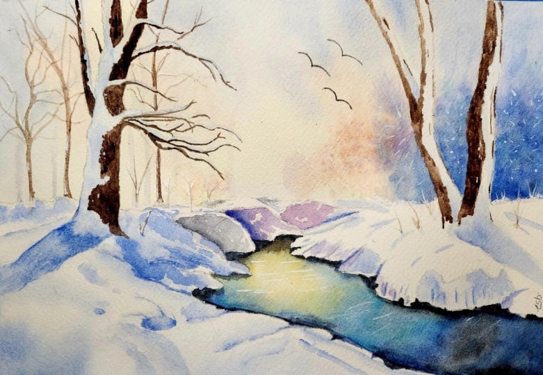
1. Welcome To The Class!: Hello, everyone. My
name is Will Elliston. And today, we're painting a luminous snow
landscape in watercolor. Snow is a superb
teacher in tone, edges, and color temperature. It's not just a season. It's a way of seeing light. We'll simplify the scene
into large shapes. Reserve clean paper for sparkle and let
soft gradients lead the eye towards a glowing
horizon and a quiet stream. Even if you simply watch, witnessing the sequence of choices is enlightening
at any level. The aim is clarity and
calm, not complexity. I've been a professional
artist for many years, exploring lots of different
subjects from wildlife and portraits to cityscapes
and countryside scenes. I've always been entranced by the possibilities of watercolor. But when I started, I had no idea where to begin
or how to improve. I didn't know what
supplies I needed, how to create the
effects I wanted, or which colors to mix. Now I've taken part in many
worldwide exhibitions, been featured in magazines, and been lucky enough
to win awards from well respected
organizations such as the International
Watercolor Society, the Masters of
Watercolor Alliance, Windsor and Newton, and the SAA. Watercolor can be overwhelming
for those starting out, which is why my goal is
to help you feel relaxed and enjoy this medium in
a step by step manner. Today, I'll be guiding you
through a complete painting, demonstrating a
variety of techniques, and explaining how I use all
my supplies and materials. Whether you're just starting out or already have some experience, you'll be able to
follow along at your own pace and improve
your watercolour skills. If this class is too challenging
or too easy for you, I have a variety of classes available at different
skill levels. I like to start off with a free expressive
approach with no fear of making mistakes as we create exciting textures
for the underlayer. As the painting progresses, we'll add more details to bring it to life and
make it stand out. I strive to simplify
complex subjects into easier shapes that
encourage playfulness. Throughout this class, I'll be sharing plenty
of tips and tricks. I'll show you how to turn
mistakes into opportunities, taking the stress out of
painting in order to have fun. I'll also provide you with
my watercolor mixing charts, which are an invaluable tool when it comes to choosing
and mixing colors. If you have any questions, you can post them in the
discussion thread down below. I'll be sure to read and
respond to everything you post. Don't forget to follow me on Skillshare by clicking the
follow button at the top. This means you'll be the
first to know when I launch a new class
or post giveaways. You can also follow me on Instagram at Will Elliston
to see my latest works. So let's get started and explore
how light lives on snow.
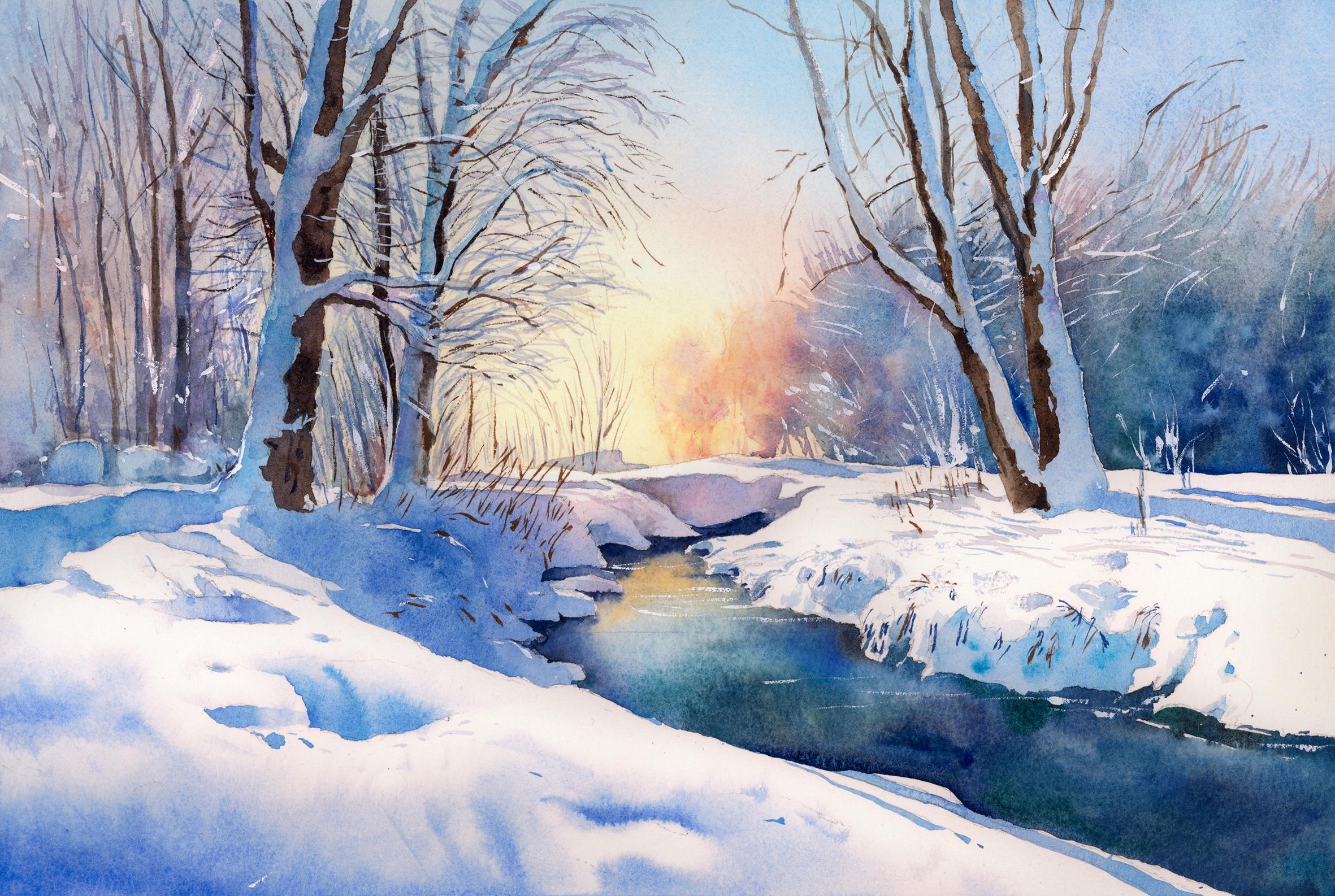
2. Your Project: Thank you so much for
joining this class today. This project invites
you to enjoy clarity, generous whites,
a modest palette, and thoughtful edges
that let light breathe. Think of snow as colored light
rather than white pigment, noticing warm and cool shifts that move across the ground, trunks and distant trees. Let the stream act as a
pathway through the design with reflections kept as
calm, readable shapes. Keep the mood spacious
and unhurried, favoring suggestion
over description. Whether you paint
along or simply watch, you'll see how a few
well placed choices make complex scenes feel
very simple and serene. In the resource section, I've added a high
resolution image of my finished painting
to help guide you. You're welcome to
follow my painting exactly or experiment with
your own composition. As we're going to be focusing on the painting aspect
of watercolor, I've provided templates
you can use to help transfer or trace the
sketch before you paint. It's fine to trace when using it as a guide for
learning how to paint. It's important to
have the underdrawing correct so that you can relax and have fun learning the
watercolor medium itself. Whichever direction
you take this class, it would be great
to see your results and the paintings you
create through it. I love giving my
students feedback, so please take a photo
afterwards and share it in the student project gallery under the Project
and resource tab. I'm always intrigued to
see how many students have different approaches and how they progress with each class. I'd love to hear
about your process and what you learned
along the way, or if you had any difficulties. I strongly recommend
that you take a look at each other's work in the
student Project Gallery. It's so inspiring to see
each other's work and extremely comforting to get the support of your
fellow students. So don't forget to like and
comment on each other's work.
3. Materials & Supplies: Before we get started
with the painting, let's go over all the materials and supplies you'll
need to paint along. Having the right materials can greatly impact the
outcome of your artwork. So I'll go over all the supplies I use for
this class and beyond. They're very useful to have at your disposal and will make it easier for you
to follow along. Let's start with the
paints themselves. And like most of the materials
we'll be using today, it's a lot to do
with preference. I have 12 stable colours in my palette that I
fill up from tubes. They are cadmium
yellow, yellow ochre, burnt sienna, cadmium
red, alizarin crimson, ultramarine blue, cobalt blue,
cerulean blue, lavender, purple, viridian, black, and
at the end of the painting, I often use white gouache
for tiny highlights. I don't use any
particular brand. These colors you can
get from any brand, although I personally
use Daniel Smith, Winsor and Newton
or Holbein paints. So let's move on to brushes. The brush I use the most is
a synthetic round brush like this Escoda Purl brush
or this Van Gogh brush. They're very versatile because
not only can you use them for detailed work
with their fine tip, but as they can hold
a lot of water, they are good for
washers as well. They're also quite affordable, so I have quite a few
in different sizes. Next are the mop brushes. Mop brushes are good for
broad brush strokes, filling in large areas and creating smooth
transitions or washes. They also have a nice tip that can be used for smaller details. But for really small details, highlights or anything
that needs more precision, I use a synthetic
size zero brush. All brands have them,
and they're super cheap. Another useful brush to have is a Chinese calligraphy brush. They tend to have long bristles
and a very pointy tip. They're perfect
for adding texture or creating dynamic
lines in your paintings. You can even fan them
out like this to achieve fur or feather
textures as well. And that's it for
brushes. Onto paper. The better quality
of your paper, the easier it will be to paint. Cheap paper crinkles easily
and is very unforgiving, not allowing you to
rework mistakes. It's harder to create
appealing effects and apply useful techniques
like rubbing away pigment. Good quality paper, however, such as cotton based paper, not only allows you to rework
mistakes multiple times, but because the pigment
reacts much better on it, the chances of
mistakes are a lot lower and you'll be more likely to create
better paintings. I use archers paper because that's what's available
in my local art shop. A water spray is
absolutely essential. By using this, it
gives you more time to paint the areas you
want before it dries. It also allows you to
reactivate the paint if you want to add a smooth
line or remove some paint. I also have an old rag or t shirt which I use
to clean my brush. Cleaning off the paint
before dipping it in the water will make the
water last a lot longer. It's always useful to
have a tissue at hand whilst painting to
lift off excess paint. Also, you never know
when an unwanted splash or drip might occur that
needs wiping away quickly. I also have a water dropper
to keep the paints wet. When you paint, it's
important to have them a similar consistency to what
they're like in the tubes. This way, it's easier to
pick up sufficient pigment. A hair dryer is useful
to have for speeding up the drying time and controlling the
dampness of the paper. And lastly, masking tape. And this, of course, is just to hold the paper down still onto the surface to stop it sliding
around whilst painting. Also, if you plan on
painting to the edge, it'll allow you to create a
very crisp, clean border. And that's everything
you'll need to paint along in today's class. Let's get on and
start the drawing.
4. Preparing The Composition: When it comes to
drawing landscapes, you have to look for rhythms. The first shape is
basically the horizon line, so we're adding that horizontal
line to start that off. Then I'm looking
for any patterns. Even if these lines don't
exist in the actual scene, I'm looking at the general shape of the trees, the stream, the outline of the bushes, the tree trunks, and
just putting them down as simple geometric
shapes to begin with. It all looks very abstract, but I'm just setting up the composure the
composition in a simple way. And then we can build on it. And even if it's not matching the references or the scene that we're
actually trying to paint, at least it has its own
inherent flow to it. It works within itself. So there's more harmony, there's more rhythm.
It guides the eye. It's easier on the
eye in some ways, it can be more pleasing to the eye than the
reference because you're drawing it yourself
and arranging these elements in a way that's more
aesthetically pleasing. So we can go through
different stages of detail, start off with organic shapes, work on detail, and
then find detail.
5. Starting The Sky: Starting off with the sky, we want to wet the paper first, and you can take as much
time as you need to get it nice and glistening. We don't want to overload it
with water, though, either. Glistening but not flooded. Now I'm creating two separate
pools on my palette, two separate mixes of
cool and then warm. I always use cerulean blue as a base for my
cools in the sky. I have that prepared
and ready to go in my palette diluted. Even before I start with
this yellow cadmium yellow. I start off very light,
pure cadmium yellow, and we're doing it very
light so that we can create a nice even transition because mixing yellow and blue
obviously makes green, and we don't want there to be an obvious green in the sky. So we're going to have
to do this bit by bit. And I'm being extra precautious here with the
two tree trunks on the left. I'm trying to paint around them. So I kept that area dry. So that there's warmth
coming through those trees. But we don't have to be too
fussy about that, really. The main sky in the middle
is what we're focusing on, and we're painting
over the other bits. So make sure you focus
on the middle here, and then adding a little
bit of cadmium red. It's barely perceptible,
but I'm doing that again, because I don't want there
to be an obvious green when I mix the warm
area of the sky, which is yellow and blue. So I'm already creating a
transition with this yellow. It's stronger at the bottom and fades out to the white
of the paper at the top. And I do that even
before adding this blue. As long as we have
the paper wet, it won't stain the paper, so we can always scrub
away if we make mistakes. Let me give you some other
tips that will help you paint such large
wash sky like this. If our blue is too strong, it will dominate the mix, and then it will go green. So be careful with your blues like I am
and go bit by bit, keep them very light, and then gradually add more in the top. Also, we want to not mix the blue and yellow
into a one shared paw. We want them to meet
softly in the middle. So even though it
is one single wash, I'm imagining it in my eye as two separate
washes combined. So I'm fading out the
yellow to nothing as it goes up and fading out the blue to nothing
as it goes down. And it's almost like
a gray in the middle.
6. Building On The Sky: So now we're working on it, again, adding more pigment. Now that we've nicely blended that and we can
see that it's not green, we can add a bit
more blue at the top and work on transitioning
at the moment, the transition
isn't that smooth. It's quite sudden. It goes from a deep blue
to a yellow at the bottom. So we're going to have
to smooth that out. Notice, at this stage, on the left and right corners, I'm actually adding a
bit of ultramarine blue into there because it makes it look even colder as it's
getting further away from that sunset on the
horizon, on the edges. I'm trying to complete the sky, this wash in an even
layer of wetness. I don't want some sections to be almost dry and other areas soaking wet because then there'll be hard edges
and it won't be smooth. So if I find myself
having to add more pigment into another
section and it makes it wetter, then I have to
compensate that and make other areas equally as wet and add more wetness
to them so that it's even. Because as long as
it's wet and even, it'll dry, nice and smooth, and the transitions
will be clean. Whilst it's still wet, also, I'm using a tissue, a rolled up tissue
to pick out some of the pigment where
the tree trunks are, where the snow will
be on the trees because I want to
paint that blue because it'll be the
snow and the shade. And if it's yellow,
and of course, the blue on top of that
yellow will turn green. It's not essential to get the pure whiteness
of the paper back. Just taking some of that
yellowness away because the blue that we'll be using
later is quite deep blue, so it won't look green
if the yellow is light. Whilst I'm doing this, I'm aware of the paper drying in the sky and when it's 80% dry, so still damp but
not completely dry, I'm going to use some warm
colors, some alizarin crimson. And a bit of burnt sienna to paint some distant trees that
kind of melt into the sky. So they're kind of
out of focus and they blend into the sky. And to get that nice blend, the paper has to
be slightly damp. So it's all about timing. It doesn't want
to be sod and wet and it doesn't want
to be completely dry, just 80 to 90% dry so
that it holds its shape, but we don't have a hard edge. And we'll actually connect this to the background
trees at the very end, the last step of the painting. But with watercolor, we always think with
the end in mind. So we have to paint this
section now to achieve that wet on wet soft
edge with the sky. Even if the shape next to it, we don't paint
until the very end. So on the left side
of this shape, it's going to blend
into the sky, and then on the right
side, it's going to blend into the blue background trees. So, in fact, we don't need to really worry about what it looks like on the right hand side because we'll overlap it later. Adding a little bit of
purple in there as well.
7. Left Background Trees: So I've used a hair dryer
to completely dry it. So I don't have to be worried
about my hands touching it because the sky
is completely dry now and can move on
to the next stage, which is starting
from left to right, painting some background trees. And these can be quite abstract, and I don't want it to
be a vibrant color. So I'm using alizarin crimson
and any blue you can use. I've used cobalt. And mixing these two
together create a purple, but not a vibrant purple, a kind of grayish purple. And that's what I'm looking for. I've kind of painted some
outline shapes of rocks. And with a small to
medium size brush, I'm going up and filling this area in quite
an abstract way. I don't want this to be
the center of interest. I just want to have fun
with some textures, so I'm playing around
whilst I'm doing it. This rock that I'm painting now is a bit closer
to the foreground, so it has a little
more vibrancy to it. But even these things
don't really matter. I'm just having fun
playing around. It's not the center of interest, so it's not going to affect the composition
that strongly. I'm just leaving a little
white gap at the top to indicate a
sparkling of snow at the top and dropping in some pure water and
other random pigments. As the paper is drying, just to encourage some texture. Because by adding this ethereal texture
into the background, we're being very suggestive and it encourages the
imagination in the viewer. It makes them participate
in the painting, and even if it's subconscious, it makes it more interesting
for them to do that. And as this abstract
wash reaches the top, I'm using the Tift
my brush to imply some twiggish kind of branches. Tinches branches that have
lost their leaves in winter. Notice how I used
that muted purple as a base wash. And
then I dropped in some blue to create some
touches of coolness within that and some touches of burnt sienna to create
some warmth within that. And then I flicker water and pigment every so often as it dries to
increase that texture. And then laying on
those thin branches, using the very tip
of my brush. M.
8. Creating Depth: Now we can start working from the background
to the foreground. And as we do so, we have to be stronger with our
pigment because the atmosphere and the air
dissipates as it comes closer. So the forms are
a bit more solid. So we kind of transition
from abstract branches and shapes and textures to shapes that are a bit
more understandable. But the background is
still not completely wet. So when I apply
these strokes now, they bleed a bit and
create some softness. I'm even using the edge of my brush to create
some dry brush marks. Just to create a bit of noise because this section
that we're painting now is the contrast to the smooth snow we'll
be painting later. The majority of this
painting will be white snow with soft
transitions in the shadows. And ironically, the snow
is the white of the paper, so we don't actually
paint the snow. So about a third of
this whole painting we don't actually have to paint. This area now, we're just
having fun creating texture and a lot of them
are vertical lines. You can see there's an
emphasis to go vertical here. It's not all perfectly vertical and the branches
are a bit squiggly, I'm not keeping them
perfectly straight, but it creates a flow, your eye draws down from these branches to the
trunks of the trees and then goes right down the shadow into the stream that
we'll be painting later and then back up the
tree on the other side. So wherever your eye
lands on this painting, it's got a place to go.
The eye won't be lost. It's not confusing,
and it has a feeling of reassurance because our
eye is guided in that way. So adding a bit more pigment
as we're getting closer. So quite random, and often
it's these random shapes that can take a bit more time because it's hard to work
out random as humans, we try to be logical and work
things out to make sense. So by creating
something that doesn't look forced can sometimes
be a challenge. But the basic idea is from
left to right in this section, we're going from thin
trunks to thicker trunks. I think there's about
five or six of them, and we're creating a bit
of variation in tone, getting darker and darker
as it comes forward. Some of them have
a bit more warmth, a bit more burnt sienna, some of them are a bit
more blue or purple.
9. Left Foreground Trees Underlayer: Now we can start working
on the main tree, the kind of eye
catching focus point. And we're going
to start off with the branches that
connect to it and we can use whatever blue color we want all the way from a purple
ish blue to a turkisy blue. I started off with kind of deeper purple blue
on the edge there, and then on this main branch, the central kind of trunk of it, I'm playing around
with lighter blues, purple blues, all
within that same wash, basically because
it's all connected o and we want to paint enough so that it has enough contrast against
the background. We don't want it to be
lighter than the background. And then we got to bear in mind, if you look at the final
painting that we're painting the left side
as snow in shade. That's what we're
painting right now. And then later on, we'll be going over
top of this on the right hand side
as the wooden branch, the wooden trunk, the actual
wood of the tree, the bark. Okay. So we don't need
this purple to be super dark because although it feels strange painting
blue as snow, this is actually
snow in the shade. You can see how this blue
looks slightly green. But because it's a very light
yellow in the background, it's not a very vibrant green. It's more like a
turquoisy green, still pleasing and fits in with the harmony
of the painting. So it can feel a bit chaotic, I imagine, painting a tree, knowing where the branches are. But if you can see, we've got the main trunk and there's only four
branches coming off it. And the kind of rule is that the trunk gets
thinner as you go up, of course, but it's
always equal in parts. So each branch that comes off takes away
from that thickness. So you've got to work out if these branches
were put together, it would all be the
same thickness. That's the general rule. You don't have to
follow it exactly. You don't have to get
a tape measure out. Now we're connecting
it to the next tree along the one on the edge, and all we need is about four or five
branches coming off it, and then we'll use the tip of our brush
later on to add loads of smaller tiny single line
branches to kind of again, create a flow and rhythm, but we'll come to
that a bit later. At the moment, we're just
connecting these branches. When possible, it's a
good idea to connect your shapes so that
nothing's completely isolated because it
creates a feeling of cohesion and everything
feels a bit more stable. So I'm playing around with
cerulean blue violet. You can mix your own
violet as well with Alsuan crimson and ltlamarin. A nice mid tone. Quite an even wash.
10. Thin Branches: Now we can start thinking about those tiny
little branches. And at the bottom,
they're quite horizontal. And then as they get higher, they curve around a bit more. And we're starting off nice and light and layering them on. This is where it's
important to have a brush. We have a nice tip. You don't want to be
using a huge brush for this because you
won't get a thin tip. But at the same time, you
don't want to use a very, very small brush
because you'll end up having to go back and forth between your palette so many times because small brushes
don't hold that much water. So try and go for as
large a brush you can that still has a tip and that you still feel
control of because, of course, you have to touch
the paper right at the tip. You can use your
finger as a kind of anchor when doing this,
if you want, as well. And it's easier if
you hold the brush completely vertical because
the tip is on the very edge. I try to angle my hand
when filming this so that I don't cover the painting so you can see what's going on. But it is much easier to
hold your brush vertical. So you see we've added all
those little branches, and we're layering them on in such a way that it just
feels like sharp texture, and we're getting gradually deeper and darker as it goes on. And eventually, later on, once we've worked out
our tonal values, we'll do a few of them in black. But we don't want to
get that stage yet. We don't want them
to be too dark. We want to keep them
all similar values and tones for the time being. Now, right now, I want to extend this blue shadow into
the snowy ground below, but I want it to
transition to white. So I'm bringing the wash down, and then I'm going to clean my brush and gradually
fade it out. So filling out the area that I want painted to begin with, like I am at the
moment, and this is kind of a cobalt blue. Then I wash my brush
and extend it and paint that whole area beyond where I want it to
go with clean water. And then I just
tap it and agitate it just a little bit
so that it bleeds out.
11. Painting The Bark: Now we can start painting
the bark of the tree. And I want a neutral
brown for that, so I'm using a bit
of burnt sienna with black and even a bit of ultramarine blue to
neutralize it even more. So it's kind of a
gray color, really. At least that's what
I'm starting off with. It's quite a thick
consistency as well. So it's thick enough so that
it won't run on the palette, but it's still very
malleable with my brush. And I'm just touching a
few areas to get started. And then once it's on the paper, I can just use that pigment that's on
my paper to fill it out, so I don't have to go back and forth to my palate frequently. And if it's too dark, then
we can lift it off later. But for the time being, I'm using the pigment
that's on my paper, and once it's spread
out, it'll lighten up. So it looks like
black to begin with, but you'll see how it goes lighter later once
we spread it out, the brown starts to show and how by painting these
little touches of brown, it actually creates the
illusion of snow on the tree. Painting on the right
hand side of the tree. Very organic shapes,
quite random. Luckily, I can see my pencil markings from
the drawing below, so I have a nice
guide to follow. There we go. Now we can
go back to the palette to adjust the value to make it
a bit dark in some areas. Using the tip of my brush to create the outline
of the shape and then using more pressure to fill out the
space in between. This is why I
extended the blue of the trunk into the
shadows of the snow below because I knew I
was going to paint this dark brown trunk
area on top of it. So even if I'm not ready to paint the whole of
the shadows on the ground, I had to at least
paint this bit. That's why I created
a transition so that I can go back to it later and create a seamless. So it won't be notable
that I actually painted the ground shadows in two parts because I want to
spend a bit more time to figure those out later.
12. Finishing The Left Trees: Now we know what colors and values we've used
for the main trunk. We can use this color to paint all the mini thin branches
that come off it. We're adding another layer to that texture in the background. Again, we're using
these branches to create a feeling
of flow and rhythm. That's where you've
got to keep in mind, whilst you're painting
this flow and rhythm and directing the eye, where do you want the
direction of the eye to go? You've got to think about also where some of these
branches are overlapping. So you've got to have this
kind of illusion of space. And whilst you're painting it, you got to think
about the depth. There's one or two
branches that are going on top of the tree below
it further back. So you can see how when
I'm painting this branch, I'm actually leaving a little
gap and then connecting it underneath so that it looks like the snow
is going on top, but we've just actually
painted the in between parts. The very tip of the brush. Let's create these curvy
wispy little branches. We really don't want
these to be thick marks. Otherwise it'll
ruin the illusion. It can be a bit time consuming, but it's great practice for hand versatility
and muscle memory. Again, keeping the brush vertical perpendicular
to the paper makes this a lot easier. I'm slightly tilting it so that you can see
me painting it. But if I were painting this
by myself without a camera, I would keep it
completely vertical, which makes sense
because the tip should be pointing
straight down. If you're holding it at an
angle and you touch the paper, it won't be as pointy.
13. Foreground Snow: Okay. Now we've finished the trees pretty
much on the left, and we can start working
on the snow shadows, the bank in the foreground. And I'm pre wetting all
that section to begin with. And you can choose what color
blue you want for the snow. That's the magic
of painting this. You just have to keep it cool. You can have purple, blue, even a bit of green,
but not overly green, a blue that's
influenced by green. And by wetting the paper first, we can create these
nice soft masses, starting quite dark, going all the way to the corner so that when we take off the tape, there's a nice clean
border, and it fades out. I've got a few pencil lines to roughly mark out where I want
there to be some shading. And this shading isn't
anything particular is just to add a bit of
interest so that it's not just pure white
of the paper. Gives it bit of form. Can help soften some
areas out if it's not blending out by
itself fast enough. The wetter the paper
is, the smoother the transitions will be. So if you want there to
be harsher transitions, wait a little bit until
it's dried a bit more. These only have to be subtle because we'll come back over in the next step once this
is completely dried off, and we'll create some hard
edges to go along with it. So at the moment,
they're nice and soft. But creating that dynamic
of some soft edges, some hard edges is what
makes a composition nice. So now we're connecting the shadows fiera
we painted before, and we're doing exactly
the same as what we did when painting
in the first place. Filling it in and
then transitioning it out into that wash below. And because we created that
transition, it's seamless. It looks like it's all painted
together at the same time. So here's where
we're going to start painting some harder
edges in the shadows, having that range between
hard edges and soft edges. And these shadows also, like the branches, lead the
eye, give it direction. You can see the shadows aiming inwards towards the composition. And even those soft shadows in the foreground are
horizontal and they're following
that direction line of the river or stream. I'm not going to add
vertical lines here. We already have vertical
lines in the trees above, and it's a common
compositional tool to have verticals and
horizontals in landscapes, owl shapes, they're known as.
14. Varying The Edges: I'm continuing to play with horizontal lost
and found shapes, organic shapes of
different sizes. Not many straight lines, keeping them soft and flowing. And on this side, the shadows are going to flow into
the bank of the river. So I'm pre wetting some sections and then dropping in
some blue pigment, tiny little dots because
again, it's contrast. Those two tiny little dots, they contrast with
the big shapes that we've got around it. And that variety
creates interest. Of course, without
those two dots, it wouldn't make
much difference. But it's these subtle little
things that we can play around with an experiment. As well as these two shapes, these little holes that we're doing in this foreground area, they lead the composition around if you look at the
middle of the painting, we've got that stream
that comes down and moves towards the right
hand side, right corner. Then if we look at
the tree on the left, that's coming down and these little holes in the
snow follow that pathway. When we think of it in our mind, we could actually draw
these leading lines, even though these lines
don't exist in the painting, they're implied lines,
implied direction lines. That's what these
little brush marks are I'm doing on the very
edge of this bank here. They're purely to guide the eye. It makes it satisfying
to look at, and it's satisfying
to paint as well. I'm leaving a little
white gap on the edge of this bank here next
to these blue lines. So when we paint the stream, it shows the lip of the edge of this bank. So it's not all blue.
15. Distant Banks: You can see the procedure
that I'm following. I start off with the sky
because it's the base layer. Then I'm working
from left to right, starting from above going down. So we did the background trees, then the foreground shadows, and now we're moving
on to the middle. So starting with the
distant shadows, there's a few rocks there
that I'm keeping very monotone because
they're going to be less vibrant that distance away adds to the
illusion of depth. That's a bit too blue, so I'm going to
soften it out a bit, take some of that blueness away, maybe add a bit more warmth. So a bit of a alizarin
crimson in there. And this rock basically defines
the horizon a bit better because the white of the snow is so similar to the lightness
of the sky tonally, that we need something to
point it out a bit more. So it adds a bit more
contrast on the horizon. Now we can start painting the shadows of the bank
on the left hand side. So I'm using cobalt
blue as a base color, and then we can
start messing around with other hues whilst we do it. So adding a bit of a alizarin crimson to
give it a bit of warmth. So it's still a cool color, but we're adding a bit of
warmth into that cool color. It makes a kind of purple, really, a violet kind of color. This warmth adds a bit of coziness because otherwise
it would be too chilling. It would look too cold. Of course, snow is cold, but having that
warm element with it is what makes it feel well,
balanced and comforting. Of course, in reality,
there would be no red in this shadow. But that's where we can
use our artistic license. So starting off with
some bold cobalt blue, and like we did with
the other elements, we can use the pigment
that's on our paper to fill out the rest
of the shadows. Merging it onto the left, using pure water to
blend it out in there. Notice also how I've left some tiny white marks
there of the paper below, and I'm going to try
and preserve those. Those little highlights work to imply the edge or the shape of this mound,
even though it's in shadow. Once you decide on a color
for your snow shadows, try and stick with it and only use other colors just to
subtly add a bit of variation, not to completely
make it different because otherwise it won't be relatable as the same thing. If I were to make the shadows in the foreground purple
and the other one's green, it wouldn't really make sense.
16. Developing Shadows: What we can do is
gradually transition the snow shadow color to the warm color in the background because if it's connected, we can relate to it and
it will make sense. But if one shadows warm
and one shadow is cool, it'll be hard to understand
it as the same thing. So we can gradually
blend it into this warm shadow as it
recedes into the distance. And we don't want to
paint into the water. So we've got to think about
how we want the rocks to be. Of course, the rocks will
be snow covered as well. So we can just block it out
as a simple kind of shape. Maybe we want to soften it out so that it transitions into the water Once everything's
roughly filled out like this, then we can start
playing around with values and creating a bit
more depth and layers. Because it's not all
one flat ground. We've got different mounds hiding behind other mounds
on top of other mounds. So we can add a bit more pigment to differentiate where
these mounds are. I feel like it's not
quite dark enough, so I'm adding a bit
more pigment here. To increase the depth of it all, then cleaning my brush so that I can create a seamless
transition in there. And whilst it's still
wet, I can just drop more pigmented
till I feel it's right. The good thing about painting
things in shadow is, at least with watercolor, you can be a bit more elusive
with the details. So it's basically just
blocking out the shapes. We don't really need
to detail out what's going inside the shadows. And then this last little
mound at the very back, I'm painting a bit darker. So that's how we
can create a bit of difference dark and then
light and then dark again. Adding a bit more
alizarin crimson for the warmth in there. This is a good example of how we can break the rules
and how we don't always have to follow the
exact reality of things. So usually we think
of cool colors as receding into the distance and warm colors being close up. But here you can see
how I've actually made it warmer and redder in the distance than
in the foreground. Yet it still makes sense, and it's a readable painting. It's a plausible scene. Adding this tiny little strip
here that's also a shadow, but it's more of a compositional tool to
connect things again. And these tiny little marks that aren't too difficult to
do this little blue stripe, it adds a bit of detail without
it being too complicated. It's an illusion of detail.
17. Right Bank Shadows: Now that the left
bank is finished, we can paint the right bank, and of course, it's not going to be fully in shadow
like the left bank. So we're going to have to
tackle it a different way. The sun's coming
slightly from the left. So it's going to be
partially in shadow. It's going to be skimming the tops of the rocks on
the surface of the snow, so there's going to be
a bit more texture. Playing around with
that idea of contrast. Smooth shadows on
the left hand side and textured shadows on
the right hand side. Keeping the thin lines in the directional flow
I want them to be. So they're curving
up from the water and flattening out as they
reach that horizon line. And my brush is quite
a thirsty brush. It's not a full brush, and that's what creates the texture. It's not coming off
my brush as easily. So it's skimming over
the tooth of the paper, creating a bit more texture. I'm only using light to mid range tones here when
painting the snow shadows. I don't ever want them to be too dark because then they
won't look like snow. Snow is only ever in the
range of light to mid range. We can let a few darker accents do some heavy lifting later on, but for this stage, we're just keeping
them mid tones. If everything is shaded, the snow stops
feeling like snow. So of course, we have to
allow the white of the paper, most of it to be preserved. And we're painting direction. So we've got to think
about the form. That's what helps work
it out in our minds. It's also snow that reveals
the quality of the light. So if it was an overcast day, we wouldn't be
painting this snow as blue and vibrant as it is. We're kind of contrasting
that warmth of the sunset. And also, if it was overcast, there wouldn't be as
many harsh shadows. I don't think it would
be easy to paint snow on overcast day because there'd
be nothing to inform us about the shape of the snow because there
wouldn't be any shadows. You got to think about
where the ridges are, the little slopes, and how they are gentle
changes of planes or angles, and how that affects the light. The clean shadow shapes are much more important
than all the texture. So that's why we
block them out first, and now we can start
scrubbing away and softening some areas and creating that exciting texture
on top of it.
18. Right Foreground Trees Underlayer: The right hand side
of the painting will be done differently
to the left hand side. So we've got a lot of texture and snowy branches
on the left hand side, whereas on the right hand side, we're going to have
some foreground trees, but the background will be a soft wash of
background trees. We'll start off painting the snow side of
these main trees, similar color to the other snow shadows
that we've painted. Keeping the blue in line with the rest of the
blues that I've used, which is a cobalt blue. But you're welcome to experiment
with different blues. You can use serllium
or ultramarine. But even with me selecting
this cobalt blue, I'm not keeping it flat. I'm dropping in a little bit of alizarin crimson to give it
a bit of a purple tinge. And maybe I'll add some
cerrillan as well. Maybe I'm lighting
some areas up now. I'm making a thirsty brush so that it's sucking up
some of the pigment, creating a bit of variety again. Adding a bit of violet there. We don't need to
be too precarious about filling this area in because we'll be coming over this area with the brown like we did
on the other trees, and we'll be filling either side with a darker wash
for the background trees. So we don't need to be concerned about painting
over the edge too much. Of course, it helps to be
as accurate as we can, but we don't want it to limit
our expression and our fun. Two. And you can see the same way we
use the shadow of the tree to draw us into the painting on
the left hand side, we've done that here too. So the shadow at the bottom
of the tree works as a directional line so that subconsciously we're drawn to the center of the painting. If you put your
finger in the middle, you could see all the
subtle lines that are facing it from the shadows to the stream to the tiny little thin branches that are curving
around and facing it.
19. Preparing The Stream: So I've completely
dried it off now, and we're going to start
painting the stream. Before we do the main
wash of the stream, I'm going to paint the rocks on the side that blend
into the stream. I'm basically painting the
rocks and the reflections of these rocks into the
water using dark pigment. This dark pigment
will be darker than the stream that we're
painting because really the water is a reflection of the sky, not the water itself. And if I paint these reflections on top of the wash that we'll
be painting for the stream, then we'll agitate it and
it won't be so clean. So by painting these reflections beforehand like we're doing now, we can connect
them seamlessly to the single wash we'll do
for the stream in a bit. Like I said, water is basically the
reflection of the sky. But whenever the
water is in shadow, we actually see through the water itself rather
than the reflection. So at the back where the
ridges and the banks are, that will be creating
a shadow on the water. So I want the water to
be quite dark there. And likewise, these parts where I'm painting the
outline of the rocks. We'll be seeing the water
through the reflection. So I'm carefully just painting the outline of where the
snow meets the water. And then I want to transition them out into
the white of the paper. Like a words, I'm blocking out the general shape using
a thick blue pigment. When it's so thick like
this and concentrated, it looks like black, but
it's actually dark blue. It's a muted dark blue
color that I'm using. In fact, to get this color, I've gone to the same
section on my palette, the same brown that I
used for the trees, but I've added a bit of
ultramarine blue into there. And you can see how it's
created this muted blue. It's not vibrant at all. It's kind of murky color blue. Sort of working my way
down across these ridges. They're using pure water so that it seamlessly
transitions out. Now, to prepare for the
main wash of the stream, I'm pre wetting the whole area, being careful only to go up to the area that
I want colored in. So I want to leave a little bit of white on the edge
at the bottom here. And I'm going to use
the tip of my brush to make sure I carefully define the edge at the
top the side here, leaving a bit of white space
of the protruding edge.
20. Starting The Water: I want to start with a
nice glow at the top. So I'm using yellow ochre, dropping that into
the wet paper. And that's going to start
blending out by itself, but I'm going to use
that dark pigment above to connect it. So I'm going to agitate it, rub my brush around so that it blends in there and it
transitions into the stream. I like a gradation. So that golden yellow kind of is like a mirror to the sky. And now we can start connecting and painting the
rest of the stream. I don't want there to be any
hard lines in the stream. So at the moment, I'm
using viridian green, using the blue on my palette to make it a bit more turquoise. Some cerulean blue
into there as well. I'm mixing all of my
blues messing around, no specific proportions,
getting a feeling. These are all the colors that
I use in every painting. So I just have a
sense of what I like. So I'm using a bit of serleon a bit of ultramarine
and a bit of cobalt, where I feel it feels
fit to use them. And that's part of your experimental
practice that's unique to you playing around to get a sense
of what you like. Darkening it in
the corners there. Because it's wet on wet, we don't need to worry
about any hard edges. The only hard edge we want is where it reaches
the river bank. Dropping in lots of
pigment, spreading it down. As the stream gets closer to us, it'll transition from the sky
to the color of the water. And it's going to
get darker as well. So I'm mixing a very
dark blue here and carefully choosing how far I
want the stream to go down. So I'm trusting my
pencil mark here, leaving a little lip of
the white paper there. Mixing I want it
to be bold here, so I'm mixing a
more solid green. I can extend it. I'm not doing all
the fiddly bits yet. I'm just blocking out
the main color to begin with and working my way down.
21. Getting Darker: Getting nice and dark as
it gets closer to us. There's a nice transition
from yellow ochre. Then it goes
lighter, and then it goes to green ultramarine, and then it kind of neutralizes, goes darker, but it's
a more neutral color. Still a tad green at
the bottom there. Then we can add more
dark pigment to increase the contrast because it's this dark pigment in the water that really makes
the white of the snow pop. Without this water feature, it would look quite flat.
You'd need something. Maybe you could do a
path rather than water, but I always like
painting water when I can because it's an
excuse to use more color. Now that we've filled
in most of the area, we can start messing around
with the edge of it. If we were to fiddle around with these details at the beginning, half the wash would finish before we even fully
filled it out, and it would create hard edges, and it would look disconnected rather than one single wash. But at least if you cover
it all to begin with, you can go back
and forth and keep the wash even wetness so that it dries even and it's all connected in a harmonyous flow. Adding and dropping
more pigment closer to the edges because I'm imagining darker stones and pebbles in the water that is closer to the
surface at the edge. As you go deeper
in, the particles in the water make
it a bit lighter. On the right hand side, it looks a bit like the snow is floating on there rather than
actually connected to it. So I'm going to drop in
a little more pigment at the back there just to
help give it a bit more form, bit of shadow, bit of reflection so that it feels like it's grounded
and connected to it. A few horizontal lines
whilst it's still wet to give the
illusion of ripples. And again, that horizontal
contrast between the vertical trees
and horizontal lines. As long as your
pigments are highly staining and you keep
them consistently wet, you can give and take pretty
much as long as you want. If it's too dark, you can take out pigment,
if it's too light, you can add more, as long as
you're able to keep it wet. Of course, ideally,
you don't want to carry on going back
and forth forever, but no one can expect to get
it right first go around. By doing it this way of keeping everything consistently wet, it gives us room and
time to think about it.
22. Starting The Right Background Trees: So we're finishing
off the water now, and we're adding a
few little reads or grasses that are poking up through the
snow on the bank. And it's these little
sharp accents, tiny little touches that give
it the illusion of detail. It's detail, but it's
not difficult realism. So it's a few touches these
random little black marks. And on the other side, we can do some grasses, maybe a bit longer.
This time, brown. So we've got blue branches
above and brown reads below. And that play of warm
and cool continues. These are directional as well. See how those reds on the left hand
side are pointing towards the center too. It's these concepts
that can lead your thinking when it comes to painting your own paintings. But now we're painting
the background trees on the right hand side, and I pre wet the paper, as always, to create a soft transition from the
orange trees to the blue ones. As you may know by now, orange and blue are
complimentary colors. So when blended together, they make gray or at least
a kind of muddy color. That isn't necessarily
bad, actually, especially in the distance where it's going to
be more muted anyway. But that's not actually
what I'm going for. I want there to be warmth, warmth in these trees that are glowing from the
sun coming from behind them. So to save it from
being too gray, I've dropped in some
alizarin crimson where this blue transitions
into the orange. So that it's a
cleaner transition, more colorful transition. Painting all the way down, negatively painting that horizon or at least where the
snow meets those trees. Got a nice hard edge there. Then I'm painting to the edge of this main
tree on the right, dark enough so that there's
a clear distinction between the background trees
and that foreground tree. I'm using a nice cerulean
blue at the moment. M
23. Varying Temperature: Mixing burnt sienna with a alizarin crimson whilst it's still very wet on the
paper, dropping that in. This warm pigment blends
with the cool wash below, and we're allowing
watercolour to mix itself. All I'm doing is dropping
it on, tapping the paper, and letting the suction draw the pigment out into that wash and allowing
it to do its own thing. Of course, I'm roughly
choosing where those drops go, and I'm choosing to do it when the paper is at
its certain wetness, when it's nice and glossy. But other than that, I'm
not touching it anymore. And if I do touch it, it'll be because I'm trying to
encourage more texture. But if I don't want texture, I'll allow it to
smooth itself out. So even though we're allowing the pigment to do its own thing, we're choosing to manipulate
it how we want it. So there's some element of
unpredictability to it. But at the same time, through practice and experimentation, we can almost predict the
unpredictability in it. We can predict the
effects that will be achieved without knowing
for certain the outcome. If you were to cut
this section out, these distant trees
in the background, by looking at them isolated, you would never think
that they are trees. You'd just think it's
a weird abstract blend from orange to blue. But within the context
of the painting, our eye fills in the gap. Our imagination
makes sense of it. So there's no need to draw
full details for these things. We draw details for
the main subjects, the highlighted focal points, the trees, the foreground
trees, that is. But everything else
is more elusive. And because of that,
it's more ethereal. So now I'm painting
that middle section, and I have to mix and
match the colors. Even though I'm starting
off with ultramarine, I have to make the allusion that it's all part of
the same shape behind. So I'm picking up some of that color and dropping
it on the other side, and likewise, I'm
scooping some of that color on the other side and dropping it in the middle.
24. Connecting The Background: I'm going to drop
in a bit of brown, a very neutral gray like brown, actually, just because it's
a bit too vibrant in there. I don't want it to
be a flat blue. And notice at the top, I'm
using the tip of my brush to create that texture of thin branches or swirling
leaves in the wind. Flicking it with pure water
to create a bit more texture, even dropping some in. And when you do that, the
effect is an instant. It takes two or 3
minutes to show up. The painting this little
section above that again, it needs to look
like it's connected, but it's not actually
connected by the same wash. So you've got to mix
and match the colours adding a little bit
of lizard cribsd at the edge because on the
other side of that branch, there's a lizard cribsid Then we can start on
the right hand side, using, again, ultramarine to start off with at the bottom. And then we can start
playing around with warm colors as it
blends upwards. Creating a nice hard
edge and making sure that edge of the snow line matches the same level the
other side of the tree. Tone is very important here because it's basically the
same color as the tree, so we have to make it darker
in order to stand out. Adding a nice warm
burnt sienna at the top and a dark strip of
ultramarine at the bottom. And look how it blends upwards
because it's wet on wet, adding in some pure
black, actually. It looks so bold and
dark at the moment, but as it dries, it will lighten up, especially as we spread
it out, as well. Starting to blend that
out into the sky. But I don't actually want it
to be a complete soft blend. There's no problem
with that, actually, but I think I'm going to
experiment a bit more with the thin brush strokes. I'm always going back
and forth between cool colors and warm colors
until it feels right. So I'm mixing brown now, which is technically
a warm color because it's like
a burnt orange. And I'm adding
those thin lines at the top where the branches. Not sure what kind
of trees there are, maybe they're pine trees or
just furry trees in general, so that this soft
transition actually changes into quite sharp
little edges at the end. And they're all
basically following the same direction as if a gust of wind is
blowing them that way.
25. Varying Texture: I think it can still
get a bit darker. So I'm going to mix some
seriliu blue and drop that in. I like seriliu because the
particles are quite thick. So as the paper dries and the particles
settle on the paper, you see quite a lot
of texture in there. Sometimes when you are applying thick
consistency like this, it's quite stubborn and doesn't want to
come off the brush, so I have to rotate and kind of squeeze it off my brush using
quite a lot of pressure. I'm not being too precious about where that dark pigment goes, as long as it's at the bottom and gradually fades
out at the top, because it's wet, it'll
be nice and soft anyway. Then whilst it's still wet, I'm mixing a very diluted white. It looks like it's a solid
white because it's wet. But actually, once this is dry, you'll see it fades out. And especially because the paper is still wet in this section, it'll disperse and it'll almost
look like it's not white. I'll look like it's just
spread out pigment. But it adds a bit more
atmosphere, a bit more texture. It's a bit like
sprinkling salt on there, but I find salt can be
very hit or miss for me. So I've added a little bit of white gouache wet
on wet instead.
26. Finishing The Right Trees: So now that that area is
completely dried out, we can go over top of
the tree to create that branch bark effect. But on this side, it's opposite to
the other side in that the bark will be on the left hand side rather
than the right hand side. So just a thin line of brown at the bottom can just
create that allusion of form of snow settling
on the branch. And I don't keep it a clean
strip of brown either. It's undulating, very organic, and maybe there's few
ridges in the bark, a few broken branches that create a bit of
texture and gaps. Then using a second brush
to fill out it a bit more. Again, it looks black
when it's concentrated, but when you add water
to it and spread it out, it goes a lighter brown color. And this warm brown contrasts with those blue distant
trees quite nicely. They're a natural pair
to keep together. So as we come to the
end of this painting, there's a few things to
consider whilst painting your own throughout the
whole of the process, but specifically at the end to see if there's any
corrections you need to make. Something to ask yourself
is my big value plan clear? So you have light snow, mid tone structures,
and a few dark anchors. You can see the darks are very
limited in this painting, but they bring the full
tonal spectrum to life. And are you protecting
the brightest lights, basically, the whites, so
that the snow stays luminous? And are your snow shadows
organized into clean, simple shapes rather than
lots of broken fragments? Then you've got to think about your temperature of colors. How is your warm light
affecting the scene and are the cool shadows complementary to the warm elements
in your painting? What subtle shifts of colors are you adding into your washes? Is it just a block of blue or are you
going to have a hint of neighboring
colors inside there. So, for example, in
the background trees, we've got blue, but we've
got green blended in there. And on the shadows in the banks, we've got blue with red blended in there to
create a kind of purple. Even though there's visually quite a lot going
on in the scene, it can actually be broken
down and simplified into a few strong masses because
those trees on the left, even though it's full
of lines in detail, it actually counts as
one kind of shape. I've done it in a way
that it has a nice kind of circular shape around there. So even though there's, like, a multitude
of trees in there, it works as one block. It's simplified into
one section. H.
27. Making It Pop: On this right hand tree, we can add a few thin branches like
we did on the other side. Not as many, though, just to
create a bit of direction. So that it increases that influence to look towards the middle
of the painting. Also, adding these sharp little
lines in the foreground, they add depth because
things that are sharper in the foreground and things
that are softer in the distance increase
that perspective, that feeling of
depth, the space, that immersion into the scene, that's why we've kept the
trees behind in the distance soft if there's too
many sharp branches, it would flatten the depth. And there's also danger in
overdescribing other elements. If there's too much
dark in the snow, it would kill the light. That's why that little bank
on the left hand side, I've still kept it
kind of mid tone. It's not a solid dark there. Now I'm using thick white
gh and painting over the top in a few key areas where it can add further depth. So it's going to overlap
some areas and think of this as a sprinkling of pure snow that's
hitting the light. So we're not covering
large areas. We're just highlighting
a few sections, maybe some ripples on the water that were reflecting
the bright sky. Or some thin branches that
are overlapping a dark area. Because some of these areas, the tiny little white areas
would have been impossible to maintain without jeopardizing the expressive
wash that we just painted, especially over this
background tree area now. I keep the pigment quite thick
on this section so that it achieves a dry brush
kind of texture. If it's too diluted as well, it won't be a solid white. It would just turn gray and
we would lose that effect. So start trying to use
this white wash as thick as you can until
it's unpaintable. If it's unpaintable, then
of course, dilute it a bit. But get to that sweet
spot where you're just able to paint with it
before it gets too thick. If the eye ever feels lost, compare everything to the rhythm or the nearest trunk and think, Are we lighter or darker than those anchor points,
those focal points. And then simplicity
returns to that. Always keeping rhythm in mind, especially when adding
these white marks here. There's a certain flow that makes sense of all the
chaos that watercolor brings.
28. Final Thoughts: Welcome back and
congratulations on completing this watercolour class on
painting a snow landscape. We explored a clear value plan, the strength of reserved paper, and how subtle
temperature shifts make snow luminous
rather than flat. Soft and firm edges
shaped trees and banks, while reflections were handled as quiet, believable forms. The same ideas apply
year around to beaches, bright fields, and
misty mornings. A scene where light and
space tell the story. Remember, watercolour
painting is not just about technical skills, but also about expressing your creativity and
personal style. I encourage you to continue
exploring, experimenting, and pushing your
boundaries to create your own unique
watercolour masterpieces. As we come to the
end of this class, I hope you feel
more confident and comfortable with your
watercolor painting abilities. Practice is key when it comes
to improving your skills, so keep on painting
and experimenting. I want to express my gratitude for each and every one of you. Your passion for
watercolor painting is so inspiring and I'm honored
to be your teacher. If you would like feedback on your painting, I'd
love to give it. So please share your painting in the student projects
gallery down below, and I'll be sure to respond. If you prefer, you can
share it on Instagram, tagging me at Will Elliston, as I would love to see it. Skillshare also loves
seeing my students work, so tag them as well
at Skillshare. After putting so
much effort into it, why not share your creation? If you have any questions
or comments about today's class or want any specific advice
related to watercolor, please reach out to me in
the discussion section. You can also let me know about any subject wildlife or scene you'd like me
to do a class on. If you found this class useful, I'd really appreciate
getting your feedback on it. Reading your reviews
fills my heart with joy and helps me create the best
experience for my students. Lastly, please click
the follow button up top so you can follow
me on Skillshare. This means that you'll be
the first to know when I launch a new class
or post giveaways. I hope you leave this class with a sharper eye for value and
a lighter touch for light. Looking forward to seeing you in future classes until
then bye for now.
 Will Elliston, Award-Winning Watercolour Artist