Transcripts
1. Introduction: Hi, everyone. My name is Nia and I will be your teacher
for today's class. One of my favorite
things to paint are cute little buildings
and storefronts. And in this class,
I'll share with you my process from
beginning to end in order to create
your own design as well with ink and wash.
Before I start to paint, I like to go through references in order to look
for features that I like or looking at
things which might capture my eye and I want
to include in the painting. Then we're going to write the ideation down
before creating simple shapes and
thumbnail designs to start the ideation process. There are times where we
just get so many ideas, and it's hard to visualize them, which is why doing really
small thumbnail design is a really good way to just have them down
quickly on paper, and you can just go ahead
and pick and choose. Of course, we're going
to do this according to the aspect ratio of your
paper or your sketchbook, so we can have the
design framed nicely. Once we finalize
the basic shapes, then we're going to design
a little bit further, make slightly larger
thumbnail sketches where we can put other
features and then we can compare which one we like before putting it
all together and finalizing the decor to be framed nicely around
your store front. Once we're set, we can start
sketching your final design. Then we're going to outline
and, of course, color it in. For the coloring process, I'll be using specific colors, but you can also create your
own color combinations. And I'll be adding things like cast shadows to just add a bit more detail
to the painting. However, if you're new to watercolors and this might
seem a bit too complex, or you just simply don't have enough time to
complete the project, you can, of course, paint it
in a simpler manner as well. If you're not up for sketching and you want to get
right into painting, I will also have the
traceable available for you to download in the projects
and resources section, so you can get straight to playing with
colors right away. Because this style of designing and painting
is very adjustable, I would say that this class is suitable for all levels,
including beginners. You can make it as complex or as simple as
you'd like it to be. In general, it's just a very
versatile way of painting. So I'm really curious what
your interpretations would be. Before we start as a disclaimer, I'll be cutting through parts of the painting if my hand is
still or off the camera, and I'll also be
speeding through parts where I might be
painting a bit too slow. This is just to get the
flow going and the lesson, and I just find that it's
easier to digest this way. So if you're new to my classes, I would recommend for
you to just either skim through a few lessons
to figure out the pacing. And once you're ready
to paint along, you can pause in
between each step. This way, when you do paint
along right next to me, you're not feeling rushed and you can comfortably
paint at your own speed. So this sounds like an
interesting class for you and you'd like to try out
the project. Let's begin.
2. Supplies: I'm going to start this class
by going over the supplies. So here are all the
supplies I need. They're just basic watercolor
painting supplies. Firstly, this is
the palette that I'll be using with the colors, but I'll go over the
colors later on. This is a pretty
basic plastic palette that I got from Diso, so it was very cheap as well. But I've had this
for a long time that the paint doesn't beat
up anymore because it has tiny micro scratches, so you can see here
the paint kind of stays as they
are as I mix it. If this is a problem for you when you use
plastic pallets, you can use porcelain pallets and this should help
you with the beating. For the brushes, I'll
be using these two. The main brush that
I'm going to use is this Princeton
velvetuch size five, and it's just a
basic round brush. This has synthetic bristles, but it's quite soft, but you can use any other synthetic round
brushes that you have. I will work more
or less the same. The second brush that I'll be using is Scepter
gold number two, and this is a size zero. This brush is by Windsor Newton, and I'm going to use this
for only the tiny details. I'll be inking or outlining my drawing before
I start to paint. For the main outline, I'll be
using this pen by Snowman. This is waterproof and
you do have to make sure that your ink is waterproof because we will
be painting on top of it. If it's not, the ink will bleed out and
it'll create a mess. For the detail later
on that I'll add, I'll be using the
aqua micron pen. This is also waterproof, but the color is
Sepia or dark brown. This is quite dark, though, so I don't think
you'd be able to tell too much of a difference between
the black and the brown, and I didn't choose
this specifically. It just happened to
be right next to me. If not, I would
just use the black. Moving on to the paper, I'll be painting on
this sketchbook, which is by Bao Hong. This is a 300 GSM
called press paper, which is why you can
see some textures. This is their academy paper
and it's 100% cotton. But with these types of
casual paintings, of course, you can just paint using regular
cellulose paper as well. To paint, you will need
a jar for your water. I'm going to only use one, but you can also use
two jars where one jar is to clean your brush and the other is to reload your paint. This way, when you're
reloading your paint, you don't have to
use muddy waters. But for me personally, I would just dump the water
and refill it. The next item is very important, and it's tissue or paper towel. I'll always have this right
next to me as I paint, so I can take off the
excess paint on my brush. This is also to control the
load on your brush so you don't create puddles when you're painting on tiny little areas. Always dab the excess paint off your bristles when you
want to control the load. To sketch and
design the subject, I'll be using this pencil, which is a pencil sharplet. This is a mechanical pencil, and I will either use B or
HB usually for the hardness. I personally like using
mechanical pencil to keep the sharpness
of the tip, but of course, you can
use any pencil you have. And my eraser here is B Boxy. This is optional, but
to make the sketching a bit more accurate and
a little bit faster, I'll be using the aid of ruler. But if you have
steady practice tens, of course, you can
leave this out. To design the store
front, in the beginning, I will be using my sketchbook to just sketch out
and write down ideas. But this is really
not necessary. You can also use any print paper you have or even scrap paper. It's just to get ideas
down really quickly before you paint or sketch
on your final paper. Those are all of the tools. Next, I'll go over the colors. These are the colors
that I'll be using, but feel free to use your
own color combinations. If you have any other in mind. You can still watch
the process to see how I've applied the values
and the textures. Firstly, this is handsy yellow
medium by Daniel Smith, Shen Brilliant
Dark by Schmincke, Bern umber by Holbein, yellow ochre by Roman Schmal, Russian blue by Holbein, gray of gray by Holbein. Quinn Red by Daniel Smith and Blee proof White
by doctor PH Martins. When I was painting this, I
was running out of Quinn Red. So later on, you might
see that it looks empty and this one
is just refilled. And here are the written list of supplies that I'll be using. You can take a screenshot
of this or you can also download it in the projects
and resources section.
3. Inspiration and Reference: Before I sketch out the ideas, I like to look through some references to get
inspired by some of them. I like to look at
things like colors and shapes of the windows
and how they display things. At the end, it might not look
like any of the references, but this is just to build
a library in your mind. I like to just scroll through these images, and by the way, I'm using Pints here, and I like to save
the ones that I like or might support my ideas. I've just searched storefront as my keyword as I'm scrolling
before I design anything. So the search is more broad, but references can be used at different stages
of your design. So as an example,
if you already have the exact theme that you want to paint, instead
of storefront, you can search exact words like bakery or cafe storefront, butcher, fish shop,
or something that is more specific to
your chosen theme. Let's just have a
look at these ones. These have interesting roofs, and I like the display here, and the color combination of the store is also really nice
with the red and the green. You can just scroll
through these and look at what sort of things
capture your eyes, and hopefully those features are something that you can
combine into your painting. I like to also look at
things like lighting. So as an example, I really love the cast shadow that is casted from the plant to the
store front here. You can see the
diagonal movement. Sorry, I accidentally
pressed the wrong thing. But here you can see so much dynamic and
movement from the light, and it brings a certain
brightness to the painting. I think I'm going
to save this one, and I'm going to
try to attempt to do a similar type of cast
shadow on my painting. Also like the slanted roof, so that's something that I'm going to
incorporate as well. You can look for colors which you would find
nice to paint with, as well as signage, like the sweet shop and
the floors on the left. What type of vibe
do you want for your shop to have
either vintage, modern, colorful or chic,
and even look for plants or other decoration ideas to frame and surround
your shop with. You can add a bunch
of flowers even to frame the name or the
signage of your shop. Have a scroll through, have
fun looking around and save the ones that you like so you can incorporate it
into your final painting. Sometimes when you're
looking through references at the
beginning of the process, it can be a little
bit intimidating because of the unlimited
choices you could have. And if this resonates with you, I would recommend for you
to at least pick a theme beforehand so you can have a little bit more
filter to choose from. Here is an example
of the reference that inspired my painting. I love the bred display here, and I just love
the simple shapes and it doesn't have
to be so detailed. And there are a couple
more images here. On the left, I really like the shape of the
building and how the plants help to frame
the side of the roof. And I also like to have
some diagonal cschto. I feel like the
lighting would give a little bit more
interest to the painting. If you're a beginner,
you can, of course, just paint blocks of color if that's more comfortable
for you to do. But of course, I'll show you
how I paint step by step in the coming lessons so you can have a go at painting using
the same style as well. Feel free to take a screenshot
of these three images, or you can also download it in the projects and
resources section if you want to have these images by your side as you're painting.
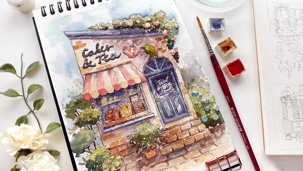
4. Ideation and Simple Shapes: After looking at the references, I've decided to do a tea house that sells pastries and such. I've already picked up my theme, but if you're still unsure
what you want to paint, before you sketch out anything, it's a good idea to just
list down all your ideas in your head just to
clear your head and have it visualize
right in front of you, which makes it a
little bit easier to pick and choose afterwards. You can just write
it down like cafe, bakery, a candy shop. Ice cream shop or
even ice cream cart. I've painted that for
and they're super fun. You can really
play with a lot of really soft pastel colors. You can even do a butcher, cheese shop, or
even a fish shop. The list just goes on and on. Flores is also really fun subject to paint because
you can play with lots of different
colors in the flowers and the display to
decorate your shop with. Here are just a few ideas. I'm just going to write
it down really quickly. Then after this, we're
going to talk about shapes. Of the buildings, which
I'm going to keep simple since I want this to
be doable for all levels, and we're going to match
it according to the type of aspect ratio we have on our paper so it
can be framed nicely. So for mine, I have
the idea of maybe writing tea and cakes or cakes
and tea for the signage. I think that would look cute. So I'm just going to jot it down right here so
I don't forget. And next, let's discuss the shapes as well
as the framing. Before I start to paint, I usually want to make sure
that whatever I'm painting is suited with the aspect ratio of my paper that I
want to paint on. So if you have
multiple sketchbooks that you can paint
on, of course, you can design your composition beforehand and
then just pick and choose the sketchbook that
would suit that composition. However, since I
want to paint in a specific sketchbook that
I really like the paper of, I'm going to make sure that my design suits that specific size or aspect
ratio of that sketchbook. So here, as an example, I'm just going to sketch out a very small and simple
shape for a shop. So here, as you can see, the silhouette of the
shop more or less suits. This square type of sketchbook or even a vertical
would still work out. But even if I do this
for a vertical layout, I feel like there would still be a lot of space at the top. That's something that
you can fill in with decorations or plants or trees. But you can also
extend the height of the shop to better suit
the frame that you have. So here just a
couple of examples. But you can see from these
types of building paintings, it might not suit a
horizontal layout. If you, however, still want to paint on a horizontal frame, I would recommend for you to add additional
buildings on the side, but make sure that the one in
the middle is the main one, so you don't add as much
detail on the sides. Well, this still depends on the style that
you're going for, but that's just an idea of how you can fill a
horizontal layout. I'm just going to
do an example here. Here, I'm just
going to play with a different proof
style for the shop, and on the sides, I'm going
to add some taller buildings. But you can see because there's a lot of space on the sides, and generally buildings
are taller going upwards. The size of your main
shop wouldn't be as big as a square or
a vertical layout. The way, this is also the
perfect time to sketch up some ideas for the shape of
the buildings very quickly. You can see how small
these sketches are and I like to at the main features
like the window shape, door shape, roof type, signage, and so on. I'm just going to draw
a couple more here, very small thumbnails of the different types I
could possibly make. These again, are just
very simple ones, but you can make it as
complicated as you would like to. After sketching a
few types here, I quite like this one. As I mentioned from
the previous lesson, I really like the slanted roof, and I just decided to add a
small canopy over the window.
5. Details and Ideation Development: M. Okay, next, I'm going to do the final composition
before I do the sketch. Since I already know what
type of sketchbook I want to paint on and it has a
vertical aspect ratio, I'm going to just
try to frame it and figure out how I could decorate
and lay out the elements, so it would fit nicely
within my paper. Here, I want to add a
tree on the left to fill some extra empty space
and increase the height. And I also want to
experiment a bit with the shape of the door and the window display to see what
type would suit the shop. The bottom here is looking
a little bit empty, so I can extend
it downwards with stairs and maybe some
potted plants by the sides. I can also draw out
the flooring of the pavement in
front of the shop to fill the rest of the space. For the window display, I'm going to add some
bread baskas just like in the display
window of the reference. As for the signage, I'm going to write script to fill the awkward
slanted space at the top. Now let's try to
sketch another one. Again, I want the
shop to be centered, but this time I'm going
to add some foliage covering the top right
side of the shop to more or less equalize the
height on both sides or at least do not have
too big of an empty space, and I'm just going
to see which one would work better
to frame the shop. I like the placement of the
extra greenerys on the right, so I decided to add it on the first composition again to see how it works
with that one, but I feel like it looks
a little bit too lush, and it looks like the shop is placed in the middle of
nowhere because of this. So I'm going to stick with the simpler design on
the second sketch. Before I sketch out
the real thing, I just want to draw a
slightly larger version so I can include a little
bit more detail and see how I like it. This is just to make sure I like how certain details look. But of course, during
the sketch later, I can always change
things along the way, at least for the smaller
details that I add on later. But I just want to make sure
that the larger elements, like the actual shape of the building and the
windows and such are fixed, so I don't have to erase
too much if I make changes. I really like the idea of having the bread
basket in front, but to fill the back
of the display, I was wondering if I could
sketch out some cakes, but then I think it would be a little bit too
complex to paint them on such a small area since they're just at the
background of the display. So I'll rethink this
area later on if I can find anything that's
a bit more simpler to draw. I just want to know I'm going to add extra shells for now. I think I'm more or less done. I just want to make sure it
fits nicely within the frame. And I also try to add a bit more trees in the
background to see how it looks. But I think I'm just
going to leave it here.
6. Sketching: I'm quite happy with
the design so far. I like the addition of
the teapot as well. So the signage has a
little bit of a flare. So in this lesson, I'm going to lightly sketch
out the composition. I'm using cold
pressed paper here, so it's quite difficult to draw straight lines
since the tip of my pencil gets caught within the texture of
the paper sometimes. But I try to just roughly
center the building first. I also gave up and
I end up using a ruler for the
longer lines just to make sure everything
is straight and not completely diagonal or wonky. Just makes the process
so much faster, especially on the first step
where I want to establish the size and position as well
as the slant of the roof. Generally, I prefer to not use a roller because
sometimes it can make a sketch look overly too
technical and organic. But for this case,
since I am going to outline it again using ink, then I'm going to get rid
of the pencil sketch. I can follow the lines
without a ruler later on, hopefully there will
still be imperfections to the lines which can help it look a little
bit more organic. The foliage and the plants would also help
with this, I think. I'm going to keep
using the ruler for longer lines of
the main features. I feel like the edges of the
stairs look kind of vary, so I decided to add another
plant right next to it, just to soften those edges. Since I already draw
out a tree on the left, on the right hand
side, I decided to add a bush instead
just for variety. Now, for the foliage
on top of the roof, because this will greatly
frame the overall painting, I want to make sure
that I really play with the height as well as the
texture of the edges. For the sign here, I'm just
going to write it normally, but I'm going to somewhat outline it with my ink later on. But you can also do
this at this stage if you don't feel comfortable outlining it
straightaway with pen. As for the added teapot, I decided to add a vine which
comes out from the teapot, I think this just makes it a
little bit more interactive. However, I actually
painted this right after, and I didn't end up liking it. So in the next lesson, I'll basically use
another sketch that I somewhat
trace from this one, but the outline will be slightly different as I'm going
to get rid of that vine. Instead, I'm just
going to do, like, a small bushy greenery
coming out of the teapot. For the bread display, I'm just going to do
small circles or ovals, and here are some baguettes. So they're long ovals,
and for the next one, I'm going to do maybe bagels. I know that the name I've
written here is cakes and tea, but I'm drawing bread,
but I feel like most bakeries also
sell cakes, anyway. And personally, I just
find that cakes and tea sound better
than bread and tea. But at the back,
I've also decided to display some teapots
and some teacups, as well as some packages that is going to represent
some boxes of tea, just to link it to the name. However, if this bothers you, of course, you can add some
display cakes instead. I just find that breads are
so much more fun to paint, especially in displays because they are very simple shapes. I decided to go over the
door with my ruler again. I feel like because there are a lot of small thin lines here, it's just a little bit
safer to use a ruler. So when it comes to
the smaller details, it's a bit easier to
divide up the space.
7. Outlining: On the right, you can see that
my outline is a little bit different compared to
my previous lesson. But this is because it's a
second outline that I did. On the left here is the first
painting that I attempted, but I didn't like
how muddy some areas are and I also don't like
the leaves on the teapot. I feel like it just looks
a little bit too crowded, so I decided to change it
to just green foliage here. I'm also going to
change the color of the flowers as well as
the windows and the door. But if you like the
first color combination, you can go ahead and
do something similar. I just want to experiment
more with the colors. Instead of green for the
accens of the roof door, and the window, I'm going
to choose blue instead. But of course, you can go ahead and do your own color
combination if you'd like. So in this lesson, I'm going
to ink the retraced outline. I'm using a waterproof pen here. This is very important because we're going to paint
on top of the ink. So make sure that
it is waterproof. If not, the paint
is going to bleed as the paint and the
water touches the ink. I'm using black here, but I find if you have a
waterproof brown pen, it'll also look nice
as the outline. In fact, it'll make the lines
look a little bit softer. For the outline of the trees
or any of the foliage, I want to make sure that I play with the height
of the edges. I like to make small and
uneven curved lines, sometimes curving inwards if
you want the trees to have softer foliage and if you want them to look a little
bit pointy and rough, you can make the lines a
little bit more jagged by curving them
outwards instead. For the smaller potted plants, just for a slightly
different texture, I'm going to draw out
some pointy leaves, and I'm going to pair
this up with some of the curved lines that
I drew out earlier, and this will just give a little bit more
volume to these plants, and the different
textures will just bring a bit more interest
to the painting later on. If you're unsure how to do
this with pen, of course, you can just sketch it out in your sketchbook or
scrap paper and see the types of lines you can create to make the outline
look a bit more interesting. I'm going to do something
similar for this one. You can see the first one, the leaves are a little
bit more pointy and sharp, whereas with this one,
I'm making them softer. The change is very subtle, but you can see that the sides of these
leaves are softer. It has more of a curve lines. Whereas for the first potted
plant that I drew out, the edges of the leaves are a little bit more
angled and sharp. And just like before
I'm going to fill in the sides, those tiny curves. And I also added
a bit more leaves at the center to add volume. By the way, for any of these
elements in the painting, feel free to add your
own flare and details. Like for the pots. You can make them different shapes
if you would like. You can even take
the main outline of the building and add your own twist or even do a
different theme altogether. For the bricks at
the bottom here, you can see from
the pencil outline, I just drew out long lines, but as I ink it, I actually want to draw it
out as individual bricks and I make the edges or the
corners a little bit curve. This just adds to
the extra realism, even if it's just the outline. I'm also going to do the
same for the stairs, I decided to add
this last minute. You can see here my lines are also a little bit imperfect. This also adds more character to the outlines instead
of everything looking perfect with one weight
for the lines which might in the end make it look kind of digitalized or kind of cold. This adds more of a human touch, but just make sure you're
following the pencil sketch. So even with those
imperfect lines, they're still more
or less straight and going in the right
direction at the very least. I really took my time
while outlining and I just find it quite relaxing just following
the pencil sketch. For the welcome mat here, I want to make it look a little bit textured as well,
kind of fluffy. So I made the lines dotted. This way, the edges doesn't
look too straight or sharp. I think that's more
or less all I need to mention for the outline
for the rest of the building, I just want the lines to again, not be too straight, which is why I'm not
using a ruler this time. I find that using cold press
paper kind of helps with more texture as well as the
different subtle line weight. But be very slow when drawing the long lines and take
your hand off often so it doesn't suddenly go the wrong
direction because we can't really erase this since this
is permanent pen or ink. I forgot to mention
for the canopy here, since I'm going to paint
it with two colors, I'm making my lines very faint in between
those two colors, so it doesn't look too overly cartoony or
two dimensional. Specifically, for the frames like the window frame
and the door frame, I want to add some line details. I'm not sure what these are, but usually they're not
just one flat thing. It's also harder to paint the details rather
than outlining it. So when I can, I'll add certain small
details to the outline, which in turn will
support the painting. Here, I've decided to
make simple bread baskets because this store also
sells bread and pastries, but you can change it to a different display if you
want to change the theme. So just like the window frames, I'm going to add
some extra lines for the door frame as well
and only for the frames. I'm just going to speed this up, so it's much easier
to see the process. But like any parts
of the outline, make sure you take
your time to do this, making sure that your lines
land at the right places. For the bush at the
top of the roof, I'm just going to
outline some flowers, and they're quite big
because I want to bunch some smaller flowers, not that it's going to
be visible or anything. I also make sure that
the curved lines look very soft and they're
all facing inwards. As for the green parts, I'm going to treat them the same way as the trees on the sides. The roof is a little
bit tricky to outline just because the
lines are very long. So make sure to do this
very, very slowly. Again, I try to do
this without a ruler. But if you feel like it's an impossible task, you
can also, of course, use a ruler just to make
sure that the distance of the lines stay more
or less quite similar. Then once I'm done, I'm going to erase all the pencil marks. The only part that I'm
going to leave out is this area where it says TT. I'm going to use my
pencil to just darken it. So when I paint it with a
dark background later on, I can still see the outline and then I can put the
white paint over. Lastly, I decided to go over
some of the lines to thicken the line weight for areas which might have a
little bit of cashedo. This will just help
a little bit with the depth of the form
for the frames and such, so the outline detail can help support the
colors later on. The light will come from the top and mostly from
the right hand side. I'm just going to thicken the lines at the
bottom of the frames. I forgot to also add extra lines at the
top of the canopy. They usually have something to hold the canopy to pull
them in and out of. The lines here that I draw
was a little bit too thin, but I think it's still okay
for this illustration.
8. Painting: Flowers and Canopy: Let's start to paint.
I'm going to paint the flowers as well as the
canopy in this lesson. I'm going to use nice
peachy pink color, and I'm going to
use pastel tones. This is from a mix of quin red, handsy aluminium, and a
lot of Jon Brilliant dark. And I'm going to use a
medium consistency to almost a light consistency to just.in with the tip of my
brush with a medium load. This is just for the base color. You can see I'm also leaving out some white spots
here and there. This is to suggest
a little bit of highlight as well as
texture to the flowers. Since I painted this
using a medium load, those dots that I painted
should be fairly dry by now. So next, I'm going to add another layer using more
or less the same color, but a darker value. So this is with added quinn red and yellow ochre instead
of the Jon brilliant dark. I'm going to apply this
the same way as the base. But instead of covering most
of the area for each flower, I'm going to paint at the bottom following the curvature
of those puffs. I'm going to let them dry now
and move on to the canopy. I'm going to start
with a really light pink just like the
base of the flour. So I've just added more Shan
Brilliant dark to the mix, and I also added more
water this time, so the color is much lighter. I'm painting,
alternating between the white and this pink for
the top of the canopy. And while the surface
is still damp, I'm going to pick up a
little bit more pigment of the slightly darker value and just.it in some random areas. So what I painted
doesn't look too flat. You're a beginner though and
adding water with wet on wet technique is still a little bit too
intimidating, of course, it's okay to paint this
whole composition using flat colors and only layer according to what's
comfortable for your level. It will just look
slightly different, but it will still look
nice nonetheless. Under the line at the top, I've added a darker
value as well. And for the white parts, I've added a touch of Prussian blue to the
light mixture before. This is just to mute the color and turn it into more
of a grayish tone. You can see that it still
has a bit of that pink, but I'm just using a really
light consistency to create this really light tone
for the top part of the canopy since the light
is hitting it from the top. So for the front facing side, I'm just using the same color, but in a thicker consistency
for a darker value. Also going to do the same
for the pink areas as well. I'm just going to use a darker
version of the same pink, just like the flowers before. Barely using any pressure as I'm painting with
the tip of my brush, and you can see I've left some white spots just
like the flowers. This is to make the colors look slightly
textured and uneven, which is like a
stylistic approach, I would say, and I even intentionally add thin layers with slightly different values. This I feel gives
a slight texture custd from light in
between surrounding areas. I feel like it also helps with the painting looking a bit
more loose at the same time. I've decided to add some
grayish blue flowers as well for the
side of the bush, and I'm going to
paint them similarly, which is as clusters, just like the pink
flowers before. This time, I didn't
outline them though. And for the base, I've used the pastel color from earlier with added gray of
gray and some Prussian blue. And for the second layer, which is to give a bit more
volume to the flowers, I've just added a little
bit more Prussian blue, but I'm still using a
fairly light consistency. So the colors stay
muted and light. I
9. Roof, Window, Door: In this lesson, I'm
going to paint the roof, door, and the window frame. This is going to be the
exon color for the shop, and I've chosen this
blue as a color. My first painting, I did green, and that looks really
nice, as well. A little bit more earthy, so you can also do
that if you'd like. For my blue here, I mixed
in some Prussian blue with a little bit of quin red to make it
slightly brighter, and I've also added some gray of gray to turn it into
a pastel color. Painting the roof and as
I get closer to the side, I've added more
Prussian blue and quin red for darker
version of the same blue, and to darken it even further, you can also add a little
bit of burnt umber. This will not only deepen, but it will also mute
the colors slightly, so it's great for shadows. I'm going to let the
roof dry, meanwhile, I'm going to move on to paint the window frames using
the same colors as before. And since this is just the base, I'm using a light
consistency first. For this bottom part
and make sure that the top face is slightly darker because it's
covered by the canopy. I use the darker
blue and I'm going to use a lighter blue for
the front facing side. Since the light is coming
from the top right, I've left and the right side slightly brighter
than the left side. In fact, I'm going to darken
the left side further. As for the window frames, the left side will be much
darker than the right side. I'm just going to line the extra detail for the
window frame on the right. I feel like the small corner will still be covered
by the canopy, so I've darkened it
slightly as well. I'm going to add the line detail for the left side of the
window frame as well. And here you can see I've added more quin red
in the ratio for a slightly different version of the same color because
it has more red. The color is more purple
than blue, but that's okay. I don't mind this
little variation. In fact, I like to pair harmonious colors together
for some variation, similar to what we
did to the canopy. As I move onto the
right hand side, I've added more Prussian blue as well as burnt umber
into the mix for a darker blue as some parts are covered by the
foliage on the roof. I want to add some uneven cstdo from the leaves of the foliage, which might reflect the roof and small parts of the building. But I'm going to add
it section by section. So as I'm painting the roof, it might look slightly abstract, but I like to leave bits
of the base color still showing as the light blue and
some areas slightly darker, and the movement of
the lines will look slightly diagonal directed
to the bottom left. Also use a thicker consistency to line the detail of the roof. Then since it's quite wet, I'm going to move on
to paint the door, starting with the base color, the similar light blue as the roof as well as
the window frame. Starting with the base, since the door is quite a large space, I want to start intentionally
leaving some white space to suggest light
reflections traveling between the foliage on the roof. Again, though, I'm going to keep the direction consistent
with the roof and I'm directing it on an angle from the top
right to the bottom left. Just as a friendly reminder,
if you're a beginner, you can just use flat colors instead of the
added cast shadows. So you can just paint it using one color and cover
a whole area. But if you're up
for the challenge, feel free to give this
technique a go as well. Now I'm layering in the cashedo
for the top of the door, again, directing it diagonally. I'm just using the tip of my
brush to cover small areas, and the base here is
still a little bit damp, which helps soften the
edges of what I'm painting. Once I've established
the cast shadow, and the surface is
a bit more dry, I picked up this
really dark blue. This is from the same mix
with added burnt umber, and I switched to
my small brush to add the line details
for the frames. And lastly, I'm also going to add shadows for the bottom of the angled moldings on the door to give it a bit
more dimensionality.
10. Exterior Wall: In this lesson,
I'm going to paint the exterior wall,
and for the color, I'm going to try to create
something that's neutral, but it still has a light hue, so it doesn't look
too pale or muted. For the color, I first
use John Brilliant dark with quin red and a little
bit of Prussian blue. I'm going to neutralize
this pinkish color by adding yellow ochre
and also gray of gray. You can see that I didn't mix my colors evenly on my palette, and this is done intentionally, so it's okay to pick up certain colors which has
slightly different tones. I actually prefer
a little bit of variation and for shadowy areas, while the surface is still damp, I also added a little bit
of that blue mixture from the door earlier and I
painted on top of the base. I'm using a really
light consistency with a lot of water in my ratio because this is just the base and I don't want
the wall to look too dark. I actually want it to
be a very light color that almost just looks
like a light tint. With watercolor, it's
always easier to add layers on top rather
than taking it off, so it's always safer to apply
your paint in this way. This is also the same
for the casheo because I still want to balance out
with the surrounding area. I don't want to accidentally
paint it too dark. So I'll just use a
fairly light consistency in the beginning and layer
it little by little. Sometimes it can
be a bit difficult to use a really
light consistency. So if you accidentally
put down a color that's a bit too dark on
your paper before it dries, you can quickly wash
off the rest of the paint and your bristles
and then use the excess water that you wash your brush with to pull the rest of
the paint so you can spread the rest of
the pigment that's already on paper outwards
to a larger area. After spreading the paint, I feel like the overall
hue looks a bit too pink. So I'm going to add some light colour variation using just purely yellow ochre, and I'm just going to add it
on in small random spots, and then I'm going to
soften the edges or blend it a little
bit better with the base color using
a clean damp brush. Next, I'm going to add the shadow custard from
the foliage on the roof. The surface should still
be a little bit damp, and the color I'm using
here is from Brussian blue, quin red, and a little
bit of burnt umber. This is a similar
color to the door, but you can see that it's a little bit more
purple compared to blue because it has more
quin red in the ratio. Just like the
cashedo of the door, I'm directing the
marks diagonally, and I've also left out some white spots to suggest some space between the leaves. While I wait for
this area to dry, I'm also going to
line right underneath the roof using a
slightly thicker consistency of the same mix. I feel like I want to
increase the value, so I'm repainting the shadow
right underneath the canopy, especially right at the top. And just to keep it consistent, I'm going to paint it
diagonally as well.
11. Foliage: In this lesson, I'm going
to be painting the plants. I decided to add little bubs of flour for this potted plants
just for extra color. For this, I use a mix of handsy yellow medium with
a little bit of quin red. While I let the flowers dry so the color doesn't
bleed out into the green, I'm going to create
the greens that I'll be using for
all of the plants. Here I've used
handsy yellow medium with Prussian blue
as the main green. Then I'm going to create
different tones by adding more handsy yellow medium
and the ratio on the side, also bit of yellow
ochre and burnt umber. Just like how I painted
all the other areas, I like to keep the color separated from each
other on the palette, so I have access to
the different tones. Here I'm using
quite a deep green. So I just picked the color which has a lot of Prussian
blue in the ratio. You can also mute this down
if this looks a bit too vibrant by adding
some burnt umber. Then at the top of this screen, I'm going to use the color which has more
handsy yellow medium. You can see the slight
changes in tonality. As I'm applying the paint. Since the light is coming
from the top right, I want these areas to have a brighter yellowish green
that is a little bit warmer. Whereas at the bottom,
I want to use a deeper and darker green
for the shadowy areas. I'm going to use a really
dark green at the bottom. This has a lot of
prussian blue in the mix and also burnt umber, and I'm also using a
really thick consistency. I just feel like this area
would be in quite a dark spot. And while I still have this
dark green on my bristles, I'm also going to add shadows underneath some of
the flower clusters. I'm going to keep building
on the darker value, so I've picked up a really thick consistency
of the dark green. Again, I'm going to
place it underneath the flower clusters and also at the bottom of
this push altogether. Because I've applied
the dark values in such a thick consistency, you can see a really stark difference
from the base color. So to make this less glaring, I'm going to use a clean damp brush to
soften the color a little bit around the edges
just to create a softer transition between the darker values and
the lighter values. While doing this, I'm also
still using the dotting method as I'm painting the leaves
before to keep the texture. After adding the darker
values on the greeneryes, I feel like I need to darken the cacheo on the roof as well just to balance the values. Now let's move on to
this tree on the left. For this one, I'm starting with more of a
muted earthy green. This is just for the base. Then I'm going to follow this up with the same dark green, which has more prussian blue and burnt umber in the ratio. For this one at the bottom, even though they're
the same tree, I feel like the first two clumps before were covered a
bit more by the canopy, so I decided to paint
them slightly darker, whereas I'm imagining that there would be light
coming through the side, so the right side would be much lighter compared
to the left. Now moving along to
the potted plants, I'm going to start with
a bright yellow green, so I just added more handsy yellow medium into the mixture. And then at the bottom,
I'm going to use a similar tone of dark
green as I've used before. Moving on to this
other leafy one, I've just mixed the dark green with the yellow green before. Again, I'm just dotting
it in random areas, especially where I
draw out the leaves. And in between, I'm going
to use a darker green. You can see this is a
little bit more muted because it has more burnt
umber in the ratio. For the bush on the
right, I'm just going to treat it again the
same way as before. You can pick whichever tone
of green that you would like, but I'm going to darken most of the bottom area and leave
the top fairly light. You can see the color of
this bush is more vibrant compared to the other foliage
that I've painted so far. This is because it
has less burnt umber, so the color is brighter
and less muted. So depending on the type of green or the tone of green
that you're looking for, you can just play
a little bit with the ratio of the color mixtures. I decided to extend the color upwards by using
some neutral gray. This is the same
green with added burnt umber in a really
thin consistency. I'm also going to mix in some of the purples that I've
used for the cast shadow, and I'm just painting
this bushy texture, but in a little bit more
of an abstract way. This is just because
I don't want to extend the color of the sky. This is just because I
don't want to extend the color of the sky
too low later on. Lastly, for the green
of this teapot, I want to make sure it's quite bright to
support the building, which is the main element
of this painting. I feel like this works so much better than the
single vinee I sketched and painted earlier just
because it's slightly larger and it looks less
cluttered this way.
12. Pots and Brick: Okay, next, I'm going to paint the bricks as
well as the pots. And for this, I'm going to
use a mix of burnt umber, quin red, and hansa
yellow medium. Now, depending on the color
that you're looking for, if you want a terracotta color, you want the hansa yellow medium and quin red mix to be
a bit more dominant. Whereas if you want something
more like this brown, you would increase the
burnt umber in the mix. You can also create a
brighter and lighter brown by increasing the hansa
yellow medium in the ratio. But if you want the painting
process to be simpler, of course, you can just use
one color for all three pots. I'm going to use the same
mixture for the bricks. And you can see I've left out some white around the bricks. And this is again to just
separate them and make them look like singular bricks instead of just one flat thing. And I feel like this also makes them look a
bit more textured. I'm also going to do the
same for the stairs, again, painting them individually
instead of just doing a minimal amount
of sweeps with my paint. And I've also left the
top empty for now. To give the brick a
bit more definition, I'm going to outline the bottom
parts of the brick using a thick consistency
of the brown and I'm going to pair this up
with a darker brown as well, which I've added some
Prussian blue into. You can see the brown here looks much more muted
than the previous one. While I still have this brown, I'm also going to
use the same tone to paint the cast shadow from the potted plants on the brick. While I wait for the
paint to settle, I'm going to paint the welcomat, and this is from the dark brown with addtansa yellow medium. This kind of just looks
like yellow ochre, but my yellow ochre was very contaminated
with other colors. So I just mix up a color that is similar
to that tone instead. The cast shadow end up being a bit too heavy for my liking, so I'm just going to
take a little bit off with my tissue
after reactivating it. Here I try to use a little
bit more blue in the ratio, and then I pair it up
with more brown just for some color variation to
bring a bit more interest. I'm also going to use the
same dark brown with again, some added blue for the casado
of the plants on the pots. Lastly, for this lesson, I'm going to paint the pot using the same pink I use for the
canopy and the flour on top. I'm using a light
consistency for the base, and then I use a dark value of the same color to paint around the teapot to give
this some roundness.
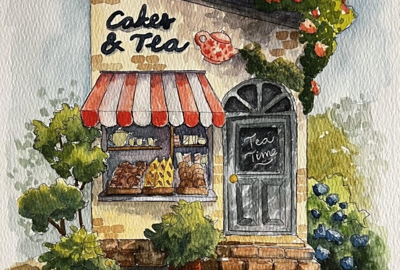
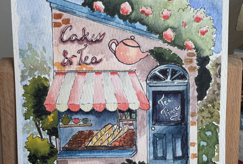
13. Display Window: Before we get to
the window display and the door and this lesson, I'm going to add a
little bit of shadow underneath the holder
of the canopy first. I use a dark blue color from
the cacheo of the door, and I'm just painting
this very lightly, applying one line first, and then I clean
my brush and use the dampness of my brush to pull some of the
paint downwards. Be careful when you're doing this because if you
put too much on, it might make your
canopy look muddy. Now let's paint the
window on the door. For this, I use a mix of Prussian blue with quin red and a little bit of burnt umber, as well as gray of gray. You can see it has come to
this very neutral gray color. I decided to add a
little bit more hue by adding more Prussian blue and a little bit of quin
red into the mix. Since Prussian blue
is very pigmented, it end up being a
little bit too vibrant, so I neutralized it slightly by adding a
bit more burnt umber, but you can see there's a
difference in the ratio. So now the gray looks a
little bit more vibrant. It looks like a really
dark blue gray. I feel like I've
covered too much, so while the surface
is still damp, I decided to take little
bits off with tissue. With the same color, I'm
going to paint in between the canopy and the display of
the teapot and the teacups, as well as the boxes on
the right hand side here. Just being very careful applying the paint using the
tip of my brush. And it doesn't
really matter if you leave out some white
space here and there. You can see I'm
painting diagonally, since I feel like on the right, I would catch a bit more light. So I've added a
bit more quinn red in the ratio for a
slightly brighter color. As you're applying the paint, make sure you're using really light brush load
so the paint doesn't puddle up in random places since we are painting on
tiny little areas. To follow this up, I'm going to paint the shelving
using a brown. You can just use burnt
umber by itself or mix up a brown if you have any
specific tones in mind. Then for the teapots
and the display, I want to look further at the back and the background
is completely dry. What I'm doing here is just reactivating some
of the color using a damp brush and pulling it towards the white of
the display items. Now for the bread, you can create different
tones of brown. For this one, I'm
just starting with burnt umber and a
bit of quin red. And you can see I'm
just painting this loosely since the items are very small and we have the outline to define
the edges anyway. Here, I've added more burnt umber for a slightly
darker brown, and I've also picked up some of the green that was
already on my palette, so the brown is a
little bit more muted. For the baguettes,
I've decided to add some yellow ochre
in the mixture, and I'm going to use
the same color to paint the cross on
the first bread. For the baskets, I'm using what's left on my brush and I've added some yellow ochre and
a tiny bit of quin red, and I'm just going to
paint it very loosely and I'm going to take off a bit with tissue on the
right hand side. Then for the insides
of the bread basket, I'm going to use that dark purple color
from the background. Some of the bread
looks a bit too pale, so I decided to go
over the colors again. And now that the background
is completely dry, I'm going to just lightly glaze a bit of hue on top
of that light purple. And because this is
only a light glaze, these items will still look like they're
in the background. I forgot to paint the
window on top of the door, so I'm just going back in with the same color
as the background. This is from Prussian blue, bit of quin red and burnt umber. And then right under the frames, I'm going to use a thicker
consistency of the same mix. This goes for the window
on the door, as well.
14. Sky and Ground: Now, let's paint the text
or the sign for the shop. I've just added more burnt umber to the queen red and
Prussian blue mix. You can see this comes to a
really dark and muted brown. Initially, I just
thought that I want a really dark color
to paint the sign. So it's a good contrast to the background
of the building. But after looking
at this again since the shop already has
somewhat of a blue theme, I realized that it
would be better if the sign is also a
dark blue color, something similar to the color
of the door or the roof, but I would use a much
thicker consistency. Well what's done is done and I'm just going
to go with it. I'm just going to add some small details before I
paint the sky and the ground. So for the door handle, since I've left it out, I'm just going to use yellow ochre. Then here, I'm going to write TT using a really thick consistency
of blue proof white, and I've also switched
to my small brush, or you can also use a
white pen for this. I'm also going to layer
in a bit more color in a light consistency over
the brick of the stairs. This is just to add a little bit extra texture
for the stones. Next, finally, we are
going to paint the sky. For the color, I'm using a mix of Prussian blue
with gray of gray, and before applying the paint, I just want to make
sure I lightly dampen the surface where I'm
going to place the blue. And I'm not doing this right to the very edge because I want
to leave the edge white. As I'm applying the paint, I'm being very careful when
I'm painting right next to the building so the paint
doesn't bleed in too much. I'm just applying
the paint by tapping my brush and letting the
paint bloom on their own. I'm leaving a bit of space in between for the color to travel, and I also want to
suggest some texture for soft clouds or just subtle but dynamic
background to this painting. For the blue behind the tree, I decided to add a bit more Prussian blue and
the tiniest bit of burnt umber to darken and
mute the blue slightly. So the brightness doesn't
compete with the foreground. As for the ground, I'm
going to start with a brown from a mix
of Prussian blue, gray of gray, bit of quin red, and a lot of burnt umber. I'm going to separate
it in my pen so I can increase the amount of
burnt umber in the ratio, and I'm starting with a
really light consistency. Doing a really light wash here, and I realize that the
color looks a bit dull. So I'm going to continue it with a slightly brighter
tone by adding some pansy yellow and a bit
of quin red into the mix, and I'm painting this
on the right hand side. While the surface is still damp, I'm going to go back in to
the previous color mixture, and I've added more Bussian
blue and quinn red. And I'm going to paint the
cashedos on the floor, specifically for
the potted plants, the stairs, as well as
the bush on the right. I'm also going to add
a bit of this color in between some of the bricks
for extra separation. Before I forget, I'm
also going to paint on the really thin tree trunks, and I've just basically added more burnt umber into
the blue mixture, and I'm painting in a
really thick consistency.
15. Final Details: Now, let's finish off
this painting by adding enhancement to the colors
as well as small details. Firstly, I'm going to increase the saturation of
the flowers here by using a mix of prescient
blue and gray of gray for the bottom of the flowers just to
make it look more blue. I'm also going to add brick textures to the empty
spots of the exterior. Just for extra texture, this is, of course, optional. If you don't like the
look, you can leave it with a cleaner exterior. And for the color, I just use basically the same brown
mixture as before. I didn't even mix
up anything new. This was still on my palette. I feel like I also need to darken the cast shadow a little bit more because it was kind of disappearing into
the base color. So I've just added a little bit especially closer
to the corners, but I don't want to overdo
this because I feel like it's quite easy to get this looking
quite messy and muddy. I'm also going to add drop
shadow underneath the writing, but I feel like this end
up making it look a little bit bulky because the writing itself was quite dark already. So I tried to salvage it by adding bleedproof white on
top of the writing later on. I thought that this would make it stand out a little bit more, so I've switched to my
small brush and pick up a really thick consistency
of ble proof white. In the beginning, I just
thought of adding highlights, but then I decided
to just go over it, and this will look like an actual writing with
outlines from the base color. Personally, I'm not too
sure how I feel about this, but I don't want to overwork it, so I just left it
there after I finish. For yours, of course,
you can just do one dark color instead of
overthinking it like I did. The white ended up covering
a lot of the brown spots, so I'm just going to add that
extra shadow underneath. The next step is optional, but I felt like sketching a
loose texture for the ground. I want this to look like stone, so I'm just going to free
hand the detail with my pen. This is a different pen. I realize after I
start drawing with it, that you can use
the exact same pen you've used for
the main outline. Here, as I'm drawing, I'm making sure that this follows a rough
perspective of the store, but it doesn't have to
look too clean or exact. In fact, I want my lines to look a little bit
scratchy and organic. If you don't want to add
this detail, it's also fine. I'll just have this detail in my outline just in
case you want to trace this and you want to
go straight to coloring. Here, I'm just
going to exaggerate the cast shadow for
the potted plants, and I'm also going to outline a bit of that texture
that I drew out earlier. So it looks like it's
part of the painting. I feel like the color
looks a bit dull, so I'm just going to glaze over a bit of this
bright orange. Just having a look
around and I'm going to enhance certain values
to darken them slightly. Or if I feel like certain areas need a little
bit more boost for the color, I would just increase
the saturation by doing a light layer over it. M This is just a fun detail, but I decided to add little
flowers on the teapot. Of course, you can
keep yours simple, but you can also add other
designs that you have in mind. This part is optional, but I feel like the left
area was a bit too clean, and I wanted to look
kind of more loose, so I added some splatters. And then I'm going to add some extra abstract tree
textures in the background. I feel like this extra
light green just pushes the tree further
into the background, which makes the
store front look a bit more in focus somehow. And that's basically it. At this point, I'm
just going to make little adjustments to balance
the painting as a whole. Going to add some
more little shadows in between the bread, as well as under
the window frame. And this is basically complete. M.
16. Closing: Congratulations for
completing this class. I hope you had fun and enjoyed watching the design
come to live. For the class project, I would love for you
to join in and create your very own storefront
in ink and watercolors. But if you have any ideas for other mediums,
you can also do that. Sometimes I see
students work with digital painting but with
watercolor textures, and they're so
beautiful to look at. So just feel free to
play around and you can make it as simple or as
complex as you want, according to your own levels. Have the option of painting what I've demonstrated
using the traceable. You can paint it exactly with the same colors that I've
chosen in the same manner. Or if you want a
bit of a challenge, you can either design
your very own or use the traceable as the main
template for the building. Then add your own
features and play with your own colors and just
add your own flare. Once you're done
with the projects, please don't forget to post
it in the project section where you can share with me
as well as other students. We can comment on
each other's work, send likes and encouragement. And personally, I just find it really exciting to see
what you come up with, especially with such a
versatile style of painting. If you enjoyed this class
or you found it useful, it would be a great
encouragement for me if you write a review. This pushes me to make more
classes that you enjoy, and it also helped
to boost my class so more people can see
it and enjoy on the fun. You would like to
see more tutorials, I do have a YouTube channel
called Nayani where I post weekly art
related tutorials. Sometimes I do
watercolors, but recently, I've been trying things like
acrylic markers, as well. Or if you would like to just
see the finished artwork, you can also follow me
on Instagram or TikTok. My Instagram handle is at IG Underscore Nanyani and my
TikTok is at Nanyani art. And that's basically
it for this class. I thank you so much if you're still here watching
right to the very end. I wish you the best of
luck for your projects, and I can't wait to see it
in the project section. I'll hopefully see you again
in the next class. Hey.
 Nianiani, Watercolorist and Graphic Designer