Transcripts
1. Introduction: Hi, everyone. My name
is Nia, and today, I'm going to be painting some colorful and
refreshing drinks. I'll be painting these in
a loose and simple style where I'll combine both the wet on wet and the wet
on dry techniques. And I portion it out in a way where I go over each
feature one by one. So you can have time to experiment, and
when you're ready, you can combine it all together and create your
own custom drinks. I try to make this class as thorough as possible in
order for you to get the full experience right down from going through the
references and showing you how I look out for inspiration
to the ideation for the glass shapes and
the painting process from the drink without ice. Then from here, I'll
try to introduce each element one
by one until I put it all together in
the final lessons where we'll combine the elements into four different drinks. With the way I've
broken it down, I would say that this class
is suited for all levels, as I've separated the class
where you can take your time and experiment with different
elements of the drinks. This way, you can just mix and match and combine
the things that you're comfortable with
and just paint or create the custom drinks
according to your levels. If you're not confident to combine all of the
elements together, you can always
simplify it the way you want it to and vice versa. This class is made
so that you can make your own decisions and create something that
you'll be proud of. In this class, I'll be
painting in real time. However, I'll still
be making cuts if my hand is either inactive
or off the camera, or there are a lot
of times where I'm just sitting trying to decide what to paint next or just waiting
for things to dry. So I would recommend if you
do want to paint along, two pause in between
each step, and this way, you have time to paint at your
own comfortable speeds and even have time to
experiment with different combinations that I might not cover in this class. I had so much fun
creating this class and I hope you share the
excitement with me. And if this sounds
like something you'd like to have a go at, come join me in this
class, and let's begin.
2. Supplies: Lesson, I'll go
over the supplies that I'll be using
for this class. Firstly, if you want to sketch
anything out for ideas, write ideas down for
different types of drinks or sketch out
shapes for the glasses, you can use a sketchbook or any paper you can use
print paper as well, and this is the
sketchbook that I used. For the pencil, I'll be using
my usual mechanical pencil. This is bipenl Sharplet, the filling is usually an HB or two B depending on the hardness that you
like to sketch with. As for my eraser, this is BIBOxy it cleans
out very quickly, and it's my favorite brand. Here are the brushes
that I'm going to use to paint the drinks.
I'm going to use two. The first one is just a
cheap synthetic brush size six by Georgian, or you can use any other brand. Like Rs or Giotto,
they work just fine. With a size brush, I usually
paint at a smaller scale. Here are the examples of the painting size that I'm
going to do in this class. However, if you prefer to
paint at a larger scale, I would suggest for you to
use larger brushes as well. For the smaller brush, this is a Windsor Newton
scepter gold size zero and the bristles
are very tiny, so it's very easy
to control when I need to paint little details like the bubbles for the fizz. I always have tissue
right next to me when I paint because this is the key to controlling
my brush load and how much paint
gets put on paper. I'm also going to
use this to lift some parts of the
painting like the ice. It's a good way to control
the load on your brush and how much water is
on your paper as well. You also need a clean
jar for your water. I'm just going to use one
and I like to just change out my water if it gets
too muddy and thick. I'll be creating drinks with
a lot of different hues, which means the water will
get dirty fairly easily, so I will need to change
it out every so often. However, I know
there are people who prefer to use two jars instead. One is for cleaning your brush, and the other one is to reload your brush and
pick up other colors, so it stays nice and clean, whereas the other jar is
generally more dirty. So there are two
ways. It's completely up to you which one
you prefer to use. For the palette, I'll be using my favorite palette
that I've always used, which is buy diso it's a
cheap plastic palette, but it's old enough, and I've used it so many times that it has
micro scratches, and these micro scratches are what keeps my paint
from beating. You can see that
whenever I mix my paint, it doesn't beat up, but it
just tastes as mixed paint. And this way it's much easier to control the
load on your brush, whereas if it beads, sometimes your bristles
will absorb too much paint. If beading is a problem for you, you can use porcelain palettes, or you can just keep using your old palettes until
it becomes like this. As for the paintings,
I'll be using this paper, which is by Canson XL 300 GSM. I feel like this paper is fairly well known and
quite easy to get. However, if you only have a different brand of
watercolor paper, you can also use whatever
you have on hand, if you're completely new
to watercolor painting, you will need watercolor
paper for this. Please don't paint on
print paper because the texture and the
thickness is very different. This is the book that I
ripped out the paper from. Looks like this, and
I use a size A three, so it's nice and
big, and I can do as many trials as I'd
like in this big space. However, you can
also do this with smaller paper or even in
your watercolor sketchbooks. This is optional, but
I usually like to have a hair dryer right
next to me as I paint to make certain
areas dry quicker. As for the colors, here are the ones that I'll
be using or you can use similar colors
or even create your own. This is indigo by Sminke. Ultramarine finst by Sminke, permanent green number
one by Holbein, shone brilliant
dark by Schminke, permanent yellow
deep by Holbein, yellow ochre by Holbein. Quinciana by Daniel Smith, Vermilion by Holbein,
Crimson Lake B Holbein, and Quin red by Daniel Smith. I'm also going to
use ble proroof white by doctor PH Martins or you can also use white guash,
preferably titanium white. For those of you who are
not comfortable drawing, I'll have the outline of
the final drinks available to download in the projects
and resources section. The size is 29.7
or the height of an A four piece of paper
by 15 centimeters, but you can always
resize according to the scale that you're
comfortable painting with. Here are the list of supplies in case you want to
get everything ready, you can take a
screenshot of this, or you can also download it in the projects and
resources section.
3. References: Let's start by looking
at references. I personally like to
look through Pinterest. You can also Google certain
drinks that you want. You can list out ideas and
then search them one by one. Or for me, I personally
just search ice drinks, and you can see so many
different types here. When you go through these, you can look at certain
colors that you like or texture combinations or even the toppings that
you find interesting. Personally, because I want
this to be for all levels, I'm also looking at simpler ones like this
passion fruit one. There are nice textures and
nice color combinations, but I can also simplify the glass to not
have these textures. So it's just a little bit
easier to paint later on. Let's crawl a little bit more and find interesting examples. I personally wouldn't really
like something that has too much ice because it might overcomplicate
the painting. So just looking around here, that blue ichi looks like it has an interesting
color combination. Find things that interest you and even find the
fruits that you like. For this punch here, this is
an interesting combination, but I find that this
will be very complex because of how many
things are in the drink. And since we're
simplifying this, those details are actually
not going to show through. So if you want to paint
something complex like this, but in a loose manner, I would suggest for you to
do it in a large scale. For the sake of
this class because I want this to be kind of beginner friendly and something that can be painted
for all levels. Here's another nice one. I really love the soft pinks
and also the grapefruit, but we might not put
all of the details in, but just take
elements of the idea. So here are the ones
that I've saved so far. I love the simplicity of
some of these drinks, and they don't have too
many bells and whistles. They're fairly simple but
also has interesting colors, and all of the drinks here
look very refreshing. I also love the
transparency of the colors. Ones that I've saved, later, I might pick one or
two or even combine certain elements together
for the final painting. But in the next lessons, I'm going to treat the
techniques as exercises, and I'm going to try
to break it down, so there's no pressure, and you can repeat
and experiment with different combinations as
many times as you'd like. These can just be fun trials, or once you build confidence, you can also turn it into
a final composition. Is an example of what I did
before creating this class. These are my trials. You can see that I've painted these on a scrap piece of paper, which was from my
previous class. I just find that doing it this
way builds less pressure. So you can make all
the mistakes you want, try different techniques and color combinations
without having too much to think
about all at once. I really enjoyed this trial, so I hope you also enjoy the way I've broken down
this class as well.
4. Glass Shapes: Before we actually
get to the painting, I'm going to go over the glass shapes first in this lesson. And since this is
for all levels, including beginners,
I'm going to keep it as simple as possible, but I am going to just try to show you
different combinations as well that you might
want to try just in case you want a bit
more of a challenge. So for the first one here, the simplest one is just
a cylindrical shape, and by changing the height, you can also create
a different glass. So let's try to make it next. With more or less
the same shape. Now for this one, I'm going
to curve the bottom slightly, it looks like a very long. Let's try to make
a shorter one of this and it looks like
a bow at the bottom, you can also add a little base. Moving along to the next one, starting with the oval opening. Then I taper a little bit at
the bottom. Just draw more. By the way, for the opening, you can also make the
opening larger if we're looking at the glass
from a higher angle. Whereas if you're looking
at directly from the front, then the top and the bottom would be
more or less straight. So this is completely up to you how big you want
the oval to be. I'm just going to
keep it more or less like this and
not think about it too much because I don't want to overcomplicate this class. These are just examples
of the basic shapes. If you want to add little
details to the glass, you can also add lines, or you can also add something that's a little bit
thicker like this. Of course, there are other
shaped glasses as well, which are more interesting than the one that
I laid out here. I'm just going to draw
a few as examples, but I'm going to
demonstrate with the simplest cylindrical
shaped glass when I'm painting in the coming
lessons because I want to focus on the
drinks as we're painting. But I'm just laying out
the options and ideas in case you want to
try any of these in your trials or experiments. Just laying it out there,
you can even paint cocktails or alcoholic beverages
with a martini glass, champagne glass, or wine glass. So there are just
so many options. You can draw more here as your ideation library
if you'd like, but I'm going to stop here
because I want to focus this class more for the
actual filling of the drinks.
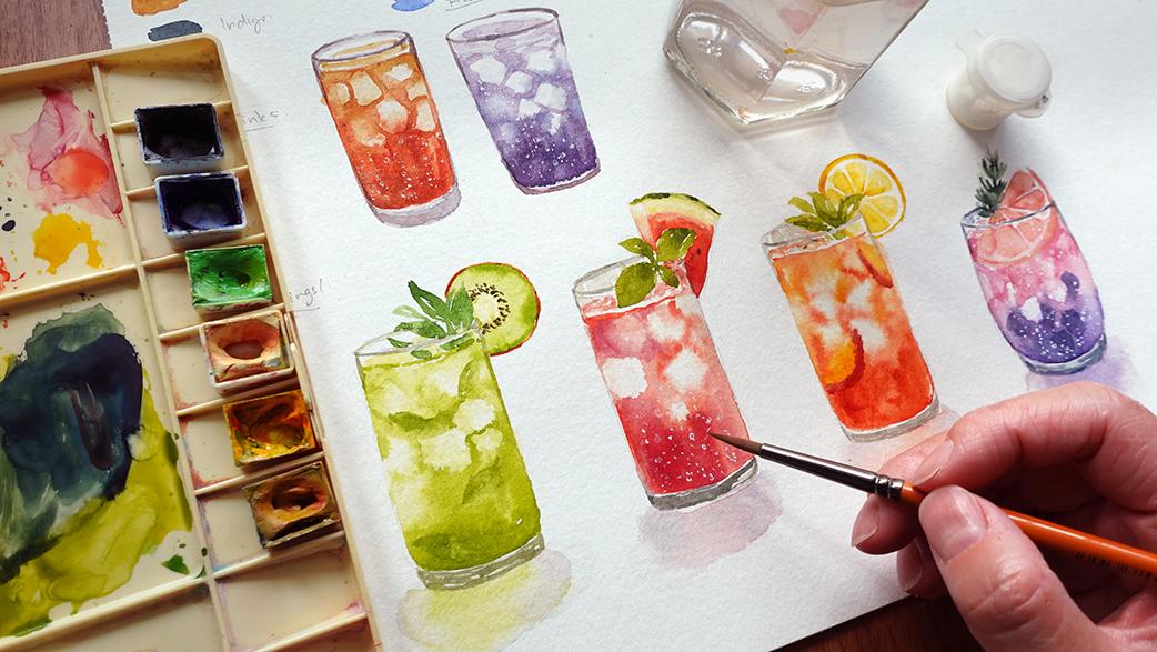
5. Non Iced Drinks: Okay, let's start with
the demonstration. I'm going to be
using my Kansan XL. This is a 300 SM, watercolor paper, this
is an A three size, so it's nice and big, and
I'll have a lot of space for me to experiment and play
with different variations. If you don't have the exact same one,
though, that's fine. You can just use the sketchbook. In this lesson, I'm going
to paint non iced drinks, and the first one
that I'm going to experiment with are teas. I find that you can create so many different
variations with T, peach tea, lemon tea, and such, and you can
also add syrups to it. So I'm going to
show you the browns that I will use and the
yellows and the reds. So you can create
different tones of browns. You can kind of mix and match
if you want to paint teas. I'm doing this because I feel like teas are
something that is kind of a staple
of all cultures, so it's easily accessible. So this might be something
that you might want to try. So let's go over the colors. Firstly, I have Quinciana here. If you don't have
this exact color, you can actually
use burnt umber. It's quite similar
to burnt umber, which is in a lot of palettes. But Quinciana is just so
vibrant and saturated, which is the quality that
I love about this color. But if you only
have burnt umber, you can also add vermilion
to your burnt umber. If you don't have vermilion, this is a mixture of a primary red with the
tiniest bit of yellow. So it's basically just a slightly orangey
red that looks like this. And when we put this
next to each other, you can see the similarities
and the warmth, which is why you can
just add this color onto your burnt umber to
create something similar. Next in line, I have
permanent yellow deep, which is a warm yellow, or you can use primary yellow
with added primary red, but just a very tiny bit, so it warms up the
yellow slightly. Yellow can be added to
the quinciena which I'll refer to as the main brown, this will turn the
brown into something that's a bit more
brighter and lighter. The next one here
is crimson lake. I love this color
because it's a rosy red, but it has a slight purple
to violet tone to it, so it's a cool rosy red. Lastly, this is yellow ochre. This is easily available in
a lot of student grade sets, and this I find would work great with the quinciena if I
pair it up in the drink. So these are the colors
that I'm going to kind of mix and match to create
different tones for the teas. But if you want to try
to experiment with other color combinations
or color mixtures, you can go ahead
and do it as well. You can paint freehand
since I'm just going to stick to the simplest
shape for the drinks. But I know for a lot of people this can be quite daunting. So to help us guide, you can sketch the outline of where the paint
is going to end, and I'm only sketching the outline of the drink
and not the glass. Since with this, I
feel like I have enough guideline to paint
the glass later on. On top, I also prefer to sketch a concave oval instead of the full oval for the
top of the drink. Now with this outline, I'm just going to
wet this whole area. I want the surface to
be evenly dampened, but not puddling
because the puddles will move the paint
too erratically, whereas with a damp surface, the paint will
stay in its place, but it will bloom out
with a blurry edge. This creates a
really nice effect that can still be controlled. On the damp surface, I've taken some quinciana in a medium
to thick consistency. I've placed it at the
bottom going upwards. Then at the top,
I'm going to use a medium to thick
consistency of yellow ochre. You can see that I'm not moving the paint too much
because the surface is damp and the paint
will somewhat follow the water and kind of
fill it up by itself. But you can help it move slightly with the
tip of your brush. Be tempted to even out everything because this
will actually dry a bit smoother and it will create the really nice gradation
from the wet on wet effect. On this damp surface, I like to sometimes increase the
saturation further, and I do this by using a thicker consistency and just dabbing it on the areas
that I want darkened. So this is just a simple color
combination with quinciana and yellow ochre for a
T. For the next one, let's try to mix it up slightly by still using
quinciana as the main brown, but I'm going to add some
crimson lake this time, and you can have a look at the mixture and
how it changes it. I'm going to start by again
dampening the surface evenly. And use a mixture of quinciana and crimson lake this time. You can see how rich
the brown looks, and it's more of a
reddish brown this time. At the top, I'm going to use the same mixture with added
permanent yellow deep, so you can see the
color is brighter, and I feel like this will be a nice base for a
peach tea drink. So these are the
two vibrant teas. Now, let's try to darken this and turn this into a
black tea instead. I forgot to put this
color down earlier. This is indigo. And if you add any cool blues like ultramarine
blue to burnt umber, this will create a black and a thick consistency or gray if I use a
thinner consistency. So this will darken the brown. So let's try to do another one. I'm going to start out by
dampening the surface. I'm going to pair the dark
brown with some yellow ochre, and this time, I'm going
to start from the top. It really doesn't matter
which area you start from. So here I'm just showing
you a different option. And at the bottom, I'm
going to add more quinciana into the indigo that was
already on my palette. This is only a
medium consistency, though, I didn't
have enough pigment, so you can see the
color is fairly light, but you can see
the different tone already from the previous ones. So let's darken this further
and add a bit more indigo. The indigo is so pigmented, I only pick up a
bit and it already darkened the brown so much
that this is almost black. So I'm going to add more quinciana to balance
out the color again. You can see how dark
and rich this is. It almost looks like coffee, but as I'm spreading it out, the pigment will also
spread out and lighten. So these are the
different types of color combinations for teas. With this technique, you
can apply it to paint other drinks as well
with different colors. Next, let's paint on the glass. I want to make sure that
most of the paint is dry before moving along
so it won't bleed out. And I just use a
hair dryer for this. For the glass, we're just going to extend the shapes down. We know that a
mixture of indigo and quinciena or burnt umber
will turn into a gray, so that in itself
can be a color. But you can adjust the gray
tone by making it warmer, cooler, a bit more
yellow and such, by adding different hues. This is something that you
can also experiment with. As an example here, I've
added some crimson lake. So the gray has a little
bit of a purple tone, and I just added a line following the curvature
of the glass. You can even not the edges here slightly if they're
slightly lop sided. And for the top, I'm going to extend it upwards. You can paint the sides first or the oval for the
rim of the glass. And then I'm just
going to connect the two lines. This is optional. After you connect in
the glass to the drink, you can only see the
side of the glass if the glass is thick
enough. So you can do both. Now, the base is
usually thicker, sometimes I like to go over it with the same color and add some darker tones in random
areas for the rim as well. And this will just add a bit
more dimension to the glass. Once I finish with the glass, then I'm going to paint the
top part of the drink where you can usually see following
the oval of the rim. And for this, I'm
just going to use a light consistency
of yellow ochre. After doing this, you can't
really see a clear separation between the top and the side of the drink,
which we painted earlier. Now I'm going to darken the
side or the top of the drink. To suggest the meniscus, you can do this in white or just leave a negative
space in between, but it's easier to darken it and layer on a
bit more paint. So now I'm just going to repeat the same thing for the other Ts. You can change the
shape of the glass slightly by extending
it further to make the base a little
bit taller than the previous T.
And this will just change a little bit of
the characteristics of the glass making it a bit more interesting with variation. So those are the different
types of teas that you can paint and you can experiment further with different
color combinations as well. But basically what I've
demonstrated earlier are techniques that can be applied
to other drinks as well. All you need to do is
change up the color. So I'm going to create
another example here. I started out by, of course, outlining and
dampening the surface. And this time, I'm going to use a pink color from Quinn red, which is a very
vibrant, rosy red. And with Jean Brilliant dark, you can also use white to turn the pink into a
pastel pink instead. The Jean Brilliant
dark just has a bit more yellow in the tone, so this turns a bit more peachy instead of a
completely rosy pink. On the damp surface, I'm going to start with a light pink. Then at the top, I'm just going to use the Jean Brilliant dark. I love the color
combination so far, but I feel like I need to
increase the saturation. So I just added more quin red. When I painted this,
I realized that this looks like one of
my childhood drinks. It's called soda
gambra in Indonesia. This is basically something like sprite with roast syrup
with condensed milk, and the colors look like this. So this kind of, like,
sparks some nostalgia in me. But yeah, basically, you can do this with other
colors as well, pinks, blues, greens,
anything you can think of. Once I'm done, I'm
going to dry it off. You can see how much softer the color becomes for this one. Then I'm going to paint on the glass like I
did for the teas. For the glass, this time, I added more crimson
lake into the mix. I feel like this would pair really nicely with
the pink drink as well. This time as I'm extending
the line downwards because the drink is
very soft and light, you can see that the
edge is very messy. What I'm doing here is
actually just smudging it with a clean damp brush
to soften those edges. Now, going back to the glass, I feel like just because they're transparent and doesn't mean they don't have a color to it, you can generally see
the color of the glass from the rim or where the
thickest part of the glass is, which is usually at the base, and some glass might look a bit blue whereas
others look a bit green. So this is something
that you can also play around and
experiment with. But for this one, I'm
just going to finish off by adding more
Jon Brilliant dark, and I'm also going to
paint it and between the rim and under
the rim at the back. With this one because the color
of the drink is so light, you can still see a bit
of pencil mark there. I'm going to try to paint
over it a bit further, but I want to do this on a dry surface so the edges
can be nice and sharp. I just use a light
consistency of the quin red. Then I'm going to soften it with some jean brilliant dark to also smudch the edge and I'm
going to take this downward. I feel like even with
this additional layer, it still looks light, but it just has a bit
more saturation. Here, let me swatch the colors because it wasn't clear before. The first one is
Jean Brilliant dark and the second one is quin red. So these are the
basis of the drinks. You can play around with as many color combinations
as you would like. But in the next lesson,
we're going to add ice.
6. Iced Drinks: In this lesson, I'm
going to be adding ice to the drinks and
combining the techniques that we learned from the
previous lesson with new techniques to suggest that there will be
ice in the drinks. We're going to just
do this one by one and add other
features as we go. So we have time to practice before putting
everything together. I'm going to start the same way as we did with the
non ice drinks, which is to draw the
outline of the drink, not the glass, just the drink. And then I'm going to dampen
or wet the surface evenly. When I'm dampening the surface, I want the water to slightly seep into the paper so
it's cold to the touch. This is how the paper
stays wet for longer. But what you don't want
to see is extra water that can move on top of
the paper as puddles. I'm just going to make
another tea for this one, since this is the one that
we've been practicing so far, I'm going to just use quinciana
placing it at the bottom. I'm going to paint
it in the middle around halfway up
or one third up. Now, from the top, I want
to use a lighter color and also preferably a
lighter consistency. I'm using a little bit
of yellow ochre here. And this time, I'm going to imagine where
the ice is going to be and try to create
outlines on the damp surface. You can see the
paint blooming out and the edges are
very blurry here. And if I feel like there isn't too much
space for the ice, you can also lift some
paint using tissue. This is easier done when
the surface is still damp. It's much easier to do
this with the tissue rolled up so you have
better control at lifting, and I feel like this is enough. Next, I'm going to go back
in with a darker brown. This has a little bit of
indigo in the mixture. Just darkening a little
bit at the bottom. Then I'm going to go back with
the yellow ochre to create more ice behind the
ones that we've already lifted or just paint
around it in general. Then you can go back
to lift more if certain areas bled more
than you wanted to. The wider the eyes, the more
it looks like it's in front, and the more tinted
or darker it is, then it means that it's overlapped behind
the lighter ones. Generally on the sides of the
glass because it's rounded, the glass has a bit
of a reflection. In the middle, the color should be the most saturated and clear, whereas the sides, it
would be a bit more faded. So if there are any eyes which are too white
on the sides, I usually just smudge it
with the surrounding color. You can already start
to see the form of the eyes here and you
can leave it that way. However, if you want to add a bit more detail,
we can layer it on. First, I want to make sure
that the surface is now dry, the outline of the
eyes that we're going to add will be nice and sharp. I'm just imagining random shapes here for the eices but it's completely up to you if you want to create randomized
shapes as well. And you can mix this up with somewhat on what effect as well. So some of the
eyes have a bit of a softer edge whereas
others have a rougher edge. Once watercolor
dries, it also fades, so this is the perfect time
to increase saturation. You can see because
the surface is dry, the paint isn't going
to move anywhere. So if you want to
smudge certain areas, you can use a clean damp brush. I'm just going to even
out the slides here, make it a bit neater
and the lines straight, and I'm also going
to clean the edges. That's basically it
for the ice drink. You can see the ice fairly clearly even though it's
painted in a loose manner. I just want to make sure
this is completely dry before painting on the rim
and the base of the glass. I'm just going to use
the same gray as before. This is from Indigo, Quinciena and Crimson Lake
in a very thin consistency, extending it down to paint
the base of the glass. How thick the base
of the glass is can also change the
look of this glass. So this is a variation
that you can easily create if you don't want to
overcomplicate your painting. But yeah, for the glass, this is just a repeat of what I did
in the previous lesson. I'm also going to add
a bit more detail to the rim by using the same color in a slightly
thicker consistency just to add a better form. And lastly, I'm going to add
the top face of the drink. Let's make another example here, and remember you can
repeat this as many times as you would like with different color combinations. This time, I also change
the glass shape slightly. I tapered the bottom this time, and I also made the top wider. I want to make sure
that the pencil marks are nice and light, then I'm going to dampen
the surface evenly. And this time, I'm going
to use a new color, which is ultramarine finest, and I'm going to mix this with quin red to make a
really bright purple, but I want the color of
the purple to be richer, which is why I added
indigo as well. And from here, I'm going
to repeat the same steps as I did for the iced tea drink. Since this color is
a mixture of three, I can just play with the ratio
to create different tones. Here I just use a thinner
consistency of the same purple outlining and blocking
the area for the eyes. I want to increase the value and the saturation at the bottom. I added more ultramarine fineness into the
previous mixture, and I'm going to paint it in the middle and around the eyes. If I feel certain areas are creating weird shapes from
the bleeding of the paint, I'm just going to clean it out slightly using my
rolled up tissue. I'm still not happy
with the saturation, so I added more quin
red in the mix as well, and I try to use a thicker consistency to paint
on the still damp surface. After that, I'm just
going to dry it off, but I want to mention that
because I added more quin red, the purple is now a
bit more of a violet, and this is why you
can play with a ratio depending on the exact colors
that you're looking for. I'm happy with how this looks, so I'm going to dry it off and paint the rim and the
base of the glass. This time, though,
I want to try to match the color of the base
to the color of the drink. I'm still going to use the
same gray as the base, but this time I mixed it with some of the purple
mixture from the drink. You can see that the gray now is a little bit more purple. It has a slight
purple tone to it, which I find matches
more with a drink. But you can always stick with just one tone of gray for all of your
drinks if you would like. I just want to show
you different types of examples so you
can pick the ones that you like and also show you ways to experiment with
your paintings as well. You also notice that I try to vary the thickness of
the base for this glass. So this one is thinner
than the one before. Again, I'm just laying out
options for you to try or at least have a look at
and decide for yourself. If you don't like
the look, then just stick with the thickness
that you prefer. There isn't enough
of the same tone on my palette so I decided to darken it by adding indigo to the mix to add the
dimension of the glass. When you're painting
at a very small scale, sometimes you can see
puddles as I take off my brush because
the load is too heavy. And whenever this happens and it feels kind of uncontrollable, you can just dab
off the excess load in your brush with tissue. Since I want the color to be
very translucent at the top, this is why I used a
very thin consistency. However, I feel like we
can see too much off the top and there
isn't much going on, so I decided to dry
it off and paint another thin layer on top to add some details
like reflections. I'm not going to add too much. I just want to make sure that
it doesn't look too plain.
7. Add Fizz: In this lesson,
we're going to paint some fizz to give
it some bubbles. I love this part
of the painting. I find that it's quite
satisfying and really fun. For this, you just
need either white pen. If you can get really thin
ones, that'll be great. But I would prefer to use my bleedproof white because
it's nice and opaque or you can also use
titanium white wash. A simple way to do this
is just to paint dots. I'm just using my
normal brush in a light brush load so the paint doesn't travel out
of the bristles too quickly. Or you can also draw
bubbles or circles. This is a little
bit more difficult to do with a large brush. So if you want this to be
a bit more controllable, you can also use a
size zero brush. To mix and match between larger
dots and very small ones, as well as the bubbles where you can see the
center of the drink. I like to randomize the placing, but I find what would
be better is to actually paint this upwards
with a slight wiggle, which I'm going
to show you here. It looks like it's
fizzing upwards instead of sideways or
any other direction. As you can see, I'm creating
soft waves with the dots. Then after painting on the dots, you can add on some larger ones as well as the little bubbles. I feel like usually
the fizz would come from the bottom
of the drink. So I would make them a bit closer together at the
bottom and more visible. And as it fizzes upwards, I'm still going to paint
them in between the eyes, but I try to do less. I'm going to do the
same thing with the T. This can be Combuca tea
that has a little fizz. And this time, I'm using
my size zero brush, so you can see that it's
so much easier to control, especially when you're
drawing the little bubbles. And I actually like to play with the opacity
of the color as well. But because bleu proof white
is fairly opaque in general, instead of using a
lighter consistency to lighten the color, I like to mix it with a little bit of the color
from the drink itself. And this will just
make the bubbles a bit less white and stark and blend in a
little bit more with the actual drink, so
it's more subtle. Now to add depth and soften some of the
bubbles even further, I like to take off
the harshness or the hard edge of these bubbles and make
them slightly blurry. To do this, I like to smudge
it with a clean damp brush, which reactivates the paint slightly, not completely though. The harder you rub
and the more water, the more you're going
to take off the paint. Then I just dab off the excess reactivated paint with tissue. Some of the bubbles are blurry whereas others
are a bit more defined. I found that this is a pretty simple way of creating depth. That's it to create the fizz. It's super simple and
I love the effect. A
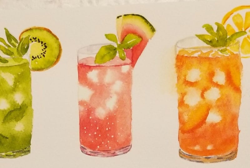
8. Toppings: Kiwi Mojito: In this lesson, we're going to start adding the
toppings for the drinks. I'm going to start with
a fairly simple one and let's have a look at
some references for this. So this is the reference
that I've chosen. I decided to do a
Kiwi mint mojito, and I feel like this
is fairly simple. The things that you have to
look out for when you're looking at references is how the top is laid out
next to the glass because some of them might be behind the rim or over the rim. So as you can see,
because this is a different angle compared to what we've been painting so far, the rim goes over and you can't really see the top
of the drink anymore. If you look at the
topping for this one, the basil goes over the rim. These are the things that you
have to notice beforehand. This way, you know which
areas to paint first. Let's have a look at
one other example. You can see this one. The drink is lower than the ones before, and we're also looking at
this from a lower viewpoint. And because the glass
is transparent, you can see the rim
going over the mint, but you can still
see the details of the mint and the lemon
behind the glass. Those are the three references
that I'm going to use, but I'm going to
tackle the mid Mojito one for this lesson. For the main light
green, I'm going to use permanent green number one by Holbein, let me just watch it. This is what it
looks like, but this is a very thick consistency. I feel like the color is
quite saturated and vibrant, so I want to somewhat neutralize it and make
it look a bit more natural by adding some indigo in the mix and also some
permanent yellow deep. Now, let me just watch it. I think I'm fairly happy with this color for the mint leaves, so I'm just going to
mix up a little bit more on my palette so
I have easy access. Now let's start
painting the mint leaves using this color mixture. I'm just going to paint
this really loosely and try to follow the basic shapes of what I see in the reference. You don't have to
copy it exactly. In fact, I just like to
take the basic idea of the position of the leaves
and kind of create my own. Once I've placed
the larger leaves, then I can look at the
composition and see where there are larger spaces where
I can fit smaller leaves. That's it for the leaves, I'm
only going to do one layer, then I'm going to dry it off completely so I can paint
the kiwi next to it. Once the leaves are
completely dry, I'm going to take a
really thin consistency of permanent yellow deep. This is so I can allocate the space for the
center of the kiwi. I'm not going to wait for the center to dry, but after this, I'm going to take
the yellow green from my palette and paint
next to it straight away, and this will be the rest
of the flesh for the kiwi. This is the same mix as before, just like the mint,
but as you can see, the ratio has so much more
permanent yellow deep and I'm also using a
light consistency. Once I've painted everything, I feel like the surface is quite damp and the center
is too dark now, so I'm just going to
lift the paint at the center using
rolled up tissue. I'm still going to take
advantage of the damp surface, and this time I'm going to
use a thick consistency of permanent green with
permanent yellow deep. I'm painting it right by the edges and because the
surface is still damp, the paint will bleed inwards. And if it's bleeding out not
in the way that you want, you can help to direct the paint using the
tip for your brush. As I'm directing the paint,
I like to follow the grain, so I'm directing it inwards. Next for the skin of the kiwi, I'm going to take a
thick consistency of yellow ochre mixed with a
little bit of quinciena. I'm using a really
light load here, so my tip is very sharp and I'm just going
to outline the kiwi. Preferably, I want the
inside of the kiwi to be fairly dry so this mixture
won't bleed into the green. To add a bit more dimension to the kiwi and a
bit of thickness, I'm going to add bit of quinciena layering on top
of some of the outlines, but not the whole circle. If not, it's just going to
become a single color again. Now for the seeds, I'm going
to use the black mixture, which is from
quinciana and indigo. I'm going to use a medium
to thick consistency. Before I paint it on, though, I do want to make
sure that the base of the green is completely dry. I'm just going to use
a hair dryer for this. Then I'm going to paint really small dots or long ovals around the
really light center. It's important for the base to be completely dry
before you do this. If not, the seed color will bleed into that beautiful
light green base. That's it for the fruit topping, all that's left is to paint
the rest of the icy drink, just like we did in
the previous lesson. But I want you to realize that the outline that I've
created this time with the pencil is actually
the outline of the glass itself instead of
just the area of the drink. This is why I painted the
mint on top of the outline. This time, I'm going to
leave a little bit of space before I paint on
the area of the drink. At first, I wanted to draw the angle exactly the same
as the reference image, which is why I straightened it. But I realized that
I've been showing you the same angle more or less
in the previous lessons. So I'm just going to apply the same angle for
this painting as well, which is why I've re
outlined the top to show a bit of an opening
inside the glass. This way, hopefully,
you'd be able to use any reference image and customize the viewpoint according to the
angle that you want. I'm also going to fill
the rig right to the top, so I'm going to extend some
of the leaf downwards and I'm going to leave out a space for the rim to go
over the leaves. I'm also going to connect
that little bit of Kiwi. However, I'm not going to add the detail because this is
going to be behind the glass, so I'm just going to treat it as if it's slightly distorted. Now I'm going to
continue down to paint the rest of the drink. You can outline the
edge of the drink, but I'm just going to
paint on the edge by using a really light consistency of the yellow green mix that it just looks like tinted water. I'm doing this also
to dampen the surface before I add on the brighter,
more saturated colors. At this point, I wasn't sure how bright I want the bottom
of the drink to be. I'm just going to use a medium consistency of the yellow green mixture to
start outlining the eyes, and I'm going to create
fairly large outlines, there's enough space for the
paint to flow in between. After this, I'm going to pull some of the paint downwards. Then I'm just going to
go with the same color and paint using a thick
consistency from the bottom up. This time, I'm not going to
fill in the whole space, though, because I feel like it might be a little bit heavy. I forgot to mention, but this is actually a slightly
larger scale as well, compared to the previous
drinks that I've painted in the previous lessons. To stop the paint from spreading and making the ice
look even smaller, I'm going to stop the
flow by taking off the excess and lifting it
with some rolled up tissue. Then I'm going to
clean the sides, making sure that the side of the glass is
nice and straight. The bottom should still be damp, and I like to take
this opportunity to add a little bit more green
to add a bit of variation. And at the top, because
I've lifted the paint, the surface is much drier
at the top than the bottom, which is why I'm going to outline some of the ice giving
it a bit more definition. I feel like the eyes
is convincing enough, so now I'm going to outline
the top of the drink, so I can continue
to the top face of the drink using a lighter consistency of the same mixture. Remember, as you're doing this, be careful to not
paint over the rim. Next, I'm going to
paint the glass. I'm going to go
back to the palette where I've mixed my graze. And at this time, I'm going
to add a little bit of green, so the color of the
glass hopefully complements the
color of the drink. I use a bit of
permanent green with some indigo mixed in with the browns that is
already on my palette, and I'm going to start by using a medium consistency to line the rim and the
side of the glass. Then I'm going to extend it
downwards to create the base. Once I'm done with a base layer, I'm going to use the
thicker consistency of the same mixture. And this time, I'm just kind of following the curves,
adding random lines. Then after this, I'm going
to add additional leaves inside of the drink using the same green mixture
as the drink itself. I don't want the leaves to take away from the actual driks. Instead, I want them to be just as supporting
elements instead. Here I'm trying to
make the leaves less defined and a
bit less visible. I do this by reactivating
the paint using a clean damp brush
for one side of the leaf and then taking
off the excess with tissue. This is what the drink looks like after we
combine everything.
9. Toppings: Watermelon Drink: For the next trick,
I'm going to paint this one with a watermelon from the reference
image that I've chosen. But I'm going to place the watermelon on
the right hand side, so it doesn't clash with
the kiwi on the left. This time, I want the
basil to go over the rim, and I'm also drawing it out this time because I feel like I will mess up the angle
of the watermelon slice, which I actually did
as I was sketching, so I'm glad I made
this decision. Again, I'm not trying
to make the position exactly the same, though. I just wanted to make sense. The watermelon in
the reference image is more flat and it's
facing towards us, whereas mine is a bit
more angled because I can see more of the side since it's slightly angled diagonally. I still have a lot
of yellow green that I've mixed on my palette
for the previous drink, and I'm just going to
use the same color. The ratio has a bit more
permanent yellow deep in the mix compared to the mint. Just like with the
previous drink, I want this to be completely
dry before painting the watermelon
because I don't want the green to run into
the pinkish reds. For the flesh of the watermelon, I'm going to use
the pink mixture from Jean Brilliant
dark and vermilion. I'm going to use a light to medium consistency
of this color to map out the area where I'm going to paint the flesh of
the watermelon. After this, I'm going to use a thick consistency
of vermilion. I'm trying to increase the saturation for the top of the flesh of the watermelon. But as I get closer
to the bottom, I'm going to leave a
bit of space and use a clean damp brush to smudge it and extend
the color downwards. This way, the bottom is
lighter than the top. While the surface of the
vermilion is still damp. I'm going to use a
thick consistency of crimson lake and paint some fibers from the
watermelon flesh. This will just be subtle because we are painting
on the damp surface, it's going to blur out. I want the small side of the
watermelon to be lighter. I'm using the pink mixture from before in a slightly
thicker consistency. But just like the other
side we've painted, I'm going to stop
before I reach the edge and just pull the rest
with the clean damp brush. After this, I want to
use the clean damp brush again to soften the edge for
the base of the watermelon. I'm also going to
take this opportunity to dampen the area of the rind. And as for the color,
I'm going to use a really thin consistency mix of permanent yellow deep
and Jon brilliant dark. I'm going to continue
downwards by picking up the color
from the basil, which is the light yellow green, and I'm going to paint a line as the color transitions to
the skin of the watermelon. I'm quite happy with how
things look at the moment, so I want to set everything
in place by drying it off. Then I'm going to use a
slightly darker green. This has more indigo in the
mixture to realign the skin. I'm going to add
even more darker green to represent the pattern that we can see from the side. Now we're going to
paint the drink. I'm going to start by
dampening the surface, and this time I've
also drawn out the outline of the glass
instead of the drink itself. I left out a little
bit of space in between the drink and
the basil leaves. I'm going to start with a pink mixture from
the watermelon, which is from vermilion
and Jean Brilliant dark. But this time, I
want the color to be a bit more vibrant and rosy. I'm going to add a
little bit of quinn red. I'm going to use a thick
consistency of this, and I'm going to start by
painting from the bottom. Then I'm just going
to keep painting until my bristles
run out of paint. On the side, I don't mind
it to be a bit lighter. Then with the rest of the paint, I can also pull it upwards. I decided to pick up a
little bit more using a really thin consistency of the same mix to
outline some ice. On the left, I feel like I
need to add another one. So while the surface
is still damp, I just lifted a little
bit of paint with tissue. I'm going to increase the depth and saturation of the color by adding crimson lake into
the previous pink mixture. I'm just going to place it in the darkest areas of the drink. However, I don't
want to overdo this. So after applying a thick
consistency at the bottom, I clean my brush and
actually pick up some paint from the damp surface to paint at the
top of the drink. While doing this, I really
don't want to lose some of the peachy tones of the drink
that we painted earlier. So we have a nice soft variation between the different
tones of reds. From the reference image, the drink has a little
bit of froth on top. I haven't painted froth
on top of the drink, so I thought that this would be a good opportunity to do it. What I'm going to do is actually not paint the
area of the froth. I'm going to leave a
bit of space in between the top of the drink and the sides that we
can see with eyes. Then for the top
part of the drink, I like to make little marking, so there are some negative
space left here and there to suggest more of
the frothy texture at the top part that we
can't really see too well. Lastly, I'm going to paint the rim as well as the
base of the glass, and I'm just going back in to the palette where
I usually mix my grease. There's a lot of browns here, so I just added some
indigo into the mix. Then I'm going to just use a thin consistency
to line everything. This time, since there's a lot of white space at the back, I don't want it
to look too flat, so I'm going to use a very thin consistency
of the same mix. So it's lighter than the rim, and I'm just going to paint some thick vertical lines going down to suggest
some reflections. After this, I'm going to paint the base of the cup
and finish it off. But I also realized that I should have painted a
bit of the watermelon under the basil and in between the drink for the
rest of the slice. But I've forgotten in this one. So don't forget to add it on using the pink mixture from
the watermelon earlier. I decided to add fist
to this painting, but I only did it after I finished painting
the third drink, but I just want to keep
everything in one place. When I was painting the fist, I was also trying a
slightly different method. I'm actually using a lighter
consistency this time with more water compared to
paint in the ratio. And you can see that
it's a bit more uncontrollable because
of how wet the paint is. After painting it on, I can just take the excess off
with my tissue, so it looks kind of
blurry and faded. Then I'm going to
go back in with a thicker consistency
to paint the smaller, more fineer bubbles and dots. And this is just another
method to create layers, and it's completely up to you which method you want to choose. Lastly, I decided to fix the watermelon using
vermilion and jon Brilliant, and I'm just going to paint in between the basil and the rim. This is optional,
but I also made the last minute decision
of adding a bit of seeds. This is from the grain mixture
from quinciana and indigo. I'm only going to paint a few. I feel like the colour is
standing out too much, so I decided to smudge it a little bit and take
it off with tissue.
10. Toppings: Lemon Peach Tea: Now let's move on
to the next drink. I wasn't sure whether I want to do a peach tea or a lemon tea, but I quite like the
topping on this one. I'm just going to try to do
something similar to that. I feel like I'm going
to need a guideline for the lemon slice this time, which is why I drew it
out really lightly. But I'm going to paint
the mint freehand. This is just my
personal preference, but if you feel
comfortable painting everything freehand,
go ahead and do that, or if you feel like you need
to outline the mint as well, you can add guidelines whenever
you feel uncomfortable. For the mint leaves,
I'm going to go back to the green palette and add more permanent yellow
deep and permanent green. I'm going to paint
three main mint leaves, and for now, I'm just going
to paint on top of the rim. And after this, I'm going to
just look around if there are any spaces that I can
fill with smaller leaves. I feel like I can add some
darker tones to the green, so I'm going to layer some on after this is completely dry. There's a little bit of the dark green already on my palate. This just has more
embigo in the mix, and I'm just going to fill or outline one side of the leaves. For the lemon, I'm
going to start by using a medium consistency of
permanent yellow deep. I'm going to try to paint
section by section, but I have to admit that this
is actually quite tricky because of the radial
angles of these sections. So for the guideline,
you can add the lines of the sections
and paint in between them. You do want to make sure that the line is extra light though, because the color will
be quite transparent. Here I'm just painting the base and I want it to
be fairly light, but I still want to be able
to see the separate sections. When I'm done with
the base color, I'm going to use a
thicker consistency of permanent yellow deep
and outline parts of these little sections, especially near the center
and behind the mid leaves, then I'm just going to
use a clean damp brush to smudge some of it. For the skin, I'm also going
to use the same color, just a thick consistency
of permanent yellow deep. I'm going to use a bit of
pressure at the halfway point. I'm going to use the tip of my brush and connect
it to the bottom. Because I want the
bottom to be lighter since we are looking at
this from the top view. Just like the Kiwi slice, I'm going to use a
thicker consistency to darken some parts of the lemon skin so it
doesn't look too flat. I feel like I really
messed up this angle, so I tried to fix it, but then I ended up
smudging everything. So I'm going to use bleedproof
white to correct this. I'm basically using
this as a white out, but I would only recommend to
do this for little sections because your watercolor
paper might not even be the same white as
this bleedproof white. Some paper can be
a bit more yellow, whereas others are
way brighter white. This is why I don't
think it'll be very convincing if you do this
for a large section. So I would definitely try to minimize these sort
of corrections. Now all that's left
for the topping is to paint under the rim and
connect everything together. I don't want this part
to be too defined, so I'm not worried about
making clean edges and such because I want the illusion of it
being behind the glass, so it looks slightly distorted and sometimes it's a
little bit unclear. Now we are ready to move
on to paint the icy drink. I started out by
dampening the surface and don't forget to leave
space under the rim. I'm going to paint ice tea, so you can use any of the color choices that I laid out in the
beginning of this class, and I'm just going to repeat
the same method to paint it. I'm going to use quinciana mix with vermilion for
the base of the tea. Then getting closer to the top, I'm going to mix
in a little bit of permanent yellow deep
and yellow ochre. My brush still has the quinciena
and vermilion, though. This is why the color
is still quite vibrant. It's just a little bit
more yellow this time. I feel like I have
enough definition for the eyes in the drink. Next, I'm going to paint some eyes popping
out of the drink. I'm going to use the
same color mixture in a thin consistency, and I'm going to paint
on some bumps and lumps trying to directly connected to what I've
painted at the bottom. After the really
light base is dry, I'm going to mix this
with some grays as well in a very light consistency
for some added reflection. Once I'm done, I'm
going to paint the rest of the drink behind
the yes and I'm using a slightly
thicker consistency so the ice looks
lighter in front. Oh at first, I wanted
to finish it here, but I decided to add some
peaches because I haven't shown you ways to create fruits
inside of the drink. What I'm going to do here is to reactivate the paint
with what brush. And once the paint
is reactivated, I can lift it with tissue. This is the same
concept when we were lifting paint for the eyes. But this time, because the
paint is completely dry now, I need the extra water to
reactivate the paint first. For the flesh, I'm using a thick consistency of
permanent yellow deep, and then I took some orange
mixture to paint the center. As for the skin,
I'm going to use a thick consistency
of crimson lake. I'm going to add another one
on the top right corner, and this time, I'm
not going to lift the base because it's
light enough to paint on. And this time, I also made the peach slightly distorted and thinner because it's a bit squished between
the eyes and glass. After this, I'm just going
to clean out the fruit, so the shapes look a
little bit better. I find that this wedge
was kind of wonky. So I cleaned out the edges. However, while
doing this, I found that I defined it a
little bit too much, so I'm just going
to smudge it using some water and lift the edge. So this time, the fruit will
look like part of the drink. I'm quite happy with
how this looks, so I'm going to bring it all together by
painting the glass. I feel like I can lift the top part of the
drink a little bit more, so I'm just going to
paint it over the rim. Then just like the
previous drink, I feel like I have enough space here to paint some reflections. For the gray, this time, you can see there's a bit more
brown in the mix. This is so it can complement
the color of the drink. B.
11. Combination: Grapefruit Blueberry Butterfly Pea Fizz: In this lesson, I'm
going to combine all the exercises that
we've gone over so far. For this one, I'm also going
to change the glass shape because we've more or less
done similar ones so far. For the fruit topping,
for this one, I'm going to do a slice
or a wedge of grapefruit, and I also added a
stem of rosemary. This time, I'm not
going to make the same mistake as the lemon. I also drew out the
guideline for the sections. This wedge is inside the glass, so I want to make sure I
avoid painting on the rim. As for the color here, I use
a mix of Jean Brilliant, dark, vermilion, and a
little bit of quin red. I'm going to paint
section by section, leaving out a bit of a white
line from the paper in between those sections and also leaving a line for the rim. To paint this, it's
much easier to do an outline and then
fill in the sections. This way you create a barrier
before filling each shape. Next, I'm going to use a slightly thicker
consistency of the same mix. This also has more vermilion
and quin red in the ratio. And just like the lemon, I'm going to line the top, as well as a little
bit of each section. And I'm going to use
a clean damp brush to soften the edges. Then I'm also going to take
advantage of the damp surface to add more of these lines and just letting the
edges soften on its own. For the skin, I'm going to go back to the soft pink mixture. So I added more Jean
Brilliant dark in the ratio. Here I'm using a
thick consistency, and I'm going to
thicken the bottom of the slice compared to the sides because I want this to be painted
in a slight angle, so it doesn't look
like a flat wedge. Next, I'm going to
paint the rosemary. I'm going to go back to
the greens on my palette. But this time, I'm
going to add indigo and a bit of Jean
Brilliant dark because I want the green to be a bluish green that is
slightly pastel in tone. I don't have a reference
for this drink because this is my own
combination that I created for this class
in order to combine all the exercises together
into one single drink. And I also want to show you that by following
the methods, you can mix and match different elements to create a drink, even without the use
of a reference image. To paint the rosemary, I just followed my outline
and paint over it, starting with a
thin consistency. Then I'm just going
to add more interest by using a darker
value of the same mix, which just has more indigo in the ratio. Now, let's
paint the drik. I'm going to start by dampening
the surface of the glass, and I'm going to raise the drink over the
grapefruit wedge, don't forget to dampen
that area as well. For the drink, I'm
not sure if you know about butterfly P T, but the color is really vibrant, deep blue, and if you add
acid to it, like lemon juice, it'll turn to pink and whatever's in between
will be purple. If you've never seen it, I would suggest for
you to search it on Google first just
so you know how bright and beautiful
the colors are. But now for the
color, I'm going to use ultramarine
finest as the blue, then I'm going to brighten it slightly with a bit of quin red. I'm going to pick up a
thick consistency on my brush and I'm going to
spread it out from the bottom. And for the top, I
want it to be pink, so I'm using quin red
as the main rosy red. This also has a bit of shun
Brilliant mix into it, though, since it was
already on my palette. I want the drink to look more
concentrated at the bottom, which is why I just use a thinner consistency to
paint the top and also not forgetting to outline the ice pieces and
avoiding those areas. At the bottom, I felt
like the purple mixture from earlier is traveling
too much into the pink, which is why I decided to
lift some for the eyes. I'm going to continue to increase the saturation
of the pink. I'm just using quin
red by itself now. This may look fairly
saturated already, but once I dry it off because the surface is still very damp, it's actually going to
lighten a lot more. This is not completely dry yet, but you can already
start to see it fading. So while the surface
is still damp, I'm just going to keep
increasing the saturation. Working from the
bottom, this time, I added a bit of
indigo to make the purple even more rich
and a little bit darker. I'm going to redefine
some of the ice by just using quin red in a slightly thicker
consistency than before. And because the surface now is not as damp as it was before, the color will also be more saturated because the pigment is not spreading out too much. Once I'm done, I'm
going to try it off. This time, I'm not going
to define the ice too much because I also want to add other details
within the drink, so I don't want it to
look too overcomplicated. I also use a really
light consistency of the quin red mixture, and I'm going to glaze it over the grapefruit that is
submerged in the drink. I don't want the grapefruit
to look too blurry, so I'm just going to
use quin red by itself to paint underneath
the grapefruit and also around the ice. The surface, you can see,
is still a little bit damp, which is why the edges I'm
painting are not sharp still, but these are all just
very subtle changes. For fun, I wanted to add blue circles as blueberries
inside of the drink. I think it'll just
look cuter this way. So I'm just using indigo here. It probably has a
little bit of quin red as well from the
previous mixture, but it doesn't really
matter too much. You can see that the
surface is still quite damp because some parts of the circle is blurring
out too much. And if that's the case, you can always just lift the
excess with tissue. Next, I'm just going
to paint the glass, going back to my palette,
which has all my grays, I added some indigo,
and this time, I also added a little bit of ultramarine
fineness into the mix. If you like the way
the glass looks now, you don't have to add the base. Personally, though, I find that I prefer thicker
looking glass. I'm still going to extend
this one downwards, starting with a
thin consistency. This one was a little bit
difficult for me though, because I'm not very
good at creating curves which are
even on both sides. This might be just a tiny
bit wonky, but it's okay. I feel like this is
still convincing enough. Once I'm done with the glass, I'm going to paint the top of the drink and also the
reflection of the glass. I'm also going to add
some fist to this drink, so I'm just going straight
in with bleed proof white. I usually like to add more fizz at the bottom,
but this time, I'm going to make
sure that some of the bubbles reach the
top of the drink, especially in front
of the grapefruit. I think that this will
make the grapefruit look more submerged in the drink behind the fizz or at least more
convincing this way. This is just a
slight adjustment, and this is just based
out of my preference. But I want to darken and somewhat smudge the
rosemary a little bit. So I'm just using the
green colour as before, but in a much
thicker consistency now that everything's
completely dry as well. I quite like the dark value,
but at the same time, the sharp edge and
the contrast stands out too much against
the soft colour drink. So I'm just going to
smudge the bottom so our eyes won't be too
drawn to the rosemary.
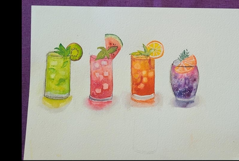
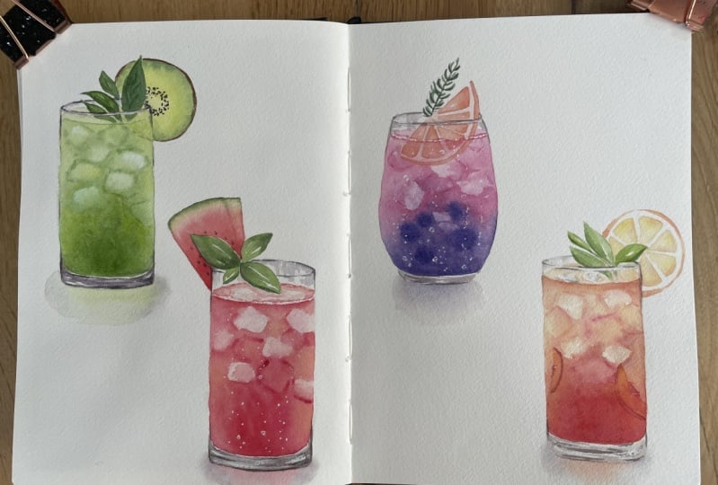
12. Shadows: So here are the finished drinks. You can call this done,
but just for fun, I decided to add some shadows or reflexion so they don't
look like they're floating. I'm just going to
start by dampening the surface under
all these glasses. Then I'm going to pick more
or less the same color of each drink and then just
paint it on the damp surface. You don't need to take
too much time doing this. I'm just going to paint them loosely as a supporting element, and I don't want the shadow
to take away from the drink, so I try to make it as
simple as possible. When I'm adding color
to the damp surface, I don't want the
paint to go right to the edge because I want the edges to blur out
naturally instead. The surface should
still be fairly damp for all of these shadows. So while I still have
the purple on my brush, I'm going to use it to paint
the sides of the shadow, and this will make the shadow
look like it's glowing as if there's a light source
from behind the drink, and the color of
the drink is custed down through the light
behind the drink. For the size of the shadow
on the purple drink, though, I use a little bit of the orangey mix from the
tea to paint the sides. It's not very visible, but that's the way I prefer it. And these are the
finished drinks. You notice that I fix
the watermelon now. I actually fixed it after I finished painting
on the shadows, but I decided to compile it
with the previous lesson, so it's just a bit
easier to follow. But yeah, this is the
completed painting.
13. Closing & Class Project: Congratulations for
completing this class. I hope you enjoyed watching the painting process
for the class project. I would love for you to paint along with me
through the lessons and exercises together before creating your own custom drinks. You can either create
something on your own or even follow the four drinks that
I've shown in this class. As I've shown you
in this class, I use a large A three paper where I combine all the exercises and the final drinks together. You can do it this way
or you can also create finished compositions
in a sketchbook or a separate piece of paper. Once you're done
with your drinks, please don't forget to post
it in the project section, so I can have a look at the different combinations
that you create. I can't wait to see how colorful this project
section is going to be. And this way, you can also share it with other students as well. You enjoyed this class, I always appreciate it if you
leave some feedback. It's always very encouraging
for me to read through them. And this way, it
pushes me to create the classes that you will
enjoy in the future. If you would like to
see more tutorials, I do have a YouTube
channel called Nian yani where I post weekly
watercolor tutorials. Or if you would like
to see more art by me, you can also follow me on my Instagram at IG
Underscore Nian Yani. If you're still here,
thank you so much for watching right to the
very end of this class. I wish you the best
for all your projects. I can't wait to see them posted. Have fun, and I'll hopefully
see you again soon. Bye.
 Nianiani, Watercolorist and Graphic Designer