Transcripts
1. Introduction: Hi, everyone. My name
is Nia, and today, I'm going to share with you a guide to watercolor
textures and form, specifically for
food illustration, and we're going to be
painting cakes in this class. A lot of times, when we paint, we tend to focus on the little
things like the details, but we forget about
the overall form, which is actually key to how you can make a painting
cohesive with each other, and in turn, you don't
really need to add too much detail in order to make something look quite realistic. This class, I'm
going to simplify this to break it
down into smaller, more actionable steps so we can tackle difficult
looking subjects, in this case, cakes into
more efficient steps. By understanding the form, we will capture the overall idea of an object that
you're trying to paint, and in turn, it will be so much easier to allocate the colors such as values,
saturation, and textures. This class, I'm going
to show you how I simplify the shapes and
angles of the cakes, and then we can use and take these simpler shapes to create small thumbnail
designs in case you want to create your own
composition or layout. I'm going to show you how
I brainstorm for ideas and look for references to support the flavors that you've
decided to paint. Then we're going to do small
painting exercises to break down values from simpler shapes of different examples
of cake slices. Learn about how to
make the textures, design our own
cake, then finally putting it all together
into your paintings. I'm going to paint
three different flavors of cakes today in a
cylindrical form. But hopefully, after doing the smaller exercises
beforehand, you'll be able to
customize your paintings. You can create the
same flavors or different flavors and
different cake shapes as well. Originally, I made this
class for all levels, as I'll be going
through a lot of basic fundamentals in the
beginning for the exercises. So hopefully you can use
these techniques and apply it to a painting
of your own level. But for the final paintings, I will be painting in
a bit more detail, which requires the knowledge of things like brush control, water load, and
paint consistency. So I would recommend
for students to have prior watercolor
experience beforehand. With this set
though, I've gotten quite a lot of messages
when people post their projects once they're
done that they're beginners and they manage to follow
along to the paintings. So if you're a beginner and you want a challenge or you
want to give this a go, I would welcome you, as well. I really tried my best in this class to break
down the steps. So hopefully, it's
something that you'll be able to
follow and understand. Just as a disclaimer, I tend to speed through or cut through parts of
the painting where it's repetitive or my hand is off the camera just
to get the class going. And I understand that everyone learns and paints at
different speeds. So if you're new to my classes, I would recommend for you
to just get an overview of the lessons by watching
it really quickly to understand the pacing
of my lessons. And when you're ready
to paint along, you can pause in between
each step or each exercise. So you can paint, draw, and practice at your own
pace without feeling rushed. So, if this sounds like
something you'd be interested in
trying, let's begin.
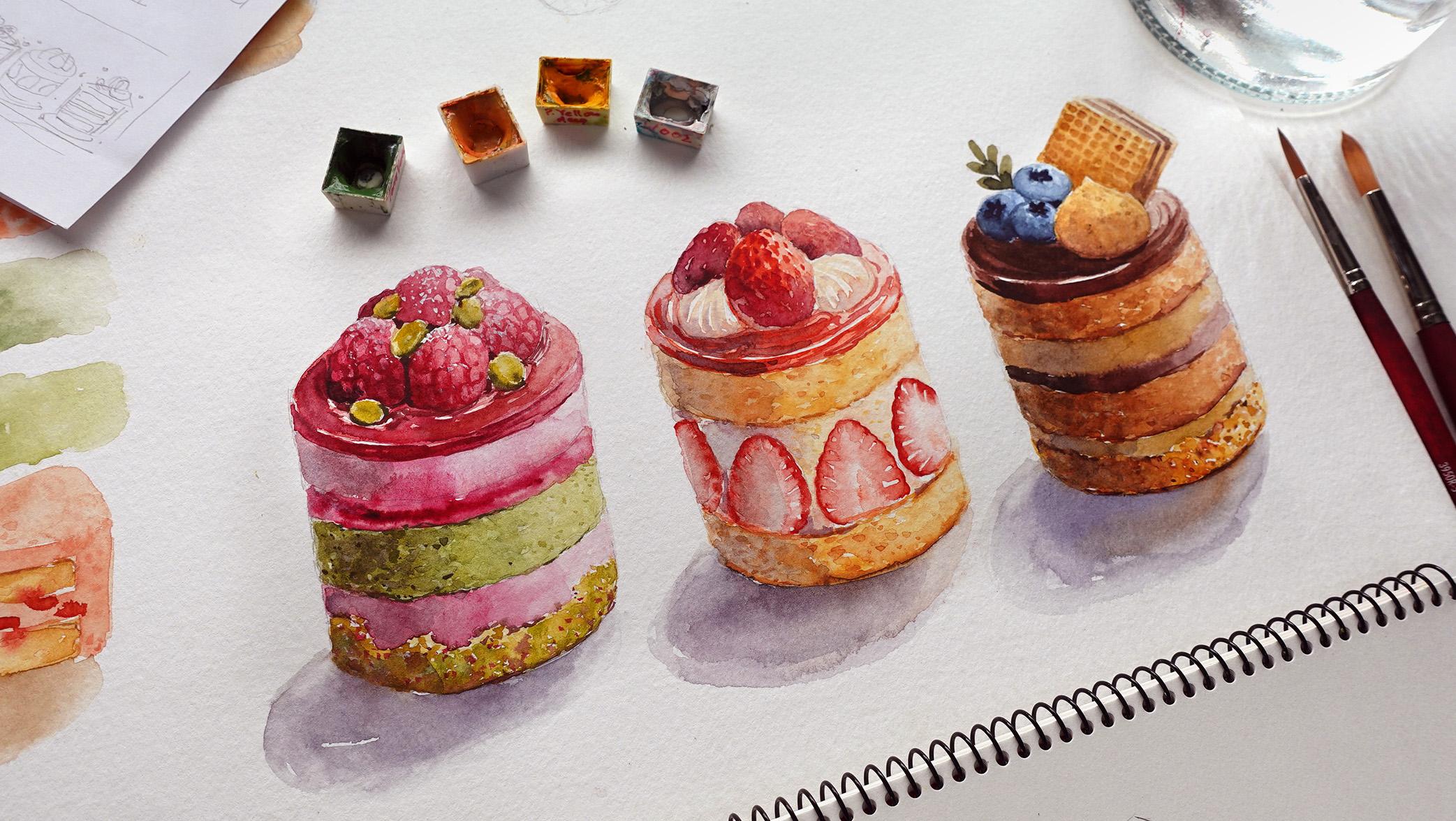
2. Supplies: In this lesson, I'm
going to go through the supplies that I'll
be using for this class. Firstly, let's talk
about the brush. For all three cakes,
I'm actually only going to use this one brush. This is by Princeton velvet
touch and it's a size five. It's a synthetic round brush, and it's quite snappy. You can also use other
synthetic brush for this. Brush is actually very new since I just opened it
specifically for this class. So the tip of my brush is
still very sharp and pointy, and this way I can easily paint all the tiny little details
just using this one brush. However, if your brush is
a little bit older and the tip is slightly frayed
and a bit hard to control, I would suggest for you
to pair this up with a small size zero brush to
paint the tiny little details. Can also use three sizes. This is a size two brush. This one is Bartimdia, but you can use any other
round synthetic brush that is a little bit smaller. So you have options to
choose from when you find there are certain areas that is a little bit
harder to control. Next, let's go through
the paper I'll be using. Firstly, I'm going to use my sketchbook just to
do little plans like the actual cake design
for painting it on and also little layouts like this for the
pencil sketches. It's just a little
bit easier this way to have it compact
in a sketchbook. But you can also just use
scrap print paper if you want. Generally, when I'm
planning for a class, I just use scrap paper just to get ideas down
really quickly. So just pick and choose whatever you're
comfortable with doing. As for the watercolor paper, I'm going to be using
a single sheet of an A three watercolor paper
to do the small exercises, trials, and things like that, as well as the final painting. And this came from
this large sketchbook, which is by KansNXL and
the thickness is 300 GSM. This watercolor
sketchbook is perforated, so I just took one sheet, but you can also
use your watercolor sketchbook or paint on a separate sheet of
watercolor paper. If you want to
frame your painting as a house or kitchen decor. I've actually made
a lesson where you can experiment with different
layouts in case you want to create specific painting for maybe a diary
entry or house decor. Next here are all the
colors that I'll be using for all three cakes. But I will also have the swatches available
for you to download. The first one is
for the first cake, which is the raspberry
and pistachio cake, second for the strawberry, and the last for
the coffee cake. But I'll also have a
list of all these colors at the end of this lesson so you can get everything ready. As for the palette, I'll be using this palette.
You can see it's quite old. This is just a cheap
plastic palette from die so originally, the color was white, but
now it's a yellow tint. However, I still like using
this because I've used it so much that I've made a
lot of micro scratches. When I'm mixing paint, the palette holds my
paint quite well. And my paint in turn
doesn't beat up. When the paint
beats up, sometimes it's a bit hard to
control the load on your brush because instead of getting the amount that
you want on your bristles, you might end up soaking a
large bead of water or paint. This is generally the problem
with plastic palettes, but as you can see if
you've used it enough, you'll get rid of that problem. But if you want to
avoid this altogether, you can also use a
porcelain palette instead. Next, you'll, of
course, need a jar of water to clean and
reload your brush. I'm only going to use one, and then I'm just
going to replace the water whenever it gets too dirty or whenever I'm switching to a different cake
that I'm going to paint. You can also use two jars. So one jar would be
to clean your paint, and the other jar would
be to reload your brush. So the water where you'll clean your brush will get quite dirty, whereas the other jar
will stay fairly clean. You'll also need tissue or
paper towel right next to you. This is as important as
all the other supplies, as important as my palette or as my jar of water
or even my brush, I would not paint without this. I use it almost every time I reload my brush in order
to get the right load, and the load determines
how much and how quickly the water and paint
flows out from your bristles. This is why I can create
really thin lines when I'm using a light load, even when I'm using a
medium sized brush. For the sketches, I'm going
to be using my pencil. This is bipenl sharplt
and for the filling, I like to use either HB or two B. I'll also
be using an eraser. My favorite brand is B Boxy. This erases very cleanly, but you can use any
eraser you have on hand, as well as kneadable erasers. And lastly, I'm going to use a hair dryer to make the
drying process quicker. You can also just wait
in between and move to another step in order to wait for certain things to dry. But when I want to paint
the next layer instantly, this is very handy to
have right next to you. And that's basically
for the supplies. I'll have all the items
listed here where you can take a screenshot
or you can download it in the projects and
resources section as well.
3. Shapes and Angles: B. In this lesson, we're going to simplify the
shapes of the cake slices. And basically, they're
just geometrical shapes. I'm going to show you three types of cake
slices in this lesson. But if you have any other ideas, you can go ahead and
play with it as well. For the first one
is a square slice. What I initially
made was a cube. From this angle, you
can see three faces or three sides of the cube. If you look at it from the top, sometimes the bottom can
look slightly distorted, so the sides will slant
inwards ever so slightly. Once you have the basic shapes, it's so much easier to divide
it up if you want to make the layers smaller and have
different types of fillings. You can just follow the lines that you've
already drawn out for the main shape and
add on more layers. These squares can also be easily turned into
rectangular ones. So here's a rectangular slice. If you'd like, it follows more or less the same
rule as the square ones. But I'm just drawing
out here as an example. Next is the classic cake slice, which will be in a wedge shape. So as long as you know
how to draw a wedge, like before, you
can divide it up and add on the layers for
the cake and the filling. Now with the wedge slices, sometimes the wedges can be shorter or taller or sometimes
a little bit thicker. So that's something that you can experiment with as well
with your composition. Generally from the
photos that I've seen, those fancy moose cakes with mirror glazes tend to be a
bit shorter compared to, say, a classic birthday cake. I'm going to draw
a taller version of a more traditional cake
with a cream filling. Just like before, I started with the
wedge, but this time, I extended the height, and this is the way I'm going to divide up the filling
for the cake. I just made three layers of cake with two layers of
filling in the middle. Depending on the look
that you're going for, you can of course, make them a little bit taller,
even if you would like, or if you like this height, but you want to
add extra filling, then you would just
need to divide up the spacing a
little bit more. As an example here,
I added a jam filling in between the
cake and the cream. For the next one,
I'm going to draw a more dynamic angle
where you can see three sides of the wedge if you're looking at
this from the top. So you can see a lot of
the toppings at the top. Then just like before,
follow the lines from the wedge for the
layers of the cakes. I would say that this is more tricky compared to
the other angles. But if you would like to experiment with
your composition, you can add this
in to add a little bit more dynamic for
the overall look. This is also a fun way to
showcase the topping if you want to play with the
cake decorations on top. With this angle, you can
see the most from the top. Whereas for the other angles, you can see mostly the side of the cake
a little bit more. For me, though,
because I want to focus on the texture
of the cake, I'm going to show more of the side angle,
not from the top. And here, I'm just going
to draw an example of what the topping would look like if I paint it or draw
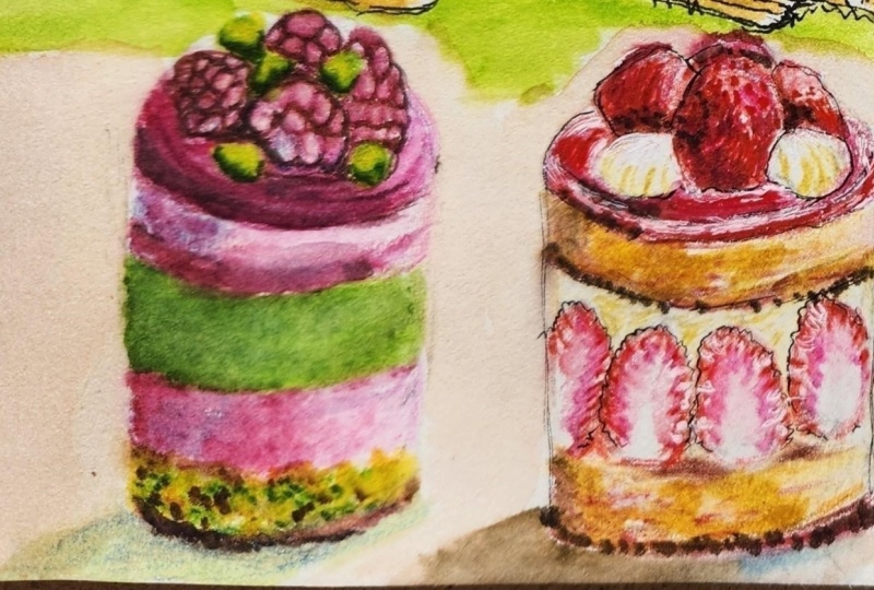
it from the side. Next is the cylindrical
shaped cake. This basically just
looked like a mini cake, and this is the shape that I was inspired by to
create this class. I just think they look so
cute presented this way, especially with
some strawberries lined along the
outside of the cream. So just like before,
starting with the three D shape of
a cylinder this time, you can divide up the layers according to the side
of the cylinder. As an example of the strawberry
one here because I only want two layers of cake with
a thick cream in the middle. I just follow the lines to the top of the cylinder and
the bottom of the cylinder, depending on the thickness
of the cake that you want. But just like before, you can always divide
it up into more layers of cakes or even add a few
layers of different fillings, depending on the design of
cake that you want to create. So just like the square slices. Now, if we want to slightly shift the angle where we can see a little
bit more off the top, then the sides would come
in a little bit more. And I also want to
follow the top and the bottom to add lines for
the layers of the cake. Now, what you want to take into consideration here with
the cylindrical cakes, when you're drawing
on the lines, you do want to follow an
invisible line to the back of the cake for the
ovals, just like the top. If not, in terms of
the perspective, it might look a bit wonky. So if you're ever unsure about how curvy those
layers should look, you can always continue
the line to create an oval at the back
just very lightly, and then just erase it once you're done if
everything makes sense. Then just like the rest
of the cake layers, if you want to add
an icing on top, you can also increase
a little bit of the height slightly by
creating another oval. Now, if you're curious, we can exaggerate
the angle even more. The oval is more
circular and you can see a little bit
more from the top, which means we won't be able
to see the bottom as much. As I'm drawing on the sides, I would make them tilt a
little bit more inwards. Usually, I was also having difficulties to figure out what the bottom would look like. I took my own advice and
I drew out another circle or an oval underneath and I can use that as
visual guideline. But once we have the basic
form now it's a bit easier to use as guideline for
the rest of the elements. Here I'm going to draw
the same type of cake as the first one just to show you what it would look
like in a different angle. So let's follow the
layer of the cake, align to the top and
the bottom curfature. So I have enough
space in the middle. Then I can add on
the strawberries, which will also tilt following
the lines on the sides. As for the topping,
I'm going to add a bunch of strawberries cut
in half facing each other. And because we can
see more of the top, you can also see the
strawberries at the back. Whereas with these ones, you would be able to see the
sides of the strawberries, but a bit less of the
strawberries at the back, especially for this cake on top. So here are a few
different types of cake slices and angles. You can mix and match any of
these for your composition or just pick one that you can repeat for different flavors.
4. Drawing Soft Textures: What we have so far here in the sketches are
the basic shapes. We can see the lines
here are very straight. They look like they
could be made out of boxes with sharp angles
and really straight lines. But in this lesson, I'm
going to try to convey the soft texture of the cakes
with softer uneven lines. Going to start by roughly
erasing the outline, you can see a little bit of the previous lines
from before and we're going to use it as guide. Now, instead of drawing
straight lines, this time you can see I'm making uneven jagged lines
for the corners, I'm trying to avoid really
tight corners like this. Instead, I try to make
it look more organic, so the ends are not as sharp, maybe even slightly curved
and the edges uneven. You don't even have to do this by following through
with the lines. Sometimes I like to
add spaces in between, and this will just
suggest something that is a bit more soft and airy. When we have softer
lines like these, it's a little bit
easier to paint over instead of those
very straight lines. Our eyes tend to be able to follow those straight
lines easier, whereas more organic
uneven lines, especially with
spaces in between, can disappear behind
the paint a bit easier, even when some of the lines
might still show through. What I like to also do before
I paint is also to use my eraser to just tap and
lighten the lines even more, or you can also do this
with a kneadable eraser. So let's just try to
redraw the lines. It's uneven and I have
spaces in between, it almost looks
like it's dashed. You can see it's
very soft and airy compared to a strong
straight line. Now let's repeat this
to another cake slice. This is basically applicable for all the different types
for the cream as well. But for the cream, I try to
not make the lines as jagged. It's just sometimes slightly
slanted a little bit, but the edges are definitely not as sharp as how we
sketched it out earlier. Now, here is the
area for the cake. I'm going to apply the
same method as before. Left out a little bit of
space for the jam as well. I made the jam a little bit more gloopy and the lines are more rounded compared
to the cakes. Here by just changing
the type of lines, you can see that this looks
so much more soft and caky. You can also add little dots and things like that
for extra texture. But since we're
going to paint this, the added textures will
be painted later on. I'm also going to do the same
for the cylindrical cake. I just want to show
you that this is applicable for all cakes. If you want to practice
this, you can go ahead and create the softer lines
for all of the sketches. But after this, I'm going to
move on to the next lesson.
5. Thumbnail Designs: Now, with the shapes that
we've sketched out earlier, let's try to put
them into a layout. And this depends on
the dimension and the aspect ratio of what you want your
final paintings to be. I can either be landscape,
square, or portrait. So I'm just going to kind of draft out little
thumbnail ideas really quickly as an example
of what I would do in order to get a visualization
of different layouts. We've simplified
the shapes before, it's now much easier and
quicker to draw them. I'm also doing very
small sketches here, so we can somewhat do a
quick brain dump where we don't have to spend too much
time on any single layout. So notice how I'm drawing the
main shapes like the cube, the wedge, and the
cylinder first. This way is much easier
to figure out the spacing before adding on the layers
on the cake and the toppings, which I'm also just
going to scribble in. You want to figure out
here is the shape of the cakes that you want to include in your final painting, as well as the placement. You can do different
combinations by just changing
one little thing at a time and come up with so many different ideas
that you can pick from. Here I'm just going to
speed things up so I can quickly show you the different layouts
that I had in mind. Want to show you both the
landscape and portrait ideas. You can also pick one
shape that you might want to repeat over the whole page with
different flavors, which is what I personally
want to do for this, or even just paint
one single cake on a page or on your sketchbook. You can also make this as
complex or as simple as you wanted to personally because I'm making this for all levels. I'm just going to keep
it fairly simple, even though I might add different elements to
the design of the cake. But you can also add little
decorative elements in your layout to make it
more fun and dynamic. So like the two layouts
that I drew out earlier, I added some splatters, as well as little elements
from the toppings, which I just scatter around the page to make
it look more fun, and it will also make
the page more colorful. For me personally
because I want to focus this class on the
textures and the form, I'm going to keep it
simple and just do three cylindrical mini cakes that I'm going to create
in different flavors. Depending on your levels
and how much time you have, you can make this as simple
or as elaborate as you want. If anything, I'd be
so excited to see the different ideas you post
in the project section. If you're super
comfortable with painting, another idea is to treat this as an urban painting
where say you bought three flavored cakes or one cake you can paint
in different angles and you can add text like
a small diary entry, I would say, with the different flavors and colors and what happened
during the day, I think that this idea would
be really cute as well. As you can see, there are
just endless combinations if you want to practice
different cake slices. But you like the flavors that
I combined in my painting. You can also do your
own version of, say, a cube or a wedge with the
same flavors that I painted, but feel free to experiment
and just have fun with this.
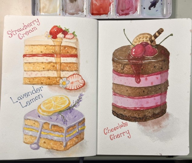
6. Reference Ideation: After doing the layouts, I realize I want to paint
three types of cakes. But of course, this depends
on your own layout. You can just paint one
or maybe even fit five, depending on the size of paper that you're
going to paint on. But since I'm going
to paint three, I'm going to figure out
the flavors by just writing down ideas of the
flavors I can combine. I've been wanting to paint the strawberry cake for a while, so that will be the one that
I place in the middle and I know that I want
strawberries with two vanilla cakes at
the top and the bottom. I also want a chocolate cake, but maybe something like a coffee and chocolate
so mocha cake. The cream and the cake can
be different tones of brown. Then leaves me with
one more cake, and since I want to
include a different color, I thought about pistachio or maybe matcha
for a green cake, or I can also paint like a purple cake with an
ube or taro flavor. But by the end of this, I realized that I want to do a combination of
pistachio and raspberry, so I can use both pinks
and greens together. Now that I figured out
the three flavors, I'm going to search
for pictures and ideas for both the
filling and the toppings. For this, I like to
look through Pinterest and just search for
mini cake ideas or even look for flavor
combinations if you're still not set on a specific one. You can also look at the angles. Personally, I like the angle here where you can see most
of the sides because I want to focus more on the filling and the texture
of the cakes for this. I quite like how this looks, so I'm just going to
click it and scroll down to see if there are
any other good ideas. Long slices also
look really cute. That could also be an idea. You can also add piping, but it can be a little
bit tricky to paint. Going to keep looking through and see if there are
any other ideas. I really love the colorful ones, so these ones are so cute with the sprinkles and different
colored cakes and fruits. Hopefully by doing this, you can get ideas or even
little snippets of ideas. But personally because I already know what
flavors I want, I can just type it in to make
the search a bit easier. So I just wrote down raspberry
pistachio mini cake, and the first picture
is already so cute. I really love the layers
as well as the topping. I actually really like
the topping because the raspberries look
very plump and cute. And I also love the combination of the green and the pink. From this, you can
also get ideas of the types of layers you can
include in your painting. If there are any small elements or features that I
like from a picture, I would then save it. This way, I have a
library of pictures, and I can sort of, like, mix and match the different elements
together in a painting. Now, moving on to the next one. I know I want to paint
a mini strawberry cake. Technically, I
already have an image in my head of what the cake
is going to look like, but I do want to look
for references for the strawberry shape
because I know strawberries come in
different shapes. Some of them are big,
some of them are small, some of them are more rounded, and I'm also looking for references of cut
strawberries as well, because some can look
softer than others. So this is what I usually do. If I'm already sure
about something, but I'm only unsure
about a certain element, then I would look for references just for that
particular element. Let me just take you
through my saved images. Here are the strawberry
slices that I like and also the combination of the
pistachio and raspberry cake. I really like the
layers on these and the topping and I like the
variety of strawberries. I see from these three pictures. I really like the
topping here with the wafer and the blueberries
and a bit of green, but I'm still unsure
about the piping. We'll see later as
we tackle this. And as for the cake, I want to remind
myself that I want at least two different tones
for the filling of the cake. I'm thinking either
chocolate cake with coffee cream or coffee cake
with chocolate Nash filling, or it can be a mixture of chocolate Nash and
coffee filling as well. These are the images that I
saved and I will compile them into a document where you can download in the projects
and resources section.
7. Cake Desig: Now that we've gone through the ideation and looking
through references, I'm going to put it all together for the three cake designs
that I'm going to make. So for the first one, I'm going to create a
raspberry pistachio cake, and I want to have a
circle of raspberries with some half pistachios
sprinkled on top. Just like the ideation process, I'm doing this very quickly, and I'm also simplifying the elements to quickly
get my ideas across. I'm going to have a translucent
jelly for the topping, and for the rest of the filling, I'm just going to first
draw the main shape, which is the cylinder. And at the bottom, I think
I'm going to create, like, a crust using maybe
a mix of cookies and some pistachios or
freeze dried raspberries. So I can include some
crunchy textures with the soft textures of
the mousse and the cake. Since the cookie crumb at the bottom is going
to be slightly green. So on top of this cookie crust, I decided to use a pink color. So that means that will
be the raspbery mouse, which leaves me
with the space in the middle for the
pistachio cake. Then on top, I'm going
to add another mouse with maybe a little bit of
jam filling in the middle. So I can play with the value
of the colors as well. Point though, I wasn't
sure whether I want to add two layers of
cake or just one. So I'm just going to draw
it this way for now. At least I know
the elements that I'm going to include
in the final painting. It just depends on the
layering that I do later on. When you're drawing,
sometimes it's a little bit difficult to
figure out what's what. So I always like to add
some writing just to remind myself what
elements I want to include and the types
of textures or colors. But I think that's
it for this one. I'm just going to clean out the outline so it makes a bit more sense for
you guys to see. But once I'm done, I'm going to move on to the next design. Since I already know what I want to do with
the strawberry one, I'm going to sketch out
the chocolate cake next. This will be a chocolate
and coffee cake just so I can get the ideas out of
my head really quickly. I like to start out with
just the cylinder shape so I can add the filling
and the topping easily. The topping, I like
the combination of wafer blueberries and also some greeneries for extra color that I've seen
in the reference picture. That's what I'm
going to add here. There's still a bit of space. I might add cream
or something else, but I think I need
another element for the topping since there's
still a little bit of space. I was thinking of adding cream, but that might be a little bit difficult to add a pipe cream, especially with a star tip. We'll just leave it for now. I'm fairly happy with the
elements I have so far. It's just one additional thing that I might add to
fill in the space. Under this, I might make it
into a chocolate ganache, but I'm not sure whether I
want it to drip down or not. I'm just going to draw the
dripped chocolate idea. I'm just not sure if this is
going to be too much or not. If I feel like there's
already a lot going on, I think I'm going to skip
the dripped chocolate and just do a straight
up chocolate ganache, but make it look glossy. This one, I want to have
a cookie base as well, but the color will
be different because this one doesn't have
the pistachio rum. I also want to include a
thick chocolate gnache, some coffee cream,
and a chocolate cake. Now, in terms of the
layering, though, I wasn't sure how it was
going to approach this. Just like before, I just want
to get the elements down, write down all the ideas
and then figure it out as I go when I paint later and see how much space I have
and things like that. I think this is enough
information for me to use to figure things
out before I paint. So next I'm going to move
on to the strawberry cake. This one is probably
the simplest one, but the strawberry itself can be a little bit
tricky to paint. For the topping, I'm going to maybe have four strawberries, small ones which are bunched
together in the middle. And I'm not sure,
but I might also add some light cream as well
in between these berries. But just like before, I'm
still not too sure about this, it really depends on how difficult it's going to
be to paint the cream. But if it's just a small amount, I feel like it's
going to be fine. Then for the filling, I'm going to have two cakes, one at the top, and
one at the bottom. And in between, I want half strawberries as a border around the thick cream filling. Just like the top, I want the
strawberries to be small, like the ones that I showed
you in the reference image. They're mostly oval,
but the tip is a little bit more sharp compared to
the bottom, which is wider. I might also add a layer
of jam at the bottom, but I'm still unsure about this. I might also end up
keeping it simple.
8. Shadows and Faces: In this lesson, I'm going
to talk about the form of the shapes that I went
through in the last lesson. In order for us to make a
convincing painting, generally, we need to know where to
place the values because that's where the shape and the dimensionality
will be formed. Then once we've established how the values are
going to be placed, then we can add things like texture on top of the
form that we visualize in our heads in order to depict the actual textures and feel
of the specific elements. So here I've just roughly
and lightly sketched out the shapes and we're not going to worry about
textures for now. I just want to talk about the different faces and how to separate them
when we're painting. I'm going to slightly speed up the process because it's more about understanding the form compared to how I paint this. But what I want to show you is, let's say we have the light
coming from one side, and I'm going to do
the same position of light for all
of these shapes. Which means the lightest area should be the top
of the cube and the side where is closest
to the light on the side should be a little bit lighter compared to the opposite side. You can do this by just using
the same color and just playing with the consistency in order to create
different values, or you can also use
other colors to increase the saturation on
one part and make the area in full shadow
look a bit more muted. Here I'm just going
to dry it off so I can introduce another color. I'm going to darken a
bit of the left side of the right face
a little bit more because I want to
create a gradient from the left to the right since the light is coming
from the right, and this will also darken it in comparison to the top face. With a bit of Sepia,
I'm going to go over the left face because this
part is in full shadow, I'm making the color
look more muted. I'm also going to
use the same color for the cast shadow as well. This isn't exactly going
to be the exact colors that I'm going to use
later on for the painting, but this is just so you can
visualize it a little bit better when I'm applying color and values
to these shapes. For the wedge because we
can only see two sides. Technically, the top
should be lighter than the side that is facing us where the layers of the
cakes are going to be. But I'm going to just
create a gradient and make one side a little bit lighter compared
to the others, so it doesn't look completely
flat because I feel like some of the light is
coming from the back as well, and the thin side of the wedge would catch a
little bit more light. I'm going to darken
the right side and the left side will
be a little bit lighter. Now, again, with the
cylindrical one, because the light is
coming from the top right, I'm just going to paint the whole thing with the
same color first. Then for the shadow this
time in the middle, I'm going to add a different type of
brown and on the left, which will be the
darkest shadow, I'm going to use the CPA. Sometimes you can also
use different tones to create shadows
because the shadows might be reflected of
a different color or something that is a bit
warmer or even cooler. Personally, I like warm tones, which is why I
picked this brown. I find by doing this, it also brings more interest to the painting because it makes the shadows look
more alive compared to just using one
color with a gradient. Here what the form
should look like. When I'm painting later, you can paint along to this or just watch this for a
bit of understanding.
9. Cake Texture: B. In this lesson, I'm going to show you how
to paint the cake texture. For the cake texture, what I like to do is to spread a light consistency on my brush. Then I like to rotate my brush around and
just use the tip to create an uneven surface while leaving a bit of white
space here and there. I want this to look
randomized and I want to create very
small brush strokes. The application of paint becomes a bit more
textured and uneven. The more we do the
starting motion and broken brush strokes, the more uneven and textured
the surface will look. It might look weird, as is, but when we apply
this to a cake, it actually looks
quite convincing. And we can also do this in
different colors as well, using the same motion. And this applies to all the
different shapes of cakes as well when they are sliced and we can see the crumb of the cake. So it doesn't really
matter what the shape is. It can be the cube cake
or the wedge cake, the cylindrical cake,
or even a Swiss roll. This lesson, I'm going to do
this in different colors, depending on the
color of your cake. Just to show you examples, you can practice this motion using the same
vanilla cake color or play with different
colors as well depending on the flavors
you want to create. But I'm just going to
speed this up since I'm going to use the same
method over and over again. This one is an example
of a chocolate cake, I used a slightly darker
brown and then I'm going to add an even darker brown while the surface is still damp. But whenever you're doing this, make sure that the load on
your brush is fairly light. This means your bristles come to a very fine point at the tip of your brush and you don't really
see too much glossiness. This way, as the paint glides, it'll be much more controllable and you won't be forming
too much puddles. The example here is a pink cake. This is from vermilion. Then I'm going to add
a bit more vermilion this time mixed with a little
bit of the dark brown, but only just a touch to
darken it ever so slightly. Generally, when
we're making cake, we tend to use
yellow ingredients like butter and egg yolks. Even if you add coloring, unless you add a lot of
coloring into your batter, it will have a
slightly yellow or a warmer tint to the
colors that you choose. Now, with these strokes in mind, we can apply it to a
simple cake painting. And depending on the
size of your cake, you can use a smaller or
larger brush to do this. So here I'm just
sketching it very, very lightly, and we can fill in those cake layers
with the textures. I'm just going to do a
simple vanilla cake, starting with a bit
of yellow ochre here, and because it's small, I've switched to a small
brush as well. Just doing light taps with the tip of my brush
with a light load. And while the surface is
still a little bit damp, I'm going to go back in with a slightly thicker consistency around the back of the cake here to create a
slight gradient, but the gradient
is still textured. H. I'm going to create a
strawberry filling for this. I'm using a mix
of vermilion with Chinese white to
create a pastel pink. As for the cream, I'm
applying the paint normally, just trying to
fill in the space. Just like the cake, I try to use a lighter consistency towards
the tip of the wedge. But as I'm applying, I'm just trying to
fill in the space, and it's okay to leave some
white spaces here and there. I'm going to use the same color
for now to paint the top, again, just filling
the space in. Then I'm going to use a thicker consistency of
the same mixture with a bit more vermilion and the
ratio to darken the side. And from here, we can start to see the form of the
different faces. This is just a very simple
painting of a cake, but we can build the detail by layering more
textures on top. Generally, the textures
will be smaller and smaller as we add
on more layers, and this is something
that will bring more realism to the painting. So as an example here, I'm just going to add more. You can see the
texture is a bit more defined now with the
addition of this new layer. And by the way, this
is just two layers, but you can add others like the third layer for little finer details like air bubbles, which we're going to do
in the final paintings. Um Let's try to apply
this to the cake. I've added a bit
of quinciena and the tiniest bit of Sepia
into the yellow ochre, and I'm going to darken the top and the bottom
part of the cake. The crust of the cake are usually slightly
darker than the crumb, and that's what I'm
trying to depict here. Again, using a very light load, so the paint is easy to control. With the same color, I'm
going to add more textures, especially at the back of
the cake to make it darker. If you feel any certain
area is too dark, you can dab off some
excess paint with tissue and using crumpled tissue will also add texture as
you take off the paint. Just like that, we now
have a simple cake.
10. Filling: Depending on how loose
you want to paint this, you can paint a free hand. Firstly, I'm just painting
free hand to give you a quick demonstration here so I don't have to
sketch it out again. But in this lesson,
I want to show you how to create a little bit of texture for the filling as well and the types of
things that you can create. It's just going to
be a quick lesson. But in the final painting
demonstrations later, I will still go through them in detail for those
specific flavors. Here I'm just painting
the base first. Then I'm going to quickly
dry it off so I can paint the second layer to separate the top face and the side face. Again, I'm using the same color, but I'm just going to go over it so it looks
darker than the top. And since I want this cream to be made out of real fruits, I'm going to add small
specks of the same pink. Using the very tip
of my brush, again, this is with a
really light load, so those specks won't
turn into big puddles. If we want to paint
this very loosely, we can also suggest
some strawberries peeking out from the cream. And here I'm using a really bright red from crimson
lake and vermilion. I'm just going to create
some random shapes. As you can see, these shapes are by no means accurate at all, but because of the overall
context of the painting, our brain can easily assume that there's fruit in between
the cake and the cream. Now let's add the cake texture
using the tip of my brush. Some of the filling is
still a little bit wet. I try to not touch it, or you can also dry it
off with a hair dryer. But if some color bleed out, I feel like this is the
beauty of watercolor as well. You just kind of let
it bleed as long as it doesn't disrupt the
other elements too much. And again, I'm going
to dry it off so I can add a little bit
more texture on top. As I'm painting, I always have tissue right next to
me or I'm holding it, even though you
can't see it here. I like to use it to
take excess paint off my brush when I feel like something is
a bit uncontrollable, of course, you can
also use the tissue to take off excess paint
on paper as well. I'm also going to add a bit of caschto so the cake doesn't
look like it's floating. I'm just using a
brown color here, but later on, I'm going to use a different color
for the cscheto. That's how you make cream. It's very simple. Next, I'm going to show you
how I paint jams. You can imagine
that the texture of jam is more of a glupy texture, so the lines that I create will be rounder and more curvy. Since there's only going to
be a thin layer of jam here, I can just go over
the previous layer since it's not too dark anyway and start with
a vermilion here, leaving some white
space in between. Then I'm going to go back
in with a stronger red by adding some crimson
lake into the vermilion. And I'm going to darken
the center as there will be richer and darker shadows
on the inside of the cake. That said if you can't see it. I basically made the
lines curvy like this and I also want to leave out some highlights for the jam
to make it look glossy. Now, these are just quick
examples of the fillings. I'm going to add fruits and crust and things like that
later for the flavors. I will go through them in detail as I paint later in
the coming lessons. But these are just quick basics which you can do
for simpler cakes.
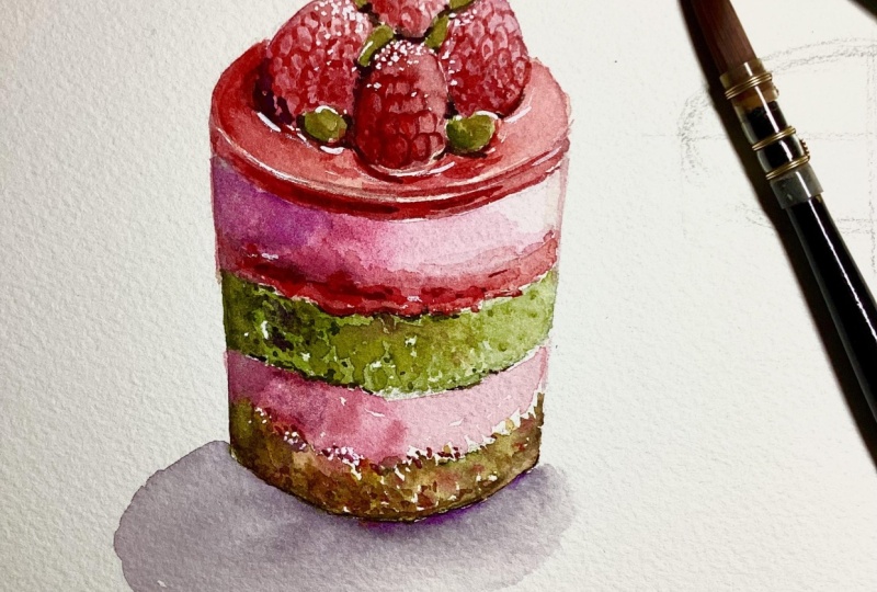
11. Cake 1: Sketch: I've sketched out
three cylinders. This way, I can just
add the designs on top and for the
filling easily. I'm going to paint the
pistachio raspberry cake first. And here I've added
another layer on top of the cylinder
for the jelly topping, for the base of the
raspberries on top. The shape of the raspberries are kind of similar
to the strawberries. They're a little bit
smaller, though, and the top is
also more rounded, whereas the strawberries
have more of a sharper tip. I'm going to place
five raspberries in a circle and one in the middle that is a little bit higher
than the other ones. So it looks like the
centerpiece of the cake. Then in between
these raspberries, I'm going to add ovals, and this will represent
some h pistachios. By the way, for the paintings, I'm not doing them in any order specifically
in terms of hardness. I feel like each cake has their own tricky parts to
them, mostly for the topping. But in terms of the filling, they're kind of more or
less the same level. So, in my opinion,
it doesn't really matter too much which one
you want to paint first. And you can also simplify it if these ones are a bit too complex for you to
follow along to. As for the filling here, I'm just dividing up the spaces. For the cookie and pistachio
crust at the bottom, I decided to make it uneven, so it looks a bit more
handmade and fun. Then I'm just going to divide up and allocate the spacing so I can paint them within the lines later on just
to make it a bit easier. As for the outlines and the
sketches that I'm doing here, I tried to make it as clean
and light as possible as you can see but if your lines are a
little bit too dark, you can also use
an eraser to just tap it over and make
the lines lighter, which will make the
painting experience a little bit more enjoyable since you don't have to worry about the pencil mark
showing through your paint.
12. Cake 1: Filling: Okay. Now let's put what
we've practiced into action. We're going to start by
painting the cake texture, and I'm also going to paint this with a little bit more
control this time. I'm going to use a mix of tear, Verde, and permanent
yellow deep here. By the way, I'll have
the list of colors for you to download in the projects and
resources section. I've switched all
the colors I use for the individual cake
so you can have it right next to you to
get everything ready. Getting back to the cake, I'm using a light consistency here, and I started in the middle, so I can pull the rest of the paint to the left
and the right side. I want the right side
to be the lightest since the light will be
coming from the top right. So I'm going to start adding a bit more color from
the middle by adding a bit more a verde in a light to medium
consistency this time. I like to just use the
tip of my brush to help spread it while
doing the dotting motion, as I've demonstrated in
the earlier lessons. As I get more towards the left, I'm going to darken
the color further by adding some Sepia into
the green mixture. I feel like the right side is looking a little bit
too light and faded. So to brighten up
the color slightly, I've decided to add more permanent yellow
deep into array in a very light consistency and just applying it very
subtly on the edges. I'm going to leave the base
of the pistachio cake to dry now and move on to the
actual base of the cake, which is the pistachio crumb. I'm going to start with yellow ochre in a
medium consistency. And just like the cake before, I'm just doing this
random tapping motion. This time, though, I'm leaving so much more white
negative space because we're also
going to introduce other colors into this section. So this is for a mix
of eravere and sepia. Then you can also add on
some permanent yellow deep into the mix as well
to brighten the green. Going to apply a few colors. So it looks like a mix of cookies and some pistachio nuts, which comes in
variations of green. So I have different shades
of both browns and greens. As I'm painting this,
I want to always make sure that the load of my
brush is nice and light. So the paint flows
out with ease, but it is still
very controllable because we're involving a
lot of different colors. If each dot is puddly then the paint will just end
up blending into each other instead of them sitting next to each other
and slightly touching. So remember to always
control the flow by tapping the excess paint or water
of your brush with tissue. So the cake looks
like it's standing. I decided to add a darker
brown at the bottom, so the base looks like
it's slightly curved in. And I'm doing this
while the surface of the crumbs are still
a little bit damp, so you can see some of the
paint also traveling upwards. And for a final
touch for the base, I think that adding red would bring a nice contrast
to the green. And since it's also going
to be the raspberry color, I decided to just.in a very thick consistency
of crimson lake. But I'm only going to
do a few of these, and I also make sure that
the dots are very small, so the red acts as
accents instead. Next, we're going to paint
in the raspberry mousse, and I'm starting with a light consistency of crimson lake. Just like the cake, I'm going
to start in the middle, and I'm going to slowly paint on the left side and the right side using whatever's
left on my brush. And since I'm painting
the right side lost, this means that the right side will always be the lightest, which is basically
what I'm going to try to do for all the layers. While the surface is still damp, I'm going to take
a bit more color, and I'm going to
place it on the left, going towards the middle because this will be
the area in shadow, so I want the color to be a bit more rich and also darker. I feel like I need to separate the crust and the move somehow. In terms of the texture, I need to make the crust look like it has some
kind of thickness. So to separate it, I'm using a thick
consistency mix of crimson lake with a
little bit of sepia, and this will sort of act as shadows in between
those two textures. Then with the same color. I'm also going to.in
the left side as well. You can see the surface
is still damp here, so I'm just going to help the paint move a little
bit with my brush. Want the left side to be the
darkest and the most muted, going to the center
or the middle, which is a little
bit darker but more saturated in color and the right side to
be the most pale. This is basically what I've
demonstrated to you when we were talking about the form
and the different phases. And I'm just going
to repeat this for the top layer of
raspberry mouse as well. I'm going to be very careful
as I paint the edges. I don't need the color to be too saturated because the value
is dark enough already. Now for the layer of jam in between the
cake and the moose, I've introduced a different red. This is a mix of vermilion
with crimson lake, starting with a light
to medium consistency, just doing a light base. I'm going to layer really
strong colors on top of this, which is why I don't mind if the right side
was a little bit dark. The surface is still damp, I took a really thick
consistency of crimson lake, again, using a very
light load on my brush, and I'm using the very tip
to spread the color and letting the color somewhat
spread while leaving some bits from the base
color still showing. I kind of like how the paint
is reacting to each other, so I'm just going to
leave it and move on to a different place while
the paint starts to dry. I'm going to move
back to the cake, which should be dry by now and add extra definition
for the texture. This is from a mix of tera Verde with permanent yellow deep. Again, I'm using a light load on my brush and using a
light consistency, starting from the middle,
then pulling it to the right hand side until
I run out of paint. Then for the left side, I'm going to add more
averde in the mixture, and I'm also using a slightly
thicker consistency, so the color is more rich
and slightly darker. Moving on to the very left side, I've decided to add a little
bit of CPI using a light to medium consistency and applying it with the
same texture as before. Now, as I'm running
out of paint, I'm going to use what's
left on my brush to add some dots on
the right hand side, because this is a
light consistency, even when the value of
the color is quite dark, it's still going to dry a bit more transparent
and more subtle. I'm going to add a subtle
crust to the cake, as well. So this is from a mix of tear verde with permanent
el deep and sepia, using quite a thick
consistency and the very tip of my brush to apply it to
the top and the bottom. By the way, for
these small parts, I'm just sticking with my brush because this is actually a brand new brush
that I just opened, so the tip is still
very, very sharp. So if the tip of your
brush is slightly frayed, I would suggest for you to use a smaller brush instead to make the painting
experience a bit more pleasurable and this way you have more control
when you're painting. You know, with the same color, I'm going to add those dots as textures, but
on the left side. I like to mix the
consistency so I can add darker and lighter
textures for these dots. These will just represent
some air bubbles, which might be softer
and some are a little bit more deep and darker.
13. Cake 1: Toppings: But now let's move on
to paint the toppings. I'm going to paint a layer of jam that is solidified with
maybe a bit of gelatin, so it will look a bit more
firm and more defined. As the base, I'm
using the same color as the jam layer before, which is from vermilion
and crimson lake. I'm starting with a medium too thin consistency
to give an outline. I make sure to paint
the side face and then leave a stripe of
white highlights. It looks like the
edge of the topping. Then I'm just going to
outline and fill in the rest of the space using
what's left in my bristles. As the raspberries
and pistachios are interacting with
the jelly topping, I also want to leave
some white highlights following the curvature
of these fruits, but I try to make
the highlights a little bit thinner and
a bit more subtle. Just like before, I'm
keeping in mind that the light is coming
from the top right. I'm going to darken the left, especially behind the
raspberries here. I'm just using a thicker
consistency of the same mixture. You can see the colors
a bit stronger. And as I'm painting towards
the right hand side, I'm always following
the curvature of the oval from the top here I'm going back in with
an even thicker consistency with extra crimson lake in
the mix to paint the side. I feel like the right hand
side is a bit too dark, so I took off the excess with tissue while the
surface is still damp. I'm going to build on the darker valleys along
the side of the topping. I'm going to use a
thick consistency, and I've added more crimson lake and a little bit of citia. I don't want to paint
over the light parts that I've left out on
the right hand side, so I'm going to be
very careful to only paint really thin streaks as
I get towards those areas. Next, I'm going to be painting the raspberries,
but before then, because the raspberries
have a pattern, and I'm going to be drawing
with my brush as well. So I'm just going
to sketch out here what I visualize
before painting. So the raspberries are made out of tiny little ovals or circles. Apparently, these are called druplets from what I've Googled. So, Okay, I'm just going to
refer them as the druplets. And with these, they are formed following the curvature
of the raspberries, which is why it's
important to think about the cross contour lines
before we draw this out. So we have visualization of those droplets wrapping
around our raspberries. After doing this, I want
to make sure to still think about the form and where
the light is coming from. Again, I'm just going to
place it from the top right, which means the shadow will
be on the bottom left. So overall for the color, it'll be darker on
the bottom left with a slight gradient going
towards the top right. Then because we have
these droplets, which also has their
own dimensions, I'm going to draw them out
with my brush later on, but darken the left bottom side or the places where
they're in shadow. Since we're going to be
painting a lot of these, I'm just going to go
straight to painting them. And I'll take you
through step by step, then we can repeat the process for the rest of the raspberries. Instead of drawing the
droplets straightaway, I'm going to paint the
base color first using a really light consistency of vermilion with
some crimson lake, and I'm starting with
a light consistency so we can slowly build on the darker values as we
start to develop the form. After painting the base, the surface should still
be a little bit damp, so I took a slightly
thicker consistency and I'm going to darken
the bottom left. Now we start to see rough
form of the raspberry. I'm going to leave
this to dry now and move on to the next one, starting with the
base color again. I'm just going to try to
do a light wash evenly. Then with a thicker consistency, I added the darker values from
the bottom going upwards. Because the first raspberry
was still a little bit damp, I try my best to not
let the colors touch. If not, the paint is just going
to blend into each other. If this worries you,
you can also dry it off completely with the hair dryer before moving on to
the next raspberry. I'm going to keep
working on the form by adding the darker values
while the surface is still damp and this dark red is from crimson lake
with a bit of CPI. I only place a little bit of this darker value right at the bottom of the
raspberry in front. The left raspberry will look slightly darker
still overall. Now moving on to the raspberry
on the right hand side, this is where the light
is hitting at most. I started with an even
lighter consistency, and as I'm building the value, I tried to use a
brighter red mixture. This is just from vermilion and crimson lake without the
sepia and you can see the color is a little
bit brighter and it's not as rich as the
raspberries on the left. There are also some raspberries hiding behind the pistachios, and I feel like this is
going to be very dark, so I just use a
medium consistency of crimson lake with vermilion
and a touch of sepia. And on the right hand side, I use the really
light consistency mix of crimson lake with vermilion. Just to separate it a little bit from the raspberry in front, I also dotted in a slightly
thicker consistency. The paint was still
cold to the touch, so I just took
advantage of it by adding even more darker values. Then I'm going to dry
it off completely, so I can start painting on those droplets
on a dry surface. I'm going to draw the druplets with my paint brush
and to do this, I want to make sure that I
have a light load on my brush, the tip comes to a
very fine point. It's not frayed
and you can't see any extra gloss or
paint at the tip, which means you
have a light load. If the tip of your brush
still looks too wet, and then you can take off
the excess with tissue. And then you have a much more
controllable brush where you can somewhat draw with
it and use it like a pen. By the way, I'm using
the same brush here, but as I mentioned before, this is a brand new brush
that I just opened. The tip is still very nice and sharp and the brush is
still very controllable. But if your brush is
a bit old and frayed, then I would consider changing to a smaller brush to do
this part of the painting. So here, after I've
drawn on the druplets, I'm just softening
where the ends touch each other with a light
consistency of the same color. And as I'm doing this,
I also want to start building the form
of the druplets in shadow by redefining them on the left side of each druplet with a slightly darker value. I feel like I have
enough information here, so I'm going to move ahead
to the next one on the left. Since this one will be darker, I feel like I don't need to
be as careful with the lines. And once I'm done drawing, I'm also darkening
the bottom left side. This time I don't mind if I lose a bit of detail as
well because we want the texture to just act as suggestions and ours will do the rest of the
adjustments automatically. So those are
basically the steps. I'm going to apply
the same thing for the raspberry on the right. But this time because this
raspberry will be lighter, I just use a slightly
lighter consistency. Going back to the
one on the left, after everything has dried, I feel like the colors
faded too much, so I'm just going to
increase the darker value. I'm quite happy with how
the raspberries look. Next, I'm going to
paint the pistachios. I'm going to start with the lights color
for the pistachios, which is from mix of yellow
ochre and ter verde, which I place very lightly
as the base color. Then I'm going to
build up on the green. I added more ter
Verde in the mix, but I'm going to
darken it a little bit further with a touch
of CPI as well. With this dark muted green, I'm going to paint the outer
part of the hat stachos. So some of them, depending
on where they are facing, it'll be on one side, and
some are thicker than others. I also added a little bit of this darker color at the center, and if it's already
completely dry, I use a really light
consistency of it. This is just to make the surface look kind of natural and uneven. Pistachios tend to have
different shades of green. So to add more brightness, I've added more permanent yellow deep into the previous mixture, and I'm just randomly
adding it to some places. I'm also going to define
the sides further with a mix of Tara verde and sepia
in a thick consistency. I'm fairly happy with
how everything looks. So now I'm going to
darken and neaten some of the edges where each elements are interacting with each other. I'm also going to add extra texture where
I feel is necessary, which will greatly depend on what you've done on
your own paintings. But it's always good to
just take a step back and connect all the pieces together
as one cohesive subject. I feel like this is
almost complete, but I'm going to finish
it off by adding some sugar dusting and
casado in the next lesson.
14. Cake 1: Shadow and Sugar Dusting: Next, I'm going to
paint the cschto so it doesn't look like
this cake is floating. And for the cscheto
I'm using indigo mixed with the red
from the raspberries, so this has a bit of vermilion, but mostly crimson lake. So the color will turn
to a muted purple. And since this is color that I've chosen for the cast shadow, I'm going to connect the
shadowy part of this cake, which is on the left side
with this color as well. So here I'm just going to
darken certain areas with a light consistency for the lighter parts like
the cake and the mousse, as I'm painting, I'm also following the texture
of these layers. For the raspberry,
though, on the left, I use a slightly
thicker consistency because the raspberry has
more of a rich color. As for the actual cast shadow, since the light is coming
from the top right, I'm going to paint the shadow going towards
the bottom left. As I'm painting the shadow, I started with area
closest to the cake. Then as I move outwards, I'm going to soften the edges
with a clean damp brush, so the outer shadows
are slightly softer and lighter
and near the cake, I want the color
to be a bit dark. So while the surface was
still a little bit damp, I added a slightly
thicker consistency. As a finishing touch,
this is optional, but I want to add extra texture. I'm going to add a
light sugar dusting using a thick consistency
of bleed proof white and I'm just
creating random dots following the druplets
of the raspberries. I feel like this is where
lots of sugar will gather, but as I'm doing this, I
try to not add too much. If not, the white will
just end up flattening the painting instead of adding
a bit of extra texture. And this is the finished
look of the first cake.
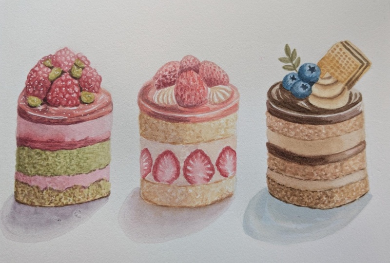
15. Cake 2: Sketch: Moving on to the second cake, I'm going to paint a
strawberry cream cake. Just like the design,
I'm going to have two pieces of cake at
the top and bottom, which leaves me with a
large space at the center. At the top, I'm going to
add an additional height for the jelly topping under
the strawberries later on. I added another oval on top, then I extended the sides and
erase the previous outline, which overlapped
with this new one. For the filling, I'm going to draw out a bunch of strawberries and this is going to follow
the curvature of the cake. These are going to be half
strawberries and the shape of the strawberries are similar to the references
that I've saved, which I would say looks like a rounded triangle or a
more narrow guitar pick. I'm going to decorate this
cake with four strawberries, and they're going to be more or less the
same shape and size. But because these are
full strawberries, I try to make the bottom
look more rounded instead of flat because the ones at the bottom
are half strawberries. And then in between
the strawberries, I'm going to add little
pipe decoration. These are going to
be the piped cream, and you can see that it's overlapped behind the first
strawberry in the middle. And once I'm done, I'm
going to just clean the outline as best as possible and make sure that the
lines are nice and light.
16. Cake 2: Strawberry: M. Before I start painting
the filling of the cake, I'm going to take you
through a quick lesson on how I paint the strawberries since that is part
of the filling. Just going to start with a
drawing first of an outline. Then I'm going to
divide up the spacing, so hopefully it's a bit easier to visualize
before you paint. Here is a reference to what I visualize when I
painted the strawberries. I really like the small types of strawberries and you can
see that the center is still very light and subtle
compared to the skin or the outer part of the strawberry where the
color is nice and vibrant. This is the contrast that I want to include in my painting. So this is how I
divide up the section. I'm going to create
an outer part or an outline with paint, and I'm going to pull the paint inwards to create
those negative lines. Then in the middle,
there's a white part, and then a really light
pink at the center. So here with paint, I'm going to start by
creating that outline using a very thick consistency of red from vermilion
and crimson lake. See how I'm painting the
lines with some curves. There are two ways
to go about this. Here I've used the damp brush to lightly dampen where I want the paint to travel to as I'm
pulling the paint inwards, or you can just skip
the step and pull the paint inwards without
the damp surface. With a clean damp brush, now I'm going to pull the
vibrant red and I'm going to paint lines with thin
white lines in between them. Damp brush will basically reactivate the paint that
you've placed earlier, which is why it's important to start with a very
thick consistency, you'll have enough
pigment to spread. Sometimes I like
to even go over it again with some more red
along the edges when needed. Next I'm going to soften the blend between the
white and the pink. Here I'm smudging it again
with a clean damp brush, and I'm going to use a very thin consistency of the same red to paint
lines at the center. As the paint starts to dry, I feel like the color is a
bit faded along the outside, so I'm going to
increase the vibrancy by layering a little bit
more color and then again, pulling some of the
paint and words. I'm going to neaten the blend a little bit and that's it
for the half strawberry. Now moving on to the
full strawberry, I'm going to start with
titanium gold ochre, mixed with a little
bit of vermilion and a really light consistency
to paint the bottom. Then for the top, I'm going
to use the same red mixture, but with mostly vermilion. I'm going to use a
light consistency. And along the outside, I'm going to make
it look textured by doing the same motion as
before to create curvy edges. And as I'm filling the
strawberry with the base color, I don't mind if I leave out
some white negative spots. Now with a medium
tootha consistency, I'm using vermilion, just
vermilion on its own. I started with a tip, and then I'm going to paint dots to replicate the
texture of strawberry. I made the dots a bit more
dense on the left side, and since the light
is from the right, I made the dots a
little bit further apart and also lighter
on the right hand side. I'm going to repeat the step, but I'm going to
use a darker red. This has some crimson
lake into the mix. Then I'm going to paint it over the previous color without
covering it completely. For an even darker red, I'm going to use the
same red mixture with added sepia this time, going to place it at the bottom, as well as add some
dots on the left side. That's it for a
simplified strawberry. At the bottom, you can
add some green leaves, but I'm actually not going
to do this for the cake, though it's an option. I'm just going to use
a mix of te Verde with a little bit of vermilion
and titanium gold ochre.
17. Cake 2: Filling: In this lesson, I'm going to show you how to paint the cake. Unfortunately, I forgot to press the record button and
I was painting already. I thought I was
already recording. So let me just try
to repeat this on a scrap piece of paper so
you don't miss anything. I just quickly sketched
and draw out the outline, but this is not going to be as accurate as the one before. I just want to
quickly get across the technique and what I've
done to create the textures, which I've basically
explained before, but this time, we're combining it all together
into the painting. So after sketching, I make sure the lines are nice and light. I made it slightly textured, and I erased any harsh lines. I'm going to start to
paint the cake layers now, starting with
titanium gold ochre. I'm using a medium to
light consistency in the middle because
this is where I want the most
vibrant color to be. I'm tapping and using
the slide and the tip of my brush to create
that uneven texture. Then I try to clean a bit of my brush and pull it to
the right hand side, so the right is
lighter than the left. As I move on to the left side, I'm going to build
the darker value here I've added some
quinciena into the mix. Leaving a little bit of space
on the left, and this time, I cleaned my brush and added a little bit of CPA
into the quinciena. And I just did the
same tapping motion as before to create
a textured surface. If there are any hard edges, I would then just
soften it up with a clean damp brush
or a little bit of color in a very thin consistency to just connect the sections. And I'm going to
repeat the same thing for the bottom of the cake, starting with a
medium consistency of titanium gold ochre. And here I clean
my brush slightly, then pull the rest of the
paint to the right hand side. So the right side of the cake
will be the lightest part. Whenever I'm painting the cake, I'm still using the
same motion as before, which is the tapping motion using the side and
the tip of my brush. And while the surface
is still damp, you can also add in
a little bit more of the titanium gold ochre as extra texture
if you would like. Now moving on to the left, I'm going to slowly build
up the darker value with some quinciena
doing the same motion, before I touch the
edge of the left side, I'm going to add some
Sepia into the mix, but I'm just using
a light consistency here so the darker value
isn't too overpowering. With the color that's
left on my brush, I'm going to drag it to the bottom to give it a
crust and also the top. And on the left side, because the surface is darker, you can add a bit
more quinciena and sepia in the mix to
create that crust. Going to slowly drag it
to the right hand side, but I try to create lighter and thinner
lines for the right, so the contrast
won't be too strong. I still have a lot of my brush, so I'm going to paint the crust for the
top layer as well. Going back to the bottom, I want this part to
look slightly thicker. I'm going to smudge
the edges using a clean damp brush and taking the excess to add
more texture on top. So this is what I've done
so far for the cake. And since we're going to be painting multiple
strawberries, I'm just going to go straight
back to the painting. To paint the strawberries, just like how I
demonstrated it before. I'm going to start with
a mix of vermilion and crimson lake in a
very thick consistency. I want a light load on my brush, then I'm going to create an outline following the
shape of the strawberry. You can see I'm making
tiny curves as I do this. As I come to the bottom, I want to make sure that
the ends are not too thick. In the demonstration, I dampen
the surface at the center. But this time, I'm
just going to use a clean damp brush to smudge
and pull the color inwards. This is the second
way of doing it, and then I'm going to manually blend the connection
together instead of using that wet surface to help the paint travel
a little bit quicker. After painting these stripes and leaving white in between, this time, I'm going to
use a clean damp brush. Here I'm going to clean the paint I have
left on my brush. Then I just took off the excess water with
tissue so I can use this damp brush to smudge all the ends together to
create a soft transition. Because I didn't dampen
the area in the middle, the paint traveled a little bit less since this is more
of a controlled way. As a result, the color
is a little bit lighter. Here I'm just trying to pull the paint a little bit more
inwards to brighten it. Then at the center, the
surface is still a touch damp. I'm going to use a
really light consistency of vermilion to just
paint a little oval. There are two more strawberries. I'm just going to
repeat the steps again for these last
two strawberries, using a really thick
consistency to paint the outline and also
making those curved lines and making sure that the bottom end is nice and sharp or at
least not too thick. Then using a clean damp brush. I'm going to pull the color inwards while leaving some white
space in between. After this, I'm going
to clean my brush again and get rid of
any excess moisture, then just connect all
those lines together, creating a softer center. Then once I'm done,
I'm going to use a thin consistency of
vermilion to paint the center. And again, I'm going to repeat this one more time for the
last strubery that we can see. Because I want the left
side to be a bit darker. Here, I've taken a little
bit of a darker red with either indigo or
CPM mixed into the red, and I just use a very
thin consistency to mute and darken
the color slightly. Then with the same color, I'm going to do the same
for the strawberry as well. I'm just going to layer thin consistency of the dark
muted red for the left side. I'm just going to clean this sharp edge here
by smudging it. Then I'm going to go back to the cakes since
the surface is now completely dry and
I'm just going to take a little bit of the
previous color mixture. This has a little bit of quinciena bit of
titanium gold booker. I'm just going to paint dots as extra textures or air bubbles. I preferably like to hold
my brush to the side. So if I accidentally
press too hard, the ovals will somewhat be horizontal oval instead of vertical oval, if
that makes sense. So what I'm thinking
behind this is as cake rises and it creates and traps all these air
bubbles inside of the cake, while it's still hot,
the cake is really tall, but as it cools down, the cake will flatten
out ever so slightly. So any strong air bubbles
which were trapped in the middle will flatten out
as well, ever so slightly. So this is why I prefer
to make these dots either small circles or
small horizontal ovals. Now, on the left side, because the area is darker in value, I added a bit of CEPI to
add those air bubbles, and on the right hand side, I added more titanium gold ochre and use a lighter
consistency as well. If there are any
rough patches that seems too contrasting
in my opinion, I like to soften
it slightly using a clean damp brush to
smudge some of the edges.
18. Cake 2: Cream: Next, I'm going to paint the cream and I want
the color to be very, very light and subtle, but not completely white. I've just used a
really light tint of titanium gold ochre
with a touch of CPA. I'm just going to paint
it very lightly with a light consistency and a
light load on my brush. Painting the middle and
the right hand side. Then as I get towards the left, I'm going to pick a bit
of that red mixture, a little bit of indigo, and you can see I've mixed in some titanium gold ochre as well from the previous mixture. You can see how
light this color is. It even just looks like a
little bit of a dirty water. But here I'm just going to very, very lightly paint in
between the strawberries. It's okay if I accidentally touch the
strawberry as well as long as they're completely dry when
you're painting this and that damp surface will activate a little bit of that
red, which I don't mind. Once I feel like there's
still too much contrast, then I'm going to build up
the color ever so slightly. Here I've picked up a bit more titanium gold ochre
for the center. I also try to connect
them all together. You can also do little
adjustments along the way. I felt like the strawberry
on the left here has too much contrast between
the outline and the inside. Here I use the consistency of that red to pull the color
inwards a little bit more. Then I'm just going to increase the intensity and soften the
blend towards the center. I'm also going to
darken the bottom of this cake ever so slightly to add a bit more
of a separation, but I don't want the
lines to be too harsh, so I smudged it with a
clean damp brush as well. Next, I'm going to
add some really, really subtle textures
on the cream. This is with a really
thin consistency of titanium gold ochre. The reason why I'm
doing this is because I don't want the cream to
look completely flat, but I don't want the texture to fight with the texture
of the cake as well. So I'm just painting
this very lightly. On the left side, because
this has a different base, I mixed in a touch of sepia. But again, I'm using a
really light consistency. In my palette, it looks
like lightly tinted water.
19. Cake 2: Topping: Then. In this lesson, we're going to paint
the cake topping. I'm going to create
the base first, which is the same
method as how I painted the raspberry
jelly base. But this time I'm going to use a different color because
this is a different flavor. I'm starting with just vermilion on its own to paint the side. Then I'm going to take a little
bit of crimson lake with a light consistency and quite a heavy brush
load so I can spread it across the top section as well while leaving
a little bit of white sliver for the highlights at the edge and
between the two faces. How I defer this one from
the previous raspberry is by using vermilion as
the most dominant color, whereas the raspberries before, I used mostly Crimson Lake. The left side faded too much, so I added a bit of crimson lake to just darken
it ever so slightly. Moving on to the top face, I'm going to add a little bit of indigo to the
previous mixture, and I'm using a light consistency
to introduce the color. Then while the surface
is still damp, I added more of that vermilion
with crimson lake mixture. As I get towards
the right, because the base color is
now completely dry, you can see the edges
are much sharper, which is what I'm looking
for because this sharp edge, just like the raspberry one will create that glossy texture. We're going to keep building
on the darker values. Here I'm using a
thicker consistency of the same mixture from
vermilion and crimson lake. I'm also going to take
a bit more to line on the top following the curvature of the cream and
the strawberries. And to darken and mute the
left side ever so slightly, I added a touch of
indigo into the mix. I'm going to clean
my brush completely because next we're going
to paint the strawberries. We're only going to add the most detail to the
strawberry in the middle, and I'm treating it
the same way as how I treated the strawberry
in the demonstration, starting with a light consistency
of titanium gold ochre, that I'm following
it up with a bit of vermilion mix into the
titanium gold ochre and again, a light consistency
while leaving a little bit of white space for the highlights on
the top right hand side. Going to follow this up
with the consistency of vermilion to darken the left side and making
my brush strokes close together on the left side and
as I go towards the right, I made the strokes a little
bit further apart so they can resemble the dips of the strawberries
where the seeds are. I'm still going to
increase the value by adding crimson lake
into the vermilion, again, using a
thick consistency. This time I'm starting
in the middle to paint the dips for the seeds. Then I'm going to use
a mix of crimson lake with a bit of indigo to
darken the bottom left side. I tried adding a bit more color, but it wasn't taking it because the surface was still damp, so I decided to dry it off with a hair dryer so I can work on a fresh dry surface where I'll be increasing a bit
more of a darker value. I feel like I have
enough information, so I'm going to start painting the strawberries at the back, starting with the left side. This is from a mix
of crimson lake with vermilion and I'm using a light to medium consistency
to paint a base first. The surface is quite damp, so I'm going to move on to
the next strawberry first, so it has a bit more
time to settle. I'm starting with a light to medium consistency of
vermillion and I took off the excess paint on tissue so I can spread the rest of the
color towards the edges. I'm also going to paint the base for the
strawberry at the back. Again, I want this to be fairly light and I don't really want to touch too much with the other strawberries
because I don't want to disrupt the colors. Strawberry on the left
should be dry now. So I'm going to build
on the darker values. This is from a mix
of crimson lake with indigo and a touch of vermilion, darkening the bottom bit
in the same way as how I painted the dark parts for
the strawberry in front. But I made most of the brush
strokes close together for the whole thing since I want this strawberry
to look quite dark. As I paint towards
the top, though, I increase more red, so this has less indigo, so the color is a bit brighter. I didn't like how
the bottom looked, so I tried to take it
off with a brush first, then I end up using my tissue since it was
also puddling wet, so I can rework that area. This time, I'm going
to use a mix of crimson lake and sepia
in a thick consistency. I feel like that's
enough for now. So next I'm going to work on the light strawberry
on the right. With this, I'm using a light to medium consistency of vermilion. You can see as I'm
painting that other layer, I've left out more
white negative space. Then I'm going to
work another layer using a bit of crimson lake. But this time the
brush strokes are closer together on
the bottom left. And lastly, for the
strawberry at the back, I'm going to use a light
consistency of both the red, bit of sepia and a
little bit of indigo. I'm going to increase a bit
more of the darker value to separate the strawberry at the back and
the ones in front. Then using the same color, I'm also going to paint in the corner for the strawberry
on the right as well. Lastly, for the
topping, I'm going to paint this piped cream. I'm going to use
medium consistency of titanium gold ochre, drawing a few lines following the curvature of
the piped cream. I'm also going to do the
same for the left hand side. I feel like a bit
of that jam color would be reflected on
the light colored cream. So I used a bit of vermilion
to paint the bottom, still following the
lines that I've painted earlier than to darken
it ever so slightly. I also use that dark
strawberry mixture, which has a bit of indigo
crimson lake and bit of sepia. But I just use a really
light consistency, especially on the
right hand side. I quite like where
this is going, but I feel like I
need to increase the vibrancy for the jam. So I'm using a thick
consistency of vermilion, and I'm also going to
add some on the side, and I'm going to do some little adjustments for
the cake, as well.
20. Cake 2: Shadows: Now, let's paint on the casheo. I'm going to treat
this the same way as how I paint the casheo
for the first cake. And for the color,
I'm going to just add and go to this mixture that I already
have on my palette, which has a bit of that red, starting with a
light consistency, very close to the cake. And as I get towards the edges, I'm going to use a
clean damp brush to create a softer transition. I'm going to get a
little bit more of that ingo mix into the
red to darken the color. Then I'm going to
paint very closely to the cake while the surface
of the cschto is still damp, and I'm going to help the
paint move with my brush. Along the edge, I also want to introduce the
color of the cake. I'm using a medium
too thick consistency of titanium gold ochre here, so it has a bit of
warmth and I'm just going to clean out the
edges with my brush. If I need to take off anything, I'll just use either clean
damp brush or tissue. Next, I'm going to use
that same mixture from the cast shadow to paint
the left side of the cake. And here I'm just using a
very, very light consistency. This will make the shadow make more sense as the same tone matches with the tone on the cake as well.
That's basically it. You can do some other
adjustments as well. I'm going to add
that same purple to some of the
edges for the cake. Maybe there are a bit of space in between the
cream and the cake. I'm also going to place it on the jelly and a tiny bit of
texture on the cream as well. The caseto is now completely dry and I felt like the
color is a bit too light. So I'm just going to do another
layer of the same color, especially near the cake. Then I use a clean damp
brush to soften the edges. I feel like I have
enough information here, so that's it for
the second cake. Let's move on to the third.
21. Cake 3: Sketch: And finally, onto
the final cake, I'm going to paint the chocolate coffee cake
or the mocha cake. I'm going to start by sketching out the little
layers on the sides. At the bottom, I want to have another cookie crust,
just like the first cake. Then I'm just going to divide up the layers for the filling. I want to have a bit of cake, bit of moose or cream, and a thin layer of
chocolate ganache. This is similar to the
raspberry pistachio, but I'm going to have two layers of cake instead of just one. At the top, I've extended
the height a little bit by adding another layer for the chocolate pinach as
the base for the topping. Then here I've added a blob. I wasn't sure if this
was going to be cream or a meringue cookie
maybe at the top, I'm going to create a flat
cube for a wafer cookie. Then in front of this cookie, I'm going to add a
few blueberries. I'm going to make the
blueberries quite big and plump. So they're going to be oval. When I'm drawing
overlapping objects, I'll just draw the full
shape on top of one another. Then once I like the position, that's when I'll erase
the overlap lines. Lastly, I'm going to add a small green leaf
for decoration. Then I want to make
sure the lines are clear enough and light
enough for me to paint on.
22. Cake 3: Filling: We're ready to paint now. I'm going to start by
painting the bottom, which is the cookie base. I'm going to use the
same technique as how I've painted the
raspberry pistachio cake, starting with a bit
of yellow ochre. This is around a
medium consistency, and I'm using the
tip of my brush to do some tapping motion, but I'm making them
a bit further apart. So there's a lot of
space in between where I can introduce
different colors. Like the other cakes, I painted
the right hand side last. So I'm just using
whatever scrap paint I have left on my brush, and I want to make
sure that the color in the middle is
the most vibrant. Here, I'm using some quinciena. And on the left, I'm going to use a light
consistency of sepia. You can also mix it
in with other browns, like the yellow ochre or mix the sepia
with the quinciena. And whenever I'm
adding different colors on the right hand side, I always want to make sure that I'm using a really
light consistency. So the overall color stays quite light compared
to the left side. I feel like I've covered
quite a bit of space. So now I'm going to start adding the tinier dots or texture. For this, I used a mix of
quinciana with a bit of CPA, and I just do little dots
with the tip of my brush, so I don't accidentally cover too much space
from the base. On the right hand side, though, I mixed in some yellow ochre as well to lighten the color, but I also used a thick consistency for a bit
more contrast in the color. Next, I'm going to
paint the cake. This is going to be a
light chocolate cake, and I used a mix of quinciana with a little bit
of sepia to get this color. Just like the previous cakes, I started from the middle. Then I pulled the rest
of the paint with a clean damp brush to
the right hand side. Now, for the left side, I've added more
quinciana into the mix. Then right at the end
of the left side, I'm going to use a light
consistency of sepia. With a mixture that I still
had left on my brush, I'm just going to add
a darker value right at the bottom of the
cookie base as well. The top layer will
be another kick, so I'm going to repeat the steps like before to
paint this one as well. After this, I'm
going to paint in the coffee mousse or
the coffee cream. For the main color, I'm
going to use sepia. But on my palette, I touch a little bit of quinciana
and yellow ochre as well. Because I want this color
to be fairly light, I'm starting with a light
consistency in the middle, pulling the paint outwards to the side with a
clean damp brush. Then on the left side,
I'm going to darken it slightly with a mix of
sepia and quinciena. I'm using a slightly
thicker consistency as you can see on the side. So the color is a
bit more vibrant. I'm going to pull
it to the center. Then on the side, I'm
going to use a very, very thin consistency of CPA. At the bottom will be another
layer of cream or moose, so I'm going to repeat
the same steps, but I'm going to be
fairly careful to not touch the cookie
base too much. Once I'm done, I'm going to leave these two layers to dry, then I'm going to paint the
dark chocolate pinache. For this, I'm using a mix
of sepia and crimson lake, painting from the middle, then using a clean damp brush
to pull it to the side. And on the left,
I'm going to create a darker color by adding a
bit of indigo into the mix. I don't mind that the mouse
is still a little bit damp, but I try to not move the paint
too much towards the top. And here I'm just trying to
direct the paint where I want it to flow towards
using my brush. I felt like the connection
here is a bit too messy, so I used a clean damp to dry brush to pull the access paint off and you can at in the
transition that way. Now, going back to the cake, since the first layer is dry, I'm going to add a
bit more texture using a mix of yellow
ochre and quinciana. And I'm just using
a light consistency here because the previous
layer was quite wet. So I see a lot of
blooming that I want to break up with
this extra layer. Now I'm going to add
the darker textures on the cake, and for this, I used some of the
brands that I had on my palate with more quinciena and a little bit
of crimson lake. I'm just doing tiny little
dots for the air bubbles. Now, to paint the texture
on the left side, I'm using the same
mix with added sepia, and I'm using a medium
to light consistency. Now I'm going to add the crust slash shadow underneath
and on top of the cake. So there's a bit of space in between the cake and the cream. For this, I'm using the
same mix as I used before, but this has added
sepia and crimson lake. I'm using a light
load on my brush so I can use the very
tip of my brush to create these very thin lines using quite a thick consistency. You can see the contrast here, then I'm going to soften the blend ever so slightly
with a clean damp brush. Using the same color mixture, I'm going to use a very
thick consistency, even thicker than before, to add extra dots
to the cookie base, and I'm also going to
darken the bottom, so the edge doesn't
look too sharp. I'm going to increase
the contrast on the darker sides
on the left here. So I'm just going to
smudge in a bit more of that quinciena mixture then I'm going to add on the
darker dots as well. Okay. Next, I'm going to make the cookie
base look a bit more dry and crunchy by separating the layer of the
cream and the cookie base. So I use sepia with that
little bit of crimson lake, and I'm going to use a
thick consistency to darken just certain
spots randomly, and this harsh separation
will create that illusion. I feel like the color of the
coffee cream is a little bit too muted and dark, so I decided to
brighten the color slightly by using yellow ochre, starting with a medium
consistency in the middle, then using a thin consistency on the left side
and the right side. That's basically
it. I'm just going to add some final adjustments, like little dots for the air bubbles for
parts of the cake. I don't want to
overdo this though, because if you have too
much dark air bubbles, it might make the cake look too dry just
like the cookie base. I try to limit this, and I'm just going to adjust
any colors that I feel need to be a little bit brighter or more
saturated and such. You can see because the
cookie base has more of that darker dots and the texture
is a bit more prominent. It looks a bit more dry
compared to the cake. So this is why I try to not overdo the textures on the cake.
23. Cake 3: Blueberry: Since one of the main
features here is a blueberry, and I feel like this is also fruit that is used
in many desserts, I'm going to show you
my thought process and how I painted this. Some people have messaged
me before on YouTube saying they can't really figure
out the roundness of the blueberries. And that's because
when we're painting, we have to think
about what's called cross contour lines
and the shades are going to follow the
cross contour lines in order to create that
three dimensional form. So here as I'm sketching it out, I'm imagining that the light is coming from the
top right as well. So I've darkened the bottom
left of the blueberry. Again, following the
curvature of the blueberry, and the flowery
part on top called the Calix is facing
away from the light, which is why I've
darkened it as well. Here I've sketched
out another one and this time I'm
going to paint it, but the light is also going to come from the top right corner. For the base color,
I'm going to use a mix of indigo with ultramarine finest so the indigo is
a little bit brighter, starting with a
light consistency. Then I'm going to slowly build
on a darker value by using the same mix in a slightly
thicker consistency to paint the bottom part. And as I'm painting the shadow, I'm following the curvature, as well as the
cross contour lines in order to suggest
the roundness of it. Once I'm done, I'm going to
dry it off completely with a hair dryer and at
an even darker value, I'm going to paint the Calix, and I'm using a
very light load on my brush in order to
control the flow. So it's like I'm drawing it
on and then coloring it in. And on the side, I'm also
going to line the bottom, then softening the blend
with a clean damp brush. I've established the
round form here, but now I'm going to make
that texture of a blueberry because some parts of the
skin has this whitish layer. And in order to suggest that, I'm going to use a thin
consistency of the same mix, and I just kind of tap it
in with my brush using a very thin consistency to
create an uneven surface. And while the surface
is still damp, I'm going to add on just
indigo by itself in a thick consistency to darken the shadowy areas
like hyena calix, as well as the bottom
of the blueberry. And that's it. Now let's
paint it on for the topping.
24. Cake 3: Blueberry Wafer: Now, let's start to
paint the toppings. I'm going to paint
the wafer cookie first because this is
the largest element. I'm going to start
with a medium to light consistency
of yellow ochre, and I'm just going to cover
this first part here. Then I'm going to pick up a
little bit of this brown. I think this has some
quinciena in it, and I mixed it with more yellow ochre and
a thick consistency. Then I'm just going to.it
in at the very corner where the wafer is hiding behind the blueberry and the
meringue cookie in front. The bottom side of the wafer
cookie will be darker. So I used yellow ochre with a bit of that
quinciena on my palate. So the value is a
little bit darker. But again, I'm just
using a medium to light consistency and just going to spread it
as a flat surface. And for the top, I use the light consistency
of yellow ochre. That's it for the
base of the wafer. I'm just going to dry it off
a bit so it's not overly wet and then I'm going to let the paint
settle completely. Meanwhile, I'm going to paint the base of the
blueberries while I wait. Just like how I demonstrated
it in the previous lesson, I'm going to paint the
base color using a mix of ultramarine finest and digo. I'm going to mix quite a bit
of paint for easy access here and I'm just going to use a light to medium
consistency first. Since all the
blueberries are touching and I want the base to be
more or less the same, I'm just going to paint
the base as a silhouette. Once I'm done with the base
color of the blueberries, the wafer should be
completely dry now. So I'm going to go back to it and paint the texture on top. I'm going to paint tiny
little square lines in a row. And for the color,
I'm using a mix of quinciana and yellow ochre. Can I'm sticking with this
brush because it still has a really fine tip that I can work with
and I can control. But you can also switch
to a small brush. I'm going to show you how
I use a smaller brush. It's just a bit easier to
control the flow of the paint that way because you don't have as many bristles to
hold a heavier load, and sometimes this load is
a bit harder to control. But what's ideal is
actually if you have a small very small flat brush, that way you can paint these squares with one
single stroke for each. This is quite
repetitive, so I'm going to skip to the final ones. And here I'm using
a smaller brush, and again, it's just a bit
easier to control the load, but I'm just painting more
or less the same way, kind of making a few
tiny little strokes to suggest some squares
next to each other. This is optional, but
for some of them, I like to add a
little extra shadow, so it looks like the
squares are kind of going inwards and it's deeper than the lines of
the wafer cookie. I got a bit tired
of this, though, so I'm not going to do it
for every single square. It's just a really
subtle suggestion. So after I painted a few, I'm going to add the layer
of chocolate on the sides. And for this, I used the previous mixture from the inside or the
filling of the cake. This is from a mix of sepia and a tiny bit of crimson lake. The top will be the lights area, so I just use a
light consistency. Then for the bottom part, I'm going to use a slightly
thicker consistency for a darker value. I'm going to darken
the bottom side, and instead of using or
adding a bit more color, I'm just going to smudge in that dark chocolate to add
a little bit of value, then I'm going to dry
it off completely. I'm going to build
on the darker value. This is from a mix of
Sepia, yellow ochre, and a little bit of quinciana
in a light consistency. I'm painting from the darkest
area to the lightest. So there's a subtle
gradient from the bottom to the
top of the wafer. I think I have enough
detail for the wafer, it looks like a
wafer cooking now. Going back to the blueberry, I'm using the same
mix as before, but this has a bit more indigo, and I'm going to start
separating those blueberries. I started with a medium
too thick consistency. Then I use a clean damp brush to soften the blend and
make this look round. I'm also going to paint the center just drawing it
on with the tip of my brush. Whenever I'm painting
tiny little areas, I'm using a very light
load on my brush. This also makes whatever I
painted dry quite quickly. So here, as you can see, the paint isn't
going to travel into each other as I'm painting
the blueberry at the back. I use a slightly
lighter consistency. Then with a clean damp brush, I'm going to smudge it all. Then at the center, I'm
going to draw on the calix. Now, as for the last blueberry, this I feel like would be the darkest blueberry
since it's facing the other way around with the right side
being the lightest. So I covered quite a bit of
it in a light consistency. Then I added more
indigo at the bottom. Then with the same
consistency indigo, I'm also going to darken the first and second blueberry as well, right at the bottom. Then I'm going to use a
clean damp brush to soften the blend and start adding the textures for the white
layer of the blueberry. I feel like I still need to add more definition and more
of the darker values. So once the blueberries are dry, I'm going to add a tiny
little detail to deepen the calices and
also define some of the textures as well
as the shadows. That's it for the
blueberries and wafer, you can adjust it until you're happy with the contrast
and form that you have. The next lesson, I'm going
to paint the layer of chocolate noche
and the meringoki.
25. Cake 3: Chocolate and Meringue Cookie: Next, I'll be painting the chocolate ganache
layer on top, and this is actually
very similar to how I painted the jam on
the previous cakes. But this time, we're going to use different shades of brown. The main brown here,
I've used a mix of sepia with some crimson lake
and a touch of quinciana. Again, I started in
the middle and I used the clean damp brush to pull the paint to
the right hand side, the right hand side is
lighter on the left, I added more sepia in the mix. At the top, I'm going to use the same color
mixture and I'm using a heavy load on my brush so I can spread the paint all across. And here I'm using a medium
to light consistency, making sure to be careful around the edges and
the little corners. And it's okay if you've left out some white
negative space. But I want to make sure I
leave out that little bit of highlight for the edge to separate the top
face and the side face. As I pull the paint towards
the right hand side, I just use a clean damp brush, so the right hand side will
be lighter than the left. Now I'm going to darken
the side a bit more. This is from mix of sepia and crimson lake and I
think consistency, placing it in the middle. Then I'm going to use
a clean damp brush to pull it to the sides. Then what what's
left on my brush. I'm also going to paint
the top with this, especially on the
left side because I want the left side
to be a bit darker. I'm going to keep building
on the darker values, especially on the left side for more contrast using
the previous mixture, but I've added more sepia, so the color is even
darker and more rich. I feel like the curve of
the chocolate ganache is too high on the
right hand side, so I decided to bring
it down a little. Then I set it in
place by drying it, and I'm going to leave
the chocolate ganache for now and move on to paint
the meringue cookie. I want this to be
coffee flavored. In the beginning, I was
still unsure whether this would be cream
or meringue cookie, but I decided to make it like a meringue cookie since I feel like this has
a bit more body. The bottom is rounder, whereas I feel like cream
would have a flatter bottom. Here I'm starting with
some yellow ochre, and just like the blueberries, I want the bottom left to be
darker than the top right. I'm going to dry it. After this, you'll
see some textures. That's because I
was still trying to attempt to make
this into a cream. But after that, I realized that I don't think
from the form, that it was possible to turn
it into cream convincingly. This is where I
finalized my decision and decided to turn this
into meringue cookie. Added some dots to
make this texture. Maybe it has some coffee
flakes or something like that. I just use a really thin
consistency of a dark brown. This is from CPO
with a little bit of quinciena or you can also mix it with some yellow
ochre if you want. Just using a light
consistency because I want the specs to be quite subtle. Again, I'm also going to
build the roundness of the form by adding the
darker values at the bottom, just like the
blueberries before. Maranoki is quite wet, so I'm going to leave it dry. Meanwhile, I'm going to
repaint the chocolate ganache. Since everything's dry
and the colors faded, I can keep building up
on the darker values. And because I'm painting
on a dry surface, you can see the edges
are very sharp, and this sharp edge would help enhance the glossiness
of the chocolate gnache. Lastly, I'm going
to paint the leaf, I'm not going to
introduce another color. Instead, I'm going to use my yellow ochre and
mix it with the blues I already have on my palette in order to create a muted green. I start out by using the tip of my brush to paint the stem, then I paint on
some rounded leaves at the top and on either side. While the surface is still damp, I created a darker green by adding more indigo in
the mix and I'm just going to.in the bottom of the leaves to create
a soft gradient. I
26. Cake 3: Shadows: Onto the last step of the
third and final cake, I'm going to paint on the
cschto and I'm going to treat this the same way as how I've treated
the previous cakes. Here I'm using a mix of
indigo with crimson lake. The purple is a bit bright. You can also mute it with a
bit of vermilion as well. But I'm just going to use
the colors for this cake. Just like before, I'm going
to use a medium consistency, starting very close to the cake, and I'm going to slowly pull the paint outwards using
a lighter consistency, and then eventually
a clean damp brush, so the edges become softer. I'm going to add
more of this color close to the cake while
the surface is still damp. And I'm also going to add the
color of the cake as well. Lastly, I'm going to bring a bit of the shadow
color on the cake, and I'm just tapping in some of this color very lightly
in a light consistency. And that's basically it
for this final cake.
27. Closing and Class Project: Congratulations on
completing this class. It was a bit of a long one, but I hope the lessons were useful for you and you
enjoyed watching it. For the class project, I
would love for you to create your own composition using the techniques I've
shown you today. You can design your
own cakes altogether, or you can also just paint along to the lessons that I've
demonstrated in this class. If you're a beginner,
you can also create cakes according
to your level, whatever you're
comfortable with. Or if you're an
advanced painter, you can design your cake and
your layout from scratch. Once you're done
with your paintings, please don't forget to post it in the project section where you can share with me as
well as other students. We can give each other
encouragement, comments, likes, and I'm just so excited to see what the project session
will look like this time. Hopefully, it'll be a very
colorful and yummy one. If you enjoyed this class and found it useful and informative, I would really appreciate it if you leave a
review and feedback, it really encourages me to make the classes that you
enjoy and hopefully, in turn, it'll also encourage others to take this
class as well. If you'd like to see
more tutorials by me, I do have a YouTube channel
called Nianiani where I post weekly watercolor tutorials
or art related things. I post every Friday. And if you would like
to see more Art by me, you can also follow
me on my Instagram. My handle is at IG
Underscore Nianiani you can also follow my
TikTok at Nianiani art. And that's it for this class. Thank you so much for
sticking right to the end if you're still here. All the best for your paintings. I can't wait to see it
in the project section, and I'll hopefully see you again soon in the next class. Bye.
 Nianiani, Watercolorist and Graphic Designer