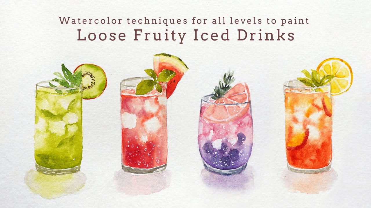
Transcripts
1. Introduction: Hi, everyone. My name is Nia, and today we're going to
go back to the basics. One of the most important
things when it comes to watercolor painting is
understanding the flow of paint. Once we understand this, we can create the
blending as well as the transitions that we intend to create
for our paintings, which in turn gives
us a lot of control. What's unique and special about this medium is the fact that it's greatly dependent on such
an unpredictable element, which is water, which
is why we need to understand how the water will affect the
paper and the paint. We also have the techniques such as what on dry as well
as what on wet techniques, which in hindsight
seem really simple, but it does take a fair bit
of experience for you to understand how the water
will affect your brush, your paint, and your paper, and also the other
variables in between, such as brush load and
paint consistency. With all of these
unpredictability, what's beautiful
about watercolors is the fact that you have the choice of either painting
with so much control, or you can also
choose to paint very freely and let the water
direct your paint. Sometimes it can be a
little bit scary to let go, especially when we don't
understand how the paint and water is going
to respond on paper. When I actually first
started with watercolors, I tend to choose the
more controlled way of painting because I wanted everything to react the
way that I intend them to. However, as I
progress and develop, it was so much easier for me to just let go and
take advantage of the free nature of watercolors and even have the choice
between the two whether I want a painting
that is a bit more illustrative and controlled or something that is a
little bit more free. Sometimes I can even combine the two techniques together
into a single painting. This is why I created this class because I wanted to
include the things I wished I knew when I
first started with watercolors or at least build the awareness of knowing what to pay attention to as we
build our experience. So let me just take you through a quick overview of this class. After this introduction,
I will take you through the supplies that I'm going to use for this class. Then I will give you
a quick overview on how to control
your brush load, since it plays a huge role in how much water we
introduce to our painting. We'll go to the wet
on dry techniques and how hard edges work, including examples,
and, of course, different ways to
create soft edges, still with the wet
on dry technique, then we'll combine
these techniques together and apply
it to layering. After this, we're
going to move to a more loose way of painting through the wet on
wet techniques. Wet on Wet those
straightforward has a lot of variable depending
on how much water we introduce to the surface. So I will give you examples
of these variables, including using
different papers, so you know the
difference between hot pressed and
cold pressed paper. We go through the
technicalities, I will then show
you an example of a simple landscape
painting while putting the techniques into practice and do this on different
paper as well. Then finally, we're going
to analyze the difference of the paint flow between
the two types of paper. Then as an extra lesson, I will take you through a
different style of painting, which is a bit more
controlled, and again, compare the reaction of paint on these two different papers. And if you want to
paint along to this, I'll have the
downloadable outline in the projects and
resources section, so you can print
it out and trace it straight onto your
watercolor paper. Hopefully after this class, you'll understand not
only how to control, but also when to let go to
paint freely with this medium and to also choose
the correct type of paper to bring your
imagination to life. And if this sounds
like something that might aid you in your
watercolor journey, please join me in this class, and let's move on
to the lessons.
2. Supplies: In this lesson, I'll go over the supplies that I use
for this whole class. But it really depends
on which part of this class you want
to paint along to. You can just watch
the examples of the techniques that
I go through in the lessons or you can also
paint along with them. It's completely up to you. For the paper, I've used hot
pressed and cold pressed, just so I can show you the difference between the
texture of the surface. But in terms of the size, you can use any size
you would like, you can also do this
in your sketchbooks. For the technical examples, I'll be using Fabriano
artistico hot press paper. This is around 300 GSM. I find that you can
see the textures and the reactions a little
bit more with hot press, which is why I decided
to demonstrate with it, even though it might not be
ideal to use this paper for certain techniques that I'm used to making with cold press. It doesn't really
matter about the size. As I mentioned before, this one, I've actually cut out
the right hand side, so I can use the paper for the painting demonstration
after these technical lessons. Since I want to show
you the comparison between hot press and
cold press paper. I'll just be doing a
quick run through of the same techniques with
cold press paper as well. And as I mentioned
before, I'm going to demonstrate painting on both of the papers so we
can compare the two. For the brush, this is the main brush that
I'm going to use. This is by George Jorn. It's a size six round
synthetic brush. Synthetic brushes are very
easy to control for beginners, but you can also use
other brands as well. And just for demonstration
and comparison, I'm going to show you
a mixed hair brush. This is by Artemdia
and it's a size six, and also a natural hair brush. This is a calligraphy brush, but I don't really
have the brand of this since this was
given for a present, and it only has Chinese
writing, which I can't read. For this, you don't have
to use the same brushes. I just want to show you the
difference in the bristles. For the landscape
painting demonstration, I'm also going to be using
this large filbert brush, so I can dampen the
surface easily. This brush is again
by Georgian and it's a size 12 filbert brush. You don't have to use the exact same though you can always use a large flat brush or
even a large round brush, whichever brush you have access to that can hold
more water just to make the process of dampening
a large surface quicker. The palette, I'll be using my usual cheap plastic palette that I got from Dio.
This is very old. It was originally white, and now it's tinted yellow, but I've used it
enough times for it to have really fine
micro scratches, so my paint no longer beats up. If you're used to using
new plastic palettes, you know that the paint
will beat up and it makes it a little bit harder to
control the load on your brush. If this happens, the
more time you use it, the more it's going to turn like this after you create those
really small scratches. It takes too much
effort for you to wait for your palette
to become this way, you can also use
porcelain palettes. In terms of the color of
the palette, ideally, white would be great or
any light colored palette, so you can see the colors
that you're mixing. These are all the colors
that I'll be using, but I'll go over them again
at the end of this lesson. I'm also going to use a tube
color for the examples, since I know I'm going to be
using a lot of this color. Next, you will also need a clean jar that you
fill with water. You can also use two jars, if you would like one for
cleaning your brush and one to dampen the color
that you're going to use. But I just change
the water from time to time onces too
thick and muddy. Also always have tissue
right next to me. When I paint, you can also use a paper towel
or an actual towel. This is as important as
all the other supplies. This is to control the
load on your brush, so you don't accidentally
make puddles. This in general, just makes the control so much easier
as you're painting, especially for fine details. For the small
landscape paintings, I'm going to also use washi
tape to mask off the sides. You can also use masking tape, but washi tape also works great. Mine is very small because it comes in is set in
different colors. This one has no brand, but you can generally use any masking tape
or any washi tape. I'm also going to
use a hair dryer, especially for the exercises to make the drying
process quicker. Or if you're patient, you can just wait for
the paint to dry. Lastly, for the sketch and
the writing on the exercises, I'm just going to use
my pencil and eraser, the pencil is bipentl Sharplet and my favorite
eraser is by boxy. Now let's move on to the colors. I'll be using this to
paint by Schmincke. The color is cobalt
turquoise, but you can, of course, use normal
dry paint as well. I decided to squeeze some freshly on my palette
just because I know I'm going to be using a lot of this color for the
technical demonstration, and it's also much
quicker to activate. Be making some quick examples
using the techniques, and these are the colors
I'm going to be using sap green by Hobein and Indigo by Schminke to
paint some bushes. And for the small
food illustration, I'll be using Jean
Brilliant Dark by Sminke and Quinciana
by Daniel Smith. Now for the painting
demonstration of the landscape, I'll be using Sepia by Hobein, Windsor red by Windsor Newton, permanent yellow
deep by Holbein, ultramarine Finest by Schminke
and Indigo by Sminke. I'll also be painting
a bred to show you an example of a different
style of painting, and here are the
colors I'll be using. This is mineral
violet by Holbein, Quinciana by Daniel Smith, handsy yellow medium
by Daniel Smith, Shen Brilliant dark by
Schminke and Sepia by Holbein. And here are the written list of the supplies in case you want
to get everything ready.
3. Brush Load: Before we talk about edges, I'm just going to
take you through a short run through how to
control your brush load, so you have a better idea
of how I apply the paint. For this whole class, I'm going to be using my synthetic brush. I think this is a
Chinese brand by Gorjor, but there are other brands that I've used before, like reefs. They basically more or less
act in the same way as this. So it doesn't really matter.
It's fairly standard. Synthetic brushes generally have stronger bristles and they can be very snappy and easy to control because it
comes to a fine point. It also doesn't soak up as
much water as softer bristles, so this is very easy to
control for beginners. For this whole
class, I'm going to paint a lot of squares
as different examples. I decided to pick one color, which is Copal
turquoise Of course, you can use other
colors as well. I just freshly squeezed
out a bit of paint on my palette for easy
access since I know I'm going to be using
a lot of this color anyway. Of course, this is
optional though you don't have to
use two paints. You can also use
the ones in a pan. I'm going to start with
my synthetic brush. I'm just going to get wet, make sure that all of the
bristles soak up some water. Now I'm just going to
activate the paint, pick up a little bit until my bristles are evenly covered. You can see I'm not using
too much water here since this is freshly
squeezed paint. But if you're using a cake or you're using dried
paint from a pan, it will take a bit more effort and a bit more time to activate. I have a medium to heavy load here and I'm just going
to paint a square. Since this is a synthetic brush and it doesn't hold
too much water, I can still paint
comfortably without the puddling too much for
the size of a square. Can see that the paint
is fairly even here. So next I'm going to show you using a heavier
load on my brush. You can see a lot of
pigment and water at the tip of my brush that it is no longer coming
to a fine tip, and I'm just going to
paint another square. This time is just a
tiny bit smaller, and you can also
see a little bit of puddle in the middle. This doesn't look
too bad, though. If the surface is
still evenly damp, the puddle can just spread out and flatten out as it goes. If you accidentally loaded
too much paint on your brush, you can always dab off
the excess with tissue. I like to take off a bit of paint from the back
of the bristles, and as you can see, now I have the perfect
amount for the square. For this next one,
I'm going to take off a little bit more
than I intend to, and as you can see, it's not even enough
to complete a square, so I decided to take a
little bit more paint. But you can see because I
don't have enough paint, sometimes the paint can look a little bit streaky depending
on the paper as well. But let's fix this. I'm going to take the tiniest bit of water, so I have a bit more dampness, and I'm going to take
the tiniest bit of paint and just go over it
again to even it out. Everything's been
okay so far because we painted a medium size square. But now let's try to paint with the same brush load but
on a smaller scale. You can see with
the same brush load because we're painting
on a smaller area, the paint will puddle up, so it will take a fairly
long time to dry. Instead, what you want to do is take off the excess with tissue, so you have a lighter load
to paint on a smaller area. This happens, you can also clean and dry your
brush completely. As you can see, there are
barely any residue of paint on my bristles and you can use this dry brush to take
off that excess puddle. Next I'm going to paint using
slightly softer brushes. Just as an example, this
is a mixed hair brush. It's still fairly snappy,
but slightly softer. You can see that this
brush isn't overloaded, since it still had
a point at the tip, but it also has a good amount of water as it covers this
whole square easily. Generally, softer bristles
just tend to be able to soak a bit more water and store it at the top
of the bristles. Time I used a heavier load, as you can see by the amount of paint at the top
of the bristles. This is more or less
a similar amount to what I use with
the synthetic brush, but you can see a little
bit more puddle forming at the center of the square compared to the ones
we painted at the top. For this next one, I have a
Chinese calligraphy brush. This is probably the
floppiest soft brush I have. And you can see that the top of the bristles collected
a lot of water, even though it still comes to a very fine point at the tip. Even though I'm
not using a lot of pressure and I am painting
a slightly larger square, you can see a lot of paint and
puddles within the square. This doesn't mean that it's not doable to paint on small areas, so I'm still going to
use the same amount, but paint on a very small
square here using the very tip. But because this
brush is very floppy, it requires a lot of control. We've already painted a
large square, a small one. Now I'm going to
take off whatever is left by painting
another large square. Notice that I did this without reloading my brush since
it holds a lot of water. And as I put a bit of
pressure on the bristles, it flops to the side
where I put the pressure, so it's no longer
like a fine pen tip. Actually so soft that when
I try to take some water, you can see the
bristles to spreading out as it soaks all
of that liquid. If I take it out,
it'll come to a point, but as I dip it again, the bristles will flare out. This is why I say this
brush is very soft and floppy in comparison to
my synthetic brushes. I said, if you have
softer brushes, which holds a bit more water, you can control the
load by dabbing off the excess using tissue so you don't accidentally
make unwanted puddles. Of course, there are
times where you can also use these puddles
to create effects, which I'll mention
later in the lessons. But generally for this class, I'm just going to
use a medium load.
4. Wet on Dry: Hard Edges: Let's start talking
about the edges. For this lesson, I'm going
to go over the wet on dry, which is basically painting on a dry surface using wet paint, and I'm going to cover
hard and clean edges. What we're essentially doing
here when we're painting on a dry surface is basically creating a barrier for
the paint to travel. So as I'm painting, this mixture of
water and paint can only move within the
damp or wet areas, and the edges next to the dry paper has
clean sharp edges. So remember, you can only create the sharp edges next
to a dry surface. This also applies when
you want to create two separate clean edges using different consistencies
of the same color, meaning a lighter tint or
darker tone next to each other, or two different colors
next to each other. If you want them to be completely separated
from each other, you have to make sure that
the first color you place is completely dry before applying the different tone or the
different color next to it. I'm just going to
make this quick. I'm using hair dryer to make
the drying process quicker. You can also do this so we
can get right to the results. Has to be completely bone dry. So as you can see, there
are no smudging here. Don't do this if the paint
is still wet because you will smudge the paint
on the clean paper. But since it's dry,
I'm going to pick up, firstly, the same color
with a lighter consistency. This means it just has more
water for a lighter tint. I'm just going to
paint right next to the previous tone without
rubbing or smudging the center. Now let's use a different color. Here I have sabrene. You can use any color
you want and T time I've activated it from a
pen watercolor paint. I'm going to do the
same thing by placing it right next to
the previous blue. There's a bit of a puddle
at the corner here, so I'm just going
to take it off with a dry brush like I did
in the previous lesson. Now, let's apply this technique. I'm going to use a medium load on my
brush to create a bush. It's just basically
random brush strokes, almost at to the center to create this pushy
effect or texture. As you can see,
because I'm using a medium load on my brush, the paint travels fairly evenly. I'm going to use a heavier
brush load, as you can see, it's a little bit more
difficult to control because the paint just ingle
with each other a little bit more and is
creating this puddle. It's also a bit more uneven. Some of the edge is
light whereas there's a puddle collected at
the bottom corner here. If this happened, you can
take off the excess using a dry brush or you can
create a larger push, you're essentially
just spreading more of the paint
to a larger space. I'm going to be painting
these bushes to apply it to the different
techniques or the edges that I'm going to go through
in this whole class. I just want to make sure you understand the load when you're painting
this push as well. Not to quickly dry it off, I'm just going to
use a hair dryer. My hair dryer fell before
I used it here and I didn't realize it
picked up a lot of dust at the corner of my table, which is why it blew the
dust over to the bush. I'm just going to clean it with tissue and I'm going
to repaint it. Going to repaint another
bush using a heavy load because I want to show
you how the heavy load will dry off or can dry off since there are areas which are going to dry
quicker than others. Where the paint is distributed
evenly around the edges, those areas are going to
dry faster than the puddle. And I'm just going
to use a hair dryer here to make it much quicker, and you can start to see some outlines forming
around the puddle. So basically, what's
happening is the paint will collect at the corners or
the edges of the puddle, leaving the center of
the puddle lighter, and it'll create this
blooming effect. This can be a
technique in itself, but sometimes you don't
want it in this type of situation if you want to paint something that
looks a bit more neat. However, this is something
that you can also embrace depending on the style of
painting that you're going for. Now that it's completely dry, you can clearly see the
outline that it has formed. But anyway, I'm just
going to create two bushes here and I'm
going to try to get the paint as evenly distributed as possible so it doesn't
create those blooms. Once I'm done, I'm just going to quickly dry it
with a hair dryer. First one, I'm going to use a light version of
the same color. This is just sub green
with a lot more water. And you can see that these are two separate bushes
overlapping each other. Sometimes when I am painting, I can get a little bit too
impatient and I don't want to wait for it to dry or even use a hair dryer
to dry certain areas. If this happens and you want to paint a separate object
right next to it, you can also leave out a bit
of white negative space, which is the white of the paper. Remember, you're
creating the separation of that barrier for
the water to flow. But anyway, you're getting
back to the painting. I'm using the same method. I waited for the
previous bush to dry and this time I
use a different color. This is from mixture
of sap green and the cobalt turquoise. You can see that I've
created two separate bushes. Now, what happens is, if you want the lighter
bush to be in front, then you would need to paint
it first beforehand because you can't paint over it since
watercolor is transparent. So here I'm using a
light consistency to paint the light
bush in front, but I'm going to more or less use the same
technique as before. Once it's completely dry, I'm going to use a darker tone of green and paint
behind this bush. Now, the difference is because the bush in front is lighter, I can actually paint over
it using that darker tone. So here I'm just creating a
different texture in front. This is not something
that you can do with a lighter consistency, which is why you have
to be fairly mindful of the layers that you
create with watercolors. Lastly, I'm going
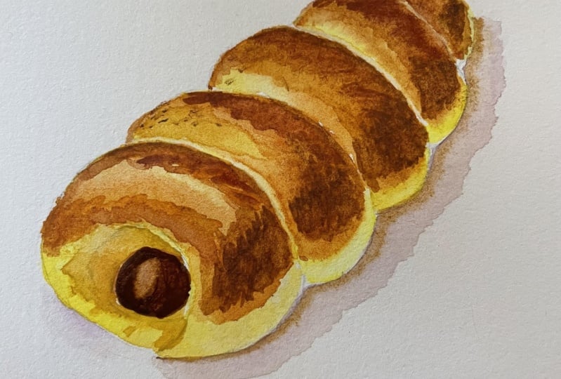
to apply this to a food illustration since this is one of my favorite
subjects to paint, and I'm going to paint a very simplified version of a pound cake using
just two colors. This is Jean Brilliant dark and I'm going to create
the basic shape, which consists of
this rounded square and two circles at the top. I wait for the crumbs
to completely dry and pink on the crust
around the outside. I'm just going to
use quinciena here. There's going to be
a very hard edge around the side of the outline. This will create a
cartoony type of illustration because
of those clean edges.
5. Wet on Dry: Soft Edges: Moving on in this lesson, I'm going to still talk
about what on dry. But this time, I'm going to show you how to create soft edges. I'm still going to
use the same color, and again, I'm going to
create a box on my dry paper. This time, I'm only
painting on the first half, and on the second
half of the box, I'm going to create a softer
transition in between. Once I'm done, I'm
going to quickly dip or slightly clean
my brush in water, and then I'm going to pick up the same color using
a thin consistency. This just has more water
compared to the pigment. And I continued on
painting without waiting for the first
half of the square to completely dry. So you can see there
are no hard edges. And while those two
areas are still wet, you can actually
help the paint move around to create a softer
transition in between. In certain cases, we might
not be quick enough to paint next to a wet surface like
we did in the first square, and this happens a lot, especially when I'm trying to paint something that's
a little bit more neat. For the second square,
I'm going to wait for the paint to settle a
little bit so we can actually see a slightly
harsher edge as I paint right next to it
with a lighter consistency. You can see that the
edge is much harsher. This happened, you can
actually reactivate the paint again by
using a damp brush and rubbing the area
that is already drying off lightly until it
becomes slightly wet again, so you can move and
pull the pigment to the side to create that
softer transition. It's completely up to you how much pigment you
want to pull and move. And since I didn't
reactivate the left side, you can actually
see where the paint are drying faster than
the right hand side. I'm just going to do
another one on the side, just so you can see different textures that it can create. For this demonstration,
I'm also using hot pressed which is more sensitive to application
of paint and wetness, in my opinion, because of the smooth surface of the paper. So you can see
clearer reactions. Whereas if you use cold press, it's actually much
easier to create a soft transition because
of the grainy paper. It helps a lot in creating
that softer transition, but I'll show you the
comparison later in this class. Let's make the same
type of transition, but this time, I'm going to
use two different colors. By the way, if you're going to paint along to these examples, you can play and experiment
as much as you want, but I'm just going straight to the next example to
get the class going. However, you can always pause in between if you want to paint
and try different things. For this two tone
one, I didn't blend. I just painted the color
right next to each other without waiting for the
first color to dry. But because it was still damp, you can still see that soft edge forming compared to the
previous one where we waited for the blue to dry and this one is where we
painted wet on both sides. Lastly, I'm going to show you my favorite way to blend colors, which in my opinion is also the most controlled
way to blend by using a clean damp brush to pull either damp paint or
completely dried paint. My brush is completely clean. I just loaded it with clean water and I like to
do some randomized motion, sometimes rounded to create a really uneven edge and I use whatever pigment is left
to blend it to the side. I've collected too much
pigment on my bristles, I would then clean my brush
again and pull it to the side again until it's basically
the white of the paper. The blue was still
a little bit damp, but let's do the same thing
to the green on the left. As you can see the green is
completely dry even after I've reactivated it
with clean damp brush, you could still see a faint line where the paint dried off. But as I keep making
these circular motions, you can slowly
reactivate the paint bit by bit until I can
control the transition. Since I've pulled
a lot of pigment, you can still see the light green next to the
white of the paper. I'm going to make this
completely blend with the paper. So again, I'm just
going to clean my brush because there's only
a light consistency left. Now there isn't too much pigment
to blend into the paper. Now, let's use these techniques
and apply it to a bush, so it's a little bit
more applicable. After painting the bush, I'm going to use a
clean damp brush to reactivate some of the paint, and now I have a loaded brush with a lighter consistency
of the same color. I'm going to create the
bushy texture outwards. This creates somewhat
of a hazy effect, or it might be something
like a back light going on. You can see a halo of the lit leaves at the top
and a darker green in front. Now let's make another bush. For this one, I'm going to
use different tones of green. I'm using sap green and then I just use a thinner
consistency next to it, as I build the shape, I'm going to add a
darker green as well. This is from a mix of
indigo and sap green. You can see, since I'm
putting the colors right next to each other without
waiting for areas to dry, the color will just somewhat
mingle with each other and it'll create this
really nice loose effect. This is personally my
favorite technique to use when I paint bushes or
trees or any plants, since it really helps make the painting look more
loose and organic. Again, you can still play
with this a little bit more. I'm going to use a
clean damp brush to extend some of the edges, creating this really
soft hazy effect. I'm also going to
show you how I apply this technique for
food illustration or maybe even still life or
something that will require a little bit more control depending on the style
that you're painting in. I'm going to create
another slice of pound cake starting with
Jean Brilliant dark. I felt like the surface
was starting to dry, so I added more water. Then I'm going to
paint the crust, which is basically
an outline around the shape using quinciena
on the damp surface. Can see the soft
edges on the inside forming as the paint
follows the water. Whenever you take
off your brush, the paint will
create these blooms as the paint collects
in those sections, and what you can do to
control this or take it off is by using a
clean dry brush. The dry brush will absorb the extra paint and as it's
loaded on your bristles, you can take off the pigment
by dabbing it off on tissue and then using the
clean dry brush again to fix those areas. Lastly, for the final example, I'm going to dry the
crumb of the cake. Then I'm going to use quinciana
to create an outline, which will create a harsh edge, and then I'm going to soften
it using a clean damp brush, which is my favorite
way of softening edges. See the top part
isn't completely dry. It's probably still
a little bit damp, you can see the paint slightly traveling inwards,
but that's okay. Since we're going to fix this, I've just dampened my brush, took off the excess
water with tissue, and then I'm just going
to go in circular motions and rub the edges until it
blends softly into the crown. Here, I've collected
too much pigment, so I'm going to re
clean my brush, take off the excess pigment, and then finish the
rest of the blending. If I can still see
a slight edge, I'm going to clean my
brush again and make sure that the blend
is almost flawless. You see how much control you can have with
this technique.
6. Wet on Dry: Layering: We can also combine all
of these techniques together and turn
them into layers, which is what we're going
to do in this lesson. Let's start with the flat
colors and the hard edges. I'm just going to create a square and I'm going to
make a couple of these. Okay, once I'm done, I'm just going to dry
these off really quickly so I can paint right on top of it without the
colours bleeding out. First one, I'm going to use the exact same color
and consistency. So you can see that
watercolor is transparent, and if you paint on top of it, only the section that you paint right on top of will
have a darker tone, whereas the rest
will be lighter. If this concept is a
little bit confusing, you can try to imagine two small square colored glass laid on top of each other and the area where it's
overlapping will automatically be a little bit darker compared to the single
transparent glass. However, as we mentioned before
in the previous lessons, I can actually soften
the edges if I want to by reactivating the
paint and moving it around. When I do this, I try to not distract the
first layer too much. Now for the second one, I'm
going to use the sap green, and with this different color, I think you can
see the separation a little bit more
between those layers. Now, let's apply this technique
to an actual painting. An easy one I like to do
is to paint balloons. And since some balloons
are transparent, I'm going to layer one
on top of another. Here I'm just starting with an upside down teardrop shape, leaving out a white negative
space for the highlight. Then I'm going to completely dry this off
using a hair dryer, then layer on an overlapped
balloon with sap green. I'm going to leave
a negative space for the highlight
on the left this time though because
the right hand side has that blue underpainting. I'm going to add two strings and tie them together
using pencil, but you can of course use pen, but since this is just
a small demonstration, it doesn't really matter. The next thing you can paint
using this technique are layered flowers where the flower petals
overlap each other. I'm just going to use
the same blue here, but you can use other colors
as well if you would like, what I want to do is paint some petals with
a gap in between. Those spaces are going to be reserved for more flower petals, so they look like they're
overlapping each other. I'm just going to paint
three here and I'm making the center of the
petals puddle up quite a bit. If it's a little bit too dry, I would just add a
little bit more paint or a little bit more
water depending on how pigmented you want
the petals to be. And after I've painted three, I make sure they're
all still wet, then I clean and dry my brush, then pick up some excess pigment at the center of the petals. So the center is slighter and the outer edges are
a bit more defined. The reason for this is so when I layer on the
petals in between, the edges will look a little bit cleaner
and more visible. Here whenever I'm picking
up the extra pigment, if my brush has
absorbed too much, I always take off the excess
using tissue and then I repeat the process again until I'm happy with the shade. Once I'm done, I'm going to
dry it off completely because we don't want
anything too smudge before adding on the
additional petals. Next, I'm going to paint a couple more using
the same technique, and I want to make sure that these ones overlap
the previous petals so you can see those delicate overlapped
flower petals together. I'm only going to
paint five petals, then I'm going to continue
downwards to draw on the stem. Again, you can use
paint, you can use pen, but for the sake of this
small demonstration, I'm only using my pencil. For this next example, we can also layer using
the two techniques. So I'm going to create a soft
edge with a square here, and then I'm going to layer on the flat color
with a hard edge. I'm just going to dry this
off and paint another box. This time I'm using sap green. As you can see, it more or less have the same effect,
but this time, the transparency goes over the light consistency
blue as well. Now let's apply the
techniques that I've gone over to a painting. It's a little bit
more applicable now that we've tried
it on the squares. I'm going to paint a flower. I painted five petals and I
left out the center empty. I'm going to use a darker blue. This is the same mixture from cobalt turquoise
with indigo, but the center just has a bit more indigo, so it's darker. As you can see, the
petals are quite dry, but I want to soften the blend, so I use a clean damp brush to pull some of the
paint outwards. Let's paint another
quick flower. I'm going to make another
five petal flowers, but this time I want the
petals to be very damp. I should have painted
this a little bit smaller so the petals
don't dry as quickly. I tried to make the
petals as puddly as possible just for the
sake of this example. But once I'm done
painting the five petals, again, I left out
the center empty. Then I'm going to
paint the center using the darker blue with
more indigo in the mix. The petals are still
slightly damp as I connect the darker blue
right to the center. I started by
connecting some lines. You can see some of the paint blooming outwards
towards the petal. This is a little bit messy, but it's just a really
quick demonstration. You can also paint this
a little bit neater and here I want to direct and help the paint move
a little bit more. I just use a clean damp
brush so I can have a slightly softer transition between the dark blue
and the light blue. Now let's paint a
similar flower reversed. I'm going to paint the
center first using a very thick
consistency of indigo. You can see that I'm using a really light load
on my brush as well, so it comes to a very fine tip where I can paint
those delicate lines. Then with a clean damp brush, I'm going to pick a little
bit of the pigment from the indigo and spread it outwards to paint
some of the petals. Again, I'm going to leave
out a little bit of space in between those
petals because I'm going to combine this with
the layering technique once the first layer of flower
petals are completely dry. Just love watching the paint flow out following the
flow of the water. It just makes watercolor
look so magical, and this is where you can just somewhat let go and let
the paint do its thing. Once I'm done, I'm
going to dry this off until it's completely bone dry. There are no puddles,
no damp surfaces, and those light
petals will be very nice when they're layered
and overlapping each other. I feel like there's enough
dark blue for the center, so I'm just going to paint
the petals separately. I'm using a really light
consistency of indigo this time to match the
color of the first layer. I'm painting in
between the petals. And as you can see, even
when I'm using a really, really light
consistency of indigo, the overlap petals are
still very visible. This is so much fun to paint. And if you would like,
you can practice painting more flowers on a
separate piece of paper. But in the next lesson, I will go over the wet
on wet technique before combining all of the techniques together to paint a landscape, as well as an illustrative
food painting.
7. Wet on Wet: In this lesson, I'll be covering the wet on wet technique, which essentially mean we're going to paint on
a damp surface. Let's start by using clean
water to paint a square. Hopefully you can
see the damp surface from the camera and I'm going to use a thick consistency of cobalt turquoise to
paint in the middle. As I mentioned earlier
in this class, watercolor can always flow
where there's a damp surface, which is an
environment that we're creating before applying
the paint in this case, where the water stops
is the barrier where the paint would also stop
flowing if it reaches the edge. Just the paint blooms and bleed outwards, creating
those textures, you can see a clear separation which we can help smooth
out with our brush, but I'm just going to let this one set and travel naturally. For the next one, I've dampened the surface
a little bit more, so the water is
somewhat puddling up, and I'm going to
take a little bit of indigo to paint the center. I'm just going to
do another one. This time, I'm just going
to evenly distribute the water again and use
sap green this time. You can see the distribution
here is a bit more even since the paper was evenly
dampened without puddles. Now let's have a look
at this indigo because the base has too much water
and it's puddling up. It's not going to look as even as the sap green or
the cobalt turquoise. And since watercolor can move
on damp or wet surfaces, having puddles mean
the paint will just flow in the
direction of the puddle. So here, as I'm
tilting my paper, you can see the paint move following where the
water is traveling. Now compare this
to the sub green. Even after tilting the paper, the green pretty
much stays in place, and this is generally the dampness I want my
paper to be as I paint. But a lot of times you
will see people tilt their paper slightly
downwards on the stand. This is so if there are puddles, the extra water will
collect at the bottom, and you can use it to spread more paint or easily
take off the excess. I started out painting
with a lot of control and it's actually
not until recently, I started embracing the wet on wet technique a little bit
more because I always find it a little bit intimidating to control and I wasn't sure about the dampness of the paper and how it will
react to my paint. It is something you
learn by experience. The more you paint, I feel the more intuitive you will be. But hopefully this
class will give you a little bit of a glimpse
of these variables, which I'm going to turn
into a table here, the wetness of the paper versus
the consistency of paint.
8. Wet on Wet: Wetness Vs Consistency: Et's start from the first row. Here I'm going to start
with a heavily wet surface, and then I'm going to go
to medium wetness and something that is a little bit too dry on the
right hand side. For this first one,
I'm also going to use a very thick consistency. You can see by the amount of pigment I've picked
up at the ends or the tip of my bristles and watch how the paint
slowly moves out, but it's going to stop
at a certain point and settle for a while since the paint is quite
thickly applied. Now moving on to the next one, I'm going to try to create
an evenly dampened surface. This is medium wetness. What I want to see here is to still be able to see
the texture of the paper, but you can obviously see that it's covered a little
bit with water. Now let's compare
this to the first one where you can obviously see a huge puddle because of how thick the highlight
is at the top here. But for this next one,
I'm also going to use the thick consistency and look how nicely
reactive this is. It's spreading evenly and you can see the lines
as it blooms out. Of course, when you're painting, how much water is not something
you can easily notice, especially when you're focusing so much on other
things as you paint. It might also react differently with different paper
or different pigments. Part of this is also letting go, trust the process and learn
from your experience, only control what
you can control. And as for this one, I'm going to only lightly dampen the surface and use a thick
consistency to paint a dot. I think what a lot of people don't realize is
that when you apply only a thin layer of water
or watercolor paint, it actually doesn't take long for the paint or
the water to dry. So in this case, I can only
see a very light bloom. This is also because
the paint is very thick compared to the amount
of water on the paper, and it's not traveling
much at all. Now let's review this again. The first one is
not even dry yet. The second one is almost
dry and you can see a really nice transition between the white of the paper
and the blue pigment, whereas the last one
barely moved at all. I can help move this if
I add a bit of water, but it won't look as organic
as the one in the middle. You can also see
how it spreads out. The color is a
little bit lighter compared to the left
and the right because the pigments traveled more and it's distributed
itself more. They are concentrated at the
center, so it stays dark. Now let's go back
to the first one. I think a lot of the pigments
have settled on the paper, but for the ones which hasn't, I can still move it
around the puddle. You can see there's a clear separation between
the light pigments which are still moving and the
darker part which stays at the center where
I place them originally. And here I'm going to
show you how it follows the water as I tilt as I
did before previously. And I'm going to also show you how artists usually
tilt their paper, and the paint or the
water collects at the bottom where they
can control it with their brush or take
off the excess. Now let's move on
to the next row. Firstly, I'm going to
wet the background until it's puddling
again for this row, I'm going to use a
medium consistency, which is ideally around
50% paint and 50% water, not that it can
be that accurate, think about it as something
that's a little bit more loose and less concentrated
compared to the first row. For this first one, though, I think I accidentally used
to think up a consistency. I feel like it's supposed
to flow a little bit more if I use a
lighter consistency. I'm just going to move on to
the next couple of squares. I feel like I can also make it a little bit lighter
for the second one, even though it's not as heavy
or thick as the first one. But luckily for this third one, I managed to get a good
medium consistency. You can see it's
spreading a little bit more even if the
surface is a little dry because the extra
water mixed with the paint adds to the
dampness of the paper, which should then help the
paint move a little bit more. Now let's move on
to the third row. I'm going to create a really puddly square again
and this time, I'm going to use an even
lighter consistency. By the way, I forgot to
mention, but for this table, I try to control the load on my brush to keep it as consistent as possible
all throughout, so it's a control variable, and I basically just try
to use a medium load, something that's not too
wet and not too dry. You can see with the
light consistency paint, it's spreading out
a little bit more. This is because the consistency
or the thickness of the paint is now a bit more
similar to the puddle. And you will see this
consistently all throughout these three squares with
a lighter consistency, it'll spread out more and also keep in mind that
with a light color, as it spreads, it's going to become even lighter
when it dries. Now onto the last square, even when this is fairly dry, you can see how quickly
the paint will spread. If you remember, as
we applied it before, the blue wasn't too different from the previous rose
that we've painted. But after it spreads
out a little bit more, everything's becoming
even lighter. You can even see
as it blooms out, the lines that's created
is much softer and more blurry compared to
the darker tones painted in a thicker
consistency.
9. Wet on Wet: Wetness Vs Load and Examples: Now, let's do another
variable where we'll test out the load on
my brush as I paint, but I'm only going to
do the medium wetness here since this is the ideal
wetness for the paper, in my opinion, anyway. I'm also going to control
the consistency in which I'm going to use a medium
consistency for all three. Again, I'm starting out
by dampening the surface. I try to get this evenly distributed and not
too puddling wet. You can't really
see the highlights around the puddle and I'm going to take a
medium consistency with a really heavy brush load. As you can see at the
tip of my bristles here, it looks like the paint
is barely hanging on and there's no fine point within my bristles as it's holding
so much water and paint. Of this heavy load, I
can put more pressure as the pigments are absorbed higher in the bristles and naturally, there's more water
and pigment as well. So the paint spreads easily, especially if it's on
this ideal wet surface. This is great when you're
trying to paint a large area or to cover up a background
or a large space. But be mindful of the
load when you're trying to use the wet on
wet technique on a smaller space because
this can become very uncontrollable very quickly
if you use a heavy load. Now moving on to
the medium load, I'm going to take the
excess off by scraping my bristles to the
side of the palate. So now you can see a slight
point to my bristles. There's less pigment, but it's still quite high
up there where I can put a medium pressure
on the damp surface. Now onto the last one, I'm going to take off the excess with tissue
just so it can absorb, but a little bit
more, you can see a finer point at the
tip of my brush, and since the pigment doesn't absorb too
far into my bristles, I don't put as much
pressure as well when I'm dipping my bristle
on the damp surface. With this what on
what technique, you can also create
a colored background or a colored wet surface
by using a little bit of paint to dampen the surface
then adding more paint on top or even using several
colors on the damp surface. I just mingles with each other. This is actually a really
good way of making blurred backgrounds for
landscapes or sceneries. You can also use it to
create abstract backgrounds. So the method is more
or less the same, but this time I'm going to use a really light color base
to create the damp surface. This just has a little bit of the cobalt turquoise pigment. Then I'm going to use
a different color. I decided to pick some indigo to paint on top of this
colored damp surface. Now, another thing that I
haven't mentioned is that when you're painting lines as
you take off your brush, that's where a lot
of the pigments collect and discharge
out of the bristles. I'll create this
bloom just like when you're dotting
using this method. As you can see,
whenever I take it off, that is where a lot of the
pigment is concentrated. And when this happened, you can use a clean damp brush or a clean dry brush to either pick up the excess
or help the paint move around on the
still damp surface. Is also a good way to make transitions a little bit
more blurry and smooth, and it gives you a
bit more control while using this loose
technique to paint. You can try to do
this multiple times or even try a larger area. Just play around with
how the paint reacts. Generally, I prefer
to use this technique on cold press paper where
it's a bit textured, but I feel like doing
this on hot press makes certain things look a
little bit more accurate. So it's just a little
bit clearer visually, especially when it
comes to seeing how wet paints reacts next to an ready dried surface or surface that
is drying faster, which in my opinion, is easier to understand
visually here, even though it's not
an ideal situation, at least for me to
paint loosely with what on what technique on
this type of paper. The next lesson, I will give you a short run through about using cold press
paper to show you the differences and
to show you that, it's also more forgiving when we try to create
soft transitions, whether by using the wet on wet or the wet on
dry techniques. In the coming lesson, I will put all these
techniques together into an actual painting
and paint it on both hot press and cold press so you can see the difference. Just to keep this consistent
with the previous lessons, I will also paint a bush using
the wet on wet technique. So you can see how it
can be applied as well. I'm starting with
a light to medium consistency of sabren
and it doesn't matter if certain areas are puddling a little bit
more than this outer area here because when I'm painting bushes or organic subjects, I like to keep it a
little bit more loose. What I'm doing here is picking up a darker green from a mix
of indigo and sap green, and I'm just going to.it in
the still wet surface using a really light brush load
so it doesn't spread out too quickly and just letting the paint
travel naturally. This what and what
technique is also great for painting sky or cloudy sky, which will be the
last demonstration of this lesson
before we put it all together and combin it into a painting in
the coming lessons. But let me just show you the basic idea of this technique. I like to create a damp
background that is colored. I just try to use
a light blue here. This is from a mix of
cobalt turquoise with a bit of indigo in a
very light consistency. Then I added a bit more indigo in the mixture for darker blue, painting it on top
of the damp surface. And I just want to help some of the paint move with
my damp brush. The blurriness is a little
bit more controlled. I'm working fairly quickly, and what I'm doing
here is rolling up a little piece of tissue, and I'm going to use it to take off some of the wet paint. While I'm doing this, I'm
dotting with my tissue and absorbing some of the paint
to create some clouds. If everything looks a bit
too light for your liking, you can also add more paint on the damp surface or even
wait for it to dry and add another layer for some darker clouds depending on the composition
of your painting.
10. Comparison Between Hot Pressed and Cold Pressed: In this lesson, I will finally compare hot press
and cold press. It's much easier in my opinion, to use cold press
with the wet on wet technique or even when
creating transitions. But as I mentioned before, I just wanted you to see the reactions with hot press
because it's much clearer and I find it just a bit
easier to understand and this reaction will
just be a little bit dealt down with
the cold press. If you're a bit
confused, what is the difference between
hot press and cold press? Hot Press watercolor
paper just has a smooth surface compared
to cold press paper, which is a bit more
grainy and textured. And there are also some
brands which has rough paper, which is even more
textured than cold press. Now, the texture really depends on the brand of
the paper as well, this one I have here
is bimolanduroi, and it's not that textured compared to
something like arches, which I have right here, you can see that
it's so much more textured and grainy
compared to the Moland. Let's compare this to the hot press that
we've been using. This is next to the Mlandroi. You can see that even with
the smoother cold press, you can clearly see that the
hot press is much smoother. If it's a little bit hard
to remember the difference, just imagine a hot
and heavy iron pressing down on paper fibers. You can imagine that
the heat will make the surface more
smooth compared to just putting a
heavy weight right on top of the fibers
to flatten it. For this demonstration, I
decided to use arches paper, so the green is a little
bit more visible, and I'm just going to paint the simple demonstration of the squares and
notice the difference between how the
paint evens out and also the edges that's going to form when I'm painting
on cold press. For this first one,
I'm going to just start by painting a square with a flat color and I can already feel
it as I'm painting this. It's so much easier for the paint to even
out since the paint just travels and evens out by itself without too much
help from my brush. I'm going to go straight
to the wet on wet. I'm going to dampen it with a medium wetness
that is fairly even. You can still see the grain of the paper and
it's not puddling wet. I'm going to just
use a medium to thick consistency with a
medium to heavy brush load. I don't know if you notice, but I feel like
the paint here as it's bursting outwards
towards the damp paper, it's following the grain more. So the shape is
more abstract and I feel like it's traveling
a little bit more as well. For this next one,
I'm going to try to use the same thickness or
same consistency of paint, but I'm going to try to
use a lighter brush load. And as you can see, even
with the lighter brush load, it's still bursting out and it's still
spreading quite a lot. What I want you
to try to imagine is if hot press is
completely smooth, it's just a flat surface. The grains on a cold press or rough paper has these wells, which then collects the water, it has micro puddles,
I would say, or wells this holds a bit more water and that is where the paint can
also travel as well. That's why I feel like the paint here can travel
in between those wells, creating more of a
smoother transition. Since these wells are
quite randomized, it will also help
with softening edges. So if I take you in a
little bit closer here, if you look at the edge on this flat colors not
completely straight. It's slightly jagged, even
though I intended to paint a straight line compared to what I've painted
on the hot press. Since the hot press is smooth, the line can also be smooth, Was if I'm painting a straight
line on the grainy paper, then it will follow the
jagged grain as well. Feel like this is what
also helps create soft transitions because
the randomized texture and the micro wells help direct
the flow of the paint on the damp surface or as we
smooth out certain edges. Comparing this to
the hot press again, if there are areas which are drying and certain
areas puddle up, it will just stay that way, whereas on the textured paper, the water or paint has more chance to travel
between those wells. Now let's try to use the pulling technique to create a soft transition
with a clean damp brush. I started with half of a square using a medium to
thick consistency. Then I clean my brush and pull the damp surface downwards until I create a
soft transition. If I've pulled enough pigment, I'm going to then clean my
brush again and take off the excess water and pull it downwards until it almost transitions to the
white of the paper. As you can see, it's
so much smoother, there are no clear areas where the paint dried faster than the areas I've
recently added water to compared to the ones I
painted with hot press. I know this one is
horizontal compared to the vertical examples
I made with hot press, let's do this
vertically as well. As you can see,
it's just as easy. It really doesn't matter
which direction you do this. This is also the reason
why I personally love using cold press the most
because it's just so forgiving. However, you'll
see me using a lot of hot press for my
food illustrations. In which case, I find
that hot press is quite nice to paint on for clean
illustrative styles.
11. Beginner Landscape on Cold Pressed: Okay, so let's put all of
the techniques together. In this lesson,
I'm going to paint a landscape using
cold press paper. I started out by masking on
the sides with my washi tape. I just use my cutting mat, so I can still move the painting around if I need to or
you can also use a board. As for the colors, I'll be using Indigo, ultramarine finest,
permanent yellow deep, SPIA, and Windsor red. I'm going to start
by painting the sky, and I'm going to use the
wet on wet technique. So I want to just dampen
the surface evenly, just like how I demonstrated
in the previous lessons. I don't want it to be
too lightly dampened, but just enough for
the paint to flow. The first color that I use
here is ultramarine fineness, and I started by using a thick consistency to
darken some of the sky. And I just use whatever's
left on my brush as it runs out of pigment to create some lighter
blues as well. You can see I'm painting
wonky horizontal lines and I like to leave
out a bit of space in between for the paint
to freely travel while also creating soft
wispy cloud textures. While the surface is still damp, I want to darken the
top part of the sky. Here I use some indigo
and I'm going to do more or less the same
texture as I move downwards. I only added a little
bit of indigo because I don't want the overall
sky to look too dark. I still want the main color
to be the ultramarine finest. After that, I rolled up a
little bit of tissue to take off some paint
that is still wet, so I can create these fluffy
cloud textures as well. Now the sky has
different textures from the soft and wispy to
the more fluffy clouds. Here I want to add
a little bit more definition under the cloud, I use a medium to light
consistency of indigo and I painted a bit more of the cloud textures on
the still damp surface. You can see, I don't have
to put much pressure, nor do I have to control it too much since the paper
is also helping me soften up the blend without having to help
the paint move manually. The paper is still damp here, and I decided to
place some mountains. So originally, these were
supposed to be mountains, but I think by the
end of this painting, it just somewhat became
part of the background or the sky since the paper was still a
little bit too damp. But this is okay.
We can always layer on top of it when we make
mistakes like these. At this point, I
was still trying to darken it to see
if it will work out. But as I mentioned before, I think it's just too wet, so the paint was just
traveling too much. Sometimes things
like this happen and you can control it by drying it and repainting on top of this as it
dries and lighten up. Or you can also just ditch it altogether like what I'm doing here and except that as just
part of the background now. I'm still going to
add some mountains, but this time I'm
going to paint it on the dry surface so the
edges doesn't soften up and I'm going to create a
soft transition by using a clean damp brush to pull
the colors downwards instead. Depending on how big your paper is compared to the
grain of your paper, it will also affect how
blurry the edges will be. This is such a small painting. It's only around 9.5 centimeters
by 12.5 centimeters. The size and the amount of
grain will remain the same, but with a larger
scale painting, your objects would naturally
be larger in general. So it has more grain in between, or you can say more pixels in between if you're used
to digital painting. So the same amount
of blur might look sharper in a large scale
compared to the small painting. I hope this makes
sense because it also factors in how
you can control or accept things that might not look the way you want it
to as you apply the paint. And this was one of
the things I was confused about at the beginning while painting
with what on what? Because I didn't factor in
how large the painting is. But anyway, going
back to the painting, I want the bottom part
of these mountains to look lighter and I'm going to dry it off because
I'm going to create another layer of
mountains or hills. This time because it's
a bit closer to us, I decided to add a bit
of permant yellow deep. This is more of a
dark blue green. I'm starting with a medium
to thick consistency to paint the outline just
like the previous layer. This time I tried to make
some of the edges look a little bit more texture to
suggest some distant trees. As I get towards the bottom, I'm going to either add a
little bit more pigment if I need to or just use clean water to pull
the paint downwards, just like I did in
the previous layer. I don't want to pull this
down too much because I want to create grassy
field in front. Here I'm going to paint
some trees taking advantage of the
still damp surface, and I added more
permanent yellow deep in the mix for a
different tone of green. I just dotted in right
at the bottom of where the mountain ends and I'm just letting the paint
bloom by itself. For the field, I decided to add even more
permanent yellow deep, so the green becomes more
earthy and brighter. Then I just use a medium
consistency to paint some lines. As for the rest, I just use a clean damp brush to use the pigment that I've
already placed on the paper, so I can create a
textured surface. While the paper is still damp, I added a bit more of the
blues in the mixture, so I can create a
darker green for the corners because I want to create somewhat of
a vignette effect. Now I'm going to dry this and notice as I dry this
from the bottom, how the light
consistency paint pushes some of the pigments under
the trees in the background. This was unintentional, but this is one of the
reasons why I love using watercolors
because these textures look so organic and I didn't
intentionally make it. It was just the paint and
the paper doing its thing. I can suggest some distant
branches under those trees. Next, I'm going to layer more
green on the grass texture. I'm just using the mix of the blues with
permanent yellow deep, and it's up to you how you want the tone
of the green to be. I'm just going to paint
this horizontally, so it looks like a flat crown. I started by using a
medium consistency, but I let the paint
run out as I continue, so some lines look
a bit more textured as I take advantage of
the grain on the paper. And while the surface
is still damp, I like to mix in some
darker greens as well. To have a variety of tones and sometimes I like
to also just use clean water to pick up the excess pigment and spread it on the still
large spaces I have. After this, I'm
just going to dry it off completely again so I can paint on the separate
elements on top of the grass. I'm just going to clean
out the edge a little bit here using a light consistency
of the same green. And once that dries, I'm going to use a slightly
thicker consistency of a dark green to paint
on some bushes in front. I'm just using the tip of my
brush to apply the paint, so I'm using a light
brush load so the paint doesn't travel too
quickly out of my bristles and it's
very controllable. I'm just going to paint a few. I like to play
with the height of the bushes and sometimes use a lighter
consistency as well. But I try to make sure that the base of the bush
is fairly flat. I don't want to make the bushes look like
they're floating. In fact, after painting
all of the bushes, I'm going to use a clean
damp brush to just soften the bottom part and to flatten it a little bit more. Lastly, I'm going to
add some fine details. I'm going to add some
branches on the larger trees in the background and
also in the foreground. You can use a small
brush for this, but I want to demonstrate
to you just how versatile a brush can be just by
controlling the brush load. As you can see, I have
a dry brush load here. I have pigment, but it's so dry that the brush comes
to a very fine point. I could even flatten it and use the thin side to paint
really fine details. Of course, you have to
control the pressure as well, but if your brush
load is too heavy, even a light pressure
won't do too much since the water flows too quickly
out of your bristles. This, I used a mix of sepia in a medium to
thick consistency, and I also added a
little bit of green to make the color consistent
with the surrounding area. For the last little detail, I'm going to add a little pop of color by using my Windsor red. Again, I mixed it with a bit of the green to make
the color consistent. And again, using a
really dry brush load, creating really small dots
on top of some of the grass, as well as the bushes. I'm going to limit the amount of the red because
I just want this to act as a little accents for pop of color on
the composition. Once I'm done with the painting and everything is
completely dry, I'm going to unmask the sides
to reveal the painting. And in the next lesson, I'm going to paint the same thing, but on hot press, so we have a comparison on how the paint
reacts on different paper.
12. Beginner Landscape on Hot Pressed: In this lesson, I'm
going to repeat the same painting
as best as I can. At least, I'm going to
apply the same elements. But this time, I'm
going to paint on hot press to show
you the difference. I'm going to use
the same colors and more or less the same color
mixtures and techniques. So I won't talk you
through the steps since it's just going to be a repetition of the
previous lesson. I mentioned before, I don't
usually use this paper for landscape paintings
because I usually like to paint a little bit more loosely when it
comes to landscapes. It's just the style that
I gravitate towards. So it's actually a new
experience for me as well. I usually use hot press for a lot of my food illustrations, like a lot of my skill share
classes that I've done in the past because I have
a lot of this paper, and it just gives a
different level of accuracy. So when I try to be very
detailed with certain textures, I can really control the
paint using hot press. Whereas with cold press, there are times I let go and let the paper and paint
do its own thing, and it's beautiful as it
is because I feel like that's actually what makes watercolor so special
compared to other mediums, where you do have
a lot of control, whereas sometimes
with watercolor, it's also about letting
go and understanding the medium so much that you kind of just trust the process. Since a lot of this is going to just be repetition
of the previous lesson, I'm not going to
repeat the steps, but I just want you to watch and see how the paint
reacts differently. I'm just going to put some relaxing music in the
background and come back to you where there
are clear differences that I want to
mention as I paint. You can also speed through this or skip to the next
lesson if you just want to see a side by side comparison of the
finished painting. For the mountains here, I felt like as I
dried the paper, there are such clear
separation between the pigments which dried
faster and the wet areas. You can see clear bloom
textures for the mountain in the background here as I add the trees on the damp surface
for the mountains in front, I feel like the paint doesn't
bloom out as quickly as on the cold press because
there are no wells helping to direct the flow
of the paint and water. With a cold press, I felt like I use a slightly
lighter load, but it was enough to kind of push and let
the paint move easily. Here, I felt like I need to
tap my brush a little bit more in order to
get the paint out and push on the damp surface. As I paint the
base of the grass, I can already see the
difference in the edges. Some lines look very clean. But for the base, I'm just going to cover it
lightly with clean water, and as I add the clean water, you can also clearly
see how the water pushes the previous
pigments away. The texture that I create with hot press is more
the water blooms, which I also intentionally added underneath the
trees in the background. So as it dries, it will suggest those
branch textures that I mentioned earlier that I accidentally added in
the previous painting. Hot press though, I can see such a clear contrast
between where the water pushes the pigments and for the texture of
the grass here, I really tried my best to create or imitate the
texture of the cold press. But since the surface
is so smooth, the streaky negative
lines that I create still have really
clean sharp edges. Whereas with the cold press, it was much easier because some of the grain
just took more paint, whereas the wells
didn't take any paint, so it helps to create those
really uneven textures. As for the rest of the painting, I didn't really feel too much of a difference because I was just painting on a dry
surface without much detail. So I'm just going to
quickly finish this off, and I'm going to also speed
this process slightly. For the last part,
I decided to darken parts of the sky because I felt like it dried up a
little bit too light. Of course, this is optional, and it really depends on how you applied
the paint earlier. I just going to paint
around the clouds. And I use a medium to
light consistency. So there are no clear
streaks in between. Of course, for
parts where the sky is just clear without
any cloud textures, I will soften some of the edges
using a clean damp brush. For areas like this one, if I felt like the edges need a little bit more
texture or more abstract, I ended up using tissue to make the edges
look a bit uneven, then I'm going to
dry everything off and take off the masking
tape once I'm done.
13. Comparison: Now, let's compare the two
painting side by side. Starting with the top, I can see some really nice soft
transitions between the colors on the cold press. To be fair, I did
layer a bit more blue on top of the hot
press, but overall, the cold press just has
smoother transition all across, and it's generally just more forgiving in terms
of application as we don't have to intentionally
soften edges manually. With the mountains, even if I use the same
application technique, you can clearly see the
lighter consistency pushing out the
pigments as it dries. So it has these blooms and
the edges are also very clean compared to the cold
press where it's less defined even after
painting on the dry surface. For the trees in front
of the mountains, you can see the blooms
created by the water looks the same as
the mountain where it's on the cold
press after it dries, it follows the texture
of the cold press paper, and those lines end up looking longer and
a bit more organic, which I find look more interesting and appropriate
for this composition. Now, compare this
to the hot press. I find that these blooms are just more or less the
same as the mountains. They're a little bit more chunky and they don't really
follow the lines, even though there are some,
they're a bit thicker. You can also see in front
where I paint the grass. Edges of the lines are much sharper compared to this
cold press where you can see those
randomized lines and textures which results
from the paper itself. This is why I personally love painting loose landscapes
on cold press because I can just take advantage of the paper texture and the medium itself and
letting it do its thing. This doesn't mean that it's
not doable on cold press. You can see that from the style, even if I use the
same techniques, the cold press just makes
it look a little bit more whimsical and somewhat
more illustrative. Which is why I feel it's only fair to add an extra
lesson where I'll paint one of my
favorite subjects in a more illustrative
style on Hot Press. So you can see the
advantages as well for, in my opinion, a more appropriate
subject for the paper. I won't repeat this
painting twice, though, but I will still paint on the cold press version of camera and show you the
difference and talk about it at the
end of this class.
14. Food Illustration Hot Presed: For this one, I'm going to start by sketching
out the subject and make sure I
have more or less a good outline for
the base form. I use this picture as
a reference roughly, but I'm not going
to copy it fully. I just need
references on some of the textures that
I mix and match, and I also use the
lighting as reference, as well as the form for
the front of this bread. As for the rest, I just use the cone shape as the base and added curve lines until I
reach the tip at the back, for those of you who like to
jump straight into painting, you can download and
trace the outline from the projects and resources
section of this class. My lines are a
little bit scratchy, so here I'm just going to clean it out before
I paint on it. And here are the
colors I'll be using. This is mineral violet, sepia, quinciena and the yellow medium, and Jean Brilliant dark. There are only a
few color mixtures, starting with a
light yellow brown. For this, I use a mix of
Jan Brilliant dark with handsy yellow medium and the
tiniest bit of quinciena. This is for the light
part of the bread, which isn't golden brown
compared to the top. So here I'm using a heavy
load to just spread it out at the bottom and also
the sides where it's visible. Then for the rest, I'm going to use a
clean damp brush to dampen and slightly tint
the rest of the area. Can see the color is
very light compared to the bottom here I'm just fixing up a little bit of the concentration of color or
the saturation on the side. Then for the highlights, I'm going to use a
very thin consistency of mineral violet on
the damp surface. This is mostly going
to be covered, so I'm just going to paint
on fairly large area. Remember to do this very lightly because
it's going to just act as a slight tint
to the highlight. The surface is still damp. I'm also going to add
this golden brown color. This is from a mix
of quinciena with a little bit of sepia to mute
it and darken it slightly. I use the medium to thick
consistency because I know the damp surface is going to help spread the
paint out naturally, and I'm using the
reference to look at the rough placement for
the purple highlight so I can avoid painting on it. Once I'm done, I'm going to
use a clean damp brush to help move the paint
and soften the edges. Still taking advantage
of the damp surface, I decided to increase
the saturation at the bottom for the
lighter part of the bread. Then I'm also going to soften the blend going towards
the high light, just using a clean damp brush, still making sure that it's light compared to the
surrounding area. I'm working quickly,
so the surface should still be a
bit damp and here I'm increasing the saturation
for the bread on the right. I also added a darker
color at the back. For the next section,
I'm going to do more or less the same thing. You can drive the
first section so the paint doesn't bleed
into this next one, but I just try to avoid getting paint in the first section
while I paint in this one. Again, I started with
the light creamy brown. Then I damp in the top part
using a clean damp brush. I forgot to add the purple, but I'm going to
avoid painting on the highlighted area using
the quinciena and SPIA mix. I'm painting diagonal lines following the form of the bread. That's because I see
some diagonal textures on the soft bread
from the reference, which is why I'm going to
try to roughly replicate it. I've left out the white
space for the highlight, so now I'm going to use that very thin
consistency of purple. Just be very mindful to not use too much pigment here because it's just going to
be very subtle. Or if you're scared of
controlling your consistency, you can just leave it
completely and just leave it as a white highlight because
the purple is just optional. I just really like
the combination of the complimentary purple with the yellow brown or the
orange brown of the bread. So from here, I'm
just going to repeat the same steps until I reach the top or the
tip of the cone. And in the next lesson, I'll be working on the
details for the next layer. I'm going to define the texture and add the filling
as well as the chado. Once I'm done covering the whole bread minus
the chocolate filling, I'm just going to dry
it off completely. So in the next
lesson, I can work on the completely dry
surface again to build on the details and saturation
of the painting. Oh
15. Food Illustration: 2nd Layer: Let's start by painting the detail for the first
section of the bread. I'm going to use the same light
brown color and I'm using a very thick consistency here on the dry surface for the
inside of the hole. I'm just using a
clean damp brush to soften the blend as I
get towards the bottom. After this, I'm going to
also add some textures, trying to imagine the
soft texture of the bread and how it folds as it
was proofing or baked. And on the still damp surface, I use a thin consistency of CPA with the tiniest
bit of quinciena. The CPA doesn't look
too muted and I'm going to place it on the
deepest part of the hole, and of course, trying to
soften the blend as I go. I'm going to work on the golden
brown textures for this, I just used the
previous color mixture, but I added more quinciena
so the color doesn't look too dark and muted but
a little bit more warm. Here I'm just using
a light brush load and a medium consistency, so my strokes are controllable. I'm using this somewhat
even like a pen. And I'm painting
on some textures, taking some ideas of
the reference image to help me imagine the
direction of my strokes. I'm not really following
the picture to a T though. So I'm just taking the overall idea and
somewhat repeating it, and also following the
round form of each section. By the way, you can download the reference image
in the projects and resources section just
like the outline if you'd like to have one right
next to you as you paint. Here, going back
to the painting, I'm going to just soften
some of the blend of those lines so it doesn't look too stark against
the light background. I went back using the light brown and just
softening the edges slightly. Some of the surfaces should
be a little bit damp now, but, of course, not
too wet at all. So I can still paint on it. This time, I'm going to
work on a darker brown, which is from the same mix
of quinciana and sepia, but this time, I just
added a bit more sepia. And using this
color, I'm going to add some random textures and also the outline at the back of this section to
separate it from the next. I'm going to repeat more
or less the same thing for the rest of the sections. But I also like to
look at the reference for some subtle changes
in the color and light. I find that a little bit of variation is good in a painting and makes it look
a little bit more organic and realistic that way. Usually for this type
of food illustration, I like to go into a bit
more detail as I paint, so I will usually add many
more layers and probably not use tooth of consistency
straightaway since there are so much
more detail I can put on. However, just for
this demonstration, I'm going to paint it
in a looser manner, so it doesn't take
too long to paint. I just want to show you the
comparison between the edges and the blending between hot pressed and
cold pressed paper. As I get towards the
end of the sections, I try to include a little bit less detail so the focus can
still be in front. Once I'm done painting
the sections, I'm going to just clean
out some of the edges. Here, I'm using the
golden brown color in a really light brush
load and consistency, and I just added
a slight outline. I'm also going to add
more textures on top to fix up and clean up some of the already
painted textures. You can also have a look
around and see if you want to add more saturation
in certain areas. Lastly, for the texture, I'm going to add
some tiny dots and lines for some really
fine marks using, of course, a dry brush load, so I can control the
application easily. Now moving on to the
chocolate filling, I'm using mostly sepia
with a little bit of quinciena starting with
a medium consistency. Then I place a light consistency of purple in a small section. Just like the bread. This is a small reflection
or highlighted area. Then for the whitest highlight, I also left out the
white of the paper. After this, I'm just going
to dry everything off. I feel like I really want to
increase the saturation of the color to make
it a little bit more bright on the right
hand side of the bread. So here I'm just glazing over a medium to consistency
of quinciena by itself, and, of course,
softening some of the blends if the
edges look too harsh. Now I'm going to
build the form of the chocolate by adding
the darker colors. This is from a mix of
sepia and quinciena. You can see I use a lot of Sepia this time
for this really dark brown and I'm using close to a very
thick consistency. Of course, I try to
soften the blend, but I also try to kind of imagine what the blob of
the chocolate looked like. The shape is fairly abstract, but I want to make sure it still has a three
dimensional form. Lastly, I'm going to add the cschto so it doesn't
look like a floating bread. And as for the cscheto, I personally love using a mix of mineral violet and sepia. I started by using a
really light consistency to just paint along the
edges, and of course, softening the blend,
using a clean damp brush, making sure that the
edges are not too rough. This is much easier
to do on cold press, as you can imagine, but I
just tried my best here. Then I'm going to
increase the value by adding the darker colors underneath the
dips of the bread. Of course, I'm going to
blur out the edges again. This is just by using
a clean damp brush, and I want to adjust the value to separate the shadow and the
actual subject itself.
16. Comparison: Let's compare the two
paintings side by side. I created the same one
on the cold press here. You can see so much
more of the edges and line details on the one I
painted on the hot press. You can see it especially when I don't manually blend
them together. Now, let's have a look
at the cold press. I feel like it's
so much smoother. I painted this fairly loosely, so the details are usually not
as crisp as the hot press, as I usually paint them
more in a loose way, but I have to say
it's so much quicker to paint on the cold
press because we don't have to spend
too much time blending each color manually. As you can see, you
can paint using both, but I feel it's generally faster to paint on
the cold press, but if you want to
create something that is super detailed, I would suggest using
hot press paper instead.
17. Closing & Class Project: Congratulations on
completing this class. I hope the information that
I shared with you today is something that will help
you in your art journey. For the projects, you
can either paint along to the demonstrations and apply it to your
very own paintings, or you can also just watch the demonstration and follow
along to the final painting. It's completely up to you. Once you're done
with your projects, don't forget to post it
in the project section, so I can see it as well
as other students. I think it's just wonderful to have community where we can share our artworks and be supportive of each
other's journey. If you enjoyed this class, please don't forget to leave
a review as it really helps encourage me to create more
classes that you enjoy. If you enjoyed my
way of teaching and would like to see
more tutorials by me, you can also follow me
on my YouTube channel, Nanai where I post weekly watercolor tutorials
or some art related videos. And if you would like,
you can also follow me on my Instagram at IG
Underscore Nayani. I'd like to thank
you for sticking right to the very
end of this class. I can't wait to see
your projects posted in the project section and share what you've
learned with me, and hopefully I'll
see you sing. Hi.
 Nianiani, Watercolorist and Graphic Designer