Transcripts
1. Introduction: Hello. I mean, I don't want the gala artists though working in loose style, also known as newsy guard down on Instagram. You might know me for all my numerous classes here on Skillshare. Today, I am going to share is your basic layering technique, which is used for painting translucent flowers. I have had a lot of requests for this topic for an online class, and I'm finally bring it here to you today. We are going to do some classic warm-up exercises. And finally, we are going to paint the African daisies in loose style using a limited color palette. We are going to painter without pencil sketches. So everyone will create the unique they Indian in loose style. This glass is in real time so you can paint along with me. You do needs to have some watercolor knowledge that they exist glass. It's not too complicated, but I do highly recommend having some basic knowledge before you dive deeper into this layering class, I have a great foundational class on color mixing already up here on Skillshare. So if you're a need for color theory, feel free to go back and first take that course. I'm super excited to see what you are going to create. And I'm sure that you will make a beautiful creations. I'll see you in the class if you are new to the channel, welcome. Press a follow button on the top, the January in these creative journey, grab your rashes and let's dive into painting.
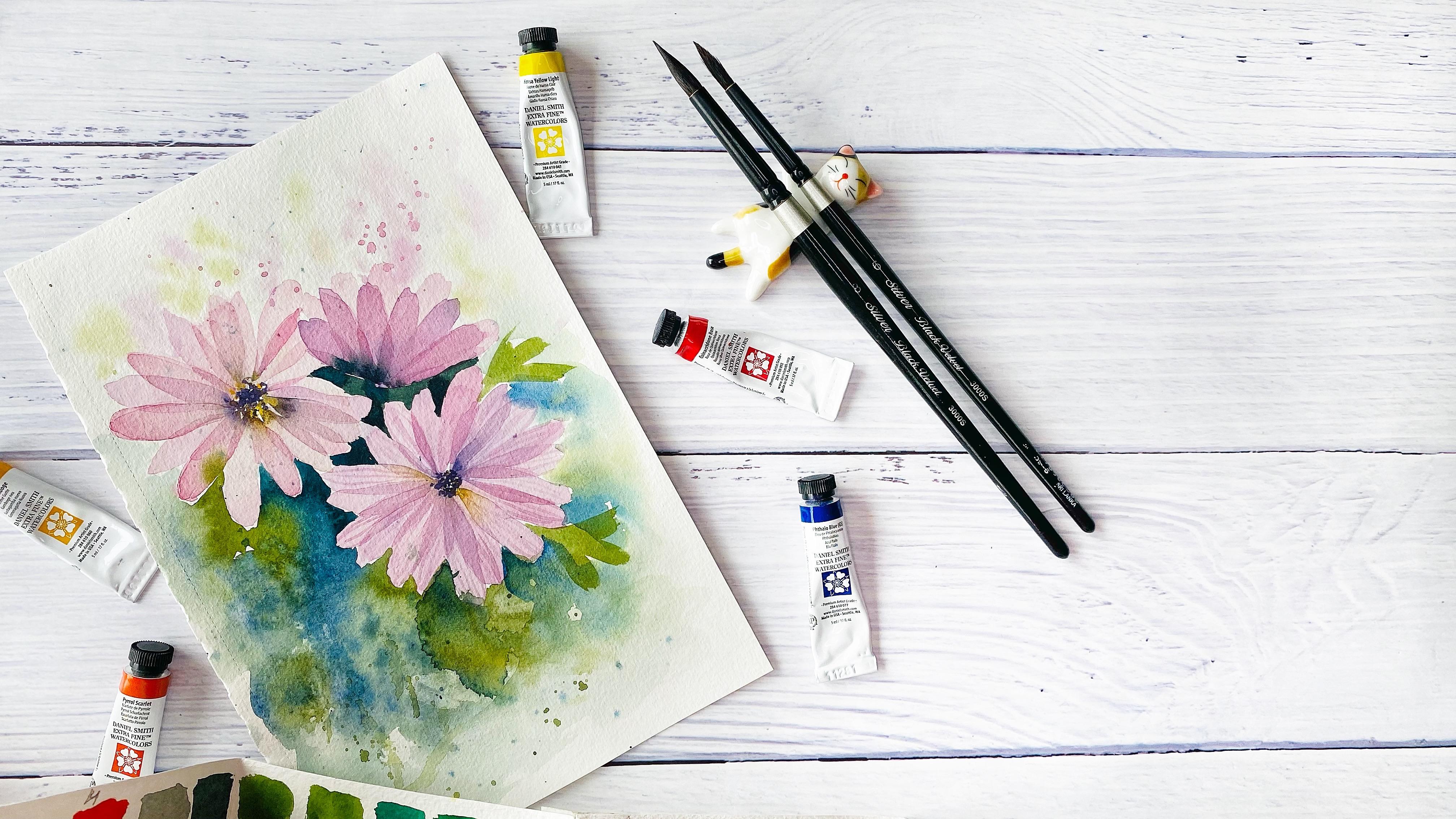
2. Supplies: Let's prepare this applies. In this class, I will use the following materials, watercolor paper, this one cellulose, one, A5 size. And this is a schedule girl which I will use watercolor paints, I will use as a basic set of Daniels. Me say actually you need to have one goal, one a warm shade of yellow, cool shade of rows, any rose color which you have. And to blue. So one goal shade and another one is in blue. And also there is a six column here. We will need to only five. So that is another challenge that we are going to use a limited color palette. If you have this reference booklet on color mixing from my color mixing basics, glasses, that would be helpful. Watercolor brushes, I will use zCX imitation of squirrels here. Number 4, 6, and 8. Blackwell would buy silver. What the color ballot, paper towels and two bonds with water. As I have mentioned, we are going to bind or without preliminary sketching. So that's why no need for buttons or what they were and the reference photos, you can find it in the class resources section. So grab your materials and let's have fun.
3. Basics of Layering Technique: We will paint the three of them. That is going to be the second one. And we will practice with color mixing of different colors. So one of them rule needs these kind of pinkish these kinds of shades of gray, which would be also always as I'm being geisha shade, then we will need some yellows. Here we can see clearly that this is warm shade of yellow. And for the flower centers there is some kind of violet. So we will see which while it we are going to mix. And here we can see that it's cool shade of pink. So that is one type of analysis which we are going to make a based on the colors. I'm going to use these six colors. What I have clear idea at the moment is that I will use a warm shade of yellow and gold shade of rows as far as the leaves. So we know that for greenery, we will need to make, to mix yellow with blue. We will have a look which ones we will need. And these will decide later. Another thing, what do we have to keep in mind is as a background. So the background is darker than our flowers and disease. What makes as a flower to look brighter and to pop up. So that is another second issue which we have to consider is about values. The flower has the lightest values as their flower center is a darker and darkest area is the background around the flower. So this rethinks or will need to keep in mind. The third which we need to consider before we will start painting. That is, we have had a look about the shape. So here is a shape is quite simple, so it's a flower center. And then the battles for circle, circle shape for pedal. So we are going to use just simple brushstrokes. So here I have already my inaccurate on rows. First, we will need to remember, Let's have a look at our guardian book. The remember that page about values that we will have for these kinds of flowers. Really, really tender, really light. So we'll have to use as the lightest values. Just the practice was your color so that it would have quite a lot of water. And if not, you can add more water. And another thing is brushstrokes. So for this flow will need quite simple brushstrokes. That is, for making battles. You can make them this way. So you just first, you hold quite high the depot of the brush and your operation stronger, stronger, and then you lift in ZBrush. So bad for z. So you need to have quite watery solution. That is one thing what we are going to do. Another technique which we are going to apply is what the color bleeding. And this one is very beautiful technique. So here I have already is a mixture of this deep dark while it for here. And let's have a look. So if here that technique which we are going to use for our flower center, just dipping your brush and leaving some marks, then very important to have a quite watery solution of your paint. And that is important now that once you are going to place to add a bend, you needed to touch. But really, really a bit this dark color. And now you can see the magic happens. So in order to get this effect, you need to keep several things in mind. As this band, it should be not so water as this one. Otherwise, it will cover completely. Let me show you then you will understand and you will see. So here. And as it better, what do you need to keep in mind in order to be able to get these beautiful or what our color bleeding effect. One thing is color, one. That one. And this is color to what happens in my case. You can see that for example here, if I will place this is color number 2. That it's, it's watery, but it's not so as much water as this one. So you can see my values. This has much more water. This second color. So first deep color. One needs to have less water then color to, in order to get these kind of effect. So then you add color number 2, which is much more watery. And the first color starts to move in the direction of where there is more water. So that is very important that for example, if you don't manage to get this effect, so it started started already to get dries it. Yes, that is another point. We need to move quite quickly while the scholar is still damp. Now, what if this one is dry? So it depends on the pigment. You may get this bleeding or not. But the main thing is remember that what let me show you what will happen if these color number 1 would be as much water, watery as is color number 2. I will try. Sometimes when you want to fail, It's not so easy. That's why Let's have a look. What was I will manage. You see, I have added more water and now it's more watery. And let's have a look. So now I have quite a lot of water here. And you can see that it's already paddle. And when I am keeping just three is really complicated to leave white spaces between the dots. And now I have another watery, the same. Have a look. So you see this color. I also have here pedal. So now this color, the consistency of violet is much more water reasons the consistency of this color. And what happens. Because so you also get a bad, okay? I do not manage to get the domain exist. Let me try again. Is like a Zen it I will make it more watery and probably like this. I will manage the may exist. But sometimes it happens when you dry them a dataset, the failure is a weird, complicated. Okay, so now I'm adding two watery and you will see that it starts like it moves. But it's not so beautiful and desire is not so much contrast. So unless you're looking for these kind of effect. But what I will be looking at is as this one so that it would be as a contrast, really dark. First color. And this is first color bleeding a bit in the second color. But my idea is that if both colors are really watery, then what you will get instead of this watercolor bleed, you will get is a mixture of two colors. So they will get mixed and you want the soul clear as these kind of watercolor bleeding. And also why it could happen that too much water or for example, is this better if you have not obeyed attention? I have touched the flower center, not just with the tip of my brush, but it was quite a big part of the body of the brush. And I have carried quite a lot of water with me of Zeff from the first color. I hope is that it's quite clearly and you will understand what I'm trying to transmit. And another thing is Technique water we are going to apply is layered petals. So this means is that we will create the first layer of the battles. And then once it will get completely dry, we will create a second layer of petals. So, and here you see that it starts to create disease beautiful. You can correct the shape or so in the areas where they intersect two layers of petals and then they created this really beautiful like shadow from another, like from the top part of petals. And the key for this technique, you need to use the same very transparent color mixture so that both layers will be really transparent. And another thing you need to keep in mind, you need to allow the first layer of petals to get dry completely. Then you will manage to get this technique. So I hope that now you have already covered this topic of techniques. And finally, let's start painting our being used during me. Flowers.
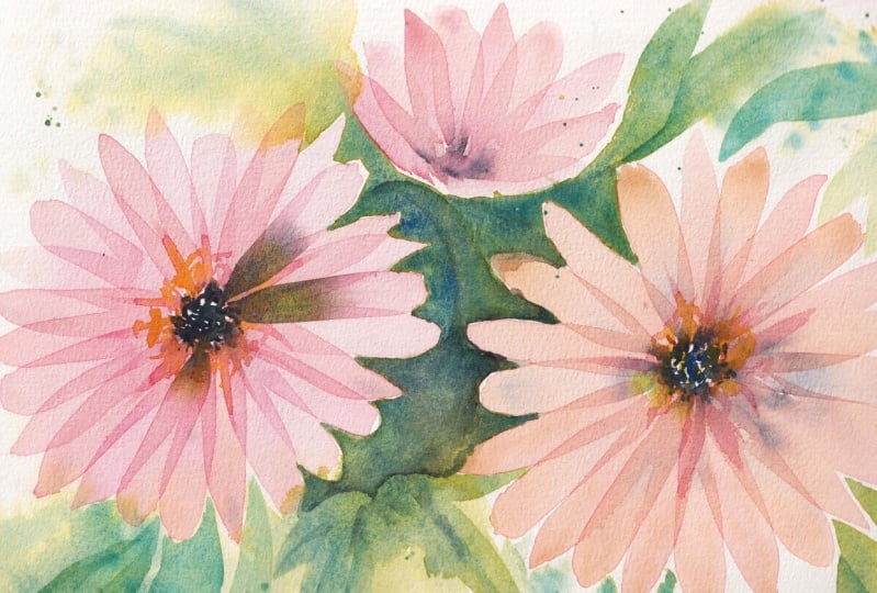
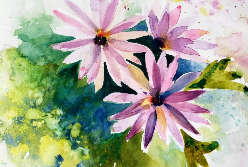
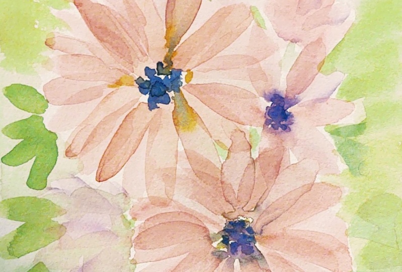
4. African Daisies Initial layer: First, let's have a look at the colors which we are going to use that I will base my choice on. This can occur in Don rows and four shades and mixture. I think that I will choose to mix it with school shade of blue, in my case is yellow-blue from Daniel Smith. And I will tend to get Zs kind of shades of this and really light values of this color. So let's prepare our color mixture. And as for wireless for the flower centers, this one, I would like to get some really, really dark shade of violet. I will use the same colors, but I will have to get the paint really thick and dense. And then now my violet is going to be a really, really dark. So what I'm considering for this flower center, I will use a warmer shade of yellow. So if you're ready, then we'll prepared, choose your colors, any rows and N equal shade of blue. And let's prepare quite watery. Here I have really watery. So really, really watery. This is just pinkish one. Here. I think that I will make another mixture and I will add, I will mix it with a bit of a cold shade of blue. So here held my colors. I will show you. So that is this one which I have mixed and this is just pure CAN agreed on rows. So, and the values are really, really light. Next one, hey, let's mix. Now you will see that it's really, this is still watery. But I need to really seek color for the flower center. So this is already better like this. So this is going to be my flower center. And this kind of deep violet. I have mixed the algorithm rows with Stella blue with cool shade of blue. So here, this is for yellow. We will add it a bit later, but have prepared one more brush. I rebelled one mobile Russia with, I will think, I think that this is one quite sinuous for warm shade of yellow. I'm going to use new gamboge. You can use, for example, cadmium, yellow deep. As for the composition. Now we're going to paint two big open flowers, and then we will see how we will add the third one. So my flower center of the first flower is going to be over here. And let's start time starting with a dark shade of violet and just deep in the point of my brush. Creating. So I have now just great when you see the battles. Some of them really nice color, the color bleeds. So I will mix, I have here this color and I will mix now it quite watery with this can occur don Rose to get a bit differentiate shade. So here we have you can correct a bit the shape and the non things that also you can add a bit of this pinkish into this, like here on the top. And the time considering that probably force here, I will place one more petal. So here we have our first flower, first layer of petals. Now we have to wait until it will get completely dry. I almost forgot about the yellow, yellow dots. So here I have my solid brush and I'm using a warm shade of yellow. And just for here, our hear it in several dots. That is another way how you can create this beautiful watercolor bleeds a great, our first flower, I think it's really painterly and it was beautiful with the color bleeds. And now let's move to our second flower. This a second flower is going to be a bit more complicated because we will have to get these kind of beautiful, really, really light color. And for this, you know, that this kind of colors you can get by mixing three. So I would say that it's more like this color using this reference book. Good. For this, I will have to mix three different primaries that it's the same kinda grid on rose, ultramarine blue, and cool shade of yellow in my case is a Hansa Yellow Light. So let's have a look. Let's prepare and as a Galois mixture. So I will use quinacridone rose right here. It should be very wary light Zen, I add a bit of ultramarine blue. Really. Is that it's too much. But yeah, okay, so just beat to beat. And then a really tiny amount of yellow. Be careful while it didn't yellow. So it's almost that I do not add anything. So this is a color and let's have a look. So here you can see that it's also a pinkish, but it's a warm shade of pink. And also we can add even more water. And then it's going to be un lighter. So let's try to play with this one. And for a bit, the darker shade, I will mix it with the second row, so which I have here on my ballot. And this time we'll make it a bit in different way because in this one you can see that there are more of this yellowish I like yellow part in the flower centers, so we'll start with yellow. So here I have my yellow and the flower center of the second one is going to be four here. And I start dipping my brush. So I'm done now. I will add a bit of a while it so this is watery violet. I'm looking for more. Oh sorry. That is that while at which we have prepared for the first flower, and this was in the example. So be careful and other tip that if you don't want to touch that flower which is getting dry, good idea to start from this flower and then move into this direction if you aren't right-handed. If not, another way that I think I would use those as Eigen way. You place your smallest finger. I don't remember how it's called. The Dominican. You place it does a paper and it's like you can make many different moments. It allows you to make these moments and then you just start adding more dots to the flower center. So here and now gums term of our battles. So the same. We're adding petals and creating beautiful watercolor bleeds. I can mix this color with a bit of a kindergarten rows to create a differentiator for rows. So this one is stronger. Here, one. I'm thinking that here also I want to open up. Yea. Yeah. Okay. So what I can and I would add a bit more of yellow in these areas where it has disappeared. This is a really tasty, I like these kind of watercolor bleeds. Okay, so here is another flower. And meanwhile we can create, this is our flower looking in another direction. So I would create it somewhere here and looking up like sideview for z. So we will have, I will use already this mixtures which I have here. And let's add zed is going to be just many battles going out from 1. So here is a shape I would like to exist. So here I will join them and I will add a bit of violet. Just hear a bit more, a bit more. And I think yes. And to make it a bit more interesting, I will add a bit of quinacridone rose. Here you can see that it's more concentrated somewhere on the top bar. And here also we can add in several areas on the deep where those ones which still you can see that they are quite watery, haven't dried. So you can add a bit of disease. Can occur. Don Rose. And now I can see that this is my flower has got already dry, except disease, petal. How you can see it and how you can detect there was a, your flower has got already dry or no. That is one of the things. You can bend your paper and you can see if it's like steel shining the surface is and it is wet. But for example, this petal has got dry. You can see that it doesn't have any kind of shine on its surface. And this flower, you can see that it doesn't have any shine. So just like you can turn the angle and see it except this petal. Another way you can show is that there's another deeply you can share with your hand as a paper nearby your flower. And then dash like this is a flower. And if it's the same temperature, so then it's already dry if the temperature of the flower feels more cooler. So it means that that steals there is some water and you will have to wait to eat. Let's add the second layer of petals. So here I have the mixture. And for this one we have edited to took in a grid on rose, a bit of yellow, blue. So I will add somewhere for here. So that is a color I didn't really tiny amount. So you can see that it's really watery. That is very important so that the paint would be very watery. And you see that as the shade. So it's changing really a bit. So I don't add really, really a lot of another second color when I'm mixing, by the way, what we were talking in there in that technique of watercolor blend, you can see that this one is like faded away colors and this one has contrast. So that's what we were looking also in our flowers. And also not a problem. We will add a bit more of. We will add a bit more of. Also, it's not a problem. If you don't have the contrast in your flower center like that, you will be able to add darker second layer and that's fine. Okay, so I can see that my flowers, this one has got already dry and I will start to add a second layer of petals. So whereas they are gross in and then they start to look really interesting. I exist shadows. So you adjust your gradients, a shape of petals which you like For this way. So here we have our flower already. What we can do is that a bit more of contrast to some petals. I'm using quinacridone rose, and I will mix it with a bit of yellow, blue, Tell really beautiful color. And probably I will adhere in the flower center so that it will create more contrast. And somewhere those ones which are still on dry, or the ones which are still wet, I will add a bit more of the flower at the battles where they're finishing the battle. Over here. And here in the flower center would be interesting. So like this, we are already creating some kind of some kind of volume and so that our petals will look with more dimension. So it seems quite nice and I really like, we aren't painting realistic ones. So that does not botanical art. What I like to do is loose flowers to get inspired from the nature and then the Bane down my interpretations. So what I can see that this flower is still wet to what you can do is though liquid, dry as it is. Or you can use or you can, or you can use a hairdryer to get a dry. So that is up to you. I think that in my case, I will wait until it will get dry naturally. So and this one as well is still really wet. So I will have to wait probably to have a cup of tea. But meanwhile.
5. Adding Following Layers: And now I can see that this is my flower has got already dry, except disease, petal. How you can see it and how you can detect there was a, your flower has got already dry or no. That is one of the things. You can bend your paper and you can see if it's like steel shining the surface is and it is wet. But for example, this petal has got dry. You can see that it doesn't have any kind of shine on its surface. And this flower, you can see that it doesn't have any shine. So just like you can turn the angle. And c, except this battle. Another way you can show is that there's another deeply Uganda share with your hand as a paper nearby your flower. And then they actually exist as a flower. And if it's the same temperature, so then it's already dry. If the temperature of the flower fields more cooler. So it means that that steals there is some water and you will have to wait to eat. Let's add the second layer of petals. So here I have some mixture. And for this one we have edited to talk in a grid on rose, a bit of yellow, blue. So I will add somewhere for here. Yeah. So that is a color. I mean, I didn't really tiny amount. So you can see that it's really watery. That is very important so that the paint would be very watery. And you see that as the shade. So it's changing really a bit. So I don't add really, really a lot of another second color when I'm mixing, by the way, what we were talking in there in that technique of watercolor blend, you can see that this one is like faded away colors and this one has contrast. So that's what we were looking also in our flowers. Also, it's not a problem. If you don't have the contrast in your flower center later you will be able to add darker second layer and that's fine. Okay, so I can see that my flowers, this one has got already dry and I will start to add a second layer of petals. So whereas they are gross in and then they start to look really interesting. I exist shadows. So you adjust your gradients. A shape of petals which you like for a here and here. So here we have our flower ready. What we can do is to add a bit more of contrast to some petals. I'm using quinacridone rose, and I will mix it with a bit of yellow, blue towel, really beautiful color. And probably I will add here in the flower center so that it will create more contrast. And somewhere those ones which are still aren't dry, or the ones we just still wet. I will add a bit more of a flower. Petals where they are finishing the battle over here. And hearing the flower center going to be interesting. So like this, we are alerted or creating some kind of volume and Isolde hour, but also we'll look, was more dimension. So it seems quite nice. I really like aren't painting realistic ones. So that does not botanical art. What I like to do is loose flowers to get inspired from the nature and then the band, my interpretations. So what I can see that this flower is still wet. What you can do is leave it dry as it is, or you can use a hairdryer to dry. While our flowers, our petals dry. Let's have a look at the green, so which again, which we can add to our flowers. So let's have a look of water we can mix. Let's open our So here we have warm shades of green. Let me have a look. Here. I have more greens. I would like this kind of green worm shades of this one for warm, that is a cool shape. Warm shade of yellow. And this one is ultramarine blue. And this one is yellow blue. So more or less, I think that it doesn't matter so much, but probably with ultramarine blue, it will look more interesting. For shadows. I will use this color. So probably I will mix these two colors, warm yellow and warm blue. It will give me quite big range of greens, these shades which I am looking for. And another thing about using ultramarine blues at it. If you have a look once it gets dry, it creates some kind of texture because it like partially is granulating paint. So you can notice that it leaves us, I'm kind of these kind of texture and with what it creates really, really beautiful effects. So that's my choice will be. So here also another way, different greens which we can get. So we'll see that probably also I like, I think this kind of green. So this is green. For this, I will need to mix cool shade of blue. We school shade of red. This is Rose, which solves this is two colors which will have used actually for petals and then like to make them stronger and cool shade of yellow. So that is another way how you can complement your battles. And another good point there of mixing greens in this way, that all three colors, so they, they are actually like they are present day in their flowers and as well in the background. And in this case says they will compliment and we'll look harmoniously. Okay, while we were talking. And I can see here that our battles has got dry finally. So let's add the second layer of petals. So you can see that this one's a little bit darker. I would like to use lighter ones. Oh, this is really bad. So it hasn't got dry completely. And if it happens to you, I think it's not bad that it has happened to me. So then you use this just a kitchen towel. You remember what you have introduced and you need to to let it dry longer so it can happen. So just don't worry, don't don't get frustrated or stop painting does remove. Okay, so we'll see how we will manage to make something may be doubly Sam, say no with the ground in order to create sounds in some other effect over there. So don't get upset. The main thing is that now you know what happens if you don't wait till it will get you one day will degrade. These kind of beautiful effect tells this one, for example, also I'm touching the paper and this one is feels really cool. So I cannot add some more details to this one. And another one. I think that's still also it's Yep, So this one has got dry and I can add this layer of petals here. And let's add some more contrast to this. That also I'm mixing vinegar don Rose so with fellow blue. So the same ones which I have used and just in several areas I'm at in some more interesting. And a bit more of quinacridone rose and probably some petals to make them more interesting. And now we'll have to leave it to dry. Meanwhile, again, make stronger this flower center. So I'm using the same mixture of violet and it becomes more beautiful. Yeah, Here are the same and we can add stronger the flower center.
6. Creating Additional Volume in Petals: So now you can see that these to my flowers has both the Lloyd Wright is, this one is still a bit wet so I won't touch it. And let's see what we can do here. That is one of the problems. But you know, why I like when I face some problems while I'm recording my glasses, is that actually when you see that when you can watch someone doing perfectly, you think like Wow, he always, he always say or she not always pains perfectly. And I all the time when I try something, that something goes wrong and I don't know how to fix it. So it doesn't look like the one that bandanna from their master class or are there. So that's why I think that that's great way. So here I got as a failure, no, but we learned actually from failures. And let's see what we can do in order to fix it. And that is another interesting thing. So you see as a problem of this area is that these petals, they are in separate it like here you can see these battles, these battle and where they overlap, you can see this beautiful shadows. We are looking for this effect, but this area, it didn't work. So what we can do, we can separate them. It's that there's a solution. So I will prepare lighter color mixture with more quinacridone rose because this one is really light. And what I have. And I think that in this mixture we have used also a bit of this one. It was with Conoco dawn, rose, ultramarine blue, and a bit of a cold shade of yellow. So here is not what I am login form. Okay, I will add a bit more yellow, maybe more of yellow 0. Now it's different. And so I will join all of these my battles and see which color I will get. I don't like this results in color. Sometimes it also happens. You try and try and, and you do not get as a color which you are looking for. So don't get upset that this really quick solution. And also in that's fine because as I paint was really watery, so you didn't throw on a really a lot of pigment. Let's start from scratch. So EBIT of kinetochores on rows. So I really like, I mean, like that's fine. I also would like to see how it how it is like to paint perfectly. But when it goes wrong, I think that is when you start to get blocked. And earlier. Now I think that it's not so often happens to me, but when I was starting, it was for me like I couldn't embed me from painting several days or weeks. If, for example, I have painted something and I didn't get the result, what I was expecting or that result. Now, imaging bit by bit of ultramarine blue. But you see that I made it really, really tiny amount and a bit of warm shade of yellow. So here I have my color mixture. Let's have a look. Yeah, so that is quite nice. I like. And we will use it for our second layer of petals. And then we'll switch to a more precise brush. And with this color will start to separate petals. So let's start, I think, from, from this one and then we will separate sees this and this. I think so. And just aware, layering second, second workplace and the second layer of the paint over this battle. So to finish my thought is that now actually I think that generally whatever you are doing in all areas of your life, It's very important to see that. Everyone actually, I don't believe that or I don't know. Maybe there are some people who are suffering the, but I don't really think so. That actually everyone, everyone happens as some mistakes occur, some mistakes. And the most inspiring and supporting is just to see the way how you can fix them. So I was, I did not do stop and to get blocked. But actually, this is a way how you can fix them and thus may exist step forward and two coupon in brewing. And I really, really finds a very supporting. So that is what actually inspires, inspires me know. Now we can see that. Now you can see that these layers of petals, so they got separated from their lower ones. And that's why that's great. When you make mistakes or something goes wrong and you're looking for solutions. And then I really find it a really valuable when I can share my insides and my solutions with you. Don't worry. If something goes wrong and don't think that it happens only to you. Okay, so now I will dry things. This one also has got already dry. So I will add these petals. And this is really relax in the way you are doing. So when you don't get stressed that something went wrong, then you start to enjoy your paint anymore. And I think that is the most rewarding and the most important actually. Another thing, while these ones are drying here, we will have to add one more layer of petals and four here. So we can reinforce some of these ones. So you're just with more precise brush. Not all of them. Some of them, the ones for example, which you see is that they got lost. For example, I think girls each petal, we'll make it stronger. Also. You can pass it like several times, not all battles, but some of them. So that to make them a bit, to give them more definition. For example, these petals and also these areas where there are shadows between battles and disease creates disease illusion of volume. That gives us depths of battles. For example. This one. Probably, I will separate one of these probabilities, one. So now this one looks really nice. Now we'll have to get back to this flower. Meanwhile, let's prepare again their solution TO here I have that four is that when we have used in a grid on rows with a bit of ultramarine blue and EBITDA for warm shade of yellow, too much yellow, and it has turned into red. You can see this color I don't like, I will add a bit more of quinacridone rose and a bit more of alternating blue. So now the color is more beautiful, bit more oval drawn in blue. So here we have. And let's see. All right, I think that I'm not happy with this color because it looks dirty. Little bit more of a grid on rows and a bit more of a gorilla nrows. And let's have a look. So x0, x1 is more pinkish. And I think I like these color mode was the one which I have got. Your color could be different from my one. So don't worry, that's fine. And I think that I will keep on with this brush which is more precise. And because this one carries much more water than these brush, you can see that it's much bigger. And now I will be more accurate with my better off here one here, and another one. And I will start the exam from the site. I'm missing somewhere over here. And I think that I will give another layer to this one's hope. Hope is one. And four here I will make one like Xunzi top. And I will add a bit of to make them a bit more interesting. So here I am. I didn't quinacridone rose somewhere on the part of some of the petals here. To spread it a bit, there was another clean brush. So for here.
7. Adding Abstract Background: Let's start to prepare a mixture for our greenery. I have chosen warm shade of yellow and ultramarine blue. So let's start to prepare as this. And then we will add one more layer to this flower. So warm shade of yellow. Let's start with yellow. And then beat by beta, we will add Ultramarine blue. So here Really bit by bit. I started already to change the color. Here I get some kind of another beautiful color. I will add a bit more ultramarine blue and a bit more of a warm shade of yellow. So here starts to appear my green. I want it to be brighter. Well, let's have a look at our green. Oh, this looks more like a gray rather than green. I will take smaller brush and then it will allow me to get more color. And I think that I will use also another mixture, that one was cool shade of blue and let's see what we get. So I think I like more as a scholar, as a warm green. So here I have warm green. Yeah, This one looks much more beautiful, but other than this color and this one I didn't like. And another brush, I will have it there with school shade of green. That is for really dark shadows. And for this I will use, will determine in blue. And I will add beat by beat as these warm yellow. So it's going to be really beautiful, beautiful color which will look more like cool shade of, so it's more like gray. I will add more blue. I need more of warm shade of yellow. And now it starts to be already more beautiful color. And I think I will let a bit of quinacridone rose to these green. So here is a color, but it turns more light gray. Let's add more of ultramarine blue. So that is fine of color mixing that you can spend quite long time searching for the color which you are looking for, which you want. Okay, so a bit more of ultramarine blue here is really dark color. But I think that I will go for cool shade of blue. Let's see. So here is the color for this one I like more looks more like the Guassian. We will add a bit more of water. This color. It's beautiful, but I think that we will need to balance it with some bread. Let's see. More like blue and a bit more of, a bit more of warm yellow. So here and here we get these kind of really calm green. If we want to, we can add in some areas cool shade of blue. And we get these kind of leaps in the shadows. And the leaves which are on the light, they will be a warmer shade. So that is going to be this kind of color mixture. Have fun with your color mixes. And meanwhile, this, my flower seems to get dry. And I will add finally, one more layer of petals. We'll give more definition to these ones so that they will also create disease kind of overlapping shadows. So here we have like this and another thing also, but this one is still wet. So I can make also, in some areas, I can make in some areas these shadows to make stronger some pedals. This is a bit strong. Ones are still wet so I cannot touch them really. Are here maybe let's start already with our green part. What we will need, these areas which are between the flowers, it's better to make them really dark. So for this, I will use these really, really dark green which we have mixed. And really carefully we're covering this part. Really beautiful watercolor bleed. So now we are going to join our, but also with the background. I wasn't going to do it, but it has happened and it looks nice. So that's why Don't worry what I am telling that even goes something different, does follow the flow of water color. And then you will make some really great discoveries. So for here, um, but, uh, we will add some colors here, and because it looks really dark and not the interesting, I will add here phthalo blue. And in some areas, I will add this darker shade those up to make it more interesting. Then probably this, this area the same I will make with this color. And four here, Emmett Till, this is dark green color. And then we will start to add more colors to make it more interesting our composition. So here I will mix this ultramarine blue and it's going to be a bit bluish. Exist. I'm switching to a bigger brush which carries more water. And also I will it start to add here some warm green areas of leaves. And it starts to bleed to me. And this looks really nice. So some areas we are going to make just like this sound will be some brushstrokes add in some leaves. So for him. And with bigger brush, I will add a bit more water and we'll start to move the pigment. This is another beautiful watercolor bleed. So if we club has just don't worry. I mean, it's something which is creating process among you and watercolors. And like this, you can create some interesting effects and make some interesting discoveries. What we can do now, what I really like, you know, that is flattering. So I am taking these really dark mixture and die splitter here. If you, your splitters printer show on the flowers, really quickly removed the gesture with a paper towel. Or you can also cover them so that they won't get it, so that they won't get really tells us they want to get them. And another thing I will use my water brush. You know that there's another thing which I really like. And here I will dry the great Sam, what the color bleeds. So that I'm trying to dissolve, like to blur blue vertices. So the soft and xj edges. And to make a bit of water to run so that I don't hear I don't like because it's kind of really hard edge and I'm trying to fix this. What you can do also to create some interesting effects. You can use your paper towel to make this dark splitters. In some areas you can add some of this dark color. Then doubly detail with just clean damp brush. Just spread it a bit so that it will start to interact with the rest of their background. Probably to make it a bit stronger. So I mix into blues, ultramarine, and phthalo blue with this mixture. And I add some more of this splitters. And another interesting thing could be, I'm removing them from one live flowers. And another interesting thing could be is to make splatters just with water, so that they also will create some interesting effects. Here, I have my brush really loaded with water, and I make some, some more splitters. So, and they also will create some interesting effects in the top part of our painting. So this is with water just I'm making to wet this area. And from that side we will add a bit more of flowers. So like splitters, which would remind us flowers and our color mixture of quinacridone rose and phthalo blue, that is too much yellow, blue, quinacridone rose. Bit more. It's going that I'm taking quite a lot of pain. So like this probably. And so for that area, I'm also adding some splatter and to make them more watery and on the top part, and also it would be interesting to add a bit of a warm shade. So here I have warm shade of green. So this way, letters which you don't need, you remove them with paper towel. And four here I think that I'm missing something. I will add. This was really big watercolor. These are what I have spread though with water. And it has grazie a really big spot that I think it is a solution could be to take smaller brush. Or now I will add more pigment so that they will get mixed. And they will create several more of these kind of, it could be also like the shape of the leaf you can create. And I think this one has got already drying, but still we can add something placing the center and it will create some more interesting effects. So more like blue. So in that area it has got an already dried. So I just can I just remove it. So what I'm missing, I think that's probably somewhere from this side. I will make this area a bit wet. And I will add a bit of this mixture of colors, just twitching. I'm making it quite blue. So I'm switching what I have here, like some blue, some warm green. And probably with more of blue would be interesting. To meet more of ultramarine blue somewhere for us there. And someone for here. And to add a bit more of a warm green within this areas. Just stepping. So I think that our background is ready and just making soft edge.
8. Additional Contrast and Texture: And here I will add a bit more green splitters. Warm greens spread splatters. Some final digest. What you can add is dead more contrast to your flowers, to this kind of shadows and to separate them. So that can make also interesting. So we're here, for example, we can end. So just mixes that all swans which you have on your color palette. And at some of these overlays that it will make, it will grade just more depths, like one more layer, more depth, and more volume to your flowers. And you might notice also that some of your battles as they are in separate it really well. So that is another way how you can separate them. Also you can add it are not only these operations, but do remember that also some petals which are lost also that is a way how you can add and do nothing. What you can do is to add some pattern to your petals, but that is already to enhance them and to make them more like Oh, some texture. So that is already up to you. And if you feel like to keep on meditating more with this painting, can help you to separate some petals for our mothers and to add some texture to some of them you can change. You can change a bit there where I am, it does their color and it will be a very, very transparent, uh, your color mixture so that it won't look very marked and very defined by just the hinge of it. Yep. So now it seems finished, is that we have explored many different things. And I hope that you also have enjoyed painting this painting with me.
9. Final Thoughts: Thank you for joining me in this class. I know that it's really exciting to use each and every color which you have. But believe me that limiting your color palette, It's a super powerful and important tool which helps you in developing your color mixing skills. So I hope that you have enjoyed this practice. And also I hope that you had enough patients though, waited till your first layer will get completely dry before adding the next layer of petals. Generally, I do hope is that you have enjoyed this. I would be a really thankful if you're going to have a moment at a live your glass review. This inspires me to create new glasses and to improve my glasses. Please share your beautiful creations in the class project gallery. Just upload the project that, and I'm super excited to see what you have created. If you are going to share your artwork on Instagram, please do not hesitate to tag me and I will be glad to support you in your art journey. If you feel like you've been creating, you can check my glasses. I have a bigger collection of watercolor glasses and jazz. Enjoy watching. See you in my next class. Bye.
 Nina Nyusikart Watercolor, Artist| Art Therapist | Loose Watercolor