Transcripts
1. Introduction. Color Mixing Challenge: Welcome to color mixing challenge. It's a hands-on class where you will level up your color mixing skills by creating seven beautiful watercolor floral paintings in loose style using a limited color palette. Hello, I'm Nina and watercolor artist. And what the cauliflower, also known as new SD card on Instagram. In this challenge, you, there will be seven colors to explore during seven weeks. Each week we will explore new color. First, you will have a color study exercise, which will help you to explore your pains, followed by a practice video where we are going to paint a floral composition. Breakfast videos are in real time so you can paint along with me. For this challenge, I will use a limited set of six primary colors. And I encourage you also to prepare a similar set of a limited color palette. You need to have color mixing basics already, as in this class, we will dive deeper. If you are a beginner or struggle with color mixing. And why do you first the watch my color mixing basics class by Zander of this challenge, you will have a clear understanding how color mixing works. You will be able to mix it with confidence and secondary colors and objectives and makes us are all three colors. You will see how the theory of complimentary colors works in practice. You will know which colors you need to use in order to get the desired shade of color. And moreover, you will unleash the possibilities of those pains which you already have. And looking forward to CNL, all your beautiful creation, post your class project in the class gallery right away. Once you start with scholars study exercises, take a picture and boasted in the project of the class, and keep aiding all other paintings. I will check the projects regularly, will leave you my feedback. Also, if you face any difficulties, that is a place to ask your questions and search for advice. I'm here to help you and support you in your art journey. If you are going to show your artworks are on Instagram, please do not hesitate to tag me, and he uses these hashtag so I can track your progress. However, I want you to Boston within the classroom for a full feedback if you are new to this channel, welcome and thank you for joining. For us. A follow button on the top, the join me in my creative journey. Here you can find a big collection of watercolor classes on the window edge, color mixing and painting in loose style. I invite you to join me in this exciting color mixing challenge and to go further, Zack was explorations of your veins and zap possibilities. Are ready to accept the challenge. Let's have color mixing, fun.
2. Supplies: Let's prepare this applies for our color mixing challenge. We will need brushes. I will use my basic set that is synthetic imitation of squirrels here. And size 8, 6, and 4. Then I will use my water brush as it is size being. I also find helpful size, medium, or you can use just normal brushes, it's fine. Then we will need our reference color mixing the reference coordinate book from the color basics class also do will be helpful to have was established law of complimentary colors. Water better to use. So two-port, so one for clean your brush and another one with clean water like later. To be sure that your brush is completely clean. Then I will use watercolor palette, or you can use just any satellite ceramic plate and paper I will use, I will paint in my sketchbook. That is our premium watercolor paper. This is a size and a four and paints. This is my personal challenge is at that I will keep on challenging myself a built-in with a limited color palette with only six primary colors. So from this set, so you could see the possibilities of color mixing these colors in the previous class. And in the next video, I will show you our explains a principal, so yeah, how you choose your limited color palette based on the big man. So in just in case if you don't have exact colors. So let's move to the next lesson and we'll start to investigate our pains which we have.
3. Limited Color Palette: Welcome to our color
mixing challenge. Before we start, I would
like that you would prepare your materials that is
mainly the paints, no, and you investigate those paints which you have so that to
understand them better, and I think that this will be really beneficial for
you that you would be able also to find the way how to use those colors
which you already have. In my personal challenge, I will use the six colors from water color essential
set by Daniel Smith. Let's have a look
at these colors. If you have checked my
color mixing basics class, then you have seen how this
set works in practice, and if not, then
let's have a look. So you can see that here
there are two yellows, two reds and two blues. Why do we need it's not enough
to have only one yellow, one red and one blue? First of all, because
different blues and different yellows
and different reds, they give us different
shades of secondary colors. And especially it's
important for getting such complex and quite
complicated colors as violets. You can see that
it's not every red, which will work for you for
getting beautiful violet. Even using different
blues with the same red, which is perfect for
creating violet, it's also could differ. Let's have a look at
what differentiates all these different
yellows reds and blues. These are three primary colors. But actually, there are
millions of yellows, millions of reds and blues. What differentiate them is the pigment which is used
for creating this color. In my case is usually
you can find it or in the information set
with your paint. If it's with pans then
while you're opening them, there you can find
this information. Also, if you're using tubes, usually the pigments
also go in somewhere, you have this information. As for my yellows I will use P three. What
does that mean? This means that pigment
yellow number three. They have many
different numbers. But for you to understand, that is, y is for yellow, B is for blue, and R is for red pigment red, and then goes the number. This is my yellow, worm shade of yellow? That is actually the mix
of two pigments that is pigment yellow 97 and
pigment yellow 110. Then let's have a
look at two reds. Let's get back to
this table that for getting these beautiful
shades of violet. You need to use
cool shade of red. But it's also not so easy and later we'll talk more Later, we'll talk more about red. At the moment, I will keep on showing you general
information about pigments. Here I have pigment red 255. Okay. And as for this
is pral scarlet color, and this is a inacridon
rose and the pigment is 19. Stays for violet. Actually, this is already. However, it is rose color, but the pigment is from the
group of violet pigments. That is also for you to keep in mind that with pigment red, it's much more complicated
to get violets compared to those reds or let's
say rose colors, where the pigment
already contains some reflects that it is perfect for creating
for mixing violets. Let's check your pins and
have a look where you have which contain the
pigment, P two blues. This is a bit easier, I think. One is French ultramarine
and the pigment is P B 29. Another one is fallow blue, and the pigment is PB 15.3. That is our pigment
4. Explore your paints: Several more things,
which I would like to comment about their
color paints. This is the swatches
from white nights, probably many of you own
or have used the paints. So what is interesting
information that here you can see different
pigments which they have used. So while choosing
which yellows to buy, have a look at which
pigments they have used. Another thing, especially
with yellows and with reds, it's really important
to have some yellows, which would be transparent. The transparency, you
can see that this is cadmium yellow lemon, which is semi opaque. Usually that is this square. If it's transparent paint, then it is just empty square. If it's semi transparent, then it's black, half white. For example, cadmium yellow. Those cadmium yellow, so
they are opaque colors, and you can see that it's
completely black square. By the way, if you are using white knights
and you're looking for and you're looking for the equivalent of my colors
that hunts a yellow light. This pigment. That's what
you would be great if you will check and investigate which pigments
you have in your paints. Here is a pigment yellow three. That could be lemon yellow. It's transparent yellow
and contains the pigment. Then I would like to
show you another thing, for example, about red. Also, it could happen that
two different colors, they have the same pigment, but they look
completely different, for example, the carmine
and the kinocid red, they have both of them, they are based on
pigment red 19. But you can see that
they look different for that they have
different shades of red. With reds, it's a bit complicated to
suggest you any reds. Just to check the
ones which you have. Those ones, I would
suggest you to look for semi transparent
or transparent ones. For example, here,
in white nights, they have the scarlet, so you can see that
it's transparent. Red. By the way, if you don't find in this
information on your paints, you can also check the website of the brand
which you are using to look for this kind
of swatches chart we indicated which
pigments in the colors. Then as for our rows. This is pigment Vlet 19. Here, for example,
in white nights, it could be inacdVlet rows. You can see that it's
really quite similar, but a bit different color, and also have a look at
another color inc lilac. It also contain is based on the pigment pigment violet 19. A for blue, that it
could be ultramarine, which is based on
pigment blue 29. Another option for
my fellow blue, it could be in white nights, it could be bright blue. That also is based
on pigment 15.3. As that is what I
wanted to tell you. And also the watches,
or, for example, you don't have to buy all
these colors unless there is, for example, as we
have seen before, olive green that you
use it really a lot, and it takes time to
mix exactly that color. So that exactly that
shade of olive green. So you just buy it
and that's all. But, for example, if only once you need some
certain color, which you really wanted for
some project or whatever. So that is one of the
ways how you can check which pigments are
included in that color, and then you can mix, for
example, this turquoise blue. That you can see that is
based on pigment blue 15.3 and pigment
green number seven. So you know that this bright
blue color is pigment blue, 15.3, and emerald green
is pigment green seven. Why is more practical,
for example, to buy this blue and
this emerald green. Instead of buying one tube of this turquoise blue, depends. If you're using turquoise
blue every day, That's fine. So that is if it's in your style and your
color palette, that's fine. But if not, then
because these blues, you can use as pure blue. You can mix it with reds, you can mix it with yellows, and it's going to be much more universal because
it's mono pigment. These emerald green are same, we can mix it with yellow, so with reds and so on, and it's going to be universal, and you would be able to add more pigments and to get
more complicated colors. Instead of the turquoise, it contains already
two pigments. So it's possibilities
is more limited. So that's what I
wanted to tell you. And here also I
wanted to show you this For example, royal blue. You can see that it's
pigment blue 29, which is ultramarine blue
and pigment white six, which is titanium blue. That's how you can
get for example, the lilac, pigment violet
19 and pigment white six. That is some kind of
pink which you have, which is based on
this violet pigment, and then you add a bit
of titanium white. You can see that all the paints which contain titanium white, they are opaque, they
cover completely. The painting so they
are transparent and the same so that you
can buy, for example, that example which we have been looking before,
that bright blue, which was pigment bright
15.3 and emerald green, which was pigment green seven. Actually, you can just that bright blue to add
a bit of titanium white, and you will get
the celestial blue. To have your pastel paint, and to get this mint one, just emerald green, and you
add a bit of titanium blue. In the discussion post about this upcoming
color mix and challenge, I have got several
questions and one of them, it was that it could be
quite challenging to mix three colors in
color mixtures and even more challenging or how
to understand the logic, how you mix four colors
in your color mixtures. Ideally, you mix
mono pigment colors. And generally the general rule of water color is in
your color mixture, should be no more
than three pigments in your color mixture. For example, olive green, let's have a look that
it contains already, pigment green pigment
yellow and pigment black. It contains already three
different pigments, green, yellow and black. In this case, it's not really recommended to mix such
complex color with others. You need to use it on its own. For example, blue, this blue you can mix
with other colors. While however, is a secondary color
which is o which could be obtained from mixing
pink with blue. But this one, you can
see that it has been created on the
basis of monopment. Then this violet, however
it's secondary color, you can mix it with
two other colors. Generally, I don't
mix four colors. When you mix four
and more colors, you get quite dirty
mixes. Let me show you. Okay. Let me show
I have one class. It's quite short one about
mixing rich dark shades. That's what happens when you
mix, really, many colors. Four, five, six, seven, that you get really
beautiful shades of really dark colors, and they are really rich ones because they have
different shades, depending on their ratio
of different colors. Then depending which color later you add to this
really dark color, you will get these complex
colors with turning towards different shades like green or violet or brownish. But if you are interested of
painting with clear colors. I mean, so that your color
mixes would be quite clear, then I wouldn't suggest you to mix more than three colors. Three monopigment colors. Or at least that is what I'm trying to keep in
my color practice. So that is general basics
for choosing your colors, and to consider which
colors are going to be for you more universal
for your color mixes. So that keeps this
in mind when you are buying your paints and when
you are choosing colors.
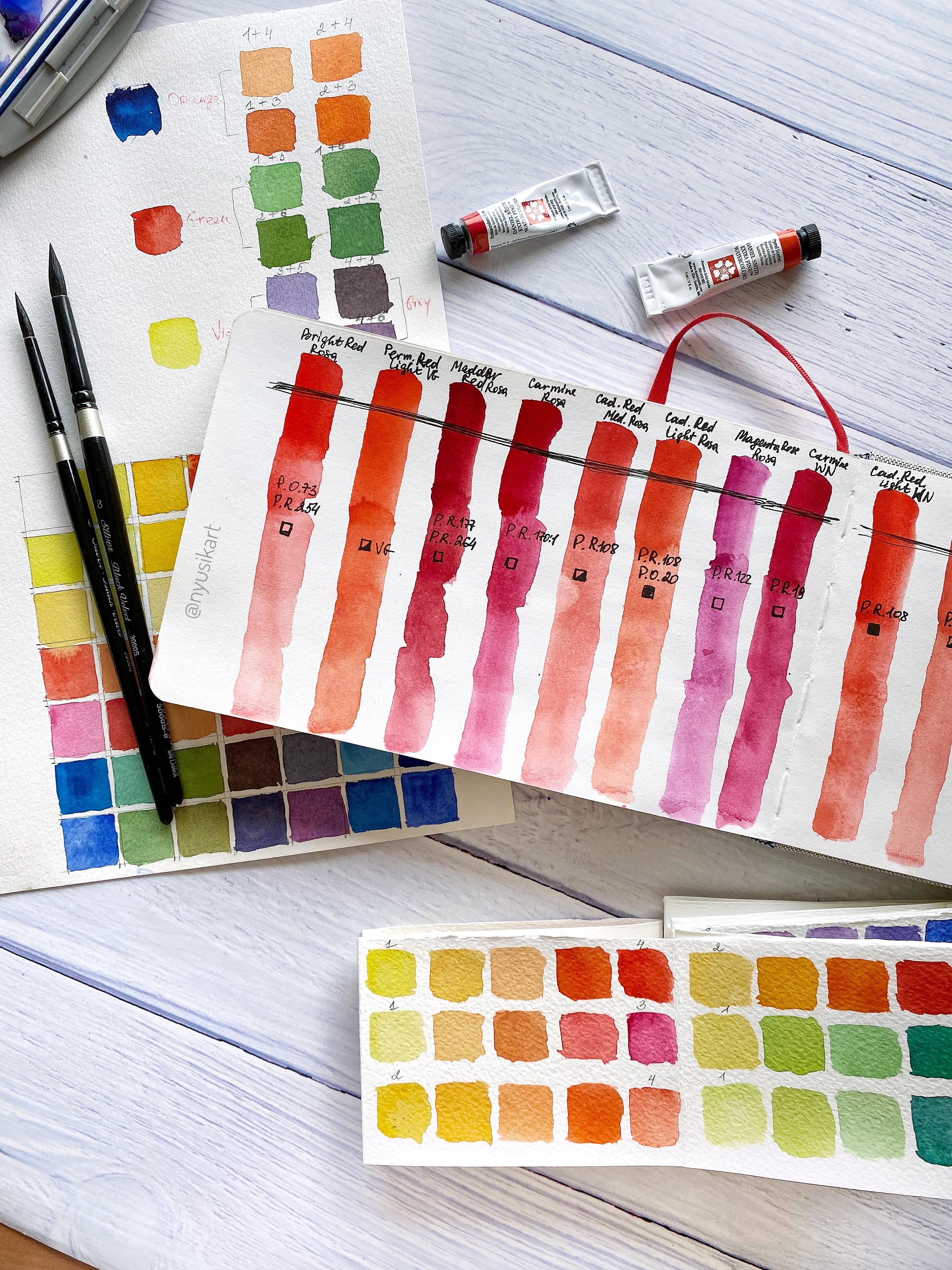
5. Red Study: Finally, we have got to
our first main exercise. That is our red. We explore now the red
color in our color mixes. So another question which
I have got from you, it was that you find it
complicated to use mine. And cadmium red light from white nights because sometimes
the result is too light, other times the result
is too opaque and it's quite complicated to get the transparency
with these colors. Let's have a look
first at this chart of white nights that here
we can find Carmine and you can see that it's
based on the pigment pigment red 19 and it's transparent
because this square is empty. That is one thing. Another thing is here I have
cadmium red light. It's based on the
pigment red 108, and this paint is opaque. Just from this
basic information, you can get already
the idea that in those areas where you
want more transparency, it's better to use carmine
red in color mixes. And to use it more as a color
mixture of your primaries. As for exactly cadmium red
light from this producer, that it's bac color and it could be quite complicated
to get transparency, or let's say it's impossible. So the way out from this, it's like or you can use it in some shadows where
you need to get this really rich color and that it would
be really opaque. These colors would be nice
to use it in the shadows, but not on the light because
it's quite opaque color. The option could be
also to look for another red for your color
mixes which are transparent, for example, another
option would be venetian red that
it's transparent. And I would like to offer you or for example, also scarlet. Here you can see that
it's also transparent. That's the way how you can read the color chart and to
choose those colors, which you like and which would
be more universal for you. The thing which I would like to offer you is that take all
those reds which you have, those differentiate no
because you have also some pink not so clear pink
that is some kind of mix, make some short investigation about the pigments
which you have. Here I have quite many of Rosa. Brand, I really
like their paints, their quality is
really, really great. And another thing
which is really important that when
you open the tube, that it doesn't
get, for example, I don't like the tubes of gg because they get
really destroyed. It's really difficult to
squeeze the paint and it's always some paint
gets dry over there, and this is so hard to
move it that I always finish with some some
injures in my hands. These tubes, I really like the shape that it's
really really easy, so they are more close
to Daniel Smith's tubes, and I really like the
quality of the paint. They're really bright
and really soft. So here I have different
shades of red. That is bright red, which is based on pigment
to pigment orange, 73 and pigment red 254. And you can see that
is transparent. Then here I have another
one which is medal red. I won't tell you
all the pigments because it's like
my investigation, and I don't want to make
this video too long. That is also I will just tell you this is
transparent one. That is meter rose, which
is also transparent one, and this is magenta rose. That is also based on pigment
red and it's transparent. Let's have a look at the
four pinks and reds, which I have from one gog. Okay. So this one is
permanent red deep, and you can see that it's based on pigment red mixed
with pigment let. And in this old, They do not have they do
not in this old tubes, they do not provide
information about how transparent or opaque
this paint is. So I'm missing that information. This is inacdrose which is
based on pigment violet. This is permanent red light. Okay. And this one is also
based on Willet pigment. This is permanent red willet. So the ones which are
based on Willett, I will put them aside and we'll use only those for example
and from this ones, Kinacridon rose is based
on pigment Willet. This means that all those
reds which you have, which are based on
pigment violet. Use them for mixing wilets. Just play with them for
mixing your violets. Those ones which
contains pigment red. These reds we will
use for mixing. I have checked here, all
these are pigment red. Mader rose, it's pigment violet. I will put to this and
magenta rose is pigment red. For example, these two reds, one is based on pigment red 254. Another one is based
on pigment red 254 and pigment violet 19. So this is the mixture
of red with violet. I would remove this also, this color, so I
will put it aside. This is the colors which
I have, which are red. Let's explore. I invite
you also to explore this. And this part of video, I will try to speed up
so that it won't be so boring to watch me
as watching the colors. While you're exploring the
transparency of your colors, I take some black liner
and make some line. So that would be quite. Here I have my black line. Now let's start to explore. The first color is going
to be this one from Rosa and it's bright red. Let's place it here. Okay. This is my
bright red from Rosa. Then I make a bit
I remove you can see that I remove just a
bit of paint from my color. Then again. Then again, here I can see
how transparent my red is. Ready this color we put aside. The next one goes a
permanent red light from from go Okay. So that color I have here? This color palette I
haven't used for centuries. So I'm gaining more color. I take the color
quite concentrated. So it is quite concentrated
and then let's place Here you can
see that this red, it turns more like
two into orange, I would say, for me, at least, and then I
remove some pigment and a bit more to check
how transparent it is. Here is my second color. Next one is this one is
also from Rosa gallery. By the way, here I have
more reds to explore. This med from Rosa. I really like this set. It's really has really
beautiful colors. However, some of them, I
have bought separately like inocrdon wire let
magenta and this blue, and I will place it nearby. This one is mad red. I remove more water. Okay. And here is how
transparent it is. Here I have this red that
we have used metal red. Next one is carmine, which is also transparent color. Let's place it nearby. Okay. Next one, I have here, this is the color which
is called here we got it. Cadmium red medium. And the pigment is
pigment red 108. W from Rosa that is the color which I have used
quite a lot for painting red. Another one is
cadmium red light. That is pigment red 108
and pigment origin 20. By the way, that if we can
check this medium one, you can see that it's
half square is empty. It means that it's
semi transparent. We will see it once
they will go dry. For example, this
cadmium red light, it's indicated that it's pace Let's see whether we will
notice any difference. Agenda that is pigment red 122, and that is transparent one. For example, this agenda, I use also quite a lot
for my mixing my wilts. Okay. You can see that this one is really
transparent one. Add some more excitement. I also have here a
set of white nights. Here is my cadmium red light. That is one color,
which you have indicated that you
have problems, and another one is
carmine that is this one. Let's also place these two
colors from white nights. What we have checked what we
have checked that Carmine was transparent red Now, let's check this
cadmium red light. Another cadmium red
light, it was this one, which was from Rosa,
and it was opaque one. You can see that it's
very opaque color, and I would say that let's
see when it will get dry, but I would say
that it's even more opaque than the one from Rosa. And the final color, I will place this Which one from Magenta,
we have placed already. I will place the yal scarlet. By the way, that is my way
how I'm using my colors. That is the ones which
are from one side. I try to leave them clean so that to have access
to the clean color. But from another side, I'm
touching for color mixes, I'm touching it
from another side, so I give it half and half. By the end of this exercise, I expect you to have
two groups to explore all those pins which you have to separate
them in two groups, the ones which are
based on pigment red, which have P R indicated
in their mixtures and another group of which are
based on let pigments. They usually indicated
as pigment let P. And with those reds which
are based on red pigment, I would like you to make this exploration about
the transparency. Why? Because it will help you to know for your further
color mixtures. For example, if you
would like to get a transparent color mixture, then it's better to use those
reds which are transparent. How to know which
reds are transparent. For this, it will help
us line black line. You can see that whether this
paint manages to cover it. For example, this one
didn't, this one one, you can see that it's really clear black color so that it means that these
colors are transparent ones. Then we come to
these two colors, and you can see that they are already isn't as
black as this one. This is a especially this one, you can see that
it's already Mm, grayish black, let's say, but it's not as
bright as this part. And this we let me check. This was a cadmium red medium, which indicated as semi opaque. And this one was a
cadmium red light, which is indicated as opaque. I wouldn't use for my mixtures, probably these two colors, but they could be
great to use them on their own for shadows in
the flowers, for example. Then magenta, this
was Carmine from white nights and you can see that Carmine I would say
that it's semi opaque. However, it's indicated
that it's transparent, but look, this one is
transparent, it's really black, this one, I notice that it's a bit it's not as clear
black line as this one. So this Carmine, I would consider based on this
test as semitransparent. And let's have a look at
this cadmium red light, what you have indicated that
it's really opaque color, and it's really difficult to get some beautiful color
mixes with this color. It's better to use
it on its own, but not in color mixes because unless you go for
this really thick color. Even if you compare these
two different brands, cadmium red light, both of
them, they have the same name. That you can see that this one, I would call it more
opaque than this one. I to compare, it could be that I have taken
more pigment of this one. I don't know, but
Cium red light for me from the switches is
the most opaque one. This is really transparent one pyalcarlet
from Daniel Smith. So that's how you can understand those reds which you have. Just experiment, investigate
and please upload your investigation
no exploration results to the class project. You can just create it, and then once you go further
in the color challenge, you would be able to upload. Also, if you have
different questions, I would be really glad
to help you and if it's possible to cover
in the following videos, leave them in the
discussion board. Now, I think that
you're ready and just go to investigate
your paints. I really hope that it would be really exciting process for you.
6. Red flowers Sketch: Today is the day number one, and our challenge is going to be to paint red or pink flowers. Here I have prepared for you some inspiration board on Pinterest so that
you will have a look and we'll see which
flowers actually are peeling you and
with those ones, you can go forward and
try to paint them. I have decided to make
it together with you, so it means that I don't have any idea what I'm
going to paint now. And I will show you
the whole process, and I hope that this real
process will give you the feeling as if you would be painting just alongside
here with me. This will inspire you, and also in this way, I will be able to
pass you some of this micret process feeling. I think that I love quite
many flowers from here, and I will try to make some
composition out of them. One of the flowers
which I like here is herba I haven't painted it. With you, probably, I will go
for that flower as big one. Then I like these flowers. I don't know what's the name, but it's something very similar. The idea is quite similar
color combination. I think I would include
several emonies. They look very
beautiful, interesting, and it could be interesting
in this effect to create to leave
these white areas. I think that would be my choice. Usually, before I
will start to paint or sometimes I start
just directly to paint. But if it's for the first time when I start painting
this flower, usually I create
some rough sketch of the shape of this flower. So that to have an idea
how I'm going to work. For example, at the moment, let's have a look at this
image of Herbera and, Here you can see that
there is yellow area. This part is really dark. It's really schematic one. It doesn't pretend to be
something masterpiece, but it's the idea to have in
mind to keep in mind while I will be painting because I will be painting without drawing. This area also is really dark. Actually, that is the darkest
area. And this flower. Then we can see that the light it looks
like from the top. Here would be some petals. These ones are going
to be light red color. Here is also some
line of petals. It's quite irregular, it's
going to be also some kind of brush strokes to
recreate these petals, and then we will have to add several petals from
they are like this. It just really schematic, but it really helps believe me, that this helps to understand
the shape of the flower and later while you're painting
loose, it really helps. It could be like this.
What can we think about how I will usually act, that I will start from the
flower center with yellow. Then I will add this
darker. Will you. And then I will start to build petals and once I
have the petals, I will add the stem. So that is my way of how I think in which
steps I will follow. Any moonyFor this, I think
that probably that is easier. The shape is just a cup shape. The ones. I realize
that they also have yellow flower centers and the ones are going to
be the simplest ones. I will start with yellow dots. Then I will add
with brush strokes, beautiful, different petals. Then here near the flower
center will have to add some darker color and to create some beautiful
watercolor bleeds. Also, I like this mony. Probably this flower, I
will make it smaller. This one could be nice for here, this shape, It doesn't
look beautiful, but it helps us make something schematic with
those flowers which you choose, the ones
which you like. It helps also to get
started to think and how you will apply in
which order your water colors, and then you will be able to work without drawing actually. And here, I think that this
flower in my composition, I will move it here lower
and here in the center, I will play some
central animony. It looks really beautiful. So here is going to be really interesting how we
will manage to create this kind of to leave
this area of white. Because this flower
looks so interesting, I will leave it as the
main central flower. Let's go forward that we will
start with this flower and then around we'll add more
the rest of the flowers.
7. Red loose flowers. Anemonies: I remind that I will use the six basic essential colors and we'll see what we'll
manage to get out of them. Here clearly that I will need to use viral scarlet or
cadmium red or those reds, which you have
warm shade of red. And in some areas, I will need to also I will need this really
dark black color. For this, really
dark black color, actually we can use the same
red with blue shade of blue. This one is fellow blue, and then we'll get this kind of really dirty color,
quite nice black. Another option, it could be but this is more
like violet colors. It could be also
quite interesting. Then I will need to mix
a warm shade of yellow with some rose and then
cool shade of blue. I think that I would go
actually for this option and we'll experiment with play
with these two colors, worm. In my case, that is pral
scarlet and cool shade of blue, that is fellow blue. Let's. I think that it
should be interesting. I start with red and the color should be
quite concentrated. You can see that it's not really watery because I need
this dark color for the flower center
and yellow blue. That is the way how we are
trying to get actually wilet but warm shade of red is not really
good for getting violet, beautiful shade of violet. But I think it would be
perfect for our purpose, that it would be black with
some kind of let shade. Here I have my color. Here I have my dark
shade, let's have a look. I think it's really beautiful, you can see that it
looks quite similar to the one which we have
see, which we see. I will place my central
flower somewhere for here. Here is going to be the center
and let's start that is really exciting moment when I'm using a four
size sketchbook. That is a really
exciting moment when your white sheet of
paper starts to become already with some marks and you don't know whether
it's going to be successful experiment
or not really. But you know what? Was always it's something really exciting. That's why just move forward and start playing
with watercolors. Here what I have.
Here in the center, it's not really white. I'm using another brush. It's just damp water. Okay. And I'm starting to
blur some parts. Here it is. And I will I think
some darker shade. I'm adding a bit
more of tele blue to create a bit more
concentrated violet. Here I head, and I will add
some more dots in the center. Just with the tip of my brush. And here. That is actually the darkest area
in the flower center. Here we have one part. Now it is going to be
the most exciting part. This brush I will
leave here that it keeps it is this dark color. Now I will prepare with another
brush with bigger brush. This is number eight,
here I will have prepared for these petals. And also, what I need to have a look that later I will need some kind of
cool shade of red like this, more or less in some
areas on the top. Then I will need again to mix
this red with fellow blue. But the thing is going to
be that I will need to keep more amount of red and
just a tiny amount of blue. And here. But the main ones, I will make them
just the way it is. Also, I will use
this water brush when I will need some water. If you're ready, then
let's start to have fun. Just with brush strokes. Here we'll have to leave some
white area. So here it is. And I will prepare at the same time with this
dark dark shade of red. So here I have. Just you can see that here I had red and I have a tiny amount of that mixture with Potal blue. Here I'm adding in those areas
where the darkest areas. I'm adding this
concentrated color. So I'm mix in a bit more. And on the very edge, I made in this color. Okay. Let's move and
paint. Second one. Just with simple brush strokes, you are trying to create
the shape of petals. Now you understand also
why it was important for me to have that my rough sketch. Because actually helps to
create this shape once you already have instead
of pencil, your brush. I will add a bit of
this darker color here from the side.
It starts to bleed. Here, it's really important that this second color which
you are introducing, it shouldn't be really watery. Actually, it should be more concentrated this first color. Otherwise, it will create this
kind of backgrounds. Okay. Let's prepare a bit more
of this darker shade. I have a bit more red, and I will add here more of
this color because this one say they look more like
in the shadowing this. I will join them a bit to this flower let's go
for the next petal. I hope that you also enjoin and your painting your flowers. Okay. By the way, while I was looking for
pins of red flowers and I have found
really like I have generally I have noted that generally most the
majority of flowers, different types of flowers. They are red, pinkish and different shades and
variations of red. I quite interesting. I have never thought
that that is the most common
color of flowers. But the majority, they were red. Here I have some more. At the moment, I'm working
with these two color mixtures. Just red, which you can use any warm shade
of red which you have. It could be also cadmium red. Then in the darkest areas, I'm adding some of this mixture of spiral scarlet
with tallow blue. So here, I think that I would like to make
even darker shade. I'm making it more concentrated
this color mixture. So here, and I will
add more like this. For here, I will add
in the center so that it will create some
kind of also volume. Here we have one
more petal is left. They look really beautiful. And I love that we have
started with red flowers. I find them really
energizing to all that. I actually love to
paint pink flowers, probably my favorite ones. And here a bit more
of dark values. Here we have the first layer, and now we'll have to
add those flowers. I will use for flowers, a bit more concentrated color, so you can see it less watery. And probably on the
tip of my brush, I will it contains
really tiny amount. I will show you that if
I will print my brush, you can see it's red and the tip of my brush is
with a bit of ellow blue, and it creates this
really dark color. I will add just petals, and I'm leaving some white
spaces so that to separate some top layer of petals from
the lower layer of petals. Again, Okay. Here I have red. I dip it into the teal blue. Here you can see that this to blue is what makes it really dark value for the red petals. For here, this way. Probably, I will Between petals, I'm leaving more
space like this. Here there is one more. I would like to make
it a bit brighter so that it won't be
as dark as this one. I will use my red and on
the tip a bit of to blue. I will make the petal now
starting from this side. And I will add a
bit more of red. And just creating this petal. And here is going to
be one more petal. I'm just creating
with brush strokes. Here I can also
correct the shape. Then you are looking on
your inspirational photo and just decide what is missing. Here I will add
some darker shade. Yeah, I think like this
for probably a bit more. Here we have our first flower.
8. Red flowers. Herbera: And now it's time to go for loose. So get prepared for this flower I will use for the flowers and our warm shade of yellow as this one is in yoga, new gamboge. And as four petals. I will, I think that it's like really warm shade of red cell that I will goal for this combination. I really like this color. So that is cool shade of yellow and red, pyro scarlet and hansa yellow light. So that is my color, which I am looking for that as a dominant color is bread with a tiny amount of yellow. For the darker part, I will use the same mixture of red with phthalo blue. So let's see how it works. And this time we're going to go for more expressive style. So I will need to make this dark William. This I will use viral Scarlett. And they beat of fellow blue. So it's getting really dark. So I'm using quite concentrated color. You can see more of that yellow, blue and a bit more of yellow-blue. And it looks more like brown. I will add warm shade of yellow. So that is going to be new gamboge, I think, and a bit more of a spiral, scarlet red, bit more of red. Now it will start to get some interesting color here it looks more like brown learning what do with a red shade of yellow and a bit more of the yellow bloom. So now for sure you will have quite a lot of fun mixing office. Okay, so here I have got some color. It gray and it's not what I'm looking for. I want to make it more like warmer shade. So I'm adding a bit more red and more blue. So here I have already have a really concentrated color. And now I will show you how it looks like. It seems nice as a scholar. So that's how it looks like. This color. And if I will add some water, it will give me this kind of dark shade that I'm that I'm still thinking that I would like to get some, I'm looking for more OZ scandal of shade. So for this I will need to use cold shade of yellow, that is hansa yellow light. Or you can use like lemon yellow or just SO yellow, yellow, blue and the quinacridone rose. So yeah, let's have fun and try to make so also z's color and we'll see which one we like more. Don't get upset if you have mixed something and then you feel like that It's not that gallery what I want, It doesn't matter. You'll have practice though, is color mixing. That's fine. Okay. Can occur. Dawn rose. And then I will add a bit more of a yellow, lemon yellow. My case is that is hansa yellow light. So it's already quite warm color and then phthalo blue. And let's see what will happen. So now it's getting really beautiful violet color. So we need to add more yellow. And okay, it's already starts to turn into brown. A bit more of yellow, and a bit more of Quinacridone Rose, and a bit more of the yellow-blue. That is just mixing practice and there is no equal proportions which you need to use. You just need to mix till you will get that color which you're looking for. I didn't really like it, but I would like to add a bit more of the yellow-blue to get it darker. And yeah, so I like this color really, really, really, really a lot. And if we will add water, then it's more like brownish, warm shade, I really like. So we can use this one as a basic one. And I introduced just several dots of these really dark one. Okay, So this is a color which you need to look for if you would like to make it more similar to my version. And one more color. So as this brush I have with this color that I will use three brushes, and one would be with this dark brown color, one will be with yellow, and one more will be when he says this kind of beautiful red color for the battles. So this is one. And therefore this, I will use Scarlett barrel scarlet. And I will adjust any amount of these. A yellow. This is light yellow in my gains is that this hansa yellow light? Here? I think that now it looks more interesting. It is like really bright red, orange color. Let's try. For me, I'm missing a bit more red to make it more red rather than orange. And a bit more red color. Yeah, I think that now, now it's the one node. And let's add a bit more of water. Suppose it, yeah, it looks really, really nice. I think this is a color which I am looking for that I'm still thinking that maybe do it a bit more of another yellow. Let's try what will happen? I am Adrian, warm shade of yellow. This one is new gamboge, or you can use cadmium yellow deep. This is already too dark. I have made it very concentrated. I will need to use more water. So yeah, I think this is a color because this one is a bit cool. Shades of red and this one is more already warmer. So just play makes your red with different yellows which you have and find that color which you like more. Now, let's have fun. I will use a mixture of both yellow and which I have. So I will start always Hansa Yellow Light was cool shade of yellow. Here I have my reference. So I will use this yellow for this flower center and the outer part. So it's like a reflection of the color of the petals and that's why it's warmer. I will use as an outer side of this vessel, so I will use as a warm shade of yellow. Okay, so get prepared and we will need water. So if you don't have water brash, just use a normal brush with a bit of water and start making like this. So I'm making a circle, not circle. I am making elite with water, Lewin, their central part, just dry paper and let's start to play. So here I start to introduce my yellow just with dots like this. So then I will add warm shade of yellow. And this is my case, a 100, the yellow light. In your case, you will have to check what you have like this. So just there with free brush movement and I'm adding this warm shade from the site. So I try not to add a lot from that side. Here, probably EBIT in the center. Just a bit, and that's it. And now let's go for this really beautiful dark shade. And again, I'm starting to head with just a bit of water. So I hope that you can see that now my water has started to change the color. And I made in this color and a bit of mixing it with that dark shade which are half and trying to get this shape. So it's really a bit for here, it's a bit more. So here we have our central part. Probably I will need to make a bit more of this color, a bit more concentrated. So that is Enoch radon rows and a bit of yellow, blue. And I will need to call shade of yellow. So here it is, and a bit more of a yellow, blue. And this color I'm introducing in some areas more concentrated. So then you can see also some yellow dots. I will add some. Cool shade of yellow. Some dots here, just some yellow. And now is a funny bar. That is, we will have fun playing with brush stokes. Okay, So let's first add these ones. I'm washing my brush so that, that all that, all petals so they won't be the same, like dark shade. So unjust here you're all playing with your brushstrokes, trying to imitate this table battles. So if they are going to die chooses central bar, that's fine. So I'm trying to vary the color so that some of them, they would be a bit darker, others. So now we get to this really tricky part. So make it a bit these petals a bit longer and we will add darker value in the lower part. And here we have some of them are really light mixed up so that you can see that it's just brush strokes. And I'm imitating the petals how they are. And now while these wet, we will start to add some darker shade of red. So here is my red and I will use a bit of this dark mixture which I have, and it will mix with my red. So these should be quite concentrated and concentrated color we are aiding here in the bottom part. And here. I also will add this color here to make it later, we'll add more contrast so that, that's why I don't worry. And I will charge more of red and on the tip I will use a bit of yellow, blue. And we'll make this lower layer of petals. That is quite quick. You will have to move really quickly. While agencies layer of petals and probably somewhere for here. So just have a look at your painting and see where you need to add more color. On my brush. I have here, I have the pedals. And what I'm going to do is to bleed some of them just with water. Just feels you'd like to lead them. And while it is still wet, I will add a bit of splatter that is going to be yellow for it in splitters. I should be your color mixer should be quite watery. So make it quite watery. And then while it is still wet, I'm adding this yellow and probably a bit more of a warm shade of yellow as well. Yeah. It will be nice. And just around, we are creating these kind of background. As a y says, I will look a bit boring normally. So here we have.
9. Red flowers. Coneflowers: And worm. Now we will need to add some more exons. For example, now, I have taken smaller brush and this is a warm shade of red or yellow, sorry, and I'm adding it should be less watery. So and I'm aiming for here some areas. And from the side, from inner side looks more like warmer. Like now we're working now on Add-ins, a contrast to the central part or part of the flower. So I will have to add more, more red here, maybe more infrared. And as well as these kind of really dark mixture. I also will add four here in the flower center. Now we can add as well here, this dark mixture. Try to leave some white areas so that they will give some kind of bruising effect. So that completes my brushes. And now just with some kind of dots, I am creating that texture in order to create the volume in this area and separating the battles. So we can make some eat more of these, read, more concentrated color in order to get, to make it darker. And blue, yellow, blue. So that is like violet. So you see these dark, dirty wireless, it's not really good for painting wild flowers, bads. It's really good for painting these agencies dark accents. That is just superb. Okey. So here we need to do to add this kind of volume. So I'm just adding this dark line. And here we are going to make it softer. And what else? To add z star is the most tricky part with these petals. And as each one. So, so in other dough, add more volume will need the domain to add more contrast. And for this, I will use a smaller brush with viral scarlet. And will it on the deep of my brush, a bit of tele blue. So, and I will go, and we'll make these kinds of brushstrokes. To add more dimension. Here we have this kind of yellow-blue and the deep. So here we have that layer. And another one is lower, lower battles. And the same with my bigger brush. I will have it with red and the deep with a bit of afterload blue. So, and here in the center, I will add more dose so that to create this illusion of depth, I also would like to add some greens for this site before it will get dry so that to make it blurred. So while this one is still wet, I'm preparing some green. Let's have a look what light green I would like to add. I think that some kind of these kind of green, so warm shade of yellow with this one is ultramarine blue. So let's prepare quickly this mixture. And ultimately in blue here. So this is quite dark. So here I have mixed that. I was looking for some green which I like. And here is my green which I have got both yellows and balls and dynamics both yellows and blues. So, and here I will also will start to make it this way. And we'll add some Z's, just simple green brushstrokes. So just don't worry and go forward and add some imitation of greenery. Sam leaves. And here would be really nice to add a bit of blue. Here is fellow yellow-blue. And they will mix it with a bit of warm shade of yellow. Warm yellow. It's missing some red. I will add a bit of red so that it won't be so strong and screaming. So here I have another green and darker. And I will let Broglie bit more of the yellow, blue and a bit more of red to make it a bit softer. Yeah. Maybe it more Fred. And now this one looks really, really dark green. So let's have a look. Houses. They seem really nice. But they look a bit cools. That okay, Let's try do it in several areas here, really dark ones. And you can see that then it started to pop up our flower. So I'm making also the shape of flowers here. I can separate some dark. Also the gives a depth, so just covering those white triangle or areas which I had there. And this one just always water brush, I'm bleeding it off. So here we have our second flower. And now I will add one more flower. I think that because otherwise it's going to be already overcrowded, that I have changed my idea. So we have one really big flower, medium-size flower and where we, since I'm smaller size flowers as so, first I would pay, I would add the Zehr stamps, do our flowers. And then probably it's because or maybe yet that it could be looking in this direction up. Let's start to place this flower on Mars there and you already know which color. So we're going to use, just guess that one is going to be light, light yellow for the flower center is going to be read for the battles. And this dark area is going to be red mixed with ultramarine blue. That one I'm going to paint quite quickly. Warm shade of yellow or pardon, cool shade of yellow. So here I have just many, many, many, many, many dots. Just on dry paper. I made in many, many, many dots. And then with this brush, I will start to make petals, red ones. So just always pyro, scarlet. And just as these kind of brushstrokes, just have fun and play with battles and with your brushstrokes. So just you can play that towards 0 towards. So here I have, and then I will add a bit more concentrated color. That is my darker shade of red and on the deep, a bit of ultramarine blue. And I will add here. Here in these areas. Here we have this flower. And I'm missing a bit more of a stronger color for yellow. So I will add more concentrated yellow just here in the center. Just deep. Okay, so this looks already really nice. And let's add timestamps and then we'll see whether we will need to do at some kind of smaller flowers or whatever. But at the moment, Let's add stems that almost the both of these flowers, they have similar stem. The only thing that anyone has, also these kind of really beautiful leaves for this demo, we'll use this mixture of greens which I have. So if you are missing that mixture, you can mix it. Warm shade of yellow with ultra marine blue. So that is my main mixture here. And then darker shade I will use that also mixture of all my yellows and all my blues. And to make it more interesting, I will, I will need dead leaves. Let's try to add like disease weight stem. At first I have added to water. It didn't water, but I'm not really I didn't like this at first my indecision, So I will second one also as idea. Oh, well, yeah, I had in the stem. That it connects a flower, it connects to the flower center. So you need to think about how it will go. So in my case is that it wasn't exist. It's quite difficult that it will go as this waste the stem and even more enemies as they have quite straight stamps. So I need to make some kind of line which will go like this for example. And that is great way to work with water brushes. Because as they actually look, I will connect it with a bit of this flower so that it will bleed a B. Then we will create some, and we'll add some red color to my stem. And here will be the stem. So this way. And now I add these kind of warm shade of green. Four here, four here. So that is warm shade of green. And to this warm shade, I will add a bit of the school shade in some areas, for example, here to create more contrast for here from one side of the, of the stem. And for here those could be quite nice idea to add a beat. So like this and here where it connects and bit more of this red and just in several places. Let's, let's add like this. So yep, it looks nice. And then we will add a second stem for this harbor a flower. And that one, it could be, let's say that this flower center, I would move it the same way for Zara, somehow like this. And this and also this one. We can bleed it so that it won't be so straight and hard. So for here also, you can bleed some Bard's four here if you want. Just up to you, just see where you want to do some more month or some dynamic and these kind of really beautiful bleeding. So that one I wanted that it would go this way. Perfect. So first I will add this warm part. So like this, and then a bit cooler shade, this one. So I will mix a bit more warm shade of yellow, warm yellow. Here I have. And in some areas I will add some darker color. Probably four here where it, or it's crossing this as a flower. And this, I will bleed.
10. Red Flowers. Adding background: I would say is that I will place one more flower really, really loose for this side. This one's, now we will add these kind of small flowers. And this is warm shade of yellow, cool shade and a little bit more of warm shade. Then I will add just with this red which I have some I have here, quite wet paper. So you can see that started to, to bleed. So I will add some more petals just, just the way it is. In some areas we can add. This is some also like brown color which I have here which we have mics on, bro, I will use this sheet and somewhere in the middle, I will add four more contrast. Here it is. Or you can enter for this contrast as we have used before, red with a tiny amount of ultramarine blue on the TPP. And this is, we'll create really beautiful this shade, shadow. Here we have one more flower and I will get from this side one more of these tiny flowers. Okay, so here I have red, dark red. And that we will see is a side view of the flower. I think this would be already enough. Just with brush strokes. Have fun, play. Just the way you feel. And how there you can look at the reference photos. How's their side your flower looks like? And then just try to recreate it with your brushstrokes as a shape. And now I will add the warm shade of yellow in the flower center. And I will add a bit more of battles from another site. Yeah, so here we have our flowers. I think that is enough. And now we'll start to add some beautiful leaves for this x is the same. I will use warm shade of yellow and they will mix it with ultramarine blue. Let's mix it in with phthalo blue. And let's see what we'll get. Warm shade of yellow, here it is. So, and now let's just play and add these kind of leaves just with brushstrokes. The things that is the stem say grows up. So just play and have fun. Worker with brushstrokes. Also. Try to feel how you feel the shape of the flower, of their battles of the stem. And how would you painted? Like, you don't know how to paint, but you have a brush, which brushstrokes or would you use? And that is also really interesting and I really like it because in fact, everyone finds their own way of gradients, these kind of brush strokes. So that's why it's really useful and in such way actually are developing your own style? No. Because your brushstrokes as they are like, That is how the way your hand behaves and how it recreates. Let's create some more shades though. I would like to get this range of greens. For this, I will use a cool shade of yellow mixed always cool shade of blue. Hansa yellow, light yellow, blue. And in this case I will need to add quinacridone rose. So some pink or rose color here, a bit more of the yellow and blue and a bit more of yellow. So we start to get already some beautiful. Yes, this color looks really beautiful. What I get here, x0, x1 looks more beautiful. And I would like to add more yellow so that to get warmer shade of yellow and green. So how it looks like. And here it will add a bit of water. This is a color what I'm looking for. And now let's add somewhere for here. So that's to make it brighter. Green areas we're going to add on wet. So just randomly make whet your pages. Okay. So, and then just started imitating their battles. Some tower for Zara is going to be also the stem. Oh, just generally brushstrokes here and there. And also will need some darker shade of green. For this, I will mix. Here is going to be yellow. I will add this is hansa yellow light and be the same. Yellow, blue. And this time I will add a bit of red to gray, darker. So here is another color, one interesting color. And I will add here somewhere in these areas under the flower, so where there is less light. And also really like these kind of. So just generally imitate in as a greener which could be in those areas. So creating that background just with water. What we can do also dead. The yellow-blue does it, it would be more like bluish color and several areas. And also we can of course here. And here I would like to add more dark and like darker shade. So for this, I will mix ultramarine blue. More Ultramarine blue. I have it a bit dirty and mix with other colors. So here it is. And here's my ultramarine blue. And I will add a hansa yellow light, and we'll get this kind of dark shade of green. So really, really dark. And also like imitating the shape of leaves. Different areas, stem for here. So that is already you will have to look at your background to see what you have, and then beat by beat to add more leaves. And here are some parts to Blue Prism. And probably I think that here it's a bit like empty. I would add there some warm shade of green. So this mixture, it was tallow yellow light or it was a hansa yellow light. I will add a bit more of a hansa yellow light, yellow, blue, and can agree don Rose. So in this area, I will add some more broadly. For here, I will add some more florals, not fluoro, so some more leaves. So just with water make some beautiful bleeds. Over here. From this side also. So that's to make it brighter and I'm missing some more. Probably I will add some of these kinds of leaves from this site. And four here. So that is already you just have a look and where you feel that your mission, some color. Try to edit. Here could be nice. Some light colors. Sorry, I'm making some broad brush marks. And then if you feel that you would like to add there some like blurriness or whatever, so you're just added. And in this area where missing some yellow, I will add some splatters. That is new gamboge of warm yellow. So just the way it is. To add some splatters. You need to have quite water resists solution. And under able, That's a will flow. And if you are unhappy with some of your splatters, you adjust for signs of dope. Bart also, let's add some yellow blood. There's no, I think I like them things that you need to act quite quickly while this area is still wet so that you will be able to, colors will be able to blend one with another. So now let's have a look what we are missing. We're missing here. So I'm contrast because this flower is closer to us, but it looks like it's really far away. And this one, it also needs some definition. So for this I will use, I will add some more red petals. So for this I will use spiral scarlet and mixed with a bit of ultramarine blue to make darker sheet and just several brushstrokes. So who is it flower. I'm holding the brush horizontally and like this, adding these brushstrokes. So here we will add some red. So just generally adding this darker accent and already as a flower won't look so like flat that it will have some dark areas. Then here we will need to add some warm yellow in the flower center. So here I have my warm Hello. Here, some, just some areas. And here as well we will need to add more dark area. I would make sense z, so warm yellow with a bit of quinacridone rose. So to get this shape, and also I will add just somewhere, or I will make spiral scarlet with a bit of ultramarine blue. So here I have these kinds of dark shade. And I just will add also some texture in this area of the flower. And do this. But also I will add a bit of parallel Scarlett just directly from the ban to make it a bit brighter. Just several brushstrokes. If you want, you can change the shape. But just several brushstrokes still make it a bit stronger. So our red flowers composition is ready. Your task would be to paint any red flowers using limited color palette. And it could be one flower to flower. So floral composition, so that is up to you. And just that you can use those examples which I have showed you here. How to paint disease flower. So, or you can choose another flower from inspiration, Pinterest board or the Josie, your own flower. I'm really looking forward to see your red flowers. So upload them onto that glass project gallery.
11. Orange Study: Welcome back to color mixing challenge. I hope that you're enjoying and you have made are already quite many discoveries with your reds. And this time new color and it's going to be orange. Oranges know that it's a secondary color and you can get it by mixing yellow and red. So your task or would be this time to investigate the same way as you did with your red. This time you will have the searcher for those oranges or which you have. And first the check as a big man, which is on which they are based. And then to check how transparent they, yeah. Why it could be useful. So to have already made the orange is useful in case when you use it quite a lot. And you prefer certain shape so that it's much more convenient for you and quicker to mix to use already based like already made the orange arrow for your color mixes. Another thing, what I would like you to pay attention while studying your oranges or would you have, as there are some of them. For example, this one is cadmium orange by White Nights, It's based on a pigment orange. So this one, for example, it's really great because Howard is a secondary color, but you will be able to mix it with two other colors. No. And for example, meanwhile, my cadmium orange from Rosa, It's based on two pigments. One is the mint orange here, and another one is pigment yellow. So you can see that later we will see how to behave. So whether there is any difference, I like keeping this in mind. Later I will show you, uh, why is this important debate, ancient dose this information. Then I have found one of the oranges I have used also to DGA and read by a White Nights is that it's transparent one compared to their cadmium orange witches or backwards. And then I have found also have these orange, It's called permanent orange by a Bangkok and does interesting drawers that it's also based on big mint orange and pigment yellow and black color. Remember later I will show you how it behaves and swatches. And I have two more like equivalence of orange. One is gonna grill and burnt orange from Daniel Smith and one more actually. So I don't have as many oranges. So that's the ones which I have and actually, I don't use them really often. I prefer to mix my own oranges. And that's what I wanted to tell you that mainly I use golden yellow. This is transparent color. And then I mix it with some red in order to get some really warm orange color. Okay, So that is one part of your investigation. Then the next part, this time we will go a bit further and the next part will be to make swatches table because it's secondary color. And you can see that depending on which yellows you will use, which read or Rhodes Scholar you will use. You, you can get a different range of orange color. What you can keep in mind that the first thing that for example, if you use a pink color, then the orange is going to be probably a bit like cooler shade if you use a warm shade of red. So it's red, then you will get warmer shade of orange. I have used a resistor swatches for this chatter. I have used all my yellows and I have compared them only with two. So one pyro scarlet and another one can occurs on the rows. So that to see exactly what is the difference, if I will use the same pair of red and one red, one rows, but with different yellows, how it will behave. So you can see that it's quite interesting what I can, I would like to pay your attention here. Cadmium yellow light here. And what could be also interesting is that it's another point to consider is whether your yellows are transparent, semi, semi transparent, or 0 back, for example, here you can see that these colors as they are. As these yellows, they are transparent and mixers are quite light and quite transparent. Meanwhile, if we will go here where he said cadmium yellow light and you can see that it's really, really thick and opaque color. It depends for your needs. That, for example, for some areas you need light transparent color. So then you go for this color mixes and for shadows or to make really bright and standout. Your subjects design. You go for cadmium, which is really opaque color and gives a really thick and very intense color. So that is one way, one swatches chart, which you will have berber, another color chart. As we remember that secondary color, orange has complimentary color, which is blue. So it's really interesting to see how behaves your oranges. So with complimentary colors. Why it's important? First, that in order to balance or unsaturated your orange, you will need to add the complimentary color, blue. And that's why it's better to know which blue is better to add and to which Orange. Another thing is that by mixing complimentary colors, you will get a beautiful shades of gray. So that is the easiest way how you can get grace. And for this, you need to be prepared to know that there was always your orange and you will take blue was there in fact for you, it will work this rule that by mixing complimentary colors, you will get grey because the remembers is permanent orange from one gunk. So here it is, that if you mix it with phthalo blue, you won't get this range of grays, you will get greens. And that is, this means is that, for example, if your orange is this one, and you use this blue, it would be really complicated and frustrating for you to find how why I don't get this gray shade so that what I get is green. So that is the point that this chart will help you to know how your paints behave and how you can actually compliment one color with another. And to get more possibilities from using your pains. So here, in order to prepare this chart, you take your all orange colors which you have already made. So that is not like you have an exam that is the ones which you have already really wants ready to use. And then you comparison with different blues. I have used a fellow blue. So all these oranges are mixed with yellow blue. And then I have used the same orange mixed with ultramarine blue. And then you could see that like, which makes us you like more, for example, cadmium orange from Rosa and from, from, from Rosa and from a White Nights that the z gives us beautiful shades of gray. So for in both cases, if you examine with yellow-blue and the same, if you mix them with alternating blue as for permanent or from one book, I would remove it from my color palette. Actually, I don't use it, So, but I have found this tube because it gives green or you can use it for purposes of getting greens. Then I have used thin acrylic, burnt orange, that it also gives some shades of greens, but I really liked these kind of color mixes it with ultramarine blue. And also, I have tested my golden yellow, you know, it's based totally on yellow pigment, so that is yellow color. But as I use it quite often now for my life where I need orange color. So I was quite curious also do test it. And you can see that that is what you can expect from yellow, that it will give you a range of greens. However, if you will check it, if you mix yellow with ultramarine, that it will give you some sheets of grace. So it's not so bad z's color. Or at least I find it quite universal because for example, if you look at these permanent orange from one God, it's still here. Even when ultramarine blue, it turn, it tends more towards the green rather than gray.
12. Orange. Swatches of Two Colors: So in this lesson, I will show you how to make these kinds of swatches of two colors. Because the fastest way you can use washi tape or you can use just lying there. So for this demonstration, I will use flush. The first of our examples is going to be how to make say yellow with red in order to get orange. And I will use hansa yellow light, we spiral scarlet. So these are colors from my limited color palette. And we start out with one color. So here I have yellow. I take quite a lot of yellow. Yellow. So here I will have my bins. Here, I have yellow and I start from this site. Then to these color mixture, I add a bit of parallel Scarlett. And it starts already to turn. You can see that this starts to get already a bit more orange. I add a bit more of the spiral scarlet, and I move into that direction. So I have quite sufficient water in my brush with quite softly. So that's it. And they'd be more concentrated, orange, bit more of parallel Scarlett. It's already turns into red. And then we finish with red. So here it is. So this one swatch is that of two primary colors. And how from this tuple, primary colors, you will get this secondary color. You take all your yellows which you have and to differentiate. So Fred, 111, goal one to see what would be the difference. And for the second chart, we will need to use complimentary colors that is already made orange with some blue. So in my case I will, because here I really liked as a pair of color says that this, which gives a really nice graze, that is cadmium orange from White Nights and ultramarine blue. So let's have a look at the pair of these complimentary colors. So here I have cadmium orange. I take quite a lot of these color. More watery. Okay. Okay. To take more. Okay. Yep. And then we start. So here is my orange, and I will use ultramarine blue from my limited color palette. So here I have already, and let's start. So that is already a bit uncertain rated orange, and I will use a bit more. So here it starts to get grayish brown color and a bit more off ultramarine blue. And we'll start already to get some nice shade a bit more. So now our aim is to get beautiful gray and we already there and a bit more ultramarine blue. So you are, I didn't beat by beat, making it's more color, more intense. And that second color starts to dominate. You start with light color and do the slight color you add, the darker color, which is stronger. So here and a bit more of ultramarine blue. So you can see now we have God really beautiful shade of gray. So here is a color and a bit more of the ultramarine to see. Okay, so my private space and a bit more of Walter Marine, just clean color. So I didn't have here enough space for my ultramarine. But that you have understood the idea. So that is ideas at first, do you investigate your orange colors which you have, how transparent they are, and on which pigments as a base. And then you prepare to charts based on swatches of two colors. One is swatches of yellow and red, yellow and rose color. And another one is based on orange and blue eyes, complimentary colors. And to see which shades of grace or greens you will get, please upload to your orange color investigations and studies that there's a class project gallery. I'm looking forward to see your discoveries.
13. Orange Flowers. Colors: Welcome to a new class, and let's see what we are going to buy it today. For today, I have prepared for your Zs board of inspiration. And that is probably some of you have guessed already that is going to be orange flowers. So here I have some really beautiful RNN goes and some Bowlby's. I really love orange Barbies. It could be a really beautiful yellow, orangey. Frazier's could be a beautiful flowers. So it's actually up to you. And which flowers would you like to paint? I think that I really like. My real loud is random colors. I really love like these kinds of colors. That is like Gause's a green issue with oranges or that I think would be my main reference photo for today. And another thing, what I really like from this photo, so you can see that it's very harmonious color combination of orange here with these kind of wide greenish. It's really beautiful. I really like, I really allows these kind of color combination. So that's what would be my aim for today. First, let's have a look at the colors, which I will, I will need so that probably I will use this kind of oranges that is warm shade of yellow. In my case, I'm going to send new gumball share with Quinacridone Rose. I really like CSI sheets. These don't like what I'm looking for. And then for this beautiful green, I think that I will go probably for is this one that is yellow light or probably this one. I think it's this one. I like this. These two colors actually is really great that they are here together and you can see what you're looking for. So this is a color that is cool shade of yellow with yellow, blue. So that I think goes, that's all. So this will be my basic two colors and we'll see what we will manage to get out of them. I will prepare to color mixture. So one is that orange. That is a new gamboge. And I will add a bit of quinacridone rose. I'm starting to it here. In this case can occur. Don Rose is stronger than yellow, so that's why you are starting with yellow and then beat by VTR adding the Nagarajan rows. So here I get already some beautiful orange color, but I would like to make it more concentrated on this one is extremely beautiful color. Let's hope. So. Yeah, this is my beautiful orange color. And also here you can see that this dark shades, so that what we have to think about this foreshadows. Let's have a look what we have here and what color I would like for the shadows. So I will need something probably Z scholar like to use for shadows. So for this I will need to mix light yellow. I'm using hansa yellow light. You can use a lemon yellow or transparent yellow. So here is one color and then I will add a bit of quinacridone rose. Oh, it's already too strong, but again, let's see. And fellow blue, um, it didn't beat by beat and start the mix, that, the mix. Here, I'm still missing some yellow. I will add a bit more hansa yellow light and a bit more of quinacridone rose. So now it starts to look more interesting and a bit more cleaner grid on rows. The analysis brown color. Okay, let's try four here, that it would be more like in the flower center. Yeah, just looks nice. I like this color. And just play with your colors. And if you don't have exactly the same ones, maybe tried to get some kind of similar color. Or maybe for your flowers, you will do something different. What else we can do for 400 shadow is at the same mixture which we have used here. So that is warm, yellow. And I will add a bit more of quinacridone rose. So in order to get my orangey color. So here I have another beautiful orange color. And then I will separate it a bit. And to this mixture I will add a bit of blue, just a tiny amount. I will use yellow, blue. So we have orange and the complimentary color to orange is blue. And in this way we can make this color less saturated. And you can see this color is going to be more beautiful for the shadow. You can see. Yeah, so I think that is better than this color is going to be more harmonious with the main basic color. So you just take a more concentrated or orange from the same colors and then you add just tiny, tiny amount of blue and you get already less saturated color, which is perfect for using in the shadows. Okay, so then I have already scholars prepared. I only say some green. For green, I have decided to use a Hansa Yellow Light with fellow blue. Okay, so let's prepare also as a scholar, green one for this hansa yellow light. Here I have it and I will mix it with a bit of yellow, blue. So here I have some really nice color. I would say that probably a bit more of yellow. Yeah. And and here is a color here. So really fresh and bright. I have all my brushes.
14. Orange Flowers. Ranunculus: Now let's think where we will place our, I think that I will go for this kind of composition, but I will use a renewed goes because here's some roses. In my case, I will place all of them are known colors. I have one separate glass. How to run Angola's. So that's why if you need more details and better idea how to bend them. So just the reverse disease glass. So I'm making a with water with water brush, I'm making just circles, but I'm leaving some areas white so that it won't be everything completely with water. So Lewin, also some nice white areas. And then let's start to add our main color. I would like to make it more watery so I'm adding more water. And then just with brushstrokes, you are creating the shape of this course. So I will make this lower part a bit lower so that it would be looking at bit down. Then I add more concentrated in six colors. This is really juicy. So for here. And a bit more concentrated color. Just in these areas. More concentrated color, I'm mainly add in the lower petals are where there is more shadow and they look darker. Here we have also the shadow. So shadow, it was this brush I had. It was shadow. I think. I hope so. No. And the shadow, I will add. So you see that my shadow is not concentrated enough, so I will have to mix a bit again. So new gamboge, quinacridone rose, and in order to make it soft, like not so saturated, I am adding a bit of yellow, blue. Oh, is that it's too much. I will add a bit more of quinacridone rose, and a bit more of new gamboge. So this is brown color, looks better, and I will add in several areas this dark color. So this is foreshadow is much better. And in the flower center, I think that it's already got dry, so I will add a bit more water and I will use this green color which I have mixed. And here I'm adding this color. So here we have our first turn and goes. Now let's make one more looking into that direction. So this time, I will start with green. And let's see, so many brushes. I will start with these green, the flower center to make it bright. And then I will add this orange, which I have here, also with some beautiful loose brush strokes. So here I have another, and I will add more concentrated orange. So I'm running out of this orange, so I prepare a bit more. That is the new gamboge and quinacridone rose too much of kinetic or don Rose little bit more yellow. So, and I will make some more of these brush strokes. That's it. And a bit more of shadow here. I held ready my orange for here, for z. So we have our second flower. And the second one, I would like to make it with a bit more like I would say that it would be somewhere for here so that it won't be complete flower. That we could see only one part of the flower. That is more interesting composition. And I think that I would make it, so here I will make it blue. So because I'm missing a bit of the sky. Yeah. I think that now I like it much more. Lower. Yeah. So okay. So with this one, we will make it looking in that direction. And for this I will use different flower center. I will use the same yellow, cool shade of yellow. And this time I will mix it with ultramarine blue, ultramarine blue, and a bit more yellow. So I have this yellow. And that is a bit differentiate. So the O key, so here a bit more of ultramarine blue. I might even just be by bit. So that is a color. Okay. Let me check how it looks like. So you see this one is a bit more, is a bit darker. And here will be our renewed goals looking into that direction. So I have here my main color. Yeah. So like these. And then let's start lane. I will add more water. So here it comes. And this is a flower. I will add a bit more concentrated color to some areas over there. Here. And now what I misunderstood, this green, I will add these green in the flower center. And I should admit that I'm not really happy with this green. And this grain looks much more interesting and more beautiful. So I will add a bit more of this yellow, Yellow Hansa Light. And after yellow, blue will make more of this color. And here in the center more of this color. I think that it's too dark. So in this way, I will admit more of yellow and the yellow will make. Usually yellow is stronger pigment and it will start to move the rest of colors. So you will see now it will create some really beautiful effect. Here I am entering my water brush and we'll start the grades is beautiful. Watercolor bleeds. So here we have our third flower. And let's add also some shadows. In some areas, it's going to be somewhere here in the flower center. So here we have our third flower.
15. Orange Flowers. Calendula: And now let's have a look at the skull in the law because I really like this this kind of bleed so that you can see that it's like this brownish, orangey color. Then this area of really beautiful yellow. And then they sell orange petals. I really like this combination and I would like to recreate something similar. As for my orange. I will use the same orange. Then I will use are also yellow. It would be more beautiful contrast if I would use a cool shade of yellow for this area. And we will have to create disease, a really darker orange brownish. So that I think that also we have somewhere here sounds in similar as only thing that this one looks more like with Violet's like violet color. So I think that to this mixture I would add a bit more, probably of ultramarine blue instead of phthalo blue are, let's play with colors. So this is going to be really exciting. And we'll see what we'll get for this flower center. So now I'm looking for the color of the flower center. To get orange. I'm using warm shade of yellow. My one is new gamboge and I add a bit of quinacridone rose to get beautiful orange and really vibrant orange. Lousy scholar. So what I am thinking that it could be really interesting combination if to make us this yellow watercolor leads and then to add from the top this orange. Okay, so I'm really excited about this flower. I keep on thinking, you know, that I'm painting with your SOW. That's why I'm also making mistakes. So don't worry, the main idea is to jump into color mixing and the phases challenge and just enjoy the process. That's why does our mistakes or whatever and they do not matter. And even wars that were being done in loose style. Okay, so here I have my orange and this time I will try to add a bit of ultramarine blue. And let's see. So this is getting more like brown, greenish. I don't like, I will add a bit more of quinacridone rose and a bit more of ultramarine blue. So I'm going now with these two colors in order to get some kind of while it, and then I will try to balance that while it was yellow. So here is the way I am. My thoughts are going on. Okay, so here I'm starting to get some kind of unsaturated while it brownish wireless or like so. And I'm now, I'm starting. Now you have seen that the heavy too much of Nagarajan rows and it turned into like pinkish color. But I'm almost there. I'm almost almost there. So I think here is as a color which I am looking for. So here it is. Let me check with water. It will start to bleed. Yeah, that is a color which I will use for the flower center. Then I will need also some orange, yellow. So that is going to be very interesting. Let's start. I will start with a warm shade of yellow and making some dots. Here. I have some dots. Then I will add this dark color. And they will need some kind of brown color. So I have here is this dark orange. I will add a bit more here in the flower center. And then again, I will add some warm yellow closer to the end. So from this side, so where it starts to connect to the pedals. So here I have now the most interesting part, how will manage all these beautiful watercolor leaves? So now be careful and be attentive. This, from this side, I will leave a bit of white, white area. So that won't create as our watercolor bleed directly from here. And I will have prepared my Hansa Yellow Light. So here it is, my yellow. And okay, I have too many brushes. And from this area I will start to make more dots of this hansa yellow light. But I am living in really tiny amount of wide area. So a bit more, a bit more here only from this side. And now I will come with my water brush. And I will start to make the petals just with water. And it starts to create these beautiful watercolor bleeds. So here is my dolls. And now the most exciting part, I will start to add this orange side of those and we'll make. So here, just mix the ones which you have. And going towards the center. So here we have. And now I would like more orangey color. So here I have really beautiful orange color. I will add those certain battles like this. And then let's try to add this layer of petals. So Zaha just flat. And we need an hour, darker, darker. But that would be interesting. You know what? That we will do in another flower. Okay, So this flower, I think that I would add some really dark orange tips. So here I have my yellow, warm yellow to this warm yellow, I am, I didn't quinacridone, rose and rose. I think not. I will use it the way it is, just in several areas. My exist. And now we will play and we will add, we'll try another technique. So this was one technique. And now let's have fun and play with another technique I think that we will make. From this side, yell, let's try to make, but then they will look very symmetrical. Okay, let's play. So one flower somewhere or z. And we'll see that it's going to be fine. I guarantee. Again, let's start with always new gamboge, warm yellow. And while making flower center, this time our flower is going to look downwards. So here we have our flower center. I will add some dark shadow. This wireless, which we have here. So it looks really nice and beautiful. And now is going to be fun part. So I'm going to use my medium size brush and I will be attentive. I am Boson into with my orange. So it's completely charged with orange. And on the deep, I will dip it in the hansa yellow light. Are you ready? Let's see what we are going to have our gaze. So this like this, and you can see how it's really interesting. This effect. Let me do again the same. So I'm busting my brash in, in orange, which we have here that is warm yellow with n rows and the tip of my brush and I'm dipping into the so you can see it's yellow. Okay. Let me show you also exist just in case if you haven't got the idea. So the deep is in yellow, Probably. Let's, let's drag this up and you can see, so the first part is a bit yellow and then turns orange. What we can do also is to try to make with water the petal, and then gum with our brush. And a bit more of this orange. And on the very deep, I'm using a bit of this yellow. So here we have another way how you can create this effect. And then darker orange to create another layer of petals. So I really like this flower is really beautiful. I really liked Del Mar of yellow. And on the very deep. And z's will add another layer of petals. On the very tip I have hansa yellow, light, shade of yellow. Here. Four here we have some more. So here we have another flower. And now let's have fun with it in greenery.
16. Orange Flowers. Foliage: I'm back to this reference photo. My inspirational for the year. And let's add these kind of areas of greenery to make it as our orange flowers to pop up. For this, we have decided to use this color and I will use also some warm shade so that it would be with the same blue. I will use a warm yellow. So my color mixes are going to be cool yellow with cool shade of blue to get this color a cool green and also warm shade of yellow with the same goal agreeing fellow blue. Okay, Let's see what we will get. This looks really exciting. I love. This is my favorite flower out of this composition is just like, Okay, so I'm mixing cold shade of green. This is hansa yellow light, and I will mix it with yellow, blue. This is already too strong. I will need to add more. You need to yellow-blue beat by beat, otherwise you will get these kind of color which I have got. And it's like those strong. Okay, a bit more. This is very strong color. So that is not what I'm looking for. Okay, so complementary color of green is red. What we can do, we can make it a bit unsaturated and I'm adding a bit of quinacridone rose. And here I get already much more beautiful color. So you see how it works in practice. All these complimentary colors and this cutlery, yeah, I like it. It's already much more beautiful. And now we can play and create these kind of sound. We're just water here also I can create, this one is really beautiful when you start to bleed it. Oh, you can bleed some pedals. So it's up to you. I really like when they start to bleed and create awesome different defects. So this is dark, olive green and I'm just creating this curious about, I will need also this light one. So in some areas I will. So here is, for example, I'm missing one color, which is really beautiful. So limited ballot is really nice. But also you need to know that some colors, so they create really beautiful effects. And for example, I will show you so that you will have an idea that, I mean, that to paint there with limited color palette is fine and you need to know it. It's just the basics. But also once you like dominated this and you can use a blight the way you like, then you can start to play. For example, I will show you this is my Hansa Yellow Light, and I will add some dots for here. And now let's see what will happen. I will add one very beautiful color of the nails miss it's called the green gold. And see what happens. So z Scholar is just perfect. You know, it's really balanced. And so this is like that color which I would be looking for while Bain disease, but I don't know, I haven't managed to get. So now I have this dark olive green which we have created. And once I will add it, this mixture, it will be really balanced and really beautiful. Yeah. So, but this color of light as green, gold, I will show, I will show you, have a look. How is this beautiful green gold? You see, it's like, it's like yellowish but really tender. So it's like yellowish, greenish. And I lousy scholar for flower centers, it's really, it's really beautiful. So however, I am trying to get my asthma yellows also, you can change the yellows. And so that is my challenges that I am using these six colors about. In fact, you can, I use different yellows. And with this yellows, you will get different. If you will mix it with the same blues, which I'm mixing, you can get different shades. But for this one, you see that probably for more. If I want use this green gold to give stricter or no disease color mixing challenge. Then I will do the same with. First I will add a Hansa Yellow Light, probably is to concentrate it already exists. Then I get as my olive green which I held mixed here. So here it looks nice, but I mean that this color, green, gold, you notice when you use it, you notice a difference. But yeah, it's fine. That just like, you know, once you dominate these colors are six basic colors, then you will be able to use many others and you just will enjoy the way how you can use them. What I will change now, always the colors. So that here to make them a bit darker. For this, I will use, I think that cold shade of yellow. Here I have, and I will mix it with ultramarine blue to get more. Yeah, So here is quite dark color. And for this areas, just to make the contrast was big, like brushstrokes. I'm just adding some imitation of petals or leaves. Sorry, sorry, here have some more leaves. And now that I think that we'll have to look what to do with this area. So I think that we need to add something from this site. Otherwise it looks a bit more unbalanced. Oh, look, what happens when you start to bleed these petals. They gives this really beautiful shiny yellow. And what would be really nice Also, you know, that they're complimentary color to orange is blue. What do you think? What would be really nice if we will add some blue, for example, alternating blue. Yep. So see what we can do. I add more water just randomly, okay, I will place it so that you could see it somewhere for here. And this is my ultramarine blue. And I will start to edit for us here. It has been mixed with some other colors, were probably with some yellow, so you can just tiny amount of yellow so that your ultramarine blue one look very strong, saturated. And now you're just making some agency, some leaves. Just play with the composition. And then a bit darker. This you can see it's really strong, ultramarine blue. And for this I will have a bit of gas which color orange. Okay, I will add a bit of this orange and you can see it starts to get kind of really beautiful color. And this color we can use here bit more. I will it dry and blue. And if you don't have orange prepared so you can use a bit of warm yellow and a bit of quinacridone rose and you get some dark shade. So, and I add some leaves for here for z so that the May exam. And you see that now it starts to look more interesting and with more contrast. So here, when we were there a bit more. And, and you know, I really like the idea to add a bit more from this side. I bit more blue. The only thing that I don't want to have it really dark as I have it now. Because these dark ones, I will also, you can power like these areas with some of these really dark shades. And this will help you also to separate your flowers somewhere for here. And with more just some variation of very loose style leaves. So this part I would like to live with sunny area like houses flower gives us this sunny effect. And from the side that I would like to add some ultramarine. But, you know, this is lower part and this part is top part. So to this top part, Let's add that is sky. And we will add saturated ultramarine blue bar. I don't want to make it really strong. So what I will do, I will make wet this area. I'd like also the composition to heroism and more like in diagonal. And I will use pure ultramarine blue. Let's have a look here. I have it. We'll make it quite watery. So here I heard, I make it really watery and I will add several drops. Also, what you need to do to save your haven't done it. Okay, So what do you need to do before splintering and disease case? It's going to be a really dark color. So you just cover your main painting now is Dowell. I think that I don't like this small brush for splitters because it gives a really tiny, like many tiny splatters. If you don't like your splitters who just remove them? Like this. Oh, here it is. Again. So I will add a bit more ultramarine blue, but I will use bigger brush. So here I have it. And some splitters. Here I have my splinters. I will add as well in the lower part some splinters to balance it and to have it more like this way. And here I'm missing some light. I will add also some yellow. That would be really sunny ones. I'm using. Here. I have my battle of hansa, yellow light, more light and sun. I will remove these ones. Here we have, and I will add some, some more splatters. So here we have. It looks a bit like it's not what I was looking for. I will use a bit more of my yellow and in some areas I just will place as it is. So here I will place my ideal. And then always brush, water brush, I will spread it. And what you can do all so it could create some beautiful patterns if you will, make splatters just with water. And then it will create also some kind of z's backgrounds. And it could look interesting.
17. Orange Flowers. Final touches: What do I missing here is to add some more contrast in the flower centers of our renewed goes for Z, I will use some darker shade of green here we had. Okay, So I will mix again, warm shade of yellow with phthalo blue, some nice olive green. And I will add a bit of light, yellow, cool shade of yellow. And here I have my color. So it's like this. And I will add several definition. So like some, several brushstrokes to the flower center. And here is the same, just several brushstrokes. And this one the same. A bit of shadow lines. I will use this orange, which we had for, I think I will use this brown color which we have used in this flowers. And I will use it for my flowers, for the shadows. Yeah, I think that is good, really good idea because then you join these colors, these flowers, so with these ones by using the same colors. That's why, by the way, like one of the advantages of using a limited color palette that you are trying to combine. I like to use the same color set, but in different combinations in your painting. And then it helps you to keep your painting more harmonized. So here we have four here also. So just several brushstrokes. And I think that our main composition is done. I would add, this one is still hasn't got dry completely. I would have added some more splatters in this area, but actually also what we can do in these areas where they attach in. I would add more, I make more olive green star here I have warm shade of yellow and let us do much. Glue will gain more yellow. So here I have my green and I will get a beta of, you can agree don Rose to make it a bit. Not so strong, color, not so saturated. And probably in some areas or here where this is a greenery, touches our flowers and I'm making soft edge with my water brush here. Then for example, it could be somewhere here. And again, soft edge. For hearing some areas. Then it gives more like contrast. This May remind us. Hydrangea. No, green, greenish. Yeah. So for here, this is the color I'm using for here also somewhere at some darker accents. So here we have from this side also, I really like this to be more blurred. I will add Sowell as the same color which I'm using for this accents. I'm using also for the axons in Zack. Flowers, damn leaves. So that is already actually like, look, have a look at your painting and see what you are missing. Where you are missing the contrast and tried to add there the contrast, my composition with orange flowers is ready. I hope you have enjoyed the process and you can paint some orange flower. So one flower, several flowers, different types of flour. So orange floral compositions that is up to you. I hope that my Pinterest board or will inspire you. And I'm really looking forward to see your orange flowers.
18. Yellow Study: Welcome back to our color mixing challenge and the things are getting more and more exciting. Well now it's starting to investigate your yellows. All yellows are very different. And the more yellows you have, the more possibilities for color mixing you will have. So here I have made this transparency swatches of my yellows. And there what you can see that some of them, they are mono pigment it as ours as a pigment it, but what could be interesting from my observation so that some warm shades of yellow, so they have also pigment orange enzyme base. And some of them, they are, so that is, and also some of them. For example, Indian gold from White Nights I have and I use quite a lot this color that it contains a red pigment. So it gets like these kind of orangey color. And another discovery which I have made it was a Naples yellow from White Nights. I didn't know, but I didn't like this color. It's quite often inherit was given me quite dirty mixes. And in fact, if you will check their producers website, you will see is that it's based on four big men's and even more that it contains also big meant white. So this color, if you use it, the better to use it on its own without mixing too much. It's like from my experience, maybe you will have another experience. And another interesting thing which I have found out first, if you will check how transparent or semi or bug they are, you can see that, for example, my basic cool shade of yellow is hansa. Yellow light is semi transparent. With yellows, it's quite complicated to find transparent ones and, but they are like more. They are assumed to be better for color mixing. I say if you have at least one transparent yellow. And one of my really frustrating towards the producer line GCG, that in their permanent yellow and transparent yellow medium, you can see especially permanent lemon yellow. You can see that it's really, really opaque color that is like from all these yellows, it's Zetia color and a yellow deep from one goal. Also that they completely I have covered and my black line. But when you go to their website, they have look at this. This is a really, really interesting. So you can see that it's a permanent lemon yellow. Permanent lemon yellow at indicated that it's transparent color. But you can see it couldn't be transparent, even semi transparent, because this one is indicated as semi-transparent, let's say. And you can see that interests change, but really, really slightly the black, but this one has covered, it's totally opaque color. So I do not agree with the information which is on the website. And then they have transparent yellow medium. So that is another color which is also indicated as transparent. So you can see that it's transparent, but I would say that it's more than these semi-transparent. So I wouldn't say that this one is transparent, semitransparent, let's say. And another. So yellow lights they indicated as here, have medium and D1. So they're indicated as half transparent, but actually they are or backup colors. So that's why, for example, if you're using these colors, pay attention and see from practice how are, how your colors are. And in this case, I think that this chart is not really close to their reality. From my experience. For this part of your class project, I would like to see your color studies of yellows and those yellows which you have and you have transparent ones, monopoly granted ones, semi transparent or opaque ones. So please make your investigations and color swatches. And I'm looking forward to seeing your class projects.
19. Yellow flowers. Sketch & Colors: Welcome to our new color challenge. Today is going to be yellow flowers. I hope that you have managed with your color mixing for painting red and orange flowers. And that the in case if you have faced any kind of difficulties and mixing your colors for those flowers, please just drop me a message in the discussion board and I will try to help you and took our day in the following videos. Here I have prepared some inspiration board with yellow flowers and that it's really interesting, for example, this flower. I think that it could be quite interesting because I really love wins. There are some kinds of mixes and this could be interesting to make some color bleeds. These cone flowers as they are really nice and really guilt. So he's really livable for me to choose from which flower to start. But I think that I will go for this, this is more complex flower. So we are going to go a bit more with our level. If you're interested, how to paint a yellow Bowlby's, you can check my glass on a wild flowers in watercolors. Be brave to paint with water. I show you step-by-step the idea how to paint them as four cone flowers. There is also a one class on expressive cone flowers to have an idea, if you will choose as these flowers, I would go for this more complex flower. And for these ones, I really like them. And later also we can add some kind of filler flowers, like for example, premolar. Okay? So the most complex flower is going to be this one. And the first thing go, which I usually do, you know that if I start to paint them more complex flower, which I don't know, I make some really rough sketch in order to understand, as a way is a structure of the flower. And here we can see that it's like cone flower. Yes, quite interesting here is this shape. And then like some individual flowers, they are 66 or 55 petaled flowers. So and for example, its shape. So to have an idea. So here battles. And this usually says the darkest area. And then looking into z direction. So we will play here also with and also the darkest areas at 1 z is flower. And here is going to be so mainly you can see only some of them. So that is like circular and then you add your battles. So here is general idea. What is important to keep in mind? That's where I here is the darkest areas, is the darkest areas are between these separate the individual flow of flowers. So here is going to be the darkest areas in order to make these flowers, to separate them know. And so I was at the time exam pop up. So here it's another idea. Here's could be another flower. Then there are some leaves. And that's it. So we can add several of these flowers because I really like how they look like. So I would add probably. So if we are going to make our composition. So, but this one's is really simple ones. So here is the most beautiful moment is going to be one way. Our first we'll place a yellow color and then we will make these, will try to create this watercolor bleeds. So actually, I have chosen, is it slower just for pure excitement of watercolor bleeds. And that is quite simple. So that is just with brushstrokes, the shape. And here we will have to add darker color. So that is our second flower. These premolars, they look quite interesting and we can add, so this is going to be quite schematic. So it's like yellow, really bright, nice yellow. And some really beautiful yellowish green. So it's also to make it in several areas. So here is my idea. And now let's have a look at the colors which we are going to use. First, I will start with the main flower, the biggest, and this is going to be my main flower. And for z, so I will use warm shade of yellow. I think that however, in some flowers you can see is that it's cool shade of yellow. So then it could be a combination. I will use both yellows for green. This is like here. You can see that there are some really beautiful like this spring green for Zed probably I will use this kind of green that is a mix, a warm one, that is a mixture of warm yellow and ultramarine blue. And a warm yellow you can use I'm using new gumball. So it depends also what you have. But the idea is like, you shouldn't feel stressed while you are painting in limited color palette. Because sometimes it's through that you can have another beautiful yellow, which would be perfect for this because it's like yellowish, greenish shade and that is already prepared color. And for example, if you have these kind of prepared colors as they will look cleaner and you just can apply them. But that is once you already really confident with color mixing, then you may go, for example, if you like CSI Scholar, you will use often and you prefer like To have it already mixed. So it's really convenient and faster. So then you just buy the scholar. And, but in your skills, if you don't have this color, it's not a problem because you can manage, you can mix it. So that is the idea behind this glass. It says Add, you will be able, when, for example, you don't have the necessary color to be able to mix it? Or do I have an idea how you can create those colors? Complex color, so which aren't easy to obtain. Or TBI. So for greenery and another, this green, dark green leaves, I think that it's going to be more of this range. So far this is cool shade of yellow, gold trade or blue, yellow, blue and red. My one is scarlet, red. Viral, viral Scarlet. Oh, okay, so then these flowers, this is going to be really a lot of fun. I will use, I think probably is a mixture of two of my yellows. That because it's like IB school shade or a warm shade. So I think that again, I will use both shades of my yellows mixture and for the flower center is going to be more so the scholar, I will have to, to look for it. I want to make it bright. So and in order to make it bright is that it's going to be more yellow mixed with, I think quinacridone rose, this one. And we will see what we will do. But that is probably the main color. And then I will see for sure we will have to add some color in order to get these beautiful color. For example, if I would go out of the six colors which I am decided to use for this challenge, for these color, it's really beautiful to use mixture of yellow with mother red cells. This is really would be perfect mixture and disease. And for these flowers, I will stay probably always these cool shade of yellow and a mixture with two different blues. So for, for this light areas. Okay, So then let's start to play with our flowers.
20. Yellow flowers. Spike shaped flowers: What we are going to do, that is we are going for that we're going to play. Okay, so let's prepare our color mixes. Here I have light, hansa, yellow light will shade of yellow. That you can see that some flowers, so they have this color. And I will add a bit of a warm shade of yellow. So I will get this mixture of both yellows. And let's see. So I will start that is a five petaled flowers just somewhere or here I choose, and I start to make this better. So for here, and for example, I am painting these ones. I'm starting from the center and then we'll see how we are going to. So this one is probably, for example, it's quite interesting that it has already some greenish in it. So for this, while it is still wet, I'm mixing cool shade of yellow with a bit of yellow, blue. And just drop some color in some areas. So for here and here. And this is like a real reflection or from the leaves and it, and the most interesting, and we'll make it bleeding, some bleeding. I mix more concentrated yellow. So this is a new gamboge, more concentrated yellow. And I mix it also with these yellow. So here I have some kind of yellow between do I have, and I start to add them in here in the flower centers to make the color more interesting. And now the most challenging that we will mix a warm shade of yellow for the flower centers that is like orange. We will have to get some orange and we start to mix this is orange or with quinacridone rose. Here I had this orange and I just introduce it in the flower center. While they still went on, he starts to bleed. So here we have our first flowers. Let's keep on adding those ones. Probably four here, one more with some warm shade. So just mix. Now you see that I have a cold shade of yellow mix of both yellows, cool and warm. Here is a cool shade of yellow mixed with blue. And this one is warm yellow. Mix them with Don roles. So that I hope I won't make you puzzled with the colors which I am using. And then just always brushstrokes. You are a great in these shapes. So that Here we have, and then we will add some warm. This mixture of both yellows. I'm using the same hansa yellow light and new gamboge. And I'm just dropping the color in different areas so that they will look more interesting. Also, I will drop this greenish color in some areas that is new. That is hansa yellow light and a bit of yellow balloon that is too strong, so I dilute it with more water and also drop in some areas. So while it's wet, it will look really beautiful. And we will need some orange that is warm shade of yellow. New gamboge and quinacridone rose. And also I will drop in several areas to create this. And even more like is there is also even darker brown. So let's have a look. Which color will we need? Because for sure we will. That is something. I would say as a scholar, I would like to add in some areas in the middle my ideas that I need to get the color which will be close to these ones. How can I get it? Here? I can see from my reference booklets that this color is a result in one from the mixer of goal, shade of yellow goes shade of blue and rows. How to know the idea from which proportions, which colors to start? So this one is closer to brown, orange. How do I get orange? Yellow and rows? But we know that draws is more dominant color. That's why we need to start with like weaker color as that would be yellow beat by beat to add good acrid on the rows. And then it will start to get to some orange color. And to do in order to balance and to answer to rate that orange, then we'll, we'll add a tiny amount of yellow, blue. Let's see in practice how it works. So here I have already orange, okay, so we start with yellow, with school shade of yellow here I have it. I will need because I want it to be darker. So I'm making more concentrated color. And these every color which you are ending, it should be more concentrated rather than those colors which you already have. So here I have new hands up light, then I add kin agreed on rows. You have seen in the heritage too much. Okay. So now it could be too much or it could be enough. What can you do? Let's try to see how the unsaturated disease color. I will show you what we have that as my color at the moment. Really beautiful. And now I will start with the yellow-blue just on the deep of my soul. You see, it's really a lot already. So I'm leaving some parts of my blue outside and I start to mix with arrest. And here I get a new color. I think that it could be nice, but broadly, I will add a bit more of Yeah. So here for me is color tends more to yellow. And that's why I have added a bit more of quinacridone rose, and this color is a bit more what I'm looking for. And I will add just a tiny amount more often. Agree. Don Rose. And yeah, so this is a color which I would like to add in my flower centers. So let's add some color. Some of them, they've got already dry. So then it would be like dry centers. Some of them still wet so that they will get this beautiful bleeding. So here we have some parts you can make a soft edge to make them bleed. That's fine. And also what you can do that I also would like to make it another, a bit stronger so that I will mix again warm shade of yellow with no before I haven't mixing cool shade of yellow. So this time I'm mixing warm shade of yellow whiskey, nitrogen rose, and I'm adding yellow, blue. This is too dark. So that is a tricky when you add stronger color, you see now it's like black. And that's not what I was looking for. The problem when we scholar mixing, when you add quite a lot amount of strong color. So then it's difficult to balance. And so here was yellow and I will add. So then you will need to keep on mixing and mixing until you will, again, we'll get to another color. But for example, you see that now it's more like orange and I would like more brownish. So then I can keep on adding phthalo blue. And let's see the color. So here it's darker brown color. And I can add in several areas, these darker color. So we have some more defined flower says The next ones are going to be more loose. I will use this mixture of warm and cool yellow and we'll add just some brush strokes. We will make it a bit more concentrated. And to be brighter. So and just to with some brush strokes. So you are adding more like the shape of your flower so that it will look nice. You can add some orange four here, four there. And and a bit of greenish because yes, it looks like it makes it more interesting. Then I will add some. Here. There are some bulbs or no, but something greenish, yellowish. So I will add some four here also, there was one yellow flower. Here we have our yellow flowers. Also you can, in some areas you can make some more concentrated mixture of yellows. Flowers will look more brighter. Here, I add a second layer. There are some brash Brin's brush marks. So here we have our main flower. What I really like to do, you know that then to add some water that it will start to bleed. So just always water brush to some areas. I am adding water to make them bleed. For example, this one yet it's still wet, it will start to bleed. It will create some kind of beautiful effect. Does don't be afraid you won't spoil your work because it will create some beautiful effects. And this fx you won't be able to recreate because it's unpredictable. But that is something which makes it unique. Okay? And I will make a, will add some, you know, split that. So to create some interesting feeling that it's sunny, these flowers and these letters really help to add this feeling and this mode. So I'm adding a bit more of splitters and some of them and make warmer, this warm yellow. It's really, really, really nice. So if you aren't happy with sounds flutters, you just remove or you just can break this. Because you have seen that my ones have fallen in some lion. So you can remove them by the way, right away. Nice advice before you will start splintering to cover you're close with something because you can imagine that now I have arisen with the split. And the yellow ones are quite complicated. Yellow and blue ones are quite complicated to remove from cloth.
21. Yellow flowers. Simple Shapes: So now let's move to our next flower is these ones. We will start with these flowers. Let's have fun. We'll start with flower centers, but before we will have, will need to have prepared our colors. To have them already ready. Here I have a mixture of cool shade of yellow with warm shade of yellow. Yeah, Joe here is just as ISA. I think that it should be more legs lazy, I think it's enough. And then for the really beautiful brown, if I would be able to use my different colors, I would use BMG genuine. You can't imagine how beautiful it would be. I will show you later. So that because, I mean, that is a beauty that once you can dominate the color mixing, then you would be able to create really beautiful effects using Asacol hours and other pains which create some textures. But at the moment we need to create two weeks, our brown color. And I will stay with the same dose at, that is a one which I would like, but it should be more reddish. For example, if in your limited color color palette, you have chosen to use red as it could be used as our cool shade of rows. So then your choice would be cool or warm shade of yellow mix. There was mother at, you will see that you will get these color so that it's like for future when you are limited with your colors, you can use that mixture. And here I have my yellow. I think that I will go also mixture of both yellows. And now I will add integrate on rows. So here I have already like red orangey color. Under this red orangey color, I will add a bit of I think that this time. Okay. And I will add a tiny amount of ultramarine blue. And you see that it's the cholera which I have got. It's saturated. Orange. Yeah, you can see that it's unsaturated orange. But I need some are that it would have more like red color, red brown with which tends to read. So that's why I made in Morgan agree don Rose and I'm adding more phthalo blue. That was to manage. And that I will need to come back to my grid on row. So you see that it takes time. Don't mix your colors and you will get those unnecessary shade which you like. So you see that it's already closer to the one which we are looking for. But I'm missing, I think that warm shade of yellow. Then you also have to think as that what is missing? It's more, you wanted to make it more towards a row. So then you add a bit of rows, or you want to make it more oranges and you add a bit of yellow. And I need more that it would be reddish. More like I think that is a color. Yeah. Can you see this color? Is really the East. Look. Yet that is a color. That is a color which I am looking for. And with this yellow, it will be very beautiful combination. I will show you. I will tell you what we are going to do with my idea, like what I am considering form battles. So that first we will make yellow and then while it is wet, we will add this color and it will start to bleed. So here it's really beautiful color mixture. Okay, so if you have prepared your colors, then we can start. This time. I will create this battle so with water first. So here it is. We also have, okay. I have also another idea that could be even more beautiful. That is one way how you can do is expand also have showed you. And now we can try also another way. That is a beauty when you are recording the class awhile yeah, doing, and while you are thinking. Because you get to really like your mind working and thinking like, oh, that could be nice and dry also zed one. So we will create first the flower center with some warm yellow, cool yellow, then some warm yellow. I have my petals wet, you see some areas start to bleed. So here I have a flower center and then I will need to use some really dark brown. So here I have one mixture of brown which we have used for these flowers. So I will place it over there and start to bleed and it's really beautiful. But I am missing that it would be more like a wireless. So I will make here, I'm actually absorbed into picture now and does That's why I'm thinking. So. I will make skin occurred on rows with phthalo blue. In order to get this. While it, this is beautiful wireless, but we need to balance it and I will add a bit of a warm shade of yellow. So while tomake unsaturated the colors, you remember about complimentary colors. So if it's wireless, you are looking for some yellow. If it's green, you are balancing it with red. And if it's orange as we did before, we have been balancing it with blue. So and I'm missing that it would be more like red. And I will add a bit more of the light blue and a bit of cool shade of yellow. Yellow and a bit more of a yellow blue. But it should be mortar towards a blue color. So here I have my color mixture and I will show you. So that is a color a bit darker. So you can see that this is more, in this column, presents more. It tends towards wireless. And if I will add a bit of water, then you can see that it turns more to islet. Yeah, you can see so that these ideas at Y0, X1 turns towards red because I have added a dominant here is going to be connected and rows. And then this one, the dominant one that is ultramarine blue because it tends to work while it. And I still, I will keep on making my petals wet. This ones are really fun. And now I will start with a bit more of this dark color which I have prepared. So those are two grades, this flower center. Now let's play with scholars, and I will start with yellow. So you can, this is one way. And then I introduced this dark red, which we have mixed and here so that, so that is another layer. And also I'm making it onwards all towards another thing. What you can do this mixture of yellow, light yellow or gold yellow and warm yellow. And then the tip of your brush into this mixture and then you create the battles. There will look a bit different. Let's check. And somewhere we can add more concentrated yellow. So here I am in just as he said, red, orange and this brownish red. I think that this one, we need to make it more concentrated. So I'm making again the mixture of Hansa, Yellow Light, Quinacridone, Rose, and I will add yellow, blue. And it's me, it's missing more. Can agree. Don Rose, little bit more of a yellow, blue damage, little bit more of quinacridone rose. And here is this color. So we will make. So if you'd like to have more detailed, like more spike is at area that edge is n. You will move your brush this way. And if you would like to have it more, blurred the outer edges and you move it outwards. I'm missing some flour separation and this we can fix our with removing, lifting the color. So how, how to do it? Just always a good thing to have Sam's identities, sine, brush, I UDP in clean water. Then you remove this extra moisture and always this moment. Then again, you clean, remove some extra moisture. And you can make these kinds of separations. Petals look more interesting. So here we have another flower. And I would like to show you another way how you can make this flower. Let's recreate disease area. I like it to how it's like a one flower appears under another, underneath another one. So for this, we will have to, well, it will be from this area. And I will show you another way how you can do it. But I mean that once you have, you know how to mix your colors. Once you know how to mix your colors, then you can explore other ones. And I will show you one color. I think that is my favorite color. Okay, So here is one color which I really, really like. See that I am placing first the water. And then I start to add this color. Doesn't it look really amazing? If you have watched my wild flowers glasses and you know that this is my favorite color, PM10. It's genuine first because it splits into brown particles and read this kind of a really beautiful shade that, and the second thing is that once it gets dry, these parts will have some textures, they will granulate. So for example, I would use, as a scholar in order to, before I would be painting these flowers as a way, like generally without this, like limited colors. Because at the moment I'm limited to these colors, but in fact that you can substitute them, as I have mentioned, that instead of, you know, how to mix as a brown color, but it takes time note to get exactly as this shade. So, and you have already ready color, which you can use a salt then you just, IN those cases when you need, you just apply this color. So that is his idea of like having many colors. Know that the yolk and paint quicker and you will have exactly that shade which you like. I will show you how I would paint this flower if I would use my favorite colors so that it would be the same as we have done before. And then I would use this PM10 genuine from Daniel Smith. So here I have it nearby. Let's see, You see that we can compare these two parts. And you have noticed that this flower is more like violet. So in this case, I would add a bit more of quinacridone rose and a bit of ultramarine blue. To get it more violet shade. Or if you have while it you just directly mixes, is BMJ genuine with violet? So you see that once you understand how the colors work, then you already know in order to get this color, which colors do I need to mix? So let's have a look. So I will create here this battles. Just simple petals. Here. I will start this BMJ January. Bit more concentrated. And with a bit of, I will mix it with a bit of violet. So that's how I would actually paint no. And four here. And it will start to bleed and to create this beautiful texture. Then for our flowers, I will use the same mixture of yellows. That's fine. Cool shade with warm shade of yellow. And Woody turn them to be more of water. Oh. And then I will use the mixture of the same PM10 genuine with a bit of quinacridone rose so that to get a red shade of brown more of and to, to make it a bit darker, I will use the yellow-blue to balance it. So you see, I have added the fellow blue and it's immediately already, the color has got darker. Here. You see it's red. And here you can see already the granulation effect itself. And here I would add a bit more. And now it's time to kinetochore don Rose, balanced with these color which we had mixture. And just and you can add also these PM10 genuine. I mean, so here it is. For example, this flower, I would add more contrast. Same mixture that it has got dry already. So I'm adding just some brush strokes to create it. More interesting, this flower.
22. Yellow flowers. Adding Background: So now we're missing some filler flowers and some dark accents or some leaves to make it pop up. For these filler flowers, I will use cool shade of yellow here. I'll take this warm shade of yellow. And I will lead somewhere for here that you can see it's like warm shade, cool shade of yellow. And let's make first here. And then it's mixed with some warmer. So it's just brush strokes for here. And then you can add some warm shade of yellow in some areas. You can see that it's here in the central part. And now we will make us a mixture of cool shade of yellow with a bit of a yellow, blue in order to get some beautiful, beautiful green. So here. And I'm just, I think that I will add a bit more of warm shade of yellow, of cool shade of blue, shade of yellow to make them look more like, Yeah, this is a color. So just adding more yellow side from this side also we can add flowers. Yes, we can do the opposite way. That first make the stems this. And then to add flowers. Yellow here, just yellow flowers. And then I am going to add a bit of warm shade of here I have that mixture of cool shade and warm shade of yellow. And actually I'm going to blur it so that it won't. It will create some, also some ground feeling, some sunny feeling. And also here you can see that there are some areas are really dark green for this, I will use warm shade of yellow with yellow blue. So I'm kind of really nice. Olive green. I will need to make it warmer. I will add more of warm yellow. And also in some areas here are closer to the flowers. I will let, and here is the same tone, it closer to the flowers, I will add a bit of warm green, bulky so we can add already some leaves. Also, we can add some here, some these darker shades for these flowers. First, let's finish. I think that was this area that it would be nice to have these kind of original I exist painting because it's turns out really beautiful and really warm, warm. I really like that. It's warm. Towel. Here it is. Sam leaves. Now it would be nice here to add some dark accents for darker greens, what we are going to use for our dark green so we can mix light yellow with phthalo blue. And to add a bit of red cells and we will get, And if we would like to make it cooler than we add more blue, because yellow and red, they are warm shades and blue compared to these two colors, It's clearly cool shade. So that's why let's create quitclaim. Our green. Here I have cool. It's already like comics in every scene. What I had, but my idea is here I have green. But it's really strong. Let me show you that is strong. It is. And those 0s green, I think that I will make it hi bit more concentrated. So here is light, cool shade of yellow and phthalo blue. And to balance I will add viral scarlet. And let's see what will happen. So now it starts to get already dark. Yeah, look. And to make it cooler, we can add a bit more of a yellow, blue and then it will look cooler. Yeah. And you can see these warmer. There's more like brownish and this is cooler shade. So, and I will add somewhere in these areas, just with some brush strokes to play. And to make it more interesting, weekend, add, drop some of these color which we had. This was quinacridone rose with I think, warm yellow and with phthalo blue. And somewhere over here just a bit more and to drop this color. But also it will create some darker values. And also what you can do, you can drop also some yellow. Let's add some somewhere. For example, over here, oh, EBIT yellow. And here I will create a bit more broadly. This leaves that I have just invented, these leaves. They are enjoying this but and you can also make them blue cells that they wouldn't get like this. And to add more yellow, to drop some yellow here up. Hope. And also it will look interesting. And what we are missing now, to add some greenery from the side, Let's add that also. It will make our flowers look with more contrast. And I will take bigger brush and I will use this warm shade of that was warm yellow, pink and yellow, blue or if it wasn't. Now, I will create that year. And I think that it was a bit off. I think that it was, Let's try what is this color? But that is also really beautiful, is that you are using different shades of greens. One, when you are mixing, then it's more complicated to use. Everywhere is the same green and it also has its own beauty. And that will make sense These ones, to add more color, that it would be darker some areas here. And I would add more cool shade of yellow. And afterload blue and a bit more of cool shade of yellow and a bit more of yellow-blue. And I'm bit more off cool shade of yellow. So that is really strong. And I need to balance it somehow. I will add quinacridone, rose, green. They are complimentary, the green is red. So this one looks like warm shade of red. And we can also create some leaves with brush strokes. So it could look more interesting. This darker color. That also here is that the best, like where there is less than under the flowers. So we will make this areas the darkest. We can add here, morphed yellow-blue to make this shade color. And a bit more of red parallel Scarlett to make it really dark and balanced. So, and in some areas, we can add some more of these leaves. It looks quite interesting. I would blow this area because otherwise it looks very defined edge. And here are the same. I will blur some of these. And probably we'll add some splatters. Let's add some splatters. And now it starts to look really interesting. And from this side, some splitters, and I would add some splatters which will be warm. Let me choose these ones. These colors I have already, you see that everything mixed so I am going for warm shade to add some warm yellow or warm green. Yeah, it looks I will use a bit of warm yellow for here and cool shade of yellow. So that is my mixture. More water and some more splitters. It looks very beautiful. Yeah, because look, because it contains yellow, it starts to make this. To create these beautiful, better and I really like. So what we are missing now is to add more contrast to these flowers by adding really darker areas between the flowers. So I'm using this dark shade of green, which we have mixed. And here's there. I'm just really small areas of dark color. So for here. Also you can mix it with some brown. Probably it could be in some areas. Interesting. So I'm already using these colors which I have over here. I would add some mixture. Also here between these flowers like this. And I think from this side somewhere for here could be. What do we need some more sense to separate these flowers from these flowers. For this, I will use as a mixture of warm yellow with cool yellow. So you see that the moment they are like Zara and separated cells, they don't have the volume. And the way so that this one, we will bring it forward, this flower. And we will add some of these dark areas here to the flower center here. And probably more. I would add some red orange here to the petals, a warm shade of yellow and quinacridone rose. Bit more contemporary don Rose. And to balance it with a bit of yellow, blue. Here is a color, and probably with more of quinacridone rose and a bit more of the yellow, blue. So, and to make some kind of like areas here that they would be also darker. Here we, here we go. As this flower, it's separated. And those ones broadly, I also will make them a bit darker. Probably some strokes to this one's a bit more of yellow. I would say that mixture of cool yellow with warm yellow to some petals are like. And for here, I will add some more splatters, I think, or warm, warm green, light greenish color as this one which I have. That should be cool shade of yellow with phthalo blue and probably some orange ones like z. So here it is. I think that, that I'm happy with my floral composition and with my yellow flowers. I hope that you also have enjoyed and you have more ideas for your paintings. And just get inspired Dao with this Pinterest inspiration board for yellow flowers. And if you have any difficulties or questions about the Indian yellow flowers and just leave your mixing your yellows are greens. Just leave your messaging in their discussion board for this class. And I'm looking forward to see your yellow flower projects. It could be one flower to flower or just the floral composition. It's up to you how you feel and enjoy your color mixing.
23. Green study: Hello my friends and welcome to our new color explorations. And this time it's going to be green. And greens are really interesting colors. So one of the first thing though, explore your greens and to see their possibilities there would be to do the same test with that transparency. That is a great way. Or when you buy your greens, when you are mixing your greens are out of yellows and blues. The things that you already makes, several pigments. And if you will have a look at the greens which already made, you may notice that there are quite many, which are based only on one big man that, and moreover, they are transparent. Among greens. I would suggest the also the pay special attention to emerald green on itself. It doesn't seem really a bidding green, but later we'll show you that you will be amazed that about its color mixing possibilities. And to be in one big, mended and transparent one, that is really great color. Another thing that I wanted to commend you that I have checked also my olive green. So olive greens are usually the ones which are Zai contain several big mentor so that yellow, green, and black. So I have also here sap greens have agreements the same, that it's like three big mended color and hear what they have found. Quite also curious that in one go because they're olive green is too big, mended one, and it's indicated as transparent one. And here I would say that it's not really clear as this black line that you can see some particles of green is That's why for me I would call it half semi-transparent. Yeah. As for other my olive green so from Rosa and from White Nights, Zai indicated as semi-transparent and the yeah. Another green. So which could be also interesting. Here I have the ones which are like granulocyte did once or so, like splitting in several colors like undersea green or green apatite. So Z's gasket greens at it splits also some blue shade. So that is another greens to consider to have and that they can be quite interesting to use for folly Aisha, and for the ground. That is one part of your green studies. As a bird is going to be though investigate and Baldi your yellows and your blues, as we know by mixing yellow with blue so we can get different shades of greens. And this is, for example, these four, which I have got out of these two yellows and blues. So, but for sure you will have more yellows and more blue colors. So you can make another swatches, so that is your yellows and the CEO, which kind of greens you can get by mixing them or with differentiates of blues. What is interesting here to keep in mind is that, for example, granulate in pain. So such as ultramarine blue and cobalt blue. And they can give you some interesting granulation in your color mixes. So that is one of the interesting points or y to mix your greens. Than then you can get these kinds of additional texture. And I think what you can explore that is to take one yellow and a different blues and to see how like, how they are, like Zoe's, your green mix is and how they are wearing depending on which blows you use. For example, here I have quite interested in as granulation effect there when I mix my Hansa Yellow Light, who is Mayan blue? Genuine. And other thing. So that is like depending on which greens you need, that is a way that depending also which are blue you will use are then you will get a different variety of greens. And another thing, what the Explorer was, your yellow, so that is the same yellow hansa yellow light. And to mix it with indigo, you would be amazed there, but you will get also, by adding indigo, you will get a SAM, interest in beautiful shades of olive green. I find, for example, the scholar really exciting and amazing that so juicy, so bright, really, really beautiful color. I like it. And one more option could be Payne's gray. That is another color which also you can experiment. And to get the shades of olive green by mixing. Hello with Payne's gray. Or if you don't have these two colors, but you have some kind of neutral black. I haven't checked. I don't usually use black color in watercolor so bad. If you have, just, for the sake of experiment, dry it, mix it, and to see what kind of green you will get. And also that is what we have been exploring. Cool shade of yellow, warm shade of yellow and warm shades. I have an exam are with indigo, Payne's gray. And you can see is that the color is different. So that is also quite important thing to keep in mind, in mind while you are choosing your yellow. So for your green mixes here I have more experiments for you that what we have been talking about, MRL green. Just have a look for sure you will have these color also. You can try to do these swatches with after yellow, green, or there is another color, yellowish green. I think that it could be. I haven't done like they're complete swatch, but that is another colors, the green color. So which could be quite interesting in color mixes, you remembers as a complimentary color to the green is red. So it means is that if you would like to get some not so screaming colors, green colors, but to make them are unsaturated and software shade. So then you will have to experiment mixing them with your red and rose colors. So let's have a look at my experiments. So here I have, for example, med, red and the colors are, why interesting. And I like as a really dark green shades as well as as ISA, dark like it's more like color, I would say Burgundy or z's kind of shade. I really like how it's changing the red and when you add a bit of emerald green. And then I have Garmin also you can see these kind of, if you dilute the scholar with lots of water, you will get really beautiful green dashed colors with magenta met the rows opera pink. So all these beings, they give really beautiful shade of these kind of being Dish Wireless, the greenish, I don't know how to describe the scholar, but these sheets are really beautiful than it was when I read this already. More like muddy colors as I call them bright red. So all red shades is a gives these kind of muddy brownish grays. That is another my discovery which I really liked and that is emerald green mixed with skin agreed on gold. So that is another suggestion. You can see that it's sold juicy these green color, I don't know, like May green, but this one is really great way to mix for sure. I would use it. I would use this combination for my florals. And another way is to mix your emerald green with some blues. And then you will get some beautiful range of these kind of blues, which are beautiful to require scholars and which are beautiful for paint in cityscapes. And more. Experiments that is based as this watchers are on, complementaries. And that is all my different greens and mix them with different red and rose colors. So here it was quite interested in olive green mixed with viral scarlet that you can get some kind of. I think that, that for autumn color is really beautiful, colorful Autumn palette. And another green which I have mentioned also that is a yellowish green and this is from White Nights and mixed with parallel Scarlett that it gives also quite pleasant green. So I would experiment more with color mixes with these green. And that is mainly my discoveries of my greens. And I really encourage you to explore your greens and looking forward to see your green studies say in the class, projects.
24. Green Flowers sketch: Welcome back to our color mixing challenge. And does the color of today's challenge is going to be green. It is indeed quite challenging color as most typical green flower. So which I have found as a hydrangeas and hell of our flowers. And I also really like, as he said, greenish, rosy so with a bit of pink flower center. So these kilowatt flower could be also quite interesting because it has a z sound like contrast with red. So for this challenge I would think and integrate make more interesting composition. And one of the trendy things like our envelopes filter with flowers. So I was thinking, why not? That could be interesting. That if we will fill this envelope with some really nice green flowers and just you open and it's bloom. And then also you will be able to use as a celebration for some greeting card for your beloved ones. And as for the flowers, which I would use is going to be rows, I really like these ones. So probably here is going to be my main rows. That is, these Bart is the most contrast. Zen. Really like that. Hanging one. It looks beautiful. So here is going to be and as arrows. And then let's have a look. What else? Probably, let's add several Pilbara flowers. I would add broccoli, one, like this one, and that you don't see completely the whole flower, but just some areas. So here we can see that the darkest values are going to be here underneath of their flowers. Here we can add several leaves. Just loose style leaves. This one looks very interesting. This hydrangea. And so here we'll have a bit of pinkish also in the flower centers. This is going to be a green. And here we can place some of these hydrangea. I think that it could be quite nice. And so here this area is going to be darker and this area is going to be like that. And we'll have to add several more leaves. So probably this way. And from here, this one's from, probably from this side. So this rule c. So this, we will see how a wall. So our composition. The more interesting thing is to have here that envelope. And it would be like some areas of the flower, so they would be outside of the borders, the envelope, so that makes them pop out.
25. Green Flowers colors: Now let's have a look at the colors which we are going to use in my case as this one I have prepared for my essentials set. So here I have used them, my cool shade of yellow, warm shade of yellow, and mix it with cold shade of blue, yellow blue, and ultramarine blue. So this is arranger of greens, which I have available from this basic six colors. So here are my roses. And for these roses, for the pink part, I will need to clearly get Nagarajan rows. And for this beautiful greenish part, I am looking for these kinds of colors. And in this case, I will need to mix cold shade of yellow with cold shade of blue. So that is going to be my option. Let's have a look for a healthy bars for the shade, I will introduce goal shade of yellow and you can use a lemon yellow or transparent yellow in my case. So that is hansa yellow light and with ultramarine blue. So more or less Z scholar. And for a really, really dark shades in the shadows. Let's have a look. But I think it's going to be more or less something like this. So in this case is going to be my mixture of green and yellow, blue, and this mixture, I can add a bit of quinacridone rose to get more or less as issue. And this one is also quite nice. It could be word choice. I think that I will go for this shade. I like it more. So this is going to be for the shadows. Remember about our complimentary colors so that I have got green and affords the shadows. The easiest way to get a harmonious color for your shadows is to add a complimentary color, in this case, to the green, I will need to add a bit of red, warm shade or cool shade which is connected and draws. So then it's really easy, you know how to iterate your colors. Here. It's a bit more challenging because we will need also these kind of purple color. And for this purple guy, Let's have a look here. What I have, I think this one is quite close. I will go for this tells that is going to create on rows or yellow-blue. And for these really, really beautiful greenish color, it's really warm. So I will choose warm, yellow with alternating blue, or warm yellow with yellow, blue. So that is Broglie's this one. And this one looks a bit more balanced. So that's the way of my thinking. And now let's prepare our colors and let's start to have fun.
26. Green Flowers Roses: So here I have my envelope always some marks because I have a tendency to go big. And that's why I will, I have placed as elements for my brushstrokes. Okay, So this would be a one part. Then let's place also some limits for their flowers. So here is going to be the main rows. This way. This, then another one is going to be teal here, I would say. And then your flower is going to be more or less in this shape. And four here is going to be a bit of hydrangea. More leaves, more leafs. So here is my blend more or less. And now let's start playing with colors. So we will need this. I'm really, really light green. I will prepare our very diluted quinacridone rose for the flower center. So it looks really nice and beautiful. And then also I will take another brush and we'll prepares with cool shade of yellow. That could be lemon yellow, transparent yellow. So I'm kind of light and transparent the hello. So here I have quite watery. You can see that it's quite nice petal here. My color palette, and I will add a bit of jello blue. Jello blue. So now it starts to be green, but very, very light. And what I'm missing that it would be It's really light and it seems really bright. So I need to get unsaturated disease color. Here is this green. But here I see that it's more like unsaturated color. And for this do remember as a complimentary color to green is red. So in my case, I will add our goal shade of red. And this is Rose. Rose, just tiny amount to make this color more beautiful and more muted. So let's see. So this color looks already better that it's that is more like what I'm looking for. Okay. And, uh, we'll need one more color with a soft brush. I will make the same mixture of green. That is hansa yellow light, and yellow-blue is, that is really strong. So this is the color. And I will add a bit of complimentary colors that is connected on rows. Why do not iterate? Because usually with with roses, their colors are more interesting. So here it was too gray and I need did greenish so that I may, I see that I am missing yellow and I start to add a bit more of yellow to my color mixture. And probably, so you can see, this is completely different color compared to this one, and we'll just do balances color. We have editor bit of quinacridone rose. And this one is really beautiful color. I like this one. Just to have a look for some spray water sprite. That it just my idea to have data bit more. Loose, looseness, disease and unpredictability. Does this painting. So just a wellspring, a bit of water and we will see where it will fall. So we'll, we'll try it though. So I will try to spray around this shape so that in those areas where we will die, choose water, you will create some beautiful watercolor bleeding so that one is damage. So here I have some areas and let's start. I will start out with a flower center. So that is my big war. That is dry paper. And with water. And I'm adding the next layer of petals. Again, I remove some color in the water so it gets really light and more watery. And then I add the next layer of petals. So I think that, that's all. We can add in several areas, a bit stronger pigment. It's too strong, so I will. Add a bit of this green which we have, you know, that is complimentary color to rows. And it will make the color a bit darker and not so saturated. And in some areas here, in the lower part, in the shadows, I will add Z scholar. So I think, yep, like this, it should be nice. And then with another brush, Let's add this outer pedals. And we'll see if they will meet some areas so with water and will start to bleed. So here and a bit more in some shadows, I'm going for here. Or here it was one more down here. So here we have our rows. And I think I will add a bit more of here. If I would want to be mixing my green, so then I would be using now olive green for this painting. It will look really beautiful and olive green grids, really, really beautiful. And granulation effect. Just let me show you that in these areas where they are, you can see that they get really, really beautiful. So that's why yeah, you can mix your olive green. But some colors are really beautiful when you buy them. So here you can see that it has gone to different. It gives different light, let's say like this. And by the way, have you noticed that this area has started to bleed because we have sprayed on water and in this area is the same. And also you may notice that now it started some watercolor bleeding towards the pinkish flower center. All these rosary login, interesting, I really like it. It needs some more contrast to get more to get this illusion of volume. And let's add a bit more of green. So in some areas, the same fellow blue. And then let's balance it. Let's see how we will balance it with red. I'm using scarlet red. You can use warm shade of red and just play with those threads which you have. So I will add just in several areas. So for here or here, and not everywhere because I don't want to spoil this beautiful lose effect and these beliefs, they are so tasty. I really like them. Okay, so here is the darkest area, or there is less light, so I add more in that direction. And here, like this, I think the zed soul with green shade, I still needed to add just several dark areas of rose-colored. So I will use rows and I will mix with a bit of this green. So here it is, and just several areas. So I will wait till you will get dry. And then I will add a bit more of contrast disease rose. Meanwhile, let's paint our second rows. I will use actually the same technique. The only thing that, Let's, let's try to do the second row. So in the opposite way, that first we will make this green petals and then we'll go to the flower center. I think that could be also quite interesting. I will use the same colors. So here I will mix a bit more hansa yellow light and bit of yellow bloom. So I here have already my green and quinacridone rose. Make it not so, so, so yeah, look, I have got differentiate. It looks also really interesting. This shade of green. And I will start the same. I will spray some water around this shape. So not here directly but around to create disease kind of beautiful blending. And I'm more interested here, I think from the side. So okay, Let's have fun. So just with brushstrokes, I'm adding some outer petals. And a bit darker green is green. So here it is to make this circular shape and just trying to see is a shape so that it would be round one. And then I made in their battles. So just trying to imitate the shape which I see on the picture. Now let's add this pink and quite diluted. Can agree, don Rose and I will add this. So with water. And I'm adding here and darker. So here flower center is the darkest area. And then with water that the pigment would be lighter. And this way. So here it is. Another rose. Later we'll add more contrast so that it would be more prominent.
27. Green Flowers. Hellebore. Hydrangea: Here is our flower. And this time, let's try that. Therefore, Holober flower I was Incans a mixture of light yellow with alternating blue. Yeah, let's try this mixture. And then we will mix different greens. By the way, if you would like this one also to make watercolor bleeds. So you just touch in some area and make it to it. So then the color will go in that direction. Whereas there is water and the paint is moving in that direction. Okay, so here are four Holober flower. I will use light, yellow, hansa, yellow light. And I will add a bit of ultramarine, French ultramarine. So here is my greenery, but it's really like light. Okay, I think that yeah, probably that is the color. A bit more of yellow. So yeah, let's have a look. What is this? So here it is for the petals and in the really, really dark shadow. So for really dark shadow, I will use some, I really like this color. And for the dark shadow, we will have to mix. Let's have a look. Our o here that we were talking, we're talking about these color mixes. So then lighter, yellow, cool shades of, cool shade of yellow, shade of blue, and quinacridone rose. So let's mix that color. I hope that you'll find it really fun mixing colors. Okay, so here we have created as a color for the herbivore and now we will need the color for the shadow. So this is light yellow with yellow, blue. And we will balance it with a bit of gain. Agree, don Rose, more of Greenland codon rows and a bit more of quinacridone rose. So that is already really, really dark. I will add a bit more of yellow and a bit more of the yellow, blue and a bit more off in a grid on rows. So that is just have fun mixing until we will get the color which you really like and you are looking for. So here is going to be my shadow color. Here it is. And now let's paint them. So in this case, I think that I will try to keep it. I will use the same. I really like this watercolor bleeding and I think that I would like to add more. Our flower will be looking down. So let's break around. If it's this petal, you can remove just with paper towel. And then let's start to create a z. So interesting shape. So here I have my color. I am making it more juicy and program I will add a bit more on fuel. Yep, so to make it a bit brighter. And then let's just so imitates the shape of battles. Here it is. And then we'll add some darker shadows. So here it is, there we can see this yellowish, better stills, I think no standards. How's their gold? Little bit more. I add just here some huge number, this yellow, this is hansa yellow light. So lemon yellow could be the option. And then really dark part. With another brush. I will add here the darkest areas underneath here. And here, also just in several areas. So here we have our hello borrows flower, like really green. And then let's add from this side some cheerful hydrangeas. I'm thinking that maybe I won't add there awhile at one, but I will give her with a pink pink shades. So that to balance a bit more with like in terms of color. And I will use as these hydrangea for these green areas, I will use this color mixture. That is, or maybe this, maybe it's this one. So that is a goal. Warm shade, new gamboge, warm shade of yellow. With for this you can use cadmium yellow, golden yellow if you have. Also could be connected on yellow and afterload blue. So let's mix for Z. I will mix a warm yellow, stella blue. Maybe more. I didn't beat by beat. So here is really bright color. Let's check how it is. So here, it looks really nice. I really like this color. So then let's in this case, I think that I will go technique would be that first to make it a bit wet. And first I will introduce a green color. And then in certain areas I will place at a bit of quinacridone rose. So this time I will make wet these parts of their paper. So for here. And then just some brave brushstrokes. I'm adding this color and it will bleed. And we'll create beautiful effects. So for here. So in these areas, It's a bit darker. So first, I will introduce quinacridone rose. And maybe I will use the same green here. It will be a bit more balanced color. And then I add these rows also to create some beautiful effects. So yeah, we have it in some areas we can add more concentrated color to make it brighter. Just clear, color. Broglie like this. Just have a look at your painting and see where you need this contrast. So here we have the only thing that in some areas I would like to add dark shade of green. So these bright green, I'm mixing agencies can actually than rows. In this case again, I'm applying this rule of complimentary colors in order to answer the rate as a color to make it muted or to make it darker, not. So that I have here again a grid on rows and green. So if I want darker shade of green, I just add a bit of a grid and rows. And if I want a darker shade of rows and then I add a tiny amount of that green, which I have mixed here. Now it's time to add the darker green and it turned into brownish. So I'm adding a bit more of a warm shade of yellow and again, a bit of blue in order to get some more of the yellow, blue and a bit more off integrate don Rose. So I've got some interesting and complex shade. Look. It's more like Brown. Okay, So it's not what I'm looking for, but you can see that brown because it has more yellow in it. And if I want to make it more greenish, okay, So here I am making it more brownish with pink hair. I did get injured and roles, but I want to make it greenish nowadays way I need that a bit more of blue. And I'm adding in a grid on, I'm adding yellow, blue, and it's searches too. Great. So these case I need to start again to balance it first to make green. You can see that now it has turned green ones I have added warm shade of green and I think that's what I'm looking for. To add in some areas, this really dark green and this looks really nice still, it's still wet, so it will be quite soft introduction of the color. And here and there, I'm adding this green mainly to keep it here in the lower part of the flower was touching roses. So here how you're mixing. For example, this green is really beautiful and I really like because it's shades. So I want to use, for example, my olive green for this. Because this, this area, this part is much more interesting. And I would like to add more looseness. So here I had just some water and bluer, some of the flowers, so forth. Yeah. I will add just several drops here so that to start to make it bleed. So you can see that it starts already bleeding. And like I have here some light color probably also for here. Yeah. So and a bit more of being because it's yeah. Now it has started to bleed. So here I have my hydrangea flowers.
28. Green Flowers. Adding Shadows: And I'm still missing, share those in my roses. Let's add already know, quinacridone rose and I will ban, balance it with some of these greens. And it's going to be dark shade of, let me show. Here is going to be a dark shade towards the shadows which I will need for my roses. It will be for these shadows. So there are, you can see that there are some here in their flower center, some battles over here or there. So just to create in some areas. And these flowers is same. So just with some brush strokes to add depth. And then we need some darker greens. Let's mix. For these roses. We have used light yellow with yellow blue. So now we have these really bright green and we will balance it out with this cannot be done rows which we have on our color, on our palette. So here I have some kind of olive green, and I will add several more brushstrokes there. And you can also make them a bit softer, just with water. You're making them softer. So here it is. Here we have our rows. Then another one also. Let's add just several areas of these darker shades to make it look more interesting. And without really removing these kinds of watercolor bleeds, which we have got already. So here we have another rose. So just with water, I'm making it softer. And now this part we need to make it darker. I think that is going to be the scholar what we are looking for to add more shadows, dark, dark areas to their millibar. So let's make this mixture. So light yellow. Cool shade of yellow with phthalo blue and a bit of quinacridone rose. So that is like you can see that I'm looking for cooler shade of green and this is too warm, so I need a bit more of blue. Blue is getting, making it cool. So look, this one looks green warmer than this one, but this one is not dark enough. So then I will add a bit of quinacridone rose. And let's see. So you see, this one is already a really dark one and this one we can use for our shadows. So then we add shadows, gradients, some illusion of here. And the great delusion of the, of the volume of this flower like this. And with water, I will make it softer lines. That's a one B, so hard. So here we have another flower and probably I will add some. Now let's add some leaves. I will add several darker points over here with our hydrangea. So that also to make it a bit, to give it a bit more of volume. Let's add also be, let's add a bit of bright colors. So here I have quinacridone rose, and I will add just a bit of this green to it so it won't be so strong. And in some areas I will make it also just, they're feeling of those flowers, petals. Here. I think this is enough. I'm still, I'm missing some contrast to these roses. I think that I will use my, I will try to grade even darker shade of this grid on rows by mixing it with this dark green, which we have used for this shadow. So here I have even darker. And I will add here some areas of this really dark. So here. And then over here.
29. Green Flowers. Foliage: And now let's add this elif. So that is going to be fun part and I would like to make it a bit more interesting that we will make it there in the way of our swatches so that you will feel how it is in practice. And I would like to offer you this pair of colors. Warm shade of yellow with warm shade of blue. So in my case is going to be new gamboge and French Ultramarine. And what we're going to do is for greenery, we will use these range of colors. So I already have fun that here I have some area in on my palette for making these torches and where we'll start. So first, I am making quite diluted migraine is going to be quite diluted and that is warm shade of yellow. You can use golden yellow. Cadmium yellow deep could be also an option. Quinacridone gold could be an option. And I'm mixing it with ultramarine blue. Bit more EBIT more that I made in really bit by bit. So here I'm mixing our greens, and here we have already our first green. It looks like this. And let's add some leaves with these green. So just simple, loose style leaves. So nothing special. Okay, a bit more of alternating blue. And some leaves are going to be a bit darker. Here. Maybe this one make it dark. Yeah, here. We have. Then I would add several leaves from the site. And I will keep on adding a bit more ultramarine blue to this mixture. And a bit more ultramarine blue. So it's more like bluish already. This color where it was our green. Here is my color. And it gives us this really beautiful contrast. Maybe this one, I will make this shape. So then we can add a bit more of yellow and we get different color. And we can add probably several leaves from the side. And some smaller one. Yeah. So we can add a bit more of yellow and then we get this color. And we can add from this side, for example, also several leaves. They're really beautiful. And then it starts to bleed over there. And let's add a bit more of ultramarine blue to some sap from one side of this color mixture and a bit more. So here is more like, again, bluish color. And we can add several leaves from the site that they are going to be a bit darker. And for example, this is dark leaves. So we can add also a bit of this worm. I made it a bit more of a warm yellow. And here I will add a bit these yellow. And now you can feel that it's more balanced these colors. But also I would like to add more watercolor bleeds. So around the envelope, I will spread with my spray and we'll see whether they'll get as for envelope, I think that that it would be interesting to make it blue so that there's a contrast would be stronger. And then, like our warm pallet of greens are with verb always. Rows will be able to be balanced by sounds and really cool shade. So let's try. And we'll see which. So this part, I will use my reference book. And what do you think Which blue would be more beautiful for envelope is going to be this really cool shade or this one. And we ought, we can do, we can mix both of them. I think that could be interesting idea. So let's try to mix them and making very, very diluted color mixture. And I'm adding a bit more of own trauma in blue. This is too strong color. That will have to diluted really, really a lot. And then let's try to do this. And they're making really, really light wash from the site. Actually you can leave it as it is without adding this envelope. It just my experiment of envelope, but I think goes out and a little bit also looks nice and no need to add this this part. So in some areas, I will add some color here, there. Okay? Now it looks more when dash wipe. And then we'll have to wait to deal will get dry a bit. And then final part would be to add just as several details.
30. Green Flowers. Envelope: While my envelope is still getting dry, we can add some splitters. Interesting background. So I will make it in there. So here, and therefore it's running water, just remove it quickly. And for example, here is a C. I will remove a bit. And let's just add some splatters. I would like to add them with this mixture of blues just randomly from that side and from somewhere from here. I have already, and I think that's yeah, well, I exist broke. I will add also some pinkish ones. Can agree. Don Rose. So from that side and from this side I will add a bit of this yellowish, greenish splatters. It could be some nice balance. So here I have my envelope virus. It has got dry. And I will add to just several brush strokes here and there. I hope that you have had fun mixing your greens. I'm really looking forward to see your work. And if you have any questions, just let me know which difficulties you have a style while mixing your greens. And I'm looking forward to see your class projects in the class project gallery.
32. Blue Flowers. Poppies. Colors: And our today's hero is blue-collar. So today we are going to paint blue flowers and I find it quite challenging. Why? Because actually there are so many blue flowers nature so that yes, it's around flowers, but not as many as, for example, red or rows ones. And the tricky part of blue flowers, he says that at least I find it now that I need also to keep up with the shape of the flower and as well with the color so that for example, these kind of blue or which is used or whizzes blue. Bobby's, that it's really specific one. And if you'd like that, if you get these kind of blue in your watercolors, then your flowers would be really amazing, known as so here I have some board inspiration board, the blue flowers. And here I wanted to show you Sam and blues, which I have, and the ones which I like. So the blues are which I am going to use for this challenge here, CCSF, yellow-blue, and pharyngeal determining which are halfway in my essential watercolor set from my favorite colors. I can show you this one. And this is the odometer glass. I really liked how you can get it green. And also if it's a very, very diluted here, I haven't managed to get it extremely blue, but very diluted with lots of water. It turns really light. Beautiful. Blue is greenish. I really like. Cobalt requires color. This is really, or teal also it's called, but it's his brand like gave this name because it has like, I don't know for me, it's like some kind of light blue and a really great the USA in the background though, or in some details to enlighten your painting. Another beautiful blue here. I also haven't managed to get completely this beautiful bluish effect. But you can see it also with loss of water, this cascade green from Daniel Smith. It's also gets a really beautiful, this bluish shade and this color I use quite a lot for backgrounds. Lunar bloom because also it's granulating color. And once it splits, then you have some kind of bluish underneath. And one more blue, which is my recent blog was this is electric blue also from Daniel Smith. And actually it's like shimmering that if you would place it darker background, then you will see that it's like shimmering. But I really like when it's really light general, I really like to use for flowers like these light values and these light, very light blue. I really like it that is so transparent and so, so like, let's have a look. What we are going to pay. I'm actually big fan of poppies and I'm very, very tempted to paint. However, I also like these Tagore flowers, so they are really cute and tender. But I'm very 10, tempted to paint some of blue poppies. And I think that at the end, I will go for poppies. And it's going to be something really loose style lot and just do enjoy these blues. And that's what I would like also to tell you about the blues is that you know that it's a primary color. So in fact, if you see some blue, so which really allow that go for it. And why? Because blues, It's really like this color. I now have no idea how you can exist. This kind of really beautiful color that yeah, you can enter some whitewash to some of these cows. Some of these blues, even today, requires you can add a bit of whitewash. But do your Wanda get completely Z's kind of color and especially is like was this granulation. And so once you add white gouache, it won't be so light is going to be like quite heavy. So that's why I winded with blue flowers. In order to have them fresh and light, you need to go for that original blues which you like. And also, for example, for the syslog for this blue poppies. Considering these my blue poppies, which colors I would choose? I would choose probably this blue, phthalo blue because it's really light. It could give quite interesting. And yeah, I think it is quite nice. And I really like, for example, these ones for shadows. Maybe it's possible dead EBIT of dynein and Aziza, fringe, ultramarine. And as for like wearing ambles, these kind of blues, it could be really beautiful with this blue horizontal color which I have. Or it could be a whizzes. Electric blue is going to be your like mind-blowing. So let's dry this time with blues, I would like to use other colors as well in order to show you that yeah, as, as great to have limited palette, but you need to have variety of primary colors so that they'll be able to combine them and to the gang becomes unnecessary. However yet, it's possible to pain just always six colors.
33. Blue Flowers. Poppies. Petal Shapes: For my inspiration, I will use our Z sub picture and I will use my water brush. I will choose after yellow, blue. Here I have quite dilute. It. Really light and diluted. Yeah, this looks nice and here is like greenish. And then later we will check which and poppies I have four petals. So we start with this central y, just with water. I'm making the shape of that dose. And the opposite one. They go like two in front of other doors. And then let's start to add these beautiful blue. So just make a shape. Oh, here it is. Four here. Also it could be cobalt blue. Quite interesting. I may give here for this color. Quite interesting. Also, it could be if you will add a bit of cobalt blue, then it can create some beautiful patterns. So here I have my cobalt blue. And in some areas, but this is too strong and you need to dissolve it. And this one, Let's add more water. So it will create here or here. So like this in the shadows. And then let's add other two petals. So here, these ones I will add on dry paper here. And I will make them mixture of my phthalo blue with a bit of French ultramarine to get mb differentiate of my blue. So you can see that it's changing. And here, here it's another shade of blue. So you also can mix blues. One was another in order to get some more beautiful shades. Here, have another blue. They can add four here. And those I need, I would say that it's going to be my ultramarine, French ultramarine. Because here I like you can see is in the shadows, there is a bit darker blue. So here we can add just somewhere. And the border of the petals. Here are my four here, also some here somewhere. And for our central part, we will need some kind of like muted yellow with a bit of greenish effect. So I would use probably this, these two colors are quite close out. That is a warm yellow with cool or when school shade of blue or with old drama. So probably this one was cool shade of blue, yellow-blue. So I will use new gamboge and tiny amount of yellow-blue. So here I have probably a bit more of yellow. Now it looks more. Should be yellow tending more towards yellow, not towards green. So it should be greenish yellow, but not yellowish green. So here I have this color and I think that is perfect. And these parts, I will make them a bit wet so that to get some watercolor bleeding. Here I start to introduce the color, yeah, beautiful color. So here we have, and there are also quite many of these tiny vessels. So just really tiny dots. So here we have our first flower. Then I would like to add this side view. This looks quite interesting. So I will start here with our stem. So that is really a loose style. So just feel free and interpret as a shape is a way you like. Yeah, that is already amazing. So with a bit of brownish eye can see. So in order to make more brown, I would add a bit of red to this, my yellow, warm shade of yellow. Let's check. So that is also possible. Those at the brownish we can ever done rows. So our yellow, a bit of quinacridone rose and then a bit of blue that is much less and a bit more of, because here you can see that it's got more like greenish. That's why I need to turn it towards more red. And now it's more like violet red and now to add a bit more of yellow. So to get it more into brown. And so that is all, for example, you can use burnt sienna. That's fine. So here I have added some, not too many. And our next part is going to be I will take bigger brush. This is number eight. And now we will start. I would like to show you for this flower because you see that it's really beautiful. These blues, I would like to show you what will happen if will use different blue. And this time I will use electric blue, shimmering color. And you can see how light it is. It's like recharged with light. And four here I will make a bit wet this area. And it's quite interesting the shape of this flower. And here we start with making the shape flower. And it's really beautiful this color and I like it. So beautiful, bright blue. So here you can see that it has darker values. So for this, I will use ultramarine, quite diluted. And maybe to this mild tremor and I will add a bit of yellow, blue. So what I'm doing now actually it's like with those blues which I have underlined dummy exam and to find different variations of these blues here and this area so which are in the shadow, they are a bit darker like this. Here we have another flower. And I would place probably this one and this one that looks OK you or maybe it's the third one from this domain. Only three. Yeah, I think that lets add this one. It looks more interesting. The same. I will use this electric blue. And this time I will make first side petal, which we can see the shape. And then with a bit of, I think I will add this mixture of ultramarine blue and yellow, blue. And I will add just tiny amount of quinacridone rose. And for these petals, this color looks really beautiful. It's like bluish, but at the same time. Now that is the yellow-blue. So I'm more and more shape. So here we have these kind of interesting mixture of different blues. And now let's add a bit of yellow. I'm using warm shade of yellow. I'm using a warm shade of yellow here. Yeah, this way. So here it my third Bobby and I would make a bit darker area because it has got already dry so I can add some more details. As is our warm yellow I will make so we skin acrid on rows and a bit more stamps. This looks nice for here as well, a bit darker ones. This was a mixture of quinacridone rose with warm shade of yellow. Looking for something similar that I have this mixture of warm yellow with a bit of toluene. I will add a bit more here to the center to get to give it a bit more of volume. So here, four here growly. I will add also a scholar to make more interesting. And here as well, that the central part, I think it's called stemming, not the case. So here, how else does this? Yeah, I think my favorite hobby, and this flower is missing some shadows and bit more of texture. So let's add a bit of texture. For this, I would like to use this mixture of phthalo blue and ultramarine blue and a bit of quinacridone rose, so it's too much violet now I'm adding a bit more of a yellow, blue and a bit more of ultramarine blue. And again, a bit of integration rows. So in order to get the really beautiful and tender shades in it at beat by beat. And your solution should be really watery. Otherwise you won't get set kind of. So here, this, it could be, but I need a bit more towards blue. So I will add a bit of ultramarine blue. And I need then to add a bit more of the Nagarajan rows and a bit more of a yellow, blue. And I think that I will start from the beginning. Because now it's it could be, but it's not what I'm looking for. So you see that sometimes front you don't get this color which you are looking for. But while mixing, your solution is getting darker and darker. And I don't want to have so dark solution. I want to have it quite transparent. So then you just remove and just start from the beginning. In this case, again, I will start with quite diluted yellow blue. So here I have it, a tiny amount of ultramarine blue. Just really, I almost do not touch it because my brush has quite a lot of water. You can see that it's charged with water. So then it just really dying on the tip of my brush. That color. And I think that I will try with this color. So let's see. And maybe in some areas I will add a bit of quinacridone rose, so that is a color. And just I in several areas to add some textures to make it look more interesting. This flower sound wearing some areas, I'm just adding darker shade. Just observe where you find this kind of dark l lines or and there was water and making soft edge. So here it is. This one I would make it more. Yeah, So then I think that I will live my flowers like this. I realized how lights they are.
34. Blue Flowers. Poppies. Adding Foliage: We can add several, but let's check our greens. For this, it would be nice to use olive green. So here is our, this is the color which I'm looking for. And disease should be a warm yellow and ultramarine blue. So let's create disease color. Let's mix it here. How warm yellow and a bit of ultramarine blue and a bit more. It's not exactly what I'm looking for. I'm happy with this color. I just remove it. And let's try with the same warm yellow. It's a bit dirty already was green and yellow, blue. And this is what I'm looking for. This looks nice. Now let's add some. And now let's add some stamps out and some leaves. So here is a white. I think this would be more interesting so that they won't be wearing this way. This way. So I don't want to make them really straight so that it's more like banded. And first, I make with water my way. So for here, something. Yeah, I think that could be interesting. And then I add to my water bath, I add a bit of alpha color which we have mixed. I find it a bit too strong, too bright. So probably I will make it more watery. So it could be also this is to seek my water to make more interested in decomposition. What we can add here, we're going to add a bit of quinacridone rose to this green to make it more. Did you know that is a complimentary color to the green? Is red. And rows will create also these kind of UC that foreshadows. And for some areas, this is really the perfect color, which we have just tiny amount of rows. Here. Let's add some leaves. For he also could be some leaf. And this part, I would rather like just some quick brushstrokes. And let's create also some bonds. So for here is going to be the bond. I also will join it somewhere over here. It could be another one and a bit more. Let's make it a bit more of this color that is warm shade of yellow with cool shade of blue. Yellow-blue was too much. So I have I did hear a bit more yellow. And also in some areas you can add just a yellow. And a bit more of quinacridone rose to make it stronger. Here is this way. And I think that we're missing some more. Some more. Probably hear a bit more of moment. It's 11, look dynamic. So we need to add some dynamic. And you know, that's the next part is going to be split the earth. So here I am it in some splitters of green or yellow so that to make them look right down here. That is our BOD. And I think now we don't have it already. So here I have some splitters. If you aren't happy with some of them you can remove. And I would like also dead from this side, some on the ground. So just with water. And then we will add some idea of SAP. And then it was big rush. I will use this electric blue and you will see what magic it grades. And I'm just adding somewhere, they're feeling of other flowers. I will use this blows which I have. And the better thing would be splitters. I can mix this is that electric blue and I can dilute our yellow-blue. And also to add some splatters and bit more of green somewhere over there. This warm shade of green. A bit more of yellow to this green so that to make it more warmer and more interesting. So here I have this one. We can just make it more dynamic. And I'm missing, I think that this is blue and the background a bit stronger. So I'm joining this so that not to leave white areas so that my flower will be joined with a background. By the way, have a look at this effect. It's really beautiful granulation which we have gotten by adding ultramarine blue because that is ultimately blow, which adds is this kind of regulation. And that's what I'm missing here at the background. So let's add a bit of this mixture that was ultra yellow blue with a bit of ultramarine blue. Here. Bit of ultramarine blue. And a bit, I think Let's try that. It's too dark. Let's remove again. And let's do the same. Yellow, blue. This one is okay the way it is. And just add in some the ground. And to this I will add a bit of I will add a bit of connected don Rose to make it a bit like this wireless shape. I think that I'm not really happy with this background flowers. So what you can do, you can just go with our paper towel, remove some parts, and to make it more interesting. And just. And then it will create also another effect was this white areas. So it should be not like one piece, but try to make here quite many pieces like this. And then it will leave some butter if we need some more splitters. So they would be bright blue color and be more satisfied yellow-blue. And I would add a bit of this electric blue to make them a bit stronger. I will remove. So here's another way. How did some texture? Yeah, I think I like em, I will make softer with water. Here it is a bit stronger areas here to reinforce themselves that these green which we have, but that is too strong green which will have this as a warm shade of yellow. New gumball mixed with phthalo blue. And I would add a bit of quinacridone rose. Maybe the market on-grid and rows. Yeah, so z is green. Now it looks much more. You can see that that is soft, damp and green. Yeah, we can add some more here, some shadows. Stronger. Here. Like this. And probably for here, also some and a bit more of this green I would add here and there, like randomly. And so that to create some here, some pointers in the ground. So that is just with dots. I'm moving like this, my brush. And I'm grading this feeling of greenery behind what I would like to exist from this side, some blue watercolor bleeds. And these will see how we will create a MOOC. Quite interesting. I will use this electric blue. Dilute it. You can use a very diluted blue. Was really beautiful lens what they like, I have mixed already all my blues which I have hours there. I think that it's too much blue from the site, so I will use the same effect. Tick, tick, tick, tick just degrade some pattern and to remove. This is blue. But I hear here I would like to add more like splitters of blue in order to connect this top part with lower bar. Because you can notice that in the lower part I almost don't have any blue. And for me, it seems that we need to connect somehow so that the Barton's a lower part. And the blues flutters is that this is their solution, could be. So here's AR and the same user abdomen, you could just remove them. So I think that I would like to add what else that is with this. A bit more of yellow and add more definition to this area, flower centers. So that to make more prominent the flowers and to add them a bit more volume. So here I would say is, is that's all. Oh, that is really beautiful. I don't know whether you can see there was camera, but here, this electric blue has given some shimmering so that it's really like really bright. What you can do also, lead is another deep how to use this shimmering watercolor that was this electric blue. You can add some areas. And also it will create this kind of shimmering effect to this flower. Once it will get dried. So then it would be possible to see this effect. So I hope that you have enjoyed disease. This was really loose flowers. And either hope that you enjoyed painting these blue, Bobby's Bureau have been baked in other blue flowers. I'm also really curious to say Zara and generally really curious and eager to see your creations with blues. So please upload your creations. Does a class project gallery.
35. Violet Study: Welcome back. Now we are almost on our final line with our color mixing challenge. And I hope that you have gained already quite a lot of knowledge and practice with your color mixing. So welcome to our new color. That is going to be violet. So I would offer was in a wireless standard is they're following experiments and studies, explorations. That first one is transparency, that your wireless, which you have that and prepared transparency chart. Then you will see like all zed beauty which you have. Actually, I was really amazed to see all my wireless altogether. And it's one of my favorite colors. And they look really, really beautiful and I really love wildlife in color mixes. So one of the swatches or which we are going to make that in order to get wildlife, do we need to mix red with blue? So here I would encourage you to prepare also some swatches of all your reds and with things which you have undertake two different blues, one cool shade of blue and another warm shade of blue. That in my case, it was a fellow blue for cool shade and French ultramarine as warm shade of blue. And I have taken my being different again occurs on rows. Opera rose and I have begun to red colors, so that is spiral scarlet and quinacridone, burnt Scarlet. So here for your red and draws check as they are pigments do remember that at the beginning we have been separated in two groups of reds are the ones which were based on pigment red and another ones which were based on pigment violet. So just have a look again at your colors, which pigments or do they contain. And then you will discover that I hope that scours the same results as mu, that, that the warm shades of red mixed with blue so they give some kind of dirty red color, Let's say like this. And pink colors makes there was Blues as a gift, differentiates of really beautiful while it. So here you can see and exist in this watch, you will see which read so or which things you will need to use for mixing your wallet. And another thing to explore is going to be complimentary swatches. So there's watches are of wireless or with different yellows. So here I have one I have used to do of my yellow. So that is hansa yellow light, cool shade, and new gumball Russia as warm shade of yellow. And I have you mix them with all my wireless. Always main part of my wireless help. And I should admit that I was quite impressed by some results. I can show you this one that this is just stunning, that this color is rows of ultramarine. Here it is. So you can see that it's quite like MOOC color. And additionally, it's also a granulating color. And you can see that there's a range of colors which it gives a while, yeah, makes it really, really beautiful. Also quinacridone violet that I love these kinds of colors. And with warm yellow I have got a bit differentiates, but the same, I was quite amazed by Zetia rows of ultramarine color that it has given me the same really stunning results. So just explore your ones. And I'm really looking forward to see your results.
36. Violet Flowers. Colors: Welcome to our new day of a challenge. And this time, probably you have guessed already we're going to paint our violet flowers. So I hope are bird and inspiration board on Pinterest for you. You can check it and to keep those flowers which you really love. Or you can paint, those ones are which I will choose. So here I have some really, really beautiful ones and I think that I'm still eager to paint more enemies. So probably I will go for these ones that I really like. That there's around many different shades, so four-letter we can practice. And also that here, also there are many different values. So here it's really, really dark flower centers, so we'll have to make some really dark color. And this one is really has many light battles as our weekend practice. Also, color values are and what our control with this as a conversation, I will stay with x0, x1, and as a four color choices, I will keep on with my challenge in six colors. And let's see. So for wireless, I have these kind of mixes that this can occur on the roles. You can take any rose color which you have, and cool shade of blue. This one is yellow-blue and another one is ultramarine blue. And then so mainly these are cool shade of red, which is rose color and blue. So you can try with different blues and depending on z, so what kind of results we will get. So that is 1. And another one is Windows. That was our complimentary colors that we have wireless. And complimentary color to a wireless is yellow, so in case we need to get darker shades or differentiate so of wireless. Again play with yellow and then we'll get more idea of different purples. So that is another thing to keep in mind. That's what my choice, that I will use quinacridone rose, so is yellow-blue and quinacridone rose, ultramarine blue. So that is these two lines. And that is a range of wireless which I can get out of these three colors.
37. Violet Flowers. Anemones.: First, let's prepare the colors which we are going to use here. And one of them is really, really dark flower centers. For this, I will need this kind of really black color and this is afterload blue mixed with parallel Scarlett cell. Let's try to create the color should be quite sick in order to get this really dark shade. So I'm starting with yellow, blue here. And then I will start to add bit by bit, pyro scarlet. So here the color starts to change into really, really dark one. Let me show you. Here is my really dark color. But if I will add some water and then it will be turning more into blue. You can see that it's third more Lego is blue shade. And I would like my color to turn more into like towards wireless color shade. So that's why I will add a bit of quinacridone rose to my color mixture. And let me show you, so that now is different shades of black, let's say like this. And it's still with blue shaded, but it's warmer. It's not so cool as this one tells, each one is like really was bluish and this is more like black. So this color I will use for flower centers. And now let's probably for this flower, I will use this shape so that it can agree on row cell with fellow blue. So here is this beautiful color. Yeah, so that is like this. And we will add in some areas more concentrated color. So that's what we'll see. And design, we will change the concentration of Z, so color by adding a bit more concentrated paint. And let's start. I will make just indicators. We're going to be my flowers. So one is going to be here, this one. And the other one is going to be over here. And the third one on the top. So that is my original blend. And let's see how their flowers will evolve. And I have my water brush and other to help me with water. And here I think that I will separate one more petal to start with really light and really watery color. So I'm using brush number 6. And I will start first with the flower center and then just with different brush strokes, gradients their flower center down just brush strokes in order to create the flower center this way. And then with another brush, was this really dark color. I will start to add the flower center. And in some areas I will, I will touch the petals. So Here we have, it should be more like round shape. And then I switched disease more concentrated scholar. And in some areas, I just add more concentrated color. And as well, I start to add more petals. Tells a lower, lower battles and I leave some white areas so that they would be more like bracing. Let's say I exist. So here I have. And now it's really, really watery. For this outer petals. They're really big and they are lighter, much lighter than the rest. So here I have probably I don't like this shape. So just with paper towel, I'm correct in the shape of this petal. And I will need to introduce the darker shades. I'm using the same gathered and rows and the yellow-blue. So this color is much more concentrated. So here you can see then zen in some areas and just add this color. Here. Usually it's worth there are some shadows. And four here. Probably it could be interesting to add a bit more different colors. So here in another mixture, I will add a bit more of the yellow-blue so that it will be a bit cool shade. And this also in several areas. Let's add this violet. So here we have another flower and as a battle. And in some areas so you can make some beautiful watercolor bleeds. So I will do it from this side. Also, we can splitter than bit of this color. I like it. So now it looks nice. We can add a bit more to make, to help possess watercolor bleed. So I think that first flower, so I think the first flower is ready. Now let's move to another one. For this one, I will choose. I see like for me they look more like exist shade of violet or this one. So let's prepare a mixture of integrals on rows with ultramarine blue. And we'll, we'll need a bit more of this dark mixture. So that was parallel Scarlett. Or you could use cadmium red with yellow blue. And it creates a really, really, really dark, but this one is with blue shade. I need a bit more of and I need a bit more of a grid on rows so that my dark mixture will turn more into wireless. And a bit more quinacridone rose. Let me show you. So here is my mixture. And therefore lead water. Here. 0, 1 is really beautiful. I think this time we'll do it the opposite way. There's a battle. We will start with really dark flower center and we will make this flower. So let's prepare another mixture of violet. For this, I will use Quinacridone, Rose, rose. So with ultramarine blue, this time, mixture is a bit different than it would be more like wireless towards blue. Let me show my purple. So this is beautiful color. And I would add a bit more in some area, a bit more of ultramarine blue. So it's good to have it like this, and even more of ultramarine blue. So just play, but actually purpose, I really, really beautiful color to mix a bit of ultramarine blue. So here is a color I think, which is quite close to their one which we are looking for. So here it is. A bit more blue. Yeah, so that is the color. And we will start there from the flower center. And this looks really exciting. I will add a bit more of categories on rose to make it like this and a bit more of the yellow-blue. Yeah, I think that now is nice, beautiful color. And from here, and just start with doping. This creates a shape. Here we have, I think. And now with another brush, Let's start to have fun. So I will use this petal color which we have mixed. And in some areas I'm going to touch this. I am going to make the petals, and I'm going to touch this dark color mixture in order to create beautiful color bleeds. Hokey. So then with this brush, I have this more violet color. And in some areas, I will add this in another color. So far here. Then four here, and another level of petals. And we will need to make really dark bit more of ultramarine blue. And a bit more of quinacridone rose and a bit more awful trauma in blue. And to be more, more like towards bluish. So here I have to then this outer petals here, or it's really, really dark just from that site. And we even can enter bit of this really dark color here where there is a shadow. So we can add this really dark color the site. And you can see that here as a color. So because I have used ultramarine blue, It's granulating paint. And here it starts granulating and it looks quite, quite curious. And let me make some watercolor bleeds. So I'm just touching with water in some areas in order to create this bleeding. So here I will join. Yeah, I think that it could be interesting for this, this way. And to join these two flowers. Okay, So here always water. I will also let it go. And probably with some that I will make them just with water this way. So just to show the second layer of Betas. So here we have our second flower. And now let's add the third one.
38. Violet Flowers. Anemones. Adding Foliage: So the satellite, let's experiment with another, let's experiment with another purple. I think that now you can see that here is really interested in these granulation effect occurs and this flower, Let's do the same. Like we will start working from the dark flower center. Our enzyme battles. But four petals. Let's use the same mixture. But where's the dominant would be phthalo blue. So that is quinacridone rose. Let's prepare. That is quinacridone rose with the yellow, blue runs a dominant is going to be the yellow-blue. And z is verbal, is really, really amazing. It's so beautiful. So reach this purple. I really, really like this color. So that would be our third flower. And we will start with dark center. So here I have my really dark center. And let's start here. Probably I will add a bit more of quinacridone rose because I want to enter bit more of a yellow, blue because this really dark color, because I want it to be darker and more towards violet. So here is my flower center. And now let's start to add petals. Here is my beautiful wildland. And let's start to add water. This starts to bleed and it's really, really beautiful that always water. I remove some part of color and this one is already lighter. And the ingredient, second layer of petals a bit, I remove a bit more of color and create. And I will end a bit more of blue so that my outer petals will have also some cooler shade. For here. Just a quick brushstrokes and loose, we add one more layer of petals. So here we have. And let's make some for the color into the zed direction. So where I'm touching with water, the paint is still wet and then they start to move into the direction of water. So here it is. Four here. So here we have our set flower. And what we can do to make it a bit more interesting, we can add some white areas. Just with a damp brush. I'm removing some areas of color. And the same here, just some marks, making them lighter. And our next challenge is going to be to add stems and greenery. Let's have a look for our greens. So for green, so we can use, I would say, is these green could be nice. Yeah, I think that I will go for this green, this warm yellow with it could be, is that one is ultramarine blue. So warm yellow with ultramarine blue or yellow, blue. So we can play with greens. And I think here also I will bleed a bit where they are joining with another flower. Now it looks more interesting. So let's mix our green for this, I will use warm yellow. One is hansa yellow light. You can use cadmium yellow Depot or golden yellow organically than gold also, it could be a quite nice option. And I'm adding phthalo blue. And here I get these beautiful, loudly green. Let me show you. So here is my green. And then let's start to make their dads or greenery. So I will start by agencies kind of leaves because they look more interesting and they will add more dynamic and more contrast. So I'm just adding these kind of shapes here. So we can add some this area. We can make it a bit wet and the lead per barrel, so some darker shade that is going to be the same, yellow. And let's make another green with this one is ultramarine blue. And it looks a bit different, it looks warmer. So in some areas, just let's add this. I will add some splatters. And here it looks nice. I think here it could be interesting to make, to define more the shape of this flower by water and by z is green. So in some areas I'm just adding these green. And to give you the definition to that flower, then let's add here some more greenery and stamps. And I think that I would like to make it a bit cool shade of green. So I'm using the same color mixture. I'm adding yellow, blue, and a bit more of a yellow blue. So this one is already too much and it's really screaming, as they call it. So here you can see this is really screaming green. And to balance it, we will add a bit of their complimentary color. As a complimentary color to green is red or rows. So I like that shade of green when it's a bit of AGI. So I like to add ganglion rows to my greens. And here I have already one green. But I think it's too brownish. Like it's too dark, I would like differentiate and green. So I will start again. So if you aren't happy with some mixture, just start again. And this is a warm shade of yellow and the yellow blue. And here I have another green and it's the same quiet screaming. So I would like to add a bit more yellow, more yellow. And this time I will try to add a bit of scarlet parallel Scarlett. And here z is green. I like much more. So have a look. So this is dark shade of green. And also let says, for example here, I don't really like I will remove. And let's add some stems. And we'll add some more greenery two bits. So here I think that would be my stems. And I'm going to make them a bit like struct ones. Just blur some of them. And it's more to create this kind of feeling of greenery from one side, so broadly for here somewhere. Just some watercolor bleeds. From this side. I just will make some, will add some splatters of green. So a bit more splatters. And I think that I would like to add some really bright splatters of green. For this, I will use the same warm shade of yellow hansa. And this one is new gamboge mix that with a bit of the yellow, blue. But it's going to be like really light and greenish and some areas I will make them wet. Just to create these kind of bleeding. I am adding water to some bards. So to make them bleed. And here I will add a bit more of yellow. Yeah, so that to have them more cheerful, these colors. And I think like this could be nice. So here I have this area and I will add a bit more of this mixture of while it also here in the lower part and in the top part. I think that's all. Maybe some hope up. So it's also possible to make. And I will remove. So here we have our enemies. Let's have a look. We're is possible or where we need to fix something here, for example, I don't like these really. Like straight line and flowers do not use, do not have this kind of straight lines. And we can add some more battles. And this one I think is the same. So just some areas. I'm using all these wireless which I have on my palate left. And just to add some brush strokes, I'm adding a bit more of. So here we have the bleed, so I'm on them. And to this one, I think that I will adjust several brush strokes and they would be more towards can agree don Rose and probably somewhere over from the side and water to make soft edge. So I think that's my I would like to add a bit more of what the color bleeds. Darker shade here. I think. That's all. So these are my expression if anyone is, I hope you had fun. You enjoyed mixing your Barbosa and I'm looking forward to see what you have created that and let me know also if you have faced any difficulties painting in purple and mixing your purples. So please upload your class project as a class project gallery. And I'm looking forward to see what you have created.
39. White Flowers: Welcome to the final part of our color mixing challenge. And probably you have Gaster's add the final is the most complicated part is going to be to paint white flowers. Actually, it's not so complicated from one side because we have our limited color palette. And we'll see that it's not so complicated to mix. Different shades of gray said, Do you see yourself for painting white flowers? And from another point it could be quite challenging because actually what could be used to as in watercolor. So what is used as for white flowers? Zeros, areas which are high on the highlight. So they are the lightest ones. And it's the best thing is to leave areas of white paper. And another thing go What makes to bring, because he's contrasted the white flowers, if you will pay attention and that is really dark surrounding background. So that is another thing go which will help you to paint white flowers. Also, I would think in Z's also to make a bit more challenging their composition. That you know that they have one class or which is dedicated completely to paint in white flowers and domains in different shades of gray. On this one, I decided to make a bit more complicated their composition. And there's my reference photo. I have chosen this photo of low doses and we are going to be in something similar to this one. But before oil move to their composition part first, let's study the shapes and the colors which you are going to use.
40. White Flowers Colors: Care we have another part to consider that is our color choice. If you have watched my class on painting white flowers, that you know that there are different ways how you, how you can approach these color mixing. And one of them is that complimentary colors. When you mix them, they give these kinds of shades of grace. As for complimentary colors. So we remember that orange, blue. So here we can see that it creates a beautiful shade. Then it's red and green. So here we see that by changing and they can different reds beings differentiates of greens. For example, emerald green and magenta. That gives really, really beautiful shade of gray I really like for examples, is this one of my favorite combinations? That is one of the ways, purple with yellow. So here we also can see that it gives us these kind of beautiful shades of gray. Nasa ways which I have showed that also you can use different types of blues, for example, a vendor, it can give also some really soft shades which are perfect to use. Them quite muted and iron so dark. So this kind of lavender makes us are really beautiful to yourself for their shadows. For example, in white, white flowers. And also you can substituted there with burnt sienna. So as an R or okra and just try to play different possibilities of oranges, blues, yellows, purples, and you will see which kind of grace you can create. So that is the basic part about complimentary colors. By the way, another way how to get the gray shades, that is, by mixing red with blue. So here you can see that, remember that it wasn't really good. Purple. It's more like towards its black with purple shade. But it gives a really beautiful or dependent which blues you will take. But it may give you, like warm red and blue, and it can give us some really beautiful shades of grace. So that is one more way how you can mix your grace here. That over here, here we have a really concentrated one, really dark one. But if we will diluted, it will be quite beautiful, clear, great. And another way how to mix your grace is using, by using three primary colors. By using three primary colors. Actually. If you will, have a look at this one which we have created in color mixing basics glass. So in fact, two mixes is oranges. We have used the red and yellow, different reds, different yellows to make these green. So we have used a different yellows and different blues, purples, we have different different reds and different blues. So here we have already two colors in all of these ones. The secondary, we have already some mixture of two powers, and then we just add the third color, which is missing the third primary color we had. And we mute their Zai scholars who can mute them. And another thing that actually by mixing different proportions, we can get grace and we can get gray. So which would be really dark ones or almost black. Or we can get by it in quite a lot of water, then we can get a really beautiful light shades of gray, so which are great for paint in white flowers. So that's the simple. Just that. It's really amazing how in three colors you have, you can see and you understand how they All opens these kind of unlimited possibilities of color mixing. And so that is the final part of our color mixing challenge that be able to mix three primary colors, yellow, blue, and red to get your shades of grace for your white flowers. And the Sadducees a quick way. So you just that they already is also oranges which you have those greens, which you have, those purples which you have. And so then you just mix two colors.
41. White Flowers Sketch: As a link to the inspiration board, though, be interested, you will find in the glossary sources description and you may chose it. The Bain does the same flower so, or others about, again, I will show you the way how I work and how I face these kinds of challenges. So here we can see that the shape of the ludus, it's actually like a cup, a cup of tea, cup of coffee. So that is GAAP. And here is a plate, know, so that let's say like this. And if it's morning and Euro just a starch in debate, then take your cup of tea or coffee. And it will inspire also to paint this beautiful flower. I really love law, disease, the first step for their purity. And also that symbol, also about beauty, but also about symbol of this period and like spiritual rebirth. Now, let's say like this. Okay, so here we have these petals which go up. And that is more or less and these kind of shapes. Then we have some battles from another site here. And then here. Whereas the lower battles connect, we have some of them going in that direction, could be some side ones exist. And four here, and this one is like the darkest one. And I think what we have, the locus, for example this further. But also they are the lightest ones because there is light, like the light is coming from this, this way, the side. So these ones are really, really light. And then we can say some midtone that what we are going to paint these areas. And we can see really, really dark areas. That is, for example, this battle here underneath, here, underneath and this shadow. So just in this one. So z is bad doll and four here. So that is that more contrast here is going to be also some yellow part. And then Gauss's a stem. As for the stem also you can see we, as for the stem also, you can see that as a rough areas here which are really like yellowish, they're really light. Then there are some areas which are a bit darker, green. And here I'm just and there's a nice, It's really, really dark. So that is the darkest area in the whole flower. And this really darkest area, it's what also bring, gives it some contrast. And like make it bebop known as so. For this we will use different values. We will, some areas will leave white paper, that is 1 to keep in mind from this side. Then we will add meets Dawn, and then we'll add shadows with the darkest values. And from another side, if you will, have a look. So here it's really, really defined this edge and really dark ground compared to their dues, a flower. And this is what makes it to look so bright. And this is going to be our approach in this painting that later we will add some really, really, really dark background from this side to give it more contrast. So that this top area, it will pop up. So that is the idea. And then this bad, we're just starting to open. I think it's more or less the same idea that here we will have that is a shape. And this area will, will leave white paper. Then here's just several big petals. We will have to add some more shading to these petals. Here I beat. And then this lower battle. So or just like, let's say, I don't know, like leaves normal. Let's say like this also sounds kind of, I don't know how they're called correctly and in botanical signs, but okay. So here's a yeah. So for my hand known to have these kinds of memory, muscle memory and the same really light. And here is a darkest part. And for he also we're going to add in some dark area. And the same is that we will leave. These areas are really dark so that the flower will look really light. So here is the idea. Just try yourself, studies the shape. Then you can add to justice some seed box. So that is quite simple shape. Or you can add a bad soul that is also quite simple shape, really dark. Like mid-tone. Then really, really, really dark. And the bottom. And then the stem, which is also really dark in that area. So here is the main idea about painting our flowers. Also, I really like if you will have a look busy cell lines of leaves, that they are really big and they are so binding Really, I really like it. And they also can also play with this. But we are going to make quite loose background and there was loose brushstrokes. We are going just to create some kind of this lines of leaves. And just some of them.
42. White Mixing Challenge: Well let's start in. That is really exciting. You know that when you have this white paper and you don't know how he's going to go my painting, we'll start with the main flower so that it will be the main, our main focal point. I will use my spiral scarlet that is very diluted color. I'm taking really diluted. And I will mix it with yellow, blue. So here are my six colors, and I will use this one and this one called shade of blue. I will use a for in order to get some beautiful. So this is already bluish, quite cool shade of blue or gray, quite cool shade. Okay, let me show you this. So that is a color. And now let's add and this color I alike for cool shadows, but also you can see that from yellow some parts and they have really warm shade of gray. So for this, I will mix the same. So actually that is my three primary colors are going to be, that is red, blue, and we'll shade of yellow. That is going to be my three primary colors, which I am going to mix in order to get shades of gray. So here again, I get my really cool shade of gray. Let's see. Yeah, really beautiful gray. I really like it. And then I will add just a tiny amount of yellow and it turns already warmer and a bit more. Um, it didn't hansa, yellow light. And I will say that it turns more like towards green gray. Let me show you. So I will add a bit more of red and a bit more of yellow. So I think now that is a color which nodes at more like with red, I need a bit more of a yellowish. So here is the one which I'm looking for that it starts to be already. Yep. So that is a color. This really, really warm, warm, gray you can see here in comparison, this one's goals is one more greenish. This is one more like with red shade and this one already turns into yellow. So isn't it amazing? Agi, so I will mix a bit more. And because while Destin, I haven't prepared to really a lot of color. A bit more yellow and a bit more of the yellow, blue, yellow, and a bit more of parallel Scarlett, bit more of yellow. And I'm almost there, a bit more and a bit more of red. Now, let's turn into red, a bit more of yellow. So here I have a bit more of yellow. Let me check. This is I think too strong. I will add more water. Here I have and a bit more of the low blue. And again, it turned into green. Okay. Okay. I will start with adding water to make more amount of this color. So more water. Here I have my battle. And I will start by, is after yellow, blue, really strong color. And probably a bit more of water because it's too much. I think I will go. So the problem could be that you start with really dark color already from the beginning. And then it's quite complicated to, to make it softer. So for example, I will remove this petal so that it's too strong. And here I am with a really light one and just edit more and more water. And then I will add a bit of red so that to neutralize and to get a beautiful shade of gray. And then once I will get that shade of gray. So here I have that shade of gray. I will add a bit of a yellow, really tiny amount to make it warmer. So if you need to make more amount of color, It's not that you'd need to take more pigment, more paint, but you need to start with a puddle of water. So that first prepares that amount of water which you will need, which no color mixture, and then start to add beat by beat, because you need that really tiny amounts of paint. And it's quite complicated. So that should be the guidance for you. So don't get frustrated. I think that it turns more into green. Now, it's quite a K, but I'm missing a bit more of yellow, I think. Okay, I will add a bit more of yellow and a bit more of yellow. Probably. This color is, is fine. Or I will try to add a bit more of yellow and a bit more terms like greens or I will add just a tiny amount of red. And still it is a green and a bit more Fred and a bit more of yellow. Okay, so let's have a look that is more or less the color which I'm looking for. And then let's start them with painting because I think that we have spent lots of time color mixing and zed is quite an ion. I don't like to mix my colors for so long.
43. White Flowers. Lotuses: Just with water, I'm making the shape this top petals. So this one's, so just GAAP. Now remember about cup of coffee or a cup of tea. Depends on your days. So here it is. Let's start to introduce the color. So here it is, this warm shades. So I am just with this brush strokes, I'm adding the color. And then with warm, this cool shade I will let here on the top and the ones which are on the light. So for here, some of them from this site. Then let's add those petals which are the lower part. So just with water, I'm using quite a lot of water to help me to create beautiful shapes. And here's the lower butt is really like green, yellowish. I will see you in darker, it looks more like greenish. So I will mix here yellow with a bit of yellow, blue, and a little bit of red. Now, I need greenish, so a bit more yellow. I think I will use warm yellow and that will solve for the SOS is really warm shade. And I just will add somewhere over here. Well these still wet. I will add a bit of green, just some drop. So here we have the shape of our low-dose. We're going to introduce yellow flower center. For this, I will mix a warm or cool shade of yellow. This one is cool trade, always a bit of warm shade. So that warm yellow. Here is this color. And just over there, I will introduce somewhere. Here we'll add a bit of water to create these kinds of watercolor bleed. Yeah, so here we have move a bit. Yep. So here is our main flower. Let's add the Zetia secondary one. This one I would like to make it a bit more like pinkish shadow. Think you shade of gray here you can see that we have used as is warm yellowish shades and this gray. And we have left, remember to leave some areas of white paper. Let's mix again. For pinkish one, I will start with good oxygen rose. I will mix the same like three primary colors and that is going occur don Rose, I will add a bit of yellow, blue. So it's already beautiful color. And I will then just any amount of warm shade of yellow. So here it's gray, quite beautiful gray. So here this, and I will add just a tiny amount of quinacridone rose to make it more pinkish. So here you can see a bit more nodes at it already. Too much. I will add more water, more water and a bit of the yellow and blue and a bit of warm shade of yellow. And again, a bit more akin agreed on rows. So here, here is a color and I really like it. Okay? So here I will place second flower. That is, that is a shape. And place. Let's add the color. So it looks more like warmer from that side. And then it turns into greenish. So here I have some greenish mixture. And I just will add several one. So with this, in the bottom, I add these green which I have mixed. Here, is also a bit like greenish. I will mix a warm shade, warm yellow with yellow, blue and a bit more of a yellow. And here also that I have here, I've been sick or solution of color mixture. And I'm adding some leaves. And then we'll let it bleed into their stem cell here we have. So that is a shape. And what else? Probably, I will add the one, but over here, four here. And that is the shape of the bond. They're quite thick stem, it's not really thin. And then with the same green which I had, that worm shaped, warm yellow, in my case, new gamboge with R, you can use cadmium yellow deep or a goal in a grid on gold. And I will have also some interesting. When z is yellow with ultramarine blue to create my greens. Yellow with blue to create some greens. And probably in some areas, I will add this color here. And another to add more contrast. Let's introduce. So here with water, I have made realistic stem so you can just remove. And I will add here along the stem this warm shade of green, this is warm yellow with phthalo blue. Are also YLDs wet. Let's let's add. I will mix also some dark shades of green. That is my warm yellow, yellow, blue. And in order to balance the remembers that green, red. So I will add a bit of red in order to get darker shade of green and it would be not so saturated. And I will adjust over here and to create some watercolor bleed here and there. And here are the same. So just add some dark areas to grades a contrast in the stem. Later we'll be back to stamps. You can make a bit wet, blurred. So if you feel like, and let's make as their main stem for this our flower. I think it would be more interesting to me to edit here. And there's this battle. I think it's too thick. I make it thinner. Yeah. Like these I like and I start to introduce, but I want to start with a warm shade. So here I mix warm yellow and yellow blue. So here is some, a bit more yellow. So this is, read is at one really light and here is a stem. This one's really beautiful. Watercolor bleeding. I really like exam. And we can even create some kind of leaves over here like these kind of waves, what we were talking about. So just gives that feeling. And then here, over there, I will introduce more concentrated darker shade of green. Now for this, I will mix more yellow with yellow blue, and I will add red to make the color. So it's two brown. I will add a bit more of the yellow-blue. So here is darker Garland and just in several areas are here, I will add this dark color. So here my loose style leaves. So just making their shape and then I move with water brush towards the center. So here, this here is a mixture of really cool shades, dark ones and yep, I like. And here also I will introduce a bit darker. So it looks nice. And what else? Let's move now to the top part. Do remember that we were talking about leaving this area for you if you find it quite challenging to like Dupain's exist without any. Under drawing. From this side, you can make just with a pencil to define more shapes here so that so like just check and create your shape so that it would look nice for this flower. So you just make some marks so that you won't cover it completely. That's it will help you not to cower and there will be a reminding, reminder for you to leave this area of white paper.
44. White Lotuses. Background: If you're ready, then let's move to this part. And that is going to be quite interesting. And we will need to have different shades of greens. Let's have here I have some light one. I will add so that it would be warmer and cooler shade of green. So this one is warm yellow mix to Estella blue. And that one, it was the same mixture, but I have added more red color so that to make it dark. So these kind of really dark, rich colors. And now let's start First. I will make AGI. So you see that that is another option. I have my dB of my water brush, it was with some color and it coupons stay in there. And then you can see that it's like that is a water has these kind of color. And it will help you also do to define the shape. So I think more or less this shape. And then I start to introduce as this warm green first. And it will blur or ZAP. Have prepared your brush, your water. So for here, just with some quick movement, we are creating this the ground. Don't think too much. It's loose painting. So just have the idea and play with water. So here, this ray, then I will add this really, really dark one in some areas and you will see that it will start to, it will give more contrast and it starts to bleed. So here I, I will add probably more from this side. This looks more interesting. And here let's add also some. So first of all, so that is another tip which you can use and it's quite useful that first, you're making web as a background around the shape. This allows you also to define. You see that for example, as this part I have a lot of paper I have left are dry, so my color will move in the direction where the water is, but not towards the dry paper. And for example, if you have defined the shape and you are unhappy with this shape, you wait till it will get dry, or you remove this water with a paper towel and then you start again to add water. Okay, so here we have another area and I think that I will make some other color. So here I have x0, x1, I will add more red because I wanted it would be a bit muted. They will lead more to this red and blue. So who's a scholar is really rich and really dark. So I really like it. And we are moving already here to the lower part. For example, this part I would like my color won't touch the flower, the petals, so I just remove. But here for example, I can already introduce this dark shade. And it could be nice to introduce it. Or here. I don't like to leave this white border because it makes like cut out to your subject. So for here and I'm creating this The, remember what I was telling you, these waves of leaves. So I'm just trying to grade them. And in this way to create the background. So for here. And it would be nice to add a bit of cool shade that this could be blue. So you just add some blue that is in the shadow. And here, do you remember that we have that You see what I was telling? That it could be a really helpful The thing that okay, this one, I will join them, these parts. And I will add really dark one here so that it will define the edge of my stem. Okay, so here I have these areas and I have my water brush. So then just like this would be the shape, you're one could be different from my one. And here, again, we're leaving some white areas of paper with water. I'm using quite a lot of water just to blur of quickly to add some areas. So here we have I think I need warmer shade now. I would like to have to add some warm areas as well. And just while it's wet, I'm aliens is warm imitation of leaves. So just, you know that if you have, I haven't mentioned how the leaves are, that they are really like this and then they go towards the center. So that's what I'm trying to recreate. That feeling of going into the center. And I'm adding just some. Here it is. And this, I don't really like white one because it makes the feeling that the flower is like cut-out know from the background. And I will need to make a bit more of color. And green, and I will use red to make it not so strong. And in these areas underneath shadow, I will add some and to soften it up with water like zis. And I think that it looks quite interesting already for me, at least. This I will leave as it is. And I think that maybe here I will make a bit lighter. This area just with water. I'm removing some paint from the stem like this. And so I think that was on the ground. That's fine. And you can see that now with a really dark background behind, it has got really light.
45. White Lotuses. Final touches: Here we have already our background. What I would like, that is probably that now we need to add more depth to our flowers. And I will start with this one. And we'll, we'll need to mix again some mixture of beautiful shade of gray. I will change. My water. Set is good to have two or three or more jars of water in order to have it clean and to get a clean colors for your flowers. Okay, here have already clean water. I will start with going up or down rows so that this too much, I don't need so much. That is going to be too strong color. So I will move to this area. You can see that it's really light, much lighter than this one, and really watery. I will add a tiny amount. It wasn't tiny. I remove some paint. Now year of yellow-blue and just tiny amount of yellow, cool shade of yellow, hansa, yellow light. So that is like Berber purple color. And I will give a bit more definition. So here I will make slopes, these water brushes I have to clean. So here I have some that also are there. And another one where Xj. So just that to add more volume and you are creating some additional battles. So I think that is enough for here it could be. So I think that is enough. That will transmit already the feeling. And we'll add to this mixture a bit more of della blue. Actually, I had already there. And to get a bit cool shade, I wondered it would be really, really cool shade was bluish gray. Yep. I think you in a bit more. It could be. Yeah. That one is the one word I'm looking for. And then I will add more shadows here. And making soft edge. Then this central petal. So I'm making definition. There was one, that one is already, I will add some more. It could be over here to add more shadow. So I'm just looking at the picture and this helps me whose idea where I need to place my shadows. So usually they go from this side in the lower area. And I'm missing some darker shades here in the lowest, but also so here is a darkest shades in the whole flower. And four here, the same more of this loop. So that is already you are adding shades and the way you see them. So like here, the darkest areas and your greeting, the volume that you're trying to add, this feeling of volume to your flower. What I can add, I think that probably I will leave it dry and then I will add even darker areas here and here. So at the moment, Let's come back to this flower. I would like to add this green petals for z. So I will use, I think I will mix a new one that is warm shade of yellow, new gamboge in my case, and a bit of yellow, blue that is too strong. A bit more of yellow. Oh, yeah. More like yellowish. So I will add a bit more of goal shade of yellow that is too strong, and I will add a bit of quinacridone rose. So I also time trying to balance my colors. So I like this one is really sunny and bright, but it's not exactly what I need. I need a bit goal shade of green. So this is was too much of quinacridone rose. So I will add again two yellows and read more of the yellow, blue. And let's see which again we have. So these green looks nice and I will make wet this area of battle, lower battle, which is like green norms. So I assume this ones, when they open. And here at the bottom, I start at the color. Sorry, it was dad. And so that is one petal and then another one I'm making wet. And I start to introduce this dark green in the lower part. I will add a bit more of these green, really dark one which had, and I will add also a bit of quinacridone rose. And here in the darkest areas. And from another side the same, I have edit the color and making the shape. So here it is that we have already our these really dark green I add here and the bottom and making down the stem so that in some areas of the stem, I also add this dark shade. So mainly here. So we're here and the stem, that is the darkest area. Okay, So here is this flower we hair with that. Let's move to the bonds about the same that we need to add the darkest value so, so that it will start to, first here to define a bigger shape. I'm adding just really dark green. And so that is that green. I think that it was warm yellow, yellow, blue, and red color. And this is the same that we will add some dark shade in the lower part of the butt. Here it is. I will add a bit more of red to make it darker here. And it will start to bleed. And then in the lower part is the same, whereas there is and the stem, It's like the darkest. And then, yeah, so here we have this part. I will move. I think it looks more interesting like that. And I will add a bit more of a darker green. So I think that's all. And the lens get back to this one. Area under nice dark one. And I will make darker. You can see that it's more like from one side, the left side is darker, so I will add some dark line. What I'm missing with this flower to add a bit. That is, and I think what you need, what I wanted to start a bit greenish, so I have a little greenish shade and a bit of this warm green. It was here on the top of that petal and a bit of warm green in the middle. It was more or less kind of, I think. Yeah. We're missing to add more contrast to their main flower. So now let's have a look. Now we can add a bit depths to there. Exists really, really bright yellow. This one is warm yellow, new gamboge, a bit of bread. Now I think a bit of quinacridone rose. And because I want to make it a bit more like brown and a bit of yellow, blue to blue eye, a bit more yellow and a bit more or integrate on the rows. So it's more like red, orange. And probably in some areas I will place like this. So just to show the depths of their forums. And I will add a bit more of a warm yellow. So somewhere over here. So that our flower center looks now as amazing and we need to care to separate the battles because you see that this area is flat. We need desert color value so that to separate this top petals from the lower ones. And for this, again, we will make our primary colors. I will mix first read and with a bit of Hello and blue. And it's too strong. So I will need again little bit of yellow already. It's really dark color. I will need more water to it and I think a bit of a warm shade of yellow, Let's add a bit warmer shade of yellow. So here I have the color. I will show you. Here it is. And with this color, I will add the final sheet. Or I hope that they're going to be final. Okay. So here I'm separated different petals. And then with water, I'm making smoothes. This color introduction so that is quite soft. Then I need four here, some area. It looks better then for here, for that one. And this one a bit. And I think that I will need to separate these two. So it would be four here. And this one. And we're almost there here. So now you can see is that we have separated. Okay, I will make it smoother bit. So we have separated this top part from lower part. And the only thing that I see that this part is not really well separated. So here, here we have our flower with more contrast. So here it is, our white lordosis. And I think they're really great. I will add here a bit separation. So that is just the Junkers. Sos, like whether it's a volume works for, for your flower or not. And if not, then you need to add a bit darker shade, but it should be a bit darker but not like, not exist dark. So it just a bit darker than you have introduced. And I think that's it. So all probably I really like how it's turned out. Just some splatters of really beautiful transparent blue. And this is heaviest quite a lot of water, and this is yellow, blue. And just in several areas on the DHAP. This blue. So I think probably these ones I will remove. So here are my loudest is, and I really, really hope that you have enjoyed this final challenge. Let me know what kind of difficulties have you faced while painting wild, wild flowers. And I'm really, really looking forward to seeing your beautiful creations. And January I enjoy every time really a lot when I see your class projects. Thank you very much for sharing them. And this is just pure joy of painting watercolors. And to share it, this joy with like-minded people. And looking forward to seeing your creations.
46. Final thoughts: Congratulations, you did it. They say color mix and challenge has been a hard thing to complete and you have managed. Now I would suggest to you is that you would have a look at all your class projects and analyze those areas which you like. Those new color combinations I color mixes which you haven't discovered. And also those moments at which you would like to improve. In this way, you will be able to see your progress. Thank you for joining means it's Challenge. It was a pleasure to see your class projects and to observe your progress. We'll be thankful if you will find several moments to leave you your classroom view. As, as this helps me to improve my glasses and also inspires me to create new ones. Remember to follow button on the top to be the first to know when's a new class that is released. Please upload your class projects. Does a class project gallery. If you still haven't. I'm really excited to see them and to leave you my feedback, if you are going to sell your artwork on Instagram, please do not hesitate to tag me. I will be glad to support you in your art journey and to share your artwork in my stories. If you feel like I keep on painting, I have a large collection of watercolor classes, winter color mixing. And I'm painting in most die. Enjoyed painting and see you in my next class. Bye.
 Nina Nyusikart Watercolor, Artist| Art Therapist | Loose Watercolor