Transcripts
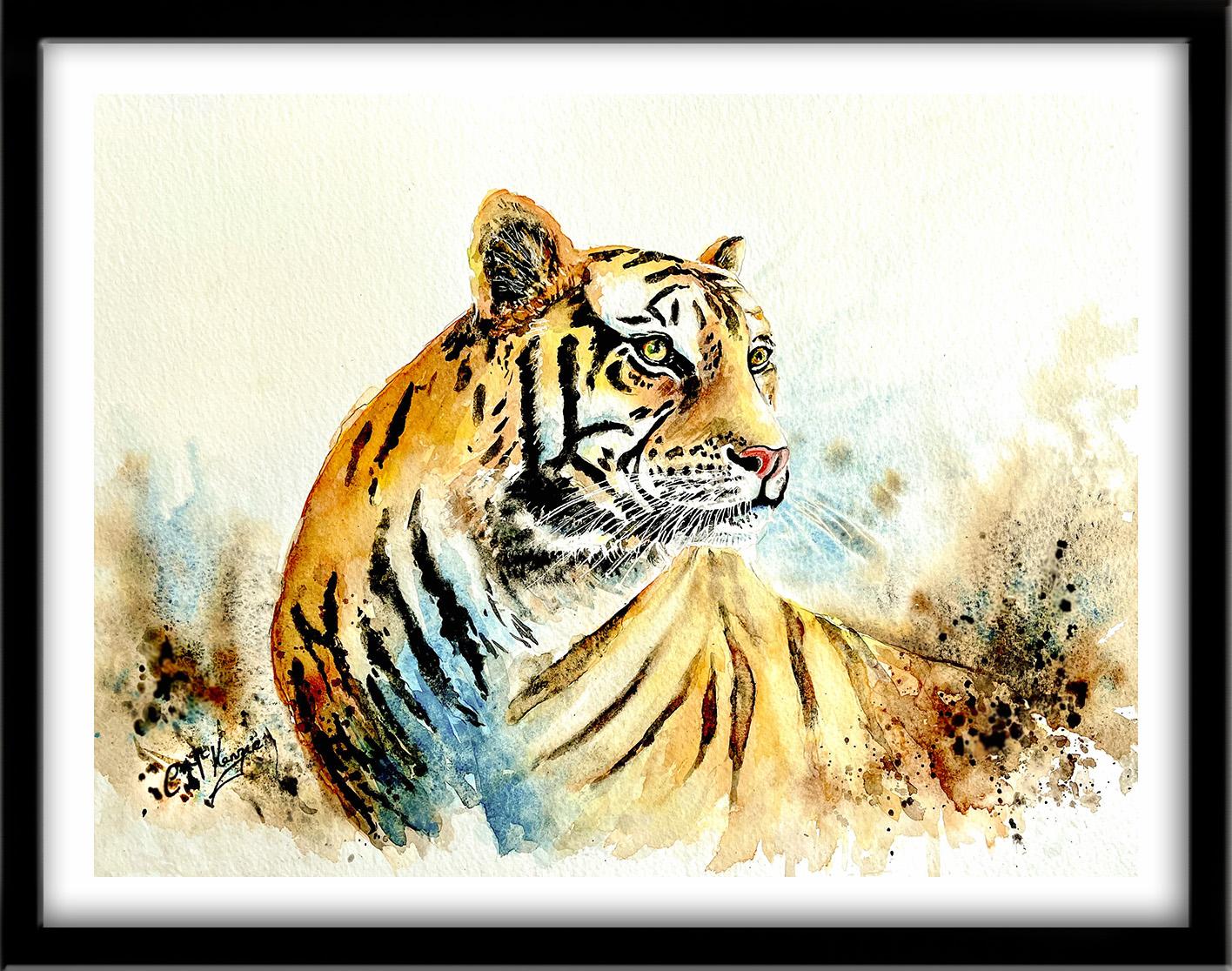
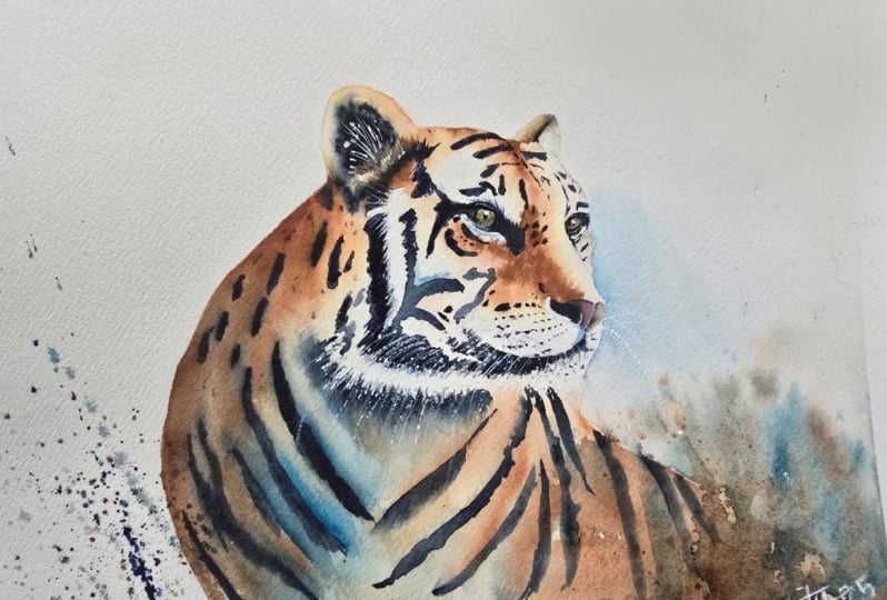
1. INTRO TIGER: Hello, and welcome.
In this class, you'll learn how to
paint a powerful and expressive tiger in watercolor, using layered washers, tonal values, and
expressive brushwork. We'll work step by step through the entire
painting process, building up the fur texture,
shadows and contrast. We'll simplify the pattern of
his luscious black stripes and we'll add detail and expression to the eyes
and facial features. And we'll paint an
abstract, splishy, splashy background so it doesn't overshadow our glorious tiger. It's suitable for all levels, including beginners, because I'm going to be guiding you
every step of the way. And I'll be sharing all
the techniques, tips, and tricks that I use in
my own professional work. And I've included a
copy of the drawing in the project resources section so that you can download
it and trace it, and then not worry
about the drawing because this is a
painting class. I am a professional artist, author, and tutor,
and over the years, I've sold a lot of work
across the world and helped hundreds of people to
learn more about watercolor. You can see examples of
my work on my website. My style leans towards
impressionistic and contemporary rather
than photorealistic. I like to explore loose approaches that
bring out the color, light, and essence
of my subjects. I've tried to
replicate this across all the many other videos
that I have on Skillshare. I'd love to see your
own finished painting, which you can upload through the project and resources tab. I'll give you some
personal feedback on it, and you'll be able to
see the artwork of other students and
get their support. At the end of the class, you'll have your own beautiful artwork to be very proud of. So let's swizzle our brushes and get on with the painting.
2. Materials overview & colour palette. Drawing. Apply masking fluid for whiskers and highlights: Tigers have this wonderful, striking beauty, combined
with courage and raw power. So I know you're
going to really love creating this beautiful animal. For this class, these are the colors and materials
that I'm using, but do feel free to use
any that you already have. For lots more, useful
information about brushes, paper, and other art materials. Take a look at the
document that I've added to the project
and resources section. You'll find that really helpful. And I've included a
copy of the drawing in the project resources section so that you can download
it and trace it, and then not worry
about the drawing because this is a
painting class. Now you can see that I've
kept the drawing very simple, minimal details so
that we get a nice, loose free flow painting. We're going to start off by
painting with masking fluid. You can apply masking fluid to the shapes where you want to reserve the white of the paper, either for highlights or to
paint over by hand later on. Now, you do need to
wait for the fluid to dry fully before applying
paint over the top of it. When it is properly dry, you can just rub
off the hard gum either with a clean finger
or with a putty rubber, and you'll see that it leaves behind crisp defined
white shapes. If the white shapes
are a bit too stark, you can soften them
with a damp brush, or you can even paint over it. Now, don't use your
good brushes for this because the gum
will spoil them. So use an old brush or even
the handle of the brush. I also use rubber tipped applicators because the gum is very easy to clean off them. You can get a ruling pen, which varies the
thickness of the line, but I tend to use an unwound paper clip for
very fine lines and dots. Another tool that I'm fond
of is the one I'm using now. It's a glass pen, and the spiral design of the
tip means that it will hold quite a lot of masking fluid before you have to dip it into
the jar again. It's got a really good point, so very useful for painting these fine whiskers
that I'm doing here. I've also, as you can see, I've painted some
whiskers in his left ear. I've added a couple of little tiny dots for the highlight in his eye and just underneath
the iris of the eye. I've also added a
fine line of masking just around the right hand
side of the left nostril, and now I'm adding
some more whiskers around his chin area
and below his mouth. I'm painting some whiskery
lines around the neck area. Now, these don't need to be quite as thin
as the whiskers. In fact, it is better if some of them are a bit
thicker than others, a little bit of
variety in the width. And you want to put this
on quite randomly, really. Again, you don't want it to be uniform like soldiers in a row. Remember, we are painting
fur and it is quite raggy. So keep these strokes a little
bit more free and easy. As I mentioned earlier, you've got to leave
the masking fluid to dry completely before
you can paint over it. And then when we
finish painting, we will remove it when
the paint is dry. And if there are
any white shapes that are a bit too stark, we can knock them back
with some more paint. Inly I've added a thin line
of masking fluid just below his left nostril and then a few more whiskers
on the right hand side.
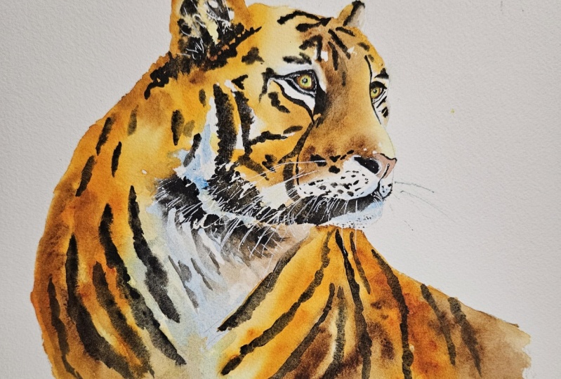
3. Head & Body - paint orange-brown fur using wet-on-wet; use tonal values for depth and form.: The key element to painting fur is to use the wet
on wet technique. The wet on wet
technique is simply putting wet paint onto wet paper or paint that is still wet and let it spread
into the wet wash. This results in a lovely
diffused effect with soft edges. Because the paint mix us into
the wetness of the paper, the color is diluted
and the tone is paler. Now, I would normally pre wet the paper with completely
clean clear water. But in order for you to be able to see where I'm wetting it, I have slightly tinted the my water with a
little bit of yellow. But I do advise that you use completely clean
water for this. What I'm actually doing is
pre wetting all the areas of the tiger's face that are an orange or orange or
yellow, brown color. And I'm leaving the white
parts of his face unwet. If you study the reference
photograph, though, you'll see that even
the white areas of the face have some
little bits of color. So white isn't
always pure white. We often have little bits of tinted pale color here
and there in the shadows. Another point to note is that we're not going
to be painting a hyper realistic image of the tiger with every single
hair painted by hand. We are creating an impression of fur through a loose
impressionistic painting. Now that I've pre wet all the non white areas
of the tiger's face, I can start to drop
in some color. I'm starting off with some
yellow With water color, it is usual to work
from light to dark, and that is why I'm starting
up with yellow because that is my lightest
color next to white. Now, you can see that I'm just dip dabbing with the
tip of my brush, letting the wet that's on the paper kind of soak up
the color from my brush, rather than pressing down really hard into
the paper with it. And just that simple action will give me some tonal variety, even within the yellow color, which will start to build
up the appearance of fur. So rather than have one
solid block of yellow color, which is the same everywhere, we getting some little
bits of lighter yellow, medium, and full
strength yellow. Because black is
such a strong color, it doesn't matter if you go over the black stripes with
the yellow paint, The only parts of the
face that you want to avoid are the parts
that are white. Now, as well as adding color
to some pre wet paper. We can also use the wet
on wet technique to add another color on top of the one that
we've just put on. Now whilst that yellow
paint is still wet, I'm starting to add some
little touches of orange. Just as added with
the yellow paint, I'm using the tip of
my brush to dip dab that orange color into the yellow underwh we
get a mottled effect, again, helping to create
the illusion of fur. If you accidentally, get your paint in some
of the white areas, just use a bit of paper towel
and dab it off quickly. Keep having a check on the
reference photograph to determine which areas
are a very pale yellow, which areas are going
towards more of an orange burnt sienna color, and where we're later going to need to be putting
some brown on. You can see very clearly that my paint is still wet because the orange color is blending and diffusing nicely into
that yellow under wash. If it happens that your
paint has started to dry, the yellow color
has started to dry, and you get in hard lines, you will need to stop, let it dry completely and then pre wet the yellow areas again. Now, the tigers
face is going to be the most important focal
point of the painting. It is important not to
rush this step too much. Take your time. If
you do need to pre wet again because the paint
is dry and then do so. Just as I varied the tone of the yellow in different
parts of the face, I'm doing the same thing
with the orange color. So there are some light
areas of orange that's particularly on the top of his head where the
light is catching it. And then some darker
areas of orange on this side of the nose and
down at the back of the neck. Now, I need to make some of these areas on the face
a little bit darker. So I've mixed some burnt sienna with some of my orange to get
a dark burnt orange color. I'm checking back
with the reference again to see where some of these dark burnt orange
sienna colors need to be. Once again, using
that di dab in action because the underlying
color is still wet, so I can still get
this mottled effect by using the tip of my brush. And creating, again,
that illusion of fur using this wet
on wet technique. But importantly, we
don't want to go over all our lovely light
and medium tones of yellow and orange. So don't overdo adding
this darker color. With any composition, you need this combination
of light tones, mid tones, and darker tones. So now we're going to add a little bit of burnt
umber to the mix to get a few really dark tones and give us the
contrast that we need. And these darker tones
alongside the light and medium, will help to show
the face as being a rounded shape of
three D appearance. I've touched in a little bit of the brown color behind the
ear at the top of the head, and now I'm just putting some
down the side of his nose. Again, I'm checking with the reference photograph to see where these
dark tones belong. Although I'm referring to this brown color as a dark tone, of course, it's now near as dark as the black stripes
are going to be. So don't make you
brown too brown. Otherwise, we won't get that contrast with
the black stripes. I'm now drizzling
in a little bit of brown down the center
of the forehead, where the skull dints in a bit. And again, just a bit around
the eyes and the nose. Bottom of the head,
in the white shapes, there is some colors, so I'm adding a little
bit of brown down there and along the
back of the far ear, touching up that right
ear, a little bit, tiding up some of
the paint and adding some dark brown into that
furry bit just below the ear. When you're painting
wet and wet like this, sometimes you go back to a place that you've
painted before, and the color has sunk a bit, It's lightened as it's
dried because water color does lighten as it dries
by about 20 to 30%. So I'm just going
back into some of the areas and adding a
little bit more brown, a little bit more
of that dark color where it's lightened,
as it's dried. I've got a few places where the burnt orange color has
lightened a bit too much, so I'm just touching
those up as well. I'm using the same process for painting the
body of our tiger. I'm using tinted water
again so you can see where I'm pre
wetting his body, but you use clean water. Then I'm adding the yellow one. I can go over those
black stripes, just as I did with the head, with my yellow paint. The shape of the body is very loosely based on this
photograph here. But I wanted my
tiger to be stood up and to emphasize
the curve of his body. But what you can see from
the photograph is that the chest area and the
insides of his legs, there's very little
orange, if any at all, it's predominantly white
with the black stripes. Whereas the top of
his back and much of the belly area uses the same orangey brown and yellow colors that
we use for the head. So those are the colorings
that I'm going to pretty much follow for the
tiger that I'm painting here. As you can see, I've
left the chest area and inside legs pretty
much unpainted. I've moved over to
his back and I'm dropping in the
same yellow color that I used for his head. As I mentioned earlier, the face is going to be the main focal point
of our painting. I don't want to add too
much detail to the body. This is going to be painted in a much looser and
spontaneous fashion. I also want the lower
part of his body to disappear into the background. I'm add him some more water, making the tone of the
yellow a lot paler as I drag it down towards the
bottom edge of the paper. While the yellow
paint is still wet, I'm adding in my orange just
as I did with the head, going down the left
hand side of his body, which is darker because
it's more in shade. Strokes very loose and fresh. Then quickly going over to
the right side of his body, adding some orange in there. Keeping it a bit lower down. I want the top of his back to be lighter where it's
catching the light, so leaving a lot more yellow up across
the top of his back. In my palette, I've still got my darker burnt orange color, where I've added some
burnt sienna to my orange, and then the even darker color, where I've added
some burnt umber. So I'm going to be
using all these colors to build up the tones
in the tiger's body. Don't forget, you can use
your paper towel to dab off any paint where you think you've applied
too much of it. And if any areas start to dry a bit lighter than when
you first put the paint on, you can go back and add a little bit more paint
in those areas as well. The important thing is to
keep everything nice and wet. Keep going with this wet on wet technique so that the
colors blend nicely together. You don't get lots
of hard edges, and we retain this
appearance of nice soft fur. Because water color is built
up in stages and layers. It never really looks
right as you go along. In fact, if it looks right
now, it's probably wrong, it's going to make the world of difference when we get
the next layer on, and particularly
the black stripes. You'll be amazed
what a difference that's going to make then. H. A.
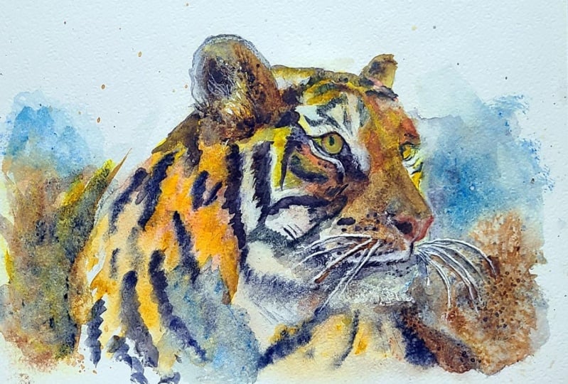
4. Head & Body - paint shadow areas using wet-on-dry; blend & soften edges to keep fur luminous: For the next part
of the painting, we're going to be
using the wet on dry technique and the blending
and softening technique. The wet on dry
technique is simply painting wet paint
onto dry paper. It allows for more
control, stronger color, and crisp hard edges
where the paint ends. The paint will only go
where the brush takes it. Because the wet on dry technique
does create hard edges. There will be times
when you need to use the blending and
softening technique to soften some of
those hard edges. Where you simply
use a damp brush to pull the paint away
from the hard edge, blending it softly
until the color disappears into the
underlying wash or white of the paper. It might sound like a
relatively simple technique, but it is actually quite a difficult one to
master thoroughly. So if you haven't
already done so, I do suggest that you
practice technique because it will make
a massive difference to all your paintings. I'm using some pale watery, seran blue to paint the
shadows in the white areas. Where the skull is curving
over the top of the eye, the fur will be in shadow. Now, you don't need to make
it too dark or too thick. Just some little light strokes going in the direction
that the fur is growing. Where you've got a
transition between the white areas of fur
and the black stripes, you will also get some shadow there because you'll be able to see some of the black hairs
showing through the white. So I'm just dancing
around these areas adding these little touches
of pale blue shadow, particularly around
those stripe areas. And I'm using a clean damp
brush to gently blend and soften the blue color
away into the background. Just a little reminder that my masking fluid is also blue. So I do understand
it might be a little bit difficult for you
to see in some areas, which is paint and
which is masking fluid. But I do stand by the PBO masking fluid
because you can see it. When it dry it has got a
more glossy look than paint, so it is easy to
see and rub off. Of shadow is just
below the nose where the two cheeks come together
underneath the nostrils. And we've got quite
a bit of shadow below those cheeks as
we move into the mouth, which is set back a little bit. I'm using a little bit
darker cerulm blue here. I think it's easier
to see which is the paint and which
is the masking fluid. For those darker
areas of shadow, you can also just touching a
little bit of cobalt blue, just to give a bit of
variety to the shadow color. And now I need to add
some eran blue to the shadows on the white areas of his chest and inner legs. Now, because this area is
further away from the light, I am using a darker, stronger of the blue color. The lower body that I've painted with oranges
and yellows and browns down at this bottom
part is also in shadow, so I'm using my
scrolling blue to go over a little bit of that
area at the bottom as well. And as you can see, I'm using the blending and
softening technique with my clean damp brush to soften a lot of
those hard edges. As I move further up the chest, I'm keeping the strokes a little bit shorter,
a little bit lighter, and I'm also going to add in some of the
orangey brown color, as well as a move towards
the underneath of the chin. A lot of people think
that shadows are gray. But if we made them gray, well the painting would
look rather dull, but also blue is the opposite color to orange and yellow
on the color wheel. By using the opposite color, it adds another dynamic, a bit more contrast and
interest to the painting. Finish now, adding all
the blue shadow color. But before I go on
to the next section, I want to just add a little
bit of color to the rises of the tiger's eyes
because I want these to dry before I paint
more detail into them. I'm just using a very pale yellow and a very
small pointy brush to add a little bit of that water yellow color into
the irises of each eye. We'll be doing more work
on the eyes later on. Don't worry if they don't
look quite right now. All you want is that very
pale water yellow wash. The pale yellow color
that I painted the eyes with in the last step has
now dried completely, so I can go on to add
more detail and color. I've mixed a green with my
serian blue and yellow. I'm using that to
paint ad the pupil. So it's not covering over the whole of the
area of the yellow. There's still that rim of
yellow around the green. Then with the point of my brush, I'm adding a very thin, fine line of burnt sienna around the outer
edge of the iris. I'm being very careful not to
touch that into the green, otherwise, the two
colors will blend and we'll just get
a color like mud. Now I'm going to start adding some really dark color
and pre wetting the ear first because I want the
dark color to soften and diffuse as it goes towards the
top of the ear to the tip. Also, some dark fur just below this little ridge of fur
at the bottom of the ear. By prett the areas before
I put the dark color on, I'll continue to get that
fur like appearance. A lot of artists prefer to mix their own black because they feel that straight
out of the tube, it can be a little bit
flat and uninteresting. However, because the
shapes that we are going to be painting with
black are quite small, I'm going to use it
straight from the tube, but I am adding a little
bit of burnt umber and a little bit of ultramarine
to liven it up a bit. And then is the time to be very bold and brave with
this very dark color. I'm dropping it in at
the bottom of the ear, and you can see how
it's moving upwards, traveling in the wet
wash towards the tip. And as it does so, it's just lightening a little bit
as it moves up there. Then as I place the dark
color into the fury area, just as we did before, you can see that
it's blending in, softening in to that
wet under wash, and this really is the most crucial part of trying to create the
appearance of fur. I'm also using the
point of my brush, little short strokes in the direction that
the fur is growing. That again, is a really
important point. Have a look at the
reference photo. Check which direction the
fur is actually growing. Because if you paint in
a different direction, it's going to look really odd. As I've said a few
times already, when you paint wet into wet, the color dilutes, and
as it starts to dry, it starts to lighten even more. You will quite often need to
go back in and add a little bit more of that dark color where it's lightening too much. I'm now going to be painting the black stripes
and black markings. The technique or the
process for every single one of these
is exactly the same. It's basically what
we've been doing, but a little bit more refined. Wet, each black stripe or black
marking with clean water. Now, it doesn't want
to be soaking wet, but it wants to be a bit
more wet than just damp. And if you're not sure
about that consistency, it might be useful to practice it on some
spare paper first. Then while it is slightly
wet or very damp, you're going to drop in your dark black color and let that travel into the wet shape. Because you've pre wet it, what you should get is a nice fuzzy edge rather
than a very hard edge. And as that shape starts to dry, you can even go back
in and just add a little dot or two of your black color here
and there in it. Again, just to vary the color and the tone in each
particular shape. If you're a fast
worker, you can do two, three or even more shapes
or stripes at a time. If you're a slow worker, then just do one
or two at a time. Now, there's quite a lot
of stripes and markings, so by the time you've
finished the tiger, you'll be quite
proficient at this. Because it is quite a
repetitive process, I'm going to just let you follow along watching the video, and I'll maybe speed it
up in a couple of places, but I will also bob back in where I need to explain
anything in more detail. Oh. Oh. At Oh. O
5. Use glazing to deepen shadows & enhance form; refine facial details; soften areas with magic sponge: I need to darken the
far left side of the tiger's body in order to convey a more three D
and rounded effect. I want to show you a
technique called glazing. Glazing is simply adding
multiple layers of thin transparent washes of
paint on top of each other, allowing the layers
below to shine. So you need to identify which of your colors are
transparent and which are opaque and just use the
transparent ones for a glaze. Glazing is used to add
richness, visual interest, or depth of color, and your layer of
glaze may cover all or just a portion
of the subject. The important thing is that
each layer of paint must be completely dry before
applying the next one. Otherwise, you will get
the pigments coming together and creating
the dreaded mud effect. When you're glazing, try to use soft gentle strokes so that you don't disturb the
underlying layers of paint with too much pressure. You can apply a glaze at any point in the
painting process or as a final adjustment to
increase color harmony or mood. You can just run a
clean damp brush along the edge of the
glaze to soften it, and water color
glazers can be soft and subtle or strong
and dramatic, depending on the effect
you want to create. I've used a thin mix
of burnt umber to glaze over the left hand
side of the tiger's body, and then I've used some
cerulu blue glaze to just intensify the shadows at the lower part of
his chest and legs. And now I'm just adding
a few little touches of seran blue and a browny gray underneath his chin,
the top of his neck. That has resulted
in giving our tiger a little bit more depth and
a rounded feel to his body. I'm using the burn
tumber to apply some more glazed color to the right hand
side of his body. Now, I'm just washing that away as well with a clean brush, so it disappears
into nothingness. To add a bit of interest
over on this side, to balance all the detail we've got on the
left and center, I'm just adding a
bit of spatter, just using my brush
to spatter on some of that brown number
over the right hand side. To balance that tail
to a little bit, I'm going to spatter
a little bit of brow number over this
left hand side as well to make it
look as though we just walk through
some jungly foliage. Then perhaps a little
bit more is needed over on that right hand side
to add some depth. I've just removed all
the masking fluid from the tiger's eye and ear. But before I give
them some attention, I'm just painting his nostril here on the left hand
side with black. There's also a very
fine thin black line that goes in between his nostrils in the center of his nose that joins
onto the mouth. Now, it'll depend what
your eye looks like after removing the masking fluid as to what you
actually need to do. I need to tidy up the
area around the iris, make that black area around there a little bit
more defined and stronger. If you don't have
a very steady hand for these very small areas, you could also use a
black waterproof pen. The only drawback of
that is that, of course, it's virtually impossible to remove a black waterproof pen
once you put it on it's on. If you've left too
much highlight from removing the
masculin fluid, you can always add a little
bit more color back in. All I need to do is add some more black on
the actual pupil. Now, you can see here
on my tiger's left ear, that having removed
the maskin fluid, the white shapes that
it's left behind, the recovered white of
the paper is too stark. It's not natural looking. I'm using my brow number, my brain umber, again, to just go over those shapes and knock the
brightness back in. Even though I'm going over
with a fairly dark color, it is quite watery, so you will still
see those shapes that are made with the maskin
fluid when it's dried. Because we have to work from
light to dark in watercolor. That is to say, we can't put a light color on top
of a dark color. So we've got to use this
kind of work around, and we wouldn't be able to
put the black color inside the ear and then put the lighter tones of
brown on top of it, hence the technique to
use the masking fluid. I hope by seeing this
actually working, you can understand
that it's not as complicated as it might sound, and it just takes a little bit of pre planning in advance. Similarly, the masculine
fluid that I put on the fur around his head is also too stark and
unnatural looking. I will need to knock
that back as well. Again, I'm using my brown
and browny gray colors to just glaze a little color over
those white marks and knock them back into
the underlying wash. I'm also using a
clean damp brush to blend and soften the edges, the beginnings of those
little white marks, the white fur into the
underlying color as well. Now, this area that
I'm looking at here, I'm also not really happy with. And although I'm
going over it with some black and gray to sort of blend the white and the black stripes together
a little bit better, I'm going to show you
another technique how we can make this look a little
bit better in a later stage. So worry too much
about it just now. Just another gentle reminder. I know I've said it before,
but just to reiterate the point that
when you're making these little brush
strokes for the fur, do remember to check with the reference photograph
which direction the fur is growing, and then make your little lines, little flicks in
that same direction. Looking at the
reference photograph, I've missed out a few
little tiny black marks that are just above his eye. I'm just with my small brush, putting in a few little black
feathery strokes for that. It helps to show
how the skull is actually bending curving
over the top of the eye. The other thing about the eye at the moment is it's got a very
unnatural looking stare. And although tigers do
have quite a fierce stare, this is a little bit
too much because because of the skull
overhanging the eye, there is always a little bit
of a shadow on top of it. So I'm just glazing
over a little bit of my gray color over the
top third of the iris. Painting dry and then rubbed off all the masking fluid apart from the whiskers
on the right hand side. Now, here's the other
little technique that I mentioned a moment ago. Although you can use a brush and some water to lift off paint. I want to introduce you to
magic sponge eraser because this little tool works miraculously to remove
unwanted paint. Just tear a small
piece of the sponge, dip it in some clean water, then squeeze it to
just damp and rub over the unwanted paint until
the color is removed. Use a paper towel in between to blot and get the last
bit of paint off and keep rinsing your sponge
out during use to keep it clean or even throw it away
and use a fresh piece. If you accidentally
get a blob of unwanted paint in the
middle of your painting, or you just want to lighten
the tone of an area, give it some highlights, this little piece of sponge
will become your best friend. Because it's normally sold as an abrasive
household cleaner, it does tend to rough up
the paper a little bit. So take extra care
if you're painting over the area that you've
sponged with another color. As you can see, I've used
the magic sponge to lighten the tone of a couple of stripes over on the left
hand side of the tiger. But I've also used it to soften some of that white fur around
the bottom of his head. So instead of having lots
of little white lines now, I've got a more softer
furrier blended effect. Then I've gone back to my
glazing technique and adding a little bit more color over some of that
white furry area. I'm using some bursa, some black, some gray, and just stroking over the edges of those white areas
so that again, I knock them back, and
they don't look too stark. This is the time where
you really need to step back and assess
your own painting. It's quite often a good idea
to actually leave it alone, have a break from
it, and come back and have another look
with a fresh eye. Another way of getting a good perspective is to actually hold it up
in front of a mirror. Quite often when you're
looking at the reverse image, you'll see little
areas that need a bit more attention that either they need something
removing or adding. There are times when I've left a painting alone
for a few days or even several weeks because it is surprising when you have another look at it
sometime later, that things stand out
much more clearly than when you're write on
top of the of your work. And the danger, of course, is if you carry on and
on adding little bits of details here and there that are probably
quite unnecessary. You can then tend to just
overwork the whole thing, and it looks too
stilted and contrived, as you start to lose that lovely freshness and looseness that you've
worked so hard to achieve. So I think I need to take
my own advice now and sit on my hands before going
on to paint the background.
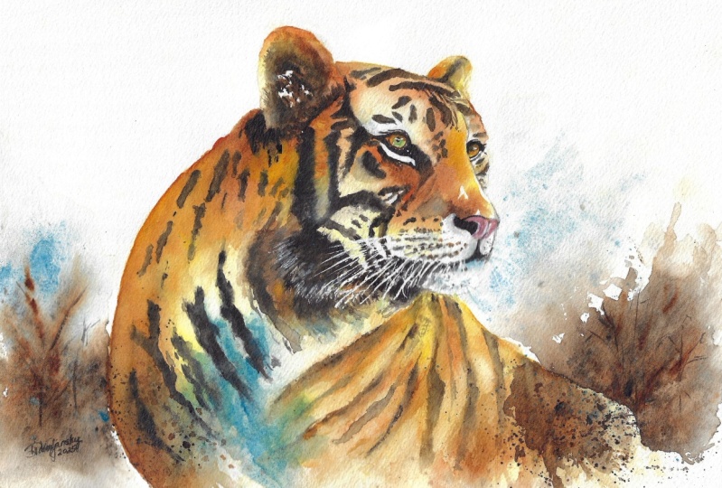
6. Paint a loose, expressive background; balance colour, texture and focus around tiger: Well, I think I was right
about having a break and assessing your work when you come back and
have a fresh look at it, because I've actually
decided that some of the blue in my shadow
areas has sunk a bit. So first of all, before
starting the background, I'm just adding a
little bit more color, glazing on some of the seran blue in this
lower chest area. Not need to do that with yours. Hopefully, you've come back
with a fresh eye and can see more clearly if there's anything else that
you need to do, or actually, if it's
perfectly fine as it is, and you just need to leave it alone and get on
with the background. But I'm also going to
just lighten a couple more of these stripes
on the right hand side. So I got my magic sponge out again and just
rubbing a little bit of the color away where it's at the top
of this right leg. And then I'm going to just
add a little bit more can blue on the left
side of his face, where it's turning away, and it is a little bit more in shadow there just above
the black stripes. Okay, so now let's crack
on with the background. First of all, I'm pre wetting the paper with a
clean wet brush, going over the left side and the right side
where I'm going to be placing some very loose abstract shapes for
the background. Nothing too complicated
because I don't want to detract from the main focal
point, which is the tiger. Then I'm starting
with the cerulan blue and painting over the area where I've placed the masking fluid on the right hand side
for his whiskers. In fact, you can see
more clearly now as I'm painting the blue over
the top of the whiskers, where those masking
lines actually are. It's all nice and wet, so the paints running freely
and blending and softening into that underlying wet
wash. At the same time, I'm lifting the paper
and tilting it a bit to encourage the paint to flow to the outer
edge of the paper. It is better to let the
paint do this naturally and flow rather than try and brush it too much
with your brush. To get a much softer and
more natural appearance using this tilting method. That is one of the
reasons why I don't take my paper down because I like to pick it up
and move it around. And now I'm using a very
strong mix of burnt umber, a little bit of black
in to darken it, and going over the back, the far right of the tiger. This again is going to lighten a little
bit when it dries, so it won't be quite
as dark as it is. Using a bit of a
spattering technique to spatter some of the
paint onto the paper. Again, that's helping me to achieve a more loose
effect as though there's some background bushes or trees or what have you
in the background. But I do want this background
color to be darker brown than the actual brown of the tiger so that it makes
the tiger stand out more. I'm just using the
tip of my brush to squiggle some little shapes, do a little bit more spattering, Let all this mix and mingle and do its own thing
really on the paper. Sometimes you've just got to give water color a little bit of freedom and you'll get some very nice, unexpected results. I'm keeping in harmony with the blue and spattering ale
bit of that over the brown, and then a little bit of
my back color as well. Using all the same
colors that I've already used in the painting to
give it a sense of harmony. Whilst it's all
still nice and wet, I'm still lifting and
tilting my paper, encouraging the paint
to flow a little further into the area
that I've pre wet. There's really no set way
of doing this and a lot of it is something that you need to judge by your own eye. But if you haven't
done it before, it might be worth just
practicing on a little bit of spare paper first and see what kind of lovely
effects you can achieve. Moving over to this
left hand side. I'm doing exactly
the same process. I've pre wet the paper, and then adding my cerulu blue, a little bit more blue, a little bit stronger
on this side because this side is a little
bit more in shadow. And then adding my strong brown, getting that mixed
in with the blue and trickling it around really
with the tip of my brush, just drizzling it here and
there, hoping for the best, actually, it's not
always something that works exactly
as you'd planned. But that is really the sort
of nice happy hoops about it. Get if it goes
really badly wrong, you can very quickly get
your paper towel and dab some paint off if you've got it on too strong
or too thick. That's what I'm going to do
now because I do want it to just soften and blend
towards the bottom. I want it to look
as though it's just fading away into nothingness. Notice also that I'm not taking this background color on either side right up to
the top of the paper. Now, I know that
some artists like to fill the whole of the
background with color. But I think my
personal feeling is in this particular composition is that there's quite
a lot going on, and so we need some white areas, light areas for the
viewer's eye to rest on. It's in danger of
becoming too overworked and too if we had
too much background. Then the actual face of the tiger is less
likely to stand out. You can see now
that I've gone in with some thicker brown paint. Because it's thicker, it
won't spread quite as much as the paint that I've
just put on a moment ago. It will still blend
in a little bit. It'll look fuzzy,
which is what I want. I don't want any too
many hard lines here, but I'm just giving
the impression of some branches and foliage
going on in the background. I'll spatter a bit more blue, I think over this
right hand side, and then let's give it
another shake of belt, see what happens
with all this color and paint that I've put on. It actually feels quite liberating to be applying
painting this way because we've been quite
meticulous really in painting all the stripes and the fur and the details in this
wonderful body of a tiger. Then to join the background with the tiger so that it's
not completely separate, but almost becomes a
part of the background, and spattering some of
that dark brown color over the far right and far
left of the tiger's body. Now you can do as much
or as little of this as you feel appropriate and what you feel
comfortable with. Then finally, I'm using a
white gel pen to just add in any little fine white hairs in the ear or in the whiskers. If you've lost the
high light in the eye, you can always use
your white gel pen to put that highlight
highlight back in. A little touches really of white that you
think are missing. L et it all dry
before rubbing off the rest of the masking fluid from the whiskers on the right, and call it finished. I do hope you've
enjoyed this painting, and that you've learned some
tips and techniques along the way that you can incorporate
into your own paintings. And why not pop it into
a mount and a frame? And you'll be amazed how good
it looks when you do that. I really love to see your
own finished painting, which you can upload to
the your project section. And if you could just take a moment to leave
me a short review, that also would be really great. I do hope you've
enjoyed this video, and it's encouraged you to have a look at some of
my other classes. I've got lots of lovely
subjects loaded with more tips and techniques to help you with your own
exciting art journey. In the meantime, thank
you for joining me, and I look forward to seeing you next time. Happy painting.
7. FINAL THOUGHTS: Well done on completing the
class and also the painting, if you've been painting
alongside of me. We've covered quite a few
different techniques. We've simplified the drawing
from the reference photo. We use masking fluid to preserve
the white of the paper. We use the wet on wet technique, putting wet paint on wet paper. And we use light medium
and dark tones of colour to convey a
rounded three D effect. And we also looked
at how to lift off paint and
recover light areas. And we use the glazing
technique to add a little bit more
richness and depth of color to the overall
look of the painting. Now, don't forget to upload your own painting through the
project and resources tab. After all your hard work,
I'd really love to see it, and I'll be sure to give
you some personal feedback. And if you've
enjoyed this video, do have a look at my other
classes on Skillshare, which are packed
with more tips and techniques to help you
on your own art journey. If you click the follow button, you'll be able to follow me, and then you'll be the first
to know when you upload a new video or any
exciting updates. And if you could
just take a moment to leave me a short review, that also would be really great. In the meantime, thank
you for joining me and I look forward to seeing you
next time Happy painting.
 Carrie McKenzie, creating painted visions