Transcripts
1. SUNFLOWERS: INTRODUCTION: Hello and a very warm welcome to my online
watercolor class. My name's Karen Mackenzie. I'm a professional
artist, author, and art tutor living in the beautiful
countryside of Yorkshire. Today we're going to be painting these beautiful sunflowers. This is a great class, it's jam packed with
watercolor techniques, tips and tricks, and I know you're going to find
it really inspiring. It's suitable for all levels. If you're a beginner, I'm going to guide you every
step of the way. Or if you're an
experienced artist looking for something
a bit different. I've included a copy
of the drawing in the project resources
section so that you can download it and trace
it and then not worry about the drawing because
this is a painting class. In all my classes you
can follow along in real time as I share the techniques that I use in
my own professional work. I've got a lot of classes now
on skillshare in a range of beautiful subjects where I show you how to keep
your work loose, fresh, and spontaneous,
without over fussing. You'll gain the confidence
and knowledge to incorporate everything you
learn into your own artwork. Best of all, at the
end of this class, you'll have your own beautiful painting to be very proud of. I've discovered lots of tips and techniques and shortcuts
over the years. Just as in my in person
face to face classes, I'll be sharing these
so that you too can get the same benefits and joy from painting that
have helped me. I'm a big believer in
learning by doing so. Rather than reading
lots of written theory, you'll be painting right
alongside me in my studio as I demonstrate each process step by step and make your
learning a happy, smiley and practical experience. If you prefer, you can watch the video the whole way through, then have a go at the
painting afterwards. And of course, you can pause
and rewind it at any time. You can see examples of
my work on my website. My style leans towards
impressionistic and contemporary rather
than photo realistic. I like to explore
loose approaches that bring out the color, light, and essence
of my subjects. I'm delighted to be able to
share with you my experience, tips and techniques that I've learned along the way
in my own art journey. Importantly, the
most valuable asset, your own time, patience,
and enthusiasm. There's no such thing as right, wrong, or failure in art. It's all about
learning and growth. Learning what worked well, practicing what you
need to improve on, and moving forward
with each step. Please don't worry
if your painting doesn't look exactly like mine. Lowe never worried
whether he looked like an Goths or Picassos. We all have our own unique style just like our fingerprint. And with that understanding, it's time to get on
with the painting.
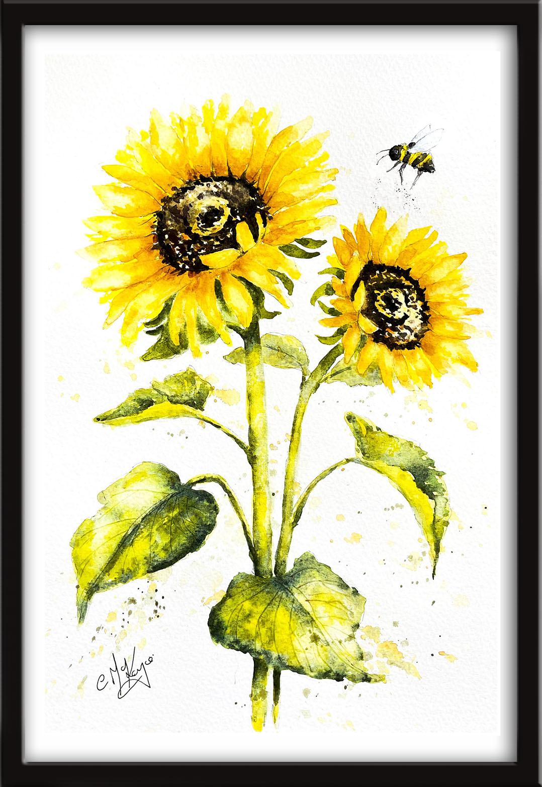
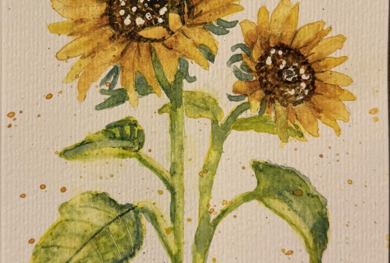
2. Materials, drawing, paint the sunflower seedheads, reserve white paper, wet-on-dry, wet-on-wet. : Hello and a very warm welcome to the first part of my
on line watercolor class. Today we're going to be painting these absolutely
beautiful sunflowers and this very busy little bee. I'm going to be sharing lots of my favorite
techniques with you, like how to paint the
very soft petals, the textured leaves, and those amazing seed
heads that are absolutely packed with
tiny little flowers. I know you're going to love
creating this painting and I'm sure it will put a really
big smile on your face too. You can either watch
the whole video through and have got the
painting afterwards, or you can paint right alongside me as I guide you through it. Now, regarding my materials, these are the ones
that I'm using. But if you have
different colors, then don't be afraid to use the ones that
you've already got. Most of my paints are either transparent or semi transparent, which will allow the white of
the paper to shine through. This is what gives water
color its wonderful radiance, which is very appropriate
for painting. These gorgeous
sunflowers tend to keep opaque paints for
when I want to cover up the underlying paper
or layer of paint. Now you can see that I've
kept the drawing very simple, minimal detail, so that we get a nice loose free flow painting. An important point to note
in the drawing is there are some little shapes that
have a little.in them now, that is to signify
that those are green Ls and not yellow petals. I've included a copy
of the drawing in the project resources
section so that you can download it and trace
it and then not worry about the drawing because
this is a painting class. I'm starting with the
seed head centers. I'm using a small
clear wax crayon. It's quick and easy to
apply and stays invisible. No need to wait for
it to dry later. It does repel the paint. When we paint over
the top of the wax, it will preserve the
white of the paper and we'll get some nice little
highlights in the center. You don't have a wax crayon, you can use a chunk
of clear candle wax. I've got three colors
mixed in my palette. I've got handsome yellow medium, which is a nice sunny yellow. I've got nace yellow, which is slightly
darker than that. And I've got another
pool of paint, which I've added
a little touch of burnt sienna to
that, Quinacridone. That's my darkest
shade of yellow. You can see now more clearly
where the wax has resisted the paint as I apply the first
layer of my yellow colors. The disadvantage of
using wax, of course, is that you can't see
easily where you've put it. Do use it with caution. We just want little
white highlights, not great big white patches whilst the
first color of yellow, the light yellow is still wet. Just doing in again, using the tip of my brush to make those little tiny
marks into the sea heads. That will give me a little
bit of variation in the color variation
in the color. Then using my darkish yellow, the third color,
I'm just dotting this around the edge
of the sea head. That will help to set it in to the main body
of the flower, give it a little bit of depth. I'm also adding a little
bit around the inner ring, a few little dots here and there to give the
seed head some depth. I will be adding some even
darker color later on, but I don't want to
add it at this stage, because if I do so, that dark color will really
flood into this wet paint. And I'll lose all my lovely
yellow and white high lights. Now I'm calling it a seed head, but actually each
sunflowers head is made of hundreds of smaller disc
flowers in the middle. That is where the seeds develop. They have both male
and female sex organs, and each produces a seed. I have heard that once the flower heads
are empty of seeds, you can use them as the
disposable scrubbing pad. Now, that's not something
that I've ever tried myself. The color, the shape, and the size of these seed heads varies massively in all different
types of sunflowers. And some of them
have a little bit of green in the center. I've mixed up a very
light green with some ultramarine and yellow and I've just dotted that
right in the middle. Bit heavy. I'm just using
some paper Tl to lift off a little bit of the paint where the
light is catching them.
3. Paint the petals, add shading, blending and softening technique: The first thing
I've done here is to use a putty rubber to erase some of the pencil
lines from the petals, because I don't want
the gray line to be standing out when I've
finished the painting. If you check back a few clips, you'll be able to
see how much lighter the drawing is now than it
was when I first put it on. The reason to use a
putty rubber is because this particular type of rubber doesn't
rough up the paper. I'm using the same three colors as I did for painting
the seed heads, for the petals,
but I'll be using a lot more of the light yellow, the handsy yellow medium. If you don't have handsy yellow, you could use something
like oriol in, or transparent yellow, or
even a cadmium yellow light. Starting with the
largest flower, I'm working my way around the petals because I want to retain
some definition in the petals so that they don't
all run into each other. I'm working my way around
painting the alternate petals. I don't want the paint to dry completely whilst I'm
doing this because I do want to put a little bit of darker color at the
base of each petal. I'm keeping my eye on them. As soon as I see the
paint start to dry, I'll be going back to the first
one with my darker color. It depends on how
fast or slow worker you are as to how many
petals you paint in one go. Even with this first
layer of yellow, I am varying the
color a little bit, trying to keep it lighter
on the tips of the petals. Because the further out they
are away from the seed head, the more that they will be translucent as the light
passes through them. I'm just lifting a bit of the color off here and
there with a damp brush. Now that I've gone back to
my original starting place, I'm now going to
take a little bit of the Quinacridone and just drop that in on the edges of some of the petals
and at the base. Now, as I said earlier, you don't want to flood your petals with
this darker color. It will spoil that
beautiful, joyous, sunny yellow that we expect
to see in the sunflower. But we do need to use some different tonal
values to define the shape and give the
petals a little bit of depth where they
meet the seed head. Particularly also
where one petal is underneath another and
they're in some shadow. You can see that I'm getting
some nice b***ds of color as the darker paint is softening
into that underlying wash. Now, if the petals
had started to dry, what I would need to do is
let them dry completely and then just pre wet them
again with some clear water. Because what we're aiming
for is some nice soft edges. Maybe one or two hard
ones for definition. But overall, we want
our petals to look nice and soft and a little bit
translucent here and there. Also, the sunflower petals do have some little darker
veins running along them. But the sizes here
are too small for us to be adding
that minor detail. But again, slightly
darker yellow will give the overall
impression of that. Now the paint is
starting to dry, but it is still a
little bit wet. I'm able to go in with my
darkish yellow and just place a little touch right at the base of the petal that beds them in, or marries them in
to the seed head. Now I'm going to leave
that flower to dry and go through exactly
the same process with the second
little sunflower. Sunflowers have been with us
for a very, very long time. They were cultivated in North America as far
back as 3,000 BCE, during the time of
Peter the Great, Great Tsar of Russia, who fell in love with sunflowers and took them back
to his country. They became very popular with people because they discovered that the oil from the sunflower wasn't banned during ***t, like the other oils that the Russian Orthodox Church banned its patrons
from consuming. By the 19th century, the country was planting over 2 million acres of
sunflowers every year. And of course, it
has since become the national flower of Ukraine, where it's also grown for sunflower seed oil
in vast quantities. The reason for its popularity as an oil is because it's an
excel***t source of vitamin D, as well as A and E and other
elements such as phosphorus, magnesium se***ium, and on. The other wonderful thing about sunflowers is that they
are completely safe to eat from its roots to the petals and can be used
for medicinal purposes. A tea made from sunflower leaves is a good alternative for
treating high fevers. The crushed leaves of the
sunflower are used sometimes as a medicine for sows and spider
bites, even snake bites. Some medical studies have found
that consuming more poly, unsaturated fat can reduce cholesterol levels
because sunflower oil fits into that category. It can be a great
alternative to butter, as well as being a beautiful, joyous flower to look
at the sunflower is also extremely useful for
mankind in lots of other ways. I think one of the
main reasons though, that we've all come
to love sunflowers so much is because they always
follow the sunshine, the little flower buds,
and the young blossoms, face the east in the
morning and follow the sun re***tlessly as the
Earth moves during the day. There's a very famous
saying that says, keep your face to the sunshine and the shadows will
fall behind you. It's what the sunflowers do. Now, whilst I've been giving you some interesting facts
and figures about them, I've almost finished painting the alternate petals
of both flowers. I'm going to repeat this
whole process over again, filling in the petals in
between that have missed. I'm going to speed up the video a little bit
while you watch along B A b 0.
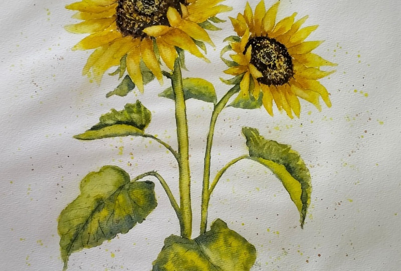
4. Paint the stems and calyx, use tonal values to create 3d effect : To paint the stems
and the calyx, I've mixed up three
different greens. A light green, a medium green, and a very dark blue green. Now I've used my green
appetite genuine, but you could use sap green
if you don't have that one. For the lightest tone of green, I've mixed it with some yellow. For the medium tone, I've
used it just on its own. And for the dark tone of green, I've mixed it with
some ultramarine. But first of all,
as you can see, I'm painting the stems
with the same sunny, yellow color that are used
for these sunflower petals. I'm using the point of a small brush to paint
the tiny leaf stems. At this stage, I'm
not painting the actual leaves themselves now. I want the yellow
paint to remain wet whilst I add
some green to them. If you're not a quick worker, maybe do one or two
stems at a time. I want to convey the
roundedness of the stems. To do that, I'm
going to be using the different tones of
green to give that effect. First of all, I'm stroking
on my very lightest green, the one that I mixed
with a bit of yellow. I'm just using the
tip of my brush to stroke that in down
the side of each stem. Now, because the yellow
paint is still wet, those two colors are b***ding
softly into each other. But the light green is not going right over across the
yellow and obliterating it. We're starting to get that three D effect for
the smaller leaf stems. I'm just putting the
green on the underside of each stem because the light will be catching
it from the top. So they're going to remain
more of a yellow color. Now I'm using my mid green and stroking that
down the side of each stem. You can see that that
also is b***ding nicely because the paint that I've put on
previously is still wet. I'm getting some
nice soft edges. It's becoming even more obvious now that
we are building up the dark and light
tones that we're getting that roundedness
of shape and foam. I'm doing exactly the same
thing on my smaller stem now, using my light and mid green to give the stem
that rounded shape. Varying the tones here and
there to break it up a bit. If your yellow paint is starting to dry now and you're
not getting that nice, soft b***ded effect
of the colors, You can use the
b***ding and softening, the hard edge technique, where you simply
use a damp brush to pull the paint away
from the hard edge. B***ding it softly
until the color disappears into the
underlying wash or white of the paper. It might sound like a
relatively simple technique, but it is actually quite
a difficult one to master thoroughly if you
haven't already done so. I do suggest that you
practice this technique because it will make a massive difference
to all your paintings. I've now switched to the
very dark blue green color. That's the green that I
mixed with the ultramarine. I'm adding that not everywhere,
just here and there. Down the sides again of the stems and underneath
the little leaf stems. Now you don't want
to outline them completely in this dark color. Look like a children's
coloring book. If you do do that, you're going for a hit and miss affair. And a little bit here, add a little bit there, but leave gaps in between
the places where you will need a dark tone is where the leaf stem
joins the main stem. Just underneath that
little area there. Also just underneath
the flower heads where the stem is going
to be in more shadow. Of course, you can use your paper towel to blot off
any paint that's looking a bit too dark and recover that yellow under Wasa
that we put on first. Or you can use a
clean, damp brush, a thirsty brush to lift off some of that paint in
the middle of the stem. Whilst I got my greens, I'm going to paint the
small leaf that's hiding behind some of the petals
on the main sunflower. You don't need to add a lot
of detail to this because it is behind the petals
so it's further back. And I'm also going to paint the little calyx that go
around the seed head. If you remember, when
I did the drawing, I added a little dot
to the shapes that were the calyx so that I
wouldn't get them mixed up. Petals. I'm using
the same three tones of green that I
use for the stems. The light green,
which was my green, mixed with a bit of yellow. The mid green, which is
the green just on its own, and the dark green, which is the ultramarine
added to the green. The darkest tones will be where the calix are nearest
to the seed heads, and they'll be a
bit lighter as they merge out towards the light. Although they are
very small shapes, we still need to be
thinking about where the shadows are so that they don't look flat
and uninteresting. The danger is with
painting these very small, tiny shapes is that
the dark color will run over the lighter color
and it will look flat. So keep your paper towel handy. And again, just as we
did with the stems, dab off any little areas that you think need
lightning. A little bit, He B, That's pretty much all the
little calyx completed now. A little bit fiddly but
well worth the effort. In fact, I think I'm
probably in danger of fiddling and
fussing too much. So I need to sit on my hands now and move on
to the next step.
5. Paint the leaves - create texture and leaf veins. Add more detail to the seedheads : To paint the leaves. I'm
using the same colors, the yellow, the light green, the mid green, and
the dark green. But I'm going to be dropping
these in in such a way to create texture the leaves
because they are quite bobbly, these two little leaves at the top of the
smaller sunflower. They don't need a lot of
detail because again, like the other little
leave that were painted just before
they are further back, I've painted them first with the sunny yellow color and then dropped in
a little bit of my mid green and a touch
of the dark green that's all b***ding and softening quite nicely
without much detail. Again, using my good old paper Tl to dab off a bit of
paint where I want to highlight this next leaf
is curling back on itself. I'm going to paint over
with the sunny yellow. I'm going to add a touch
of my light green. Then I will need to leave it to dry a little bit
and come back to it later to add the detail I need to show where it is
actually curving over. I should mention to
you why I'm using the Green Appetite genuine
paint made by Daniel Smith. Now it is one of the
more expensive paint. It's not cheap, but it is one of the few green colors that give you this
wonderful granulation. Which means that you do get this lovely mottled effect
without hardly having to try. That does ***d itself so
well to texture in foliage. Alternatively,
another method that you could try would be to add some granulating medium
made by Windsor and Newton. You can add that
to any paint color that you've already got. I think you'll be able to see a little bit more clearly on this larger leaf what I mean by granulation and getting this
rather nice mottled effect, ultramarine blue
that I'm adding to the green is also a
granulating color, which is why I've chosen it. That's giving me a double whammy of granulation and this
mottled appearance. I'm just drizzling it around
the edge of the leaf at the bottom because although the leaves aren't anywhere
near as rounded as the stems, we still want to give them a little bit of a
curved appearance. Now for the tiny
veins in the leaves, I'm using the point
of a cocktail stick. You could use an
unwound paper clip if you don't have a
cocktail stick to hand. What's happening here
is that when you score into the paper that's
got wet paint on it, the paint runs back into the groove that
you've just made, and it appears darker. There are many ways to
paint the veins on leaves, but this is quite a simple
method because the sunflowers, the flower heads are the
star of the painting. I don't want to overshadow them with too much
detail on the leaves. I've lifted a little bit of color off with a thirsty brush, and then just adding
a bit more of that sunny yellow
color in again, This is another leaf that's
curving back on itself. So I'm just going
to paint it with a bit of sunny yellow
like I did the other one. And a touch of green and
then leave it to dry again. This leaf at the bottom is
another example of where I can use the cocktail stick
to add some veins to it. I would suggest that
you keep the number of veins fairly minimal. You don't want them to be
too fussy and complicated. If you're not sure exactly what direction the veins going, then pop outside and pick a leaf and have a really
good look at one. For this painting, we are
making the leaves darker, but of course in some
leaves the veins are actually more yellow than
the actual leaf color. It would be really
fiddle to paint in and out amongst all these
tiny little vein shapes. One other method that you
could use would be to use some yellow gouache to paint on some yellow veins or even
a watercolor pencil. Or you could use an
acrylic paint pen, such as those made by Posca. But with any of these methods, instead of adding the vein
lines while the paint is wet, you would need to
wait until it was completely dry and then
add them on afterwards. To give these two larger leaves a little bit
more definition, I'm using my darker green, ultramarine blue and green
color to just trickle in a little bit more dark tone
along those bottom edges. Now going back to the leaves
that are curved over, they have dried quite a bit. Now I can use my darker green. Just going over the top of where the leaf is curving back. It's inside the leaf really, that's where it will be in a little bit more
darker tone and shadow. And I'm just using a hit and miss approach with
that darker green, even little slivers of the
yellow paint in between. That's still nice and wet. I can go in with that red, blue, green color
and just again, add a little touch here and there where the leaf
is curving back in itself and using the points of my little brush to
just flick some of that color upwards
and outwards. I'm repeating that over here on this other leaf that's
curving back on itself. It's the same process. So I'll just speed the
video up a little bit while you watch along 0. The seed heads in
the painting were too small for you to be able to see exactly what I was doing. I've painted this larger shape, and this is what
I'm going to use to illustrate the process. I've mixed up three dark colors. One is burned tuber on its own. The second one is burned tuber with a little
bit of black. So a dark brown black color. The third color is
very dark black. I'm using the dark brown
back color to go around the outer edge of the seed head and around
the little petals. As I said earlier on, these seed heads are
actually made up of hundreds and hundreds
of tiny little flowers. I'm painting now in a fashion
using a very small brush. I think it's either
number one or number two, but it's got a very good point, so I can get some really
fine dots with it. I'm painting wet on dry, wet paint, on dry paper. I haven't pre wet it. I am getting some
crisp hard edges, as you would expect with
these little seeds. You don't need to worry about getting them all
exactly the same. You can have some random shapes. You can have some shapes
joining into each other. Heads do come in a variety
of sizes and shapes. It's up to you how detailed or simple you want
to make yours. Having gone round
the outer edge, I'm now focusing
on the inner ring, again using that dark
brown black color. Then right in the very center, we've got a small circle of that very dark
brown black color. I've switched now to the
burnt number on its own, and I'm just filling
in in between those dark rings with some
more dots and dashes, Being mindful not to obliterate all the lovely
colors that I put on earlier. My lovely yellows and
burnt sienna colors, just as before where I've put the wax on right
at the beginning. That will still repel
this darker paint. I'll still retain some little white highlights
here and there. If you're not sure about doing this particular
section of the painting, you could do exactly
what I've done and try it out on a
practice piece first. It's very repetitive, you
just need a bit of patience. But actually, I found
it quite therapeutic. If you haven't already noticed, I am adding some
of the dark brown, black color in and amongst the burnt umber to give it
some depth here and there. With more shapes in a painting, we do want to introduce some
variety to avoid them being flat and uninteresting
in the inner ring. I'm going to be painting
some little dots that are even smaller and
tinier than these here. Now if you struggle with that, you could use your cocktail
stick again and use the point of that to do
some little tiny dots. Or you could use a very
sharp water color pencil and add them in with that. Now it's time to get out
that really dark black color and go around the edges again with that really
dark black tone. A little bit like the leaves, the seed head is not as rounded as the
stems by any means, but it is slightly curved. Adding these dark tones
will give us that effect. I'm using the same black color, that dark tone, to go around the inner ring
of the seed head. Still being careful not
to completely obliterate the lovely sunny yellow and bert sienna colors that
we put on earlier. We do still want that light
color to glow through. But having said that, the area behind the little petals that are curling
over the sea head, that is going to be darker because it's going to
be in shadow from them. Now, this example that I've
used here to illustrate the process is much larger than the seed heads
in our actual painting. It's not going to take as long to do those as it is
for me to do this one. Before I finish, I'm adding a little bit more
of that very dark black to the center circle
right in the middle. To marry the seed head up with the petals that
are going around it, we just need to flick
some little bits of dark color in between the petals where they meet
the edge of the seed head. I hope being able to see
that larger example was useful and here's how they turned out on the
actual painting.
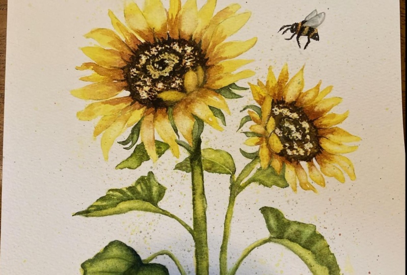
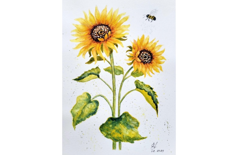
6. Final touches - glazing, lift off paint, spatter background, add a little bee: Time now for a few
final touches which I think will really enhance
the finished painting. First of all, I want to add a little bit more richness
and depth of color to the petals of the sunflower and also to a few little
areas of the leaves. I'm going to glaze
over some of them with that sunny yellow color that we used at the beginning. The term glazing is simply applying one or more
layers of very thin, transparent wash of
paint on top of another, allowing the underlying
layer to shine through. This is where it's
really important to identify which of your colors
are truly transparent. If you glaze over
with an opaque color, it's just going to
look more muddy. You need to make sure
that the paper is completely dry and
try to use soft, gentle strokes, so that you don't disturb the
underlying layer of paint. With too much brush pressure, I've mixed a very thin, watery, sunny yellow
color in my palette. And I'm just using that
to glaze over some of these petals that need a little bit more
richness and sunshine. Now it might be that
your painting doesn't require this or doesn't
require as much as sign. Putting on this is where
you need to stand back, have a look at your own work and see what actually
really needs doing. Mine did just need
brightening up a little bit and that's why
I'm putting this glaze on. But if yours doesn't, don't
do what's not necessary. There is a very fine
line between adding final details to enhance
and overworking. But I do think that
there are some areas of my leaves that have also
doubled down a bit. Once they've dried, I'm going to add a little bit of
sunshine to those two. However that I am only adding that yellow in
a few little places, I'm not going over the
whole of every leaf. I'm adding a final touch of glaze to a few little
areas on the stems. And funnily enough, as if it's
almost trying to help me, a lovely shaft of sunlight has just sucked into my studio. How lovely was that? Now, although you can lift off paint with a brush
and some water, I want to introduce
you to magic sponge, because this little tool
works miraculously to either remove unwanted paint or to lighten an area
that is too dark. It comes in an oblong block, but I tear little bits of it off so that I can access
smaller areas. Just sweat the sponge
in some clean water, give it a squeeze so it's damp. And then rub the
unwanted paint gently away until the color is removed. Use the paper towel
to blot in between rubbings to get that
last bit of paint off. If you want to get right
back to white paper, do keep rinsing your
sponge during used to keep it clean or even throw it
away and use a fresh bit. Now, some colors do stay in the paper more than
others and can be a little bit stubborn regarding getting right
back to white paper, but most of them will do so now. You can buy it as a specialist
tool from art retailers, or you can get it in the
cleaning departments of local supermarkets
or thrift stores where it's sold as a
general household cleaner. If you accidentally get
splashes of unwanted paint on your painting or just want to lighten the
tone of an area, this little piece of sponge, become your best
friend in the studio. So as you can see, I've been using the magic
sponge to just lift off some of the paint and add highlights to the end of my petals where
they are catching the light. There are occasions
where lifting off paint is just as important
as putting it on. Having sorted the petals out, I'm now going to
turn my attention to my leaves and recover a few highlights here
and there on them too. It is worth mentioning
that the sponge, of course, is an abrasive. When you use it, it does
very slightly roughen the paper up if you're going to paint
over the top of it again, that can be a bit tricky. You can find if you have
rubbed it too much. It's a bit like painting
on blotting paper. I tend to use this really as a final step rather than in
the middle of a painting. When I might be going to paint some more layers
of color on top, I've lifted a couple of
highlights on the stems. Finally, I'm just going to
lift a little highlight on those seed heads for the background. I'm going to add some spatter to give it a harmonious feel. I'm going to use
exactly the same colors that I've used for the
rest of the painting. If you've not used
spattering before, it's a technique where
paint is flicked onto the painting surface to produce interesting
textural effects. If you spatter onto dry paper, you'll get a harder
crisper effect. But if you spatter
onto wet paper, you'll get a much softer effect. And you just hold the brush horizontally about 2
" above the paper, then shake the brush
with a wrist flick in action to force the
paint onto the paper. Or alternatively,
tap the brush with your forefinger or with a second brush that you're
holding in the opposite hand. You can also use a toothbrush
for very fine spatters and just rub your
finger over the bristles to spray the
paint onto the paper. It's very useful
technique for creating a more natural and random
appearance than if you were to try and put all these
little marks on by hand. It's a nice way of
creating some background without filling in all that extra white paper
with solid color. I have used mainly
yellow spatter around the petals of the flower, but a mixture of green and yellow around the
leaves and stems. I didn't originally intend
to include a little, it wasn't until I'd finished the painting that I thought it might be
quite a nice addition. As you can see here, I've popped one on, but don't worry because it is included in the drawing
that I've left for you. In the resources section, I painted the little stripes
of yellow in the same sunny, yellow color that we
used for the petals. And then I've added a touch
of the darker yellow, the race gold, just at the bottom where
it's more in shadow. I've given it a
very quick blast of the hair dryer because I don't want the black color to run
too much into the yellow. On the other hand, because the
little bee is covered with thousands of little hairs that
all merge into each other, I don't want it to look like
plastic stripes either. I guess we're trying to aim for a fuzzy separation between
the yellow and the black. Now it is a very small shape. I'm using a small brush
with a good point. And because it is
such a small shape, you won't be able to get much
detail into the eye itself. If you can manage to leave
a very tiny little dot of white paper where the highlight in the pupil is,
then that's fine. But otherwise, you can always
use a white pen afterwards. When it's dry to
paint little legs. I'm going to switch to an
even finer pointed brush. It's an Escoda versatile size because I want to keep
them quite spindly and a little bit lighter
in tone than the body. And then a couple of little
fine lines for the antenna. The wings of the little E are pretty much like
transparent leaves. They've got a network of little veins running
around them. Painting in a bit of a haphazard fashion with
some light gray paint. You don't want the
wings to be too dark. Then I'm washing each wing with some clear water so that none of those little marks
stand out too much. I'm going to add just
the tiniest bit of black spray underneath the bee to give it a sense of movement. But I don't want it to
go onto the flowers, so I'm using some paper towel
as a mask to protect them. First, I picked up some black paint on
an old bristle brush, and then dabbed it several
times on my palette before giving a couple of quick
dabs lightly on the paper. As you can see, it's
very subtle and just acts as a little link between
the flower and the bee. There's no doubt
that sunflowers have the power to lift our
spirits and make us smile. I do hope that you've
enjoyed painting them. Why not bring a
little sunshine into your own home by popping
it in a frame and hanging it on a wall somewhere
where you and others can see and
smile every day. Really love to see your
own finished painting, which you can upload to
the your project section. If you could just take a moment to leave me a short review, that also would be really great. I do hope you have enjoyed this video and it's
encouraged you to have a look at some of my other
classes in the meantime. Thank you for joining me, and I look forward to
seeing you next time. Happy painting.
7. SUNFLOWERS: FINAL THOUGHTS: Well done on completing the
class and also the painting. If you've been painting
alongside of me, we've covered quite a few
different techniques. We've simplified the drawing
from the reference photo. We use the wet on dry technique, putting wet paint on dry paper. And then we use the
wet on wet technique. Putting wet paint on wet paper, we use light, medium, and dark tones of color to convey a rounded three D effect. We also looked at how to lift off paint and
recover light areas. We use the glazing
technique to add a little bit more
richness and depth of color to the overall
look of the painting. I would really love to see
your own finished painting, which you can upload to
the your project section. If you could just take a moment to leave me a short review, that also would be really great. I do hope you've enjoyed this
video and it's encouraged have a look at some of my
other classes in the meantime. Thank you for joining
me and I look forward to seeing you next
time. Happy painting.
 Carrie McKenzie, creating painted visions