Transcripts
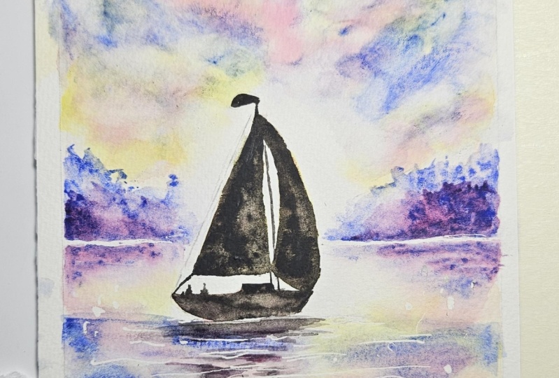
1. SAIL BOAT INTRODUCTION: Hello and a very warm welcome to my online
watercolor class. My name's Karen Mackenzie. I'm a professional
artist, author, and art tutor living in the beautiful
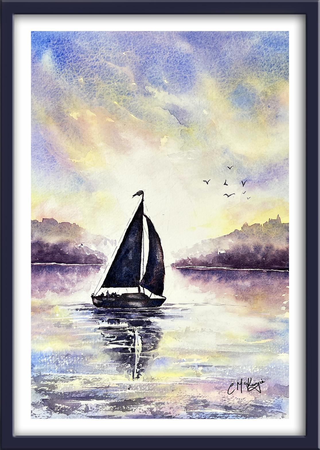
countryside of Yorkshire. Today we're going to be painting this lovely sailboat silhouetted against a glorious sunset. It's jam packed with
watercolor techniques, tips and tricks, and I know you're going to find
it really inspiring. It's suitable for all levels. If you're a beginner, I'm going to guide you every
step of the way. Or if you're an
experienced artist looking for something
a bit different. I've included a copy
of the drawing in the project resources
section so that you can download it and trace
it and then not worry about the drawing because
this is a painting class. In all my classes you
can follow along in real time as I share the techniques that I use in
my own professional work. I've got a lot of classes now on skill share in a range of beautiful subjects where I show you how to keep
your work loose, fresh and spontaneous,
without over fussing. And you'll gain the
confidence and knowledge to incorporate everything you
learn into your own artwork. Best of all, at the
end of this class, you'll have your own
beautiful painting to be very proud of. I've discovered lots of tips and techniques and shortcuts
over the years. Just as in my in person
face to face classes, I'll be sharing these
so that you too can get the same benefits and joy from painting that
have helped me. I'm a big believer in
learning by doing, rather than reading
lots of written theory. You'll be painting right
alongside me in my studio as I demonstrate each process step by step and make your
learning a happy, smiley and practical experience. If you prefer, you can watch the video the whole way through, then have a go at the
painting afterwards. Of course, you can pause
and rewind it at any time. You can see examples of
my work on my website. My style leans towards
impressionistic and contemporary rather
than photo realistic. I like to explore
loose approaches that bring out the color, light, and essence
of my subjects. I'm delighted to be able to
share with you my experience, tips and techniques that I've learned along the way
in my own art journey. Importantly, the
most valuable asset is your own time,
patience, and enthusiasm. There's no such thing as right, wrong, or failure in art. It's all about
learning and growth. Learning what worked well, practicing what you
need to improve on, and moving forward
with each step. Please don't worry
if your painting doesn't look exactly like mine. Lowry. Never worried
whether his look like Angus or Picasso's. We all have our own unique style just like our fingerprint. And with that understanding, it's time to get on
with the painting.
2. Materials, Drawing, Masking to reserve white paper.: Hello and a very warm welcome to my on line
watercolor class. My name's Cary Mackenzie. I'm a professional
artist, author, and tutor living in the wonderful countryside
of Yorkshire. I'm going to be sharing my favorite techniques and
lots of tips with you, such as how to create a lovely, soft, dramatic sunset sky. How to paint the
reflections in the water, and how to silhouette
our little sailboat. Now some of that might
sound a little bit tricky, but it's a lot easier
than you think. And I'm going to show
you how step by, I think you're really going to love painting this
little sailboat. You can either watch
the whole video through and have got the
painting afterwards, or you can paint right alongside me as I guide you through it. Now, regarding my materials, these are the ones
that I'm using. But if you have
different colors, then don't be afraid to use the ones that
you've already got. Most of my paints are either transparent or semi transparent, which will allow the white of
the paper to shine through. This is what gives water
color its wonderful radiance. Tend to keep opaque
paints when I want to cover up the underlying
paper or layer of paint. Now you can see that I've
kept the drawing very simple, minimal detail, so that we get a nice loose free flow painting. And I've included a
copy of the drawing in the project resources
section so that you can download it and trace it and then not worry
about the drawing, because this is a
painting class, you can apply masking fluid to the shapes where you want to reserve the white of the paper, either for highlights or
to paint over by hand. Later on, you do
need to wait for the fluid to dry fully before applying
paint over the top of it. When it is properly dry, you can just rub
off the hard gum either with a clean finger
or with a putty rubber. And you'll see that it leaves behind crisp, defined
white shapes. If the white shapes
are a bit too stark, you can soften them with a damp brush or you can
even paint over it. Now, don't use your
good brushes for this because the gum
will spoil them. Use an old brush or even
the handle of the brush. I also use rubber
tipped applicators because the gum is very
easy to clean off them. You can get a rolling pen, which varies the
thickness of the line, but I tend to use an unwound paper clip for
very fine lines and dots. As you can see, that's
exactly what I'm using here. I've applied a very fine
line of masking fluid along the horizon that will just help to separate the
sky from the sea. I've also added a little sliver just immediately beneath
the hole of the boat. I'm now applying it in fairly
random horizontal strokes, where I want to
reserve the white of the paper for ripples
in the water. When it comes to actually
painting this little seascape, I want to keep the area around the boat both above
and below the horizon. The lightest. I'm
concentrating most of the masking fluid
for the ripples in that area below the boat where the water will
catch the light. As you can see from
what I'm doing, there isn't really a precise
method for doing this. You want to keep it very random, so don't make all your
strokes the same ***gth, make a few that are
thinner than others. Very importantly,
remember to keep them horizontal because
water is level, with a few little dots and splashes here and there.
This bit is done.
3. Paint the Sky and Sea - 1st Layer wet-on-wet: I'm using the wet on wet
technique to paint the sky because that will
give me a lovely, soft b***ded appearance. Wet on wet just means applying
wet paint on wet paper. I've wet the whole of the sky area thoroughly
with clean water. And a large brush, I've got a watery mix of
handsome yellow light, you could use al transparent yellow or even a
cadmium yellow light. Also got ready some
watery permanent rose. First of all, I'm applying
the yellow color now. It's b***ding nicely into
that wet under wash. So I'm getting some
really nice soft edges. Note that I'm keeping the area around the boat
sails very light. I'm not applying the
paint over the top of them when I add my little touches of permanent rose because everything
is still very wet. You can see that, that
pink color is diffusing softly into the yellow
under wash. Again, I'm keeping everything
nice and soft and b***ded. If it's a bit sluggish,
do what I'm doing. Lift your paper up and give it a really good shape to
get those colors moving. The paper is
starting to dry now, so I'm going to stop to paint
the reflections in the sky. We're almost going to
repeat the process, except we're going to reverse the positions of the colors so that they are mirrored below. Just as I did with the sky, I'm thoroughly pre wetting the paper with some clean water. It sounds very
obvious to say it, but water is wet. We do need p***ty of
water to paint the sea. Now I'm applying
the yellow paint roughly in the places which are mirrored below the sky and also underneath
the boat itself. While that yellow
paint is still wet, just as I did with the sky, I'm dropping in the permanent
rose over the top of it. I'm making a mental note
of where the pink is in the sky and then adding that in the water in a
position that mirrors it. It doesn't need to be
absolutely precise because the waves in the sea will
distort it a little anyway.
4. Sky and Sea - 2nd Layer. Paint the distant hills and reflections in water.: If we mixed pink, blue and yellow together
in our palette, we'd end up with a muddy
brown or gray color. There's a danger
that that could also happen if we mix
them on the paper. That's one of the reasons
why it's very useful in watercolor to build the paint
and color up in layers, letting each layer in between. For the second layer, I am wetting the paper, just as I did with
the first one. Before I apply the color, I'm using a large soft brush, although you can't see it
very clearly from the video. I am brushing on the
water very carefully and gently so as not to disturb
the underlying colors. I still want an area of
lightness around the boat, but I don't want any hard edges. I am wetting around
it even though I won't be painting or allowing
the paint to run into that. The two colors
that I'm using for this second layer are
ultramarine on its own, and ultramarine mixed with some permanent rose to give
me a purple color. I'm applying the
ultramarine on its own first, just as before. You can see that that
is diffusing and b***ding nicely into the
underlying wet wash. I'm using the tip of
brush to encourage the paint to run down over the top of the
yellow and the pink. Being careful where to apply
brush strokes because I don't want to cover up those
two colors completely. It's important to
consider that skies tend to take on a personality
all of their own. It would be really difficult to copy exactly what
I'm doing here. In fact, if I was
painting it again myself, my sky certainly wouldn't
look like this again. Whilst I'm encouraging you
to follow this process, do give the water
color a little bit of free rein and let it
do its own thing. If you can loosen up a
bit and go with the flow, you will be pleasantly surprised at the results that appear. If anything occurs that
you really don't like, you've got your paper towel to hand and you can just
simply block that off. As I mentioned when we
did the previous lay, whilst the paper is still wet, you can keep working into it, but as soon as the
paper starts to dry, you really do have to
stop or you'll get some unsightly marks and it
won't look very sky like. Don't be afraid to
tilt your paper. Move it from side to side, give it a good or shake. If needed, you'll find
that the colors will b***d much more effectively than if you try and
do it with the brush. Now, my blue paint is still
very wet. I have no problem. Now, in going over with
my dark purple color, this is going to
add a real good bit of contrast in the sky. If we paint everything
in the same tone, we would have a rather bland
and uninteresting painting. We do need those darker tones
to go with the light ones, to give the painting some depth and that little bit of pizzas. But use your own intuition
here, your own judgment, to see where is
the best place in your painting to add
these darker tones. Remember that I've pre, wet the whole of the sky. Wherever I position
this darker color, it's going to b***d and diffuse into those
underlying colors. But I can also
leave gaps so that those other colors
also shine through. And I'm still getting
the soft transition between one and the other, keeping my eye on that central area that
I want to keep light. I've got my paper towel, just taking any paint away that's run a
little bit too far. You can also use a thirsty
brush, that's a damp, clean brush to lift off any little tiny
areas of paint too. I'm in danger now of
fiddling and overworking it. So I'm going to move
on to the reflections. Painting the reflections
for the blue and the purple that I put into
the sky is no different, really, from when
we did the pink and the yellow colors I
am putting on the. Clear water, first of all, over the whole of the sea, just like I did the sky. First of all, I'm
using ultramarine. I'm painting it on using
horizontal brush strokes, just as I did before. Making these go in and between
the pink and the yellow. We're painting water. Remember to keep it
all very watery. You don't want really thick
paint going over here. Again, I'm making a mental
note of where the blue appears in the sky and trying to
mirror it below in the water. Do note as well that I've left an area of relatively
white space below the horizon because that
is where I'm going to be painting the reflections of the hills when we
come to paint them. I can paint right over the masking fluid because that
dried quite some time ago. No fear of smudging that. Now, I'm going to start breaking up the blue
a little bit with that darker purple color
that I also put in the sky. Although we used some very directional brush strokes
when we painted the sky. Notice that I'm not doing
that when I paint the sea. I am still keeping my brush strokes level because that's how the color
will appear in the water. Even though we've put some masking fluid on to
reserve the white of the paper, you can still leave
some little gaps of white or pale color. In between these
horizontal strokes, I've mixed up some
more purple color with the ultramarine
and permanent rose. I've got quite a lot of
water already on my brush. The paint is much diluted when I'm applying
it to the paper. I'm using the flat of my brush against the paper and
almost dancing across it, really, to create some
interesting shapes across the top of the hill, instead of just
one straight line, I'm using my paper towel to
just dab some of that color off where the hill starts to
go into that area of light. Then I'm doing
exactly the same for the hill that's coming
in from the other side. But you want to just try and vary the shape of
it here and there. You don't want these
two hillsides, either side of the paper
to look like book ends. They don't want to match
each other exactly. Don't get too caught up in defining what the little
shapes are Along the top, the viewer's eye will fill
them in and they might see a church or a clump of
trees or something. Again, block that
color off where the hillside is diffusing
into the light. Then with not as
much color on brush, I get a stronger darker color. I'm going in just
above the horizon, stroking that darker
color along there. I'm using the tip of my brush to just drag that color
upwards and outwards, creating some more
shapes this time a little bit darker
in tone that will push the ones that we've
just painted further back into the distance and give
the painting some depth. Working my way along, adding little random
shapes here and there, joining some of them up again, I shall blot it off with my paper towel as it lightens
towards that light area. Then I'm repeating that again over on the other
side of the boat. Again, remembering to just
keep those shapes different from the right hand side so that we've got some variety
and interest going on now. I didn't need
to wet the paper when I painted the
hills in the last step. But I do need to
wet the paper when I'm painting their reflections. Because once again,
this is in water. The reflections need to have
a nice watery feel to them. And the color needs
to b***d in softly to those previous colors that
we've painted in the sea. Because I have pre
wet the paper, the tone of the purple
color is fairly light. It's mixing in with that
water and diluting it. Then as you bring it down, it's just diffusing gently into those other colors that
we painted on previously. Exactly the same process
at the other side. As always, if we do get
any hard unwanted edges, we can soften them off with our paper towel or
with a damp brush before the reflection
dries completely. I'm adding some more color
just below the horizon line. And that's just giving
us the extra bit of contrasting color
above and below. I've only added a small
amount of paint because I don't want it to go right down to the bottom
of the reflection.
5. Paint the Sail Boat and reflections in water. Bleed colours, Lift off Paint, Blending and Softeni: I want to paint a
sailboat very dark, but not quite black so that it's in silhouette from
the light background. But in my experience, painting a subject
with a black or a very dark color can make it look a little
bit flat and dull. Also because the boat is, IE, the light is
coming from behind, there will be some color
reflecting through from the sky for those reasons. First of all, I'm painting
over the whole of the boat and the sails with the yellow color
that we used for the sky. Then working quickly, while the yellow paint
is still very wet, I'm dropping in
some permanent rows over the top of the
yellow and letting those two colors
mingle and b***d very much as we did with
the sky and the water. I'm using the tip of my brush to fill in the shapes
of the sails and the boat and to encourage those two colors to b***d a little bit more
together here and there. But you can see that
there are still areas of definite yellow and
some definite pinks, as well as the merged orange
color between the two. Don't forget to paint the
little flag at the top, which is also going
to be in silhouette. I've got already mixed
some of the dark purple, to which I've added a little bit of Mars black to
make it even darker. One of the reasons that I use Mars black is because
it granulates. We will get a bit of a mottled
effect with this pigment. But if you don't
have it, use the black that you've already
got. That will be fine. I'm continuing to work very
quickly because I don't want the yellow and pink paint
that I put on to be dry. When I apply this darker color, you can see here how
this darker, black, purple color is bleeding in
to those colors underneath. The overall impression
that we get is that although the sale is
very dark in color, now, there is a glow
coming through it. If you're not a fast worker, I would suggest that
you do the sales first and then do
the boat afterwards, or you could even do
one sail at a time. I've got quite a good point on the large brush
that I'm using, but if you find it easier, switch to using a smaller brush where you've got
the straight lines. Moving on to the second sail and repeating exactly
the same process. And you can see still how wet that yellow
and pink paint is because the dark
color is bleeding into it again and
spreading quite nicely. Paying special attention to
the edges of each shape, making those darker than the central areas
and also smooth. I'm remembering that
watercolor dries about 20 to 30% lighter
than when it's wet. I've got to have a think
of whether I've put enough dark paint on and what it's going to look
like when it's dry. I'm returning to
the first sail and dropping in some more
dark color over the top. Moving on now to
the little boat. I'm applying the same
dark color over it. Giving a little bit
of attention to the different shapes
within the boat, but not too much because
it is in silhouette. It is important though, where there are straight
lines to keep them straight and not have
wibbly, wobbly edges. Then I'm going to use
the tip of my brush again to paint in
some of the rigging. Now, the rigging, of course, doesn't need to be
quite thin lines. We don't want them looking
like planks of wood. Again, switch to a smaller
brush if you need to, or even use a watercolor
pencil or pen. Having said that,
the central flagpole does need to be a little bit thicker in width
than the rigging. Standing back and having
a look at my boat color, it seems to me a little bit too brown and not
on the blue side. I've mixed in some
more ultramarine into my mix whilst it's
still wet, which it is. I'm going back over
and dropping in a more darker blue color to enhance that
silhouette appearance. There's likely to be
some people on board of and also a few other ships. But it's too small
a distance for me to try to put them
in, in detail. I'm just scribbling, dibble, dabbling in with
my brush to create a few odd shapes here and there. The viewer's eye will fill them in and work out what they are. There's no need to fuss
with too much detail. I mix some more blue into
my dark purple black color. And adding this now to get an even stronger and
more intense silhouette. I want it to really stand out against that back
lit light area. It might be that
yours is absolutely fine and you don't need to
add any more dark color. That's really a judgment
call for you to make a bit like the sky
that were painted earlier. As long as it's still wet, you can keep working into it, but there is always that fine
line about overworking it. I just switched to a much
smaller brush to paint that very fine rigging
line that's running alongside the flagpole or the
masters I should call it. Then ironically, after
putting all that paint on, I'm going to use
a thirsty brush. That's a clean, damp brush, to just lift a few
areas of paint where there might
be some highlights on the boat and on the sail. Nothing too stark or drastic, just a few subtle
highlights here and there. I'm ready now to move on
to paint the reflections. Now on your drawing, I
have indicated where the reflections will go
with some dotted lines. Although I'm painting
this quite freehand because we are going
back to painting water, I'm now painting
with clean water, some horizontal lines, where those dark reflections
are going to go. What you don't want is
solid blocks of color, because the waves in
the water will break up and distort the reflections. I am leaving p***ty
of gaps in between those horizontal brush strokes because the reflections in the water not back like
the boat and the sails. I don't need to paint with
the yellow and the pink. First of all, I can go straight
in with my dark color, just as I did with the
hills when we painted them. I mirroring the shapes that
are above in the water below. But of course, with the boat, we've got a little
bit more detail to put in than we
had with the hills. As the reflections get
further away from the source, they will get more
broken and they will not be as strong in color. You don't need to worry
us much now about getting those straight lines
that we have to get on the sails or
the top of the boat. As long as we've got the overall shapes in
the right place, they can be much looser
and impressionistic. I've also still got
the masking fluid on. We won't get the full
impression of what this looks like until
the paint is dry and I remove the
masking fluid will also break up some of these
horizontal lines that I'm painting in. Now, I'm going to add a little bit darker color in the reflection immediately
underneath the boat. That does need
strengthening up a bit because it's
nearer to the source. Wherever I've pre wet the paper before
applying the paint, those lines will be softer and b***ding into
the underlying wash. But there are some areas of
the paint that are going onto dry paper and
that's resulting in hard edges which doesn't
have a watery appearance. We need to use the b***ding and softening technique to fade them into the underlaying water. This is where the b***ding and softening technique comes in, where you simply
use a damp brush to pull the paint away
from the hard edge. B***ding it softly
until the color disappears into the underlaying wash or white of the paper. It might sound like a
relatively simple technique, but it is actually quite
a difficult one to master thoroughly if you
haven't already done so. I do suggest that you
practice this technique because it will make a massive difference
to all your paintings. I have just used a damp
brush to soften some of those hard edges that
have occurred at the ends of my horizontal
reflection strokes. As I've got the
dark color to hand, I'm using dry brush strokes at the very front of the water. If you look closely
at watercolor paper, you'll see that the surface
has a rather dimpled effect, like a series of small
peaks and valleys. The dry brush stroke lets
the color catch the peaks, but miss the valleys so you
get a broken texture effect. You need to work on dry
paper for best effect, And the paint shouldn't
be too watery, the brush shouldn't be too
overloaded with paint. And it is useful to keep some
paper towel handy to remove any excess moisture from the brush or excess
paint from the paper. The appearance of
the brush stroke is determined by the
speed of your stroke, the amount of paint
on your brush, the surface of the paper, the wetness of the paper, the amount of pressure
that you actually apply, and the angle of your brush. If you want to
depict rigging lines on boats or telephone wires, then use the brush tip that produces a sharp,
thinner, broken line. Whereas if you scuff it with the side or the
belly of the brush, you will get wider marks. That's very useful for
creating waves in the sea, glistening highlights on a
lake or snow on mountain tops. If you splay the brush bristles, the marks can resemble weathered wood grain tree bark
or even foliage on trees.
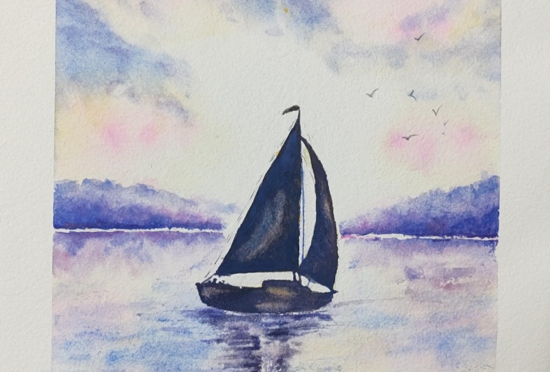
6. 5. Recover Highlights. Strengthen Tones. Add Rigging and Birds. Use Sandpaper for glistening highlig: I've removed all
the masking fluid, now I want to recover some
highlights in the painting. And I'm going to use
some magic sponge. Although you can use a brush and some water to lift off paint, I want to introduce you to
magic sponge eraser because this little tool works miraculously to remove
unwanted paint, you can use it to lighten
an area that is too dark or even strip the color
right back to white paper, depending on which
color you've used. Because some colors do stain in the paper
more than others, just tear a small
piece of the sponge, dip it in some clean water, then squeeze it to
just damp and rub over the unwanted paint until
the color is removed. Use a paper towel in
between to blot and get the last bit of
paint off and keep rinsing your sponge out
during use to keep it clean or even throw it away
and use a fresh piece. If you accidentally get a
blob of unwanted paint in the middle of your
painting or you just want to lighten
the tone of an area, give it some highlights. This little piece of
sponge will become your best friend because it's normally sold as an
abrasive household cleaner. It does tend to rough up
the paper a little bit. Take extra care if
you're painting over the area that you've
sponged with another color. As you can see, I've
sponged away and lightened the tone of a blob of yellow and pink color the
top right hand corner of the sky that I
really didn't think went well with the
rest of the sky. I'm much happier now
with that lighter tone, but it's still looking
a bit too stark. I've painted over the whole of this area with clear water, Now I'm adding on
top of that wet, clear water wash some
of my ultramarine blue. This is quite a good
example of how you can recover and alter something
that's niggling you. In one part of your painting, I have heard it said many
times that you can't alter or cover up your mistakes in watercolor, But in natural fact, I have found there are quite often lots of tips and tricks and methods like this that you can use to work
your way around them. The important thing to
remember here where you are adding paint to a sky that
you've already painted, is to apply that wet under wash a lot further than
the area that you are actually going to paint by pre wetting the area of
paper that you're going to paint with clear
water first gives that paint room to travel
before it reaches the edge. The layer of paint that you're putting on now will soften and gently b***d into
the previous layers of color that you
put on earlier. You'll avoid getting
those unwanted hard edges that you don't want in the sky. Now, if you are quite happy with the sky that you've already
got in your painting, don't do this just
for the sake of it. Instead, why not practice
it on a spare piece of paper just so you
master the technique? Here's the before and after comparison of the difference
it's made to my painting. I've gone back to my dark black, purple color because I want
to add a few extra tones. Just darken those
horizontal strokes immediately underneath
the boat itself. And a few of the
ripples around and about working wet on dry, wet paint, on dry paper. Because of that,
I'm going to have a few little hard edges that I will need to
use the b***ding and softening technique that
we use before just to soften the edge of those ripples into the underlying wash. I'm also using the dry
brush technique that I get a broken line in some places give me that
rough texture to look. I'm just re,
establishing some of the little shapes that
have perhaps lightened a little bit too much on drying when you're almost at the end of a
painting as I am now. There's always this
fine line again between doing the little final details
that need to be done. And overworking and
fiddling and fussing. The best thing to
do is to walk away. Leave me painting alone. For a few minutes
or an hour or so, Come back to it
with a fresh eye. And then analyze and make a judgment of what
does need to be done, but what is best left alone
and not tampered with. Now, there are a few
more rigging lines that I want to put
in on the boat, but I'm going to use a
pencil for these because I don't want them to be
too dark and overpowering. Make sure that your pencil
has got a nice sharp point, and if necessary,
use a ruler to help you with some
straight lines if you don't have a very steady hand. I'm also going to use my little pencil to add
a few birds in the sky. Using the pencil
first before painting them means that you
can adjust them, change them around, or even
remove them altogether. If you want to do,
it's very important to keep the size of
the birds relative to the other subjects in the painting,
particularly the boat. We don't want any big
albatrosses flying overhead. Keep your birds quite small. Make sure that they are in
different positions of flight. Make sure that you're happy with where you've
positioned them. Before you add a little paint, these birds are in
the far distance. I've got quite a watery
mix of my dark color. I'm literally just going over my pencil lines with
this darker tone. For some reason the eye
does like to look at groups of odd numbers rather
than groups of even ones. It's actually called
the rule of odds. So I've done five little birds and I'm going
to add another two to make that up to a
little flock of seven. Finally, I want to show you how easy and quickly you can create a few more glistening
highlights in the water just by dragging a piece of rough
sandpaper across it. As with most of
these little tricks, less is more. Don't overdo it. On that note, I'm going to
say the painting is finished. I do hope you've enjoyed painting this lovely
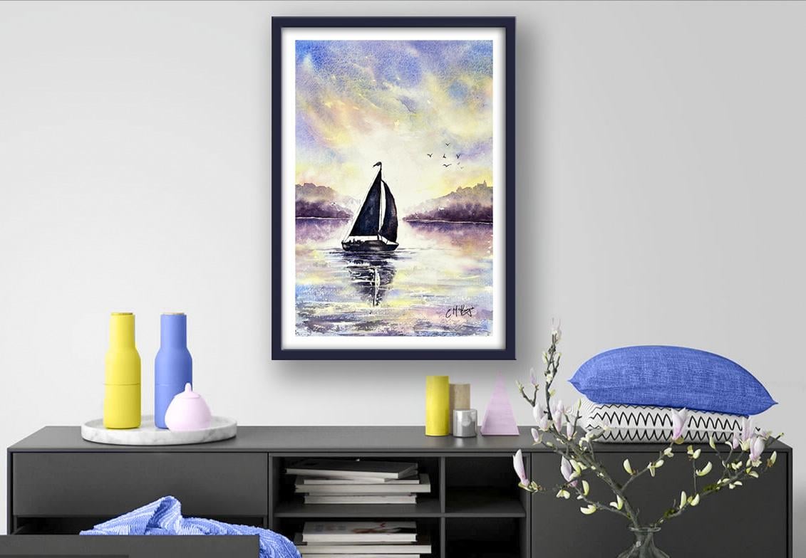
sailboat in the sunset. It'll look, even in a frame, really love to see your
own finished painting, which you can upload to
the your project section. If you could just take a moment to leave me a short review, that also would be really great. I do hope you have enjoyed this video and it's
encouraged you to have a look at some of my other
classes in the meantime. Thank you for joining me, and I look forward to seeing you next time. Happy painting.
7. SAIL BOAT FINAL THOUGHTS: Well done on completing the
class and also the painting. If you've been painting
alongside of me, we've covered quite a few
different techniques. We've simplified the drawing
from the reference photo. We use the wet on wet technique. Wet paint on wet paper to create a beautiful
soft sunset sky. We looked at how to
paint reflections, the water, using
directional brush strokes. We learned how to
bleed different colors into each other to
create a back lit glow. We used the b***ding
and softening technique to soften any hard edges
that were in the water. We also looked at how to lift off paint and
recover light areas. I would really love to see
your own finished painting, which you can upload to
the your project section. If you could just take a moment to leave me a short review, that also would be really great. I do hope you've enjoyed this video and it's
encouraged you to have a look at some of my other
classes in the meantime. Thank you for joining me, and I look forward to seeing you next time. Happy Painting.
 Carrie McKenzie, creating painted visions