Transcripts
1. DUCKS: INTRODUCTION: Hi there. My name
is Carrie McKenzie. I'm a professional artist, author and R2 to live in, in the beautiful
countryside of Yorkshire. This class is suitable
for all levels. If you're a beginner and
have never been to before, I'll be guiding
your every step of the way throughout
the whole process. Were built in how to
blend and bleed colors into each other without
getting the dreaded mode. We'll look at how
to lift off Paint, which is sometimes as
important as putting its own. We'll look at how to paint fine details such as
the eye and logic. That is a many, many more. So that at the end of the class, you'll have your own
beautiful little painting to be very proud of. I've discovered lots of tips and techniques and shortcuts
over the years. So just as in my in-person
face-to-face classes, I'll be sharing these
so that U2 can get the same benefits enjoy from painting that have helped me. A big believer in
learning by doing, rather than reading
lots of written theory. You'll be painting right
alongside me and my studio. Aside, demonstrate each
process step-by-step, and make your learning a happy, Smiley, and practical
experience. Or if you prefer, you can
watch the video the whole way through and how they got
the painting afterwards. And of course, you can pause
and rewind it at anytime. I provided a reference
photograph and also the drawing for
you to download. Now don't worry about
tracing the drawing because this course is about
painting, not drawing. You can see examples of
my work on my website. My style leans towards
impressionistic and contemporary rather
than photorealistic. I like to explore
loose approaches that bring out the color, light, and essence
of nice objects. I'm delighted to be
able to share with you. May experience tips
and techniques that I've learned along the
way in my own Art journey. Importantly, the
most valuable asset is your own time,
patients and enthusiasm. There's no such
thing as right or wrong or failure in Art. It's all about
learning and growth. Learning what worked well, practicing what you
need to improve on, and moving forward
with each step. Please don't worry
if your painting doesn't look exactly like mine. Lowry never worried
whether he's look like golf of Picasso's. We all have our
own unique style, just like our fingerprints. With that understanding, it's time to get on
with the painting
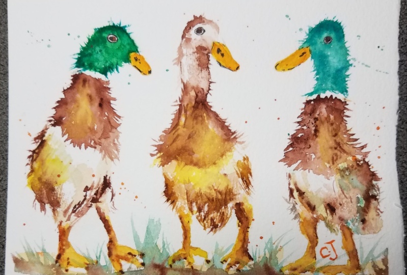
2. Materials, Composition and Drawing. Paint the beaks and feet; Wet-on-Dry Technique: Hi there. In a very
warm welcome to the first part of this
online watercolour workshop. In this class, we're
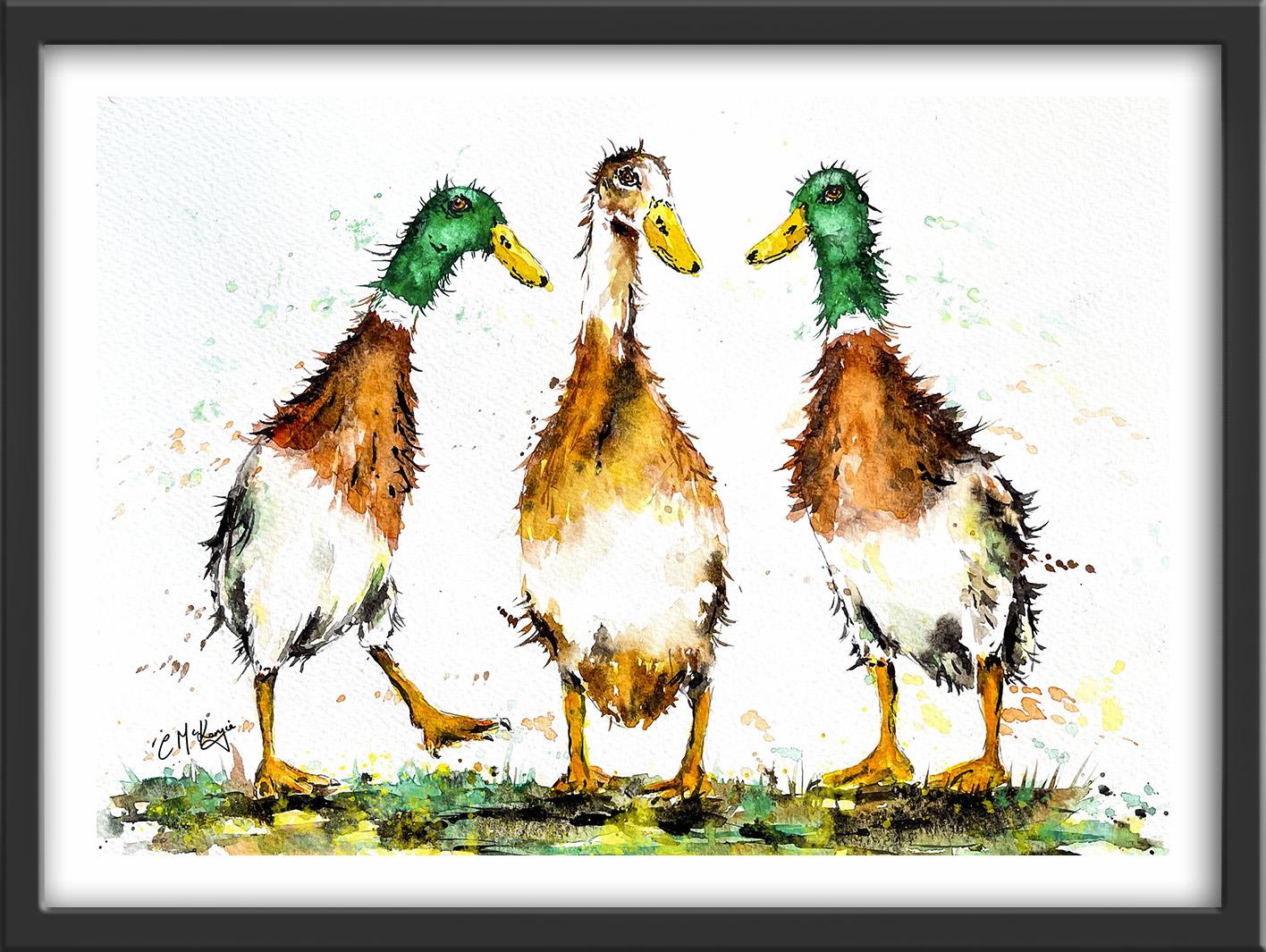
going to be painting these lovely, quirky
little Ducks. We've got fabulous feathers and beaks, feet and foreground. That don't worry because
I'll be showing you from start to finish how to tackle all these different
elements so that you can create your very own
funny Ducks painting. You can either watch
the whole video through and how to go to
the painting afterwards, or you can paint right alongside me as I guide you through it. Now these the colors
that I'm using. But if you've got
different ones, do feel free to use what
you've already got. Most of my parents are either transparent
or semi-transparent, which will allow the white
of the paper shine through. And this is what
gives you Watercolor. It's wonderful, radiant. Tend to keep our PECC
paints for when I wanted to cover up the underlying
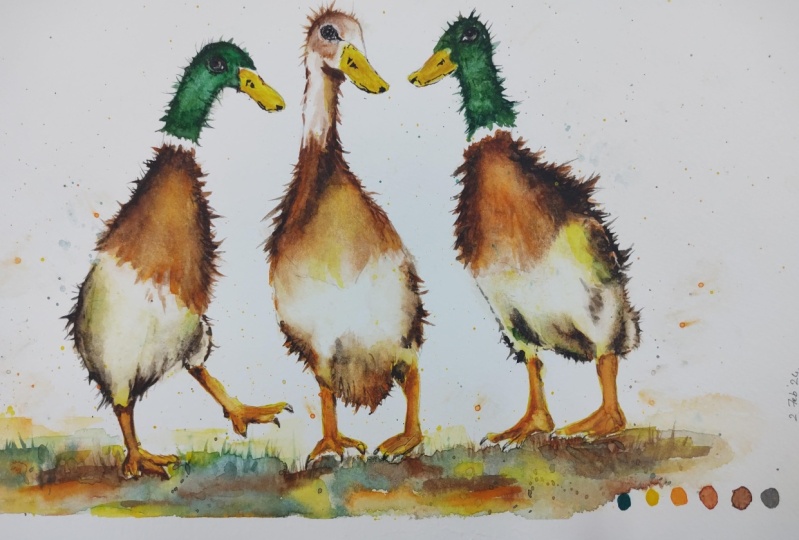
paper all layer of paint. To get the composition
that I had in mind. I put three separate photographs together in less software
editing program. That is the beauty
of artistic license. Now you can see that I've
kept the drawing very simple, minimal details so that we get a nice loose free fall painting. The first thing
to do, of course, is to transfer the drawing
to your watercolour paper. You can do that free hand if
you're a competent drawer. Or you can use some
graphite transfer paper or even rub the back of
the drawing with a pencil, turnover the sheet, place it
on their watercolour paper, and then go over the
drawing outlines with a ballpoint pen. We're starting off with
the wet-on-dry technique. That's wet paint on dry paper, which gives us more control. Stronger color. I'm using
hansa yellow light. You can use Arial and, or any other light yellow color. And I'm using the points of
my brush to just fill in the beaks of the
three little ducks with these yellow color. My parents is quite thin. It's about the consistency
of tea or single cream. I'm just brushing that colour lightly over the beak shapes. You don't want to rub
too hard on the paper. All it does disturb
the little fibers. I'm using the same color
to paint the feet, to PubMed brush, just to paint into those tiny
little tour shapes. If you do leave some little
gaps of white paper, don't worry about it because we don't
want it to look like a child's chlorine that we've
filled in all the lines. And also we're
going to be put in some more color on
top of this one. If you've not heard of
these Ducks before, they are actually called Indian Runner Ducks
because they were discovered in the West Indies
and brought to Europe. Unlike the Ducks that
we're more familiar with, these are very much like
penguins standing up straight and they can
run extremely fast. And in some cultures, they are actually known
as penguin Ducks. The other little
interesting fact about them is that they're
Les Green Eggs, not yellow or white or brown
3. Paint upper bodies; Wet-on-Wet technique, Harmony & Variety, Tonal Values: The reason that they
can stand upright, so unlikeable the Ducks, is because their little legs, a place further
back in the bodies, mix some burnt sienna, which is the light golden brown, and some burnt umber, which is a darker brown and a very dark mix with burnt
on that plus mars black. So three separate
colors in my palette. Starting with the burnt sienna, I'm using the point of my brush to paint
a little feathers, bearing in mind the direction that the feathers
are growing in. I didn't a little bit of orange
just here in there to add a bit of variety.
Didn't see that. I'm using a darker tone on the left and right edges and a lighter tone
in the middle. And the reason for that
is that we need to convey the roundedness of the
little bird's body. Then some burnt
umber that darker brown just on those outer edges. And it's by using these light, medium and dark
tones that we can convey assaults of 3D effect. Then while the
paint is still wet, I'm using the points of
my brush to flick out of fuel little feathers
coming out from his body. So although we can't
actually see them running, these little flicks will give us a sense of movement
in the feathers. Again, while the
paint is still wet, I'm using my very dark
mix of brown and black to just add some more dark
tone to those outer edges. I'm flicking those also
outwards and downwards. I am now using what's called
the wet-on-wet technique. That's wet paint on wet paper. So that allows less control. But what is nice about
it is that we're getting this lovely dilution of colours were getting
softer edges. And where we've got
the different colors. They are intermixing and
Blending gently with each other. So it is looking very naturally
feather-like and soft. I'm using exactly
the same process for this little Duck on
the right-hand side, starting off with
the burnt sienna and some touches of orange. And then the burnt umber and the very dark
black will go on to those outer edges just as we
did the first little Duck. Remember to keep your
strokes lights and feathery and going in the direction that the
feathers are growing in. And keep the dark colors on the outer edges left and
right on the lighter color, the lighter tone in the middle. You can also see
that I am missing out little bits of white
paper here in there. Now they will serve as
highlights in the body. But if I don't like
them later on, when I'm finished, I can
always fill them in. But for now I just want one or two little white
highlights to remain. Now whilst I'm
painting another area, I'm still mindful of what's going on in the area
that I've just painted. And a thumb kind of dancing
over at my first little Duck. The colors have run into each other in
that middle section. So I'm taking a clean, semi dry, thirsty brush and just lifting
some of that color out. I do sometimes think
it's as much about lifting color off as it
is about putting it on. That makes a difference to the overall look
of the painting. I'm flicking the brown pants up on the left and right
sides of his little body. Just as I did before, to convey that
sense of movement. I think on this little bird
you can see a little bit more clearly how that wet-in-wet
technique works. You can see these dark
colors just blending into the light color that
I've put on previously. And if you haven't already
used this technique, it's probably worth spending just a few minutes
practice in it beforehand. Now just adding little flicks of feathers coming down over
the lower half of his body, which is quite
pale, almost white. And I'm mindful that there be, I've stopped a
little bit abruptly on the first little ducks, so I'll knit back over there now and I'd a few more
of that is coming down over the lower
part of his body to the great thing about this part of the painting is that you don't need
to be too precise. In fact, it kinda helps
to convey the movement by letting your brush go a little bit crazy
here in there. So bit by bit, we are building up the density of the feathers going around Little Bodies and giving
them a more solid feel, an appearance in unconscious now that the paint
is starting to dry. So I don't need to get on and use my dark very dark brown, black mix to get those dark tones on the
left and right side. So that's what I'm doing now. Because if I do leave it to dry, I would have to wait for it to completely dry and
then re-wet it again in order to get this
nice soft blended effect with the wet-on-wet technique. Now, another way to paint
those little flicks of feathers coming out from his
body is to use a pencil. As long as the
paint is still wet, they pencil or drag it out in a much didn't align then
you can with a brush. So quite useful to have
that to hand as well. Now, with the middle Duck, I don't want his
upper body to be quite as dark as he's
tool little friends. So first of all,
I've just painted on with some clear water and that will dilute and we
can detune that again, I'm using just the same process as I did with the other two. If we check back with the
reference photograph again, we can see that his
upper body colours doesn't stretch as far
down as the other two. And he's also got quite a
deep shadow on his neck area. That's where he's
twisting his neck and the shadow is
underneath the muzzle. The other difference, of course, is that the little Ducks
to the left and right have little white colors separating the brown upper parts of
their body from there. Very emerald green
Heads and Necks. Whereas our central Duck doesn't have a green
head or neck at all. He's just all brown and white. I've no idea what the biological
reason for it is that these little endian
Runner Ducks do come in different
colors and sizes. I think we've got a
nice representation here with our little trio. And cause it is good to introduce a little
bit of variety. If everything look the same, it would be boring. So we've got a nice little
break in the color scheme. While we're on the
subject to Variety. Note that their little heads are pointing slightly in
different directions. Their feet are positioned very
differently to each other. And they're bodies are also positioned in different stances. So although we've got some
very similar looking ducks, in some respects, we've
got those differences. We've got that
Variety that keeps the composition from the come
into harmonious and flat. And that might be
something useful to consider when you are
designing your own paintings.
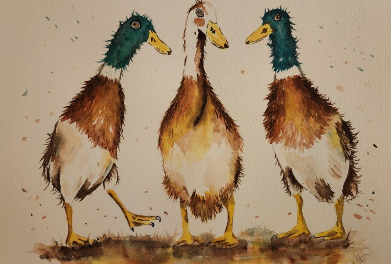
4. Paint the Heads and Necks; Lift off Paint Techniques. Paint the Lower Bodies, adding shadow: I've just mixed a little bit of yellow in with my viridian. I wanted it to be
more of a yellow, a green, than a blue-green. But one of the beauties of using viridian is it's one of the fuel greens that
actually granulate. So you do get a little
bit of a mottled, variegated texture with it, which will help the feathery
look that we're after. Painting the Heads wet-on-dry. So I've got plenty of control with where
the paint is going. The feathers on the
neck and head and much smaller of cost than
the ones on the body. But I'm still using those
little downward strokes, using the brush in the direction that the
feathers are growing. And just to set it before, I'm using a pencil to pull
out some of that color into little flicks going
around the head and the neck. Now although you want to keep to the contour of the
neck and the head, you don't want to make these little flicks
all the same in terms of size and shape
and distance apart. So you don't want
them to look like little match sticks going
all the way around. I'm just as we did
with the Bodies and using that very dark
brown black color to add some dark
tone in order to convey the rounded shape
of the neck and the head. And again, adding some
little black flecks again with the tip of my brush, which is a little
bit on the big side. So I'm just swapping over to a smaller size brush to get some very fine that the
reflex coming out. Now I'm going to repeat
exactly the same process to paint the green head of this
ritual Duck on the right. Now just speed the
video up a bit for this because you've already
seen me do it once. I do hope by the way,
that you've remembered, to leave the little
white color in-between the brown upper bodies
and the green neck, as well as adding
the dark color to the right and left
sides of the neck. Also add a few little
touches in the center of the neck and just
below the chin line to sculpt the roundness of
the neck and the head and show the little dimples and
shadows that are there to. Now when it comes to painting the head in the neck
of the central Duck, I've reverted back to the burnt sienna and burnt umber colors that were
used for his little body. When I'm checking back with
the reference photograph, I can see that quite
a lot of the head and particularly the
neck remain way, so we don't need to put
a lot of colour on here. I'm paying particular
attention to the dark shadow
that's underneath the chin area going
down this side, the right-hand side of his neck. And I'm flicking out that brown paint just as
I did the green earlier. Very much exaggerated,
of course, these flakes from the
reference photograph. But this is where we can
use artistic license to add a bit of quirkiness and
character to our painting. In fact, as I'm just looking at his body
that I painted earlier, I think have under don't really the feathers inflicts there. So whilst I've got
the brown Pune, so I'm just going to add a few more little flicks and
feathers here and there. Watercolor just tend to dry. About 30% lighter than
when you put it on wet. So it's not always easy
to judge the right tone. But the beauty is of course, it's a lot easier to add more color than
it is to takeoff. But having said that, I am now going to
show you a couple of ways that you can
Lift off pin where you want to either lighten the tone or recover
the white completely. Now although you can use a
damp brush to lift off Paint, if it's really stubborn
or you want to get it even almost back to white Magic sponge is just that
little bit more effective. It's often called magic eraser. And you can buy it
from Art retailers. They can also buy from the cleaning section in
local supermarkets or thrift stores where it's sold as a general cleaner for
others and skirting boards. All you need to do is
tear a little bit off the oblong shape
that it comes in, dampen it in some clean water, and then rub the unwanted paint gently until the
colour is removed. Keep you within your
paper towel in-between, Robin, to block that
last bit of pins off. And you'll keep rinsing
his sponge during use to keep it clean or even throw it away and users under
the small bit. Now, it might be that you
don't need to do this at all. That you've retained some of
those lovely light tones. The trick now is you
do need to use it, is not to strip off
too much color. If you don't have any
magic sponge to hand, you can always use a small
stiff bristle brush, dampen it in the usual way, and then scrub off of
the paint with that. And again, blot with
your paper towel. I'm now going to paint the lower parts of the
little Ducks bodies. Now, although I said
there were whites, actually they're not pure white. There is quite a lot of color, particularly in the shadows and in the little dips and
dimples in-between the feathers that have popped up the reference
photograph again, so that you can see very
clearly that there are in fact, quite a few shadows and
colors in these white areas. Now a lot of people think
that shadows are gray, but in fact, there can be quite a lot of coloring shadows. And if we did use gray on the lower half of
the little Ducks body, it would look very dismal and disjointed from the
rest of the painting. So I'm using all the same colors that we've been
using up to press. I've got a little bit of yellow, little bit of burnt sienna. And I'm also adding
a little touch of emerald viridian green
because that again will tie in and give a little
bit of Harmony to the painting we talked earlier about the
need for Variety. But we do also need
a degree of Harmony. The viewer's eye will move
around the paint in much more easily if there is a pattern
to shapes and colors. And even in the shadows, we need to add different tones, light, medium, and dark, to convey the depth of those
shadows where they occur. The lightness of the
shadows where they recede. And that's why I'm adding
some dark color now into the light and medium shadows that
I've already painted. Once again, this helps to convey the rounded shape of the little bodies that 3D
effect that we're after. Now we are still
painting feathers. So we need to keep those
brushstrokes shorten directional following the
contours of the body. Pay particular attention to
where the leg is coming into the body because there is some deep shadow
either side of it. But the message here
is to keep it subtle. We don't want to overdo
all the shadow areas and lose the fact that this area
of the body is quite white. And just as before, I'm adding some little flicks of feathers coming out
in that dark color. And just a little reminder
here that these little flakes do need to be random in
terms of shape and length. And although this should be going in the similar direction, you don't want them all to
follow a line of soldiers. And it's probably useful to
remember the old saying. Less is more. So you don't want to
surround the whole outline. Leave little gaps
here and there. So that you've got some areas
where you've got flicks of feathers and a few little
areas where there aren't. The process that I've just
done for the lower body on the left little Duck is exactly the same
for the other two, with the only difference
being that there is no green on the middle Duck. And also the shadow
at the base of his lawyer body is much stronger than is the
tool little friends So I'm just going to let
the video player know while you watch me complete
the rest of this section.
5. Paint the eyes. Add another layer of colour to the beaks and feet; Layering & Blending : Now the eyes a very small in terms of the
overall painting. So we don't need to add
a lot of detail here. I'm using a mix of burnt sienna with a
little bit of orange. And I'm just painting over
the whole of the eye shape, leaving that little sliver
of white around the eyes. If you have forgotten
to leave that sliver of white paper around the
eyes, don't worry, you can always use a bit
of white gouache to go around it later on when the
paint is completely dry. And I'm going to
leave the eyes there for now because I can't add the black until the color that I've just put on is bone dry. So I'm moving on to add another layer of colour
to the feet and toes. A pretty wet them with
some clean water. And then I'm just trickling
some orange color down the left-hand side of
the first little leg and coming along underneath the
tools that colours spreading across into the wet wash where
the yellow was previously. It's not completely
obliterating the yellow. We're still getting that
lighter yellow tone on the right-hand side, which is where the light
will be catching them. And I'm repeating that process. For the other five little lakes. Before the paint dries, I will be adding some
dark brown color. So if you're a slower worker, don't do all these
likes, it won't. She could do one
or two at a time because I'm working quite fast. The paint is still wet. So I can go in and add
my very dark color to emphasize the tones
at the far left. The little marks
in-between the tools. If the paint has dried, then I would have
to pre wet it again with some clean water before
I did in the dark colors. You don't want to
completely outline the whole of the ligand
for with this dark color. Otherwise it's going
to look again like a children's coloring book
that you've filled in. So you want to do a sort
of hit and miss approach, add a little bit of
dark then this a bit, and then I'd a bit more where there are any
missing bits, the viewers, I will simply fill them in the dark color to spread too far more than
you wanted it to. Just simply use a damp, clean brush to lift
it back off again. Once you're happy with
the overall shape of the feet, legs, if you want to do, you can just add in
a little bit more orange and let that floor to
give it a bit more vibrancy. Or your painting might be
perfectly fine, just to say is. I've also added a
few little dashes of black where the talons are
at the end of the tools. Another option you
can use if you are getting some hard edges
because the paint has dried, is to use the blending
and softening technique. Use a damp brush Pull the pen away
from the hard edge, blending it softly until
the color disappears into the underlying wash is another technique that
I would urge you to practice if you've
not already done so because it will make such a difference
to your paintings. I'll let the video run
now whilst you watch me finish the legs and toes
of the other two birds. And finally, just to
complete this section, we're going to apply a
little bit more color, just as we did with the feet and legs to the literal Ducks beaks. At the moment, they are
rather flat looking. So we need to add
some touches of orange and a couple of light
switches have burnt sienna. Now the beaks are very hard, almost plasticky soft surface. So we don't worry
as much here about hard edges as we would
do in other places. So I'm blending and softening
some of those edges, but others unleash indiscernible
6. Add details to the eyes and beaks. Paint the foreground, background and intensify colour; : This is a very small area
that I'm going to paint now. So I am using a black waterproof pen
with a very small nib. I think it's a nought 0.3. If you've got a
very steady hand, There's no reason
why you couldn't use a small brush with a very fine point and
some black paint. In fact, the advantage
of using paint instead of a pen is that
if you do make an error, you can sponge it off with the magic sponge
like we did earlier. However, because it is
such a very tiny area, you'd probably end
up washing out the whole of the eye and
having to start and do the I again with the
permanent black pen marker. Of course, once it's on it is
on your can't wash it off, like you can do with paints. So if you are using a
pen, take your time. Don't rush. And try not to completely obliterate
the light brownie, orangey iris color that
we've put on earlier. Because if you do paint
them completely black, they're going to look a bit unnatural and as
if they are stuck com I suppose if the
worsted couldn't, the worst than that did happen, you could always use a bit of opaque colored gouache,
awesome opaque acrylic. I know that wouldn't
go down very well with watercolor purists. But this is a very,
very small area of the painting and needs most. And you'd be amazed
at what some of the Old Masters used to
use in their paintings. I'm also going to use the black
permanent waterproof pen, tool paint, the
details in the beak. They've got quite a tiny nostril in the beat towards the top end. And again, just like the, I don't make it too
dense and too dark or too much of a definite shape. Hopefully, you can see from the close-up that I am just making a number of little dashes and squiggles and join in
a few of those up. I'm also indicating the division between the upper
and lower beak. Again, not outline in it completely a bit of
a hit and miss line. The very thin, almost
scratchy kind of appearance. They do also have a little rectangular black mark on the very tip of their beak. But again, keep these little
marks subtle so that they become a part of the painting that don't completely dominated. If you're at all worried about
using the waterproof pen, concerned it might
spoil your painting, but you'll are
reluctant to as paint because it is such
small markings. The other tool that you could use would be a
watercolor pencil. Just make sure that it's
got a really sharp point. And if you didn't want
to use a strong black, you could even use a dark gray for any other fine
details at this stage, the best thing to do is
actually to walk away and leave the painting alone for a bit and then come back to
it with a fresh eye. There's always a danger of fiddling too much
and overwork in a painting that
just come a point where you've really got to
sit on your hands and stop. So I think that's what
I'm going to do now. I'm going to have a nice
cup of tea and come back to finish the painting
with the foreground. I'm going to be painting
the foreground and adding a little spatter to the
background using the same colors. If you haven't already use
this pattern technique. Here's an information sheet and you can pause the video,
have a read through it, and then continue painting
a very abstract foreground. Because I don't
want it to compete with the stars if the shear, which is our three little
endian Runner Ducks, I'm using exactly
the same colors that I've used for the
rest of the painting. So first of all, I'm using my orange color and I've just brush them of
that cross the foreground. And whilst I've got the
orange on my brush, and now using a flicking action to spatter some of
that color into the background around
the Ducks where there is more likely
to be some movement And working quite quickly so
that the foreground colors blending and softening to each other and adding some yellow. Now, again, using the paint that's on
that brush to spatter, that is to false the paint off
onto the watercolor paper. To tie in all the colors. And now add in a little bit of viridian into the foreground. Just a few little
touches here and there that help us to bring in little bits of unity and harmony into the overall
look of the painting. Because I'm painting wet in wet. You can see that I'm
actually getting some quite interesting shapes in the foreground without having
to really do very much, just like we did the
flux for the feathers. You can use the tip of your
brush to just flick some of that color upwards
to resemble grasses. You can go in-between the little toes and it doesn't
matter if you actually get a little bit of
paint of the top of the feet because they
are stood in this graph. So some of it naturally
will flick up around them. And now I'm spattering some of another region around
the little heads. So it looks as though
the Heads, the moving. And it is important
to try and hi In the colors of the spatter
with the areas of paint, the shapes that you are
spattering next to. Can use the tip of your
brush to lengthen some of those little dots of
spatter there in the shapes. And if they are too dark, you don't want them to
stand out too much, you can just block them with
a paper towel and reduce the tune with the paint. Now In Watercolor, we work
from light to dark, usually. So the light colors are on. And I'm now adding the darker
color, the burnt umber. And again, I can flick
some of this color upwards to resemble
some darker grasses. When you are flicking
the grass shapes up. Do remember to do them in
the same way that we did. The flux for the feathers. Keep them random. You don't want them to be all
uniform in a rural standing up like a row of matches
or a real of soldiers. And then skip the
foreground some depth. And now brushing on using horizontal
strokes to begin with, the very dark black brown
that annexed earlier. And I'm using the dark color Spata around the lower
parts of the bodies, mainly where I've got
that really dark paint. And I'm working my way now
around the foreground. And in little bits
of different colors where I might have missed a bit where there's a gap or where we need a little
bit of enhancement. Now, I could stop here. You could say that
the painting is finished and that'll
be perfectly fine. But I think I mentioned
earlier that watercolors dry, about 30% lighter than
when you put them on. And I do feel I've lost some of the orange and yellow tones, the little bird's body
and in the foreground. So what I'm gonna
do now is leave my painting to dry completely. And then I'm going to add
some glazes of colour. Now, if you haven't used the
glazing technique before, here's some
information which you can pause and read if you wish. In simple terms, glazing is just applying another
layer of very thin, transparent wash of color
on top of underlain ones. So you allow the layers of color below or to shine through. But you can also, by doing this, add some richness, visual
interest and depth of colour. You can glaze over the whole of the painting or just
a portion of it. The important thing to remember is that
each layer of paint must be completely bone dry
before applying the next one. To avoid mixing the pigments together and creating
the dreaded mood. You also need to use gentle strokes with
a soft brush so that you don't disturb those
underlying layers of paint with too
much brush pressure. I've mixed a pool of very thin, watery yellow and a
thin, watery orange. I'm just kind of drizzling are trickling this paint
over the top of the areas that I want
to add a bit more color to make them a little bit
more vibrant and interesting. I'm only applying the color in those little areas that I think of dulled down a
bit as the pins, it's been drying and just
need a little bit more zest. I'm bringing back to life. I think you can see that
now with the central Duck, how that little glaze of yellow, I've given him a, just a
little bit more pizzazz. I'm also adding little bits of yellow there, feet and legs. I'm just working my way
around the painting, adding these little
spots of colored glaze here and there where I
think it needs a boost. There's no definite prescription for where to add the glaze. When you do your painting, you'll need to just have a good look and assess
where you think you're needing some extra color and apply it to those portions, do it just slavishly follow
what I'm doing because your intensity of
color might be very different when it's
dried to mine. And remember that even these
little glazes of color, just like when we apply, any watercolour pin, will dry lighter than when
we first apply it. To tie the overall
painting together, I'm just adding a
few little touches of yellow and orange. Now in the foreground, it does look a little bright at the moment, but as I've said, these very thin washes of color will lighten
as the paint dries. So I think it's definitely
time now for me to stop and call the
painting finished. I do hope you've
enjoyed painting our quirky little Runner Ducks are called nine Paddle
Waddle and Quack. Be interested to see what
names you will come up with. In the meantime, I hope to paint with you again very soon. Really love to see your
own finished painting, which you can upload to
the Your Project section. If you could just take a moment to leave me a short review, that also would be really great. I do hope you've
enjoyed this video and it's encouraged
you to have a look at some of my other classes. In the meantime, thank
you for joining me and I look forward to seeing you
next time. Happy painting
7. DUCKS: FINAL THOUGHTS : Well done on
completing the class. And also the painting. If you've been painting
alongside of me. We've covered quite a few
different techniques. We've simplified the drawing
from the reference photo. We use the Wet-on-Dry Technique, putting wet paint on dry paper. And then we use the
wet-on-wet technique, putting wet paint on wet paper, using directional brush strokes to give us the
impression of feathers. We also looked at
how to lift off Paint and recover light areas. And we use the glazing
technique to add a little bit more
richness and depth of colour to the overall
look at the painting. I would really love to see
your own finished painting, which you can upload to
the Your Project section. If you could just take a moment to leave me a short review, that also would be really great. I do hope you've
enjoyed this video and it's encouraged you to have a look at some of
my other classes. In the meantime, thank
you for joining me and I look forward to seeing you
next time. Happy painting
 Carrie McKenzie, creating painted visions