Transcripts
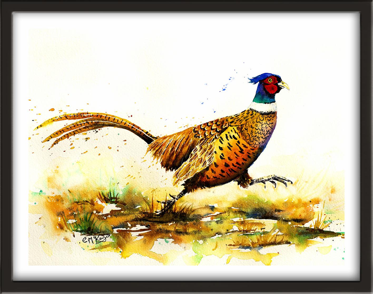
1. INTRODUCTION: Hello, and welcome. This class we'll paint
a vibrant pheasant in watercolour full
of rich autumn color, flowing tail feathers
and expressive detail. This is a perfect project for building confidence
with layering, tonal values, and
feather texture or while keeping a fresh
loose watercolor feel. We'll explore
techniques for building depth and creating
soft blends of color and how to use color and turn to create
a rounded three D effect. It's suitable for all levels, including beginners because I'm going to be guiding you
every step of the way. And I'll be sharing all
the techniques, tips, and tricks that I use in
my own professional work. I've included a copy
of the drawing in the project resources section so that you can download
it and trace it, and then not worry
about the drawing because this is a
painting class. I am a professional artist, author, and tutor,
and over the years, I've sold a lot of
work across the world and helped hundreds of people to learn more about watercolour. You can see examples of
my work on my website. My style leans
towards impressionism and contemporary rather
than photorealistic. I like to explore loose approaches that
bring out the color, light, and essence
of my subjects. I've tried to
replicate this across all the many other videos
that I have on Skillshare. I'd love to see your
own finished painting, which you can upload through the project and resources tab. I'll give you some
personal feedback on it, and you'll be able to
see the artwork of other students and
get their support. At the end of the
class, you'll have your own beautiful artwork
to be very proud of. So let's swizzle our brushes and get on with the painting.
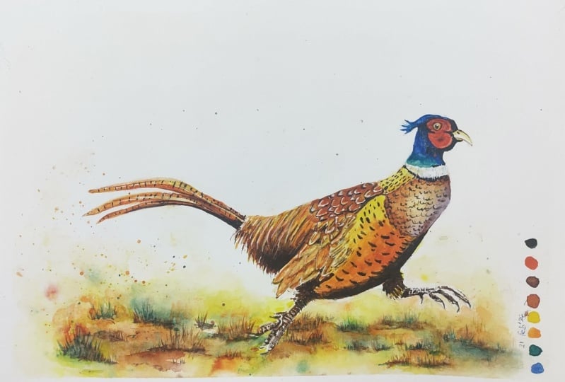
2. Materials, drawing composition, masking : Hello and welcome to my watercolor class
where we're going to be painting this fabulous
golden pheasant. I'm going to be sharing
lots of tips and techniques with you
and show you how to paint the different
feathers and markings in different
parts of his body. I know you're going to love
creating this painting, and I'm sure it will put a really big smile
on your face too. You can either watch
the whole video through and have got the
painting afterwards, or you can paint right alongside me as I guide you through it. Now, regarding my materials, these are the ones
that I'm using. But if you have
different colors, then don't be afraid to use the ones that
you've already got. Most of my paints are either transparent or semi transparent, which will allow the white of
the paper to shine through. This is what gives water color. It's wonderful radiance. I tend to keep opaque
paints for when I want to cover up the underlying
paper or layer of paint. Now you can see that I've
kept the drawing very simple, minimal detail, so that we get a nice loose free for painting. I've included a copy
of the drawing in the project resources section so that you can download
it and trace it. And then not worry about
the drawing because this is a painting class to begin with. I'm applying some masking fluid and I'm using an
unwound paper clip, which is one of the best
little tools I've come across for applying very fine
lines or small dots. You can apply masking fluid to the shapes where you want to reserve the white of the paper, either for highlights or
to paint over by hand. Later on, you do
need to wait for the fluid to dry fully before applying
paint over the top of it. When it is properly dry, you can just rub
off the hard gum either with a clean finger
or with a putty rubber. And you'll see that it leaves behind crisp, defined
white shapes. If the white shapes
are a bit too stark, you can soften them with a damp brush or you can
even paint over it. Now, don't use your
good brushes for this, because the gum will spoil them. Use an old brush or even
the handle of the brush. I also use rubber tipped applicators because the gum is very easy to clean off them. You can get a rolling pen, which varies the
thickness of the line, but I tend to use an unwound paper clip for
very fine lines and dots. As you can see, I've added
a tiny.in the pupil of his eye and also at the top and bottom of the white
collar around his neck. That's just to remind
me really not to paint over into that white area. Now I'm outlining the feathers on his wing area
and just putting a very thin line
up the middle of each feather is a little
bit like a patchwork quilt. Really, you can see from the reference photo
that there are about six different patterns and shapes of color
around his body area. In each of those
patchwork sections, we've got different
markings on the feathers. At the moment, I'm checking each section to see which ones do need
some masking fluid, some white of the paper, reserving and which actually
might not need that. Now I know it's a little bit fiddly going around all
these wing feathers, But it will be worth
it because it will avoid a lot more
detailed work later on. Now, I know it's quite hard to see from the
reference photograph, but his little feet
do have a lot of ridges or markings
in the skin areas. Whilst I've got my
unwound paper clip out, I'm going to use the
tip of that to just add the little white
indentations on his feet. What you can see from
the reference photograph is how the light is catching
the top of the feet, particularly on the
one that's raised. We'll need to add a little
bit of masking fluid there as well to preserve
those white highlights. Now, I know that some
artists don't like to use masking fluid at all and prefer to paint around
the white shapes. But in very small
areas such as these, it really would be a
panicoty job to do that. I'm all in favor of
making life a bit easier. I do have a preference for this blue bio masking
fluid because it is blue, so you can see where
you've put it. Unlike some masking fluids that are white or creamy color, when you get going
with your painting, it can be quite hard to see it, but also it does rub off really well and doesn't
damage the paper. It's one of the best
I've come across anyway. I've moved on now to the
far end of his body, and we've got lots
of tiny thin hair, very dense, falling over
from the back of his body. Again, I want to preserve some white or light ones when
I remove the masking fluid. I may well even go over them with a bit of yellow
or golden color. Now I'm using my rubber
tipped applicator. It has got a very
good point on it, so I'm still able to paint on some very thin fine
lines and just going down the middle of the
tail feathers with that in the middle of his back, we've got some strongly defined U shaped black and
white markings. I'm putting them
on quite randomly, you don't want them
all in a straight row or evenly spaced like
a row of matches. Finally, I'm spattering or flicking on some
masking fluid over the foreground to help break up the paint when we
apply it later on.
3. First layer - head, iris, upper body: wet-on-wet and wet-on-dry : More often than not, water
color is built up in layers. We're going to make a start with the first layer on his head
and the top of his body. I'm starting with
the eye and I've got a very pale mix of Quinacridone
gold, quite watery. I don't want this eye
iris to be too dark. I've cleaned my brush and
now I'm applying some ultramarine to the feathers that are across the
top of his head. It's a small area. Make sure that you've got a good point on the
brush that you're using, so that you can
more easily get in between the wattle areas that
are later going to be read. Now, the face is going to be the main focal point
of the painting. It's just worth taking
a little bit of time over this particular area
and getting it right. I have slightly altered the
wattle shape on my drawing. I didn't want it to go right
up to the top of the head. This is where we
can use a bit of artistic license in creating
our own composition. We don't need to follow
the photograph slavishly. In fact, the photograph that
you are looking at now is a composite of several
different photographs which have merged together. In the original photograph, the pheasant was just stood still with both
feet on the ground. But I wanted to inject
some movement into it. I've used another photograph of a running pheasant and
put the two together in my software to come up with the version
that's in front of you. I often do this with photographs because it's
very rare that you can find just one that does
exactly what you had in mind. I often spend more time tinkering about with
photographs and coming up with the right composition
as I do painting it to make this blue area a
little bit more interesting, I'm just dotting in a little
bit of manganese violet. Now I'm touching
in some Viridian, which you can see quite
clearly in the photograph. He really is such a
gloriously colored bird that he just begs to be painted. I do keep referring to our
pheasant as a, as a hymn, because actually it is only the male species that
have these glorious colors. The female pheasants are
rather dull and a bit dowdy, which I do think is very unfair, but nature is what it is. Although the little cap
of feathers on the top of the pheasants head in the
photograph is quite still. I am flicking mine out a
little bit because after all, our pheasant is having
a good old run. I'm imagining that the wind will be ruffling them
up a little bit. I've gone back to
the Quinone gold, although the beak is
predominantly white, I'm adding a little
bit of yellow shading above and below where the
top and lower beak meet. I'm adding a few
little flicks of ultramarine over the top of the vidian to encourage those two colors to blend
together a little bit more. I can't paint the red
wattle because the color will just run into the blue
that I've just put on. So I'm going to leave
that to dry and turn my attention to his body. We'll call this
section patchwork one. I'm using my quin gold, or you can use yellow
if you don't have that to just paint over this
particular section, it's quite light,
quite transparent. Not heavy. In fact, I'm going to use some
paper towel to just dab off that top part where
it's catching the light. For patchwork two, I'm
using burnt sienna. Again, it's quite
a watery mixture, about the consistency of tea. I'm just stroking it on there in the direction
of the feathers. It doesn't matter if
this color does blend a little bit with the yellow
that we've just put on. Because there is a
gradual transition between these two areas. For the lower part
of this section, I'm adding in a little
touch of manganese violet. I think you can see from the
photograph that there is this cast of violet just running down the
front of his chest. That will also tie
in nicely with the violet that we put on
earlier in his neck area. I've used a bit
of paper towel to blot a small high light
out of this area. Because it is a three
D rounded foam, we do need to use a mixture
of tones, light, medium, dark to convey that roundedness and structure to the body. When you do lift a high
light out, that way, the paint often runs back
into it because the paper, of course, is still wet. You might have to do
it several times, either with the paper
towel or with a clean, damp brush or both. I'm adding a little bit more
violet and burnt sienna down the front edge of this shape and along the bottom where it is
going to be more in shadow. For patchwork three, I'm
using the burt sienna again, brushing over the masking fluid because it's perfectly dry. Now the yellow section that I painted earlier
is nearly dry. Now the sienna is
not running into it. I'm just getting a nice
soft transition between the two to give that little
area time to dry. I'm now moving over
onto the tail feathers. I'm using the quin gold again. Again, quite watery,
transparent. I'm just brushing that
over the top feather, then using the same color. I'm brushing over
the other two colors with that quin gold. But the bottom feather
is going to be in a little bit more shade because of the two
over the top of it. I've also picked up
a little bit of the burnt on the tip of my
brush for that one. If you're looking at
the reference photo, you'll see that actually all the feathers
are very tightly packed and it looks like there is just one
single feather. But again, I wanted to use
a bit of artistic license, add a little bit of dynamic into the painting and movement. So I've got them separated out whilst the yellow
paint is still wet. I've added in some touches
of transparent orange and a few little touches of Bert Sienna on the
underneath of the feathers. At the same time, I'm
being mindful not to completely obliterate
that lovely yellow color. The previous section that I painted has now
dried sufficiently that I can start painting
patchwork section four. Now, I think I mentioned earlier that this is an
area of very fine, tightly packed
feathers, very thin, over this back area. I'm using the pointed tip of my brush to paint lots of lines coming
over from the back, falling over this area. I'm starting off with
the quin gold color, then I'm adding in
some little touches of the transparent orange, little bit like when I
painted the tail feathers. And I'm going to also add in some little streaks
of burnt sienna. And particularly applying the burnt see end
of the darker color to the underside of this section where
it's more in shadow. To emphasize this even more, I'm touching in some burnt
umber, a darker brown. As you can see when you use
this wet on wet technique, that's wet paint on
top of wet paper, you get this lovely
soft transition of color from the
lighter to the dark. But once again, do be
mindful not to allow that dark color to overtake the lovely light yellow and oranges that
you've just put on. You just want it at
that bottom area. And I've also added
a little touch of dark brown where the tail
feathers join the body. I'm keeping an eye on the areas that I've
already painted. I think one or two
of them could do with a little bit
of glamming up. I've got a mixture of yellow and orange that I'm just glazing over this section to give it a bit of a
brighter appearance. I'm adding a little
bit more quin gold to the lower part of the yellow section where it's turning over
the body again. To try and give it a
little bit more form for the section
I'm painting now. I've mixed some orange
in with the bird sienna. So it's a more orange
you look And painting that over the top
part of this section, softening it into the
underlying color, reinforcing that
small high light.
4. First layer - lower body, tail feathers and feet: I'm now going to paint the first layer of
the rest of his body. And I'm starting off with the wattle and that's that red area at the
front of his face. I'm using cadmium red, but you can use any bright
red that you have to hand because it's a small area. I'm using a small brush that's
got a really good point. I think my brush is a
size to over the years. I think I must have
spent a fortune on expensive sable brushes, but I've found that
the points wear out quite quickly and I'm
having to replace them. I also prefer the synthetic sable because they've got a little bit more
spring in them, which suits my
style of painting. If you live in the UK, I get my brushes now from a
company called Major. They have an online website
and they are very reasonable. They're called orange
round synthetic Sable. I don't have any
commercial connection or stocks and shares
in that company. I just find that the points last a long time and the brushes
work really well for me. However, what I
do recommend that you don't skimp on
is cheap paper. I can't emphasize enough
how much difference a good quality paper will
make to your painting. The paper that I'm using here
is Bockingford, 140 pounds. I also use the 200
pounds which is a little bit thicker and also Saunders Waterford High White is a bit more expensive
than Bockingford, but it will accept a
lot of punishment. I don't even advise that you use cheap paper for
practice because all you're learning is how
the paint behaves on the practice paper
and not how it will behave on your good paper. Anyway, back to the painting. I should tell you
what I'm doing now. I've just painted over patchwork section five
with the quin gold. While it's still wet, I'm dropping in some of
the transparent orange. Now you can see I've not taken the orange color
right up to the top. I've got the quin gold appearing predominantly at
the top of this section. And the color is getting darker towards pure orange as
it goes lower down. Then I'm just softening
that hard edge at the bottom with a
clean, damp brush. I'm using the same quin gold to paint the tops of his legs. One will be a lot darker later on when I
add another layer, but I want to have that
yellow glow underneath. I'm just using a little bit
of paper towel to dab off some of the orange that's running right down
to the bottom edge, sticking with quin gold. I'm now painting
the last section, section six, of this fantastic
patchwork quilt of a body. At the same time,
I'm thinking that the orange on the
last section that I painted has really just sunk in a bit and looking
at the photograph, it is a lot more vibrant. I'm adding in a little bit more of that transparent orange. Fortunately, the paint
beneath is still wet, so I am still getting that
nice blend of colors. And at the same time, I'm getting much
more of a color hit. Whilst I've got that
orange paint on my brush. I am also adding a
little bit more of that color on the feathers
at the back of his body. Then returning back
to patchwork six, I'm adding in a little bit of burnt sienna to the quin
gold mix in my palette. And I'm just going to
apply a little bit of that to each of
the feathers here. Now, I'm not taking
a lot of care, I'm doing it quite randomly. Just adding a little
splodge were to each one. Then I'm using that
same light brown color to just define a few
of the tail feathers. Then for his feet, I'm using burned timber and trying to leave
a little bit of white paper in
between the two toes that are close together
to separate them out. We've already got some
masking fluid on here, which is also going to preserve some of the white
paper when we remove it and depict the little ridges that you've got
in the skin here. I'm using the tip of my brush to paint in
the little claws. Now I'm just using one little
curve stroke for each claw. I'm not trying to paint
a lot of detail on here because you simply wouldn't be able to see them
at this distance. Then before I finish
this particular section, I'm going to just strengthen
the definition between the upper and lower beak and
also his little nostril. I'm still using the burnt umber and adding a few little markings
to make that definition. I'm now going to leave
it to completely dry before moving on
to the second layer.
5. Use tonal values to create a rounded 3D effect; add feather markings; paint tops of legs and eye pup: I'm using pure black
to paint the pupil in his eye and also
around the iris. Now some artists prefer
to mix their own black, which you can do with your darkest blue and
your darkest brown. Or you can mix a red blue
and a little bit of yellow. But for small areas
such as this, I'm quite happy to use it
straight out of the tube. Now if you don't
have a steady hand for this tiny area
around the eye, you could use a black
waterproof pen instead. But just be mindful
that, of course, it is waterproof
so once it's on, you wouldn't be able to get it off if you did
make a mistake. I'm using the same black to paint just underneath
the feathers that are on the top of his head and around the wattle at
the front of his face. This will end up being the
focal point of the painting. Just take a little
bit of time around these tiny shapes
with your brush, you can see that I've taken a little bit of artistic license with the shape of the wattle as compared with the
photograph, the reference. That's because I
wanted to get in a little bit more contrast between the red and
the black areas, which again, would help to draw the viewer's eye to
this focal area. Before adding the black color to the underside of
the wattle area. I am pre wetting the neck with some clean
water because I want the black to blend into it rather than just sit
floating on the top. Don't forget, you can use
the tip of your brush to just pull that black color
down into the underlying blue. Use tiny strokes in the direction that the
feathers would naturally grow. I want to add the
different markings now on the different
parts of his body. Now, I don't want
to paint wet on dry because the marks
will look very solid. They'll have hard
edges and they walk feel as though they're
integrated with the feathers. On the other hand, I don't
want to paint wet into wet. If I paint dark markings
on to wet paint, those dark colors will
spread across the feathers, overtake them, and it'll
end up being a muddy mess. What I really want to do is
paint wet into slightly damp. I've dipped my brush into water and then
partially dried it on some paper Toll before then dampening the areas
across the body. It's important to
stroke the brush gently over the areas so that you don't disturb the
underlying color. Then just give it a moment or two to dry a little bit more before starting to add
your dark black marks. If the paint spreads too much. When you apply your
first little mark, pause for a moment or
two and then try again. In this section, we've got little short dashes of dark markings,
little linear lines. You don't want them too regular, so you don't want
them exactly the same in terms of length
and distance apart. Again, try to be
a little bit more random just as nature would be. Have some a little bit
shorter than others. And don't have them all lined
up like a row of soldiers. To give the next section a
little bit more time to dry, I'm adding the
black color beneath the masculine fluid at the
bottom of the white collar. I'm using tiny little strokes in the direction of the feather. You don't want it to
be a solid black band, almost like a tie
around his neck. The markings in this
next section are like a lot of curly us
all joined together. How many you actually put
on is entirely up to you because we're not doing a hyperrealistic or a
botanical painting here, but we do want to convey
this impression of the different markings on
each section of his body. But you should be able to see from the reference photograph that the markings on this section are more
tightly packed together, they are more condensed, it's a little bit fiddly. You do want very fine lines. Again, use the point of a small brush so that you're not getting big thick
lines in this area. I wouldn't advise using
a black waterproof pen in this area because you would get too much
of a uniform line. Whereas with the brush, you will naturally get lines that are a
little bit darker, some a bit lighter, some
disappearing altogether, and that will give it
a more natural look. Moving over to the area
at the middle back, we've got a completely
different shape of mark. It's somewhere between a U and a V. There's certainly
not as many of them. You want to place
the dark V shape just underneath the masking
fluid that you applied earlier in the next section, the markings are
not quite so dark. I'm using my burnt number to which I've added a
little bit of black. So I've got a dark brown
rather than a pure black. I'm using that color to
define the feather shapes. I can still see the
original pencil drawing that's telling me where
those feathers are lying. Again, can't emphasize enough. Always paint in the direction of the feathers as they are
in that particular area using the same
black brown color. I'm adding a few strokes over
the very back of his body. Pulling that down over and in between the colored strokes
that I've already put there. But be careful not to overshadow the lovely colors
that you've already got. For the tail feathers, I've reverted back to
that pure black color. I'm painting these linear marks that go across the
whole of the feather. We've got three tail
feathers splayed out here. Do each one of them separately? This is another little area that I've used a little bit of artistic license in the
reference photograph. The feathers are all
tightly packed together, but to add a little bit
of movement to our bird, I have separated and
splayed them out. In this last section, this is where I
think the markings look most distinguished. Now, they are not exactly
straight but they're not exactly curved either,
somewhere in between, a very gentle curve, but just as before, you don't want them to be
too uniform and regular in terms of being in a straight line or being
all the same size. I'm not going to put on quite as many as are shown in the
reference photograph. We've got quite a
lot going on already and I don't want it to
look too fussy and busy. I'm using my dark
brown and my black intermittently now to paint these feathers on the
tops of his legs, and also to strengthen and emphasize the
shapes on the feet. Now in regard to the feet, it might be that you've
already got enough color and enough definition on the
ones that you've painted. This is where you need
to stand back and assess your own painting and see what extra little
touches around the feet, areas that is needed. It's a little bit like that, all saying, if it ain't
broken, don't fix it. Do watch what I'm doing, but don't slavishly follow
me, just for the sake of it. Always have a look at how
your own work is looking. Because as you've probably
found out by now, watercolor is a very
unpredictable medium. It doesn't always do exactly
what you want it to do, in a way that's
the beauty of it. I'm not going to really know
what else I need to add to the feet until this paint is dry and I can remove
the masking fluid. But I can now paint the wispy, dark brown and black feathers
that are on this back leg. If anything, it will
be a little bit darker than the front leg because it's further away and more in shadow. Speaking of shadow, you can see from the
reference photograph that there is this
very dark shadow running underneath his body. I'm using my dark brown
black color to paint that in this section of the painting has dried. Now I am using a damp brush to blend the hard edge
of that dark line in. You really do need to use the blending and
softening technique to its full advantage. To get that soft
transition between the dark shadow of the underbelly as it moves
towards the orange and yellow. Now that I've got all the colors and markings on his body, I do feel that the red on the wattle in my painting
has sunk in a bit. I'm going over that area
with some more cadmium red. Now I'm going to leave it all and take a little
break because it is a good idea to walk away and come back to have a look at your painting with a fresh eye.
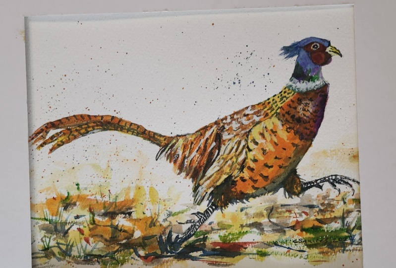
6. Final details, glaze colour to add richness, paint a loose abstract foreground : I've removed all of
the masking fluid with a clean finger. Now, if the white
of the paper that's revealed is a little
bit too stark, you can just very gently
brush over it with a damp, soft brush that will
just knock back those very white areas
a little bit and help them to blend in with
the rest of the painting. That's exactly what
I've done here. The other thing that I've
done off camera is to add a glaze of orange
to his underbelly. Glazing is simply applying
multiple layers of thin, transparent washes of paint
on top of each other, allowing the layer
below to shine through. It's used to add richness
and depth of color, which is what I felt my little pheasants
underbelly needed. Have a good look at
your own painting and decide whether you
need to knock any of the whites back or add
a little glaze before proceeding we're into
the final details of our little pheasant. Now again, this is where you need to have a look
at your painting and see if there are any
more little areas that need Touching up Madin a little bit more dark
color to is lower body just below the wing and below
the rear tail feathers. I've also got quite
a lot of white paper revealed from removing the
masking fluid in this area. I'm just stroking over them with a little glaze
of orange and yellow. I'm also adding in a few
little shadow feathers in the white collar area, particularly at the
left hand side, so it doesn't look like his
head is floating in space. And there will of course,
be a little indents of feathers in this area. Just a few little touches
downward strokes. Again, using a small
pointed brush. You only need a few here
and there. Don't overdo it. We do want this area to
stay predominantly white. The final details that madding are a little
white.in the eye, I'm using a white
gel pen to do that. I'm also adding a few
little random feathers around that white collar area, again, using the white gel pen. Then there comes a time when you've really got to stop
fiddling and faffing. I'm now going to move
on to the foreground. We've got quite a lot of
detail in our little pheasant. I don't want the foreground
to compete with that. Therefore, I'm going
to be painting a very loose
abstract foreground. As you can see, I'm
using a large brush, it's a ten or 12. And I've started with my
lightest yellow color, then I'm adding into that
and into other areas, a little bit of the
darker yellow color. You can use the tip of your
brush to flick some of that wet paint outwards
into grass shapes. But do make sure
that they are quite random and not sticking
up like match sticks. There's no hard and
fast way, really, of painting an abstract
foreground like this. It's rather intuitive,
but you don't need to work reasonably quickly so that you get a nice blend
between the colors. But at the same time, don't be afraid to leave
a few hard edges here. I've added a few
streaks of orange, and now I'm just using a clean, damp brush to spread some of that paint around so it
fades into the distance. Take a little bit of care when you're painting
around his dark feet. You don't want that
black color to smudge. On the other hand,
actually it might look like blurred
motion and be quite effective apart from when I'm
flicking a few grasses up. You can see that I'm using
mostly horizontal strokes, but we can liven it up a little bit with
some orange spatter. I'm trying to create the
impression that as he is running across the Earth is kicking
up little bits of soil. I want to bring in some of the other colors
that I've used in the painting to give it a
sense of balance and harmony. I'm adding in now my vidian, the paint is still wet. So I am getting
some nice blends of that color into the colors
that I've already laid down. Notice that I am still
leaving white shapes, white areas of paper to give a bit of relief
on the viewer's eye. Now I'm starting to add
some stronger color, the orange or orange
sienna color. Because at the moment,
it's all one tone. And we need to add depth and
tone into the foreground, just as we did
with our pheasant. Now I'm going darker still with the blue color when I apply this onto the
already wet paint. That'll blend in as well, but it'll give me
some nice dark edges. It's time to add
some real darks now. So I'm using the burnt tumber. Again, going into the wet paint, looking where I've
got shapes already formed in this
abstract foreground. I don't want to lose all
my lovely light colors. But this brown is
certainly helping to make this area look more
soil like more earthy, Going ever darker,
it's time to add a bit of pizzas with the
really dark black. The positioning of this
color is important because it's going to be darker beneath the foot that's
touching the ground. This is where as he's running, he will have disturbed
the soil the most. Whereas the other foot
is raised in the air, so it needs to be
lighter under that one. Adding this dark color in
and around his left foot, we'll bed him in to
the foreground nicely. To increase the
sense of movement, I'm adding some spatter
around his tail feathers. Now, we painted those in yellows
and oranges and siennas. So those are the colors that I'm using for the spatter there. Instead of spattering head on as I did with the foreground, I've used more diagonal flicks that will also help with
the sense of movement. I'm using that diagonal
flicking action to add a little bit of
black around his feet. Then moving up to the head area, I'm using that same
diagonal flicking action to spatter some of the blue that
we painted that area in. As the paint in the
foreground has begun to dry, I've noticed that
I've lost some of the little grass shapes
that I put in earlier. I'm using Vidian and
a small pointed brush to just flick a few more grass
shapes up here and there. Then I need to bed them
in to the Earth area, to the soil with a little bit of burnt timber at the
bottom of each clump. If you've ever been
fortunate enough to come across one of these
beautiful pheasants, you'll have seen that
unlike most birds, they're not very good at flying. They actually do prefer to run. They can only fly fast for
relatively short distances, although they can get up to about 48 miles per
hour when cruising. But if they're chased, they can fly up to 60 miles an hour. In fact, if they are
startled and chased, they will burst to
the sky in a flush. But for the most
part, pheasants spend almost their entire life on the ground and are rarely
ever seen in trees. Another quite interesting
fact about pheasants is that the very flamboyant
and colorful male is not faithful to his partner. In fact, it could be described as a bit of a gigolo because he's usually seen with a full
harem of female pheasants. And unfortunately, the poor females are
rather dull and brown. And do, if you think that the
English male pheasant is colorful and flamboyant, take a look at the
Himalayan mournal pheasant. Very exotic. You'll find
him in the Himalayas, but also Eastern Afghanistan, Pakistan, Tibet
button, and Myanmar. If you're a really
big lover of color, you might well want
to have a go at painting him after this one. Anyway, returning to our
little English pheasant, I feel duty bound to have a go at the old English
tongue twister. If you've not heard it
before, it goes like this. I'm not a pheasant plucker, I'm a pheasant plucker's son. And I'm busy plucking pheasants till the pheasant plucker comes. Now try having to go
at that yourself. It's not as easy as it sounds, especially if he had a
little tipple or two. Anyway, I hope you've found
it entertaining listening to a few facts and tongue
twisters about the pheasant. While you've been watching me
finish off this foreground, as always, I'm starting
to fiddle an over work, so it's time to
call it finished. I hope you've enjoyed this painting and that
you've learned some tips and techniques along the
way that you can incorporate into
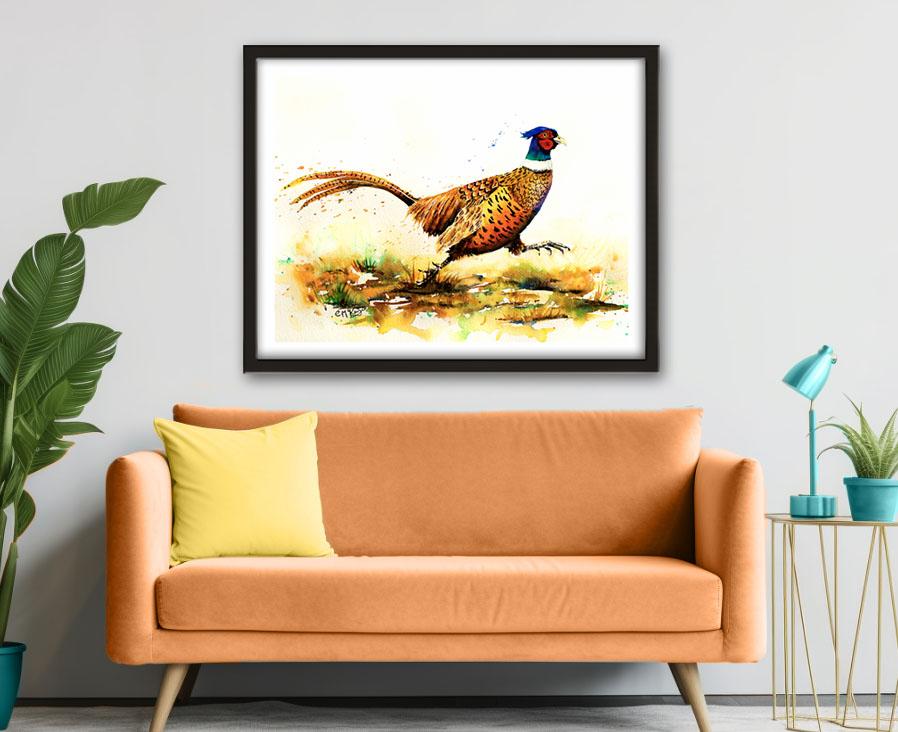
your own paintings. Why not pop it into
a mount and a frame? And you'll be amazed how good
it looks when you do that. I'd really love to see your
own finished painting, which you can upload to
the your project section. If you could just take a moment to leave me a short review, that also would be really great. I hope you've
enjoyed this video. It's encouraged you to
have a look at some of my other classes
in the meantime. Thank you for joining
me and I look forward to seeing you next
time. Happy painting.
7. FINAL THOUGHTS: Well done on completing the
class and also the painting, if you've been painting
alongside of me. We've covered quite a few
different techniques. We've simplified the drawing
from the reference photo. We use the wet-on-dry technique, putting wet paint on dry paper, and then we use the
wet-on-wet technique, putting wet paint on wet paper, and we use light medium
and dark tones of color to convey a
rounded three D effect. We use mark making to apply different patterns
over his body, and we use the glazing technique to add richness in color. Now, don't forget to upload your own painting through the
project and resources tab. After all your hard work,
I'd really love to see it, and I'll be sure to give
you some personal feedback. And if you've
enjoyed this video, do have a look at my other
classes on Skillshare, which are packed
with more tips and techniques to help you
on your own art journey. If you click the follow button, you'll be able to follow me, and then you'll be the first
to know when you upload a new video or any
exciting updates. And if you could
just take a moment to leave me a short review, that also would be really great. In the meantime, thank
you for joining me, and I look forward to seeing you next time Happy Painting.
 Carrie McKenzie, creating painted visions