Transcripts
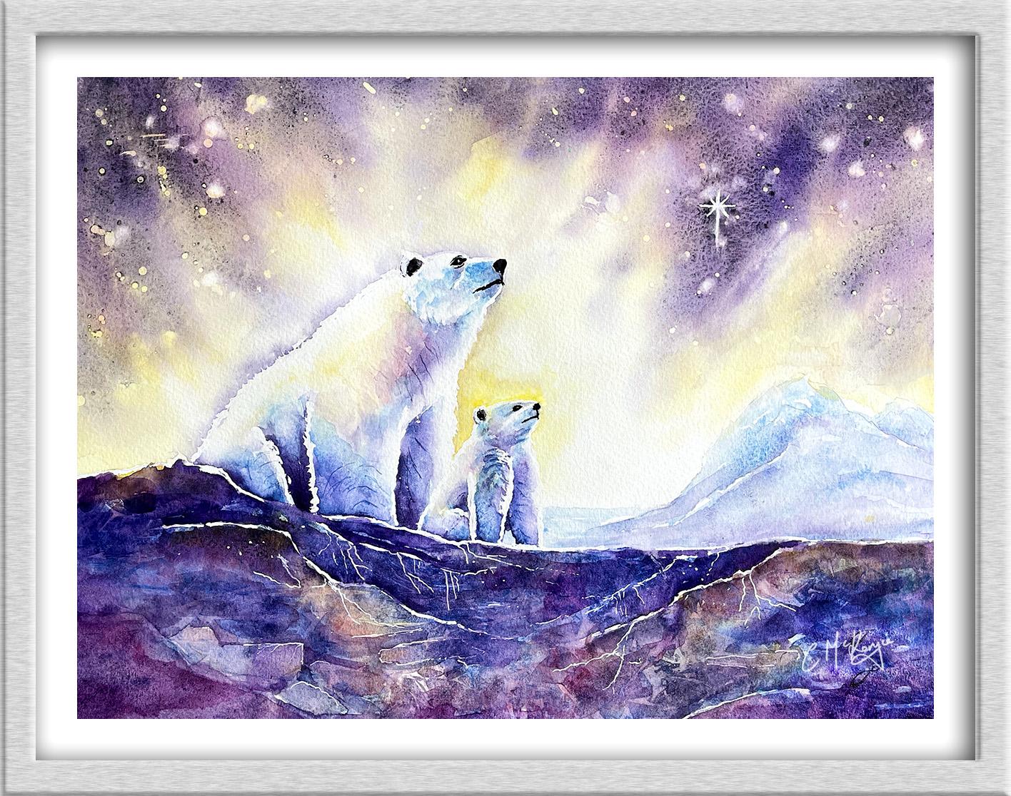
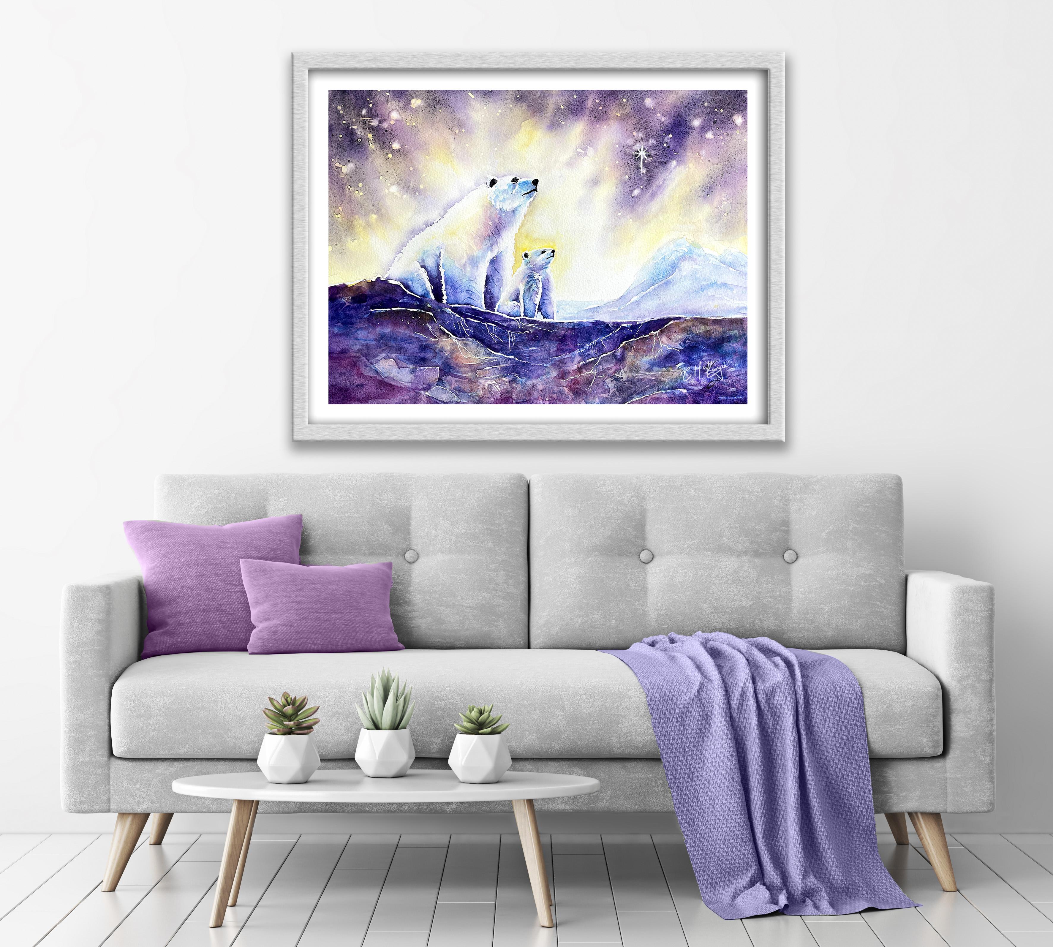
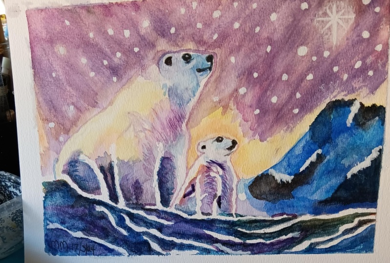
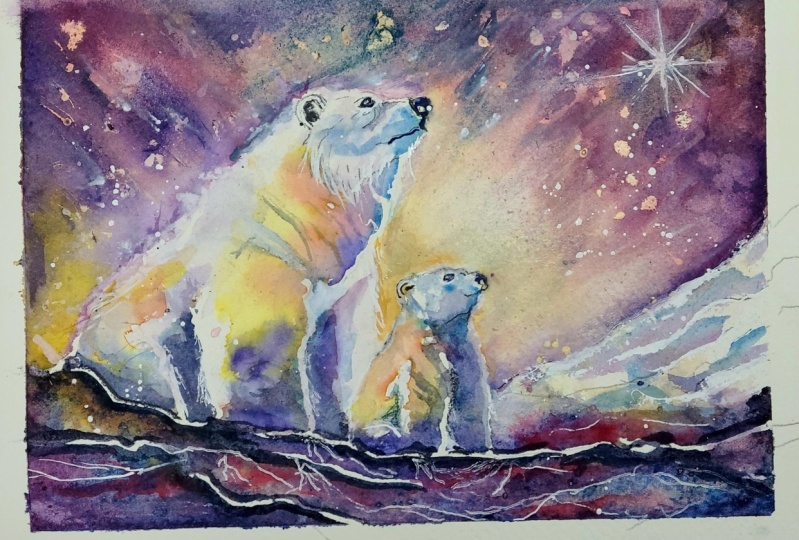
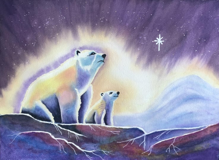
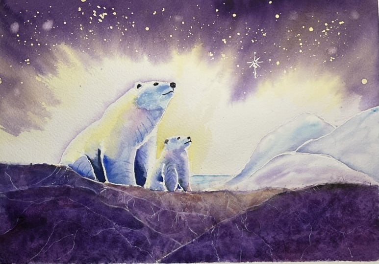
1. INTRODUCTION: Hello, and welcome. We're going to paint this magical Arctic
landscape featuring a mother polar bear and her cub gazing up at
a glowing winter sky. You'll learn how to create luminous skies using
wet-on-wet techniques, blend soft color transitions, and build depth with
layered washers. We'll use masking fluid
for snowfall effects, plastic wrap to create abstract, icy textures and tonal values to give the bears beautiful
three dimensional form. By the end of the
class, you'll have a striking arctic scene
full of color, light, and magical touches,
along with a collection of techniques that
you'll be able to use in many future paintings. It's suitable for all levels, including beginners because I'm going to be guiding you
every step of the way. And I'll be sharing all
the techniques, tips, and tricks that I use in
my own professional work. I've included a copy
of the drawing in the project resources section so that you can download
it and trace it, and then not worry
about the drawing because this is a
painting class. I am a professional artist, author, and tutor,
and over the years, I've sold a lot of work
across the world and helped hundreds of people to
learn more about watercolor. You can see examples of
my work on my website. My style leans
towards impressionism and contemporary rather
than photorealistic. I like to explore loose approaches that
bring out the color, light, and essence
of my subjects. I've tried to
replicate this across all the many other videos
that I have on Skillshare. I'd love to see your
own finished painting, which you can upload through the project and resources tab. I'll give you some
personal feedback on it, and you'll be able to
see the artwork of other students and
get their support. At the end of the
class, you'll have your own beautiful artwork
to be very proud of. So let's swizzle our brushes and get on with the painting.
2. Materials, Drawing and Masking Fluid to preserve highlights and snowfall effects.: I know you're going to love
creating this painting, and it will give
you a really big polar bear hug at the end. For this class, these are the colours and materials
that I'm using, but do feel free to use
any that you already have. For information on brushes
and paper, et cetera, do check out the basic
materials document that I've added to the
project resources section. Now you can see that I've
kept the drawing very simple, minimal detail so
that we get a nice, loose free flow painting. There isn't an actual
reference photograph. I've used a number of
imaginative elements to come up with the composition. But I have attached a couple
of different images here, just so you can
see the structure and appearance of polar bears. And I've included a
copy of the drawing in the project resources section so that you can download
it and trace it, and then not worry
about the drawing because this is a
painting class. You can apply masking fluid to the shapes where you want to reserve the white of the paper, either for highlights or to
paint over by hand later on. Now, you do need to
wait for the fluid to dry fully before applying
paint over the top of it. When it is properly dry, you can just rub
off the hard gum either with a clean finger
or with a putty rubber, and you'll see that it leaves behind crisp defined
white shapes. If the white shapes
are a bit too stark, you can soften them
with a damp brush, or you can even paint over it. Now, don't use your
good brushes for this because the gum
will spoil them. So use an old brush or even
the handle of the brush. I also use rubber tipped applicators because the gum is very easy to clean off them. You can get a ruling pen, which varies the
thickness of the line, but I tend to use an unwound paper clip for
very fine lines and dots. And as you can see here, I am using an unwound paper clip to apply the masking
fluid to very thin, fine lines of the north star. I'm also using it to add a very tiny dot for the
highlight in each eye. I've now switched to my
rubber tipped applicator, and I'm outlining the bears where they are backlit
against a very bright sky. Notice also that I'm not
using straight lines. I'm using very wiggly lines to represent the fur
surrounding the polar bears. And here and there, I'm flicking the masking
fluid outwards, particularly where the fur
is thicker and denser. I'm working my way
around mother bear. I've not done a wiggly line across the top of
her head or just underneath her chin
because the fur will be thinner in that area. So the masking line is
more straight there. Similarly with baby bear, the masking lines that I'm putting around his
head are straighter, but then I'm using the
wiggly line going down his front leg to represent
that furry edge. And they are quite
fluffy little creatures, so that furry is very fluffy, very thick, very dense. I've masked the outer edges
of the second front leg, and just going down his
little back now, again, this is going to catch the
light from that backlit sky. Then moving over to um, I'm masking her front leg at the left hand side and also the top of this
back leg that again, we'll just be
catching the light. Back lighting is a technique that's often used in
photography and cinema. By placing the light, the back light
behind the subject, it separates the subject from the background by creating a rim of white light
around its edges. And this can create a very unique and compelling
atmosphere. And to finish off, I'm just adding a little
bit of masking to the top edges of the icy rock where they also catch the light.
3. 1st Layer: paint luminous watercolor sky; plastic wrap for organic icy textures; first layer bears: Going to build the sky
up in several layers. This first layer is going to use the wet on wet technique. The wet on wet technique is
simply putting wet paint onto wet paper or paint that is still wet and let it spread
into the wet wash. This results in a lovely
diffused effect with soft edges. Because the paint mix into
the wetness of the paper, The color is diluted
and the tone is paler. I'm using a large hake brush, which has very soft bristles to apply the water in the
majority of the sky area. I want the sky to
be really nice and wet so that I get lots of
soft blending in color. Moving down towards the bears, I am using a smaller
brush again, it's a soft bristle brush just to get that water
nearer the edges. I don't want to
wet the insides of the bears because I don't want the sky color to
go down onto them. If you do accidentally get
any water onto the bears, just dab it off with
some paper towel. I've already got mixed in my
palette, some windy yellow. It's quite dilute, very watery bit like the
consistency of tea. I've mixed that with
a little bit of permanent rose to
get a pinky orange. And I've got a little bit of permanent rose mixed as well. Have you noticed that all of my brush strokes are coming in diagonally towards the bears because they are going
to be the main focus. And I want the direction of the paint to help
draw attention there. But apart from this tiny
area between the bears, I'm not taking that yellow color right up to the edges of them. That's because I want
the area immediately around the bears to remain
quite light and white. As the color moves
further down the paper, it becomes lighter, loses strength as it dilutes
into that wet wash. In other words, the color
is going to be stronger at the top of the paper than it is as it moves
towards the bears. If the paint does travel a
bit further than you wanted, you can use some paper
towel just to blot it off. Using the directional
strokes as with the brush, to recover some light areas whilst the yellow paint
is still very wet. I'm adding in some of my pinky
orange over the top of it. Now, I'm not obliterating
all of the yellow. I want some of that
light color to remain. I'm leaving spaces in between my strokes because everything
is still very wet. You can see that
these two colors are nicely blending and
mingling into each other. I'm adding just a touch of that orange color
around baby bear because when I remove
the masking fluid later on and we get that
white rim of light, it will need some color behind
it to make it stand out. I'll be doing
something similar with the mother bear when I paint
the second layer later on. But for now, I want the area around her to be very
white and light. One of the reasons
that I don't take my paper down is so
that I can lift it up, wiggle it about,
move it from side to side to encourage the
colors to blend and mingle. If you get any pools of water along the
top or side edges, then just use some paper
towel to soak it up. And then to add a bit more vibrance and dynamic
color to the sky, and putting in my
diluted permanent rose. Again, this is about the
consistency of some watery tea. But because the paint is
starting to dry a little bit, I've got to give the paper
now a really good shake, wiggle it about to
get the pink to blend softly into the
yellow and orange. What I don't want is a lot
of hard edges in the sky. I want that sky to be
really nice and soft. The key to creating a soft sky is simply not to overwork it. Don't keep laboring on it
when the paper begins to dry, because that is when
you get hard edges. You've often got to go just
with whatever you've got, let it do its own thing
and don't try to force it into something that looks
messy and overworked. You can use a piece of twisted up paper towel just to lift any areas where you
do want to recover some white as long as
that paper is still wet. And you can add
any bits of color where the color has
sunk or disappeared. But it's time for me
to take my own advice now and move on
to the next part. We're now going to add a first layer of
color to the bears. The masking fluid
around the bears will stop the sky color
from spreading into them. I can carry on now working on the bears without waiting
for the sky to dry. Because I want more control of how the color appears
in the bears. I'm using the wet
on dry technique. The wet on dry
technique is simply painting wet paint on dry paper. It allows for more control, stronger color and crisp, hard edges where the paint ends. The paint will only go where
the brush takes it again. Because this is
just a first layer, I'm keeping my colors
very wary and thin. The consistency of tea again, I've started off
with cerulean blue, and I'm painting that
around the snout and mouth, just under the chin and
around the back of the head. I'm using the tip of my brush to very gently pull
some of that paint away into the white areas so
that it lightens in tone. As it moves further away from
where I first placed it, there'll be a bit
of shadow here, just underneath the chin, on the neck area, and little bits of shadow in the fur going around the head. Similarly with baby bear, I've got shadow going around
the back of the head, over his snout, and under
his little chin area. I'm using a small brush with a very good point
as you can see, so that I can get into
these tiny little shapes. Now, don't forget when you're
applying the color onto the bears that although we
are adding shadow color, they are predominantly white. We don't want to cover over
all of the white paper, but it's only by applying different tones
of light, medium, and dark color to the
bears that we get this three D rounded
form effect. I've popped up a photograph of another family of polar
bears to demonstrate this. You can see there that although there are
lots of light tones, there are also many mid tones and even some dark tones
that are almost black. In fact, beneath
all that thick fur, polar bears actually
have jet black skins. And the polar bears fur
is also translucent and only appears white because
it reflects visible light. I've now moved on to use
some very pale water yellow. This color will be reflected
from the sky above. Notice that I'm not painting right up to the edges
of the masking fluid. I'm still leaving little
border of natural white paper. While the yellow
paint is still wet, I'm adding in a few touches of the orange color and a few little touches
of the permanent rose. Not only will they
add a bit of variety, but they'll also add some
depth to the medium tones. Then to add more color and
depth to the mid tones, I'm adding a little touch here and there of cerulean blue. The color and tones
will be darker in the areas where the bears are further away from the light, particularly in between the legs and at the bottom of the legs. Now because I'm painting wet
and dry, I am of course, getting some hard edges
where the paint stops before that white rim of light to get a more subtle
graduated effect. Going to use the blending
and softening technique, where you simply
use the damp brush to pull the paint away
from the hard edge. Blending it softly
until the color disappears into the underlying wash or white of the paper. It might sound like a
relatively simple technique, but it is actually quite
a difficult one to master thoroughly if you
haven't already done so. Do suggest that you practice
this technique because it will make a massive difference
to all your paintings. For the areas where the tone
needs to be even darker, I'm introducing some
dioxison purple. Now if you don't
have that purple, you can mix it with some pink
and blue, or red and blue. The colors that I've just
put on are still very wet. Again, I'm getting
some nice soft blends naturally when I drop
the purple on top. Although it might
look quite dark and pretty unnatural
at the moment. Do remember that
watercolor dry is about 20 to 30% lighter than
when you first put it on. Also, we are going to make the sky much darker
in the next section. Tone is very relative
once the sky is dark, these colors that
we're painting on here now will look
comparatively lighter. I've got a little bit too
much purple on this area. I'm lifting it off with
a clean, damp brush. Then I'm going to
add a little bit of my permanent rose for warmth. And the pink color will
also help to bridge the transition
between the yellow and the purple
without creating mud. So I'm going to just let
you watch along now as I carry on adding the first layer of color to our polar bears. By now, the first layer
of paint that we put on the sky should have dried
completely if it hasn't, Give it a bit more time before you start this particular step. Now as you can see, I'm just spattering on
some masking fluid. I'm using the handle
of my applicator. You could use the
handle of an old brush, but using this
spattering techniques gives you a nice random effect. You can add a few little
dots here and there. With your brush handle
or applicator handle, whatever you're using, fill in any gaps that
the spattering Mrs. But what you don't want
is lots of uniform dots. You don't want them all the same size or the same distance apart. And that's where
spattering gives you this much more
natural appearance. Now, we usually use masking fluid to retain
the white of the paper. But in this instance, we're actually
retaining the color of the yellow and the orange and the pink that we put
on as the first layer. Now I need to leave
that masking fluid that I've just spattered
on to dry again. While it does so, I'm turning my attention to the foreground. Now you do need to have some pieces of
plastic wrap or cling film as it's often known to hand ready for when
we've applied the paint. I'm stronger, slightly thicker mixes of paint to apply to
the foreground. I'm using the same
colors that I've used in the sky and the bears yellow, my pink and my pinky orange. But I'm leaving quite a lot of white space in
between these colors, because that is where I want to apply my blues and purples. Remember, if you mix blue and
pink and yellow together, you're going to get browns
and blacks and grays. That's why I'm trying
to keep the colors separate to some extent
in this foreground area, although I want to have some touches of yellow
and pink and orange, I want this area to be
predominantly blue and purple, such as you might
get with icy rock. There's no precise formula
to applying these colors. You need to just put
them on quite randomly. Again, I'm letting them blend together where the colors meet. But I'm not afraid of leaving a few white bits here and there, because they will just
look like ice later on. In addition to using
the cerulean blue, I am introducing some
French ultramarine because this is a darker blue. And I want this area
of the painting to be much darker than
the middle area. Then, while all this
paint is still very wet, I'm loading in some of
my bluey purple color. I've added a little bit
of black to the purple, so we've got some really
strong dark color. But I'm being
careful not to cover over all the lovely colors
that I've just put on. Because even though we're
working with a stronger color, we still want some
light and medium tones in this area of the painting. You don't need to
worry about creating anything too precise
or figurative, because once we put
the plastic wrap on, it's going to look
very different. We're going to get lots of abstract random shapes be really virtually impossible
to create by brush. It's very important to get the plastic wrap on while
the paint is still wet. Otherwise, once it's dried, it will have absolutely
no effect whatsoever, whilst all this paint is
still nice and juicy and wet. And the plying the plastic wrap over the top of it,
as you can see, I'm using my fingers to press
the wrap into the paint, push it, crumple it, stretch it. You can see these shapes underneath the wrap already
starting to emerge. Putting a second
piece of wrap over the right hand side of
the painting, Again, getting that on
quickly before it dries and doing exactly
the same thing, pressing into it,
pushing and pulling it. And then once it's on, you need to leave it
alone and let it be. It does need to be completely dry before you remove
the plastic wrap, and it can take a little
bit longer than normal.
4. 2nd Layer: strengthen sky; paint distant mountains for depth; add darker tone to bears for 3D form: I'm using my large
hake brush again to paint clear water over the
whole of the sky area. Just as I did before when I did the first layer,
Just as previously, I'm taking a little
bit of care not to get any water onto
the bears themselves because I'm going to be
using some very dark paint shortly that I don't want
to spill over onto them. The paint consistency for the second layer is going
to be much thicker than it was for the first layer to encourage it to flow
down the paper. I'm just using this paint box, pushing it underneath the paper to lift it up at that top end, which will encourage
the paint to flow down. I've mixed my purple with
a little bit of black and also a little bit of
rose just to warm it up and make it a more
red shade of purple. Just as when we did
the first layer. You can see that
this very dark paint is actually blending in, softening, and diffusing into
that underlying wet wash. But because the yellow
and pinky orange colors had dried before we put the water on for
the second layer, we're not getting
a really big mix of purple and yellow and orange that's avoiding
getting that dreaded mud. Our first layer of bright light
colors can still be seen, nice and bright, glowing through underneath
the dark purple. Just as before, you
can see that I'm using diagonal brush strokes to draw the attention and
focus to the bears. I want my purple color to be darkest at the top and
sides of the painting. As it runs toward the center, it diffuses and becomes lighter. That's why I'm placing most of the dark paint at
the very top and sides of the paper and letting it trickle down into
the underlying wash. It transitions nicely
and becomes fainter. I'm doing my usual
thing of shaking the paper up and down
from side to side, and particularly
tilting it towards the top to keep the darker
paint at that top edge. In fact, I've just
put some old toweling underneath the paper so that
it will catch the drips, catch the paint
that's running off. Because what I don't want
is for that paint to run back into the painting
and create cauliflowers. I've added a little
bit more dark color around the North Star, so that when I rub the
masking fluid off, we'll get a really
good contrast between the white of the paper
and this dark purple. You can keep adding little touches of dark
paint where you think it's needed As long as that paper
is still very wet as before. As soon as it starts to dry, that's when we need to stop. I've removed the paint box and the paper towel now
and laid my painting completely flat so that the paint doesn't continue
to travel downwards. I'm adding a few touches
of my purple paint, not as dark as it is in the
top corners of the sky, but just enough to make that rim of white
light stand out more. When I do remove that masking
fluid around the back, I'm using a clean, damp brush to just blend that paint into
the underlying wash, so I get a nice soft transition. I'm going to leave the
sky to dry now and turn my attention to this icy
mountain in the background. Subjects that are in the
distance are usually paler, a little bit bluer, and you can't really see
much detail in them. I'm using a very thin mix of cerulean blue about the
consistency of water, tea, leaving little bits out in the mountain to convey
the impression of ice. I'm keeping it very
simple and loose because cerulean blue
is a granulating color. You can see that I'm
actually getting quite a mottled defect
without having to try. I'm adding little touches of
cerulean blue here and there in the mountains
just to give them a little bit of
structure and depth, then carrying that blue
across into the sea. It's only a small
area for the sea. But do remember to keep horizontal strokes because
water is always level. There's a little bit of blue in between the baby
polar bears legs. That is actually the
sea in the background. Add a little touch
of cerulean there. I'm just having to pull
back a little bit of the plastic wrap so I can get right up to the edge
of that distant shape. Although I'm adding
in little touches of this blue color here and there because the
paint is very wet, I'm not getting too
many hard edges. It's all very soft and diffused. If you do get any hard
edges that you don't want, then you can use the softening
and blending technique that we learned earlier
to soften them, there will be some
reflection from the sky onto this
distant mountain, particularly as it's icy. I need to add in a little bit of the purple color that
I use for the sky. That will help to tie
it in with the rest of the painting and give it
a more harmonious look. But I have watered down the strong purple color
that I use for the sky. This is quite a thin
mix now, again, because the underlying
blue color is still wet, I'm still getting a nice
soft, diffused appearance. That's the distant
mountain. Pretty much done. It's time now for
the big reveal. I'm pulling off my
plastic wrap to reveal all the wonderful abstract
shapes it's made underneath. Now, of course, it
would be impossible for yours to look
exactly like mine, but I hope you're pleased with the result that you've got. Now, I'll be returning to
the foreground shortly. But before that, I want to give the bears a second
layer of color. Starting with the mother bear. I'm adding a little bit more
blue around the snout, face, and head area because the tone here needs
to be a little bit darker and stronger than that background sky
of yellow and orange. The slightly darker tone will just help to bring
that shape forward. I'm bringing that darker color around the bottom of
the head and just using a few little flicky
brush strokes to denote the fur that is
coming around there. Then switching over
to my purple color, this is the dilute
color that I used on the mountain because even though you use a diluted color when it's on top of color
that's already there, this will help to strengthen it. I'm adding some of this purple
color to the chest area, underneath the chin,
because there will be a shadow here from
the head above. I'm using a few
directional strokes with the very tip of my brush to show the direction that
the fair is growing. Another way of doing this is to use the unwound paper clip that you use for the masking and just score it into the paper. The paint will go
back into the lines that you've just made and
it will appear much darker. As with most things,
less is more. Don't overdo this little
technique of scoring the paper. When you do score it, do try to make
those lines random. You don't want them to be
absolutely symmetrical, like soldiers in a line. Also, once you've scored
the paper in this way, it's pretty near impossible to do anything about it later. If you think you've
done too many. I'm going to work my way
around each of the bears now, adding this darker shadow, building up the shape
and form of the bodies. These wonderful,
magnificent bears are found in quite a
number of countries. You could see them in the
frozen wilds of the Arctic. In Canada, Alaska,
Greenland, Russia, and Norway, about two thirds
of the global figure. Actually live in Canada, and by the way, none of
them live in the Antarctic. That is where you'll
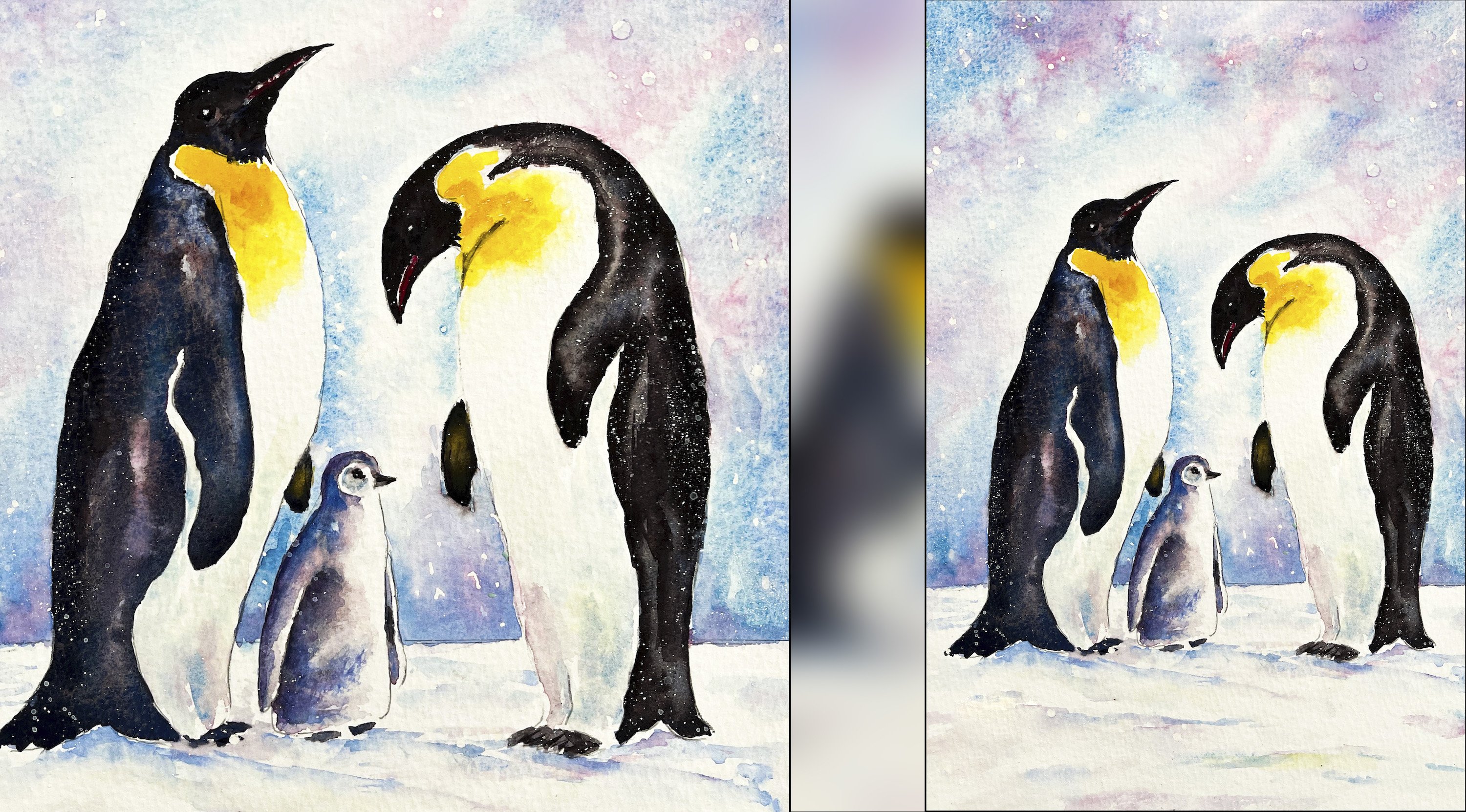
find Penguins. I'm rather fond of penguins with their quirky little
characters and Wadley walks. Maybe I'll do a painting
on those very soon. They're very small in comparison to our lovely polar bears. They are seriously big bears. They can measure over 2.5 meters long and weigh around
680 kilograms. In fact, their huge
size and weight makes them the largest
living meat eater Earth. One of the reasons that they
are able to survive some of the harshest environments on our planet is that as well
as their very thick fur, they have a layer of
fat called blubber that insulates the bodies from the near freezing air and water. The black skin that I
mentioned earlier helps them to soak up the sun's
rays and keep warm. They have an incredible
sense of smell and they use this to track their
favorite meal of seals. And in fact, they can sniff them out from up to 16
kilometers away. Now you wouldn't think with all that fur and blubber
that they'd be able to swim. But despite their
size and weight, they are actually
excellent swimmers. And they can comfortably swim at about 10 kilometers an
hour because they have slightly webbed 30
centimeter wide paws, which they use like
paddles in the water. But despite that, they
are not quick enough to reliably catch
seals in open water. That's why you'll see them
quite often on floating ice, using it as a hunting platform. They wait near the seal, breathing holes or
at the I's edge for a seal to surface and
then snatch it from the sea. And that's the meal.
And the other thing I mentioned earlier is that their fur isn't actually white. It's transparent
with a hollow core that reflects the light. And that also helps them to blend in to their surroundings. A very useful trick, especially when
hunting weary seals, female polar bears, give birth
to their cubs in snowdons, usually about
November or December, where they are protected
from the harsh environment. Believe it or not, the little
cubs when they're born, are about the same size as a guinea pig that's less than
a two pound bag of sugar. But the mother's milk is
the fattiest found on land. In fact, it's about 31% fat
when the Cubs are born. This provides plenty of calories to help the
Cubs grow very rapidly. Female polar bears also have a very strong maternal instinct, and they will absolutely shower the cubs with love
and affection. Polar bears of all ages do like to play and
have fun together, and are very rarely
aggressive with each other. The little Cubs stay in the dens for about
four to five months, and then they'll
stay with the mother for another two years, during which time they'll learn all the skills they need to survive in the
harsh environment. Polar bears are incredibly
good travelers. They can roam for over
3,000 kilometers a month. Because underneath the
bottom of each paw, it's covered by small soft
bumps known as pupil. These grip the eyes
a little bit like snow boots and keep the
bear from slipping. Another interesting fact about polar bears feet is that
when the female is ready to, she emits a stinky scent
through her feet so that the male polar bear can find
her through her footprints. Although that sounds
a little bit weird, I guess it's the
polar bear equivalent of female humans using perfumes because ice
moves all the time. Polar bears don't have actual defined territory
like most other animals. Unfortunately, because
of climate change and its effect on the ice, the polar bears are now
defined as vulnerable. There are now only about 20 to 30,000 polar bears
across the globe. This number is estimated to fall quite dramatically because
of climate change. International Polar Bear
Day is on 27 February 2024, and that will
highlight and raise all the issues
that are affecting polar bears and how we can help by reducing our
own carbon footprint. I hope you found some of that background
information interesting on our wonderful
polar bear friends, whilst you've been watching
me build up the shadows and tones on the two lovely polar
bears in this painting.
5. Refine Light & Contrast: deepen shadows in foreground & bears; magic sponge to recover light tones.: Although you can use a brush and some water to lift off paint, I want to introduce you to
magic sponge eraser because this little tool works miraculously to remove
unwanted paint, you can use it to lighten
an area that is too dark or even strip the color
right back to white paper, depending on which
color you've used. Because some colors do stain
the paper more than others, just tear a small
piece of the sponge, dip it in some clean water, then squeeze it to
just damp and rub over the unwanted paint until
the color is removed. Use a paper towel in between to blot and get the last
bit of paint off. And keep rinsing your sponge
out during use to keep it clean or even throw it away
and use a fresh piece. If you accidentally get a
blob of unwanted paint in the middle of your
painting or you just want to lighten
the tone of an area, give it some highlights. This little piece of
sponge will become your best friend because it's normally sold as an
abrasive household cleaner. It does tend to rough up
the paper a little bit. Take extra care if
you're painting over the area that you've
sponged with another color. Now, I had a bit of a hard edge here in the sky
that I didn't like. That's been an ideal
place to show you how you can soften it with a
little bit of magic sponge. Now as you can see, I've already removed all the masking fluid
from my painting. That's revealed the
white of the paper for the North Star image that we masked at the beginning
of the painting. It's also revealed the yellow
and yellow orange dots, circles and shapes
that we masked after the first layer
of the sky was dry. And sometimes the
shapes that you reveal from being masked
are a little bit too stark, a little bit to stand
out ish and defined. I think that that is
particularly true now of some of these shapes
that are left in the sky. What I'm doing here is using a clean brush with
some clean water. And just very gently brushing over the sky area with
that clean water. That just helps to
knock back those shapes into the underlying wash so that they're not
quite as distinct. The other thing that
I'm doing now is just re wetting that area where I'd use magic sponge
on a hard edge in the sky. Once it's wet, I can just drop a little bit
of paint into it. And that'll again,
just softly blend and diffuse in to those
underlying colors. Now, a little word of caution. You can only do this if you have definitely already pre
wet the paper first. If you add more
paint to dry paper, you're going to get
more hard edges. Although this might seem quite an obvious
thing to restate, it is maybe something that's
worth a little practice. Another little technique
that you might like to try with magic sponge is creating a little halo of light around some of
these circular shapes. You could actually do
it with a damp brush by just dabbing the damp
brush onto the shape. And then dabbing it
with some paper tel, or you can do what I'm doing here using a tiny bit of sponge. Just dabbing that
onto the shape. It will just lift
off a little bit of the surrounding paint so that you get a little
halo of light around it. I think this is another
occasion where less is more. Don't overdo it. Just a few here and there
will intensify that lovely, dreamy atmosphere of light. I'll leave this sky
area to dry now and turn my attention
back to the foreground. Because it is the foreground where we can see more detail. I don't need to add some depth and shadows
to this rocky area. I'm using my dark
purple blue mix. Going in behind some
of the white icy lines that were left behind after
I removed the Maskum fluid. I'm also looking at where the plastic wrap has created
natural rock shapes. I can use those random
abstract shapes to add more definition
to the rock area. You can watch along now as
I build up my foreground. But bear in mind that your foreground is going to
look a little bit different to mine because of the random nature of the
plastic wrap exercise. You may need to build up your foreground in a
slightly different way with the depths and shadows appearing in different
parts of the foreground. Depending on the patterns that have emerged in
your own painting. I'm now going to use
black for the ears, eyes, nose, and mouth. Now, a lot of artists don't like using black straight
out of the tube. They prefer to mix it. If that's what you want to
do, that's absolutely fine. You can mix a black
with your darkest blue, a dark pink or red,
and some yellow. You could also mix it with your darkest blue and
a very dark brown. But for very small
areas such as this, I'm quite happy to use a black
straight out of the tube. You could, of course, use a black waterproof pen if you don't have a
very steady hand. But the danger there is that
because it is waterproof, once it's on, it's on, and you can easily
remove it, if at all. I'm also using a small brush, which has a very good point. It means I can get into these tiny little shapes
much more easily. Now, in case you haven't already spotted my deliberate mistake, I did accidentally rub
off the small dot of masking fluid that I'd put in
the pupil for a high light. When I've painted the
mother bear's eye, I've had to try and leave a
tiny little dot of white. And amongst that black paint, if you've done the same
thing and you find it difficult to leave that
white dot, then don't worry. Because when the
black paint is dry, you can always add it with a white gel pen or even a little dot of white
gouache or white acrylic.
6. Final Details: glaze foreground to enrich colour; add ice cracks with white pen. : In the last stages
of a painting, there's always that fine
line between adding those few final details that
will make the paintings zing and the danger
of overworking it. With that in mind,
I'm just going to show you a couple of
techniques that I think will enhance the painting without laboring it too
much and spoiling it. First of all, I'm using a white gel pen to
add a few very thin, fine, icy cracks in
the rocky foreground. This is definitely a case
of not doing too many, because otherwise it'll end up looking more like
a spider's web. The important thing here is to keep those lines very fine, very spidery, almost like
the roots of a tree. And keep them random
in terms of size, length, and distance
between each other. What you don't want is
for them to look like a synchronized row
of matchsticks. If this is a technique that
you've not done before, then I suggest that again, you take a little bit of time out to practice it on
a bit of spare paper. Have a look at the
abstract shapes created by the plastic wrap and just
see if there's one or two of those shapes that
you want to highlight. Bring out with a
little touch of white. Can you see that?
I'm placing these mostly in the central
area of the foreground, Not at the far edges, because what we don't
want to do is take the viewer's eye out
of the painting, either to the left
or the right edge. The focal point of a
painting will more often than not occur where there
is the strongest contrast, the darkest dark and the
lightest light in my painting. The darkest dark against
the lightest light is where the mother bear's eye is next to the white at
the top of her head. There's a similar contrast in the baby bears eye and head, but because the black
and white areas are not quite as big, the attention will be
diverted back to the mother. Now for the second final detail, which we will do
through glazing, I want to show you a
technique called glazing. Glazing is simply adding
multiple layers of thin, transparent washes of paint
on top of each other, allowing the layers
below to shine through. You need to identify which of your colors are
transparent and which are opaque and just use the
transparent ones for a glaze. Glazing is used to add richness, visual interest,
or depth of color. Your layer of glaze may cover all or just a portion
of the subject. The important thing is that
each layer of paint must be completely dry before
applying the next one. Otherwise, you will
get the pigments coming together and creating the dreaded mud effect
when you're glazing. Try to use soft, gentle strokes so that you don't disturb the underlying layers of paint with too much pressure. You can apply a glaze at any point in the
painting process, or as a final adjustment to increase color harmony or mood, you can just run a clean, damp brush along the edge
of the glaze to soften it. Water color glazers can
be soft and subtle, or strong and dramatic depending on the effect
you want to create. Looking at my painting, I felt that the foreground
was a little bit too on the blue side and didn't really tie in with the more
reddish purple sky. Now, it may be, of course, that the colors in your
foreground have turned out absolutely perfect and you're
more than happy with it. If so, don't follow this step
just for the sake of it, but take the learning, perhaps for future paintings
of your own. I've mixed a very thin, watery mix of a reddish
purple in my palette. I'm using this to go over the foreground with
a very soft brush, brushing over this warmer color, particularly along the bottom and the left and right sides, which is where the
foreground appeared bluest. Now, to some extent, this
extra layer of paint will, of course, cover over some of the shapes that I had
got there previously. But because it is
so thin and watery, it will really just
tint the paper and the colors rather than
obliterating them completely. Just as a reminder that it will on it in
to not obliterate is because I have used transparent colors to make
this reddish purple color. I've used dioxazine purple, which is a transparent color, and permanent rose, which is
another transparent color. I'm not in danger of using opaque colors that would actually obliterate
what's underneath. Finally, I'm adding a
little bit of black into my reddish purple
mix so that I can make the foreground corners and the bottom edge a little bit darker in tone than elsewhere. And that again, will tie in with the way that I've
vien netted the sky. Now I think it's definitely
time to say that final is final and
the painting is done. I do hope you've enjoyed this painting and that
you've learnt some tips and techniques along the
way that you can incorporate into
your own paintings. And why not pop it into
a mount and a frame? And you'll be amazed how
good it looks when you. I would really love to see your own finished painting which you can upload to the
your project section. If you could just take a moment to leave me a short review, that also would be really great. I do hope you've enjoyed this video and it's
encouraged you to have a look at some of my other
classes in the meantime. Thank you for joining
me and I look forward to seeing your next
time. Happy painting.
7. FINAL THOUGHTS: Well done on completing the
class and also the painting, if you've been painting
alongside of me. We've covered quite a few
different techniques. We've simplified the drawing
from the reference photo. And then we used the
wet on wet technique, putting wet paint on wet paper. We use the wet on dry technique, putting wet paint on dry paper. And we use light medium
and dark tones of colour to convey a
rounded three D effect. And we also looked
at how to lift off paint and
recover light areas. We use plastic wrap to create random abstract shapes
in the foreground. And we use the glazing
technique to add a little bit more
richness and depth of color to the overall
look of the painting. Now, don't forget to upload your own painting through the
project and resources tab. After all your hard work,
I'd really love to see it, and I'll be sure to give
you some personal feedback. And if you've
enjoyed this video, do have a look at my other
classes on Skillshare, which are packed
with more tips and techniques to help you
on your own art journey. If you click the follow button, you'll be able to follow me, and then you'll be the first
to know when you upload a new video or any
exciting updates. And if you could
just take a moment to leave me a short review, that also would be really great. In the meantime, thank
you for joining me, and I look forward to seeing you next time. Happy painting.
 Carrie McKenzie, creating painted visions